Major stock indexes fell over 2% on Monday, May 13th.
While the majority of our indicators are still showing signs of strength, various measures of market health are signalling the potential for a change of trend from the strong upward moves so far this year.
Last week, our proprietary signals moved most client portfolios into a roughly 30% cash position. We could not have anticipated the trade events that have transpired since, but our system took steps to help protect portfolios in advance, which is exactly the goal of any good system.
Market Update
Volatility is Back, but for How Long?
Following increased tensions in the China trade tariff talks over the past week, major US stock indices fell hard on Monday, with the Dow Jones down over 700 points at its low.
The political game being played between Trump and China is impossible to predict or assign odds to. It would be like assigning odds to a game of chicken. Who will blink first? Neither Trump nor Xi of China know those odds, so how possibly could we?
One thing is for certain…do not make any investment moves based upon this trade war/beef/tantrum/conflict/negotiation, or whatever other description you’d like to assign.
Instead of looking at the news to make investment decisions, we analyze a wide variety of objective indicators designed to understand the health of the market. We have developed a set of rules that govern our portfolio management activities, and execute the plan with diligence and consistency.
Based on our analysis, we see two scenarios as most likely to occur:
- The market has a 5-10% pullback, followed by new all-time highs this summer/fall.
- The market has a much larger pullback that will ultimately fall below the December 2018 lows. This would result in a decline exceeding 20% before ultimately moving to new highs.
Both of these scenarios would likely lead to the same ultimate conclusion…new all-time highs. However, the path with which they might get there would be extremely different.
SCENARIO 1: 5-10% Pullback
If the first scenario is happening, the pullback should not be more than 5-10% from the highs reached a few weeks ago. Currently, the market is 5% below its highs.
These are normal, garden-variety-type pullbacks that typically occur 1-2 times per year. Some risk management is required for these declines, but the end result is that only nominal, temporary damage is done to portfolios.
However, as is the case when investing, it is unknown if the pullback will stop at 5%, 10%, 20% or worse. The fog of war is thick, and the future is unknown. Which is why we focus on objective risk management tools that can limit overall portfolio declines.
We prefer to let the data do the talking, and a majority of data can be found in price charts.
One reason we like to use charts in our analysis, is that you can easily visualize some key inputs that move stock prices.
There are many important indicators to consider, but most have an indirect impact on market prices. There is no magical valuation level that moves prices; there is no specific level of economic activity that cause stock prices to get to a certain area. No level of unemployment, product sales, inflation, debt level, or any other economic indicator actually causes prices to move. They have important INDIRECT effects on stock prices, but none actually change the price by themselves.
Ultimately, moves up and down in the markets are driven by supply and demand. Period.
It doesn’t matter if people buy or sell stocks because they are panicked, because they are hopeful, because they love Trump or because they despise him. It is the actual act of buying and selling that drives prices, not the reasons for these actions.
Most market analysis focuses on indirect causation. This results in the analysis to ultimately be about human behavior. A prediction about the market based on an economic indicator is simply a prediction of how people will INTERPRET and ACT on this economic data, not on the data itself. Market analysts practicing this type of interpretation don’t realize that they would be more accurate in their predictions with a psychology degree than an economics degree.
Back to supply and demand. This is what actually moves prices. Higher supply (more sellers) pushes down prices, while higher demand (more buyers) pushes prices higher. This gets us to our first chart.
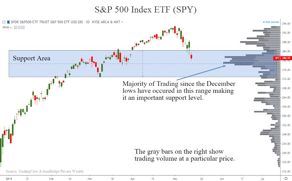
In the chart below, we look at a critical area of support on the S&P 500 index. This chart shows the market performance from the December lows. It also shows a unique way to show index volume, called “Price-by-Volume”.
Typical charts show the volume of shares that was traded during a particular time-frame…daily volume on a daily chart, weekly volume on a weekly chart, etc. This chart instead shows the amount of shares that were traded at a given price level. Bigger bars on the chart shows higher volume, and vice-versa. This can tell us when other market participants likely bought shares in a rising trend or sold them in a falling trend. In other words, it can provide a glimpse into supply and demand levels.
Since the market has been moving consistently higher since December, this area shows us that a large portion of the trading that has occurred has happened in the price range that we are in now.
These areas of increased volume-by-price can provide a very reliable indicator of future behavior of the market. If the “Support Area” in the chart above proves to hold, we can expect that the likely outcome is that the market will move to new all-time highs in relatively short order.
However, if market prices break below the support area, we would expect to see increased selling pressure as supply in the market overwhelms demand. If this occurs, the odds dramatically increase that scenario two will develop.
SCENARIO 2: Retest of December Lows (20%+ decline)
This is the scenario we hope doesn’t happen. The market recovers from the awful 4th quarter last year, only to “Rinse and Repeat”.
Last week we would assign this probability as a much lower likelihood than Scenario 1.
These odds appear to be increasing slightly. Through last week, the aggressive areas of the market were continually scoring very high on in our system. We discussed this in our last “Insights” report which you can view HERE.
Sectors such as technology, consumer discretionary and industrials were leading the way, while more defensive areas like utilities, healthcare and consumer staples. Since the market started to move lower, that is changing.
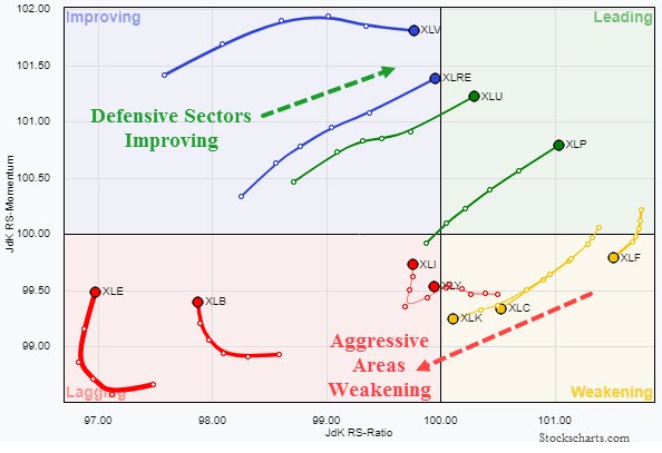
One of the easy ways to visualize this rotation is using the chart below.
 This type of chart is called a “Relative Rotation Graph”, or RRG. We use a more advanced type of this chart in our day-to-day process, but this one is a good visual of moves under the surface of the market.
The symbols listed in the chart are those of various sector ETFs. The tickers that are moving up and to the right are showing strength when measured against the S&P 500 Index. XLP is the Consumer Staples fund, XLU is utilities, XLRE is real estate, and XLV is healthcare. These have shown relative strength recently.
Conversely, XLK (Technology), XLY (Consumer Discretionary), and XLF (Finanicals) are all showing weakening movements. While XLI (Industrials) is trying to strengthen once again.
This tells us that we could be witnessing the early signs of a trend change. When markets get volatile, market participants move into these defensive areas. That has been the case recently, at least to some degree.
Other indicators we follow are still showing signs of strength. Also, the indirect causation factors (ie, economic indicators) are also showing good signs of strength that could support buying.
What do we do Next?
As of today, the upward trend is still in tact. We continue to believe we are late cycle, and large moves like this are to be expected.
Yes, there were announced that the US would implement increased tariffs on Chinese goods, but the market has been declining for almost two weeks prior to that announcement. So other factors must have been at play.
We can choose to attempt to predict how these various other factors might cause people to buy or sell or hold. Or we can accept that the market price is the market price, and position portfolios accordingly.
Fortunately, our diligence in risk management paid off last week as IronBridge clients had roughly 30% of their portfolio move to cash. Knowing your exit can pay off when markets get volatile. Developing and executing a repeatable process is key.
In the meantime, we will continue to monitor the markets and make necessary adjustments. We hope the market finds its footing and starts to move higher, and prove that Scenario 1 is in the cards.
But hope is not an investment strategy.
We a have strict buy and sell discipline we will continue to adhere to, so you can rest assured we will take prudent and appropriate actions as stewards of your hard-earned wealth. Cash on the sideline will be put back to work as investments meet our buy criteria, and other investments sold if they meet our sell criteria.
In the meantime, we expect to see elevated volatility in the markets, with large price moves up and down until the market finds it footing. But the market is showing that risk has indeed increased, and we should pay attention to this warning.
Please reach out with any questions or if you’d like to schedule a time to discuss the potential market outcomes or your portfolio specifically.
Invest wisely.
Our clients have unique and meaningful goals.
We help clients achieve those goals through forward-thinking portfolios, principled advice, a deep understanding of financial markets, and an innovative fee structure.
Contact us for a Consultation.
Neither the information provided nor any opinion expressed constitutes a solicitation for the purchase or sale of any security. The investments and investment strategies identified herein may not be suitable for all investors. The appropriateness of a particular investment will depend upon an investor’s individual circumstances and objectives. *The information contained herein has been obtained from sources that are believed to be reliable. However, IronBridge does not independently verify the accuracy of this information and makes no representations as to its accuracy or completeness. Disclaimer This presentation is for informational purposes only. All opinions and estimates constitute our judgment as of the date of this communication and are subject to change without notice. > Neither the information provided nor any opinion expressed constitutes a solicitation for the purchase or sale of any security. The investments and investment strategies identified herein may not be suitable for all investors. The appropriateness of a particular investment will depend upon an investor’s individual circumstances and objectives. *The information contained herein has been obtained from sources that are believed to be reliable. However, IronBridge does not independently verify the accuracy of this information and makes no representations as to its accuracy or completeness.

