We’re not sure if it’s the cold weather, the post-holiday blues, or just too much Federal Reserve eggnog, but the markets are as calm now as at any point in history.
In this “Slumber Issue”, we wonder if investors are falling asleep at the wheel, do our best not to wake up Rip Van Winkle, and discuss an inconvenient truth about diversification.
[maxbutton id=”5″ url=”https://ironbridge360.com/wp-content/uploads/2018/01/IronBridge-Insights-2018-01-12.pdf” text=”View PDF” ]
In This Issue:
PORTFOLIO Insights: An Inconvenient Truth about Diversification
Are bonds and stocks inversely correlated? Most financial professionals will tell you that bonds provide safety to your portfolio during times of market stress; we disagree.
MACRO Insights: Have Investors Fallen Asleep at the Wheel?
The stock market’s volatility hit a new all time low as the market hit another all time high. Is low volatility something to be worried about or something that should be celebrated?
Market Microscope: Don’t Wake Up Yet, Rip Van Winkle
Today’s unprecedentedly low level of volatility has many market observers concerned. Indeed low volatility is a late cycle phenomenon, however, it does not necessarily mean a market top is just around the corner. There have been extended periods of low volatility in the past.
On Our Radar
Trump Taxes: The tax bill has passed as companies continue to dissect how changes may affect them. The theme should be one-time impairments from tax-deferred assets, along with plans for future stock buybacks and dividends. We should learn more about tax effects on companies during earnings season.
Great Start: The S&P 500 is off to its best start in 30 years…since 1987.
Earnings: 4Q Earnings season has begun, and companies have a high bar to continue the growth seen in 2017.
Federal Reserve: The Fed is expected to raise rates 3 more times in 2018 as the bond market has already started to price this in.
FIT Model Update: Uptrend

Fundamental Overview: Earnings season will begin in full force over the coming weeks. Retail will be in the spotlight after a good 4th quarter for many of those stocks’ prices.
Investor Sentiment Overview: Numerous surveys and other sentiment indicators continue to set records for stock market optimism. Adding to this growing list, the Investors Intelligence subscription service recently published the number of bullish advisors compared to bearish advisors has now hit 4.8:1. This marks the most bullish that cohort has been in 31 years.
Technical Overview: The market has kicked off one of the strongest starts ever as the S&P was up over 3% after the first 6 days of trading in 2018. The last time stocks started the year off this well was also 31 years ago.
Focus Chart
The VIX is Sleeping Like Rip Van Winkle
The VIX Index is a key measure of expected near-term volatility in stocks, based on the prices of certain options on the S&P 500 Index. A low reading is a sign that investors believe the risk of a near-term decline is low, and a high reading reflects the fear of a near-term market decline.
However, the VIX index, like other investor sentiment readings, tend to be contrarian signals. In other words, a low VIX is more reflective of a high point in stocks, while a high VIX typically accompanies a bottom.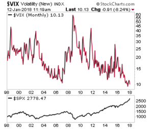
The S&P 500’s measure of volatility has been hovering at or near record lows for the past six months. The monthly average of the VIX has now fallen below 10 for the first time ever, and this has many concerned. The chart below reveals the extremely low level of the VIX, and a low VIX has indeed typically coincided with stock market tops.
But, just because the VIX has made a new all time low, and the stock market has simultaneously made a new all time high, does not necessarily mean the stock market’s trend of low volatility and higher prices will soon end.
A deeper look at volatility reveals there have been four prior periods where volatility was behaving similarly. Two of those periods did indeed see market pullbacks shortly after, but the other two periods saw the equity markets continue higher for months and years before ultimately succumbing to a change in trend.
Until proven otherwise, volatility is showing more signs of a Rip Van Winkle continuing its slumber than a Sleeping Bear about to abruptly awake.
Portfolio Insight
An Inconvenient Truth about Diversification
“It is difficult to get a man to understand something when his salary depends on him not understanding it.” – Upton Sinclair
How long will this bull market last?
 This is the single most common question we hear. It is not unsophisticated investors that ask us this either…this question comes up in almost every conversation we have, from very sophisticated investors to those would self-identify as not really understanding the markets.
This question is relevant. Not just for the obvious reason that we would love to know beforehand what will happen. It is relevant because it tells us that most investors are not confident in what they will do when the next downturn starts. It also reflects very poorly on an investment industry that has been selling diversification and asset allocation as the primary tool for “risk-management”.
There is a prevailing thought by investment firms that bonds and stocks move inversely to each other. It is from this belief that a diversified portfolio consists of an adequate amount of bonds coupled with an adequate amount of stocks.
But, there is a problem. Most money managers believe this to be true because they have only lived and invested during one macro trend. Since the early 1980’s, both stocks and bonds have been in long-term and tremendously strong bull markets. Historically, however, this is far from the norm.
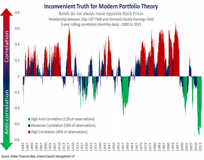
The graphic below shows the relationship between stocks and bonds in three colors: 1) Red (periods of High Correlation), when stocks and bonds moved in the same direction; 2) Green (Anti-Correlation), time periods when stocks and bonds moved in opposite directions; and 3) Blue (Moderate Correlation), when stocks and bonds moved relatively in sync with each other.
Modern-day diversification is based on periods in Green. This happens a mere 11% of time! If this only occurs 11% of the time, then why is the prevailing thought of pie chart diversification so rampant on Wall Street? There are a few reasons, but one of them is also shown by the chart.
During the past 20 years there has been a flight to safety whenever stocks fell in price. In other words, there is a recency bias being played out.
In reality over 50% of the time there is a slight correlation, and 30% of the time there is a high, positive, correlation between stock prices and bond prices. In other words, when stocks fall bonds also fall.
There are many ways to manage risk in portfolios, but diversification is inadequate.
So what’s our answer to the question? I wish we knew when it will end. But we are not afraid to invest at these levels because we have already planned our exit strategies and know exactly what we will do for our clients when this bull market does change.
Macro Insight
Have Investors Fallen Asleep at the Wheel?
Suppose you are driving in a car on an interstate in a rural part of the country using cruise control set at 70 mph. Traffic is light, and you never have to touch your gas or your brake…until you start getting closer to the city.
Then your smooth ride is over. You certainly can no longer use your cruise control, and you likely must partake instead in white knuckle driving. There was zero volatility, now there is too much of it, and driving has become more dangerous.
The stock market currently is on cruise control going 70 mph in the rural part of the country and not having to bother with the gas or the brakes. But, too little volatility can also be dangerous. When you are able to just set the cruise control and sit back and relax while driving, it’s easy to get lulled to sleep, and if you have ever driven through West Texas then you have probably personally experienced this risk.
That is where we find ourselves in the market today, with the risk of being lulled to sleep, wondering how long that slumber may last.
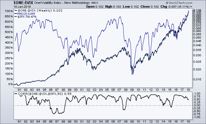
Shown in the chart below with the blue line is the S&P 500’s volatility index ($VIX), inverted. It is inverted to align volatility with stock prices as the black line represents the S&P 500 during the same 30 year period. Notice that these two indices generally move in the same direction.
Currently, that blue line is at its highest level ever (the VIX is at its lowest level ever), which reveals the market has been driving on a rural road with its cruise control set for a very long time. Is the market now lulled to sleep by the lack of volatility?
The chart reveals a few key things which we will discuss in more detail in the Market Microscope section next:
- Volatility moves in cycles, and we are indeed late cycle.
- This low of volatility for this long is not the norm.
- Volatility is negatively correlated with the market. Lower volatility = higher markets
- Volatility can continue to fall, but the longer that occurs the less likely it continues. There is a zero bound.
Market Microscope
Don’t Wake up Yet, Rip Van Winkle
The VIX has hit an all time low, but how long can this low volatility persist? We look at a few indicators to help tell us when this bout of low volatility will be ending. The bond market also enjoyed relatively low volatility over the past few years, but that looks like it has now changed as more and more investors are noticing the change in trend in yields.
In the story of Rip Van Winkle, the title character goes to sleep after a game of bowling and heavy drinking with a merry band of dwarves. He falls asleep, and awakens 20 years later an old man, only to realize that things had changed dramatically when he awoke.
A look at volatility in the stock market over the past 6 months shows that risk is taking a nice long slumber as well.
The VIX Index is a key measure of expected near-term volatility in stocks, based on the prices of certain options on the S&P 500 Index. A low reading is a sign that investors believe the risk of a near-term decline is low, and a high reading reflects the fear of a near-term market decline.
However, the VIX index, like other investor sentiment readings, tend to be contrarian signals. In other words, a low VIX is more reflective of a high point in stocks, while a high VIX typically accompanies a bottom.
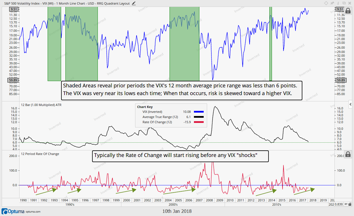
A further detailed look at volatility, below, reveals that the current low level of volatility is indeed not the norm. This monthly chart of the inverted VIX also shows the VIX fell below $10 recently. In the early 90’s, the mid-90’s, and in 2006, the VIX approached single digits, but it never quite got there.
Indeed today we are at a historical extreme when it comes to volatility. This new low for volatility could suggest we are due a mean reversion and that the VIX may be more a sleeping bear very close to waking rather than a Rip Van Winkle that will continue to enjoy its nice slumber. We believe this to be a shortsighted conclusion, however.
The VIX may be in single digits, and it may seem that it has been muted for a very long time, but in reality, the 2nd half of the chart reveals some intricacies of this VIX decline are actually not unprecedented.
(Graphic Content Warning: the following few paragraphs get in the investment weeds, but there is more to the report afterwards so stay with us)
The middle section of the above graphic reveals the “Average True Range” (ATR) which is a measure of the average monthly high to low range for the prior 12 months. In a lot of ways it shows us the “volatility of volatility”.
The ATR measurement reveals the prior 12 months VIX has had an average “range” of 6.1 points. This is low, but, interestingly, this is not the lowest that range has been.
There have been extended periods where the VIX’s ATR has been below 6 points, as highlighted in green. During these periods, the volatility of volatility was even lower than it is today. But we also see that during those highlighted green sections when the ATR was below 6, the VIX was at or very near its low price for the cycle. There indeed had been very little further decline in volatility once the ATR reached 6 as the start of each green section was at or near the low in the VIX, but that didn’t mean stock prices started to fall.
When we look at what followed the dates that the ATR fell below 6, we gain a little more insight. The first occurrence preceded the 1994 market 10%+ pullback, so it was a pretty good signal that a market top was near.
The second occurrence, however, occurred in the midst of the tech bubble, from 1994 – 1997, which ultimately lead to 1998’s pullback, but the low ATR lasted for 3 years prior to that outcome. The VIX was low, and it started to move higher, but at a slow enough pace to keep the ATR below 6 for 3 years.
During the mid-2000’s the volatility of volatility also stayed below the 6 level. This reading lasted for two years, before volatility started to pick up again in 2006. More recently, in 2014, the ATR of the VIX approached 6 and volatility immediately reversed, coinciding with the last meaningful pullback we have seen, 2015’s.
With a current ATR reading of 6.1, we are approaching that level again. However, given we have two examples of the VIX’s ATR falling below 6, and staying there for months/years, we should not look at the VIX here and its ATR at 6 and assume we are witnessing a market top, like, for instance, in 2015.
As history teaches us, we could continue in this low volatility environment for awhile, or, like the tech bubble, we could actually see a bottom in the VIX, yet see the market and the VIX both rise together for a few more months/years.
Finally, the bottom part of the chart is another measure of volatility’s volatility. The 12 month rate of change (ROC) measures the price today with the price from 12 months ago. Before the VIX bottoms and starts to move higher, its 12 month rate of change typically starts to also move higher. More importantly, though, the large spikes in the ROC that occurred along with large spikes in the VIX only happened after the ROC had been slowly moving higher. In other words large spikes in the VIX didn’t just happen overnight; there was a building up of the VIX prior.
What history teaches us is we should not expect a massive monthly VIX spike to occur out of nowhere. We should first start to see a gradual pick up in overall volatility by first seeing the ROC continue to steadily move higher. This could be combined with an ATR that moves back above the 6 points level. That’s when historically large prolonged spikes higher in the VIX and larger selloffs in stocks have occurred.
Penny Stocks
Ultimately, a low VIX is a sign of investor complacency. A different way to look at this complacency is to look at trading volumes in the most aggressive areas of the market. Historically, penny stocks (or stocks that trade for under $5/share, and not on one of the major stock exchanges), have been the place where investors have gone to “hit a home run”.
During the late 1990’s tech bubble, speculators were being fined for spreading false rumors in America Online chat rooms about virtually unknown penny stocks. Jonathan Lebed was one of them. He was 15 years old, and was charged with security manipulation by the SEC.
But, whatever happened to penny stocks? The only ones today that garner any attention are those like the Long Island Iced Tea company, which, after a name change to Long Blockchain Corp, is now supposedly in the Bitcoin mining business.
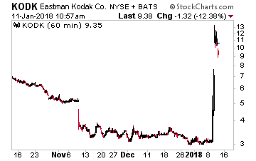
Or, Kodak (remember the camera company?) which quadrupled its stock price from $3 to over $13 when its management suggested they would use crypto as a tool to help manage digital property rights. Kodak’s recent price spike is shown below.
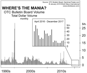
But beyond the Bitcoin mania, today we largely hear nothing about penny stocks. Like volatility, today’s lull in penny stock activity is unprecedented.
The next chart reveals a virtual standstill over the past two years in the dollar volume traded in penny stocks. Penny stocks historically have been the bastion of speculative pride, where the gutsiest of speculators could strike it rich, but today it seems that cohort has either disappeared or moved on to other means of speculation (Bitcoin perhaps?). Compare today’s dollar volume, under $50MM/month, to the late ’90’s $25B+/month. Volatility in penny stocks is virtually non-existent.
For all intents and purposes, the penny stock market has dried up, helping confirm the extremely low volatility in the broader market as even the most speculative of speculators are seemingly taking it easy.
Bond Market
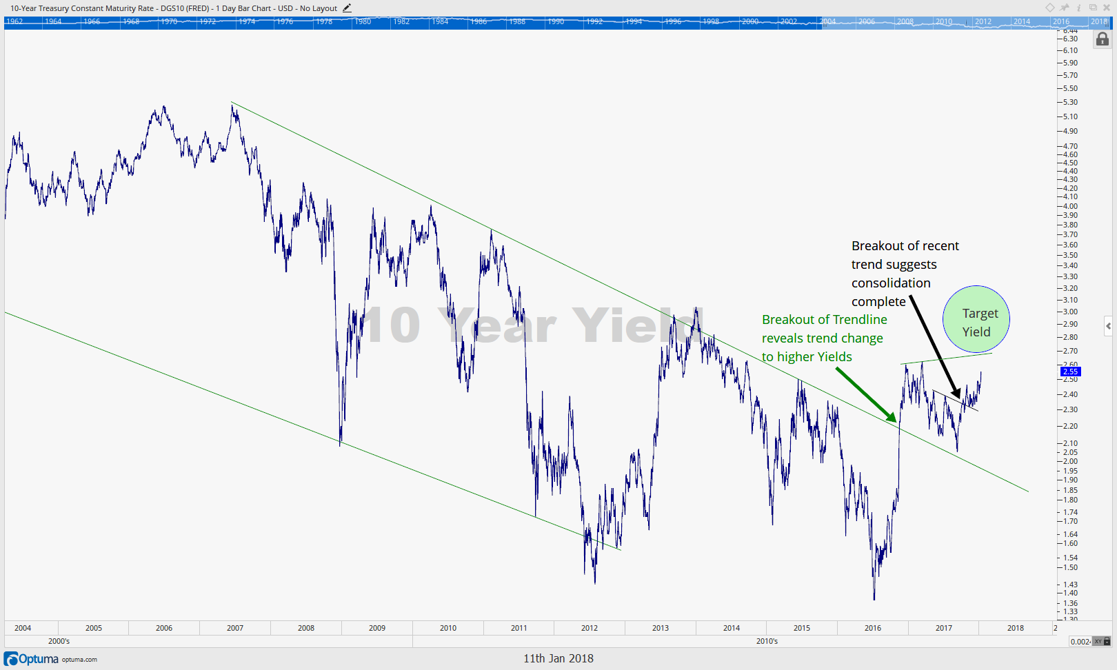
We have discussed the coming rise in bond yields numerous times over the past year, and this past week that thesis started gaining attention from some of the better known bond fund managers.
Bill Gross, of Janus, was one of them as he utilized a similar chart to the one we provided in our 2018 Outlook and is updated below to proclaim that the bond bull market of the past 35 years “is over”. He also published his latest musings where he is calling for a “0-1%” annual return on bonds for the foreseeable future. Can you imagine a world where bonds return 1% or less and stock prices are also declining?
We can, and we are fully preparing for such an environment when, unfortunately, the traditional “pie chart” diversification fails investors when they need it most. Many investors are going to get a wake up call when they realize the bond portion of their portfolio is not providing them the diversification they thought they had. The Portfolio Insights section of this update provides a great analysis showing just how little bonds do protect when stocks decline.
Recent examples of rising bond prices during stock market selloffs are the exception more so than the norm, and our 9/29/17 IronBridge Insights also laid out why this has to be the case economically. As interest rates rise, the cost of capital also rises, and when the cost of capital rises, equity prices must come down, representing a fundamental rule of finance of falling bond prices and falling equity prices.
One way to mitigate the risk of a rising rate and falling bond price environment is instead of owning bonds that have fixed rates, own floating rate bonds, which will return more yield as rates rise. This is similar to also owning floating rate CDs and shorter duration Treasuries that you can then re-roll into higher rates as the overall rate environment rises. Could you imagine being locked into a 2% 10 Year Treasury bond if the 10 year Treasury yield is at 6% in two years? That’s a very real possibility that we would prefer to avoid.
With the 10 Year now creeping toward its 2017 highs, and the mainstream media now talking about the end to the bond bull it is likely we are nearing a short term pause in the move higher in yields. However, we expect the longer-term trend in bond yields to remain up and are looking at any rallies in bonds as ones to be sold. 3% on the 10 Year remains a good short term target in 2018 as the technical chart above suggests.
We hope the move higher in yields remains a calm and measured one. We also hope risk’s Rip Van Winkle slumber continues for a while longer.
Our clients have unique and meaningful goals.
We help clients achieve those goals through forward-thinking portfolios, principled advice, a deep understanding of financial markets, and an innovative fee structure.
Contact us for a Consultation.
Disclaimer This presentation is for informational purposes only. All opinions and estimates constitute our judgment as of the date of this communication and are subject to change without notice. > Neither the information provided nor any opinion expressed constitutes a solicitation for the purchase or sale of any security. The investments and investment strategies identified herein may not be suitable for all investors. The appropriateness of a particular investment will depend upon an investor’s individual circumstances and objectives. *The information contained herein has been obtained from sources that are believed to be reliable. However, IronBridge does not independently verify the accuracy of this information and makes no representations as to its accuracy or completeness.
