Chaos Theory is a branch of mathematics that focuses on the behavior of complex, dynamic systems such as the weather, fluid mechanics and financial markets. A popular expression from this theory tells of a butterfly that flaps its wings in China and causes a hurricane in Texas. What could be the butterfly in today’s markets?
[maxbutton id=”5″ url=”https://ironbridge360.com/wp-content/uploads/2018/10/IronBridge-Insights-2018-10-19-Butterfly-Effect.pdf” text=”View PDF” ]
FIT Model Update: Late Cycle Bull Market
On Friday, October 19, the Bank of the Ozarks, a small regional bank located in the Southeast US, fell 25% in price as the company greatly missed earnings. The interesting aspect of the miss is that it was largely due to two commercial real estate projects: one mall located in South Carolina and one residential land development property in North Carolina. What caught Wall Street off guard was that the appraisal value for these two properties was cut 20% in just the past three months. It’s been a long time since we’ve seen negative real estate news…perhaps this is an inflection point?
Portfolio Insights
Butterfly Effect
“I have noticed that even those who assert that everything is predestined and that we can change nothing about it still look both ways before crossing the street.”
– Stephen Hawking, Physicist
Most of us have heard about the butterfly effect. The most popular expression tells of a butterfly that flaps its wings in China and causes a hurricane in Texas.
There is a branch of mathematics that focuses on the behavior of complex, dynamic systems called Chaos Theory. At its core, chaos theory proposes that the future behavior of a complex system is fully determined by its initial conditions. A slight variation in the initial conditions will lead to widely diverging outcomes.
Common examples of complex systems are the weather, road traffic, fluid mechanics and financial markets. The weather is the easiest analogy to make when applying chaos theory…meteorologists can generally predict the overall cycle of the weather (hot in summer and cold in winter), but their weather models have very low accuracy more than 5-7 days in advance.
Financial markets are the same way. One can generally predict that a bull market is followed by a bear market. But predicting precisely when that will occur is a lucky guess at best. Analysts were overly optimistic in early 2008, predicting an average return of 8% for the S&P 500 that year. It went on to fall 55%. In 2017, analysts predicted a rise in the S&P 500 of roughly 8%. It returned almost 22%.
To try to predict the market is a folly. No one can be accurate with any real consistency or effectiveness over time without a tremendous amount of luck. But we can and should deeply understand the current conditions of financial markets. Each and every day can be considered an initial condition for the future outcomes in asset prices.
We should also look for potential butterflies.
In the Market Microscope section below, we look at the potential outcomes in the markets, and discuss specifics on what is driving recent market volatility. But first, let’s view these potential outcomes on the wings of one really big butterfly.
The Butterfly: Global Liquidity
Beginning in 2008, central banks across the globe began flooding the financial markets with liquidity. The US Federal Reserve was purchasing various Treasury bonds, and the proceeds from these purchases made their way into the US stock market.
Other central banks were purchasing securities as well. Only many of these foreign central banks were not only buying bonds, they were investing directly into their respective stock markets. They use exchange-traded funds, various derivative contracts, and individual companies directly.
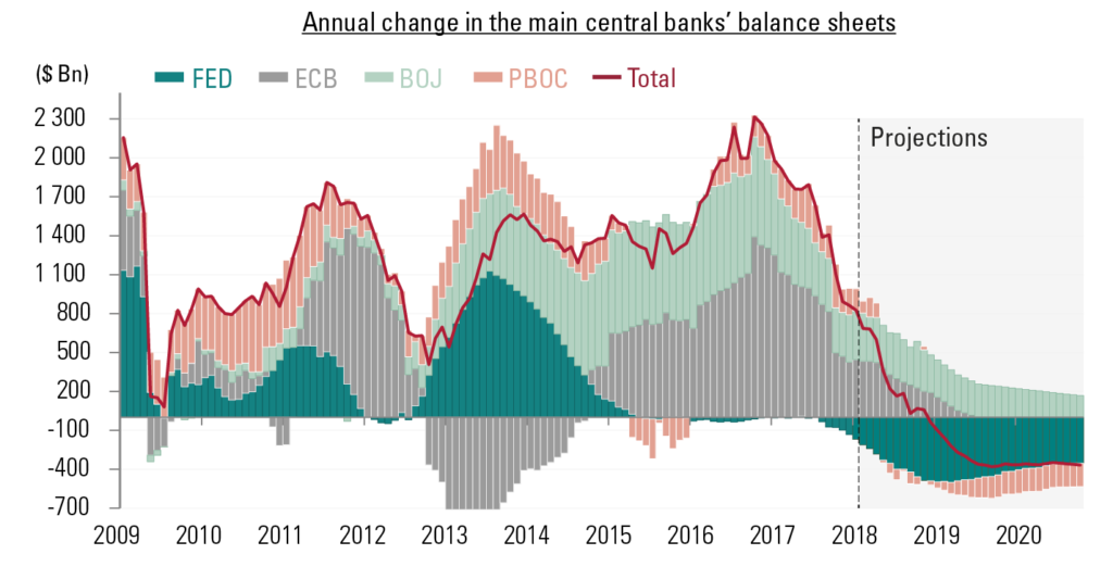
The chart below shows the change in central bank balance sheets since 2009.
The red line shows the annual change in the balance sheets of the largest four central banks in the world: The US Federal Reserve (FED), and European Central Bank (ECB), the Bank of Japan (BOJ) and the People’s Bank of China (PBOC).
This chart shows that global liquidity has consistently been added into the financial system for almost a decade. However, this red line is going negative in the fourth quarter of 2018. That means now. Arguably the single largest contributor to the rise in stocks since the financial crisis in 2008 is no longer happening. It is now removing liquidity from the financial system. If adding liquidity helped, will reducing liquidity hurt?
Given this simple, but very important, understanding of current conditions, it does not surprise us that volatility has returned in 2018.
However, central banks are not the only reason liquidity is being reduced. The other is strength in the US Dollar.
Currency markets are by far the largest markets in the world. Currencies on average trade 30x more volume on a daily basis. (On an average day, over $5 Trillion worth of currency is exchanged across the globe. Compare this to stocks, which trade on average $169 Billion.)
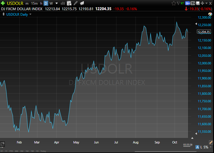
The next chart shows the US Dollar versus a basket of currencies. January was a very strong month for risk assets, particularly international stocks. During that time, the US dollar fell very quickly. Since then, the dollar has consistently risen while risk assets, especially international stocks, have struggled.
When the value of the US dollar rises against another currency, say the Euro, it takes more Euros to buy one dollar than before. Because of this increased exchange rate, US dollars become more and more scarce in these countries. This US dollar strength can cause all sorts of various outcomes in other countries.
This year, for example, has seen multiple currency crises: Turkey, Venezuela, Brazil, Chile, South Africa and China have all had dramatic depreciation of their currency this year. As a direct result, stock and bond markets in these countries have suffered dramatically. Emerging Market stocks are down 12% this year, but off almost 25% from their highs in late January. All due to reduced currency liquidity.
If we want to try to identify the butterflies that may flap their wings and cause hurricanes, it is logical to start with global liquidity. It has the power to overwhelm economies, earnings and entire financial markets, and we should pay attention.
Let’s now turn our attention to the current volatility, and what potential outcomes we should expect.
Market Microscope
Where the Rubber Meets the Road
“It is a capital mistake to theorize before one has data. Insensibly one begins to twist facts to suit theories, instead of theories to suit facts”
-Sir Arthur Conan Doyle, author
The markets are in such an interesting and precarious place right now we think it appropriate to really focus on the charts and potential outcomes they present. So much has happened in such a small amount of time thus far in October, we want to point out a few of the key things we are watching in the coming weeks.
The bottom line is the market’s recent selloff that culminated with last week’s significant uptick in volatility has stopped and gained back a portion of the initial losses. However, the jury is still out whether this bounce will fail or if, like February’s lows, it is one to ultimately be bought. It’s simply too early to know as the market continues to digest last week’s move lower.
Some stocks, sectors, and indices fared better than others. The technology sector fell over 9% from peak to trough already this month, while the health care sector fared 33% better, falling just over 6%. Key indices, such as the Transportation Index, the New York Stock Exchange, Small Caps, and the Dow are now flirting with unchanged or now negative for the year, while others, such as the S&P and Nasdaq remain solidly up on the year.
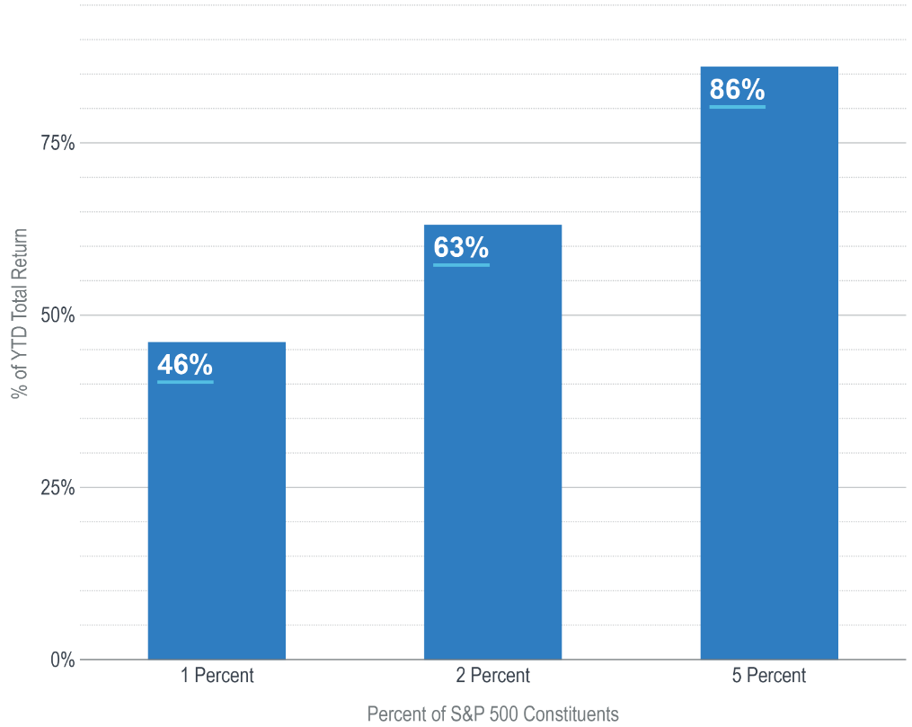
There have been some common themes we have been following this year, and one of those has been the concerning breadth (or lack there of). This has come to fruition as shown by the varying sets of returns laid out above. Many stocks and indices remain flat to down this year, while a handful of large cap stocks continue to pull more than their weight in the larger, cap-weighted, indices, such as the S&P 500.
In other words, the generals continue to go to battle finding fewer and fewer soldiers following them. The chart below, from Advisor Perspectives, puts this into perspective as just 1% of S&P 500 companies (literally just 5 companies) were responsible for almost 50% of its gains year to date. 25 of the 500 constituents (5%) are responsible for over 80% of the gains. This reveals a glaring risk in the market…if these leaders stop leading, the markets will be poised to fall as there are no other leaders or sectors to pick up the slack.
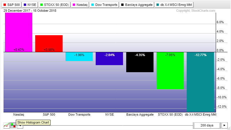
The next chart shows how various markets have performed thus far this year.
The Nasdaq remains solidly in the green, with the S&P and Dow still up, but now only by an average of 2.5%. The Russell 2000 is also one bad day away from slipping into negative territory again while the NYSE and Transports are already there, down over 3.5% each year to date. European stocks have seen a horrible year, down around (-8%) while Emerging Markets are down over (-12%).
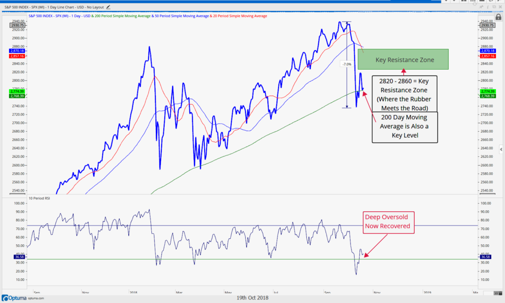
 The S&P is one market index we like to follow, and its chart is shown below. After falling a swift 7% in about one week’s time, it is recovering toward an area discussed in our interim update published October 10. On its way down it has flirted a few times with the 200 day moving average (the average price of the Index over the trailing 200 days, and a price many analysts watch as it represents the breakeven point of buyers and sellers during that period). Whether the S&P can actually get all the way to the resistance zone highlighted (and beyond it) remains an important question, as it seems there was some “smart” money that pushed the markets lower during this latest selloff.
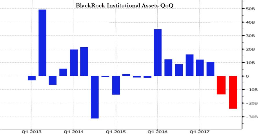
The next chart from BlackRock shows this smart money and reveals one reason to think this selloff may have further to go.
According to Blackrock’s order flow (the world’s largest money manager), the 2nd and 3rd quarters of 2018 saw significant selling by institutions. This on the surface may not mean much, but the reason the institutions get the reputation for being the “smart” money is because of their size. These are the behemoth pensions, mutual funds, and hedge funds, and when they are selling, they are selling big $ amounts. In this case, it was $30B of Institutional asset liquidation.
Looking back at the chart we see an interesting development. The only other time over the last five years we saw this kind of institutional selling was the 2nd and 4th quarters of 2015, and what occurred during the 2nd quarter of 2015 and 1Q of 2016 following those negative flows? The market peaked, rolled over, and endured similarly swift drawdowns as the one we are currently witnessing.
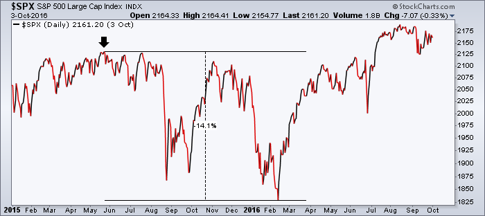
The next chart shows what happened surrounding these similar negative money flows as the market peaked in May 2015 on its way to a double dip 14% pullback. Coincidence or a warning sign of things to come?
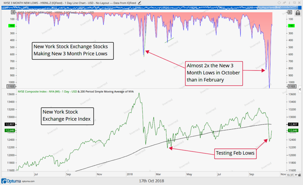
One final chart we want to look at concerns the relatively weak average New York Stock Exchange stock.
Another interesting development so far this month has been the significant decline in breadth in stocks that trade on the New York Stock Exchange. The top portion of the chart below shows that compared to February’s larger decline, nearer term traders are feeling much more pain during this drawdown of 7% compared to February’s 12% pullback. This is partly a result of how strong the end of 2017 and January 2018 were, but it’s also a sign that many stocks plainly are not doing well. Over 1100 of around 1900 NYSE stocks just witnessed new 3 month price lows. This compares to just 600 of those stocks reaching new 3 month lows back in February.
Put another way, the majority of buyers of New York Stock Exchange stocks over the past 3 months are now losing money in those positions.
In addition, as the chart points out, The NYSE Composite today is back and testing its 2018 lows, already at negative returns for the year. A break much below 12,200 would be a very negative sign for this index and suggest the market’s downtrend may actually just be in its infancy now.
Breadth is bad, but price has so far held the 2018 lows, a positive technical development, so we must give the market some credit here, but we by no means are out of the woods yet.
One thing to watch is if the NYSE Composite’s price can get back above its 200 day moving average along with how it reacts once it does so. Does the 200 day then become a support level that is holding (like the S&P thus far has done during the latter half of this week?)
When a theory or idea is put to the test, it is known as “where the rubber meets the road”. The markets right now are being put to the test for the first time since the February drawdown. Will they ultimately recover as occurred then, or will the larger markets, still being driven by a few heavyweights, join their cousins in further price deterioration?
Given the institutional selling that has occurred recently and the still deteriorated breadth, our guard remains up as the rubber indeed is hitting the road right now.
Invest wisely.
Our clients have unique and meaningful goals.
We help clients achieve those goals through forward-thinking portfolios, principled advice, a deep understanding of financial markets, and an innovative fee structure.
Contact us for a Consultation.
Neither the information provided nor any opinion expressed constitutes a solicitation for the purchase or sale of any security. The investments and investment strategies identified herein may not be suitable for all investors. The appropriateness of a particular investment will depend upon an investor’s individual circumstances and objectives. *The information contained herein has been obtained from sources that are believed to be reliable. However, IronBridge does not independently verify the accuracy of this information and makes no representations as to its accuracy or completeness. Disclaimer This presentation is for informational purposes only. All opinions and estimates constitute our judgment as of the date of this communication and are subject to change without notice. > Neither the information provided nor any opinion expressed constitutes a solicitation for the purchase or sale of any security. The investments and investment strategies identified herein may not be suitable for all investors. The appropriateness of a particular investment will depend upon an investor’s individual circumstances and objectives. *The information contained herein has been obtained from sources that are believed to be reliable. However, IronBridge does not independently verify the accuracy of this information and makes no representations as to its accuracy or completeness.

