Market stress continues, as the S&P 500 has fallen over 13% this month, and is on track to be the worst December in history. When used effectively, cash can be an incredibly effective way to manage risks during times of stress like we’re in now. We explore these uses, and look at whether the Grinch will continue to burn our Christmas decorations or put them back on the tree.
[maxbutton id=”5″ url=”https://ironbridge360.com/wp-content/uploads/2018/12/IronBridge-Insights-2018-12-07-Youre-a-Mean-One.pdf” text=”View PDF” ]
Portfolio Insights
Take Control
“Delay is the deadliest form of Denial.” -C. Northcote Parkinson, British Author
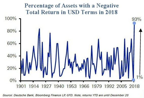
Two weeks ago we wrote about there being “Nowhere to Run” (read article HERE) as virtually every asset class has seen negative returns this year. In “Nowhere to Run”, we discussed the weak performance across 8 high level asset classes. Deutsche Bank took this a step deeper and looked at 70 various asset classes across the globe, including stocks, bonds, commodities, currencies, country-specific assets and many more.
As shown in the first chart, an amazing 93% of assets across the globe are negative year to date. This is truly unprecedented since at least 1900.
At IronBridge we’ve tried to make it a point to communicate that we think of cash as a productive asset that can be very valuable to own during times of stress like we are in now.
This concept can be difficult for some investors. We have been bludgeoned by the investment industry to believe that you must remain invested in all assets at all times, despite how obvious the risks may be. They tell us that to do otherwise is foolish.
In some ways they are right. To act on emotion is foolish. Mistakes occur when assets are bought on optimism and sold on fear. In the short-term, these decisions feel good. But when the market inevitably turns to the next phase of its cycle, the mistake is revealed. That panic sell order when the market is crashing felt good, but then it rebounded 50% and you missed out. That high-flying tech stock everyone got rich on was fun seeing in your account until it dropped 70%.
So cash inadvertently becomes the villain. It is the way salespeople financial advisors are trained to handle your concerned call. “Stay the Course”, they say. “Our year-end target is 20% higher than it is now, so you don’t want to sell”, they say. “We have a well-diversified portfolio”, they say.
Sometimes doing nothing is justified. And many times it pays off. But 10 years into a bull market, with risks as obvious as the ones we have today, is not a time to do nothing. The further the market falls, the less appealing cash will become, but up to this point it’s been very beneficial to own.The question becomes, what is an effective way to manage risks? There are many ways to manage risks, and we believe cash is an incredibly helpful tool in our toolbox.
But it hinges on having a PLAN around managing risks and modifying cash exposure. This is the missing link that the investment industry doesn’t want to spend the time developing. But it is the critical difference between a decision that adds value to your financial situation, or becomes the worst decision you’ve made in years. If you are in equities, know the conditions that would cause you to get out. If you’re out of assets, know the conditions when you’ll get back in.
So in an environment when almost every asset class is falling, cash is a predictable way to control risk in portfolios.
A few reasons we believe cash is a key component in a portfolio is:
- It is the one truly non-correlated asset. Cash does not fluctuate in value near as much as all other assets.
- It affords optionality. What we mean by this is by being in cash, we are much more ready and equipped to make a purchase when the time comes. In other words we don’t have to sell something else in order to buy something we want to. Having cash gives us the most flexibility in a portfolio.
- It is safe and allows one to “live to play another day”. By being in cash we can sleep well at night knowing portfolios will be safe, regardless what we wake up to.
- It generates alpha during down markets. Cash allows an investor to outperform during bad markets, and in a year like 2018 when there truly is nowhere to hide, it becomes one of the only assets that helps provide alpha (aka outperformance).
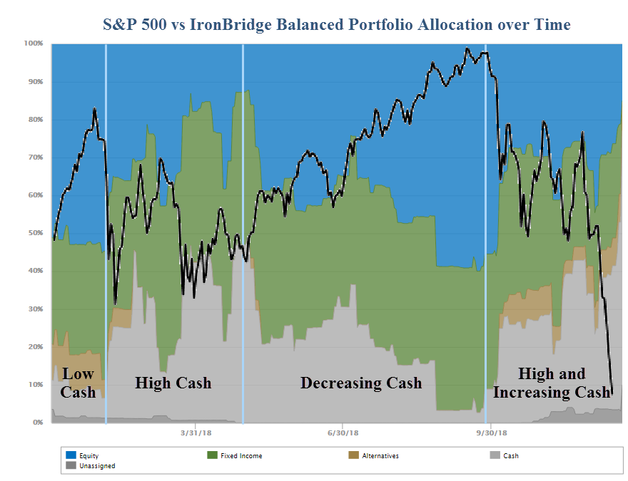
At IronBridge we have made investments in technology in order to help us communicate to our clients in a more transparent (and we think) more fiduciary way. The chart below is one such report all of our clients have seen (or will soon see).
What this chart shows is how one’s portfolio is allocated through time between stocks, bonds, alternatives, and cash. The black line is the S&P 500. Both are shown year-to-date. (In the chart, blue represents stocks, green is bonds, and grey is cash.)
The example shown is for our “balanced” portfolio and reveals the shifting allocation over the course of this year. There have been four distinct “seasons” this year:
- “Low Cash”: Accounts were fully allocated with very little cash for all of 2017, until late January 2018 when the market fell.
- “High Cash”: Cash exposure increased when the markets fell 12% in February and stayed volatile through March.
- “Decreasing Cash”: Throughout the spring and summer risk/return profiles improved. Cash exposure decreased and equity exposure increased, as our investment process systematically gave us buy signals as market risks declined.
- “High and Increasing Cash”: Then, since early October, our process has given us plenty of warning signals of volatility to come. Our clients are currently at their highest cash levels of the year.
Using cash as a strategic asset to help manage risk has helped our clients significantly outperform their benchmarks in 2018. We think transparent tools, such as the one provided above, allows us to have a more meaningful and fulfilling conversation with our clients.
In addition to providing more transparency, it really helps tell the story of what we have done and are doing in client portfolios. How long will we be so heavily allocated to cash?
Our Market Microscope section next looks to answer that question as we are looking for a few things that will help us increase our odds we are witnessing a market bottom.
Market Microscope
You’re a Mean One
“You’re a mean one, Mr. Grinch. You really are a heel. You’re as cuddly as a cactus, you’re as charming as an eel, Mr. Grinch. You’re a bad banana with a greasy black peel!”
-Dr. Seuss
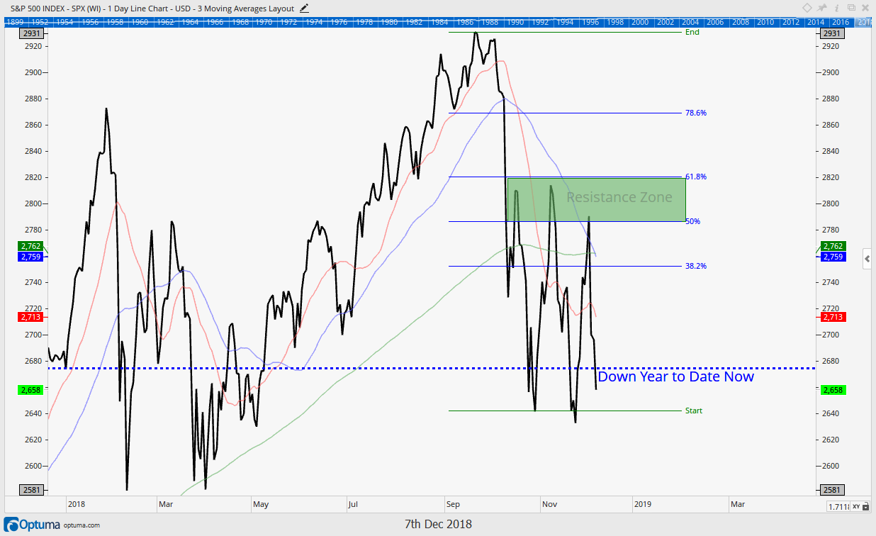
Two weeks ago we discussed the important range the stock market had been trading in (between 2800 and 2640). Since then, in addition to the increased likelihood the year ends with virtually all asset classes lower (also discussed two weeks ago and unprecedented since at least the ’60s), it’s now becoming increasingly certain that stocks are going to end 2018 down for the year. The S&P is now down over 5% year to date.
The first chart below is the chart we provided two weeks ago along with the following warning, which we put at more than 50% probability,” on a more negative note, the market has also formed a very key “support” level surrounding the 2640 level. We feel a break and a few days below this price level would confirm a larger, and longer-term bear market is upon us.” That indeed has occurred as a breakdown in price has now formed a new low for 2018.
S&P 500: Two Weeks Ago
S&P 500: Today
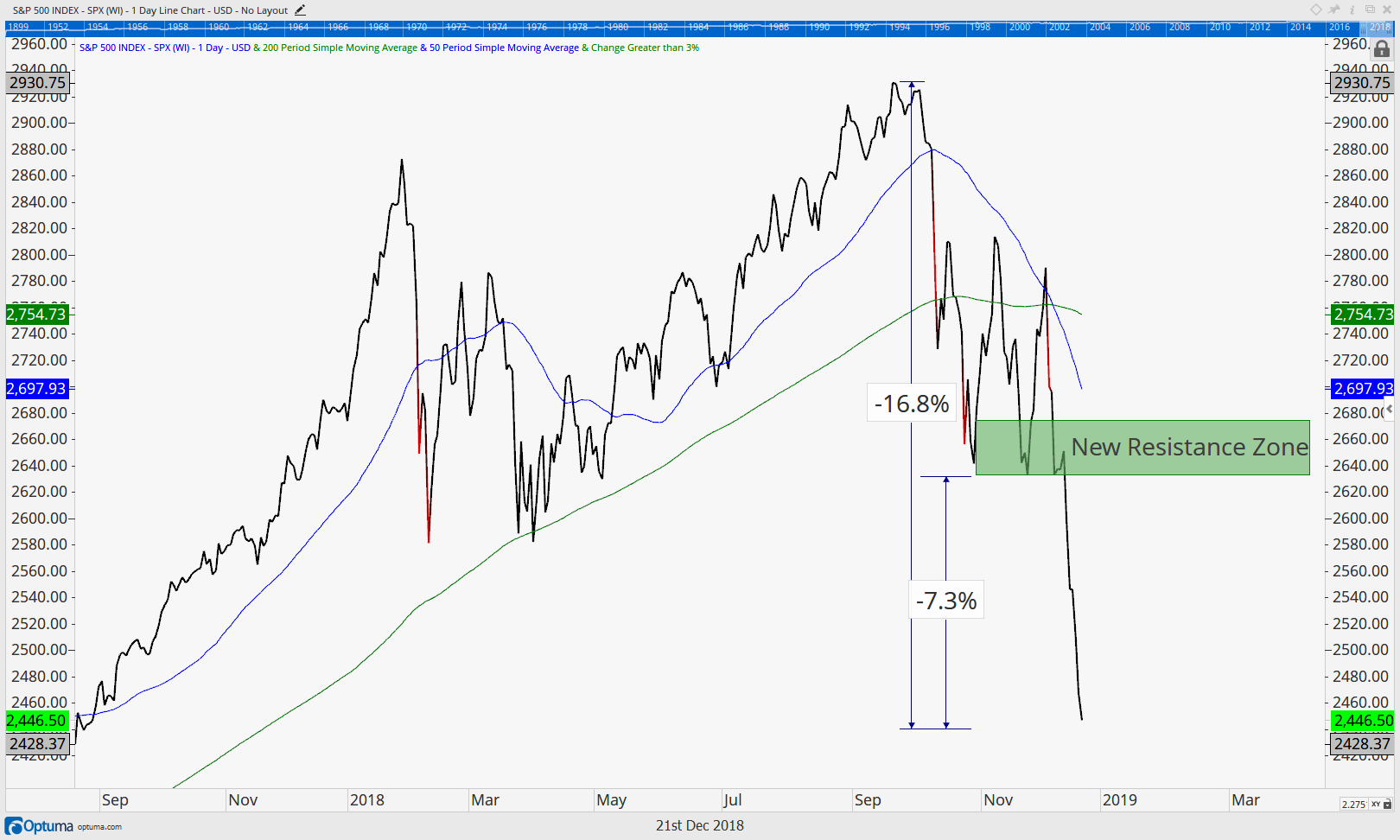
The second chart above shows the market through today. The S&P 500’s price is now over 7% below that key level, confirming it has indeed broken down and should now be considered not just in a short term pullback but also in an intermediate term one. That former support surrounding $2600 should now be thought of as a key resistance zone (if the market can even make it back up there).
The swift breakdown of the February and March lows is not a good sign.
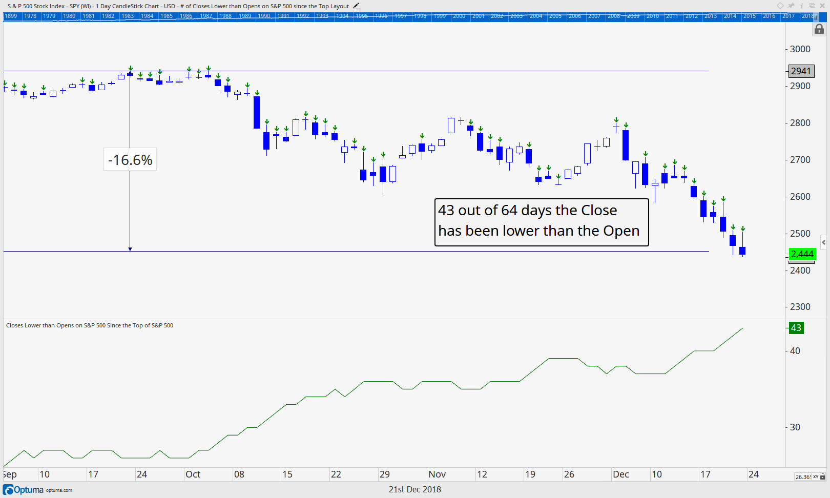
If you follow price, and price alone, then it is tough to be bullish here. Day after day we watch as the market opens up but then is sold throughout the day. The next chart shows what has occurred daily over the last two months and apparently there is a major change in the market’s mood. What used to be bought on pullbacks is now being sold on rallies. The chart shows this new phenomenon.
The S&P 500 chart below identifies all the days that had a lower daily close since the top 62 trading days ago.
This is shown two ways: 1) The solid blue “candlesticks” represent a day that closed lower than it opened; and 2) The green arrows also identify the same lower close than open day. Two thirds of all days have seen a daily market close lower than it has opened with 41 out of the last 62 days opening higher than they closed (there’s a lot of solid blue).
When we looked back in time over rolling 62 days, we saw that this indeed is the most lower closes than opens ever in a 62 day window on the S&P 500. In other words the selling during the market’s open hours has been unprecedented with investors selling throughout the day an unprecedented 66% of the time.
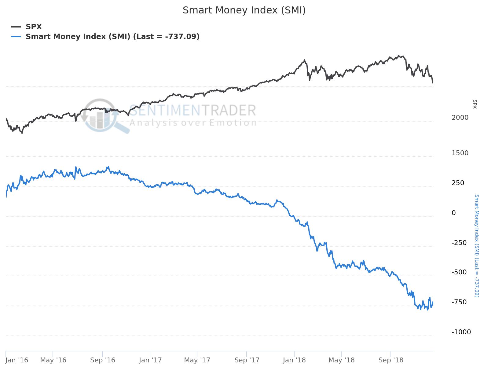
Another similar measure we use to track the market’s internal strength or weakness is called the “Smart Money Index”. The Smart Money Index, as described by SentimenTrader.com subtracts out the first 30 minutes (suspected to be a more emotional time of the day) and adds the last hour of trading (suspected to be the “smarter” money) together to come up with a net price change (ignoring all the “stuff” in the middle).
So, if the first 30 minutes saw the market up 10 points, and the last hour of the day saw the market down 10 points, the Smart Money Index would fall 20 points (less +10 points plus -10 points) regardless what the S&P did in between those two time periods. The chart to the right, also from SentimenTrader.com shows a very bearish Smart Money Index, which has been deteriorating since the Summer of 2016. Notice the speed of decline has really picked up pace in 2018.
Some investors dismiss the Smart Money Index today due to the plethora of ETFs and other funds which have daily re-balancing, but we still think the data is meaningful, especially when you couple it with other indicators and analysis, such as the unprecedented amount of closes being lower than the opens. Both the number of days being sold as well as the net first 30 and last hour of trading suggest the sellers are in control here.
High Yield Bonds
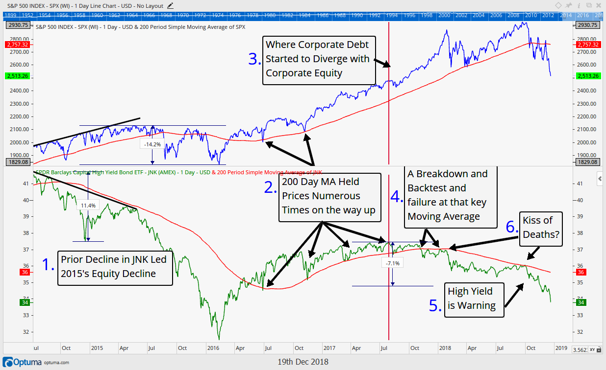
Another indicator we have been paying close attention to and have written about multiple times since we formed IronBridge the Summer of 2017, is the bond market, specifically high yield bonds.
The chart below updates our “kiss of death” junk bond chart and reveals how that market 1) again warned of an impending top in equities in 2017 and continued to warn by not confirming new highs into the Fall of this year and 2) continues to confirm how weak the high yield and thus (in our opinion) how weak the equity markets really are.
Notice in the bottom section high yield debt continues to crater along with equities (shown in the top section). Investors really need to see some firming up in the high yield market, otherwise the risk is this turns into a full blown credit crisis rather than a standard market pullback.
Volatility (VIX)
So is a bottom even close here? One group of investors thinks it’s a ways off.
Why? Because there really hasn’t been the fear or capitulation often associated with meaningful bottoms.
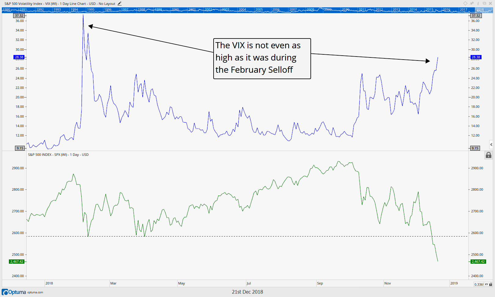
Volatility has actually been fairly subdued during this decline as depicted by the VIX index chart below, which surprisingly still remains below the spike levels seen back in February. So we have a lower VIX, even though the S&P 500 is now over 5% lower in price! Typical bottoms see some sort of VIX spike higher, which is a sign of increased fear and a wash out of traders, ultimately setting the stage for a bottom. We haven’t seen that yet.
Is it absolutely necessary for a bottom? No, there are rarely absolutes in investing, but it would sure tip the probabilities higher of a bottom in our opinion.
So when will we see a tradeable bottom?
In our opinion, if we can get
- Some form of capitulation/fear such as a vix spike higher (preferably above the 40 level), then…
- A sustained rally where the stock market’s closes are higher than the opens that ultimately retakes the 2600 level, and…
- Also get some sort of stability in the high yield bond market, then we would be able to get more bullish.
This is a lot to ask indeed. Until then, we will remain conservative and in elevated levels of cash as the environment remains one where there is indeed very few places to hide.
Happy Holidays, and invest wisely!
Our clients have unique and meaningful goals.
We help clients achieve those goals through forward-thinking portfolios, principled advice, a deep understanding of financial markets, and an innovative fee structure.
Contact us for a Consultation.
Neither the information provided nor any opinion expressed constitutes a solicitation for the purchase or sale of any security. The investments and investment strategies identified herein may not be suitable for all investors. The appropriateness of a particular investment will depend upon an investor’s individual circumstances and objectives. *The information contained herein has been obtained from sources that are believed to be reliable. However, IronBridge does not independently verify the accuracy of this information and makes no representations as to its accuracy or completeness. Disclaimer This presentation is for informational purposes only. All opinions and estimates constitute our judgment as of the date of this communication and are subject to change without notice. > Neither the information provided nor any opinion expressed constitutes a solicitation for the purchase or sale of any security. The investments and investment strategies identified herein may not be suitable for all investors. The appropriateness of a particular investment will depend upon an investor’s individual circumstances and objectives. *The information contained herein has been obtained from sources that are believed to be reliable. However, IronBridge does not independently verify the accuracy of this information and makes no representations as to its accuracy or completeness.
