Prudent management of portfolios does not include an “all-in” clause. As the market continues to show resilience following the steep selloff in the fourth quarter last year, we are continuing to reallocate out of cash and into equity and other attractive investments. However, we’re not convinced we are out of the woods just yet.
Plus, the dangers of linear thinking are one of the most under-rated dangers in investing and finance. We believe these risks are most evident in fixed income markets today. If interest rise too much from current levels, default rates could skyrocket.
Portfolio Insights
Dipping Our Toes
“Wisely and slow. They stumble that run fast.”
-William Shakespeare’s “Romeo & Juliet”
Managing risk is not an “all-or-nothing” game. A strategy that moves too quickly to protect principal will not be successful over the long run, because it will be punished by the market’s natural price cycles. Conversely, a strategy that is too slow to react to changing market conditions will also be punished for waiting too long as severe damage to capital is done. As we have said previously, hope is not an investment strategy.
IronBridge clients held high cash allocations throughout most of the decline from October through December. However, in early January, we began to get signals to increase equity exposure. And for the first time in 15 months, clients now have exposure to international stocks.
So now that markets have seen a very nice rebound from the Christmas Eve lows, should we go “all-in” and try to capture every bit of gains we can?
Of course not. No investment process that includes any sort of “all-in” trigger will be successful. Instead, we implement processes that combine daily, weekly and monthly signals to adjust to the natural rhythm of the market. Daily signals respond more quickly as changes occur. As such, we were able to reallocate cash within a week or two of the recent low.
However, other signals take either a little more time or a bigger move in price to develop. Markets must “prove” the trend is legitimate. By varying the length of time over which we look for opportunities, it is possible to create response system that changes with the speed of the market.
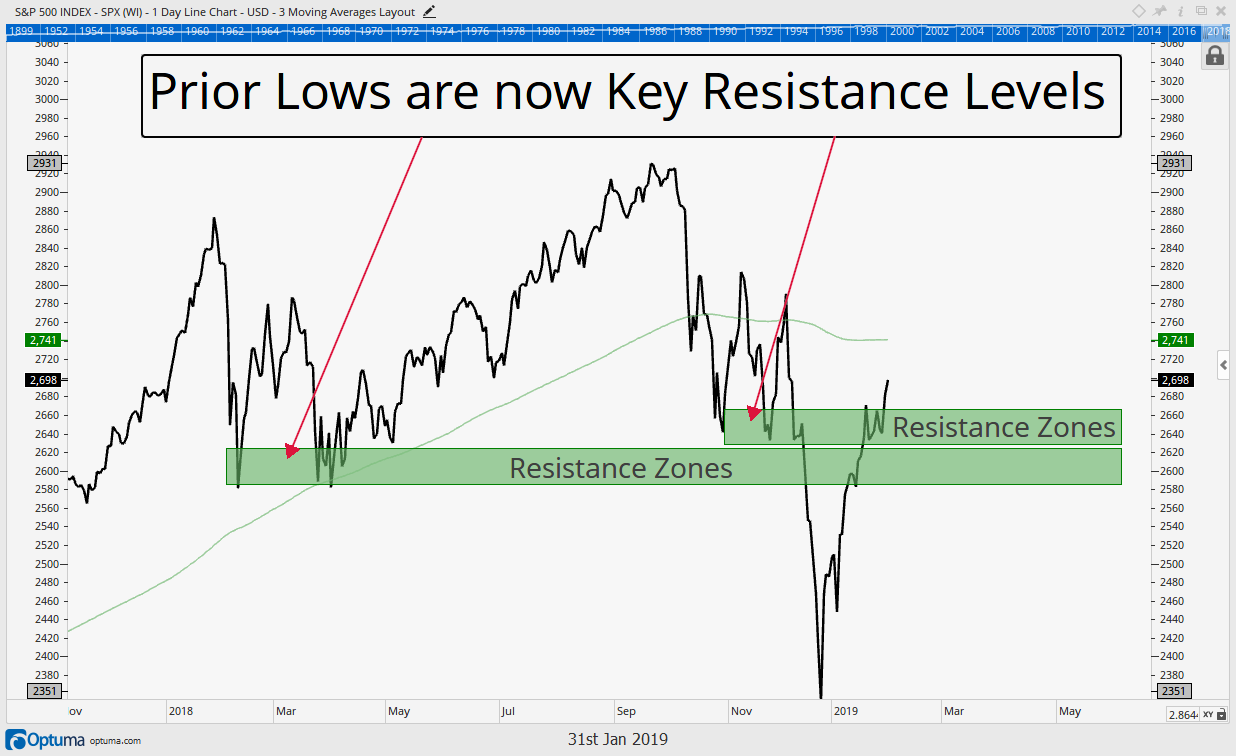
In our last ‘Insights’ we examined a few key areas we wanted to see the market overcome before we could get too excited about the bounce that’s occurred since Dec 24. Those areas are highlighted in the chart below, along with updated price data.
Now that the market has started to stick its head above those resistance levels, if further signals that we should continue to further allocate cash on the sidelines back into stocks.
Perhaps the decline that started last year is indeed over. Perhaps it is not. We really don’t know, but we do know that as these levels are overcome our reward to risk ratios start to look better. The opposite is also true. If the market gives up these gains and again falls back below these highlighted zones, the market would warn us risk is once again being taken off and the potential reward for being in stocks may not be worth the risk.
On the chart there also is a green trend line, the 200 day moving average (MA), which is a popular price long term investors like to watch as a signal for a more bullish tilt or a more bearish tilt. Back in March notice how price fell perfectly to “test” that 200 day moving average. Then, in September and the 4th quarter, the mood changed. Prices fell through the 200 day moving average but could never sustain any real time over that level. Price today remains below the 200 day moving average, a representative example of why we are not yet fully allocated to stocks again.
The 200 day MA is an important level. In a presentation we did almost a year ago to the AAII (American Association of Individual Investors) we looked at a handful of major market tops (link here). One of the common traits of all market tops is a selloff below a key price point, and then a “retest” of that same price point, only to fail spectacularly at that level. In the 1987, 2000, and 2007 major market tops the 200 day moving average was a key level the market tested, and ultimately failed.
So the market has made excellent progress in repairing some of the damage done in the fall. The key price level of 2740 is the next important hurdle for the market to overcome.
Market Microscope
Fake Corporate News
“The dogs with the loudest bark are the ones that are most afraid.”
-Norman Reedus, “Walking Dead” actor
In our last ‘Insights’ we discussed Wall Street Strategist game theory with a key takeaway that there are rarely good reasons for those that work on Wall Street to ever be bearish. Even if they want to be, they would probably be fired if they publicly expressed that opinion. Some could even go as far as calling a lot of Wall Street “news” actually opinion, or even “fake news” since it’s almost always trying to push a pre-determined agenda.
We alluded to the fact there are very few equity “sell” ratings given, and the same kind of conflicted rose-colored outlooks extend to discussions concerning America’s companies.
Don’t get us wrong, we want to be bullish, and we are in some ways and certainly are during interim periods of the market cycle, but a lot of the problems we have with Wall Street and financial analysis in general stems from the persistent linear thinking.
Too often topics of conversation revolve around the current state of things and projects that same state going forward. Earnings are x today and will grow by y% from here which discounts to z valuation today goes the typical formula with no leeway and/or too much reliance on no interruption to that projection.
But we know from reality that the markets aren’t linear. Instead they work in cycles.
Take the bond market. Where are we today in its cycle?
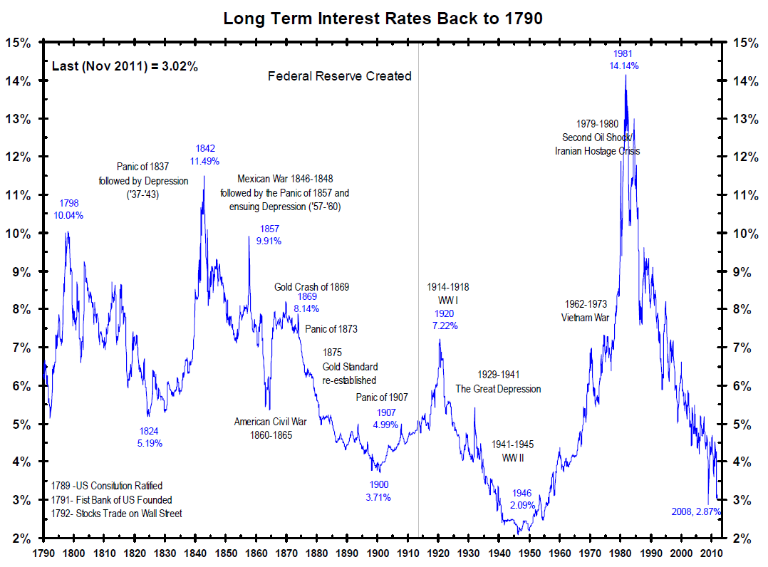
The first chart below shows interest rates going back to 1790. (Yes, 1790, when George Washington gave his first State of the Union address).
Does the bond market move in a straight line, or does it move in a series of ups and downs (cycles)? Clearly, over the last 200+ years bond market stakeholders have seen a market that moves in cycles rather than straight lines.
Another observation from the chart above is that there is an approximate 30 year cycle length between the peaks and troughs. For unknown reasons (perhaps generational demographics?) the bond market’s general linear trajectory reverses every 30 or so years, creating the cycles we see.
More recently the chart shows we just witnessed a 35 year trend of falling bond yields (rising bond prices) from 1981 to 2016. This decline in yields has fueled the most debt creation in the history of the world (to the Nth degree).
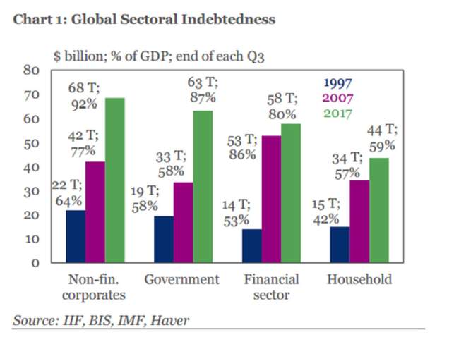
The next chart shows just how much more debt the world has taken on compared to its GDP (Gross Domestic Product) during this bull market in bonds. This chart shows debt loads as a percentage of GDP from 1997, 2007 and today. Why have decision makers taken on such historically large debt burdens across the board? We think it is at least partially a product of the linear thinking.
This dramatic increase in debt to GDP could be potentially considered okay in a falling interest rate environment (like we just saw for the past 35 years) as the cost on that debt falls over time.
However, what happens if the bond market is not linear, is actually cyclical, and we did just recently witness the bottom in yields in 2016, now in a rising interest rate environment? In such a scenario, December’s dramatic selloff in all asset classes may be a harbinger of what’s to come.
Have you read or heard this statement lately? “Balance sheets have never been stronger”. We sure have.
Pundits can try to get away with this statement because of 1) the inherent bullish bias of Wall Street and 2) the linear thinking that interest rates are low therefore companies can afford the interest cost. A casual observer of Wall Street probably thinks that America’s corporations are in wonderful shape as there have been way more positive discussions around earnings, share buybacks, and the issuance of debt at all time low interest rates than negative stories. “Interest rates are at all time lows, so it makes sense to add debt”, they proclaim. This is all backwards looking and because of linear thinking, but the sad part is this is not even the worst of the news.
Jumping to the conclusion, corporate balance sheets are actually worse today than ever in history, and that’s not even assuming a rising interest rate environment!
Said another way, there is a historically massive amount of leverage risk in corporations. If indeed we have entered a rising interest rate environment, and even if we have not entered a rising rate environment, these corporations still have historically high risks in the event of negative earnings growth or any sort of business hiccup.
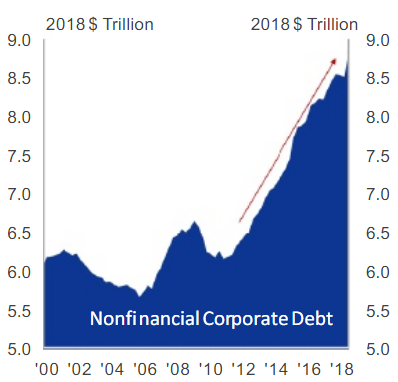
The next series of charts below, courtesy of First Pacific, shows how much debt has grown over the past 18 years. Corporations have added over $2 Trillion in debt, now over $8.5T, since the last business cycle peak in 2007 yet their profits during the same time are essentially flat at $1.3T (not shown).
This has resulted in a number of key ratios to reach or nearly reach historical levels.
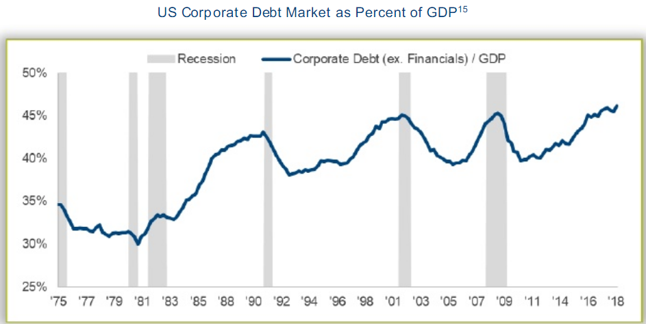
The final series of charts shows various key lending ratios warning where we are within historical norms. Corporate debt as a % of GDP is first. Taking on debt is much more manageable when it is going to profitable endeavors. This ratio is now at an all time high above 45%, showing that debt is growing faster than the economy.
We can’t help but notice the cyclicality of this chart as well. Interestingly, prior peaks coincided with recessions. Debt grew faster than GDP leading up to every other prior recession.
Another chart also reveals to us the cyclicality of the leverage market. When we look at the top 3,000 publicly traded U.S. stocks, the amount of leverage taken on compared to cash earnings has been phenomenal.
Prior to 2014, this ratio never exceeded 1.5x debt to EBITDA. Today it is pushing 2.0x. With earnings roughly the same today as in 2007, this means companies have been adding this debt with little value to the bottom line.
Perhaps this is just a bunch of “junk” debt driving the recent trends. Perhaps the bulk of the “good” companies in America are in better shape?
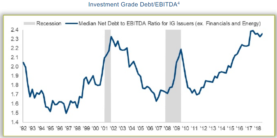
Nope, as the final chart shows. Investment grade companies (those the market and ratings agencies believe to be of superior strength) have also indulged, also leading to the highest debt to earnings ratios in history.
Perhaps an all time low interest rate environment justifies all time high ratios. But, what happens when the inevitable cyclicality of the bond market returns, or the inevitable recession pushes earnings down?
For those of us that think cyclically rather than linearly, the risks in the bond market are historically high right now.
Invest Wisely.
Our clients have unique and meaningful goals.
We help clients achieve those goals through forward-thinking portfolios, principled advice, a deep understanding of financial markets, and an innovative fee structure.
Contact us for a Consultation.
Neither the information provided nor any opinion expressed constitutes a solicitation for the purchase or sale of any security. The investments and investment strategies identified herein may not be suitable for all investors. The appropriateness of a particular investment will depend upon an investor’s individual circumstances and objectives. *The information contained herein has been obtained from sources that are believed to be reliable. However, IronBridge does not independently verify the accuracy of this information and makes no representations as to its accuracy or completeness. Disclaimer This presentation is for informational purposes only. All opinions and estimates constitute our judgment as of the date of this communication and are subject to change without notice. > Neither the information provided nor any opinion expressed constitutes a solicitation for the purchase or sale of any security. The investments and investment strategies identified herein may not be suitable for all investors. The appropriateness of a particular investment will depend upon an investor’s individual circumstances and objectives. *The information contained herein has been obtained from sources that are believed to be reliable. However, IronBridge does not independently verify the accuracy of this information and makes no representations as to its accuracy or completeness.

