In this issue, we focus on how Geopolitics affects the markets, how we maintain discipline in portfolios, and update the charts based on the recent market volatility.
On Our Radar
NORTH KOREA: The saber rattling continues as tensions escalate. We discuss the affects of geopolitics in our Macro section below.
MARKET TURBULENCE RETURNS: The calm markets over the past few months quickly changed. Our signals are close to triggering a slight increase in cash exposure.
JACKSON HOLE: The Federal Reserve meets from Aug 24-26 to discuss “Fostering a Dynamic Global Economy.” They will discuss geopolitics instead.
VIX RECORDS: Various measurements of volatility are showing record levels of complacency.
FIT Model Update: Consolidation in a Bull Market

Investor Sentiment: The market complacency as measured by various data points concerning the VIX Index continued through this week. We are now seeing some of the ramifications of elevated complacency as the S&P had its biggest down day in 3 months on Aug 10.
Technical: The market has recently broken to new all time highs after consolidating, but failed to hold those all time highs. This pushed the market back into its consolidating range as we look out for an intermediate top.
Macro Insights
GEOPOLITICS: Not What You Might Think
Is War with North Korea Inevitable?
We hope not, and we shake our heads at this situation. Thursday, August 10, 2017 was a day the markets all fell over 1%. In fact it was the biggest down day in three months. No doubt there will be countless media outlets that try to blame the decline on “elevated tensions with North Korea”, but history suggests such stretched causations don’t hold up to the eye test, much less statistical analysis. In reality the markets move for thousands of reasons, and geopolitical risk is just one of those thousand potential reasons.
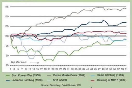
In short it’s impossible to prove that geopolitical events drive the world’s markets, and any potential correlation is likely coincidental. The market’s reaction to the terrorist attacks on 9/11 provides a good backdrop for discussion.
What Happened to markets after 9/11?
The next chart reveals the market’s performance surrounding 9/11/2001. The key takeaway is the stock market was already down over 25% before any of the horrible events of that day occurred.
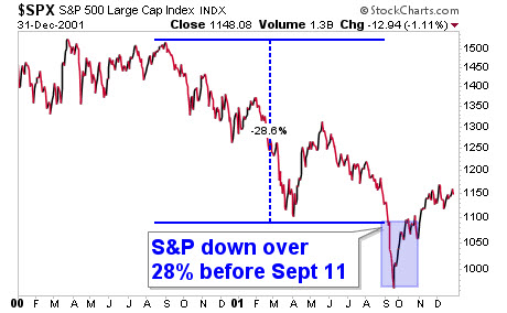
The trend was already down, the market had already rolled over from its top 1.5 years earlier, and it was in the middle of a downtrend when those events occurred. The market actually shut down for the remainder of the week of 9/10, its longest close since 1933. This certainly did not help the psyche of investors who were already concerned about the 25%+ drawdown they had already endured.
Did the events of 9/11 result in the market’s further decline into its lows ultimately below $1000 in September 2001? It’s quite possible, but it is impossible to prove. If anything, it may have sped up the process, but from a technical analyst’s point of view, in early September 2001 the market had already broken down below the earlier lows seen that year. That breakdown in price in technical terms was a key event that should have lead to further selling.
The fact 9/11 occurred certainly probably didn’t help things, but did it actually “cause” the stock market’s further decline into the Sept 2011 lows? That is tough to prove, just as it will be tough to prove North Korea has anything at all to do with the market’s movements this week.
Portfolio Insights
Discipline and Risk Management
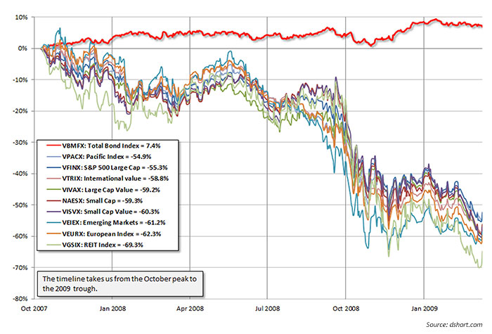
Most firms rely mostly on asset allocation to manage risk. The theory is that different assets perform differently in different environments. While this sounds good, it has been proven to be dramatically ineffective, especially during times of stress.
The False Hope of Asset Allocation
Risk Management Strategies
One strategy alone will not effectively manage risk in today’s investing environment. Thus, we at IronBridge apply multiple strategies within each portfolio to attempt to more effectively manage risk. They include:
- Stop-Loss Strategy (see the chart below)
- Sector Rotation (see our previous Insights newsletter for more on this)
- Proprietary S&P 500 Index Long/Cash model
- Asset Allocation/Diversification
- Planning for various economic and market outcomes
The chart below from Tradestops shows an example of our stop loss strategy. We have exits on every position in our client portfolios. The yellow and red lines show how our exit price increases as the value of the particular investment increases. Not every exit strategy is the same, and there is no sure way to ensure profits. However, we believe that using various risk management strategies can help to avoid large and damaging drawdowns within portfolios.

Market Microscope
Small Cap Fake-Out, S&P 500, VIX Complacency
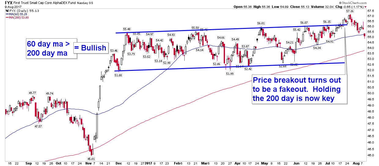
The new highs hit over the past two weeks have reversed. As alluded to two weeks ago, the new high in small caps has also indeed turned out to be a false breakout as price has fallen back within its 3 month average. Longer term, there has been little damage done, but we remain keen to the fact that the market remains extremely bullish sentiment-wise and overvalued fundamentally. What keeps this market rising is the bullish technical trend that has been in place since November. Is that trend in danger of ending?
Small Caps Fake-out
The chart below is the same one from two weeks ago, just updated with price action since then. Notice that the new highs reached on the small cap ETF have now been reversed as price moves back into its former price range in place since December. That breakout which then swiftly moves back into range is termed a “false breakout”. When false breakouts occur, they often mark near term tops, and that indeed is what is occurring over the short term. For small cap stocks, the short term trend has now turned down.
The far right bar on the chart reveals price has fallen back below its 60 day moving average, equivalent to the average price of the last 3 months. Just below is the 200 day moving average. The 200 day moving average has been a key support for the market’s intermediate term trend and is a level we are keeping an eye on as it’s important it once again holds as support.
Notice back in November that same 200 day moving average acted as support during election time. We should expect a similar support to occur again, assuming price moves down to test it. A break of the 200 day moving average would increase the risk that the market’s intermediate term trend has also turned down.
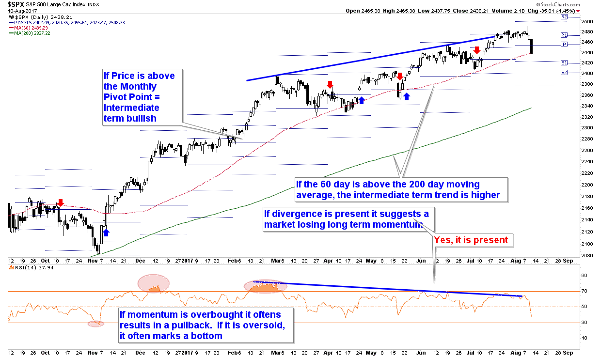
Zooming out to the bigger picture we see an S&P chart that looks slightly better than the small caps. Although price has also moved off of its highs, it found support on Thursday at its trailing 60 day price average. However, if price stays below $2454, then the market’s monthly “Pivot Point” will have failed as support. Pivot Points are used to help identify the average price of the prior month. If price falls below both its 60 day moving average and the Pivot Point it will increase the odds the intermediate term has turned down for the S&P.
S&P 500: Still Bullish, but…
On the next chart we also have been following another technical “negative” as the bearish divergence between price and momentum, pointed out in prior editions of this newsletter, remains present. That certainly adds to the risk the intermediate term trend may be turning down here. But, let’s not put the cart before the horse. For now the weight of the evidence for a bearish trend change is not quite there. That won’t occur until (if) the S&P joins the small caps in breaking below its 60 day moving average around $2440. This is something to keep an eye on early next week.
Volatility, Welcome Back our Long Lost Friend!
One of the biggest market headlines this Summer has been the lack of volatility in the markets. The chart below shows one such example as actual volatility, as measured by the ATR indicator (Average True Range – in orange), which measures the range of the market’s average price movement over a given period of time, has reached a three year low. Indeed, volatility is very low right now, one of its lowest levels in history as the ATR sits at just $33/week.
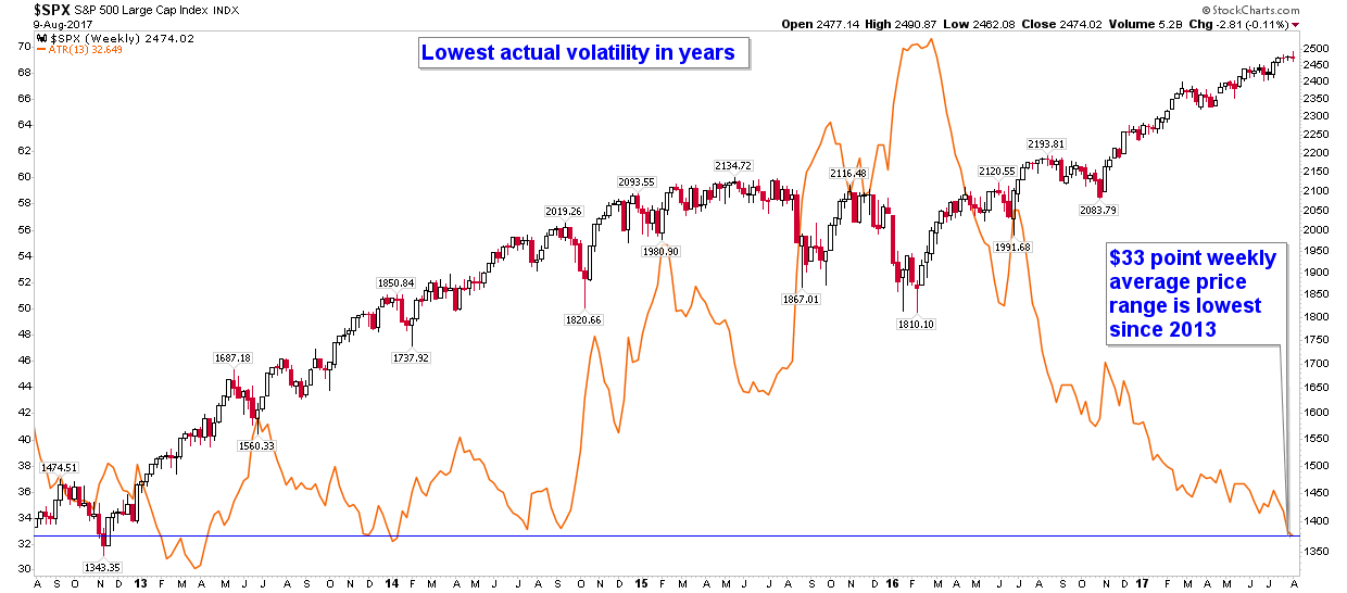
Furthermore, even though we are making a 3.5 year low in ATR, this is actually misleading as a 30 point price range on an S&P price of $2400 is much different than the same 30 point price range on an S&P at $1800. 30/$2400=1.25% average weekly price range, but 30 points on $1800=1.67% weekly price range. In reality today’s low volatility is much more extreme than any recent history.
There is a well known index measuring the S&P’s volatility called the VIX Index. The VIX Index measures the implied volatility baked into the cost of S&P options contracts. It sounds complicated, and can often be, but the primary way to think of the VIX is as a “fear” or “greed” indicator. When the VIX is elevated, and thus implied, or expected, volatility is high, fear is also typically elevated. When the VIX is depressed, fear is generally low (and greed is typically high), and recently the VIX has been flirting with all time lows. The chart below is updated with a moving average of the VIX index shown in blue. Notice that its movement largely tracks the actual volatility as measured by the markets average weekly range (ATR)? The VIX Index is also near its lows right now.
Another takeaway from the chart is the low ATR and low VIX are typically associated with a market top, and they certainly are not associated with a market bottom. Notice on the chart that tops in the market typically formed at times, or just after times, the volatility measurements were bottoming. May 2013, July 2014, and June 2015’s tops all formed with the VIX and/or the ATR near their lows. Is this week another such example?
Low VIX Not a Reason to Celebrate
- Through Monday, August 7, the Dow had closed at a new all time high for nine straight days, a record string of new all time highs. However, although there were nine straight up days, the Dow only gained 1.8% during this time (an average of just 0.2%/day).
- Through Tuesday, August 8, the S&P spent all 13 prior days in a range of -0.3% and +0.3%. This was the first time in history that occurred.
When we see stats such as these, the market contrarians in us should start to listen up.Somewhat counter intuitively, when records such as these are forming it reveals the market’s current underlying complacency and disregard for history. Stewards of market history realize that the markets are not linear but indeed are cyclical as current conditions never last into perpetuity. The chart of the VIX and ATR reveal the cyclicality of volatility.
Contrarians are worrying about the lack of volatility right now, not celebrating it, and we agree that it is now a concern.
But, the concern with the level of VIX doesn’t stop at the Index itself. Countless hedge funds and other trading strategies have noticed the perpetual trend of falling volatility and have built trading strategies around it. Many of them have been profitable over the last few years as they typically sell volatility, but their success will only last as long as volatility continues to wane.
Even the push toward passive portfolio management and index investing is just a function of the recent temporary trend of lower volatility. It is likely this trend, like most trends adopted by the mainstream, will end in tears.
Record Short VIX Contracts
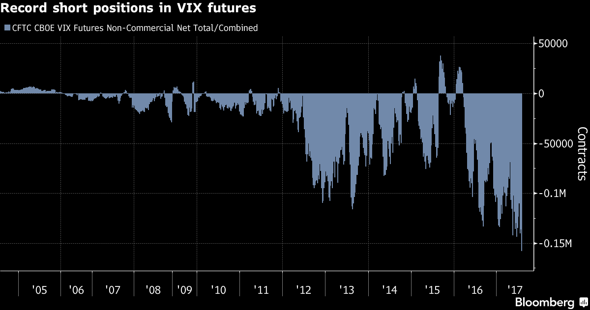
Another measurement of just how little volatility there has been can be seen through the amount of VIX futures contracts being traded. That too has reached a record as the next chart shows. There are now over 650,000 open volatility contracts, a record that in itself reveals to us how mainstream volatility has become, but this raises an even bigger concern.
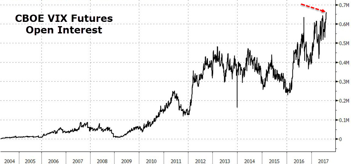
The amount of speculators short volatility is also at an all time record, and this cohort of investors typically is on the wrong side of the trade at key inflection points. That chart, courtesy of Bloomberg, is shown last.
The final chart’s index shows the data is that of “CFTC CBOE VIX Futures Non-Commercial Net Total”, but translated another way, the chart is of those firms that are labeled as “speculators”. This is a little known fact about the CFTC’s reporting requirements. Those who trade futures are either labeled as “Large Speculators”, “Small Speculators”, or “Commercials”. It’s a zero sum equation as you must be one of those three types of investors. This chart combines both the large and small speculators into one index.
So, speculators are the most short the VIX they have ever been? This is probably not going to end well!
