Despite hurricanes, floods, fires and threats of nuclear war, markets continue their relentless push higher. In this issue we analyze the economic impact after previous hurricanes, discuss why financial stocks are leading the markets, and feature a discussion on how we construct portfolios.
[maxbutton id=”1″ url=”https://ironbridge360.com/wp-content/uploads/2017/09/IronBridge-Insights-2017-09-15.pdf” text=”View PDF of this Report” ]
Insights Overview
Macro Insights: Is there an economic silver lining with hurricanes and other catastrophes? The Broken Window Fallacy reminds us that most of the time the economics surrounding catastrophes are zero sum.
Portfolio Insights: We “lift the hood” on investment strategy to give an overview on how we construct portfolios, as well as give current positioning in each of our subcomponent sleeves.
Market Microscope: Do hurricanes affect the markets? We look at the economic affect of previous hurricanes for the answer. The markets continue to give us mixed signals as price continues to rise but on weaker and weaker internals. Eventually this will result in a more meaningful pullback, but until that occurs the trend remains higher.
On Our Radar
North Korea: Tensions are still high, and seem to change every few days. However, markets continue to remain calm even when tensions escalate.
Hurricane(s) Aftermath: Irma’s track to the north was postponed long enough to spare Miami the worst of the storm, still some parts of the Caribbean and Florida will never be the same. Our thoughts are still with those in Houston recovering.
FIT Model Update: Uptrend

Fundamental Overview: The Bank of Japan now owns over 74% of all ETF assets in that country. This means the Japanese Central Bank is the largest owner of equities in Japan. This also likely means price discovery may be lost as they likely are a buyer at any price. The Swiss National Bank is performing a similar role. Central Banks no doubt are distorting markets.
Investor Sentiment Overview: The popular University of Michigan sentiment index just posted an all time high reading of 65% of investors being optimistic that stock prices will be higher in 12 months. The only other times readings this high were in 2015 and 2017, both preceding meaningful pullbacks.
Technical Overview: The market continues to sing a similar tune. New highs are being made in a handful of stocks, which is lifting the indices, but breadth and other measures of market health are not showing as strong of signals.
Focus Chart
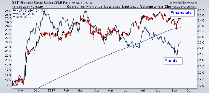
Interest Rates are Driving Financial Stocks
There was some relief in the financial sector this week once the verdict on Irma’s damage was better known. However, we must be very careful not to confuse causation and correlation. The more relevant driver of financials this week was likely interest rates, which have started to move higher. Higher yields tend to benefit the financial sector, specifically banks and insurance companies. This primarily has to do with the funding components of their businesses that rely on higher yields for lending.
Macro Insight
Beware: The Broken Window Fallacy
What economic impacts will Hurricanes Harvey and Irma have?
The broken window fallacy gets its name from a story developed by the French economist, Frederic Bastiat, to help explain why breaking a window does not increase economic activity. The story is about a son who inadvertently breaks a window. His father must find a glazier to repair the window as the town onlookers conclude that breaking windows must be good for the economy since the glazier will receive new funds which he then can use to buy more goods.
The key to the story is the townspeople are missing an inherent and “unseen” third party. Money went to the glazier but at the expense of some other third party. The income helps the glazier, but it hurts the other third party that otherwise would have received the funds. In other words, the money is just taken from one pocket and put into another.
Bastiat takes his theory a step further. He concludes that actually replacing a window, a home, or many other things destroyed during catastrophes or war is actually a net negative drain on the economy. He argues war destroys not only the existing capital, but accumulated capital built up over years. It also forces investment into specific areas that otherwise may not have been the best investment option. A home is a good example of this. Approximately 63% of homes in the U.S. are owner occupied. These homes aren’t used to create an income stream, they are used to survive. Money put into an owner occupied home does little to actually stimulate the economy. It takes income that otherwise could have been spent or invested elsewhere and puts it into a largely unproductive asset of the economy. The theory argues that spending money on non-productive assets, such as an owner occupied home, may actually be a net negative for the economy as capital is parked in an unproductive vehicle.
With Hurricanes Harvey and Irma forcing their destruction upon millions, the fallacy is again in the spotlight. The victims of the storms are all now “forced” to reinvest in their homes. The money they spend on their homes is money that could have been spent or invested elsewhere, in more productive assets. Many will also borrow to fund this spending, which may on the surface suggest a boon to the economy, but this just takes money from the pocket of the future and puts it into the pocket of today. There may be some short term benefit, but it’s a burden as that loan is repaid. At a minimum disasters have a net neutral affect on the economy, but more likely they may actually be a drag on it.
So should we expect the economic impacts of Hurricanes Harvey and Irma to be a boon for the U.S. economy? It’s not likely, and a research study focused on the hotel industry performed by CBRE and summarized above reveals this unlikelihood. It should be noted they admit that quantifying the full impacts of disasters (both measurable and immeasurable) is impossible, but their attempt reveals the inconclusiveness. In two cases the GMP (Gross Metro Product) during the quarter of the event was higher than the prior year’s average, but in the other two examples, the GMP was lower. If we see a jump in Houston’s GMP this quarter as a result of Harvey, it is likely that jump will come at the expense of either 1) other nearby cities where workers have migrated from or 2) will be offset in outer periods as required maintenance and other upgrades to houses are just pulled forward to today and/or in the case of debt, repaid at a later date.
Portfolio Insight
A Peek into Portfolio Construction
IronBridge client portfolios are divided into six distinct and separate strategies that we call “sleeves”. Each sleeve has a unique purpose and investment universe. Exposure to these sleeves vary depending on portfolio objective and risk tolerances. Here is an overview of our strategies:
INCOME: This sleeve has two goals: income and preservation of capital. In this portion of portfolios we attempt to hire best-in-class managers who invest only in the fixed income markets, or bonds. We use various analysis tools to understand their exposure and compare them against their peers.
TACTICAL INCOME: Here we look for income-generating investments that may or may not be bonds. Our universe in this sleeve consists of fixed income, floating rate securities, preferred stocks, high dividend stocks, convertible bonds, among others. We have a disciplined strategy to give us buy and sell signals.
TACTICAL MODEL: Our tactical exposure is the most flexible part of client portfolios. This subcomponent is the ultimate “wind at our back” strategy that we discussed in our previous Insights issue. Within this sleeve we can invest in US stocks, international stocks, bonds, cash or commodities, as well as use various hedging strategies to manage risk. However, we only own 5 positions at any given time, and a position must meet stringent criteria to knock another position off the list. Again, we have defined exits on any position owned within this sleeve.
CORE EQUITY: This is our blue-chip stock exposure. We like fundamentally sound companies with strong balance sheets who are leaders in their sector. Again, we use strict buy/sell discipline to identify which stocks to purchase and when to sell. These stocks are easily recognizable by any investor.
PROPRIETARY SECTOR ROTATION STRATEGY: Our sector rotation sleeve is where we attempt to generate alpha, or relative outperformance versus the S&P 500. We have developed a proprietary mathematical process that attempts to identify the outperforming sectors, and we strictly focus on these sectors. Sectors include various industries such as technology, consumer staples, financial companies, materials, energy, etc.
PROPRIETARY LONG/CASH STRATEGY: Our final sleeve is our proprietary risk-managed index strategy. At any given time we are either long the S&P 500 using low cost ETFs or are in cash. This is a strategy that Chad Karnes has been using for many years and we have a high degree of confidence in the ability to participate in larger up-trends while avoiding large draw-downs or losses.
So that’s nice, but how are we actually invested? The chart below shows our current positioning in each sleeve. We also show how each sleeve can potentially be invested in it’s maximum and minimum risk exposure. This structure advances prevailing asset allocation theory by truly diversifying portfolios.
Market Microscope
How Markets React to Hurricanes; Dancing Until the Music Stops
The market continues its persistent grind upward as we enter into the final quarter of the year. There remain many concerning developments, but most important to us is price, and price continues in its uptrend, at least for now. Small cap stocks remain lagging the large caps, which again have broken out to new highs. We also like owning the financials here as the bond market may be picking up in volatility.
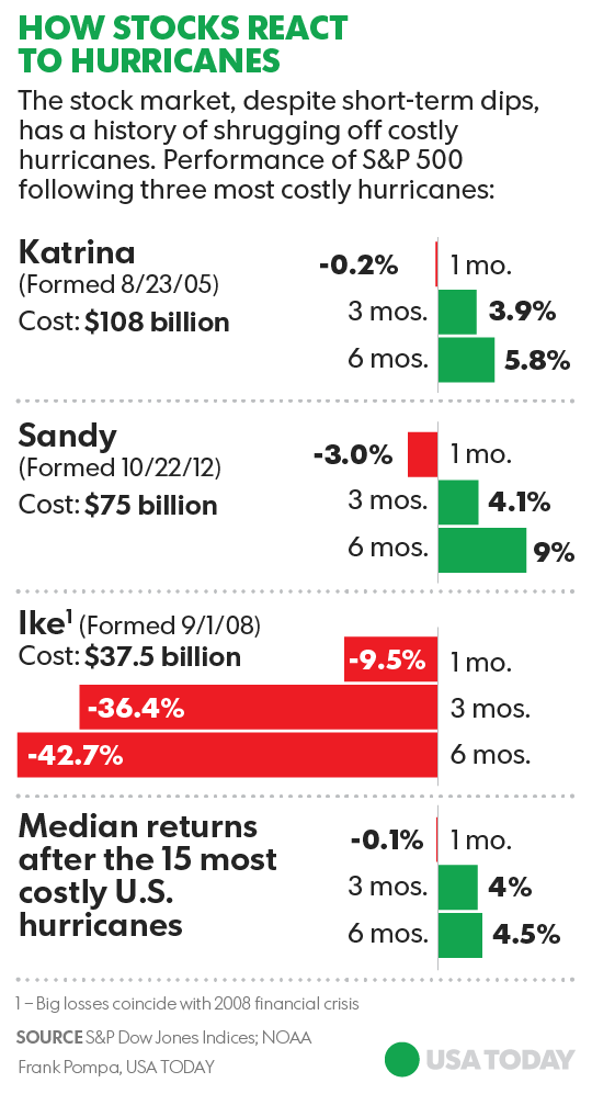
How Stocks React to Hurricanes:
It’s impossible to prove that correlation equals causation, but given our knowledge of the broken window fallacy and how catastrophes generally aren’t a net positive for the economy,  our bet is that they also don’t really affect the stock market. The graphic from USA Today helps solidify the net neutral effect that natural disasters have on stock prices.
Why would Hurricane Ike have such a profound negative effect on the market while Hurricanes Katrina and Sandy had the exact opposite effect? The summation at the bottom shows us that the median return of the market 6 months after a hurricane is 4.5%. This is the same median return of the market for any given 6 month period. It seems hurricanes have little to no effect on the stock markets.
Financials
One sector that has seen a turnaround recently is the financials. Many suggest the relief rally that occurred this week in the sector was a result of Hurricane Irma’s less abrasive track across Florida. Major cities were largely spared, and thus insurers and other banks breathed a sigh of relief. However, this assumption is likely incorrect. What if we were to suggest that the Hurricane had little, if any, affect on the stock market?
How can we make such an extreme suggestion? For one, by analyzing the chart below.
The chart displays two price indices, one, XLF (the red and black candlesticks), which tracks the change in price of the financial sector, and another, $TNX (the orange line), which tracks the yield on the 10 Year Treasury note. The bottom portion of the graphic tracks the statistical correlation between these two price indices. The 10 day correlation between the two is an extremely high 89%. This tells us that the financial stocks are moving very much in line with Treasury yields.
This has generally been the case all year as the correlation has remained above 0, and often reaching toward the 90th percentile.
In our inaugural Insights, published July 13, 2017 (which is published on our website) we discussed the potential for a rising yield environment going forward. If that indeed is occurring and if yields do continue to climb here then it is likely, given the high correlation, that financial stocks will also benefit. We have been adding financials to our portfolios to take advantage of this change in the bond market’s trend.
On the other hand, there is certainly some merit to the assumption that banks should benefit, at least over the short term, in a rising interest rate environment. The market seems to be reacting to that potential, and the high correlation between financials and Treasury yields suggests that financial firms’ stock prices instead are being driven by the broader macro trend of rising U.S. Treasury rates rather than shorter term hurricane hiccups.
US Equities
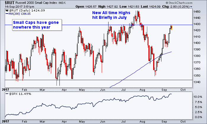
Small Caps continue to Underperform Large Caps
The market’s sideways price action continues into September as some indices remain stuck in the same price range seen all year. The first chart below shows the Small Cap Index, which tracks 2000 of the smaller publicly traded companies. It’s one of those indices that has been underperforming the S&P 500 all year, up just 5% compared to the S&P’s 11% year to date performance. The attempted breakout into new all time highs in July lasted only one week as prices fell back to their 200 day moving average. Since it has rallied back but now faces the big hurdle of overcoming those prior price highs above $1430.
Is Your Breadth Any Better?
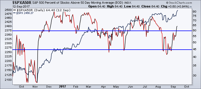
In our last issue we discussed the market’s bad breadth. We’re afraid that situation has not improved as the number of S&P 500 stocks above their respective 50 day moving averages (in short and intermediate term uptrends) is at just 64%. This on its own may not be so concerning, but when you couple it with the fact that the S&P has just made another new all time high and is above its own 50 day moving average by 40 points, it shows just how much the market’s returns are reliant on just a handful of larger companies and sectors in the indices.
The next chart reveals that reality, but we’d like to draw your attention to the entirety of the chart. New all time highs have been made multiple times this year. But notice how the new highs made back in January saw around 80% of constituents trading above their respective 50 day moving averages. New highs again were made in March with over 75% of stocks trading above their 50 day moving average. New highs in June resulted in a fewer 73% of stocks trading above their own 50 days (sensing a trend here yet?)
Notice on the chart that the red and black line over the year has formed a series of lower high points while the S&P, in navy, continues to make new highs. This trend of declining breadth was discussed last issue and unfortunately it continues through today. Every small pullback that has occurred thus far in 2017 has resulted in fewer and fewer stocks rebounding above their own 50 day moving averages. We suspect the latest rally will end seeing the amount of stocks above their 50 day moving averages peak somewhere south of 75%. If that does not occur and this indicator can get back above 75% then it would be a welcome sign that the market’s rally has regained its momentum and may offer us more upside potential. Until then we must conclude that although the market keeps rising, there will come a time when there won’t be enough stocks left in uptrends to continue to carry the broader market’s trend. This chart is one of many we use to help us stay abreast of the market’s moves. Right now its one of the many reasons we continue to keep a cautious posture.
Dancing Until the Music Stops
Below, the Dow chart shows us the new price highs being made in the broader indices. Although breadth remains a concern, price comes first and foremost, and price continues to make new highs. Notice too price remains above its key averages. As long as it does, it suggests even though we remain cautious, we also remain in a bullish trend and thus invested long.
Our clients have unique and meaningful goals.
We help clients achieve those goals through forward-thinking portfolios, principled advice, a deep understanding of financial markets, and an innovative fee structure.
Contact us for a Consultation.
Disclaimer This presentation is for informational purposes only. All opinions and estimates constitute our judgment as of the date of this communication and are subject to change without notice. > Neither the information provided nor any opinion expressed constitutes a solicitation for the purchase or sale of any security. The investments and investment strategies identified herein may not be suitable for all investors. The appropriateness of a particular investment will depend upon an investor’s individual circumstances and objectives. *The information contained herein has been obtained from sources that are believed to be reliable. However, Ironbridge does not independently verify the accuracy of this information and makes no representations as to its accuracy or completeness.


