• Skip to main content
  • Skip to footer

IronBridge Private Wealth

Forward with Confidence

  • Home
  • Difference
  • Process
  • Services
  • Insights
    • IronBridge Insights
    • Strategic Wealth Blog
    • Strategic Growth Video Podcast
    • YouTube Channel
  • Team
  • Clients
  • Form CRS
  • Contact Us

IronBridge Insights

Tug of War

July 27, 2018

The mixed messages from the markets continue this week as we look at the tug of war between strong economic activity and the continued narrowing in the number of stocks participating in the market’s move higher. GDP growth and corporate earnings reports have shown incredible strength for the 2nd quarter. While the market continues to show positive developments over the short-term, there remains enough concerns for us to keep a prudent cash allocation to keep our options open.

[maxbutton id=”5″ url=”https://ironbridge360.com/wp-content/uploads/2018/07/IronBridge-Insights-2018-07-27-Tug-of-War.pdf” text=”View PDF” ]


FIT Model Update: Market Correction

Earnings have rocked the market the past few weeks as companies such as Amazon and many health care companies maintain their positive momentum while other firms, largely in the tech arena, have missed elevated expectations. Earnings remain a positive tailwind for stocks, as 53% of S&P 500 companies have reported earnings that contribute to an estimated $124 of earnings per share of the S&P 500. At current prices that would make the S&P trading at 22.8x earnings, down from its peak levels of 24.3x hit last year.


Portfolio Insights

Strong Like Bull

“It’s essential to remember that just about everything is cyclical. There’s little I’m certain of, but these things are true: Cycles always prevail eventually. Nothing goes in one direction forever. Trees don’t grow to the sky. Few things go to zero. And there’s little that’s as dangerous for investor health as insistence on extrapolating today’s events into the future.”

– Howard Marks, successful investor

 GDP Comes in Strong

Second quarter GDP for the US was reported this morning, and the results were strong. The 4.1% growth rate was the highest since 2014, and the 4th best quarter since the 2008 financial crisis, as shown in the chart below from the Wall Street Journal.

The components of GDP were fairly strong across the board as well. Consumer spending, business spending and government spending all contributed to the positive number, and could remain strong in the coming quarters.

Should we expect 4% growth to be the new normal? While we cheer this number, we also caution that we should not extrapolate this too far into the future. Net Trade contributed more than 1% of GDP, primarily due to a surge in soybean exports ahead of a 25% retaliatory tariff from China set to go in effect today.

In fact, China has begun to shift large amounts of their commodity outsourcing from the US to Brazil as trade tensions remain elevated.

So we may have seen some future economic activity be pulled into this past quarter as a result of the trade tensions. This would suggest that actual GDP activity may have been closer to 3% than the 4.1% official reading.

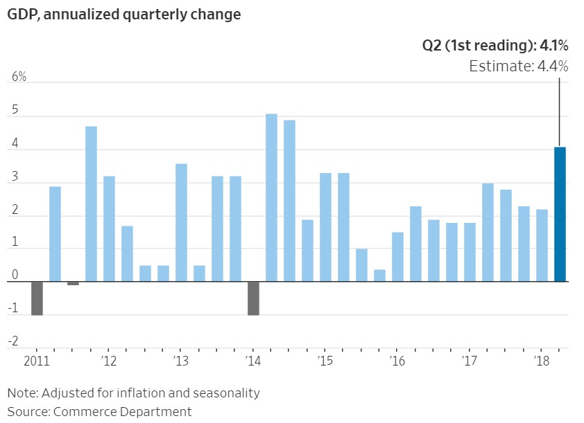
From an economic perspective, strong growth is obviously a good thing. From an investment perspective, it is usually a good thing. Of the previous five times quarterly growth was above 4%, four of those times resulted in a higher market over the next 12 months. This suggests that there is some tailwind to elevated growth numbers like was reported today.

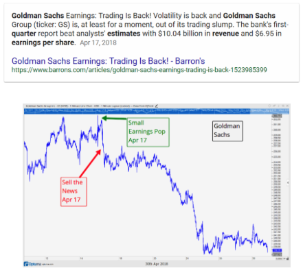
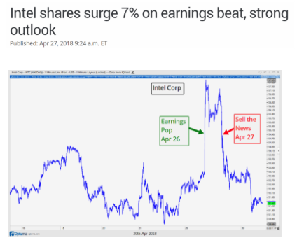
Earnings are Also Strong

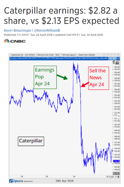
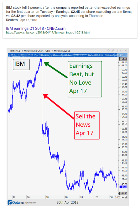
With the exception of some notable companies like Facebook and Twitter (whose stock prices both fell 20% after poor earnings announcements), earnings for the 2nd quarter have also been very strong. Expectations coming into earnings season were incredibly high, and thus far companies have delivered, posting a 22.6% rise in earnings. As of this publication, 82% of companies who have reported have exceeded analyst expectations. The long-term average is for 64% of companies to beat expectations. So any way you slice it, earnings have been good.

Earnings can be manipulated in various ways, as we discussed in our previous Insights edition, so we also like to look at revenue announcements. By this measure, companies also showed strong results, delivering an 8.7% increase in revenue over this time last year, with 53% of companies having reported thus far.

When earnings grow at a faster pace than stock prices, valuations will go down. That has been the case over the past year, as P/E ratios have fallen from a high of 24.3 last year to the current 22.4 level. This still suggests that equities remain over-valued, and supports our thesis that we remain in a late-cycle environment.

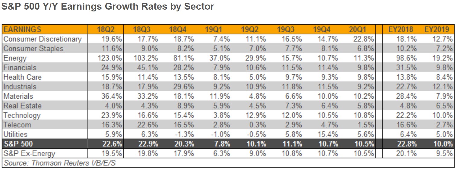
From a sector standpoint, the growth seems to be broad-based as well. The table below shows the 11 sectors in the S&P 500, with the column on the far left showing the recent quarter’s growth rates. Energy stands out as the big winner this quarter, with a 123% growth rate over the past year. We must keep in mind that energy earnings one year ago were in a much different environment, when oil was trading in the $40 range. It now trades close to $70 per barrel.

Nonetheless, based on the data being reported right now, the economic strength seems to be broad-based. But is this being reflected in the markets? Next we discuss market breadth, which does not appear to be as broad based as the economic data might suggest.


Market Microscope

No Participation Trophies

“A bird in the hand is worth two in the bush.”  – Unknown Origin

The Market still has bad Breadth

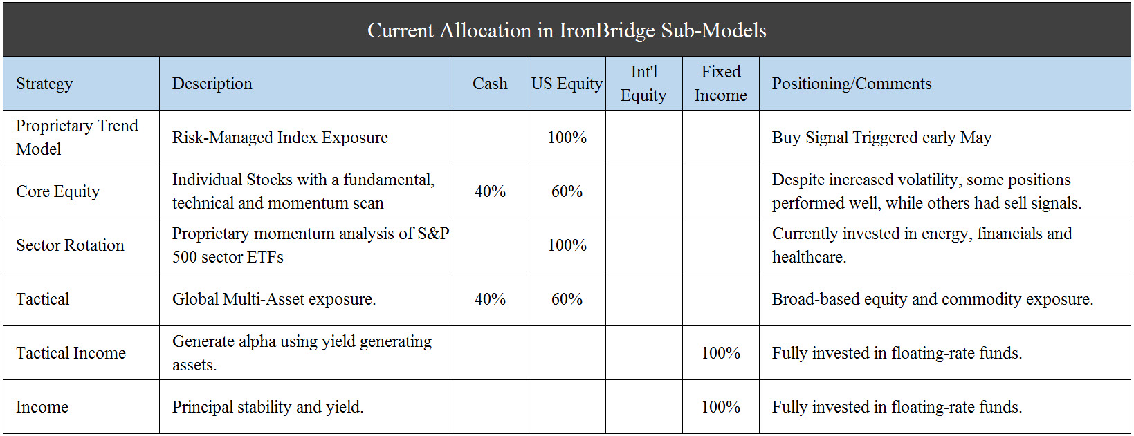
Over the last few months we have maintained a modest amount of cash or cash equivalents in our portfolios. Why has that been and what are we waiting on to re-allocate? Granted, we have slowly put our cash back to work over the last few weeks/months as we got defensive around the February drawdown, but we still prefer the optionality having some cash allows currently compared to the definitive nature of being fully invested.

First, let’s talk about the role cash plays in one’s portfolio. We use cash as a short term tactical vehicle with a typically short life expectancy. Back in 2017 we held virtually zero cash in our portfolios while we were participating in a strong bull market, but now we have around 10-20% in cash or short term cash equivalents. Why do we want to still hold some cash right now? In short, we continue to want to leave our options open as we feel risks remain elevated.

The risks that crept into the markets in February have not fully resolved themselves as they continue to show up in various indicators and techniques we utilize. One technique, which we have referred to a few times in this newsletter, studies the individual components of the market, otherwise known as breadth analysis. Long term readers of our work often hear us refer to breadth as “Generals and Soldiers”. In a “healthy” market we would expect that most stocks are participating in an uptrend. When that’s the case, markets trend higher with little hiccup along the way.

But, what have we seen since the February selloff? We have seen 7 relatively large moves (up, down, up, down, up, down, and now back up). The reason this occurs is because not all stocks are participating in the trend higher the S&P itself has been privy to the last 2 months. The market has been able to give back gains, sometimes substantially, because there is this dearth of companies participating in the uptrend and sometimes that shows up in the Index (and sometimes the Index largely covers it up – as occurring now).

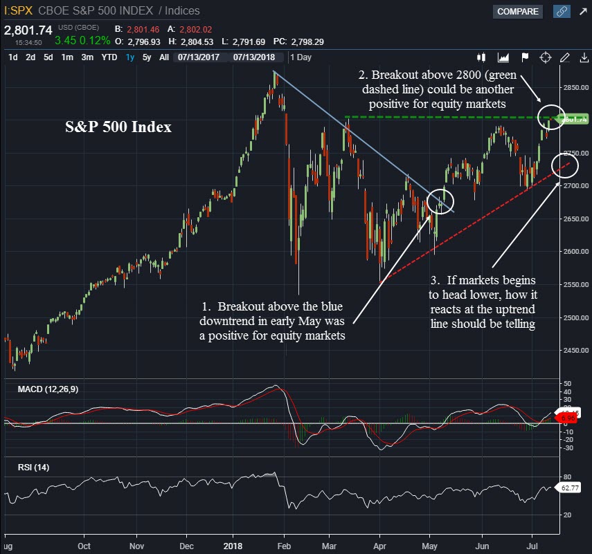
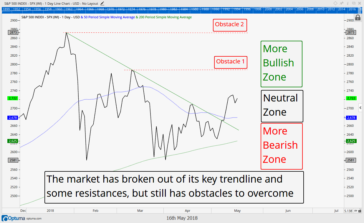
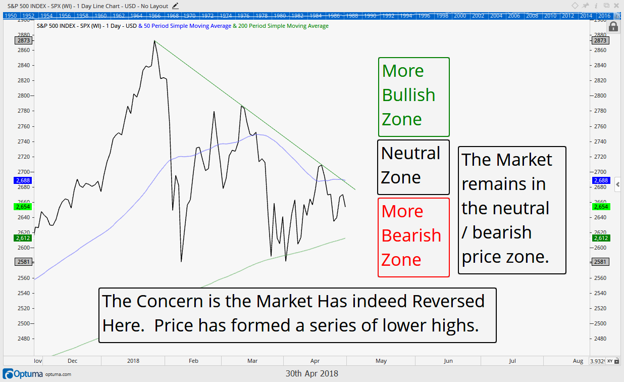
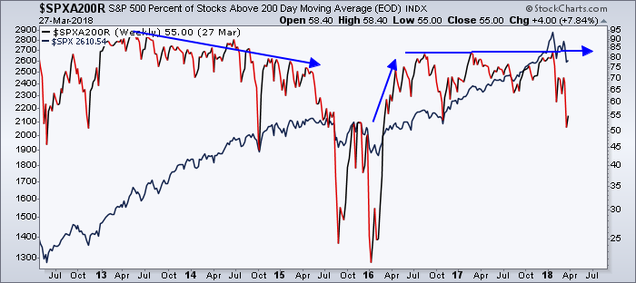
How do we know there is a dearth of stocks in an uptrend? Insert exhibit one. Our first chart below shows the S&P 500 in the top section along with its 200 day moving average. Prices are very nearly matching their January price highs, up almost 7% for the year now as the 200 day moving average has been a good proxy in letting us know the S&P indeed remains in an uptrend.


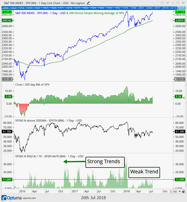
The second section of the chart shows this 7% gain is around 6% above that trailing 200 day moving average, which is a decent amount, although it is actually nearer the lower end of the average range over the last few years. These 2 graphs suggest all is well with the market.

But, here is our real issue with the market’s internals; The final two sections reveal there are only 62% of companies in the S&P 500 above their own 200 day moving average and there are only 11% of S&P 500 stocks showing strong momentum (RSI measurement > 70%). This may not seem like important facts, but if we look at the chart’s history we get some context. Compared to the last two years, this is near the low end of the range for both measurements. Notice too that these breadth indicators since the February selloff have been virtually flat-lined, much lower than they were in 2017.

What does this really mean? Many market participants use the 200 day moving average as a bull/bear line in the sand. If prices are above the 200 day moving average (meaning the price today is above or below the average price of the last 200 days (almost 1 year), the stock is in a bullish trend. If it is below, it is in a bearish trend (falling prices). This indicator shows that almost 40% of stocks are now trading below their average trailing price of the last 200 days, or put another way, 40% of stocks are showing a bearish tendency, and that is near the most extreme of the past 2 years. Compare this to the 70-80% of stocks that were above their 200 day moving averages through most of 2017.

So why is the S&P close to making a new all time high? Well, a large part of the reason is simply because it is a market capitalization weighted index. If the S&P 500 was an “equal weight” index it would be another 2.4% lower in price year to date than it is today. The below chart helps put this in perspective.

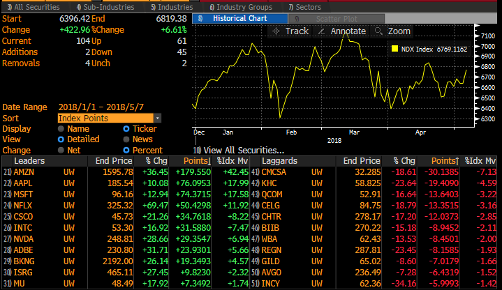
The graphic below compares an equal weight S&P 500 Index (all 500 stocks are equal to 0.2% of the index) to a market weight Index where the top 5 holdings are almost 15% of the total (and 4 of the 5 are in the Tech sector and Amazon). Since June there has been a drastic drop off in performance between the equal weight index (RSP) and the market cap weighted one (SPY) as the chart below shows.

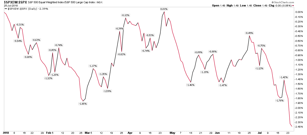
This ratio chart helps confirm that fewer and fewer stocks are propelling the S&P 500 higher. What about the Dow?

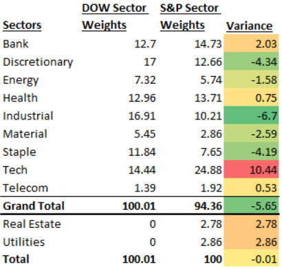
The Dow Jones Industrial Average has 30 companies in it. This compares to the 500 companies in the s&p 500. Those 30 stocks are also chosen by a committee, which means they can overweight or underweight sectors and exposures as they see fit. Building on the work in our last newsletter, when looking at the allocations of the Index to the sectors, the Dow, with only 30 stocks, surprisingly seems to have more equality than the S&P 500 and this is driven largely because one index is price weighted (the Dow) and the other is cap weighted (the S&P 500).

The next chart shows a comparison of the Dow’s sector exposure (assigning each Dow stock to its sector) compared to the S&P 500’s sector exposure. There is one glaring difference; technology is 10% more of the S&P 500 than it is the Dow (shown in red).

How has that affected these two indices?

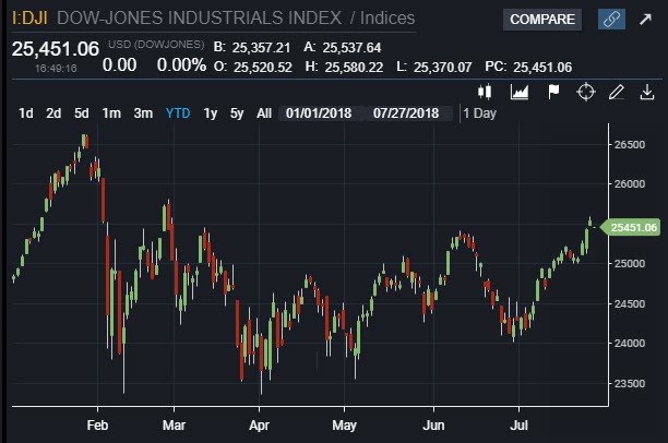
The chart below is the Dow Jones since the start of the year. This chart looks a little bit different than the S&P’s, and interestingly it looks a lot like the breadth indicator mentioned at the onset of this analysis that showed just 60% of the S&P in an uptrend.

The Dow has not recovered its February “snap back” highs and has only regained about half of its decline from February. The Dow is also only up 2.5% year to date versus the S&P’s 7%, helping show that those 30 large cap stocks just are not performing near as well as those at the top of the S&P’s market cap.

Without the tech sector, the S&P would look a lot like the Dow YTD, or said another way, because the Dow has 40% less Technology company exposure, it has significantly underperformed the S&P year to date.

However, the Dow is just 30 stocks, can we really draw the conclusion most stocks are struggling when we are using an index of just 30? One final chart helps bring it full circle. Enter the NYSE Composite Index on the final chart.

The New York Stock Exchange (NYSE) Composite Index tracks all 3,000(ish) securities traded on the New York Stock Exchange and can give a better view of what is happening across the entire stock market (small, mid, and large cap stocks across all sectors). It also has a less Technology focus since a lot of tech stocks trade on the Nasdaq Stock Exchange rather than the NYSE.

The NYSE Composite chart, interestingly, looks a lot like the Dow’s. Stocks have only recovered around half of their February drawdown as that index is just 2% above its trailing 200 day price average and up just 1% year to date.

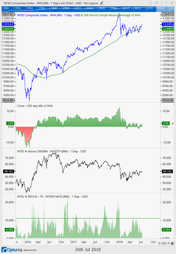
Most interesting, however, is less than 50% of all New York Stock Exchange securities are above their respective 200 day moving averages. This means a majority of stocks are actually in downtrends! Furthermore, and revealed in the final section of the graphic, less than 5% of NYSE stocks are showing strong momentum (a relative strength index reading >70%). This compares to the 10%+ that was seen frequently in 2016 and 2017.

Touched upon last week, one of the primary reasons we are seeing this dichotomy between the S&P 500 and market breadth is the fact the Tech sector (and Amazon) are really the stocks driving the market’s returns. Investors have flocked to these big name companies in the tech sector to the point that we even suggested calling it a “bubble”. And, when investors pile into big name stocks at such a pace, risks of negative surprises, such as Facebook’s 20% decline this week, become ever more elevated. If we exclude the tech sector, the markets are revealing a rather questionable setup where many stocks and sectors have not really recovered from the February decline.

What do our strategies say about all of this? The great thing about our strategies is they are largely objective. None of this really matters to them as this research is primarily a subjective and academic discussion rather than an investment strategy. In reality, the conclusion of this analysis has already showed up in our strategies and is why we continue to hold a decent amount of cash as we have been slower to reinvest capital seeing fewer and fewer attractive potential holdings. We manage tactically and actively and invest when we feel the risk versus reward dynamics are in our favor. With over 50% of NYSE stocks in downtrends, it is simply not as attractive an investment environment as was 2016 & 2017, when 70%+ of stocks were above their respective 200 day moving averages and stocks had more momentum.

The good news is this could all change on a dime, and we remain ready and waiting with a little bit of cash in hand for when it does. As the saying goes, a bird in the hand is worth two in the bush!

Invest wisely.


 Our clients have unique and meaningful goals.

We help clients achieve those goals through forward-thinking portfolios, principled advice, a deep understanding of financial markets, and an innovative fee structure.

Contact us for a Consultation.

Neither the information provided nor any opinion expressed constitutes a solicitation for the purchase or sale of any security. The investments and investment strategies identified herein may not be suitable for all investors. The appropriateness of a particular investment will depend upon an investor’s individual circumstances and objectives. *The information contained herein has been obtained from sources that are believed to be reliable. However, IronBridge does not independently verify the accuracy of this information and makes no representations as to its accuracy or completeness.  Disclaimer This presentation is for informational purposes only. All opinions and estimates constitute our judgment as of the date of this communication and are subject to change without notice. > Neither the information provided nor any opinion expressed constitutes a solicitation for the purchase or sale of any security. The investments and investment strategies identified herein may not be suitable for all investors. The appropriateness of a particular investment will depend upon an investor’s individual circumstances and objectives. *The information contained herein has been obtained from sources that are believed to be reliable. However, IronBridge does not independently verify the accuracy of this information and makes no representations as to its accuracy or completeness.

Filed Under: IronBridge Insights

Looking for Bubbles

July 13, 2018

Stocks are once again attempting to add more positive signs to the choppiness that has characterized the past six months. While the short-term signs are looking more and more positive as the days and weeks go by, longer term signs are showing extreme valuations in many different sectors. International investing continues to show that ignoring currency effects on your international stock and bond exposure will lead to disappointment.

[maxbutton id=”5″ url=”https://ironbridge360.com/wp-content/uploads/2018/07/IronBridge-Insights-2018-07-13-Looking-for-Bubbles.pdf” text=”View PDF” ]


FIT Model Update: Market Correction

Are we in another tech bubble? They say that history doesn’t repeat but instead it “rhymes”. This time seems no different. In addition to a tech bubble we may also be in a consumer discretionary bubble (driven by Amazon, mainly). Value and similar “Staple” stocks by some measures are at their cheapest levels ever. This has been driven by an insatiable desire to own the FANG and other growth stocks, but are the reasons for the increased ownership admirable? It is not a stretch to suggest that we are in an equity bubble right now.


Portfolio Insights

Stocks Attempting to Break Higher

Once again, the stock market is on the verge of an upside breakout. Over the past few Insights issues, we have noted the positive short-term developments in equity markets. We increased equity exposure throughout early and mid May, and we continue monitor our signals to further increase equity exposure.

The chart below is the S&P 500. We have identified three key areas.

The first area to note was in early May. This was the first time the S&P 500 showed some signs of promise since the volatility began in February. It broke above its down-trending line in early May, noted by the blue line, and has since been in a choppy grind higher. We noted this importance in our May 18th issue “The Good, the Bad & the Ugly”. At that time, we also noted that the next important level would be the March highs. Well, here we are testing those highs.

The second area to notice is the critical test the market finds itself facing. There have been a few times over the past 6 months when the entire investing world was watching one key level to determine the near-term future of markets. We are currently at one of those levels today. The highs from March of this year (2800 on the S&P) are important levels for the market to overcome.

If the market can break above (and stay above) the all-important 2800-level (green line on the chart), then the market has a very good shot at making new all-time highs.

However, if this level proves again to be strong resistance and the market starts to drift lower, then the next level we will be watching is the uptrend from the March lows (red line). A breakdown at this level would be very troubling, and likely increase the chances that the market will re-visit the lows from February.

Earnings Season

For us, it is always fascinating when the market gets to critical resistance when circumstances seem to be aligning to push the market in one direction or another. One major catalyst is earnings season. It kicks off this week with consensus for earnings to rise more than 20% versus this time last year. This is an incredibly large hurdle, due in large part to the tax cuts and improvements in the energy sector (ie, higher oil prices).

Earnings can rise for a variety of reasons. These reasons are: increased sales, improved margins and stock buy-backs.

  • Increased sales are easy to understand. A company that sells slip-n-slides reports that is has sold more slip-n-slides this quarter. That’s good for the bottom line.
  • Earnings can also grow by reducing costs. If various input costs (labor, materials, transportation, etc) go down, then sales don’t have to rise for earnings to improve.
  • Stock buy-backs are the way companies can skew the numbers without having to increase sales or reduce costs. By reducing the number of shares outstanding, a company can make earnings-per-share rise.

To us, it will be as important to understand how earnings have increased due to sales, costs, or buy-backs as how much they actually rose.

One other catalyst is the continued trade tensions across the globe. While we are beginning to get the sense that the markets may be getting immune to President Trump’s endless tweets, uncertainty from those in power cause uncertainty in markets, and that has the potential to lead to temporary mis-pricing both higher and lower.

Trade negotiations will likely continue over the next few months, but will they continue to cause short-term bouts of volatility?

Bottom line, we believe investors have very high expectations this earnings season. We also believe there are parts of the market that are very over-valued (discussed below), and continue to watch our signals for appropriate responses and portfolio allocations.  These issues do not mean the market cannot head higher, though, and we will continue to participate if markets want to continue higher.


Market Microscope

It’s a Bubble Gum World

There are so many good quotes about market “bubbles”, like the one above, and why not, they are an amazing thing to behold. But what if we told you that we could be witnessing a bubble right now, would you believe us?

Did you know that there was a stock market bubble while it was occurring in the late 90’s? Many people talked about it, and a lot of people made huge bets against the markets in the late 90s in anticipation of a bursting of the bubble, only to have their accounts blow up as the bubble just got bigger and bigger (Tiger Fund’s $6.7B long/short fund, is one example of a fund closing during that time…read about it here). Warren Buffett was even ridiculed and his investment acumen questioned during this time for largely staying away from tech investments. Eventually he was proved largely correct, but his experience shows just how difficult it is to actually recognize when a bubble is occurring and how long it may last. Did TimeWarner know they were in a stock market bubble when they paid $160B for AOL? In hindsight we can confirm a bubble’s existence, while in real time we can only speculate that it is occurring as all we can really do is trust our decision making processes.

Richard Thaler is an economist that focuses his research on human behavior and also provides us a good quote on bubbles, “It’s not that we can predict bubbles – if we could, we would be rich. But we can certainly have a bubble warning system.” IronBridge’s bubble warning system has started to alert us of one such potential in certain pockets of the market.

The first chart below got us thinking about this more. Value stocks in the U.S. today are the cheapest they have ever been compared to growth stocks. Put another way (and if you flipped the chart upside down), growth stocks are the most costly to own in their history compared to value. The only other comparable period was the .com bubble, and when we hear the phrase, “the only other time in history was during the .com bubble” our warning system indeed starts flashing.

Value stocks are typically the stocks with positive cash flows, pay dividends, make profits, and return “value” to investors. Generally these companies are mature and have been in business for awhile. Warren Buffett is a famed “value” investor, so value stocks are ones that Buffett could have on his radar.

Growth stocks, on the other hand generally don’t pay out dividends, may not have profits, and are typically younger in their age, and for some reason these are the stocks everyone keeps buying. Returns in growth stocks typically come from price appreciation and terminal values whereas returns in value stocks typically come from dividends and cash flows. If value stocks are the cheapest they have ever been compared to growth then it seems many investors have abandoned value investing in exchange for some new kind of investing as, for whatever reason, investors continue to pursue growth over value (we think we know a big reason why and it has to do with passive/index investing and returns chasing).

Perhaps this is just an anomaly. What exactly is value and growth anyways? Investors used to invest based on value and growth, perhaps now they are utilizing sectors more so than those more traditional labels, so let’s take a look at some sectors and see if they are showing similar extremes.

The next chart shows 2 of the 11 sector ETFs, the consumer staples sector ETF (XLP) and the technology sector ETF (XLK), measured against one another. These two ETFs make up 32% of the S&P 500’s market cap, with technology 25% of it.

The top 5 holdings in the consumer staples sector are Proctor and Gamble, Coca Cola, Pepsico, Philip Morris, and Wal-Mart. XLP is down over 6% so far this year. These are companies that make household goods, typically physical goods purchased daily such as food, beverages, and paper products.

The top 5 holdings in the technology sector are Apple, Microsoft, Google, Facebook, and Visa, and the interesting thing is these 5 companies make up almost 50% of that sector, making them a whopping 12.5% of the S&P 500. XLK is up 14% this year (largely as a result of these stocks’ performance). This also means these 5 stocks have contributed almost 2% to the entire S&P’s return in 2018, but we digress.

The next chart below is the flipped chart of the first one, moving technology to the numerator and staples to the denominator. It helps show things a little differently, but the conclusion is the same, tech stocks are the most expensive they have ever been compared to staples, besides during the .com bubble, and “the only other comparable period was in the .com bubble” could be reason enough to think that technology stocks have once again entered bubble territory.

The charts above reveal only one other time in history have consumer staples been this unloved compared to technology. So, we now have two examples of extreme over and under valuation to support a thesis of a potential bubble once again in growth/tech and/or a potential generational buying opportunity in value/consumer staples.

But this is where it also starts to get interesting. Let’s look at another sector, the fourth largest, at 14% of the stock market.

The consumer discretionary sector (XLY) is dominated by Amazon. Interestingly, like Tech, that sector is also up over 14% year to date, led by Amazon which is up over 50% already this year! Amazon alone is 23% of the entire discretionary sector, and similar to the top 5 Tech stocks, that implies Amazon has also contributed about 1.6% of the S&P 500’s gains this year. These 5 tech stocks along with Amazon account for almost all of the S&P 500’s gross gains this year!

The chart below now shows the relationship between this consumer discretionary and the consumer staples sectors. History is also being made between these two. Compared to the consumer staples’s sector, both tech and discretionary have entered historical extremes.

It’s pretty easy to make the connection that “Value” is similar in nature to “Staples”, and “Growth” is similar to both “Technology” and “Discretionary”. Taken as a whole we are at a historical level of over-valuation for technology and discretionary stocks and under-valuation of staple stocks. Given the last time these kinds of extremes were seen was in the tech bubble of the late 1990s, it’s also not hard to jump to the conclusion that we could be witnessing another similar bubble in the making.

Alluded to earlier, these sector funds are somewhat a product of a self-fulfilling prophecy; here’s how that works:

As investors buy Amazon, it becomes bigger, and as it gets bigger every single market weighted ETF and mutual fund and hedge fund must also buy more of it in order to keep up with its size, primarily because their benchmarks also now have the greater amount of Amazon in them. This is how these stocks can continue to defy the fundamentals and lack of cash flows, etc, and can continue well into bubble territory. Essentially fund flows are what is driving price higher, and many smart investors must chase these stocks, whether they like it or not, or risk under-performing their benchmarks. The reality is many buyers are having to buy it, and have become buyers at any price, and this is how stretched valuations can become even more stretched.

We think this is one of the biggest hidden risks in passive investing; that an Amazon can become 25% of an entire sector is really a travesty (it only has 4% of all retail sales and two years ago was less than 10% of this sector), but it is the reality of the situation. Unfortunately, today’s market is much more a product of the index investing trend and popularity of passive etfs than sound fundamental decision making.

Taking a step back, though, it’s all just a zero sum game, and the counter-argument to the bubble conjecture is that investors are just choosing one type of stock (growth) over another (value), albeit at a historical clip. These potential bubbles are being measured in relative terms, comparing one stock sector to another, not stocks versus other assets, for instance. So there may be “bubbles” in certain sectors (XLK and XLY), there are the opposite of “bubbles” in others (XLP).

Investors in stocks generally will choose between other stocks, meaning if an investor didn’t buy Amazon or SPY (S&P 500 ETF) or XLY or the staples sector they would buy some other stock, and right now they are choosing to buy the tech and discretionary names at the expense of the value, staples, companies. There very well may be a bubble in consumer discretionary and technology stocks, especially compared to consumer staples, but the real question is, is there a bubble in stocks as a whole?

The next chart may provide a clue.

The real bubble indicator is likely a measurement of the amount of stocks one owns compared to other assets such as homes, bonds, cash, or alternatives, and one way to measure this is through the Federal Reserve’s data on household financial assets. The chart above reveals that equities were recently over 39% of the average household’s assets, and that is the 2nd highest level ever, only behind the .com bubble.

So, once again we have an instance when “the only other comparable period was the .com bubble”, but this instance is pertaining to all assets as a whole, not just pockets of “growth” or sectors.

Another good aspect of this graph is how far back in history it goes. We can see that the 3 prior major market peaks of levels of stocks as % of household assets above 35% also aligns neatly with historic stock market tops.

Are you old enough to remember the “bubble gum pop” of the late 1960s? The Archies, Ohio Express, and the Monkees are examples of artists from back then who sang generally happy songs about love and dating marketed toward teenagers. This genre of music also happened to accompany a historic stock market top as a then record 37.7% of household assets were invested in the stock market. Things were relatively good as reflected by the pop music as the baby boomer generation was coming of age. The stock market top of 1966 did not exceed that level for 17 years. Only until 1983 did the Dow finally make a new high.

During the .com bubble, stocks soared to as high as 48% of household assets as price gains were a large part of this new all time high as a percent of assets. And, again, just before the financial crisis, stocks as a % of household assets rapidly approached 38%. Now today stocks have recently peaked above 39% of household assets. With this data through the end of 2016 and no doubt with 2017’s great year, equities as % of household assets are now likely back above 40%.

The chart helps reveal that today investors are as “vested” in the stock market as they have ever been, actually the second most “reliance” on it in history, and they are not in good company based on history. This aligns with the thesis we are once again likely witnessing some bubbles.

Uncovering the Hidden Euros in International Investing

Last issue we touched on the international stock market and its recent under-performance. This issue we want to dive into the topic a little more as it helps continue the conversation around the typical diversification tactics which suggest constant exposure to varying assets, including international stocks and bonds (and thus knowingly or not, to currencies).

As we turned the calendar from 2017 to 2018 we called attention to one underlying theme that seemed universal…that international stocks were poised to continue their stellar run in 2018. We, however, were skeptical and highlighted how most investment mangers were not recognizing a major risk in international markets, that these international stocks were not only driven by individual company performance, but also by currency ups and downs.

We think many of the promoters of such diversification strategies have been missing a key point, that currencies have as much effect on international investment performance as the underlying holdings themselves. In reality investors are really investing in currencies as much as they are equities when they own international stocks. Furthermore, why not separate your investments in international stocks from your investments in currencies, as these should be two separate investment processes and decisions as they are two entirely different assets! Unfortunately this is rarely done. (at IronBridge we utilize separate ETFs for currencies and local currency based ETFs to make sure we account for this)

As an example: suppose German stocks were up 10% but the Euro is also down 10%, an investor investing from the U.S. would net nothing as those two returns offset one another. Currency translation wipes out all gains. Germans are jumping for joy with their 10% gains, but Americans would not be happy with their flat returns. 2017 was a great year for international stocks (it was a great year for most stocks), but if you take out the gains seen in the Euro, many international stocks actually underperformed the U.S. markets. The chart below shows one example of this.

Notice that when the U.S. Dollar was rising (top portion in red), the Dow Jones Stoxx 50 (an index of European Stocks priced in Euros) did rather poorly, however, when the Dollar declined (which means the Euro advanced and is highlighted in green), the Stoxx 50 did much better. But also notice the difference between the middle section, which is priced in the local currency, the Euro, and the bottom portion of the chart, which is essentially the same thing, just converted to U.S. Dollars.

The currency translation amplified the returns, both negatively and positively, highlighting just how international investments are affected by currency movements. In 2014, Europe was essentially flat, but Americans that invested in the Vanguard European ETF were down significantly. Now look how international stocks are down thus far in 2018, a large part due to the Euro being down 3% so far this year! International is underperforming, not because the European markets are doing horribly in local currencies, but largely because the Euro is what is killing returns.

Bottom line…the market continues to give a little something to everyone. Bulls can view the potential breakout as a sign the markets will continue higher for another few years. While bears can see over-valuation in many areas of the market as a bug in search of a windshield, just waiting for the next major down market.

We continue to remain disciplined and unemotional. Whichever way the market decides to go is fine with us, and we have already made preparations for either scenario.

Invest wisely.


 Our clients have unique and meaningful goals.

We help clients achieve those goals through forward-thinking portfolios, principled advice, a deep understanding of financial markets, and an innovative fee structure.

Contact us for a Consultation.

Neither the information provided nor any opinion expressed constitutes a solicitation for the purchase or sale of any security. The investments and investment strategies identified herein may not be suitable for all investors. The appropriateness of a particular investment will depend upon an investor’s individual circumstances and objectives. *The information contained herein has been obtained from sources that are believed to be reliable. However, IronBridge does not independently verify the accuracy of this information and makes no representations as to its accuracy or completeness.  Disclaimer This presentation is for informational purposes only. All opinions and estimates constitute our judgment as of the date of this communication and are subject to change without notice. > Neither the information provided nor any opinion expressed constitutes a solicitation for the purchase or sale of any security. The investments and investment strategies identified herein may not be suitable for all investors. The appropriateness of a particular investment will depend upon an investor’s individual circumstances and objectives. *The information contained herein has been obtained from sources that are believed to be reliable. However, IronBridge does not independently verify the accuracy of this information and makes no representations as to its accuracy or completeness.

Filed Under: IronBridge Insights

Diversification Fatigue

June 22, 2018

Markets have calmed from the high volatility that has characterized 2018 thus far. However, the bond market has been showing consistent signs of stress, and traditional diversification is once again causing broadly diversified portfolios to suffer from underperformance. We call this “diversification fatigue”, and it is once again proving you can have too much of a good thing.

[maxbutton id=”5″ url=”https://ironbridge360.com/wp-content/uploads/2018/06/IronBridge-Insights-2018-June-22-1.pdf” text=”View PDF” ]


FIT Model Update: Market Correction

The number of covenant lite loans that were issued in 2017 set a record. This is very interesting considering the last peak in covenant lite loans was in 2007, just before the financial crisis.

Covenants are placed on bonds to help give the lender comfort that they will get their money back. If more lenders are offering bonds with fewer covenants then it means they are extremely optimistic. This is a concern because we know that market tops always occur when optimism is rosiest. Is optimism rosy enough to mark another stock market peak? Time will tell, but the good news is we continue to have our strategies that will also warn us so.


Investment Strategy

When Should You Adjust your Exposure?

When Should You Adjust Exposure?

You have a diversified portfolio, maybe you meet with your financial advisor regularly, and are shown your “pie chart” at each meeting. But the returns just don’t seem to be keeping up with what you expect, or there are so many different holdings in your portfolio that you don’t know where to start. How do you know if you are really diversified and when to adjust exposure and make changes?

In its most basic form, successful investing involves doing more of what is working and less of what is not. Traditional diversification goes against this basic tenet, as it promotes holding assets that aren’t working as well with a goal of protecting your portfolio during turmoil. Diversification is at its heart a risk management tool, not a returns boosting tool.

Take recently for example, the US stock market has surged since the 2009 lows, beating almost every other asset class in the process. A portfolio that had assets other than US stocks suffered as a result. If you weren’t diversified and held only U.S. Stocks, you did very well, but if you were diversified you did less well. So, should you just put your assets in US stocks, have no diversification, and forget about it? While that’s what an increasing number of people have done over the past 10 years (known as passive or index investing), this is not the appropriate response. There still of course is risk in such a strategy, and your portfolio also likely has other goals beyond growth, like yield or stability.

What is an appropriate response is to better understand the reasons why certain investments are in your portfolio and if they really are providing diversification. And even more importantly, to have a process that allows your portfolio to adjust exposure to various assets within a pre-defined range to maximize the benefit of diversification.

In our view, diversification does provide benefit in not having too many eggs in one basket as you don’t want to overly expose your hard-earned assets to singular risks (known as idiosyncratic risk). But, unfortunately many investors fall into the trap of diversifying just for the purpose of diversifying. And, in that case they still have what is known as market risk. Having different assets in a portfolio for the sole reason of having different assets in your portfolio is not a strategy that in and of itself provides diversification. If the stock market falls 50% and you hold a bunch of different stocks, diversification won’t help you.

Adjusting exposures (aka active management) can supplement diversification.

When to adjust exposure is a question not easily answered. However, we believe that you can use a series of rules to help your portfolio gain exposure to assets that are behaving better than others. And more importantly, you can identify the conditions that allow more favorable times to make the necessary adjustments and also diversify better into non-correlated assets (such as cash).

  1. Identify Long-Term Trends. We see two major long-term trends in play right now: Interest Rates are moving higher, and that we are late in the investment cycle. Identifying trends is crucial, and can help direct investment decisions such as holding timeframes and exit strategies.
  2. Identify Shorter-Term Trends. We use advanced mathematical models to help identify shorter-term trends. Without sophisticated techniques that have been tested and show likelihood of success, investment decisions based on short-term trends is not advised.
  3. Do Not Chase Performance. Don’t follow the hottest investment idea. Bitcoin is the best example over the past few years of a possible desire to adjust exposure. US Technology companies are not far behind, although we have seen that market change its trend yet.
  4. Understand When You’re Making Emotional Decisions. Human error is the biggest cause of investment mistakes. Whether being too confident that the market is over-valued, too confident that the market is cheap, or too confident in the potential direction of an asset, making a decision based on gut-feel that is nothing more than a guess is not a good idea. (This also applies to large firm investment committees as well.)

We believe we are currently in an environment that is favorable for active management and actively adjusting exposures. Two of our top adjustments have been staying away from international stocks, and staying away from fixed interest rate bonds.

International Stocks continue to Underperform

Entering 2018, a common theme being spewed from the large investment firms was the almost certain proclamation that international stocks will finally begin to consistently outperform US stocks. After all, 2017 was an impressive year: Emerging markets were up 37%, and Developed stocks were up almost 26%. Both outperformed US stocks. But, as we have pointed out numerous times in this newsletter, the primary reason for foreign stocks outperformance in 2017 was because of the weakening Dollar. In 2018 the Dollar has gained almost 4%, and that has put a lot of pressure on international stocks.

Here’s a look at year-to-date performance of various asset classes. Notice international and emerging market stocks are underperforming U.S. stocks significantly.

  • US Stocks (S&P 500): up 3.2%
  • US Stocks (Dow Jones): down 0.34%
  • US Stocks (Russell 2000): up 9.5%
  • International Stocks (EAFE): down 1.29%
  • Emerging Markets Stocks: down 3.03%
  • 10-Year Treasury Bonds: down 2.24%
  • High Yield Bonds: down 0.52%
  • REITs: down 1.92%

2018 is a great example of diversification fatigue. Most large investment firms recommend portfolios that are very static and rebalance only to a set percentage. They usually don’t tweak exposure much. We, instead, manage to exposure and recognize the little diversification benefit one really receives, for example, from owning both U.S. and International Stocks. The only real diversification comes from the currency. The chart below from McClellan Financial puts things in perspective. EEM (Emerging Markets) has pulled back 15% from its highs while the S&P is only down 4%. What has being diversified in international stocks really provided you? International stocks haven’t participated on the upside and it won’t protect you on the downside.


If you have been over diversified in “hot” investments, such as emerging markets, then, unfortunately, it has been a drag on your portfolio’s performance.


Market Microscope

The Bond Market is Grumpy

The bond market is said to be smarter than the stock market. Why is this?

  1. The bond market is much bigger than the stock market. The U.S. Bond Market has over $40 Trillion in outstanding debt, while the U.S. Stock Market, even with its excellent performance since the financial crisis, is still smaller, just $30 Trillion in size.
  2. The retail investor largely is not involved and that may mean those making decisions in the bond market are more sophisticated (or at least they pretend to be). Except through ETFs and mutual funds, retail investors don’t typically invest in bonds. For example, there is no 4 letter ticker to invest in Apple’s $100B in debt, but there is a ticker for Apple’s equity (AAPL).
  3. Bond holders come before equity owners during liquidation and payment events. This typically makes the bond market a more conservative place to invest as bondholders get paid interest and principal before equity owners get paid dividends.
  4. Bond price fluctuations and interest rates have a direct effect on company earnings and thus equity prices, but equity price fluctuations do not directly affect company earnings or bond prices. A company’s bond price affects it more directly than its equity price.
  5. Bond prices are less reactive and volatile due to the above reasons. Prices move slower and are more stable, helping bring volatility down and also allowing for more comfort around the longer term investment horizon.
  6. Sometimes the bond and stock market confirm one another’s movements, and other times they don’t. It is those other times where investors would do well to pay attention, because if something is awry in the equity market, the bond market has often already sniffed it out. We’ll look at some examples of this below.

If we can agree that the bod market may be smarter than the stock market, then it makes sense that we should be looking at the bond market as often, if not more often, than the equity market. We could also conclude that movements in the bond market may actually be more important than movements in stocks. So what is the bond market showing us?

First up, a chart we have highlighted before, showing the high yield bond market’s proxy, JNK (at the bottom), versus the S&P 500 (at the top). The lower prices in the bond market in 2014 was a warning to the equity markets well before the 2015 equity selloff. Bonds were selling off while equities kept rallying, and that was a warning to the equity market.

Today is a similar story. Unlike equities, JNK remains weak, sitting below its 200 day price average and showing no improvement since the equity low in early April. High yield bonds suggest we must question the current equity rally.


One argument for the bullish equities case could be that high yield debt is just a small segment of corporate bonds. What about investment grade and other corporate debt?

The next chart shows the performance of investment grade bonds through Goldman Sach’s Investment Grade Corporate Bond ETF (GIGB, in green) versus the S&P 500 (SPX, in blue). This chart shows a similar story, investment grade bonds are down 3.5% year to date versus the S&P up 2.6%. Year to date, corporate bonds are hurting, and as history reveals, this underperformance often eventually bleeds into equities. On the following page, a zoomed out version going back to 2016, reveals a similar equity market “tell” by investment grade bonds. A peak in corporate bond prices in July 2016 was followed by a lower price peak one year later. This occurred while the equity markets kept making new highs. The bond market was not confirming equity strength, and it all came to fruition in February 2018 when equities joined bonds and sold off 12% peak to trough.


The corporate bond market was not making new highs,even though equities were, and that was a problem. If the bond market can warn us of market tops, then why can’t it also warn us of market bottoms? The longer term chart on the following page also gives an example of this.

Do you remember the market decline of 2015? That (almost 20%) pullback put a lot of investors on edge. For one it was the largest pullback in years, but it also occurred during a lot of global and fiscal uncertainty (sound familiar?). However, one way to gain confidence that an equity bottom had formed was to look at the corporate debt market. Just as the corporate debt market was a good warning siren when bonds did not confirm stocks on the way up, it was also a good siren for confirming the bottom as corporate debt confirmed the move in equities.

After the 2015 decline stocks started to move higher in early 2016. Simultaneously investment grade bonds (and high yield bonds – see first chart) also started to move higher in price. This helped solidify the bullish case and shows how powerful moves can occur when the corporate debt market is confirming the corporate equity market. Contrastingly, when there is not a confirmation it often warns us that something is awry and our guard should be up.

Right now our guard indeed remains up because corporate debt is not confirming the recent moves higher in equities. This is likely why the equity market has struggled to move higher the last five months.

Until corporate bonds start to also move higher in price, we probably shouldn’t expect too much from equities.

An interesting add on to all of this is the bond market’s down year is occurring as companies issue the most covenant -lite (cov-lite) loans in their history. Covenants are the “protections” bond issuers put into place to make sure companies don’t veer too far from their promises and cash flow projections.

When bonds are “covenant-lite” it means issuers aren’t demanding as much risk protection and thus are more bullish in their outlooks. The chart below shows the cyclicality of this and also reveals the last time covenant-lite loans were all the rage was in 2007, just before the financial crisis.

Is it possible for us to conclude, given the massive amount of cov-lite issuance lately, investors have even rosier outlooks now than they did just before the financial crisis?

Cov-lite loans seem to be abundant later in the cycle (1999, 2007, and now). There is certainly an apparent cyclicality with them and it is not a coincidence that Cov-lite issuances rise during bull markets and decline during bear markets.

It will be interesting to see, with bond prices in 2018 down over 3% how that affects the amount of covenant-lite issuances. The falling bond price alone reveals an elevated risk in the market, so it is likely this latest covenant-lite bond boom is also slowing.

Finally, just like in 2008, the massive amount of cov-lite loans will probably only exacerbate any problems that may arise in the event of an economic slowdown.

Bottom line…the bond market is not a market that should be ignored. Our interpretation of the current state of the bond market suggests that equity market risks will likely remain high during the coming months.

Invest wisely.


 Our clients have unique and meaningful goals.

We help clients achieve those goals through forward-thinking portfolios, principled advice, a deep understanding of financial markets, and an innovative fee structure.

Contact us for a Consultation.

Neither the information provided nor any opinion expressed constitutes a solicitation for the purchase or sale of any security. The investments and investment strategies identified herein may not be suitable for all investors. The appropriateness of a particular investment will depend upon an investor’s individual circumstances and objectives. *The information contained herein has been obtained from sources that are believed to be reliable. However, IronBridge does not independently verify the accuracy of this information and makes no representations as to its accuracy or completeness.  Disclaimer This presentation is for informational purposes only. All opinions and estimates constitute our judgment as of the date of this communication and are subject to change without notice. > Neither the information provided nor any opinion expressed constitutes a solicitation for the purchase or sale of any security. The investments and investment strategies identified herein may not be suitable for all investors. The appropriateness of a particular investment will depend upon an investor’s individual circumstances and objectives. *The information contained herein has been obtained from sources that are believed to be reliable. However, IronBridge does not independently verify the accuracy of this information and makes no representations as to its accuracy or completeness.

Filed Under: IronBridge Insights

La Dolce Vita?

June 1, 2018

Italian bond yields and Italian bank stocks were pummeled this week, with fears returning of another European banking crisis similar to Greece in 2011. There are lessons when markets turn from calm to extremely volatile in short periods of time. Are markets currently undergoing a Paradigm Shift, or should we expect la dolce vita (the good life) to return to markets?

[maxbutton id=”5″ url=”https://ironbridge360.com/wp-content/uploads/2018/06/IronBridge-Insights-2018-06-01-La-Dolce-Vita.pdf” text=”View PDF” ]


Executive Summary

Global Insights

Last week it was North Korea, this week it is Italian Bond Yields, what foreign country will be the media’s scapegoat next week?

Remember as we turned the calendar from 2017 to 2018 international stocks were all the rage, but we were warning against them because of the currency and other risks they pose. That turned out to be a good call as international stocks are largely down for the year. In addition there remains significant country specific risk as the Italy issue revealed to us this week. Geopolitical risk remains a major concern, but when have we ever not had geopolitical risk?

It seems the real risk is the increased market volatility, which is a significant change to recent years. It seems we all need to reset our volatility expectations.

Market Microscope

In this issue we dive further into what we are considering the beginning of a paradigm shift, where increased volatility may be the new norm. The “littlest” things it seems have been setting the markets off in ways they never would have one year ago.

An extremely low number of companies that are “carrying the team” is one plausible reason for the increased volatility. If one of the top 5 technology companies has a bad day, then it is highly likley the markets as a whole will also have a bad day.

In addition to the increased volatility and low attribution Investor Sentiment remains elevated. After such a volatile period and 10% market selloff, this is rare and could be a sign of investor complacency.

There does not seem to be a wall of worry as investors remain largely bullish and invested.


FIT Model Update: Market Correction

A recent Investors Intelligence survey reveals that the recent bout of volatility hasn’t really spooked advisors. We could draw the conclusion that market participants remain rather complacent as the survey reveals there is a rather high level of confidence still in the market, the opposite of the “worry” that is needed in order for the market to “climb a wall of worry”.

Recent attribution analysis, also discussed in this issue, shows a rather risky environment where fewer and fewer stocks are carrying the Indices higher. As long as markets maintain such thin attribution, volatility is likely to remain high as there is little to cushion the market’s falls.


Global Insights

No More la Dolce Vita?

European Risks Escalate

Volatility comes in many forms. It usually presents itself quickly, as we have seen many times over the past few months. Nowhere has it been more evident than what is occurring in Italy this week.

Seemingly out of nowhere, stress appeared in the Italian government bond market. For many years, yields on European government debt were negative. This means that someone who purchased a bond for $1,000 (or Euros in this case), were going to receive $990 at maturity. Yes, this means they were guaranteed to lose money on this investment. You may ask, “Why would someone do this?”

The “someone” doing this has primarily been the European Central Bank (ECB). The same way the Federal Reserve embarked on a bond-buying program to prop up US markets from 2010 to 2017, the ECB has been doing the same with European markets. Buyers like central banks are what we call “indiscriminate buyers”. They will buy at any price. The primary reason is to create a false sense of calm, reassuring markets that there is nothing to fear and all is well.

Two charts below from the Wall Street Journal show what happens when indiscriminate buyers get overwhelmed by market forces. The first chart below shows the yield on 2-year Italian Government Bonds. They went from negative 0.35% to almost 3.00% in a matter of weeks. This would be an enormous price move in government bonds if it happened over the course of many months.

The next chart is an index of Italian bank stocks. These stocks were at recent highs in early May. By the end of May they had fallen 23%, mostly over the past week! The red circles on the charts show that buyers have shown up in the Italian bonds, but not in stocks. Why?


The answer is incredibly simple…the Italian government purchased €500,000,000 of Italian government bonds this week.

What Caused This?

The common reason cited for the explosion in yields and dramatic drop in Italian bank stocks was that the Italian government will be led by coalition of two anti-establishment political parties. The fear is that the new government does not appreciate the Eurozone’s mission of uniting the European continent under one monetary union, and the risks of another Eurozone crisis similar to Greece in 2011 may emerge.

This is a legitimate concern. However, this is not a new development. The move towards anti-establishment politics is not a surprise. (Hello, “the Donald” is President.) What we find most interesting is: 1) The reaction was not isolated to Italian markets; and 2) It occurred during a period of already increased volatility.

Spain has had its own political uncertainty recently, but this has been happening over the better part of the past year. Nothing new has emerged in Spain recently.

But look at the charts below, also from the WSJ. It was not only Italy that suffered…Spain, Portugal and even the Slovak Republic all saw incredible moves this week. This didn’t happen last year when Catalan moved to secede from Spain. Markets across the globe were in a steady up-trend when that was news.

What Does it all Mean?

For our clients at IronBridge, we have not had exposure to European stocks or bonds since last fall. Our investment models that attempt to identify favorable risk/reward markets have consistently put international investments below cash, US stocks and US bonds over the past 6-8 months.

More importantly, we believe that periods like this provide important lessons for investors who pay attention.

  1. When someone has their “finger on the scale” of the markets, bad things can happen when that finger is removed. The ECB artificially kept interest rates low with their indiscriminate purchases. When market forces exert their will, market manipulators cannot keep up. (Yes, we believe that central banks are market manipulators).
  2. Assets have a natural equilibrium price. This is the price where buyers and sellers exert an equal force up and down on the price. When a beach ball is held under water, it naturally wants to splash above the surface when it is released. This is what we have seen in Italian bonds and bank stocks this week…the equilibrium price was much lower for Italian bank stocks than where they were trading. And bond yields were much lower than they should have been. When the beach ball started to move towards the surface, it moved quickly. Historically, prices tend to move past their equilibrium price after being too high (or too low) for extended periods. Thus, periods of volatility occur as the markets find their footing.
  3. Markets change, and can change quickly. This is late cycle market behavior. Upside returns are possible, but downside risks can emerge and cause tremendous damage if not properly identified. Coming into 2018, most large firms were (and still are) touting the stability and growth potential of international investments. We have already seen the initial response from these firms, which is to stubbornly stick to their thesis, not acknowledging that maybe they are wrong. Our signals have not shared that same optimism, and as such our clients have avoided international exposure this year, along with the increased risks they pose.
  4. Unexpected things happen after volatility has already begun to rise. Political uncertainty was the supposed catalyst for the move in Italian markets this week, but that was just the news that finally began the search for equilibrium. If it wasn’t this piece of news, it would have been something else that triggered it soon. France, Italy and Spain have all had political uncertainty over the past few years, but the overall market environment was calm, and thus damaging moves did not occur. It took political uncertainty happening during a time of increased volatility that resulted in the damaging price movements in Italy this week.

Periods of increased volatility hold surprises for those not prepared.


Market Microscope

Paradigm Shift?

Volatility Paradigms Shifting?

Is the sudden outburst of volatility in 2018 proof that we are witnessing some sort of a paradigm shift in the markets?

As discussed, this week the big “news” was the election results in Italy, which sent shock waves through its bond market and translated negatively simultaneously to the rest of our interconnected finance world. Italy was to blame for the market’s rather negative reaction the first day back from the Memorial Day holiday. The following day, a complete reversal of the entire volatile day occurred. 400 Dow points down and 400 Dow points back up. Go figure.

But hasn’t Italy been in the news and a “risk” for years now (remember the PIGS)? Even more obvious, should we not be surprised that such a swift repricing in those bonds could occur given Italy’s risk of repayment of these government bonds, as measured by the lower yield they were paying, was actually lower than that of the United States to begin with? In other words, the “market” was valuing Italy’s bonds as a higher quality than those of the U.S until this occurred! Really not that much has changed, but for some reason all of this is affecting the market more in 2018 than in years past.

The graphic below from SentimenTrader.com, reveals that already in 2018, we have seen two of the most volatile days in the history of the VIX Index! Going back to 1990 there had been just 20 occurrences of a daily VIX spike over 40%. On Tuesday, 5/29, the VIX spiked over 42% intra-day, the 21st move ever over 40% and the 17th most volatile move ever. History making days such as this is one reason we think we may be in the midst of some sort of paradigm shift. Whether that shift is to a higher volatility cycle, a repricing of risk and markets topping process, or just a temporary blip before we return back to the low vol environment so many have become accustomed to remains to be seen, but it is definitely safe to say that things in 2018 are nothing like years past. Already in 2018 we have seen the single largest volatility spike in history, followed now by the 17th largest ever.

One way we are trying to manage this new environment is by not pigeon holing the market’s movements into a singular event as the cause for its behavior. It is much too complex for that. One news item is likely not the cause for the increase in volatility. For instance Trump was President all of last year, sending just as many “interesting” Tweets as today, yet the market, then, remained calm and largely carried on. So why are his Tweets today affecting the markets so? North Korea also was a major headline risk last year (as it has been for most of its history), but for some reason “Summit On, Summit Off” is affecting the market in 2018 unlike it would have in 2017. Another headline grabber, tariffs, were well known as part of Trump’s campaign promises in 2016, yet here we are, two years later, supposedly surprised by the tariff back and forths.

These same events and developments just seem to matter to the market more in 2018. We wonder why, and think it could be a sign that the market’s bull cycle may be nearing its end.

Beyond the apparent change in tone of the market, another potential reason for the increased volatility could be a result of the smaller and smaller number of “soldiers” following the “generals” into battle. We warned about this in detail back in the 3/30/2018 issue, and below, courtesy of Hedge Fund Telemetry, we have another graphic that helps show how few generals there really are.

Listed at the bottom of the graphic are the top leaders and laggards in the Nasdaq 100 Index (the ETF for the largest 100 companies listed on Nasdaq – ticker:QQQ). The %Idx Move columns show how much effect each stock has had on the Nasdaq 100’s performance year to date through mid-May. Amazingly Amazon, Apple, Microsoft, Netflix, and Cisco (5 companies) have accounted for almost 100% of the Index’s gains.

These “leaders” are the Lebron James of the stock market right now, putting the entire market of stocks on their shoulders and leading the indices so far this year to victory. But if you live by the sword then you also die by the sword the saying goes, and just like the Cleveland Cavaliers, if these stocks start losing favor, or they have an “off night”, then the Index will also suffer more greatly as there is nobody else that can score 40+ points a game (Lebron James scored 51 points in Game 1 of the NBA Finals on 5/31/2018, and yet the Cavs still lost).

Notice also on the right side how much more distributed the downside “laggards” are. The top 5 laggards make up just 20% of the negative returns year to date. When the “leaders” start to decline, their effect on the market will be out-sized, another likely reason for the increased volatility we are seeing as fewer stocks are smoothing the ups and downs.

We think Thomas, who runs Hedge Fund Telemetry, has it right when he says that right now we are seeing a “chase” in the FANG stocks as everyone piles into the leaders in an effort to outperform the index. He points out, there is very little short interest in these stocks, suggesting there are few big investors out there that don’t already own the FAANG cohort. With such minimal short interest there is 1) little fuel for a short squeeze and 2) a sign that there is probably not many investors left to help fuel prices much higher.


A lot of it really is just a self fulfilling prophecy driven by the cap-weighting process ETFs use.

As these companies gain in price and thus market cap, they become bigger components of popular ETFs, and when investors buy these popular ETFs (a big trend right now), more of that money is then allocated to these now larger companies which now make up a bigger percentage of the ETF. The big become bigger.

The cycle continues until it is reversed and the self-fulfilling occurs similarly on the way down, just as it did on the way up. These behemoths are sold, which makes their weights in the ETFs smaller, which then means these funds must sell a portion of them and so on and so on. There is no doubt that when these popular stocks become out of favor, their declines will be faster than the market’s as a result of this cap weighting relationship.

One other interesting aspect of the recent uptick in volatility is it hasn’t really scared investors out of the stock market, at least not yet anyways. The chart below, from Thechartstore.com reveals the percentage of bulls less the bears in the Investors Intelligence Advisors survey resides at 30%, meaning there are 30% more bulls than bears currently, which as they point out on the chart is still danger territory for a market top. Looking at the chart since 2007, this is above average.

Even with record setting volatility, investors aren’t spooked. No walls of worry here, and that remains a reason to remain skeptical and perhaps even worried as the arrows on the chart point out!

Bottom line…volatility is showing up in many areas across the investment landscape. This does not mean that positive returns are not available, but caution is warranted while we watch if this is truly a paradigm shift, or just a temporary nap in another day of living the good life.

Invest wisely.


 Our clients have unique and meaningful goals.

We help clients achieve those goals through forward-thinking portfolios, principled advice, a deep understanding of financial markets, and an innovative fee structure.

Contact us for a Consultation.

Neither the information provided nor any opinion expressed constitutes a solicitation for the purchase or sale of any security. The investments and investment strategies identified herein may not be suitable for all investors. The appropriateness of a particular investment will depend upon an investor’s individual circumstances and objectives. *The information contained herein has been obtained from sources that are believed to be reliable. However, IronBridge does not independently verify the accuracy of this information and makes no representations as to its accuracy or completeness.  Disclaimer This presentation is for informational purposes only. All opinions and estimates constitute our judgment as of the date of this communication and are subject to change without notice. > Neither the information provided nor any opinion expressed constitutes a solicitation for the purchase or sale of any security. The investments and investment strategies identified herein may not be suitable for all investors. The appropriateness of a particular investment will depend upon an investor’s individual circumstances and objectives. *The information contained herein has been obtained from sources that are believed to be reliable. However, IronBridge does not independently verify the accuracy of this information and makes no representations as to its accuracy or completeness.

Filed Under: IronBridge Insights

The Good, the Bad & the Ugly

May 18, 2018

Clint Eastwood turns 88 years old on May 31, and we are celebrating the legendary actor by looking at the Good, the Bad, and the Ugly in today’s market. We also celebrate him by incorporating truly awful puns in weak attempts to appear witty. Hopefully us High Plains Drifters won’t remain Unforgiven for being so blatantly in the Line of Fire.

[maxbutton id=”5″ url=”https://ironbridge360.com/wp-content/uploads/2018/05/IronBridge-Insights-2018-05-18-The-Good-the-Bad-and-the-Ugly.pdf” text=”View PDF” ]


Executive Summary

Portfolio Insights

One of the primary reasons we have implemented a rules-based investing system is that one must remain objective in the face of volatility. Mistakes happen when investors stubbornly stick to either a bullish or bearish bias.

Since our last report, we have received numerous buy signals, and have increased exposure to equities as a result. Positive developments have finally begun to occur in stocks. While we welcome this development, we still believe that risks are elevated and risk management should remain a strong focus over the coming months.

Market Microscope

The Good: US Stocks…Stocks have moved back into the “Neutral” zone, and have simultaneously broken above a downtrend line of the past few months. The coast is not all the way clear though.

The Bad: Volatility…So far in 2018, as shown in the chart to the right, there have been more days with greater than 1% moves up or down than any year since 2009. This type of daily volatility is normally found during bear markets.

The Ugly: Bonds…Yields on the 10-year US Treasury bond have moved above the important 3% level. To us, this further confirms that bonds have moved into a long-term (multi-decade) bear market. The corporate debt market is also showing signs of stress. Investors who are relying on bonds to provide safety and protection during times of stress need to re-evaluate their exposure.

Owning individual bonds help with principal risk, but carry the risk of opportunity lost as rates rise. Durations should remain very short and credit exposure monitored closely. Extreme caution is recommended.


FIT Model Update: Market Correction

Last issue we talked about the changed sentiment environment as extremely positive earnings reports actually resulted in lower share prices. It seems multiples, interest rates, and valuations may now be becoming more important to investors than earnings.

Sentiment is one of the 3 types of financial analysis we watch, and when such shifts in the market’s mood occurs, we take notice. This has shown up already through an extremely high increase in volatility, however, this has yet to have a negative effect on the long-term potential for the S&P 500. This will remain as long as the 200 day moving average of the S&P 500 holds.


Portfolio Insights

Positive Signs Starting to Emerge?

Portfolio Update

It seems like its not just the weather in Austin that has heated up recently…the stock market has warmed up some as well. After three months of volatile, mostly bearish developments, we have finally seen some positive developments occur over the past two weeks. Maybe the Outlaw Josie Wales is finally driving his Gran Torino over the Bridges of Madison County to A Perfect World, or maybe its just another headfake with more downside left to go.

While the market has attempted to renew the bull market a few times in the past three months, the current rally appears to have the best chance of succeeding.

When we wrote our last Insights two weeks ago, our clients were heavily positioned in cash. Approximately 75% of our clients’ target equity exposure was in cash, with only 25% invested. The market was testing its 200-day moving average, and volatility was once again elevated.

However, shortly after we published our last report, the market started to move higher and triggered multiple buy signals in several different sub-strategies. Thus far, these buy signals have given our clients a Fistful of Dollars more than they had a few weeks ago. (Are you done with the Eastwood stuff yet?)

We welcome the positive developments. However, we are not quite ready to ring the “all-clear” bell just yet. The positions added recently all have exits very close to our entry prices, and risks still remain elevated in our opinion. (In the next section we dig deeper into the positive and negative areas of the markets.)

It has been some time since we updated positioning, and with all the changes over the past couple weeks now seems like a good time for this update. The chart below shows our current strategy positioning. Please let us know if you’d like an update on how your portfolio is allocated to these strategies.

To summarize:

  • Trend Model is now back to being fully invested in an S&P 500 index fund
  • Sector Exposure is now fully exposed to equities (it was previously 50% cash), with two positions in energy, one in financials, and one in healthcare.
  • Core Equity (individual stock exposure) remains 50% invested.
  • Tactical Model is now 60% invested, all in US stocks.
  • Fixed Income exposure remains fully invested in floating rate bonds, positioning for a continued rise in rates.

These changes reflect the recent developments in our market analysis models, and reflect the increased probability that the bull market could resume. However, we stress that we would not be surprised to see a reversal in our signals that would cause us to move back to the sidelines. Such is life investing in a late cycle market.


Market Microscope

The Good, the Bad & the Ugly


The Good – The Stock Market

After three months of selling, stocks have finally broken out of their downtrend as depicted in the chart below, and risk has once again shifted toward a more neutral stance. They seem keen to “go ahead, make my day” as the all-important 200 day moving average has once again held a test in early May, proving there are buyers stepping in at those levels for entry points. Thus far those buyers have won out as price has respected that key moving average a few times now.

The coast is not all clear, though, as stocks still haven’t proven they can sustain an uptrend. That won’t be proven until $2800 can be regained again. This is identified as obstacle 1. A move above this level will provide the first longer-term trend of higher price highs and higher price lows since January, a bullish development.

If that obstacle can indeed be overcome, then the all time high near $2900 would be next. Overcoming that would point to a test of the round number $3,000 level as the next likely resistance.


The Bad – Volatility

“Now you’ve got to ask yourself one question, Do I feel Lucky?…Well, do ya, punk?” There have been almost as many 1% up and down days thus far in 2018 than the last two years combined. Contrast this to 2017, when the number was at a 20 year low, with only 3 sessions posting a close more than 1% up or 1% down.

The chart below puts this into historical perspective. Volatility certainly is back as stocks have been running The Gauntlet, and there are a number of takeaways from this reality.

First, the extremely low volatility in 2017 was certainly an anomaly of sorts. Indeed it saw the lowest volatility of the past 20 years, however, not far behind is 2006 and 2007 with just 10 days of greater than a 1% move. This taken in isolation could suggest that the kind of low volatility seen in 2006, 2007, and 2017 is the kind that precedes major market tops, as 2006 and 2007 did. There is definitely a “complacency” associated with market tops, and low volatility may be one way to identify it.

Second, there is a pretty clear cyclicality to volatility as depicted by the orange curves. After peaking in 2003, volatility subsided through 2007, when it spiked again. By 2011 volatility was low again, until 2015. This could be thought of as the volatility cycle being similar to the business cycle, or economic cycle, or ultimately the stock market’s cycles.

Third, the current pace of volatility suggests 2018 will very likely be even more volatile than 2008 and has the potential to be the most volatile year of the past 20, surpassing 2009’s 60 trading days of + or – 1%. We are only 5 months into 2018, yet we are over half way to 2009’s record.

Fourth, the number of 1% days is pretty evenly split between up 1% and down 1%. This is rather surprising, as you could have thought first, that there would be more 1% down days given fear is a greater emotion than greed, or you could have taken the opposite approach and assumed that during a bull market, there would be more 1% up days, but neither one of these can really be confirmed.

Finally, it’s pretty obvious that volatility is greater during bear markets. The most 1% days occurred during the 2000-2003 and 2007-2009 bear markets.

We are currently at thirty-two 1% days thus far in 2018. During 2000 and 2008, there were at least thirty-eight 1% moves in the market, so if you are holding out hope that this spell of volatility is not ushering in a new bear market then you probably should target thirty-eight as your magic number.

Having said all of this, statistics are meant to be broken, so we aren’t putting too much weight onto the fact that we are already at such a blistering pace. Volatility could slow down from here on out, or it could continue its blustering pace and not kick off a new bear market, however, what we do recognize is the volatility environment has indeed changed, at least for now, necessitating much more attention to portfolios than the anomaly 2017.

The Ugly – The Bond Market

Bonds continue to be In the Line of Fire as yields continue their rise.

The first chart below was one we published last year, updated through today, that warned of the coming rise in yields. We shifted portfolios to shorter durations and floating rate exposure in preparation, and that has paid off as the Barclays AGG (the most popular index to track bond performance) has declined 4% thus far this year, while we have been relatively successful in our bond exposure.

The first chart reveals the initial target 3% on the 10 Year yield has now been reached. This rise in yields has been the driver in lower bond prices as yield investors continue to look For A Few Dollars More.

After such a swift move higher in yields it is likely the bond market’s march will take a breather, but over the long run we continue to think we are in a rising yield environment, which ultimately will also affect equities negatively.

Beyond the increase in volatility, another reason we are keeping our guard up and continue to think that rising bond yields will eventually affect equities negatively is displayed in the final chart, discussed in more detail in our March 30 issue. High yield debt continues to underperform. It has barely budged during the recent 4%+ rally in equities off its lows. This fact coupled with how junk bonds have been a pretty good leading indicator for equities does not sit well in our stomachs. We need to see some positive developments in high yield, otherwise it should be taken as a signal equities will eventually have to selloff in order to reflect the now higher yields their counter-part corporate bonds are offering.

After all corporate bonds, with their liquidation preferences and guaranteed payout schedules, start to look more and more attractive compared to equities the higher yields get.

Bottom line…stocks are showing signs of promise, but don’t get complacent. Volatility is flashing warnings signs, and stay away from bonds.

Invest wisely.


 Our clients have unique and meaningful goals.

We help clients achieve those goals through forward-thinking portfolios, principled advice, a deep understanding of financial markets, and an innovative fee structure.

Contact us for a Consultation.

Neither the information provided nor any opinion expressed constitutes a solicitation for the purchase or sale of any security. The investments and investment strategies identified herein may not be suitable for all investors. The appropriateness of a particular investment will depend upon an investor’s individual circumstances and objectives. *The information contained herein has been obtained from sources that are believed to be reliable. However, IronBridge does not independently verify the accuracy of this information and makes no representations as to its accuracy or completeness.  Disclaimer This presentation is for informational purposes only. All opinions and estimates constitute our judgment as of the date of this communication and are subject to change without notice. > Neither the information provided nor any opinion expressed constitutes a solicitation for the purchase or sale of any security. The investments and investment strategies identified herein may not be suitable for all investors. The appropriateness of a particular investment will depend upon an investor’s individual circumstances and objectives. *The information contained herein has been obtained from sources that are believed to be reliable. However, IronBridge does not independently verify the accuracy of this information and makes no representations as to its accuracy or completeness.

Filed Under: IronBridge Insights

Pay No Attention to the Man Behind the Curtain

May 3, 2018

It seems that the market’s mood may be changing. After blowout earnings from many companies, stock prices have fallen in price instead of rising as one might expect. When bullish events happen, yet bearish price action follows, the potential exists of a shift in investor moods. Is the Fed partially to blame?

[maxbutton id=”5″ url=”https://ironbridge360.com/wp-content/uploads/2018/05/IronBridge-Insights-2018-05-03-Mood-Swings.pdf” text=”View PDF of this Report” ]


Executive Summary

Economic Insights: Don’t Fight the Fed

Many investors (including us) believe the Federal Reserve’s Asset Purchase Program, initiated during the Financial Crisis and continued until 2014, had a direct and positive effect on the stock and bond markets. From 2014 to 2016 the Fed then essentially kept it’s balance sheet at a relatively stable level near $4.5 Trillion. The Fed is now embarking on a program to reduce that balance sheet, and the unprecedented Asset Purchase Programs are now giving way to a similarly unprecedented Asset Tapering Program in which the Fed will allow termed assets to not be renewed, effectively removing liquidity from the markets.  Should we expect Tapering to have the opposite effect as Easing?

Stock Market: Range Bound

The S&P 500 has continued its choppy, sideways market action for the past 3 months. Despite having numerous days when prices changed greater than 1% up and down, the market has made no progress up or down. We continue to watch the 200-day moving average (along with every other professional investor on the planet) as the key level that the markets must hold. A breakdown of this level will likely result in a tremendous amount of downside pressure on the markets.

Corporate Earnings: Mood Swings

We are about mid-way through earnings season, and the results have been phenomenal. Nearly 80% of companies have exceeded estimates, which is well above the 68% average of companies that typically beat in a quarter. And these are earnings that have exceeded already elevated estimates. The market rewards companies that do this, right? Apparently not, as the broad market is lower today than when earnings season began. Markets are incredibly complex systems that do not react to one or two data points (except maybe the Fed). Companies such as Goldman Sachs, IBM, Intel and Caterpillar have all had amazingly strong earnings, but their stock price suffered dramatically following the announcements. Earnings are important, but are only one of many different factors that drive stock prices, and fundamental analysis alone is not a good predictor of market prices.


FIT Model Update: Market Correction

The market remains in its technically sideways chart pattern, having not broken down below the all-important 200 day moving average but also not making a new high above February’s all time levels. We remain in a range bound market, heading sideways, until proven otherwise. We are also entering the famed “worst six months” calendar period for the stock market. Historically the months from May through October have very significantly underperformed the other 6 months of the year, resulting in almost no gain since 1950. We dive further into this stat at the end of this report.


Economic Insights

Don’t Fight the Fed

The Federal Reserve’s Tapering Program

On October 13, 2017 the Federal Reserve announced its much anticipated “tapering” program with the schedule of a $10B per month roll off in Central Bank purchases. The first chart below provides an update of the Fed’s Assets on its balance sheet and it indeed shows that they have been tapering.

This chart shows that after peaking around $4.515T, the Fed’s balance sheet declined to around $4.460T at the time of the Taper announcement. Today it sits at $4.375T, so let’s do some math around the pace of the tapering.

Here was the proposed schedule of Federal Reserve tapering:

  • October 2017 – $10B
  • November – $10B ($20B cumulative)
  • December – $10B ($30B cumulative)
  • January – $20B ($50B cumulative)
  • February – $20B ($70B cumulative)
  • March – $20B ($90B cumulative)
  • April – $30B ($120B cumulative)
  • May 2018 – $30B ($150B cumulative)

So, it seems at the end of April the Fed should have had around $120B fewer assets than they did in October. This would equate to around $4.340T on its balance sheet, which is around $30B short of where they actually are today.

What’s also missed by most is that this is not the first time the Fed has “Tapered”, and the timing of that last “Taper” is peculiar at best. The last time the Fed reduced its balance sheet was during the early stages of the financial crisis, when it reduced its holdings by $300B from around $2.200T to $1.875T during early 2008. Could the Fed had been a catalyst to the great financial crisis?

The next chart below, from McClellan financial, does infer there is a linkage between Fed Balance Sheet tapering and the recent equity market selloff. If that linkage is indeed real, then we should not only expect continued equity weakness, but even a pickup in it as the Fed plays catch up while also continuing to increase its pace of tapering.

We believe that it is no coincidence that volatility returned to the equity markets at nearly the same time that the Federal Reserve started to increase the rate of tapering.  After all, if we are supposed to “Not Fight the Fed” on the way up, then we probably should also not fight them on the way down.

If indeed you want to “Not Fight the Fed” or also believe their tapering back in 2008 could have led to the financial crisis, then you would do as they are doing now and also be selling your riskier assets.


Market Microscope

Mood Swings

Stock Market

It’s been a month since we last published an Insights, but as far as the market’s price is concerned, that time might as well have been lost. The S&P’s price today is around $2640. The S&P’s price closed on Mar 29 at $2641, so essentially no change in price has occurred during that time. Don’t get us wrong, there has been plenty of volatility in the meantime, with numerous 1%+ intraday swings, but if you left on vacation for a month to your deserted island oasis, you would have thought nothing really happened in April when you returned. What this means from an investment strategy perspective is we have not had a conclusion to the price predicament we have been outlining the last few months as we still remain range-bound.

The chart below updates us as to the market’s recent movements. We have been looking for a decline below the 200 day moving average to help confirm a more bearish scenario, and we have been watching for new highs to add value to the bullish case. We remain with no resolution, yet.

Mood Swings

Sometimes news headlines don’t accurately capture reality, especially when it comes to markets. We’ve included some of these headlines and charts below.

The headlines followed the respective company’s earnings announcements. If one were to assume that earnings alone drive stock prices, then one would conclude we’d be sitting once again at all time stock market highs. That is simply not the case and is one reason why we believe you need more than just fundamental analysis to make better investment decisions.

In most cases, first quarter earnings have beaten estimates. In some cases the beat has been historic. Let’s look at the headlines of these Dow Jones Industrial Average members:

  • Caterpillar’s earnings jumped over 30%. That is an incredible year over year number.
  • IBM ‘s results weren’t as glamorous compared to some others, but they still beat earnings estimates by 3 cents.
  • Barron’s declared for Goldman that “Trading is Back!”
  • Intel had a “strong” outlook.
  • United Healthcare even had investors seemingly jumping for joy.


But, if we look at the reactions to these earnings, we see that this excitement was very short lived. Earnings were great, yet stock prices of these companies have been hit hard. For whatever reason, this new reality suggests the market may have changed its mood to a “sell the news” mantra. This is one reason why we like to look at charts. This change in mood shows up in them and also helps us stay ahead of the market’s behavioral mood swings as well as avoid all this earnings “noise”.

How great have earnings been? By some measures they have been the best in 25 years.

The next chart from SentimenTrader puts into perspective just how great this earnings season has been. Over 80% of companies that have reported this earnings season (>75% of companies thus far) have beaten their earnings estimate, and this is shaping up to be the most positive earnings season in over 25 years.

Not only is this earnings season looking the best in at least 25 years, we also can see from the chart below that just having a beat rate >70% is rather unusual and really just a product of the 2000’s.

However, as the four examples shown reveal, positive earnings surprises are not necessarily reasons to celebrate. This year, for whatever reason, investors have been selling the good earnings news. SentimenTrader furthers its analysis with a look at all the times earnings beats were greater than any time over the prior 3 years (36 months) and concludes that over the study’s 25 year period this has occurred 12 times. The conclusion to the analysis was that stock price returns after such periods were average at best, offering little as to predictability of such significant earnings beats.

What we do know is that investor mood was indeed recently highly elevated. This was revealed by 2017’s well above average stock market returns, January’s well above average 5% return, and the much discussed tax cut driven earnings expectations heading into this earnings season. Since then, however, investor’s have been selling the good news, instead of buying it, and that suggests a negative mood swing on the part of investors.

We wrote about investor complacency on January 12 of this year, in what we dubbed “The Slumber Issue”. Read it HERE.

Coupling the new reality of a negative mood swing with the fact the price of the S&P remains lower than it was prior to earnings even starting, we remain cautious of these markets.

Worst Six Months

Also from SentimenTrader, the chart to the right helps summarize the “worst 6 months” market anomaly. Since 1950, the market has essentially done nothing between the months of May and October. 99% of the market’s returns have occurred in just 6 months of the year, between November and April.

As the callout on the chart also points out, when adjusting for inflation, the 6 month time frame beginning now actually has a negative 68 year return.

This is an amazing statistic that has little acceptable explanation behind it. Is it because the annual tax season has completed? Does it have to do with Summer and vacations? Any way you look at it, it’s an ominous reality.

The good news is any 1, 2, 3, or even 10 year period can buck the trend, and is why we don’t make investment decisions based on statistics alone. It’s certainly an interesting, thought provoking, anomaly.

Bottom line…we continue to be in a period of elevated risks, and one should not ignore the potential for substantial damage to portfolio values over the coming months.

Invest wisely.


 Our clients have unique and meaningful goals.

We help clients achieve those goals through forward-thinking portfolios, principled advice, a deep understanding of financial markets, and an innovative fee structure.

Contact us for a Consultation.

Neither the information provided nor any opinion expressed constitutes a solicitation for the purchase or sale of any security. The investments and investment strategies identified herein may not be suitable for all investors. The appropriateness of a particular investment will depend upon an investor’s individual circumstances and objectives. *The information contained herein has been obtained from sources that are believed to be reliable. However, IronBridge does not independently verify the accuracy of this information and makes no representations as to its accuracy or completeness.  Disclaimer This presentation is for informational purposes only. All opinions and estimates constitute our judgment as of the date of this communication and are subject to change without notice. > Neither the information provided nor any opinion expressed constitutes a solicitation for the purchase or sale of any security. The investments and investment strategies identified herein may not be suitable for all investors. The appropriateness of a particular investment will depend upon an investor’s individual circumstances and objectives. *The information contained herein has been obtained from sources that are believed to be reliable. However, IronBridge does not independently verify the accuracy of this information and makes no representations as to its accuracy or completeness.

Filed Under: IronBridge Insights

Soldiers are AWOL

March 30, 2018

An analogy we like to make is that markets are like armies composed of generals (leading stocks) and soldiers (the rest of the index). Currently, there are many soldiers that are AWOL. In this issue we review current portfolio positioning, update the scenarios outlined in our previous report, and take another look at market breadth.

[maxbutton id=”5″ url=”https://ironbridge360.com/wp-content/uploads/2018/03/IronBridge-Insights-2018-03-30-Soldiers-are-AWOL.pdf” text=”View PDF” ]


Executive Summary

The market continues its pattern of not having a pattern. Daily swings over the past three weeks have been much higher than the previous year, and almost every day we have seen multiple-hundred-point swings in the Dow.

Bottom line, the equity markets are still in a bull market, but for the first time in two years the potential exists for an extended period of negative returns. Prepare accordingly.

Portfolio Update

We analyze current portfolio positioning in each of our sub-strategies.

  • Increased cash exposure
  • Watching daily for new buy signals
  • Outperformance can happen as a result of good risk management
  • We identify important developments to watch for in Q2

Stock Market

We review the four potential market outcomes described in our last Insights issue, with updated probabilities for each.

  • Expectation #1: Sideways then New Lows (Previous 35% Probability) – (Now Irrelevant)
  • Expectation #2: Headfake Higher then New Lows (Previous 30% Probability) – (Now 75% Probability)
  • Expectation #3: New Highs, Volatility is Over (Previous 25% Probability) – (Now Irrelevant)
  • Expectation #4: Sideways, then New Highs (Previous 10% Probability) – (Now 25% Probability)

In-Depth Market Analysis

We explore in more details how market breadth indicators can help simplify market analysis.

  • Markets are like armies, generals, and soldiers.
  • The markets need the majority of its soldiers (normal stocks) to be acting in unison for a trend to continue.

FIT Model Update: Market Correction

A breakdown in price below the market’s 200 day moving averages would tip the scale even more toward the bearish side of the fence. The S&P has fallen to that level twice now, and so far has found buyers. That level needs to continue to hold otherwise the technicals are at risk of joining the fundamental and sentiment indicators in raising the probability we are witnessing the next major market top. To us, even if a breakthrough of the 200 day MA occurs, it is what happens once the next bottom is found that matters more. In such a scenario, will the market be able to regain the 200 day MA on a retest, or not?


Portfolio Insights

Adapting to Changing Conditions


“Worry is the Interest Paid by those Who Borrow Trouble” – George Washington

We have continued to make changes to portfolios over the past few weeks, primarily continuing our move to more conservative holdings while we wait out the increased market volatility. That strategy has turned out to be just fine as we are largely happy with how portfolios are currently positioned, and have nice returns to show for our risk management strategies. As we look deeper into the market’s actions we continue to see some things that concern us and are watching one key level on the S&P 500 for directional signals.

Portfolio Positioning Update

It’s hard to believe we’re already a quarter of the way through 2018. Market action during the past three months has given everyone a reminder that risks actually do still exist when investing capital.

The table below shows the six separate and distinct strategies that compose our client portfolios. We have included a brief description of the strategy, the current allocation within each component, and comments on the current positioning.

Our signals have moved client portfolios largely to the sidelines, as has been the case for much of the past two months. As a result, volatility has been greatly reduced. Because of this reduced risk, most of our clients outperformed their respective benchmarks, as well as most equity markets for the first quarter.We continue to believe this to be a period of greatly increased risk that should not be ignored. Opportunities always arise from these environments, but it is important to have a plan that will adjust as market conditions change.


What to Watch For Next

We discuss our updated market projections in the Market Microscope section below, but there are also important “tells” that may be important for the direction of markets in the second quarter.  As we’ve said before, markets are complex systems, and there is no single indicator that drives prices. But some key developments would help us conclude that the markets were either headed lower or higher from here:

Bullish Signals (markets move higher):

  • Q1 earnings reports exceed expectations by at least 8%, to account for rising P/E’s over the past year.
  • GDP exceeds 3.5%.
  • S&P 500 holds its 200-day moving average, and shows increased volume on a rebound.
  • Dow Jones Transportation index moves above 10,800

Bearish Signals (markets head lower):

  • S&P 500 breaks below its 200-day moving average.
  • Earnings reports are at or below expectations.
  • Major stock indices move below February lows.

Next, we review and update the potential market outcomes from our previous Insights newsletter.


Market Microscope

Updating Possible Outcomes

“A good plan, violently executed now, is better than a perfect plan next week.” – General Patton

Stock Market

In our last publication we laid out the four scenarios we were watching for the stock markets, labeling probabilities around each, and how those probabilities were helping drive our portfolio decisions. Well, a lot has happened over the last three weeks!

As a reminder, the four scenarios were summarized with the below descriptions, and over the last 3 weeks, the market has pretty much followed the script of Expectation 2. We have also updated the scenarios as we stand today.

  • Expectation #1: Sideways then New Lows (35% Probability) – (Now Irrelevant)
  • Expectation #2: Headfake Higher then New Lows (30% Probability) – (Now 75% Probability)
  • Expectation #3: New Highs, Volatility is Over (25% Probability) – (Now Irrelevant)
  • Expectation #4: Sideways Consolidation, then New Highs (10% Probability) – (Now 25% Probability)

The key levels we were watching on the S&P 500 Index were $2780 on the upside and $2660 on the downside. After publication the market moved north of $2780, somewhat increasing the overall probability of a bullish resumption of the uptrend as Expectation 2 and 3 were both in play.  However, that potential was short lived as last week saw the market’s largest decline in two years and prices waterfalled down through $2660, well above where the market sits today.

This significantly increases the odds that Expectation 2 is in play. In that update we suggested that, “$2660 was also a “level a lot of traders are watching since it held price as support once already. In other words it could be a level where self-fulfilling prophecy takes over as sellers create more sellers which create more sellers, etc.”

We think it is safe to say that that waterfall indeed occurred as last week’s almost 7% decline proved. Below, the updated Expectation 2 chart is included, now with a 75% probability of occurring. There is still a chance the market is tracing out the sideways consolidation suggested by expectation 4, but those odds still remain low.

More of the details we are watching are discussed in the “Breadth” section next, but for the S&P 500 index specifically we are watching the 200 day moving average (the green line in the chart below), as our next line in the sand on whether to become even more defensive or not. A close below it would only add to the bearish argument.


Stock Market Breadth

Breadth can be a confusing subject, but we find it easier to understand with a battlefield analogy: think of the markets as having armies, generals and soldiers.  

If the stock market indices (S&P 500, Dow Jones Average, and Nasdaq, for example) are thought of as the armies, and the larger and more popular companies that hold more weight within the indices (Amazon, Google, Facebook, Apple) are thought of as the generals, then the remainder of the indices’ components could be thought of as soldiers (armies, generals, and soldiers).

Just like a battlefield, what would happen if these generals are charging a hill with fewer and fewer soldiers continuing to follow them? Eventually they would find their army too small and defeat would be inevitable. This is similar to what breadth analysis tries to measure.  How many soldiers are actually following the generals into battle? How strong is the army/index really? Is the army/index just a handful of generals and a relatively few amount of soldiers, or is the army a lot of generals and a lot of soldiers?

Just because the S&P and Dow may be rising in price, winning battles so to speak, it does not necessarily mean that they are doing so with a strong army. Eventually that army will run into a battle it is not adequately supplied to win. That is what we are seeing now.

There are a number of different ways to measure breadth, and a few of them are charted out next.  Perhaps the simplest is to start at the highest level, at the army level. Are the stock market armies winning together?

The chart to the right shows the U.S. market’s 3 biggest armies, the S&P 500, the Nasdaq, and the Dow. A very interesting development is they have all started to do their own thing!

From bottom to top, the Dow made a new low in March, below February’s price levels, while the Nasdaq actually made a new high, not confirmed by any other index. Stuck in between the two is the S&P 500, which has not made a new high nor has it made a new low during that same time.


Even at the highest level, there are disconnects in breadth as the 3 indices suggest the Nasdaq is stronger while the Dow is weaker.

Another measure of breadth we like is to look at the number of stocks above or below their respective 200 day moving averages. The 200 day is often used as a level to tell whether a stock is in a bullish (above the 200 day moving average) or a bearish trend (below the 200 day moving average).

The next chart is showing us some interesting things. First off it is relevant to know that the S&P itself still remains above its 200 day moving average, just barely, but how are the soldiers doing in this regard? They are doing similarly, with around 55% of constituents still above their own 200 day moving averages. From this aspect breadth is confirming price.

One thing we have pointed out on the chart is that deterioration in this percentage of companies above thier own 200 day moving average often occurs prior to a market selloff. One example that took almost two years to develop is highlighted as this breadth measurement peaked in 2013 near 95% and deteriorated to near 75% in 2015 prior to the market’s rolling over 15% then. Since then, breadth peaked in 2016 and again twice in 2017 near just 80%.

The first takeaway is we can compare the 80% peak recently to the 95% peak in 2013 and draw a conclusion that the market’s rise since 2015 has actually been weaker than the market’s rise from 2011 to 2013.

This in itself may be relevant, but we also can look at the two year period of 2016 to 2018 and recognize the generals were charging the hill, with fewer and fewer soldiers following them, as represented by the stagnant 80% peak in stock prices > 200 day moving averages.  The S&P was making new all time highs, but no more than 80% of stocks were rising above their own 200 day moving averages. In other words, the market was being driven higher by the generals at a much greater rate than the rest of the soldiers were moving.

Astute investors would recognize these generals as the FAANG (Facebook, Apple, Amazon, Netflix, and Google) stocks that have largely carried the markets higher. From trough to peak over the last year, this cohort was up almost 100% as the chart below, from McClellan Financial, reveals.

Breadth in High Yield Bonds

Another breadth measurement we like measures equities versus other similar securities. Discussed in the last ‘Insights’, JNK, an ETF that tracks the high yield debt market, has not been confirming the equity markets in its rise higher.

Next, we are going to take a deeper look at JNK and explain why we have been watching it closely. One reason we like to pay attention to high yield debt is because it is often referred to as the “smarter” money than that which invests in equities (the theory is that little retail participates directly in the buying and selling of debt instruments, thus it is smarter).

Because of this, the high yield debt markets can be a leading indicator of whats to come for equities.

The chart below shows the S&P 500 on top with the JNK index on the bottom, labeled 1-5. Moving in order, the first thing to notice is that indeed, the junk bond market topped in price almost a full year ahead of the equity markets, back in July of 2017.

Equities continued higher, but high yield debt prices did not. The “smarter” money stopped buying high yield bonds and likely stopped buying equities as well, leaving that instead to the retail investor.  The 2nd thing to notice is that both the high yield and equity markets rose in trend above their 200 day moving average prices. Numerous times price fell back to test those levels and support was found. JNK tested it four times in 2016 and 2017 while the S&P tested it twice.

However, as #3 reveals, JNK has since broken down below its 200 day moving average, and, in an even more bearish development, it has now backtested that key price level and been rejected by it. This is bearish price activity, and we should consider the junk bond market in a bearish trend until that 200 day ma can be overcome. Similarly, the S&P 500 is also now testing its 200 day moving average. A break below, a retest, and a rejection in price there, should also be considered bearish price activity.

Finally, like the first chart in the breadth section showing the decline in stocks above their 200 day moving averages preceding a market top, a decline in JNK also preceded 2015’s market top. For all these reasons we continue to keep an eye on the high yield and debt markets as they indeed can also give us clues as to what lies ahead for equities.

All of this tells us that weak market breadth, the breakdown in high yield credit, and many other signs should have investors on high alert for additional downside. The key is the 200-day moving average on the S&P.
Invest wisely.

Our clients have unique and meaningful goals.

We help clients achieve those goals through forward-thinking portfolios, principled advice, a deep understanding of financial markets, and an innovative fee structure.

Contact us for a Consultation.

Neither the information provided nor any opinion expressed constitutes a solicitation for the purchase or sale of any security. The investments and investment strategies identified herein may not be suitable for all investors. The appropriateness of a particular investment will depend upon an investor’s individual circumstances and objectives. *The information contained herein has been obtained from sources that are believed to be reliable. However, IronBridge does not independently verify the accuracy of this information and makes no representations as to its accuracy or completeness.  Disclaimer This presentation is for informational purposes only. All opinions and estimates constitute our judgment as of the date of this communication and are subject to change without notice. > Neither the information provided nor any opinion expressed constitutes a solicitation for the purchase or sale of any security. The investments and investment strategies identified herein may not be suitable for all investors. The appropriateness of a particular investment will depend upon an investor’s individual circumstances and objectives. *The information contained herein has been obtained from sources that are believed to be reliable. However, IronBridge does not independently verify the accuracy of this information and makes no representations as to its accuracy or completeness.

Filed Under: IronBridge Insights

Charting the Course: Four Possible Market Outcomes

March 9, 2018

In this issue we chart the four likely paths the market may take over the coming weeks and months, update our “Two Most Important Days” analysis, and look again at the weakness in High Yield Bonds.

[maxbutton id=”5″ url=”https://ironbridge360.com/wp-content/uploads/2018/03/IronBridge-Insights-2018-03-09-Charting-the-Course-Four-Potential-Outcomes.pdf” text=”View PDF” ]


Executive Summary

Well, the “two most important days” has been stretched into “the two important weeks”, and it may even get stretched into the “two most important months”. We are approaching the one month anniversary since the markets bounced off their lows. Unfortunately, the market has little to show for it, except for a significant uptick in volatility. Since the initial rebound off the February lows, the market has been moving sideways, and essentially running in place the entire time.

Market Update

We update the S&P 500 chart from a few weeks ago and analyze recent market action.

  • The market is in a neutral position, with signals neither pointing strongly bullish nor strongly bearish.
  • False Breaks higher and lower keep near-term moves uncertain and risks high.

Stock Market

We identify the four most likely potential outcomes for the markets, and assign probabilities for each.

  • Expectation #1: New Lows (35% Probability)
  • Expectation #2: Headfake Higher then New Lows (30% Probability)
  • Expectation #3: New Highs, Volatility is Over (25% Probability)
  • Expectation #4: Sideways Consolidation for Weeks/Months, then New Highs (10% Probability)

Bond Market

We look again at high yield bonds, which continue to show signs of stress.

  • High Yield Bonds will often move in price before stocks, making it an important market to follow and analyze.
  • Recent price movements show the early signs of a longer term topping process.
  • Bearish activity in this market needs to be resolved in a more bullish fashion in order for stocks to make new highs.

Over the past week we have received new buy signals in our trend model and on select stocks (primarily technology stocks). We still remain with elevated cash positions in client portfolios, but less so that on our last update. Downside risks still remain elevated, and these new positions have very little tolerance for downside movements.


FIT Model Update: Market Correction

Some technical indicators have improved as the trauma of the quick pullback recedes (for now). Fundamental indicators have shown some signs of deterioration the past month as GDP, consumer spending, industrial production and housing statistics have all come in below expectations.

Currently, all three primary inputs are still flashing warning signs as we are, at a minimum, within a short term market correction, waiting for confirmation of the bottom. Overall conditions have improved somewhat during the past week, but structurally we still view this period as a time of elevated risk.


Market Insights

Mixed Signals

Well, the “two most important days” has been stretched into “the two important weeks”, and it may even get stretched into the “two most important months”. We are approaching the one month anniversary since the markets bounced off their lows. Unfortunately, the market has little to show for it, except for a significant uptick in volatility. Since the initial rebound off the February lows, the market has been moving sideways, and essentially running in place the entire time.

Update to the “Two Most Important Days”

Given the speed of the decline in early February, we anticipated that the markets would resolve themselves either higher or lower in a relatively quick manner. But, as markets like to do, they have a mind of their own and decided to stay out a little past curfew. The first chart below is the one we published on February 15th. The second chart is the updated chart through the morning of March 9th.


In February, we anticipated a tug of war around the 50-62% retracement level, followed by a fairly quick resolution. We indeed saw the tug of war around this level, but instead of a quick resolution, we have now seen two “headfakes”.  As shown in the March 9th chart above, the first headfake occurred with a break above this level, followed by an immediate return within these levels. This is a failed bullish signal, increasing odds of a break lower.

Then, the market gave us another headfake, but this time with a break LOWER from this area, followed by an immediate return into the retracement zone. This resulted in a failed BEARISH signal, increasing the odds of a break higher.

What this tells us is that the market currently has no dominating trend with many potential outcomes, both positive and negative. We discuss the four likely scenarios below.


Market Microscope

Four Possible Outcomes

“The pessimist complains about the wind; the optimist expects it to change; the realist adjusts the sails.” – William Arthur Ward, American Writer

Stock Market

Now that we have recapped the past few weeks, let’s get to the more important job of looking forward. The market currently has more potential outcomes than any time in the past 3-5 years.

From a technical perspective, the strong uptrend since the February 2016 lows is being challenged. From a fundamental perspective, recent economic strength is also being challenged with various economic measures coming in lower than expected (GDP, housing, consumer spending and industrial production all had readings below expectations in the past month). The Federal Reserve is also beginning the process of shrinking their balance sheet, acting to slowly remove liquidity from markets.

Based on the readings of the many market signals we watch, as well as our deep study of previous market cycles, we anticipate there to be four primary outcomes we need to consider over the coming weeks and months.

Expectation #1: Sideways then New Lows (35% Probability)

The chart of the S&P 500 below reveals one of our two primary expectations of where the market may go right now. This is similar to what we expected in our last ‘Insights’. We put the odds of this scenario at 35%, but the total odds at 65% that the market ultimately moves below the initial panic selling from early February. A high probability for sure, but no sure thing by any means.

The chart below reveals how price today is essentially at the same levels it was at the time of our Feb 23 ‘Insights’. The market has now provided us new information, and a breakdown in price below the recent low at $2660 will shift those 35% odds higher, but for now we watch the tug of war occurring at this all-important retracement zone referenced in our “most important two days” interim report.


Expectation #2: Headfake Higher then New Lows (30% Probability)

The next chart below reveals our next best interpretation of what the market is preparing for us. This week we have seen some market strength, which has increased the odds somewhat of this potential playing out. That strength has also resulted in us increasing our equity exposure this week as new buy signals moved some cash off of the sidelines.

There is a popular saying “the market fools most of the people most of the time”, and expectation 2 would certainly satisfy that presumption.

Notice there is one common denominator in both of these first two scenarios. If the market falls below $2660, then it would significantly increase the odds we are heading toward new lows below $2500 on the S&P. $2660 is a key level we are watching and likely the next point in which we will further lighten our exposure to equities.

A decline below $2660 would help confirm that the sellers have won the tug of war of the last month. It also is likely a level a lot of traders are watching since it held price as support once already. In other words it could be a level where self-fulfilling prophecy takes over as sellers create more sellers which create more sellers, etc. If the 2nd scenario is what is occurring, we will get our first warning sign when price exceeds, but then falls back below $2780.


Expectation #3: New Highs, Volatility is Over (25% Probability)

The 3rd option must be given some benefit of the doubt, given how strong the market has been over the past two years, and further back since 2009. Although many technical indicators suggest another new price low must be made before a new all time high can be, absolute certainties are never an option in the financial markets and we are fully aware that bullish cases still exist.

ALERT: If you work for a large investment firm, don’t worry about the other scenarios because this is the only one that has been approved by your corporate attorneys, and the only scenario you can discuss with clients.

As many of you know we prefer not to guess where the market is headed, and instead allow price to guide us first and foremost. A price break above $2780 would help increase the odds we have seen a meaningful bottom.

The difference between Expectation 3 and Expectation 2 is what occurs after that $2780 is eventually exceeded. Will price eventually fall back down below that level which marks the upper end of the recent tug of war zone, or will bulls be able to hold the momentum into the Spring and Summer months, on to new all time highs?


Expectation #4: Sideways Consolidation, then New Highs (10% Probability)

Finally, the last real option is this tug of war continues for months before ultimately culminating in higher prices. If this scenario is playing out, we should not fall below February’s low.

We only give this setup a 10% chance because of how strong the initial down move was. If this were your typical sideways consolidation you would typically have had a lot of indecision on the way down, similar to how you have indecision now, on the way back up. That simply was not the case with the emphatic move lower, which keeps the odds low that this will drag on for months without conclusion.

If we take all the weighted cases we come up with a bearish expectation of 65% and a bullish one of 35%, which is roughly how we have our equities positioned currently (about 65% of our potential equity exposure is in cash).

Over the last 1.5 months our signals have had us exiting for various reasons, and seemingly with good cause as we have largely been on the sidelines during all this volatility. Some holdings were stopped out with 7%+ declines from their peaks. Other holdings were exited on Feb 5, just before the bulk of the first 1,000 point down day on the Dow. Other positions we have taken profits and redeployed.

We remain largely invested in our individual equity holdings; we just got a new buy signal in our trend model, and we are 50% exposed in our sector allocations.

Overall we are very pleased with the way our portfolio strategy has performed during this volatile period, and we are confident we are ready for whatever the market throws at us next, bearish or bullish. After all, it’s better to have a plan and not need it rather than to need a plan and not have one!


High Yield Bonds

Last ‘Insights’ we mentioned how we were also reeling in some of our credit exposure. The chart above points out some reasons why. High Yield bonds (also known as junk bonds) are typically those bonds that are one step above equity on a company’s balance sheet. They are usually last in the bond pecking order but just ahead of equities when it comes to liquidation preferences, which is why investors often require higher rates of interest when buying them. Because they are typically just one level better than equities they can be a pretty good proxy for equity behavior. This is also why some refer to high yield bonds as a good leading indicator for stocks. The chart above, of JNK, is an ETF that tracks the performance of a large basket of high yield debt.

Taking a look at the chart indeed it is true that high yield is a good proxy for equities, with a few peculiarities.

First, we can see that high yield debt also sold off from its January highs, similar to equities. But we have also added two vertical lines which help support the case that high yield can be a good leading indicator. Notice that JNK topped out around one month prior to equities, in early January?  Additionally its second, lower, peak in price came a few days before equity’s ultimate peak. Secondly, and one reason we remain more bearish than bullish right now, is on the right side of the chart.

If you remember the 5 rules of a topping process discussed in our October 27, 2017 issue, then you’ll remember that steps 1-3 are a rounded top formation, a breakdown in price below key indicators, and then a backtest, and ultimately, failure of that backtest at key price levels.

Taking a look back at the chart above indeed price has rallied back to the 200 day moving average, after breaking down below it, and has thus far been rejected. This is bearish activity until proven otherwise.

Invest wisely.


Our clients have unique and meaningful goals.

We help clients achieve those goals through forward-thinking portfolios, principled advice, a deep understanding of financial markets, and an innovative fee structure.

Contact us for a Consultation.

Neither the information provided nor any opinion expressed constitutes a solicitation for the purchase or sale of any security. The investments and investment strategies identified herein may not be suitable for all investors. The appropriateness of a particular investment will depend upon an investor’s individual circumstances and objectives. *The information contained herein has been obtained from sources that are believed to be reliable. However, IronBridge does not independently verify the accuracy of this information and makes no representations as to its accuracy or completeness.  Disclaimer This presentation is for informational purposes only. All opinions and estimates constitute our judgment as of the date of this communication and are subject to change without notice. > Neither the information provided nor any opinion expressed constitutes a solicitation for the purchase or sale of any security. The investments and investment strategies identified herein may not be suitable for all investors. The appropriateness of a particular investment will depend upon an investor’s individual circumstances and objectives. *The information contained herein has been obtained from sources that are believed to be reliable. However, IronBridge does not independently verify the accuracy of this information and makes no representations as to its accuracy or completeness.

Filed Under: IronBridge Insights

  • « Go to Previous Page
  • Go to page 1
  • Interim pages omitted …
  • Go to page 8
  • Go to page 9
  • Go to page 10
  • Go to page 11
  • Go to page 12
  • Go to Next Page »

Footer

LET'S CONNECT

  • Email
  • Facebook
  • Instagram
  • LinkedIn
  • Twitter

AUSTIN LOCATION

6420 Bee Caves Rd, Suite 201

Austin, Texas 78746

DISCLOSURES

Form ADV  |  Privacy Policy  |  Website Disclosures

  • Home
  • Difference
  • Process
  • Services
  • Insights
  • Team
  • Clients
  • Form CRS
  • Contact Us

Copyright © 2017-Present by IronBridge Private Wealth, LLC. All rights reserved.