• Skip to main content
  • Skip to footer

IronBridge Private Wealth

Forward with Confidence

  • Home
  • Difference
  • Process
  • Services
  • Insights
    • IronBridge Insights
    • Strategic Wealth Blog
    • Strategic Growth Video Podcast
    • YouTube Channel
  • Team
  • Clients
  • Form CRS
  • Contact Us

IronBridge Insights

Corrections are Not Healthy

February 23, 2018

In this issue we dig deeper into the possible market outcomes following the recent volatility, explain why market corrections are not healthy, and review portfolio changes and positioning.

[maxbutton id=”5″ url=”https://ironbridge360.com/wp-content/uploads/2018/02/IronBridge-Insights-2018-02-23.pdf” text=”View PDF” ]


Executive Summary

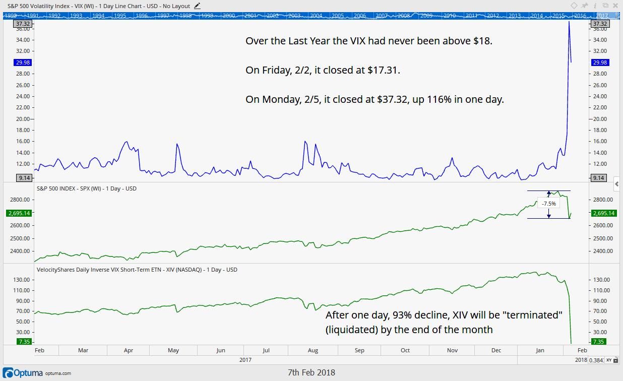
On Thursday, February 15, 2018 in our interim update we proclaimed “the next two days are the most important since 2016”. This is because the market was in the midst of a perfectly normal retracement in price after a swift selloff. The recent snap back rally was expected and is something that occurs after every big selloff, but what comes next in our opinion is the real key to the market’s intentions.

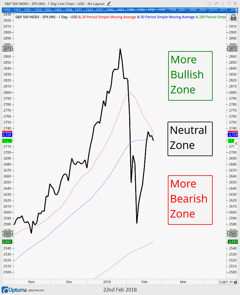
Historically, where price is today is where either counter-trend rallies failed and prices resumed their downtrend, or the market proved the selloff was over by powering higher through key moving averages and price levels.

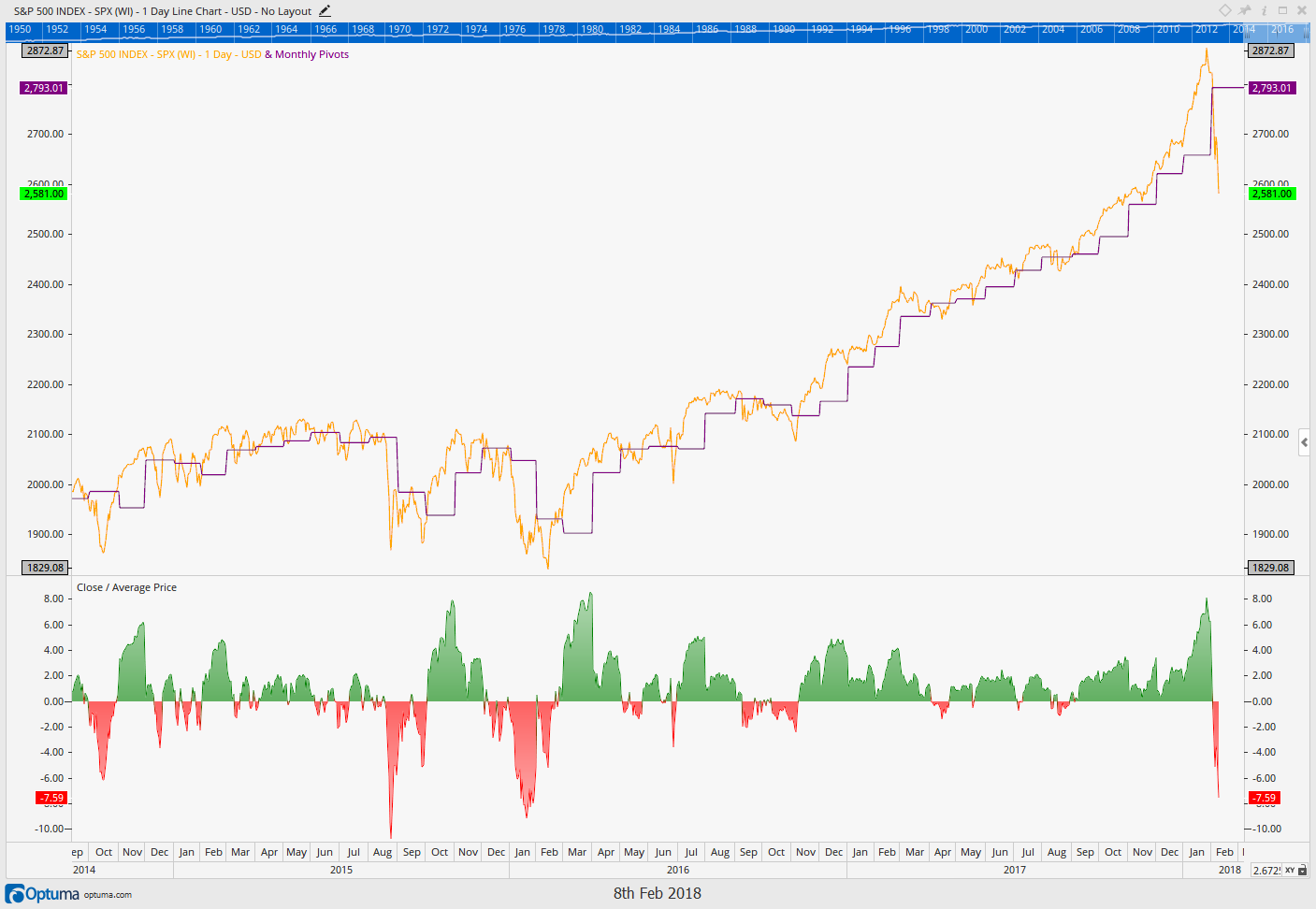
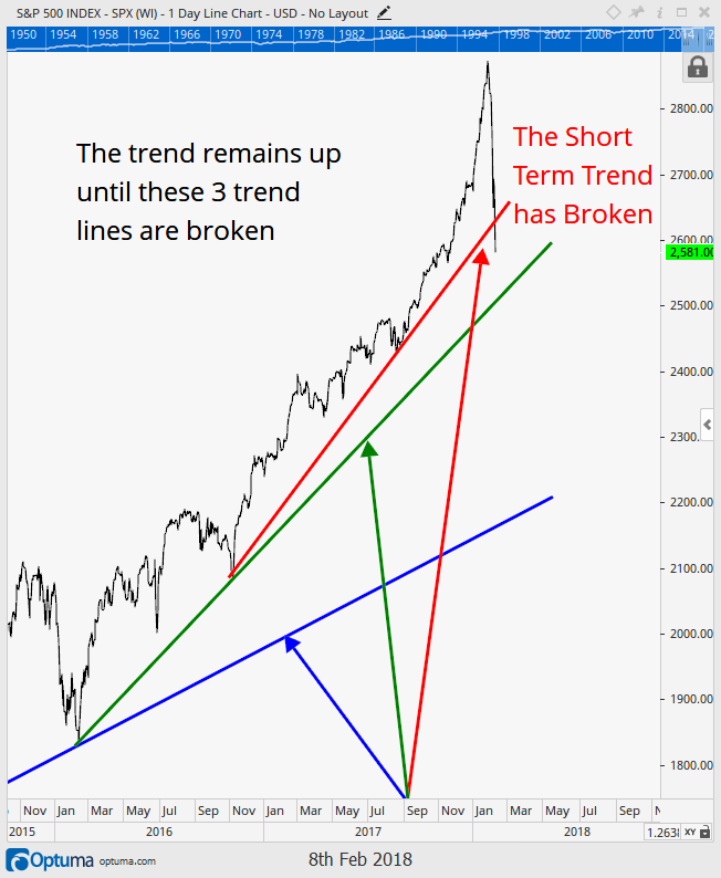
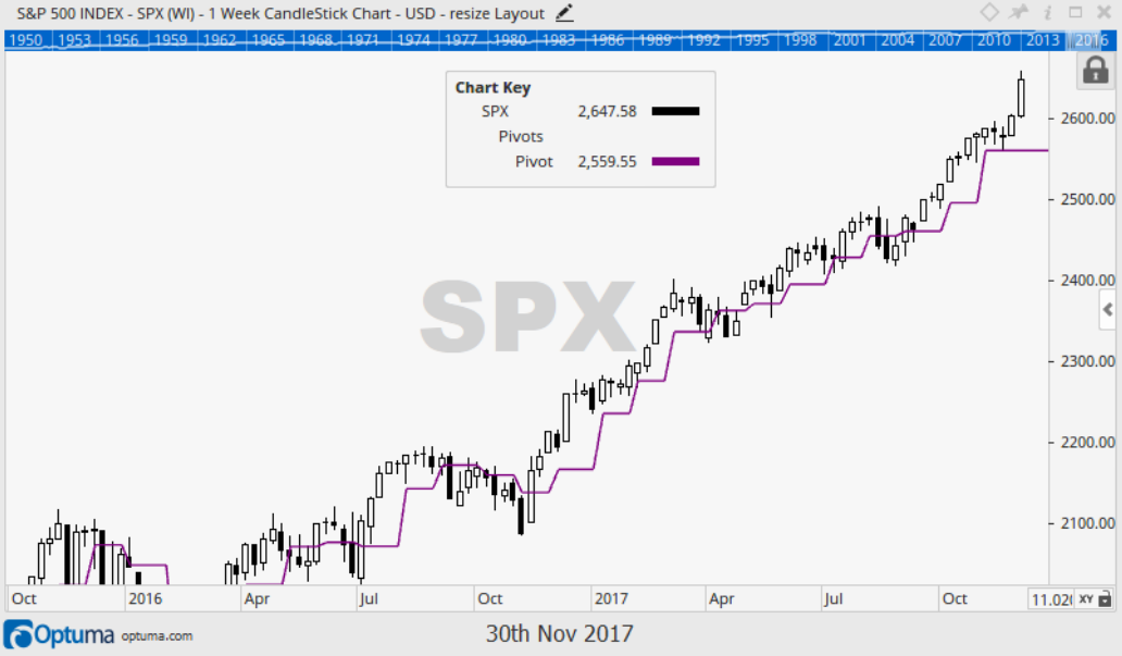
Since that update, the market’s rally has continued to stall for more than a few days at its key moving averages as shown by the chart below and in more detail in our Market Microscope section. We continue to anxiously wait for the culmination of this perfectly normal counter-trend bounce as the time has come to “do or die”.

To us, nothing has been proven by the market, yet, other than the fact the short term trend of the market has indeed turned down. That fact will remain until price can regain its key moving averages, and ultimately make its next new all time high. In the meantime we remain with an elevated cash amount waiting for the market to nudge us one way or the other.

In our Portfolio Insights section we discuss the latest correction and challenge some of the popular terms, such as “healthy correction”. We also have started to reel in our fixed income holding’s credit risk. One thing we do know is that if the equity market is rolling over, so too will be the credit markets rolling over, and we are trying to get ahead of that curve, in case it too is on the horizon. The High Yield Bond market’s chart does not look healthy.


FIT Model Update: Market Correction

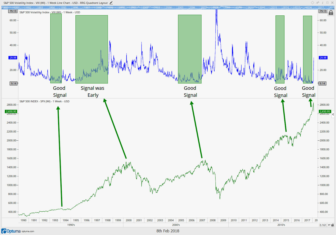
For the past seven months, our signals have almost exclusively been telling us that while the fundamentals and sentiment portions of our model were showing an over-valued and over-bought market, the technical indicators still showed strength. That has now changed with the recent 10% market pullback.

Currently, all three primary inputs are now flashing warning signs as we are, at a minimum, within a short term market correction, waiting for confirmation of the bottom. In a more worse case, at the beginning of a deeper bear market. Technical conditions can change quickly, and we are watching closely.


Market Microscope

The Market has Regained some of its Losses…Now What?

Stock Market

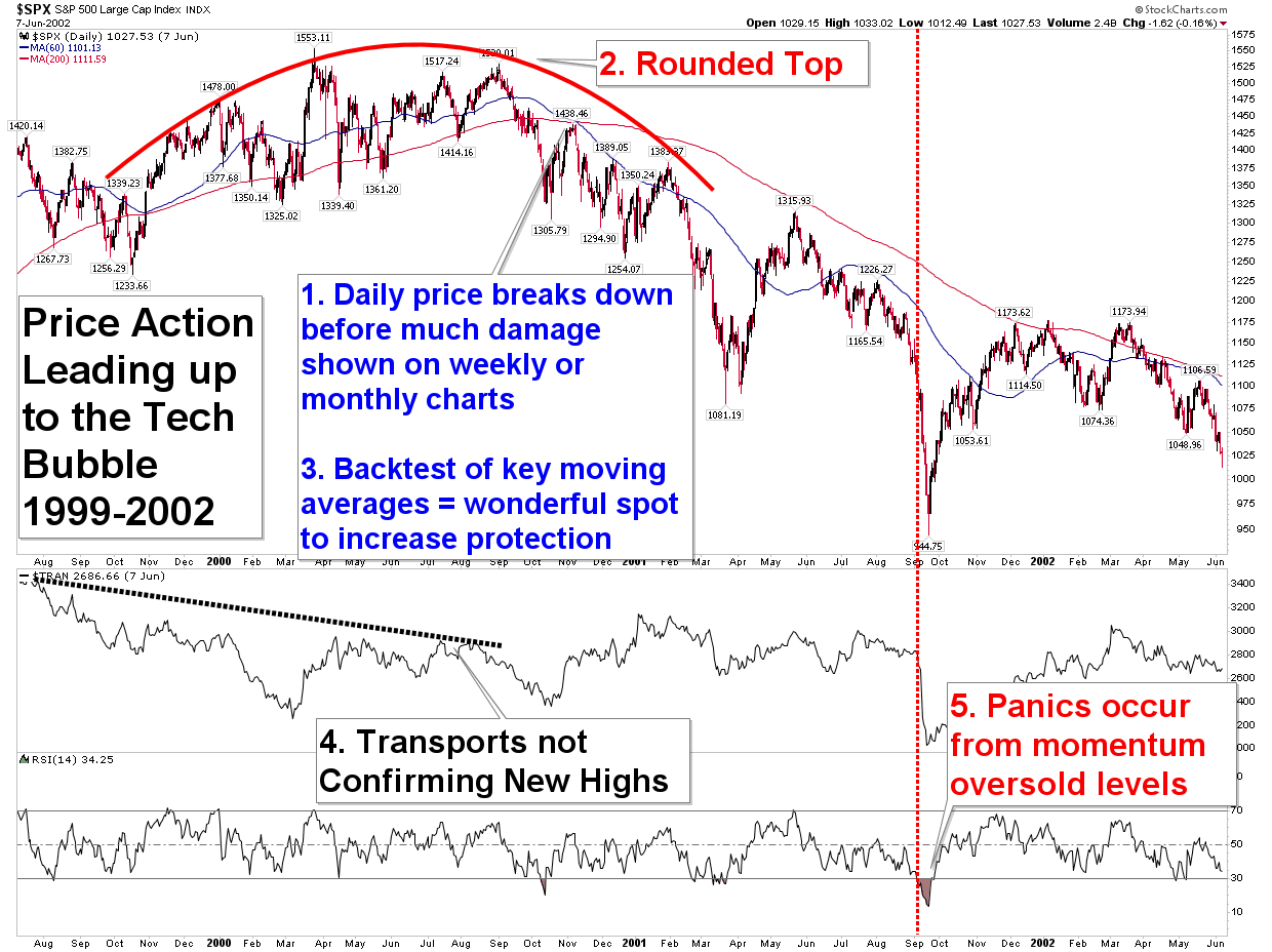
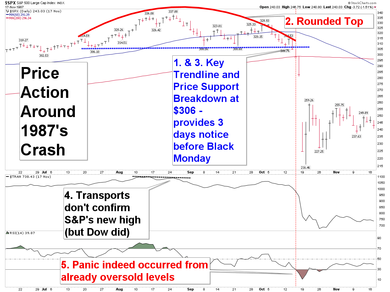
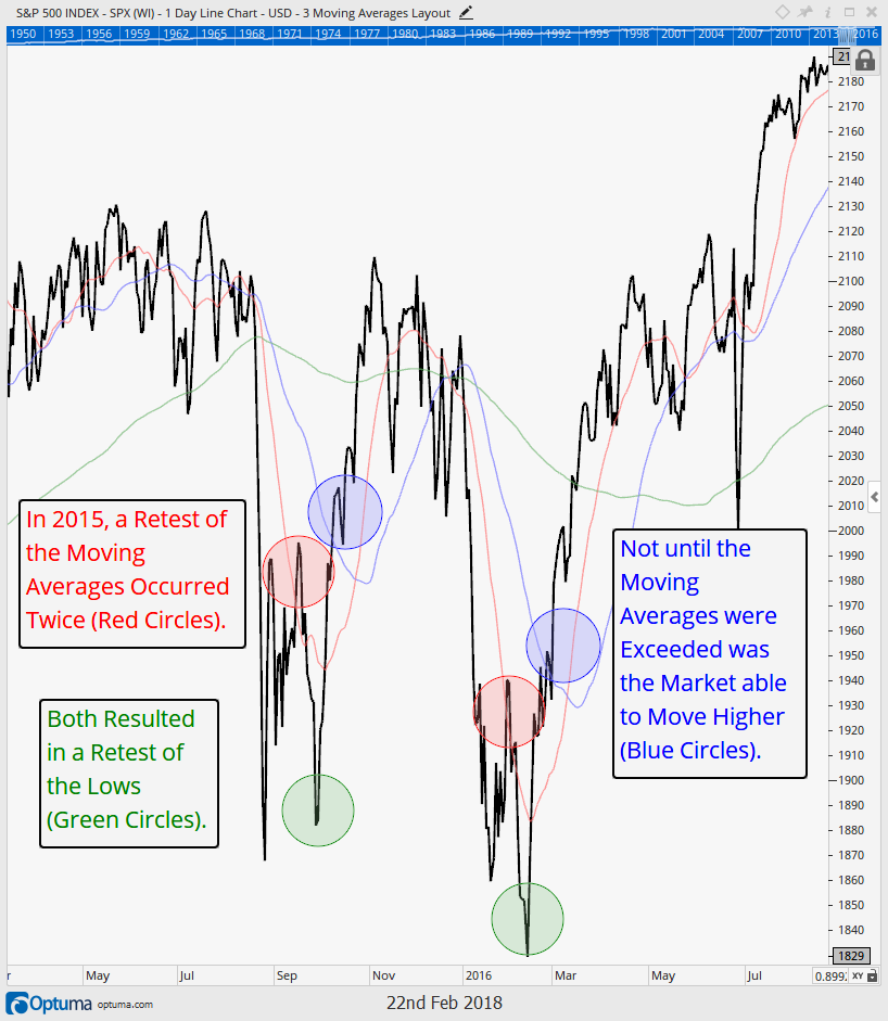
Below are a few recent examples of market pullbacks. On the first chart below is the 2015 minor market top, and on the next chart is the 2007 major market top. Both of these tops started out similarly, and also look, in their early stages, very much like the recent decline in the markets witnessed over the last few weeks. Other similarities of these tops include having rather swift initial sell-offs, “V Shaped” bottoms, and an initial bounce that ultimately tests moving averages and typical retracement levels.

In the case of 2015’s pullback, the initial selloff ultimately lead to a 14% drawdown from all time highs. Shortly after the initial “panic” selloff, stocks bounced, but they met resistance at the 20 day moving average (the initial red circle in the chart below). This led to another test of the low (initial green circle).

Ultimately stocks rose from there, but they still never made a new all time high. This resulted in the formation of a series of “lower highs”, which is one of two official components to a downtrend (the other being a series of “lower lows” accompanying the “lower highs”). Prices soon fell back below all the moving averages and again met resistance on the bounce, ultimately succumbing to the final low in the move. Not until a break and sustained move above the 20 and 50 day moving averages, and then ultimately the 200 day moving average, did the market prove it was resuming its uptrend.


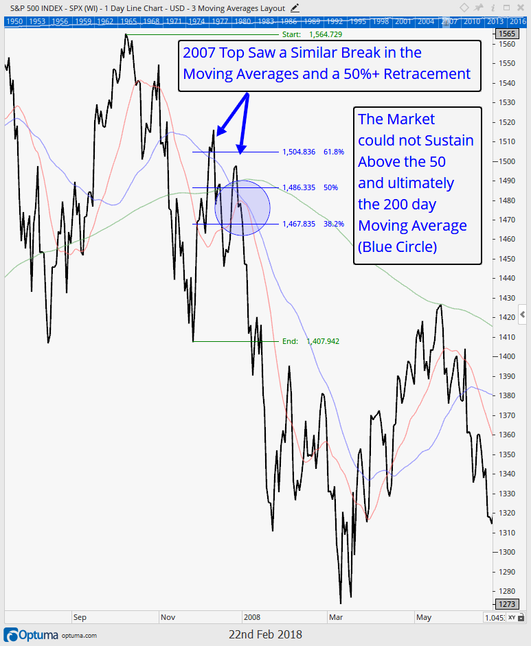
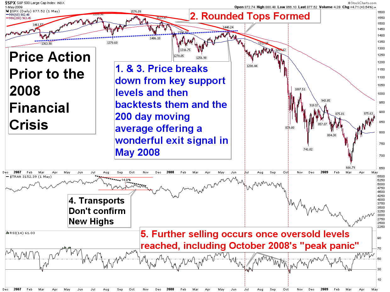
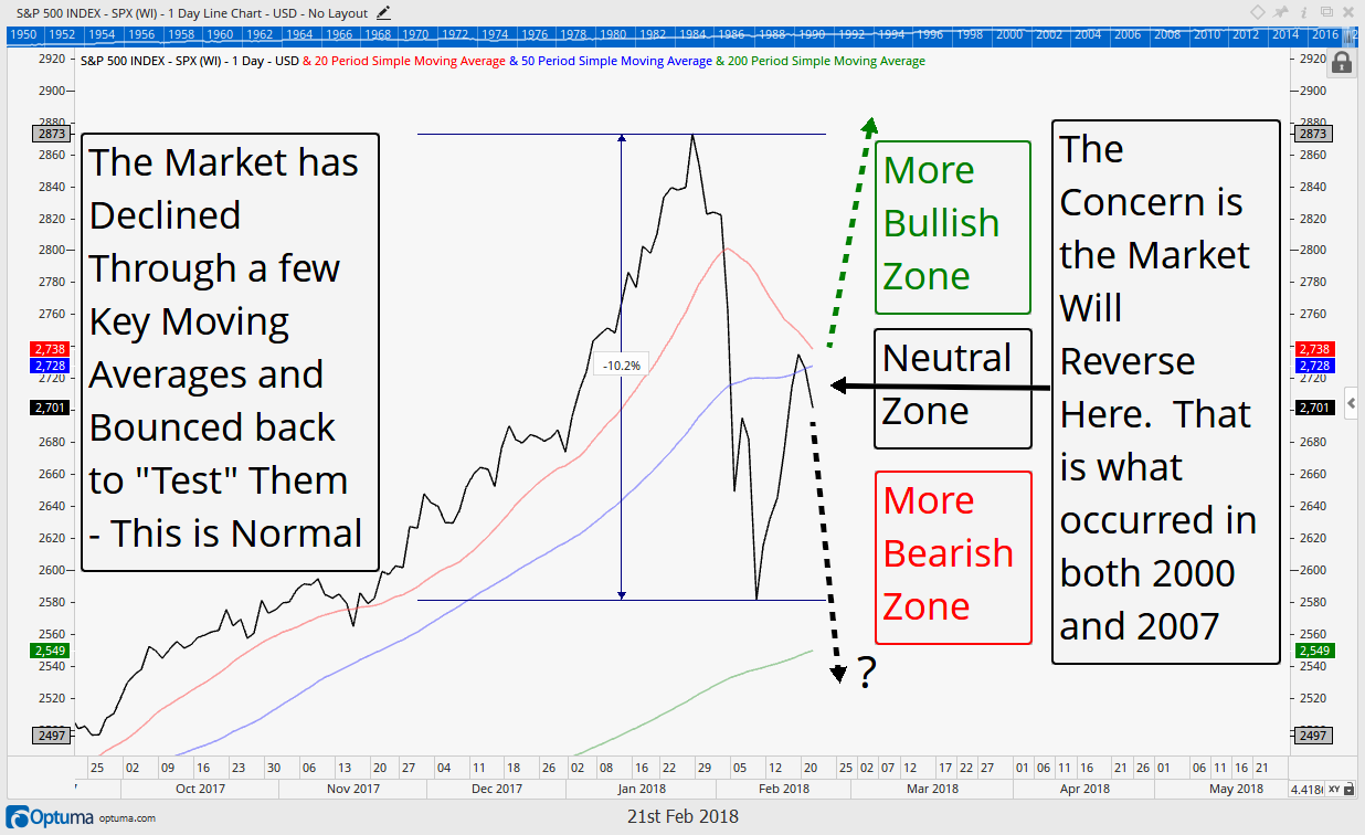
The second chart above shows that 2007 saw a similar setup with an initially steep selloff (a very similar to today (-10%) decline), and subsequent bounce into typical retracement levels (50% to 61.8%). Similarly moving averages were tested, but price could not sustain above them (as shown in the blue circle). Ultimately a series of lower highs were formed that were never broken out of and price fell back through all the moving averages, setting up the initial warnings of the soon to come bear market.

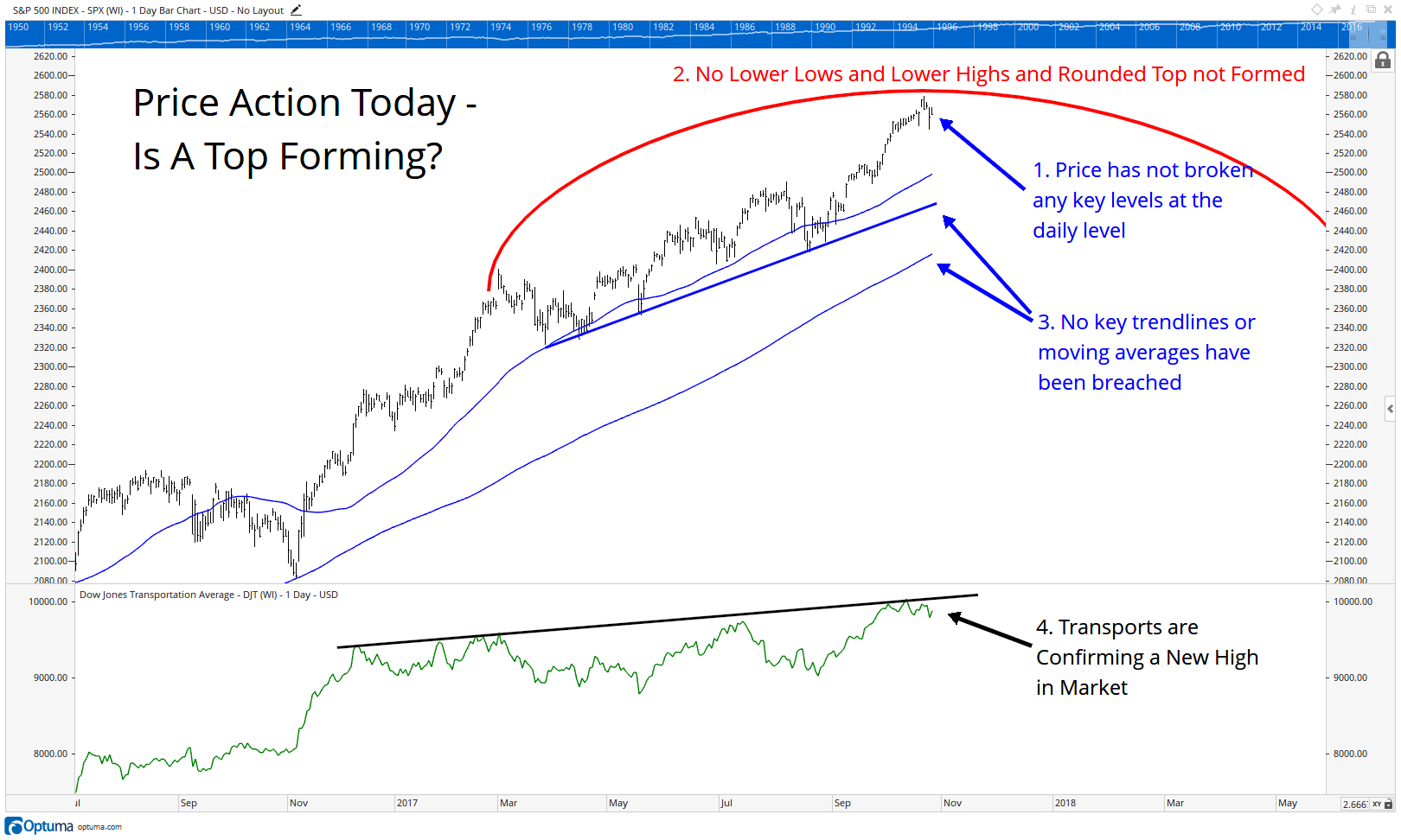
The stock market is in a very similar and precarious situation right now, which is why we labeled two days recently, “the most important since 2016”. Will this selloff be like 2015/2016 and breakout above the moving averages? Or, will it remain below them, poised for a retest of its lows (and potentially more downside) like 2007?

This key binary decision point is why we continue to feel we are at an extremely important market juncture here.

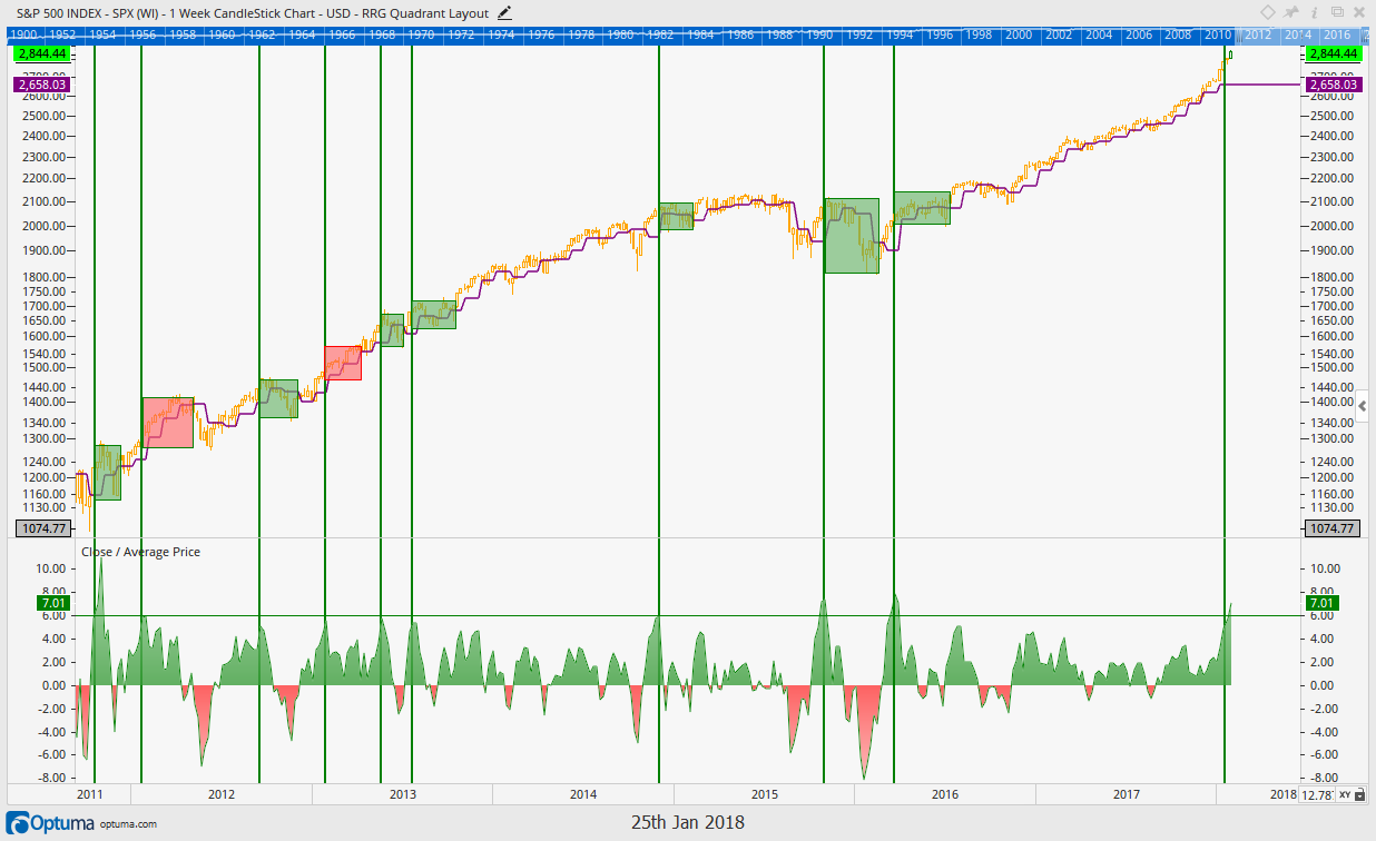
Shown below, the market’s recent drawdown of 10.2% has now bounced 50% and into the same key moving averages that helped guide the way in 2007 and 2015. Thus far price has been rejected at these moving averages. If Price can move above the 50 and 20 day moving averages that would be a bullish signal. However, if it remains below them, it opens the door up for another retest of the early Feb lows, at a minimum.

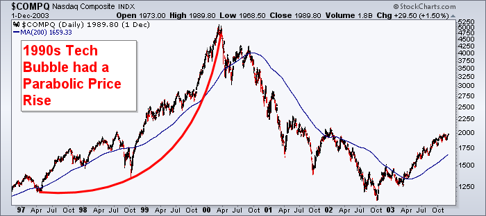
The next chart shows one more example for us to look at, from the year 2000. That year also saw a swift drop from its highs, followed by a bounce in prices to around 50% and into the moving averages. Notice (in blue) that price failed to overtake the 50 day moving average, which resulted in more selling, a formation of lower highs and lower lows in price, and ultimately a 2.5 year bear market.
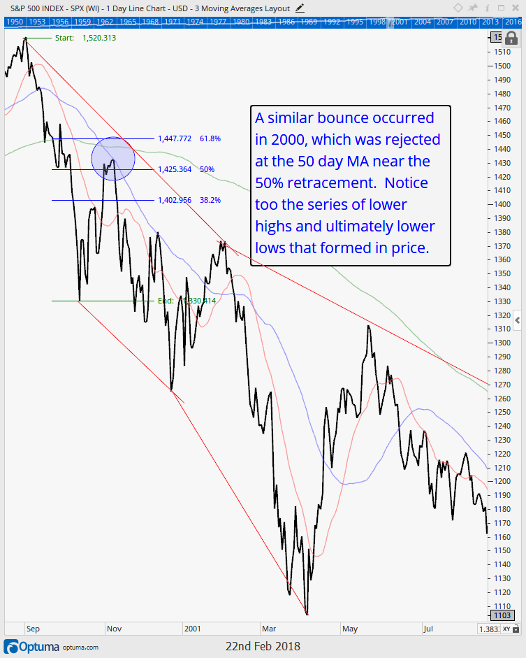

Portfolio Insight

“Healing is a matter of time, but sometimes also a matter of opportunity.”  – Hippocrates

Corrections are Not Healthy

It always amazes us to read the market commentary that gets recycled during different parts of the market cycle. One that we’ve read many times over the past few weeks is the ol’ “Corrections are Healthy” mantra.

There is nothing healthy about the destruction of capital.

The intentions are good by those who say this, and we understand the theory…the market has become frothy, and price declines serve to reset expectations, allow an overheated economy to cool, work off overbought conditions, allow inventories to reset, and/or value to better be found. This theory is similar to the Broken Window Fallacy, which we wrote about following the devastating hurricanes last fall (read it HERE).

But this theory neglects the real effects of market declines. One is very tangible: loss of capital. The other is more cerebral: increased uncertainty and the loss of “mental capital”. Markets and economic activity are performed by humans, and we are not rational beings at all times. (Washington DC continually reminds us of this fact.)

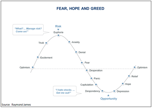
Mental capital includes the various behavioral finance issues that all investors experience. Once mental capital is fully expended, investors throw in the towel. This typically happens at the end of a long downtrend, which we refer to as “capitulation”, or panic selling.

Almost everyone has experienced this at some point, and if you haven’t, you probably haven’t been investing very long. It is the retiree who sold in March 2009, and is still waiting to get back in. It’s the tech investor who bought at the peak in the late 90’s and sold at the bottom in 2002. It’s the reason many people say “you can’t time the market”.

But managing risk is not about timing the market. It is about surveying probabilities. It is about investing in favorable times, and choosing to reduce risk when the odds of unfavorable times are increasing. The odds have increased that we are now entering into one of these potentially unfavorable times. Taking steps to manage risk helps protect both real and mental capital.

Portfolio Updates

We have made two primary shifts in portfolios over the past few weeks:

  1. Reduced Equity Exposure
  2. Increased Credit Quality in Fixed Income

As discussed in our interim updates and our last ‘Insights’, we have had multiple sell signals in our equity exposure in the past two weeks. We stress that this is likely to be a temporary allocation shift until our models give us new buy signals. But thus far, we have not received new buy signals in any of our equity strategies that we are monitoring daily.

Our buy signals are not designed to find the absolute bottom of a correction, as it is impossible to know at the moment an ultimate market low occurs. Our buy signals are designed to invest with the wind at our back. We want the probabilities of success to be in our favor. We believe this is our most important fiduciary duties to our clients. If we are risking our clients’ capital, we must have a reason to believe the odds are in our favor that we can generate positive returns. There is a popular saying in the trading circles that, “picking bottoms is for losers”, and we tend to agree.

On the surface, if may seem counter-intuitive that higher prices present better investment opportunities. But this is exactly the case in the current market environment. While the pullback was indeed violent, the internal market stats are not currently strong enough to create conditions in which our models say “buy”. So for now, the equity markets are in “no man’s land”, which we discussed in-depth in the Market Microscope section. We currently are waiting for the market to resolve itself either higher or lower. In the meantime, we will exercise prudence and patience with our clients’ hard-earned capital.

In a perfect world we would sell near the beginning of a downtrend and reinvest below the level that we initially sold out. In that case we would continue to outperform the market, and that is certainly one of our goals. There is risk that we ultimately re-buy at slightly higher prices (called whipsaw risk), losing some ground to the market, but that is a risk we are willing to take, especially when measured against the potential downside potential. Additionally we have other strategies in place with goals of offsetting this whipsaw risk. As our clients know, we have remained largely vested in our individual security names as well as some specific sectors, which have done well during this turbulence.

Fixed Income

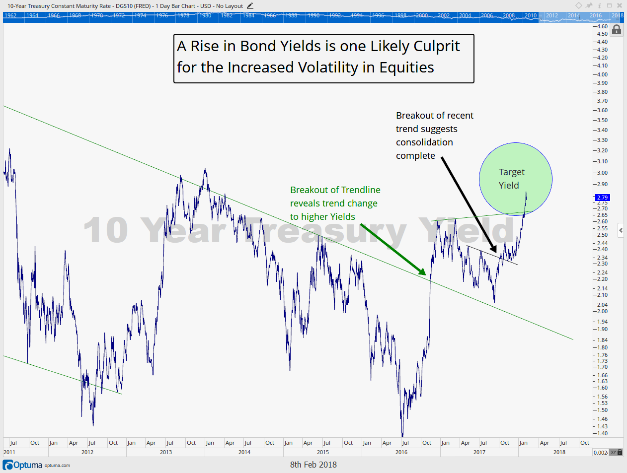
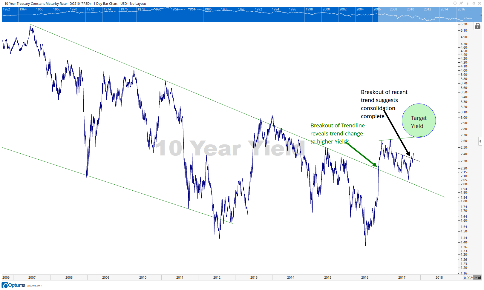
Fixed income, on the other hand, continues to send a very clear message: rates are moving higher.

When investing in fixed income, there are essentially two types of risks investors can take: Interest Rate Risk, and Credit Risk. There are many other nuanced ways to measure risk, but these are the two big ones.

Interest Rate Risk means that an investment’s value will change due to a change in the absolute level of interest rates (source: Investopedia). More specifically, if interest rates rise the investment will lose value, and if interest rates decline it will gain in value. Longer-dated investments have more interest rate risk than those with shorter maturities.

We have been positioning clients for a rising rate environment for many months by focusing on investments with very short maturities. We have already been minimizing interest rate risk.

However, to generate higher yields, we had been taking on some credit risk. This is the risk we have addressed more recently as we have shifted some of our fixed income funds.

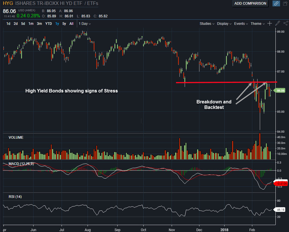
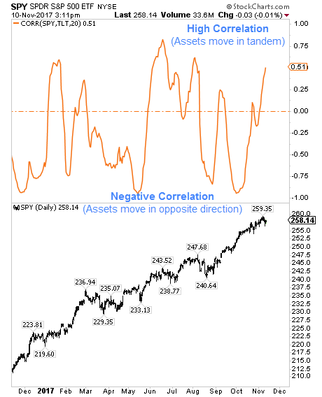
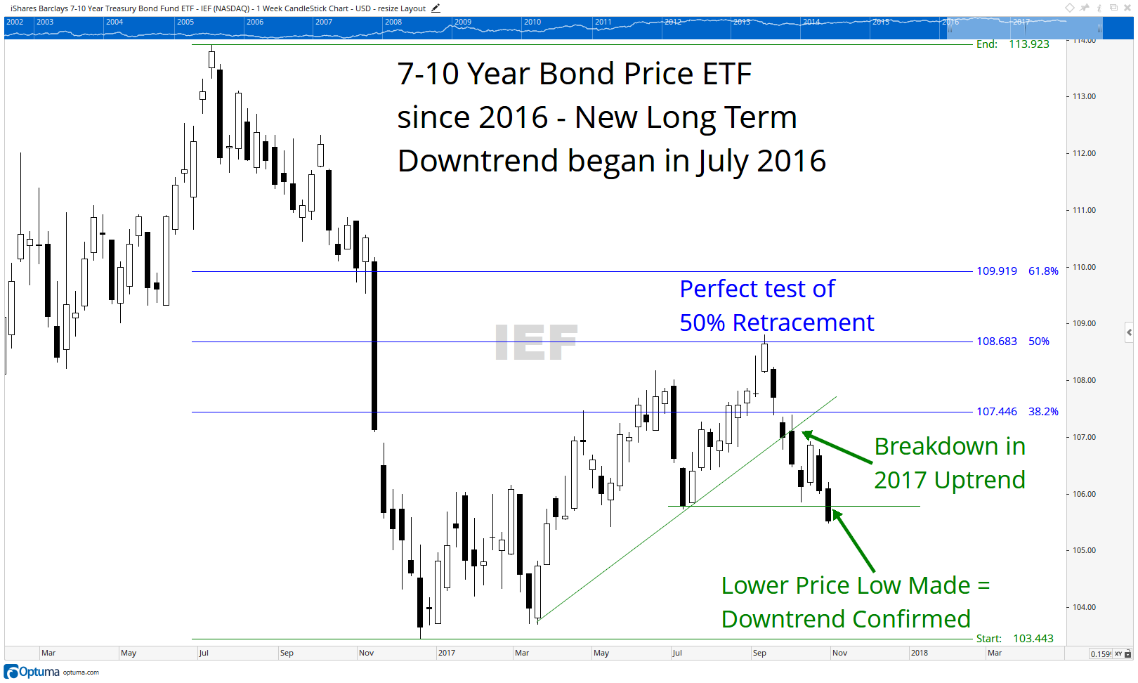
As shown in the chart above, high yield bonds (which we have tried to minimize ownership of) have declined along with the equity markets. The breakdown and retest of the support level over the past two years is a warning sign that credit risk may not be a risk worth taking any longer. In response, we have increased credit quality as another way to manage risk.

One final thought on fixed income. We discussed back in the January 11, 2018 issue as well as in our February 12, 2018 issue, how bonds and stocks actually tend to fall in price together during periods of stress. Notice how in the chart above HYG fell in price from its January highs to its February lows. High yield credit fell along with equities during this time, helping prove that diversification alone will not protect you from market selloffs.

If you are not our client, you should ask your advisor what your portfolio will look like if yields continue to rise and equities continue to fall?


Our clients have unique and meaningful goals.

We help clients achieve those goals through forward-thinking portfolios, principled advice, a deep understanding of financial markets, and an innovative fee structure.

Contact us for a Consultation.

Neither the information provided nor any opinion expressed constitutes a solicitation for the purchase or sale of any security. The investments and investment strategies identified herein may not be suitable for all investors. The appropriateness of a particular investment will depend upon an investor’s individual circumstances and objectives. *The information contained herein has been obtained from sources that are believed to be reliable. However, IronBridge does not independently verify the accuracy of this information and makes no representations as to its accuracy or completeness.  Disclaimer This presentation is for informational purposes only. All opinions and estimates constitute our judgment as of the date of this communication and are subject to change without notice. > Neither the information provided nor any opinion expressed constitutes a solicitation for the purchase or sale of any security. The investments and investment strategies identified herein may not be suitable for all investors. The appropriateness of a particular investment will depend upon an investor’s individual circumstances and objectives. *The information contained herein has been obtained from sources that are believed to be reliable. However, IronBridge does not independently verify the accuracy of this information and makes no representations as to its accuracy or completeness.  

Filed Under: IronBridge Insights

It’s All Phil’s Fault & How to Invest Late in a Cycle

February 9, 2018

In this issue we discuss 6 Ways to Invest late in a market cycle, explore the past week’s volatility in more detail, and offer two explanations of why the markets fell so far so fast.

[maxbutton id=”5″ url=”https://ironbridge360.com/wp-content/uploads/2018/02/IronBridge-Insights-2018-02-09-1.pdf” text=”View PDF” ]


In This Issue:

MARKET RECAP: It’s All Phil’s Fault

Correlation is not causation. Just because things happen at the same time does not mean they are related. We look at two possible explanations for the market decline this past week.

PORTFOLIO Insights: 6 Ways to Invest when it’s Late in a Market Cycle

We review the characteristics of a market that is late in its cycle, and explain the six principles of investing during a late cycle environment.

MARKET MICROSCOPE: That Escalated Quickly

The VIX Index more than doubled in a 24 hour period causing some ETNs to actually close up shop. This rapid pace of the VIX’s move was unprecedented. Also, equities saw their biggest pullback since August of 2015 as one of our technical indicators has moved to a more conservative signal. Before all the fireworks we moved a portion of portfolios to cash, where it still sits.


On Our Radar

Trump Taxes: The tax bill has passed as companies continue to dissect how changes may affect them.

Earnings: 4Q Earnings season has begun, and companies have a high bar to continue the growth seen in 2017. GAAP Reported Earnings estimates for the full year have risen another $6 to $146.

Federal Reserve: The Fed is expected to raise rates 3 more times in 2018 as the bond market has already started to price this in.

Winter Olympics: The Winter Olympics kick off this weekend in South Korea.

Government Shutdown: The shutdown was avoided as a last minute signing of the latest bill occurred on Thursday 2/8/2018.

Economy: 4Q GDP rose by 2.6%, well below estimates above 3%.

Volatility: By some measures the recent bout of volatility was the most ever in such a rapid amount of time as the VIX spiked from under 20 to over 50 in a matter of hours during Monday’s (2/5) market slide. The increased volatility sent shockwaves across the markets. Still, it seems the VIX’s movements were exacerbated by the lopsidedness of the short trade as some estimates suggest that such a move higher in the VIX should have sent the S&P down 15%.


FIT Model Update: Uptrend with EARLY TOPPING PROCESS

Fundamental Overview: Although the Dow Jones Industrial Average declined over 10% from its peak to its trough during this latest decline, valuations are still very stretched. By most measures it would take a bear market decline (20%+) to bring valuations back in line with historical norms. One glaring example of this is the 5 Year Treasury Note’s yield of 2.5%. This typically safer investment is providing more income than the much riskier S&P 500’s 1.8% yield.

Investor Sentiment Overview: This week showed us one risk in being in a very crowded trade as the low volatility trade finally ended. The trade was so lopsided that a popular ETN used to short volatility literally blew up when Credit Suisse “terminated” its short volatility ETN (ticker: XIV) on Tuesday morning. So many investors had piled into the short volatility trade when the volatility index (VIX) rallied over 100% from the prior day, the ETN didn’t have the funds to cover its short positions, essentially bankrupting it. Essentially the short vol traders were caught in a massive short squeeze.

Technical Overview: Friday’s (2/2), Monday’s (2/5), and Thursday’s (2/8) crashes in stock prices essentially wiped out two months of gains as prices reversed back to late November levels. Our trend strategy and sector strategies gave us some sell signals as we increased our cash exposure this week.


Market Recap

The past week in the markets has been incredibly volatile, and as uncertain as any period since the 2008 financial crisis. There are many potential explanations of what cause the volatility over the past week. Some say it’s just inevitable, but we offer two possible explanations.

Maybe it’s all “Phil”s fault.

Last Friday, Punxsutawney Phil saw his shadow and the Dow fell 656 points. Then, following an Eagles Super Bowl win, the city of Philadelphia shut down to celebrate the victory and the Dow fell 1,175 points. To cap off a rocky week, Philadelphia again shut down for the Super Bowl parade on Thursday, while the Dow fell another 1,033 points. Thanks Phil.

We don’t mean to make light of markets falling so dramatically, but we point this out to highlight the importance that correlation is not causation. Just because things happen at the same time does not mean they are related.

Our Real Analysis of the Past Week

Based on our work examining the market behavior this week, we believe a series of things occurred:

  1. A Fragile Structure. The markets were very overextended from the record-low volatility over the past 6 months. This is a setup for a fragile market structure, as we have discussed previously. Low volatility increases risk, it does not reduce it.
  2. Liquidity was reduced. Record equity in-flows in January removed a large portion of potential liquidity for the markets. When selling started, there was a lack of buyers.
  3. Algorithms sold on Friday and Monday. There are many programmed trading funds across the globe. When they start to sell, it has the potential to create a self-fulfilling spiral. It starts with a large sell order in a thinly-traded market, which created a sell-order imbalance. Other computer programs see this and also enter sell orders. This makes sense to us, particularly when we noticed that volumes were normal levels (typically we would expect to see an increase in volume given such large declines).
  4. Risk Parity Funds sold on Thursday. There has been a dramatic rise of assets in what are called “Risk Parity Funds”. These funds target a specified level of risk. If risk rises, they must reduce their exposure. As risk declines, they increase exposure. As a result of the spike in volatility on Monday and Tuesday, there was anywhere between $200b and $400b of selling pressure from these types of funds.
  5. Key Technical Levels Provided Support and Resistance. This morning, the S&P 500 bounced off its 200-day-moving-average. This is the average price of the index over the past 200 days, and is a very closely watched level by portfolio managers. In fact, the S&P 500 tested its 20-dMA, 50-dMA and 200-dMA at some point during this week.
  6. Diversification Didn’t Work. As we explain below, almost every asset class was punished during the past week, as we have previously predicted.

Portfolio Insight

How to Invest Late in a Cycle

“There are two concepts we can hold on to with confidence: Rule No. 1: Most things will prove to be cyclical. Rule No. 2: Some of the greatest opportunities for gain and loss come when other people forget Rule No. 1” – Howard Marks, Investor

One of our persistent themes over the past few months has been discipline. We believe this is the most important trait that you as an investor, and us as wealth managers, must exercise when faced with late cycle investing.

First, what do we mean by “Late Cycle” investing?

Every market, whether it be in stocks, bonds, real estate, commodities, currencies, etc, works in cycles. These cycles are not always predictable, and their turning points are definitely not predictable. However, it does not take a PhD in Economics to understand that a bull market that began 9 years ago is not in its early stages of expansion. Quite the opposite. In almost every measure that we watch, signs abound that we are late in the cycle.

The list below shows the broad characteristics of market cycles.

So what are the characteristics of a Late Cycle environment?

  • Economic Fundamentals are Strong. Fundamentals always look the best at the top, and the worst at the bottom. During the Tech Bubble in the late 1990s the underlying economic conditions were quite good. GDP had expanded for 9 consecutive years, as shown in the chart below.
  • Volatility is Low. More on this in the Market Microscope section below.
  • Valuations are High. Prices tend to rise faster than earnings late in market cycles, causing various valuation measures to increase. We see that today in P/E ratios being near all-time highs.
  • Optimism is High. The most consistent characteristic of market cycles appear in sentiment measures. Optimism is high near a market peak, and extremely low near market lows. This is easy to understand, as bull markets feel good and bear markets do not. No one likes to lose money.

How to Invest in a Late Cycle Environment

1. Shorten Your Time Frame (aka, Don’t Buy and Hold)

You should expect to own investments for a shorter period of time. The longer you hold an investment, the more likely it is that the next down cycle will occur while you own it. This means more careful screening of investments, and adhering to a strict exit strategy.

2. Reduce Your Tolerance for Downside Risk

Upside return potential is reduced late cycle. This doesn’t mean you can’t generate nice returns, but you must plan out strategies to get you adequate upside to compensate for your downside risk. We prefer a general 3-to-1 ratio: own investments with the potential to at least earn 3-times the upside versus the downside risk. So if we expect a 15% upside return potential, we want no more than 5% of downside risk.

3. It’s Okay to Miss Out on some Upside to Avoid Big Downside

One of the risks of late cycle investing is called getting “whipsawed”. This is where you own a position, get an exit signal, only to get another buy signal shortly afterward, resulting in a potential sell and then a soon after repurchase. In order to mitigate whipsaw risk it is important to structure exit and re-entry signals so that the potential loss is less than the potential loss of holding the position through the volatile periods.

4. Don’t Rely on Asset Allocation

We have mentioned this is many of our previous reports. Asset allocation does not work when markets undergo stress. And the past week has definitely shown stress in markets with the Dow Jones down 1000pts not one, but TWO days this week.

Here is the performance of various asset classes from peak to trough from their recent highs:

  • US Stocks (Large Cap, S&P 500): Down 11.82%
  • US Stocks (Small Cap, Russell 2000): Down 11.21%
  • International Stocks (EAFA Index): Down 12.58%
  • Emerging Market Stocks: Down 13.87%
  • Corporate Bonds: Down 5.47%
  • US Treasury Bonds: Down 8.08%
  • Gold: Down 4.16%
  • Oil: Down 9.6%
  • Bitcoin: Down 69.1%
  • Euro (Ticker:FXE): Down 2.6%
  • Emerging Market Sovereign Debt (Ticker: PCY): Down 6.4%
  • Mortgage Bonds (Ticker: MBG): Down 4.3%
  • Reits (Ticker:REIT): Down 13.3%
  • Manhattan, NYC Apartment Rental Costs: Down 3.6%
  • U.S. Dollar (Ticker: UUP): Up 2.4%

You get the picture. How well did a diversified portfolio prepare for and handle the downturn? Based on the numbers above, not well at all.

5. Don’t Listen to “Stay the Course” Advice.

The most common advice we hear from almost every major investment firm includes some combination of the following phrases: “Corrections are Inevitable”, “Stay the Course”, and “Markets Always Recover”. This advice is better than panicking, but it makes us wonder a few things.

For example, one of the country’s largest banks published a report to their institutional investors advising to sell stocks on January 30th. A subsidiary of this bank, one of the country’s largest investment firms, told clients to ride it out. There is a fundamental conflict with this advice.

We believe that most investment advisors do not understand how markets fundamentally work. Would you take your car to a repair shop that didn’t know how an engine worked? Yet, on LinkedIn we find article after article from advisors attempting to provide various reasons for the correction, but their conclusion is and always will be to “stay the course”. The irony is that this advice is exactly why investors panic as they lose confidence in their strategy.

6. Plan Investments within the Context of Your Overall Portfolio

Define your goals, define the overall structure of your portfolio, and design an investment methodology that fills the buckets.

Having a plan in place that reflects the cycle the market is currently in allows one to be fully prepared for weeks like the one we just had. Broad asset allocation may be sufficient during the early or middle stages of a cycle, but as we have seen the past week and exemplified in the example to the right where we have the last week’s performance across the world, it can fail you when you most need it during the late stages of a cycle.

As we mentioned in our Monday Special Report, “We have put in the work, so our clients can have peace of mind that we are taking every prudent step to address a variety of of potential market outcomes, good and bad”.


Market Microscope

That Escalated Quickly

One month ago we took a look at the extremely calm markets and one measurement of its serenity, volatility. In that issue we discussed the sleeping VIX. It seems Rip Van Winkle has awoken from his slumber! In that same issue we reiterated our stance that we were in a rising yield environment where we projected a 10 year Treasury approaching 3.0%. That has already come to fruition.

Late Cycle Investing:

A persistent theme over the past year has been the record low volatility. Back on August 11, 2017 we discussed this as we proclaimed, “a low VIX should not be something necessarily celebrated, but instead should be treated more as a red flag as market tops almost always are associated with periods of low volatility”. In addition charts were provided showing the record low volatility and the record amount of speculative short VIX contracts (which have now contributed to the extraordinary VIX move discussed in more detail below).

The chart below is similar to the one we provided in our January 12, 2018 ‘Insights’. In that issue we showed 4 prior times the VIX was near all time lows. 3 of those 4 preceded meaningful market pullbacks, and we now have a 5th occurrence, which also is in the process of marking a meaningful market pullback with the S&P and Dow falling over 10% from their highs. Low VIX levels are associated with market tops, not market bottoms. Similarly a low VIX is also associated with being late in the cycle, as the chart below helps show. Low VIX levels typically occur prior to market tops and market tops are by definition late in the market’s cycle, so a low VIX helps us confirm we are indeed late in the cycle.

But a low VIX also tells us more. A depressed VIX means volatility expectations are low, and thus tolerance for any elevated volatility should also be low. Contrastingly, in a high volatility environment larger price moves are expected, and thus should be tolerated more openly. We keep our tolerance for volatility low by keeping our stop losses and exit signals tighter than we would earlier in a cycle, when increased volatility expectations suggest allowing more tolerance for price moves. Those tighter stops have helped us move some portions of the portfolio to cash, ahead of a lot of the fireworks and whatever may be on the near horizon.

Volatility:

Well that escalated quickly! If you haven’t heard, this past week we witnessed an unprecedented move in volatility as the S&P 500’s Volatility Index (the VIX) skyrocketed over 100% in just one day. Not to get too technical but the VIX Index measures the underlying cost of volatility in an S&P 500 Index Option contract. In short it tracks the cost traders are willing to pay for volatility uncertainty, and on Monday that cost skyrocketed.

The chart below shows the recent history of the VIX along with the S&P 500 Index as well as a popular Exchange Traded Note (ETN) which allowed traders to participate on the short side of the VIX trade (owners profited when the VIX declined in price and lost when the VIX rallied in price).

The chart below shows that not once over the past year did the VIX close above the $18 level. That all changed on Monday, February 5, 2018 when the VIX more than doubled as the Dow Simultaneously fell over 1,000 points.

The move higher in the VIX was so unprecedented, that one exchange traded note (ETN), ticker: XIV, is having to liquidate whatever assets they have left as they couldn’t cover all the losses absorbed during the rout. For all intents and purposes the fund was caught in a massive short squeeze in the price of volatility which ultimately bankrupted them.

If there is a positive perspective to this story perhaps it is that the S&P was only down 7.5% from its peak to its trough since hitting its all time high two weeks ago. Some experts have suggested that similar moves higher in the VIX in the past would have sent the S&P down 15% or more.

The other silver lining is that our trend model gave us our first sell signal since August as we moved a portion of our portfolios to cash before most of the fireworks started. We remain with a somewhat elevated cash position as we continue to monitor the situation.

What this also means is volatility is likely here to stay, at least for a little while, as revealed on Thursday, February 8, 2018 when the Dow had its 2nd 1,000+ point drop in under one week. When extremely popular funds blow up, it can take some time for the dust to settle.

Stock Market:

Volatility has certainly picked up, but how much damage has actually been done to the markets?

The chart below shows the same chart as discussed in our update two weeks ago with the S&P 500 (in orange) along with the prior month’s average price (in purple).

The bottom indicator reveals the percentage distance price is away from its prior month average, and the takeaway from that discussion was that the market (at 6% above the prior month’s average price) had only been that stretched above its average price 9 times over the past 7 years with seven of those nine instances resulting in a flat to down market at some point within the next few months.

In other words, putting new money to work at those stretched prices had an elevated amount of risk associated with it. The market has since heeded to that historical precedent and indeed pulled back to levels that are now over 7% lower than January’s average price (and down 10% from the all time high). So, once again that signal turned out to be a beneficial one, and we are now in the midst of the market’s first meaningful pullback in almost two years. But does this mean the bull market is over?

The chart below reveals the longer terms have not yet been affected by the recent short term market gyrations. The short term trend has broken down after the 10% pullback in the markets, but the intermediate and longer term trends remain intact. This is why we remain with some equity exposure at this juncture. However, further deterioration in price would have us continue our trend of raising cash.


Bond Market:

Another persistent theme we have been following is the continued deterioration of the bond market. We first wrote about this expectation in our inaugural ‘Insights’, published July 13, 2017, and since then the bond market has seen a fairly swift move higher in yields (and lower in price).

The next chart is one we published in October with our projection of a move toward 3% on the 10 Year Treasury. Updated we see that the target yield discussed then has already been reached as the 10 Year moves toward the 3% level.

Remember a higher bond yield affects not just bond prices, but it also affects equities prices. If you are looking for yield, why would you buy the S&P 500 with a yield of just 1.75%, when you can get a safer Treasury Bond that pays above 2%?

The September 29, 2017 ‘Insights’ went more in depth as to how bond yields affect stock prices, but suffice it to say that a rising yield environment is not good for bonds, it is not good for stocks, and it is not good for commodities (which provide no return and actually cost money to carry).

Another reason to be concerned about rising bond yields is the chart below from the Federal Reserve.

There is a persistent thought on Wall Street that corporate balance sheets are “stronger than they have ever been”. But, this is simply not true.

The chart below shows that debt to non-financial corporations sits at an all time high approaching $14T. This means there is now $3T more in debt today on corporate balance sheets than there was preceding the financial crisis.

This may not be such a huge problem in a low interest rate environment, but as interest rates rise, these corporations will be refinancing at higher rates, increasing interest expense and lowering earnings.

The reality is corporations have used the low interest rate environment to essentially lever up their balance sheets, using the increased debt to buyback shares and fund other short term priorities. Eventually this will probably come back to haunt, after 5 years when their debt comes due, they don’t have the cash to pay it back, and they must refinance.

Or they just convince Philadelphia to keep working.


Our clients have unique and meaningful goals.

We help clients achieve those goals through forward-thinking portfolios, principled advice, a deep understanding of financial markets, and an innovative fee structure.

Contact us for a Consultation.

Neither the information provided nor any opinion expressed constitutes a solicitation for the purchase or sale of any security. The investments and investment strategies identified herein may not be suitable for all investors. The appropriateness of a particular investment will depend upon an investor’s individual circumstances and objectives. *The information contained herein has been obtained from sources that are believed to be reliable. However, IronBridge does not independently verify the accuracy of this information and makes no representations as to its accuracy or completeness.  Disclaimer This presentation is for informational purposes only. All opinions and estimates constitute our judgment as of the date of this communication and are subject to change without notice. > Neither the information provided nor any opinion expressed constitutes a solicitation for the purchase or sale of any security. The investments and investment strategies identified herein may not be suitable for all investors. The appropriateness of a particular investment will depend upon an investor’s individual circumstances and objectives. *The information contained herein has been obtained from sources that are believed to be reliable. However, IronBridge does not independently verify the accuracy of this information and makes no representations as to its accuracy or completeness.  

Filed Under: IronBridge Insights

What Will be the Effects of the Tax Cut?

January 26, 2018

What will be the real effects of the new tax legislation?

In this issue we discuss what companies may do with the extra funds from the tax cut, look at the announcements made thus far, and take another look at the hot stock market.

[maxbutton id=”5″ url=”https://ironbridge360.com/wp-content/uploads/2018/01/IronBridge-Insights-2018-01-26.pdf” text=”View PDF” ]


In This Issue:

PORTFOLIO Insights: What will Companies do with the Projected Tax Savings, and How will it Impact your Portfolio?

There are five likely ways corporations will use any savings from the tax reform. We discuss the most likely one in more depth.

MARKET MICROSCOPE: What is the Impact from the Tax Cut?

One persistent theme with the Trump tax cuts has been around the savings that will occur at the corporate level. No doubt there will be some savings, but how much really? One stat we have seen shows that of 25 companies that have reported their expected tax savings, those savings were 8.7%.

MARKET MICROSCOPE: US Stocks: To the Moon!

The stock market has been incredibly strong. The S&P 500’s hot start to the year, by one measurement, suggest a cool down over the next few months.


On Our Radar

Trump Taxes: The tax bill has passed as companies continue to dissect how changes may affect them. We take a deeper look at tax savings expectations in our Market Microscope.

Earnings: 4Q Earnings season has begun, and companies have a high bar to continue the growth seen in 2017.

Federal Reserve: The Fed is expected to raise rates 3 more times in 2018 as the bond market has already started to price this in.

Davos Economic Forum: The economic minds of the world met this week in Switzerland. One of their efforts is to coordinate global growth. President Trump’s more protective agendas have been a hot topic of discussion.

Government Shutdown: The government shutdown was a non-event and it likely will continue to be uneventful unless there is a more prolonged shutdown.

Economy: 4Q GDP rose by 2.6%, well below estimates above 3%. However, this is a preliminary number and will be revised in the near future.

January Barometer: Have you ever heard the saying, “so goes January, so goes the year”? This adage is a result of the statistical tendency for the full year market performance to follow the month of January’s. If January is positive, then typically the rest of the year was…at least until 1985. Since then the market’s full year performance has had little statistical correlation to how January performed.


FIT Model Update: Uptrend

Fundamental Overview: Many year end S&P price targets are already being hit as we expect the banks to readjust these targets higher. When prices rise quicker than earnings, P/E ratios also rise. This is what we are seeing today with a trailing 12 month price to earnings ratio (P/E) now above 25x, resulting in an earnings yield of 4% (E/P). With 5 Year Treasuries now pushing 2.5% it’s only a matter of time before a corporate bond yields more than its equity counterpart, flipping the reward to risk paradigm.

Investor Sentiment Overview: The latest sentiment measurement to join the club of extremity is the amount of leverage being used to buy equities. Rydex funds was one of the first mutual fund families to offer leveraged funds. The current ratio of leveraged long dollars to leveraged short dollars has gone parabolic, now almost 4x as much, and the largest spread in its history.

Technical Overview: The S&P 500 is up over 6% thus far in January, well above the average price paid of $2,658 in December. This is the farthest distance from the prior month’s average since March 2016. Back then returns one month later were positive, but 3 months later they were flat. Discussed in more detail in the Market Microscope, since 2009, 7 of the last 9 times the market was this stretched resulted in zero to negative gains at some point within the following 3 months.


Portfolio Insight

Tax Changes are Affecting Corporate Profits

“A conflict of interest may be defined as a set of conditions in which professional judgement of a primary interest, such as making decisions on the merits of legislation tends to be unduly influenced by a secondary interest, such as a personal financial gain” -Dennis Thomson, Brookings Institute

Corporate earnings are an important factor in the health of the economy and markets. How will the new tax law affect earnings and how should you factor this in to your investment portfolio?

At their core, markets are forward-looking. Professional investors aren’t as concerned with what has already happened as they are about what may happen in the future.

By definition, earnings are backward looking. The announcements we receive from companies give us their actual financial results for the previous quarter. Granted, most companies provide guidance as to what their best estimate of the next few quarters may hold, but many times this guidance is more of a cat-and-mouse game with analysts than true projections for coming quarters. This makes most earnings seasons relatively boring with little surprises.

This earnings season is different. There has not been corporate tax reform in a very long time.

We are not going to discuss the merits of this tax legislation from a societal, budgetary or political standpoint, but we are anxious to hear how it will impact the bottom line of various companies, industries and sectors.

We discuss this more in the Market Microscope section below, but so far, our initial analysis shows an increase in earnings of 8.7% for those 25 companies that have actually provided estimates of the direct impact from the tax cut. However, guess how much the S&P 500 has risen since the tax cut was passed? It has risen 8%!

The real question is….what will companies DO with this potential extra 8.7%?

In our view, companies are likely to do some combination of the following actions:

  • Stock Buybacks: This is when a company uses corporate funds to repurchase their own company shares. This can have a positive impact on stock prices by adding new “buyers” into the market (increased demand), as well as reducing the number of shares available to trade (reduced supply).
  • Special Dividends: These are one-time payments made to shareholders, typically initiated on the “suggestion” of the largest shareholders, and would likely be done by those companies that already have a relatively high dividend yield.
  • Mergers/Acquisitions: Companies may acquire smaller competitors to increase market share, or acquire strategic partners to allow entrance into a new market.
  • Capital Expenditures/Efficiency Improvements: Investment in labor-saving automation to reduce costs.
  • Employee Bonuses: Using extra funds to the benefit of employees.

While there have been companies announcing employee bonuses, they are likely doing so to generate positive publicity, and to help improve workplace morale. What employees get paid is driven by the marketplace for that particular position and what that employee’s responsibilities and skills can provide to an employer. Wages are not driven by the amount of free cash flow within a corporation, so we believe that wage growth due to tax policy is likely to be temporary.

Instead, the most likely use of that cash will be continued stock buybacks and increased dividends. In fact, companies have already been announcing increased buyback programs. So let’s take a look at how buybacks have affected markets in the past.

One of the most interesting aspects of stock buyback programs is that they tend to correlate very well with the stock market cycle.

The chart below shows the dollar amount of buybacks by S&P 500 companies in dark blue, the number of companies repurchasing shares in a lighter blue, and the S&P 500 in green.

Upon inspection, some interesting things appear.

First, both the number of companies repurchasing shares and the dollar amount of those repurchases tended to lag the performance of the S&P. In other words, share repurchases appear to follow the market, not be a leading indicator of future prices. This happens both when markets rise and when they fall.

Second, companies tend to buyback the most shares near market peaks while buying the least amount of shares near market bottoms. In other words, a higher market LEADS to increased buybacks, and a lower market LEADS to decreased buybacks. In some ways this makes sense, as economic downturns lead to reduced cash on corporate balance sheets. Corporations simply don’t have the cash to do buybacks. But, how do you explain the extreme amount of buybacks at the opposite end of the spectrum?

Why do companies buy back their most shares at their highest prices and valuations?

Notice the most share buybacks ever was in the 3Q of 2007, the exact same time as the top of the markets, and just before the average share price fell 50%+. This was the exact wrong time to buyback shares, yet CEOs and boards, etc did it anyways, to an extreme! They certainly weren’t putting shareholder dollars to good use then. It would have been better for them to pay attention to valuations and wait for a better buying opportunity, like in 2008 or 2009, when almost no company was doing buybacks.

There have also been periods where increased buybacks did not lead to higher stock prices. In the chart above, increased buybacks in 2011 did not result in a higher market. In fact, the market was flat for most of 2011 and 2012. Again in 2014 and 2015, increased share repurchases occurred when the market was flat to down. Conversely, the decrease in buybacks in both dollar value and number of companies in 2016 did not lead to lower markets. In fact, both 2016 and 2017 were excellent years for stocks. It appears to us that increased buybacks are something that happens in conjunction with prevailing market trends, not a leading indicator, but more of a confirming or lagging one.

So how should you factor in the tax changes into your portfolio?

Given how strong the market has been in the past few months, it may have already been priced into your portfolio. But as we get more clarity into which sectors and companies will benefit most from the tax changes the market will reward and punish as it sees fit. Instead of trying to predict what will happen with the tax law changes and how they affect the market’s prices, we have designed strategies to listen to these changes and adapt as necessary.

Near term, the trend of the market is higher, and will be until proven otherwise by a breakdown in its price, but as we discuss in our next section, the market is also very stretched and may be due to take a bit of a breather. That does not mean you should move to cash. It means you should have a strict risk management policy for your holdings and be prepared to take profits if and when the trends change.


Market Microscope

Higher Prices Due to Tax Cuts?

The recent changes to the tax code, specifically the corporate side, have received a lot of attention lately. The hype surrounding the changes, in some ways seems to be just that as we are not seeing that significant of a jump in 2018’s earnings expectations, at least not yet. It could be a case where companies are still trying to figure out the impacts, or it could be a case of companies with the good news simply barking the loudest.

Earnings & Taxes

Was December 2017’s 1.5% and January 2018’s 6%+ stock market returns driven by the passing of the tax code revisions? Perhaps. What about 2017’s full year S&P 19% return? Was such a great return a result of expected future tax savings for investors? That’s certainly a possibility, but unfortunately it is impossible to tell exactly why the market has rallied as it has, just as it is impossible to ever prove exactly why the market does what it does. However, what we can look into with a little more conviction is the amount of tax savings the market is expecting as a result of these revisions. If the tax savings are real then it is likely they are providing some benefit to the markets.

We received the following graphic from a research analyst that was proposing significant improvements in future company earnings, and rightly so. Thus far 25 of the 500 S&P companies have proclaimed they would see an 8.7% benefit to their bottom lines because of the tax law changes. If that holds across the board, an 8.7% jump in earnings would be great news for the market. But, that would require the 475 other companies to also raise their estimates.

The graphic hints at the reality of the situation. At least thus far, only a few of the 500 largest companies will see great benefit from the tax law changes, but 475 others either will not, don’t know yet, or aren’t communicating their expectations yet.

If we do the math, the graphic to the right equates to a weighted expected bump in Earnings per Share, or “EPS” of 1.6%, which is nice, but we would hardly consider it justified for the hype that has surrounded it.

The concern is the much anticipated tax revision in reality will benefit just a small percentage of the S&P while the rest see little real benefit (as depicted by the chart) and the 1.6% weighted average calculation.

It could also be a case of companies with good news barking the loudest (or soonest) while those companies with little (or negative) news remain mum. That may be a best case scenario as we wait to see if there are any more positive announcements, but thus far it seems the bang from the tax buck may not be as great as expected.

The next two graphics below show in detail what most already know; that the U.S. statutory tax rate is the high point on the scale, and most companies don’t pay near that rate. The U.S. Corporate tax rate did not used to be 35%, as implied. It actually was an average 29%.

The graphic below tracks the effective tax rate of the 500 largest companies through time. The effective rate in 2016 was already down to 29% (and trending lower), so at a maximum the tax savings would be at most 8% on average (29% less the new 21% rate).

The next graphic provides a little more detail around industry. Biotechs already had an effective tax rate of 20%, so it is likely they see little benefit as a group from the changes. REITS and energy related companies may end up paying more. Standard and Poor’s does a great job consolidating all the company earnings estimates from all of the projections made by analysts which are available every day on their website.

Standard & Poor’s data is updated as estimates change and actual earnings replace estimates. Today’s 2018 earnings estimates are highlighted in the final chart to show the full year estimate as of January 24 of GAAP earnings of $139.67.

The table to the right starts with what were October’s 2018 full year estimates, and then December’s, and finally today’s.

Today’s earnings estimate for 2018 is indeed higher than the $134.48 estimate on 12/7/2017, prior to the tax bill’s finalization. This equates to a 3.7% increase since the passing of the bill, and a 4.1% change since October, as it does look like earnings are getting some boost from the tax changes. How much of this is the actual result of taxes, it’s impossible to know for sure, but the jump in EPS does look at least partially driven by taxes. But just as important as earnings, price has been rising even faster than EPS, as highlighed in green.

The S&P is up 9.6% since early October. This suggests that even with the 4.1% boost in earnings, price remains well ahead of it, rallying faster than earnings, and continuing to push valuation ratios ever higher into the stratosphere.

EPS has grown 4.1% but prices have grown 9.6%, pushing forward P/E ratios up another 5.3% higher. The market is either baking in further earnings growth, or it is just continuing its “irrational” ways by largely ignoring fundamentals.


Stock Market

The chart below shows the S&P 500 (in orange) along with the prior month’s average price (in purple) since 2011. The bottom indicator reveals the percentage distance price is away from its prior month average. The indicator is a kind of momentum indicator that helps reveal overbought and oversold conditions.

Price as of 1/25/2018 is now 7.01% above December’s average price, and this is interesting because price being this far from the average has only occurred a few times since 2011.

Shown on the chart are vertical lines which reveal the prior times price rose 6% or more above the prior month’s average price. This has occurred 9 times during this timespan. What is interesting is what the market did following these readings.

7 out of 9 times the market made no positive ground or was lower at some point in the following three months. These occurrences are shown in green. The other two false signals resulted in 1) the market rallying for more than 3 months more, but then eventually pulling back to the price levels of the initial signal 6 months later. The other signal, in early 2013, was simply one that did not work.

Another takeaway from the chart is with prices now over 7% above their prior month’s average, today joins just 3 other occurrences in that same 7 year span (2011’s, 2015’s, and 2016’s). All three of these instances resulted in the market being flat to down from those levels at some point within the following 3 months.

So, what does it mean? It means the market is stretched here. It has probably run too far too fast and could succumb to the powers of mean reversion. It also does not necessarily mean a market decline is around the corner. Note this indicator reading >7% occurred prior to the largest pullback during the timespan, the late 2015 top that culminated with the 2016 low, but the market being more than 7% away from the prior month’s average price also occurred in 2011, resulting in just a small pullback of a few percent.

We remain bullish but are watching signals like this to help us apply rigor around when we allocate new capital to the markets. Blindly buying when the market is already 7% beyond its prior month’s average price has not been a historically great decision, so we don’t mind having some patience here and letting the market provide us a better reward to risk profile.


Our clients have unique and meaningful goals.

We help clients achieve those goals through forward-thinking portfolios, principled advice, a deep understanding of financial markets, and an innovative fee structure.

Contact us for a Consultation.

Neither the information provided nor any opinion expressed constitutes a solicitation for the purchase or sale of any security. The investments and investment strategies identified herein may not be suitable for all investors. The appropriateness of a particular investment will depend upon an investor’s individual circumstances and objectives. \n *The information contained herein has been obtained from sources that are believed to be reliable. However, Ironbridge does not independently verify the accuracy of this information and makes no representations as to its accuracy or completeness.   “,”m”:[{“s”:0,”n”:”c”,”v”:”#333333ff”,”e”:798},{“s”:0,”n”:”fc”,”v”:”Regular”,”e”:798},{“s”:0,”n”:”f”,”v”:”Arimo”,”e”:798},{“s”:0,”n”:”s”,”v”:9,”e”:798}]}”>Disclaimer This presentation is for informational purposes only. All opinions and estimates constitute our judgment as of the date of this communication and are subject to change without notice. > Neither the information provided nor any opinion expressed constitutes a solicitation for the purchase or sale of any security. The investments and investment strategies identified herein may not be suitable for all investors. The appropriateness of a particular investment will depend upon an investor’s individual circumstances and objectives. *The information contained herein has been obtained from sources that are believed to be reliable. However, IronBridge does not independently verify the accuracy of this information and makes no representations as to its accuracy or completeness.  

Filed Under: IronBridge Insights

The Slumber Issue: Investors Asleep at the Wheel, and Don’t Wake Up Rip Van Winkle

January 12, 2018

We’re not sure if it’s the cold weather, the post-holiday blues, or just too much Federal Reserve eggnog, but the markets are as calm now as at any point in history.

In this “Slumber Issue”, we wonder if investors are falling asleep at the wheel, do our best not to wake up Rip Van Winkle, and discuss an inconvenient truth about diversification.

[maxbutton id=”5″ url=”https://ironbridge360.com/wp-content/uploads/2018/01/IronBridge-Insights-2018-01-12.pdf” text=”View PDF” ]


In This Issue:

PORTFOLIO Insights: An Inconvenient Truth about Diversification

Are bonds and stocks inversely correlated? Most financial professionals will tell you that bonds provide safety to your portfolio during times of market stress; we disagree.

MACRO Insights: Have Investors Fallen Asleep at the Wheel?

The stock market’s volatility hit a new all time low as the market hit another all time high. Is low volatility something to be worried about or something that should be celebrated?

Market Microscope: Don’t Wake Up Yet, Rip Van Winkle

Today’s unprecedentedly low level of volatility has many market observers concerned. Indeed low volatility is a late cycle phenomenon, however, it does not necessarily mean a market top is just around the corner. There have been extended periods of low volatility in the past.


On Our Radar

Trump Taxes: The tax bill has passed as companies continue to dissect how changes may affect them. The theme should be one-time impairments from tax-deferred assets, along with plans for future stock buybacks and dividends. We should learn more about tax effects on companies during earnings season.

Great Start: The S&P 500 is off to its best start in 30 years…since 1987.

Earnings: 4Q Earnings season has begun, and companies have a high bar to continue the growth seen in 2017.

Federal Reserve: The Fed is expected to raise rates 3 more times in 2018 as the bond market has already started to price this in.


FIT Model Update: Uptrend

Fundamental Overview: Earnings season will begin in full force over the coming weeks. Retail will be in the spotlight after a good 4th quarter for many of those stocks’ prices.

Investor Sentiment Overview: Numerous surveys and other sentiment indicators continue to set records for stock market optimism. Adding to this growing list, the Investors Intelligence subscription service recently published the number of bullish advisors compared to bearish advisors has now hit 4.8:1. This marks the most bullish that cohort has been in 31 years.

Technical Overview: The market has kicked off one of the strongest starts ever as the S&P was up over 3% after the first 6 days of trading in 2018. The last time stocks started the year off this well was also 31 years ago.


Focus Chart

The VIX is Sleeping Like Rip Van Winkle

The VIX Index is a key measure of expected near-term volatility in stocks, based on the prices of certain options on the S&P 500 Index. A low reading is a sign that investors believe the risk of a near-term decline is low, and a high reading reflects the fear of a near-term market decline.

However, the VIX index, like other investor sentiment readings, tend to be contrarian signals. In other words, a low VIX is more reflective of a high point in stocks, while a high VIX typically accompanies a bottom.

The S&P 500’s measure of volatility has been hovering at or near record lows for the past six months. The monthly average of the VIX has now fallen below 10 for the first time ever, and this has many concerned. The chart below reveals the extremely low level of the VIX, and a low VIX has indeed typically coincided with stock market tops.

But, just because the VIX has made a new all time low, and the stock market has simultaneously made a new all time high, does not necessarily mean the stock market’s trend of low volatility and higher prices will soon end.

A deeper look at volatility reveals there have been four prior periods where volatility was behaving similarly. Two of those periods did indeed see market pullbacks shortly after, but the other two periods saw the equity markets continue higher for months and years before ultimately succumbing to a change in trend.

Until proven otherwise, volatility is showing more signs of a Rip Van Winkle continuing its slumber than a Sleeping Bear about to abruptly awake.


Portfolio Insight

An Inconvenient Truth about Diversification

“It is difficult to get a man to understand something when his salary depends on him not understanding it.” – Upton Sinclair 

How long will this bull market last?

This is the single most common question we hear. It is not unsophisticated investors that ask us this either…this question comes up in almost every conversation we have, from very sophisticated investors to those would self-identify as not really understanding the markets.

This question is relevant. Not just for the obvious reason that we would love to know beforehand what will happen. It is relevant because it tells us that most investors are not confident in what they will do when the next downturn starts. It also reflects very poorly on an investment industry that has been selling diversification and asset allocation as the primary tool for “risk-management”.

There is a prevailing thought by investment firms that bonds and stocks move inversely to each other. It is from this belief that a diversified portfolio consists of an adequate amount of bonds coupled with an adequate amount of stocks.

But, there is a problem. Most money managers believe this to be true because they have only lived and invested during one macro trend. Since the early 1980’s, both stocks and bonds have been in long-term and tremendously strong bull markets. Historically, however, this is far from the norm.

The graphic below shows the relationship between stocks and bonds in three colors: 1) Red (periods of High Correlation), when stocks and bonds moved in the same direction; 2) Green (Anti-Correlation), time periods when stocks and bonds moved in opposite directions; and 3) Blue (Moderate Correlation), when stocks and bonds moved relatively in sync with each other.

Modern-day diversification is based on periods in Green. This happens a mere 11% of time! If this only occurs 11% of the time, then why is the prevailing thought of pie chart diversification so rampant on Wall Street? There are a few reasons, but one of them is also shown by the chart.

During the past 20 years there has been a flight to safety whenever stocks fell in price. In other words, there is a recency bias being played out.

In reality over 50% of the time there is a slight correlation, and 30% of the time there is a high, positive, correlation between stock prices and bond prices. In other words, when stocks fall bonds also fall.

There are many ways to manage risk in portfolios, but diversification is inadequate.

So what’s our answer to the question? I wish we knew when it will end. But we are not afraid to invest at these levels because we have already planned our exit strategies and know exactly what we will do for our clients when this bull market does change.


Macro Insight

Have Investors Fallen Asleep at the Wheel?

Suppose you are driving in a car on an interstate in a rural part of the country using cruise control set at 70 mph. Traffic is light, and you never have to touch your gas or your brake…until you start getting closer to the city.

Then your smooth ride is over. You certainly can no longer use your cruise control, and you likely must partake instead in white knuckle driving. There was zero volatility, now there is too much of it, and driving has become more dangerous.

The stock market currently is on cruise control going 70 mph in the rural part of the country and not having to bother with the gas or the brakes. But, too little volatility can also be dangerous. When you are able to just set the cruise control and sit back and relax while driving, it’s easy to get lulled to sleep, and if you have ever driven through West Texas then you have probably personally experienced this risk.

That is where we find ourselves in the market today, with the risk of being lulled to sleep, wondering how long that slumber may last.

Shown in the chart below with the blue line is the S&P 500’s volatility index ($VIX), inverted. It is inverted to align volatility with stock prices as the black line represents the S&P 500 during the same 30 year period. Notice that these two indices generally move in the same direction.

Currently, that blue line is at its highest level ever (the VIX is at its lowest level ever), which reveals the market has been driving on a rural road with its cruise control set for a very long time. Is the market now lulled to sleep by the lack of volatility?

The chart reveals a few key things which we will discuss in more detail in the Market Microscope section next:

  1. Volatility moves in cycles, and we are indeed late cycle.
  2. This low of volatility for this long is not the norm.
  3. Volatility is negatively correlated with the market. Lower volatility = higher markets
  4. Volatility can continue to fall, but the longer that occurs the less likely it continues. There is a zero bound.


Market Microscope

Don’t Wake up Yet, Rip Van Winkle

The VIX has hit an all time low, but how long can this low volatility persist? We look at a few indicators to help tell us when this bout of low volatility will be ending. The bond market also enjoyed relatively low volatility over the past few years, but that looks like it has now changed as more and more investors are noticing the change in trend in yields.

In the story of Rip Van Winkle, the title character goes to sleep after a game of bowling and heavy drinking with a merry band of dwarves. He falls asleep, and awakens 20 years later an old man, only to realize that things had changed dramatically when he awoke.

A look at volatility in the stock market over the past 6 months shows that risk is taking a nice long slumber as well.

The VIX Index is a key measure of expected near-term volatility in stocks, based on the prices of certain options on the S&P 500 Index. A low reading is a sign that investors believe the risk of a near-term decline is low, and a high reading reflects the fear of a near-term market decline.

However, the VIX index, like other investor sentiment readings, tend to be contrarian signals. In other words, a low VIX is more reflective of a high point in stocks, while a high VIX typically accompanies a bottom.

A further detailed look at volatility, below, reveals that the current low level of volatility is indeed not the norm. This monthly chart of the inverted VIX also shows the VIX fell below $10 recently. In the early 90’s, the mid-90’s, and in 2006, the VIX approached single digits, but it never quite got there.

Indeed today we are at a historical extreme when it comes to volatility. This new low for volatility could suggest we are due a mean reversion and that the VIX may be more a sleeping bear very close to waking rather than a Rip Van Winkle that will continue to enjoy its nice slumber. We believe this to be a shortsighted conclusion, however.

The VIX may be in single digits, and it may seem that it has been muted for a very long time, but in reality, the 2nd half of the chart reveals some intricacies of this VIX decline are actually not unprecedented.

(Graphic Content Warning: the following few paragraphs get in the investment weeds, but there is more to the report afterwards so stay with us)

The middle section of the above graphic reveals the “Average True Range” (ATR) which is a measure of the average monthly high to low range for the prior 12 months. In a lot of ways it shows us the “volatility of volatility”.

The ATR measurement reveals the prior 12 months VIX has had an average “range” of 6.1 points. This is low, but, interestingly, this is not the lowest that range has been.

There have been extended periods where the VIX’s ATR has been below 6 points, as highlighted in green. During these periods, the volatility of volatility was even lower than it is today. But we also see that during those highlighted green sections when the ATR was below 6, the VIX was at or very near its low price for the cycle. There indeed had been very little further decline in volatility once the ATR reached 6 as the start of each green section was at or near the low in the VIX, but that didn’t mean stock prices started to fall.

When we look at what followed the dates that the ATR fell below 6, we gain a little more insight. The first occurrence preceded the 1994 market 10%+ pullback, so it was a pretty good signal that a market top was near.

The second occurrence, however, occurred in the midst of the tech bubble, from 1994 – 1997, which ultimately lead to 1998’s pullback, but the low ATR lasted for 3 years prior to that outcome. The VIX was low, and it started to move higher, but at a slow enough pace to keep the ATR below 6 for 3 years.

During the mid-2000’s the volatility of volatility also stayed below the 6 level. This reading lasted for two years, before volatility started to pick up again in 2006. More recently, in 2014, the ATR of the VIX approached 6 and volatility immediately reversed, coinciding with the last meaningful pullback we have seen, 2015’s.

With a current ATR reading of 6.1, we are approaching that level again. However, given we have two examples of the VIX’s ATR falling below 6, and staying there for months/years, we should not look at the VIX here and its ATR at 6 and assume we are witnessing a market top, like, for instance, in 2015.

As history teaches us, we could continue in this low volatility environment for awhile, or, like the tech bubble, we could actually see a bottom in the VIX, yet see the market and the VIX both rise together for a few more months/years.

Finally, the bottom part of the chart is another measure of volatility’s volatility. The 12 month rate of change (ROC) measures the price today with the price from 12 months ago. Before the VIX bottoms and starts to move higher, its 12 month rate of change typically starts to also move higher. More importantly, though, the large spikes in the ROC that occurred along with large spikes in the VIX only happened after the ROC had been slowly moving higher. In other words large spikes in the VIX didn’t just happen overnight; there was a building up of the VIX prior.

What history teaches us is we should not expect a massive monthly VIX spike to occur out of nowhere. We should first start to see a gradual pick up in overall volatility by first seeing the ROC continue to steadily move higher. This could be combined with an ATR that moves back above the 6 points level. That’s when historically large prolonged spikes higher in the VIX and larger selloffs in stocks have occurred.


Penny Stocks

Ultimately, a low VIX is a sign of investor complacency. A different way to look at this complacency is to look at trading volumes in the most aggressive areas of the market. Historically, penny stocks (or stocks that trade for under $5/share, and not on one of the major stock exchanges), have been the place where investors have gone to “hit a home run”.

During the late 1990’s tech bubble, speculators were being fined for spreading false rumors in America Online chat rooms about virtually unknown penny stocks. Jonathan Lebed was one of them. He was 15 years old, and was charged with security manipulation by the SEC.

But, whatever happened to penny stocks? The only ones today that garner any attention are those like the Long Island Iced Tea company, which, after a name change to Long Blockchain Corp, is now supposedly in the Bitcoin mining business.

Or, Kodak (remember the camera company?) which quadrupled its stock price from $3 to over $13 when its management suggested they would use crypto as a tool to help manage digital property rights. Kodak’s recent price spike is shown below.

But beyond the Bitcoin mania, today we largely hear nothing about penny stocks. Like volatility, today’s lull in penny stock activity is unprecedented.

The next chart reveals a virtual standstill over the past two years in the dollar volume traded in penny stocks. Penny stocks historically have been the bastion of speculative pride, where the gutsiest of speculators could strike it rich, but today it seems that cohort has either disappeared or moved on to other means of speculation (Bitcoin perhaps?). Compare today’s dollar volume, under $50MM/month, to the late ’90’s $25B+/month. Volatility in penny stocks is virtually non-existent.

For all intents and purposes, the penny stock market has dried up, helping confirm the extremely low volatility in the broader market as even the most speculative of speculators are seemingly taking it easy.


Bond Market

We have discussed the coming rise in bond yields numerous times over the past year, and this past week that thesis started gaining attention from some of the better known bond fund managers.

Bill Gross, of Janus, was one of them as he utilized a similar chart to the one we provided in our 2018 Outlook and is updated below to proclaim that the bond bull market of the past 35 years “is over”. He also published his latest musings where he is calling for a “0-1%” annual return on bonds for the foreseeable future. Can you imagine a world where bonds return 1% or less and stock prices are also declining?

We can, and we are fully preparing for such an environment when, unfortunately, the traditional “pie chart” diversification fails investors when they need it most. Many investors are going to get a wake up call when they realize the bond portion of their portfolio is not providing them the diversification they thought they had. The Portfolio Insights section of this update provides a great analysis showing just how little bonds do protect when stocks decline.


Recent examples of rising bond prices during stock market selloffs are the exception more so than the norm, and our 9/29/17 IronBridge Insights also laid out why this has to be the case economically. As interest rates rise, the cost of capital also rises, and when the cost of capital rises, equity prices must come down, representing a fundamental rule of finance of falling bond prices and falling equity prices.

One way to mitigate the risk of a rising rate and falling bond price environment is instead of owning bonds that have fixed rates, own floating rate bonds, which will return more yield as rates rise. This is similar to also owning floating rate CDs and shorter duration Treasuries that you can then re-roll into higher rates as the overall rate environment rises. Could you imagine being locked into a 2% 10 Year Treasury bond if the 10 year Treasury yield is at 6% in two years? That’s a very real possibility that we would prefer to avoid.

With the 10 Year now creeping toward its 2017 highs, and the mainstream media now talking about the end to the bond bull it is likely we are nearing a short term pause in the move higher in yields. However, we expect the longer-term trend in bond yields to remain up and are looking at any rallies in bonds as ones to be sold. 3% on the 10 Year remains a good short term target in 2018 as the technical chart above suggests.

We hope the move higher in yields remains a calm and measured one. We also hope risk’s Rip Van Winkle slumber continues for a while longer.


Our clients have unique and meaningful goals.

We help clients achieve those goals through forward-thinking portfolios, principled advice, a deep understanding of financial markets, and an innovative fee structure.

Contact us for a Consultation.

Disclaimer This presentation is for informational purposes only. All opinions and estimates constitute our judgment as of the date of this communication and are subject to change without notice. > Neither the information provided nor any opinion expressed constitutes a solicitation for the purchase or sale of any security. The investments and investment strategies identified herein may not be suitable for all investors. The appropriateness of a particular investment will depend upon an investor’s individual circumstances and objectives. *The information contained herein has been obtained from sources that are believed to be reliable. However, IronBridge does not independently verify the accuracy of this information and makes no representations as to its accuracy or completeness.  

Filed Under: IronBridge Insights

2018 Outlook

December 21, 2017

It’s that time of year again…the talking heads and ivory tower financial geniuses all disguise their wild guesses as well thought out analysis as to where markets will be at the end of next year.

Without question, there is value in thinking deeply about where markets may be headed. However, we believe that an effective outlook report helps identify potential catalysts that could change the direction of various markets, not a platform for a current day Nostradamus.

In this report, you won’t find specific projections on where the markets will be 12 months from now. (Spoiler alert…nobody knows).

What you will find is a collection of what we believe to be the most important characteristics of the current environment that have the highest potential to give us clues on what may be in store for 2018.

We hope you enjoy our Outlook Report, and welcome your feedback and discussion.

We also hope you and your loved ones have a safe and joyous holiday season, and a very prosperous 2018!

[maxbutton id=”5″ url=”https://ironbridge360.com/wp-content/uploads/2017/12/IronBridge-2018-Outlook-1.pdf” text=”2018 Outlook Report” ]


Filed Under: IronBridge Insights, Market Commentary, Special Report

Bitcoin, the Shoeshine Boy, and our Three Pillars of Investing

December 1, 2017

We discuss the basics of Bitcoin, examine its exuberance, review our three pillars of investing, and look at whether crypto currencies are affecting other areas of the markets.

[maxbutton id=”5″ url=”https://ironbridge360.com/wp-content/uploads/2017/12/IronBridge-Insights-2017-12-01.pdf” text=”View PDF” ]


Insights Overview

MACRO Insights: What is Bitcoin?

The big story over the past few months is the meteoric rise of Bitcoin. No doubt it’s a hot market that has captured the public’s interest. But, what is it?

PORTFOLIO Insights: The Three Pillars of Investing

There are many ways to successfully invest. The most important part of any investment strategy is the process with which decisions are made. In our view, there are three primary contributors to returns. We call these “pillars” of our investment process, and it is through this lens that we view our client portfolios.

Market Microscope: Are Crypto Currencies Affecting the Markets?

The last week of November was an extremely interesting one with two out of five trading days with significantly more volatility than the world has become accustomed to. One of these days was likely highly correlated with what was occurring in the crypto currency markets.


On Our Radar

Budget Impasse: The next drama surrounding the budget is due Dec 8 and is flying under the radar as a recent tweet by Trump suggests there will be a government shutdown to end the year unless certain negotiations are completed.

Trump Taxes: We sent out an update on the Trump tax proposal the week of Oct 30. The details are still being negotiated, but it seems likely something is passed by year end.


FIT Model Update: Uptrend

Fundamental Overview: Goldman Sachs released a report this week that looked at today’s global bond, stock, and credit market valuations. The results were not good as they proclaimed, “It has seldom been the case that equities, bonds, and credit have been similarly expensive at the same time, only in the Roaring ’20s and the Golden ’50s. All good things must come to an end…there will be a bear market eventually”.

Investor Sentiment Overview: Stocks have never risen for 13 months in a row…until Nov 2017, when stocks completed that feat for the first time ever.

Technical Overview: The recent weakness in tech has our attention, as some stocks have sold off substantially, but thus far little technical damage has been done at the sector or index levels.


Focus Chart

The Shoeshine Boy

Have you ever heard the story of the shoeshine boy?

The story goes that in 1929 one famous investor was able to exit the stock market prior to its 80% crash in price because the young boy that shined his shoes started giving him stock advice.

The thesis is that by the time the shoeshine boy starts to get in on the act, the rest of the world has too. In 2017 the price of 1 Bitcoin has risen from under $1,000 to over $10,000 as it’s peppered all over the news.

Is Bitcoin today’s shoeshine boy parallel?


Portfolio Insight

Three Pillars of Our Investment Strategy

“If you can’t describe what you’re doing as a process, you don’t know what you’re doing.”

– W Edwards Deming

There are many ways to successfully invest, but the most important part of any investment strategy is the process with which decisions are made.

In our view, there are three primary contributors to returns. We call these “pillars” of our investment process, and it is through this lens that we view our client portfolios.

The three investment pillars are:

  1. Participation
  2. Momentum
  3. Risk Management

Let’s look at the first pillar: Participation. This is fairly simple…the goal is to participate in favorable markets. Anyone who invests in an index fund takes this approach. Don’t get too fancy, don’t overthink things, just gain exposure to a particular market in your portfolio.

Most of the time this market is US Equities. But participation also includes other areas, such as bonds, international stocks, commodities, etc. Most people focus on this part of the investment process, as witnessed in the widespread popularity of index funds over the past 10 years.

Because we have been in a good market for so many years, many people don’t think about the opposite of participation. What markets do we NOT want to participate in? Sometimes we want to avoid certain parts of the market either because they aren’t as strong as other areas, or worse, they are declining in value.

The second pillar attempts to out-pace the broader market. This is called Momentum investing. The analogy we tend to make is that an index is like a car driving down the highway at 65 mph. But the index is simply an average of all of its components. At any given time, there are “cars” that are driving 75 or 80 mph, while others are only going 35.

Momentum investing attempts to identify the investments that are accelerating past the average, and get out of those investments once this acceleration stops.

The third pillar is only applicable during times of market stress. Risk Management is not en vogue right now, but that doesn’t mean it should not be practiced. In fact, we believe risk management to be the single biggest contributor to returns over time.

The issue with risk management is that it only really gets its time to shine once every 5-10 years. But when it does, having effective risk controls is the most important tool an investor has at his or her disposal.

Much of this issue is dedicated to Bitcoin given its popularity right now. There is no question that momentum is extremely high in Bitcoin, and has been all year, and our clients could potentially earn very high returns if we allocated a certain exposure to crypto currencies and they continued to perform.

This is where we as wealth managers must make a difficult decision. We conclude that this is an area of the market we are choosing NOT to participate in. Momentum is just one of our investment pillars.

With Bitcoin moving in price sometimes 10-20% in a day, we cannot possibly apply a prudent set of risk management strategies to an asset of this nature. To us,momentum does not trump risk management.


Macro Insight

What’s the Deal with Bitcoin?

Bitcoin has been a hot topic recently. Its ascent from $1,000 to over $11,000 this year has received increased coverage on almost every news outlet, and now it is tough to leave a party without hearing somebody mention it. It now has a huge cult following, has been banned in China, and has even gained attention from hedge fund managers as they scramble to raise new funds to take advantage of the latest craze. But what in the world is Bitcoin anyways?

What is a Crypto Currency?

At is most basic form, a crypto currency is nothing more than an entry in an electronic database that no one can change without fulfilling specific conditions. Bitcoin was the first and most popular of these crypto currencies. Now, it is only one of over 1,000+ crypto currencies.

We view Bitcoin as having two separate identities:

  1. It’s use as a Digital Currency
  2. The Blockchain technology powering them.
How did it get started?

Bitcoin was designed to be a purely peer-to-peer version of electronic cash that could avoid being processed through a financial institution. The original software for Bitcoin is a technology called “blockchain”. It was developed by a person or group of people using the pseudonym Satoshi Nakamoto. You can view the original white paper by clicking here.

Bitcoin as a Digital Currency

Bitcoin is a digital “currency”, meaning it can only be transacted online. It has no physical form, and is not redeemable for any other commodity such as gold. Its currency value resides only in two ways: 1) the willingness of other people to use another acceptable form of payment (such as US Dollars or Euros) to “buy” someone else’s Bitcoin; and 2) the willingness of a business or individual to accept Bitcoin as a form of payment itself.

The first of these values seems widespread (at least for now) with more than 10MM+ accounts opened on Coinbase, the U.S.’s most popular website used to buy and sell crypto currencies. Bitcoin’s meteoric rise in price has helped fuel the recent demand to “get in on the action”.

But the second of the values, those willing to accept Bitcoin as payment, is still in its infancy. You can’t use a Bitcoin at Wal-Mart, for instance. The graphic below, summarized from an article from steemit.com, reveals the current locations that accept Bitcoin. Looking at the list, besides Overstock and Microsoft, the adoption by large vendors has been very slow and likely disappointing for Bitcoin enthusiasts.

Even those firms like Overstock.com and Microsoft must still convert their crypto currencies back to a more widely accepted value, for reporting and other purposes, likely leading them to immediately redeem any Bitcoins back for Dollars for all the purchases made using Bitcoin. This in and of itself brings into question Bitcoin’s relevance as a replacement currency.

How are Bitcoins Created?

One other key aspect of Bitcoin, that not all crypto currencies can claim is its supply limitation. Bitcoin has an innovative feature which caps its supply. For every new “coin” that is “mined”, the “miner” (someone with a very high powered computer) must solve harder and harder puzzles which require more and more time and/or processing power. The supply is also capped at 21MM coins, so once those 21MM coins are mined, then there will be no more created (21MM is projected to be reached by 2140).

Originally this cap on supply made it extremely attractive as a currency alternative since the currency would not be able to be diluted. However, with more than 1,000 other crypto currencies now in existence. It seems the supply of crypto as a whole is unlimited with no cap on supply, likely lessening its attractiveness as a replacement currency.

What is Blockchain Technology?

In our view, the biggest potential impact from Bitcoin is from its technology. Blockchain technology is an innovative technology that allows digital information to be distributed but not copied. Picture a spreadsheet or document that is duplicated thousands of times across a network of computers. Information is available to all users once it is shared.

In the illustration below, the initial “information” being distributed is a Bitcoin transaction. One person is selling Bitcoin, while another is buying it using a currency such as US dollars. Once the transaction is requested, it is broadcast to a broad network of computers for validation.

A transaction does not need to involve Bitcoin. It could involve contracts, public records, financial transactions, internal company documents, or any variety of information. Once verified, the transaction is time-stamped, and a new “block” of data is entered onto a digital ledger. Similar to sending an email or a fax, once it is sent it cannot be changed.

All subsequent transactions are then added to the “chain”. So once the transaction is complete and verified, the record of it cannot be altered. The theory is that by sharing transactions among many different independent users, these blocks of information cannot be modified by a single user, has transparency among all of its users, and has no single point of failure.

Are we going to invest in Bitcoin?

Bitcoin is extremely popular right now, as evidenced both by its meteoric price rise, but also by the amount of people talking about it. There are certainly some merits to it, such as the blockchain technology.

However, we believe we are witnessing a speculative fever right now in Bitcoin for a multitude of reasons: we also have heard multiple stories of young kids becoming rich by trading it; we are witnessing the price of Bitcoin go parabolic; it’s being discussed on every news channel.

We believe many investors are confusing the potential of the technology with the value of a Bitcoin. When taking into account all the considerations for a prudent investment, Bitcoin does not meet any of our standards.

In the Market Microscope section we look at some of these in more detail along with a chart of Bitcoin’s price since 2016.


Market Microscope

Do Crypto Currencies Affect other Areas of the Market?
Crypto Currencies

What do the six tickers listed have to do with one another? Here is a hint: they are all in the same industry as represented by the final ticker, which is a popular ETF for that industry.

These tickers are all semiconductor companies and the Semiconductor Holders ETF (SMH), and their prices all got crushed on Wednesday, Nov 30 as outlined in the graphic. So on a day when the S&P 500 was flat, why did these stocks fare so poorly? Our speculation is that some equities are being thought of as plays on crypto-currencies.

The thought process goes like this: many of these currencies, Bitcoin for instance, need very high computing power to mine “coins”. These coins become more attractive at higher prices as breakeven costs get lower, but they also look more unattractive as price declines. Now check out the next chart, from Coinbase, the U.S.’s most popular exchange for Bitcoins, with over 10 Million accounts.

On that same day, Bitcoin opened U.S. trading well above $11,000, but it proceeded to swiftly fall below $9,000, over 20% from its peak just a few hours earlier. During that time that largest exchange for Bitcoin, CoinBase, went offline as any owners of the crypto-currency were essentially held hostage. Bitcoin also wasn’t the only crypto to fall so much, most of the larger ones all fell in price.Nobody in the media was talking about how the semiconductors likely fell victim to their relationship with crypto currencies, wanted or not.

Similarly some of the run up in these semiconductor stocks are also likely because of the crypto boom that has been occurring. Over the past one year, the semiconductor holdings ETF is up over 40%, more than double that of the S&P during the same time.Live by the sword, die by the sword we suppose, as owners of semi conductor stocks, like it or not, should be paying attention to Bitcoin’s price. If it crashes, it’s likely semis will too.


Bitcoin going Parabolic

The chart below shows us Bitcoin’s price history since 2016.

On the chart we have also drawn a parabolic trendline to show the speculative nature of its price rise since March as it has moved from under $1,000 to north of $10,000.

As students of the market’s history, we recognize this chart as a big warning sign. It’s rare for prices to move parabolically, but when they do, they almost always have massive corrections once the parabolic move is finished.

The next chart reveals one example in history when there was a similar parabolic price move. In the late 1970’s inflation had gripped America, and there was no better place to see the response to that inflation than in the price of the precious metals.

Over a two month period leading into January 1980 silver’s price went parabolic, tripling in price from under $20 per ounce to over $45 per ounce. The chart shows the parabolic nature as prices increased in their rate of ascent.

However, once that crescendo was reached, prices came roaring back down. In this case prices moved back below where that parabola started. In Bitcoin’s case this would be back below $1,000.

Another example is shown next. We all remember the tech “bubble”, right? Well prices of technology stocks back then also moved in a parabola as depicted on the chart of the Nasdaq.

Once that parabola was complete, those prices also came crashing back to earth just as quickly as they rose. Stock market technical analysts recognize the increased danger in a market that has become parabolic.

Bitcoin seems to be behaving that way right now. All the talk, attention, and euphoria surrounding it only adds value to the thesis that it too will eventually come crashing back down.


Stock Market

The Dow and S&P avoided most of the fireworks this week and as mentioned in the FIT Model Conclusion from the Summary page of this report, the S&P has now set an all time record with 13 straight months of positive performance. It’s as if the stock market will never go down again (said with tongue in cheek)! The first chart below shows this bullish streak, but until we start to see that trend slowing, and then rolling over, we will continue to try to take advantage of it.

So what are we looking for right now to help us warn of the next pullback? We are watching what is known as the market’s Pivot Points to tell us what trend the market is in. Pivot Point is really just a fancy way of saying average price, and it is somewhat similar to a moving average. It’s calculation is the prior period’s (high+low+close)/3 to come up with a quick estimate of the average price paid during that period.

The next chart outlines the Monthly Pivot Point in purple. Notice that these levels “reset” every month as the period on the chart changes. With the switch from November to December, we also have a new Pivot Point to watch as we move into the final month of the year. October’s average price paid was $2560 (shown on the chart), and November’s average price paid was $2621, which is now December’s Pivot Point and the level we are watching.

Notice also how these levels have been rising along with the market ever since last November? As long as price stays above its Pivot Point, it shows us that the trend continues upward. When price starts falling below the Pivot it will warn us that the trend has slowed and the risk of a larger pullback has increased. That is the next clue we are watching to warn that the market’s nonstop ascent may be temporarily over.


Our clients have unique and meaningful goals.

We help clients achieve those goals through forward-thinking portfolios, principled advice, a deep understanding of financial markets, and an innovative fee structure.

Contact us for a Consultation.

Disclaimer This presentation is for informational purposes only. All opinions and estimates constitute our judgment as of the date of this communication and are subject to change without notice. > Neither the information provided nor any opinion expressed constitutes a solicitation for the purchase or sale of any security. The investments and investment strategies identified herein may not be suitable for all investors. The appropriateness of a particular investment will depend upon an investor’s individual circumstances and objectives. *The information contained herein has been obtained from sources that are believed to be reliable. However, Ironbridge does not independently verify the accuracy of this information and makes no representations as to its accuracy or completeness.  

Filed Under: IronBridge Insights

Investor Sentiment and the Flaws in Modern Portfolio Theory

November 10, 2017

We explore Investor Sentiment, look at optimism in late stage bull markets, and discuss the three major flaws of modern portfolio theory.

[maxbutton id=”1″ url=”https://ironbridge360.com/wp-content/uploads/2017/11/IronBridge-Insights-2017-11-10.pdf” text=”Read the PDF” ]


Insights Overview

Portfolio Insights: The Three Flaws of Modern Portfolio Theory

Modern Portfolio Theory is one of the most widely used principles in investing and finance today. And it is terribly flawed.

Macro Insights: What exactly is Investor Sentiment?

We speak a lot to the three pillars of our market analysis – fundamentals, sentiment, and technicals – but what exactly is sentiment and how do we account for it in our strategies?

Market Microscope: Sentiment Indicators Suggest Optimism is High

There are countless ways to measure sentiment. We discuss a few, where to find them, and how to interpret them. Most sentiment measures currently suggest that optimism is very high, but that does not mean optimism and thus share prices, cannot continue higher. These indicators tend to have extended moves when optimism is high.


On Our Radar

Earnings: Earnings are largely in for the 3Q.  No major surprises.

Trump Taxes: We sent out an update on the Trump tax proposal the week of Oct 30 as we received more details around the initial proposal. Although far from being passed (Goldman Sachs is giving a compromised version a 65% chance of passing), the implications to individuals could be significant. Proper planning may help you take advantage of the coming changes.


FIT Model Update: Uptrend

Fundamental Overview: Earnings are mostly done, and the trend of the past few years continues. Tech earnings were strong, retail earnings were weak, and market valuations are high.

Investor Sentiment Overview: Sentiment continues to hover near euphoric extremes, however, history shows us this hovering can last a while before the markets change their trend. This week the VIX (a measurement of stock market volatility which often moves inversely to the markets) is at an all time low, but that doesn’t necessarily mean it is time to sell. Prior instances of VIX bottoms occurred in 1993 (7 years before the actual market peak) and January 2007 (9 months before that market top). One thing to watch for is a rising VIX Index along with a rising stock market.

Technical Overview: The trend remains up, and the technicals continue to point towards higher prices.


Focus Chart

Low VIX not a sign of a Major Top

One theme over the past few years has been the persistence of sentiment indicators reaching extreme levels. In many ways this is a warning sign that the market is indeed at levels that could form a market top.

However, a look back at the history of a few popular sentiment indicators shows us we can sit in these extreme levels for a long time before their implications ever come to fruition.

The chart below shows one such indicator, the VIX, which we discuss in more detail in the Market Microscope section.


Portfolio Insight

Three Flaws of Modern Portfolio Theory

“In theory, theory and practice are the same. In practice, they are not.” – Albert Einstein

Modern Portfolio Theory (MPT) is the preferred investment theory used by most banks and large investment firms. We believe there are flaws with MPT that are placing client assets at extreme risk. History shows MPT to be useless when markets undergo any kind of stress. We find there to be three major flaws in Modern Portfolio Theory:

1. Investors are not always Rational.

The basis of Modern Portfolio Theory is the “Efficient Market Hypothesis”. This investment theory states that stock prices always trade at their fair value, and cannot ever be over-valued or under-valued. It also states that investors always behave in rational ways, and never panic or get too excited about their investments. Markets have a long history of boom and bust cycles, from the tulip bubble in the 1600’s to the real estate bubble of the mid-2000’s.

2. Correlations Change Over Time

MPT attempts to maximize return and minimize risk by using diversification, or having different assets within a portfolio that perform differently in different market environments. The measure of how investments interact with each other is called “Correlation”. Two assets with a correlation of “one” move in exactly the same way. Conversely, assets with a correlation of “negative one” move exactly opposite of each other.

MPT makes the assumption that these correlations do not change over time, and that investments will behave in a predictable way regardless of market conditions. Not only do investment correlations change over time, they change many times throughout any given year.

The top portion of the chart to the right shows the correlation between stocks and bonds.

Over the past year, correlations have switched from positive to negative a total of 12 times! It is impossible to make a longer-term projection on how assets might interact with each other and be anywhere close to accurate. Yet, this is the cornerstone of the supposedly “diversified portfolio” being sold by large banks.

3. Mathematical Flaws

We won’t go into much detail about the math surrounding this, but MPT uses an assumption that asset returns follow a Gaussian (or normal) statistical distribution, which is not the case in real life.

There are other mathematical errors with this theory, primarily in the risk, return and volatility assumptions that are based on expected future values that simply cannot be predicted with any accuracy.

Don’t misunderstand, we believe greatly in diversification. But the diversification we believe in uses different strategies, signals and outcomes to achieve results.

Bottom line, don’t rely on Modern Portfolio Theory to achieve your financial goals.


Macro Insight

Is the Market Sentimental?

In the Overview page of every issue of ‘Insights’ we feature our FIT Model and what it is telling us about the markets. One of the key components to the FIT Model is Consumer Sentiment, but what is this oft overlooked component to the markets? Sentiment is likely the most subjective piece to a stock’s price, but at certain times, it may be the most important.

In the Overview page of the last issue of the ‘IronBridge Insights’ we brought to your attention the University of Michigan Consumer Sentiment Survey, one of the longest running consumer surveys. That survey recently reached levels last seen in 2004, suggesting consumers are the most optimistic they have been in over 10 years.

This issue we want to call attention to another popular sentiment indicator (shown below), the Conference Board’s measure of consumer confidence. That sentiment survey also helps confirm what the University of Michigan survey suggested two weeks ago…consumer confidence is again at the optimistic levels associated with prior market peaks. Notice on the chart below, from SentimenTrader, that prior extremes in confidence (blue) have generally correlated with peaks in the stock market (the top chart of the S&P aligns with the peaks in consumer confidence’s blue line).

These two surveys are subjective in nature, meaning a consumer could have one opinion one day and another opinion the next day, even though their situation may not have changed. However, another sentiment indicator also shown on the chart, is a more objective measure of how consumers feel. Have you heard any of the claims by the media that there is all of this “cash on the sidelines”?

The index shown in red, from the BEA (Bureau of Economic Analysis), reveals cash levels as a % of disposable income is actually near its all time lows. This reveals that not only are consumers subjectively optimistic, but the historically low levels of cash reveal they are also objectively putting their money where their mouth is, by either spending or investing. The final takeaway from the chart is shown by the red dots. These dots reveal that when confidence is peaking, and cash is at its lows, market tops are usually not too far away (at least based on the setup heading into 2000 and 2007).


Market Microscope

Optimists can get more Optimistic

Most investors don’t pay attention to sentiment indicators, but adding the tool to your toolbox can be beneficial, especially around key market inflection points. Extreme sentiment readings often occur before or simultaneous to major market tops and bottoms. Many of these sentiment measurements are known as coincident indicators, largely because they typically rise and fall along with stock prices, but we like to think of them as more than just coincidence. We prefer to think of them as confirmation indicators.

Famed investor Baron Rothschild is credited with coming up with the term, “buy when there is blood in the streets”. His timely suggestion came about in the early 1800s when he was making investments after the panic that followed Napoleon’s Battle at Waterloo. The quote is really just a play on investor sentiment. When investors are most panicked is when they should be buying, and, similarly, when they are most euphoric is when they should be selling. This is the essence of sentiment analysis; attempting to solve where within the panic and euphoria cycles we are.

Below is a table that lays out some of the sentiment indicators we use and how we interpret them. This, by no means, is an exhaustive list, but it does help show how we try to objectify where we are currently within the sentiment environment.

Most sentiment measures are best looked at over longer term periods. In other words, with a few exceptions, sentiment measures are rather slow moving, and thus better compared over long periods of time. Similarly, just because a sentiment measure may be at an extreme does not mean it won’t become more extreme or that a market top is imminent. This is why we don’t look at sentiment measures in isolation and refer to them as confirmations – we couple them with the fundamentals and technicals to try to get confirmation of what our other indicators are telling us.


Where are We in the Sentiment Environment?

Referring back to this graph, IronBridge has come up with a proprietary way to weight the different sentiment measurements to help us get a better feel for where we are within the overall sentiment environment.

Rydex Cash

For instance the Rydex cash cushion suggests investors are about as bullish as they have ever been (very little cash cushion with record long exposure to leveraged ETFs). We compare today’s reading with history to draw that conclusion. To us, the fact that investors are now the most leveraged they have ever been within the Rydex fund family is meaningful, especially when you consider we also had similar extreme readings in this index back in the year 2000 and in 2007, just before major market tops. This is why we score that indicator a 1 out of 10 (1 being the most bearish and 10 the most bullish).

Market Sectors

However, when we look at the different stock market sectors, we don’t see any bearish deterioration, quite the contrary, as the leading sectors today are typically the ones that outperform during bull markets. If we see this start to change we will lower that score down from an 8 out of 10 (generally bullish), but for now that measurement suggests bullishness.

Overall we are neutral in our sentiment indicators as the weighted score reveals. Many indicators are at extremes, but that does not mean a market top is imminent (more on that below).

Other Sentiment Indicators

Some other examples of subjective sentiment measures include the following:

  • Telephone surveys (like the UofM sentiment survey)
  • Polling (like answering Money Magazine’s annual investor questionnaire)
  • The skyscraper index (the notion that most skyscrapers are either built or designed near the end of bull markets)
  • The hemline index (a study suggesting the length of women’s dresses generally follows the stock market’s ups and downs)
  • The popularity of passive investing versus active investing (the notion that passive investing is more preferable near the end of a bull market than near the beginning of one)
  • The cover of the magazine indicator (numerous studies which suggest that when an investment theme makes it onto the cover of a major media outlet, the opportunity has likely already passed)

Objective measurements are typically measured by either Dollars, or some similar form of consistent standard. Some examples are shown next:

  • How much of your portfolio is invested in stocks versus bonds versus cash? (This is an objective measure of how investors “feel” about these individual markets. It also varies greatly through time)
  • How much leverage people are using to buy investments (Typically people won’t use leverage unless they think they will be able to pay it back. Therefore more leverage is usually utilized during good times more so than during bad times.)
  • NYSE Margin Debt (The NYSE tracks how much margin is being used to buy stocks. Right now that measure is at an all time high, which is meaningful if you are aware that leverage is highest near market peaks and lowest near market bottoms)
  • Number of covenant-lite loans. (Covenant-lite loans are typically a result of a bull market and similar to leverage their popularity coindices with bull markets)
  • What the cost of portfolio insurance is (the VIX Index, for instance – more on that below)
  • Number of IPOs (There is a very positive correlation between the # of IPOs and stock prices. High stock prices motivate companies to go public and “cash in”. Low stock prices cause the opposite

Another sentiment chart is shown next. Can you guess if this is an objective form or subjective form of sentiment?

That chart is of another sentiment measurement built from a monthly survey to one of the largest investment groups, the AAII (American Association of Individual Investors).

The survey asks the group members to disclose what percentage of their portfolio is weighted in stocks. Currently the cohort is 68% invested in stocks, which, as SentimenTrader has pointed out, suggests the group is rather optimistic.

When we look back at history at other times this group was this optimistic, the year 2000 and year 2007, tops were forming. However, there were also plenty of false positives, meaning that the measure hit optimistic levels, yet stocks were still higher 1 year later. This optimistic reading occurred for the first time in 1997. Stocks took 3 more years to top, but it is pretty clear that there is value in knowing when this group is optimistic and when it is pessimistic. At times it was pessimistic were some of the best buying opportunities ever.


VIX Index

The final chart is of the VIX Index. There has been talk all year about the ultra low VIX, and indeed the next chart shows us that the VIX is indeed at an all time low. Most savvy investors understand the inverse relationship between the VIX and the stock market, which is why many are pointing to the ultra low VIX as a sign of caution for equities, and they will likely be proved right at some point over the next 6 years, but that is a long time to potentially be wrong in the investment world. In some sense their warnings are warranted, but, taking a step back and looking at the history helps us build a better investment thesis.

There have been prior times when the VIX was similarly low, and in all of those cases the bottom in the VIX occurred well before an actual market top occurred. In Dec 1993, the VIX hit a low. It then took over 6 years of a rising VIX and rising market to form the next major top. Prior to the financial crisis, the VIX bottomed in January of 2007, a full 9 months before that market saw its final high.

Although a low VIX is certainly something that is associated with market tops, sometimes that low VIX can persist for months (or even years) before market prices actually respond.

Instead of seeing the low VIX and drawing the market top conclusion, a better signal may be waiting for the VIX to turn up in price (along with stocks). That convergence has been a better indicator a top was near as pointed out on the chart.

The low VIX could be construed as an early warning sign, and in that sense we should look at it as yet another signal the ingredients are in place for a market top to form, however, sometimes these ingredients can cook for months before the bear’s meal is finally ready.

That is likely the case right now with the VIX and a lot of the other sentiment indicators. Many have been extreme for months (or years) already, yet the market’s rally persists. The AAII chart above is a good example of this. Often, it reaches the optimistic zone, but that does not preclude an immediate market decline. Instead that optimism may persist as it enters the upper extremes, and then persists. It seems the real signal is when the index moves back out of optimism, down toward pessimism.


One thing is for sure, many sentiment indicators have reached levels associated with prior market tops. But, that doesn’t mean one is upon us exactly right now. Many of these indicators have had plenty of false positives over the last few years. We believe we have a framework in place to at least help warn us when and if the next major top is upon us. We don’t believe we are there yet, but we are certainly aware that the risks are and have been elevated, at least from a sentiment standpoint.


Our clients have unique and meaningful goals.

We help clients achieve those goals through forward-thinking portfolios, principled advice, a deep understanding of financial markets, and an innovative fee structure.

Contact us for a Consultation.

Disclaimer This presentation is for informational purposes only. All opinions and estimates constitute our judgment as of the date of this communication and are subject to change without notice. > Neither the information provided nor any opinion expressed constitutes a solicitation for the purchase or sale of any security. The investments and investment strategies identified herein may not be suitable for all investors. The appropriateness of a particular investment will depend upon an investor’s individual circumstances and objectives. *The information contained herein has been obtained from sources that are believed to be reliable. However, Ironbridge does not independently verify the accuracy of this information and makes no representations as to its accuracy or completeness.  

Filed Under: IronBridge Insights

What Does a Market Top Look Like?

October 27, 2017

We discuss what to look for when a stock market tops, look at the topping processes in 1987, 2000 and 2007, and reveal five ways to avoid the emotional market cycle.

[maxbutton id=”1″ url=”https://ironbridge360.com/wp-content/uploads/2017/10/IronBridge-Insights-2017-10-27.pdf” text=”Read a PDF of the Report” ]


Insights Overview

Portfolio Insights: 5 Ways to Avoid the Emotional Market Cycle

Markets are a collection of humans acting in both rational and irrational ways. We must remember that markets work in cycles, and we believe that being aware your own emotional responses can make you a better investor.

Macro Insights: What does a Market Top Look Like?

Market tops are a “process” as stocks don’t just fall from the sky. There are typically warning signs that help investors recognize when the risk of a major top has increased. The key is knowing where to look, what to look for, and ultimately having the discipline to listen to what the market is telling us.

Market Microscope: Is the Market Topping?

A look back at the market tops of 1987, 2000, and 2007 reveals a few interesting technical clues. The bond market also continues its roll-over as yields rise.


On Our Radar

Earnings: We are thick in earnings season as we dove into the details in our last Newsletter.  For the most part, earnings have been very strong.

Trump Taxes: There are some large implications from the potential changes to the tax codes. The changes to the corporate tax code will likely have more impact on stock prices, but individuals should also consult their CPA concerning the implications of changes. One example: If most deductions are going away, then pulling forward deductible expenses to 2017 may make sense.


FIT Model Update: Uptrend

Fundamental Overview: Technology earnings have come in strong but the S&P’s overall long term earnings growth remains weak and lagging recent price rises. This means P/E ratios remain elevated.

Investor Sentiment Overview: The University of Michigan Consumer Sentiment Indicator, a popular and long-standing measure of the consumer based on random phone calls to 500 households, hit its highest levels since 2004. This indicator is back above the 100 level for the first time since then, suggesting the consumer is now “over” the financial crisis (which took this Index down to the 55 level). The 100 level was also the starting point for the Index back in 1964. It peaked at a level of 112 in the year 2000, simultaneous with the stock market’s peak. The best way to view it is as a contrary indicator.

Technical Overview: Technicals continue to remain overweight and bullish in our FIT Model


Focus Chart

Topping Process Leading up to 2008

Nobody rings a bell at the top, but history shows us that there are plenty of warning signs leading up to major stock market peaks and large market declines. One reason for this is the herd mentality of humans. We tend to follow what others are doing, resulting in similar repeating patterns in the markets.

One key in recognizing a top is knowing what tools to be looking at and how to interpret them. The chart of the Tech Bubble to the right is discussed in detail along with a couple of other major market topping events and lays out 5 key things to look for when trying to decide if the market has topped out or not.

Nobody is able to predict the exact market top to the day, but by utilizing the appropriate tools we are able to recognize when the risk has increased of a major market drawdown.


Portfolio Insight

Know Thyself

Markets are not beholden to the laws of physics. Too many professional and individual investors use formulas to calculate the value of an investment. Here is one of the simpler examples: E(R1) = RFR + B[E(Rmkt)-RFR]. (This is a way to calculate the expected return on an investment relative to the “risk free rate”.)

While these can sometimes be useful, we believe that no formula can account for the fact that markets are a collection of human beings acting in both rational and irrational ways.

Why do stocks change value by more than 1% in a day? Or by more than 10% in a few months (up or down)? Have the underlying fundamentals of the company changed that much? Sometimes the answer is “yes”, but overwhelmingly it is because human investors are making emotional decisions about the stock.

The graphic to the below shows the typical emotional cycle of investing. As the market moves higher, investors move from optimism to excitement, and eventually to euphoria. When the cycle turns lower, investors experience anxiety, denial, fear and eventually panic and despondency.

Awareness of these characteristics can help us identify which part of the market cycle we are in currently. We believe the overall market is now somewhere between excitement and euphoria since risk management, by many, is perceived to be less important.

So how do you avoid or at least minimize the negative effects your own emotions may have on your portfolio? Here are five strategies that may help:

  1. Pay attention to your emotions. Know when you are feeling nervous, excited, fearful or exuberant. When these emotions surface, try to not make a decision immediately, rather take a step back, do objective analysis, and sleep on the decision.
  2. Apply a rules based approach. Try to eliminate emotions from your investment process. Develop rules and stick to those rules.
  3. If you use a financial advisor, ask what rules they use. Asset allocation and rebalancing is not adequate. There must be entry and exit strategies applied. Your advisor and those running allocation models at their firm are humans too, subject to the same emotional cycles.
  4. Do not get emotionally attached to an investment. It may be your favorite company, but if it’s not working, get out. You can always get back in, even if its at a different price.
  5. Don’t let a small loss turn into a big loss. Sometimes an investment doesn’t work out as planned. That’s okay. As they say in golf, don’t let one bad shot affect the next one.

Those who forget that markets work in cycles are those that are most hurt when the cycle turns. One way to help manage the cycles is to also manage our emotions. Having rules and strategies in place before market moves helps keep the emotion out of the investment process, allowing us to have a plan regardless of the circumstances.


Macro Insight

The Anatomy of a Market Top

There is an old saying on Wall Street that “nobody rings a bell at the top”. And, we say, “thank goodness for that”, because if there were a bell rung, nobody would ever get a chance to exit before the market immediately free-fell as that bell was dinged. Instead, market tops are usually relatively slow, and calm, at least until the larger masses join in the fun. This presents opportunity for those that know their history and know what to watch for.

There are often many technical signs a potential top may be occurring as long as you know where to look. No market top is ever exactly the same, but there are a few things that typically occur before any major selling really begins.

  1. The first thing to note is that the market’s price starts to fall on a minute by minute basis before it falls on a daily basis before it falls week after week after week. In short, by keeping an eye on the shorter time frames we can stay ahead of the longer trends. A one year selloff doesn’t happen without first a selloff in shorter time frames.
  2. The market shows a rounded formation of price action. This is referred to as it “rolling over”.
  3. The market has broken key moving averages and trendlines. It often “backtests” and fails at these key levels.
  4. Market non-confirmations occur (key Indices aren’t making new highs while others are).
  5. Market panics often occur from already oversold readings, certainly not from new all time highs or overbought readings.

A look at the dot-com bubble and subsequent decline helps support these findings. There certainly were technical warning signs that increased the odds of a top forming.


Market Microscope

A Further Look at Key Market Tops

All market tops have historically had a few common traits that can help keen investors better prepare for the potential price declines that eventually follow. To further validate this claim let’s also look at two other major recent market tops.

The 1987 Crash

The 1987 crash was a short lived phenomenon, but it too showed similar traits of increased risk in being long equities prior to the actual crash occurring. Similarly, the financial crisis didn’t just occur overnight. It too showed many signs of a market weakening and risk in being long equities increasing, well before any real panic periods. In other words, there were warning signs which could have helped investors recognize the increase risk in owning equities.

The chart below reveals that all 5 rules also were largely occurring prior to the 1987 crash. Analysts following the shorter terms would have seen on Wednesday, October 14, 1987 price close below a key $306 price level. Additionally that day’s price action formed a bearish pattern in and of itself with an opening price below that key support level, a rally that attempted to bring price back above it, but one that ultimately failed with price falling back down to close below $306. Thursday continued the trend and then Friday furthered the selloff.

Notice that price entered the oversold momentum levels on that Thursday, a full two days before the Monday crash. Mean-reverters may have thought this was a good time to buy, but technical analysts would have noted the breakdown below $306 kept price bearishly inclined. Friday, then closed below the 200 day moving average, another warning to get even more conservative heading into the weekend. The writing was certainly on the wall, if you were paying attention to the right indicators.


2008 Financial Crisis

Finally, further evidence that market prices do provide clues to those paying attention can be garnered by analyzing the financial crisis. Similar to the other two large declines of the past 40 years, warning signs were certainly there.

  1. Price had already broken down in the shorter time frames.
  2. There was a rounded top formation.
  3. There was another great moving average breakdown and subsequent back test very early during the decline.
  4. Other Indices topped back in July 2007, while the S&P topped in October 2007.
  5. Panics occurred after large selloffs had already occurred.


What Should We Expect to Happen when the Next Top Arrives?

Will the next top look like these tops? It won’t exactly, but there are a few things we should expect.

  • Prices will breakdown in the shorter time frames first. A few down days in a row will eventually lead to a down week, which will lead to a down month, and so on. Paying attention to shorter time frames will help us stay ahead of the trend.
  • There will likely be a rounded top, a market that is slowly rolling over. It likely will take weeks to months to form.
  • There will be a breakdown in key trendlines, supports, and/or moving averages that ideally will be backtested, with a price failure that then resumes the downtrend. This warning sign should increase our urgency when it occurs.
  • There will probably be non-confirmations among the Indices. For example, the S&P may make another new all time high, but the Dow won’t.
  • Finally, any major crashes within a larger decline would likely occur only after the market had been selling off already. In other words, we shouldn’t expect a new all time high one day, followed by a crash the next day.

So, where does this leave us today?

The final equity chart (shown next) reveals we probably are not at a market top here, either that or it is still too early to tell. Let’s go through the list.

  1. There has been no meaningful price breakdowns on the shorter time frames. Until we see some price damage done daily, we won’t see any done weekly, monthly, or yearly.
  2. There is no rounded top. In order to have a rounded top we must also have a lower price high form at some point. That has not occurred for a year, and we must see these lower price highs before that can be confirmed.
  3. Price remains above all key moving averages and trendlines. Until these key levels fail, the market’s bullish trend should be expected to continue. If they do fail, that should increase our urgency of the potential for a top.
  4. There are no major intermarket divergences as all the key Indices have reached new all time highs together. The bottom portion of the chart shows us the Dow Transportation Average. Right now all the major indices are aligned, making new all time highs together.

Given the data, it’s very hard to make the argument that we are witnessing a top right now. In fact, the market looks extremely bullish. That of course could change, and if we start to see price fall below the key levels identified, it would add credence to taking a more conservative stance, but until that occurs, we remain bullish.


Bonds

In our inaugural publication on July 13, 2017, we dove into the bond market and provided a backdrop as to why we are preparing for a bearish market in bonds. In this update we look at recent price action and how the short term price action is now bleeding into the longer term charts. The resumption of the trend higher in bond yields appears to continue to be intact and probable.

The next chart reveals the 10 Year Treasury yield, and how it has started to move higher again. A recent breakout in yields has ended the downtrend in place since the beginning of the year. This suggests the market is resuming its larger trend in place since early 2016 of higher yields.

The next chart shows weekly price data. It takes a longer term focus on the markets, generating data points over a week’s time rather than a day’s. The first thing to note is that yield and price are inverse of one another. When the yield rises (upper chart), the price falls, (lower chart). Similarly the big move down in 2016 on the chart to the right coincided with the big move up in yields in 2016 in the upper chart.

Since that big move down in price, bonds worked their way back to a perfect (and typical) 50% price retracement. Once that level was hit, prices fell and have now taken out the two key supports in place during the 2017 counter-trend rally. This suggests the counter-trend move is now over and the prevailing trend (lower prices/higher yields has taken back over. We continue to expect pressure on bonds and thus have moved portions of our income producing portfolio to take advantage of a rising yield environment.

In an environment of rising yields, traditional bonds tend to lose value.


Our clients have unique and meaningful goals.

We help clients achieve those goals through forward-thinking portfolios, principled advice, a deep understanding of financial markets, and an innovative fee structure.

Contact us for a Consultation.

Disclaimer This presentation is for informational purposes only. All opinions and estimates constitute our judgment as of the date of this communication and are subject to change without notice. > Neither the information provided nor any opinion expressed constitutes a solicitation for the purchase or sale of any security. The investments and investment strategies identified herein may not be suitable for all investors. The appropriateness of a particular investment will depend upon an investor’s individual circumstances and objectives. *The information contained herein has been obtained from sources that are believed to be reliable. However, Ironbridge does not independently verify the accuracy of this information and makes no representations as to its accuracy or completeness.  

Filed Under: IronBridge Insights

  • « Go to Previous Page
  • Go to page 1
  • Interim pages omitted …
  • Go to page 9
  • Go to page 10
  • Go to page 11
  • Go to page 12
  • Go to Next Page »

Footer

LET'S CONNECT

  • Email
  • Facebook
  • Instagram
  • LinkedIn
  • Twitter

AUSTIN LOCATION

6420 Bee Caves Rd, Suite 201

Austin, Texas 78746

DISCLOSURES

Form ADV  |  Privacy Policy  |  Website Disclosures

  • Home
  • Difference
  • Process
  • Services
  • Insights
  • Team
  • Clients
  • Form CRS
  • Contact Us

Copyright © 2017-Present by IronBridge Private Wealth, LLC. All rights reserved.