• Skip to main content
  • Skip to footer

IronBridge Private Wealth

Forward with Confidence

  • Home
  • Difference
  • Process
  • Services
  • Insights
    • IronBridge Insights
    • Strategic Wealth Blog
    • Strategic Growth Video Podcast
    • YouTube Channel
  • Team
  • Clients
  • Form CRS
  • Contact Us

IronBridge Insights

Cognitive Biases, Earnings Season, and one Very Over-Valued Market

October 13, 2017

We explore how cognitive biases like Anchoring and Confirmation bias affect predictions, discuss whether earnings are driving the market, and look at valuation levels that are near historical extremes.

[maxbutton id=”1″ url=”https://ironbridge360.com/wp-content/uploads/2017/10/IronBridge-Insights-2017-10-13.pdf” text=”Read the Full Report” ]


Insights Overview

Macro Insights: It’s Earnings Season:  When it comes to earnings, a lot of games can be played. We feel the best way to view earnings is through a long term historical perspective.

Portfolio Insights: Cognitive Biases:  Behavioral finance is the study of how certain cognitive biases affect the decision-making process of investors. There are many ways the brain tricks itself into unknowingly making mistakes. We explore “anchoring” and “confirmation” biases in our Portfolio Insights section.

Market Microscope: Just how “Overvalued” is the Market?:  The Buffett Indicator is one way to measure valuations. It’s a longer term fundamental 10 year horizon indicator that has suggested to be out of stocks for years. Rather than relying solely on fundamentals, the technicals remain the better barometer for the markets currently.


On Our Radar

Earnings:  Earnings are expected to hit another quarterly record, but as discussed throughout this issue, that doesn’t mean stocks are cheap.

Trump Taxes:  The markets have been focused on the potential for tax reform as one potential narrative for currently high valuations. It’s looking more and more likely that once again Washington will be at a stand still. Is there a tax premium currently built into share prices?


FIT Model Update: Uptrend

Fundamental Overview:  The Buffett Indicator, discussed in more detail in the Market Microscope section, reveals the market is its 2nd most overvalued ever.

Investor Sentiment Overview:  Famed economist, Richard Thaler, has won the Nobel Prize in Economics. This would probably not make headlines, except for the fact that he won the prize based on his work in a relatively “new” field of economics, known as “behavioral economics” of which a “groundbreaking” idea that humans are not rational is a key tenet. We admit being a little tongue in cheek as we bring this to your attention since we believe irrationality has always been a reality in the financial markets. If it weren’t then things like “investor sentiment” wouldn’t even exist.

Technical Overview:  Technicals continue to remain overweight in our FIT Model.


Focus Chart

Multiple Expansion vs Rising Earnings

It’s earnings season and analysts are going hoopla for the expected 22% year over year growth. We, however, are taking a step back and noticing that earnings today are barely higher than they were 3 years ago. Essentially earnings are flat, even though price has risen over 500 points since.

The chart below reveals times when the market is rising due to rising earnings and times the market is rising due to multiple expansion. Since 2014 we have seen a market that has been rising much more because of multiple expansion rather than earnings. The chart also reveals a risk of $500 S&P points as price growth has greatly outpaced earnings growth. History (and the chart) shows us that both earnings and stock prices are cyclical, and eventually prices will come back in line with earnings.

In addition, in our Market Microscope section, we discuss the “Buffett Indicator”, which also shows the market is rising much faster than GDP, which historically puts us in a very difficult place for long term investment expectations. The Buffett Indicator, for only the 2nd time in history is suggesting the stock market will have an average annual return of (-2%) for the next 10 years. In other words, the market is overvalued by at least 20%.


Portfolio Insight

Cognitive Biases

“Prediction is difficult, especially about the future.” This quote has been attributed to multiple people, including Yogi Berra, Mark Twain and Niels Bohr. We think the market environment over the past several years illustrates this quote amazingly well.

Behavioral finance is the study of how certain cognitive biases affect the decision-making process of investors. There are many ways the brain tricks itself into unknowingly making mistakes. Two of these biases are called “anchoring” and “confirmation” biases.

Anchoring describes the common human tendency to rely too heavily on the first piece of information offered (the “anchor”) when making decisions (Wikipedia). One example of anchoring occurs when someone makes a prediction.

The initial prediction becomes the anchor. When presented with new information that may contradict the initial prediction, the brain does not impartially assess this new information; rather, the original prediction strongly influences the next prediction. At best, the initial prediction is modified slightly. At worst, new information is discarded and the person looks for information that would help support their prediction.

This process of seeking information that supports a certain point of view is called “confirmation bias”. New information is more easily accepted if it confirms the thesis, while contradictory information is more readily dismissed.

We see this type of behavior all the time. It is most obvious in today’s political climate, but it is very prevalent in finance as well. And its prevalence is not by clients and investors like the market analysts would lead us to believe. In fact, we believe it happens most often by the research departments at large financial institutions.

We recently read a report from a large bank about their year-end predictions for 2018. There must be an award somewhere for fastest to publish next years guess. The report predicted the market would be at the end of 2018 exactly where it was on the publication date.

They may be 100% accurate in their prediction, and predict the year-end number to the penny. We have no idea. We do believe that if they are wrong, they will only slightly change their 2018 target as the year progresses. And if they are REALLY wrong, they will say that there was no way to predict such an outcome from occurring, even if there were signs all along.

We also see anchoring bias in earnings estimates. The chart below by Alhambra Investment Partners shows how earnings predictions are reliably optimistic at the beginning of each year. The blue lines show that predictions are even anchored to the previous year’s projections!

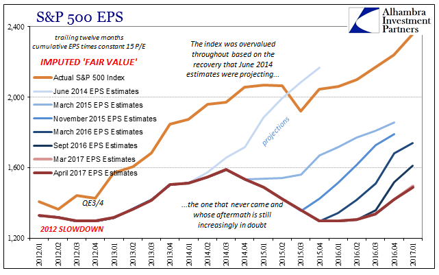
There is one predictor of the market that we as investors should pay attention to…the market itself. It is always right, and the price is always the price, regardless of how over-valued or under-valued it may seem. It does things it “shouldn’t” do all the time, and just as often doesn’t do things it “should”.

One of our goals at IronBridge is to remove as much emotion as possible from investment decisions, and let data drive our actions as we strive to understand how we may be mis-understanding the markets. We think listening to the market rather than trying to tell it what to do is a better strategy, but of course, we’re probably biased.


Macro Insight

Show Me the Money

The first month of every quarter brings us earnings season. This is the time companies report their quarterly earnings from their just completed 3 month quarters. Firms have 45 days to report, but many of them cluster their reporting around the same time similar companies report. This past week, for instance there were 9 S&P 500 companies reporting earnings; 6 of the 9 were banks. However, only 5% of S&P companies have reported 3Q 2017 earnings. In this issue we look at some takeaways from earnings seasons.

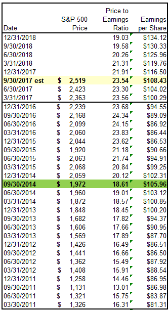
The top portion of the table below lays out the current S&P 500 earnings picture with the current reporting season highlighted in yellow. The quarter ended September is expected to bring $29.80 in reported earnings per share, taking the trailing 12 months earnings to $108.43. This is year over year growth of almost 22%, a very good number. Couple that with an S&P 500 price of $2,519 and it results in a Price to Earnings ratio of 23.5x, which remains very high from a historical perspective.

The remainder of the table shows the longer history of earnings which helps put the current situation into context. The $108 in earnings will be an all time record high. But, if we look at a few of the prior all time highs, the $108 becomes less impressive.

Notice that back in the same quarter in 2014 earnings were $105.96. In other words, here we are three years later, and earnings are only $2.50 higher, or around 2.3% growth during that time. This equates to less than 1% earnings growth annually over the past 3 years, and if we adjust for inflation, it becomes negative real growth.

Additionally, with only 5% of constituents reporting, the $108 remains far from a lock. It’s entirely plausible that the $108 is not reached. This would make today’s exuberance surrounding record earnings even more questionable.

Notice in the table the 2018 expected earnings are a whopping $134 per share? Ignore any future estimates as it is a habit for Wall Street to grossly overestimate future earnings. It helps them fill a narrative to sell valuations, but future earnings have a very consistent habit of starting out way too high, only to be worked backward as the period gets closer. More on this “phenomenon” can be found here, but needless to say there are some conflicts of interest surrounding earnings estimates as the higher earnings estimates, the lower future P/E ratios are. The chart shows how “if” earnings do reach the $130s, P/E ratios at today’s prices would indeed fall to 19x. We won’t hold our breath.

In the Market Microscope section we expand on earnings, P/E ratios, and estimates and how they have impacted share prices historically. It seems there are times when earnings matter more, and times when earnings matter much less. can you guess which period we are in now?

One clue is the fact P/E ratios have remained elevated above 20x for 3 years straight now. Another was alluded to earlier. From a peak earnings to peak earnings perspective, growth just has not been there.

In the Market Microscope we look at a popular valuation technique as well as the historical relationship between earnings and share prices. The conclusion remains: valuations are very lofty.


Market Microscope

Just How Over-Valued is the Market?

A famous valuation quote from Warren Buffett states, “the price you pay determines your rate of return”, and while Wall Street and the media would like us to stay focused on the big 22% expected jump in year over year earnings, we look past the short term and recognize the longer term risks in a market that remains priced too high based on fundamentals. This is why we also use technical and sentiment analysis to make investment decisions.

Is the Market Overvalued?

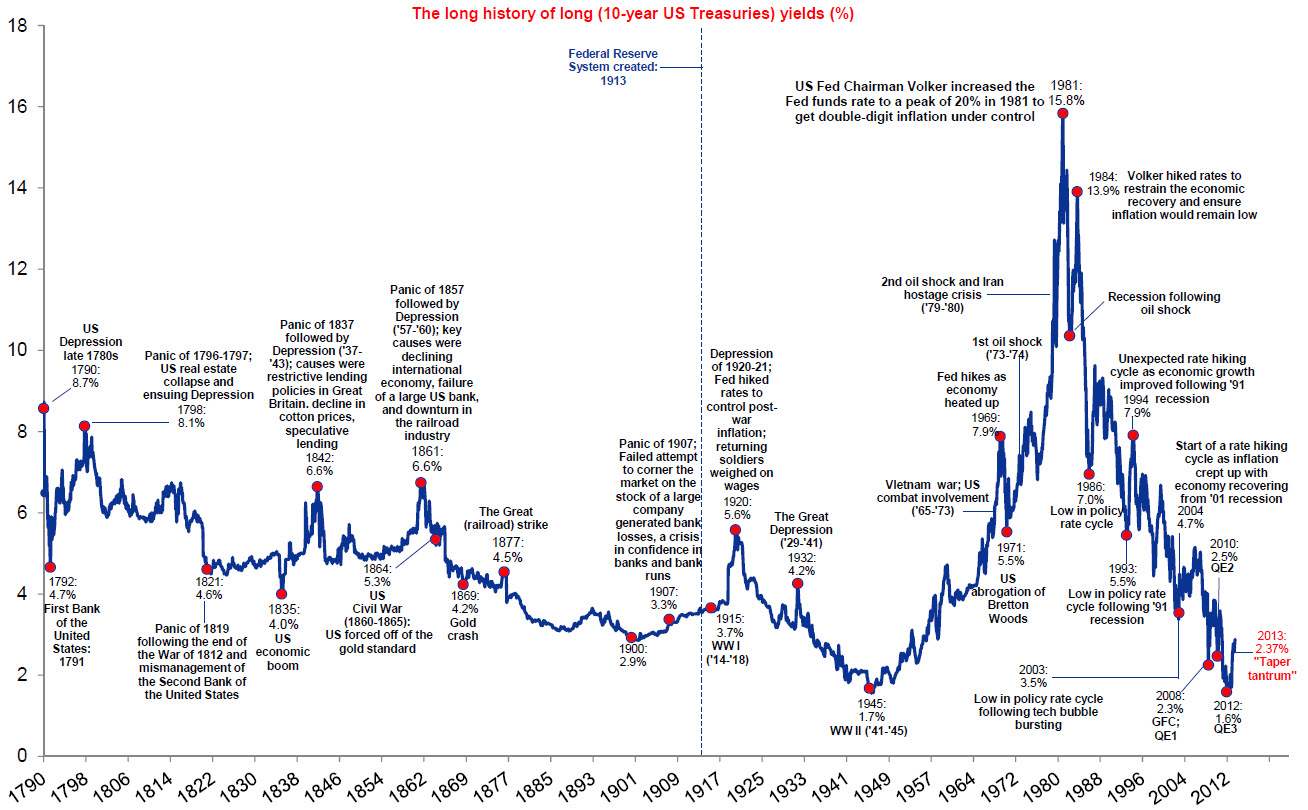
The “Buffett Indicator” got its name, of course, from Warren Buffett, but it got its fame from being the one indicator Warren Buffett turns to to decipher the market’s valuation question. “Is the market over or under valued?” The Buffett Indicator is shown below as built by Jesse Felder, of the ‘Felder Report’.

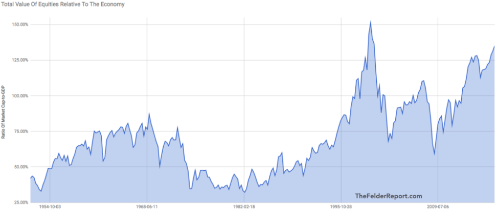
This indicator takes the market capitalization of equities (price x shares) and divides that number by the GDP of America. The ratio, he proposes, is a good barometer of whether equities are over or under priced.

The chart goes back to the 1950s and does reveal the market currently is the 2nd most expensive it has ever been, when compared to GDP, and heading higher. This surpasses the valuations leading up to the financial crisis (which saw a P/E ratio peak in 3Q 2007 at 19.4x earnings compared to today’s 23.5x). The only other time this ratio was more extreme was during the 1990s .com bubble.

Additionally, Mr. Felder runs the Buffett indicator through a statistical test of its predictive power using actual 10 year average returns. Impressively the indicator does do a wonderful job predicting 10 year actual returns. What does it say now?

The Buffett Indicator is showing an expected annual return of (-2.9%) over the next 10 years. It’s also only the 2nd time in history it has predicted a negative 10 year expected return. The only other time negative returns were predicted was during the latter stages of the Tech Bubble, which actually came to fruition as the blue line on the graphic reveals the negative real returns during the period of 1998 through 2008. This means that today’s buy and hold investors, based on this indicator, should expect to lose money in the stock market over the next 10 years.

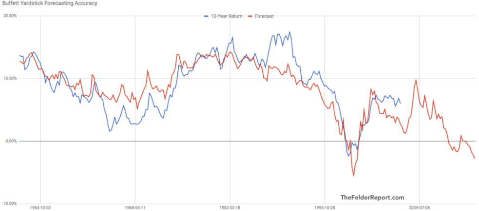
Notice too that since the year 2000 expected 10 year annual returns have never been above 10%? Based on the Buffett Indicator, valuations have been historically high for over 2 decades, not offering value investors as good of real long term investment potential as the past. Compare the 2000s to the 50 years prior. The indicator offered multiple periods throughout the 50s and 80s with 10%+ expected annual returns. Those days have been long gone as investors must now navigate public markets that have been perpetually overvalued.

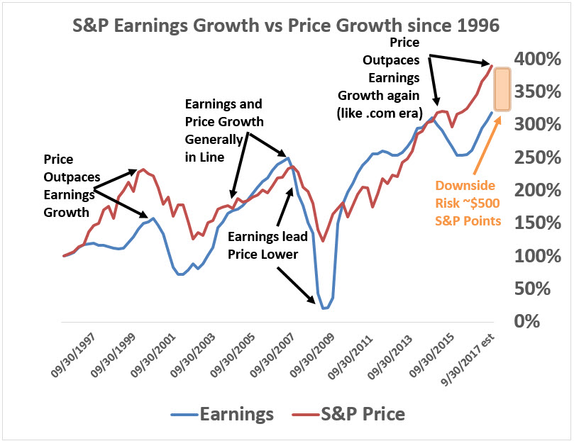
Zooming into the last 20 years we have built our own indicator which helps show us what kind of near term risk we could have in this market. The following chart indexes the S&P price growth compared to the S&P’s earnings growth over that period. Price is shown in red with earnings in blue. We can learn a few things:

  1. Earnings and prices have generally risen and fallen together. This makes sense since earnings are supposed to be a driver of share prices. The chart of the last 20 years reveals that, yes, generally share prices and earnings rise and fall together, but there are times this isn’t true.
  2. Similar to the Buffett Indicator, which shows us when the market’s price gets ahead of GDP we also see times when the market’s price gets ahead of company earnings. This occurred during the .com bubble and is pointed out on the graphic. This also is occurring now.
  3. The market’s price and earnings were highly correlated and generally rose together during the mid and late 2000s and from 2010 through 2014. This chart supports the fact that the financial crisis’s price meltdown was at least somewhat driven by falling earnings. Whereas the .com price meltdown was more likely, at least initially, a mean reversion since price growth got so far ahead of earnings growth. However, once price started to fall, earnings also eventually started to fall as well, compounding the pressure on prices.
  4. Today’s situation looks more like the .com bubble than the financial crisis. Earnings are essentially where they were 3 years ago, yet the S&P’s price is over $500 points higher. This equates to a roughly 25% risk of decline for the S&P to get back in line with earnings and is highlighted in orange on the graphic. But, one other thing we can learn from the chart is that price and earnings tend to over and under shoot their mean reversions. If we were to see a decline in the S&P start soon, it is likely earnings would also eventually start to decline. This would exacerbate the current $500 point gap between the S&P and where earnings suggest the S&P should be.
  5. One final thought on the chart and another way to interpret it. Really this chart is getting back to price to earnings ratios. Another way to look at the potential downside risk is to see that back in September of 2014 the S&P had a P/E ratio of 18.61x on earnings of $106. Since then the S&P’s earnings are essentially flat (up 2.3% in 3 years) yet price is over $500 higher, resulting in a current P/E of 23.54x. The S&P’s price has risen almost entirely due to multiple expansion rather than earnings growth, and this has occurred in an environment where interest rates are actually rising (if they were declining, one could potentially justify multiple expansion). There is risk that the P/E reverts back to that 18.61x level, and $108 of earnings * 18.61= an S&P of $2000.

What does it all mean? By almost every fundamental measure markets are over valued and have been overvalued for years, yet price has continued to rise. This is similar to what occurred during the .com bubble. Fundamentals have suggested a top for years, but clearly that has not worked, at least not over the short term. Investors need more tools in their toolbox than just traditional fundamental analysis if they want to be successful over both the short and long terms. This is why we also use technical as well as sentiment analysis to help us navigate the markets. During certain times these techniques carry a lot more weight in the market’s actions than fundamentals. We think one of those times is now.

Some technical analysis is discussed next.

Equity Technicals

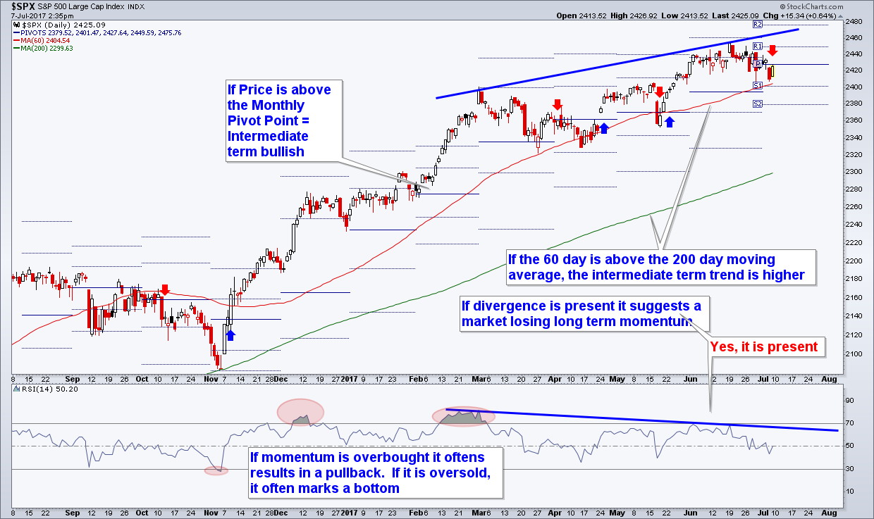
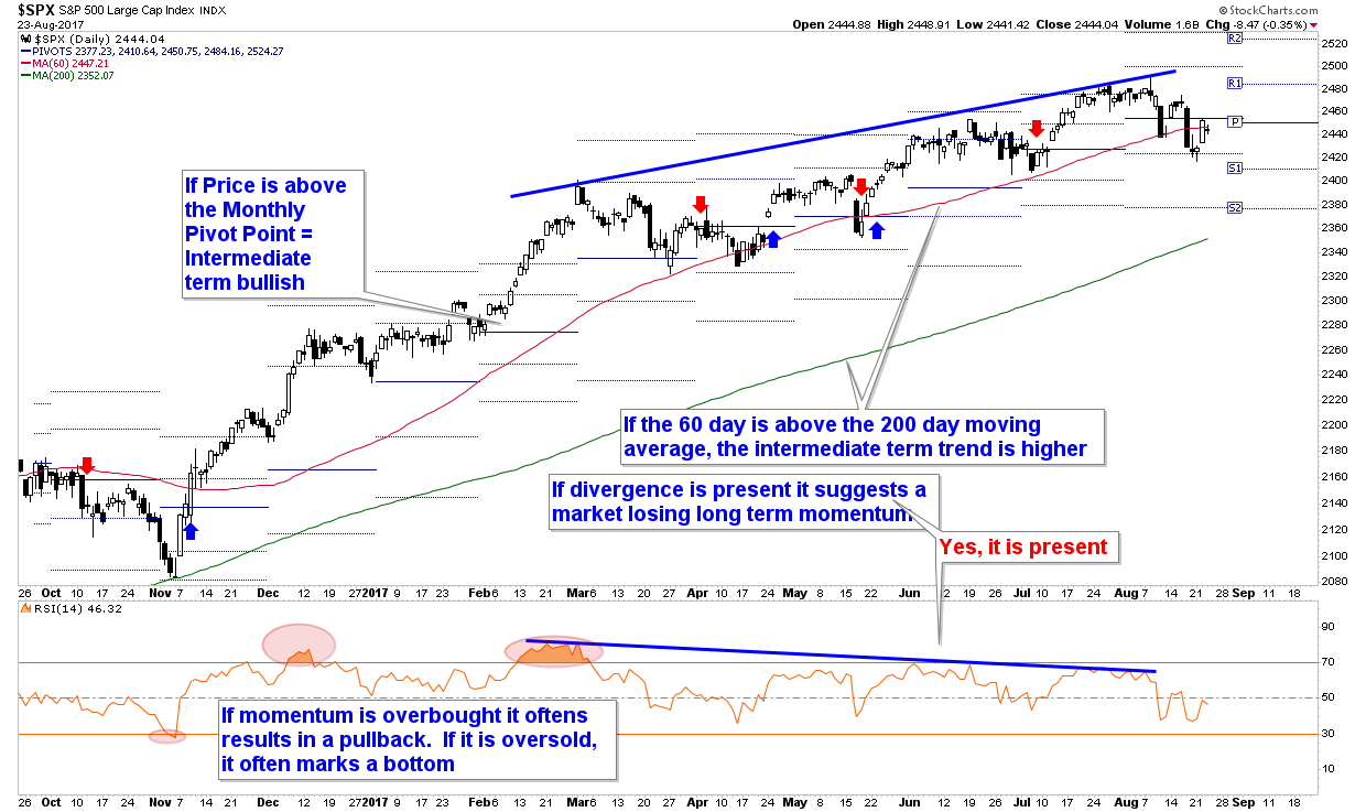
The chart below is one of hundreds we follow each week, but we like this one right now because it provides a succinct picture of 4 key short term (days to weeks) and intermediate term (weeks to months) technical indicators for the market.

But before we get into the chart, let’s take a step back and discuss why we even care about technical analysis and put so much weight on it?

Simply put, because technical analysis focuses on price first and foremost and price is what makes us money or not. Fundamental analysis on the other hand largely focuses on earnings, which may or may not be correctly reflected through price and thus may or may not actually affect the performance of our investments, especially over the shorter time frames.

Case in point: the Buffett Indicator has suggested being short stocks for two years now (the expected negative 10 year returns), yet the market has continued to rise, rather substantially. Valuations are stretched, but can get even more stretched before succumbing to their more natural state. At some point GDP and earnings will likely carry more weight in the markets’ price decisions, but for the past few years, that has not been the case. Technical analysis, on the other hand, has largely been beneficial in navigating the markets as the trend has largely been up and the charts have largely shown that. 

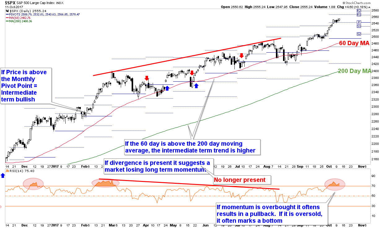
There are four key indicators on the chart:

  1. Moving Averages – Moving averages help smooth out price action. On the chart we have two moving averages, the 60 day and the 200 day moving averages. When price is above its 60 day moving average, it reveals the short term trend is bullish, and when price is above its 200 day moving average, it reveals the intermediate term trend is higher. Additionally, when the 60 day moving average is above the 200 day moving average it shows the short term trend’s momentum is stronger than the 200 day…all of which is bullish. Price has remained above both of these averages throughout the last 11 months.
  2. Pivot Points – Pivot Points are a trend indicator and are shown by the horizontal blue lines that adjust each month. October’s Pivot Point is $2495 while November’s is currently $2544 (but is fluid until the calendar officially switches over to November). When price is above the Pivot Point (which it is now), it’s a sign that price today is above last month’s average price. That’s a bullish sign. Additionally, when the Pivot Points are rising, that’s also a bullish sign since the average monthly price is also rising.
  3. Momentum Divergences – When price is rising but momentum indicators, such as the RSI Indicator at the bottom of the graphic, are not, it presents a case of waning interest by market participants. On the chart, shown by the red trendlines, there was a divergence that was forming during the price move from the March high to the July high. As prices made new all time highs, momentum was not confirming the trend. This presented a small problem for the market, which it wound up fixing with the August pullback. The pullback flushed out the weak hands and momentum has rejoined price now with an overbought reading accompanying the new price high in September and October. This excessive momentum now presents another short term problem the market will likely need to work out.
  4. Extremes – When price moves too far too fast, that can also be small issue for the market since shorter term focused market players are more likely to take some money off the table once momentum has slowed. Notice on the chart, highlighted by the red ellipses, there have been 3 overbought scenarios over the last 11 months. The scenario back in December lead to a sideways market that lost more time rather than price, however, the overbought condition in March resulted in a larger pullback as well as a two month period of net sideways market action. The overbought readings helped identify when price was ripe for a stall, and we are at that point again today with the overbought status now on the market.

Although the technicals reveal an overbought market condition, the uptrend remains intact. Overall the chart is bullish as price remains above its moving averages and Pivot Points as well as in a trend of rising Pivot Points and moving averages. We may see some short term weakness given the overbought condition, but it’s not expected to damage the currently bullish picture.

The technicals continue to paint a bullish picture, and as a result we remain fully vested. At some point this market will rollover, and when it does the technicals should also help warn us that the risk of a larger pullback is upon us.

When we couple the technicals with fundamentals and prevailing sentiment we get a much better picture of the overall health of the market. Using fundamentals alone would not have been a good strategy over the last few years, and there will be times when relying on technicals alone also won’t be an ideal strategy.

For now we lean on the technicals and allow price to be our guide first and foremost as we continue to be participants in this bull market.


Our clients have unique and meaningful goals.

We help clients achieve those goals through forward-thinking portfolios, principled advice, a deep understanding of financial markets, and an innovative fee structure.

Contact us for a Consultation.

Disclaimer This presentation is for informational purposes only. All opinions and estimates constitute our judgment as of the date of this communication and are subject to change without notice. > Neither the information provided nor any opinion expressed constitutes a solicitation for the purchase or sale of any security. The investments and investment strategies identified herein may not be suitable for all investors. The appropriateness of a particular investment will depend upon an investor’s individual circumstances and objectives. *The information contained herein has been obtained from sources that are believed to be reliable. However, Ironbridge does not independently verify the accuracy of this information and makes no representations as to its accuracy or completeness.  

Filed Under: IronBridge Insights

Time-Frame Diversification, Seasonality and a Deep Dive into Stock/Bond Relationship

September 29, 2017

Introducing a new way to diversify portfolios based on market cycles. Plus, September is historically the worst month for stocks, but not this year. And we take a deep dive into how bonds and interest rates affect stock prices.

[maxbutton id=”1″ url=”https://ironbridge360.com/wp-content/uploads/2017/09/IronBridge-Insights-2017-09-29.pdf” text=”View the Full Report” ]


Insights Overview

Macro Insights:  Did you know that September is historically the worst month for the stock market? Not this year. It’s never a good idea to base decisions on statistics alone, but the 4th quarter is historically the most bullish period for stocks.

Portfolio Insights:  A frequent topic of conversation within our firm is how poorly traditional asset allocation models address real portfolio risk. We believe one of the most overlooked aspects of portfolio management is diversifying your timeframe, or how long you own an investment.

Market Microscope: The bond market had a busy week with seemingly no real catalyst. However, the charts helped us get ahead of the recent change in trend as the odds continue to increase the market has resumed a trend of rising yields. There are a few ETFs that capitalize on rising yields.


On Our Radar

Politics: Capital Hill has now shifted its focus to a revamping of the tax code as President Trump released his latest version on September 27.

Federal Reserve: The Federal Reserve met September 19 & 20 as they confirmed one more rate hike will likely occur in December as well as providing a schedule of the planned selling of their investments starting in Oct. The pace of the selling is slow in the grand scheme of things, but it will be interesting to see how the bond market responds.


FIT Model Update: Uptrend

Fundamental Overview: The popular economist Robert Shiller recently proclaimed in a news article that the stock market looks today “like it did prior to the 13 other bear markets”. His criteria included 1) high valuations, specifically a CAPE ratio above 22.1, 2) >13.3% year over year earnings growth, and 3) low volatility.

Investor Sentiment Overview: The week of September 18 saw the smallest range in the S&P 500 in over 40 years as the Index moved within a price range of less than 0.5%. The prevailing theme of all time low volatility continues.

Technical Overview: The markets continue to largely move higher and we continue to participate in the trend. As long as the technical signs remain bullish, we will remain vested. A key level we are watching for the month of October is S&P $2485. As long as it holds we will remain fully vested.


Focus Chart

Years that End in 7

Some statistics suggest the 4th quarter is the strongest quarter of the year for stocks. Other statistics, such as those portrayed in the graphic below, suggest the market could have a very difficult fourth quarter. Years that have ended in 7 for some reason have been very bad years for the stock market, especially the 4th quarter.

Could a similar fate be awaiting us this year?

Statisticians will tell you that having less than 30 data points makes it virtually impossible to accept a conclusion using statistics alone, so this chart probably shouldn’t carry much weight in market analysis.

In the Macro Insights as well as the Market Microscope sections we take a look at some of these statistics as we enter into the 4th quarter. Our conclusion is that market statistics are nice and often fun to talk about, but they are not very strong support for an investment thesis.


Portfolio Insight

Adjust Time Frames Based on Market Cycle

We met with a new potential client this week who had accumulated a large balance in their savings account. This family has been very successful, are incredibly intelligent, and pay attention to markets. But they have a quandary: What do you do with cash now?

They were nervous that if they invested in stocks this late in the cycle, they would risk losing a substantial amount of their principle. However, they were also concerned about having a large part of their portfolio being stagnant and remaining in cash. This is very common after witnessing the current expansion.

A frequent topic of conversation within our firm is how poorly traditional asset allocation models address real portfolio risk. We believe one of the most overlooked aspects of portfolio management is diversifying how long you own an investment. This time frame diversification must change based on where we are in the current market cycle.

When addressing the question of cash, and portfolio strategy in general, we believe a different approach is required. This approach is intuitive, but not implemented by the average portfolio manager or investor. This approach adds a layer of diversification that specifically addresses how long investors should own an investment within their portfolio.

The chart below shows the S&P 500 from the 2009 low separated into three phases: Early Cycle, Mid-Cycle and Late Cycle. We have identified a few of the characteristics typical of each cycle’s behavior.

Early in the cycle (think 2009 or 2010), you must anticipate having positions that are more volatile, because the market and economy are typically emerging from a recession, investors nerves are frayed, and there is uncertainty whether the early recovery will continue. Early in the market and economic cycle, the risk of loss is HIGHER over a 1-year timeframe than a 5-year timeframe, because the chances of recovery are substantially higher after seeing a large market loss and economic recession. Your timeframe over which you expect to earn profits must be extended.

Late Cycle investing is just the opposite. The risk of loss late in a cycle is much LOWER over a 1-year timeframe than a 5-year timeframe, because the chances of another recession increase as timeframes are increased. Late in the cycle, investors should reduce the length of time they expect to hold investments, and have multiple exit strategies in place.

We believe we are late in this market cycle. We would not be surprised if a major top happened next month, but we would also not be surprised if it happened 5 years from now. By diversifying your expectations, particularly about how long you may own any particular investment, we believe you can more confidently invest in any part of the cycle.


Macro Insight

‘Tis the Seasonality

Any change or pattern that repeats over the course of a year can be said to be seasonal. Historically September has been the worst performing month, averaging a loss of (-1.1%) over the last 20 years. During that span only 45% of Septembers have seen positive returns. However, 2017 was having nothing to do with that historical trend as this year’s September has been one of the better ones, up 1.4% (at least through 9/27).

The chart below looks at how often each month was positive, and the average return for each month over the past 20 years. First, across the top of each bar is the percentage of months that a particular month saw a positive return. September was positive just 45% of the time. October, however, has had positive returns 74% of the time, the 2nd most reliable month of the year.

Second, the numbers in the bottom of each bar reveals the average monthly return during this 20 year span. September’s average return over the last 20 years has been a loss of (-1.1%), the worst of all months. The opposite can be said for the next 3 months which boast some of the most bullish statistics of the year.

Going back even further, to 1950, reveals a similar outcome. September returns on average were down (-0.67%) with positive returns just 29 of the 67 years. However, the 4th quarter has a positive trend when going back to 1950 as well. Since 1950, the S&P in October is up on average 0.76%, November it has been up an average 1.38%, and December up an average 1.54%. So all together the 4th quarter historical average return was 3.5%.

Do we make portfolio based decisions based on statistics alone? No, of course not and neither should anyone, but we are fully aware that the market is entering its sweet spot known as the “best seven months” which runs from October through April.

Why is this the case? We really don’t know, but we do know that any one year is not bound to statistical averages so neither are we. If September 2017 doesn’t prove to us how a data point can buck a historical trend, then perhaps October of 2008 and October of 1987 can teach us something. These months saw a (-17%) decline and (-22%) decline, respectively, even though October is the strongest month on average historically.

You are likely to hear a lot about the “best seven months” in the mainstream media over the coming weeks. Just remember that statistics are more of a guide rather than a rule. We use multiple signals to help warn us if we are to see a 4th quarter that is going to look more like the average or move contrary to it. For more on seasonality, check out the Market Microscope section which looks at the market’s typical pattern combining the 11 years since 1900 that all ended in 7 (1907, 1917, 1927, 2007, etc). It suggests a significantly different outcome to the year.


Market Microscope

The Hidden Relationship between Stocks & Bonds

What do Rising Interest Rates Really Mean? First, let’s look at the bond market to see why we think bonds are a timely topic today.

On Wednesday, September 27, we saw a relatively large move in the bond market, with no real apparent catalyst. The media, not surprisingly didn’t give it much coverage, but it is something we had been watching and expecting. Treasury prices, especially the longer dated ones, fell sizable. TLT, an ETF that tracks the 20+ year Treasury bond market, fell 1.5% on the day and followed through with another 0.5% decline the following day. Why do we think this is important? Because it is conceivable that bonds have renewed their falling price/rising yield trend that started back in July 2016.

The next chart shows how bond prices indeed peaked back in July 2016, fell 18% rather swiftly into December 2016, and have since been clawing their way back. However, that rally has now stalled and the first leg of a 3 legged stool may have just cracked, as labeled 1,2,3 on the chart. Price has broken below the uptrend in place all of 2017, revealing a change in short term price momentum from up to down.

Trend Remains Down for Bonds

A change in the trend of bond prices is important for a number of reasons, but most importantly to investors is the 1) direct impact it has on bonds and also 2) the direct and indirect impact bond yields have on stocks. Stewards of finance spend a lifetime learning the intricacies between the bond and stock markets, so we are just going to be able to scratch the surface in this report, but hopefully it will provide us a better understanding of the risks (and rewards) that could come from a trend change in the bond market.

First, let’s take one more look at the bond market to see why we are increasing the odds that the next leg down in bond prices is upon us. The next chart zooms into the last 11 months and reveals that the long term Treasury bond rallied in 2 equidistant trends off the March and May lows.

Beginning in July, the third move of that uptrend did not match the speed of the prior two trends. This is revealed on two sections of the chart above. First, price was not able to reach the parallel trend channel line shown in blue that was formed from the prior two peaks, and second, through the use of a momentum indicator shown at the bottom of the graphic. Although price wasn’t able to reach the trend channel target, price did squeak a new high in August. However, it was on lesser momentum as measured by the RSI indicator. Lower momentum in and of itself is not that big of a deal, especially since price came back down in September and appeared to hold its lower trend channel support, however, a breakdown of that support this week increases the risk that this rally in bonds that started back in December may be over.

A falling bond market means that yields are rising, and if you are an income investor, could mean you are losing out, primarily through the opportunity cost of not being able to buy bonds that now offer a higher yield than was previously obtained. This is one way that falling bond prices affect investors. An example may help.

Bond Prices Fall as Yields Rise

Say you buy a 5 year bond right now that pays 5% yield. You plan to hold to maturity and collect the yield. In one year a very similar bond is issued, but it is now paying 6%. In such a scenario it is likely your bond price has now fallen to account for the fact that an investor could now buy essentially the same bond, but get a higher yield. Why would an investor buy the 5% bond now when they could get 6% instead? Price thus drops on the 5% bond to compensate. Meanwhile, you, the owner of the 5% bond, are stuck with a bond paying you below market yields. You could sell the bond, but you would lose in price what you would then gain in yield buy reinvesting in the higher yielding bond. Falling bond prices and thus higher bond yields means you would miss out on the opportunity for higher returns, so you lose that opportunity, or spread, during a rising rate environment. The two charts below help show how moves in yield affect prices. A 2% rise in interest rates would typically result in a 10% drop in a 5 year bond’s price.

Geek Out with the Finance Nerds

The 2nd way falling bond prices affect portfolios is a more indirect way through equities.

First off, if a firm has any debt its earnings are generally decreased when interest rates rise. This is because the cost to service such debt, the interest rate, is incresing. The graphic below is from Whole Food’s (ticker:WFM) Fiscal Year 2016 profit and loss statement. Notice that as of September 2016 WFM was paying $41MM in interest expense each year? After digging into their annual report we discovered this interest equates to the 5.2% yield they pay on their $1B loan due in 2025. What happens to this number if in 2025 Whole Foods must refinance at a 10.4% rate (essentially a doubling of interest rates)? Their interest expense would then become $82MM, up from 5% to almost 10% of their pre-tax profit. Rising interest rates directly affect profits negatively for most companies that have to borrow to fund their businesses.

In our opinion, even more important than the direct effect rising yields have on equities is the indirect effect they have on stock prices. If interest rates double in two years, Whole Foods won’t have to worry about that for another 7 years (their bond isn’t due to be paid back until 2025), however, they will have to worry about that if they need any more money between now and then. In reality, the indirect effect the doubling of interest rates would have on their share price is likely much more important to their share price than the interest expense they pay. Here’s why:

The next chart reveals something finance geeks (like us) are very familiar with. It represents the calculation of the Discount Rate used when “discounting future cash flows back to today” in order to come up with a present value for the company’s share price. Here’s how it works: As an investor you want some sort of return on your equity. Let’s assume that bond yields are 5% and equity return expectations are 10%. If 50% of a firm’s capital structure is made up of debt and the other 50% is equity and the company pays no taxes, the Weighted Average Cost of Capital (WACC), as demonstrated to the right, would be 7.5%.

So what happens to the equation if interest rates double to 10%? The knee jerk answer would be to adjust the bond yield portion of the same equation to derive a WACC of 10% (10%*50%+10%*50%). However, this would be incorrect as the cost of equity actually must always be higher than the cost of debt, because of the liquidation, legal, and payment pecking orders debt has over equity. In other words, the “cost of equity” is dependent on the cost of debt, making the cost of debt the most important factor in deriving a discount rate (discount rate is also known as IRR-internal rate of return, expected return, or cost of capital). Furthermore, there are arguments to be made that the relationship between the cost of debt and the cost of equity is not linear and in many ways becomes exponential, but for this example lets just assume that a doubling of the cost of debt results in the doubling of the cost of equity as well.

Using the Whole Foods financial statements we built a table comparing these two scenarios. When there was a 7.5% cost of capital that then doubles to 15%, we see a share price that is cut in half by 51%…all because of an increase in the cost of capital. Per the opening of this section, a doubling of interest rates results in an ~5% drop in earnings through direct increased interest costs (which we have actually ignored in this analysis), but that same doubling of interest rates actually has a much more profound effect on the share price through its indirect effects by means discounting the future. The same Net Income delivers a much lower share price, all because of a change in the interest rate.

The table below helps reveal the “hidden” interest rate risk (note that growth rates assumed were backed into based on the $47 per share purchase price paid by Amazon for Whole Foods on June 16, 2017).

If interest rates have started another round of rising, then they should eventually lead to higher discount rates and increased interest expenses. This in turn will then lead to lower equity prices. Even in the scenario as laid out in the example where earnings manage to maintain their levels, in a rising interest rate environment share prices feel pressure. This is probably one of the biggest hidden risks to the long-term bull market nobody is talking about, as a rising interest rate environment is not a good environment for stock prices.

One other way to think about this is through the lens of a stock versus bond investment decision. Imagine a world where you could get a U.S. Treasury Note that yielded 10% per year, guaranteed (would be nice, huh?). It would be tough not to choose to invest in U.S. Treasuries at 10%. In order to not invest there and instead invest in equities you would need to expect returns that are likely significantly greater than 10% (so, thus, the discount rate also increases). As interest rates move up in yield it makes bonds more appealing from an investment standpoint, adding to the pressure on U.S. stocks. It’s hard to find a time in history where rising interest rates were actually good for equities. Given the context above, it’s easy to see why it’s tough for equities to excel in such an environment.


US Equities

Seasonality: Interesting, but Not a Part of Decision-Making

In the Macro Insights section we discussed how statistics can be fun to talk about, but can also be dangerous to use for investing purposes. Shown on the next page, courtesy of Tom McClellan who has created numerous technical indicators and writes a popular technical focused newsletter called ‘The McClellan Market Report’, is a very similar example using historical averages to project what the market might do in the future..the difference is the data in the following chart is only from years that end in the number 7. It also concludes the exact opposite of what the statistical analysis in the Macro Insights section concluded.

For some reason, going back over 100 years, the years that have end in 7 have collectively had a very difficult time, especially in the final half of the year. It could be because of the presidential election and political cycle or because of larger, underlying cyclical currents in the markets, but regardless the why, the contrasting chart shown below and based around similar market return statistics provides some great talking points on the validity of statistics. Analyzing these charts certainly supports the popular saying that “you can say anything with statistics”.

On one hand, as was discussed in the Macro section, we look at the S&P since 1950 and we see a 4th quarter that historically has done very well. But, on the other hand we look at the market during all the years ending in 7 and we see a very difficult 4th quarter looking back at us. These examples help solidify our position of not allowing statistics to drive our investment thesis.

Now, onto the chart below.

From October 3 to the end of the year (the 4th quarter) in the years ending in 7 resulted in an average loss of over 10%. This is in stark contrast to our earlier research which suggested a 3.5% average gain during this period. To reconcile the two we must recognize that the years that do not end in 7 were much better on average than those years that end in 7. The interesting parallel McClellan makes to the below chart is that the run up in stocks thus far this year has performed fairly similar to the average performance of all the years that end in 7. But the real takeaway from his analysis is the risk that is directly in front of us at we turn the page to October.

Those that are familiar with the history of the markets will recognize that the 1987 crash occurred in October, and that may be an anomaly, so McClellan does us a favor and disregards that year (the blue line). Even if we exclude 1987’s crash we notice that stocks still on average fell over 5% during the month of October in years that end in 7.

So what does it all mean?


Should we put all our money to cash before the inevitable October crash of 2017 occurs? Or, should we put all our cash into stocks in preparation for the inevitable 3.5% 4Q 2017 returns that will occur? Doesn’t this kind of feel like the battle of wits confrontation in the movie ‘The Princess Bride’ paraphrased below? Man in Black: “Alright, where is the poison? The battle of wits has begun! It ends when you decide and we both drink, and find out who is right…and who is dead. Vizzini: “But, it’s so simple…I clearly cannot choose the wine in front of you…but, I clearly cannot choose the wine in front of me…but I simply cannot choose the wine in front of you…so I clearly cannot choose the wine in front of me” Statistics like these are nice for cocktail parties, but usually not reliable enough to drive investment decisions.


Our clients have unique and meaningful goals.

We help clients achieve those goals through forward-thinking portfolios, principled advice, a deep understanding of financial markets, and an innovative fee structure.

Contact us for a Consultation.

Disclaimer This presentation is for informational purposes only. All opinions and estimates constitute our judgment as of the date of this communication and are subject to change without notice. > Neither the information provided nor any opinion expressed constitutes a solicitation for the purchase or sale of any security. The investments and investment strategies identified herein may not be suitable for all investors. The appropriateness of a particular investment will depend upon an investor’s individual circumstances and objectives. *The information contained herein has been obtained from sources that are believed to be reliable. However, Ironbridge does not independently verify the accuracy of this information and makes no representations as to its accuracy or completeness.  

Filed Under: IronBridge Insights

Broken Window Fallacy, Portfolio Construction & Performance after Hurricanes

September 15, 2017

Despite hurricanes, floods, fires and threats of nuclear war, markets continue their relentless push higher. In this issue we analyze the economic impact after previous hurricanes, discuss why financial stocks are leading the markets, and feature a discussion on how we construct portfolios.

[maxbutton id=”1″ url=”https://ironbridge360.com/wp-content/uploads/2017/09/IronBridge-Insights-2017-09-15.pdf” text=”View PDF of this Report” ]


Insights Overview

Macro Insights: Is there an economic silver lining with hurricanes and other catastrophes? The Broken Window Fallacy reminds us that most of the time the economics surrounding catastrophes are zero sum.

Portfolio Insights: We “lift the hood” on investment strategy to give an overview on how we construct portfolios, as well as give current positioning in each of our subcomponent sleeves.

Market Microscope: Do hurricanes affect the markets? We look at the economic affect of previous hurricanes for the answer. The markets continue to give us mixed signals as price continues to rise but on weaker and weaker internals. Eventually this will result in a more meaningful pullback, but until that occurs the trend remains higher.


On Our Radar

North Korea: Tensions are still high, and seem to change every few days. However, markets continue to remain calm even when tensions escalate.

Hurricane(s) Aftermath: Irma’s track to the north was postponed long enough to spare Miami the worst of the storm, still some parts of the Caribbean and Florida will never be the same. Our thoughts are still with those in Houston recovering.


FIT Model Update: Uptrend

Fundamental Overview:  The Bank of Japan now owns over 74% of all ETF assets in that country. This means the Japanese Central Bank is the largest owner of equities in Japan. This also likely means price discovery may be lost as they likely are a buyer at any price. The Swiss National Bank is performing a similar role. Central Banks no doubt are distorting markets.

Investor Sentiment Overview: The popular University of Michigan sentiment index just posted an all time high reading of 65% of investors being optimistic that stock prices will be higher in 12 months. The only other times readings this high were in 2015 and 2017, both preceding meaningful pullbacks.

Technical Overview: The market continues to sing a similar tune. New highs are being made in a handful of stocks, which is lifting the indices, but breadth and other measures of market health are not showing as strong of signals.


Focus Chart

Interest Rates are Driving Financial Stocks

There was some relief in the financial sector this week once the verdict on Irma’s damage was better known. However, we must be very careful not to confuse causation and correlation. The more relevant driver of financials this week was likely interest rates, which have started to move higher. Higher yields tend to benefit the financial sector, specifically banks and insurance companies. This primarily has to do with the funding components of their businesses that rely on higher yields for lending.


Macro Insight

Beware: The Broken Window Fallacy

What economic impacts will Hurricanes Harvey and Irma have?

The broken window fallacy gets its name from a story developed by the French economist, Frederic Bastiat, to help explain why breaking a window does not increase economic activity. The story is about a son who inadvertently breaks a window. His father must find a glazier to repair the window as the town onlookers conclude that breaking windows must be good for the economy since the glazier will receive new funds which he then can use to buy more goods.

The key to the story is the townspeople are missing an inherent and “unseen” third party. Money went to the glazier but at the expense of some other third party. The income helps the glazier, but it hurts the other third party that otherwise would have received the funds. In other words, the money is just taken from one pocket and put into another.

Bastiat takes his theory a step further. He concludes that actually replacing a window, a home, or many other things destroyed during catastrophes or war is actually a net negative drain on the economy. He argues war destroys not only the existing capital, but accumulated capital built up over years. It also forces investment into specific areas that otherwise may not have been the best investment option. A home is a good example of this. Approximately 63% of homes in the U.S. are owner occupied. These homes aren’t used to create an income stream, they are used to survive. Money put into an owner occupied home does little to actually stimulate the economy. It takes income that otherwise could have been spent or invested elsewhere and puts it into a largely unproductive asset of the economy. The theory argues that spending money on non-productive assets, such as an owner occupied home, may actually be a net negative for the economy as capital is parked in an unproductive vehicle.

With Hurricanes Harvey and Irma forcing their destruction upon millions, the fallacy is again in the spotlight. The victims of the storms are all now “forced” to reinvest in their homes. The money they spend on their homes is money that could have been spent or invested elsewhere, in more productive assets. Many will also borrow to fund this spending, which may on the surface suggest a boon to the economy, but this just takes money from the pocket of the future and puts it into the pocket of today. There may be some short term benefit, but it’s a burden as that loan is repaid. At a minimum disasters have a net neutral affect on the economy, but more likely they may actually be a drag on it.

So should we expect the economic impacts of Hurricanes Harvey and Irma to be a boon for the U.S. economy? It’s not likely, and a research study focused on the hotel industry performed by CBRE and summarized above reveals this unlikelihood. It should be noted they admit that quantifying the full impacts of disasters (both measurable and immeasurable) is impossible, but their attempt reveals the inconclusiveness. In two cases the GMP (Gross Metro Product) during the quarter of the event was higher than the prior year’s average, but in the other two examples, the GMP was lower. If we see a jump in Houston’s GMP this quarter as a result of Harvey, it is likely that jump will come at the expense of either 1) other nearby cities where workers have migrated from or 2) will be offset in outer periods as required maintenance and other upgrades to houses are just pulled forward to today and/or in the case of debt, repaid at a later date.


Portfolio Insight

A Peek into Portfolio Construction

IronBridge client portfolios are divided into six distinct and separate strategies that we call “sleeves”. Each sleeve has a unique purpose and investment universe. Exposure to these sleeves vary depending on portfolio objective and risk tolerances. Here is an overview of our strategies:

INCOME: This sleeve has two goals: income and preservation of capital. In this portion of portfolios we attempt to hire best-in-class managers who invest only in the fixed income markets, or bonds. We use various analysis tools to understand their exposure and compare them against their peers.

TACTICAL INCOME: Here we look for income-generating investments that may or may not be bonds. Our universe in this sleeve consists of fixed income, floating rate securities, preferred stocks, high dividend stocks, convertible bonds, among others. We have a disciplined strategy to give us buy and sell signals.

TACTICAL MODEL: Our tactical exposure is the most flexible part of client portfolios. This subcomponent is the ultimate “wind at our back” strategy that we discussed in our previous Insights issue. Within this sleeve we can invest in US stocks, international stocks, bonds, cash or commodities, as well as use various hedging strategies to manage risk. However, we only own 5 positions at any given time, and a position must meet stringent criteria to knock another position off the list. Again, we have defined exits on any position owned within this sleeve.

CORE EQUITY: This is our blue-chip stock exposure. We like fundamentally sound companies with strong balance sheets who are leaders in their sector. Again, we use strict buy/sell discipline to identify which stocks to purchase and when to sell. These stocks are easily recognizable by any investor.

PROPRIETARY SECTOR ROTATION STRATEGY: Our sector rotation sleeve is where we attempt to generate alpha, or relative outperformance versus the S&P 500. We have developed a proprietary mathematical process that attempts to identify the outperforming sectors, and we strictly focus on these sectors. Sectors include various industries such as technology, consumer staples, financial companies, materials, energy, etc.

PROPRIETARY LONG/CASH STRATEGY: Our final sleeve is our proprietary risk-managed index strategy. At any given time we are either long the S&P 500 using low cost ETFs or are in cash. This is a strategy that Chad Karnes has been using for many years and we have a high degree of confidence in the ability to participate in larger up-trends while avoiding large draw-downs or losses.

So that’s nice, but how are we actually invested? The chart below shows our current positioning in each sleeve. We also show how each sleeve can potentially be invested in it’s maximum and minimum risk exposure. This structure advances prevailing asset allocation theory by truly diversifying portfolios.


Market Microscope

How Markets React to Hurricanes; Dancing Until the Music Stops

The market continues its persistent grind upward as we enter into the final quarter of the year. There remain many concerning developments, but most important to us is price, and price continues in its uptrend, at least for now. Small cap stocks remain lagging the large caps, which again have broken out to new highs. We also like owning the financials here as the bond market may be picking up in volatility.

How Stocks React to Hurricanes:

It’s impossible to prove that correlation equals causation, but given our knowledge of the broken window fallacy and how catastrophes generally aren’t a net positive for the economy, our bet is that they also don’t really affect the stock market. The graphic from USA Today helps solidify the net neutral effect that natural disasters have on stock prices.

Why would Hurricane Ike have such a profound negative effect on the market while Hurricanes Katrina and Sandy had the exact opposite effect? The summation at the bottom shows us that the median return of the market 6 months after a hurricane is 4.5%. This is the same median return of the market for any given 6 month period. It seems hurricanes have little to no effect on the stock markets.

Financials

One sector that has seen a turnaround recently is the financials. Many suggest the relief rally that occurred this week in the sector was a result of Hurricane Irma’s less abrasive track across Florida. Major cities were largely spared, and thus insurers and other banks breathed a sigh of relief. However, this assumption is likely incorrect. What if we were to suggest that the Hurricane had little, if any, affect on the stock market?

How can we make such an extreme suggestion? For one, by analyzing the chart below.

The chart displays two price indices, one, XLF (the red and black candlesticks), which tracks the change in price of the financial sector, and another, $TNX (the orange line), which tracks the yield on the 10 Year Treasury note. The bottom portion of the graphic tracks the statistical correlation between these two price indices. The 10 day correlation between the two is an extremely high 89%. This tells us that the financial stocks are moving very much in line with Treasury yields.

This has generally been the case all year as the correlation has remained above 0, and often reaching toward the 90th percentile.

In our inaugural Insights, published July 13, 2017 (which is published on our website) we discussed the potential for a rising yield environment going forward. If that indeed is occurring and if yields do continue to climb here then it is likely, given the high correlation, that financial stocks will also benefit. We have been adding financials to our portfolios to take advantage of this change in the bond market’s trend.

On the other hand, there is certainly some merit to the assumption that banks should benefit, at least over the short term, in a rising interest rate environment. The market seems to be reacting to that potential, and the high correlation between financials and Treasury yields suggests that financial firms’ stock prices instead are being driven by the broader macro trend of rising U.S. Treasury rates rather than shorter term hurricane hiccups.


US Equities

Small Caps continue to Underperform Large Caps

The market’s sideways price action continues into September as some indices remain stuck in the same price range seen all year. The first chart below shows the Small Cap Index, which tracks 2000 of the smaller publicly traded companies. It’s one of those indices that has been underperforming the S&P 500 all year, up just 5% compared to the S&P’s 11% year to date performance. The attempted breakout into new all time highs in July lasted only one week as prices fell back to their 200 day moving average. Since it has rallied back but now faces the big hurdle of overcoming those prior price highs above $1430.


Is Your Breadth Any Better?

In our last issue we discussed the market’s bad breadth. We’re afraid that situation has not improved as the number of S&P 500 stocks above their respective 50 day moving averages (in short and intermediate term uptrends) is at just 64%. This on its own may not be so concerning, but when you couple it with the fact that the S&P has just made another new all time high and is above its own 50 day moving average by 40 points, it shows just how much the market’s returns are reliant on just a handful of larger companies and sectors in the indices.

The next chart reveals that reality, but we’d like to draw your attention to the entirety of the chart. New all time highs have been made multiple times this year. But notice how the new highs made back in January saw around 80% of constituents trading above their respective 50 day moving averages. New highs again were made in March with over 75% of stocks trading above their 50 day moving average. New highs in June resulted in a fewer 73% of stocks trading above their own 50 days (sensing a trend here yet?)

Notice on the chart that the red and black line over the year has formed a series of lower high points while the S&P, in navy, continues to make new highs. This trend of declining breadth was discussed last issue and unfortunately it continues through today. Every small pullback that has occurred thus far in 2017 has resulted in fewer and fewer stocks rebounding above their own 50 day moving averages. We suspect the latest rally will end seeing the amount of stocks above their 50 day moving averages peak somewhere south of 75%. If that does not occur and this indicator can get back above 75% then it would be a welcome sign that the market’s rally has regained its momentum and may offer us more upside potential. Until then we must conclude that although the market keeps rising, there will come a time when there won’t be enough stocks left in uptrends to continue to carry the broader market’s trend. This chart is one of many we use to help us stay abreast of the market’s moves. Right now its one of the many reasons we continue to keep a cautious posture.


Dancing Until the Music Stops

Below, the Dow chart shows us the new price highs being made in the broader indices. Although breadth remains a concern, price comes first and foremost, and price continues to make new highs. Notice too price remains above its key averages. As long as it does, it suggests even though we remain cautious, we also remain in a bullish trend and thus invested long.


Our clients have unique and meaningful goals.

We help clients achieve those goals through forward-thinking portfolios, principled advice, a deep understanding of financial markets, and an innovative fee structure.

Contact us for a Consultation.

Disclaimer This presentation is for informational purposes only. All opinions and estimates constitute our judgment as of the date of this communication and are subject to change without notice. > Neither the information provided nor any opinion expressed constitutes a solicitation for the purchase or sale of any security. The investments and investment strategies identified herein may not be suitable for all investors. The appropriateness of a particular investment will depend upon an investor’s individual circumstances and objectives. *The information contained herein has been obtained from sources that are believed to be reliable. However, Ironbridge does not independently verify the accuracy of this information and makes no representations as to its accuracy or completeness.  

Filed Under: IronBridge Insights

Generals and Soldiers, Dodging Market Hurricanes, and Revealing the Real Driver of International Stock Performance

August 29, 2017

Investors in international stocks in 2017 have been more “lucky” than “good” as the majority of their gains haven’t come from fundamental moves in the market, rather they have primarily come from currency fluctuations.  In fact, the majority of these gains came from something likely completely overlooked: the currency risk they were subjecting their portfolio to.


Insights Overview

MACRO INSIGHTS: International stocks have been performing phenomenally…or have they? What’s really behind the big run these equities have had so far year to date, but more importantly, will it continue?

PORTFOLIO INSIGHTS: Investing is much like trying to sail with the wind at our backs while trying to dodge a hurricane. Our proprietary tactical rotation strategy seeks to mathematically find positive trends while avoiding negative ones.

MARKET MICROSCOPE: The market has confirmed its short term pullback with another new low reached this week. Our eyes are wide open as to the real reasons international stocks have been outperforming. As such we also are aware of the risks in chasing such a trend.


On Our Radar

NORTH KOREA: As expected, heightened tensions proved transitory, and the situation did not have a lasting impact on equity markets.

JACKSON HOLE: The Fed’s annual Jackson Hole event has wrapped up and the biggest takeaway from Yellen’s speech is she “fears risks of excessive optimism will return sooner rather than later”. Like most things Fed related, it’s more talk than action.

MARKET CALM: The last week in August is historically the lowest volume week of the year. This can exacerbate moves up or down.

HURRICANE HARVEY: Our thoughts are with our readers, clients, friends and family in the Texas coastal regions as Hurricane Harvey makes landfall.


FIT Model Update: Consolidation

Fundamental Overview: Another measure of valuation, a variant of the PEG ratio (Price to Earnings growth), just reached an all time high and is 60% above its long term average going back to the 1950s. By almost all historical accounts, the market’s valuation remains extreme.

Investor Sentiment Overview: After pulling back in May and June, margin debt on the NYSE is again at an all time high. Margin debt expands as the markets rise and it contracts as they fall. It also reveals that risk appetites remain bullish, but the more debt to buy equities increases, the bigger the risk declines will be exacerbated.

Technical Overview: The market has recently broken to new all time highs after consolidating, but failed to hold those all time highs. This pushed the market back into its consolidating range as we look out for an intermediate top.


Focus Chart

Generals and Soldiers

Although we have seen a short term pullback, the S&P still remains within 3% of its all time high. We can’t say that for a lot of its 500 constituents though, as 175 of them now trade below their respective 200 day moving averages.

The Focus Chart below warns that there are some cracks forming in the foundation of the market. Historically these cracks have lead to larger pullbacks as the generals keep charging the mountain only to find fewer and fewer soldiers following them into battle.


Macro Insight

What You See is not Always What You Get

Is it a Good Time to Add To International Stocks?

Thus far in 2017, one of the hottest topics has been the performance of the European equity markets. However, if you talk to a German, they aren’t near as excited as Americans are about this trend. The reality is the outperformance of most international ETFs is being driven by the currency’s change in value, not that country’s stock market changes.

Case in point: the German market is actually down around 7% from its peak back in June.  So far this year, the German equity market ETF is up almost 20%. It has been a wonderful place for anyone invested in it. The top half of the graphic below reveals this performance. However, what has really been driving its returns will probably surprise most investors.

The middle section of the graphic reveals the “real” performance of Germany’s stock market (the $DAX) in 2017…up just a relatively measly 6.5%. So what gives? Why is the German ETF up more than 3x the actual German stock market? The final clue to this puzzle is revealed through the bottom line in the graphic.

The European currency, the Euro, is up over 13% this year, a really big move for a currency in such a short time, bridging the gap between what the German stock market is actually doing versus what the U.S. Dollar based ETF implies.

What does it all mean? It means that the returns many are touting from being in international stocks are actually not being driven by equities, but instead by currencies. Furthermore, to be bullish international stocks here, you actually must be bullish the Euro, or other foreign currencies. Further thoughts and analysis surrounding international stocks and the Euro can be found in the Market Microscope section of this report.

To answer our own question, international stocks are not showing fundamental reasons to move higher, other than being cheaper than US stocks on some measures. This by itself is not a reason to invest in international stocks.


Portfolio Insight

Sail with the Winds at Your Back

As Hurricane Harvey threatens the Texas coast, we thought this an appropriate time to discuss to one of our investment themes: Invest when the environment is favorable and control risk when it is not.

Don’t Fight the Trend

Exposure: Tactical Rotation including US stocks, international stocks, government bonds, corporate bonds, hedging strategies, and more.

Investment Thesis: Find trends and participate in those trends, wherever they may be.

Commentary: A famous quote is “Don’t Fight the Trend”. Within client portfolios we have a Tactical “sleeve”, or sub-component, where we allocate a portion of portfolios to a strategy that mathematically seeks out markets that are outperforming. The idea is to invest where and when the trend is favorable, while attempting to avoid markets that are showing signs of stress.

Market Hurricanes and Calmer Seas

Market hurricanes are less frequent than financial media would like us to believe, but in the markets there are plenty of long stormy stretches and many more sunny and calm periods. But how can we tell when it will be sunny and when we need to buy canned beans to wait out a storm.

Unfortunately, we can’t always tell. But we can use data from underneath the surface of various markets and apply a strict discipline to gain exposure to places that are showing out-performance and favorable momentum.

We are not attempting to guess where the market will go next, and move in-and-out of investments hoping to guess correctly. It is quite the opposite…market prices tend to move in cycles, and these cycles can be identified with regularity based our statistical calculations.

Some cycles are small and short in duration, while others persist much longer than anyone can predict. The move higher in stocks from the 2009 lows is an excellent example. So is the decline from 2007 to those lows.

Just as we discussed last issue that risk management is not achieved by using only one strategy, attempting to sail with the wind at our backs (or to avoid the hurricane) also requires multiple layers of analysis to achieve success. Thus, we use a variety of tools to determine trend:

  • Technical Analysis, such as the concepts we discuss in our Market Microscope section.
  • Fundamental Analysis, including P/E ratios, Price-to-book, Price-to-sales, Free Cash Flow, etc.

Macro Analysis, or identifying bigger global trends involving GDP growth, global debt loads, and other factors.


Market Microscope

Market Choppiness Continues, Your Breadth Stinks

The selloff that started two weeks ago continues through this week as the market confirmed the short term move by making another short term low. Weakening momentum and waning market breadth helped warn of the risk that was in place and it may also help warn us when this decline is nearing its completion. International stocks aren’t looking near as rosy as they do on the surface. To be a buyer of Europe here you must be very bullish the Euro.

US Equities: Weakening but Not Alarming

The one day selloff in the markets that occurred around the time this publication was last penned followed through again last week as the first chart below reveals. The waning momentum (as depicted by the divergence discussed on the graphic) that had plagued the market’s rather mundane rise since its March 1 top weighed the market down enough it fell through its 60 day moving average as well as the August Pivot point (both shown on the chart). This price action confirms the short term trend has indeed turned lower.

As a result, our models have told us it is prudent to raise cash temporarily in portfolios until this volatility passes. We don’t know how long or how deep a correction may be, so we have specific re-entry points mapped out for all clients if and when the market reverses higher. Late in the market cycle we must pay attention to draw-down risk.

At IronBridge we follow over 25 “official” indicators as part of our FIT Model. A few of those are discussed in the above chart, but we also keep our pulse on hundreds (if not thousands) of other market indicators. One such indicator is discussed next.


Take My Breadth Away

The stock market indexes can be misleading. What do we mean by that? Well, each index is just a function of all its components. The S&P, for instance, is made up of 500 stocks that are weighted in the index by market cap. Its top 5 components make up over 10% of the entire Index’s performance on any given day. The S&P is truly an example of the 80/20 rule. Over 80% of the stocks in the index make up less than 20% of its performance.

A great way to show how just a few companies can move the S&P 500 is shown by the next graphic.

The chart below shows the number of S&P 500 stocks that are above their own 200 day moving averages. The S&P itself is well above its own 200 day moving average, by over 4%, but the same cannot be said for many of its components. In fact, quite contrary.

Currently only 65% of the S&P 500 (325 companies) are above their own 200 day moving averages. This means there are 175 companies withing the S&P 500 that are in a bear market, with price below the last 200 day average price.

Analysis like this pertaining to the market’s components’ participation or not in trends is generally called breadth analysis and is a way to help peel back the onion that is the market.

So what does the chart reveal the onion looks like underneath? Well, with just 65% of components above their own 200 day moving averages, the market is approaching levels associated with larger selloffs. Notice the commentary on the chart reveals that typically the more significant market bottoms occur when this indicator falls below the 50th percentile. So from that aspect, the market could have more room to fall.

However, we prefer to use this indicator as more of a leading one, as revealed by the annotations. Market tops often form after there is a divergence between the S&P 500’s price and this indicator (as has been occurring since March). Notice that the top back in 2007 occurred when the S&P made a new price high in October (a higher high formed in price), but this breadth indicator was making a lower high.

Similarly, the strong rally off of 2009’s bottom ended in 2010 with a sign from this indicator’s slight divergence. Finally, the long topping process of 2015 was preceded by a slow decay in the number of stocks above their 200 day moving averages.

Generals and Soldiers

So why could this indicator be a good signal for market tops? We like to think of breadth in terms of generals and soldiers. The generals of the market (the top 20% of its constituents by market weight) continue their trends of higher prices, while the soldiers are dropping off. The generals and the market can continue to charge the mountain, but eventually if too few soldiers are following them, they too must retreat.

Recently, the FAANG stocks (Facebook, Apple, Amazon, Netflix, and Google) have been the generals, but even they are starting to show signs of slowing as the Nasdaq (an index made up largely of technology stocks) has started to lag (GOOGL is down 6%, AMZN is down 10%, and FB is down 5% from their recent all time highs). If the generals are also starting to also fade from their bullish trends, then we may see breadth indicators such as this one slip below the 50th percentile, and offer a larger pullback than we already have had.

One final takeaway from this chart. If we look back at the divergences that have formed. We can notice that when the market finally does pullback, it often pulls back to a price level that was associated with the former peak in the breadth indicator.

The start of the black lines drawn on the chart of the S&P 500 shows when the peak in the breadth indicator occurred. The price that coincides with the beginning of that line seems to be a good downside target. In this case it is the March 1, 2017 price of $2400 that would satisfy that rule. Last week’s low of $2417 has come close to that price. Is that enough to satisfy the rule, or will we see another decline through $2400 first?


Euro Currency in Counter-Trend Correction

As discussed in the Macro Insights section, the Euro has been on a tear this year, up over 13%. However, if we zoom out and look at the longer-term, it appears the Euro is actually in a major downtrend, and if that’s the case then the recent tailwind that most European ETFs have enjoyed may soon be coming to an end.

The first chart below shows the current, longer-term, technical picture of the Euro’s ETF. Even with the relatively large rally this year, it has done little to change the long term bearish trend in the Euro.

Picking up where the Macro Insights section left off, the next chart shows the relative performance between two European focused ETFs that invest in basically the same stocks. Can you guess what the difference between the two are?

One ETF has currency exposure. One does not.

In orange, the Vanguard European ETF, VGK, does not hedge its currency exposure, so it is exposed to all the ups and downs of the Euro currency. As a result it has gained significantly more than the WisdomTree European Hedged ETF, in green, even though they invest in the same companies!

VGK is up almost 18% this year while HEDJ is up less than 7%. This is a similar corollary to the Macro Insight’s analysis of EWG and the German stock market. Unhedged, European stocks are up almost 18% and German stocks are up 19%, but if one were to hedge the currency risk (a truer equity investment), a U.S. investor in Europe would be up around 6.5% and up similarly in Germany.

Another way to look at the difference between two investment potentials is to compare them relatively.

The bottom segment of the chart reveals one technique to help decide which ETF is in the stronger trend. By dividing the two prices by one another through time we can see relative performance. Clearly the last few months it has been better to be in VGK and exposed to the Euro currency. However, one is taking a large leap of faith to conclude that European equities are actually doing better than U.S. equities. In reality the Euro is doing better than the U.S. Dollar.


Emerging Markets and the Euro

Friday, Aug 25, is a great example of how the Euro’s performance actually drives a large bulk of these ETF’s performance. Mid-morning the Euro was up 0.53% while EEM (the most popular emerging markets ETF) was up the exact same amount! One snapshot in time may not prove much, but the chart below sure does.

This chart displays the Euro’s price over the last year (as represented by its tracking ETF, FXE) compared to the price of EEM (in orange). Their trends have been largely the same, but more importantly check out the bottom indicator, which measures the 100 day correlation between EEM and FXE.

That correlation is at 95% and has been that way for weeks. When dealing with correlations one must always be careful not to assume causation, but in this case it makes perfect sense since the Euro is actually a large part of EEM’s performance. Why is that?

The reality is investors may be fooling themselves when thinking that international stocks are the place to be. In fact, if you take the currency out of the equation, the U.S. market remains dominant.


Better Lucky than Good?

The chart below shows the S&P 500 in orange with the German Dax Index along side it. The S&P is up 9% year to date versus a German market that is up just 6% in local currency. Put another way, investors in international stocks in 2017 have been more “lucky” than “good” as the majority of their gains haven’t come from fundamental moves in the market, rather they have primarily come from currency fluctuations.

Instead, the majority of their gains came from something they likely completely overlooked when building their investment thesis: the currency risk they were subjecting their portfolio to.


Our clients have unique and meaningful goals.

We help clients achieve those goals through forward-thinking portfolios, principled advice, a deep understanding of financial markets, and an innovative fee structure.

Contact us for a Consultation.


Filed Under: IronBridge Insights

Geopolitics, Discipline and Record Short VIX

August 11, 2017

In this issue, we focus on how Geopolitics affects the markets, how we maintain discipline in portfolios, and update the charts based on the recent market volatility.


On Our Radar

NORTH KOREA: The saber rattling continues as tensions escalate. We discuss the affects of geopolitics in our Macro section below.

MARKET TURBULENCE RETURNS: The calm markets over the past few months quickly changed. Our signals are close to triggering a slight increase in cash exposure.

JACKSON HOLE: The Federal Reserve meets from Aug 24-26 to discuss “Fostering a Dynamic Global Economy.” They will discuss geopolitics instead. 

VIX RECORDS: Various measurements of volatility are showing record levels of complacency.


FIT Model Update:  Consolidation in a Bull Market

FIT Model Logo
Fundamentals: Earnings are growing but at a lesser pace than historically with June 2017’s $105 trailing 12 months earnings still well below recent estimates. Earnings may have now peaked out again as analysts and their “rose colored glasses” have been expecting S&P earnings well into the $120s for years now. Quarter after quarter that continues to disappoint.

Investor Sentiment: The market complacency as measured by various data points concerning the VIX Index continued through this week. We are now seeing some of the ramifications of elevated complacency as the S&P had its biggest down day in 3 months on Aug 10.

Technical: The market has recently broken to new all time highs after consolidating, but failed to hold those all time highs. This pushed the market back into its consolidating range as we look out for an intermediate top.


Macro Insights

GEOPOLITICS: Not What You Might Think
Is War with North Korea Inevitable?

We hope not, and we shake our heads at this situation. Thursday, August 10, 2017 was a day the markets all fell over 1%. In fact it was the biggest down day in three months. No doubt there will be countless media outlets that try to blame the decline on “elevated tensions with North Korea”, but history suggests such stretched causations don’t hold up to the eye test, much less statistical analysis. In reality the markets move for thousands of reasons, and geopolitical risk is just one of those thousand potential reasons.

geopolitical events
The chart above reveals market reactions following key geopolitical events since 1950. Even the market’s selloff after 9/11 was fully recovered within 60 days (more on that below). At a minimum one could draw the conclusion that market reactions to key political events are temporary and could be taken advantage of by savvy investors, but a more likely scenario, especially given examples such as the Cuban Missile Crisis in 1962 which resulted in zero downside and ultimately a lot of upside in the markets, is that geopolitical events should be considered random, inconclusive, or non-material.

In short it’s impossible to prove that geopolitical events drive the world’s markets, and any potential correlation is likely coincidental. The market’s reaction to the terrorist attacks on 9/11 provides a good backdrop for discussion.

What Happened to markets after 9/11?

The next chart reveals the market’s performance surrounding 9/11/2001. The key takeaway is the stock market was already down over 25% before any of the horrible events of that day occurred.

9-11-01 S&P

The trend was already down, the market had already rolled over from its top 1.5 years earlier, and it was in the middle of a downtrend when those events occurred. The market actually shut down for the remainder of the week of 9/10, its longest close since 1933. This certainly did not help the psyche of investors who were already concerned about the 25%+ drawdown they had already endured.

Did the events of 9/11 result in the market’s further decline into its lows ultimately below $1000 in September 2001? It’s quite possible, but it is impossible to prove. If anything, it may have sped up the process, but from a technical analyst’s point of view, in early September 2001 the market had already broken down below the earlier lows seen that year. That breakdown in price in technical terms was a key event that should have lead to further selling.

The fact 9/11 occurred certainly probably didn’t help things, but did it actually “cause” the stock market’s further decline into the Sept 2011 lows? That is tough to prove, just as it will be tough to prove North Korea has anything at all to do with the market’s movements this week. 


Portfolio Insights

Discipline and Risk Management

Most firms rely mostly on asset allocation to manage risk. The theory is that different assets perform differently in different environments. While this sounds good, it has been proven to be dramatically ineffective, especially during times of stress.

The False Hope of Asset Allocation
The chart below shows the performance of various asset classes during the 2008 financial crisis. Asset allocation proved to be incredibly insufficient, just when investors needed it most.  The only asset class that performed well was bonds.  Interest rates moved from 5% to 0% over this period of time, supporting bond prices.  What happens if the Fed can’t move interest rates next time?
cross asset correlation
Risk Management Strategies

One strategy alone will not effectively manage risk in today’s investing environment. Thus, we at IronBridge apply multiple strategies within each portfolio to attempt to more effectively manage risk. They include:

  • Stop-Loss Strategy (see the chart below)
  • Sector Rotation (see our previous Insights newsletter for more on this)
  • Proprietary S&P 500 Index Long/Cash model
  • Asset Allocation/Diversification
  • Planning for various economic and market outcomes

The chart below from Tradestops shows an example of our stop loss strategy. We have exits on every position in our client portfolios. The yellow and red lines show how our exit price increases as the value of the particular investment increases. Not every exit strategy is the same, and there is no sure way to ensure profits. However, we believe that using various risk management strategies can help to avoid large and damaging drawdowns within portfolios.

trade stops 2

Market Microscope

Small Cap Fake-Out, S&P 500, VIX Complacency

The new highs hit over the past two weeks have reversed. As alluded to two weeks ago, the new high in small caps has also indeed turned out to be a false breakout as price has fallen back within its 3 month average. Longer term, there has been little damage done, but we remain keen to the fact that the market remains extremely bullish sentiment-wise and overvalued fundamentally. What keeps this market rising is the bullish technical trend that has been in place since November. Is that trend in danger of ending?

Small Caps Fake-out

The chart below is the same one from two weeks ago, just updated with price action since then. Notice that the new highs reached on the small cap ETF have now been reversed as price moves back into its former price range in place since December. That breakout which then swiftly moves back into range is termed a “false breakout”. When false breakouts occur, they often mark near term tops, and that indeed is what is occurring over the short term. For small cap stocks, the short term trend has now turned down.

The far right bar on the chart reveals price has fallen back below its 60 day moving average, equivalent to the average price of the last 3 months. Just below is the 200 day moving average. The 200 day moving average has been a key support for the market’s intermediate term trend and is a level we are keeping an eye on as it’s important it once again holds as support.

Notice back in November that same 200 day moving average acted as support during election time. We should expect a similar support to occur again, assuming price moves down to test it. A break of the 200 day moving average would increase the risk that the market’s intermediate term trend has also turned down.

small cap stocks.jpg

Zooming out to the bigger picture we see an S&P chart that looks slightly better than the small caps. Although price has also moved off of its highs, it found support on Thursday at its trailing 60 day price average. However, if price stays below $2454, then the market’s monthly “Pivot Point” will have failed as support. Pivot Points are used to help identify the average price of the prior month. If price falls below both its 60 day moving average and the Pivot Point it will increase the odds the intermediate term has turned down for the S&P.


S&P 500: Still Bullish, but…

On the next chart we also have been following another technical “negative” as the bearish divergence between price and momentum, pointed out in prior editions of this newsletter, remains present. That certainly adds to the risk the intermediate term trend may be turning down here. But, let’s not put the cart before the horse. For now the weight of the evidence for a bearish trend change is not quite there. That won’t occur until (if) the S&P joins the small caps in breaking below its 60 day moving average around $2440. This is something to keep an eye on early next week.

S&P PIVOT

Volatility, Welcome Back our Long Lost Friend!

One of the biggest market headlines this Summer has been the lack of volatility in the markets. The chart below shows one such example as actual volatility, as measured by the ATR indicator (Average True Range – in orange), which measures the range of the market’s average price movement over a given period of time, has reached a three year low. Indeed, volatility is very low right now, one of its lowest levels in history as the ATR sits at just $33/week.

S&P ATR

Furthermore, even though we are making a 3.5 year low in ATR, this is actually misleading as a 30 point price range on an S&P price of $2400 is much different than the same 30 point price range on an S&P at $1800. 30/$2400=1.25% average weekly price range, but 30 points on $1800=1.67% weekly price range. In reality today’s low volatility is much more extreme than any recent history.

There is a well known index measuring the S&P’s volatility called the VIX Index. The VIX Index measures the implied volatility baked into the cost of S&P options contracts. It sounds complicated, and can often be, but the primary way to think of the VIX is as a “fear” or “greed” indicator. When the VIX is elevated, and thus implied, or expected, volatility is high, fear is also typically elevated. When the VIX is depressed, fear is generally low (and greed is typically high), and recently the VIX has been flirting with all time lows. The chart below is updated with a moving average of the VIX index shown in blue. Notice that its movement largely tracks the actual volatility as measured by the markets average weekly range (ATR)? The VIX Index is also near its lows right now.

Another takeaway from the chart is the low ATR and low VIX are typically associated with a market top, and they certainly are not associated with a market bottom. Notice on the chart that tops in the market typically formed at times, or just after times, the volatility measurements were bottoming. May 2013, July 2014, and June 2015’s tops all formed with the VIX and/or the ATR near their lows. Is this week another such example?


Low VIX Not a Reason to Celebrate
If you are a market bull, a low VIX should not be something necessarily celebrated, but instead should be treated more as a red flag as market tops almost always are associated with periods of low volatilities. On the flip side, spikes in volatility often coincide with market bottoms. Notice on the chart above that the four largest spikes upward in the two volatility indices occurred as the market was forming its bottoms.
Volatility is cyclical, and low volatility right now is a warning sign, not a breath of fresh air as many assume.  Below is a list of some of the other records relating to volatility that have been broken recently.
  • Through Monday, August 7, the Dow had closed at a new all time high for nine straight days, a record string of new all time highs. However, although there were nine straight up days, the Dow only gained 1.8% during this time (an average of just 0.2%/day).
  • Through Tuesday, August 8, the S&P spent all 13 prior days in a range of -0.3% and +0.3%. This was the first time in history that occurred.

When we see stats such as these, the market contrarians in us should start to listen up.Somewhat counter intuitively, when records such as these are forming it reveals the market’s current underlying complacency and disregard for history. Stewards of market history realize that the markets are not linear but indeed are cyclical as current conditions never last into perpetuity. The chart of the VIX and ATR reveal the cyclicality of volatility.

Contrarians are worrying about the lack of volatility right now, not celebrating it, and we agree that it is now a concern.

But, the concern with the level of VIX doesn’t stop at the Index itself. Countless hedge funds and other trading strategies have noticed the perpetual trend of falling volatility and have built trading strategies around it. Many of them have been profitable over the last few years as they typically sell volatility, but their success will only last as long as volatility continues to wane.

Even the push toward passive portfolio management and index investing is just a function of the recent temporary trend of lower volatility. It is likely this trend, like most trends adopted by the mainstream, will end in tears.


Record Short VIX Contracts

Another measurement of just how little volatility there has been can be seen through the amount of VIX futures contracts being traded. That too has reached a record as the next chart shows. There are now over 650,000 open volatility contracts, a record that in itself reveals to us how mainstream volatility has become, but this raises an even bigger concern.

20170809_VIX

The amount of speculators short volatility is also at an all time record, and this cohort of investors typically is on the wrong side of the trade at key inflection points. That chart, courtesy of Bloomberg, is shown last.

The final chart’s index shows the data is that of “CFTC CBOE VIX Futures Non-Commercial Net Total”, but translated another way, the chart is of those firms that are labeled as “speculators”. This is a little known fact about the CFTC’s reporting requirements. Those who trade futures are either labeled as “Large Speculators”, “Small Speculators”, or “Commercials”. It’s a zero sum equation as you must be one of those three types of investors. This chart combines both the large and small speculators into one index.

So, speculators are the most short the VIX they have ever been? This is probably not going to end well!

vix speculators
Disclaimer This presentation is for informational purposes only. All opinions and estimates constitute our judgment as of the date of this communication and are subject to change without notice. > Neither the information provided nor any opinion expressed constitutes a solicitation for the purchase or sale of any security. The investments and investment strategies identified herein may not be suitable for all investors. The appropriateness of a particular investment will depend upon an investor’s individual circumstances and objectives. *The information contained herein has been obtained from sources that are believed to be reliable. However, Ironbridge does not independently verify the accuracy of this information and makes no representations as to its accuracy or completeness.   

Filed Under: IronBridge Insights

Sector Rotation, Breakout in Small Caps, Sectors as a Warning Signal

July 28, 2017

Sector rotation can be a powerful tool to stay ahead of key macro trends and outperform relative benchmarks.  We have ranked sector performance over the last month.  Currently, the sectors that are leading are Financials, Materials and Technology, which are more economically sensitive. At the same time, the defensive sectors are lagging, such as Utilities and Staples. This reveals an overall bullish posture.

INSIGHTS OVERVIEW

In this issue, we focus on Sector Rotation strategies, the breakout in Small Cap stocks, and take a look at how sector rotation can warn us of potential market stress before it actually occurs.

Read the full Report: IronBridge Insights – 2017-07-28

On Our Radar

Fed: The July FOMC meeting occured this week, with no change made in interest rates. However, the Fed did say that normalization of the balance sheet would begin soon.
GDP: Second quarter GDP released on 7/28 was lower than estimates at 2.6%.  Economic growth continues to be lower than should be expected at this point in the cycle.

Earnings: We are right in earnings season, and generally earnings have been strong. Companies continue to operate efficiently. Some companies have been subject to “sell the news”.

Washington: The vote on healthcare takes center stage this week in the continuing decades-long battle of who can appear most incompetent.

FIT MODEL UPDATE: Bull Market

Fundamentals: Earnings continue to be largely positive, but earnings aren’t all that control share prices. Some stocks have seen some profit taking on the good news. Overall the economy and fundamentals continue to move forward in a positive way.

Investor Sentiment: The latest record to be reached on the sentiment front concerns derivatives. The amount of put options purchased (options purchased to anticipate a decline in price) versus the amount of call options purchased (options purchased to anticipate a move higher in price) recently on the VIX Index set a low not seen for almost 3 years. This reveals market complacency remains very prevalent, and complacency often coincides with market tops.

Technicals: On most indices the market has broken out to new all time highs. This moves the technical needle back into bullish territory (from the former consolidation). We remain fully invested to take advantage of any further upside.

PORTFOLIO INSIGHT

Over the next few weeks, we will be introducing into client portfolios our sector rotation strategy. This involves owning different sector ETFs that are outperforming the S&P 500. Sector rotation can be a powerful tool to stay ahead of key macro trends and outperform relative benchmarks.

We have developed strict buy and sell disciplines that allows us to rigorously back-test how our approach would have performed in various market cycles and over various time-frames. We are very pleased with the results.

The chart below ranks all the sectors over the last month. Currently, the sectors that are leading are Technology, Energy and Cyclicals, which are more economically sensitive. At the same time, the defensive sectors are lagging, such as Utilities and Staples. This reveals an overall bullish posture.

We view there to be many potential benefits to our sector rotation strategy:

  • It removes emotion.
  • We do not try to predict which sector will outperform.
  • Sector rankings give us information on the overall health of the market.
  • Back-testing of this strategy shows excellent risk/reward metrics.
  • This strategy promotes prudent, focused diversification.

Our clients will have varying degrees of exposure to this strategy depending on each client’s individual goals and risk preferences. It replaces a portion of the equity exposure currently target allocations.

MARKET MICROSCOPE

Small Caps Break Higher

The biggest news on the technical front this week is the breakout in price that is occurring across most domestic markets. In particular, the breakout by small caps seems to be more relevant, given that it has been underperforming and consolidating since late 2016. In other words, small cap stocks hadn’t really done much for over 6 months as the chart above reveals, but that looks to be changing.

The rally in November and December took price into the mid $50s for FYX, one exchange traded product that focuses on small cap stocks. Since then the ETF moved net sideways, which is consistent with other small cap focused funds. Notice as the calendar moved from June to July, its price was below $55, the level reached in early December. Small cap stocks went nowhere for eight months, but that now seems to have ended with the technical breakout.

Relative strength analysis is a technique we like to use to help us make our investment decisions. One such example is shown next.

Small caps have broken out to new all time highs, but so have the other major domestic markets. So should we be invested in small caps right now, or is there a better option?

The chart above compares the performance of the small cap index to one of the large cap index funds. If the chart is moving higher, it means small caps are outperforming. If it is moving lower then large caps are outperforming. Right now the difference between the two is negligible.

Since early June, small caps have been outperforming large caps, but since December, large caps have been outperforming. One could also say that the two have performed equally over the last year, since the ratio today is the same as it was one year ago.

The chart above suggests that both large and small caps are performing similarly. Have large cap stocks also broken out to new all time highs, just like small caps? Indeed they have as the next graphic reveals. Right now both large cap and small caps are rising and making new all time highs, leaving us interested in both large and small caps right now. What this analysis helps prove is our indifference right now between large caps and small caps. They both are good choices, performing similarly over the last year.

Sector Rotation:

There is a little know but very important relationship in finance. Sector rotation is the concept of market participants rotating money from sector to sector looking for excess returns.

Generally, safer stocks such as those of utility companies and basic household goods (consumer staples) tend to perform better, relative to their peers, during recessions or times of market stress. Other sectors, such as technology, industrial companies and discretionary consumer goods tend to perform better during times of growth.

The chart above reveals the sector breakdown across the top along with the business cycle along the bottom (in green) and stock market cycle along the bottom (in red). Depending on which sectors are leading the markets, we can get a better glimpse into where we are within the market’s overall cycle.

The chart below shows the sector performance during the financial crisis. The stock market peaked in October 2007 and bottomed in March 2009, which is shown below. The leading sectors were the consumer staples, Health Care, and Utilities, two of which are considered the safest of the sectors. Keep in mind this chart reveals sector performance relative to the S&P 500.

What Happened to Sectors during the Financial Crisis?

The chart below shows the sector performance during the financial crisis. The stock market peaked in October 2007 and bottomed in March 2009, which is shown below. The leading sectors were the consumer staples, Health Care, and Utilities, two of which are considered the safest of the sectors. Keep in mind this chart reveals sector performance relative to the S&P 500.

Savvy readers will recognize, however, that this out performance by the defensive sectors occurred during the financial crisis. In other words, the crisis was already happening, and pain was already being felt. The key question is, do these defensive sectors start to outperform prior to the start of market down turns? Ah ha! They do!

Sectors Warn of Potential Stress?

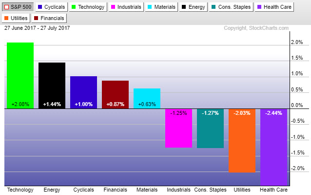
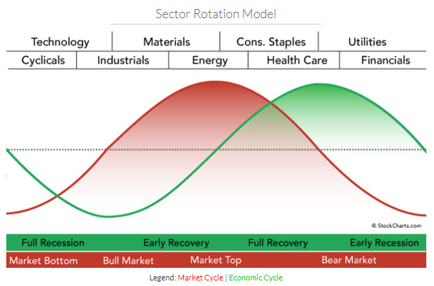
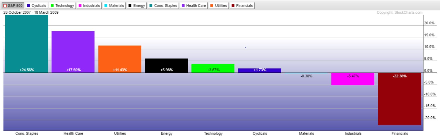
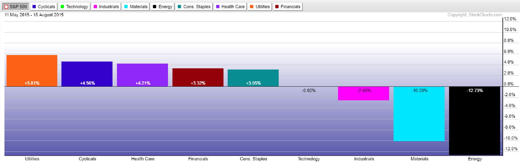
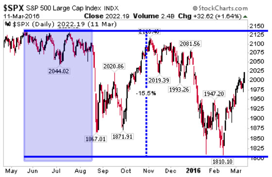
Wouldn’t it be nice, if we could be warned that something big could be brewing around the corner? Sector rotation happens to be one such warning sign we can look to for that signal of increased risk.  The chart on the right reveals the most recent sizeable market pullback, the one that occurred in late 2015/early 2016, which took the S&P from a peak to trough decline of over 15%.

On the left hand side we have shaded a large area where the market moved sideways to slightly down, but generally didn’t really do much. This period, however, was just before a very swift 200+ point S&P drop.

The chart immediately below shows the relative sector performance during this time. Notice anything familiar? The utility, health care, and staple sectors were in the group of out-performers, with utilities leading the way.

If we think of the S&P like a house, then the sectors would be the foundation, walls, and roof of that house. The utility and consumer staples, being generally the least volatile and most reliable of the sectors would be the foundation. The consumer cyclical, industrial, technology, and energy sectors would be the roof, with the financials, materials, and health care sectors the walls connecting the two. Typically a house can survive with some wall damage and even some roof damage, however, if the foundation on the house goes, the entire home becomes unstable.
This is how we like to look at the different sectors, and looking at the past helps prove to us that if the utility and/or staples sectors start to become the market out-performers, we should probably be looking to start protecting our holdings and moving to safer areas of the markets.
The good news is we are not seeing the utilities or staples lead this market, quite the contrary actually as the staples and utilities have been lagging over the last 50 days.
One of our proprietary techniques keeps us abreast of which sectors are leading and which are lagging, offering insight into the market’s broader cyclical position. Until the utilities and staples start moving into the outperforming column, we remain fully vested in equities.

Filed Under: IronBridge Insights

Yield Curve Rising could signal next Market Peak

July 14, 2017

The yield curve has been steadily declining since the end of QE3 in 2014. Historically, an inverted yield curve has preceded recessions. However, it is not until the yield curve starts to rise after being inverted that we should be on the lookout for the next major stock market correction.

In this issue we discuss:

  1. The impact of rising yields and what it can tell us about market peaks
  2. Investments in client portfolios designed to benefit from a rising interest rate environment
  3. The trend in the S&P 500 continues to push higher, while it appears that we are now in a rising rate environment, one not seen since the 1970s.

MACRO INSIGHTS

The yield curve chart shows the 10 year Treasury minus the 2 year Treasury history, one measure of the “yield curve”. The yield curve sits at 0.98% right now, meaning the 10 year Treasury rate is 0.98% higher than the 2 year Treasury rate.

There have been two official recessions over the past 20 years, one lasting from March 2001-Nov 2001 and from Dec 2007 – June 2009.  Neither one of these recessions occurred when the yield curve was actually negative. Instead these recessions were occurring as the yield curve was rising.

A closer look at the chart reveals that the yield curve’s inversion actually didn’t result in a stock market decline. The declines in equities didn’t begin until the yield curve was rising.  Although it may be a sign a recession is coming, quite often the market continues its bullish ways in the face of an inverted yield curve.  Rather, once that yield curve starts to rise, that’s when we should be on the lookout for a stock market correction.

As called out on the left hand side of the chart above, when the yield curve is high it means longer-dated Treasuries offer more relative yield than shorter duration Treasuries. Similarly, when the yield curve is low (as it is now), shorter-dated Treasuries are likely the better end of the yield investment curve as we wait for the inevitable rise in the curve and thus more attractive rates. We have shortened bond duration to take advantage of a rising yield environment where shorter term yields don’t rise as quickly as longer-term yields. We have also positioned duration exposure in portfolios in such a way to potentially benefit from a rising rate environment. Being in shorter durations will be especially important if yields across the board are going to continue their recent ways. More details around that potential can be found in the Market Microscope section below.

PORTFOLIO POSITIONING

Portfolios have exposure to multiple fixed income mutual funds that are positioned well, in our opinion, for a rising interest rate environment. We focus on two of these funds below. Many firms have been calling for a rise in interest rates for many years, and it simply has not come to fruition. The data appears to be telling us that rising rates are finally here.  

Exposure #1: Floating Rate (Senior Loan) Fund

Investment Thesis: Generate current yield that increases as rates increase.

Commentary: This investment is positioned for rising rates by having exposure to corporate loans whose interest rates increase as general market rates increase. Many of these loans are tied to the 3-month LIBOR, shown in the chart above. Owning these types of investments are analogous to being the recipient of the payments from an adjustable rate mortgage. Your payments increase as rates rise, with relative stability in principle, unlike traditional bonds whose value may decline as interest rates rise. These are “senior” loans, meaning they are debt obligations that hold legal claim to the company’s assets above all other debt obligations. The primary risk in this fund is a deterioration in credit quality, typically associated with a weakening economic environment or outright recession. Weakening GDP or earnings would prompt a reduction in exposure to this fund.

Exposure #2: Diversified Income Fund

Investment Thesis: High current income with hedges against bond price declines.

Commentary: This fund is in the portfolio for two reasons: 1) Hedge against falling bond prices, and 2) Current yield is 4.61% with an effective duration of negative 0.70. What does this mean? Duration is a measure of a fund’s sensitivity to a change in interest rates. The higher a fund’s duration, the larger a corresponding move occurs in its price when interest rates move. Since this fund has a negative duration, we should expect the fund price to move higher if interest rates also move higher, which is what we expect to occur in the future. The table above shows various ways funds hedge interest rate risk. Fortunately, this fund does the hedging for us. This is an actively-managed, broadly diversified fund seeking multiple sources of income across a variety of bond markets. This fund employs strategies that seek to reduce interest-rate risk.

MARKET MICROSCOPE:  Detailed Analysis of Relevant Markets

The bull market continues, even as we see the S&P 500 take occasional pauses. We continue to monitor for signs that the bull market that began in 2009 is coming to an end, but for now the trend remains up. The bond market has been where recent action is as yields have started to creep higher. Are we about to embark on another significant generational rise in yields?

US Equities

Since the swift November and December rally the market has really embraced the Dog Days of Summer mantra. The first chart below shows us (by the green trendline) that the market really lifted off after the November Presidential election uncertainty was removed. Since then, although rising, the market has been much more tepid. After gaining around 9% in the one month following the election, the S&P has moved just 7% in the 7 months since (averaging just 1% per month).

The chart above as well as the next one leaves us with a small reason to start to get a little concerned, though. First thing to notice, on the far right side price has recently tested the yellow trendline in place since December. This reveals momentum has slipped to its slowest pace since that time period. A break of the trendline would then reveal a first since October, that momentum has turned negative, a precursor to a trend change.

The next chart below reveals a few other ways to measure trend. Trendlines, moving averages, and “Pivot Points” are all part of our FIT Model’s proprietary calculations, and two of the three are on the cusp of providing us some new signals. In fact you will probably see this next chart in this publication quite often because it actually hosts 4 key technical indicators used to objectively measure the stock market’s situation. Can you spot them?

Each of the blue boxes point out 4 indicators that are part of our FIT Model. How are each four doing?

First, in order of the callouts moving clockwise, there is a simple math calculation used by traders called “Pivot Points”. Pivot Points are a quick and easy calculation of the “average” price a particular entity traded at during the prior period. In this case that prior period is the month of June.

The numerous blue horizontal bars on the graphic mark the Monthly Pivot Points, and we can see all the way to the right that during the week of Jul 3, July’s Pivot Point (June’s average level of 2428) was broken below but quickly regained. A prolonged break below it would be a bearish development.

The second bubble calls out 2 moving averages, the 60 day and the 200 day, which together help us see both trend and momentum. When the 60 day is above the 200 day, momentum and trend are both strong. When the 60 day dips below the 200 day, that shows momentum has turned negative. If both the 60 day and 200 day moving averages are moving higher, then it shows us those trends are both higher, and similarly if both these moving averages are heading lower, that would be a bearish sign. Right now they are both strongly bullish, and with current prices above both these averages, that too reiterates the strong bullish trend.

The 3rd callout shifts to the bottom of the chart, which shows an indicator called the RSI. RSI stands for relative strength indicator and is a momentum measurement that looks at the current price versus price over the prior stated periods (in this case 14 days). More simply, if that line is declining then it shows momentum is also declining.

The blue line showing that decline is called a divergence. Divergences occur when prices are doing one thing, but momentum is doing another, and they are often present at key turning points in the market. In this case, indeed, price has been making new all time highs, but momentum has been slowing, and that is not a good sign for the intermediate term as it reveals a price that is rising but at a lesser pace than previously in this trend.

Finally, we also like to watch for extreme readings in momentum as the red ellipses outline. When momentum is overbought or oversold, it often coincides with a key market top or market bottom, respectively. Indeed the red ellipses did align with November’s lows, December’s temporary price high, and again with March 1’s top that lasted for 3 months. There is no extreme reading on this indicator at the moment. By looking at all of these different indicators, we can build a better picture of where we sit within the market’s trend. We add weightings and categories and can come up with a clearer picture of what to expect going forward, which is the primary goal of our FIT Model.

Our FIT Model’s current reading is “Consolidation within a Bull Market”. So, we remain in a bull market, but expect some sideways to partially down movement within that Bull Market over the coming weeks/months. We remain overall bullish equities with the expectation that this bullish trend’s end is somewhere on the horizon. Until that point, we remain fully invested to target allocations in equities.

Bonds

Bond markets move in roughly 30 year cycles. Interestingly these cycles align with demographic generations. Those born in Generation X have seen their entire adult lives in a bond bull market. The baby boomers have been a part of two different bond markets, one of falling bond prices and rising yields in the 60s and 70s when they were young and another of rising bond prices and falling yields in the 80s, 90s, 00s, and 10s as they matured. We think both of these generations are about to see the next cycle take place. The chart below, from ZeroHedge, reveals the long history of the 10 Year Treasury Yield. What is clear is that bond yields do not move in a linear fashion and indeed move in more cyclical ways. Additionally if we look back at the history we do see about a 30 year cycle in bonds.

Looking back the last 100 years, in 1921 yields topped out near 5.6%. 24 years later, during WW2, yields hit a low of 1.7%. From 1945 to 1981, 36 years, bond yields rose drastically to a high of 15.8%.

From there yields fell to what we think is the next “generational low” at just 1.6%. That trend of falling yields lasted 31 years from 1981 to 2012. Today, the 10-year Treasury yield is at 2.3%.

Even before 1921, the prior trend low of 2.9% was hit in 1900, a 21 year trend. Before that, a high of 6.6% was hit in 1861, a 39 year trend, and so on and so on as can be gathered from the chart. To us it is clear that there is an average 30 year trend in bond yields, and if that is true then the odds that we have just witnessed a major low in bond yields has certainly increased with yields falling for 31 years and yields across the curve showing large moves higher.

As the chart to the right shows, we have seen Short Term Treasury yields as measured by the 1-Month Treasury bonds move up tremendously in just the last 1.5 years. The annualized 1 month yield is almost 1% from what was 0% in late 2015.

Perhaps more meaningful, especially if you have been thinking about refinancing your home, is the 30 Year Treasury Yield. It too saw a fairly large move in rates from just over 2.1% to over 3.1% in a matter of months (July 2016 to Dec 2016). It’s not a stretch to imagine 30 Year Treasury Yields back above 4% in short time, especially if indeed the 30 year cycle in bonds is moving back toward higher rates.

We have been shortening the duration of all bonds, where we can, in order to minimize the price hit they take as rates move higher. What this allows is for us not to get locked into a bond for a longer period of time than necessary, allowing us to reinvest more quickly into higher yields. We also have been looking at ways to hedge, in case the rise in bond yields is just getting started. After a 9 year lull in the short term Treasury (as the 1 month chart reveals), it’s hard not to look at the last 1.5 years and not conclude that a change in trend to higher yields is upon us.

_________________________________

Disclaimer This presentation is for informational purposes only. All opinions and estimates constitute our judgment as of the date of this communication and are subject to change without notice. > Neither the information provided nor any opinion expressed constitutes a solicitation for the purchase or sale of any security. The investments and investment strategies identified herein may not be suitable for all investors. The appropriateness of a particular investment will depend upon an investor’s individual circumstances and objectives. *The information contained herein has been obtained from sources that are believed to be reliable. However, IronBridge does not independently verify the accuracy of this information and makes no representations as to its accuracy or completeness.  

Filed Under: IronBridge Insights

  • « Go to Previous Page
  • Go to page 1
  • Interim pages omitted …
  • Go to page 10
  • Go to page 11
  • Go to page 12

Footer

LET'S CONNECT

  • Email
  • Facebook
  • Instagram
  • LinkedIn
  • Twitter

AUSTIN LOCATION

6420 Bee Caves Rd, Suite 201

Austin, Texas 78746

DISCLOSURES

Form ADV  |  Privacy Policy  |  Website Disclosures

  • Home
  • Difference
  • Process
  • Services
  • Insights
  • Team
  • Clients
  • Form CRS
  • Contact Us

Copyright © 2017-Present by IronBridge Private Wealth, LLC. All rights reserved.