• Skip to main content
  • Skip to footer

IronBridge Private Wealth

Forward with Confidence

  • Home
  • Difference
  • Process
  • Services
  • Insights
    • IronBridge Insights
    • Strategic Wealth Blog
    • Strategic Growth Video Podcast
    • YouTube Channel
  • Team
  • Clients
  • Form CRS
  • Contact Us

IronBridge Insights

The Fed’s Secret Indicator

September 25, 2019

What if we told you that we knew what the Fed was looking at in their meetings? That we knew their secret? It would take the guesswork out of trying to predict what the Fed was going to do. Well, it may just be hiding in plain sight.


“Secrets aren’t secret.  They’re just hidden treasures waiting to be exploited.”

-Stephen White, Author

The Fed’s Secret Indicator

This week the Federal Reserve Bank of the United States did something that surprised absolutely no one. They cut their Fed Funds rate (the rate that they charge banks to borrow) another 25 basis points. This had been telegraphed to exhaustion, and the only real unknown coming out of the meeting was what will happen in the near future.

Chairman Powell did not help this uncertainty as he pushed back on every question asked of him about the Fed’s next move. It is worth noting the Fed was the most divided they have been in recent history, with 3 members opposing the 25 basis point cut. So it seems, even the Fed doesn’t know what it is going to do over the coming months (spoiler alert: we do!).

The Fed has two official mandates: price stability in the overall economy and maximum employment. Since 2008, the Fed has done two things to attempt to achieve these mandates: control short-term interest rates and print money to help boost asset prices.

We won’t get into the merits or criticisms of various Quantitative Easing programs the Fed has done over the past 10 years. Instead, let’s focus on how the Fed “controls” short-term interest rates.

The Fed looks at a tremendous amount of data. Economic numbers, employment information, and endless data on global markets.  They must have a process on how to analyze all of this information, right? They have dozens of PhD economists who know how to interpret all of this data and use it to formulate a comprehensive and effective strategy to determine what they should do at their next meeting.

They definitely have employees that should be able to do the work. The Federal Reserve has over 17,000 employees with an annual payroll in excess of $3.5B per year. (Read the Federal Reserve Annual Report HERE.)

The main question is…why?

Many of their employees serve in the regulatory arm that governs various banking institutions. We get that.  But setting the Fed Funds rate doesn’t need to be a primary function. In fact, we don’t think the Fed is actually doing ANYTHING when it comes to setting rates.

We know their secret.

And unfortunately, it’s not very exciting.

The Fed simply follows the rate that the market sets. Period.

Our apologies if we got you too excited about their secret. (Editor’s note…If you did get too excited, then you probably need to get out more).

This is one primary reason why they are continuously behind the curve and cannot prevent recessions or business cycles. They would admit they “look at a lot of different indicators”, but the reality is they only need to look at one…the US Treasury market.

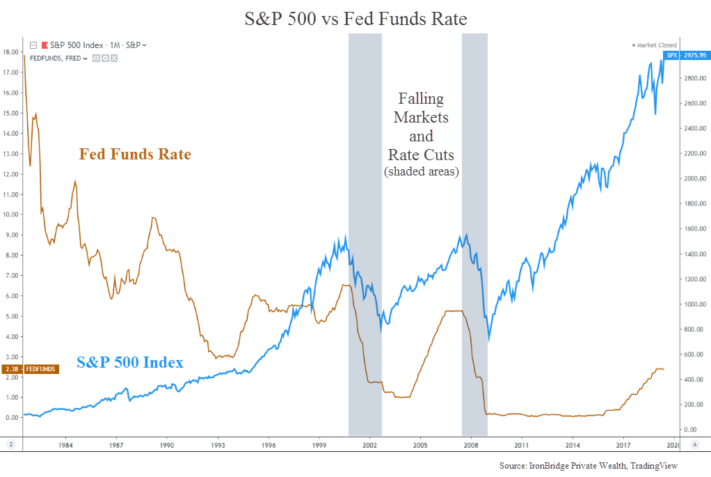
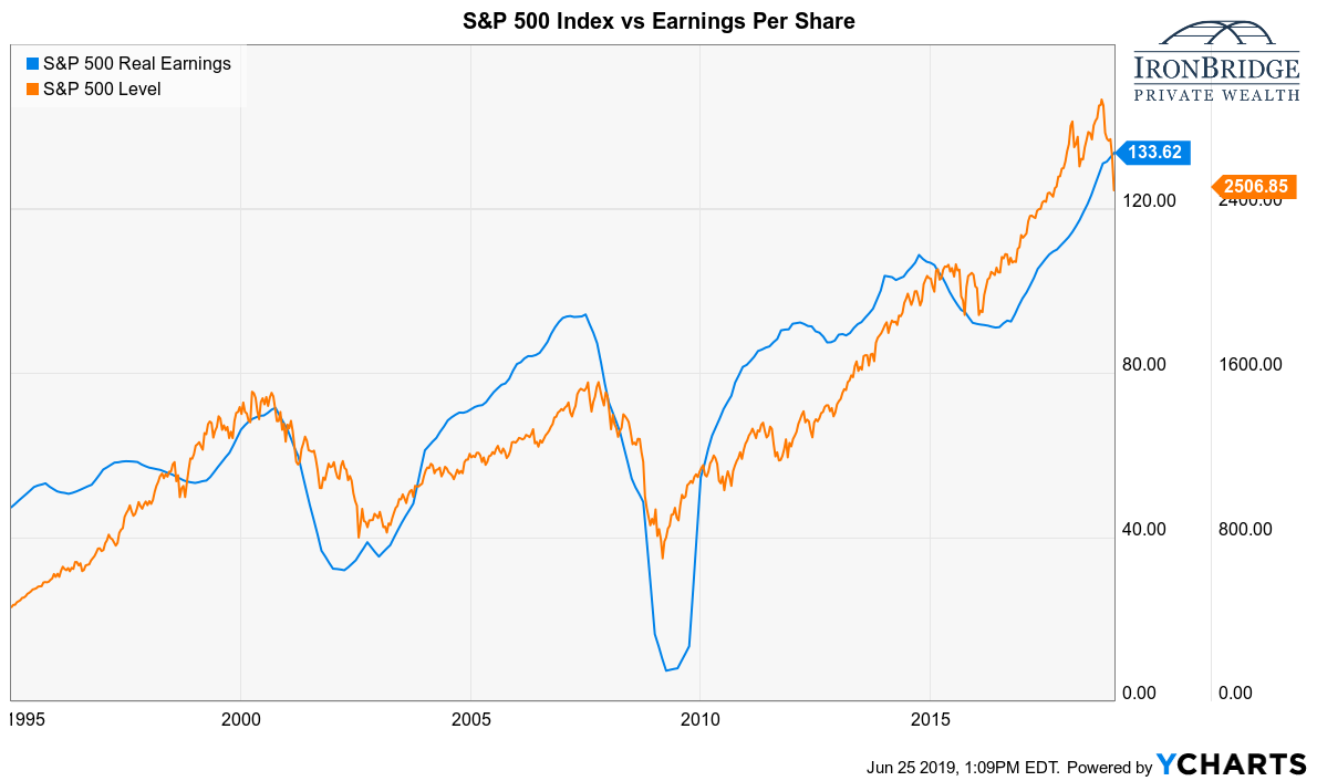
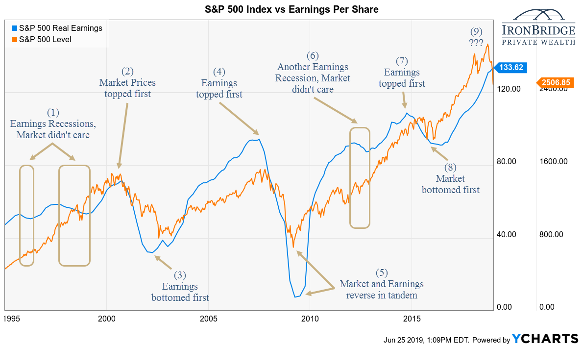
Looking back over the past 25 years, the Treasury market has consistently moved ahead of the Fed. The chart below, courtesy of McClellan Financial Publications, shows how the 2-Year Treasury yield led the Fed Funds rate during each and every turning point, as well as the majority of the time in between.

Shouldn’t the Fed Funds rate be LEADING market rates?

It sure does look like market rates are ahead of the Fed.

But what if the short-term treasury markets are in fact following the Fed? After all, the Fed has regularly scheduled press conferences, and various members speak about interest rates and the economy in between meetings. Maybe the Fed is guiding the short-term rates?

Again, we don’t think so. To make the point, let’s look closer at 2008. Why did the Fed need to have 3 unscheduled/ emergency rate cuts during the financial crisis (which still did not help prevent the worst recession since the Great Depression)? If they actually set interest rate policy instead of following it they would have just moved the Fed Funds rate to 0% during their October 2008 meeting rather than waiting until December of that year to do so. Or at a minimum, the short-term Treasury rates should quickly adjust once the Fed announced their rate cut. But that didn’t happen.

Maybe they thought things would get better. The more likely scenario is that they realized the treasury markets were pricing in far worse outcomes than their “experts” though. In fairness to them, they do have something to worry about that the bond market doesn’t necessarily have to worry about…politics. The Fed is supposed to be non-political, but they absolutely have to worry about the optics of their policies, US Senate oversight, and overall public perception. In reality, the perception problem is most likely as important to their jobs as being correct in their policy decisions. Nevertheless, the Fed is continuously behind the eight ball because they must follow the bond market for their signals.

The next chart below shows what we consider to be the best leading indicator of the Fed Funds rate…the 3 month Treasury bill’s interest rate. The first chart below is zoomed into 2008 to further the discussion.

The 3 month Treasury rate is at the bottom of the chart, and the Fed Funds rate itself in shown the middle section. The top portion is the difference between the two. Notice the significant lag between the two, especially in September of 2008?

This lag is shown more clearly in the top portion of the chart. During the majority of 2008, the Fed Funds rate was higher than the 3 month Treasury bill, oftentimes much higher. This meant they were chasing the 3 month bill all the way down.

In short, the Fed easily could have justified cutting more throughout 2008, but for whatever reason, they didn’t. By September of 2008, the Fed’s rate was over 2% higher than the 3 month Treasury bill’s rate, highlighting how policy could not keep up with the reality of the situation.

In 2008, the Fed was obviously slow to recognize what needed to be done, and took its cue from the market.

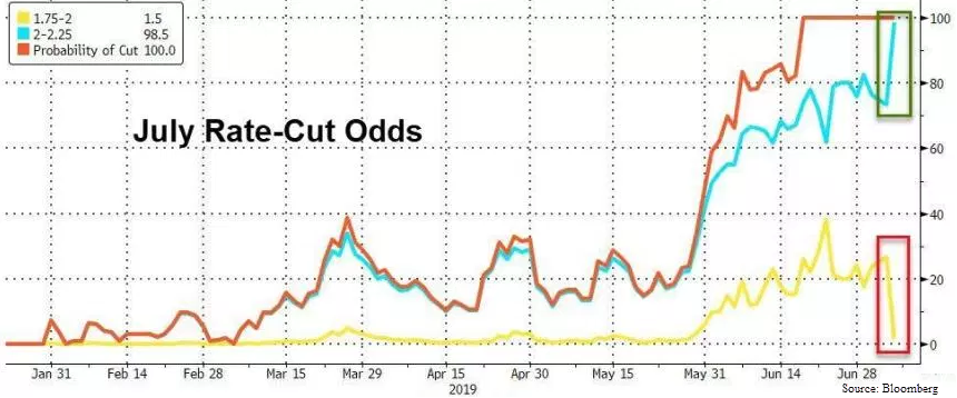
Now let’s fast forward to today as we have seen two 25 basis point cuts over the past two months. The next chart zooms into the last 3 years.

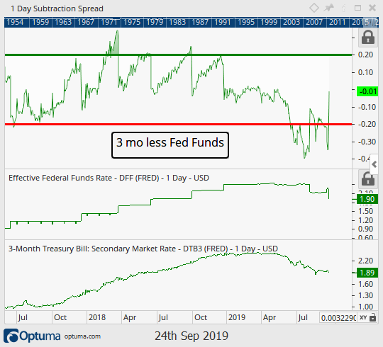
Notice a pattern? Every time the 3 month Treasury yield was 20 basis points above the Fed Funds rate, the Fed raised rates at their next meeting.

But then it changed. In June of this year, the difference between the Fed Funds rate and the 3 month Treasury dipped below 20 basis points (and stayed below longer than a few days). In our view, this was the catalyst that sent the Fed cutting interest rates on July 31 (effective in August).

We also should note this spread never got more than 40 basis points wide, and is the reason why the Fed did not cave to the President’s calls to cut 50 basis points at the time.

But what about this most recent September announcement where they cut an additional 25 basis points? This was the most controversial one in recent history (at least from the Fed’s internal Committee’s perspective with 2 members voting for no change and 1 voting for a 50 bp cut).

The most recent cut was also justified, and so was the size of it at 25 basis points. This is shown by the chart above that reveals with the effective rate between 2.00% and 2.25% the spread between it and the 3 month Treasury was once again over 20 basis points wide. Today it is spot on with just 1 basis point difference.

So what will the Federal Reserve do at the October meeting? Based on the 3 month Treasury they won’t do anything (not unless the market causes a major shift in that interest rate). This will more than likely make a number of people unhappy. The Commander in Chief for one, but also there is currently a 65% chance of another rate cut in October. These folks may be disappointed as well.

Investment firms will put in way too much effort and gnashing their teeth over trying to predict the Fed’s next move, when in reality all we need to do is watch the 3 month Treasury for any signals that may suggest otherwise.

If the difference between the 3 month rate and Fed Funds rate is large enough, they will cut. If not, they won’t. Thanks for playing.

In the meantime, we will make the suggestion that the Fed should simply announce that the Fed Funds rate will be pegged to the 3-month Treasury. That would save us all quite a bit of time and energy, and most likely improve the odds that the Fed can actually accomplish its dual mandates.


Stock Market Update: Buy High, Sell Higher?

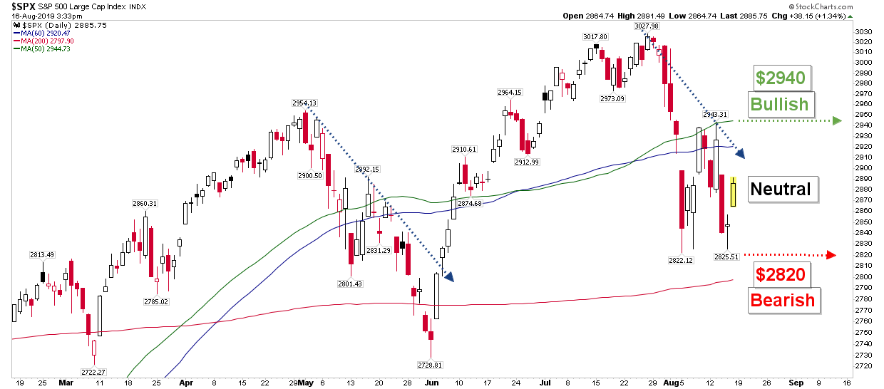
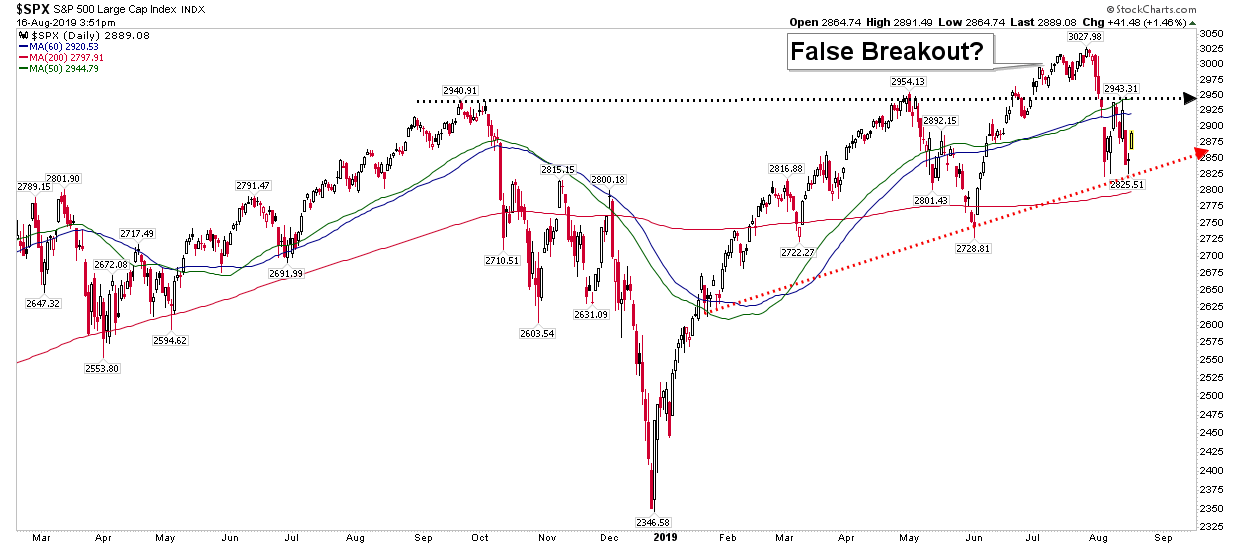
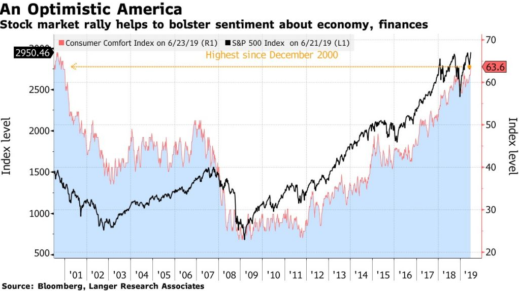
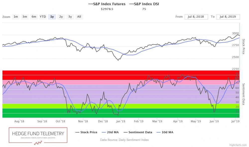
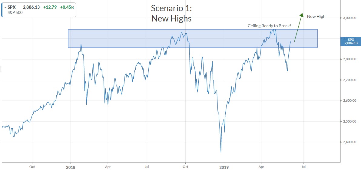
It seems we were well on our ways to finally breaking out to new all time highs when the Fed’s lack of future transparency threw a wrench into that plan. Immediately on the Fed’s announcement Wednesday, September 18 the market sold off. It recovered by the end of the day but has since tread sideways as price remains between recent support and all time highs resistance.

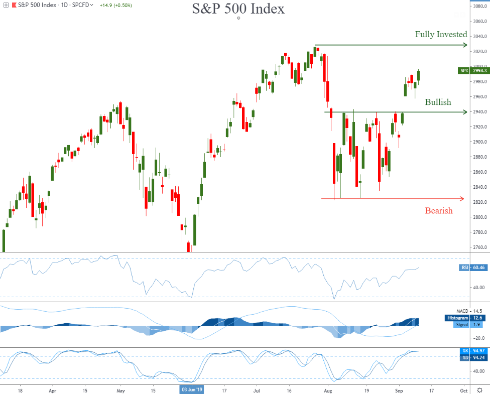
After all was said and done, the stock market remained within a couple of percent of new all time highs, as we continue to wait for a breakout to new all time highs before we allocate more capital to equities. This essentially means we are willing to buy at higher prices, what why is this?

The chart below is the same one we have discussed the past few ‘Insights’, but we have added some trading math to help show why sometimes it is better to buy high rather than buy low.

Doesn’t it seem counter-intuitive to wait for higher prices before adding exposure to equities? We have been ingrained to think that buying low and selling high is the appropriate chain of events, however, that certainly is not always the case. The reason is because of the risk side of the equation. Sometimes there is less risk when purchasing at a higher price.

The chart below helps explain this philosophy, but in general, we look for at a minimum a 3:1 return to risk ratio on every position we buy. What this means is we are looking for a security that has equal chance of rising at least three times what it could decline.

In the example below the reward to risk ratio is significantly improved if we wait for new highs before buying. Note in yellow the math around buying right now and the summary of that trade in yellow in the bottom right. A 3.6x reward to risk ratio is not bad, and is one reason why we added some positions in early September. That ratio was improved when price was closer to those August levels, so what we added in September had a reward to risk ratio around 5.0x.

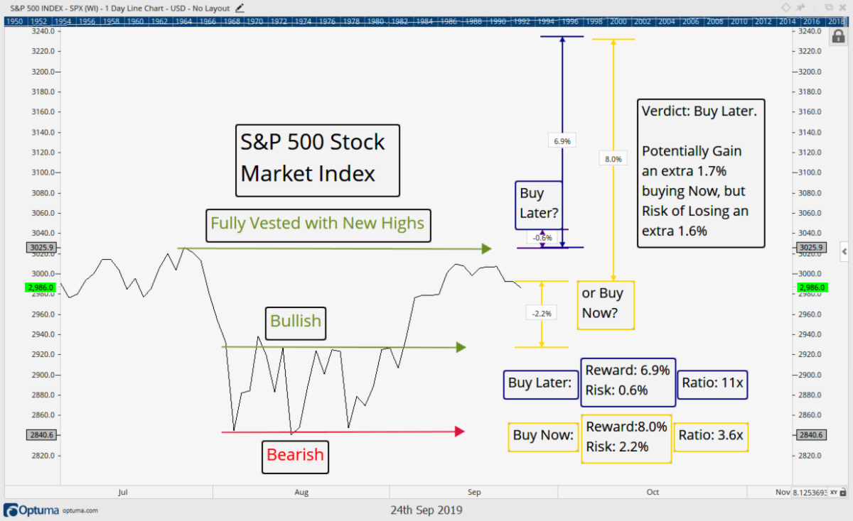
Buying right now there is a hypothetical potential 8% gain, but a potential 2.2% loss. That 2.2% loss is identified by the next logical level of support (where price spent all of August). This is the likely level price would pull back if it were to fall from here. Although still a decent trading opportunity (with a reward to risk ratio of 3.6x), it is not as good an option as the navy blue, buy later, option.

If we wait to buy on a breakout, we can then utilize the all time high at $3025 as the next logical support zone, resulting in risk of only 0.6% in buying once that breakout occurs. Waiting to buy results in us missing out on 1.7% (0.6% +(8.0%-6.9%)) of potential upside, but it also results in us potentially not losing 1.6% (2.2%-0.6%). Waiting for a breakout before buying offers an 11x reward to risk ratio in this scenario, which is a lot more attractive than a 3.6x ratio.

That said, we have added stock exposure to client portfolios over the past month, as certain investments did meet our 3-to-1 principle. But the remaining cash will be allocated if the market does indeed break to new all-time highs.

Sometimes it does make more sense to wait for higher prices before buying with the primary reason being the risk that can be avoided by doing so. Buying low and selling high sometimes is not as good as buying high and selling higher.

Invest Wisely!


 Our clients have unique and meaningful goals.

We help clients achieve those goals through forward-thinking portfolios, principled advice, a deep understanding of financial markets, and an innovative fee structure.

Contact us for a Consultation.

Neither the information provided nor any opinion expressed constitutes a solicitation for the purchase or sale of any security. The investments and investment strategies identified herein may not be suitable for all investors. The appropriateness of a particular investment will depend upon an investor’s individual circumstances and objectives. *The information contained herein has been obtained from sources that are believed to be reliable. However, IronBridge does not independently verify the accuracy of this information and makes no representations as to its accuracy or completeness.  Disclaimer This presentation is for informational purposes only. All opinions and estimates constitute our judgment as of the date of this communication and are subject to change without notice. > Neither the information provided nor any opinion expressed constitutes a solicitation for the purchase or sale of any security. The investments and investment strategies identified herein may not be suitable for all investors. The appropriateness of a particular investment will depend upon an investor’s individual circumstances and objectives. *The information contained herein has been obtained from sources that are believed to be reliable. However, IronBridge does not independently verify the accuracy of this information and makes no representations as to its accuracy or completeness.

Filed Under: IronBridge Insights

The Big Three

September 11, 2019

In investing there are three major disciplines that attempt to analyze the factors that drive investment performance. We take a look at the primary components we are watching in each of these three key areas in the markets to get clues as to what is next.


We remember the heroes and first responders who selflessly rushed in to save lives and recover victims during the tragic events of 9/11, and hope that we never forget the attitude of service and gratitude that emerged following that awful day.


“Learn avidly. Question repeatedly what you have learned. Analyze it carefully. Then put what you have learned into practice.”

-Edward Cocker, English mathematician (1631-1675)

There are three broad disciplines investment decisions fall into. Virtually all investors are aware of one of them, fundamental analysis. Many are also aware of a second financial discipline, technical analysis. However, very few investors are aware of the third discipline, sentiment analysis.

Even fewer utilize all three disciplines in their investment techniques.

The reality is these disciplines combine to create the current market price, and if you are looking at just one thing, you are likely to miss some major component to the markets. In this update we take a look at one important factor in each of these realms that has caught our attention.

The most traditional discipline of the three is fundamental analysis. It’s what is taught in business school, and it is what most investors primarily utilize when making their investment decision. Investopedia defines fundamental analysis as, “a method of measuring a security’s intrinsic value by examining related economic and financial factors”. Examples include the state of the economy, industry conditions, company financials, and a company’s management. But again, if you study just fundamentals, then you are likely missing some major pieces to the markets.

This reality can be proven at any given second because fundamentals change, on average, much slower than price does. By that definition alone price cannot be solely driven by fundamentals, otherwise it would be dead in the water when the fundamentals weren’t changing. The reality is prices are moving all the time because of peoples’ expectations and/or thoughts, and that is no longer in the realm of fundamental analysis. Have you ever owned a stock and watched as an earnings report hit the wire? Revenues were off the charts, profits were off the charts, and the outlook was amazing, only to watch as the stock fell in price? This happens all the time, and cannot be explained by fundamentals alone so we also look at two other financial disciplines.

But let’s not confuse fundamentals not being the holy grail with them not being important. Fundamentals do matter, and one thing we are watching right now is the inverted yield curve.

The Fundamental Clock is now Ticking: The Yield Curve Inversion

You can’t call yourself an investor and not know that the yield curve has recently inverted. It’s all over the news and has historically been a major fundamental warning sign as there has never been a recession that didn’t first see at least some portion of the yield curve invert.

In other words, it has a perfect record of predicting a recession (although the statisticians in the room would point out there have only been 10 instances since 1950 and 5 since 1975, so the sample size is extremely small). Let’s just assume, though, this time is not different, and since a vast majority of the yield curve has inverted, the clock is now ticking toward a recession.

So what does that mean for the stock market?

Bank of America points out the average time between a 2 and 10 Year inversion and recession is 16 months. But, the dispersion is wide. Over the past 5 recessions the shortest time frame from inversion to actual official recession (2 consecutive quarters of GDP contraction) was 14 months (the 2000 stock market top and 2001 recession), but the longest has been 34 months (1998’s inversion and 2001 recession).

To make things even more unpredictable and convoluted, the stock market’s reaction is similarly as disperse. The chart below reveals prior periods when at least 60% of the Treasury curve inverted going back to the late ’70s.

The 1978 and 1989 inversions offered great 2 and 3 year returns, but getting there was a roller coaster. However, the two more recent inversion episodes resulted in more dire longer term results, with generational 3 year drawdowns of 40%+.

We think the lesson here is you cannot make investment decisions around fundamentals alone. After all, which fundamental data point from the table above would you choose? Would you choose the bullish one year 1978 or 1989 post-inverted yield curve returns, or would you choose the post-inversion 2000 and 2006 negative 3 month returns as your guide?

The yield curve has inverted and that probably means a recession will come at some point, but that does not mean the stock market won’t continue to rise for some unknown period in the future. This is but one small piece to the super complex stock market, and making a decision based solely on the yield curve seems silly to us.

Let’s look at the pressing issues in the other two finance disciplines.

What we are Watching Technically: A Break Out of the August Range

In our last ‘Insights’, “The Price is Always Right”, we discussed price and how price is a major component to what we look at when making our buy and sell decisions. The reason is we believe all of the fundamental data, the first discipline, is largely embedded in price already. Why spend so much time and effort on fundamentals if focusing instead on the technicals already includes the fundamentals? That seems like a more efficient use of one’s time to us.

The study of price, otherwise known as technical analysis is defined by Investopedia as, “a trading discipline employed to evaluate investments and identify trading opportunities by analyzing statistical trends gathered from trading activity, such as price movement and volume.” When bets are placed on the future of a security, for whatever reason, it is reflected in price. Examples of technical analysis include trends, momentum, relative strength, and supports & resistance levels.

An update to the chart discussed in our last ‘Insights’ is shown below. The great thing about this chart is the inverted yield curve is already included in it. In fact all known information as well as expectations are baked into this chart of price!

In our last issue we pointed to two levels that would get us more bullish as well as more bearish. Since then price has moved above the point of being “more bullish” and as a result we have decreased our cash exposure to around 25% (down from 35%). A move back into the range, and certainly below the “Bearish” level would have us back to 35%+ cash, but a continued move higher from here would have us continue to decrease our cash exposure.

We don’t need to complicate things with all these scenarios and what ifs around the yield curve, price will show us the way in whatever scenario plays out and right now we are marginally bullish as long as that $2850-$2930 August price zone is not revisited.


An Update on Sentiment: Mixed Messages

Sentiment analysis is the third prevalent pillar of the financial markets, and it is the least understood.

Sentiment analysis is defined as, “the overall attitude of investors toward a particular security or financial market. It is the feeling or tone of a market, or its crowd psychology, as revealed through the activity and price movement of the securities traded in that market.” Examples include surveys, margin loan levels, hedging activities, and market breadth.

Sentiment is an interesting study because the majority of the time there may not be much that sentiment is telling us, as it is very subjective by nature. However, sentiment extremes tend to make their appearance just at the right time, typically when market trends are at or near extremes themselves. In other words, sentiment can help raise red flags, especially near market tops and bottoms.

The problem with sentiment, on the other hand, is that it is highly subjective and tough to measure across time, cycles, and generations. The good news is, price also is inclusive of sentiment as people’s overall attitudes toward the market are already reflected in the prices that are agreed upon.

Sentiment red flags were raised and discussed most recently in our July 23 ‘Insights’ titled, “Feeling Sentimental”. In that issue we discussed the % of sentiment indicators we follow showing excess optimism, which was over 40% at the time, raising a red flag the market was overbought. That week the market topped as we remain below those levels still today. So, in that case, the extreme sentiment readings indeed did help prepare us for an eventual change in the direction of price.

For more information on sentiment and how we use it you can check out our previous publications including June 11, when we recognized all the negative sentiment in the media that just wasn’t showing up in price, in our March 30, 2018 issue as breadth was deteriorating as the market rallied, ultimately resulting in that fourth quarter’s 20% decline, and finally back on November 10, 2017, when we dove into sentiment, discussing a plethora of different sentiment signals we follow.

The chart above tracks a popular and long running survey of a large group of investors known as the American Association of Individual Investors. This chart measures the spread between those that answer the survey bullishly less those that answer it bearishly, revealing that a majority of members who answered the survey recently are bearish, with a net 17% bearish response. This is one of the lowest readings ever!

This data is only useful in context, though, and the history of the survey’s results provides that much needed context. This history suggests this indicator to be generally contrarian in nature, translated to mean when the members are net bearish, that typically aligns more with market bottoms than market tops, and when the cohort is net bullish, some sort of market top is typically being formed.

This is not always the case, though, and here in lies some of the subjectivity of the survey and issues with sentiment in general largely discussed in that July 23 ‘Insights’. The people that are members today are not the same ones that were members 30 years ago, adding some complexity to the consistency of the timeline. In addition it’s entirely possible the membership of AAII has aged along with the service, changing the demographic and potentially the outlook along with age. There has been a net trend toward bearishness since the early 2000s after all, which would be an interesting case study in and of itself.

Still it is probably a meaningful data point that this cohort is as bearish now as they were at the lows of 2015 and the lows of December of last year, both times which did align with significant market bottoms. Thus, we should give this survey a bullish slant as this cohort is indeed more often than not most bearish at market bottoms than market tops. It’s bearishness today skews bullishly for the market’s potentials.

Again, the great thing about technical analysis is the AAII cohort’s opinion is already included in price. If price continues higher from here, it’s likely that all those pessimists had already sold. But if it continues lower from here, then it’s likely one of those times when this cohort correctly predicted the coming trouble, like they did near the top of 2007 as well as the leading up the the 2011 drawdown.

For now, we will continue to watch price action and let it be our guide. Fundamentals and sentiment can certainly help in your investment decision making, but we think the all-inclusiveness of technical analysis provides much more bang for your “time” buck.

After all, would we make an investment decision based solely on the yield curve inverting? Or, would we buy the market here just because the AAII group is significantly bearish? The answers to these two questions are a resounding “no”. But we would buy this market if it is moving higher and sell this market if it is moving lower.

Invest Wisely!


 Our clients have unique and meaningful goals.

We help clients achieve those goals through forward-thinking portfolios, principled advice, a deep understanding of financial markets, and an innovative fee structure.

Contact us for a Consultation.

Neither the information provided nor any opinion expressed constitutes a solicitation for the purchase or sale of any security. The investments and investment strategies identified herein may not be suitable for all investors. The appropriateness of a particular investment will depend upon an investor’s individual circumstances and objectives. *The information contained herein has been obtained from sources that are believed to be reliable. However, IronBridge does not independently verify the accuracy of this information and makes no representations as to its accuracy or completeness.  Disclaimer This presentation is for informational purposes only. All opinions and estimates constitute our judgment as of the date of this communication and are subject to change without notice. > Neither the information provided nor any opinion expressed constitutes a solicitation for the purchase or sale of any security. The investments and investment strategies identified herein may not be suitable for all investors. The appropriateness of a particular investment will depend upon an investor’s individual circumstances and objectives. *The information contained herein has been obtained from sources that are believed to be reliable. However, IronBridge does not independently verify the accuracy of this information and makes no representations as to its accuracy or completeness.

Filed Under: IronBridge Insights

Price is Always Right

August 22, 2019

August has seen a massive pick up in volatility, and we are watching two key price levels to help us guide portfolios. After all, price is the single most important factor when making investment decisions.


“I would much rather wait a few moments more to soar with an eagle than rush to fly with a fledgling sparrow.”
-Charlie Chan, The Sky Dragon (1949)

Two weeks ago (on August 7), as the Dow declined 800 points we published our ‘Insights’, titled “Central Bank Steamroller“, where we brought attention to 1) the increased volatility, but also 2) the things we can and cannot control in the markets.

“Focus instead on what you can control”, was the takeaway. The two most important factors you can control when making an investment are the price you pay and the price you receive when you sell.

Price matters. After all, price is what actually makes you any money or not.

Earnings, tariffs, inverted yield curves, the Fed, recession probabilities, negative interest rates, and GDP all have influences on the investment landscape. But these do not directly influence your investment portfolio. You can be 100% accurate in predicting every economic indicator, but if the price you sell is lower than the price you paid, then you still lost money. Everything else is, in a way, largely irrelevant. Would you rather be right or make money? We know our answer.

Because price is the primary determinant of whether our clients make money or not, we focus a great deal of our efforts on charts. To us, charts are exquisitely beautiful. They contain the collective wisdom of every investor in that particular market. Charts tell us without bias what price is actually doing. And price is always right.

Price doesn’t care what any of us think. It is what it is. Period. Too many investors and portfolio managers try to argue with price, and attempt to defend their own perception of what they think prices should be. This is the ultimate waste of time and effort. Worst of all, this type of thinking leads to the single biggest reason portfolios lose value: trying to justify why the market is wrong and you are right.

We purposely try to ignore much of the commentary around things that are out of our control. If information is included in commentary, do we really think that millions of market participants are collectively ignoring that information? The reality is that information is either already factored into the current price, or that the information simply doesn’t matter. Either way, price already has encountered, dissected, and adjusted for the information in question.

The chart below shows where price currently is with our annotations of where we would be a further buyer and/or a further seller. With price still stuck in between these two levels, we are remaining in a “wait and see mode”. Not making a decision is also a decision and at certain times it makes more sense to us from a reward to risk perspective to allow the market to continue to disseminate information. The choppy action of the last two weeks reveals the market is still digesting the (6.5%) move down in price off the July highs.

Once this initial decline culminated with August 5th’s 800 point Dow down day, the market recovered in a typical fashion, by bouncing back to roughly the midpoint of the move down, which also happened to be where a couple of key moving averages were hanging out.

Price remains near that level, and this is normal in a free market with buyers and sellers both competing for their own self interests. It makes sense that when the dust has settled price finds itself about midway between its recent highs and its recent lows as well as at the same level as the average price over the past 50 and 60 days. This is the average price and where buyers and sellers have settled. But, now what?

That 50% retracement area at 2940 on the S&P 500 Index acted as resistance, and we saw a second 800 point Dow down day in as many weeks on Wednesday, August 14. Notice also Friday (August 16th) of that week and this most recent Monday (August 19th) took prices back up to that level of resistance (are you sensing a pattern here?), where thus far resistance has once again held. Three times in the last 3 weeks the 2940 level has been tested with thus far an inability to overcome it. In plain English: Sellers are winning over the buyers right now.

An interesting aspect is this all looks very similar to what the market did back in May, when it also fell, bounced, and then fell again. This is one reason why we think it is very important for the market to hold its recent lows. Otherwise it risks, at a minimum, a May redux with another equal sized move lower from here. This is why we have identified 2820 as a line in the sand for us.

In the longer term chart below, we also are seeing some important developments. The market broke to new all time highs in June and July, but has now reversed, breaking below the levels of the former all time high reached in September 2018 as well as April 2019.

With price now back below those previous all time highs, the potential is now there for the entire summer move to be considered a “false breakout”, a bearish development in which the markets “trick” long term investors into buying the new highs, only to flip the script and trap them in losing positions. Even worse, the recent bounce in the markets that met resistance at the 50 and 60 day moving averages also met resistance of the two former all time highs near 2940.

Investors who bought in June or July are now underwater and trapped there with losses unless price can retake that former support that is now resistance (~2940).

To us, it is very important the market holds its 200 day moving average and red trendlines shown in both charts above. The short term trend has already turned down, but a break of the intermediate term support would further increase the probability that a larger selloff is in the works. If the market moves below its 200 day moving average for example, chances increase that we could see a decline similar to the October-December 2018 pullback, and ultimately see prices fall 20-30% from the peak in July.

We are prepared for whatever scenario the market throws at us and we have already significantly increased our cash positions during the 5% pullback we have seen in August. We are prepared to continue that move into cash if $2820 breaks.

In the more bullish scenario, we have identified some individual stocks and ETFs to add to our client portfolios in the event the market has once again found a bottom and wants to move higher. A break above $2940, as the first chart calls out, would help identify the more bullish scenario.

Until either one of these price zones gives way, we don’t see any reason to be impatient right now. The safety that cash has provided our clients during multiple 800 point Dow down days has a very real and beneficial effect on volatility and returns for our clients.

As the late Tom Petty so eloquently put it, “Waiting may be the hardest part”, but during volatile times such as these, it’s much nicer to do that waiting while in cash rather than other instruments froth with turbulence and deviations.

When it comes to investing, price is what matters most. Price is what makes your account go up and it is what makes your account go down. Having a plan and process around price makes sense to us. Hopefully it makes sense to you too!

Invest Wisely!


 Our clients have unique and meaningful goals.

We help clients achieve those goals through forward-thinking portfolios, principled advice, a deep understanding of financial markets, and an innovative fee structure.

Contact us for a Consultation.

Neither the information provided nor any opinion expressed constitutes a solicitation for the purchase or sale of any security. The investments and investment strategies identified herein may not be suitable for all investors. The appropriateness of a particular investment will depend upon an investor’s individual circumstances and objectives. *The information contained herein has been obtained from sources that are believed to be reliable. However, IronBridge does not independently verify the accuracy of this information and makes no representations as to its accuracy or completeness.  Disclaimer This presentation is for informational purposes only. All opinions and estimates constitute our judgment as of the date of this communication and are subject to change without notice. > Neither the information provided nor any opinion expressed constitutes a solicitation for the purchase or sale of any security. The investments and investment strategies identified herein may not be suitable for all investors. The appropriateness of a particular investment will depend upon an investor’s individual circumstances and objectives. *The information contained herein has been obtained from sources that are believed to be reliable. However, IronBridge does not independently verify the accuracy of this information and makes no representations as to its accuracy or completeness.

Filed Under: IronBridge Insights

Central Bank Steamroller

August 7, 2019

Central banks have been the dominant factor in global markets for well over a decade now. It’s important to avoid getting steamrolled by their actions, good or bad. Recognizing what is in your control can help both financially and emotionally when markets become volatile.


“Control your own destiny, or someone else will.”

-Jack Welch

Volatility is back.

Last week, the Federal Reserve met and cut interest rates by 0.25%. This is exactly what the market was anticipating, but markets sold off when Jerome Powell hinted that the Fed wouldn’t be quite as aggressive with future rate cuts. The market proceeded to fall 3.5% from last Wednesday to Friday.

Then over the weekend, the Chinese central bank devalued its currency relative to the US Dollar. This led to another 3% decline in stocks on Monday. The Dow Jones had its 6th biggest point decline in history.

Why did we see so much volatility over the past week?

Two words: Central Banks.

Central banks have dominated the investment landscape over the past decade. You only need to see one chart to explain everything that has happened in the markets since the global financial crisis.

The chart below, courtesy of Yardeni Research, shows the combined assets of the Federal Reserve, the European Central Bank, and the Bank of Japan, plotted against the S&P 500 index.

You can throw out everything else you hear or read about the markets. THIS is what is driving asset prices. Period.

We are living in an age where central banks are the dominant force in global markets. So much so that across the globe, there is now $15 Trillion worth of bonds that have a NEGATIVE YIELD, as shown the in chart from Bloomberg below.

This means that people are literally paying to own these bonds. It’s like putting a $100 bill in a safety deposit box, paying the bank $1.00 each year to hold it, and keeping it there for up to 50 years.

This sounds crazy to us. But this is reality. (And has all the ingredients for a major asset bubble, but we’ll save that for another day.)

What do textbooks tell us about this kind of environment? Nothing. This doesn’t exist in textbooks. But we don’t need textbooks to identify the most important theme in today’s investment world: don’t get run over by the steamroller.

You can get run over by not being prepared for volatility. You can also get run over by missing out on a multi-year run in the stock market.  In order to not get run over, you must first identify what you can and can’t control.

What CAN we control?

First, let’s recognize that there are varying levels of “control”. If you are selling your home, you can’t control the interest rate environment, or how many people are moving to/from your city. But you can make your house as appealing as possible by doing strategic face-lifts to make it more attractive to a potential buyer.

So let’s identify things in three categories: No Control, Partial Control and Full Control.

Investment-related items where we can exert No Control:

  • The Federal Reserve
  • Direction of the markets
  • When the next recession will occur
  • Earnings reports
  • Economic data
  • Asset class performance
  • Interest rates
  • Performance of a stock
  • Global politics

These are all items that are important in identifying the overall investing environment, but are not things you cannot exert any influence over, at least not directly.

Investment-related items with Partial Control:

  • Private investments (board seats, marketing, process controls)
  • Real estate (upgrading a property, maximizing rents, landscaping, etc)
  • Local politics

These are partially in your control because you can exert effort and capital to potentially alter the outcome in your favor. But you don’t control the broad real estate market, the end user of a company’s goods and services, and what a politician ultimately decides. But you can impact some of the dynamics that could influence your outcome.

Investment-related items with Full Control:

  • How much you invest (Asset Allocation)
  • What you buy (Asset Selection)
  • When you buy (timing of entry)
  • What price you pay (determines risk and reward)
  • When you sell (timing of exit)
  • What price you get when you sell (maximum acceptable loss, profit taking, etc)

Going through this exercise, a funny thing stands out. Most people focus on WHAT THEY CAN’T CONTROL.

Predictions of what earnings will be, where the market will end the year, where interest rates are headed…these are all factors out of people’s control (unless you’re on the Federal Reserve board or the Twitter-in-Chief). There’s no telling much time and effort is spent analyzing things that are at best an educated guess, and ultimately don’t impact the profitability of your portfolio!

Instead, one should focus primarily on what is within your own control. At IronBridge, we spend time developing and improving processes to help identify where our clients should be invested, how much risk to take given our clients’ individual circumstances, and how to tactically gain exposure to areas with higher probabilities of investment success.

By focusing on what you can control, you take two important steps.

First, you realize that you don’t have to be a victim of all the ups and downs of the market.

How many times have you been told to “stay the course”? In a bull market, this advice can pay off and make complete sense. But even in long bull markets, there can be 20% and 30% drops, that ultimately recover but waste the most precious commodity of all…time.

But markets aren’t always in a bull market. There are times when 20, 30 or even 40 years go by with little to no returns. And that’s not factoring in inflation. More often than not, “stay the course” is the response of a financial advisor that has no idea what he or she is doing, and ultimately is not doing any real “management” of a portfolio.

They haven’t focused on the items that are in their control. They haven’t done the work to identify entry and exit prices, or set maximum losses across the portfolio, or have a proven and repeatable process to identify what to own and when.

There is no perfect system, but that’s not the objective. A reliable and repeatable system is the goal.

Second, when you don’t ride every up-and-down in the markets, you realize that you can become more a opportunistic investor.

If you’re not constantly invested at all times, you have dry powder (aka, cash). When you have cash, you can both preserve wealth and be selective when markets get volatile. This is the most common feature of the best investors of all time. Warren Buffet doesn’t stay invested at all times. Jeff Bezos just sold $3B worth of Amazon stock. The best investors on the planet realize what they control, and none of them have a pie chart they stick to through thick and thin.

By taking steps to systematically increase cash in your portfolio, you can then embrace volatility, not be frightened by it. Because now it presents opportunities, not threats.  So in the current market environment, more than ever before in history, it becomes about being tactical.

There are areas of the markets, like bonds that we discussed above, that have a very high likelihood of showing negative returns for decades into the future. You don’t have to remain invested there. International stocks is an excellent example of an asset class that has been embraced by most investment advisors, but shouldn’t have been.

Emerging market stocks have been the focal point of both large and small firms over the past decade. We have seen countless portfolios that have anywhere from 10% to 30% exposure to international stocks. An allocation to this area has consistently hurt.

The chart below shows the most common ETF that invests in emerging markets, ticker EEM. Emerging market stocks are currently at the same level they were in 2006.

International stocks will eventually have their day in the sun, but could be especially vulnerable going forward given the heightened state of the trade war between the US and China. Our signals have consistently avoided any exposure to international investments for this very reason.

Bottom line, US Stocks are in year 11 of the bull market. They could easily continue higher for years into the future, but could also see a massive decline similar to that of 2008.

What will happen? Who knows. But as long we focus on what we can control, adapt as circumstances change, and keep strict controls on exposures in portfolios, the odds are in our favor that we can handle whatever the markets throw at us next.

Invest Wisely.


 Our clients have unique and meaningful goals.

We help clients achieve those goals through forward-thinking portfolios, principled advice, a deep understanding of financial markets, and an innovative fee structure.

Contact us for a Consultation.

Neither the information provided nor any opinion expressed constitutes a solicitation for the purchase or sale of any security. The investments and investment strategies identified herein may not be suitable for all investors. The appropriateness of a particular investment will depend upon an investor’s individual circumstances and objectives. *The information contained herein has been obtained from sources that are believed to be reliable. However, IronBridge does not independently verify the accuracy of this information and makes no representations as to its accuracy or completeness.  Disclaimer This presentation is for informational purposes only. All opinions and estimates constitute our judgment as of the date of this communication and are subject to change without notice. > Neither the information provided nor any opinion expressed constitutes a solicitation for the purchase or sale of any security. The investments and investment strategies identified herein may not be suitable for all investors. The appropriateness of a particular investment will depend upon an investor’s individual circumstances and objectives. *The information contained herein has been obtained from sources that are believed to be reliable. However, IronBridge does not independently verify the accuracy of this information and makes no representations as to its accuracy or completeness.

Filed Under: IronBridge Insights

Feeling Sentimental

July 23, 2019

There are three primary components to market analysis: fundamentals, quantitative/technical analysis, and sentiment.

Sentiment analysis, sometimes known as behavioral finance, can play a major part in the market’s movements. Investors are emotional, and understanding the emotional status of the market can give insights into both the current and future market conditions.


“All through time, people have basically acted and reacted the same way in the market as a result of greed, fear, ignorance, and hope. That is why the numerical formations and patterns recur on a constant basis. Over and over, with slight variations. Because markets are driven by humans and human nature never changes.”

-Jesse Livermore, Famed American Investor

Back on June 11 we looked at the markets and thought of the famous term, “climbing the wall of worry or sliding down the slope of hope“, and although we didn’t go into the broader topic of sentiment then, that famous saying is rooted by terms more in line with one’s emotions rather those more traditionally associated with the markets. The words worry and hope are descriptors of emotions and much more likely to be found as topics of discussion in a psychology textbook than in finance curriculum. But history teaches us that, although typically given less attention by the general public, sentiment and emotions are a major component to markets, personal life, and the business environment in general. We think it may even be a primary driver of business cycles.

Have you ever made an impulse buy? That’s an example of an emotional decision, and similar emotions to purchase can also affect investors. Have you ever bought a stock because you were afraid of missing out on gains? Notice “afraid” is an emotion and buying something out of fear could also be considered an impulsive action.

The “Business Confidence” Index is one way the government tries to track market sentiment. There are many of these indices out there, with one displayed below, but generally they are surveys provided by economists to business owners to attempt to get a “feel” for the business environment.

Confidence, after all, is a subjective state of mind, not an objective measurement found on a profit and loss statement. Economists have even figured out that, although they are not generally called out in their “ceteris paribus” models, confidence and emotions are a very important part of the business cycle. The index depicted below shows that confidence, too, moves in a cyclical nature. High at times, and low at other times.

Is sentiment currently elevated or is it depressed?

Like most things, it depends. If a person just got a new job, is making a lot of money, is happy with their life, and is “optimistic” about their future projections, they are probably more likely to buy a car, a house, a stock, etc.

On the flip side, if one just lost their job, had no income, and was overly pessimistic about their situation, would they be more likely to buy stocks or sell stocks?

2008 is a perfect example of the emotional psychology that comes along with stock market analysis. Very few thought about buying stocks on the way down during the financial crisis, and thus we saw nearly a 60% decline in the markets. There were probably other factors at play, but mood and lack of confidence were certainly major components.

Back in June in our “Wall of Worry” Newsletter, we noticed a negative sentiment backdrop at the time. The news was largely negative and there were countless reasons from the talking heads not to invest in stocks. Since then, however, the S&P has rallied to new all time highs. Sentiment was low, and that was a pretty good indicator that we could be bullish. But things change and the markets’ sentiment ebbs and flows now suggest a little more caution here.

Famous Trader Sir John Templeton is credited as coining the term, “Bull markets are born on pessimism, grow on skepticism, mature on optimism, and die on euphoria”.

The saying goes on…”The time of maximum pessimism is the time to buy, and the time of maximum optimism is the best time to sell”. This quote sums up sentiment analysis and what equation we are trying to solve. Are we currently at a time of pessimism, skepticism, optimism, or euphoria is a question we ask ourselves regularly.

One reason why many investors may stray away from sentiment analysis is because it’s not really that easy. Let’s elaborate. It’s easy to measure revenues and fundamentals (it’s just math), but it’s extremely hard to measure emotions, which are much more subjective and vary from person to person.

One’s optimism may be elevated, but is it high compared to anothers? If we told you we were super optimistic about stocks, and another portfolio manager said they were pretty optimistic, it’s entirely possible that the pretty optimistic manager could actually be more bullish than the super optimistic one. How? The super optimistic manager may have a bearish inclination or personality, so a super optimistic outlook may only mean a 50% allocation to equities whereas a pretty optimistic allocation by the other manager may mean a 70% allocation to equities. Have you ever met a “negative nancy”? If they told you they were really happy to be at a party would they be more happy than a more bubbly personality’s “pretty happy” to be at a party? Maybe, but maybe not, and thus we introduce the problem with surveys, with a jab at surveys in the cartoon below.

Surveys, such as those about business confidence, are one way to try to get a bearing on sentiment. But these surveys are influenced by an individual’s personal experiences or inclinations that particular day, week, or year.

There’s a risk of inconsistency. There can be a tremendous amount of bias in surveys and many of the traditional ways to try to measure sentiment.

This bias is certainly a reason to try to take the subjectivity out of emotional analysis and attempt to objectify it. It’s also a reason why many investors aren’t that versed in sentiment analysis. After all is said and done, the analysis itself still carries a level of subjectivity to it.

Extreme pessimism can always get more extreme just as optimism can always get more euphoric.

To us this is no different than the extremities in many other areas of finance, such as fundamental analysis (bond yields are at all time lows but could still go lower), valuations (expensive can always get more expensive), or technical analysis (oversold and overbought can always get more oversold or more overbought). Despite its subjectivity, we find sentiment analysis to be extremely valuable and a key component in measuring the longer term potential of investments.

Jason Geopfert at SentimenTrader.com is one of the partners we use for sentiment data. They, as much as anyone we have encountered, do a fantastic job of objectifying the subjective field of sentiment analysis. One way they do this is by utilizing objective data sources in the first place. There are plenty of ways to measure sentiment beyond potentially biased surveys. Some examples of the more objective indicators they provide include:

  • Margin debt utilized by investors (how much leverage are investors taking?)
  • The number of put options being bought compared to call options (how bearish or bullish are investors?)
  • The amount of cash in accounts (how much cash is available to invest in the markets?)
  • Insiders buying or selling (What is the “smart” money doing?)
  • Volume and Open Interest (Is there increased or decreased activity?)

Jason and his team also utilize popular, but more subjective, survey sources such as:

  • NAAIM
  • AAII
  • Conference Board

In addition, they categorize sentiment more broadly into ten categories (we’ll go into the numbers in a bit).

  • Optix – Analysis of ETFs and their underlying holdings
  • Volatility – What volatility measures are implying about the market
  • Options – What options traders are doing with their money
  • Breadth – What the market internals are showing
  • Surveys – What surveys are suggesting about confidence
  • COT (Commitment of Traders) – What the speculators and hedgers are doing
  • Hedging -What’s the level of hedging going on
  • Cash – How much cash is on the sidelines
  • Insiders – What Insiders at companies are doing with their own shares
  • Rydex – What Rydex Fund’s investors are investing in

In each of these 10 categories they have a number of indicators that they have gathered data and tracked as an index over years and in many cases over decades. Because the site has a long history of indexed data they can also identify when these indicators are at various “extremes”. We think pictures indeed can be worth a thousand words, so below is the index of these aggregated indicators at “extremes”.

The SentimenTrader “% at Extremes” chart above reveals a few things pertaining to sentiment.

  1. The red line shows 38% of their indicators are currently posting an “Optimism Extreme”, which should be looked at as a bearish signal.
  2. The green line reveals 0% of indicators are currently posting a “Pessimistic Extreme”, which is also bearish (it’s a sign of excessive optimism/euphoria to have zero pessimism anywhere).
  3. 38% is historically a high number and is near the range reached at prior market tops. Recently, the May 2019 top coincided with 49% of their sentiment indicators near extremities, but the September 2018 top coincided with a peak of just 40% of their indicators near bullish extremes.
  4. 0% at pessimistic extremes is also a number associated with market tops. The chart helps reveal this. Notice the lows of 2018 were associated with pessimistic readings of 40%+ of indicators but market tops saw the % of pessimistic indicators drop near or to 0%.
  5. Point 3 is a good example of the subjectiveness that still exists in sentiment data, even after objectifying this data. Is 38% a high enough number to mark a top? It’s happened before, but then again, so has 49%, so there could be more rally to go before ultimately topping out. It doesn’t have to though.
  6. Based on their indicators the market is in an optimistic state. History suggests the market is likely closer to a top than a bottom.

Next is a breakdown of where each of the 10 sentiment categories currently stand. All but one are in the “very bearish” range.

One final chart we want to show is the same “% at extremes” chart as above for the 2007-2009 period. The only difference being the index in blue is the % of optimistic extremes less the % of pessimistic extremes. With the current reading of 38% optimistic extremes and 0% pessimistic, this indicator also has a value of 38% today.

Interestingly, the 2006-2007 period saw a similar level of optimistic extremes near the market tops as we have seen recently with a peak reading of 42% in late 2006, a second peak reading of 38% in June of 2007, and then a final peak, at the October 2007 stock market peak, of just 21%, reached again in December 2007, just before the bulk of the financial crisis occurred.

Sentiment was deteriorating in 2007, and this deteriorating nature of sentiment is also something analysts could (and should) take note of as it helps solidify another popular saying, “market tops are a process”.

Sentiment was deteriorating for a year prior to the ultimate stock market peak in 2007, but more importantly, sentiment was peaking when the stock market was peaking and troughing when the stock market was troughing.

It’s pretty clear to us that sentiment, emotions, behavioral finance, whatever you want to call it, is an extremely valuable tool.

Even during the 2008 crisis, when stocks were on their way to a 40%+ decline, spikes in optimism coincided with market tops as the chart above shows. May and August 2008 stand out. And, on the opposite end of the spectrum July and October 2008 also reveal a level of peak pessimism that helped align with those temporary market bottoms.

The market’s mood, indeed, does matter, and right now that mood is optimistic, potentially to an extreme. It’s certainly elevated to levels that have marked previous tops, so we are cognizant of that and watching for any prolonged downturn in stock prices.

Does it mean we are about to embark on another 2007 and 2008?

No, as sentiment remains a subjective tool where extremes can always get more extreme. But it does mean we should continue to monitor the situation intently. As a result we have continued to tighten the stop loss prices of our holdings to help us stay ahead of any potential trend change, just in case sentiment is once again leading the market and showing signs of another market top.

The good news is, if we are topping now or in the near future, we can also look for an extreme reading of pessimism to help identify an increased likelihood we are witnessing a bottom, just as December 2018’s reading of pessimism moved above 40% of indicators. A similar move would likely help mark at a minimum a near term bottom, as exemplified by both the recent time series as well as the one from the 2006-2009 period.

Invest Wisely.


 Our clients have unique and meaningful goals.

We help clients achieve those goals through forward-thinking portfolios, principled advice, a deep understanding of financial markets, and an innovative fee structure.

Contact us for a Consultation.

Neither the information provided nor any opinion expressed constitutes a solicitation for the purchase or sale of any security. The investments and investment strategies identified herein may not be suitable for all investors. The appropriateness of a particular investment will depend upon an investor’s individual circumstances and objectives. *The information contained herein has been obtained from sources that are believed to be reliable. However, IronBridge does not independently verify the accuracy of this information and makes no representations as to its accuracy or completeness.  Disclaimer This presentation is for informational purposes only. All opinions and estimates constitute our judgment as of the date of this communication and are subject to change without notice. > Neither the information provided nor any opinion expressed constitutes a solicitation for the purchase or sale of any security. The investments and investment strategies identified herein may not be suitable for all investors. The appropriateness of a particular investment will depend upon an investor’s individual circumstances and objectives. *The information contained herein has been obtained from sources that are believed to be reliable. However, IronBridge does not independently verify the accuracy of this information and makes no representations as to its accuracy or completeness.

Filed Under: IronBridge Insights

The Most Interesting Rate Cut in the World

July 11, 2019

Despite relatively good economic data, a record high stock market, and low unemployment, the Federal Reserve will likely cut rates at their next meeting on July 30-31. Why would they do this? And how should we think about the potential impact from the most interesting rate cut in the world?


Market Microscope

What will happen if the Fed cuts rates?

“Everything is paradox. The danger is in one-dimensional thinking.”

-Lesley Hazleton, author

As wealth managers, we get quite a few questions. By far the most common question is “What’s the market going to do next?”

Our canned answer is that we don’t know and we frankly don’t care. We just want our clients to make money. Plus, if we are completely transparent, we have to be aware that markets are too complex to narrow movements down to just one or two catalysts.

But sometimes it becomes obvious that there IS a primary catalyst at work in the financial markets. Today, this catalyst seems relatively obvious…the Fed.

The narrative we hear almost daily from various “news” outlets, and have for basically the past 10 years, are predictions about what the Fed will do next.

Will the Fed cut rates? Will they increase rates? Then we hear the pundits on the news channels give their wild ass guesses well-informed analysis on what will happen next.

But the fact is, the Fed is very important right now.

Trade tensions and politics have pushed the Fed into a very interesting position. There has been increasing anticipation by market participants that they should cut rates by at least 0.25% at their next meeting. But economic data suggests a cut might not be warranted. (The Fed is supposedly non-political and data-dependent…we shall see.)

As shown in the first chart, courtesy of Bloomberg, market participants are definitely anticipating a cut. Currently, the odds of a rate cut at the July 31st meeting stands at 100%. Yes that is correct, the market is pricing in a 100% chance of a rate cut later this month.

In our view this is incredibly strange behavior by the Fed. So what would possibly make them cut right now, and what might be the impact?

There are two primary schools of thought on why the Fed may cut rates by 0.25% in late July:

  1. They made a mistake by increasing rates too far last fall.
  2. The Fed should cut as a preventative measure against a potential economic slow-down.

Each of these thoughts could fill hundreds of pages of analysis, something we will not embark upon (thankfully).

In fact, to us the reasons behind the move just don’t matter that much. Reasons don’t impact our clients’ net worth. What’s more important is to understand the potential impact from a rate cut.

To understand this, let’s look at it in a few different ways. First is to understand if there might be a direct cause-and-effect relationship between rate changes and the stock market.

One-Dimensional Thinking

One approach is to think about market relationships in a one-dimensional, or linear, way. Linear thinking looks at the world through if-then statements. If a 2-year-old walks into the corner of a table, then he begins to cry. Cause-effect.

Let’s start with a common narrative that the rate increase last fall by the Fed led directly to the 20% market decline in Q4. This would fit nicely into the CNBC news feed. Headlines read “Markets Fall on Fed Rate Increase”. Simple, straight-forward, easy to understand. The Fed caused the market to decline.

We could then assume that the Fed “pivot” in late December to signal a more dovish stance also directly led to the market’s subsequent rise to new highs that we just experienced.

But do we know that this was the reason for the decline? After all, the Fed doesn’t explicitly buy stocks outright (yet). Why would a Fed Funds rate of 2.5% be too high, but 2.25% wasn’t? That extra 0.25% caused a 20% drop in US markets? Why wasn’t 1.75% too high? Or 4%??

The total value of the US stock market is roughly $35 Trillion. This would mean that the last 0.25% rise resulted in $7 Trillion eliminated from US markets alone?? This doesn’t even factor in international markets, fixed income markets or currency markets.

One-dimensional thinking can work at times. The Fed is juicing the markets, so let’s buy stocks. After all, it’s worked since 2009.

But markets are more complex than that. In complex systems, one-dimensional thinking almost always leads to a misunderstanding of the situation. Yes, it makes us feel good to explain events in a direct and easy way. But inevitably this type of thinking will cause a tremendous amount of overconfidence by simplifying the understanding of very complicated market dynamics.

Too much confidence when dealing with financial markets is the kiss of death. Markets simply do not operate in direct cause and effect ways, despite how much it might seem they do during certain periods of time. They do not abide by mathematical equations. Quite simply, markets are not physics.

So to base investment decisions on the next Fed move is an act of over-confidence. But that is exactly what is happening right now by some of the “smartest” investment professionals in the world, particularly those at large institutions.

Let’s get back to our assumption that the Fed increase led to the market decline last year. Under this assumption, let’s take this a linear step forward.

If Fed rate increases lead to a declining stock market, then a Fed rate decrease should lead to a rising stock market, right? After all, that’s what the market assumptions have been so far this year, and without question is the case in July 2019.

But does that assumption hold up? Let’s take a look.

The chart below shows the S&P 500 Index in blue and the the Federal Funds rate in orange.

The two shaded areas show the last two times the Fed cut rates. From almost the exact point of the first rate cut, stock markets began major declines. Not exactly great times to be invested.

But prior to 2008, there was no noticeable correlation between stock market performance and the Fed Funds rate.

While the Fed was in a generally declining rate environment throughout the 1980’s and 1990’s, there were periods where interest rates rose quite dramatically with no real effect on stocks.

So should we assume that a rate cut is good, as the market is assuming right now? Or does this mean that a rate cut is bad, like what happened in 2000 and 2008? Or should we assume that it doesn’t really matter all that much like the couple of decades before that?

To assume it is either good or bad misses the point. The point is that it just ain’t that simple.

Two Dimensional Thinking

So let’s start to think in a two-dimensional fashion. Maybe Fed rate changes aren’t about directly impacting stocks, but impacting the attitude of market participants to indirectly influence stock prices.

Maybe the last 0.25% rise was simply the straw that broke the camel’s back. After all, the stock market is a game of confidence. Maybe market participants started to lose confidence in the Fed after the last quarter-point move, and started to sell.

So let’s take a look at how confidence might look relative to the market. Increased confidence would then LEAD the market higher, while decreasing confidence would precede a market decline.

The first chart below shows the confidence consumers have in their outlook for the economy and their own personal finances (red line with blue shading), compared to the S&P 500 Index (black).

There is obvious correlation between the two, but beyond that there is no real predictive value in this chart. Is the stock market good because consumers feel confident? Or do consumers feel confident because the stock market is good? Or are they both changing due to some completely separate reason?

Okay, so that didn’t really help. Instead of consumers, what about actual investors?

The next chart is from Thomas Thornton at Hedge Fund Telemetry (one of our favorite research partners), and it looks at the sentiment of actual market participants. The S&P 500 is shown in the top half of the chart, while sentiment data is shown on the bottom.

When the bottom half of this chart is in the red-zone along the top, sentiment is high. It is very low when it is in the green areas along the bottom.  Once again, there is obvious correlation between the two indicators. This chart shows that like consumers, investors tend to move along the same progression as the market itself…high confidence when the market is up and low confidence when the market is down. Again, are confident investors making the market rise, or does a market rise make confident investors?

These are what are called “coincident” indicators. They tend to move in the same direction at roughly the same time, but have no reliable predictive relationship between the two.

If anything, we simply need to be aware that overly confident investors tend to be present near market tops, while overly pessimistic investors tend to be more plentiful near bottoms.

So the two-dimensional thinking that rate cuts are designed to influence investor attitude doesn’t really help us understand what might happen, so let’s take it one step further.

Three Dimensional Thinking and Beyond

A more likely scenario is that the Fed rate cut is meant to influence the large institutional investors, not individual investors, by signalling to these institutions what the Fed wants investors to think the reaction of the market will be.

Why else would the language from Fed meetings and communications be so closely monitored?

To predict market movements following a Fed move under this thought process, we then would need to predict the intent of the Fed, the anticipated reaction of investors, the actual reaction of investors, and also what institutional investors might do in response!

Good luck with that.

As crazy as it sounds, this analysis is happening right now in many conference rooms across the globe. How many highly-paid research analysts at Goldman Sachs and UBS and Merrill Lynch and Wells Fargo are spending time trying to guess what will happen if the Fed does or doesn’t cut rates? Are they playing three-dimensional chess, or are they over-simplifying things?

If they’re playing chess (3-D or even 4-D), then they are simply guessing. If they are over-simplifying, they are engaging in reckless behavior.

We can try to guess all we want, but our guesses don’t matter. The predictions by the thousands of highly-paid analysts don’t matter.

Once the reaction happens, there will be people that get it right. And there will be just as many people who get it wrong. And most will do absolutely nothing in their client portfolios regardless of whether they are right or wrong.

This gets to one of the largest and most fundamental flaws in the investment industry. It doesn’t matter if you are right or wrong. It only matters what happens to the bottom line of your investment portfolio.

So What Might Happen?

Prices will change over the next month, quarter and beyond. Maybe earnings will move prices up. Maybe not. Maybe the Fed will cut 0.25% and the market will go up 20%. Maybe it will go down 20%.

In our June 11th Insights report titled “Climbing the Wall of Worry” (read it HERE), we mapped out three potential scenarios to watch for: New Highs, Further Downside then New Highs, and the Path of Maximum Pain.  Since then, the second scenario has been eliminated. Now it appears that there are two primary outcomes.

The immediately bullish scenario is that the market is coming out of a cyclical bear market that lasted roughly 18 months from January of 2018 to July of 2019. That effectively means that the choppiness we’ve seen over the past 18 months served to wipe the slate clean, allowing for the next leg higher in stocks.

If this scenario starts to play out, then the market is likely to be stronger and more persistent than almost anyone sees possible right now.

The other scenario would just as equally surprise investors. This path would be much different, and would cause all sorts of distress in the markets. We have already seen a new all-time high in the S&P 500 Index over the past few weeks. What would follow in this scenario would initially be a 25% decline (plus or minus), to undercut the lows from last December. Once investors were convinced that the next major bear market was imminent, we would see a massive rise to new all-time highs once again.

The market tends to surprise many people. Either of these two scenarios would have that characteristic.  Of course, it could also take many different forms than that, but these patterns would be very consistent with previous markets moves from different points history.

Will the Fed be the catalyst to push the market one way or another? Maybe. The timing sure seems to be lining up well.  But the market is going to do what it will. And we won’t know for sure in real time which catalysts are important and which aren’t. So we don’t care to think about that.

Instead of spending time trying to develop a successful prediction mechanism, we think it is much more valuable to spend time mapping out specific actions for what to do if prices move up, down or sideways.

Price is what matters. Not opinions.

Invest wisely.


 Our clients have unique and meaningful goals.

We help clients achieve those goals through forward-thinking portfolios, principled advice, a deep understanding of financial markets, and an innovative fee structure.

Contact us for a Consultation.

Neither the information provided nor any opinion expressed constitutes a solicitation for the purchase or sale of any security. The investments and investment strategies identified herein may not be suitable for all investors. The appropriateness of a particular investment will depend upon an investor’s individual circumstances and objectives. *The information contained herein has been obtained from sources that are believed to be reliable. However, IronBridge does not independently verify the accuracy of this information and makes no representations as to its accuracy or completeness.  Disclaimer This presentation is for informational purposes only. All opinions and estimates constitute our judgment as of the date of this communication and are subject to change without notice. > Neither the information provided nor any opinion expressed constitutes a solicitation for the purchase or sale of any security. The investments and investment strategies identified herein may not be suitable for all investors. The appropriateness of a particular investment will depend upon an investor’s individual circumstances and objectives. *The information contained herein has been obtained from sources that are believed to be reliable. However, IronBridge does not independently verify the accuracy of this information and makes no representations as to its accuracy or completeness.

Filed Under: IronBridge Insights

Do Earnings Matter?

June 25, 2019

Earnings reports are one of the most watched and analyzed metrics in global markets today. Earnings declined in the first quarter of the year, and are currently at risk of printing back-to-back declines for the first time in 3 years.

But do earnings matter? Or is there something more constructive we can be doing?


Market Microscope

Are Earnings Important?

“It is pointless to try to reason a man out of a thing he was never reasoned into”

-Jonathan Swift, Author, 1700s

Stock investors look to many different data points in an attempt to analyze individual companies and the broad market itself. At the top most analysts’ lists is corporate earnings.

Earnings by themselves are pretty simple…it is the total amount of money a company brought in during a specified period of time. It’s revenue earned before the company pays any expenses.

The Securities and Exchange Commission (SEC) requires US companies to report earnings on a quarterly and annual basis. Many investors consider earnings, along with the other “ratios” associated with earnings (such as P/E ratios), to be the most important factor in investing.

But should it be, or is it just noise?

In order to be useful as an investing tool, a metric must have some sort of predictive property. So we asked a simple question…can earnings give guidance to future market performance?

Let’s separate our discussion into two basic sections:

  1. Earnings Estimates
  2. Actual Reported Earnings

Every quarter there is an approximately 6 week time frame where the vast majority of S&P 500 companies report earnings. The week of July 8 kicks off the 2nd quarter’s earning season, and this upcoming window will have no shortage of attention.

The S&P runs the risk of having its first two consecutive quarters of earnings decline (Q1 2019 and Q2 2019) since 2016 when the first two quarters of that year posted consecutive year over year earnings depletion.

But, another potential quarter of earnings declines is just one part of where the attention will be. The S&P is also at risk of having a full year 2019 earnings subtraction.


Earnings Estimates

As with most things in finance there are a vast range of opinions on what potential earnings will be. Analysts factor in sales projections, economic indicators, industry trends, and many other things when making their predictions.

The first chart below shows two separate earnings estimates. The blue line shows the full year estimated earnings growth from analysts at the company Standard & Poor’s, the facilitator and defacto “expert” of the S&P 500 Index. Generally, they are more reactive in their estimates and take company estimates at face value. The top down estimates aggregated by S&P project an 11% year over year earnings growth in 2019.

Contrast this blue line to the red line, which is the consensus estimate across all the analysts tracked in the industry (30+ analysts), many of which build their own bottoms up earnings projection models for each company they estimate.

Consensus earnings are much more pessimistic as they are assuming just a 2.1% growth in 2019 earnings. If this comes to fruition it would be the slowest growth rate since 2015. Many are suggesting an actual economic recession could be on the horizon based on this earnings slowdown.

Looking out to 2020, earnings estimates are projected around 11% growth. Not bad, but this would be the slowest growth rate since 2015.

However, if we analyze their record, analysts consistently show an extremely bullish bias, especially at the beginning of an estimate’s timeline.

The next chart is from Yardeni research and is known as the “squiggles chart”. We previously discussed the squiggle chart in “Plan, Don’t Predict” last August…read it HERE.

We love this chart because it shows Wall Street’s incredibly bullish bias year end and year out, and it paints a great picture of how earnings estimates move over time. It also shows just how wrong these “experts” can be. (It’s almost as if part of their business model is for you to be overly optimistic…but we digress.)

This chart shows the weekly earnings estimate every year since 2011, and tracks how those estimates change throughout the year.

There’s a clear trend that is in place.

In all years since 2011, except one, earnings estimates start out higher than they ultimately end. In many cases, the change is quite dramatic. 2019 is one of those examples with an almost 90% drop in earnings growth estimates from 11% down to the current 2%.

Note, the only year estimates actually went up was in 2018, and that was solely the result of the tax law changes.

This sure doesn’t seem very helpful.

Perhaps this bullish earnings bias is a recent phenomenon?

Let’s give these analysts the benefit of the doubt. They’re humans after all (just don’t invite one to a dinner party). Maybe the record amount of Fed stimulus has skewed their projection methodology, or maybe something structural changed since 2008.

So let’s go back to the 1980s and 1990s. Before data was instantaneously available. Surely this will show a more prudent data set and possibly show less optimistic projections?

Sorry. Analysts were MUCH more bullish on earnings relative to where they actually were reported. Even more skewed than they are today!

It’s pretty clear there is a bullish bias in Wall Street’s earnings estimates as earnings are almost always much more optimistic than reality brings.

More importantly, these earnings estimates serve as the primary basis for almost all of the year-end market projections that come out of these same firms!

Turning back to 2019’s expectations, it’s not just an individual company or sector that is the culprit.

The next graphic, also from Yardeni, breaks down 2019’s earnings estimates for all the S&P 500 sectors.

Every single sector’s estimates have been coming down with material and real estate companies as a whole posting negative earnings growth. Communications, Health Care, Consumer Staples, and Utilities are all on the verge of posting negative earnings as well.

If these earnings projections do have an impact on stock prices, shouldn’t stock prices be affected when changes in these estimates occur?

The graphic below shows the direction of earnings revisions along with the percent change in the S&P 500 stock index.

Amazingly, in 2012, 2013, 2014, 2016, and 2017 all saw double digit stock market gains, even though earnings estimates were being CUT in each of those years. In some cases these cuts were very large.

Did the market care? No, prices still rose!

To make matters worse, in the one year earnings revisions actually went up (2018), stock prices actually fell!

With this kind of track record we draw three conclusions:

  1. Estimates will be excessively bullish. Assume actual year over year earnings growth rates will come in somewhere around 10 percentage points (or more) below initial estimates.
  2. Estimating earnings is a fool’s errand. If the experts consistently get it wrong, why should we think we could do it any better?
  3. There is very little, if any, decision-making value in earnings estimates. A successful investing process should eliminate unnecessary steps.

Bottom line, earnings forecasts will only serve to increase your uncertainty. So we believe it is best to not use them as a part of your investment process.


Actual Earnings

Okay, so it makes sense that people aren’t the best predictors of the future. But surely the actual earnings themselves have some value?

Since actual earnings aren’t modified much following their announcements, we don’t need to look at squiggles to understand if there is a meaningful correlation.

So let’s look at actual earnings over time, and compare them to the S&P 500.  The chart below shows the S&P 500 since 1995 (in orange), plotted against real earnings (blue).

First, we can see some obvious correlations here. Rising markets are accompanied by rising earnings, and vice-versa.  That seems fairly intuitive. But let’s look at some key points along the way to determine if the relationship is as close as it appears.

Next is the same chart as above, only we have notated 9 important time frames.

Essentially we looked for earnings recessions and turning points. Maybe earnings would provide a reliable indicator then?

During the two major economic recessions in 2001 and 2008, earnings declined dramatically. It doesn’t take a PhD to know that occurred. However, what is interesting is that actual earnings declined EVERY quarter during that time. There was no reason to believe that earnings would rebound until they actual DID rebound, despite analysts’ consistently bullish predictions.

Outside of those two economic recessions, there were four earnings recessions occurred. Three of these resulted in a market that was UP during the earnings recession, and are shown in the gold boxes above (in 1996, 1998 and 2012). The fourth was in 2015-2016, when the market declined during that period.

It doesn’t quite make sense, but does this suggest we should expect the market to RISE during earnings recessions??

Maybe the turning points will be more helpful.

There are seven turning points markets on the chart above. And there is no good conclusion that can be made about whether the market begins to move first or whether earnings do:

  • At the 2000 top, market prices started to decline first.
  • In 2002/2003, earnings bottomed first.
  • At the 2007 top, earnings declined first.
  • In 2009, they bottomed in tandem.
  • In 2015, earnings declined first, but the market bottomed first in 2016.

Confused yet? Us too.

The data is even more confusing if you expand the charts back to include periods since the 1950’s.

Confusing data doesn’t help. Clarity of mind and purpose is absolutely required to succeed in the complicated world of investing.


So what is the takeaway?

If earnings estimates are consistently downgraded week after week, month after month, yet the stock market largely has gone up during these years, how can we logically conclude that earnings ESTIMATES drive share prices?

And despite actual earnings having a high correlation with generally rising or falling markets, actual earnings show no meaningful insights into the future direction of market prices. So how can we logically conclude that ACTUAL earnings drive share prices?

The answer to both is simply “We can’t.”

If share prices go up even when earnings are declining, why spend so much time projecting earnings?

Just because data is commonly used doesn’t mean it is effective. And this data appears to be incredibly ineffective. While we will know what earnings are doing, we won’t and shouldn’t use it as as a meaningful tool for decision making.

At best, it can give us a feel for the overall economic environment. But so can a lot of indicators. With earnings, up is good, falling is bad. Except when it isn’t.

As uncle Lewis would say in Christmas Vacation…”Since you’re not doing anything constructive, go get my stogie!”

Invest wisely.


 Our clients have unique and meaningful goals.

We help clients achieve those goals through forward-thinking portfolios, principled advice, a deep understanding of financial markets, and an innovative fee structure.

Contact us for a Consultation.

Neither the information provided nor any opinion expressed constitutes a solicitation for the purchase or sale of any security. The investments and investment strategies identified herein may not be suitable for all investors. The appropriateness of a particular investment will depend upon an investor’s individual circumstances and objectives. *The information contained herein has been obtained from sources that are believed to be reliable. However, IronBridge does not independently verify the accuracy of this information and makes no representations as to its accuracy or completeness.  Disclaimer This presentation is for informational purposes only. All opinions and estimates constitute our judgment as of the date of this communication and are subject to change without notice. > Neither the information provided nor any opinion expressed constitutes a solicitation for the purchase or sale of any security. The investments and investment strategies identified herein may not be suitable for all investors. The appropriateness of a particular investment will depend upon an investor’s individual circumstances and objectives. *The information contained herein has been obtained from sources that are believed to be reliable. However, IronBridge does not independently verify the accuracy of this information and makes no representations as to its accuracy or completeness.

Filed Under: IronBridge Insights

Climbing the Wall of Worry

June 11, 2019

There is an old saying that markets “climb a wall of worry” and “slide down a slope of hope”. Given the incredibly bizarre nature of today’s investment world, it seems the wall of worry is alive and well. We examine the effects of tariffs, and look at three potential paths the market may take for the remainder of this year.


Market Microscope

Worries, Worries, Everywhere

“Worry often gives a small thing a big shadow.”

-Swedish Proverb

There are always issues to address when investing, but today’s environment seems much more bizarre than usual.

The biggest “weird” we see in the market is this: The market is less than 2% from all-time-highs, yet there is over an 80% likelihood of a Fed Rate CUT by July.

Let that sink in. The economy is fairly strong, employment is the lowest in decades, markets are near all-time highs, but a 2.5% Fed Funds rate is too high?

We understand the risks out there right now. Here’s a quick tally of them:

  1. Recession potential is rising
  2. Inverted yield curve
  3. Earnings Declining
  4. Multi-continent Tariff Threats
  5. Unpredictable Politics
  6. Deficit spending
  7. Zero-Interest Rate Policies (ZIRP) across the globe
  8. Global slowdown
  9. Tweets that Move Markets (Still can’t believe this one)
  10. Potential Fed Rate Cuts

…and these are just the 10 that quickly popped into our minds.

It’s been over a decade since the yield curve last inverted and 0% ZIRP was the policy of choice by central banks around the world. Plus, for most investors, this is the first time in our adult lives that trade tariffs and protectionism have been major policy initiatives. In fact, the tariff policies being implemented today are in direct contrast of the policies during the 80s, 90s, and 00s, when the WTO and NAFTA were more in favor. We truly are living in an unprecedented moment in time.

Yet, with all of these unknowns, fears, and risks, the 10 year long bull market remains less than 2% from its all time price high!

One would think with such a scary looking backdrop, the market would be discounting prices more…yet it is not, and that is what’s important (and frankly, all that really matters for our work).

There are always reasons to be fearful, just as there are always reasons to be optimistic, but if we look at what really matters to your portfolio’s performance (price), it’s just not reflecting much of this worry.

This is the reality of the situation, and in finance parlance, this is called “climbing a wall of worry”. In fact there is an old Wall Street saying, “the markets climb a wall of worry and slide down a slope of hope”. To us, there’s little doubt that right now we remain in the “Wall of Worry” phase, at least when it comes to the sentiment surrounding the news. Most major news talking points, it seems, have a negative connotation around them.

In the past few weeks, tariffs against Mexico were both announced and quickly rescinded as a “deal” had supposedly been reached to avoid such tariffs.

But what happens if these tariffs do actually get implemented?

According to the Washington Post, who utilized U.S. Commerce Department data, the United States imports $360B worth of goods from Mexico each year. The top imports are crude oil, tractors, computer equipment and televisions, medical instruments, refrigerators, air conditioners, dates and figs, and beer.

A 5% tariff was expected to start this week with a 25% tariff looming. A representative from the Peterson Institute draws the conclusion that if the 25% tariff is passed on through price to the consumer then it would imply a $900 cost increase per household, with the caveat that this is just from the Mexican tariff (not including China or Europe or other country tariffs). The full cost of all proposed tariffs could easily reach a few thousand dollars.

However, the market just DOES NOT CARE. Stocks have more than shrugged off the Mexican tariff news, just another sign to us this market continues to just climb the wall of worry!

The Friday of the surprise Mexican tariff announcement saw a roughly 1% move down in stocks. Could you imagine if such an announcement was made during the height of the financial crisis in 2008? This kind of news probably would have moved the market 5%+. Instead the market falls less than 1% and is now a few percentage points higher today than last week when the news was first announced.

To us this helps prove the market does not really move on news, as it’s likely a more coincidental indicator than anything. A $900 increase in costs to the average household as a result of the Mexican tariffs would be about the same estimated amount the average household gained from the recent Trump tax cut. Allegedly the Trump tax cut provided a massive catalyst for the market’s upside (especially January 2018’s 6%+ move higher), but apparently a potentially equally negative proposal to the average household barely affects it. This is why we think trying to use news to analyze and/or make investment decisions is a lesson in futility (something we recently wrote about here).

This is an important lesson we try hard to emphasize…do not make investment decisions based on news. Period. News programs are designed to sell commercials, not provide you with relevant, objective information.

Instead, we try to focus on what really matters to our investors’ portfolios, actual movements in their investments’ prices.

So what are the likely outcomes with regards to prices over the near term?


Three Equally Likely Scenarios

If you’ve read previous publications of ours, you probably know that we like to get deep into the weeds of the markets. What we don’t like to do is to get deep into the supposed “reasons” behind the market moves.

The biggest patch of weeds we try to avoid is the news. It’s a sticker patch that causes nothing but pain and irritation. The news apparatus has become a massive intellectual cesspool, and we always seem to be less informed after even a brief viewing.

Staying out of the news “weeds” helps provide clarity. You don’t need to think about every single Presidential tweet, or every comment from a Fed President, or every economic data point that gets announced. We must understand that yes, some things could have a profound effect on the equity markets, but that most will not. Accepting that news is simply a distraction is liberating. And it allows for a more objective approach to analysis.

Plus, the market ultimately decides what is important and what is not. So it seems logical to listen to the market (aka, prices), not to pundits. By combining a focus on price behavior with understanding the current position in the market cycle, a more effective investment process can be implemented.

One of our core investment principles is that we do not believe that markets can be predicted with any success or consistency. However, there are times when the market does narrow down the likely paths forward to a few identifiable, high-probability outcomes. We appear to be in one of those times right now.

We view three scenarios as being most likely:

  1. New Highs Immediately
  2. Further Downside before New Highs
  3. The Path of Maximum Pain

Each of these scenarios result in the market ultimately making new highs. But the path to get there is very different.


SCENARIO 1: New Highs

The first potential scenario is a good one for markets. This scenario suggests that the volatility over the past 18 months have washed out sellers, and the risk is now to the upside. This also suggests that the “wall of worry” is strong, and that cash on the sidelines will chase the market higher.

The first chart below is that of the S&P 500 over the past 2 years. The markets have halted their rise at roughly the same price level 3 times now over the last 18 months. This area is shaded blue in the chart below.

However, the shaded area reveals a “glass ceiling” that could be ready to break. You can only knock on glass so many times before it eventually cracks. This happens fairly often in financial markets.

Source: Koyfin, IronBridge Private Wealth

From a technician’s perspective, this ceiling is bearish until proven otherwise. The best proof would occur with a break out of this resistance near 2,950 on the S&P (27,000 on the Dow) , a price point sellers have proven they control 3 out of 3 of the past attempts.

Normally, our signals would be telling us to buy equities above this price level. This tends to shift the probability of success in your favor by reducing the risk of a turnaround at an obviously important level.

However, we have systematically been getting signals to increase equity exposure from the levels we had a couple months ago. The signals we are receiving today is very reminiscent of the spring of 2018, which saw a period of volatility followed by the market moving back to new all time highs.

One thing that is different than last spring, however, is that we are seeing a very strange mix of assets showing strength. In the past week alone, we have seen both momentum stocks give us buy signals, as well as very defensive precious metals.

The prevailing “Wall of Worry” the market apparently is climbing would support this scenario as all the over-worried and under-invested investors would have to continue to chase prices here, ultimately taking the markets to new highs.

As we stand today, our clients still have elevated cash positions, but at lower levels than a couple weeks ago. The remaining cash will be invested if the market does indeed move to new all-time-highs.


SCENARIO 2: Further Downside before New Highs

While the first scenario is indeed bullish, we see another scenario that might stoke the bearishness a little further before reversing.

What has occurred over the last month could be considered your quintessential “mean reversion”. (Mean reversion is a theory used in finance that suggests that asset prices and historical returns eventually will revert to the long-run mean or average level of the entire data set. Source: Investopedia)

Markets rarely move in straight lines and we can see many examples in history where a primary move occurs, then a secondary move correcting some (but not all) of that primary move, only to be followed by another primary move in the original direction of the trend. The next chart shows some examples of these mean reversions over the last 18 months.

Mean reversion isn’t necessarily a strategy you will learn about in the textbooks, but practitioners know that it always happens. And to us it makes sense.

Market participants need time to digest, analyze, and make decisions, at all the different time frames they play in. Whether it’s a 1.5 year bear market, mean reverting the 1990s and early 2000s rallies, or a month long pullback digesting the recent increased recession expectations (like we just witnessed in May), or a daytrader looking for an entry price a few pennies lower, prices mean revert as a result of the market participants seeking their own self interests (the best price possible). Mean reversion is simply a bi-product of a natural occurring free market mechanism that attempts to seek out a price agreed upon by buyers and sellers.

It makes sense that there will be times when the buyers are initially winning, give some price back in search of cheaper prices at lower levels, and then jump back in once those prices are reached. This is the reason support and resistance are formed. Charts are simply a tool to help us more easily identify those support and resistance levels.

The chart below outlines a few of the key mean reversions of the past 18 months. There’s been plenty of them, both on the way up as well as the way down. This is simply the result of buyers and sellers seeking their own self-interests.

Source: Optuma, IronBridge Private Wealth

Is the recent 5.1% mean reversion enough of a pullback after such a massive rally off of the December lows? Time will tell, and the key is that even if we pullback some more from here, it does not negate the potential this remains just a regular ole mean reversion of a rally, similar to Spring of 2018, which saw an initial pullback, a bounce of 6.2%, and then ultimately the final low, around 9.4% lower. A similar 9.4% pullback today would put the S&P around $2,675 at its next low.

But even the 5.1% pullback we just completed from April 29 could be enough here as the Spring rally in 2018 proves. After that same large 9.4% drawdown in February 2018, the market resumed its rally, ultimately making a slightly higher all time high into September 2018, and along the way were just two measly 2-3% pullbacks. So, yea, 5.1% could be all she wrote for this pullback.

If it is not, we would expect to generally see a pattern similar to the chart below.

Source: Koyfin, IronBridge Private Wealth

These two levels we are paying close attention are the new all time highs with the potential downside around 9% to $2,675 (if the mean reversion is to continue). That $2,675 level seems to be a good place for a more permanent line in the sand for taking a more bullish or bearish stance on the markets.

As long as we stay above it with this Wall of Worry, the path of least resistance seems higher, but we also shall remember how the math works…we are only 2% from that all time resistance that has rejected price 3 times over the past 18 months.


SCENARIO 3: Path of Maximum Pain

While the first two scenarios are indeed bullish, this third scenario would cause the most angst and damage to the most market participants.

The markets have a wicked side to them. They tend to inflict the most harm to the most people at the most times. This is not a function of some diabolical manipulation that occurs by a select few. It is just the opposite.

Markets are the collective wisdom/fear/irrationality of crowds. When the majority of the people are most optimistic, there is no incremental buyer. So prices fall just as everyone agrees that prices should continue higher.

Conversely, when the majority of the crowd is pessimistic, there is no incremental seller. So prices RISE as everyone becomes certain they will continue to fall lower.

So being aware of the “maximum pain” trade can be helpful.

So what could cause the most pain?

In our opinion, it would be the following sequence of events:

  1. Quick move to new all-time highs. This would suck in the remaining bears and imply the market was going to continue moving higher.
  2. False Breakout. The all-time highs would only last a short period of time. Possibly only days or weeks. It would then reverse lower very quickly.
  3. Undercut the December Lows. Another sharp leg lower that would dramatically increase fear, and ultimately move lower than the December lows.
  4. False Breakdown. The December lows are only temporarily broken, and the market turns higher.
  5. Strong Grind to New All-Time Highs. After all that, the market has a strong move to all time highs.

The chart below maps this scenario out:

Source: Koyfin, IronBridge Private Wealth

Trying to anticipate 4-5 market moves in advance is somewhat silly. But this path would generally fit with relatively common previous market patterns, and would most certainly inflict the most pain on the most participants.

But bottom line, this scenario is impossible to try to predict accurately, so we by no means expect to look back at this chart and get it right. We simply must challenge our own assumptions and interpretations in order to gain clarity.


Putting it all together, what are we actually doing right now in these unprecedented markets?

It’s always fun to conjecture about the markets, but the good news for us is our strategies are largely rules based and independent of one another. We utilize techniques that are based on math and algorithms, but given the independence of our strategies it is also always interesting to see what kinds of signals they are giving us.

For instance our trend model has recently got us positioned for a breakout to new all time highs, so it is taking option #1 above, that this pullback is complete and we will once again test new all time highs.

We also are starting to get some bullish signals on specific stocks and clients have seen us recently filling out that portion of their portfolio, now almost back to fully allocated. Interestingly, they will notice a somewhat more defensive characteristic of a lot of their individual holdings, though, potentially a bi-product of these seemingly likely scenarios.

We also are keeping some of our “powder” dry in the event scenario 2 or 3 plays out as we wait for confirmation by the market of new all time highs before fully allocating again.

Anytime we can get a very limited amount of risk for a 3x more potential reward, we are very happy investors. A break below 2,675 on the S&P, however, would have us get significantly more bearish.

To put it simply we should be fully allocated in the event we reach new all time highs, and we will get much more defensive if a test of that all time high fails and the markets fall back below 2,675.

These moves also need to be put in the proper context.  We are late cycle and risks are elevated.  While there still appears to be good investment gains to be made, we must be respect the market and keep risk management strategies very focused and ready to implement.

Invest wisely.


 Our clients have unique and meaningful goals.

We help clients achieve those goals through forward-thinking portfolios, principled advice, a deep understanding of financial markets, and an innovative fee structure.

Contact us for a Consultation.

Neither the information provided nor any opinion expressed constitutes a solicitation for the purchase or sale of any security. The investments and investment strategies identified herein may not be suitable for all investors. The appropriateness of a particular investment will depend upon an investor’s individual circumstances and objectives. *The information contained herein has been obtained from sources that are believed to be reliable. However, IronBridge does not independently verify the accuracy of this information and makes no representations as to its accuracy or completeness.  Disclaimer This presentation is for informational purposes only. All opinions and estimates constitute our judgment as of the date of this communication and are subject to change without notice. > Neither the information provided nor any opinion expressed constitutes a solicitation for the purchase or sale of any security. The investments and investment strategies identified herein may not be suitable for all investors. The appropriateness of a particular investment will depend upon an investor’s individual circumstances and objectives. *The information contained herein has been obtained from sources that are believed to be reliable. However, IronBridge does not independently verify the accuracy of this information and makes no representations as to its accuracy or completeness.

Filed Under: IronBridge Insights

  • « Go to Previous Page
  • Go to page 1
  • Interim pages omitted …
  • Go to page 5
  • Go to page 6
  • Go to page 7
  • Go to page 8
  • Go to page 9
  • Interim pages omitted …
  • Go to page 12
  • Go to Next Page »

Footer

LET'S CONNECT

  • Email
  • Facebook
  • Instagram
  • LinkedIn
  • Twitter

AUSTIN LOCATION

6420 Bee Caves Rd, Suite 201

Austin, Texas 78746

DISCLOSURES

Form ADV  |  Privacy Policy  |  Website Disclosures

  • Home
  • Difference
  • Process
  • Services
  • Insights
  • Team
  • Clients
  • Form CRS
  • Contact Us

Copyright © 2017-Present by IronBridge Private Wealth, LLC. All rights reserved.