• Skip to main content
  • Skip to footer

IronBridge Private Wealth

Forward with Confidence

  • Home
  • Difference
  • Process
  • Services
  • Insights
    • IronBridge Insights
    • Strategic Wealth Blog
    • Strategic Growth Video Podcast
    • YouTube Channel
  • Team
  • Clients
  • Form CRS
  • Contact Us

IronBridge Insights

Three Principles for a Better Portfolio

May 17, 2019

Markets are full of surprises. We have seen plenty over past the week, and even more over the past few years. Should we be surprised though? We discuss three principles to help improve portfolio construction to help deal with the inevitable surprises that will occur as investors.


Market Microscope

Use Principles to Guide your Process

“You have power over your mind, not outside events. Realize this, and you will find strength.”

-Marcus Aurelius

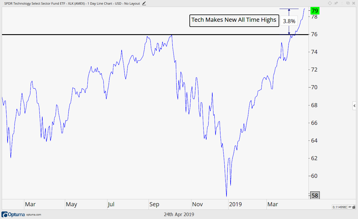
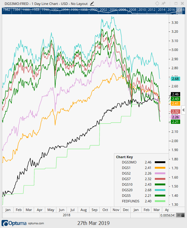
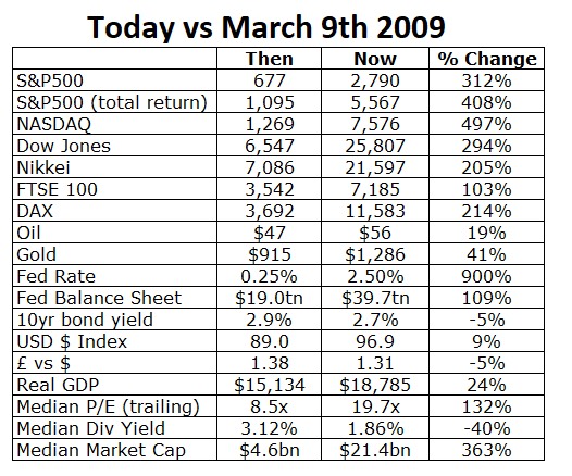
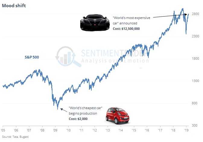
The S&P 500 broke to new all-time highs over the past few weeks, and as we wrote two weeks ago in “Yes, Dear”, new all-time highs should be considered bullish.

However, last weekend’s news that trade tensions with China were heating up again cleared the way for increased selling pressure. Some would say this was a surprise, but is it really?

Should we be surprised that Trump is jaw-boning of the Federal Reserve to reduce rates? Should we be surprised that a trade deal is not done, given the sizes of the two respective economies?

Should we be surprised that the market is taking a pause after a furious rally from the December lows? Should we be surprised that the “animal spirits” of a 10-year old bull market continue to push markets higher despite frothy valuations?

No we should not be surprised. We know better. We should EXPECT the surprise and be prepared for it, even if we don’t know what form the surprise will take.

So what are you supposed to do as an investor when faced with such surprises?

There are many answers to this question.

The run-of-the-mill investment advisor, including those at nearly every large investment firm, would suggest that you should just stay invested everywhere and always. They would suggest you not pay attention to the news, that you don’t open your statement when markets are volatile, that you don’t ask them tough questions about what is really happening in your investment portfolio.

The basis of this strategy is “Hope”.

You (and the advisor referenced above) hope the markets don’t fall too far. You hope you have the resources to withstand a major decline. You hope that it continues to rise like it has the past 10 years.

But what if that hope is misguided? What if the decline from last year was just a precursor of more downside to come? Or conversely, what if the market keeps going up for the next 5 years, despite this already being the longest expansion in history?

We’ve said many times that “Hope is not an investment strategy”.

In order to effectively address both downside and upside surprises, you must operate under a set of principles that guide your behavior during times of uncertainty.

And more importantly, these principles must be established and tested PRIOR to uncertain times, or else they will be abandoned when you need them most. This is why we hear of people who have sold at the bottom (or in many cases you may have been one of the people that sold at the bottom). Without governing principles, it is incredibly easy to abandon a plan. If there was even a plan at all.

Operating with a specific set of principles allows you to execute your plan with consistency, no matter what the environment may bring.

At IronBridge, we believe the following principles are essential to investment success:

  1. Accept reality as it is, not as you wish it to be.
  2. Markets are too complex to successfully predict with consistency.
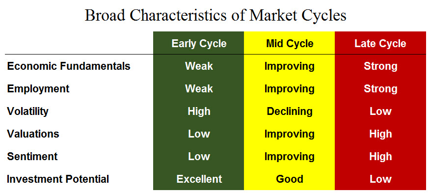
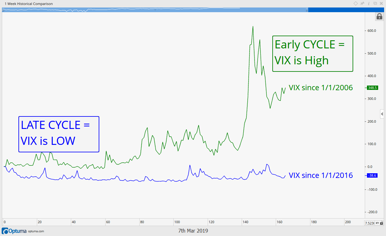
  3. Markets work in cycles; You must adapt to succeed.

The common theme in our principles is pretty simple: WE DON’T KNOW EVERYTHING.

And that’s okay.

As people who have been in the investment industry for decades, we realize that this goes against the fabric of what this industry has been built upon…the massive egos of mostly insecure men.

Turn on CNBC and you’ll hear these egos stating with great authority and confidence about exactly what happened in the markets today and why. Followed by someone who will state with equal confidence predicting exactly what will happen tomorrow, next week or years into the future.

Guess what…they are making it all up.

Once you can come to terms that there is more uncertainty in the future of the markets than what you think, you then are liberated to develop a truly effective investment strategy.

Let’s go through our principles briefly:


Principle 1: Accept Reality as It Is, not as You Wish it To Be

We won’t get to deep into the psychological and behavioral finance issues that cause us humans to project our own belief system onto the world around us. There are countless books that address these topics.

We simply need to know that we are predisposed to certain subconscious flaws when it comes to investing. It’s okay, we’re human. If we can recognize how certain flaws may negatively affect outcomes, then we can include in our investment process tools which serve to minimize these flaws.

These flaws cause us to view things in a way that is not truly objective. We all have prior experiences that we bring to our current view of markets. Some people have been burned too many times to invest in stocks. Others have been successful and have no problem holding through periods of volatility. There is nothing wrong with either view, as long as we can acknowledge and recognize the lens through which we see the world.

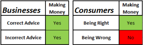
The single biggest flaw is ego. We as humans want to be correct. We want to be right. We want to be able to believe that we have insights that others don’t.

Accepting reality delivers a blow to our ego. It causes us to face the fact that we might be wrong. And being wrong implies being ineffective.

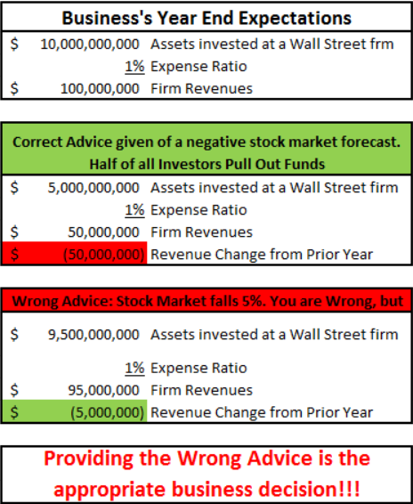
So most investment professionals focus on trying to be right. And it is only natural that as someone who uses an investment professional, you want them to be right just as badly. The fact is, markets go up roughly 80% of the time. (At least that has been the case for the professional lives of anyone in the industry today…there are plenty of instances where financial markets languished for decades, but that is for another day).

Accepting reality can be difficult, but it is absolutely critical when it comes to risk management.

Many times our process has identified a stock that meets all the proper criteria for inclusion in a portfolio: a great company, sound fundamentals, favorable trend, solid growth potential, and excellent risk/reward metrics.

We optimistically buy this stock for clients. We can visualize the experience of sweet delight as we watch this stock rise in value for our clients.

Then it does exactly the opposite of what we think it will do.

A couple weeks later it declines and reaches our predefined exit price. If we let our ego get in the way, we would hold this stock. It met all of our criteria. It’s a well-known company with a great track record. Surely this stock will turnaround and prove that our analysis was in fact correct. “The market is wrong about this stock,” we might be inclined to say.

What should we do?

It’s not always easy to do, but we follow our process. We sell the stock and move on. Maybe it will provide another quality setup in the future that will generate profits. Maybe it bounces immediately after it is sold. But that doesn’t matter. It didn’t work. We gave it room to breathe, and identified the prudent level of capital to risk on that investment. It unfortunately didn’t grow like we thought it would, so we move on. There are thousands of stocks, why stick with one that isn’t working?

What matters is having a proven, repeatable process that you can adhere to.

Accepting reality keeps your ego out of the equation. If you don’t care about whether you are right or wrong on the direction of a stock or the market in general, you can more objectively assess and execute a successful strategy.


Principle 2: Markets are too complex to successfully predict with consistency

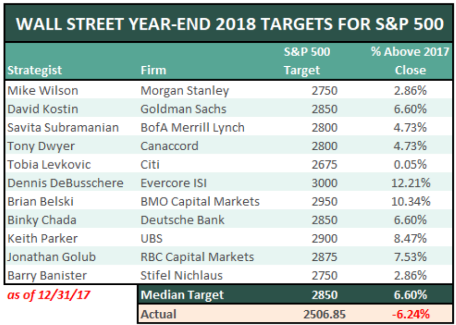
In our opinion, this is the hardest principle to fully embrace. The investment industry overwhelms us with market predictions.

Every day we see fancy reports that discuss predictions about things. Some are obvious, like the litany of year-end predictions in January. But some of them are more subtle. Overweight international stocks, underweight small caps, even-weight bonds, etc. These inherently involve predictions about the future.

They’re everywhere. But are they useful? Are the people who make the predictions held accountable? Is there a track-record anywhere that measures these market predictions? Of course not. The marketing department wouldn’t let that happen. Nor would their legal counsel. The fact is that most predictions don’t have any better track record than a randomly selected period of time.

So if we’re not predicting, what can we do? In the past, the information we had available to us was limited. The Wall Street Journal was the internet of the day. CNBC was actually a valuable resource (imagine that).

Today we have data. Boatloads of data. We don’t need the overconfident investment gurus to guide us with their predictions or analysis.

In many ways, we have too much data. So it not only becomes a puzzle of finding data, but filtering data so that it is impactful and useful.

We believe the best way to address uncertainty is by combining data analytics and judgement based on experience.

The best example of a successful integration of data and judgement can be found in aviation. The combination of an experienced pilot using the help of computers to fly a plane has resulted in a dramatic decrease in the annual rate of fatal airliner accidents, as shown in the chart below.

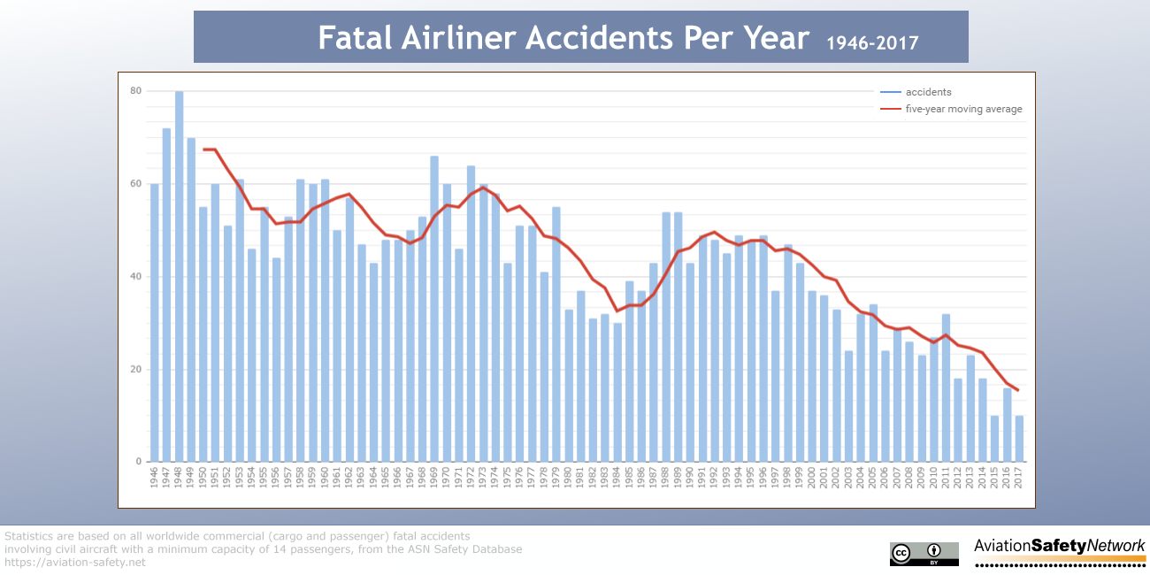
As we have unfortunately seen this year, when technology alone is in control, bad things can happen. Two accidents with the newest Boeing jetliner were due to the pilots’ inability to override the technology used to fly the plane.

And it backfired tragically.

While hundreds of people won’t lose their life if your portfolio falls 50%, we can still learn valuable lessons to help avoid financial disasters.

Because there is a tremendous amount of data available, there are many way to use it. In our opinion, we choose to look at a combination of fundamental data, quantitative data, and sentiment readings.

Fundamental data includes things like the economy, company earnings, employment, etc. These are the things that can give us context about the general investing environment, but are actually very poor if you’re using them to guide investing decisions.

Case in point: One investing environment has a 4.5% GDP, 4% unemployment, has been growing for 5 consecutive years, with record corporate profits. The second environment has negative 5% GDP, 12% unemployment, been in a recession for 15 months, and there are companies on the verge of bankruptcy.

Which environment would you choose?

The first environment was characteristic of 2007 near the peak of the market. The second was in April 2009, one month into the longest bull market in history.  The second environment, when the economy was awful, provided the best investment opportunity, while the second led to a decline of 55% in markets.

Economic data only provides context. It does not have a direct affect on markets.

Quantitative and sentiment data has a more direct effect, because they are actual influences on market prices. Buy and Sell volume. Optimism and Pessimism of actual market participants. Put/Call ratios. Momentum and Relative Strength measures. These provide more than context…they provide actionable signals to improve risk/reward characteristics of a portfolio.

If you do feel compelled to try to predict the market, present alternatives. What are the various scenarios that could play out? Be your own devil’s advocate and your results will improve.


Principle 3: Markets work in cycles. You must adapt to succeed.

This seems obvious to us, but it is not to most. People forget about market cycles 10 years into a bull market.

This is also a difficult principle to act upon. Principle number 2 states that we can’t predict the markets, so how could we possibly adapt to a changing market cycle?

You must have a plan. Having a set of rules allows you to participate in rising markets while minimizing damage in declining ones.

We won’t dive too much into rules, as there are millions of possible combinations.

At IronBridge, some of the rules we have developed include methods to stack-rank investments based on specified criteria, performing comparative analysis among multiple asset classes, breaking down markets into various sub-components, rules around the maximum loss to take on a given position, rules that direct the entry and exit of securities, and rules around overall portfolio construction so that clients of varying financial circumstances can benefit from similar actions in portfolios.

Ultimately, the specific rules matter, but they don’t matter as much as simply having a set of rules. Once you have an established set of rules, you can back-test them and see if they would have adjusted to a changing market. You can see the maximum loss, or maximum gain. You can have data around what your strategy would have actually done. This will provide confidence in implementing that strategy in various market environments.

What these principles serve to do is shift control back into your hands. You don’t have to be subject to the whims of global politics. You don’t have to subject your hard earned capital to large potential losses. You can expose your capital and know the worst case scenario, while shifting the odds in your favor that you will experience much more of the good and best-case scenarios.

Surprises will forever be a part of investing. Accept that they will occur, plan your actions beforehand, and execute your strategy with rigor. You can shift control from outside events to your own actions. Doing so will help you succeed.

Invest wisely.


 Our clients have unique and meaningful goals.

We help clients achieve those goals through forward-thinking portfolios, principled advice, a deep understanding of financial markets, and an innovative fee structure.

Contact us for a Consultation.

Neither the information provided nor any opinion expressed constitutes a solicitation for the purchase or sale of any security. The investments and investment strategies identified herein may not be suitable for all investors. The appropriateness of a particular investment will depend upon an investor’s individual circumstances and objectives. *The information contained herein has been obtained from sources that are believed to be reliable. However, IronBridge does not independently verify the accuracy of this information and makes no representations as to its accuracy or completeness.  Disclaimer This presentation is for informational purposes only. All opinions and estimates constitute our judgment as of the date of this communication and are subject to change without notice. > Neither the information provided nor any opinion expressed constitutes a solicitation for the purchase or sale of any security. The investments and investment strategies identified herein may not be suitable for all investors. The appropriateness of a particular investment will depend upon an investor’s individual circumstances and objectives. *The information contained herein has been obtained from sources that are believed to be reliable. However, IronBridge does not independently verify the accuracy of this information and makes no representations as to its accuracy or completeness.

Filed Under: IronBridge Insights

Yes Dear

April 25, 2019

The past six months have been good and bad to both bulls and bears. Bullish investors have participated in an amazingly strong 2019, but had to tolerate a loss of over 20% of their capital in Q4. While bearish investors were feeling great around Christmas, only to see their pessimism crushed with the markets moving dramatically higher since. In investing, as in relationships, sometimes the best advice is simply to “listen”.


Market Microscope

Good Relationships Start with Good Listening

“When people talk, listen completely. Most people never listen”

-Ernest Hemingway, Author

As market analysts, we scour through loads and loads of data in order to stay abreast of the daily meanderings of the investment markets. Sometimes it seems like an exercise in futility; other times we are sure we are witnessing a comedy of errors.

One things for certain, through this process we encounter countless opinions, statistics, and prognostications. We also always have the luxury in hindsight to see how things ultimately play out. After all, the markets are just one big history lesson. This is why we like to use charts and graphs so much. They help present this history in a visual, user friendly way.

But perhaps more importantly, they also help to filter out a lot of the noise.

Not only is it our job to sift through all that data and identify those points that seem to make the most sense, it too is our job to ignore a lot of the opinions and statistics and instead “trust” the market itself to tell us what it wants. After all, you can find a statistic (and opinion) for anything these days.

TV stations like CNBC love to showcase the Archie Bunkers of the investment world…stubborn people who think they are always right, and refuse to listen to counter-arguments. Why? Because they sell more commercials than someone who says they don’t know what is going to happen.

We view these Archie Bunkers as foolish. One must be able to change course and adapt as circumstances change. One should NOT remain gruff and demeaning to the possibilities of outcomes other than what one predicted.

Too much time is wasted trying to predict what the market is going to do. Will it rise, will it fall, will Tesla’s earnings beat, and if so, will the stock react positively (no, and, no as we saw 4-25-19)? To us, this is the exercise in futility alluded to earlier.

Nobody really knows all these answers. Markets are too complex to be predicted with any consistency.

A better approach? To LISTEN to the market. The foundation of our investment philosophy it that it is exponentially more valuable to actually listen to the market rather than all the predictions from the talking heads.

Confirmation bias, discussed multiple times in our own publication, is one of the most dangerous things an investor can fall into.

So instead of searching for only one side of the argument, let’s play a game of “Point, Counter-Point”, and look at two very bullish developments over the past few months along with their counter-points.


Bullish Point 1:
The Tech Sector is Leading and Making New Highs
Bearish Counter-Point 1:
Market “Breadth” is notably weak, with many large companies far from making New Highs
Bullish Point 2:
The Nasdaq and S&P Have Made New All Time Highs
Bearish Counter-Point 2:
Small Caps, Lumber, and Copper, all considered Leading Indicators, are Not Confirming the New Highs

Bullish Point 1: The Tech Sector is Leading and Making New Highs

The first chart below shows a very positive development. The technology sector, which is 20% of the S&P 500 by weight, just made a new all time high price, helping to take the S&P up to new highs the week of April 22, 2019.

Cyclical areas of the market are leading the way is one of the key signs of an overall healthy market. In February and March of last year, despite a quick 12% selloff in the S&P 500, the more aggressive areas of the market were consistently scoring well on our investment screens. Technology and Consumer Discretionary stocks, which are more sensitive to changing economic conditions, were the leaders.

Perhaps coincidentally (perhaps not), the market had a relatively short and shallow pullback, and ultimately moved to new highs last September. This was a textbook case of how listening to the market proved much more valuable than listening to those who were concerned about the US/China trade tensions. Risk appetite remained high, and markets ultimately moved higher.

If we compare early last year to when the market was making new all-time highs in September, these tech leaders became laggards. Sectors such as Consumer Staples and Healthcare became the leaders, which was a sign that market participants were skeptical of the rise in stocks and were de-risking their equity exposure.

The switch from aggressive areas outperforming to defensive areas outperforming was an excellent sign that trouble may occur, and an excellent signal that we should make sure our risk management strategies are ready to be implemented. This is ultimately what happened, as the S&P fell over 20% from peak-to-trough during a difficult Q4.

Once again, listening proved to be the right tactic in our relationship.

Today, and for most of the past 4 months, the leading sectors have been Technology, Industrials and Consumer Discretionary. These are the three most aggressive sectors within the S&P 500, and have historically been the most economically sensitive.

Seeing these areas do well are not a guarantee that the market will continue higher, but it is a positive sign nonetheless.

Counter-Point 1: Market “Breadth” is notably weak, with many large companies far from making New Highs

As Lee Corso would say on College Gameday, “Not so fast my friend!”

The tech sector is making new all time highs, and that is great news. Unfortunately, many large companies are not receiving near the attention the tech sector as a whole is receiving. Additionally, even stocks within the tech sector are showing some weakness.

Because it is a cap weighted index, when the larger companies are doing well, the index, by a function of its cap weighting also does well. (A “cap-weighted index”, sometimes called a “market-value-weighted index”, is a stock market index whose components are weighted according the total market value of their outstanding shares.” – Investopedia) Essentially, The bigger the stock, the more influence it has on the index.

The chart below shows the top holdings in one of the most popular sector funds, the Technology sector ETF (ticker XLK). Microsoft and Apple make up a whopping 35%! As long as these two stocks perform well, the odds are high XLK will too, and that’s exactly what has happened with Microsoft up over 10% above its Fall 2018 high and up over 25% thus far in 2019. For reference, Apple is up over 30% in 2019!

The next 3 holdings in XLK are Visa (up 22% in 2019), Intel (up 25% year to date), and Cisco (up 32% in 2019), collectively making up another 15% of the Index. All together the top 5 holdings are 50% of the sector ETF, and with this sector 20% of the S&P, it means these 5 stocks are just 1% of the S&P 500’s companies (5/500) but they represent 10% of its daily swings up and down.

This sword cuts both ways. If these stocks ever start to falter, we should expect XLK to struggle as well as the S&P.

To expand on this breadth observation, the graphic below shows 20 of the top 100 largest S&P 500 companies. The key differentiator is that these stocks all remain a full 15%+ below their Fall 2018 price peaks (the graphic is filtered by distance from recent price high). They are not participating in the recovery near as much as some of the other companies out there.

The 52 Week Drawdown column shows how far these stocks have fallen from their September 2018 price highs. Additionally, at the top in gray shows that the average S&P 100 stock is still 7.88% below their all-time highs.

It’s tough to get too excited about the market getting close to new all time highs when the likes of FedEx, Walgreens, and Kraft are performing so dismally.

Surprisingly, some of the “new economy” stocks. like Nvidia and Facebook, are also in this category. Nvidia is up 43% thus far in 2019, yet it remains down a massive 36% from its all time high, remaining in a bearish trend.

If we were to try to draw a conclusion to this it’s that pockets of the market/economy remain strong while other pockets (Healthcare, Financials, Consumer Products, and some Transports) remain rather weak.

When the markets don’t have a lot of participation it’s known as “weak breadth”, and weak breadth seems to be what we are seeing right now during this move higher.

Ideally, we would like to see market breadth improve, which could provide fuel for the next move higher in stocks. However, as it exists today, we take this as a negative for the markets, and signals that our risk management strategies should once again be ready to be deployed.


Bullish Point 2: The Nasdaq and S&P Have Made New All Time Highs

Bottom line, new all-time highs are bullish. Price is the judge and jury (much like our significant others). It doesn’t matter whether you think the market should be at all-time highs or not…they are at all-time highs. Period.

Similar to the Technology sector discussed previously, the Nasdaq Composite Index has made a new all time high, and many investors look at this as a positive since that index is typically indicative of the “growth” aspects of our economy.

The chart below shows the Nasdaq’s performance over the last year. Looked at in a silo, this is potentially bullish price action as all the drawdown from last year has been depleted with a 31% move off the lows. A series of higher price highs is the ultimate sign of the start of a “bullish” trend.

Once again, technology stocks continues to power the market higher.

We’ll reiterate…new highs are bullish, and should be taken as such.

Counter Point 2: Small Caps, Lumber, and Copper, all considered Leading Indicators, are Not Confirming the New Highs

The Nasdaq may be making new all time highs, but technology stocks are not the only part of the market that can give clues about the future direction of prices. Other growth segments of our economy are not showing the same strength.

The small-cap Russell 2000 index is a great example as it helps track the performance of the U.S.’s small cap companies. These smaller, more domestically focused firms are also typically thought of as “growth” since they on average grow faster than the much larger large cap companies.

The problem is they have not performed near as well as the Nasdaq, tech, or some other larger cap dominated segments during this bounce back. Even worse, those stocks have moved net sideways since mid-February while the larger cap indices continued their march higher.

Coming out of the pullback in early 2018, small caps led the way, and were one of the first areas of the markets to make new highs. As seen in the chart above, that is definitely not the case today.

We discussed earlier about the heavy weighting of the top holdings in XLK. The Nasdaq has the same issue. The top 3 stocks in the Nasdaq Composite are Microsoft, Apple, and Amazon, comprising a whopping 23% of its movements. These 3 stocks are just 3 out of 2,639 companies yet they make up almost one fourth of the entire Index. These three stocks have performed remarkably well during the first part of 2019, lifting the Index to new all time highs.

But if we look one level deeper, many Nasdaq stocks are actually struggling. In fact, the past two weeks there have been more 52 week price lows than 52 week price highs of Nasdaq components. The chart below, from Lyons Share, outlines all the other times this has occurred in the Nasdaq.

Notice, over the short term this has resulted in largely flat to negative returns, and over the long run it is a mixed bag, courtesy of the tech bubble. Many of these signals occurred in 1998 and 1999, resulting in a 6 month to 1 year timeframe significant outperformance, but then followed by a significant underperformance 2 years later.

If we exclude the tech bubble, then the overall results are largely negative. However, if we exclude this period we also leave much fewer data points in our sample size, minimizing the statistical value of such findings.

So, do we focus on the short term statistics, the long run statistics, both of them, none of them, including the tech bubble, or excluding it? A case of futility perhaps?

Contrast the Nasdaq’s top 3 positions of 23% to the Russell 2000 index ETF (ticker IWM), which has its top 3 holdings (FIVE, ETSY, CREE) making up just 1% of its movements. The top three holdings in the Nasdaq are over 20x more important than the top 3 holdings of the Russell 2000. Let’s let that sink in.

From a breadth perspective, the Russell 2000 is much more representative of the “average” stock. Shown previously, indeed its 7% distance from its high is similar to the S&P 100’s current 8% average distance discussed earlier. The Cap weightings seem to once again be playing a major part in the market’s rebound.

We saw similar declining breadth readings leading up to both tops in 2018. It remains to be seen if a similar result will unfold with the current lack of breadth.

Beyond Equities, even some commodity economic leading indicators are showing us warning signs. Copper, referred to by many as “Doctor Copper” because of its supposed ability to predict economic expansion and contraction, has not seen near the rebound in its price after also falling off the proverbial cliff in 2018.

Lumber prices have moved swiftly down after recovering a portion of their massive losses seen post-Hurricane Harvey in 2018. Lumber is a major component of housing and is often looked to as a guide for growth in that industry and beyond.

The two charts below provide reasons to question the positive economic outlook some of the stock markets are suggesting. Some stock indices remain strong, but two commodities, with “leading” potential remain rather weak.

Notice how these two charts look a lot like the Small Cap Index chart above. All three fell in price after topping sometime in 2018, only to retrace a portion of that decline, with Lumber potentially providing the more ominous outlook as its price remains near multi-year lows, down around 50%.

Of note is Copper and Lumber held up to their end of the “leading indicator” bargain as they topped out well in advance of equities. This at a minimum suggests we should pay attention when they aren’t confirming equity moves.

We have offered up these bullish and bearish dichotomies as examples to remind us that trying to predict exactly what markets will do is a futile exercise. There are always compelling reasons to be bullish and always very good reasons to be bearish, and that has not changed today and will likely never change. Although there are certainly risks in the market today, it doesn’t mean we should be avoiding the markets.

But, being aware of the risks does help us better prepare and allows us heightened opportunity to keep our profits in the event we do see another large drawdown event.

The great news for us and our clients is that we don’t have to really care about all of these bullish points and bearish counter points since our systems are designed to capture market returns regardless of the underlying environment.

If the bullish argument for equities continues to win, that will be great, as we are essentially fully invested right now and have been able to participate in the markets recent moves higher. The lack of breadth hasn’t kept the large cap markets from rallying, and our clients will have exposure to that area (as long as it continues).

But if the bearish argument is going to win, that will also be okay by us as our strategies are designed to minimize downside exposure when volatility starts to pick up and protect the profits we gained on the way up.

For now and always, we will keep our ears on the market and try to be the best listeners we can.

And most importantly, we will remember that the market (and our relationship partner) is always right!

Invest wisely.


 Our clients have unique and meaningful goals.

We help clients achieve those goals through forward-thinking portfolios, principled advice, a deep understanding of financial markets, and an innovative fee structure.

Contact us for a Consultation.

Neither the information provided nor any opinion expressed constitutes a solicitation for the purchase or sale of any security. The investments and investment strategies identified herein may not be suitable for all investors. The appropriateness of a particular investment will depend upon an investor’s individual circumstances and objectives. *The information contained herein has been obtained from sources that are believed to be reliable. However, IronBridge does not independently verify the accuracy of this information and makes no representations as to its accuracy or completeness.  Disclaimer This presentation is for informational purposes only. All opinions and estimates constitute our judgment as of the date of this communication and are subject to change without notice. > Neither the information provided nor any opinion expressed constitutes a solicitation for the purchase or sale of any security. The investments and investment strategies identified herein may not be suitable for all investors. The appropriateness of a particular investment will depend upon an investor’s individual circumstances and objectives. *The information contained herein has been obtained from sources that are believed to be reliable. However, IronBridge does not independently verify the accuracy of this information and makes no representations as to its accuracy or completeness.

Filed Under: IronBridge Insights

We Were Inverted

March 29, 2019

Over the past week, parts of the yield curve have inverted for the first time since prior to the ’08 financial crisis. Many investors view an inverted yield curve as one of the first indications that the economy is entering into a recession. While it does have some historical importance, the actual significance is much more nuanced.


Market Microscope

What is an Inverted Yield Curve?

“I would not interpret the currently very flat yield curve as indicating a significant slowdown to come.”

-Ben Bernanke, former Chair of the Federal Reserve, March 2006

“The evidence very clearly indicates that its efficacy (the yield curve) as a forecasting tool has diminished very dramatically because of economic events”

-Alan Greenspan, former Chair of the Federal Reserve, July 2005

Last week, one measure of the yield curve inverted for the first time since 2007. Prices on the 10 year US Treasury bond rallied, and as a result its yield fell substantially below the yields on shorter term bonds.

There are many ways to interpret an inverted yield curve, but before we get too deep into the discussion, let’s take a step back.

What is an Inverted Yield Curve?

First of all, the “Yield Curve” is simply a graph of yield versus maturity. Yields go from low-to-high on the y-axis (up and down), while maturities are shown from short to long along the x-axis (left-to-right).

Yield curves can be plotted for a variety of instruments: US Treasury Bonds, Certificates of Deposits, Corporate Bonds, International Bonds, etc. However, for this publication, when referring to the “yield curve” we are referring to yields on US Treasury bonds.

The difference between a “Normal” and “Inverted” yield curve is shown in the chart above, courtesy of Seeking Alpha.

In a normal environment, an investor would expect to get a higher interest rate for a longer-term investment. A 5-year CD from a bank should pay you more than your savings account. This is a “Normal” yield curve.  However, if your savings account paid 3%, but that same 5-year CD paid only 1%, then the yield curve is “inverted”, as the longer-term investment pays less.

It is fairly rare to see an interest rates with these characteristics. An inverted yield curve is rare because inflation and the time value of money suggest longer dated bonds should yield more than shorter dated ones.

Yield curve inversions are not just a reflection of the current interest rate environment. The yield curve is also known as the “recession indicator”, as it has been a fairly good predictor of an impending recession.  However, like most things in the investment world, reality is more nuanced than what you’ll find on CNBC.

Multiple Time Frames

One nuance is the fact that multiple time-frames that can become inverted. There is not just one yield curve; it is a collection of multiple data points.

The next chart below shows the recent history of different Treasury yields, as well as the Fed Funds rate.

To read this chart, simply look at the number after the “DGS” in the Chart Key. “DGS3MO” is the 3-month Treasury yield. “DGS1” is the 1-year, “DGS2” is the 2-year, and so on.

For the first time since 2017, short term Treasury yields are at the same level as the current Fed Funds target, suggesting equilibrium there. This is likely the primary reason the Fed did not raise rates recently (their latest meeting was Mar 20), and it is a very good reason to expect no further rate raises in 2019. In fact, if the short end of the curve starts to follow the long end lower in yield, it would be a clue the Fed will indeed cut rates later this year.

Another nuance of the yield curve is how yields are inter-related to other assets, specifically stocks. Notice on the chart starting near the peak of equities, back in September of 2018, the longer dated bonds (the 5, 7, 10, and 20 years) all started to fall in yield while the 3 month (shown in black) has barely budged. One reason for the move higher in Treasury bonds is lowered earnings expectations from the likes of FedEx, Delta, and virtually all of the semiconductor manufacturers, as investors took assets out of the stock market and put it into the bond market.

It is not just the US that is showing signs of stress. German “bunds” have also been bid precipitously and are once again trading at negative yields. In fact over $10 Trillion worth of bonds around the world are currently trading at negative yields.

This occurs when a bond is issued at a nominal yield (for instance a 10 year German Bund issued at 2% in Dec 2011) but is then bid up in price to the point its yield to maturity turns negative. The 10 year German Bund today has a coupon rate of just 0.25%, so it will not take much demand to push those yields into negative territory.

The next chart shows the effective rate of the German Bund. Notice the negative territory today as these bonds have also gotten a boost in buyers in the 1Q.

Why in the world would someone buy a negative yielding instrument?

Investopedia helps us narrow down some reasons with the following:

  1. A buyer that has no choice, like a central bank or a hedge fund. Other examples could be those entities with mandates, like an endowment fund that requires 3-5% of its portfolio in Treasury assets at all times or a passively managed Treasury ETF, such as IEF or TLT, which must always own the Treasury asset class in their mandate.
  2. A foreign investor who could offset the negative yield with a currency gain. There is a complex theory in finance known as interest rate parity which essentially suggests that interest rates in countries are affected by those same countries’ currency exchange and forward rates. These investors may be fine with the loss in yield, expecting the currency gains to more than offset.
  3. An investor may think that a negative yield is better than what could be a larger loss elsewhere, a play on risk expectations. In other words, there is no better alternative, and they may see parking funds on the sidelines for 5 years at a slightly negative rate as more attractive than parking it elsewhere with unknown risks. An expected period of deflation could be an example of this. Although an investor in a 5 year German Bund with a 0.0% coupon today may not expect to make any money in their bonds, they may expect to be able to buy more once the principal comes due in 5 years because deflation has lowered prices of all the alternatives around them.

This 3rd scenario, deflation, largely explains our current predicament in the U.S and the World. It seems growth expectations continue to come down. The Atlanta Fed recently projected just a 0.5% 1Q GDP growth rate, sparking some fears again around deflation.

In addition, and contrary to what Alan Greenspan, Ben Bernanke, and Janet Yellen have all testified during similar times of inversion (thus the two quotes to open this section), there is some merit to being worried about the inversion of the yield curve as it does have a solid predictive history, but it also directly affects some industries.

One example is in the banking sector. Banks borrow at short term rates (like the 3 month Treasury curently @ 2.41%) and lend at longer term rates (like the 30 year mortgage currently costing around 4%+). The longer short term rates stay elevated compared to longer term rates, the more pressure is put on banks as their margins are squeezed. This could ultimately be a cause of a recession if banks tighten up their lending enough to slow growth.

Indeed, we have seen bank stocks hammered of late with the inverted yield curve as the chart of XLF (the financials sector ETF) reveals over 6% decline in less than two weeks.

It seems the market is pricing in such a scenario of slowed lending and less profit for the banks, but so far the broader market as a whole has not responded much to the inversion.

Should we be scared about an inverted yield curve?

As people who study market history we can identify a few things to watch:

  1. The stock market’s price will tell us when we are nearing a recession, and more importantly for our readers, a bear market. Thus far this has not occurred as prices maintain their rebounded levels off the December lows.
  2. A look at history reveals the inversion of the yield curve itself is not that big of a deal to the stock market.

The final chart below points out other times the 3 month yield was above the 10 year yield (below the blue line at 0%). But it is a big deal when that inversion occurs and then the Treasury market comes out of that inversion. History suggests that will be the real test.

It may be because we are coming out of the inversion or just the lag on the inverted curve, but regardless, the stock market selloffs of 2000 and 2007 did not occur until the yield curve had already inverted and started to normalize.

In other words, this bull market could continue longer, as it did in 2006 and 2007.

The fact is, an inverted yield curve itself is not cause for worry, at least not immediately. There is a lag between the time the curve inverts and the start of a recession.

The proper time to become worried is once the yield curve normalizes after becoming inverted. When the short end starts to join the long end and stocks start to sell off, then we will get more worried about the inversion.

Either way, the fact that parts of the yield curve are starting to invert is yet another sign that says we are late in this investment cycle. There remains decent upside return potential, but risks are elevated, and will be until the next bear market occurs.

Invest Wisely.


 Our clients have unique and meaningful goals.

We help clients achieve those goals through forward-thinking portfolios, principled advice, a deep understanding of financial markets, and an innovative fee structure.

Contact us for a Consultation.

Neither the information provided nor any opinion expressed constitutes a solicitation for the purchase or sale of any security. The investments and investment strategies identified herein may not be suitable for all investors. The appropriateness of a particular investment will depend upon an investor’s individual circumstances and objectives. *The information contained herein has been obtained from sources that are believed to be reliable. However, IronBridge does not independently verify the accuracy of this information and makes no representations as to its accuracy or completeness.  Disclaimer This presentation is for informational purposes only. All opinions and estimates constitute our judgment as of the date of this communication and are subject to change without notice. > Neither the information provided nor any opinion expressed constitutes a solicitation for the purchase or sale of any security. The investments and investment strategies identified herein may not be suitable for all investors. The appropriateness of a particular investment will depend upon an investor’s individual circumstances and objectives. *The information contained herein has been obtained from sources that are believed to be reliable. However, IronBridge does not independently verify the accuracy of this information and makes no representations as to its accuracy or completeness.

Filed Under: IronBridge Insights

Cycles & Anniversaries

March 8, 2019

Knowing where you are within an economic, investment, or social cycle may be the single most important factor in making an investment decision. History is rife with examples of cycle extremes, both on the upside and on the downside, offering excellent corollaries to today’s cycle environment. We should adjust our thinking based on where we are within a cycle.

Market Microscope

Where are we within the Market Cycle?

“Most people get interested in stocks when everyone else is. The time to get interested is when nobody else is. You can’t buy what is popular and do well.

-Warren Buffett


Ten years ago this week marked the end to one of the largest bear markets in recent history. On March 9, 2009, the S&P 500 traded at the creepy level of 666, which marked the low point of the decline that began in October of 2007. All told, the market declined 54% over that time frame.

Since then, as we all know, markets have been incredibly strong. The S&P 500 is up over 400% since that day ten years ago, along with many other markets that have shown tremendous strength, as shown in the chart below.

The natural question to ask is “Why?”. What caused such a large decline, followed by such a large rise?

There are as many theories as to why things happen in markets as there are market participants. And each theory is about as useful as a screen door on a submarine.

In our view, it is not the “why” that is important. Because the real answer to “Why?” is simple…markets work in cycles. Period. Anything more than that is simply an attempt to try to sound smart at a dinner party.

Whatever confluence of events that led to the last bear market is not likely to be the same reasons we enter into the next one. Thus, to spend time and effort understanding exactly what happened is an activity for market historians and college professors. It is NOT a useful activity for portfolio managers like us who are trying to navigate changing markets in real-time, with hard-earned wealth that has been entrusted to us by our clients.

What is important are the conditions that existed around that period of time. Paying attention to how different parts of the economy and markets were behaving can help us better identify where we currently are in the market cycle. Then, by understanding where we are in the current market cycle, we can then more effectively apply strategies that best take advantage of the risks and rewards that exist today.

We know that the moves from the 2009 lows have been strong, but they also have been very long as well. The graphic below shows that this is also the longest bull market in the S&P 500 Index since the index was created back in 1949.

What we, as market analysts, find more interesting than the size and duration of this bull market is just how different today is compared to March 2009.

Where were you in October of 2008, when the bulk of the fear occurred? Numerous days, and even weeks, there was flat out panic. The stock market fell over 25% in just that one month.

We have left Warren Buffett’s quote above from our last ‘Insights’ as the headline as it remains relevant to our thesis this week. Do you remember Buffett’s full page Wall Street Journal plea on October 17, 2008 to “Buy American. I am”? Granted, the market fell another 20+% from there before ultimately hitting its lows, but Buffet’s Op Ed was published generally when nobody was interested in buying stocks. There were bailouts, unprecedented moves by banking systems, and AIG was even nationalized. Fear was in the air.

The fear in 2008 and early 2009 was real, but it was also normal. The market cycle punishes those who are not prepared for it.

Over one year ago, in February 2018, our ‘IronBridge Insights’ used the following graphic to help show the dichotomy between a market that was late in its cycle or early in one. This chart’s importance to us remains, especially as we think back to 2008 and, specifically March 2009.

Notice how the things that people traditionally associate with a good investing environment are actually opposite of what you hear on the CNBC’s of the world. When the economic environment is at its WEAKEST is precisely the time when your investment opportunities are the greatest.

When things look awful is the best time to invest. When everything seemingly looks the strongest is the time for caution.

Let’s look at how a few of these indicators today compare to them in 2009.

The March 2009 quarterly earnings of the S&P was just $7.52 per S&P share, down 66% from the then all time high $21.88 of June 2007. In less than two years, life in America shifted abruptly. The graphic to the left characterizing the different phases of a market suggests that early in a market cycle economic fundamentals are weak. We would constitute a 66% decline in earnings and at the lowest level since the .com bust as weak.

Contrast this to right now. September 2018 earnings hit an all time high of $36.36 per share, a full 5x more than earnings back in early 2009. Economic fundamentals it seems are very strong currently.

There are countless ways we could measure the economic backdrop, but one other one, unemployment, is a pretty universally accepted gauge. In March 2009 the Federal unemployment rate was 8.5%. Today it is at 4%. It’s tough to argue, from an economic aspect at least, that we are anything but late cycle right now. To put things in perspective, at the prior all time stock market peak, in October 2007 also had a 4 handle, at 4.7%. Economically and employment-wise, today looks a lot more like 2007 than it does 2009.

How about the next topic on the cycle list above, volatility?

The chart of volatility below shows two timelines: one originating on Jan 1, 2006 (green line), and another originating on Jan 1, 2016 (blue line). Comparing the two periods reveals what many already know, volatility is much higher earlier in a market cycle than it is later in the cycle.

Volatility was relatively low in 2006 and 2007, just as it was low in 2016 and 2017. This is par for the course late in a cycle. 2018 finally saw some volatility creep into the market (perhaps a sign that the cycle is trying to turn?). Obviously a major spike higher in volatility occurred during the financial crisis, a sign that the late cycle of 2006 and 2007 had turned to an early cycle of 2008 and 2009.

A product of economic fundamentals, there is also a vast difference between valuations of companies late in a market cycle versus early in the cycle.

The price to earnings (P/E) ratio at the low of the last cycle (2011) was 13x. The previous peak occurred in December of 2007, at 22x. Just 10 months before the bottom fell out of the stock market, the P/E ratio was hitting an all time high!

We have seen a similar event today. In fact in both June and September 2018, the market was trading at the same 22x multiple on earnings. This aligns the valuations of today with 2007.

Sentiment is another very important aspect of cycle analysis. It may even be the most important. Why? Because sentiment is a major input into price since investor feelings, moods, and behaviors all affect prices. Additionally, when sentiment is positive, prices are elevated, and when sentiment is negative prices are depressed, having a major affect on the other key inputs to cycle analysis, affecting valuation, economics, employment and volatility.

The next chart shows NYSE Margin Debt, or the debt investors have taken on backed by their equity holdings.

Notice a trend? When investor sentiment is high, they are more willing to lever up their investments. Recently that sentiment peaked at a new all time high, a full 50% more than the prior peak in 2007. Again we see that margin debt levels today are more in line with the year 2007 (and 2000) than it was anytime between 2008 and 2014. Based on sentiment and the significantly more margin investors are using, once again we must conclude we are late in the cycle.

Another, less scientific view of sentiment looks at societal trends in an attempt to identify the market cycle. As shown on the chart below, courtesy of SentimenTrader, the “world’s cheapest car” debuted at the depths of the financial crisis. Just recently, the “world’s most expensive car” was announced. For those interested, see specs HERE…it’s a 1500 horsepower, 16-cylinder widow-maker sports car.

Where we are within a cycle is crucial to making sound investment decisions. Just as Warren Buffett said in his 2008 Op Ed, “Be fearful when others are greedy, and be greedy when others are fearful”. Which brings us to the final input to the cycle conversation.

Knowing where we are the in the market cycle in and of itself doesn’t do much. It’s the ability to USE this knowledge to your advantage that is key.

“Alpha” is a term used to measure the performance of an investment strategy relative to a benchmark. Generating alpha is every investor’s dream. Positive alpha means the strategy is performing better than a benchmark. A mutual fund that invests in US stocks would have the S&P 500 Index as a likely benchmark. If the S&P was up 10% in a given year, and the fund was up 14%, that fund generated positive alpha that year.

Providing alpha to investors is difficult. Over the past 10 years, over 90% of active mutual funds under-performed their respective benchmarks. The reason for this is simple. They are using strategies that have not adjusted to today’s investing environment.

In order to generate alpha, one must have some sort of edge. We believe that you can use the market cycle to help to achieve outperformance, but you must adjust to the current environment.

We apply a variety of strategies in client portfolios, but there are a few themes that we apply late in an investment cycle like we believe we are in right now.

  • Shorten your Time Frame. Late in a cycle, we expect to hold investments for a shorter period of time. The risk of a big loss increases as time goes by, as the cycle inevitably will turn from good to bad.
  • Don’t let a small loss turn into a big loss. After 10 years of a good market, declines can be large. We have exit signals on every position in actively managed client portfolios. Our average downside risk is approximately 5% right now.
  • It’s okay to be in cash, at least temporarily. Cash can provide dramatic outperformance in down markets (it was the best performing asset class in 2018.) However, if you have an increased cash allocation, you must have know the conditions that would cause that to be reinvested.
  • Have a defined, repeatable process. While characteristics are similar, no two investment cycles are the same. You must have a process that can adapt to any market environment.

There is always opportunity for those that work for it. By identifying the conditions present in the current environment and applying common sense rules, we believe the investing odds can be skewed in your favor.

Invest Wisely.


 Our clients have unique and meaningful goals.

We help clients achieve those goals through forward-thinking portfolios, principled advice, a deep understanding of financial markets, and an innovative fee structure.

Contact us for a Consultation.

Neither the information provided nor any opinion expressed constitutes a solicitation for the purchase or sale of any security. The investments and investment strategies identified herein may not be suitable for all investors. The appropriateness of a particular investment will depend upon an investor’s individual circumstances and objectives. *The information contained herein has been obtained from sources that are believed to be reliable. However, IronBridge does not independently verify the accuracy of this information and makes no representations as to its accuracy or completeness.  Disclaimer This presentation is for informational purposes only. All opinions and estimates constitute our judgment as of the date of this communication and are subject to change without notice. > Neither the information provided nor any opinion expressed constitutes a solicitation for the purchase or sale of any security. The investments and investment strategies identified herein may not be suitable for all investors. The appropriateness of a particular investment will depend upon an investor’s individual circumstances and objectives. *The information contained herein has been obtained from sources that are believed to be reliable. However, IronBridge does not independently verify the accuracy of this information and makes no representations as to its accuracy or completeness.

Filed Under: IronBridge Insights

Cyborgs & Recessions

February 15, 2019

With rapid advancements in technology computing power, we now have access to information that was once unfathomable. But having information and properly using information are two very different things. A successful investment strategy must combine the benefits of both humans and machines.

Numerous economic indicators are flashing warning signs. Most recently, December retail sales came in horribly below predictions. Additionally, the consumer has taken on a massive amount of non-housing debt since the financial crisis. It seems the prevailing theme of a strong consumer may be misleading, just as the strong corporate balance sheet was proven to be in our last ‘Insights’.


Portfolio Insights

Cyborg Portfolios

“Computers are incredibly fast, accurate and stupid. Human beings are incredibly slow, inaccurate and brilliant. Together they are powerful beyond imagination.”

-Quote attributed to both Albert Einstein and Leo Cherne

The stock market continues to suck investors back in, us included. Following such a dramatic fall in Q4, the market completely reversed course and has been amazingly strong since Christmas Eve.

So was that it? The bear market lasted three months, and we’re now on the way to new highs? We definitely are not ruling that out. Or was that the market decline just an omen of things to come? We can’t rule that out either.

We find ourselves today in an absolutely textbook Late Cycle environment. What makes investing so difficult late in a cycle is the wide dispersion in potential outcomes. Return potential is still good, as the bull market could last another 3-5 years. But downside risk is incredibly elevated as well. So we end up with a year when the market could easily be up 20-30%. It could also be down 20-30%.

You may ask, “So what’s an investor to do…just buy the index and forget about volatility?” We don’t think so. “Should you bury cash in the backyard and avoid this mess altogether?” We don’t think that either.

“So I’m supposed to just sit here and read your vague answers to my serious questions?” Sorry, we’ll get on with it.

In this kind of environment it all comes down to two things: Discipline and Mindset.

Discipline

The investment world is not lacking in technology, and it is not lacking in information. Quite the opposite, as we are awash in information about the markets provided by a plethora of different technologies.

But having too much information can become a burden if there is not a repeatable way to process that information. This is where Discipline comes in.

Microprocessor counts have doubled every year since 1971, as shown in the first chart. This gives us access to data that was once unimaginable.

Microprocessor Growth over Time

Access to technology and data can be a great asset in portfolio management when used properly. It can help identify and adjust to opportunities before our brains piece the puzzle together. Computers can process millions upon millions of data points in a fraction of a second. The human brain, on the other hand, can only process between five and nine “chunks” of information at any given time.

Here is where things can go wrong. What if you’re using technology to find great data, but it’s the wrong data? Or what if you’re focused on a few seemingly important investment themes, but they are the wrong themes? Or, it’s the right data, but you just don’t know how to properly use it? It’s not the ability to have information that is important. It’s the ability to find information that can give you an advantage that is important.

The most important aspect to using technology is discipline. There are many times that the data and the human brain are in conflict. What then? If you don’t have a repeatable process that has been tested in various conditions, then human nature takes over, and decisions are made on fear and greed rather than being rooted in probabilities.

But a system that is reliant on technology alone misses the fundamental concept that markets are not physics. Markets and economies are the broad collection of billions of individual decisions. An economy is not a “thing” by itself. An economy is someone deciding to buy a sandwich. And to buy a car. And to give flowers to their significant other. And to fall behind on payments on the car they just bought (more on that in the Market Microscope section below).

Likewise, the market is not a “thing” by itself either. It is someone buying 100 shares of Apple from someone who is selling 100 shares of Apple. Repeat that a couple billion times every day and you have the stock market.

But on a scale as large as the market and the economy, it DOES start to display its own behaviors as if it were an independent “thing”. A wonderful book was written on this called “Extraordinary Popular Delusions and the Madness of Crowds”, by Scottish journalist Charles Mackay. (Available on Amazon HERE).

In it, Mackay analyzes the great financial bubbles of history, such as the tulip bubble and South Sea bubble, but also explores societal manias like the Crusades and Witch Manias in Europe that lasted for two centuries. It is as applicable today as it was when it was written. In 1841.

That is because the human psyche has not changed. Yes, we now have iPhones and centralized plumbing and tall buildings, but we’re still humans. And subject to all the same flaws that humans have repeated for thousands of years.

The lesson is that while technology can crunch numbers, it is not yet very effective at contextualizing data. In our opinion, the ideal combination of humans and technology is for humans to create the structure, technology to do the mining of data, and then humans to approve and act on the data.

This is exactly how we build portfolios. We create portfolio sub-structures that have very specific goals, with specific sets of rules. Then we let the computers take over and analyze data. Using this process, we can then customize portfolios for clients with varying objectives and risk tolerances.

Taking this “cyborg” approach, we believe we can both leverage technology to fill the gaps in analysis that cannot possibly be achieved by humans, but still have a human over-ride to contextualize portfolio decisions to act in the best interest of our clients.

With any human involvement in a decision-making process, the experience and background of the decision-maker becomes an important factor. This brings us to the other important requirement to successfully invest, which is mindset.

Mindset

In January, we discussed the difference between being right and making money (found HERE). What we primarily mean when we say this is that we frankly don’t care if we’re right about the direction of the market. No investor’s goal should be to try to predict the market. If it is, then the entire portfolio foundation is built on sand, not concrete.

The goal is to make the greatest return possible with the least amount of risk. Period. It’s about probabilities, not predictions. Discussions around mindset are geared primarily at behavioral finance topics. We discussed various cognitive biases in late 2017 (read it HERE).

When left unchecked, the human brain will wreak havoc on an investment portfolio. Fear will make you sell low, greed will make you buy high.

But the most harmful situation is a stealth one, and is called “anchoring”. This is what we see every day in the investment world. Recently, the largest investment firms came out with their 2019 forecasts. Not only is this useless in that these predictions are statistically awful at being “right”, but it causes people to now put a stake in the ground on what their prediction is.

The reason this is so harmful is because once someone makes a prediction, it is psychologically extremely difficult to admit you’re wrong. So the investment committee of these large firms say that the market should go up over 20% this year. The financial advisors listen to their investment committee, and then tell their clients the markets are going to go up by 20% this year. Then these clients tell their friends the market is going up 20% this year.

Now everyone is “anchored” to this prediction.

Anchoring becomes the most harmful when markets change. When anchored to the belief in an outcome, people become slower to listen to data that contradicts this belief. Changing data is ignored, or at least made to sound less relevant.

This is why so many mistakes happen at market peaks and market bottoms. People buy the high-flying stocks at the top and ride them down. People panic at the lows and miss the rallies. Rinse and repeat.

When investing, you must be able to admit defeat and move on from an investment. To do otherwise inevitably results in the loss of capital. Yes, maybe you held on during the volatility last fall, and the market rebounded (at least partially).

Maybe the market will continue to go up for another few years. But in the part of the market cycle where we find ourselves today, you must be willing to objectively look at all data and not get dogmatic about what you think will happen.

Your mindset becomes an active factor in your investment returns. Awareness of your own mindset becomes a way to minimize the negative effects on returns from our human behaviors.

Thus, we strive to combine the benefits of both the human mind and the machine technology into a cyborg-like process, using advanced technologies, a prudent overall portfolio structure, and an rigorously open mindset to be aware of both risks and opportunities in today’s world.


Market Microscope

Recession on the Horizon?

“Most people get interested in stocks when everyone else is. The time to get interested is when nobody else is. You can’t buy what is popular and do well.

-Warren Buffett

Webster’s dictionary has been the predominant source for definitions and the meanings of words for over two centuries. Interestingly, they offer online their 1828 version (visit HERE) which should be void of any modern day influence to language. Utilizing this version can sometimes provide a more interesting angle to language and meaning.

When we look up the word ‘Skeptic’ in the 1828 dictionary (or Sceptic as that version has the word), we see that a Sceptic is one who doubts the truth and reality of any system or doctrine. Also, the definition continues, in philosophy sceptic is a follower of Pyrho, the leader of a sect that maintained that “no certain inferences can be drawn from the reports of the senses”. So essentially a skeptic is one who doubts all he/she encounters in systems, documents, and his or her own senses.

That seems pretty extreme, but the Warren Buffett quote above is a testament to skeptical investing (or what some may refer to as contrarian investing), something many would agree Buffett has mastered. Generally speaking Buffett buys up out of favor companies, and as a result of their dislike, he typically gets them at deeply discounted prices. After all, the crowd majority’s lack of interest is what provides him his out of favor opportunities at deeply discounted prices. He is a skeptic of the crowd’s consensus.

Putting on our own skeptic hat, how should we view the following two recent “news” headlines”. Which of these two statements is the crowd consensus currently?

  • CNBC – Jan 22, 2019 – “Bank of America CEO, ‘U.S. consumer is very strong'”
  • CNBC – Feb 12, 2019 – “A record number of Americans are 90 days behind on their car payments”

We see a lot of presentations. We get presentations from Goldman Sachs, from First Trust, from Pimco, from Wells Fargo, from hedge funds, from analysts, even from the government. Most of the recent presentations have the same takeaway: The U.S. economy is strong, the consumer is strong, and therefore the stock market will be strong.

The first headline above paints a similar picture as most other presentations we’ve come across. This positive outlook is likely where the crowd currently resides. But in a world where the consumer is very strong, how can we have data points as suggested by headline #2 and supported by the 2 charts on this page? The consumer is as strong as ever, yet 7 million of them are “deciding” not to make their car payments? If it is true, then it means there are more people delinquent today than ever, even during and coming out of the financial crisis. WOW!

The first chart below reveals, at the subprime level anyways, the number of delinquencies as a % of auto loans outstanding has also never been higher…and this data only is updated through the 1Q of 2018. We wonder how the 4Q’s volatility affected this number.

Additionally the next chart shows the massive ballooning of auto loans, a new record, and now well over $1 Trillion.

The skeptic in us has to be questioning the real “strength” of the American consumer here. This should not be occurring in a robust economy still in its uptrend. Look at 2007’s subprime delinquencies as an example. There were less than 4% delinquent, even in early 2008. This data suggests the lower end of the consumer sphere is in worse shape today than prior to the financial crisis.

Last week we took a look at the corporate balance sheet and discussed how things have seemingly gotten worse, not better, since the financial crisis, contrary to the popular opinion as businesses have grown their debt loads more than their assets. It seems we were contrarians concerning the corporate balance sheet and now, putting on our skeptic hat, we are not so fast to jump to the popular conclusion that the consumer is “very strong” either.

There’s certainly a case to be made that both business and consumers are masking underlying issues with growing debt.

The chart above also helps support this conclusion. Why is the consumer today taking on more debt than they did prior to the financial crisis? When this chart is adjusted for the number of households in America, the debt today per household is on par with the debt per household 10 years ago. It seems we are back where we started as the consumer once again levers up to participate in the trend, only this is likely way too late. The time to lever up is after a large downtrend, not after 10 years of uptrend.

Some debt is arguably better than others. Many would agree that mortgage debt is probably the best kind. The interest is tax deductible, the life of the asset is potentially infinite, and it provides a fundamental human need of shelter. If mortgage debt were rising and other debt was falling, it could be a signal of a positive move by consumers, funding fundamental needs versus wants, but take a look at the next chart below.

Non-Housing consumer debt has skyrocketed almost 50% since the financial crisis.

In 2008 there were 117 million households. Today there are 128 million. This means there was $22 thousand dollars of non-housing debt per household in 2008. Today each household owes over $30 thousand, a 36% increase. During 2008, median household income peaked at $51,800. Today it is $62,000, unadjusted for inflation. This is a 20% increase in income.

Median household income has increased by 20% since the financial crisis, but non-housing debt for each household has increased by 36%.

Call us contrarians, but debt at both the corporate and household levels are increasing, and we are now starting to see signs of strain in the auto loan market. The economy continues to show signs of slowing and potentially rolling over.

Adding insult to injury on Thursday, Feb 14 December retail sales numbers were released and it was a disaster. Estimates were for growth of retail sales (which includes both online and store bought) of slight growth of 0.1% year over year.

Instead, and shown in the chart below, retail sales cratered by -1.2%, the largest December decline since 2008 and the 2nd worst December on record. The graphic shows each month’s year over year retail sales growth.

What does it all mean? It means we are indeed likely headed for recession.

The final graph shows the history of the Federal Reserve’s recession probability tracker. Before this week’s dismal retail sales number and auto loan deterioration the number was already the highest, at 24%, since the financial crisis, and now this model will likely continue higher as the year progresses.

The odds of a recession in the next 12 months continue to increase and is probably one reason Fed Chair Powell but the brakes on rate hikes and even hinted at slowing, stopping, or even reversing the Fed’s balance sheet normalization program. The Fed is now more worried about a recession on the horizon than it is inflation, and that is clear as depicted in their model above.

For months now analysts have been pointing to the consumer as the stronghold for the economy, but given the level of debt and also the increasing number of defaults in the auto loan industry as well as the deteriorating December retail sales number, that mantra is breaking down.

The Fed is also now clearly worried that such deterioration will lead to recession, and it seems the stock market also priced some of this in during December’s selloff.

The question now is has the stock market also priced in a full blown recession that seems ever more likely to occur?

Invest Wisely.


 Our clients have unique and meaningful goals.

We help clients achieve those goals through forward-thinking portfolios, principled advice, a deep understanding of financial markets, and an innovative fee structure.

Contact us for a Consultation.

Neither the information provided nor any opinion expressed constitutes a solicitation for the purchase or sale of any security. The investments and investment strategies identified herein may not be suitable for all investors. The appropriateness of a particular investment will depend upon an investor’s individual circumstances and objectives. *The information contained herein has been obtained from sources that are believed to be reliable. However, IronBridge does not independently verify the accuracy of this information and makes no representations as to its accuracy or completeness.  Disclaimer This presentation is for informational purposes only. All opinions and estimates constitute our judgment as of the date of this communication and are subject to change without notice. > Neither the information provided nor any opinion expressed constitutes a solicitation for the purchase or sale of any security. The investments and investment strategies identified herein may not be suitable for all investors. The appropriateness of a particular investment will depend upon an investor’s individual circumstances and objectives. *The information contained herein has been obtained from sources that are believed to be reliable. However, IronBridge does not independently verify the accuracy of this information and makes no representations as to its accuracy or completeness.

Filed Under: IronBridge Insights

Dipping Our Toes

February 1, 2019

Prudent management of portfolios does not include an “all-in” clause. As the market continues to show resilience following the steep selloff in the fourth quarter last year, we are continuing to reallocate out of cash and into equity and other attractive investments. However, we’re not convinced we are out of the woods just yet.

Plus, the dangers of linear thinking are one of the most under-rated dangers in investing and finance. We believe these risks are most evident in fixed income markets today. If interest rise too much from current levels, default rates could skyrocket.


Portfolio Insights

Dipping Our Toes

“Wisely and slow. They stumble that run fast.”

-William Shakespeare’s “Romeo & Juliet”

Managing risk is not an “all-or-nothing” game. A strategy that moves too quickly to protect principal will not be successful over the long run, because it will be punished by the market’s natural price cycles. Conversely, a strategy that is too slow to react to changing market conditions will also be punished for waiting too long as severe damage to capital is done. As we have said previously, hope is not an investment strategy.

IronBridge clients held high cash allocations throughout most of the decline from October through December. However, in early January, we began to get signals to increase equity exposure. And for the first time in 15 months, clients now have exposure to international stocks.

So now that markets have seen a very nice rebound from the Christmas Eve lows, should we go “all-in” and try to capture every bit of gains we can?

Of course not. No investment process that includes any sort of “all-in” trigger will be successful. Instead, we implement processes that combine daily, weekly and monthly signals to adjust to the natural rhythm of the market. Daily signals respond more quickly as changes occur. As such, we were able to reallocate cash within a week or two of the recent low.

However, other signals take either a little more time or a bigger move in price to develop. Markets must “prove” the trend is legitimate. By varying the length of time over which we look for opportunities, it is possible to create response system that changes with the speed of the market.

In our last ‘Insights’ we examined a few key areas we wanted to see the market overcome before we could get too excited about the bounce that’s occurred since Dec 24. Those areas are highlighted in the chart below, along with updated price data.

Now that the market has started to stick its head above those resistance levels, if further signals that we should continue to further allocate cash on the sidelines back into stocks.

Perhaps the decline that started last year is indeed over. Perhaps it is not. We really don’t know, but we do know that as these levels are overcome our reward to risk ratios start to look better. The opposite is also true. If the market gives up these gains and again falls back below these highlighted zones, the market would warn us risk is once again being taken off and the potential reward for being in stocks may not be worth the risk.

On the chart there also is a green trend line, the 200 day moving average (MA), which is a popular price long term investors like to watch as a signal for a more bullish tilt or a more bearish tilt. Back in March notice how price fell perfectly to “test” that 200 day moving average. Then, in September and the 4th quarter, the mood changed. Prices fell through the 200 day moving average but could never sustain any real time over that level. Price today remains below the 200 day moving average, a representative example of why we are not yet fully allocated to stocks again.

The 200 day MA is an important level. In a presentation we did almost a year ago to the AAII (American Association of Individual Investors) we looked at a handful of major market tops (link here). One of the common traits of all market tops is a selloff below a key price point, and then a “retest” of that same price point, only to fail spectacularly at that level. In the 1987, 2000, and 2007 major market tops the 200 day moving average was a key level the market tested, and ultimately failed.

So the market has made excellent progress in repairing some of the damage done in the fall. The key price level of 2740 is the next important hurdle for the market to overcome.


Market Microscope

Fake Corporate News

“The dogs with the loudest bark are the ones that are most afraid.”

-Norman Reedus, “Walking Dead” actor

In our last ‘Insights’ we discussed Wall Street Strategist game theory with a key takeaway that there are rarely good reasons for those that work on Wall Street to ever be bearish. Even if they want to be, they would probably be fired if they publicly expressed that opinion. Some could even go as far as calling a lot of Wall Street “news” actually opinion, or even “fake news” since it’s almost always trying to push a pre-determined agenda.

We alluded to the fact there are very few equity “sell” ratings given, and the same kind of conflicted rose-colored outlooks extend to discussions concerning America’s companies.

Don’t get us wrong, we want to be bullish, and we are in some ways and certainly are during interim periods of the market cycle, but a lot of the problems we have with Wall Street and financial analysis in general stems from the persistent linear thinking.

Too often topics of conversation revolve around the current state of things and projects that same state going forward. Earnings are x today and will grow by y% from here which discounts to z valuation today goes the typical formula with no leeway and/or too much reliance on no interruption to that projection.

But we know from reality that the markets aren’t linear. Instead they work in cycles.

Take the bond market. Where are we today in its cycle?

The first chart below shows interest rates going back to 1790. (Yes, 1790, when George Washington gave his first State of the Union address).

Does the bond market move in a straight line, or does it move in a series of ups and downs (cycles)? Clearly, over the last 200+ years bond market stakeholders have seen a market that moves in cycles rather than straight lines.

Another observation from the chart above is that there is an approximate 30 year cycle length between the peaks and troughs. For unknown reasons (perhaps generational demographics?) the bond market’s general linear trajectory reverses every 30 or so years, creating the cycles we see.

More recently the chart shows we just witnessed a 35 year trend of falling bond yields (rising bond prices) from 1981 to 2016. This decline in yields has fueled the most debt creation in the history of the world (to the Nth degree).

The next chart shows just how much more debt the world has taken on compared to its GDP (Gross Domestic Product) during this bull market in bonds. This chart shows debt loads as a percentage of GDP from 1997, 2007 and today. Why have decision makers taken on such historically large debt burdens across the board? We think it is at least partially a product of the linear thinking.

This dramatic increase in debt to GDP could be potentially considered okay in a falling interest rate environment (like we just saw for the past 35 years) as the cost on that debt falls over time.

However, what happens if the bond market is not linear, is actually cyclical, and we did just recently witness the bottom in yields in 2016, now in a rising interest rate environment?  In such a scenario, December’s dramatic selloff in all asset classes may be a harbinger of what’s to come.

Have you read or heard this statement lately? “Balance sheets have never been stronger”. We sure have.

Pundits can try to get away with this statement because of 1) the inherent bullish bias of Wall Street and 2) the linear thinking that interest rates are low therefore companies can afford the interest cost. A casual observer of Wall Street probably thinks that America’s corporations are in wonderful shape as there have been way more positive discussions around earnings, share buybacks, and the issuance of debt at all time low interest rates than negative stories. “Interest rates are at all time lows, so it makes sense to add debt”, they proclaim. This is all backwards looking and because of linear thinking, but the sad part is this is not even the worst of the news.

Jumping to the conclusion, corporate balance sheets are actually worse today than ever in history, and that’s not even assuming a rising interest rate environment!

Said another way, there is a historically massive amount of leverage risk in corporations. If indeed we have entered a rising interest rate environment, and even if we have not entered a rising rate environment, these corporations still have historically high risks in the event of negative earnings growth or any sort of business hiccup.

The next series of charts below, courtesy of First Pacific, shows how much debt has grown over the past 18 years. Corporations have added over $2 Trillion in debt, now over $8.5T, since the last business cycle peak in 2007 yet their profits during the same time are essentially flat at $1.3T (not shown).

This has resulted in a number of key ratios to reach or nearly reach historical levels.

The final series of charts shows various key lending ratios warning where we are within historical norms. Corporate debt as a % of GDP is first. Taking on debt is much more manageable when it is going to profitable endeavors. This ratio is now at an all time high above 45%, showing that debt is growing faster than the economy.

We can’t help but notice the cyclicality of this chart as well. Interestingly, prior peaks coincided with recessions. Debt grew faster than GDP leading up to every other prior recession.

Another chart also reveals to us the cyclicality of the leverage market. When we look at the top 3,000 publicly traded U.S. stocks, the amount of leverage taken on compared to cash earnings has been phenomenal.

Prior to 2014, this ratio never exceeded 1.5x debt to EBITDA. Today it is pushing 2.0x. With earnings roughly the same today as in 2007, this means companies have been adding this debt with little value to the bottom line.

Perhaps this is just a bunch of “junk” debt driving the recent trends. Perhaps the bulk of the “good” companies in America are in better shape?

Nope, as the final chart shows. Investment grade companies (those the market and ratings agencies believe to be of superior strength) have also indulged, also leading to the highest debt to earnings ratios in history.

Perhaps an all time low interest rate environment justifies all time high ratios. But, what happens when the inevitable cyclicality of the bond market returns, or the inevitable recession pushes earnings down?

For those of us that think cyclically rather than linearly, the risks in the bond market are historically high right now.

Invest Wisely.


 Our clients have unique and meaningful goals.

We help clients achieve those goals through forward-thinking portfolios, principled advice, a deep understanding of financial markets, and an innovative fee structure.

Contact us for a Consultation.

Neither the information provided nor any opinion expressed constitutes a solicitation for the purchase or sale of any security. The investments and investment strategies identified herein may not be suitable for all investors. The appropriateness of a particular investment will depend upon an investor’s individual circumstances and objectives. *The information contained herein has been obtained from sources that are believed to be reliable. However, IronBridge does not independently verify the accuracy of this information and makes no representations as to its accuracy or completeness.  Disclaimer This presentation is for informational purposes only. All opinions and estimates constitute our judgment as of the date of this communication and are subject to change without notice. > Neither the information provided nor any opinion expressed constitutes a solicitation for the purchase or sale of any security. The investments and investment strategies identified herein may not be suitable for all investors. The appropriateness of a particular investment will depend upon an investor’s individual circumstances and objectives. *The information contained herein has been obtained from sources that are believed to be reliable. However, IronBridge does not independently verify the accuracy of this information and makes no representations as to its accuracy or completeness.

Filed Under: IronBridge Insights

Be Right or Make Money?

January 11, 2019

It’s that time of year when all of Wall Street makes their predictions on where the markets are headed in 2019. But beware, you are being sold something and you may not recognize it.
Plus, as bulls and bears continue their tango, we ask “Now What”? Evidence exists for both positive and negative outcomes, so we discuss the important near-term levels that will likely impact the first half of the year, if not much longer.

Portfolio Insights

The Now What Moment

“The ultimate measure of a man is not where he stands in moments of comfort and convenience, but where he stands at times of challenge and controversy”

-Martin Luther King, Jr.

Is it just us, or does mid-December feel like a really long time ago? If you were on an island getaway, or spending time in some beautiful Italian villa the week before and after Christmas, boy did you miss some excitement. (And please send us a postcard). On Christmas Eve, the US stock market was down over 16% in December alone, and down over 20% from the highs of the year.

Not to be outdone, the bulls stepped up with a ferocious 1000+ point rally on the Dow the day after Christmas that has continued into early January. This rally helped limit some of the damage, and make 2018 look not nearly as bad as it otherwise could have.

The schizophrenic last two weeks of the year were a fitting way to end 2018. In our first Insights issue of last year, titled “The Slumber Issue” (read it HERE), we discussed how we thought investors were “asleep at the wheel”, having been lulled into a false sense of complacency caused by both 2017’s record low volatility and 9 years of a very strong market.

But that complacency quickly turned to anxiety in the spring…which turned back into complacency during the summer…and back to heightened anxiety in the fall. (Oh, the market, you evil temptress.)

So when the ball dropped on New Year’s Eve, just how bad was 2018? Frankly, not nearly as bad as it could have been. 2018 was, however, the first time ever the market finished negatively after posting positive gains through the first 3 quarters of the year.

As shown in the chart below, courtesy of Visual Capitalist, 2018 was not just a bad year for US stocks. Almost every asset class across the globe finished negative for the year. Equity, Fixed Income and Alternative investments all posted negative returns. And the only reason we say “almost” is that US Treasury bonds eked out a measly 0.2% total return for the year, despite ripping 5% higher during the last two months.


Fast forward to today…even with the shocking declines in December and Q4, it does not appear to us that investors have shaken their complacency. One group whose confidence definitely has not been shaken are Wall Street strategists. As we discuss in the Market Microscope section below, their moderately optimistic forecasts in 2018 have been updated with enormously optimistic forecasts for 2019.

We do not publish year-end forecasts. It’s not because we are a smaller firm and don’t have the research staff to do so, and it’s not because we can look at the larger firms for guidance. No, it is simply because we don’t like BS. Markets are simply too complex to predict a year in the future with any consistency.

There’s a reason weather apps only show a 10 day forecast. The national weather service has difficulty predicting the weather in two weeks, and weather is based on physics. How on earth would the dynamics of millions of humans with different backgrounds, cultures, incentives, fears, greed, and every other emotion possibly be put into a calculator?

That said, we do strongly believe that if you listen to the market, it will reveal insightful knowledge on which parts of the market are being sought after by other, much larger market participants than us. That provides clues on when and where to invest to best be positioned so that the probabilities of success are skewed in your favor.

So as we look toward the future, what do we now expect from the markets? We think right now is the “Now What” moment for 2019. We have gotten a good bounce that has the important high yield debt markets (discussed in prior issues) participating. This is all good news as breadth and the plethora of other oversold signals that accompanied December are also working themselves out. However, if we look at the chart below, price really has only worked its way back to a very important zone – the level prices tested back during the February and April 2018 selloff with the October and November support levels also just above. So, we think the market has only worked its way back to its mean reversion, a very typical expectation in a bear market. Now is where the proverbial “rubber hits the road”; the “Now What” moment for the market.

Otherwise known as resistance, these price zones are levels we are watching for sellers to now re-enter the market.

The theory behind resistance levels (and support levels for that matter) goes like this: a typical investor may have bought stocks in the latter half of 2017 or January 2018, only to see them give back all of their gains and maybe even lose some ground. The investor may justify that the fundamentals all look good still and they haven’t really held the stock long enough to give the investment time to perform. “Let’s add some more here at cheaper prices”, they think. So the investor buys some more during the 1Q 2018 pullback. They watch as prices rise, proving how genius they are and feel good as the market makes new highs in 2018.

Then the 4Q happens and stocks pullback in October to just breakeven with 2017 levels again. And, again they justify holding and maybe they even buy some more. Stocks bounce a little, but, in December their investment rapidly falls over 10% and they have had enough. They vow to get out as soon as they get back to breakeven. The market is giving them that opportunity right now with the recent bounce as the average buyer throughout 2017 and 2018 is watching their investment now get back near break even. Will they all sell or continue to hold, hoping for a resumption of the bull market?

The implications of successfully overcoming this resistance area is quite large in our opinion. If price can exceed the two green boxes shown in the chart, then asset managers across the globe, will likely aggressively begin adding exposure to portfolios, it will trigger buy signals for many algorithms that trade on momentum signals, and will generally add to the feeling that maybe the worst is behind us for a while. It opens the door a lot wider for the bull market to resume, and potentially lead to an excellent year for performance and returns.

Conversely, markets moving lower from this general price range could easily signal that investors who were previously “trapped” by poorly timed buys in the fall have found their opportunity to exit at not that much of a decline. We believe remaining nimble, shortening your expected holding time for any investment, and being vigilant in managing risks will lead to a successful 2019, regardless of what the markets may have in store.

Time will certainly tell!


Market Microscope

Projections amid Conflicts of Interest

“The superior man understands what is right; The inferior man understands what will sell”

-Confucius, philosopher

There is a great book by Ned Davis (of Ned Davis Research) entitled ‘Being Right or Making Money’. At first glance you may look at that title and assume there is a typo. “We don’t mean or, we mean and. You have to be right in order to make money” are some thoughts that may be circling in one’s brain, but that’s the power behind the statement. You see, the two are not dependent on one another. In fact you don’t have to be right to make money. And, nobody knows this better than Wall Street Strategists.

It’s this time of year when the strategists all publish their year end stock market targets. What do we think they are trying to accomplish by publishing these forecasts?

Do we think they are more interested in being right? Or are they more interested in making money? Look at the table below of 2019’s recently minted estimates.

What’s the takeaway here? With a median expected return of 24% in 2019, one would be dumb not to plow 100% into equities, right, because all the “experts” are uber-bullish? And, that is exactly what they want you to do. Why? Because that’s how they make money, of course.

Every single one of these firms makes money either on transaction fees, expense ratios, equity flows, or any of their other means that are tied to the popularity of the stock market.

If you were to take their advice and put all your money into the stock market and you make 24% in 2019, that’s great, you will be right, they will be right, you will make money, and they will make money.

But what if the strategists are wrong? Who is taking the risk of that possibility? What if the market actually falls for the year (like it did in 2018 – more on that below)? The strategists would be wrong, you would be wrong, but they would still make money while you lost money.

Below is a Game Theory analysis of this decision between the banks and the investor.


At the top we see that the businesses make money no matter the outcome as they collect their fees regardless if they are right or wrong.

Granted, in a down market, their fee would be compressed a little as their assets shrink in size (management fees are typically a percentage of assets), but that outcome still makes them plenty of money and is way better than if investors pulled all their assets from management and moved them into cash or other, safer, and cheaper options (which they presumably would do in the event there was a consensus negative market projection).

The series of tables below puts some math behind these outcomes.

In the first scenario, the strategist is correct and predicts that the stock market will fall in 2019. However, that is a disaster for the firm. In the event a strategist actually had the guts to suggest a down market, it is highly likely existing investors would pull their money from the stock market and park it in a safer environment.

There is very little incentive in making this call as the firm makes money in either scenario, and the potential loss from clients pulling their money out is way higher than the potential for the them to gain new clients by making the correct call. It just isn’t worth the risk, so they make perpetually bullish calls. All of them do as we see in the first chart.

This is the same reason you will rarely see a “sell” designation by an analyst. The farthest they will go is a “hold” or “market-weight”. There’s just no upside to making such a call. Nobody will buy the stock if it’s rated a sell, and thus nobody at the firm will make any money, therefore there is no incentive to ever rate anything a sell.

Even worse, that firm that was given the sell rating will probably never do business with the bank that gave them the sell rating, as it likely ruins any potential relationship.

Would you rather take your company public with a firm that has a bunch of buy ratings on all the stocks in your industry and thus likely to offer a buy rating on your stock and suggest a high stock price, or would you rather use the firm that gives a potentially more honest designation of a “hold” or even a “sell”, with a lower price target, potentially costing the CEO and all the insiders millions of dollars in personal wealth? Hmmm, this one’s a toughy. There just aren’t any sell designations on Wall Street, because there are no monetary incentives to provide them.

This is also why many advisors and money managers suggest “staying the course” and riding things out as they are often dis-incentivized to move assets out of equity funds and into typically cheaper, safer options. Those commissions and trails are often much larger for equity funds than they are for money markets and CDs. Who would have thought conflicts of interest exist on Wall Street!

There’s no better example of this than last year. The next chart looks at Wall Street analysts predictions for LAST year, 2018. They got it very wrong as they were over 12% off in their 2018 projections!!!

That is a massive miss, yet here we are again with these same strategists trying to “make the right call” again.

We don’t know how many investment strategy reports we will read this year that will point to these targets as being reasons for being bullish, but it definitely will be a plethora of them.

Also no big surprise, not one Wall Street firm projected a negative year for the S&P in 2018. They never will, and if they miraculously did, it would never be more than just a few percent lower as the game theory math we looked at earlier shows us why. They could never predict a decline that would cause more funds to exodus than the amount of asset depreciation as a result of a decline in the market.

A 5% market decline lowers assets by 5%, but calling for a market decline of 5% would probably lose all these firms more than 5% of assets as a mass exodus by investors could occur.

We don’t even play this game. We prefer instead to listen to the market and participate when it’s being amicable and not participate when it’s throwing its tantrums. As a 100% fiduciary and independent firm, we are not beholden to our strategists “year end targets”. We also can put clients first and with our fee structure have zero difference in incentive between stocks, bonds, cash, real estate, or other investments.

A major part of making successful investment decisions is to just get out of the way of all the incentives. If you align your incentives with your clients then you can avoid these conflicts of interest, stop worrying about being right or wrong, and beat the big banks at their own game.

The interesting thing about this year is strategists are really sticking their necks out. They were wrong by 12% last year, and this year they are projecting an average 24% gain. This seems like a mistake.

Furthermore, there is a fairly wide dispersion among them.

In 2018 the widest spread in year end projections was 12%. This year the spread is 20%. Continuing with our game theory analysis, we understand why all the projections are positive. That’s the easy analysis now.

But why would they project 20-30% upside from here? What’s the benefit in going so big? That seems like a massive gamble with little positive payout. We are perplexed and would love to hear your thoughts why they would make such large projections.

Maybe they truly believe they can project the price of the markets in a year, but then they would be putting “being right” ahead of “making money”. What if the market only returns the trailing 20 year average return of 6%? Every single strategist would be wrong once again for the umpteenth year in a row, and massively wrong.

Perhaps they know they are really just competing with each other for bragging rights, but again, there’s real money at risk here, not just ego. If there ever was a year to stick your neck out and go for broke, perhaps this is the year to do it. If one strategist goes out on a limb and guesses a flat or even negative market in 2019, they would be over 24% away from the average pick and more than 10% away from the lowest estimate. They would be “the one strategist who got it right”, and could potentially come out ahead.

The stock market has negative returns 25% of the time with 24 down years in the S&P since 1926. 2018 was a down year and in year’s that follow down years, there is no real variance from average returns.

Some 2nd years kept going down (2002, 1931) while some 2nd years rebounded (2009, 1991).

So, from a purely statistical and historical perspective it seems to make more sense for these strategists to predict a high single digit return for 2019 (which none of them are doing) rather than the massive gain they are prognosticating. One thing we know is Wall Street is making decisions around money, so there must be a reason for such lofty S&P projections from the strategists. Do they really need such lofty projections to entice investors back into the market?

These projections have little meaning to us, since we believe they are all made up anyways in order to try to take from our coffers and fill theirs. One thing we do know is they will not be successful at that.

Invest Wisely.


 Our clients have unique and meaningful goals.

We help clients achieve those goals through forward-thinking portfolios, principled advice, a deep understanding of financial markets, and an innovative fee structure.

Contact us for a Consultation.

Neither the information provided nor any opinion expressed constitutes a solicitation for the purchase or sale of any security. The investments and investment strategies identified herein may not be suitable for all investors. The appropriateness of a particular investment will depend upon an investor’s individual circumstances and objectives. *The information contained herein has been obtained from sources that are believed to be reliable. However, IronBridge does not independently verify the accuracy of this information and makes no representations as to its accuracy or completeness.  Disclaimer This presentation is for informational purposes only. All opinions and estimates constitute our judgment as of the date of this communication and are subject to change without notice. > Neither the information provided nor any opinion expressed constitutes a solicitation for the purchase or sale of any security. The investments and investment strategies identified herein may not be suitable for all investors. The appropriateness of a particular investment will depend upon an investor’s individual circumstances and objectives. *The information contained herein has been obtained from sources that are believed to be reliable. However, IronBridge does not independently verify the accuracy of this information and makes no representations as to its accuracy or completeness.

Filed Under: IronBridge Insights

You’re a Mean One…

December 21, 2018

Market stress continues, as the S&P 500 has fallen over 13% this month, and is on track to be the worst December in history. When used effectively, cash can be an incredibly effective way to manage risks during times of stress like we’re in now. We explore these uses, and look at whether the Grinch will continue to burn our Christmas decorations or put them back on the tree.

[maxbutton id=”5″ url=”https://ironbridge360.com/wp-content/uploads/2018/12/IronBridge-Insights-2018-12-07-Youre-a-Mean-One.pdf” text=”View PDF” ]


Portfolio Insights

Take Control

“Delay is the deadliest form of Denial.”  -C. Northcote Parkinson, British Author

Two weeks ago we wrote about there being “Nowhere to Run” (read article HERE) as virtually every asset class has seen negative returns this year. In “Nowhere to Run”, we discussed the weak performance across 8 high level asset classes. Deutsche Bank took this a step deeper and looked at 70 various asset classes across the globe, including stocks, bonds, commodities, currencies, country-specific assets and many more.

As shown in the first chart, an amazing 93% of assets across the globe are negative year to date. This is truly unprecedented since at least 1900.

At IronBridge we’ve tried to make it a point to communicate that we think of cash as a productive asset that can be very valuable to own during times of stress like we are in now.

This concept can be difficult for some investors. We have been bludgeoned by the investment industry to believe that you must remain invested in all assets at all times, despite how obvious the risks may be. They tell us that to do otherwise is foolish.

In some ways they are right. To act on emotion is foolish. Mistakes occur when assets are bought on optimism and sold on fear. In the short-term, these decisions feel good. But when the market inevitably turns to the next phase of its cycle, the mistake is revealed. That panic sell order when the market is crashing felt good, but then it rebounded 50% and you missed out. That high-flying tech stock everyone got rich on was fun seeing in your account until it dropped 70%.

So cash inadvertently becomes the villain. It is the way salespeople financial advisors are trained to handle your concerned call. “Stay the Course”, they say. “Our year-end target is 20% higher than it is now, so you don’t want to sell”, they say. “We have a well-diversified portfolio”, they say.

Sometimes doing nothing is justified. And many times it pays off. But 10 years into a bull market, with risks as obvious as the ones we have today, is not a time to do nothing. The further the market falls, the less appealing cash will become, but up to this point it’s been very beneficial to own.The question becomes, what is an effective way to manage risks? There are many ways to manage risks, and we believe cash is an incredibly helpful tool in our toolbox.

But it hinges on having a PLAN around managing risks and modifying cash exposure. This is the missing link that the investment industry doesn’t want to spend the time developing. But it is the critical difference between a decision that adds value to your financial situation, or becomes the worst decision you’ve made in years. If you are in equities, know the conditions that would cause you to get out. If you’re out of assets, know the conditions when you’ll get back in.

So in an environment when almost every asset class is falling, cash is a predictable way to control risk in portfolios.

A few reasons we believe cash is a key component in a portfolio is:

  • It is the one truly non-correlated asset. Cash does not fluctuate in value near as much as all other assets.
  • It affords optionality. What we mean by this is by being in cash, we are much more ready and equipped to make a purchase when the time comes. In other words we don’t have to sell something else in order to buy something we want to. Having cash gives us the most flexibility in a portfolio.
  • It is safe and allows one to “live to play another day”. By being in cash we can sleep well at night knowing portfolios will be safe, regardless what we wake up to.
  • It generates alpha during down markets. Cash allows an investor to outperform during bad markets, and in a year like 2018 when there truly is nowhere to hide, it becomes one of the only assets that helps provide alpha (aka outperformance).

At IronBridge we have made investments in technology in order to help us communicate to our clients in a more transparent (and we think) more fiduciary way. The chart below is one such report all of our clients have seen (or will soon see).

What this chart shows is how one’s portfolio is allocated through time between stocks, bonds, alternatives, and cash. The black line is the S&P 500. Both are shown year-to-date. (In the chart, blue represents stocks, green is bonds, and grey is cash.)

The example shown is for our “balanced” portfolio and reveals the shifting allocation over the course of this year. There have been four distinct “seasons” this year:

  1. “Low Cash”: Accounts were fully allocated with very little cash for all of 2017, until late January 2018 when the market fell.
  2. “High Cash”: Cash exposure increased when the markets fell 12% in February and stayed volatile through March.
  3. “Decreasing Cash”: Throughout the spring and summer risk/return profiles improved. Cash exposure decreased and equity exposure increased, as our investment process systematically gave us buy signals as market risks declined.
  4. “High and Increasing Cash”: Then, since early October, our process has given us plenty of warning signals of volatility to come. Our clients are currently at their highest cash levels of the year.

Using cash as a strategic asset to help manage risk has helped our clients significantly outperform their benchmarks in 2018. We think transparent tools, such as the one provided above, allows us to have a more meaningful and fulfilling conversation with our clients.

In addition to providing more transparency, it really helps tell the story of what we have done and are doing in client portfolios. How long will we be so heavily allocated to cash?

Our Market Microscope section next looks to answer that question as we are looking for a few things that will help us increase our odds we are witnessing a market bottom.


Market Microscope

You’re a Mean One

“You’re a mean one, Mr. Grinch. You really are a heel. You’re as cuddly as a cactus, you’re as charming as an eel, Mr. Grinch. You’re a bad banana with a greasy black peel!”

-Dr. Seuss 

US Stocks

Two weeks ago we discussed the important range the stock market had been trading in (between 2800 and 2640). Since then, in addition to the increased likelihood the year ends with virtually all asset classes lower (also discussed two weeks ago and unprecedented since at least the ’60s), it’s now becoming increasingly certain that stocks are going to end 2018 down for the year. The S&P is now down over 5% year to date.

The first chart below is the chart we provided two weeks ago along with the following warning, which we put at more than 50% probability,” on a more negative note, the market has also formed a very key “support” level surrounding the 2640 level. We feel a break and a few days below this price level would confirm a larger, and longer-term bear market is upon us.” That indeed has occurred as a breakdown in price has now formed a new low for 2018.

S&P 500: Two Weeks Ago

S&P 500: Today

The second chart above shows the market through today. The S&P 500’s price is now over 7% below that key level, confirming it has indeed broken down and should now be considered not just in a short term pullback but also in an intermediate term one. That former support surrounding $2600 should now be thought of as a key resistance zone (if the market can even make it back up there).

The swift breakdown of the February and March lows is not a good sign.

If you follow price, and price alone, then it is tough to be bullish here. Day after day we watch as the market opens up but then is sold throughout the day. The next chart shows what has occurred daily over the last two months and apparently there is a major change in the market’s mood. What used to be bought on pullbacks is now being sold on rallies. The chart shows this new phenomenon.

The S&P 500 chart below identifies all the days that had a lower daily close since the top 62 trading days ago.

This is shown two ways: 1) The solid blue “candlesticks” represent a day that closed lower than it opened; and 2) The green arrows also identify the same lower close than open day. Two thirds of all days have seen a daily market close lower than it has opened with 41 out of the last 62 days opening higher than they closed (there’s a lot of solid blue).

When we looked back in time over rolling 62 days, we saw that this indeed is the most lower closes than opens ever in a 62 day window on the S&P 500. In other words the selling during the market’s open hours has been unprecedented with investors selling throughout the day an unprecedented 66% of the time.

Another similar measure we use to track the market’s internal strength or weakness is called the “Smart Money Index”. The Smart Money Index, as described by SentimenTrader.com subtracts out the first 30 minutes (suspected to be a more emotional time of the day) and adds the last hour of trading (suspected to be the “smarter” money) together to come up with a net price change (ignoring all the “stuff” in the middle).

So, if the first 30 minutes saw the market up 10 points, and the last hour of the day saw the market down 10 points, the Smart Money Index would fall 20 points (less +10 points plus -10 points) regardless what the S&P did in between those two time periods. The chart to the right, also from SentimenTrader.com shows a very bearish Smart Money Index, which has been deteriorating since the Summer of 2016. Notice the speed of decline has really picked up pace in 2018.

Some investors dismiss the Smart Money Index today due to the plethora of ETFs and other funds which have daily re-balancing, but we still think the data is meaningful, especially when you couple it with other indicators and analysis, such as the unprecedented amount of closes being lower than the opens. Both the number of days being sold as well as the net first 30 and last hour of trading suggest the sellers are in control here.

High Yield Bonds

Another indicator we have been paying close attention to and have written about multiple times since we formed IronBridge the Summer of 2017, is the bond market, specifically high yield bonds.

The chart below updates our “kiss of death” junk bond chart and reveals how that market 1) again warned of an impending top in equities in 2017 and continued to warn by not confirming new highs into the Fall of this year and 2) continues to confirm how weak the high yield and thus (in our opinion) how weak the equity markets really are.

Notice in the bottom section high yield debt continues to crater along with equities (shown in the top section). Investors really need to see some firming up in the high yield market, otherwise the risk is this turns into a full blown credit crisis rather than a standard market pullback.

Volatility (VIX)

So is a bottom even close here? One group of investors thinks it’s a ways off.

Why? Because there really hasn’t been the fear or capitulation often associated with meaningful bottoms.

Volatility has actually been fairly subdued during this decline as depicted by the VIX index chart below, which surprisingly still remains below the spike levels seen back in February. So we have a lower VIX, even though the S&P 500 is now over 5% lower in price! Typical bottoms see some sort of VIX spike higher, which is a sign of increased fear and a wash out of traders, ultimately setting the stage for a bottom. We haven’t seen that yet.

Is it absolutely necessary for a bottom? No, there are rarely absolutes in investing, but it would sure tip the probabilities higher of a bottom in our opinion.

So when will we see a tradeable bottom?

In our opinion, if we can get

  1. Some form of capitulation/fear such as a vix spike higher (preferably above the 40 level), then…
  2. A sustained rally where the stock market’s closes are higher than the opens that ultimately retakes the 2600 level, and…
  3. Also get some sort of stability in the high yield bond market, then we would be able to get more bullish.

This is a lot to ask indeed. Until then, we will remain conservative and in elevated levels of cash as the environment remains one where there is indeed very few places to hide.

Happy Holidays, and invest wisely!


 Our clients have unique and meaningful goals.

We help clients achieve those goals through forward-thinking portfolios, principled advice, a deep understanding of financial markets, and an innovative fee structure.

Contact us for a Consultation.

Neither the information provided nor any opinion expressed constitutes a solicitation for the purchase or sale of any security. The investments and investment strategies identified herein may not be suitable for all investors. The appropriateness of a particular investment will depend upon an investor’s individual circumstances and objectives. *The information contained herein has been obtained from sources that are believed to be reliable. However, IronBridge does not independently verify the accuracy of this information and makes no representations as to its accuracy or completeness.  Disclaimer This presentation is for informational purposes only. All opinions and estimates constitute our judgment as of the date of this communication and are subject to change without notice. > Neither the information provided nor any opinion expressed constitutes a solicitation for the purchase or sale of any security. The investments and investment strategies identified herein may not be suitable for all investors. The appropriateness of a particular investment will depend upon an investor’s individual circumstances and objectives. *The information contained herein has been obtained from sources that are believed to be reliable. However, IronBridge does not independently verify the accuracy of this information and makes no representations as to its accuracy or completeness.

Filed Under: IronBridge Insights

  • « Go to Previous Page
  • Go to page 1
  • Interim pages omitted …
  • Go to page 6
  • Go to page 7
  • Go to page 8
  • Go to page 9
  • Go to page 10
  • Interim pages omitted …
  • Go to page 12
  • Go to Next Page »

Footer

LET'S CONNECT

  • Email
  • Facebook
  • Instagram
  • LinkedIn
  • Twitter

AUSTIN LOCATION

6420 Bee Caves Rd, Suite 201

Austin, Texas 78746

DISCLOSURES

Form ADV  |  Privacy Policy  |  Website Disclosures

  • Home
  • Difference
  • Process
  • Services
  • Insights
  • Team
  • Clients
  • Form CRS
  • Contact Us

Copyright © 2017-Present by IronBridge Private Wealth, LLC. All rights reserved.