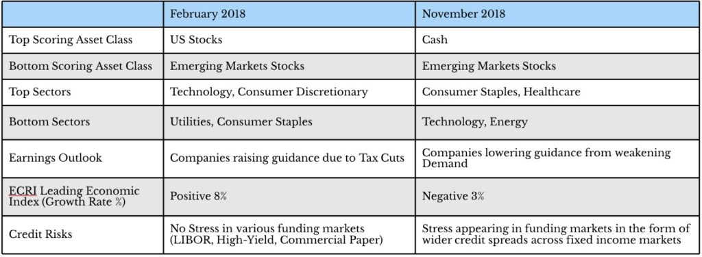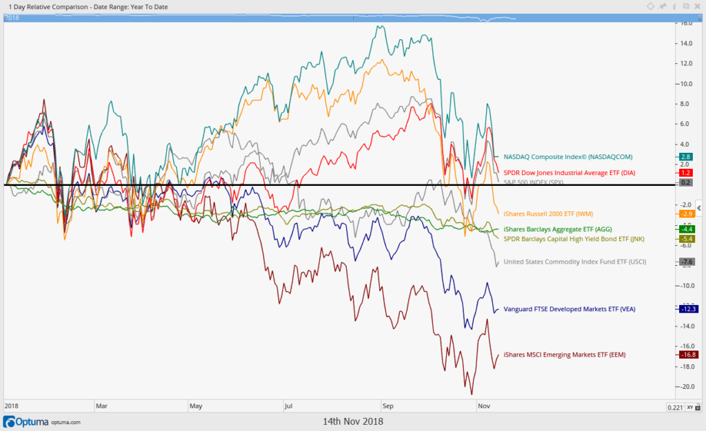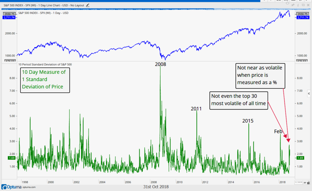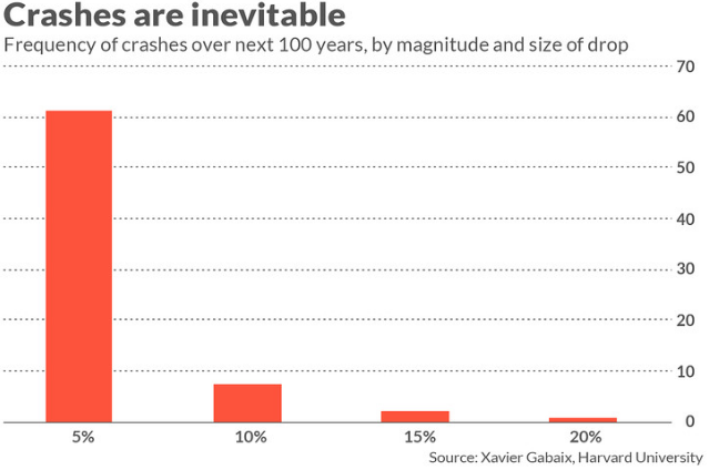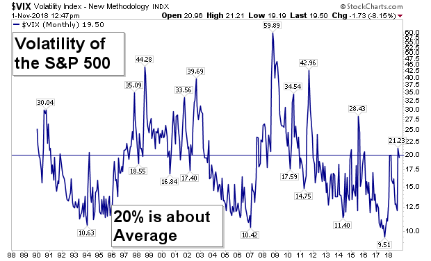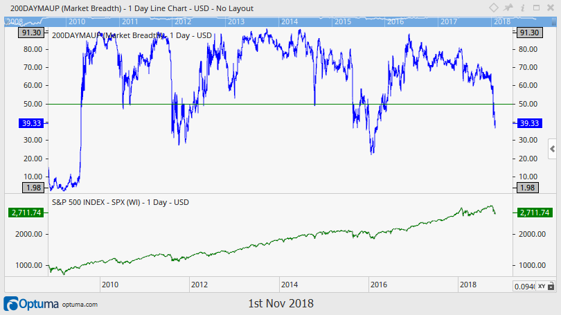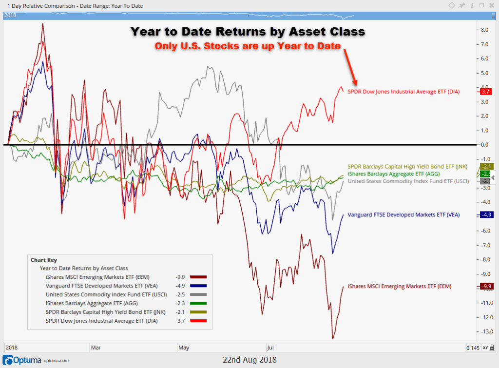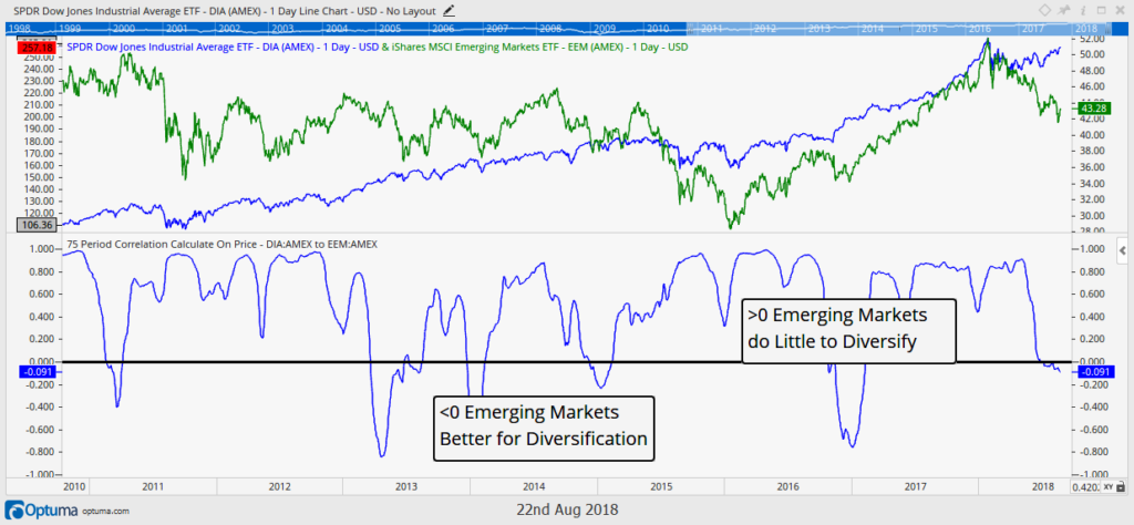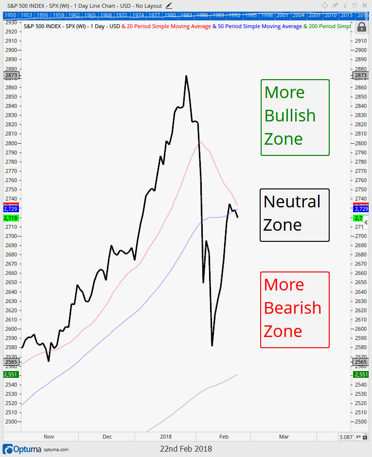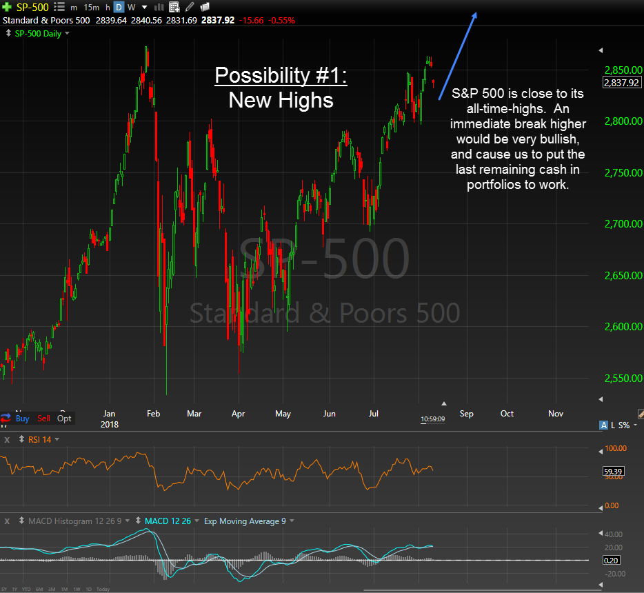
Over the past 18 months, we have been preparing portfolios for what we view as the inevitable risk that assets begin to move in sync with one another. This is typical late cycle behavior, and one that poses difficulty for traditional portfolio management. This is now occurring, and we continue to place a premium on risk management strategies. Patience, Preparation and Process is key to successfully navigating an environment like the one we find ourselves in today.
Portfolio Insights
Nowhere to Run
“There are two concepts we can hold to with confidence: Rule #1: Most things will prove to be cyclical. Rule #2: Some of the greatest opportunity for gain and loss will come when people forget Rule #1.” -Howard Marks, Investor
As we near the end of 2018, it is natural to look back and analyze what has happened. In our opinion, this year may very well be remembered as the year things changed.
There are two important takeaways from this year that we believe may have profound implications for portfolio composition going forward:
- Bonds aren’t rising when stocks fall.
- Asset classes across the globe are moving in unison.
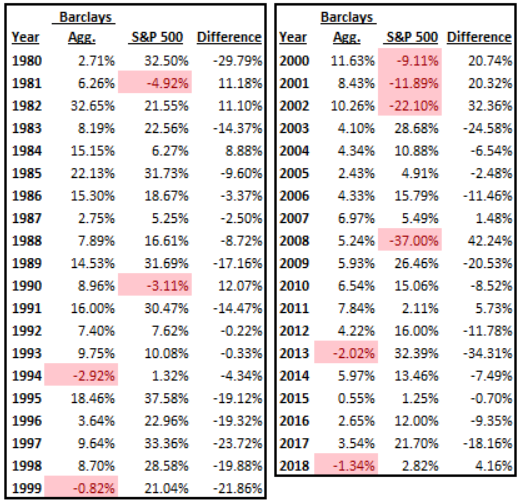
So far this year, bond market returns are negative for the first time since 2013. In fact, since 1980, bond market returns have been negative only three times, in 1994, 1999 and in 2013. So we are witnessing just the 4th negative year in 38 years for the bond market (as measured by the Bloomberg Barclays Aggregate Bond Index).
That is a strong bull market my friends, and it appears to be nearing its end.
The table below shows both the bond and stock market annual returns since 1980. The worst year for bonds was back in 1994, but with only a -(2.92%) decline.
Another interesting finding is that only one of those years looks like anything close to 2018 thus far (data through 12/5/18). 1994’s -(2.92%) bond market decline also occurred during a weak stock market environment, with the S&P up only 1.32% that year. The other two negative bond market years encountered much more robust equity markets with 1999 up over 21% and 2013 up over 32%. The stock market as we go to print is also now flirting with negative territory, and if it closes negative along with the bond market, it will be the first time that has happened since the early 1970s!
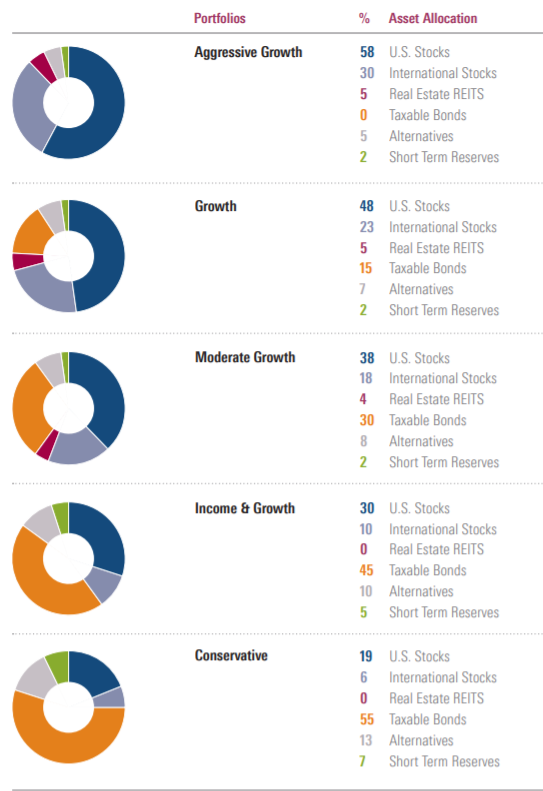
This environment is in direct contrast to how the asset allocation diversification model (the pie chart) is supposed to behave. When bonds are being sold, stocks are supposed to be bought as a sign of strong risk appetite, but that’s not occurring today. This is a major reason why most investors’ portfolios are down in 2018. Both bonds and stocks have not had a good year, and that is rare.
2018 is unique in other ways too.
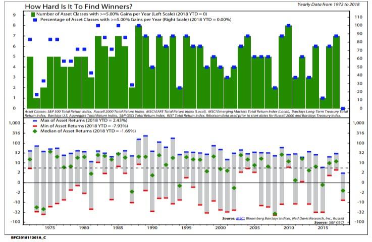
The next chart below reveals that it doesn’t end at stocks and bonds. The lack of positive performance is being seen across all 8 major asset class (Large Cap Stocks, Small Cap Stocks, International, Emerging Markets, US Treasury Bonds, Corporate Bonds, Commodities and Real Estate), and that is unprecedented for this generation. This is shown on the chart in a few different ways.
First, on the top section of the chart, both the number and percentage of these 8 asset classes that are up over 5% this year is at zero. Not one asset class is returning more than 5% for the first time since at least the early 1970s. In this sense 2018 is unprecedented, especially given the easier access through ETFs and mutual funds investors now have to all of these markets.
The bottom of the chart also reveals that the median return of these asset classes is approaching -(2%) with no asset class returning more than 3% (large cap stocks are now flirting with negative returns, pushing this extreme even further).
Never has there been a year when no asset class returned at least 3%, and if 2018 closes the year that way it certainly will be remembered as the year there was indeed, and unprecedentedly, nowhere to hide.
Why is this happening?
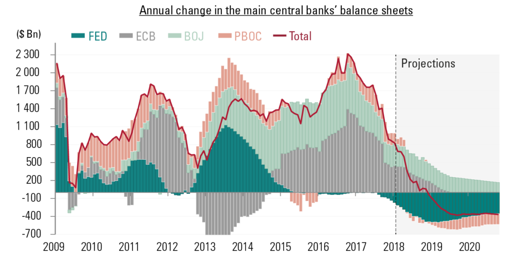
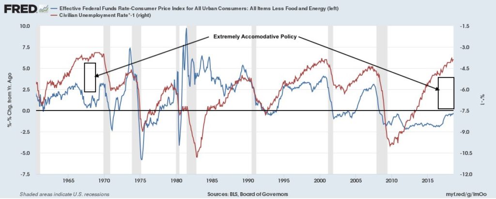
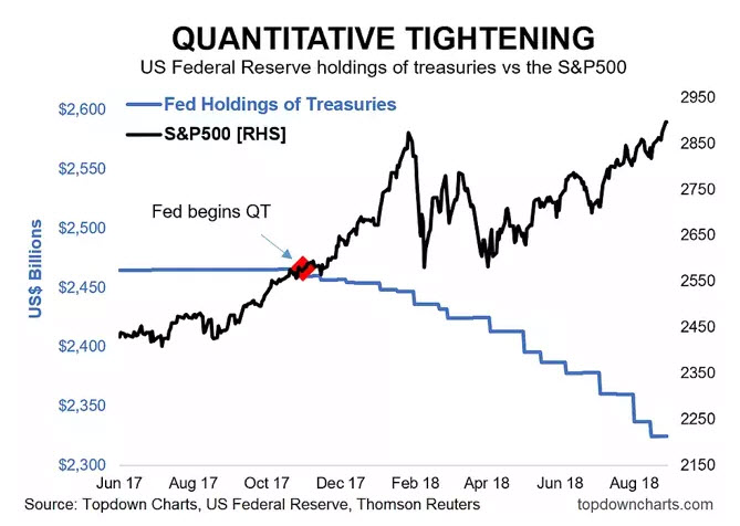
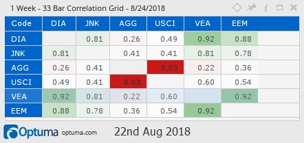
The cause of this type of highly-correlated performance is very easy to pinpoint in our opinion…look no further than the global central bank printing press. 10 years and $21 Trillion of manufactured liquidity MUST have consequences. The direct consequences initially were a strongly rising stock market. Now that this liquidity is being reversed, the effect of reduced liquidity is being felt. And no asset is being spared.
Maybe this is a one-year phenomenon, but we don’t think so. We believe it may be a paradigm shift, and we believe we are entering into an extended period where correlations are very high.
Which is why we believe there are profound consequences to what has happened this year.
Portfolios based on the assumption that you simply should diversify your holdings and own a variety of different assets are destined for sub-par returns. High correlations are great when everything is going up. But if you’re counting on a diversified portfolio to provide any real risk management benefits, you will be sorely disappointed.
Unfortunately, we do not have any idea how long an environment like this may last. Maybe 2018 is the only year it happens. Our guess, however, is that it will last for multiple years into the future. If it is shorter than that, then it will likely be a result of a large bear market that took all asset prices down dramatically in a short period of time.
It is much easier as an asset manager to simply put together a pie chart and occasionally re-balance. This is why it is so common in the investment industry. But just because it is common doesn’t mean that it is effective.
We have already done the hard work associated with developing an investment process that addresses any kind of market environment, including one where asset correlations increase.
In the meantime, we will continue to be diligent and prudent in our investment process, and adjust portfolios accordingly.
Market Microscope
Under Pressure
“A diamond is a chunk of coal that did well under pressure.” -Henry Kissinger
US Stocks
Equity markets have gone through another week of strong selling pressure, so let’s look at some key things we are watching. There is a real risk that 2018 completes the year with a negative return. Here’s why:
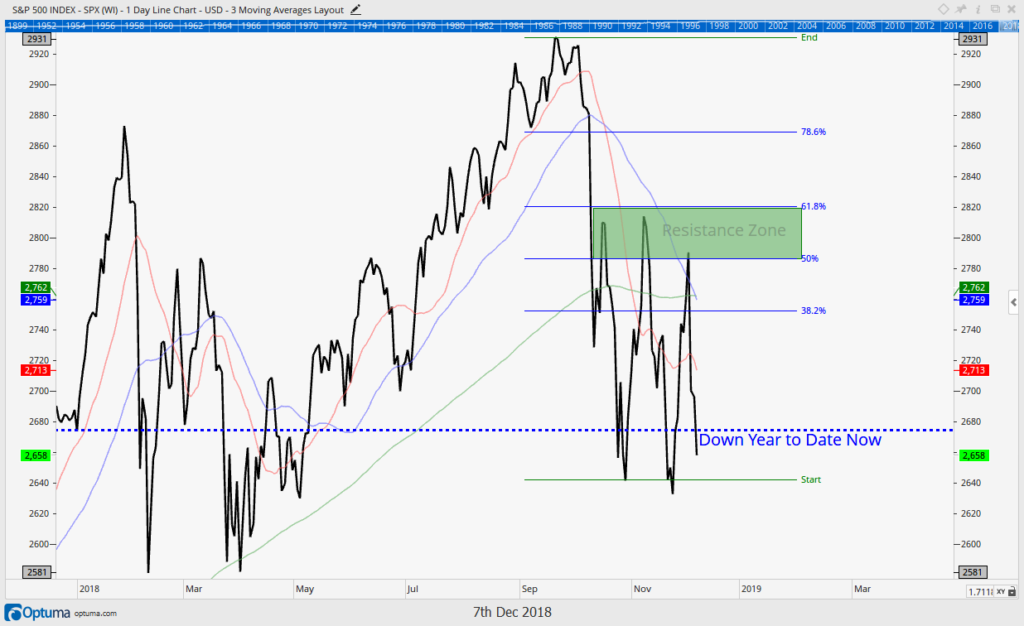
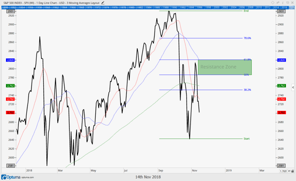
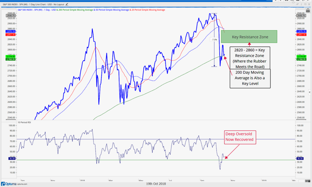
Since the October selloff, the market has now tried 3 times to overcome its key resistance zone between a typical 50% and 62% retracement of the prior move (down).
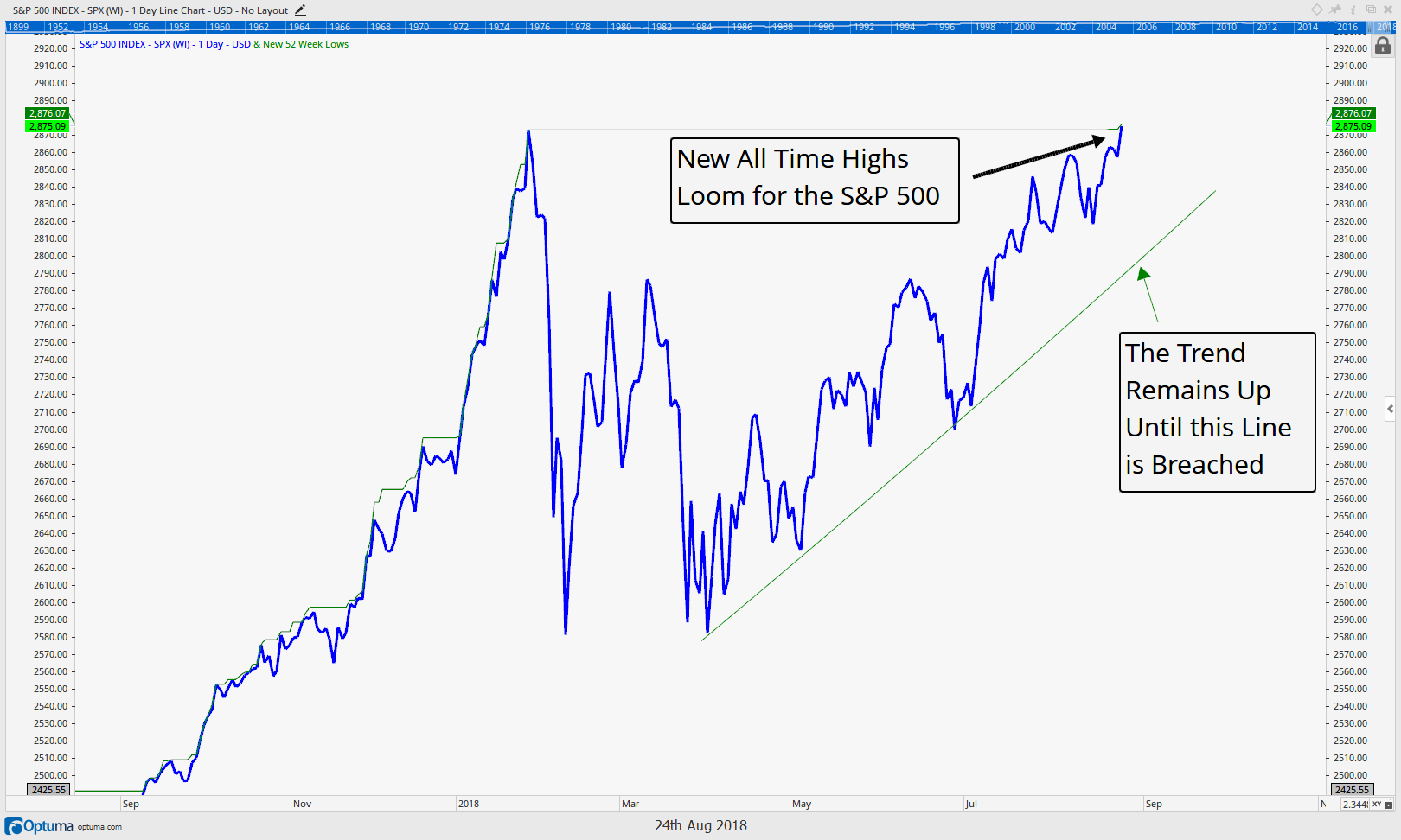
The chart below shows this through its highlighted green “resistance zone”. It’s clear the market has met a significant amount of sellers in this area as the retreat from it has been very swift. Nothing exemplifies this more than Tuesday’s (Dec 4) 3%+ decline across most U.S. equity indices. The S&P is now back near breakeven on the year.
Overcoming this resistance zone is key for the U.S. markets and thus also key for us to start reinvesting our hefty cash equivalent exposures.
On a more negative note, however, the market has also formed a very key “support” level surrounding the 2640 level. We feel a break and a few days below this price level would confirm a larger, and longer-term bear market is upon us.
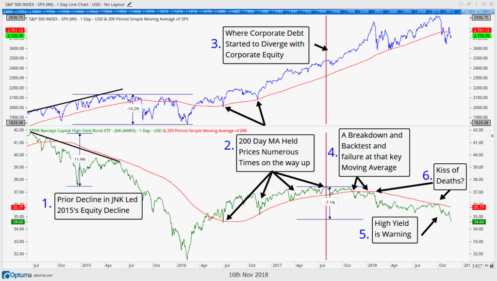
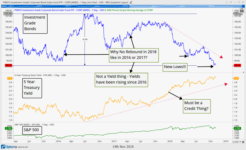
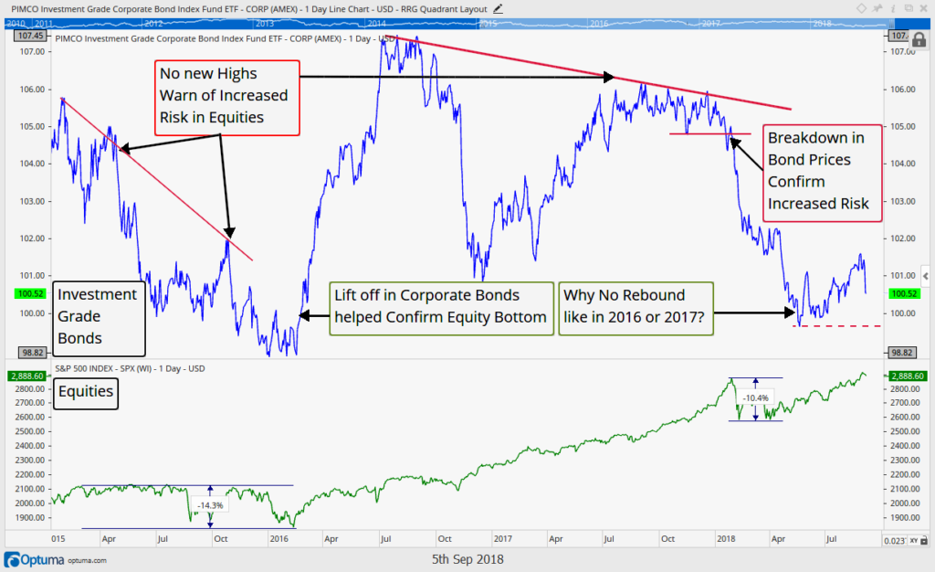
The bond market has already broken down from its similar support levels (discussed in detail in our last ‘Insights’), which historically has been a negative omen for equities, so it is not far fetched at all to think equities could do the same. We give the odds of further breakdown at least a 50% chance.
Currently, client portfolios hold an elevated amount of cash to protect us if the market indeed breaks below that key 2640 level. We also hold cash to allow us to be opportunistic and deploy it in the event the market can actually regain and sustain what we feel is a very important 2800 level.
A break below 2640 would also have us moving more assets to safety, and, unfortunately that is a real possibility here. However, seeing the forest through the trees, if that occurs it will allow us to redeploy that capital at lower (possibly much lower) prices and value.
Many markets are already in “corrections” (meaning they’ve fallen over 10% from their peaks), but remember, all corrections (and bear markets for that matter) allow is for more opportunity for those who prepare.
We eagerly await the outcome of the market’s latest gyrations, and look forward to discussing them in this Newsletter as they unfold.
What about global equity markets?
International Stocks
While US Stocks continue to be under pressure, the investing environment remains equally as difficult in international stocks.
The US stock market has had some reprieve throughout the year, staging a decent mid-year rally on the back of the tax cuts. International stocks, on the other hand, did not have the same reprieve.
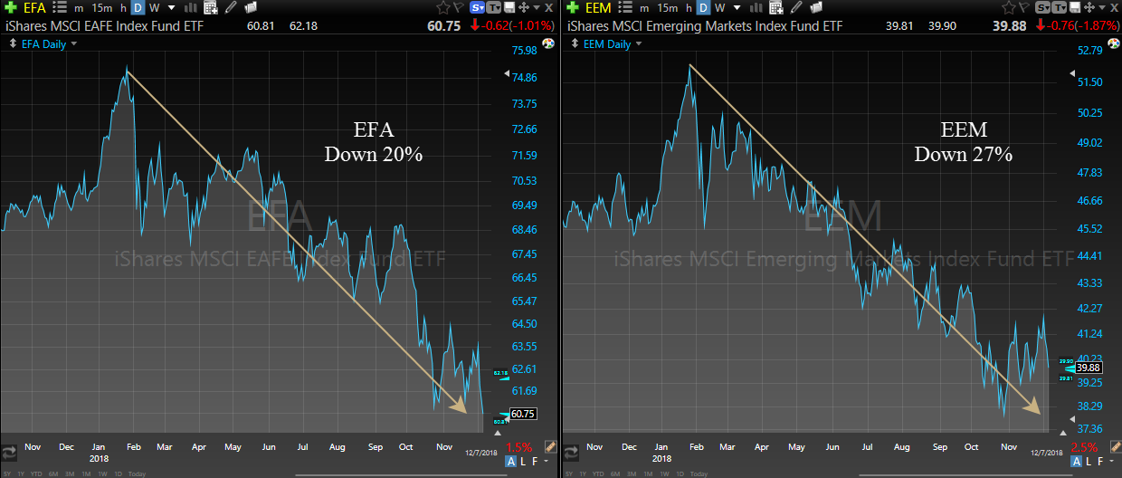
As down-trends go, the decline in international stocks is the perfect definition of one, as shown in the two charts below. The first chart is the ticker EFA, an index fund meant to resemble the performance of the EAFE stock index (EAFE stands for “Europe, Australasia and the Far East”). The second chart is the most popular ETF for emerging markets, and include companies from various South American, Asian and African countries.
There is nothing in either chart that says “buy”. In fact, a strategy with any discipline whatsoever would have seen an exit from these positions sometime in Q2 at the latest.
Wall Street strategists can pontificate all day long about whether or not valuations of foreign stocks are attractive enough to risk capital in them, but the market is clearly telling the world that these companies are in trouble. Investors in these markets have been punished badly this year, and continue to be punished through today.
If these are included in your portfolio, and have not been sold by your portfolio manager, the logical question is “why not?” What are they waiting to see in order to sell? A 30% decline? A 50% decline?
And if they are not willing to sell or even reduce international exposure in the face of a 20-30% decline, how large must a decline in US stocks be before risk is adjusted in them?
Outside of a small subset of high dividend European companies, very few international investments pass our tests for inclusion into client portfolios.
However, with every price decline is opportunity, so we continue to be diligent in analyzing international markets, as some day they will provide an excellent investment option. But that time does not appear to be now.
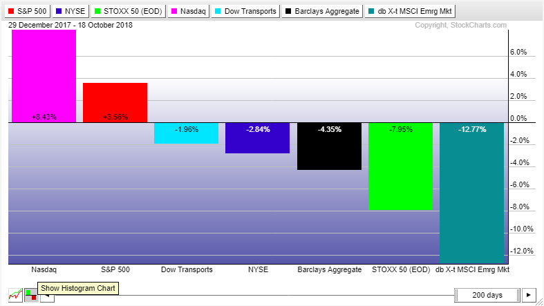
Across the globe and across every asset class, the investing environment is a challenging one.
Invest Wisely.
Neither the information provided nor any opinion expressed constitutes a solicitation for the purchase or sale of any security. The investments and investment strategies identified herein may not be suitable for all investors. The appropriateness of a particular investment will depend upon an investor’s individual circumstances and objectives. *The information contained herein has been obtained from sources that are believed to be reliable. However, IronBridge does not independently verify the accuracy of this information and makes no representations as to its accuracy or completeness. Disclaimer This presentation is for informational purposes only. All opinions and estimates constitute our judgment as of the date of this communication and are subject to change without notice. > Neither the information provided nor any opinion expressed constitutes a solicitation for the purchase or sale of any security. The investments and investment strategies identified herein may not be suitable for all investors. The appropriateness of a particular investment will depend upon an investor’s individual circumstances and objectives. *The information contained herein has been obtained from sources that are believed to be reliable. However, IronBridge does not independently verify the accuracy of this information and makes no representations as to its accuracy or completeness.

