There is an old saying that markets “climb a wall of worry” and “slide down a slope of hope”. Given the incredibly bizarre nature of today’s investment world, it seems the wall of worry is alive and well. We examine the effects of tariffs, and look at three potential paths the market may take for the remainder of this year.
Market Microscope
Worries, Worries, Everywhere
“Worry often gives a small thing a big shadow.”
-Swedish Proverb
 There are always issues to address when investing, but today’s environment seems much more bizarre than usual.
The biggest “weird” we see in the market is this: The market is less than 2% from all-time-highs, yet there is over an 80% likelihood of a Fed Rate CUT by July.
Let that sink in. The economy is fairly strong, employment is the lowest in decades, markets are near all-time highs, but a 2.5% Fed Funds rate is too high?
We understand the risks out there right now. Here’s a quick tally of them:
- Recession potential is rising
- Inverted yield curve
- Earnings Declining
- Multi-continent Tariff Threats
- Unpredictable Politics
- Deficit spending
- Zero-Interest Rate Policies (ZIRP) across the globe
- Global slowdown
- Tweets that Move Markets (Still can’t believe this one)
- Potential Fed Rate Cuts
…and these are just the 10 that quickly popped into our minds.
It’s been over a decade since the yield curve last inverted and 0% ZIRP was the policy of choice by central banks around the world. Plus, for most investors, this is the first time in our adult lives that trade tariffs and protectionism have been major policy initiatives. In fact, the tariff policies being implemented today are in direct contrast of the policies during the 80s, 90s, and 00s, when the WTO and NAFTA were more in favor. We truly are living in an unprecedented moment in time.
Yet, with all of these unknowns, fears, and risks, the 10 year long bull market remains less than 2% from its all time price high!
One would think with such a scary looking backdrop, the market would be discounting prices more…yet it is not, and that is what’s important (and frankly, all that really matters for our work).
There are always reasons to be fearful, just as there are always reasons to be optimistic, but if we look at what really matters to your portfolio’s performance (price), it’s just not reflecting much of this worry.
This is the reality of the situation, and in finance parlance, this is called “climbing a wall of worry”. In fact there is an old Wall Street saying, “the markets climb a wall of worry and slide down a slope of hope”. To us, there’s little doubt that right now we remain in the “Wall of Worry” phase, at least when it comes to the sentiment surrounding the news. Most major news talking points, it seems, have a negative connotation around them.
In the past few weeks, tariffs against Mexico were both announced and quickly rescinded as a “deal” had supposedly been reached to avoid such tariffs.
But what happens if these tariffs do actually get implemented?
According to the Washington Post, who utilized U.S. Commerce Department data, the United States imports $360B worth of goods from Mexico each year. The top imports are crude oil, tractors, computer equipment and televisions, medical instruments, refrigerators, air conditioners, dates and figs, and beer.
A 5% tariff was expected to start this week with a 25% tariff looming. A representative from the Peterson Institute draws the conclusion that if the 25% tariff is passed on through price to the consumer then it would imply a $900 cost increase per household, with the caveat that this is just from the Mexican tariff (not including China or Europe or other country tariffs). The full cost of all proposed tariffs could easily reach a few thousand dollars.
However, the market just DOES NOT CARE. Stocks have more than shrugged off the Mexican tariff news, just another sign to us this market continues to just climb the wall of worry!
The Friday of the surprise Mexican tariff announcement saw a roughly 1% move down in stocks. Could you imagine if such an announcement was made during the height of the financial crisis in 2008? This kind of news probably would have moved the market 5%+. Instead the market falls less than 1% and is now a few percentage points higher today than last week when the news was first announced.
To us this helps prove the market does not really move on news, as it’s likely a more coincidental indicator than anything. A $900 increase in costs to the average household as a result of the Mexican tariffs would be about the same estimated amount the average household gained from the recent Trump tax cut. Allegedly the Trump tax cut provided a massive catalyst for the market’s upside (especially January 2018’s 6%+ move higher), but apparently a potentially equally negative proposal to the average household barely affects it. This is why we think trying to use news to analyze and/or make investment decisions is a lesson in futility (something we recently wrote about here).
This is an important lesson we try hard to emphasize…do not make investment decisions based on news. Period. News programs are designed to sell commercials, not provide you with relevant, objective information.
Instead, we try to focus on what really matters to our investors’ portfolios, actual movements in their investments’ prices.
So what are the likely outcomes with regards to prices over the near term?
 Three Equally Likely Scenarios
If you’ve read previous publications of ours, you probably know that we like to get deep into the weeds of the markets. What we don’t like to do is to get deep into the supposed “reasons” behind the market moves.
The biggest patch of weeds we try to avoid is the news. It’s a sticker patch that causes nothing but pain and irritation. The news apparatus has become a massive intellectual cesspool, and we always seem to be less informed after even a brief viewing.
Staying out of the news “weeds” helps provide clarity. You don’t need to think about every single Presidential tweet, or every comment from a Fed President, or every economic data point that gets announced. We must understand that yes, some things could have a profound effect on the equity markets, but that most will not. Accepting that news is simply a distraction is liberating. And it allows for a more objective approach to analysis.
Plus, the market ultimately decides what is important and what is not. So it seems logical to listen to the market (aka, prices), not to pundits. By combining a focus on price behavior with understanding the current position in the market cycle, a more effective investment process can be implemented.
One of our core investment principles is that we do not believe that markets can be predicted with any success or consistency. However, there are times when the market does narrow down the likely paths forward to a few identifiable, high-probability outcomes. We appear to be in one of those times right now.
We view three scenarios as being most likely:
- New Highs Immediately
- Further Downside before New Highs
- The Path of Maximum Pain
Each of these scenarios result in the market ultimately making new highs. But the path to get there is very different.
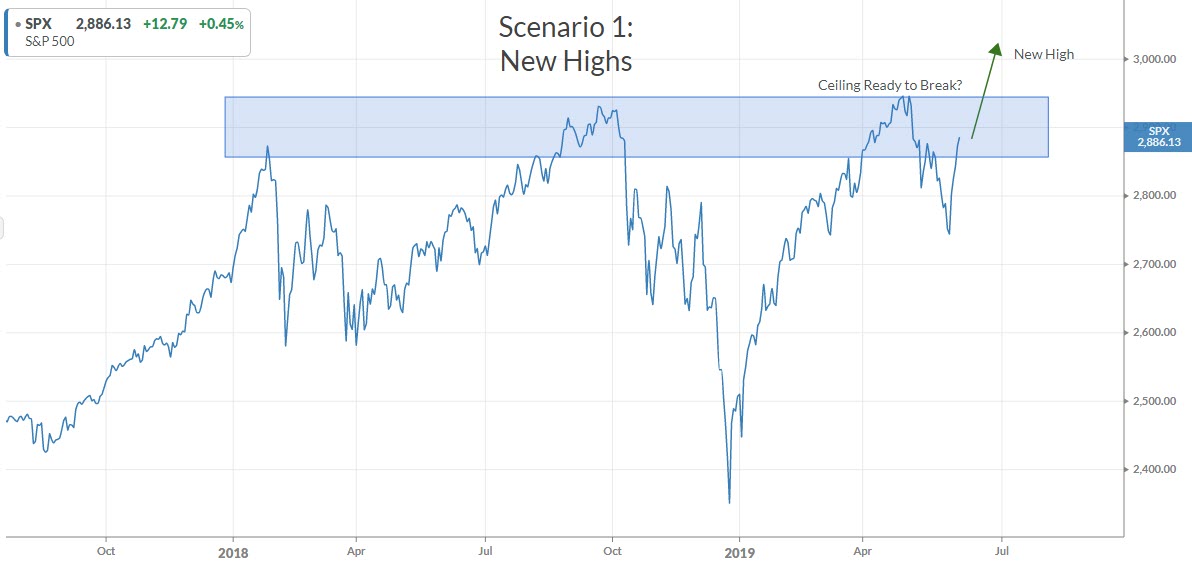
SCENARIO 1: New Highs
The first potential scenario is a good one for markets. This scenario suggests that the volatility over the past 18 months have washed out sellers, and the risk is now to the upside. This also suggests that the “wall of worry” is strong, and that cash on the sidelines will chase the market higher.
The first chart below is that of the S&P 500 over the past 2 years. The markets have halted their rise at roughly the same price level 3 times now over the last 18 months. This area is shaded blue in the chart below.
However, the shaded area reveals a “glass ceiling” that could be ready to break. You can only knock on glass so many times before it eventually cracks. This happens fairly often in financial markets.
Source: Koyfin, IronBridge Private Wealth
From a technician’s perspective, this ceiling is bearish until proven otherwise. The best proof would occur with a break out of this resistance near 2,950 on the S&P (27,000 on the Dow) , a price point sellers have proven they control 3 out of 3 of the past attempts.
Normally, our signals would be telling us to buy equities above this price level. This tends to shift the probability of success in your favor by reducing the risk of a turnaround at an obviously important level.
However, we have systematically been getting signals to increase equity exposure from the levels we had a couple months ago. The signals we are receiving today is very reminiscent of the spring of 2018, which saw a period of volatility followed by the market moving back to new all time highs.
One thing that is different than last spring, however, is that we are seeing a very strange mix of assets showing strength. In the past week alone, we have seen both momentum stocks give us buy signals, as well as very defensive precious metals.
The prevailing “Wall of Worry” the market apparently is climbing would support this scenario as all the over-worried and under-invested investors would have to continue to chase prices here, ultimately taking the markets to new highs.
As we stand today, our clients still have elevated cash positions, but at lower levels than a couple weeks ago. The remaining cash will be invested if the market does indeed move to new all-time-highs.
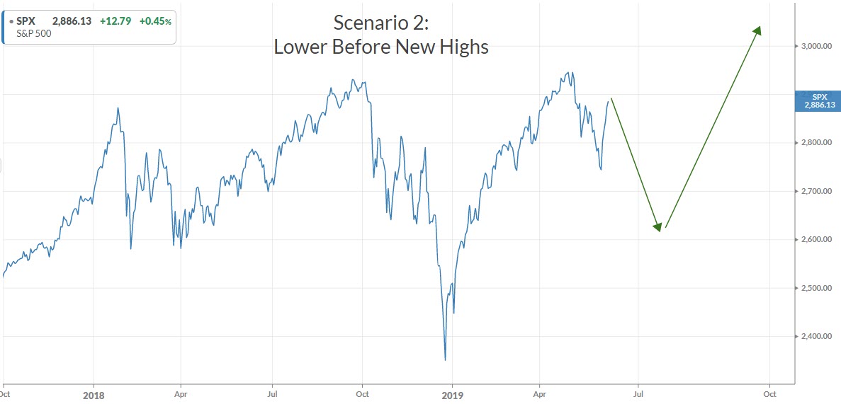
SCENARIO 2: Further Downside before New Highs
While the first scenario is indeed bullish, we see another scenario that might stoke the bearishness a little further before reversing.
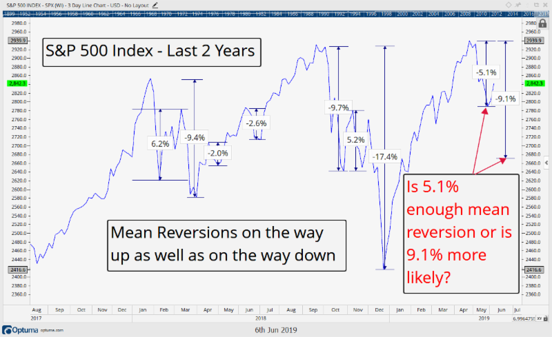
What has occurred over the last month could be considered your quintessential “mean reversion”. (Mean reversion is a theory used in finance that suggests that asset prices and historical returns eventually will revert to the long-run mean or average level of the entire data set. Source: Investopedia)
Markets rarely move in straight lines and we can see many examples in history where a primary move occurs, then a secondary move correcting some (but not all) of that primary move, only to be followed by another primary move in the original direction of the trend. The next chart shows some examples of these mean reversions over the last 18 months.
Mean reversion isn’t necessarily a strategy you will learn about in the textbooks, but practitioners know that it always happens. And to us it makes sense.
Market participants need time to digest, analyze, and make decisions, at all the different time frames they play in. Whether it’s a 1.5 year bear market, mean reverting the 1990s and early 2000s rallies, or a month long pullback digesting the recent increased recession expectations (like we just witnessed in May), or a daytrader looking for an entry price a few pennies lower, prices mean revert as a result of the market participants seeking their own self interests (the best price possible). Mean reversion is simply a bi-product of a natural occurring free market mechanism that attempts to seek out a price agreed upon by buyers and sellers.
It makes sense that there will be times when the buyers are initially winning, give some price back in search of cheaper prices at lower levels, and then jump back in once those prices are reached. This is the reason support and resistance are formed. Charts are simply a tool to help us more easily identify those support and resistance levels.
The chart below outlines a few of the key mean reversions of the past 18 months. There’s been plenty of them, both on the way up as well as the way down. This is simply the result of buyers and sellers seeking their own self-interests.
Source: Optuma, IronBridge Private Wealth
Is the recent 5.1% mean reversion enough of a pullback after such a massive rally off of the December lows? Time will tell, and the key is that even if we pullback some more from here, it does not negate the potential this remains just a regular ole mean reversion of a rally, similar to Spring of 2018, which saw an initial pullback, a bounce of 6.2%, and then ultimately the final low, around 9.4% lower. A similar 9.4% pullback today would put the S&P around $2,675 at its next low.
But even the 5.1% pullback we just completed from April 29 could be enough here as the Spring rally in 2018 proves. After that same large 9.4% drawdown in February 2018, the market resumed its rally, ultimately making a slightly higher all time high into September 2018, and along the way were just two measly 2-3% pullbacks. So, yea, 5.1% could be all she wrote for this pullback.
If it is not, we would expect to generally see a pattern similar to the chart below.
Source: Koyfin, IronBridge Private Wealth
These two levels we are paying close attention are the new all time highs with the potential downside around 9% to $2,675 (if the mean reversion is to continue). That $2,675 level seems to be a good place for a more permanent line in the sand for taking a more bullish or bearish stance on the markets.
As long as we stay above it with this Wall of Worry, the path of least resistance seems higher, but we also shall remember how the math works…we are only 2% from that all time resistance that has rejected price 3 times over the past 18 months.
SCENARIO 3: Path of Maximum Pain
While the first two scenarios are indeed bullish, this third scenario would cause the most angst and damage to the most market participants.
The markets have a wicked side to them. They tend to inflict the most harm to the most people at the most times. This is not a function of some diabolical manipulation that occurs by a select few. It is just the opposite.
Markets are the collective wisdom/fear/irrationality of crowds. When the majority of the people are most optimistic, there is no incremental buyer. So prices fall just as everyone agrees that prices should continue higher.
Conversely, when the majority of the crowd is pessimistic, there is no incremental seller. So prices RISE as everyone becomes certain they will continue to fall lower.
So being aware of the “maximum pain” trade can be helpful.
So what could cause the most pain?
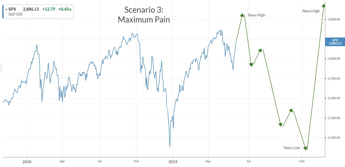
In our opinion, it would be the following sequence of events:
- Quick move to new all-time highs. This would suck in the remaining bears and imply the market was going to continue moving higher.
- False Breakout. The all-time highs would only last a short period of time. Possibly only days or weeks. It would then reverse lower very quickly.
- Undercut the December Lows. Another sharp leg lower that would dramatically increase fear, and ultimately move lower than the December lows.
- False Breakdown. The December lows are only temporarily broken, and the market turns higher.
- Strong Grind to New All-Time Highs. After all that, the market has a strong move to all time highs.
The chart below maps this scenario out:
Source: Koyfin, IronBridge Private Wealth
Trying to anticipate 4-5 market moves in advance is somewhat silly. But this path would generally fit with relatively common previous market patterns, and would most certainly inflict the most pain on the most participants.
But bottom line, this scenario is impossible to try to predict accurately, so we by no means expect to look back at this chart and get it right. We simply must challenge our own assumptions and interpretations in order to gain clarity.
Putting it all together, what are we actually doing right now in these unprecedented markets?
It’s always fun to conjecture about the markets, but the good news for us is our strategies are largely rules based and independent of one another. We utilize techniques that are based on math and algorithms, but given the independence of our strategies it is also always interesting to see what kinds of signals they are giving us.
For instance our trend model has recently got us positioned for a breakout to new all time highs, so it is taking option #1 above, that this pullback is complete and we will once again test new all time highs.
We also are starting to get some bullish signals on specific stocks and clients have seen us recently filling out that portion of their portfolio, now almost back to fully allocated. Interestingly, they will notice a somewhat more defensive characteristic of a lot of their individual holdings, though, potentially a bi-product of these seemingly likely scenarios.
We also are keeping some of our “powder” dry in the event scenario 2 or 3 plays out as we wait for confirmation by the market of new all time highs before fully allocating again.
Anytime we can get a very limited amount of risk for a 3x more potential reward, we are very happy investors. A break below 2,675 on the S&P, however, would have us get significantly more bearish.
To put it simply we should be fully allocated in the event we reach new all time highs, and we will get much more defensive if a test of that all time high fails and the markets fall back below 2,675.
These moves also need to be put in the proper context. We are late cycle and risks are elevated. While there still appears to be good investment gains to be made, we must be respect the market and keep risk management strategies very focused and ready to implement.
Invest wisely.
Our clients have unique and meaningful goals.
We help clients achieve those goals through forward-thinking portfolios, principled advice, a deep understanding of financial markets, and an innovative fee structure.
Contact us for a Consultation.
Neither the information provided nor any opinion expressed constitutes a solicitation for the purchase or sale of any security. The investments and investment strategies identified herein may not be suitable for all investors. The appropriateness of a particular investment will depend upon an investor’s individual circumstances and objectives. *The information contained herein has been obtained from sources that are believed to be reliable. However, IronBridge does not independently verify the accuracy of this information and makes no representations as to its accuracy or completeness. Disclaimer This presentation is for informational purposes only. All opinions and estimates constitute our judgment as of the date of this communication and are subject to change without notice. > Neither the information provided nor any opinion expressed constitutes a solicitation for the purchase or sale of any security. The investments and investment strategies identified herein may not be suitable for all investors. The appropriateness of a particular investment will depend upon an investor’s individual circumstances and objectives. *The information contained herein has been obtained from sources that are believed to be reliable. However, IronBridge does not independently verify the accuracy of this information and makes no representations as to its accuracy or completeness.


