We explore how cognitive biases like Anchoring and Confirmation bias affect predictions, discuss whether earnings are driving the market, and look at valuation levels that are near historical extremes.
[maxbutton id=”1″ url=”https://ironbridge360.com/wp-content/uploads/2017/10/IronBridge-Insights-2017-10-13.pdf” text=”Read the Full Report” ]
Insights Overview
Macro Insights: It’s Earnings Season: When it comes to earnings, a lot of games can be played. We feel the best way to view earnings is through a long term historical perspective.
Portfolio Insights: Cognitive Biases: Behavioral finance is the study of how certain cognitive biases affect the decision-making process of investors. There are many ways the brain tricks itself into unknowingly making mistakes. We explore “anchoring” and “confirmation” biases in our Portfolio Insights section.
Market Microscope: Just how “Overvalued” is the Market?: The Buffett Indicator is one way to measure valuations. It’s a longer term fundamental 10 year horizon indicator that has suggested to be out of stocks for years. Rather than relying solely on fundamentals, the technicals remain the better barometer for the markets currently.
On Our Radar
Earnings: Earnings are expected to hit another quarterly record, but as discussed throughout this issue, that doesn’t mean stocks are cheap.
Trump Taxes: The markets have been focused on the potential for tax reform as one potential narrative for currently high valuations. It’s looking more and more likely that once again Washington will be at a stand still. Is there a tax premium currently built into share prices?
FIT Model Update: Uptrend

Fundamental Overview: The Buffett Indicator, discussed in more detail in the Market Microscope section, reveals the market is its 2nd most overvalued ever.
Investor Sentiment Overview: Famed economist, Richard Thaler, has won the Nobel Prize in Economics. This would probably not make headlines, except for the fact that he won the prize based on his work in a relatively “new” field of economics, known as “behavioral economics” of which a “groundbreaking” idea that humans are not rational is a key tenet. We admit being a little tongue in cheek as we bring this to your attention since we believe irrationality has always been a reality in the financial markets. If it weren’t then things like “investor sentiment” wouldn’t even exist.
Technical Overview: Technicals continue to remain overweight in our FIT Model.
Focus Chart
Multiple Expansion vs Rising Earnings
It’s earnings season and analysts are going hoopla for the expected 22% year over year growth. We, however, are taking a step back and noticing that earnings today are barely higher than they were 3 years ago. Essentially earnings are flat, even though price has risen over 500 points since.
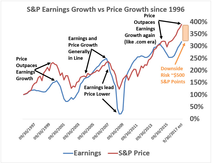
The chart below reveals times when the market is rising due to rising earnings and times the market is rising due to multiple expansion. Since 2014 we have seen a market that has been rising much more because of multiple expansion rather than earnings. The chart also reveals a risk of $500 S&P points as price growth has greatly outpaced earnings growth. History (and the chart) shows us that both earnings and stock prices are cyclical, and eventually prices will come back in line with earnings.
In addition, in our Market Microscope section, we discuss the “Buffett Indicator”, which also shows the market is rising much faster than GDP, which historically puts us in a very difficult place for long term investment expectations. The Buffett Indicator, for only the 2nd time in history is suggesting the stock market will have an average annual return of (-2%) for the next 10 years. In other words, the market is overvalued by at least 20%.
Portfolio Insight
Cognitive Biases
“Prediction is difficult, especially about the future.” This quote has been attributed to multiple people, including Yogi Berra, Mark Twain and Niels Bohr. We think the market environment over the past several years illustrates this quote amazingly well.
Behavioral finance is the study of how certain cognitive biases affect the decision-making process of investors. There are many ways the brain tricks itself into unknowingly making mistakes. Two of these biases are called “anchoring” and “confirmation” biases.
Anchoring describes the common human tendency to rely too heavily on the first piece of information offered (the “anchor”) when making decisions (Wikipedia). One example of anchoring occurs when someone makes a prediction.
The initial prediction becomes the anchor. When presented with new information that may contradict the initial prediction, the brain does not impartially assess this new information; rather, the original prediction strongly influences the next prediction. At best, the initial prediction is modified slightly. At worst, new information is discarded and the person looks for information that would help support their prediction.
This process of seeking information that supports a certain point of view is called “confirmation bias”. New information is more easily accepted if it confirms the thesis, while contradictory information is more readily dismissed.
We see this type of behavior all the time. It is most obvious in today’s political climate, but it is very prevalent in finance as well. And its prevalence is not by clients and investors like the market analysts would lead us to believe. In fact, we believe it happens most often by the research departments at large financial institutions.
We recently read a report from a large bank about their year-end predictions for 2018. There must be an award somewhere for fastest to publish next years guess. The report predicted the market would be at the end of 2018 exactly where it was on the publication date.
They may be 100% accurate in their prediction, and predict the year-end number to the penny. We have no idea. We do believe that if they are wrong, they will only slightly change their 2018 target as the year progresses. And if they are REALLY wrong, they will say that there was no way to predict such an outcome from occurring, even if there were signs all along.
We also see anchoring bias in earnings estimates. The chart below by Alhambra Investment Partners shows how earnings predictions are reliably optimistic at the beginning of each year. The blue lines show that predictions are even anchored to the previous year’s projections!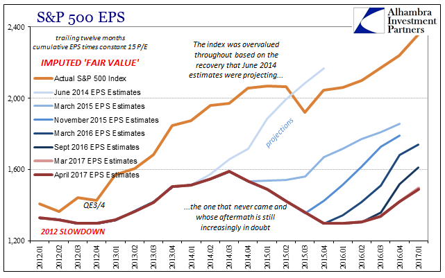
There is one predictor of the market that we as investors should pay attention to…the market itself. It is always right, and the price is always the price, regardless of how over-valued or under-valued it may seem. It does things it “shouldn’t” do all the time, and just as often doesn’t do things it “should”.
One of our goals at IronBridge is to remove as much emotion as possible from investment decisions, and let data drive our actions as we strive to understand how we may be mis-understanding the markets. We think listening to the market rather than trying to tell it what to do is a better strategy, but of course, we’re probably biased.
Macro Insight
Show Me the Money
The first month of every quarter brings us earnings season. This is the time companies report their quarterly earnings from their just completed 3 month quarters. Firms have 45 days to report, but many of them cluster their reporting around the same time similar companies report. This past week, for instance there were 9 S&P 500 companies reporting earnings; 6 of the 9 were banks. However, only 5% of S&P companies have reported 3Q 2017 earnings. In this issue we look at some takeaways from earnings seasons.
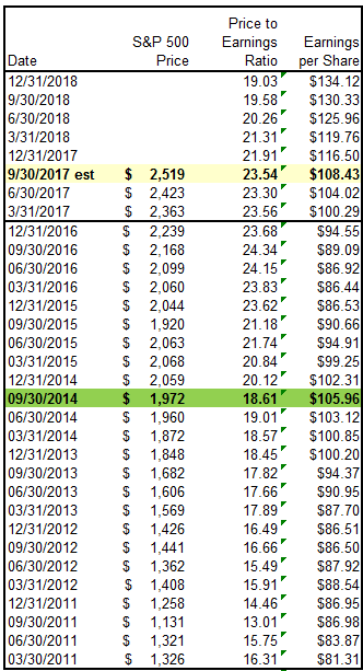
The top portion of the table below lays out the current S&P 500 earnings picture with the current reporting season highlighted in yellow. The quarter ended September is expected to bring $29.80 in reported earnings per share, taking the trailing 12 months earnings to $108.43. This is year over year growth of almost 22%, a very good number. Couple that with an S&P 500 price of $2,519 and it results in a Price to Earnings ratio of 23.5x, which remains very high from a historical perspective.
The remainder of the table shows the longer history of earnings which helps put the current situation into context. The $108 in earnings will be an all time record high. But, if we look at a few of the prior all time highs, the $108 becomes less impressive.
Notice that back in the same quarter in 2014 earnings were $105.96. In other words, here we are three years later, and earnings are only $2.50 higher, or around 2.3% growth during that time. This equates to less than 1% earnings growth annually over the past 3 years, and if we adjust for inflation, it becomes negative real growth.
Additionally, with only 5% of constituents reporting, the $108 remains far from a lock. It’s entirely plausible that the $108 is not reached. This would make today’s exuberance surrounding record earnings even more questionable.
Notice in the table the 2018 expected earnings are a whopping $134 per share? Ignore any future estimates as it is a habit for Wall Street to grossly overestimate future earnings. It helps them fill a narrative to sell valuations, but future earnings have a very consistent habit of starting out way too high, only to be worked backward as the period gets closer. More on this “phenomenon” can be found here, but needless to say there are some conflicts of interest surrounding earnings estimates as the higher earnings estimates, the lower future P/E ratios are. The chart shows how “if” earnings do reach the $130s, P/E ratios at today’s prices would indeed fall to 19x. We won’t hold our breath.
In the Market Microscope section we expand on earnings, P/E ratios, and estimates and how they have impacted share prices historically. It seems there are times when earnings matter more, and times when earnings matter much less. can you guess which period we are in now?
One clue is the fact P/E ratios have remained elevated above 20x for 3 years straight now. Another was alluded to earlier. From a peak earnings to peak earnings perspective, growth just has not been there.
In the Market Microscope we look at a popular valuation technique as well as the historical relationship between earnings and share prices. The conclusion remains: valuations are very lofty.
Market Microscope
Just How Over-Valued is the Market?
A famous valuation quote from Warren Buffett states, “the price you pay determines your rate of return”, and while Wall Street and the media would like us to stay focused on the big 22% expected jump in year over year earnings, we look past the short term and recognize the longer term risks in a market that remains priced too high based on fundamentals. This is why we also use technical and sentiment analysis to make investment decisions.
Is the Market Overvalued?
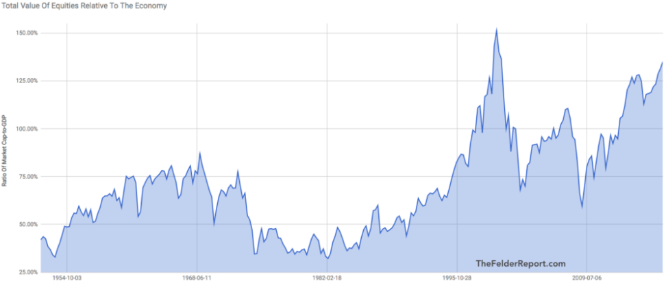
The “Buffett Indicator” got its name, of course, from Warren Buffett, but it got its fame from being the one indicator Warren Buffett turns to to decipher the market’s valuation question. “Is the market over or under valued?” The Buffett Indicator is shown below as built by Jesse Felder, of the ‘Felder Report’.
This indicator takes the market capitalization of equities (price x shares) and divides that number by the GDP of America. The ratio, he proposes, is a good barometer of whether equities are over or under priced.
The chart goes back to the 1950s and does reveal the market currently is the 2nd most expensive it has ever been, when compared to GDP, and heading higher. This surpasses the valuations leading up to the financial crisis (which saw a P/E ratio peak in 3Q 2007 at 19.4x earnings compared to today’s 23.5x). The only other time this ratio was more extreme was during the 1990s .com bubble.
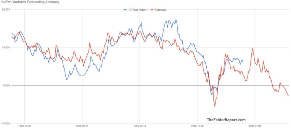
Additionally, Mr. Felder runs the Buffett indicator through a statistical test of its predictive power using actual 10 year average returns. Impressively the indicator does do a wonderful job predicting 10 year actual returns. What does it say now?
The Buffett Indicator is showing an expected annual return of (-2.9%) over the next 10 years. It’s also only the 2nd time in history it has predicted a negative 10 year expected return. The only other time negative returns were predicted was during the latter stages of the Tech Bubble, which actually came to fruition as the blue line on the graphic reveals the negative real returns during the period of 1998 through 2008. This means that today’s buy and hold investors, based on this indicator, should expect to lose money in the stock market over the next 10 years.
Notice too that since the year 2000 expected 10 year annual returns have never been above 10%? Based on the Buffett Indicator, valuations have been historically high for over 2 decades, not offering value investors as good of real long term investment potential as the past. Compare the 2000s to the 50 years prior. The indicator offered multiple periods throughout the 50s and 80s with 10%+ expected annual returns. Those days have been long gone as investors must now navigate public markets that have been perpetually overvalued.
Zooming into the last 20 years we have built our own indicator which helps show us what kind of near term risk we could have in this market. The following chart indexes the S&P price growth compared to the S&P’s earnings growth over that period. Price is shown in red with earnings in blue. We can learn a few things:
- Earnings and prices have generally risen and fallen together. This makes sense since earnings are supposed to be a driver of share prices. The chart of the last 20 years reveals that, yes, generally share prices and earnings rise and fall together, but there are times this isn’t true.
- Similar to the Buffett Indicator, which shows us when the market’s price gets ahead of GDP we also see times when the market’s price gets ahead of company earnings. This occurred during the .com bubble and is pointed out on the graphic. This also is occurring now.
- The market’s price and earnings were highly correlated and generally rose together during the mid and late 2000s and from 2010 through 2014. This chart supports the fact that the financial crisis’s price meltdown was at least somewhat driven by falling earnings. Whereas the .com price meltdown was more likely, at least initially, a mean reversion since price growth got so far ahead of earnings growth. However, once price started to fall, earnings also eventually started to fall as well, compounding the pressure on prices.
- Today’s situation looks more like the .com bubble than the financial crisis. Earnings are essentially where they were 3 years ago, yet the S&P’s price is over $500 points higher. This equates to a roughly 25% risk of decline for the S&P to get back in line with earnings and is highlighted in orange on the graphic. But, one other thing we can learn from the chart is that price and earnings tend to over and under shoot their mean reversions. If we were to see a decline in the S&P start soon, it is likely earnings would also eventually start to decline. This would exacerbate the current $500 point gap between the S&P and where earnings suggest the S&P should be.
- One final thought on the chart and another way to interpret it. Really this chart is getting back to price to earnings ratios. Another way to look at the potential downside risk is to see that back in September of 2014 the S&P had a P/E ratio of 18.61x on earnings of $106. Since then the S&P’s earnings are essentially flat (up 2.3% in 3 years) yet price is over $500 higher, resulting in a current P/E of 23.54x. The S&P’s price has risen almost entirely due to multiple expansion rather than earnings growth, and this has occurred in an environment where interest rates are actually rising (if they were declining, one could potentially justify multiple expansion). There is risk that the P/E reverts back to that 18.61x level, and $108 of earnings * 18.61= an S&P of $2000.
What does it all mean? By almost every fundamental measure markets are over valued and have been overvalued for years, yet price has continued to rise. This is similar to what occurred during the .com bubble. Fundamentals have suggested a top for years, but clearly that has not worked, at least not over the short term. Investors need more tools in their toolbox than just traditional fundamental analysis if they want to be successful over both the short and long terms. This is why we also use technical as well as sentiment analysis to help us navigate the markets. During certain times these techniques carry a lot more weight in the market’s actions than fundamentals. We think one of those times is now.
Some technical analysis is discussed next.
Equity Technicals
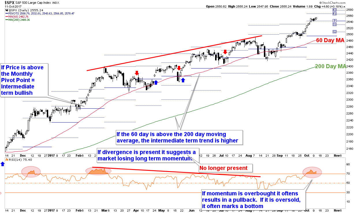
The chart below is one of hundreds we follow each week, but we like this one right now because it provides a succinct picture of 4 key short term (days to weeks) and intermediate term (weeks to months) technical indicators for the market.
But before we get into the chart, let’s take a step back and discuss why we even care about technical analysis and put so much weight on it?
Simply put, because technical analysis focuses on price first and foremost and price is what makes us money or not. Fundamental analysis on the other hand largely focuses on earnings, which may or may not be correctly reflected through price and thus may or may not actually affect the performance of our investments, especially over the shorter time frames.
Case in point: the Buffett Indicator has suggested being short stocks for two years now (the expected negative 10 year returns), yet the market has continued to rise, rather substantially. Valuations are stretched, but can get even more stretched before succumbing to their more natural state. At some point GDP and earnings will likely carry more weight in the markets’ price decisions, but for the past few years, that has not been the case. Technical analysis, on the other hand, has largely been beneficial in navigating the markets as the trend has largely been up and the charts have largely shown that.
There are four key indicators on the chart:
- Moving Averages – Moving averages help smooth out price action. On the chart we have two moving averages, the 60 day and the 200 day moving averages. When price is above its 60 day moving average, it reveals the short term trend is bullish, and when price is above its 200 day moving average, it reveals the intermediate term trend is higher. Additionally, when the 60 day moving average is above the 200 day moving average it shows the short term trend’s momentum is stronger than the 200 day…all of which is bullish. Price has remained above both of these averages throughout the last 11 months.
- Pivot Points – Pivot Points are a trend indicator and are shown by the horizontal blue lines that adjust each month. October’s Pivot Point is $2495 while November’s is currently $2544 (but is fluid until the calendar officially switches over to November). When price is above the Pivot Point (which it is now), it’s a sign that price today is above last month’s average price. That’s a bullish sign. Additionally, when the Pivot Points are rising, that’s also a bullish sign since the average monthly price is also rising.
- Momentum Divergences – When price is rising but momentum indicators, such as the RSI Indicator at the bottom of the graphic, are not, it presents a case of waning interest by market participants. On the chart, shown by the red trendlines, there was a divergence that was forming during the price move from the March high to the July high. As prices made new all time highs, momentum was not confirming the trend. This presented a small problem for the market, which it wound up fixing with the August pullback. The pullback flushed out the weak hands and momentum has rejoined price now with an overbought reading accompanying the new price high in September and October. This excessive momentum now presents another short term problem the market will likely need to work out.
- Extremes – When price moves too far too fast, that can also be small issue for the market since shorter term focused market players are more likely to take some money off the table once momentum has slowed. Notice on the chart, highlighted by the red ellipses, there have been 3 overbought scenarios over the last 11 months. The scenario back in December lead to a sideways market that lost more time rather than price, however, the overbought condition in March resulted in a larger pullback as well as a two month period of net sideways market action. The overbought readings helped identify when price was ripe for a stall, and we are at that point again today with the overbought status now on the market.
Although the technicals reveal an overbought market condition, the uptrend remains intact. Overall the chart is bullish as price remains above its moving averages and Pivot Points as well as in a trend of rising Pivot Points and moving averages. We may see some short term weakness given the overbought condition, but it’s not expected to damage the currently bullish picture.
The technicals continue to paint a bullish picture, and as a result we remain fully vested. At some point this market will rollover, and when it does the technicals should also help warn us that the risk of a larger pullback is upon us.
When we couple the technicals with fundamentals and prevailing sentiment we get a much better picture of the overall health of the market. Using fundamentals alone would not have been a good strategy over the last few years, and there will be times when relying on technicals alone also won’t be an ideal strategy.
For now we lean on the technicals and allow price to be our guide first and foremost as we continue to be participants in this bull market.
Our clients have unique and meaningful goals.
We help clients achieve those goals through forward-thinking portfolios, principled advice, a deep understanding of financial markets, and an innovative fee structure.
Contact us for a Consultation.
Disclaimer This presentation is for informational purposes only. All opinions and estimates constitute our judgment as of the date of this communication and are subject to change without notice. > Neither the information provided nor any opinion expressed constitutes a solicitation for the purchase or sale of any security. The investments and investment strategies identified herein may not be suitable for all investors. The appropriateness of a particular investment will depend upon an investor’s individual circumstances and objectives. *The information contained herein has been obtained from sources that are believed to be reliable. However, Ironbridge does not independently verify the accuracy of this information and makes no representations as to its accuracy or completeness.
