A theme has developed over the past month that likely has a great deal of importance to investing over the next few years. It is called “dispersion.” We have seen financial markets disconnect from the real economy, and assets within markets are showing massive differences in performance. What does this mean and how can you take advantage of it?
“To lend to a bank, we simply use the computer to mark up the size of the account.”
-Ben Bernanke, 2009
 It has been a month since our last Insights newsletter, and excluding the last few days, market prices have not changed very much. The market tornado from late February to mid-April all of a sudden became calm and somewhat pleasant weather over the past month or so.
There has, however, been a major theme develop over the past month. This is one of dispersion.
When we refer to “dispersion”, we are referring to an increased difference between various parts of the financial markets, as well as a growing difference between financial markets and the real economy. Let’s explore both.
Stock Prices vs the Real Economy
Let’s first focus on the dispersion between stock prices and the economy. This is the most notable characteristic of the current environment, and to many the most confusing.
Since late March, there has been a massive disconnect between asset prices and the real economy. Unemployment and GDP numbers will be shockingly bad this quarter. We have already seen more than 20 million people file for unemployment in the past month.
Yet, markets continue to be stubbornly and somewhat surprisingly strong.
Why?
The answer is simple…the Fed.
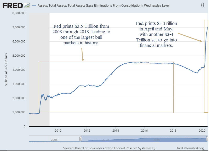
For the 10 years following the 2008 financial crisis, the Fed printed almost $4 Trillion that made its way into financial markets. This liquidity led to one of the largest and longest bull markets in history.
The Fed has printed another $3 Trillion…since April.
And the Fed is not done yet. They have announced an ADDITIONAL $3 Trillion that is scheduled to make its way into the markets over the next few months. This also doesn’t include the $3 Trillion that Congress authorized in various stimulus packages.
Money “printed” by the Fed and forced into the financial markets can be tracked by the Fed Balance Sheet, which is shown on the chart below.
Again, the explosion higher in the balance sheet at the far right side of the chart could expand an additional $3-4 Trillion very soon.
The speed of the Fed’s action has been breathtaking. Never before in history have we seen such an explosion higher in liquidity coming from Washington, D.C.
There were two previous times anything remotely like this happened before:
- In 2009, when the Fed printed over $1 Trillion, kicking-off the massive 11-year bull market.
- In 2013, when the Fed began QE3 and printed $1.5 Trillion when it looked like the economy was about to move back into a recession.
Both of these previous actions were very good for stocks, and resulted in the S&P 500 doubling after 2009, and rising over 50% between 2012-2014.
Short-term, it appears that the Fed’s actions will have positive effects on the markets, but it also raises more questions…
- How does the Fed print this kind of money?
- This can’t be good long-term. How does this all end?
How Does the Fed Print Money?
When the Fed “prints” money, is simply does so in a digital way. Imagine if you could go into your online banking portal and add a zero to the end of your balance. That is all that is happening. The Fed “prints” by digitally manipulating account balances.
There are two interviews that explain this process.
The first is Ben Bernanke on 60 minutes in 2009, as they were beginning the massive expansion of the balance sheet. He explains this very simple digital “mark-up” of accounts that commercial banks have at the Federal Reserve. Watch the snippet HERE, and the full interview HERE. This interview was aired on March 15, 2009. The end of the bear market was March 6, 2009. Coincidence?
The second interview is from earlier this month, also with 60 minutes. This time with current Fed chairman Jerome Powell. It is worth the 13 minutes to watch the full interview. View it HERE. He discusses the printing mechanism around minute 6 of the video.
These interviews are both interesting and disturbing. Surely this can’t be good over the long-term, right? We’ll touch on that below.
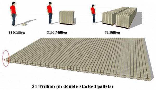
Let’s just try to get it into context. Numbers this large are simply hard to imagine. What does $1 Trillion even look like?
Below, you get an idea. This illustration, courtesy of Reddit, shows just how massive $1 Trillion really is.
Yes, that’s a guy standing at the corner in the red circle. These are $100 dollar bills, cover almost the entire size of a football field, stacked two pallets tall.
Ok, so this visual didn’t help much. (Frankly, the $1 Million and $100 Million look way too small, but what do we know.)
Thinking about it in a different way, the size of the US economy is just over $20 Trillion. This represents the total economic output over the course of an entire year. Every car sold, every Netflix subscription bought, every burger and fries consumed…everything.
And in the span of a few short months, there will be over $9 Trillion of stimulus making its way into the markets and economy. Mostly into the markets.
After the Fed adds its zeros, it then buys various assets in the financial markets. Right now, it is buying US Treasury bonds and five different bond ETFs. It has also expanded its buying to include certain corporate bonds, including those classified as “junk”.
Once these bonds are purchased, the sellers (companies such as Citadel and Blackrock), then use the proceeds to put these funds into the stock market. This creates demand, albeit artificial, for stocks. Stocks move higher by having more buyers than sellers. So stocks then move higher, despite the crushing activity in the real economy.
When viewed this way, it’s hard to imagine how the Fed would NOT have an impact on markets. The size of this round of printing is simply overwhelming the markets. And that is their entire goal.
It is also easy to understand why we have the disconnect between stocks and the economy. Liquidity is propping up markets, while the real economy is largely unaffected by the Fed’s actions.
We simply cannot ignore the Fed, whether we agree with what they are doing or not.
How Does This All End?
At some point, markets will not respond favorably to the Fed’s actions. At some point, there will be a price to pay for all this craziness.
Will that be now? Maybe, but doubtful. It seems that the Fed still has not run out of ammunition.
In fact, we would not be surprised that the next step in the Fed’s arsenal is to begin the direct purchase of stocks. There is already discussion of this on Capital Hill, and other countries such as Switzerland and Japan already are doing this exact thing. It should not come as a surprise if the Fed starts to do it next.
What the ultimate end game looks like, no one knows. Frankly, the history around previous debt cycles is too lengthy to cover here. Unfortunately, these cycles of massive debt expansion usually end in war. (Thanks for ending the week on a happy note, guys.)
Back to the investment impact of all of this money printing.
Of all the data points to consider in the current environment, the Fed is by far the most important. It is no surprise that the massive injection of liquidity coincided with a strong rebound in stocks.
And the Fed is only halfway done.
We discussed how massive printing helped stocks in previous years. If you’ve watched the stock market over the past two months, you probably noticed that the markets think it will be effective this time around as well. The S&P 500 is up 35% from the late March lows, and still has another 12% to go to make it back to where it was in February before all of this chaos began.
Many people are wondering if this is just a bear market rally. In other words, many investors are expecting prices to fall below the levels seen in March, and are betting that the recent spike in prices will be completely reversed.
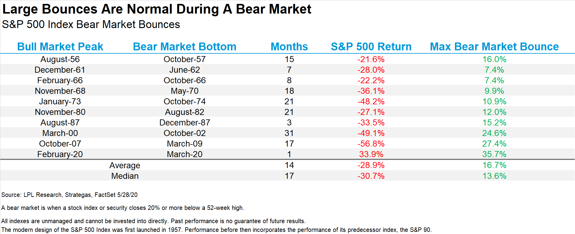
We are not ruling that out, but if it happened, it would be the single largest bear market bounce in history.
The chart below, from Ryan Detrick with LPL Financial, shows the largest percentage gains during bear markets.
The decline from February to March was the fastest 30%+ decline in history, so maybe we will see history once again with the largest bounce in a bear market ever? Again, we are not ruling that out, but at this point it has to be viewed as a very low probability scenario.
This suggests that the market is not going to retest the lows from March. Furthermore, it suggests that we should expect new highs this year, possibly as soon as this summer.
Which leads to the next logical question…what should we do now?
Dispersion in Financial Markets
Before getting into what actions we are taking, let’s revisit what kind of shape we might see in a potential recovery. As we discussed in previous newsletter “Dare We Look at Earnings” HERE, would it be a “V”, a “W”, a “U” or an “L”?
We are starting to get our answer. And the answer is “Yes”.
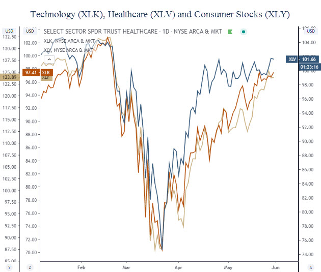
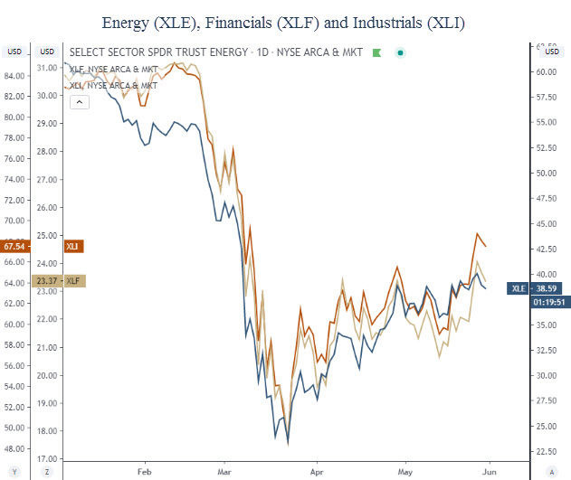
Some areas of the market and economy are recovering very quickly, and are taking the “V” shape, while others are not nearly as strong. Unlike previous bear markets, where everything gets hit hard and recovers simultaneously, today’s market is showing a great divide between the winners and the losers.
Frankly, we at IronBridge are very excited about this development. This means active management can shine.
Let’s take a look at a few sectors to notice the massive dispersion between them. The first chart below shows the “V”-shaped recoveries in technology, healthcare and consumer stocks. It is very easy to see the V in these areas.
Other areas of the market have not been nearly as strong.
Energy, financials and industrials have all struggled to make any real progress higher. They are taking the shape of a “W”, or potentially even an “L” or “U”. It is yet to be determined, as shown below.
These are the perfect examples of dispersion. If you owned the three in the first chart, and didn’t own the three in the bottom chart, you experienced out-performance.
This is exactly what our investment process was created to recognize and take advantage of.
Our clients have been heavily exposed to investments in the outperforming sectors in top chart, and have had little to no exposure to the ones in the bottom.
It’s not too late either. Cash on the sidelines can be put to work at these levels, albeit in a prudent and disciplined way. Higher prices are likely ahead, but we still need to watch for a second COVID wave and potential market weakness. However, as we said, that seems like the lower likelihood right now.
Bottom line, dispersion favors active management over passive management. It can be a very good time to invest, if you have the right methodology.
We believe this dispersion is a paradigm shift that may continue for years into the future. Not only will we likely see continued dispersion between sectors, but we will also see dispersion in broader asset classes as well.
The successful portfolio in the coming years will have the ability to recognize leadership changes in the markets. At some point, technology and healthcare will start to lag and energy and financials will excel.
A disciplined process can recognize both dispersion and change in leadership. That combined with strong risk management is a recipe for success in any environment.
Invest wisely!
Our clients have unique and meaningful goals.
We help clients achieve those goals through forward-thinking portfolios, principled advice, a deep understanding of financial markets, and an innovative fee structure.
Contact us for a Consultation.
Neither the information provided nor any opinion expressed constitutes a solicitation for the purchase or sale of any security. The investments and investment strategies identified herein may not be suitable for all investors. The appropriateness of a particular investment will depend upon an investor’s individual circumstances and objectives. *The information contained herein has been obtained from sources that are believed to be reliable. However, IronBridge does not independently verify the accuracy of this information and makes no representations as to its accuracy or completeness. Disclaimer This presentation is for informational purposes only. All opinions and estimates constitute our judgment as of the date of this communication and are subject to change without notice. > Neither the information provided nor any opinion expressed constitutes a solicitation for the purchase or sale of any security. The investments and investment strategies identified herein may not be suitable for all investors. The appropriateness of a particular investment will depend upon an investor’s individual circumstances and objectives. *The information contained herein has been obtained from sources that are believed to be reliable. However, IronBridge does not independently verify the accuracy of this information and makes no representations as to its accuracy or completeness.
