Sometimes what should make sense simply doesn’t. This is especially true this year. We just witnessed the worst quarterly economic data in history, yet markets have now officially made up all of their losses from the COVID crash. This begs the question…does GDP matter to stocks?
“A man should look for what is, and not for what he thinks it should be.”
-Albert Einstein
Despite staggeringly high unemployment, the worst economic data in a century, a pending presidential election, social unrest and over 800,000 deaths worldwide from COVID, the S&P 500 index has officially made back all of its losses from earlier this year.
After making an all-time-high on February 19th, the S&P 500 then went on to set some pretty unfortunate records. The resulting 37% decline was:
- The fastest 10% decline from all-time-highs in history.
- The fastest 20% decline from all-time-highs in history.
- The fastest 30% decline from all-time-highs in history.
In addition to these records, the Dow Jones had 12 separate days where it fell over 1,000 points during the course of a day. That only happened once in history before this year.
As unprecedented as the decline was, we have now experienced an equally unprecedented recovery. On Monday, the S&P 500 fully recovered the entire decline, surprising many people in the process.
The size of this decline and recovery is not unusual. It is the speed at which it occurred that is so amazing.
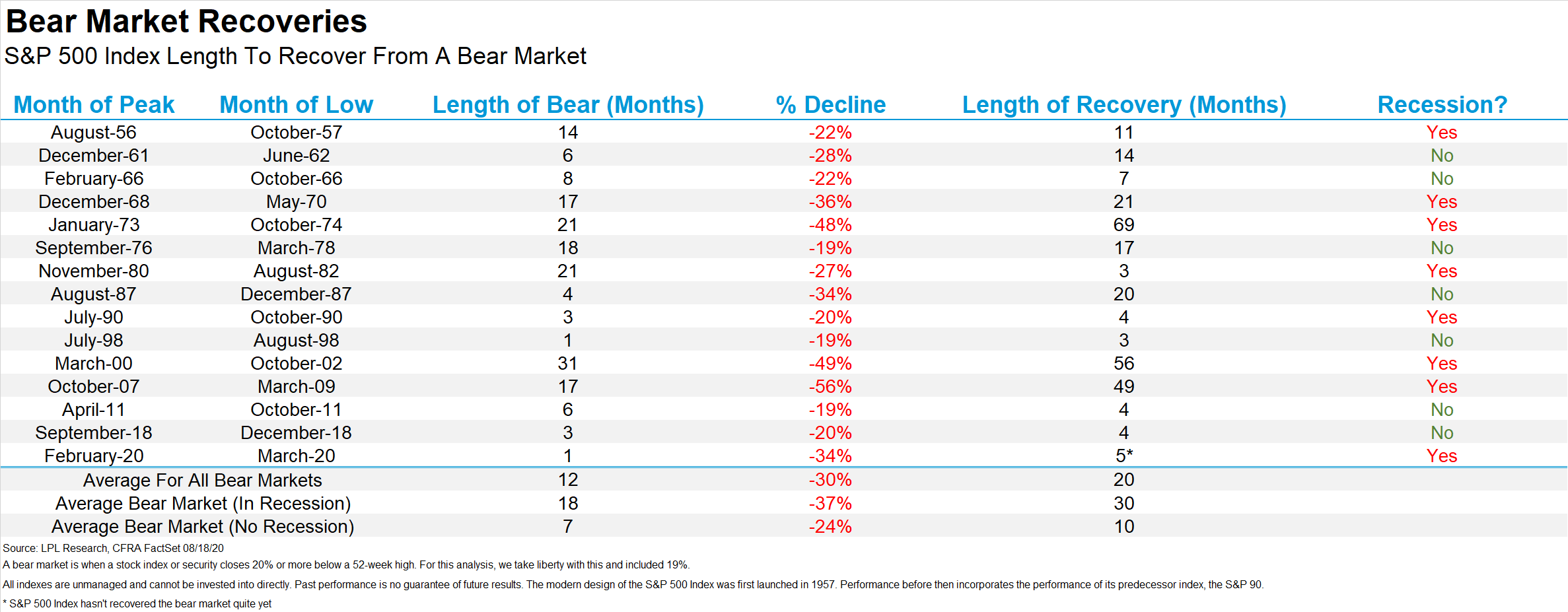
There have been 15 bear markets since 1956, as shown in the first graph below. This is courtesy of Ryan Detrick of LPL Research, who is becoming one of our favorite analysts to follow.
This graph shows the length of the bear market, the percent decline during that period, how long it took the market to recover, and whether or not there was an official recession.
Let’s focus on the last three rows that summarize the data.
It is interesting to note that not every bear market led to a recession. Of the 15 bear market environments, only 8 were accompanied by a recession. (This is where the popular saying “the stock market has predicted 10 of the past 5 recessions” comes from.)
The average decline of these 15 bears was 30% and occurred over a 12 month period. And, on average, it took 20 months for the market to fully recover those losses.
There is no doubt that we are currently in a recession. If we only focused on the environments that had both a bear market AND a recession, then the average decline increases to 37% over 18 months, with an average recovery time of 30 months.
The fall in stock prices we saw in March is right in line with the average bear market. However, instead of taking 18 months, it took just over ONE MONTH for the decline to occur. This recovery only took 5 months, instead of the average 30 months for prices to recover.
Wow.
(NOTE: This particular chart was published last week before the market officially made new highs. It also shows a 34% decline for the S&P 500, which was the decline on a closing basis, or only based on prices at the end of each trading day. The intra-day decline was over 37%.)
The speed of the decline and recovery speaks to just how unique this environment has been. This is the first government imposed recession outside of a global war, at least in the US. It did not start within the economy itself. There was no excess supply of goods, or an organic decline in demand. It was the result of governmental policies aimed at slowing the transmission of an extremely contagious and uncertain virus.
For many people, this dramatic rebound doesn’t make sense when combined with so many uncertainties. In many ways, we agree. Despite this strong run, there are plenty of reasons to be skeptical about the stock market.
But should we be skeptical?
GDP and Stock Prices
There are dozens of ways we could analyze the current environment. But let’s focus on the big daddy…GDP.
Of the many data economic data points from this year, perhaps GDP is the most profound. (GDP is Gross Domestic Product, or the total economic output of a region.)
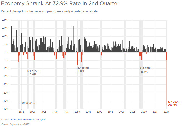
In the second quarter, US GDP fell a whopping 32.9%, as shown in the next graph from an article by NPR.
This recession is far deeper than any previous one. The decline in the second quarter was greater than any previous quarterly decline, even including the Great Depression (which is not shown in this graph).
It seems logical that the stock market should be tied to economic output. A rising economy should result in rising stock prices, and vice-versa. It would also seem logical to expect to see a rise (or decline) in stocks that is proportional to the rise (or decline) in the economy. In other words, an economy shrinking faster should result in a proportionally weaker stock market.
The market fell 56% during the 2008 financial crisis. GDP fell much further this year, yet stocks “only” fell 37%. The market should be about to start a decline that is proportionate to the decline in the economy, right?
While that may happen, we should not expect it to happen. Why not?
The answer may surprise you. tock prices are simply not that correlated to GDP. At least not in real time, and at least not when looking at GDP alone.
We know there are some of you that are surprised, even shocked, to hear us suggest something like this, but stay with us, it won’t be as shocking when we’re done.
Before we dig into the data, let’s first have a quick statistics tutorial.
One way to look at correlation is with a scatter plot chart. Scatter plots show one data set on the y-axis (up and down), and another data set on the x-axis (left-to-right).
When two data sets are plotted on the same chart, we can then easily see what type of correlation there may be between the two data sets.
There are essentially three types of correlation:
- Positive
- Negative
- No Correlation
Visually, it looks like this.
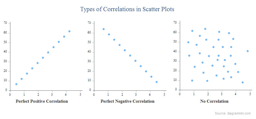 Positive correlation is what we should expect out of a relationship between GDP and stock prices. Higher GDP should, in theory, correlate with higher stock prices. The line should be going up and to the right.
There are varying degrees of correlation as well. Not everything is perfectly correlated, and we shouldn’t expect that out of stocks. But we should expect to see a relationship between the two.
So let’s look at the data.
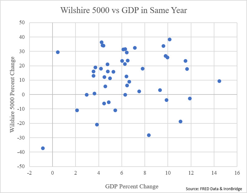
The first scatter plot below shows the Wilshire 5000 Index versus GDP, from 1970 through 2019. The Wilshire 5000 is the most comprehensive of all stock indexes, and most closely resembles the US economy. (Ironically, it currently represents only 3500 companies, but was composed of 5000 companies when it was introduced in 1974.)
Each dot represents one year, and shows the performance of the Wilshire and GDP growth for that particular year.
What do we notice? For starters, it sure does look like the “No Correlation” example above.
Again, if stocks were correlated to GDP, the dots should be in a pattern that generally went from the bottom left to the upper right. A rising GDP would be associated with a rising stock market. So the strongest GDP years would have the strongest stock market performance.
But that simply is not the case. If we look at just about any of the GDP numbers, stock performance is all over the place.
A year with 4% GDP has had market performance anywhere from up over 30% to down more than 20%. Even the strongest economic years had both positive and negative performance.
Despite seeing this data, it doesn’t make sense that they would not correlate at all. Surely there is a way to see a connection between economic activity and stock prices.
Stocks vs the Following Year’s GDP
Markets are discounting mechanisms. This means that they are not looking at what is happening right now. They are looking into the future and trying to anticipate future conditions. They are forward-looking.
Maybe the current year’s stock price is more reflective of next year’s GDP.
This would make sense as well. By the time GDP falls, the market has already fallen. The same holds true when markets and the economy rebounds.
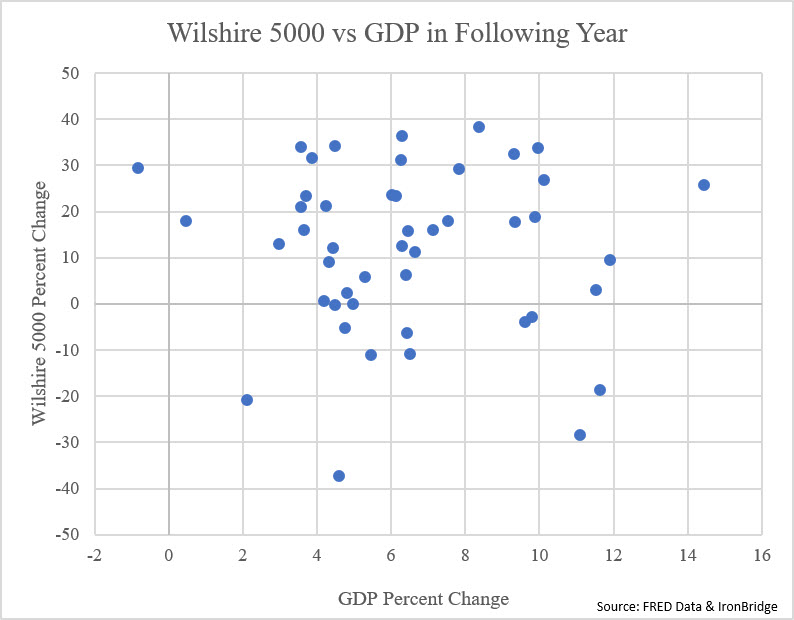
Let’s look at the same data, only with GDP shifted forward one year. The next chart below shows this. Instead of showing both stock returns and GDP for 1990, it shows stock returns for 1990 and GDP for 1991 for example. We shouldn’t expect the correlation to be perfect, but it seems like it should show somewhat better correlation, right?
This is still a random collection of dots with no correlating pattern.
Obviously, calendar-based analysis has its own flaws, as bear markets and recessions don’t start and stop at year-end. But that isn’t enough of a reason to show no correlation at all.
We have mentioned in previous newsletters and in nearly every client conversation that the primary reason stocks are higher is actually quite simple…it’s the Fed.
Stocks vs M2/GDP
The Fed has been massively increasing the money supply, which made its way into stocks, resulting in higher prices. One of the primary measures of the amount of money available to go into various assets is known as M2.
M2 is a measure of the money supply that includes cash, checking deposits, and funds that are easily converted to cash, such as money market funds and savings accounts (source: Investopedia). M2 is also a target of central bank monetary policy.
If we incorporate the money supply into the equation, we now start to see some very strong correlations.
Let’s look at some analysis from another one of our favorite research analysts, Tom McClellan.
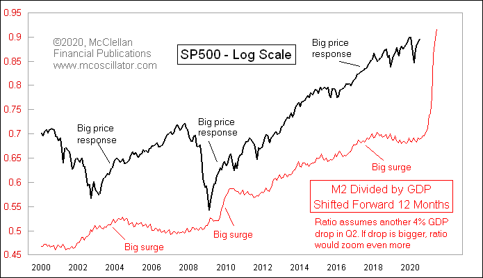
The next chart incorporates M2, GDP and stock prices, shifted forward one-year. The black line is the S&P 500, and the red line is M2 divided by GDP.
When the red line is rising, that means that the money supply is growing faster than GDP. This can happen when the Fed prints money (the numerator rises), or when GDP is falling (the denominator is falling).
As noted on the chart, when there are large surges of the M2/GDP ratio, the markets tends to have big surges as well. The correlation is very easy to see, even if it is not on a scatter plot.
There is a massive surge in this ratio right now. This chart was published before the Q2 GDP announcement came out, and assumed a 4% drop in GDP for the second quarter. The big spike on the right is literally off the charts now that the actual GDP number is a negative 33%.
Not surprisingly, the market is seeing a big surge higher in prices as well, despite all of the economic damage.
This chart confirms what we have been saying for some time now. The Fed is what matters, not the underlying economic data.
In fact, this type of correlation shows just the opposite of what we were looking for initially. Stocks aren’t LEADING the data, they are FOLLOWING the increases in overall liquidity.
It speaks to just how much the Fed has skewed markets in the modern era. The fact that we can analyze data showing very little connection between economic performance and market performance is truly stunning. And the gap seems to be increasing dramatically this year.
The primary question then becomes, “How long with this last?”
Unfortunately, we have no idea.
Maybe the economy catches up to the market. Maybe the market catches down to the economy. Maybe they continue live in alternate universes.
But with the M2/GDP ratio surging, with the Fed continuing to pump trillions of dollars into the financial markets, and with stocks breaking to new all-time highs, it is only logical to assume that rising stock prices should continue for some time. And it will likely be measured in years, not in months.
Since April, our signals have consistently been telling us that this is a risk-on environment, at least in the near-term.
Longer-term becomes more tricky. We will write more about this in the future, but our view is that we are in the late stages of a long-term debt cycle that began in the early 1980’s. There have been many debt cycles in history, and unfortunately every one of them have ended poorly.
Our best guess is that the next major down cycle will begin when markets lose confidence in the Fed. But that may be many years into the future.
For now, we are in a period where you can take advantage of rising prices. Nothing goes straight up, and there will be bumps along the way. You must have a predetermined risk management process that can reduce risk when the music eventually stops.
But as of now, the trend is favorable, and the environment is a positive one for risk assets. And we should operate under that perspective until prices tell us it is time to change.
Invest wisely!
Our clients have unique and meaningful goals.
We help clients achieve those goals through forward-thinking portfolios, principled advice, a deep understanding of financial markets, and an innovative fee structure.
Contact us for a Consultation.
Neither the information provided nor any opinion expressed constitutes a solicitation for the purchase or sale of any security. The investments and investment strategies identified herein may not be suitable for all investors. The appropriateness of a particular investment will depend upon an investor’s individual circumstances and objectives. *The information contained herein has been obtained from sources that are believed to be reliable. However, IronBridge does not independently verify the accuracy of this information and makes no representations as to its accuracy or completeness. Disclaimer This presentation is for informational purposes only. All opinions and estimates constitute our judgment as of the date of this communication and are subject to change without notice. > Neither the information provided nor any opinion expressed constitutes a solicitation for the purchase or sale of any security. The investments and investment strategies identified herein may not be suitable for all investors. The appropriateness of a particular investment will depend upon an investor’s individual circumstances and objectives. *The information contained herein has been obtained from sources that are believed to be reliable. However, IronBridge does not independently verify the accuracy of this information and makes no representations as to its accuracy or completeness.

