In his excellent book “Black Swan”, Nassim Taleb wrote: “A turkey is fed for a thousand days by a butcher; every day confirms to the turkey’s staff of analysts that butchers love turkeys ‘with increased statistical confidence.’ The butcher will keep feeding the turkey until a few days before Thanksgiving. Then comes that day when it is really not a very good idea to be a turkey.”
[maxbutton id=”5″ url=”https://ironbridge360.com/wp-content/uploads/2018/11/IronBridge-Insights-2018-11-20-Dont-be-a-Turkey.pdf” text=”View PDF” ]
Market Insights
Risks Remain Elevated
“Patient opportunism – waiting for bargains – is often your best strategy.”
– Howard Marks, Investor
Thanksgiving week is typically very quiet in financial markets. Trading volumes are usually low, retailers are prepping for a “Black Friday” sales surge, and November marks the beginning of what is seasonally a very strong 6 months through April. That has not been the case this year.
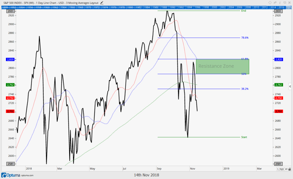
On October 10th, we published a special report titled “It’s Baaaaaack…”, suggesting that the calm market between last April to September was over (read this article HERE). On that day, the S&P 500 was trading just below 2800. We were looking for the market to work lower over the next few sessions, followed by a relief rally. The market’s true test would come at the resistance zone around 2850.
The market proceeded to fall another 6% to 2620. It then rallied to 2816 in early November, just below our target resistance zone. Unfortunately, the market failed that test and has proceeded to fall another 6.5% to where we are today.
Today, the primary question is: “Is this the start of the “Big One?”
Unfortunately, no one knows the answer for sure until after the fact. But we can definitively say that the risks in markets today are higher now than at any time since the 2009 lows.
Why do we say this? Based on the data we have analyzed, the pullback that started in October appears different than the one this past February. We use advanced computer programs that analyze a tremendous amount of market data. We ask these programs to help us stack rank investment opportunities across client portfolios, as well as give us clues as to the health of the various global markets and their underlying characteristics.
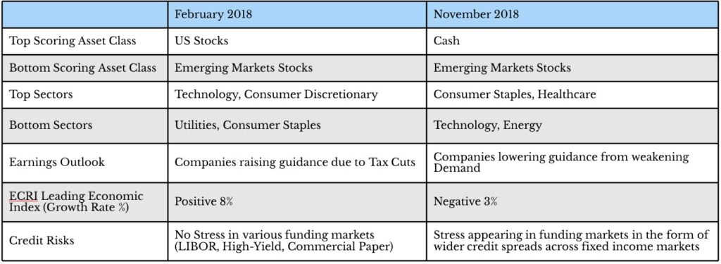
Let’s use the chart below to compare the February environment to the current one, looking at a variety of factors:
In February, US Stocks were still scoring very well in our systems relative to other assets such as bonds and international stocks. Under the surface of the market, more aggressive sectors such as technology stocks, retail stocks, and even small and mid-cap stocks were also showing strength. This told us that while we should take steps to manage risks in client portfolios, buy-signals were going to re-appear at some point. That is what happened.
Today, we have no question that buy-signals will also re-appear at some point. Maybe they happen sooner rather than later, and this was yet another short-term panic that is quickly dismissed. But given the context of this selloff, it is our concern that lower prices are in store.
In fact, almost across the board since early October, defensive areas of the market have overtaken the aggressive areas in a sign that there is a large de-risking of portfolios taking place across the globe.
The bond market in particular is known as the “smarter” market, due to the relative lack of smaller investors participating in it. This is signaling a de-risking environment as well, which we go into next.
Risks are incredibly elevated right now, more than they have been in many years. The delicious turkey dinner the market has served over the past few years may be over, and if you’re searching for leftovers you might be out of luck.
Market Microscope
Bonds are Speaking, but are Stocks Listening?
“Things are not always what they seem. The first appearance deceives many.”
– Phaedrus, Roman Poet
Let’s start with the equity markets. In early October equities topped for the 2nd time this year, and fell around 10% to their October lows. A (typical) oversold bounce brought equities back to a normal 38%-62% retracement zone in November. Since that has occurred, stocks have resumed the decline, giving back most of the gains and once again flirting with negative returns for the year. The bounce into the resistance zone was expected and discussed in the 10/19 issue when the market was still searching for its October lows. The big question is “now what”, and the downtrend that started earlier this week resulted in our signals once again suggesting we increase cash.
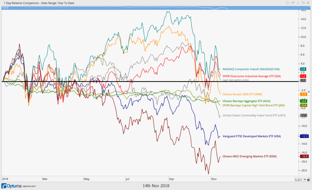
Let’s also get grounded as to how other asset classes are faring. Below is a chart of key various asset returns year to date. Of note is that U.S. equities remain the only positive asset class (and that has now changed with 11/20’s continued selloff). Various emerging market indices remain down more than 10% while the AGG Index (a broad bond market index) remains down over 4% this year. U.S. stocks have been the place to be (and where we have been) and is one reason why we are generally performing better than our benchmarks across all strategies (see page 4).
We think the bond market’s negative performance may actually be the key story of 2018 (and potentially 2019) as there are some interesting developments.
There are a few reasons we care about the bond market including, but not limited to, the following:
- It’s significantly larger than the stock market. Some estimates have the global bond market at $100 Trillion while the global equity markets are much smaller in comparison, at just $64 Trillion
- The retail investor is typically not involved directly. This leads some to believe the bond market is “smarter” as the institutions and professionals make the vast majority of bond market buy and sell decisions.
- Bonds have preferential treatment over equity on the balance sheet. Bond principals are paid out before equity during any liquidations. Bond interest payments also have preferential treatment over dividend payments.
- Some tranches of debt are issued by a borrower at literally just one level away from equity, with no collateral, no covenants, and maybe even convertible to equity. These bonds are typically the high yield, or “junk”, tranches. Even though these bonds typically are covenant-lite and/or may be convertible to equity, they do have a “preferential” yield payment associated with them and thus are still “safer” than outright equity.
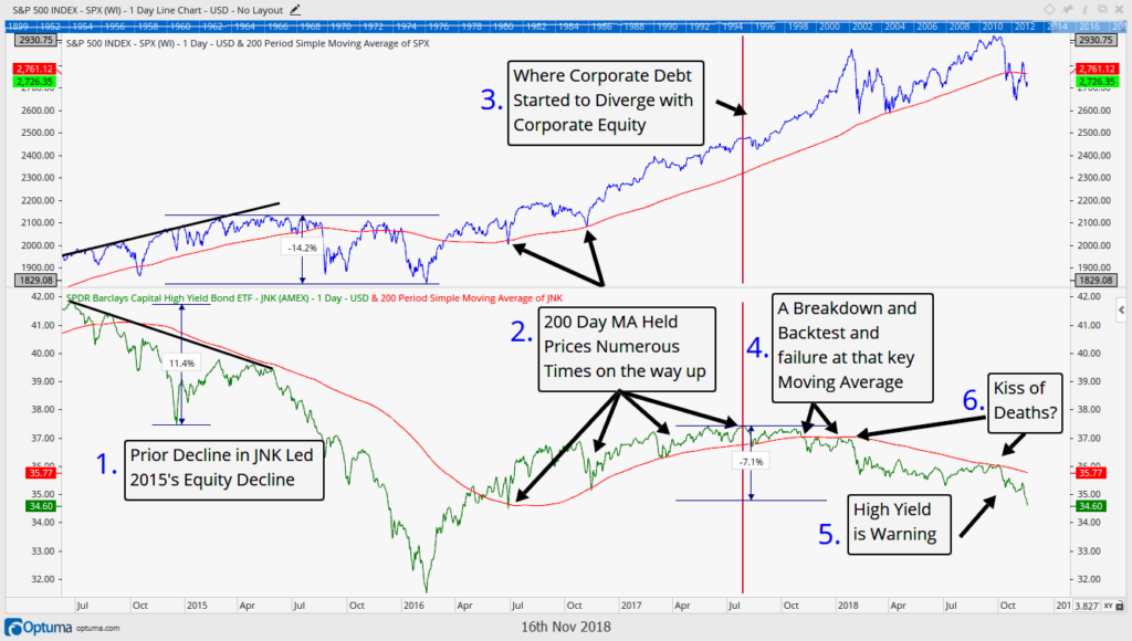
For these and other reasons, we like to pay attention to what the bond, and especially the high yield bond, markets are doing. The first chart below, is a busy one, and one we have shown before, but if you follow the numbering system, hopefully it will come together. The top section of the chart is the S&P 500 while the bottom section is a popular high yield debt ETF, JNK.
The numbered items on the chart above discuss the following:
- Back in 2014 the S&P 500 (equities) were making new all time highs. However, junk bond prices had already peaked and were actually falling in price. This divergence between high yield debt prices and equity prices (which, given their similarities, typically should trade in the same direction) warned of 2015’s 14% pullback.
- Junk bond prices were confirming the equity market uptrend all through 2016 and early 2017, with numerous tests of key support levels. This confirmation helped solidify the bullish case for equities.
- However, something happened in mid-2017. High yield bond prices no longer were going up in price.
- Equities continued higher into January, but the bond market cracked. In October-December of 2017, the high yield debt market actually fell in price, breaking the key support that the 200 day moving average had been providing. This breakdown helped warn of the increased risk to equities heading into the February 12% equity drawdown.
- Look at what has happened since February’s selloff in both stocks and bonds. Stocks retested their highs, but high yield bonds wanted nothing to do with it
- Also look at what has occurred in November. High yield bonds are making new lows and have not participated even in the retracement bounce off the lows over the last month.
This is very concerning to us, and unfortunately that concern doesn’t stop at the high yield bond market.
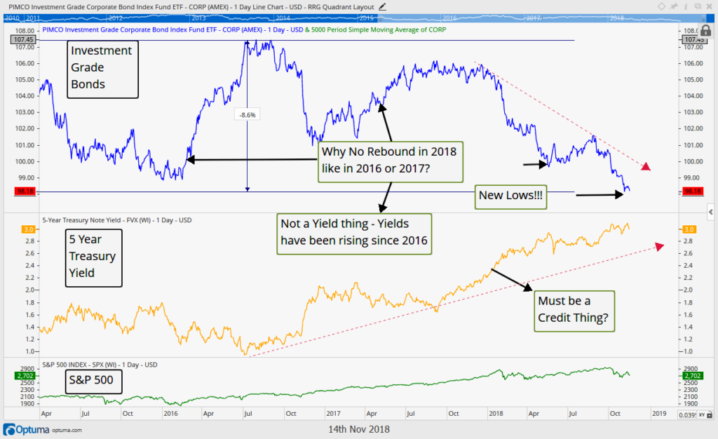
The investment grade corporate bond market is also showing signs of weakening. This means the risk that had previously been largely isolated in the weaker tranches of debt are also now showing up in the more mainstream, larger, and typically “safer”, tranches.
The chart below is of a popular corporate bond ETF, ticker CORP, and managed by the gigantic firm, PIMCO. Since 2016, when bond yields bottomed, investment grade bonds are down over 8% in price. More concerning, though, is the fact that this market has now made a new low, below even that seen during the 2015 market hiccup. So, investment grade bond prices are below where they were in 2015, yet equity prices remain 48% higher than they were at 2015’s price low. That seems like a risk to equity prices.
The term “Fallen Angel” has been thrown around lately, and investors use that term to describe a tranche of debt, an investment, or a company that used to be investment grade or have some higher quality credit rating that is now priced or rated at a lower quality. The century old firm, General Electric, is the latest “fallen angel” to be in the news.
This article from Business Insider (click HERE) does a great job explaining the growth in the bond market, the ratings given to bonds, and what the risks are around “Fallen Angels”. If a company gets a cut in its credit rating, it results in lower bond prices, higher yields, and ultimately more costs of carrying debt loads. As yields go up and debt gets costlier, the risk of fallen angels will likely continue to increase.
One more interesting thing about the chart above. Notice that the ultimate peak in investment grade bond prices occurred during the Summer of 2016. The orange line shows, this is also when Treasury yields bottomed (the 5 year Treasury yield was near 1.0%). Since then, as yields have risen, corporate bonds have declined in price. As the Federal Reserve continues to raise rates, we should not expect that trend to change.
The primary takeaway for us, though, is that the bond markets are not confirming the equity markets in higher prices, quite the contrary, and historically that has typically preceded equity market tops.
The last chart below looks at historical correlation between stocks and bonds. They generally trend in the same direction, but when they don’t, it is typically a warning sign for stocks.
Bonds of all sort have started to roll over and are now firmly in bearish trends, and if this continues it will be hard to expect equities not to eventually/continue to follow them lower. Historically, the relationship between high yield debt and equities is above 70% correlated as depicted in the correlation history above which measures the 200 day correlation between the two through time.
This shows us that yes, indeed, high yield bond prices and stock prices generally trend in the same direction, and right now, no, that is not a good thing.
Invest wisely.
Our clients have unique and meaningful goals.
We help clients achieve those goals through forward-thinking portfolios, principled advice, a deep understanding of financial markets, and an innovative fee structure.
Contact us for a Consultation.
Neither the information provided nor any opinion expressed constitutes a solicitation for the purchase or sale of any security. The investments and investment strategies identified herein may not be suitable for all investors. The appropriateness of a particular investment will depend upon an investor’s individual circumstances and objectives. *The information contained herein has been obtained from sources that are believed to be reliable. However, IronBridge does not independently verify the accuracy of this information and makes no representations as to its accuracy or completeness. Disclaimer This presentation is for informational purposes only. All opinions and estimates constitute our judgment as of the date of this communication and are subject to change without notice. > Neither the information provided nor any opinion expressed constitutes a solicitation for the purchase or sale of any security. The investments and investment strategies identified herein may not be suitable for all investors. The appropriateness of a particular investment will depend upon an investor’s individual circumstances and objectives. *The information contained herein has been obtained from sources that are believed to be reliable. However, IronBridge does not independently verify the accuracy of this information and makes no representations as to its accuracy or completeness.

