We explore Investor Sentiment, look at optimism in late stage bull markets, and discuss the three major flaws of modern portfolio theory.
[maxbutton id=”1″ url=”https://ironbridge360.com/wp-content/uploads/2017/11/IronBridge-Insights-2017-11-10.pdf” text=”Read the PDF” ]
Insights Overview
Portfolio Insights: The Three Flaws of Modern Portfolio Theory
Modern Portfolio Theory is one of the most widely used principles in investing and finance today. And it is terribly flawed.
Macro Insights: What exactly is Investor Sentiment?
We speak a lot to the three pillars of our market analysis – fundamentals, sentiment, and technicals – but what exactly is sentiment and how do we account for it in our strategies?
Market Microscope: Sentiment Indicators Suggest Optimism is High
There are countless ways to measure sentiment. We discuss a few, where to find them, and how to interpret them. Most sentiment measures currently suggest that optimism is very high, but that does not mean optimism and thus share prices, cannot continue higher. These indicators tend to have extended moves when optimism is high.
On Our Radar
Earnings: Earnings are largely in for the 3Q. No major surprises.
Trump Taxes: We sent out an update on the Trump tax proposal the week of Oct 30 as we received more details around the initial proposal. Although far from being passed (Goldman Sachs is giving a compromised version a 65% chance of passing), the implications to individuals could be significant. Proper planning may help you take advantage of the coming changes.
FIT Model Update: Uptrend

Fundamental Overview: Earnings are mostly done, and the trend of the past few years continues. Tech earnings were strong, retail earnings were weak, and market valuations are high.
Investor Sentiment Overview: Sentiment continues to hover near euphoric extremes, however, history shows us this hovering can last a while before the markets change their trend. This week the VIX (a measurement of stock market volatility which often moves inversely to the markets) is at an all time low, but that doesn’t necessarily mean it is time to sell. Prior instances of VIX bottoms occurred in 1993 (7 years before the actual market peak) and January 2007 (9 months before that market top). One thing to watch for is a rising VIX Index along with a rising stock market.
Technical Overview: The trend remains up, and the technicals continue to point towards higher prices.
Focus Chart
Low VIX not a sign of a Major Top
One theme over the past few years has been the persistence of sentiment indicators reaching extreme levels. In many ways this is a warning sign that the market is indeed at levels that could form a market top.
However, a look back at the history of a few popular sentiment indicators shows us we can sit in these extreme levels for a long time before their implications ever come to fruition.
The chart below shows one such indicator, the VIX, which we discuss in more detail in the Market Microscope section.
Portfolio Insight
Three Flaws of Modern Portfolio Theory
“In theory, theory and practice are the same. In practice, they are not.” – Albert Einstein
Modern Portfolio Theory (MPT) is the preferred investment theory used by most banks and large investment firms. We believe there are flaws with MPT that are placing client assets at extreme risk. History shows MPT to be useless when markets undergo any kind of stress. We find there to be three major flaws in Modern Portfolio Theory:
1. Investors are not always Rational.
The basis of Modern Portfolio Theory is the “Efficient Market Hypothesis”. This investment theory states that stock prices always trade at their fair value, and cannot ever be over-valued or under-valued. It also states that investors always behave in rational ways, and never panic or get too excited about their investments. Markets have a long history of boom and bust cycles, from the tulip bubble in the 1600’s to the real estate bubble of the mid-2000’s.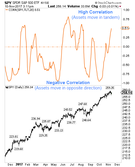
2. Correlations Change Over Time
MPT attempts to maximize return and minimize risk by using diversification, or having different assets within a portfolio that perform differently in different market environments. The measure of how investments interact with each other is called “Correlation”. Two assets with a correlation of “one” move in exactly the same way. Conversely, assets with a correlation of “negative one” move exactly opposite of each other.
MPT makes the assumption that these correlations do not change over time, and that investments will behave in a predictable way regardless of market conditions. Not only do investment correlations change over time, they change many times throughout any given year.
The top portion of the chart to the right shows the correlation between stocks and bonds.
Over the past year, correlations have switched from positive to negative a total of 12 times! It is impossible to make a longer-term projection on how assets might interact with each other and be anywhere close to accurate. Yet, this is the cornerstone of the supposedly “diversified portfolio” being sold by large banks.
3. Mathematical Flaws
We won’t go into much detail about the math surrounding this, but MPT uses an assumption that asset returns follow a Gaussian (or normal) statistical distribution, which is not the case in real life.
There are other mathematical errors with this theory, primarily in the risk, return and volatility assumptions that are based on expected future values that simply cannot be predicted with any accuracy.
Don’t misunderstand, we believe greatly in diversification. But the diversification we believe in uses different strategies, signals and outcomes to achieve results.
Bottom line, don’t rely on Modern Portfolio Theory to achieve your financial goals.
Macro Insight
Is the Market Sentimental?
In the Overview page of every issue of ‘Insights’ we feature our FIT Model and what it is telling us about the markets. One of the key components to the FIT Model is Consumer Sentiment, but what is this oft overlooked component to the markets? Sentiment is likely the most subjective piece to a stock’s price, but at certain times, it may be the most important.
In the Overview page of the last issue of the ‘IronBridge Insights’ we brought to your attention the University of Michigan Consumer Sentiment Survey, one of the longest running consumer surveys. That survey recently reached levels last seen in 2004, suggesting consumers are the most optimistic they have been in over 10 years.
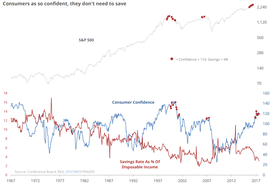
This issue we want to call attention to another popular sentiment indicator (shown below), the Conference Board’s measure of consumer confidence. That sentiment survey also helps confirm what the University of Michigan survey suggested two weeks ago…consumer confidence is again at the optimistic levels associated with prior market peaks. Notice on the chart below, from SentimenTrader, that prior extremes in confidence (blue) have generally correlated with peaks in the stock market (the top chart of the S&P aligns with the peaks in consumer confidence’s blue line).
These two surveys are subjective in nature, meaning a consumer could have one opinion one day and another opinion the next day, even though their situation may not have changed. However, another sentiment indicator also shown on the chart, is a more objective measure of how consumers feel. Have you heard any of the claims by the media that there is all of this “cash on the sidelines”?
The index shown in red, from the BEA (Bureau of Economic Analysis), reveals cash levels as a % of disposable income is actually near its all time lows. This reveals that not only are consumers subjectively optimistic, but the historically low levels of cash reveal they are also objectively putting their money where their mouth is, by either spending or investing. The final takeaway from the chart is shown by the red dots. These dots reveal that when confidence is peaking, and cash is at its lows, market tops are usually not too far away (at least based on the setup heading into 2000 and 2007).
Market Microscope
Optimists can get more Optimistic
Most investors don’t pay attention to sentiment indicators, but adding the tool to your toolbox can be beneficial, especially around key market inflection points. Extreme sentiment readings often occur before or simultaneous to major market tops and bottoms. Many of these sentiment measurements are known as coincident indicators, largely because they typically rise and fall along with stock prices, but we like to think of them as more than just coincidence. We prefer to think of them as confirmation indicators.
Famed investor Baron Rothschild is credited with coming up with the term, “buy when there is blood in the streets”. His timely suggestion came about in the early 1800s when he was making investments after the panic that followed Napoleon’s Battle at Waterloo. The quote is really just a play on investor sentiment. When investors are most panicked is when they should be buying, and, similarly, when they are most euphoric is when they should be selling. This is the essence of sentiment analysis; attempting to solve where within the panic and euphoria cycles we are.
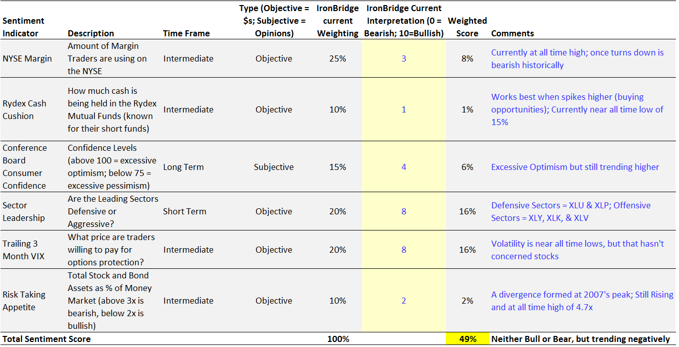
Below is a table that lays out some of the sentiment indicators we use and how we interpret them. This, by no means, is an exhaustive list, but it does help show how we try to objectify where we are currently within the sentiment environment.
Most sentiment measures are best looked at over longer term periods. In other words, with a few exceptions, sentiment measures are rather slow moving, and thus better compared over long periods of time. Similarly, just because a sentiment measure may be at an extreme does not mean it won’t become more extreme or that a market top is imminent. This is why we don’t look at sentiment measures in isolation and refer to them as confirmations – we couple them with the fundamentals and technicals to try to get confirmation of what our other indicators are telling us.
Where are We in the Sentiment Environment?
Referring back to this graph, IronBridge has come up with a proprietary way to weight the different sentiment measurements to help us get a better feel for where we are within the overall sentiment environment.
Rydex Cash
For instance the Rydex cash cushion suggests investors are about as bullish as they have ever been (very little cash cushion with record long exposure to leveraged ETFs). We compare today’s reading with history to draw that conclusion. To us, the fact that investors are now the most leveraged they have ever been within the Rydex fund family is meaningful, especially when you consider we also had similar extreme readings in this index back in the year 2000 and in 2007, just before major market tops. This is why we score that indicator a 1 out of 10 (1 being the most bearish and 10 the most bullish).
Market Sectors
However, when we look at the different stock market sectors, we don’t see any bearish deterioration, quite the contrary, as the leading sectors today are typically the ones that outperform during bull markets. If we see this start to change we will lower that score down from an 8 out of 10 (generally bullish), but for now that measurement suggests bullishness.
Overall we are neutral in our sentiment indicators as the weighted score reveals. Many indicators are at extremes, but that does not mean a market top is imminent (more on that below).
Other Sentiment Indicators
Some other examples of subjective sentiment measures include the following:
- Telephone surveys (like the UofM sentiment survey)
- Polling (like answering Money Magazine’s annual investor questionnaire)
- The skyscraper index (the notion that most skyscrapers are either built or designed near the end of bull markets)
- The hemline index (a study suggesting the length of women’s dresses generally follows the stock market’s ups and downs)
- The popularity of passive investing versus active investing (the notion that passive investing is more preferable near the end of a bull market than near the beginning of one)
- The cover of the magazine indicator (numerous studies which suggest that when an investment theme makes it onto the cover of a major media outlet, the opportunity has likely already passed)
Objective measurements are typically measured by either Dollars, or some similar form of consistent standard. Some examples are shown next:
- How much of your portfolio is invested in stocks versus bonds versus cash? (This is an objective measure of how investors “feel” about these individual markets. It also varies greatly through time)
- How much leverage people are using to buy investments (Typically people won’t use leverage unless they think they will be able to pay it back. Therefore more leverage is usually utilized during good times more so than during bad times.)
- NYSE Margin Debt (The NYSE tracks how much margin is being used to buy stocks. Right now that measure is at an all time high, which is meaningful if you are aware that leverage is highest near market peaks and lowest near market bottoms)
- Number of covenant-lite loans. (Covenant-lite loans are typically a result of a bull market and similar to leverage their popularity coindices with bull markets)
- What the cost of portfolio insurance is (the VIX Index, for instance – more on that below)
- Number of IPOs (There is a very positive correlation between the # of IPOs and stock prices. High stock prices motivate companies to go public and “cash in”. Low stock prices cause the opposite
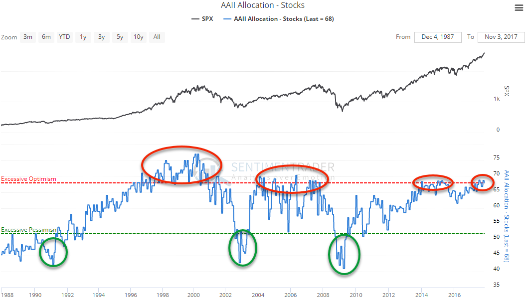
Another sentiment chart is shown next. Can you guess if this is an objective form or subjective form of sentiment?
That chart is of another sentiment measurement built from a monthly survey to one of the largest investment groups, the AAII (American Association of Individual Investors).
The survey asks the group members to disclose what percentage of their portfolio is weighted in stocks. Currently the cohort is 68% invested in stocks, which, as SentimenTrader has pointed out, suggests the group is rather optimistic.
When we look back at history at other times this group was this optimistic, the year 2000 and year 2007, tops were forming. However, there were also plenty of false positives, meaning that the measure hit optimistic levels, yet stocks were still higher 1 year later. This optimistic reading occurred for the first time in 1997. Stocks took 3 more years to top, but it is pretty clear that there is value in knowing when this group is optimistic and when it is pessimistic. At times it was pessimistic were some of the best buying opportunities ever.
VIX Index
The final chart is of the VIX Index. There has been talk all year about the ultra low VIX, and indeed the next chart shows us that the VIX is indeed at an all time low. Most savvy investors understand the inverse relationship between the VIX and the stock market, which is why many are pointing to the ultra low VIX as a sign of caution for equities, and they will likely be proved right at some point over the next 6 years, but that is a long time to potentially be wrong in the investment world. In some sense their warnings are warranted, but, taking a step back and looking at the history helps us build a better investment thesis.
There have been prior times when the VIX was similarly low, and in all of those cases the bottom in the VIX occurred well before an actual market top occurred. In Dec 1993, the VIX hit a low. It then took over 6 years of a rising VIX and rising market to form the next major top. Prior to the financial crisis, the VIX bottomed in January of 2007, a full 9 months before that market saw its final high.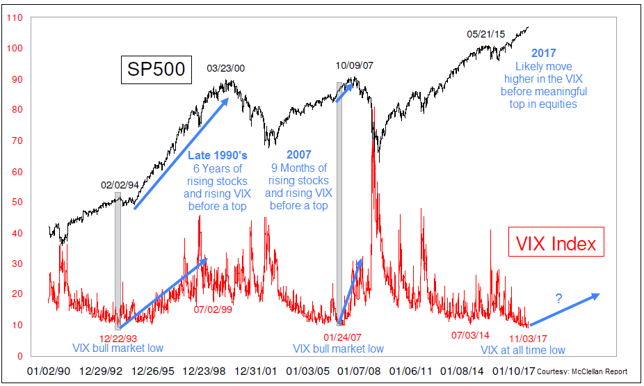
Although a low VIX is certainly something that is associated with market tops, sometimes that low VIX can persist for months (or even years) before market prices actually respond.
Instead of seeing the low VIX and drawing the market top conclusion, a better signal may be waiting for the VIX to turn up in price (along with stocks). That convergence has been a better indicator a top was near as pointed out on the chart.
The low VIX could be construed as an early warning sign, and in that sense we should look at it as yet another signal the ingredients are in place for a market top to form, however, sometimes these ingredients can cook for months before the bear’s meal is finally ready.
That is likely the case right now with the VIX and a lot of the other sentiment indicators. Many have been extreme for months (or years) already, yet the market’s rally persists. The AAII chart above is a good example of this. Often, it reaches the optimistic zone, but that does not preclude an immediate market decline. Instead that optimism may persist as it enters the upper extremes, and then persists. It seems the real signal is when the index moves back out of optimism, down toward pessimism.
One thing is for sure, many sentiment indicators have reached levels associated with prior market tops. But, that doesn’t mean one is upon us exactly right now. Many of these indicators have had plenty of false positives over the last few years. We believe we have a framework in place to at least help warn us when and if the next major top is upon us. We don’t believe we are there yet, but we are certainly aware that the risks are and have been elevated, at least from a sentiment standpoint.
Our clients have unique and meaningful goals.
We help clients achieve those goals through forward-thinking portfolios, principled advice, a deep understanding of financial markets, and an innovative fee structure.
Contact us for a Consultation.
Disclaimer This presentation is for informational purposes only. All opinions and estimates constitute our judgment as of the date of this communication and are subject to change without notice. > Neither the information provided nor any opinion expressed constitutes a solicitation for the purchase or sale of any security. The investments and investment strategies identified herein may not be suitable for all investors. The appropriateness of a particular investment will depend upon an investor’s individual circumstances and objectives. *The information contained herein has been obtained from sources that are believed to be reliable. However, Ironbridge does not independently verify the accuracy of this information and makes no representations as to its accuracy or completeness.
