“If your friends were jumping off a bridge, would you jump too?” We have all heard that saying at some point in our lives. We might jump, if it was into the refreshing waters of Barton Springs, but would answer a resounding “no” if it meant jumping off the Pennybacker Bridge. Such is the concept of risk and reward. However, risks are not static in financial markets, and can change quite frequently. We discuss strategies to adjust portfolios as the risk and reward dynamics in markets change. We also look into ways certain areas of the markets can give clues about other areas, and examine the dreaded September effect.
[maxbutton id=”5″ url=”https://ironbridge360.com/wp-content/uploads/2018/09/IronBridge-Insights-2018-09-07-Jumping-off-the-Bridge.pdf” text=”View PDF” ]
FIT Model Update: Late Cycle Bull Market
![]()
The market broke to new all-time-highs over the past two weeks. After an initial acceleration higher, the market is now re-testing those breakout levels. If the market can hold these levels, it suggests that we may enter into another period of higher prices. However, if prices fail to hold, and the market moves back below its all-time-highs, then the probability increases that we have witnessed a “false breakout”, and would likely see increased downward pressure on prices. We are prepared for either scenario.
Market Microscope
Calculated Risk Taking
“Take calculated risks. That is quite different than being rash.” – General George S. Patton
Jumping off the Bridge
We probably have all heard the saying at one point in our lives (usually from a parent), “If all your friends were jumping off a bridge, would you jump too?” Well, actually, maybe. What if that bridge was only 3 feet off the ground? Or if you jumped and landed in the refreshing waters of Barton Springs? That’s a big difference from jumping off the Pennybacker Bridge, for instance, pictured on the cover of this research report. That decision all boils down to risk versus return.
One of the most under-appreciated facts in the investment world is that risks are not static…they change over time. Markets do not behave in a scientific and predictable way, where we could apply a mathematical formula and know the exact outcome. Which is too bad, because we really like math. When building a bridge, the laws of physics apply (as would apply when jumping off the bridge too). But when building a portfolio, we must use other means.
The most important factor when building a portfolio is understanding the trade-off between risks and returns. If risks remained constant, then we could always predict exactly how much stocks versus bonds each individual client should own. Because we would then know exactly how this portfolio would react in any environment. We would know the returns that would be achieved when markets went up, and know the downside that would occur when markets went down. In this fantasy static-risk world, a portfolio should keep same allocation of stocks and bonds and cash at all time.
But unfortunately, risks are not static. What is also unfortunate is that the majority of investors have portfolios that remain invested the same way despite the changing dynamics of risks and returns.
Don’t misunderstand, we strongly believe that asset allocation is very valuable. But each portfolio’s target asset allocation should be like using cruise control in your car, something to get you from point A to point B in a safe and easy way when the risk of crashing is low and traffic is flowing consistently. But who pulls out of their driveway, sets the cruise on 65 mph (or 85 in Texas), and doesn’t use the brakes or accelerator on their way to their destination?
Only three people would do such a thing: a lunatic, anyone driving on Mopac during rush hour, or your typical investment advisor.
But if a portfolio’s allocation to stocks and bonds can and should change over time, how would you know when to do that? Isn’t that “timing the market”? Not at all, in our opinion. It is the logical and prudent evolution of portfolio management to adjust exposures to reflect the natural adjustments of the risks and returns in markets.
So what strategies can be implemented to adjust portfolios as markets change?
- Keep it Simple. Markets are incredibly complex systems, and complex systems require simple solutions. If the potential reward of an investment is reduced, then reduce risk accordingly. We have a general rule of thumb at IronBridge that we prefer to have a reward-to-risk ratio of 3-to-1. This means that if we expect a particular investment to return 15%, then we are willing to lose 5% on that investment. If that particular investment loses 5%, get out and move on. It’s okay to sell. It’s not okay to just watch a small loss turn into a big loss. Some investments have higher potential returns, such as technology stocks, so they will also have a higher potential draw-down if markets fall. However, other investments, such as bonds or dividend stocks, do not have as high of a return potential, so we limit the potential downside accordingly.
- Pay close attention to the little things, and the big things will take care of themselves. Instead of making broad, macro calls about the future direction of the markets (which is an effort in futility), we choose to make small, focused calls on individual positions. If the market moves higher, positions should generally rise and may even exceed our return expectation. That’s great. All you have to do is adjust the exit based on the higher price to keep overall risks properly aligned. If the market decides to move lower, having an exit strategy on each position in a portfolio allows you to naturally adjust to the increased risk by removing investments that are simply not working. This attention to detail can help portfolios remain invested in good markets, while reducing risks in bad ones.
- Have a Defined, Repeatable and Unemotional Process. We have said before that investing without a specific game plan is simply gambling. It exposes portfolios to potential mistakes of human behavior that inevitably occur over various market cycles. It permits people to sell at the bottom and buy at the top, because there is not a process in place to do otherwise. We have developed specific methodologies to determine our actions, and identified a variety of signals that allow us to remain unemotional and unbiased, to keep us from trying to guess what the market will do next. Instead, our efforts are focused on listening to what the market tells us. We plan each portfolio, plan every trade, and know exactly what we will do if certain things happen.
Because markets are so complex, there is not a “perfect” approach on how to most effectively grow and protect wealth. There have been many successful investors over time who have taken dramatically different approaches to investing. That’s okay. The important thing to remember is to have a plan, execute that plan diligently, and make adjustments over time to increase the efficiency of your system.
The next logical question is how do you determine when risks are changing?
One very effective way to recognize changes in risk and return dynamics is to analyze charts. In our view, charts contain all of the collective wisdom of the market (along with the all the fear and greed as well). When historical precedents are no longer working, we take notice. That is occurring in the bond market right now.
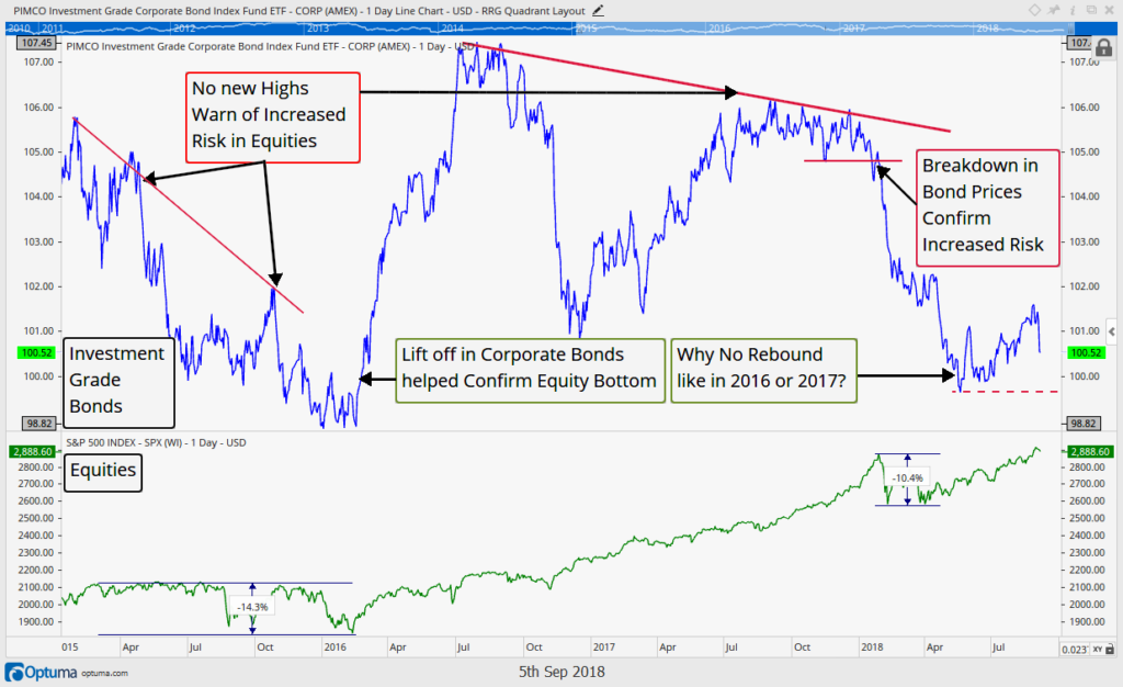
The chart below shows bond prices in blue and stock prices in green. This chart shows that investment grade corporate bonds have been hovering near their recent lows, while corporate equities are making new highs.
The relationship between stocks and bonds that we are seeing today is eerily similar to the summer of 2015, shortly before the market fell almost 15% in a matter of weeks. A decline in the Chinese Yuan (its currency) was the catalyst for the sharp equity decline, but there were signs that risks were increasing months before the drop began, as shown on the left side of the chart above. This non-confirmation was a warning sign of elevated risks in equities. Buying rising equities when corporate bond prices are also rising has historically been a good thing. But buying equities when corporate bonds are not in a bullish trend has typically not been a good thing.
Right now the fact that investment grade bonds, which, for fundamental reasons, should behave similarly to corporate equities, are not following equity markets higher in price is telling and reveals to us that risk indeed is more elevated here than it was, for instance, in 2017 when investment grade bond prices were also rising with equity prices.
The dynamic has now changed and so too must our reward vs. risk expectations.
Unlike the previous chart of corporate bonds not confirming the recent move higher in equities, the next two charts look to help confirm a prevailing theme. An interesting ratio of two equity groups is helping solidify the long-term change in trend of the bond market from falling rates to rising rates.
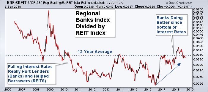
“Neither a borrower nor a lender be; For loan oft loses both itself and friend, and borrowing dulls the edge of husbandry,” claimed Polonius from Shakespeare’s Hamlet, and our next chart reveals which side of that aisle has been the better one to be on over recent history.
JC Parets, of AllStarCharts.com turned us on to this chart which takes the regional banks (who lend the money), and Real Estate Investment Trusts, or REITS (who borrow the money), and compares the two over time. When the ratio is rising in value, it means the lenders (the banks) are outperforming. Conversely, when the ratio is falling, the borrowers are performing better.
There is a very high correlation between this ratio and bond yields, helping confirm that equities are also supporting the idea of a rising interest rate environment. The ratio chart bottomed in mid-2016 along with the 10 year Treasury yield, and have moved higher ever since.
This is also a case where digging more deeply into the relationship between economic partners (banks and real estate investors), can give us clues to other parts of the market, in this case US Treasury yields.
The result of this analysis is that we believe risks in the bond market have increased, and have been for over two years now. And the effect of this increased risk is being felt by bond investors. Over the past two years, the price on 10-year Treasury bonds has fallen almost 10%.
The other immediate result of this analysis is that either stocks or bonds will likely alter their recent direction. Stocks have moved higher while corporate bond prices have moved lower. With the market breaking to new all-time highs in the past couple weeks, we hope that bond prices catch up to stocks and start moving higher. While we must respect the strong price action being shown by US stocks, we must also be cognizant of the potential for stocks to “catch-down” to corporate bonds as well.
We continue to be fully allocated, but have consistently increased our exit prices across portfolios to keep risks for clients properly and prudently aligned.
Historical Insights
September is the Worst
“Facts are stubborn things, but statistics are pliable.” – Mark Twain
We do not make investment decisions based on statistics alone. But we are cognizant that some statistics are simply a measure of historical truths. And, if history indeed doesn’t necessarily “repeat”, but it does “rhyme”, as the saying goes, then there is some reason to pay attention to certain statistics. At a minimum we should be aware of history and what it teaches us. Enter September; if history is our guide, we should expect the weakness seen this first week of September to continue through the remainder of the month.
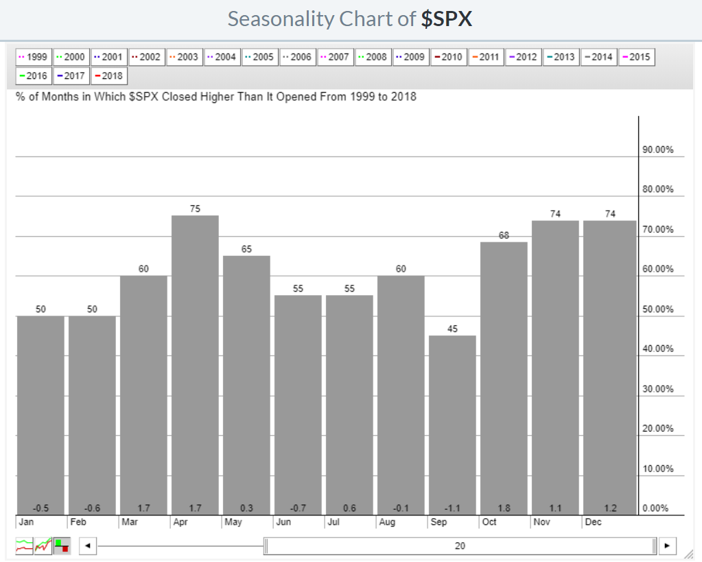
The first chart below, from stockcharts.com reveals that September is already the historically weakest month of them all. Not only does it finish negatively more often than not (up just 45% of the time), it also has an average historical return of (-1.1%), well below the next worse month, June’s average drawdown of (-0.7%). Not shown, if we expand the data all the way back to 1950, we get a similar outcome. 38 Septembers were down, with only 30 up resulting in an average monthly return of (-0.6%), and still the worst month over the period. The chart below shows the percentage of time each month was up along with the average return each month since 1999.
If we apply another filter on these historical numbers, specifically, how September fares after periods of strength leading up to it, like we just witnessed, we have historically seen an even weaker month of September.
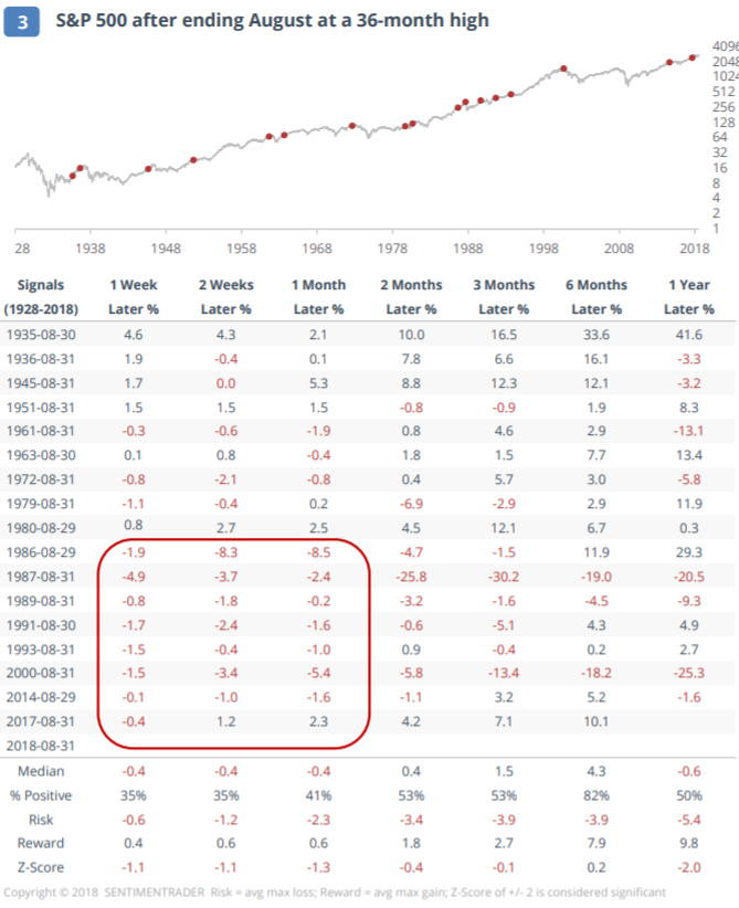
The following table from Jason Goepfert, at SentimenTrader.com breaks this down for us. Since the 1920s there have been 17 instances where August set a new 3 year high, and we see what the result has been in September following those periods.
August’s close set a new monthly all time high, which satisfies the new 3 year high filter Jason uses, and if history is any guide, then the reward versus risk of being in the stock market for the next month is not attractive. One month later, the average drawdown was (-2.3%) while the average upside was just 0.6%, with only 41% of Septembers positive. Furthermore, the results for the following year saw just a median return of (-0.6%), with a positive 1 year hit rate of a coin flip (50%).
Again, we aren’t making investment decisions based on these facts, but risk over the next month as well as the next year historically has been elevated following a new 3 year high obtained in the typically slow Summer month of August.
Invest wisely.
Our clients have unique and meaningful goals.
We help clients achieve those goals through forward-thinking portfolios, principled advice, a deep understanding of financial markets, and an innovative fee structure.
Contact us for a Consultation.
Neither the information provided nor any opinion expressed constitutes a solicitation for the purchase or sale of any security. The investments and investment strategies identified herein may not be suitable for all investors. The appropriateness of a particular investment will depend upon an investor’s individual circumstances and objectives. *The information contained herein has been obtained from sources that are believed to be reliable. However, IronBridge does not independently verify the accuracy of this information and makes no representations as to its accuracy or completeness. Disclaimer This presentation is for informational purposes only. All opinions and estimates constitute our judgment as of the date of this communication and are subject to change without notice. > Neither the information provided nor any opinion expressed constitutes a solicitation for the purchase or sale of any security. The investments and investment strategies identified herein may not be suitable for all investors. The appropriateness of a particular investment will depend upon an investor’s individual circumstances and objectives. *The information contained herein has been obtained from sources that are believed to be reliable. However, IronBridge does not independently verify the accuracy of this information and makes no representations as to its accuracy or completeness.


