• Skip to main content
  • Skip to footer

IronBridge Private Wealth

Forward with Confidence

  • Home
  • Difference
  • Process
  • Services
  • Insights
    • IronBridge Insights
    • Strategic Wealth Blog
    • Strategic Growth Video Podcast
    • YouTube Channel
  • Team
  • Clients
  • Form CRS
  • Contact Us

Elections and Volatility

November 2, 2018

Midterm elections occur next Tuesday, and there is plenty of discussion on how the outcome may affect stock prices. But what does the data tell us from previous elections? Also, volatility, whether due to elections or not, is a common measure of risk. But is the “VIX” the best way to analyze it?

[maxbutton id=”5″ url=”https://ironbridge360.com/wp-content/uploads/2018/11/IronBridge-Insights-2018-11-02-Elections-Volatility.pdf” text=”View PDF” ]


Election Insights

Do Elections Affect Markets?

“People never lie so much as after a hunt, during a war or before an election.”

– Otto von Bismark, Chancellor of the German Empire from 1871-1890

Elections Matter (?)

It’s election time again…time for the American electorate to become more divided and angry than usual, followed by the immediate spin of greatness and/or doom by each side once the results are announced. Maybe we’re skeptical (actually, yes, we’re very skeptical), but don’t we inevitably end up with the “same ol’ thing” regardless of the outcome?

Skepticism aside, there is no shortage of predictions about how the outcome of the midterm elections next week may affect the stock market. However, in recent memory, these wild guesses predictions have not been tremendously accurate. We prefer to let the data to the talking…so what does the data say?

Much of our investment philosophy is based on properly identifying trends. So naturally, we went in search of “Post-Mid-Term-Election-Trends”. During our research, we uncovered some interesting items.

TREND #1: The sitting President’s party usually loses seats.

This was somewhat surprising to us, but going back to 1934, there have only been three times that the President’s party gained seats in a mid-term election. As shown on the chart below, courtesy of “American Presidency Project”, the only presidents to gain seats in a mid-term was Franklin Roosevelt in 1934, Bill Clinton in 1998, and George Bush in 2002.

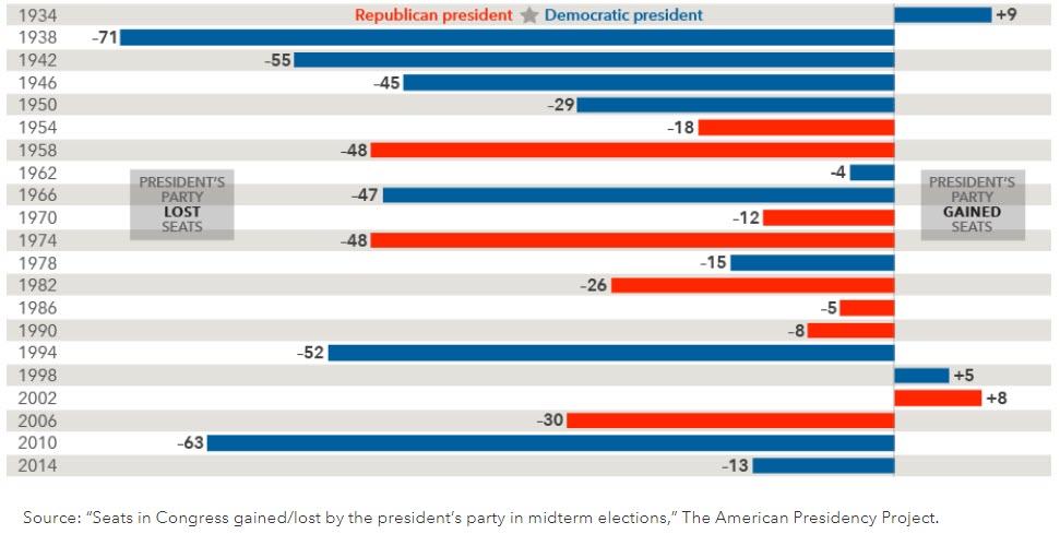
What conditions were present during the mid-term elections where Presidents gained seats? FDR was in the throes of the Great Depression, Clinton was in the middle of one of the biggest stock market booms in history, and G.W. was still in the post-9/11 terrorism uncertainty. They all had extenuating circumstances that logically allowed the country to want “more of the same”.

The only other two elections that were even close was Kennedy in 1962 and Reagan in 1986. Two overwhelmingly popular presidents during times of relative peace and prosperity. The current President is not exactly popular, the market has been very choppy this year, and the US is not in a major conflict (yet). So it seems reasonable to us that this election should resemble previous elections where the sitting President lost seats.

Most polls as of this publication have Democrats gaining an average of 39 seats in the House and no real change in the Senate. The average loss is 27 seats since 1934. So this year’s results would be slightly higher than average, but still in a reasonable range for the typical mid-term election cycle.

We don’t see anything that should surprise the markets here.

TREND #2: Volatility tends to pick up in the months prior to a midterm election.

We discuss volatility more deeply in the Market Microscope section below. But history tells us that as an election gets closer, volatility tends to increase. It seems that the market begins to price in the uncertainty involved with a potential change in political power, along with the associated economic policy ramifications.

The next chart looks at annualized monthly volatility since 1970. The blue bars show the midterm election years, while the gray bars represent the monthly volatility of all other years.

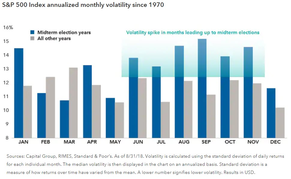
There is a distinct difference in the numbers between July and November, with midterm years being decidedly more volatile. Actually, the volatility is higher in 10 of the 12 months using this comparison.

Why would this happen? One logical reason is that a sitting President makes a pretty good “villain” for the opposing party to rally against. Looking back at the first chart, both FDR and Clinton had net gains in Congressional seats in one election, but they also had some of the worst losses of seats in their other mid-terms.

Maybe investors get nervous with all the divisive rhetoric. Maybe every mid-term since 1934 had the potential to change the overall direction of the markets. Or maybe the markets are simply a collection of human beings subject to the same influence of fear and greed during and after each election cycle.

Frankly, we don’t care why volatility might pick up, we just care whether it does or not. This year seems to fit with the historical trend, as volatility has risen substantially in the past month.

In fact, 2018 has closely followed a typical midterm election cycle pattern. So once again, we don’t see anything here that would suggest a surprise to the markets next week. What is left to learn is whether things will calm down following the election as it has in the past.

TREND #3: The previous direction tends to resume once the election is done.

When international tensions were escalating between the US and North Korea in August of 2017, our research told us that geopolitics only has a temporary effect on market performance. (Read the report HERE.) Even such large events as 9/11, the Korean War and the Cuban Missile Crisis only had an affect on stock prices for 60 days at the most.

History tells us that elections have a similar, temporary impact. There is typically a bit of a pause leading up to the election, volatility picks up for a few months, then the previous direction (up or down) continues once it is over.

What has happened in recent history?

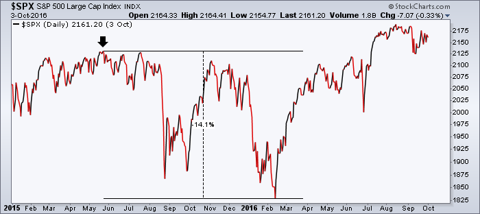
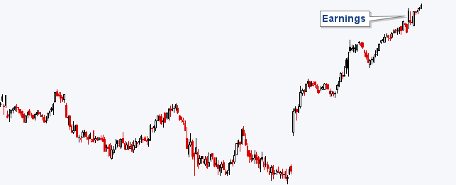
  • In 2016, almost everyone predicted that if “The Donald” won, markets would tank. They did, for about 5 hours at 2am on election night. By the open, it had fully recovered and the market went on to rise for 14 months. The fact is, once the election was done, uncertainty was removed. The trend was up before the election and continued after the votes were tallied.
  • In 2014, the market slowed in October and November, but promptly resumed the uptrend after the election.
  • 2012 is almost identical to 2014.
  • In 2010, the market was soft from May to July, and resumed its uptrend in September and continued into the next year.
  • 2008 also shows no noticeable affect from the election. The trend here was down, and continued down post-election.

We could continue this exercise for the past 100 years, but you get the point. Each of these recent elections were extremely volatile from a political standpoint, which should have produced much larger swings in the market if elections truly have an impact on asset prices. But the data suggests they don’t.

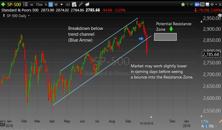
The most important question about 2018 and the midterm election is: “What was the trend going into the election?”. This is the hard part. For most of the past year, the market has been indecisive and sloppy. There have been four distinct “seasons” this year…UP until January, DOWN through May, UP to September and DOWN since.

So what should we expect?

Well, since there hasn’t been any real trend this year, we don’t see how the results next week really change anything. The market is likely to remain indecisive and sloppy until the new trend emerges, regardless of the Congressional outcome.

Yes, there are policy implications; yes, there may be tax implications; maybe it throws the US into total chaos. Maybe “this time is different”, but that is always a sucker’s bet.

So we wait with anticipation for the outcomes next Tuesday, but history tells us not to change our investment process simply because it is the first Tuesday of November.


Market Microscope

Volatility Picks Up, but is that Bad?

There are many kinds of risks, but volatility may be the least relevant of them all”

– Howard Marks, Investor 

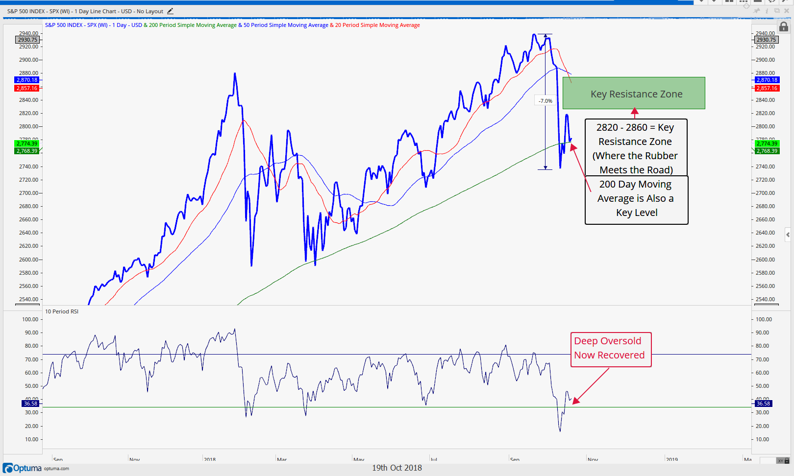
October’s pickup in market volatility has certainly caught the eye of market participants as the 4th quarter is off to its roughest start since the financial crisis with October in the books and down over (-7%). The increased downside price pressure is (rightly) on everyone’s mind.

There were 16 negative days in October, the most down days in any one month since 1970 and tied for the 3rd worst since 1928! SentimenTrader.com points out that statistically whenever a month has seen 15 or more down days (12 prior occurrences), future returns were on average negative throughout the following 6 months, so this increase in volatility certainly deserves all the attention it is getting.

The most popular measure of volatility pertaining to the stock market is the VIX Index, but let’s take a step back and first discuss what volatility actually means because there are countless ways to actually measure volatility. Case in point, even the VIX Index is not just a measure of “volatility”. It is a measure of “implied volatility”, meaning people’s expectations for future volatility are also an input to the VIX Index. We also shouldn’t make the mistake of limiting our thoughts of volatility to the mathematical standard deviation, often referred to as realized volatility. Volatility is much more than just standard deviations and variances.

Alluded to in the opening quote by Mr. Marks, volatility can mean a lot of different things to a lot of different people, but generally speaking volatility can be thought of through its definition: “liability to change rapidly and unpredictably”. The volatility of the stock market, for instance, is how quickly it is changing and that is often measured through its price measurements (but it doesn’t have to be limited to price measurements – more on that later). The controversy (if we can call it a controversy) around volatility is more around the way to measure it as opposed to what it is. We can all agree that volatility is the liability to change rapidly, but what we can’t necessarily agree on is exactly how to measure it, if it is “bad”, or predict when it will occur and won’t occur.

Many investors associate increased volatility with increased risk, but that also does not necessarily have to be the case. After this October’s (-7%) decline, stocks are cheaper and may offer more opportunity for value seekers. Has anything changed for these stocks besides their prices? Valuations have indeed come down. In this case more volatility could actually mean decreased risk as securities with the same fundamentals can now be bought cheaper. Some investors look forward to bouts of volatility as an opportunity creator. And, indeed, they may be onto something.

Although it may not feel that way (we are all subject to recency bias), what if we were to tell you the current volatility is actually rather average and by some measures, on the lower end of the spectrum? Even though the 16 down days in October is one of the worst on records, there are many examples that suggest the volatility we just witnessed is actually not that elevated. Again, it depends on how you want to measure volatility.

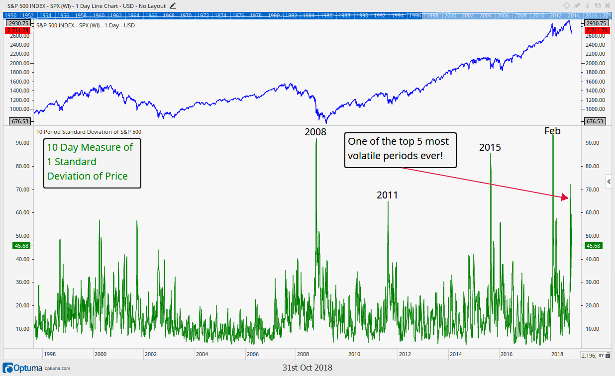
The first chart (above) is an excellent example of this because a very straightforward math calculation of price changes (realized volatility) provides us with two completely different takeaways.

The first chart shows us the S&P 500 with a simple calculation of its 10 day standard deviation of price. Based on this volatility measure, the S&P is seeing one of its most volatile periods ever with a peak 10 day standard deviation of over 70 points!

But, let’s take a look at the next chart, which is the exact same calculation, with one small difference. Can you spot the discrepancy?

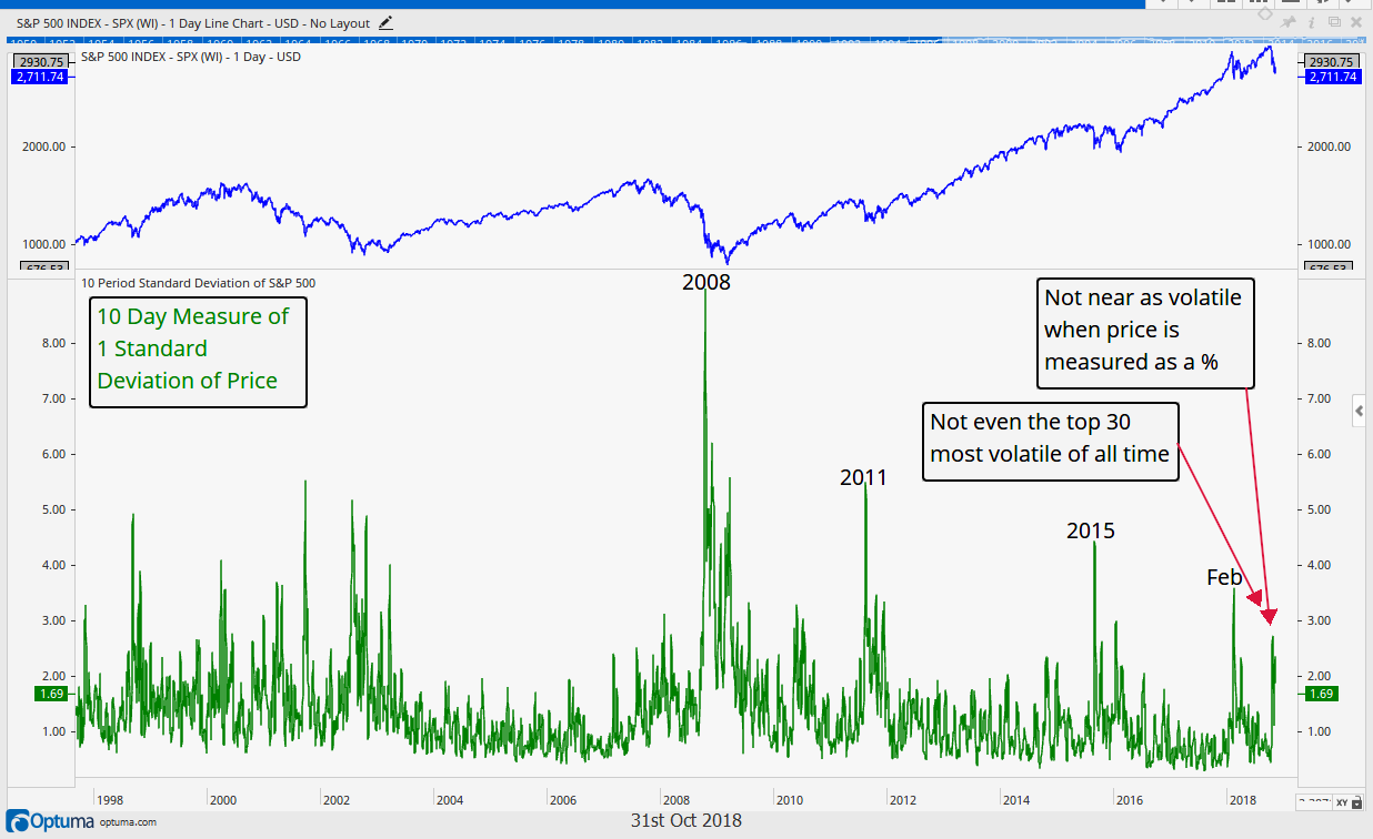
This is the exact same 10 day standard deviation in price, just with one key difference. Instead of a measure of absolute price changes (70+ point standard deviation) it is a measure of relative (percentage based) price changes (peaking slightly above 2%). A 10 day standard deviation of 2% doesn’t even register on history’s top 30 ten day standard deviation events. On a percentage basis, realized volatility is thus far not very extreme and still very much in the realm of “average”, a far cry from the non-normalized measure of standard deviation shown previously utilizing price alone.

There’s a few other measures of volatility we would like to draw your attention to as well. One way volatility can be measured is by drawdowns (distance from the high to the low). Thus far the S&P has “only” declined 10% from its highs one month ago with its worse day around a (-3%) decline.

Where does that stand historically? One recent research study suggests that a (-3%) decline is well within normalcy. Some of the study’s takeaways are shown in the table to the right and reveals the reality is volatility remains pretty tame today. Extrapolating these statistics suggests a (-5%) daily decline should occur on average every 1.6 years, yet it’s been over 7 years since we have seen a daily decline of more than 5%.

So from this aspect the market is either/or 1) long overdue and 2) been in a period of extremely low volatility given the lack of occurrence recently.

Similarly, a 10% daily decline should occur 8 times in a 100 year period (or once every 12 years), yet its been since 1987 since that’s occurred (31 years).

We like to look at statistics, but would never make investment decisions based solely on them. In this case the takeaway is statistics do help provide some historical perspective that we have been in a period of very low volatility, even when we include this October’s selloff.

Let’s look at two more measure of volatility, the most popular measure, the VIX, as well as a different approach to measuring volatility.

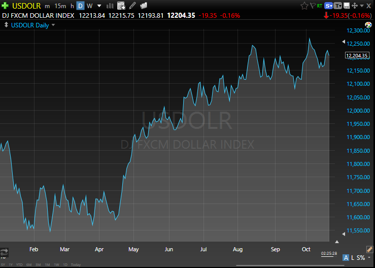
The first chart on this page shows the popular VIX Index charted monthly , currently residing around the 20 level (the VIX level at the end of each month). Since the VIX was first created (late 1980s) this is about average. Notice that the period from 1997 through 2004 was essentially spent in its entirety with a VIX above the 20 level, similar to 2008 through 2012.

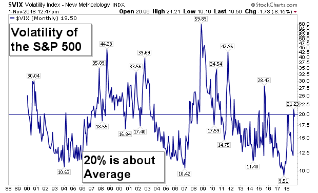
Although the recent move from a low below 10 to a high above 20 is rather large, it is by no means abnormal, especially if we are kicking off a new cycle of higher volatility in general.

The VIX index tells us the volatility we have seen thus far in 2018 is really not that extreme as both February and October closed near the long term average of just 20.

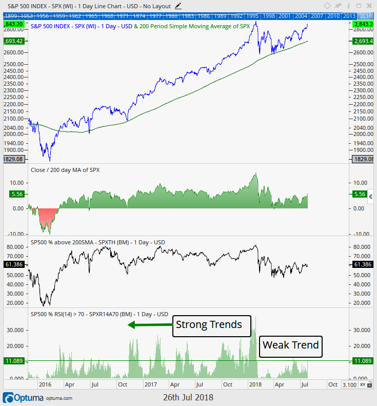
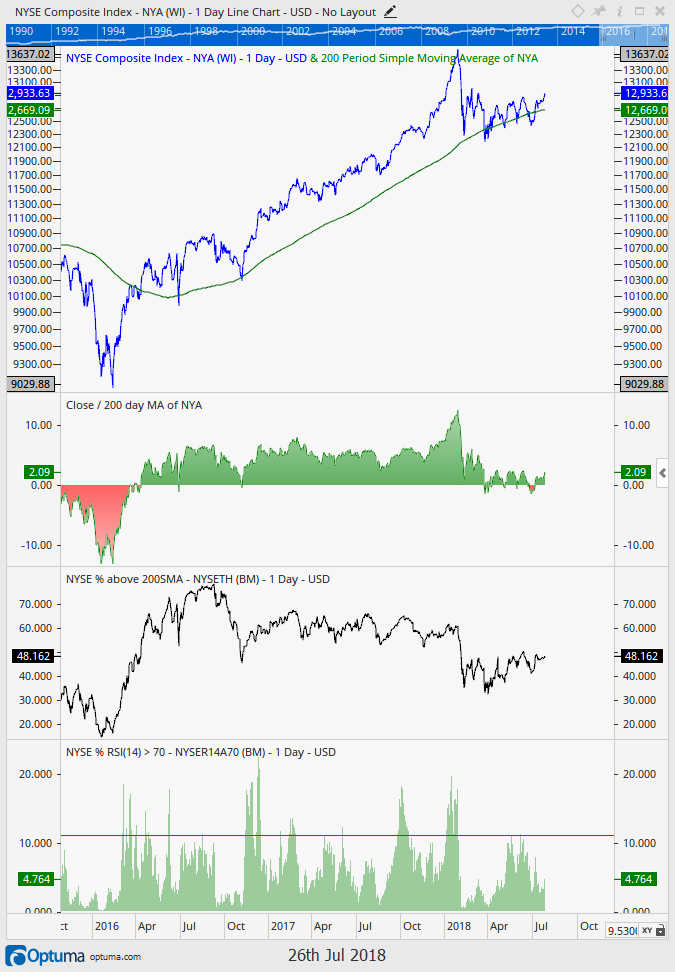
The next chart is one we think a lot of investors are referring to when they speak of volatility. What most interests investors is not necessarily if there is volatility or not, but rather if “things” are moving up or moving down. This next chart shows us just that.

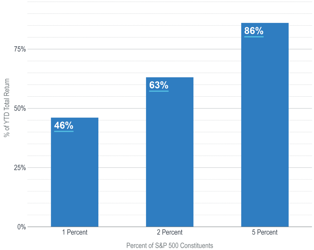
Below is a plot of the percentage of S&P 500 constituents that have their 200 day moving averages moving up. In general the direction the 200 day moving average moves reveals what trend a stock is in. If the 200 day moving average is sloping up, that means prices have been generally rising over the prior 10 months. The opposite is true as well. If the 200 day moving average has a downward trajectory then it means the average price of that security is trending downward.

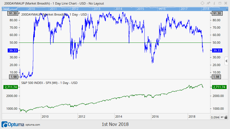
This chart helps us answer the question of whether stocks are generally moving up or moving down.

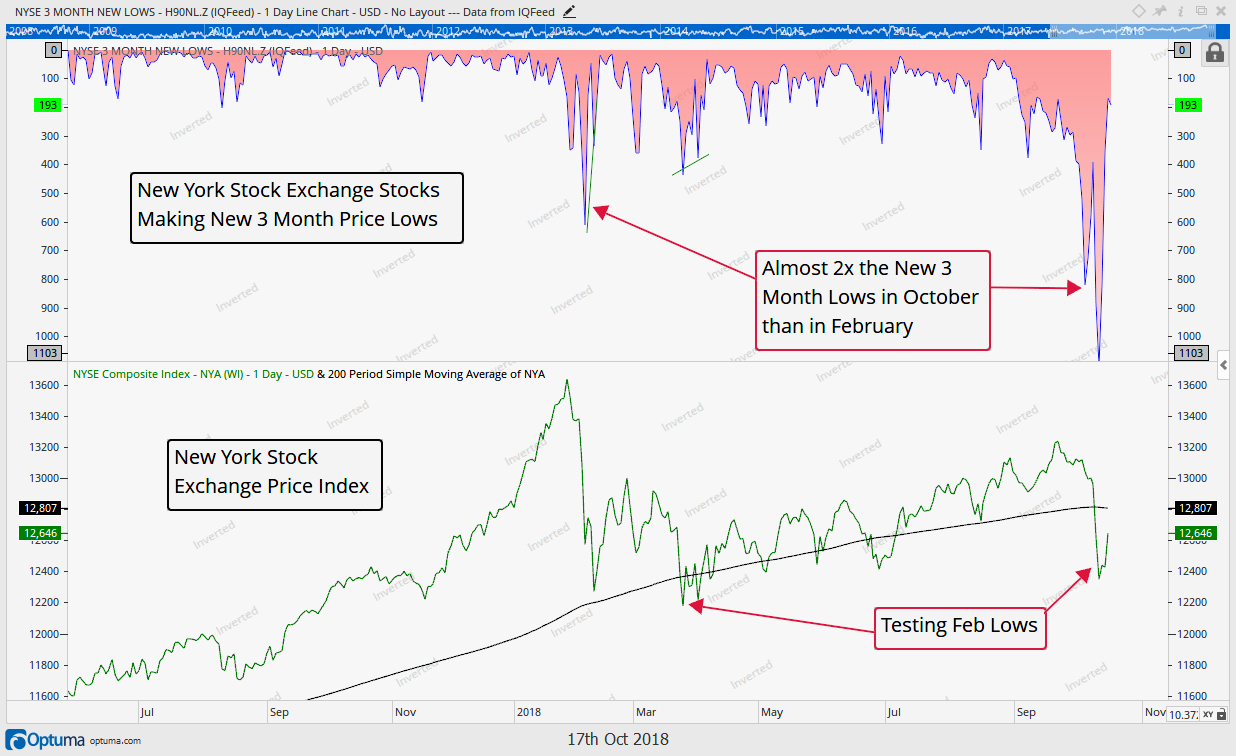
The blue line at the top of the graphic plots the percentage of the 500 S&P companies that have a 200 day moving average that is sloping upward (a rising price trend). That level has now dipped below 40% for the first time since 2015, so more than 60% of S&P 500 stocks (303 of them to be exact) are now in downtrends.

This level is much lower than what was witnessed back in February. The average S&P 500 stock’s average price over the last 10 months is in a downtrend.

Notice that the prior two large pullbacks (2011 and 2015) were double bottom affairs, similar to 2018, with two moves down. Both of those bottoms saw this indicator dip to around 30% before the ultimate bottom was in. 2008 is the clear outlier as this ratio botttomed at less than 2% of stocks showing uptrends.

Volatility has picked up, but is it extreme? By some measures it is, but in our opinion the weight of the evidence suggests we are not in abnormal times and may just be moving back toward historical average volatility.

We tend to agree with Mr. Marks and his quote, volatility may have picked up, but that doesn’t have to scare us. After all, lower prices can be a good thing if you’re prepared to take advantage of them.

Invest wisely.


 Our clients have unique and meaningful goals.

We help clients achieve those goals through forward-thinking portfolios, principled advice, a deep understanding of financial markets, and an innovative fee structure.

Contact us for a Consultation.

Neither the information provided nor any opinion expressed constitutes a solicitation for the purchase or sale of any security. The investments and investment strategies identified herein may not be suitable for all investors. The appropriateness of a particular investment will depend upon an investor’s individual circumstances and objectives. *The information contained herein has been obtained from sources that are believed to be reliable. However, IronBridge does not independently verify the accuracy of this information and makes no representations as to its accuracy or completeness.  Disclaimer This presentation is for informational purposes only. All opinions and estimates constitute our judgment as of the date of this communication and are subject to change without notice. > Neither the information provided nor any opinion expressed constitutes a solicitation for the purchase or sale of any security. The investments and investment strategies identified herein may not be suitable for all investors. The appropriateness of a particular investment will depend upon an investor’s individual circumstances and objectives. *The information contained herein has been obtained from sources that are believed to be reliable. However, IronBridge does not independently verify the accuracy of this information and makes no representations as to its accuracy or completeness.

Filed Under: IronBridge Insights

The Butterfly Effect

October 19, 2018

Chaos Theory is a branch of mathematics that focuses on the behavior of complex, dynamic systems such as the weather, fluid mechanics and financial markets. A popular expression from this theory tells of a butterfly that flaps its wings in China and causes a hurricane in Texas. What could be the butterfly in today’s markets?

[maxbutton id=”5″ url=”https://ironbridge360.com/wp-content/uploads/2018/10/IronBridge-Insights-2018-10-19-Butterfly-Effect.pdf” text=”View PDF” ]


FIT Model Update: Late Cycle Bull Market

On Friday, October 19, the Bank of the Ozarks, a small regional bank located in the Southeast US, fell 25% in price as the company greatly missed earnings. The interesting aspect of the miss is that it was largely due to two commercial real estate projects: one mall located in South Carolina and one residential land development property in North Carolina. What caught Wall Street off guard was that the appraisal value for these two properties was cut 20% in just the past three months. It’s been a long time since we’ve seen negative real estate news…perhaps this is an inflection point?


Portfolio Insights

Butterfly Effect

“I have noticed that even those who assert that everything is predestined and that we can change nothing about it still look both ways before crossing the street.” 

– Stephen Hawking, Physicist

Chaos Theory

Most of us have heard about the butterfly effect. The most popular expression tells of a butterfly that flaps its wings in China and causes a hurricane in Texas.

There is a branch of mathematics that focuses on the behavior of complex, dynamic systems called Chaos Theory. At its core, chaos theory proposes that the future behavior of a complex system is fully determined by its initial conditions. A slight variation in the initial conditions will lead to widely diverging outcomes.

Common examples of complex systems are the weather, road traffic, fluid mechanics and financial markets. The weather is the easiest analogy to make when applying chaos theory…meteorologists can generally predict the overall cycle of the weather (hot in summer and cold in winter), but their weather models have very low accuracy more than 5-7 days in advance.

Financial markets are the same way. One can generally predict that a bull market is followed by a bear market. But predicting precisely when that will occur is a lucky guess at best. Analysts were overly optimistic in early 2008, predicting an average return of 8% for the S&P 500 that year. It went on to fall 55%. In 2017, analysts predicted a rise in the S&P 500 of roughly 8%. It returned almost 22%.

To try to predict the market is a folly. No one can be accurate with any real consistency or effectiveness over time without a tremendous amount of luck. But we can and should deeply understand the current conditions of financial markets. Each and every day can be considered an initial condition for the future outcomes in asset prices.

We should also look for potential butterflies.

In the Market Microscope section below, we look at the potential outcomes in the markets, and discuss specifics on what is driving recent market volatility. But first, let’s view these potential outcomes on the wings of one really big butterfly.

The Butterfly: Global Liquidity

Beginning in 2008, central banks across the globe began flooding the financial markets with liquidity. The US Federal Reserve was purchasing various Treasury bonds, and the proceeds from these purchases made their way into the US stock market.

Other central banks were purchasing securities as well. Only many of these foreign central banks were not only buying bonds, they were investing directly into their respective stock markets. They use exchange-traded funds, various derivative contracts, and individual companies directly.

The chart below shows the change in central bank balance sheets since 2009.

The red line shows the annual change in the balance sheets of the largest four central banks in the world: The US Federal Reserve (FED), and European Central Bank (ECB), the Bank of Japan (BOJ) and the People’s Bank of China (PBOC).

This chart shows that global liquidity has consistently been added into the financial system for almost a decade. However, this red line is going negative in the fourth quarter of 2018. That means now. Arguably the single largest contributor to the rise in stocks since the financial crisis in 2008 is no longer happening. It is now removing liquidity from the financial system. If adding liquidity helped, will reducing liquidity hurt?

Given this simple, but very important, understanding of current conditions, it does not surprise us that volatility has returned in 2018.

However, central banks are not the only reason liquidity is being reduced. The other is strength in the US Dollar.

Currency markets are by far the largest markets in the world. Currencies on average trade 30x more volume on a daily basis. (On an average day, over $5 Trillion worth of currency is exchanged across the globe. Compare this to stocks, which trade on average $169 Billion.)

The next chart shows the US Dollar versus a basket of currencies. January was a very strong month for risk assets, particularly international stocks. During that time, the US dollar fell very quickly. Since then, the dollar has consistently risen while risk assets, especially international stocks, have struggled.

When the value of the US dollar rises against another currency, say the Euro, it takes more Euros to buy one dollar than before. Because of this increased exchange rate, US dollars become more and more scarce in these countries. This US dollar strength can cause all sorts of various outcomes in other countries.

This year, for example, has seen multiple currency crises: Turkey, Venezuela, Brazil, Chile, South Africa and China have all had dramatic depreciation of their currency this year. As a direct result, stock and bond markets in these countries have suffered dramatically. Emerging Market stocks are down 12% this year, but off almost 25% from their highs in late January. All due to reduced currency liquidity.

If we want to try to identify the butterflies that may flap their wings and cause hurricanes, it is logical to start with global liquidity. It has the power to overwhelm economies, earnings and entire financial markets, and we should pay attention.

Let’s now turn our attention to the current volatility, and what potential outcomes we should expect.


Market Microscope

Where the Rubber Meets the Road

“It is a capital mistake to theorize before one has data. Insensibly one begins to twist facts to suit theories, instead of theories to suit facts”

-Sir Arthur Conan Doyle, author

The markets are in such an interesting and precarious place right now we think it appropriate to really focus on the charts and potential outcomes they present. So much has happened in such a small amount of time thus far in October, we want to point out a few of the key things we are watching in the coming weeks.

The bottom line is the market’s recent selloff that culminated with last week’s significant uptick in volatility has stopped and gained back a portion of the initial losses. However, the jury is still out whether this bounce will fail or if, like February’s lows, it is one to ultimately be bought. It’s simply too early to know as the market continues to digest last week’s move lower.

Some stocks, sectors, and indices fared better than others. The technology sector fell over 9% from peak to trough already this month, while the health care sector fared 33% better, falling just over 6%. Key indices, such as the Transportation Index, the New York Stock Exchange, Small Caps, and the Dow are now flirting with unchanged or now negative for the year, while others, such as the S&P and Nasdaq remain solidly up on the year.

There have been some common themes we have been following this year, and one of those has been the concerning breadth (or lack there of). This has come to fruition as shown by the varying sets of returns laid out above. Many stocks and indices remain flat to down this year, while a handful of large cap stocks continue to pull more than their weight in the larger, cap-weighted, indices, such as the S&P 500.

In other words, the generals continue to go to battle finding fewer and fewer soldiers following them. The chart below, from Advisor Perspectives, puts this into perspective as just 1% of S&P 500 companies (literally just 5 companies) were responsible for almost 50% of its gains year to date. 25 of the 500 constituents (5%) are responsible for over 80% of the gains. This reveals a glaring risk in the market…if these leaders stop leading, the markets will be poised to fall as there are no other leaders or sectors to pick up the slack.

The next chart shows how various markets have performed thus far this year.

The Nasdaq remains solidly in the green, with the S&P and Dow still up, but now only by an average of 2.5%. The Russell 2000 is also one bad day away from slipping into negative territory again while the NYSE and Transports are already there, down over 3.5% each year to date. European stocks have seen a horrible year, down around (-8%) while Emerging Markets are down over (-12%).

The S&P is one market index we like to follow, and its chart is shown below. After falling a swift 7% in about one week’s time, it is recovering toward an area discussed in our interim update published October 10. On its way down it has flirted a few times with the 200 day moving average (the average price of the Index over the trailing 200 days, and a price many analysts watch as it represents the breakeven point of buyers and sellers during that period). Whether the S&P can actually get all the way to the resistance zone highlighted (and beyond it) remains an important question, as it seems there was some “smart” money that pushed the markets lower during this latest selloff.

The next chart from BlackRock shows this smart money and reveals one reason to think this selloff may have further to go.

According to Blackrock’s order flow (the world’s largest money manager), the 2nd and 3rd quarters of 2018 saw significant selling by institutions. This on the surface may not mean much, but the reason the institutions get the reputation for being the “smart” money is because of their size. These are the behemoth pensions, mutual funds, and hedge funds, and when they are selling, they are selling big $ amounts. In this case, it was $30B of Institutional asset liquidation.

Looking back at the chart we see an interesting development. The only other time over the last five years we saw this kind of institutional selling was the 2nd and 4th quarters of 2015, and what occurred during the 2nd quarter of 2015 and 1Q of 2016 following those negative flows? The market peaked, rolled over, and endured similarly swift drawdowns as the one we are currently witnessing.

The next chart shows what happened surrounding these similar negative money flows as the market peaked in May 2015 on its way to a double dip 14% pullback. Coincidence or a warning sign of things to come?

One final chart we want to look at concerns the relatively weak average New York Stock Exchange stock.

Another interesting development so far this month has been the significant decline in breadth in stocks that trade on the New York Stock Exchange. The top portion of the chart below shows that compared to February’s larger decline, nearer term traders are feeling much more pain during this drawdown of 7% compared to February’s 12% pullback. This is partly a result of how strong the end of 2017 and January 2018 were, but it’s also a sign that many stocks plainly are not doing well. Over 1100 of around 1900 NYSE stocks just witnessed new 3 month price lows. This compares to just 600 of those stocks reaching new 3 month lows back in February.

Put another way, the majority of buyers of New York Stock Exchange stocks over the past 3 months are now losing money in those positions.

In addition, as the chart points out, The NYSE Composite today is back and testing its 2018 lows, already at negative returns for the year. A break much below 12,200 would be a very negative sign for this index and suggest the market’s downtrend may actually just be in its infancy now.

Breadth is bad, but price has so far held the 2018 lows, a positive technical development, so we must give the market some credit here, but we by no means are out of the woods yet.

One thing to watch is if the NYSE Composite’s price can get back above its 200 day moving average along with how it reacts once it does so. Does the 200 day then become a support level that is holding (like the S&P thus far has done during the latter half of this week?)

When a theory or idea is put to the test, it is known as “where the rubber meets the road”. The markets right now are being put to the test for the first time since the February drawdown. Will they ultimately recover as occurred then, or will the larger markets, still being driven by a few heavyweights, join their cousins in further price deterioration?

Given the institutional selling that has occurred recently and the still deteriorated breadth, our guard remains up as the rubber indeed is hitting the road right now.

Invest wisely.


 Our clients have unique and meaningful goals.

We help clients achieve those goals through forward-thinking portfolios, principled advice, a deep understanding of financial markets, and an innovative fee structure.

Contact us for a Consultation.

Neither the information provided nor any opinion expressed constitutes a solicitation for the purchase or sale of any security. The investments and investment strategies identified herein may not be suitable for all investors. The appropriateness of a particular investment will depend upon an investor’s individual circumstances and objectives. *The information contained herein has been obtained from sources that are believed to be reliable. However, IronBridge does not independently verify the accuracy of this information and makes no representations as to its accuracy or completeness.  Disclaimer This presentation is for informational purposes only. All opinions and estimates constitute our judgment as of the date of this communication and are subject to change without notice. > Neither the information provided nor any opinion expressed constitutes a solicitation for the purchase or sale of any security. The investments and investment strategies identified herein may not be suitable for all investors. The appropriateness of a particular investment will depend upon an investor’s individual circumstances and objectives. *The information contained herein has been obtained from sources that are believed to be reliable. However, IronBridge does not independently verify the accuracy of this information and makes no representations as to its accuracy or completeness.

Filed Under: IronBridge Insights

It’s Baaaaaack….

October 10, 2018

The past few months have seen a consistent reduction of risks in the US stock market. That has changed over the past week, and volatility is back with a vengeance today. The Dow Jones fell 823 points, the 3rd largest point decline in history. The two largest declines occurred in February.  


Risks have once again increased, and the character of the market may have changed today. It is not a foregone conclusion that the market will see a period of volatility like what happened in February, but the likelihood of that is much higher today than last week.

The important “tell” will be how the market behaves once it has an inevitable bounce from these oversold levels.

Fortunately, for IronBridge clients, our proprietary models shifted portfolios into a more defensive mode last week, and as a result risk was reduced by nearly a third of what it was a couple weeks ago.

We cannot stress enough that the most important part of an investor’s toolkit is having an unbiased, repeatable process that can adapt to changing conditions.


Stock Markets

Stock markets across the globe had a heavy dose of selling today. Some of today’s moves:

  • S&P 500: Down 94 points, or 3.29%
  • Dow Jones: Down 832 points, or 3.15%
  • Nasdaq: Down 316 points, or 4.08%
  • Russell 2000: Down 46 points, or 2.86%
  • Semiconductor Stocks: Down 4.46%

What happened?

The news outlets will blame higher interest rates, but we do not think that is the culprit. In fact, interest rates were little changed today. The fact is, interest rates have been steadily moving higher since August. And all of a sudden it matters today? Not last week, or two weeks ago? Today, when interest rates were little changed?

Instead, we believe the culprit for the selloff was weakness under the surface of the market.

There are three important stats that help us understand this weakness:

  • Five stocks (or 1% out of 500) were responsible for an amazing 60% of the return for the S&P 500 Index this year.
  • 48% of S&P 500 stocks are in a bear market, as measured by being below their 200-day moving average.
  • 60% of all NYSE stocks are in a bear market. NYSE stocks represent more than 2000 companies, or all of the stocks traded on the New York Stock Exchange.

So we have a situation were 1% of the index was responsible for a majority of the rise, while half of the index is showing tremendous weakness.

The simple fact is the foundation of the stock market appears weak. We are not suggesting the economy is weak, or that stocks cannot move higher from here. But there is no question in our mind that the underlying base of the stock market is simply weak. And when selling occurs, prices can decline in a hurry.

What happens next?

A few things typically happen following a sharp decline like we saw today:

  1. Markets tends to have some sort of “follow-through”, meaning slightly lower prices are likely in the coming days.
  2. The follow-through declines occur more slowly. In other words, prices are marginally lower, but do not occur as quickly with such violence.
  3. Divergences occur. Selling pressure abates, and some degree of order returns.
  4. A bounce happens, and prices recover at least some of the decline.
  5. Prices move into a “Resistance Zone”, where the real battle between bulls and bears takes place.
  6. The trend appears. Either the previous uptrend reasserts itself, or we see a trend change into a weaker market.

We hope that the subsequent bounce that is likely to occur happens with the same velocity as the move lower. Unfortunately, it usually doesn’t happen that way. Instead, we tend to see the market drift higher to levels where many investors entered the market. Its at this level where the trend can better be analyzed (noted on the chart below in the “Potential Resistance Zone”.)

However, in some cases, the decline accelerates. This happened in early February of this year. From a statistical standpoint, this is a much more rare occurrence, but the potential damage from such a “crash” is much higher.

In the chart below, we point out a few key areas.

First, the market had been rising in a very well-defined trend channel since last spring, noted by the two blue parallel lines. Yesterday, the market tested the lower-end of the trend channel. This is very typical.

This morning, the trendline was broken, and sellers came out with a vengeance.

The important part now is to see if and when a bounce occurs, and most importantly how the market reacts following a bounce.


Fixed Income

The bond market had been showing signs of stress for most of the past two years. This stress has accelerated in the past 6 weeks, but higher rates are no surprise. Fixed income actually appears to moving into a more favorable position in our investment signals, and we would not be surprised to add longer dated bonds back into client portfolios in the coming weeks.


Bottom Line

We are taking a prudent and disciplined approach to this period of volatility. We hope the market continues to move higher, and hope we get signals to increase client exposure to risk. But as we’ve said before, hope is not an investment strategy.

We continue to monitor our market signals closely, and are prepared to both increase or decrease risk as warranted.

Invest wisely.

Disclaimer This presentation is for informational purposes only. All opinions and estimates constitute our judgment as of the date of this communication and are subject to change without notice. > Neither the information provided nor any opinion expressed constitutes a solicitation for the purchase or sale of any security. The investments and investment strategies identified herein may not be suitable for all investors. The appropriateness of a particular investment will depend upon an investor’s individual circumstances and objectives. *The information contained herein has been obtained from sources that are believed to be reliable. However, IronBridge does not independently verify the accuracy of this information and makes no representations as to its accuracy or completeness.

Filed Under: Special Report

What do you See?

September 27, 2018

Confirmation bias is one of the most prevalent mistakes investors make in the market. They are bullish or bearish, likely for the wrong reasons. In reality a better approach is to not be bullish nor bearish, which will allow for a more well rounded investment analysis and decision making. We provide compelling reasons to be both bullish and bearish, helping show just how futile such a stance in the market is.

[maxbutton id=”5″ url=”https://ironbridge360.com/wp-content/uploads/2018/09/IronBridge-Insights-2018-09-27-What-do-you-See.pdf” text=”View PDF” ]


FIT Model Update: Late Cycle Bull Market


The Fed raised rates once again to between 2.0% and 2.25% on Wednesday, Sept 26. These rate rises should trickle into shorter term investments such as checking, savings, and CD accounts over the coming weeks, offering further reason to look at cash and cash alternatives as viable short term holdings, especially during times of market stress. With the rate increase, the yield curve is on the verge of inverting, something that has preceded every single recession of modern time.


Portfolio Insights

What do you See?

“Your worst enemy cannot harm you as much as your own unguarded thoughts.”  – Buddha


The Mind Hears what it Wants to Hear

Have you seen the picture below before? Is it a picture of a young woman or of an old lady? When we first looked at it, we initially saw a picture of a young woman with her head turned away. However, after coming back to it a second time, the jawline of the young woman became the nose of an older lady with her head tilted slightly down. The mind (and this picture’s artist) are incredible things, aren’t they?

However, the mind can also get us into trouble, especially when investing. We operate with biases on a daily basis. The question is, “What do we do about these biases?” Before we can solve a problem, we must identify it, so let’s identify some biases.

Fast Company magazine helps us call out five biases that we may be guilty of on any given day. More importantly, by recognizing when these biases are occurring, it can help us make better decisions in the markets, in business, and in life in general. Here’s the list of their top five biases (in no particular order) we can be guilty of:

  1. Confirmation Bias – Seeking only evidence that supports a belief or expectation. Example: This occurs every two years during the Congressional and Presidential elections. It also occurs in the stock market, which we will dive into in the Market Microscope section next.
  2. Availability Bias – Relying on information that is readily available more so than harder to find information. Example: The media likes to talk up a lot of different topics, therefore our minds are more likely to remember those topics, and try to make decisions based on them alone.
  3. Anchoring Bias – Utilizing a reference point that may be far from the actual value. Example: Being provided a low estimate for a project may make all other estimates look ridiculous, when in fact they are reasonable.
  4. Overconfidence Bias – People who have had success, tend to think it will continue, which can lead to bad decisions. Example: A hedge fund manager who has been correct in the past, and lets his ego prevent him from admitting mistakes and changing course.
  5. Rush to Solve – Being in a hurry and not utilizing all available information to make a decision. Example: Deadlines are a major reason people may fall victim to the rush to solve bias.

We encounter a lot of these biases on a regular basis, but confirmation bias is the one that we encounter in the markets every day. Are you a bull or a bear? What reasons do you use to justify your position? Both consciously and subconsciously we humans seek out data to confirm our preconceived notions about what the future may hold.

Having a default point of view by itself is not necessarily a bad thing. After all we all must make choices one way or another, but if you choose a side (bull or bear) for the wrong reasons, likely you will fall victim to confirmation biases and look only for information and data that supports your viewpoints, ignoring most, if not all, differing data.

With mid-term elections coming up, politics are an obvious example of this bias. Do you choose Fox News or MSNBC for your nightly news and commentary? Viewers of those stations typically are watching the program that already confirms their political views and biases. This is a blatant confirmation bias example that likely results in a viewer not getting all the information and viewpoints. Psychologists would suggest switching the station to the one you least like in order to avoid confirmation bias and allow for you to make a more informed decision.

We at IronBridge are neither bullish nor bearish, and by not taking a bullish or bearish stance in the markets we can avoid (or at least reduce) mistakes that can occur from confirmation bias. If we said we were bullish, we may fall victim to looking (and presenting) only bullish arguments, charts, and data in order to justify that position. We would talk about earnings growth, tax cuts, and a strong economy. If we were bearish, we may focus on the negatives, such as all-time extreme valuations, high debt loads, trade tariffs or geopolitics. We live in a complex world, and things will never be always good or always bad.

Instead, we recommend investors try to remain as neutral and objective as possible. Markets work in cycles. There are times to be bullish and times to be bearish, a time to reap and a time to sow. Confirmation bias can prevent the objective execution of investment decisions. If prices are rising, we want our clients to participate in that trend. If they are falling, we want to avoid costly damage to hard-earned wealth. Simple as that.

Successful investing is about getting the probabilities of profit in your favor, and positioning your portfolio accordingly. Strict self-assessment, and recognizing your own potential biases is a great step towards that success.


Market Microscope

Both Sides of the Coin

“The eyes see all, but the mind shows us what we want to see.”  – William Shakespeare


Are you bullish? We have some charts for you!

Are you bearish? We have some charts for you!

But wait, there’s more!

Sounds like an infomercial doesn’t it? Sometimes we feel that way about the markets as the manager of a long-only mutual fund shows off all his knowledgeable reasons why the market will continue to go up. After his commentary, the manager of a short equity hedge fund then goes on television discussing all the various reasons why he expects a bear market in the near future. Both managers are very compelling and state many indisputable facts that reasonably support their theses.

However, there’s a reason why neither manager waffles between bullish and bearish and a reason why you will probably never see somebody on CNBC say they don’t care which way the market goes. Most managers must support their fund’s mandates, and thus must be biased toward the market in that direction. Most are also benchmarked to an equity only index and must stay as near as 100% vested at all times.

This is really a shame as they are all blatant examples of confirmation bias sprinkled in with a large dose of conflicts of interest. The long only fund manager must find stocks to be long, and he will always find compelling reasons to support that bias. Just as the short only manager must always find (and will find) a bear market thesis somewhere. They are on television to sell their particular investment strategy, not provide objective information. The news station likes it too, because they are simply trying to sell commercials!

Why do you see way more buy recommendations than sell recommendations for stocks by the big banks? These analysts serve the long-only side of the market and are thus biased to be long as they take in fees from the long only fund managers as well as fees from their own ETF, mutual fund, and structured products that only make money if you “are invested” in them.

Luckily, IronBridge has a luxury most managers don’t. We don’t have to be bullish or bearish, and we also have the ability to go to cash and stay in cash (when necessary). We don’t earn fees from ETFs, mutual funds, or other structured products, only the fees our clients pay us to be their 100% fiduciary manager.

But, let’s play the game, let’s provide some candy for the bulls and some candy for the bears and see which side has a more compelling argument. We will see that whatever side of the camp you want to be on, there is plenty of Halloween candy for you to feast on.

Unfortunately most of these talking points are unproductive from an investment strategy perspective. Still, charts are fun to look at, so let’s take a gander!

The Bullish Case

There are many reasons to believe a continuation of the bull market that started in 2009 may continue for another few months, if not for another few years into the future.

Let’s look at three of them: the Fed, the Economy, and the Market Cycle.

Bullish: The Fed

First, despite numerous rate hikes over the past couple years, there is data that suggests the Fed is still in an extremely accommodative position. The chart below, courtesy of Jesse Felder, shows that by one measurement the Fed is still as accommodative as any time in the past 80 years.

This chart looks a the effective Federal Funds Rate minus inflation, versus the unemployment rate (inverted). Large gaps have previously led to periods of continued low unemployment, implying a strong economy and higher stock prices.

As recently as this week, the Fed’s comments suggest they believe the economy still has room to move higher, and is continuing to increase interest rates at a slow pace.

Bullish: The Economy

Second, the economy is strong. Second quarter GDP came in at 4.2%. The economy has been consistently growing at a 2-3% pace for many years. The typical signs of an impending recession are simply not here, and the economy is not over-heating, which would signal the last phase of the economic cycle.

Bullish: The Market Cycle

Third, while we believe the market is late in the current cycle, there are seasonality patterns that suggest the next 18 months could be strong. The chart to the right shows a well known market cycle called the Presidential Effect, courtesy of McClellan Publications.

The third year of a presidential term is by far the strongest historically. This pattern measures the 12 months from November to October of a President’s 3rd year in office. The average market return has historically been over 15%. In fact, the last time a president’s 3rd year in office was negative was 1939!

Buyer beware though, because one issue with using historical statistics as well as trying to pick a bullish or bearish investment stance as a strategy is being revealed now. The 2nd presidential year was supposed to be a flat year, yet the market is up over 10% this 2nd year of Trump’s term. Utilizing this strategy alone would have had you out of the market over the last year, to the detriment of your portfolio.

However, looking at the Fed, the Economy and the Market Cycle, the case can be made that the current market cycle supports a bullish view. So should we move all our chips into stocks and enjoy the bullish case? Let’s look at the other side of the argument next.

The Bearish Case

To examine the bearish case, we’ll look at three areas that strongly suggest this bull market is over, and we should expect a large market decline any time.

These areas are: the Fed, the Economy and the Market Cycle.

Bearish: The Fed

First, the Fed. There is little argument that the Fed’s actions over the past 10 years have resulted in higher stock prices. The S&P 500 index rose in lock-step with the Fed’s balance sheet, as the Federal Reserve implemented various Quantitative Easing programs designed to inject liquidity into the financial markets.

However, since last year, the Fed has reversed these programs, removing liquidity from the system and doing what has been referred to as “Quantitative Tightening”.

If adding liquidity to the markets resulted in higher stock prices, removal of liquidity must have the opposite effect.

The chart below shows the opposite: stocks have continued to move higher while the Fed balance sheet has shrunk. At what point will the market reflect this reduced liquidity? We call this the “Fed Premium”, and it suggests that stocks are poised to fall, and fall big.

Bearish: The Economy

What about the Economy? Isn’t it strong and robust? Yes, but the economy is always the strongest at the top of the cycle and the weakest at the bottom. Leading economic indicators are showing a deterioration in the areas of the economy that project future economic activity, as shown in the next chart.

This chart shows an economy that is moving in a positive direction, but slowing. In fact, the growth rate is about to move negative, meaning that leading indicators are showing cracks in the strong economic narrative. This index is not a perfect indicator, but it does imply that the economy could be weakening.

Bearish: The Market Cycle

Finally, the Market Cycle also suggest that caution is warranted, and that we should be watching for a potentially very large decline.

One indicator suggesting caution is called the “Hindenburg Omen”. This is a term coined by the late Jim Miekka and is an indicator capturing extremes in market breadth.

An “Omen” has 3 requirements:

  1. New 52 week price highs and new 52 week lows must each be more than 2.8% of all advancers and decliners
  2. NYSE Composite Index must be above the level it was 50 days ago.
  3. The McClellan Oscillator must be below zero (a cumulative breadth tool)

When an omen occurs it suggests a split market in which there are a good number of stocks making new highs but also a good number of stocks making new lows. Ultimately it signals a divided market, and that division has been showing up all year, to the tune of 44 occurrences this year alone. The 44 number is largely irrelevant on its own, but when you notice that 1) this is the most occurrences ever over the last 40 years, and 2) that these omens have historically occurred during market topping processes, it becomes much more meaningful. The chart below shows in red the three other times there were this many Omens. 2000, 2007, and 2015 is not good market company to keep.

So, which case is more compelling? Are you a bull or a bear? Either way, you have plenty of evidence to support your bias.

But hopefully you see how biases in the market can be a dangerous thing. Perhaps you disliked Trump before the election and you absolutely despise him today, that bias may have had you miss out on a major move higher in the market. The same would apply for President Obama’s term. Or, perhaps you invested in Bitcoin last year because all of your friends were getting rich. These are all biases that may have resulted in investors making faulty business/investment decisions. The S&P is up over 30% since Trump was elected, and Bitcoin has now fallen over 60% from its peak near $20,000 late last year.

Instead of picking sides in the bull/bear debate, we prefer to allow the market to do what it may, while we participate in the uptrends and do our best to avoid any potential downtrends.

The only way to really do this successfully is to allow the market price and other objective indicators be your guide and largely ignore all the biases that try to creep inside our minds. And most importantly, to apply a disciplined, objective and repeatable process.

Investors will not be able to get out of the way in the event of a downtrend if they are biased bullishly. They will continuously have reasons to be bullish and continuously have reasons to “stay the course”. Similarly, investors who are perpetually negative will always be able to find a reason to avoid the markets. They will remain out of the market, even while it is rising in price.

We prefer to remain neutral and allow the markets to run their courses, taking advantage where we can, while we can, and for as long as we can. The market price is the final judge and jury when investing.

Buddha said it best, “your worst enemy cannot hurt you as much as your own mind”. Getting rid of biases, especially the confirmation bias, gets us one step closer to making better financial decisions.

Invest wisely.


 Our clients have unique and meaningful goals.

We help clients achieve those goals through forward-thinking portfolios, principled advice, a deep understanding of financial markets, and an innovative fee structure.

Contact us for a Consultation.

Neither the information provided nor any opinion expressed constitutes a solicitation for the purchase or sale of any security. The investments and investment strategies identified herein may not be suitable for all investors. The appropriateness of a particular investment will depend upon an investor’s individual circumstances and objectives. *The information contained herein has been obtained from sources that are believed to be reliable. However, IronBridge does not independently verify the accuracy of this information and makes no representations as to its accuracy or completeness.  Disclaimer This presentation is for informational purposes only. All opinions and estimates constitute our judgment as of the date of this communication and are subject to change without notice. > Neither the information provided nor any opinion expressed constitutes a solicitation for the purchase or sale of any security. The investments and investment strategies identified herein may not be suitable for all investors. The appropriateness of a particular investment will depend upon an investor’s individual circumstances and objectives. *The information contained herein has been obtained from sources that are believed to be reliable. However, IronBridge does not independently verify the accuracy of this information and makes no representations as to its accuracy or completeness.

Filed Under: IronBridge Insights

Jumping off the Bridge

September 7, 2018

“If your friends were jumping off a bridge, would you jump too?” We have all heard that saying at some point in our lives. We might jump, if it was into the refreshing waters of Barton Springs, but would answer a resounding “no” if it meant jumping off the Pennybacker Bridge. Such is the concept of risk and reward. However, risks are not static in financial markets, and can change quite frequently. We discuss strategies to adjust portfolios as the risk and reward dynamics in markets change. We also look into ways certain areas of the markets can give clues about other areas, and examine the dreaded September effect.

[maxbutton id=”5″ url=”https://ironbridge360.com/wp-content/uploads/2018/09/IronBridge-Insights-2018-09-07-Jumping-off-the-Bridge.pdf” text=”View PDF” ]


FIT Model Update: Late Cycle Bull Market

The market broke to new all-time-highs over the past two weeks. After an initial acceleration higher, the market is now re-testing those breakout levels. If the market can hold these levels, it suggests that we may enter into another period of higher prices. However, if prices fail to hold, and the market moves back below its all-time-highs, then the probability increases that we have witnessed a “false breakout”, and would likely see increased downward pressure on prices. We are prepared for either scenario.


Market Microscope

Calculated Risk Taking

“Take calculated risks. That is quite different than being rash.”  – General George S. Patton

Jumping off the Bridge

We probably have all heard the saying at one point in our lives (usually from a parent), “If all your friends were jumping off a bridge, would you jump too?” Well, actually, maybe. What if that bridge was only 3 feet off the ground? Or if you jumped and landed in the refreshing waters of Barton Springs? That’s a big difference from jumping off the Pennybacker Bridge, for instance, pictured on the cover of this research report. That decision all boils down to risk versus return.

One of the most under-appreciated facts in the investment world is that risks are not static…they change over time. Markets do not behave in a scientific and predictable way, where we could apply a mathematical formula and know the exact outcome. Which is too bad, because we really like math. When building a bridge, the laws of physics apply (as would apply when jumping off the bridge too). But when building a portfolio, we must use other means.

The most important factor when building a portfolio is understanding the trade-off between risks and returns. If risks remained constant, then we could always predict exactly how much stocks versus bonds each individual client should own. Because we would then know exactly how this portfolio would react in any environment. We would know the returns that would be achieved when markets went up, and know the downside that would occur when markets went down. In this fantasy static-risk world, a portfolio should keep same allocation of stocks and bonds and cash at all time.

But unfortunately, risks are not static. What is also unfortunate is that the majority of investors have portfolios that remain invested the same way despite the changing dynamics of risks and returns.

Don’t misunderstand, we strongly believe that asset allocation is very valuable. But each portfolio’s target asset allocation should be like using cruise control in your car, something to get you from point A to point B in a safe and easy way when the risk of crashing is low and traffic is flowing consistently. But who pulls out of their driveway, sets the cruise on 65 mph (or 85 in Texas), and doesn’t use the brakes or accelerator on their way to their destination?

Only three people would do such a thing: a lunatic, anyone driving on Mopac during rush hour, or your typical investment advisor.

But if a portfolio’s allocation to stocks and bonds can and should change over time, how would you know when to do that? Isn’t that “timing the market”? Not at all, in our opinion. It is the logical and prudent evolution of portfolio management to adjust exposures to reflect the natural adjustments of the risks and returns in markets.

So what strategies can be implemented to adjust portfolios as markets change?

  1. Keep it Simple. Markets are incredibly complex systems, and complex systems require simple solutions. If the potential reward of an investment is reduced, then reduce risk accordingly. We have a general rule of thumb at IronBridge that we prefer to have a reward-to-risk ratio of 3-to-1. This means that if we expect a particular investment to return 15%, then we are willing to lose 5% on that investment. If that particular investment loses 5%, get out and move on. It’s okay to sell. It’s not okay to just watch a small loss turn into a big loss. Some investments have higher potential returns, such as technology stocks, so they will also have a higher potential draw-down if markets fall. However, other investments, such as bonds or dividend stocks, do not have as high of a return potential, so we limit the potential downside accordingly.
  2. Pay close attention to the little things, and the big things will take care of themselves. Instead of making broad, macro calls about the future direction of the markets (which is an effort in futility), we choose to make small, focused calls on individual positions. If the market moves higher, positions should generally rise and may even exceed our return expectation. That’s great. All you have to do is adjust the exit based on the higher price to keep overall risks properly aligned. If the market decides to move lower, having an exit strategy on each position in a portfolio allows you to naturally adjust to the increased risk by removing investments that are simply not working. This attention to detail can help portfolios remain invested in good markets, while reducing risks in bad ones.
  3. Have a Defined, Repeatable and Unemotional Process. We have said before that investing without a specific game plan is simply gambling. It exposes portfolios to potential mistakes of human behavior that inevitably occur over various market cycles. It permits people to sell at the bottom and buy at the top, because there is not a process in place to do otherwise. We have developed specific methodologies to determine our actions, and identified a variety of signals that allow us to remain unemotional and unbiased, to keep us from trying to guess what the market will do next.  Instead, our efforts are focused on listening to what the market tells us.  We plan each portfolio, plan every trade, and know exactly what we will do if certain things happen.

Because markets are so complex, there is not a “perfect” approach on how to most effectively grow and protect wealth. There have been many successful investors over time who have taken dramatically different approaches to investing. That’s okay. The important thing to remember is to have a plan, execute that plan diligently, and make adjustments over time to increase the efficiency of your system.

The next logical question is how do you determine when risks are changing?

One very effective way to recognize changes in risk and return dynamics is to analyze charts. In our view, charts contain all of the collective wisdom of the market (along with the all the fear and greed as well). When historical precedents are no longer working, we take notice. That is occurring in the bond market right now.

The chart below shows bond prices in blue and stock prices in green. This chart shows that investment grade corporate bonds have been hovering near their recent lows, while corporate equities are making new highs.

The relationship between stocks and bonds that we are seeing today is eerily similar to the summer of 2015, shortly before the market fell almost 15% in a matter of weeks. A decline in the Chinese Yuan (its currency) was the catalyst for the sharp equity decline, but there were signs that risks were increasing months before the drop began, as shown on the left side of the chart above. This non-confirmation was a warning sign of elevated risks in equities. Buying rising equities when corporate bond prices are also rising has historically been a good thing. But buying equities when corporate bonds are not in a bullish trend has typically not been a good thing.

Right now the fact that investment grade bonds, which, for fundamental reasons, should behave similarly to corporate equities, are not following equity markets higher in price is telling and reveals to us that risk indeed is more elevated here than it was, for instance, in 2017 when investment grade bond prices were also rising with equity prices.

The dynamic has now changed and so too must our reward vs. risk expectations.

Unlike the previous chart of corporate bonds not confirming the recent move higher in equities, the next two charts look to help confirm a prevailing theme. An interesting ratio of two equity groups is helping solidify the long-term change in trend of the bond market from falling rates to rising rates.

“Neither a borrower nor a lender be; For loan oft loses both itself and friend, and borrowing dulls the edge of husbandry,” claimed Polonius from Shakespeare’s Hamlet, and our next chart reveals which side of that aisle has been the better one to be on over recent history.

JC Parets, of AllStarCharts.com turned us on to this chart which takes the regional banks (who lend the money), and Real Estate Investment Trusts, or REITS (who borrow the money), and compares the two over time. When the ratio is rising in value, it means the lenders (the banks) are outperforming. Conversely, when the ratio is falling, the borrowers are performing better.

There is a very high correlation between this ratio and bond yields, helping confirm that equities are also supporting the idea of a rising interest rate environment. The ratio chart bottomed in mid-2016 along with the 10 year Treasury yield, and have moved higher ever since.

This is also a case where digging more deeply into the relationship between economic partners (banks and real estate investors), can give us clues to other parts of the market, in this case US Treasury yields.

The result of this analysis is that we believe risks in the bond market have increased, and have been for over two years now. And the effect of this increased risk is being felt by bond investors. Over the past two years, the price on 10-year Treasury bonds has fallen almost 10%.

The other immediate result of this analysis is that either stocks or bonds will likely alter their recent direction. Stocks have moved higher while corporate bond prices have moved lower. With the market breaking to new all-time highs in the past couple weeks, we hope that bond prices catch up to stocks and start moving higher. While we must respect the strong price action being shown by US stocks, we must also be cognizant of the potential for stocks to “catch-down” to corporate bonds as well.

We continue to be fully allocated, but have consistently increased our exit prices across portfolios to keep risks for clients properly and prudently aligned.


Historical Insights

September is the Worst

“Facts are stubborn things, but statistics are pliable.”  – Mark Twain

We do not make investment decisions based on statistics alone. But we are cognizant that some statistics are simply a measure of historical truths. And, if history indeed doesn’t necessarily “repeat”, but it does “rhyme”, as the saying goes, then there is some reason to pay attention to certain statistics. At a minimum we should be aware of history and what it teaches us. Enter September; if history is our guide, we should expect the weakness seen this first week of September to continue through the remainder of the month.

The first chart below, from stockcharts.com reveals that September is already the historically weakest month of them all. Not only does it finish negatively more often than not (up just 45% of the time), it also has an average historical return of (-1.1%), well below the next worse month, June’s average drawdown of (-0.7%). Not shown, if we expand the data all the way back to 1950, we get a similar outcome. 38 Septembers were down, with only 30 up resulting in an average monthly return of (-0.6%), and still the worst month over the period. The chart below shows the percentage of time each month was up along with the average return each month since 1999.

If we apply another filter on these historical numbers, specifically, how September fares after periods of strength leading up to it, like we just witnessed, we have historically seen an even weaker month of September.

The following table from Jason Goepfert, at SentimenTrader.com breaks this down for us. Since the 1920s there have been 17 instances where August set a new 3 year high, and we see what the result has been in September following those periods.

August’s close set a new monthly all time high, which satisfies the new 3 year high filter Jason uses, and if history is any guide, then the reward versus risk of being in the stock market for the next month is not attractive. One month later, the average drawdown was (-2.3%) while the average upside was just 0.6%, with only 41% of Septembers positive. Furthermore, the results for the following year saw just a median return of (-0.6%), with a positive 1 year hit rate of a coin flip (50%).

Again, we aren’t making investment decisions based on these facts, but risk over the next month as well as the next year historically has been elevated following a new 3 year high obtained in the typically slow Summer month of August.

Invest wisely.


 Our clients have unique and meaningful goals.

We help clients achieve those goals through forward-thinking portfolios, principled advice, a deep understanding of financial markets, and an innovative fee structure.

Contact us for a Consultation.

Neither the information provided nor any opinion expressed constitutes a solicitation for the purchase or sale of any security. The investments and investment strategies identified herein may not be suitable for all investors. The appropriateness of a particular investment will depend upon an investor’s individual circumstances and objectives. *The information contained herein has been obtained from sources that are believed to be reliable. However, IronBridge does not independently verify the accuracy of this information and makes no representations as to its accuracy or completeness.  Disclaimer This presentation is for informational purposes only. All opinions and estimates constitute our judgment as of the date of this communication and are subject to change without notice. > Neither the information provided nor any opinion expressed constitutes a solicitation for the purchase or sale of any security. The investments and investment strategies identified herein may not be suitable for all investors. The appropriateness of a particular investment will depend upon an investor’s individual circumstances and objectives. *The information contained herein has been obtained from sources that are believed to be reliable. However, IronBridge does not independently verify the accuracy of this information and makes no representations as to its accuracy or completeness.

Filed Under: IronBridge Insights

Investment Nirvana

August 24, 2018

The S&P 500 has broken out and hit a new all time high as we will allocate any remaining cash so that we may participate in the renewed bull trend. Also, we continue our discussion on the theme of over-diversification. It is a real thing, and many investors have seen how real it is in 2018 with many portfolios underperforming because of their allocations into investments such as international stocks, high yield debt, and emerging market equities. There is no such thing as investing nirvana, but we do break down the reasons for diversifying and suggest a new way to approach it.

[maxbutton id=”5″ url=”https://ironbridge360.com/wp-content/uploads/2018/08/IronBridge-Insights-2018-08-24-Investment-Nirvana.pdf” text=”View PDF” ]


FIT Model Update: Bull Market

The amount of unsecured personal loans issued has ballooned to over $120B. Borrowers are using the proceeds to pay off other loans, renovating their homes, or as a Barclays offer promotes, “take a trip”. According to TransUnion 1.5 million of these loans were issued to borrowers with credit scores under 601, otherwise known as subprime. Statistics without context don’t provide much value, but comparing the $120B issued in this market today to the prior peak in 2007 shows an almost doubling of its size. It does seem there is a credit boom right now.


Portfolio Insights

The Trend is Your Friend

“The Waiting is the Hardest Part.” – Tom Petty, Musician

The market just completed the next major market signal, a breakout to new all time highs on the S&P 500. This move, in our opinion, removes the immediate risks that have been elevated since February and allow us to put to work the remainder of any cash on the sidelines.The chart below shows that we have just made a new high in the S&P 500.

When price makes a new high it shows us that buyers are overwhelming sellers or said another way, that demand is overwhelming supply. As long as demand is greater than supply prices will rise.

Does a new all time high relieve us of all the risks we have been focused on since February? No, of course not, and on our radar for risks to the bullish trend remain the following:

  • Our July 27th ‘IronBridge Insights’ discussed the weakened state of breadth. Still, even this close to a new all time, less than 65% of S&P 500 stocks are above their 200 day average prices. The gap between the S&P’s new all time high with over 35% of its constituents in bear markets (price<200 day moving average) is large.
  • The Dow and NYSE are still not participating in the new highs seen by the Small Caps, Mid Caps, Nasdaq, and now S&P 500.
  • In the June 1st and July 13th issues we called out the potential tech and Amazon bubble driven by Passive Investment vehicles. That risk remains as a small list of stocks continue to fuel the S&P 500 higher.

However, the fact of the matter is the market’s longer term bullish trend is now resuming, and we want to continue to participate in it. Next week we may get the opportunity to start putting the remainder of our cash to work as we identify certain areas of strength.

Discussed in our next section, one area may actually be international stocks, after a long lull from our screens. Other areas of strength we have been seeing are in small and mid-cap stocks as well as some of the largest large caps.


Market Microscope

Investment Nirvana

“Diversification is protection against ignorance. It makes little sense if you know what you are doing.” – Warren Buffet

Just a Cop-Out

We see a lot of portfolios in our business. Most of them are pretty much the same. Allocate a lot of one’s capital to domestic equities, a lesser amount to domestic bonds, a smaller, yet sizable amount to international equities, and the remainder in other, supposedly non-correlated assets such as commodities, real estate, bonds, or alternatives.

The chart below, from Morningstar, shows typically suggested portfolios with diversification out of U.S. Stocks and into International Stocks, REITS, Taxable Bonds, Alternatives, and cash at varying degrees, and this indeed is how 95%+ of portfolios look.

The primary mathematical driver for diversification is called “correlation”, defined as a mutual relationship or connection between two or more things. It is our job to specifically focus on correlations among different assets in a portfolio. Historically, correlations between assets and more broadly, asset classes, was wide, and often negative.

However, the whole idea of diversification breaks down as correlations move closer and closer toward 1 (correlation is measured between -1 and 1), and, unfortunately, a move closer and closer toward 1 is what has been occurring over the past decade across most asset classes. The biggest wake up call to this was the financial crisis, when just about every asset out there fell in price together. Most banks struggled as an example because, for the first time ever home values across the entire country fell in price together. There was little protection from being diversified, and unfortunately it seems not much has changed as markets across the globe continue to generally rise and fall together.

In a simplistic example, if two assets have a correlation of 1, there is zero statistical difference between their price movements. When one moves 1%, the other will move 1%. In this example, there is zero benefit in owning both of these assets…you might as well just own one. This is similar to the financial crisis scenario where all assets fell in price together. There was little protection from owning international stocks, homes, oil, gold, silver, private equity,or most other investment assets. They all fell in value together at the same time, and an investor’s only real protection was that some fell a little less than others. But the point is a positively correlated portfolio rises and falls together.

A negatively or zero correlated portfolio, however, would have fared much better in such a scenario. If two assets have a correlation of -1, then when one rises 1%, the other is expected to fall (-1%). But if your portfolio was completely negatively correlated, which implies a 100% hedged portfolio, it would get nowhere as gains in one asset would be completely offset by losses in another. Ideally a correlation near 0% is where portfolios should be to maximize diversification value…a portfolio where asset classes are completely independent of one another. However, that’s not the world we live in, and it’s especially not the one we have lived in since the financial crisis.

A correlation of 0 suggests assets have the maximum risk protection and they also have the maximum performance opportunity, as they all independently could rise with no outside factor affecting more than one asset’s returns. They also could all independently not fall when one particular asset is falling in price. A portfolio with a correlation of 0 is nirvana and is what true diversification strives to accomplish.

However, we do not live in an investment nirvana, quite the contrary. Instead investors have been duped into thinking that a pie-charted/diversified portfolio is something that is needed at all times. In reality this diversified portfolio, as Warren Buffett says in the quote we have chosen to represent this article, is what your advisor does when they don’t know what they are doing.

Diversification is probably more of a cop-out. It’s what your advisor relies on to cover his or her you know what when stocks fall. By being diversified, the adviser hopes the other assets in the portfolio will help buffer drawdowns, and pre-financial crisis, this largely would have worked. The typical advisor would throw you into one of the pie charts shown previously in hopes the diversification will help them weather the storm, but this research was based on price analysis decades ago, and the markets have indeed changed. Today, the correlations have shifted so much that the strategy is failing. The markets are much more inter-related and connected and the only asset that over the long run still has a correlation near 0 is cash or cash equivalents. There also are limitations of diversification such as the fact that correlations are backwards looking and can and do change on a dime. Correlations after all are just statistical formulas built from prior price movement history.

The table above shows the correlations of the popular asset classes from a “diversified” portfolio so far this year in 2018 (33 weeks). Every single asset is positively correlated, with the only ones remotely close to a zero correlation, commodities (USCI) coupled with bonds (AGG). Developed international stocks (VEA) are 92% correlated with the Dow and Emerging Market Stocks (EEM) are 88% correlated. Thus, there has been very little diversification benefit in owning DIA (Dow Jones Average), VEA, and EEM. Junk Bonds (JNK) are also in the same bucket, offering very little correlation, and thus diversification, with worldwide equities.

In fact, the next chart shows how being “diversified” in 2018 has really hurt portfolios, more so than helped them. Not only are correlations high, offering no real diversification value, but prices of most assets are falling in price together.

Only U.S. stocks have positive returns thus far in 2018. So, we have a case where diversification has not protected portfolios from the downside, quite the opposite, diversification has been the cause of the downside with those assets all falling in price together. Diversification does not work when assets are highly correlated, and 2018 has been a perfect case study for diversification fatigue and how being diversified, in and of itself, is not an investment strategy.

Finding Investment Nirvana

One final chart reveals what we think is a smarter way to think about diversification and security inclusion. Why hold highly correlated assets in a portfolio for the sole purpose of diversifying out risk, when the definition of high correlation means they are not diversifying out risk? The time to diversify is when correlations are low, not when they are high.

Instead, more concentration in what is working and less correlated assets works better than broad diversification across things that are highly correlated and/or not working. This is what Buffett meant in his quote. He concentrates his investments…the definition of not diversifying.

The final chart suggests that instead, at the turn of the year, when most other advisors were very bullish on international and emerging market stocks (shown in green), they would have been better off staying away from this asset class and remaining in U.S. stocks (blue line). With the extreme correlations as shown in the 2nd section of the chart, they were getting little, if no, diversification bang for their buck. These advisers essentially were taking a lot of risk in being in international stocks for no extra expected reward.

Contrast this to right now, when emerging market stocks have finally become uncorrelated with U.S. equities. At a minimum adding emerging market stocks to a portfolio today would at least provide a non-correlated asset class, potentially helping the diversification argument, and maybe even offering outperformance over the U.S. Instead, asset managers who stick with the pie chart at all times will just be clawing back from losses already incurred, continuing to underperform along the way. In hindsight these diversifiers would have been better waiting until now to add international and emerging market stocks to their pie charts.

A correlation of zero is closer to investment nirvana, at least from a diversification perspective. At a minimum we now finally have a diversification reason to own international equities, and that indeed has been rare over the past 8 years, with quarterly correlations between emerging and U.S. markets below 0 for only the 6th time in 8 years (final chart).

Will international and emerging market stocks cross our screens for portfolio inclusion, is a whole other story, but at least now they are adding value from a non-correlated asset aspect.

Invest wisely.


 Our clients have unique and meaningful goals.

We help clients achieve those goals through forward-thinking portfolios, principled advice, a deep understanding of financial markets, and an innovative fee structure.

Contact us for a Consultation.

Neither the information provided nor any opinion expressed constitutes a solicitation for the purchase or sale of any security. The investments and investment strategies identified herein may not be suitable for all investors. The appropriateness of a particular investment will depend upon an investor’s individual circumstances and objectives. *The information contained herein has been obtained from sources that are believed to be reliable. However, IronBridge does not independently verify the accuracy of this information and makes no representations as to its accuracy or completeness.  Disclaimer This presentation is for informational purposes only. All opinions and estimates constitute our judgment as of the date of this communication and are subject to change without notice. > Neither the information provided nor any opinion expressed constitutes a solicitation for the purchase or sale of any security. The investments and investment strategies identified herein may not be suitable for all investors. The appropriateness of a particular investment will depend upon an investor’s individual circumstances and objectives. *The information contained herein has been obtained from sources that are believed to be reliable. However, IronBridge does not independently verify the accuracy of this information and makes no representations as to its accuracy or completeness.

Filed Under: IronBridge Insights

Plan, Don’t Predict

August 10, 2018

Predicting what markets will do is an effort in futility. Too many people proclaim their brilliance by making guesses on where markets will be in 6 months, next year, or many years in the future. Sometimes they get it right, but that doesn’t mean it was prudent to do so. We believe in listening to the markets and positioning accordingly. The foundation of successful investing, in our opinion, is to have a specific plan for each asset in your portfolio, and knowing what you will do if certain things occur. Buying assets with no plan, or simply holding a portfolio of various assets regardless of market conditions, is not investing, it is gambling.

[maxbutton id=”5″ url=”https://ironbridge360.com/wp-content/uploads/2018/08/IronBridge-Insights-2018-08-10-Plan-dont-Predict.pdf” text=”View PDF” ]


FIT Model Update: Market Correction

Sentiment: Market sentiment in January 2018 as measured by “Daily Sentiment Indicator” reached as high as 96 (on a scale of 100). As a contrarian indicator sentiment shows us how bullish or bearish the market is, and when the market is the most bullish is usually times when a temporary (or larger) top can form. This played out in January. Now, this sentiment measurement has again returned to an 85, and sentiment tops typically occur at levels above 75. Since sentiment follows the market, a decline in sentiment often follows and coincides with a decline in the markets. Current sentiment levels have us watching for a short term top.


Portfolio Insights

Plan, Don’t Predict

“Prediction is very difficult, especially about the future.” – Niels Bohr, Scientist

This week, the S&P 500 moved within 9.4 points of the all-time high, or a mere 0.33%. While it has moved away slightly from the highs, it is only one or two good days away from a break higher.

In our March 9th Insights report, we discussed four possible market outcomes. You can read the report HERE.

In February and March, and depicted in charts similar to the one to the right, we discussed four potential outcomes:

  • Expectation #1: New Lows
  • Expectation #2: Headfake Higher then New Lows
  • Expectation #3: New Highs Volatility is Over
  • Expectation #4: Sideways Consolidation for Weeks/Months, then New Highs

Two of these potential outcomes suggested higher prices were ahead. Expectation #4 appears to be what happened. The market was choppy for a few months, then began to make a more concerted move higher in July and August.

At the time, as noted in the chart below, we identified multiple levels that would trigger buy signals, resulting in equity exposure to be increased back to the levels clients had prior to the February drop. We have since stuck to this process, and as a result clients are back to being almost fully invested, with only one hurdle left for the market to overcome…new all time highs.


What should we expect now?

Before we get into the three scenarios, let’s take a brief inventory of both the good and bad things that could press the market towards its next move.

Good (Tailwind):

  • Overall Economy. GDP posted a strong 4.1% growth rate in the second quarter.
  • Corporate Earnings. (see more in the section below on this)
  • Inflation. Recent readings on inflation show that inflation is increasing, but not at a detrimental pace.

Bad (Headwinds):

  • Valuations. Unless one makes unrealistic assumptions about future earnings growth, stocks are over-valued at current levels by many measures.
  • Fewer Stocks Participating. In January, more than 20% of the S&P 1500 (yes, 1500 not 500) were making new 52-week highs. This week with the market about to make another new high, only 6% of companies were at 52-week highs. This means that the current market is weaker now than in January.
  • Fed. The Federal Reserve is embarking on “quantitative tightening”, withdrawing $40 billion per month from markets. The accommodative environment is over.
  • Interest Rates. Higher interest rates can pose a threat to stock prices, as the risk-free return rises.
  • International Stocks. International and Emerging Market stocks continue to be extremely weak. Emerging Market stocks are nearly 20% lower than they were in January.
  • Tech Stocks Showing Stress. The undisputed leaders over the past few years are starting to show signs of weakness.
  • Trade Wars and Geopolitics. While these remain potential risks to markets, we believe these to be lower risk than many other investment firms.

In the current environment, it becomes very easy to view the market through whatever lens you prefer. If someone believes the market will move higher, there is plenty of strong evidence to support that theory. Conversely, if one wishes to make a case for a much lower market, data can support that theory as well.

This is one of the primary reasons we stress that you must use a disciplined and unemotional process to determine how to position portfolios, rather than simply trying to guess which way the market will go.

Next our the latest market possibilities, and what our process tells us about what actions to take for each one.

Possibility #1: New Highs

This is obviously the scenario that we all hope occurs. If the market decides to break to new highs, it would likely result in a continued move higher throughout the remainder of 2018, and probably into 2019.

Actions to Take:

  • Become fully invested in target allocations with a sustained break above 2873.
  • Focus on momentum to generate “alpha”, or outperformance relative to benchmarks.
  • Raise stop-losses across the portfolio to reflect this breakout.

Areas that should Benefit:

  • US Stocks, particularly small and mid caps.
  • Floating Rate Bonds, as interest rates continue higher.
  • Commodities and other inflation-sensitive investments.

Areas that may be Hurt:

  • Fixed Income, especially longer-duration holdings.
  • International Stocks and Bonds as the U.S. market remains the top performer around the world.

Possibility #2: Choppy, then Higher

This scenario would simply delay the market’s ascent to new highs. There is a common pattern in stocks that has the potential to take shape with the test of the all time high we are seeing now, called a “Cup with Handle”. It is illustrated on the “Possibility #2” chart to the below.

Actions to Take:

  • Keep discipline with an exit strategy, as the market still has many potential outcomes.
  • Become fully invested in target allocations with an eventual break above 2873.
  • Watch the behavior of aggressive investments versus safer ones. A relative increase in safer investments could suggest further downside.

Areas that should Benefit:

  • US Stocks, particularly lower-volatility stocks.
  • Defensive stocks this Fall, then more aggressive stocks on a break higher.

Areas that may be Hurt:

  • International Stocks and Bonds, if the US Dollar continues its rise.

Possibility #3: New Lows

There is a saying that the market likes to punish as many people as possible, and this scenario would certainly do that. Most talk of a re-test of the February lows is gone, and optimism has taken back the reins. This may be a lower probability scenario, but is one that we cannot rule out.

Actions to Take:

  • Stick to your exit strategies. Exposure to stocks would gradually decrease as exit signals occur, and cash in portfolios would rise. The end result is a portfolio with much lower risk.
  • There would likely be very few buy signals, as our algorithms would rank cash higher than most other assets. Patience would be required as the conditions that would potentially cause this type of move reverted to sometime more positive.

Areas that should Benefit:

  • Fixed Income, particularly higher quality and longer duration bonds.
  • Defensive stocks, such as healthcare and utilities.

Areas that may be Hurt:

  • US Stocks.
  • International Stocks and Bonds.
  • Junk Bonds.
  • Commodities.

As we mentioned earlier, “In the current environment, it becomes very easy to view the market through whatever lens you prefer”. There certainly remains data to also support further downside, if the market wants to move that way.

We strongly believe that markets cannot be successfully predicted with any regularity. Attempts at predicting them have been proven to be statistically no better than random guesses. We cannot stress that enough. Thus, our philosophy is to listen intently to the markets, because they do convey plenty of incredibly valuable information.

We believe we are in the later stages of the market cycle that began in 2009. Complacency will be punished. Maybe not immediately, but eventually. There will likely be opportunity for profits before that happens, so we will continue to listen to what the market is saying, and position clients accordingly.


Market Microscope

Coin Toss
“Mediocrity – Set the Bar Low Enough and Everyone is Exceptional”
-Sarcastic Motivational Poster


Earnings Continue to be Strong

Over 80% of S&P 500 companies reporting earnings have beaten their earnings expectations for the 2Q 2018. This used to be a big deal, but as Jason, founder of SentimenTrader states, “much like high school and college grades, there has been ‘average inflation’ – nowadays almost everyone is above average. The trend of earnings surprises is clearly higher”.

Even with the “average inflation” phenomenon, a beat number of 80% thus far this quarter is near an all time high (the average number of “beats” has been around 67% of the time). No doubt about it, 2018 earnings have been great and are expected to remain that way into 2019. But before we get ahead of ourselves, there has been a very clear tendency for earnings expectations to be high when they are first discussed 1+ years before they are due but then ratcheted down to more realistic numbers ahead of the actual earnings release date. The first chart below shows this earnings history and is known by its creator, Ed Yardeni of Yardeni Research, as the “squiggles chart”.


The above chart reveals the S&P 500’s consensus earnings estimate history of the stated year from when those earnings first came out to when they were actually reported. For example, notice 2011’s “squiggle” started in mid-2009 and 2018’s squiggle started in 2016? The 2018 squiggle ends with the current 2Q 2018’s estimates and will continue to be updated through Dec 2018’s earnings. We don’t yet have 2020 numbers, but we should start getting those beginning next quarter. One key thing to notice is that there certainly has been a persistent over-promise, then under deliver trend to earnings each year starting in 2012. Every year started out with high expectations, but estimates, however, were continuously ratcheted down as more information was learned.

In order to connect the dots from the opening paragraph, which says over 80% of companies are beating their estimates with the takeaway from the above chart, we should recognize that the “earnings beat” number is the here and now earnings estimate, not the one that was expected during previous periods. Since mid-2015, when the original 2017 operating earnings estimate was near $145, those estimates continued to be ratcheted down from 2015 to end 2017 nearer $130 operating earnings per share. In Dec 2017, around 80% of companies were beating their (now reduced to below $130) earnings estimates as well.

2018, however, is interesting for two reasons, one, earnings estimates are actually increasing (rather than declining), and companies are still beating those ratcheted up earnings estimates. Indeed, it is a special and positive year.

One key point to make about 2018 is the huge spike upward in earnings expectations. 2018 was well on its way to another year of over promising and under delivering, but the tax law changes occurred and earnings got a massive bump higher. That same bump affected 2019’s estimates as well.

Another very interesting aspect is this same bump is occurring in revenue expectations. The chart below reveals the revenue “squiggles”. Revenues had been following the same over-promise and under deliver trend of the last five years, but that trend is no longer. The tax cuts have affected revenues positively as well, which is probably a side effect of them as companies expect their customers benefiting from the tax cuts to spend more as a result (spending as opposed to saving). What has not showed up (at least not yet) seems to be the tariff ramifications. Interestingly there is no down-tick or negative expectations as a whole to earnings from the recent tariff banter.

So earnings and revenue remain strong, so we should be all in bullish and expecting another very strong stock market in 2018 and 2019, right? That very well could be the case but there is an issue with this kind of thinking and it involves those pesky beings we like to call humans.


Making investment decisions based solely on earnings is a difficult proposition. The stock market is driven off of expectations as much as anything else, and expectations are driven off of human behavior. Even when earnings and/or revenues “beat”, stocks can and do sell off, and there are countless examples of this through history.

One great example of this just occurred in July 2018.

Check out the first two graphics below. Which one is Facebook’s earnings this quarter, and which is First Data Corp’s (FDC)? Shown on the right side is the latest 2nd quarter’s data.

Both stocks beat their earnings estimates by 2 cents, but both stocks behaved extremely differently from one another in the after math. One stock had an earnings estimate of 37 cents with a 2 cent beat of 39 cents actual, while the other stock had an estimate of $1.72 and also beat it by 2 cents, coming in with earnings of $1.74.

Both of these companies beat their earnings estimates, yet they both did not behave the same, nor as expected with an equity price rally.

One of the charts below is Facebook (ticker:FB) and the other chart is First Data (ticker:FDC). The markets responded in completely opposite ways to the same outcome.

Which Set of Earnings is Facebook and which is First Data?


Which Chart is Facebook and which is First Data?

How could these stocks have such vastly different outcomes when their earnings beats were exactly the same? Humans is how. Human beings have their own expectations that go well beyond consensus earnings estimates, and many of these expectations and thoughts may not even have to do with financials or the company at all. Humans could just feel like selling. They may have not liked the tone of Mark Zuckerberg. They may have found a different investment, they may have needed to pay a margin call, they may have even needed the money for a new house or to make bail.

As you may recognize, the second chart above is Facebook, which fell 20% following earnings. Who knows why, but the beautiful thing is that we may not need to know why. In fact it is impossible for anyone to ever know exactly why Facebook fell 20% and First Data rallied on the same amount of earnings beat. The market has proven time and time again that trying to rationale one, two, three, or many exogenous reasons as to why a stock price does what it does is a fool’s errand. Nobody knows why for certain.

It may be possible to predict what the earnings per share will be. That’s all math, and many analysts get paid a lot of money to do just that, but it is impossible to know exactly how a stock will respond in price to these events, such as earnings. The graphics above help put this in perspective as two companies which have the same earnings beat the same amount, do the exact opposite thing, to a drastic degree.

Taking this a step further, it is probably dangerous to invest in a company based solely on a hunch that it will beat earnings, as you walk a tight rope of “luck or skill”. Maybe it will beat and price will rise, but then again, it might pull a Facebook and fall. Sometimes beating just isn’t enough. On the flip-side there are also countless examples of a stock missing earnings expectations, yet it rallies in price. There are even examples of the same stock beating one quarter and rallying, and missing estimates the next quarter, and rallying. How come?

The same collection of unpredictable humans making decisions is the cause of all of these outcomes. Humans are the unknown variable that cannot be predicted. For this reason, humans have even been labeled as “irrational”, and it’s hard to argue with that considering human reactions can be completely opposite toward the exact same event.

This is why we at IronBridge don’t try to predict the market; You just can’t with any long-term success. Instead we prefer to listen to the market and try to recognize that there really is no “why”, but instead there is just “is”. Once an investor can get past this conundrum, then the doors toward success can more easily be opened. We don’t pretend to know exactly what the market will do in the future, we just hope to be along for the ride while it’s going up, and sitting on the sidelines while it goes down.

Whether this is because of better earnings, growing GDP, tariffs, currency wars, or Trump, who cares, it just is!

Invest wisely.


 Our clients have unique and meaningful goals.

We help clients achieve those goals through forward-thinking portfolios, principled advice, a deep understanding of financial markets, and an innovative fee structure.

Contact us for a Consultation.

Neither the information provided nor any opinion expressed constitutes a solicitation for the purchase or sale of any security. The investments and investment strategies identified herein may not be suitable for all investors. The appropriateness of a particular investment will depend upon an investor’s individual circumstances and objectives. *The information contained herein has been obtained from sources that are believed to be reliable. However, IronBridge does not independently verify the accuracy of this information and makes no representations as to its accuracy or completeness.  Disclaimer This presentation is for informational purposes only. All opinions and estimates constitute our judgment as of the date of this communication and are subject to change without notice. > Neither the information provided nor any opinion expressed constitutes a solicitation for the purchase or sale of any security. The investments and investment strategies identified herein may not be suitable for all investors. The appropriateness of a particular investment will depend upon an investor’s individual circumstances and objectives. *The information contained herein has been obtained from sources that are believed to be reliable. However, IronBridge does not independently verify the accuracy of this information and makes no representations as to its accuracy or completeness.

Filed Under: IronBridge Insights

Tug of War

July 27, 2018

The mixed messages from the markets continue this week as we look at the tug of war between strong economic activity and the continued narrowing in the number of stocks participating in the market’s move higher. GDP growth and corporate earnings reports have shown incredible strength for the 2nd quarter. While the market continues to show positive developments over the short-term, there remains enough concerns for us to keep a prudent cash allocation to keep our options open.

[maxbutton id=”5″ url=”https://ironbridge360.com/wp-content/uploads/2018/07/IronBridge-Insights-2018-07-27-Tug-of-War.pdf” text=”View PDF” ]


FIT Model Update: Market Correction

Earnings have rocked the market the past few weeks as companies such as Amazon and many health care companies maintain their positive momentum while other firms, largely in the tech arena, have missed elevated expectations. Earnings remain a positive tailwind for stocks, as 53% of S&P 500 companies have reported earnings that contribute to an estimated $124 of earnings per share of the S&P 500. At current prices that would make the S&P trading at 22.8x earnings, down from its peak levels of 24.3x hit last year.


Portfolio Insights

Strong Like Bull

“It’s essential to remember that just about everything is cyclical. There’s little I’m certain of, but these things are true: Cycles always prevail eventually. Nothing goes in one direction forever. Trees don’t grow to the sky. Few things go to zero. And there’s little that’s as dangerous for investor health as insistence on extrapolating today’s events into the future.”

– Howard Marks, successful investor

 GDP Comes in Strong

Second quarter GDP for the US was reported this morning, and the results were strong. The 4.1% growth rate was the highest since 2014, and the 4th best quarter since the 2008 financial crisis, as shown in the chart below from the Wall Street Journal.

The components of GDP were fairly strong across the board as well. Consumer spending, business spending and government spending all contributed to the positive number, and could remain strong in the coming quarters.

Should we expect 4% growth to be the new normal? While we cheer this number, we also caution that we should not extrapolate this too far into the future. Net Trade contributed more than 1% of GDP, primarily due to a surge in soybean exports ahead of a 25% retaliatory tariff from China set to go in effect today.

In fact, China has begun to shift large amounts of their commodity outsourcing from the US to Brazil as trade tensions remain elevated.

So we may have seen some future economic activity be pulled into this past quarter as a result of the trade tensions. This would suggest that actual GDP activity may have been closer to 3% than the 4.1% official reading.

From an economic perspective, strong growth is obviously a good thing. From an investment perspective, it is usually a good thing. Of the previous five times quarterly growth was above 4%, four of those times resulted in a higher market over the next 12 months. This suggests that there is some tailwind to elevated growth numbers like was reported today.

Earnings are Also Strong

With the exception of some notable companies like Facebook and Twitter (whose stock prices both fell 20% after poor earnings announcements), earnings for the 2nd quarter have also been very strong. Expectations coming into earnings season were incredibly high, and thus far companies have delivered, posting a 22.6% rise in earnings. As of this publication, 82% of companies who have reported have exceeded analyst expectations. The long-term average is for 64% of companies to beat expectations. So any way you slice it, earnings have been good.

Earnings can be manipulated in various ways, as we discussed in our previous Insights edition, so we also like to look at revenue announcements. By this measure, companies also showed strong results, delivering an 8.7% increase in revenue over this time last year, with 53% of companies having reported thus far.

When earnings grow at a faster pace than stock prices, valuations will go down. That has been the case over the past year, as P/E ratios have fallen from a high of 24.3 last year to the current 22.4 level. This still suggests that equities remain over-valued, and supports our thesis that we remain in a late-cycle environment.

From a sector standpoint, the growth seems to be broad-based as well. The table below shows the 11 sectors in the S&P 500, with the column on the far left showing the recent quarter’s growth rates. Energy stands out as the big winner this quarter, with a 123% growth rate over the past year. We must keep in mind that energy earnings one year ago were in a much different environment, when oil was trading in the $40 range. It now trades close to $70 per barrel.

Nonetheless, based on the data being reported right now, the economic strength seems to be broad-based. But is this being reflected in the markets? Next we discuss market breadth, which does not appear to be as broad based as the economic data might suggest.


Market Microscope

No Participation Trophies

“A bird in the hand is worth two in the bush.”  – Unknown Origin

The Market still has bad Breadth

Over the last few months we have maintained a modest amount of cash or cash equivalents in our portfolios. Why has that been and what are we waiting on to re-allocate? Granted, we have slowly put our cash back to work over the last few weeks/months as we got defensive around the February drawdown, but we still prefer the optionality having some cash allows currently compared to the definitive nature of being fully invested.

First, let’s talk about the role cash plays in one’s portfolio. We use cash as a short term tactical vehicle with a typically short life expectancy. Back in 2017 we held virtually zero cash in our portfolios while we were participating in a strong bull market, but now we have around 10-20% in cash or short term cash equivalents. Why do we want to still hold some cash right now? In short, we continue to want to leave our options open as we feel risks remain elevated.

The risks that crept into the markets in February have not fully resolved themselves as they continue to show up in various indicators and techniques we utilize. One technique, which we have referred to a few times in this newsletter, studies the individual components of the market, otherwise known as breadth analysis. Long term readers of our work often hear us refer to breadth as “Generals and Soldiers”. In a “healthy” market we would expect that most stocks are participating in an uptrend. When that’s the case, markets trend higher with little hiccup along the way.

But, what have we seen since the February selloff? We have seen 7 relatively large moves (up, down, up, down, up, down, and now back up). The reason this occurs is because not all stocks are participating in the trend higher the S&P itself has been privy to the last 2 months. The market has been able to give back gains, sometimes substantially, because there is this dearth of companies participating in the uptrend and sometimes that shows up in the Index (and sometimes the Index largely covers it up – as occurring now).

How do we know there is a dearth of stocks in an uptrend? Insert exhibit one. Our first chart below shows the S&P 500 in the top section along with its 200 day moving average. Prices are very nearly matching their January price highs, up almost 7% for the year now as the 200 day moving average has been a good proxy in letting us know the S&P indeed remains in an uptrend.


The second section of the chart shows this 7% gain is around 6% above that trailing 200 day moving average, which is a decent amount, although it is actually nearer the lower end of the average range over the last few years. These 2 graphs suggest all is well with the market.

But, here is our real issue with the market’s internals; The final two sections reveal there are only 62% of companies in the S&P 500 above their own 200 day moving average and there are only 11% of S&P 500 stocks showing strong momentum (RSI measurement > 70%). This may not seem like important facts, but if we look at the chart’s history we get some context. Compared to the last two years, this is near the low end of the range for both measurements. Notice too that these breadth indicators since the February selloff have been virtually flat-lined, much lower than they were in 2017.

What does this really mean? Many market participants use the 200 day moving average as a bull/bear line in the sand. If prices are above the 200 day moving average (meaning the price today is above or below the average price of the last 200 days (almost 1 year), the stock is in a bullish trend. If it is below, it is in a bearish trend (falling prices). This indicator shows that almost 40% of stocks are now trading below their average trailing price of the last 200 days, or put another way, 40% of stocks are showing a bearish tendency, and that is near the most extreme of the past 2 years. Compare this to the 70-80% of stocks that were above their 200 day moving averages through most of 2017.

So why is the S&P close to making a new all time high? Well, a large part of the reason is simply because it is a market capitalization weighted index. If the S&P 500 was an “equal weight” index it would be another 2.4% lower in price year to date than it is today. The below chart helps put this in perspective.

The graphic below compares an equal weight S&P 500 Index (all 500 stocks are equal to 0.2% of the index) to a market weight Index where the top 5 holdings are almost 15% of the total (and 4 of the 5 are in the Tech sector and Amazon). Since June there has been a drastic drop off in performance between the equal weight index (RSP) and the market cap weighted one (SPY) as the chart below shows.

This ratio chart helps confirm that fewer and fewer stocks are propelling the S&P 500 higher. What about the Dow?

The Dow Jones Industrial Average has 30 companies in it. This compares to the 500 companies in the s&p 500. Those 30 stocks are also chosen by a committee, which means they can overweight or underweight sectors and exposures as they see fit. Building on the work in our last newsletter, when looking at the allocations of the Index to the sectors, the Dow, with only 30 stocks, surprisingly seems to have more equality than the S&P 500 and this is driven largely because one index is price weighted (the Dow) and the other is cap weighted (the S&P 500).

The next chart shows a comparison of the Dow’s sector exposure (assigning each Dow stock to its sector) compared to the S&P 500’s sector exposure. There is one glaring difference; technology is 10% more of the S&P 500 than it is the Dow (shown in red).

How has that affected these two indices?

The chart below is the Dow Jones since the start of the year. This chart looks a little bit different than the S&P’s, and interestingly it looks a lot like the breadth indicator mentioned at the onset of this analysis that showed just 60% of the S&P in an uptrend.

The Dow has not recovered its February “snap back” highs and has only regained about half of its decline from February. The Dow is also only up 2.5% year to date versus the S&P’s 7%, helping show that those 30 large cap stocks just are not performing near as well as those at the top of the S&P’s market cap.

Without the tech sector, the S&P would look a lot like the Dow YTD, or said another way, because the Dow has 40% less Technology company exposure, it has significantly underperformed the S&P year to date.

However, the Dow is just 30 stocks, can we really draw the conclusion most stocks are struggling when we are using an index of just 30? One final chart helps bring it full circle. Enter the NYSE Composite Index on the final chart.

The New York Stock Exchange (NYSE) Composite Index tracks all 3,000(ish) securities traded on the New York Stock Exchange and can give a better view of what is happening across the entire stock market (small, mid, and large cap stocks across all sectors). It also has a less Technology focus since a lot of tech stocks trade on the Nasdaq Stock Exchange rather than the NYSE.

The NYSE Composite chart, interestingly, looks a lot like the Dow’s. Stocks have only recovered around half of their February drawdown as that index is just 2% above its trailing 200 day price average and up just 1% year to date.

Most interesting, however, is less than 50% of all New York Stock Exchange securities are above their respective 200 day moving averages. This means a majority of stocks are actually in downtrends! Furthermore, and revealed in the final section of the graphic, less than 5% of NYSE stocks are showing strong momentum (a relative strength index reading >70%). This compares to the 10%+ that was seen frequently in 2016 and 2017.

Touched upon last week, one of the primary reasons we are seeing this dichotomy between the S&P 500 and market breadth is the fact the Tech sector (and Amazon) are really the stocks driving the market’s returns. Investors have flocked to these big name companies in the tech sector to the point that we even suggested calling it a “bubble”. And, when investors pile into big name stocks at such a pace, risks of negative surprises, such as Facebook’s 20% decline this week, become ever more elevated. If we exclude the tech sector, the markets are revealing a rather questionable setup where many stocks and sectors have not really recovered from the February decline.

What do our strategies say about all of this? The great thing about our strategies is they are largely objective. None of this really matters to them as this research is primarily a subjective and academic discussion rather than an investment strategy. In reality, the conclusion of this analysis has already showed up in our strategies and is why we continue to hold a decent amount of cash as we have been slower to reinvest capital seeing fewer and fewer attractive potential holdings. We manage tactically and actively and invest when we feel the risk versus reward dynamics are in our favor. With over 50% of NYSE stocks in downtrends, it is simply not as attractive an investment environment as was 2016 & 2017, when 70%+ of stocks were above their respective 200 day moving averages and stocks had more momentum.

The good news is this could all change on a dime, and we remain ready and waiting with a little bit of cash in hand for when it does. As the saying goes, a bird in the hand is worth two in the bush!

Invest wisely.


 Our clients have unique and meaningful goals.

We help clients achieve those goals through forward-thinking portfolios, principled advice, a deep understanding of financial markets, and an innovative fee structure.

Contact us for a Consultation.

Neither the information provided nor any opinion expressed constitutes a solicitation for the purchase or sale of any security. The investments and investment strategies identified herein may not be suitable for all investors. The appropriateness of a particular investment will depend upon an investor’s individual circumstances and objectives. *The information contained herein has been obtained from sources that are believed to be reliable. However, IronBridge does not independently verify the accuracy of this information and makes no representations as to its accuracy or completeness.  Disclaimer This presentation is for informational purposes only. All opinions and estimates constitute our judgment as of the date of this communication and are subject to change without notice. > Neither the information provided nor any opinion expressed constitutes a solicitation for the purchase or sale of any security. The investments and investment strategies identified herein may not be suitable for all investors. The appropriateness of a particular investment will depend upon an investor’s individual circumstances and objectives. *The information contained herein has been obtained from sources that are believed to be reliable. However, IronBridge does not independently verify the accuracy of this information and makes no representations as to its accuracy or completeness.

Filed Under: IronBridge Insights

  • « Go to Previous Page
  • Go to page 1
  • Interim pages omitted …
  • Go to page 13
  • Go to page 14
  • Go to page 15
  • Go to page 16
  • Go to page 17
  • Interim pages omitted …
  • Go to page 19
  • Go to Next Page »

Footer

LET'S CONNECT

  • Email
  • Facebook
  • Instagram
  • LinkedIn
  • Twitter

AUSTIN LOCATION

6420 Bee Caves Rd, Suite 201

Austin, Texas 78746

DISCLOSURES

Form ADV  |  Privacy Policy  |  Website Disclosures

  • Home
  • Difference
  • Process
  • Services
  • Insights
  • Team
  • Clients
  • Form CRS
  • Contact Us

Copyright © 2017-Present by IronBridge Private Wealth, LLC. All rights reserved.