In this issue we chart the four likely paths the market may take over the coming weeks and months, update our “Two Most Important Days” analysis, and look again at the weakness in High Yield Bonds.
[maxbutton id=”5″ url=”https://ironbridge360.com/wp-content/uploads/2018/03/IronBridge-Insights-2018-03-09-Charting-the-Course-Four-Potential-Outcomes.pdf” text=”View PDF” ]
Executive Summary
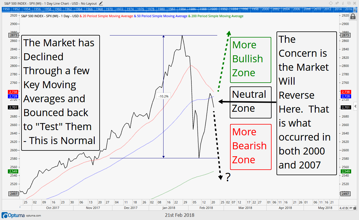
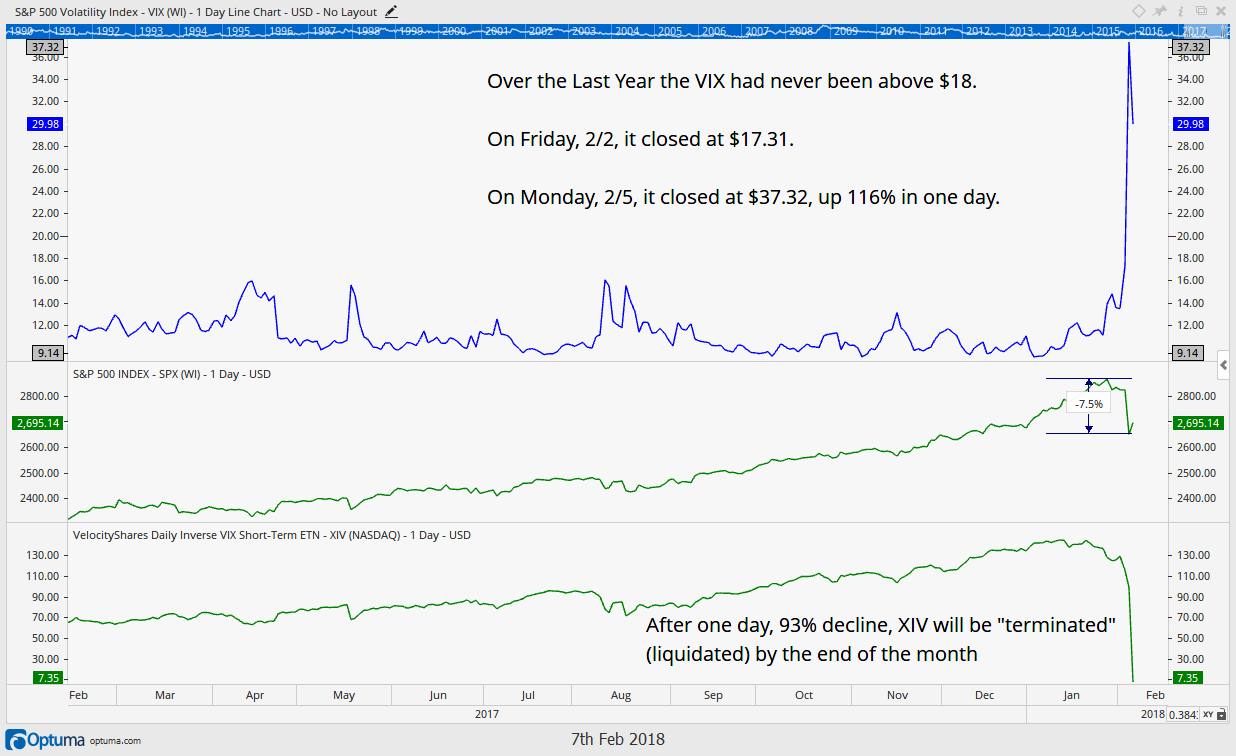
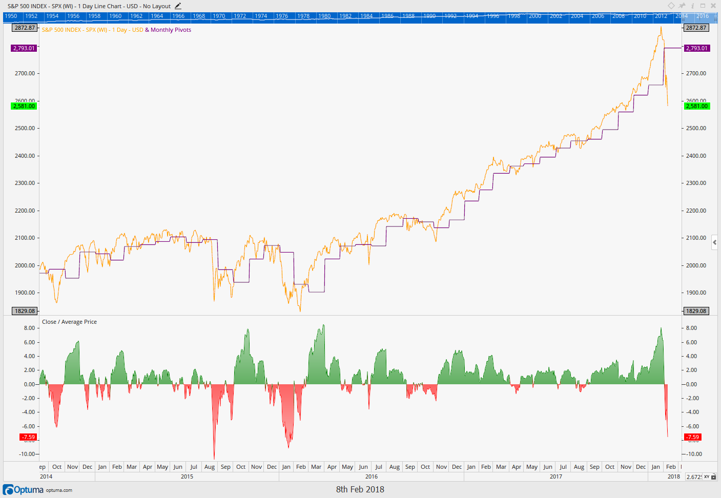
Well, the “two most important days” has been stretched into “the two important weeks”, and it may even get stretched into the “two most important months”. We are approaching the one month anniversary since the markets bounced off their lows. Unfortunately, the market has little to show for it, except for a significant uptick in volatility. Since the initial rebound off the February lows, the market has been moving sideways, and essentially running in place the entire time.
Market Update
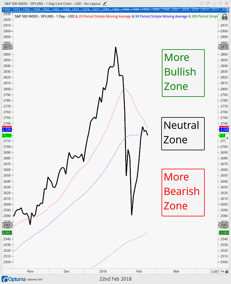
We update the S&P 500 chart from a few weeks ago and analyze recent market action.
- The market is in a neutral position, with signals neither pointing strongly bullish nor strongly bearish.
- False Breaks higher and lower keep near-term moves uncertain and risks high.
Stock Market
We identify the four most likely potential outcomes for the markets, and assign probabilities for each.
- Expectation #1: New Lows (35% Probability)
- Expectation #2: Headfake Higher then New Lows (30% Probability)
- Expectation #3: New Highs, Volatility is Over (25% Probability)
- Expectation #4: Sideways Consolidation for Weeks/Months, then New Highs (10% Probability)
Bond Market
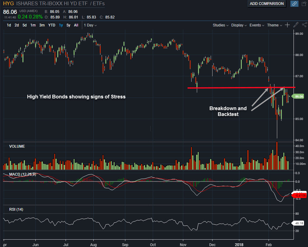
We look again at high yield bonds, which continue to show signs of stress.
- High Yield Bonds will often move in price before stocks, making it an important market to follow and analyze.
- Recent price movements show the early signs of a longer term topping process.
- Bearish activity in this market needs to be resolved in a more bullish fashion in order for stocks to make new highs.
Over the past week we have received new buy signals in our trend model and on select stocks (primarily technology stocks). We still remain with elevated cash positions in client portfolios, but less so that on our last update. Downside risks still remain elevated, and these new positions have very little tolerance for downside movements.
FIT Model Update: Market Correction
![]()
Some technical indicators have improved as the trauma of the quick pullback recedes (for now). Fundamental indicators have shown some signs of deterioration the past month as GDP, consumer spending, industrial production and housing statistics have all come in below expectations.
Currently, all three primary inputs are still flashing warning signs as we are, at a minimum, within a short term market correction, waiting for confirmation of the bottom. Overall conditions have improved somewhat during the past week, but structurally we still view this period as a time of elevated risk.
Market Insights
Mixed Signals

Well, the “two most important days” has been stretched into “the two important weeks”, and it may even get stretched into the “two most important months”. We are approaching the one month anniversary since the markets bounced off their lows. Unfortunately, the market has little to show for it, except for a significant uptick in volatility. Since the initial rebound off the February lows, the market has been moving sideways, and essentially running in place the entire time.
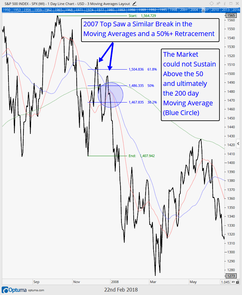
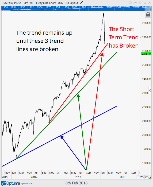
Update to the “Two Most Important Days”
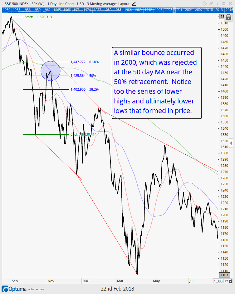
Given the speed of the decline in early February, we anticipated that the markets would resolve themselves either higher or lower in a relatively quick manner. But, as markets like to do, they have a mind of their own and decided to stay out a little past curfew. The first chart below is the one we published on February 15th. The second chart is the updated chart through the morning of March 9th.


In February, we anticipated a tug of war around the 50-62% retracement level, followed by a fairly quick resolution. We indeed saw the tug of war around this level, but instead of a quick resolution, we have now seen two “headfakes”. As shown in the March 9th chart above, the first headfake occurred with a break above this level, followed by an immediate return within these levels. This is a failed bullish signal, increasing odds of a break lower.
Then, the market gave us another headfake, but this time with a break LOWER from this area, followed by an immediate return into the retracement zone. This resulted in a failed BEARISH signal, increasing the odds of a break higher.
What this tells us is that the market currently has no dominating trend with many potential outcomes, both positive and negative. We discuss the four likely scenarios below.
Market Microscope
Four Possible Outcomes
“The pessimist complains about the wind; the optimist expects it to change; the realist adjusts the sails.” – William Arthur Ward, American Writer

Stock Market
Now that we have recapped the past few weeks, let’s get to the more important job of looking forward. The market currently has more potential outcomes than any time in the past 3-5 years.
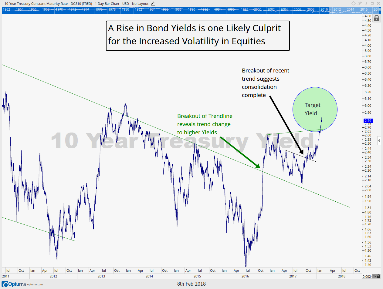
From a technical perspective, the strong uptrend since the February 2016 lows is being challenged. From a fundamental perspective, recent economic strength is also being challenged with various economic measures coming in lower than expected (GDP, housing, consumer spending and industrial production all had readings below expectations in the past month). The Federal Reserve is also beginning the process of shrinking their balance sheet, acting to slowly remove liquidity from markets.
Based on the readings of the many market signals we watch, as well as our deep study of previous market cycles, we anticipate there to be four primary outcomes we need to consider over the coming weeks and months.
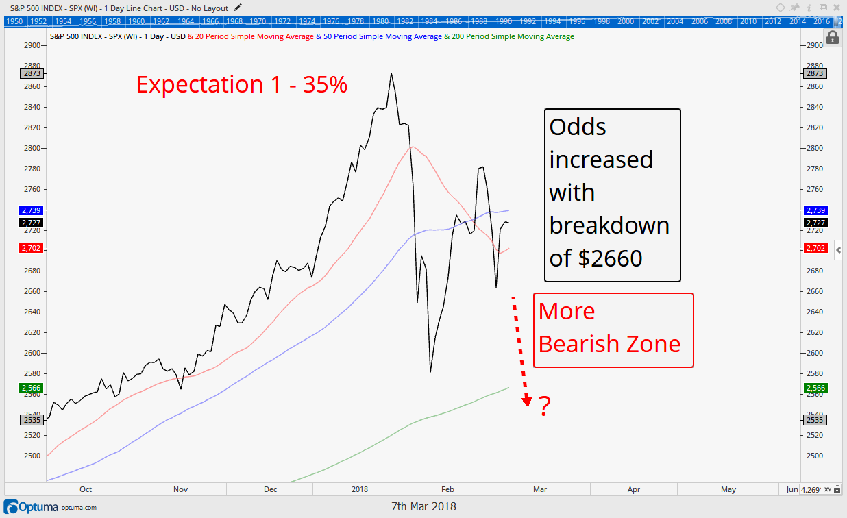
Expectation #1: Sideways then New Lows (35% Probability)
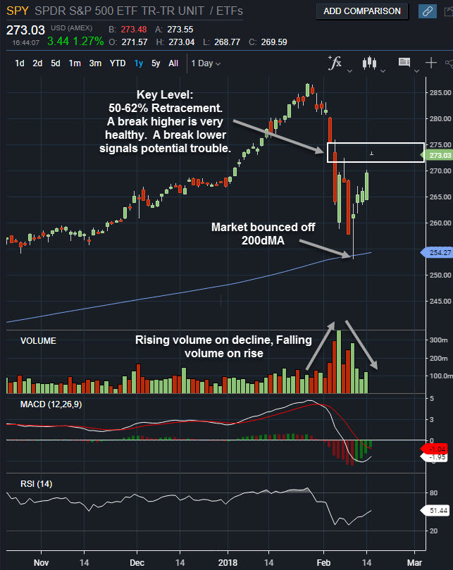
The chart of the S&P 500 below reveals one of our two primary expectations of where the market may go right now. This is similar to what we expected in our last ‘Insights’. We put the odds of this scenario at 35%, but the total odds at 65% that the market ultimately moves below the initial panic selling from early February. A high probability for sure, but no sure thing by any means.
The chart below reveals how price today is essentially at the same levels it was at the time of our Feb 23 ‘Insights’. The market has now provided us new information, and a breakdown in price below the recent low at $2660 will shift those 35% odds higher, but for now we watch the tug of war occurring at this all-important retracement zone referenced in our “most important two days” interim report.
Expectation #2: Headfake Higher then New Lows (30% Probability)
The next chart below reveals our next best interpretation of what the market is preparing for us. This week we have seen some market strength, which has increased the odds somewhat of this potential playing out. That strength has also resulted in us increasing our equity exposure this week as new buy signals moved some cash off of the sidelines.
There is a popular saying “the market fools most of the people most of the time”, and expectation 2 would certainly satisfy that presumption.
Notice there is one common denominator in both of these first two scenarios. If the market falls below $2660, then it would significantly increase the odds we are heading toward new lows below $2500 on the S&P. $2660 is a key level we are watching and likely the next point in which we will further lighten our exposure to equities.
A decline below $2660 would help confirm that the sellers have won the tug of war of the last month. It also is likely a level a lot of traders are watching since it held price as support once already. In other words it could be a level where self-fulfilling prophecy takes over as sellers create more sellers which create more sellers, etc. If the 2nd scenario is what is occurring, we will get our first warning sign when price exceeds, but then falls back below $2780.

Expectation #3: New Highs, Volatility is Over (25% Probability)
The 3rd option must be given some benefit of the doubt, given how strong the market has been over the past two years, and further back since 2009. Although many technical indicators suggest another new price low must be made before a new all time high can be, absolute certainties are never an option in the financial markets and we are fully aware that bullish cases still exist.
ALERT: If you work for a large investment firm, don’t worry about the other scenarios because this is the only one that has been approved by your corporate attorneys, and the only scenario you can discuss with clients.
As many of you know we prefer not to guess where the market is headed, and instead allow price to guide us first and foremost. A price break above $2780 would help increase the odds we have seen a meaningful bottom.
The difference between Expectation 3 and Expectation 2 is what occurs after that $2780 is eventually exceeded. Will price eventually fall back down below that level which marks the upper end of the recent tug of war zone, or will bulls be able to hold the momentum into the Spring and Summer months, on to new all time highs?

Expectation #4: Sideways Consolidation, then New Highs (10% Probability)
Finally, the last real option is this tug of war continues for months before ultimately culminating in higher prices. If this scenario is playing out, we should not fall below February’s low.
We only give this setup a 10% chance because of how strong the initial down move was. If this were your typical sideways consolidation you would typically have had a lot of indecision on the way down, similar to how you have indecision now, on the way back up. That simply was not the case with the emphatic move lower, which keeps the odds low that this will drag on for months without conclusion.

If we take all the weighted cases we come up with a bearish expectation of 65% and a bullish one of 35%, which is roughly how we have our equities positioned currently (about 65% of our potential equity exposure is in cash).
Over the last 1.5 months our signals have had us exiting for various reasons, and seemingly with good cause as we have largely been on the sidelines during all this volatility. Some holdings were stopped out with 7%+ declines from their peaks. Other holdings were exited on Feb 5, just before the bulk of the first 1,000 point down day on the Dow. Other positions we have taken profits and redeployed.
We remain largely invested in our individual equity holdings; we just got a new buy signal in our trend model, and we are 50% exposed in our sector allocations.
Overall we are very pleased with the way our portfolio strategy has performed during this volatile period, and we are confident we are ready for whatever the market throws at us next, bearish or bullish. After all, it’s better to have a plan and not need it rather than to need a plan and not have one!
High Yield Bonds
Last ‘Insights’ we mentioned how we were also reeling in some of our credit exposure. The chart above points out some reasons why. High Yield bonds (also known as junk bonds) are typically those bonds that are one step above equity on a company’s balance sheet. They are usually last in the bond pecking order but just ahead of equities when it comes to liquidation preferences, which is why investors often require higher rates of interest when buying them. Because they are typically just one level better than equities they can be a pretty good proxy for equity behavior. This is also why some refer to high yield bonds as a good leading indicator for stocks. The chart above, of JNK, is an ETF that tracks the performance of a large basket of high yield debt.
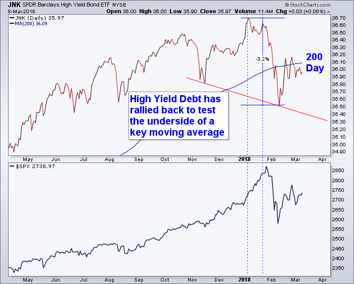
Taking a look at the chart indeed it is true that high yield is a good proxy for equities, with a few peculiarities.
First, we can see that high yield debt also sold off from its January highs, similar to equities. But we have also added two vertical lines which help support the case that high yield can be a good leading indicator. Notice that JNK topped out around one month prior to equities, in early January? Additionally its second, lower, peak in price came a few days before equity’s ultimate peak. Secondly, and one reason we remain more bearish than bullish right now, is on the right side of the chart.
If you remember the 5 rules of a topping process discussed in our October 27, 2017 issue, then you’ll remember that steps 1-3 are a rounded top formation, a breakdown in price below key indicators, and then a backtest, and ultimately, failure of that backtest at key price levels.
Taking a look back at the chart above indeed price has rallied back to the 200 day moving average, after breaking down below it, and has thus far been rejected. This is bearish activity until proven otherwise.
Invest wisely.
Our clients have unique and meaningful goals.
We help clients achieve those goals through forward-thinking portfolios, principled advice, a deep understanding of financial markets, and an innovative fee structure.
Contact us for a Consultation.
Neither the information provided nor any opinion expressed constitutes a solicitation for the purchase or sale of any security. The investments and investment strategies identified herein may not be suitable for all investors. The appropriateness of a particular investment will depend upon an investor’s individual circumstances and objectives. *The information contained herein has been obtained from sources that are believed to be reliable. However, IronBridge does not independently verify the accuracy of this information and makes no representations as to its accuracy or completeness. Disclaimer This presentation is for informational purposes only. All opinions and estimates constitute our judgment as of the date of this communication and are subject to change without notice. > Neither the information provided nor any opinion expressed constitutes a solicitation for the purchase or sale of any security. The investments and investment strategies identified herein may not be suitable for all investors. The appropriateness of a particular investment will depend upon an investor’s individual circumstances and objectives. *The information contained herein has been obtained from sources that are believed to be reliable. However, IronBridge does not independently verify the accuracy of this information and makes no representations as to its accuracy or completeness.