We discuss what to look for when a stock market tops, look at the topping processes in 1987, 2000 and 2007, and reveal five ways to avoid the emotional market cycle.
[maxbutton id=”1″ url=”https://ironbridge360.com/wp-content/uploads/2017/10/IronBridge-Insights-2017-10-27.pdf” text=”Read a PDF of the Report” ]
Insights Overview
Portfolio Insights: 5 Ways to Avoid the Emotional Market Cycle
Markets are a collection of humans acting in both rational and irrational ways. We must remember that markets work in cycles, and we believe that being aware your own emotional responses can make you a better investor.
Macro Insights: What does a Market Top Look Like?
Market tops are a “process” as stocks don’t just fall from the sky. There are typically warning signs that help investors recognize when the risk of a major top has increased. The key is knowing where to look, what to look for, and ultimately having the discipline to listen to what the market is telling us.
Market Microscope: Is the Market Topping?
A look back at the market tops of 1987, 2000, and 2007 reveals a few interesting technical clues. The bond market also continues its roll-over as yields rise.
On Our Radar
Earnings: We are thick in earnings season as we dove into the details in our last Newsletter. For the most part, earnings have been very strong.
Trump Taxes: There are some large implications from the potential changes to the tax codes. The changes to the corporate tax code will likely have more impact on stock prices, but individuals should also consult their CPA concerning the implications of changes. One example: If most deductions are going away, then pulling forward deductible expenses to 2017 may make sense.
FIT Model Update: Uptrend

Fundamental Overview: Technology earnings have come in strong but the S&P’s overall long term earnings growth remains weak and lagging recent price rises. This means P/E ratios remain elevated.
Investor Sentiment Overview: The University of Michigan Consumer Sentiment Indicator, a popular and long-standing measure of the consumer based on random phone calls to 500 households, hit its highest levels since 2004. This indicator is back above the 100 level for the first time since then, suggesting the consumer is now “over” the financial crisis (which took this Index down to the 55 level). The 100 level was also the starting point for the Index back in 1964. It peaked at a level of 112 in the year 2000, simultaneous with the stock market’s peak. The best way to view it is as a contrary indicator.
Technical Overview: Technicals continue to remain overweight and bullish in our FIT Model
Focus Chart
Topping Process Leading up to 2008
Nobody rings a bell at the top, but history shows us that there are plenty of warning signs leading up to major stock market peaks and large market declines. One reason for this is the herd mentality of humans. We tend to follow what others are doing, resulting in similar repeating patterns in the markets.
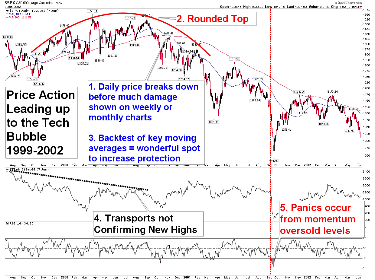
One key in recognizing a top is knowing what tools to be looking at and how to interpret them. The chart of the Tech Bubble to the right is discussed in detail along with a couple of other major market topping events and lays out 5 key things to look for when trying to decide if the market has topped out or not.
Nobody is able to predict the exact market top to the day, but by utilizing the appropriate tools we are able to recognize when the risk has increased of a major market drawdown.
Portfolio Insight
Know Thyself
Markets are not beholden to the laws of physics. Too many professional and individual investors use formulas to calculate the value of an investment. Here is one of the simpler examples: E(R1) = RFR + B[E(Rmkt)-RFR]. (This is a way to calculate the expected return on an investment relative to the “risk free rate”.)
While these can sometimes be useful, we believe that no formula can account for the fact that markets are a collection of human beings acting in both rational and irrational ways.
Why do stocks change value by more than 1% in a day? Or by more than 10% in a few months (up or down)? Have the underlying fundamentals of the company changed that much? Sometimes the answer is “yes”, but overwhelmingly it is because human investors are making emotional decisions about the stock.
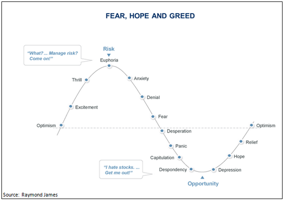
The graphic to the below shows the typical emotional cycle of investing. As the market moves higher, investors move from optimism to excitement, and eventually to euphoria. When the cycle turns lower, investors experience anxiety, denial, fear and eventually panic and despondency.
Awareness of these characteristics can help us identify which part of the market cycle we are in currently. We believe the overall market is now somewhere between excitement and euphoria since risk management, by many, is perceived to be less important.
So how do you avoid or at least minimize the negative effects your own emotions may have on your portfolio? Here are five strategies that may help:
- Pay attention to your emotions. Know when you are feeling nervous, excited, fearful or exuberant. When these emotions surface, try to not make a decision immediately, rather take a step back, do objective analysis, and sleep on the decision.
- Apply a rules based approach. Try to eliminate emotions from your investment process. Develop rules and stick to those rules.
- If you use a financial advisor, ask what rules they use. Asset allocation and rebalancing is not adequate. There must be entry and exit strategies applied. Your advisor and those running allocation models at their firm are humans too, subject to the same emotional cycles.
- Do not get emotionally attached to an investment. It may be your favorite company, but if it’s not working, get out. You can always get back in, even if its at a different price.
- Don’t let a small loss turn into a big loss. Sometimes an investment doesn’t work out as planned. That’s okay. As they say in golf, don’t let one bad shot affect the next one.
Those who forget that markets work in cycles are those that are most hurt when the cycle turns. One way to help manage the cycles is to also manage our emotions. Having rules and strategies in place before market moves helps keep the emotion out of the investment process, allowing us to have a plan regardless of the circumstances.
Macro Insight
The Anatomy of a Market Top
There is an old saying on Wall Street that “nobody rings a bell at the top”. And, we say, “thank goodness for that”, because if there were a bell rung, nobody would ever get a chance to exit before the market immediately free-fell as that bell was dinged. Instead, market tops are usually relatively slow, and calm, at least until the larger masses join in the fun. This presents opportunity for those that know their history and know what to watch for.
There are often many technical signs a potential top may be occurring as long as you know where to look. No market top is ever exactly the same, but there are a few things that typically occur before any major selling really begins.
- The first thing to note is that the market’s price starts to fall on a minute by minute basis before it falls on a daily basis before it falls week after week after week. In short, by keeping an eye on the shorter time frames we can stay ahead of the longer trends. A one year selloff doesn’t happen without first a selloff in shorter time frames.
- The market shows a rounded formation of price action. This is referred to as it “rolling over”.
- The market has broken key moving averages and trendlines. It often “backtests” and fails at these key levels.
- Market non-confirmations occur (key Indices aren’t making new highs while others are).
- Market panics often occur from already oversold readings, certainly not from new all time highs or overbought readings.
A look at the dot-com bubble and subsequent decline helps support these findings. There certainly were technical warning signs that increased the odds of a top forming.
Market Microscope
A Further Look at Key Market Tops
All market tops have historically had a few common traits that can help keen investors better prepare for the potential price declines that eventually follow. To further validate this claim let’s also look at two other major recent market tops.
The 1987 Crash
The 1987 crash was a short lived phenomenon, but it too showed similar traits of increased risk in being long equities prior to the actual crash occurring. Similarly, the financial crisis didn’t just occur overnight. It too showed many signs of a market weakening and risk in being long equities increasing, well before any real panic periods. In other words, there were warning signs which could have helped investors recognize the increase risk in owning equities.
The chart below reveals that all 5 rules also were largely occurring prior to the 1987 crash. Analysts following the shorter terms would have seen on Wednesday, October 14, 1987 price close below a key $306 price level. Additionally that day’s price action formed a bearish pattern in and of itself with an opening price below that key support level, a rally that attempted to bring price back above it, but one that ultimately failed with price falling back down to close below $306. Thursday continued the trend and then Friday furthered the selloff.
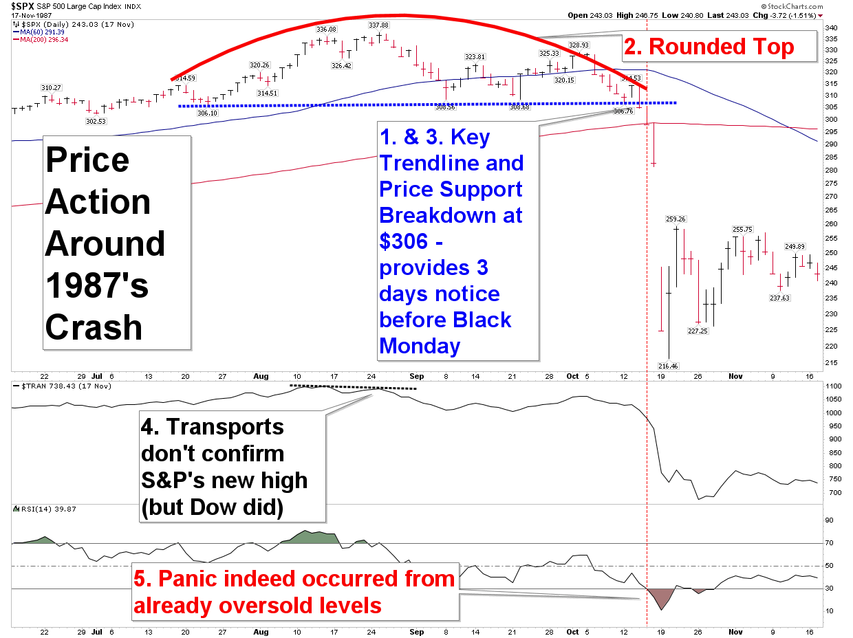 Notice that price entered the oversold momentum levels on that Thursday, a full two days before the Monday crash. Mean-reverters may have thought this was a good time to buy, but technical analysts would have noted the breakdown below $306 kept price bearishly inclined. Friday, then closed below the 200 day moving average, another warning to get even more conservative heading into the weekend. The writing was certainly on the wall, if you were paying attention to the right indicators.
2008 Financial Crisis
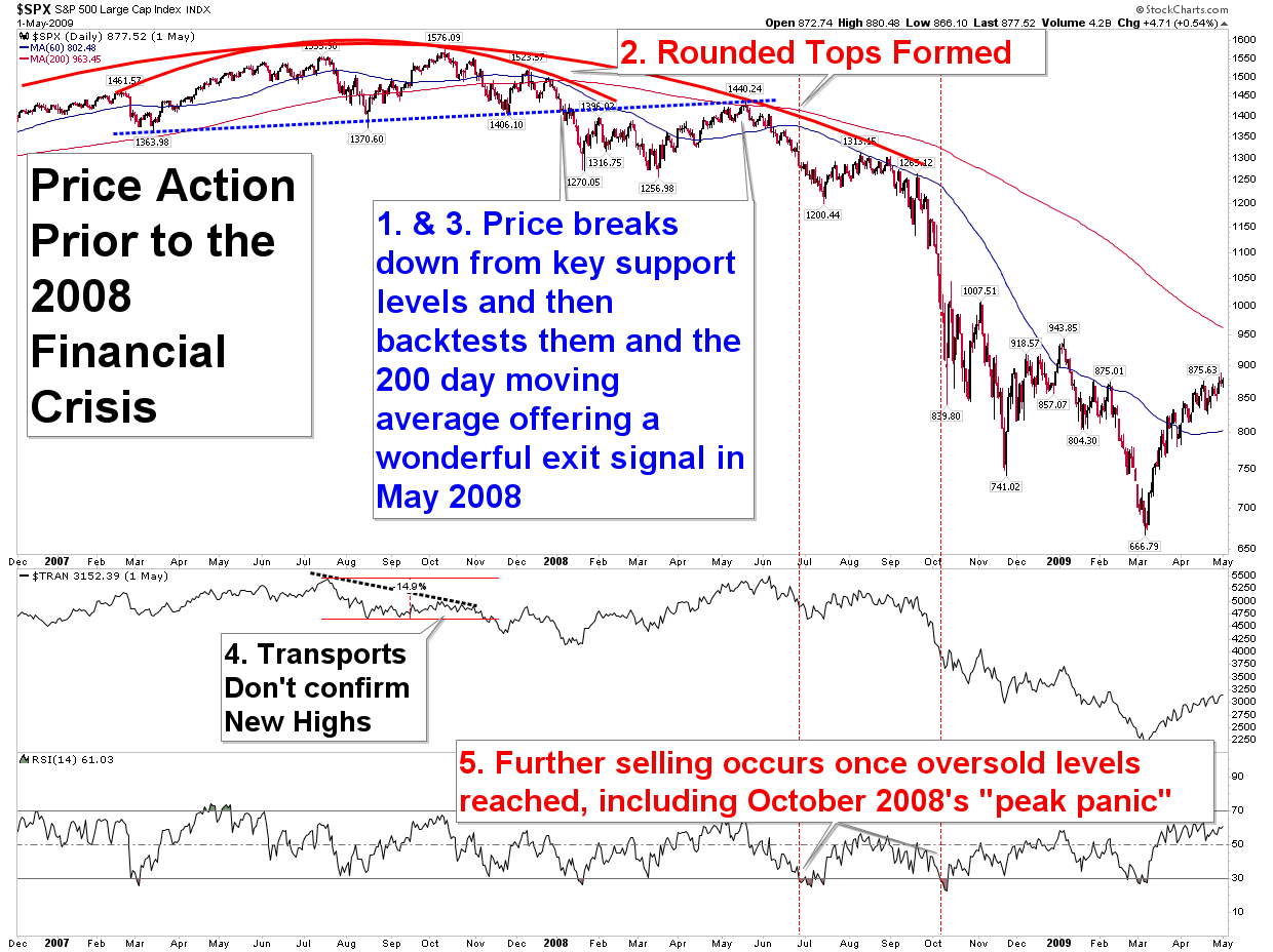
Finally, further evidence that market prices do provide clues to those paying attention can be garnered by analyzing the financial crisis. Similar to the other two large declines of the past 40 years, warning signs were certainly there.
- Price had already broken down in the shorter time frames.
- There was a rounded top formation.
- There was another great moving average breakdown and subsequent back test very early during the decline.
- Other Indices topped back in July 2007, while the S&P topped in October 2007.
- Panics occurred after large selloffs had already occurred.
What Should We Expect to Happen when the Next Top Arrives?
Will the next top look like these tops? It won’t exactly, but there are a few things we should expect.
- Prices will breakdown in the shorter time frames first. A few down days in a row will eventually lead to a down week, which will lead to a down month, and so on. Paying attention to shorter time frames will help us stay ahead of the trend.
- There will likely be a rounded top, a market that is slowly rolling over. It likely will take weeks to months to form.
- There will be a breakdown in key trendlines, supports, and/or moving averages that ideally will be backtested, with a price failure that then resumes the downtrend. This warning sign should increase our urgency when it occurs.
- There will probably be non-confirmations among the Indices. For example, the S&P may make another new all time high, but the Dow won’t.
- Finally, any major crashes within a larger decline would likely occur only after the market had been selling off already. In other words, we shouldn’t expect a new all time high one day, followed by a crash the next day.
So, where does this leave us today?
The final equity chart (shown next) reveals we probably are not at a market top here, either that or it is still too early to tell. Let’s go through the list.
- There has been no meaningful price breakdowns on the shorter time frames. Until we see some price damage done daily, we won’t see any done weekly, monthly, or yearly.
- There is no rounded top. In order to have a rounded top we must also have a lower price high form at some point. That has not occurred for a year, and we must see these lower price highs before that can be confirmed.
- Price remains above all key moving averages and trendlines. Until these key levels fail, the market’s bullish trend should be expected to continue. If they do fail, that should increase our urgency of the potential for a top.
- There are no major intermarket divergences as all the key Indices have reached new all time highs together. The bottom portion of the chart shows us the Dow Transportation Average. Right now all the major indices are aligned, making new all time highs together.
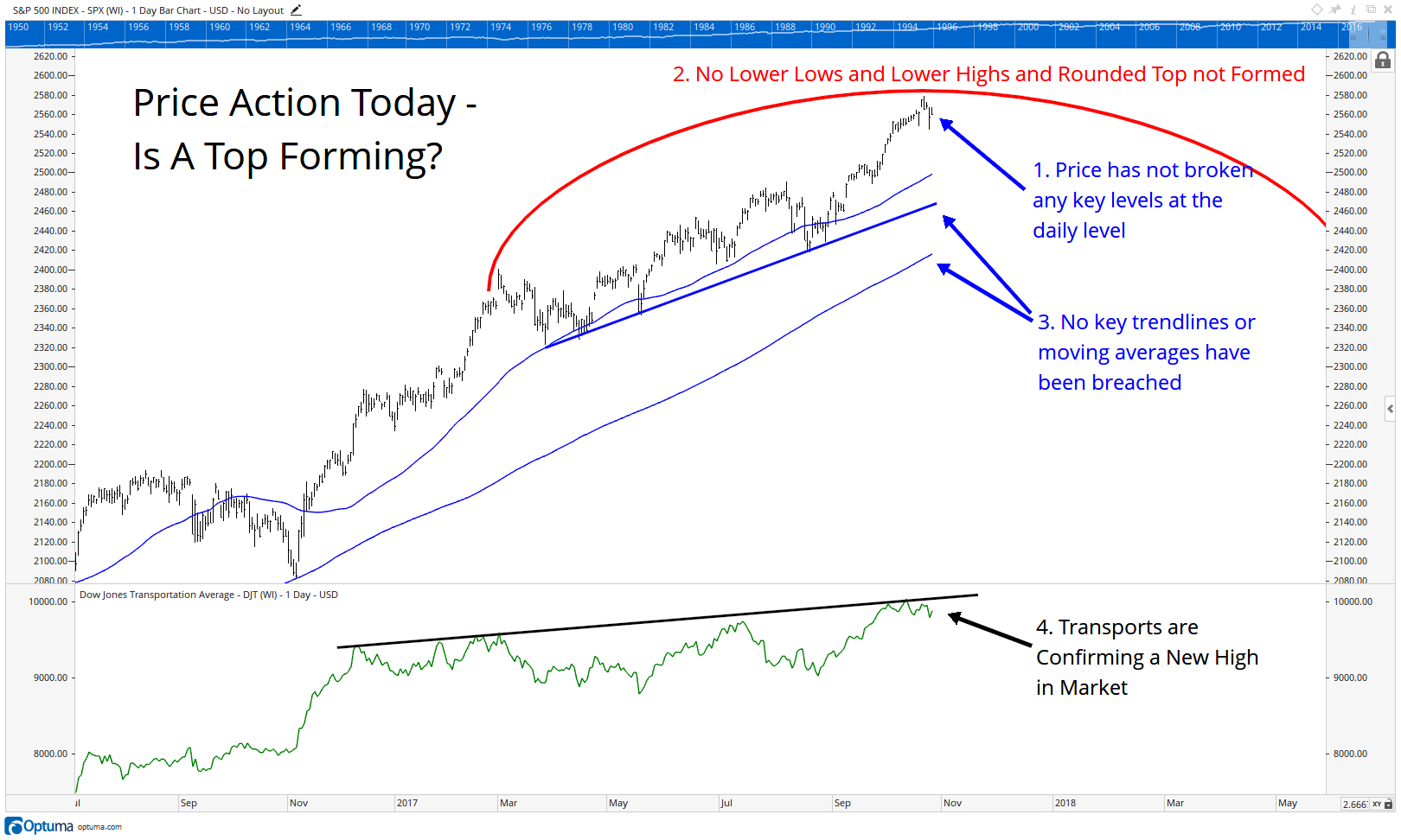 Given the data, it’s very hard to make the argument that we are witnessing a top right now. In fact, the market looks extremely bullish. That of course could change, and if we start to see price fall below the key levels identified, it would add credence to taking a more conservative stance, but until that occurs, we remain bullish.
Bonds
In our inaugural publication on July 13, 2017, we dove into the bond market and provided a backdrop as to why we are preparing for a bearish market in bonds. In this update we look at recent price action and how the short term price action is now bleeding into the longer term charts. The resumption of the trend higher in bond yields appears to continue to be intact and probable.
The next chart reveals the 10 Year Treasury yield, and how it has started to move higher again. A recent breakout in yields has ended the downtrend in place since the beginning of the year. This suggests the market is resuming its larger trend in place since early 2016 of higher yields.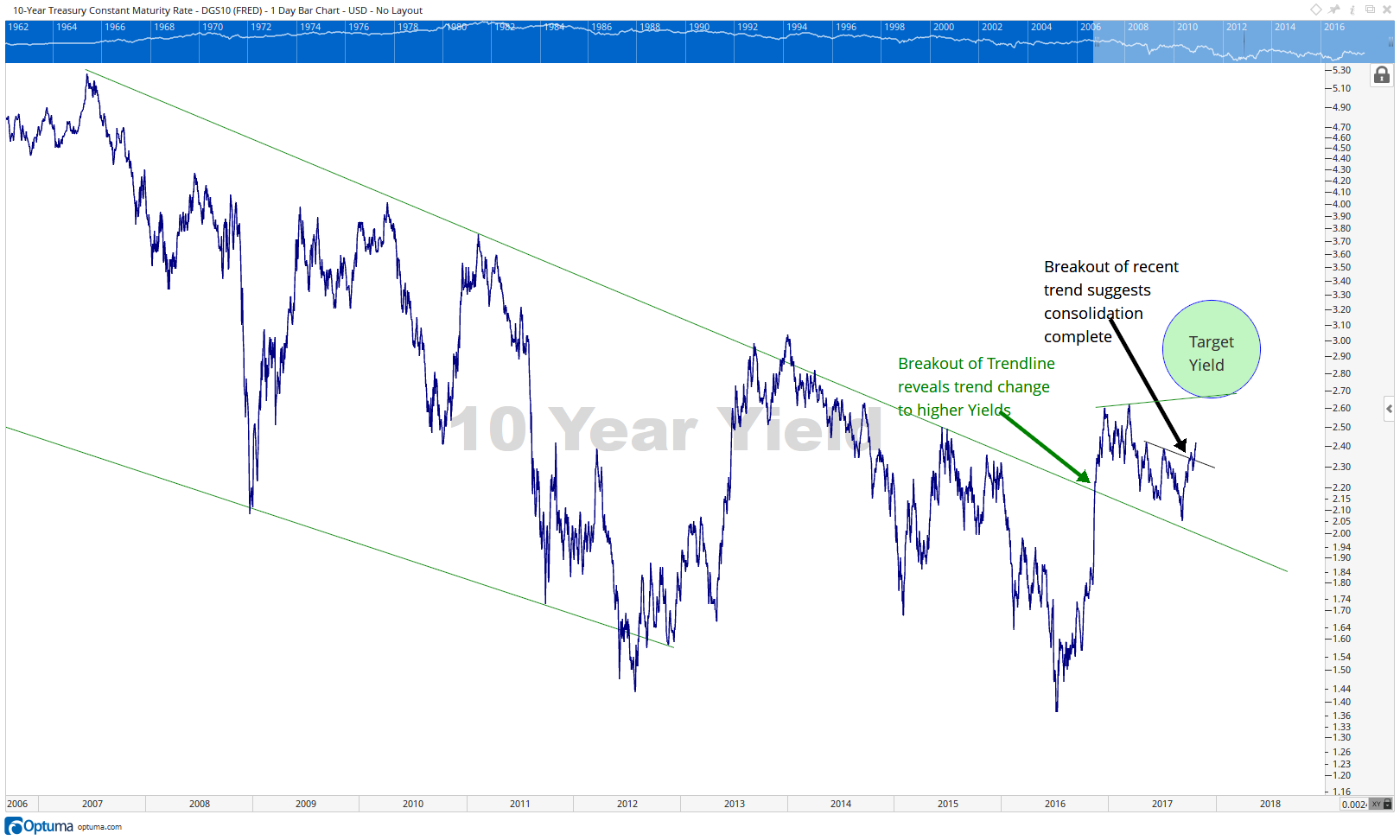
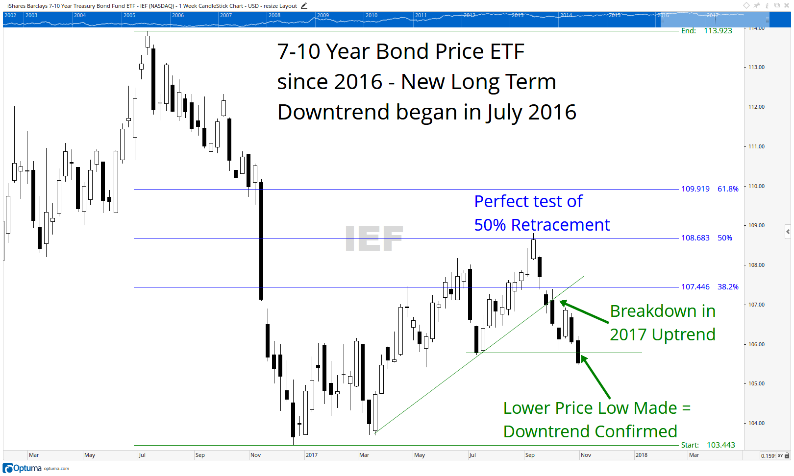
The next chart shows weekly price data. It takes a longer term focus on the markets, generating data points over a week’s time rather than a day’s. The first thing to note is that yield and price are inverse of one another. When the yield rises (upper chart), the price falls, (lower chart). Similarly the big move down in 2016 on the chart to the right coincided with the big move up in yields in 2016 in the upper chart.
Since that big move down in price, bonds worked their way back to a perfect (and typical) 50% price retracement. Once that level was hit, prices fell and have now taken out the two key supports in place during the 2017 counter-trend rally. This suggests the counter-trend move is now over and the prevailing trend (lower prices/higher yields has taken back over. We continue to expect pressure on bonds and thus have moved portions of our income producing portfolio to take advantage of a rising yield environment.
In an environment of rising yields, traditional bonds tend to lose value.
Our clients have unique and meaningful goals.
We help clients achieve those goals through forward-thinking portfolios, principled advice, a deep understanding of financial markets, and an innovative fee structure.
Contact us for a Consultation.
Disclaimer This presentation is for informational purposes only. All opinions and estimates constitute our judgment as of the date of this communication and are subject to change without notice. > Neither the information provided nor any opinion expressed constitutes a solicitation for the purchase or sale of any security. The investments and investment strategies identified herein may not be suitable for all investors. The appropriateness of a particular investment will depend upon an investor’s individual circumstances and objectives. *The information contained herein has been obtained from sources that are believed to be reliable. However, Ironbridge does not independently verify the accuracy of this information and makes no representations as to its accuracy or completeness.
