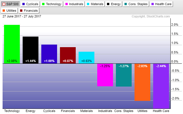
Sector rotation can be a powerful tool to stay ahead of key macro trends and outperform relative benchmarks. We have ranked sector performance over the last month. Currently, the sectors that are leading are Financials, Materials and Technology, which are more economically sensitive. At the same time, the defensive sectors are lagging, such as Utilities and Staples. This reveals an overall bullish posture.
INSIGHTS OVERVIEW
In this issue, we focus on Sector Rotation strategies, the breakout in Small Cap stocks, and take a look at how sector rotation can warn us of potential market stress before it actually occurs.
Read the full Report: IronBridge Insights – 2017-07-28
On Our Radar
Earnings: We are right in earnings season, and generally earnings have been strong. Companies continue to operate efficiently. Some companies have been subject to “sell the news”.
Washington: The vote on healthcare takes center stage this week in the continuing decades-long battle of who can appear most incompetent.
FIT MODEL UPDATE: Bull Market
 Fundamentals: Earnings continue to be largely positive, but earnings aren’t all that control share prices. Some stocks have seen some profit taking on the good news. Overall the economy and fundamentals continue to move forward in a positive way.
Investor Sentiment: The latest record to be reached on the sentiment front concerns derivatives. The amount of put options purchased (options purchased to anticipate a decline in price) versus the amount of call options purchased (options purchased to anticipate a move higher in price) recently on the VIX Index set a low not seen for almost 3 years. This reveals market complacency remains very prevalent, and complacency often coincides with market tops.
Technicals: On most indices the market has broken out to new all time highs. This moves the technical needle back into bullish territory (from the former consolidation). We remain fully invested to take advantage of any further upside.
Over the next few weeks, we will be introducing into client portfolios our sector rotation strategy. This involves owning different sector ETFs that are outperforming the S&P 500. Sector rotation can be a powerful tool to stay ahead of key macro trends and outperform relative benchmarks.
We have developed strict buy and sell disciplines that allows us to rigorously back-test how our approach would have performed in various market cycles and over various time-frames. We are very pleased with the results.
The chart below ranks all the sectors over the last month. Currently, the sectors that are leading are Technology, Energy and Cyclicals, which are more economically sensitive. At the same time, the defensive sectors are lagging, such as Utilities and Staples. This reveals an overall bullish posture.
We view there to be many potential benefits to our sector rotation strategy:
- It removes emotion.
- We do not try to predict which sector will outperform.
- Sector rankings give us information on the overall health of the market.
- Back-testing of this strategy shows excellent risk/reward metrics.
- This strategy promotes prudent, focused diversification.
Our clients will have varying degrees of exposure to this strategy depending on each client’s individual goals and risk preferences. It replaces a portion of the equity exposure currently target allocations.
MARKET MICROSCOPE
Small Caps Break Higher
The biggest news on the technical front this week is the breakout in price that is occurring across most domestic markets. In particular, the breakout by small caps seems to be more relevant, given that it has been underperforming and consolidating since late 2016. In other words, small cap stocks hadn’t really done much for over 6 months as the chart above reveals, but that looks to be changing.
The rally in November and December took price into the mid $50s for FYX, one exchange traded product that focuses on small cap stocks. Since then the ETF moved net sideways, which is consistent with other small cap focused funds. Notice as the calendar moved from June to July, its price was below $55, the level reached in early December. Small cap stocks went nowhere for eight months, but that now seems to have ended with the technical breakout.
Relative strength analysis is a technique we like to use to help us make our investment decisions. One such example is shown next.
Small caps have broken out to new all time highs, but so have the other major domestic markets. So should we be invested in small caps right now, or is there a better option?
The chart above compares the performance of the small cap index to one of the large cap index funds. If the chart is moving higher, it means small caps are outperforming. If it is moving lower then large caps are outperforming. Right now the difference between the two is negligible.
Since early June, small caps have been outperforming large caps, but since December, large caps have been outperforming. One could also say that the two have performed equally over the last year, since the ratio today is the same as it was one year ago.
The chart above suggests that both large and small caps are performing similarly. Have large cap stocks also broken out to new all time highs, just like small caps? Indeed they have as the next graphic reveals. Right now both large cap and small caps are rising and making new all time highs, leaving us interested in both large and small caps right now. What this analysis helps prove is our indifference right now between large caps and small caps. They both are good choices, performing similarly over the last year.
Sector Rotation:
There is a little know but very important relationship in finance. Sector rotation is the concept of market participants rotating money from sector to sector looking for excess returns.
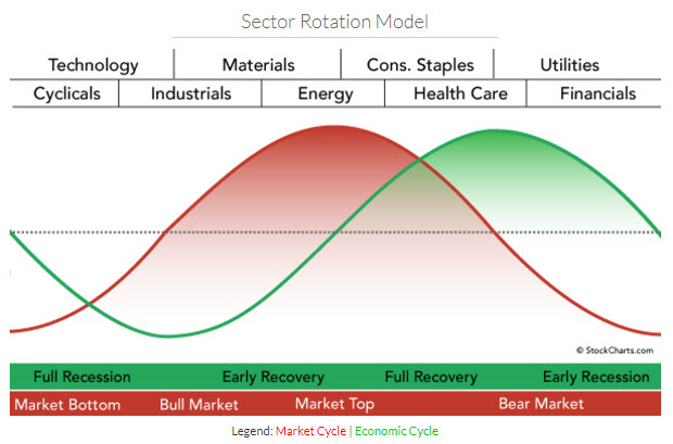
Generally, safer stocks such as those of utility companies and basic household goods (consumer staples) tend to perform better, relative to their peers, during recessions or times of market stress. Other sectors, such as technology, industrial companies and discretionary consumer goods tend to perform better during times of growth.

The chart above reveals the sector breakdown across the top along with the business cycle along the bottom (in green) and stock market cycle along the bottom (in red). Depending on which sectors are leading the markets, we can get a better glimpse into where we are within the market’s overall cycle.
The chart below shows the sector performance during the financial crisis. The stock market peaked in October 2007 and bottomed in March 2009, which is shown below. The leading sectors were the consumer staples, Health Care, and Utilities, two of which are considered the safest of the sectors. Keep in mind this chart reveals sector performance relative to the S&P 500.
What Happened to Sectors during the Financial Crisis?
The chart below shows the sector performance during the financial crisis. The stock market peaked in October 2007 and bottomed in March 2009, which is shown below. The leading sectors were the consumer staples, Health Care, and Utilities, two of which are considered the safest of the sectors. Keep in mind this chart reveals sector performance relative to the S&P 500.
Savvy readers will recognize, however, that this out performance by the defensive sectors occurred during the financial crisis. In other words, the crisis was already happening, and pain was already being felt. The key question is, do these defensive sectors start to outperform prior to the start of market down turns? Ah ha! They do!
Sectors Warn of Potential Stress?
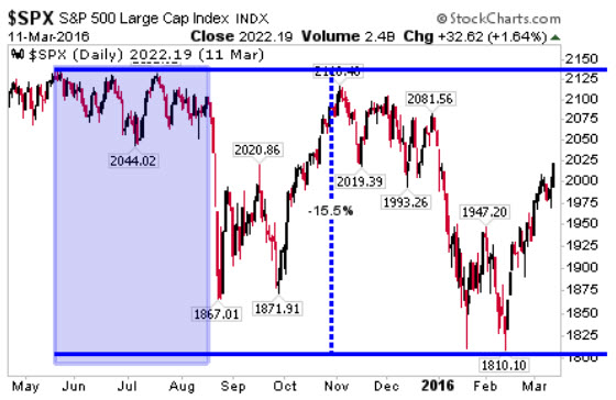
 Wouldn’t it be nice, if we could be warned that something big could be brewing around the corner? Sector rotation happens to be one such warning sign we can look to for that signal of increased risk. The chart on the right reveals the most recent sizeable market pullback, the one that occurred in late 2015/early 2016, which took the S&P from a peak to trough decline of over 15%.
On the left hand side we have shaded a large area where the market moved sideways to slightly down, but generally didn’t really do much. This period, however, was just before a very swift 200+ point S&P drop.
The chart immediately below shows the relative sector performance during this time. Notice anything familiar? The utility, health care, and staple sectors were in the group of out-performers, with utilities leading the way.


