An analogy we like to make is that markets are like armies composed of generals (leading stocks) and soldiers (the rest of the index). Currently, there are many soldiers that are AWOL. In this issue we review current portfolio positioning, update the scenarios outlined in our previous report, and take another look at market breadth.
[maxbutton id=”5″ url=”https://ironbridge360.com/wp-content/uploads/2018/03/IronBridge-Insights-2018-03-30-Soldiers-are-AWOL.pdf” text=”View PDF” ]
Executive Summary
The market continues its pattern of not having a pattern. Daily swings over the past three weeks have been much higher than the previous year, and almost every day we have seen multiple-hundred-point swings in the Dow.
Bottom line, the equity markets are still in a bull market, but for the first time in two years the potential exists for an extended period of negative returns. Prepare accordingly.
Portfolio Update
We analyze current portfolio positioning in each of our sub-strategies.
- Increased cash exposure
- Watching daily for new buy signals
- Outperformance can happen as a result of good risk management
- We identify important developments to watch for in Q2
Stock Market
We review the four potential market outcomes described in our last Insights issue, with updated probabilities for each.
- Expectation #1: Sideways then New Lows (Previous 35% Probability) – (Now Irrelevant)
- Expectation #2: Headfake Higher then New Lows (Previous 30% Probability) – (Now 75% Probability)
- Expectation #3: New Highs, Volatility is Over (Previous 25% Probability) – (Now Irrelevant)
- Expectation #4: Sideways, then New Highs (Previous 10% Probability) – (Now 25% Probability)
In-Depth Market Analysis
We explore in more details how market breadth indicators can help simplify market analysis.
- Markets are like armies, generals, and soldiers.
- The markets need the majority of its soldiers (normal stocks) to be acting in unison for a trend to continue.
FIT Model Update: Market Correction
![]()
A breakdown in price below the market’s 200 day moving averages would tip the scale even more toward the bearish side of the fence. The S&P has fallen to that level twice now, and so far has found buyers. That level needs to continue to hold otherwise the technicals are at risk of joining the fundamental and sentiment indicators in raising the probability we are witnessing the next major market top. To us, even if a breakthrough of the 200 day MA occurs, it is what happens once the next bottom is found that matters more. In such a scenario, will the market be able to regain the 200 day MA on a retest, or not?
Portfolio Insights
Adapting to Changing Conditions
“Worry is the Interest Paid by those Who Borrow Trouble” – George Washington
 We have continued to make changes to portfolios over the past few weeks, primarily continuing our move to more conservative holdings while we wait out the increased market volatility. That strategy has turned out to be just fine as we are largely happy with how portfolios are currently positioned, and have nice returns to show for our risk management strategies. As we look deeper into the market’s actions we continue to see some things that concern us and are watching one key level on the S&P 500 for directional signals.
Portfolio Positioning Update
It’s hard to believe we’re already a quarter of the way through 2018. Market action during the past three months has given everyone a reminder that risks actually do still exist when investing capital.
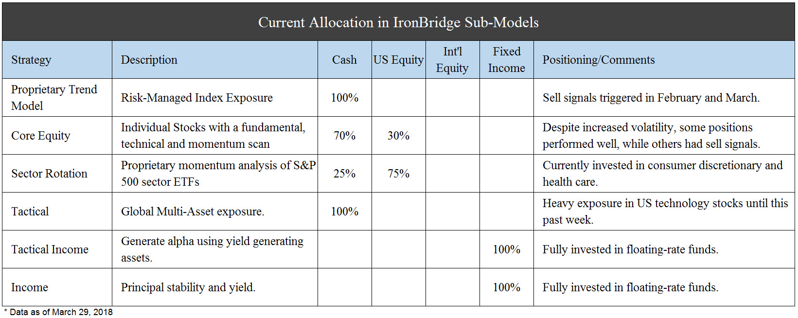
The table below shows the six separate and distinct strategies that compose our client portfolios. We have included a brief description of the strategy, the current allocation within each component, and comments on the current positioning.
Our signals have moved client portfolios largely to the sidelines, as has been the case for much of the past two months. As a result, volatility has been greatly reduced. Because of this reduced risk, most of our clients outperformed their respective benchmarks, as well as most equity markets for the first quarter.We continue to believe this to be a period of greatly increased risk that should not be ignored. Opportunities always arise from these environments, but it is important to have a plan that will adjust as market conditions change.
What to Watch For Next
We discuss our updated market projections in the Market Microscope section below, but there are also important “tells” that may be important for the direction of markets in the second quarter. As we’ve said before, markets are complex systems, and there is no single indicator that drives prices. But some key developments would help us conclude that the markets were either headed lower or higher from here:
Bullish Signals (markets move higher):
- Q1 earnings reports exceed expectations by at least 8%, to account for rising P/E’s over the past year.
- GDP exceeds 3.5%.
- S&P 500 holds its 200-day moving average, and shows increased volume on a rebound.
- Dow Jones Transportation index moves above 10,800
Bearish Signals (markets head lower):
- S&P 500 breaks below its 200-day moving average.
- Earnings reports are at or below expectations.
- Major stock indices move below February lows.
Next, we review and update the potential market outcomes from our previous Insights newsletter.
Market Microscope
Updating Possible Outcomes
“A good plan, violently executed now, is better than a perfect plan next week.” – General Patton
Stock Market
In our last publication we laid out the four scenarios we were watching for the stock markets, labeling probabilities around each, and how those probabilities were helping drive our portfolio decisions. Well, a lot has happened over the last three weeks!
As a reminder, the four scenarios were summarized with the below descriptions, and over the last 3 weeks, the market has pretty much followed the script of Expectation 2. We have also updated the scenarios as we stand today.
- Expectation #1: Sideways then New Lows (35% Probability) – (Now Irrelevant)
- Expectation #2: Headfake Higher then New Lows (30% Probability) – (Now 75% Probability)
- Expectation #3: New Highs, Volatility is Over (25% Probability) – (Now Irrelevant)
- Expectation #4: Sideways Consolidation, then New Highs (10% Probability) – (Now 25% Probability)
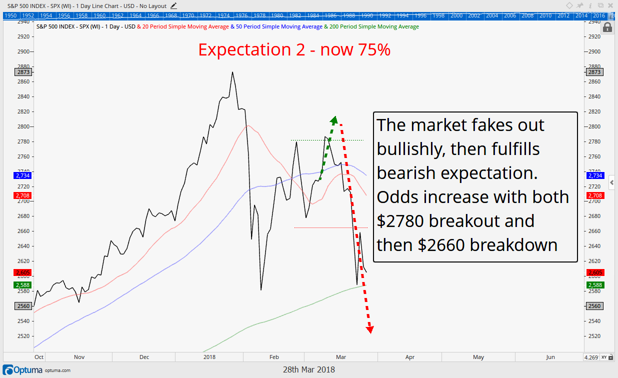
The key levels we were watching on the S&P 500 Index were $2780 on the upside and $2660 on the downside. After publication the market moved north of $2780, somewhat increasing the overall probability of a bullish resumption of the uptrend as Expectation 2 and 3 were both in play. However, that potential was short lived as last week saw the market’s largest decline in two years and prices waterfalled down through $2660, well above where the market sits today.
This significantly increases the odds that Expectation 2 is in play. In that update we suggested that, “$2660 was also a “level a lot of traders are watching since it held price as support once already. In other words it could be a level where self-fulfilling prophecy takes over as sellers create more sellers which create more sellers, etc.”
We think it is safe to say that that waterfall indeed occurred as last week’s almost 7% decline proved. Below, the updated Expectation 2 chart is included, now with a 75% probability of occurring. There is still a chance the market is tracing out the sideways consolidation suggested by expectation 4, but those odds still remain low.
More of the details we are watching are discussed in the “Breadth” section next, but for the S&P 500 index specifically we are watching the 200 day moving average (the green line in the chart below), as our next line in the sand on whether to become even more defensive or not. A close below it would only add to the bearish argument.
Stock Market Breadth
Breadth can be a confusing subject, but we find it easier to understand with a battlefield analogy: think of the markets as having armies, generals and soldiers. 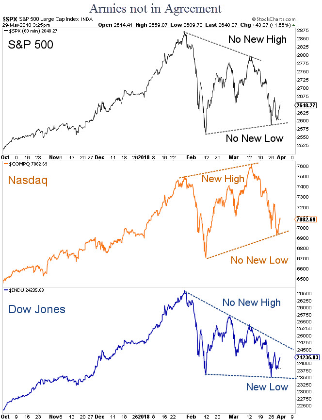
If the stock market indices (S&P 500, Dow Jones Average, and Nasdaq, for example) are thought of as the armies, and the larger and more popular companies that hold more weight within the indices (Amazon, Google, Facebook, Apple) are thought of as the generals, then the remainder of the indices’ components could be thought of as soldiers (armies, generals, and soldiers).
Just like a battlefield, what would happen if these generals are charging a hill with fewer and fewer soldiers continuing to follow them? Eventually they would find their army too small and defeat would be inevitable. This is similar to what breadth analysis tries to measure. How many soldiers are actually following the generals into battle? How strong is the army/index really? Is the army/index just a handful of generals and a relatively few amount of soldiers, or is the army a lot of generals and a lot of soldiers?
Just because the S&P and Dow may be rising in price, winning battles so to speak, it does not necessarily mean that they are doing so with a strong army. Eventually that army will run into a battle it is not adequately supplied to win. That is what we are seeing now.
There are a number of different ways to measure breadth, and a few of them are charted out next. Perhaps the simplest is to start at the highest level, at the army level. Are the stock market armies winning together?
The chart to the right shows the U.S. market’s 3 biggest armies, the S&P 500, the Nasdaq, and the Dow. A very interesting development is they have all started to do their own thing!
From bottom to top, the Dow made a new low in March, below February’s price levels, while the Nasdaq actually made a new high, not confirmed by any other index. Stuck in between the two is the S&P 500, which has not made a new high nor has it made a new low during that same time.
Even at the highest level, there are disconnects in breadth as the 3 indices suggest the Nasdaq is stronger while the Dow is weaker.
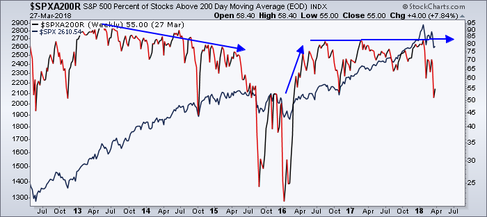
Another measure of breadth we like is to look at the number of stocks above or below their respective 200 day moving averages. The 200 day is often used as a level to tell whether a stock is in a bullish (above the 200 day moving average) or a bearish trend (below the 200 day moving average).
The next chart is showing us some interesting things. First off it is relevant to know that the S&P itself still remains above its 200 day moving average, just barely, but how are the soldiers doing in this regard? They are doing similarly, with around 55% of constituents still above their own 200 day moving averages. From this aspect breadth is confirming price.
One thing we have pointed out on the chart is that deterioration in this percentage of companies above thier own 200 day moving average often occurs prior to a market selloff. One example that took almost two years to develop is highlighted as this breadth measurement peaked in 2013 near 95% and deteriorated to near 75% in 2015 prior to the market’s rolling over 15% then. Since then, breadth peaked in 2016 and again twice in 2017 near just 80%.
The first takeaway is we can compare the 80% peak recently to the 95% peak in 2013 and draw a conclusion that the market’s rise since 2015 has actually been weaker than the market’s rise from 2011 to 2013.
This in itself may be relevant, but we also can look at the two year period of 2016 to 2018 and recognize the generals were charging the hill, with fewer and fewer soldiers following them, as represented by the stagnant 80% peak in stock prices > 200 day moving averages. The S&P was making new all time highs, but no more than 80% of stocks were rising above their own 200 day moving averages. In other words, the market was being driven higher by the generals at a much greater rate than the rest of the soldiers were moving.
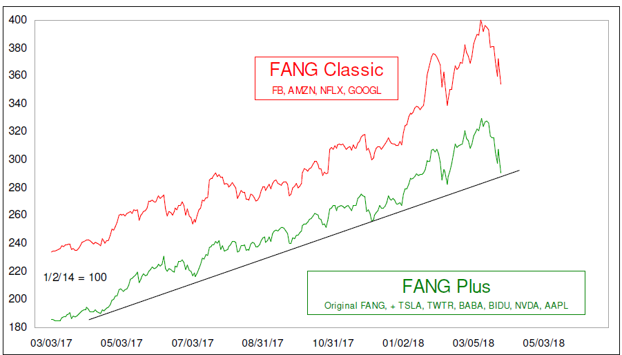
Astute investors would recognize these generals as the FAANG (Facebook, Apple, Amazon, Netflix, and Google) stocks that have largely carried the markets higher. From trough to peak over the last year, this cohort was up almost 100% as the chart below, from McClellan Financial, reveals.
Breadth in High Yield Bonds
Another breadth measurement we like measures equities versus other similar securities. Discussed in the last ‘Insights’, JNK, an ETF that tracks the high yield debt market, has not been confirming the equity markets in its rise higher.
Next, we are going to take a deeper look at JNK and explain why we have been watching it closely. One reason we like to pay attention to high yield debt is because it is often referred to as the “smarter” money than that which invests in equities (the theory is that little retail participates directly in the buying and selling of debt instruments, thus it is smarter).
Because of this, the high yield debt markets can be a leading indicator of whats to come for equities.
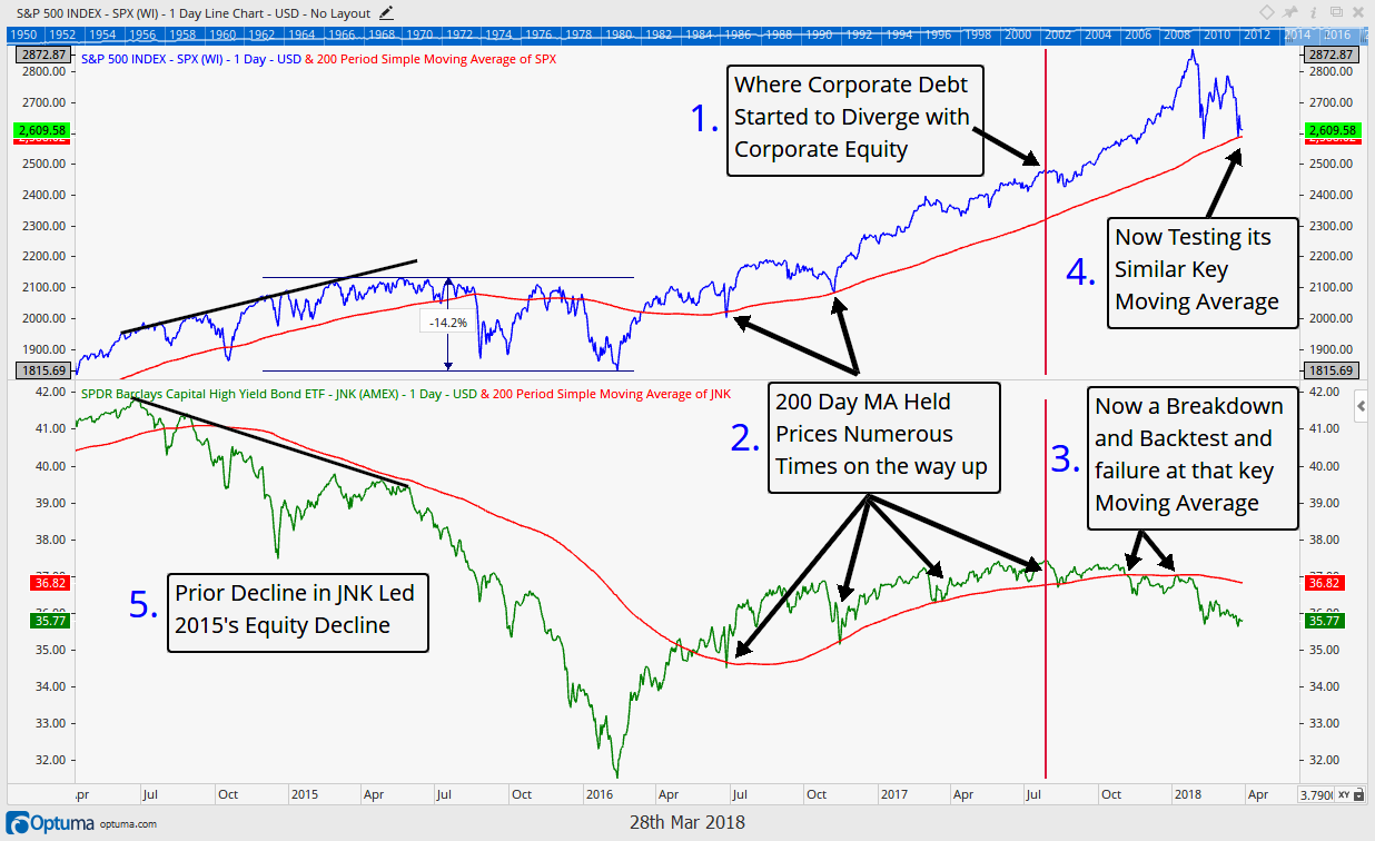
The chart below shows the S&P 500 on top with the JNK index on the bottom, labeled 1-5. Moving in order, the first thing to notice is that indeed, the junk bond market topped in price almost a full year ahead of the equity markets, back in July of 2017.
Equities continued higher, but high yield debt prices did not. The “smarter” money stopped buying high yield bonds and likely stopped buying equities as well, leaving that instead to the retail investor. The 2nd thing to notice is that both the high yield and equity markets rose in trend above their 200 day moving average prices. Numerous times price fell back to test those levels and support was found. JNK tested it four times in 2016 and 2017 while the S&P tested it twice.
However, as #3 reveals, JNK has since broken down below its 200 day moving average, and, in an even more bearish development, it has now backtested that key price level and been rejected by it. This is bearish price activity, and we should consider the junk bond market in a bearish trend until that 200 day ma can be overcome. Similarly, the S&P 500 is also now testing its 200 day moving average. A break below, a retest, and a rejection in price there, should also be considered bearish price activity.
Finally, like the first chart in the breadth section showing the decline in stocks above their 200 day moving averages preceding a market top, a decline in JNK also preceded 2015’s market top. For all these reasons we continue to keep an eye on the high yield and debt markets as they indeed can also give us clues as to what lies ahead for equities.
Our clients have unique and meaningful goals.
We help clients achieve those goals through forward-thinking portfolios, principled advice, a deep understanding of financial markets, and an innovative fee structure.
Contact us for a Consultation.
Neither the information provided nor any opinion expressed constitutes a solicitation for the purchase or sale of any security. The investments and investment strategies identified herein may not be suitable for all investors. The appropriateness of a particular investment will depend upon an investor’s individual circumstances and objectives. *The information contained herein has been obtained from sources that are believed to be reliable. However, IronBridge does not independently verify the accuracy of this information and makes no representations as to its accuracy or completeness. Disclaimer This presentation is for informational purposes only. All opinions and estimates constitute our judgment as of the date of this communication and are subject to change without notice. > Neither the information provided nor any opinion expressed constitutes a solicitation for the purchase or sale of any security. The investments and investment strategies identified herein may not be suitable for all investors. The appropriateness of a particular investment will depend upon an investor’s individual circumstances and objectives. *The information contained herein has been obtained from sources that are believed to be reliable. However, IronBridge does not independently verify the accuracy of this information and makes no representations as to its accuracy or completeness.
