Clint Eastwood turns 88 years old on May 31, and we are celebrating the legendary actor by looking at the Good, the Bad, and the Ugly in today’s market. We also celebrate him by incorporating truly awful puns in weak attempts to appear witty. Hopefully us High Plains Drifters won’t remain Unforgiven for being so blatantly in the Line of Fire.
[maxbutton id=”5″ url=”https://ironbridge360.com/wp-content/uploads/2018/05/IronBridge-Insights-2018-05-18-The-Good-the-Bad-and-the-Ugly.pdf” text=”View PDF” ]
Executive Summary
Portfolio Insights
One of the primary reasons we have implemented a rules-based investing system is that one must remain objective in the face of volatility. Mistakes happen when investors stubbornly stick to either a bullish or bearish bias.
Since our last report, we have received numerous buy signals, and have increased exposure to equities as a result. Positive developments have finally begun to occur in stocks. While we welcome this development, we still believe that risks are elevated and risk management should remain a strong focus over the coming months.
Market Microscope
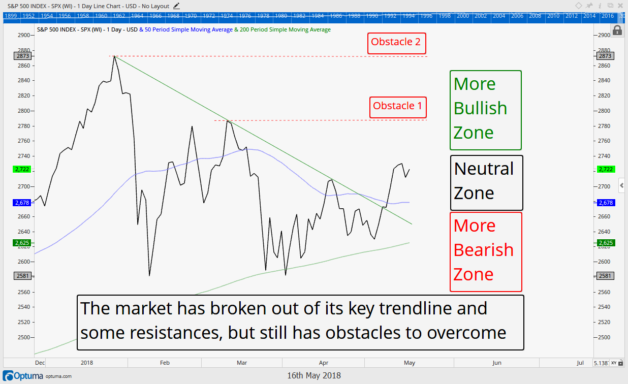
The Good: US Stocks…Stocks have moved back into the “Neutral” zone, and have simultaneously broken above a downtrend line of the past few months. The coast is not all the way clear though.
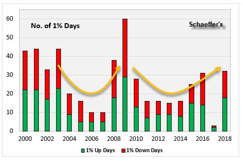
The Bad: Volatility…So far in 2018, as shown in the chart to the right, there have been more days with greater than 1% moves up or down than any year since 2009. This type of daily volatility is normally found during bear markets.
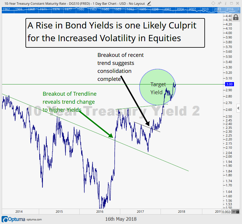
The Ugly: Bonds…Yields on the 10-year US Treasury bond have moved above the important 3% level. To us, this further confirms that bonds have moved into a long-term (multi-decade) bear market. The corporate debt market is also showing signs of stress. Investors who are relying on bonds to provide safety and protection during times of stress need to re-evaluate their exposure.
Owning individual bonds help with principal risk, but carry the risk of opportunity lost as rates rise. Durations should remain very short and credit exposure monitored closely. Extreme caution is recommended.
FIT Model Update: Market Correction
![]()
Last issue we talked about the changed sentiment environment as extremely positive earnings reports actually resulted in lower share prices. It seems multiples, interest rates, and valuations may now be becoming more important to investors than earnings.
Sentiment is one of the 3 types of financial analysis we watch, and when such shifts in the market’s mood occurs, we take notice. This has shown up already through an extremely high increase in volatility, however, this has yet to have a negative effect on the long-term potential for the S&P 500. This will remain as long as the 200 day moving average of the S&P 500 holds.
Portfolio Insights
Positive Signs Starting to Emerge?
It seems like its not just the weather in Austin that has heated up recently…the stock market has warmed up some as well. After three months of volatile, mostly bearish developments, we have finally seen some positive developments occur over the past two weeks. Maybe the Outlaw Josie Wales is finally driving his Gran Torino over the Bridges of Madison County to A Perfect World, or maybe its just another headfake with more downside left to go.
While the market has attempted to renew the bull market a few times in the past three months, the current rally appears to have the best chance of succeeding.
When we wrote our last Insights two weeks ago, our clients were heavily positioned in cash. Approximately 75% of our clients’ target equity exposure was in cash, with only 25% invested. The market was testing its 200-day moving average, and volatility was once again elevated.
However, shortly after we published our last report, the market started to move higher and triggered multiple buy signals in several different sub-strategies. Thus far, these buy signals have given our clients a Fistful of Dollars more than they had a few weeks ago. (Are you done with the Eastwood stuff yet?)
We welcome the positive developments. However, we are not quite ready to ring the “all-clear” bell just yet. The positions added recently all have exits very close to our entry prices, and risks still remain elevated in our opinion. (In the next section we dig deeper into the positive and negative areas of the markets.)
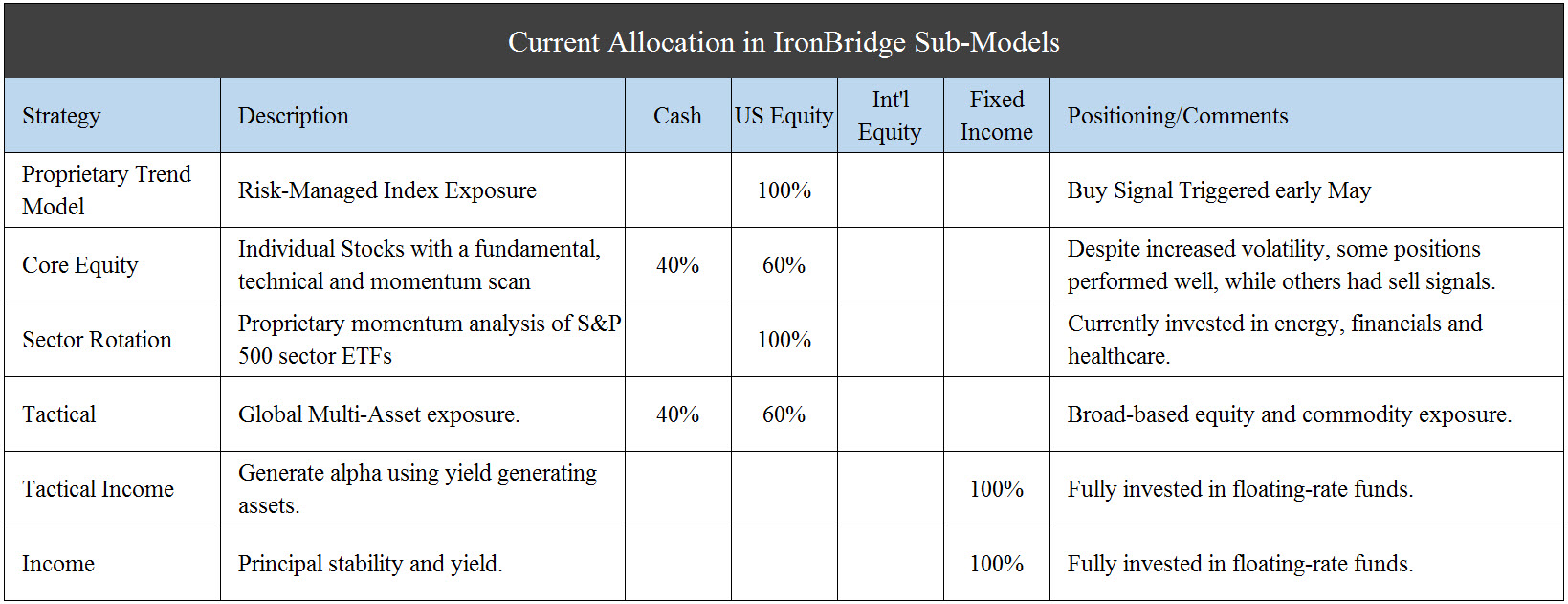
It has been some time since we updated positioning, and with all the changes over the past couple weeks now seems like a good time for this update. The chart below shows our current strategy positioning. Please let us know if you’d like an update on how your portfolio is allocated to these strategies.
To summarize:
- Trend Model is now back to being fully invested in an S&P 500 index fund
- Sector Exposure is now fully exposed to equities (it was previously 50% cash), with two positions in energy, one in financials, and one in healthcare.
- Core Equity (individual stock exposure) remains 50% invested.
- Tactical Model is now 60% invested, all in US stocks.
- Fixed Income exposure remains fully invested in floating rate bonds, positioning for a continued rise in rates.
These changes reflect the recent developments in our market analysis models, and reflect the increased probability that the bull market could resume. However, we stress that we would not be surprised to see a reversal in our signals that would cause us to move back to the sidelines. Such is life investing in a late cycle market.
Market Microscope
The Good, the Bad & the Ugly
The Good – The Stock Market
After three months of selling, stocks have finally broken out of their downtrend as depicted in the chart below, and risk has once again shifted toward a more neutral stance. They seem keen to “go ahead, make my day” as the all-important 200 day moving average has once again held a test in early May, proving there are buyers stepping in at those levels for entry points. Thus far those buyers have won out as price has respected that key moving average a few times now.
The coast is not all clear, though, as stocks still haven’t proven they can sustain an uptrend. That won’t be proven until $2800 can be regained again. This is identified as obstacle 1. A move above this level will provide the first longer-term trend of higher price highs and higher price lows since January, a bullish development.
If that obstacle can indeed be overcome, then the all time high near $2900 would be next. Overcoming that would point to a test of the round number $3,000 level as the next likely resistance.
The Bad – Volatility
“Now you’ve got to ask yourself one question, Do I feel Lucky?…Well, do ya, punk?” There have been almost as many 1% up and down days thus far in 2018 than the last two years combined. Contrast this to 2017, when the number was at a 20 year low, with only 3 sessions posting a close more than 1% up or 1% down.
The chart below puts this into historical perspective. Volatility certainly is back as stocks have been running The Gauntlet, and there are a number of takeaways from this reality.
First, the extremely low volatility in 2017 was certainly an anomaly of sorts. Indeed it saw the lowest volatility of the past 20 years, however, not far behind is 2006 and 2007 with just 10 days of greater than a 1% move. This taken in isolation could suggest that the kind of low volatility seen in 2006, 2007, and 2017 is the kind that precedes major market tops, as 2006 and 2007 did. There is definitely a “complacency” associated with market tops, and low volatility may be one way to identify it.
Second, there is a pretty clear cyclicality to volatility as depicted by the orange curves. After peaking in 2003, volatility subsided through 2007, when it spiked again. By 2011 volatility was low again, until 2015. This could be thought of as the volatility cycle being similar to the business cycle, or economic cycle, or ultimately the stock market’s cycles.
Third, the current pace of volatility suggests 2018 will very likely be even more volatile than 2008 and has the potential to be the most volatile year of the past 20, surpassing 2009’s 60 trading days of + or – 1%. We are only 5 months into 2018, yet we are over half way to 2009’s record.
Fourth, the number of 1% days is pretty evenly split between up 1% and down 1%. This is rather surprising, as you could have thought first, that there would be more 1% down days given fear is a greater emotion than greed, or you could have taken the opposite approach and assumed that during a bull market, there would be more 1% up days, but neither one of these can really be confirmed.
Finally, it’s pretty obvious that volatility is greater during bear markets. The most 1% days occurred during the 2000-2003 and 2007-2009 bear markets.
We are currently at thirty-two 1% days thus far in 2018. During 2000 and 2008, there were at least thirty-eight 1% moves in the market, so if you are holding out hope that this spell of volatility is not ushering in a new bear market then you probably should target thirty-eight as your magic number.
Having said all of this, statistics are meant to be broken, so we aren’t putting too much weight onto the fact that we are already at such a blistering pace. Volatility could slow down from here on out, or it could continue its blustering pace and not kick off a new bear market, however, what we do recognize is the volatility environment has indeed changed, at least for now, necessitating much more attention to portfolios than the anomaly 2017.
The Ugly – The Bond Market
Bonds continue to be In the Line of Fire as yields continue their rise.
The first chart below was one we published last year, updated through today, that warned of the coming rise in yields. We shifted portfolios to shorter durations and floating rate exposure in preparation, and that has paid off as the Barclays AGG (the most popular index to track bond performance) has declined 4% thus far this year, while we have been relatively successful in our bond exposure.
The first chart reveals the initial target 3% on the 10 Year yield has now been reached. This rise in yields has been the driver in lower bond prices as yield investors continue to look For A Few Dollars More.
After such a swift move higher in yields it is likely the bond market’s march will take a breather, but over the long run we continue to think we are in a rising yield environment, which ultimately will also affect equities negatively.
Beyond the increase in volatility, another reason we are keeping our guard up and continue to think that rising bond yields will eventually affect equities negatively is displayed in the final chart, discussed in more detail in our March 30 issue. High yield debt continues to underperform. It has barely budged during the recent 4%+ rally in equities off its lows. This fact coupled with how junk bonds have been a pretty good leading indicator for equities does not sit well in our stomachs. We need to see some positive developments in high yield, otherwise it should be taken as a signal equities will eventually have to selloff in order to reflect the now higher yields their counter-part corporate bonds are offering.
After all corporate bonds, with their liquidation preferences and guaranteed payout schedules, start to look more and more attractive compared to equities the higher yields get.
Bottom line…stocks are showing signs of promise, but don’t get complacent. Volatility is flashing warnings signs, and stay away from bonds.
Invest wisely.
Our clients have unique and meaningful goals.
We help clients achieve those goals through forward-thinking portfolios, principled advice, a deep understanding of financial markets, and an innovative fee structure.
Contact us for a Consultation.
Neither the information provided nor any opinion expressed constitutes a solicitation for the purchase or sale of any security. The investments and investment strategies identified herein may not be suitable for all investors. The appropriateness of a particular investment will depend upon an investor’s individual circumstances and objectives. *The information contained herein has been obtained from sources that are believed to be reliable. However, IronBridge does not independently verify the accuracy of this information and makes no representations as to its accuracy or completeness. Disclaimer This presentation is for informational purposes only. All opinions and estimates constitute our judgment as of the date of this communication and are subject to change without notice. > Neither the information provided nor any opinion expressed constitutes a solicitation for the purchase or sale of any security. The investments and investment strategies identified herein may not be suitable for all investors. The appropriateness of a particular investment will depend upon an investor’s individual circumstances and objectives. *The information contained herein has been obtained from sources that are believed to be reliable. However, IronBridge does not independently verify the accuracy of this information and makes no representations as to its accuracy or completeness.


