Introducing a new way to diversify portfolios based on market cycles. Plus, September is historically the worst month for stocks, but not this year. And we take a deep dive into how bonds and interest rates affect stock prices.
[maxbutton id=”1″ url=”https://ironbridge360.com/wp-content/uploads/2017/09/IronBridge-Insights-2017-09-29.pdf” text=”View the Full Report” ]
Insights Overview
Macro Insights: Did you know that September is historically the worst month for the stock market? Not this year. It’s never a good idea to base decisions on statistics alone, but the 4th quarter is historically the most bullish period for stocks.
Portfolio Insights: A frequent topic of conversation within our firm is how poorly traditional asset allocation models address real portfolio risk. We believe one of the most overlooked aspects of portfolio management is diversifying your timeframe, or how long you own an investment.
Market Microscope: The bond market had a busy week with seemingly no real catalyst. However, the charts helped us get ahead of the recent change in trend as the odds continue to increase the market has resumed a trend of rising yields. There are a few ETFs that capitalize on rising yields.
On Our Radar
Politics: Capital Hill has now shifted its focus to a revamping of the tax code as President Trump released his latest version on September 27.
Federal Reserve: The Federal Reserve met September 19 & 20 as they confirmed one more rate hike will likely occur in December as well as providing a schedule of the planned selling of their investments starting in Oct. The pace of the selling is slow in the grand scheme of things, but it will be interesting to see how the bond market responds.
FIT Model Update: Uptrend

Fundamental Overview: The popular economist Robert Shiller recently proclaimed in a news article that the stock market looks today “like it did prior to the 13 other bear markets”. His criteria included 1) high valuations, specifically a CAPE ratio above 22.1, 2) >13.3% year over year earnings growth, and 3) low volatility.
Investor Sentiment Overview: The week of September 18 saw the smallest range in the S&P 500 in over 40 years as the Index moved within a price range of less than 0.5%. The prevailing theme of all time low volatility continues.
Technical Overview: The markets continue to largely move higher and we continue to participate in the trend. As long as the technical signs remain bullish, we will remain vested. A key level we are watching for the month of October is S&P $2485. As long as it holds we will remain fully vested.
Focus Chart
Years that End in 7
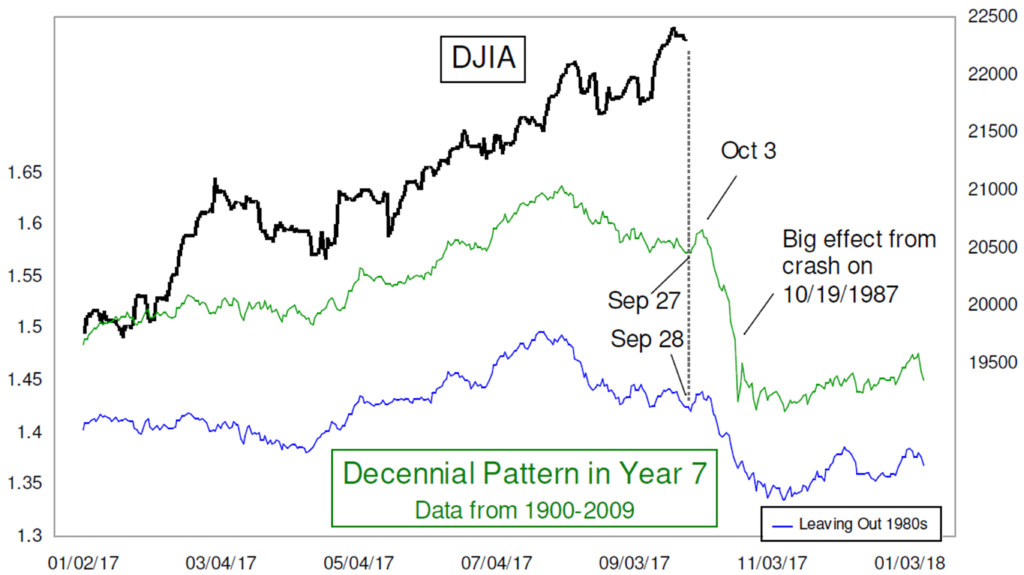
Some statistics suggest the 4th quarter is the strongest quarter of the year for stocks. Other statistics, such as those portrayed in the graphic below, suggest the market could have a very difficult fourth quarter. Years that have ended in 7 for some reason have been very bad years for the stock market, especially the 4th quarter.
Could a similar fate be awaiting us this year?
Statisticians will tell you that having less than 30 data points makes it virtually impossible to accept a conclusion using statistics alone, so this chart probably shouldn’t carry much weight in market analysis.
In the Macro Insights as well as the Market Microscope sections we take a look at some of these statistics as we enter into the 4th quarter. Our conclusion is that market statistics are nice and often fun to talk about, but they are not very strong support for an investment thesis.
Portfolio Insight
Adjust Time Frames Based on Market Cycle
We met with a new potential client this week who had accumulated a large balance in their savings account. This family has been very successful, are incredibly intelligent, and pay attention to markets. But they have a quandary: What do you do with cash now?
They were nervous that if they invested in stocks this late in the cycle, they would risk losing a substantial amount of their principle. However, they were also concerned about having a large part of their portfolio being stagnant and remaining in cash. This is very common after witnessing the current expansion.
A frequent topic of conversation within our firm is how poorly traditional asset allocation models address real portfolio risk. We believe one of the most overlooked aspects of portfolio management is diversifying how long you own an investment. This time frame diversification must change based on where we are in the current market cycle.
When addressing the question of cash, and portfolio strategy in general, we believe a different approach is required. This approach is intuitive, but not implemented by the average portfolio manager or investor. This approach adds a layer of diversification that specifically addresses how long investors should own an investment within their portfolio.
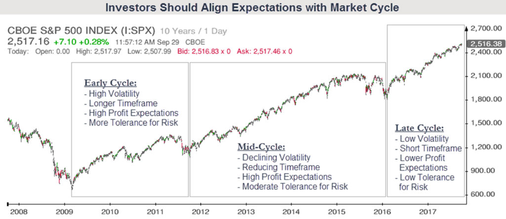
The chart below shows the S&P 500 from the 2009 low separated into three phases: Early Cycle, Mid-Cycle and Late Cycle. We have identified a few of the characteristics typical of each cycle’s behavior.
Early in the cycle (think 2009 or 2010), you must anticipate having positions that are more volatile, because the market and economy are typically emerging from a recession, investors nerves are frayed, and there is uncertainty whether the early recovery will continue. Early in the market and economic cycle, the risk of loss is HIGHER over a 1-year timeframe than a 5-year timeframe, because the chances of recovery are substantially higher after seeing a large market loss and economic recession. Your timeframe over which you expect to earn profits must be extended.
Late Cycle investing is just the opposite. The risk of loss late in a cycle is much LOWER over a 1-year timeframe than a 5-year timeframe, because the chances of another recession increase as timeframes are increased. Late in the cycle, investors should reduce the length of time they expect to hold investments, and have multiple exit strategies in place.
We believe we are late in this market cycle. We would not be surprised if a major top happened next month, but we would also not be surprised if it happened 5 years from now. By diversifying your expectations, particularly about how long you may own any particular investment, we believe you can more confidently invest in any part of the cycle.
Macro Insight
‘Tis the Seasonality
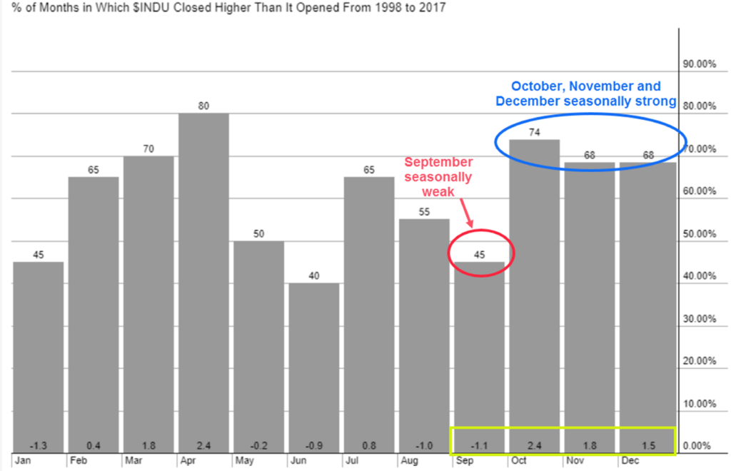
Any change or pattern that repeats over the course of a year can be said to be seasonal. Historically September has been the worst performing month, averaging a loss of (-1.1%) over the last 20 years. During that span only 45% of Septembers have seen positive returns. However, 2017 was having nothing to do with that historical trend as this year’s September has been one of the better ones, up 1.4% (at least through 9/27).
The chart below looks at how often each month was positive, and the average return for each month over the past 20 years. First, across the top of each bar is the percentage of months that a particular month saw a positive return. September was positive just 45% of the time. October, however, has had positive returns 74% of the time, the 2nd most reliable month of the year.
Second, the numbers in the bottom of each bar reveals the average monthly return during this 20 year span. September’s average return over the last 20 years has been a loss of (-1.1%), the worst of all months. The opposite can be said for the next 3 months which boast some of the most bullish statistics of the year.
Going back even further, to 1950, reveals a similar outcome. September returns on average were down (-0.67%) with positive returns just 29 of the 67 years. However, the 4th quarter has a positive trend when going back to 1950 as well. Since 1950, the S&P in October is up on average 0.76%, November it has been up an average 1.38%, and December up an average 1.54%. So all together the 4th quarter historical average return was 3.5%.
Do we make portfolio based decisions based on statistics alone? No, of course not and neither should anyone, but we are fully aware that the market is entering its sweet spot known as the “best seven months” which runs from October through April.
Why is this the case? We really don’t know, but we do know that any one year is not bound to statistical averages so neither are we. If September 2017 doesn’t prove to us how a data point can buck a historical trend, then perhaps October of 2008 and October of 1987 can teach us something. These months saw a (-17%) decline and (-22%) decline, respectively, even though October is the strongest month on average historically.
You are likely to hear a lot about the “best seven months” in the mainstream media over the coming weeks. Just remember that statistics are more of a guide rather than a rule. We use multiple signals to help warn us if we are to see a 4th quarter that is going to look more like the average or move contrary to it. For more on seasonality, check out the Market Microscope section which looks at the market’s typical pattern combining the 11 years since 1900 that all ended in 7 (1907, 1917, 1927, 2007, etc). It suggests a significantly different outcome to the year.
Market Microscope
The Hidden Relationship between Stocks & Bonds
What do Rising Interest Rates Really Mean? First, let’s look at the bond market to see why we think bonds are a timely topic today.
On Wednesday, September 27, we saw a relatively large move in the bond market, with no real apparent catalyst. The media, not surprisingly didn’t give it much coverage, but it is something we had been watching and expecting. Treasury prices, especially the longer dated ones, fell sizable. TLT, an ETF that tracks the 20+ year Treasury bond market, fell 1.5% on the day and followed through with another 0.5% decline the following day. Why do we think this is important? Because it is conceivable that bonds have renewed their falling price/rising yield trend that started back in July 2016.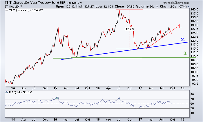
The next chart shows how bond prices indeed peaked back in July 2016, fell 18% rather swiftly into December 2016, and have since been clawing their way back. However, that rally has now stalled and the first leg of a 3 legged stool may have just cracked, as labeled 1,2,3 on the chart. Price has broken below the uptrend in place all of 2017, revealing a change in short term price momentum from up to down.
Trend Remains Down for Bonds
A change in the trend of bond prices is important for a number of reasons, but most importantly to investors is the 1) direct impact it has on bonds and also 2) the direct and indirect impact bond yields have on stocks. Stewards of finance spend a lifetime learning the intricacies between the bond and stock markets, so we are just going to be able to scratch the surface in this report, but hopefully it will provide us a better understanding of the risks (and rewards) that could come from a trend change in the bond market.
First, let’s take one more look at the bond market to see why we are increasing the odds that the next leg down in bond prices is upon us. The next chart zooms into the last 11 months and reveals that the long term Treasury bond rallied in 2 equidistant trends off the March and May lows.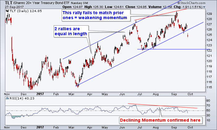
Beginning in July, the third move of that uptrend did not match the speed of the prior two trends. This is revealed on two sections of the chart above. First, price was not able to reach the parallel trend channel line shown in blue that was formed from the prior two peaks, and second, through the use of a momentum indicator shown at the bottom of the graphic. Although price wasn’t able to reach the trend channel target, price did squeak a new high in August. However, it was on lesser momentum as measured by the RSI indicator. Lower momentum in and of itself is not that big of a deal, especially since price came back down in September and appeared to hold its lower trend channel support, however, a breakdown of that support this week increases the risk that this rally in bonds that started back in December may be over.
A falling bond market means that yields are rising, and if you are an income investor, could mean you are losing out, primarily through the opportunity cost of not being able to buy bonds that now offer a higher yield than was previously obtained. This is one way that falling bond prices affect investors. An example may help.
Bond Prices Fall as Yields Rise
Say you buy a 5 year bond right now that pays 5% yield. You plan to hold to maturity and collect the yield. In one year a very similar bond is issued, but it is now paying 6%. In such a scenario it is likely your bond price has now fallen to account for the fact that an investor could now buy essentially the same bond, but get a higher yield. Why would an investor buy the 5% bond now when they could get 6% instead? Price thus drops on the 5% bond to compensate. Meanwhile, you, the owner of the 5% bond, are stuck with a bond paying you below market yields. You could sell the bond, but you would lose in price what you would then gain in yield buy reinvesting in the higher yielding bond. Falling bond prices and thus higher bond yields means you would miss out on the opportunity for higher returns, so you lose that opportunity, or spread, during a rising rate environment. The two charts below help show how moves in yield affect prices. A 2% rise in interest rates would typically result in a 10% drop in a 5 year bond’s price.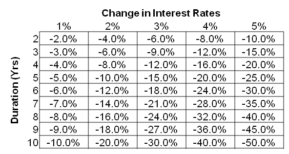

Geek Out with the Finance Nerds
The 2nd way falling bond prices affect portfolios is a more indirect way through equities.
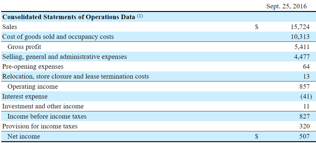
First off, if a firm has any debt its earnings are generally decreased when interest rates rise. This is because the cost to service such debt, the interest rate, is incresing. The graphic below is from Whole Food’s (ticker:WFM) Fiscal Year 2016 profit and loss statement. Notice that as of September 2016 WFM was paying $41MM in interest expense each year? After digging into their annual report we discovered this interest equates to the 5.2% yield they pay on their $1B loan due in 2025. What happens to this number if in 2025 Whole Foods must refinance at a 10.4% rate (essentially a doubling of interest rates)? Their interest expense would then become $82MM, up from 5% to almost 10% of their pre-tax profit. Rising interest rates directly affect profits negatively for most companies that have to borrow to fund their businesses.
In our opinion, even more important than the direct effect rising yields have on equities is the indirect effect they have on stock prices. If interest rates double in two years, Whole Foods won’t have to worry about that for another 7 years (their bond isn’t due to be paid back until 2025), however, they will have to worry about that if they need any more money between now and then. In reality, the indirect effect the doubling of interest rates would have on their share price is likely much more important to their share price than the interest expense they pay. Here’s why: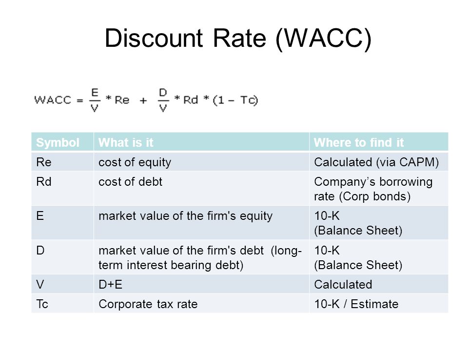
The next chart reveals something finance geeks (like us) are very familiar with. It represents the calculation of the Discount Rate used when “discounting future cash flows back to today” in order to come up with a present value for the company’s share price. Here’s how it works: As an investor you want some sort of return on your equity. Let’s assume that bond yields are 5% and equity return expectations are 10%. If 50% of a firm’s capital structure is made up of debt and the other 50% is equity and the company pays no taxes, the Weighted Average Cost of Capital (WACC), as demonstrated to the right, would be 7.5%.
So what happens to the equation if interest rates double to 10%? The knee jerk answer would be to adjust the bond yield portion of the same equation to derive a WACC of 10% (10%*50%+10%*50%). However, this would be incorrect as the cost of equity actually must always be higher than the cost of debt, because of the liquidation, legal, and payment pecking orders debt has over equity. In other words, the “cost of equity” is dependent on the cost of debt, making the cost of debt the most important factor in deriving a discount rate (discount rate is also known as IRR-internal rate of return, expected return, or cost of capital). Furthermore, there are arguments to be made that the relationship between the cost of debt and the cost of equity is not linear and in many ways becomes exponential, but for this example lets just assume that a doubling of the cost of debt results in the doubling of the cost of equity as well.
Using the Whole Foods financial statements we built a table comparing these two scenarios. When there was a 7.5% cost of capital that then doubles to 15%, we see a share price that is cut in half by 51%…all because of an increase in the cost of capital. Per the opening of this section, a doubling of interest rates results in an ~5% drop in earnings through direct increased interest costs (which we have actually ignored in this analysis), but that same doubling of interest rates actually has a much more profound effect on the share price through its indirect effects by means discounting the future. The same Net Income delivers a much lower share price, all because of a change in the interest rate.
The table below helps reveal the “hidden” interest rate risk (note that growth rates assumed were backed into based on the $47 per share purchase price paid by Amazon for Whole Foods on June 16, 2017). 
If interest rates have started another round of rising, then they should eventually lead to higher discount rates and increased interest expenses. This in turn will then lead to lower equity prices. Even in the scenario as laid out in the example where earnings manage to maintain their levels, in a rising interest rate environment share prices feel pressure. This is probably one of the biggest hidden risks to the long-term bull market nobody is talking about, as a rising interest rate environment is not a good environment for stock prices.
One other way to think about this is through the lens of a stock versus bond investment decision. Imagine a world where you could get a U.S. Treasury Note that yielded 10% per year, guaranteed (would be nice, huh?). It would be tough not to choose to invest in U.S. Treasuries at 10%. In order to not invest there and instead invest in equities you would need to expect returns that are likely significantly greater than 10% (so, thus, the discount rate also increases). As interest rates move up in yield it makes bonds more appealing from an investment standpoint, adding to the pressure on U.S. stocks. It’s hard to find a time in history where rising interest rates were actually good for equities. Given the context above, it’s easy to see why it’s tough for equities to excel in such an environment.
US Equities
Seasonality: Interesting, but Not a Part of Decision-Making
In the Macro Insights section we discussed how statistics can be fun to talk about, but can also be dangerous to use for investing purposes. Shown on the next page, courtesy of Tom McClellan who has created numerous technical indicators and writes a popular technical focused newsletter called ‘The McClellan Market Report’, is a very similar example using historical averages to project what the market might do in the future..the difference is the data in the following chart is only from years that end in the number 7. It also concludes the exact opposite of what the statistical analysis in the Macro Insights section concluded.
For some reason, going back over 100 years, the years that have end in 7 have collectively had a very difficult time, especially in the final half of the year. It could be because of the presidential election and political cycle or because of larger, underlying cyclical currents in the markets, but regardless the why, the contrasting chart shown below and based around similar market return statistics provides some great talking points on the validity of statistics. Analyzing these charts certainly supports the popular saying that “you can say anything with statistics”.
On one hand, as was discussed in the Macro section, we look at the S&P since 1950 and we see a 4th quarter that historically has done very well. But, on the other hand we look at the market during all the years ending in 7 and we see a very difficult 4th quarter looking back at us. These examples help solidify our position of not allowing statistics to drive our investment thesis.
Now, onto the chart below.
From October 3 to the end of the year (the 4th quarter) in the years ending in 7 resulted in an average loss of over 10%. This is in stark contrast to our earlier research which suggested a 3.5% average gain during this period. To reconcile the two we must recognize that the years that do not end in 7 were much better on average than those years that end in 7. The interesting parallel McClellan makes to the below chart is that the run up in stocks thus far this year has performed fairly similar to the average performance of all the years that end in 7. But the real takeaway from his analysis is the risk that is directly in front of us at we turn the page to October.
Those that are familiar with the history of the markets will recognize that the 1987 crash occurred in October, and that may be an anomaly, so McClellan does us a favor and disregards that year (the blue line). Even if we exclude 1987’s crash we notice that stocks still on average fell over 5% during the month of October in years that end in 7.
So what does it all mean?
Should we put all our money to cash before the inevitable October crash of 2017 occurs? Or, should we put all our cash into stocks in preparation for the inevitable 3.5% 4Q 2017 returns that will occur? Doesn’t this kind of feel like the battle of wits confrontation in the movie ‘The Princess Bride’ paraphrased below? Man in Black: “Alright, where is the poison? The battle of wits has begun! It ends when you decide and we both drink, and find out who is right…and who is dead. Vizzini: “But, it’s so simple…I clearly cannot choose the wine in front of you…but, I clearly cannot choose the wine in front of me…but I simply cannot choose the wine in front of you…so I clearly cannot choose the wine in front of me” Statistics like these are nice for cocktail parties, but usually not reliable enough to drive investment decisions.
Our clients have unique and meaningful goals.
We help clients achieve those goals through forward-thinking portfolios, principled advice, a deep understanding of financial markets, and an innovative fee structure.
Contact us for a Consultation.
Disclaimer This presentation is for informational purposes only. All opinions and estimates constitute our judgment as of the date of this communication and are subject to change without notice. > Neither the information provided nor any opinion expressed constitutes a solicitation for the purchase or sale of any security. The investments and investment strategies identified herein may not be suitable for all investors. The appropriateness of a particular investment will depend upon an investor’s individual circumstances and objectives. *The information contained herein has been obtained from sources that are believed to be reliable. However, Ironbridge does not independently verify the accuracy of this information and makes no representations as to its accuracy or completeness.
