• Skip to main content
  • Skip to footer

IronBridge Private Wealth

Forward with Confidence

  • Home
  • Difference
  • Process
  • Services
  • Insights
    • IronBridge Insights
    • Strategic Wealth Blog
    • Strategic Growth Video Podcast
    • YouTube Channel
  • Team
  • Clients
  • Form CRS
  • Contact Us

IronBridge Insights

Expectations vs Reality

April 9, 2020

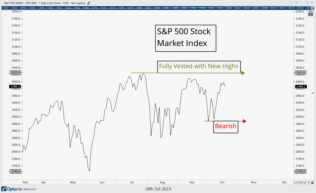
In our previous report, we discussed how earnings for the next two quarters are likely to be some of the worst numbers in history. Does that mean markets will fall in response? Not necessarily. For it’s not the actual economic numbers that matter…it’s how the actual numbers differ from their expectations that truly drive prices.

Plus, we identify three potential scenarios that could unfold over the coming months.


“Suffering has been stronger than all other teaching, and has taught me to understand what your heart used to be. I have been bent and broken, but – I hope – into a better shape.”

-Eleanor Roosevelt


The impact of the COVID-19 virus continues to effect us all. Our thoughts and prayers go out to those who are suffering from health conditions, financial hardships or simply from loneliness. May blessing be with you all.

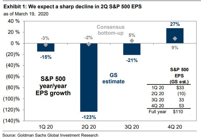
In our last issue of Insights, “Dare we Look at Earnings?”, we tried to take an early look at the potential impact that the unprecedented shut-down is having on company earnings. Bottom line, as one would guess, earnings are likely to be horrific.

Should we then assume that markets will also be horrific when these earnings are announced?

Not necessarily.

Markets do not move on economic results alone. Data points, whether corporate earnings, unemployment claims, or COVID-19 statistics, do not necessarily move markets by themselves. Rather, it is much more important to understand how the ACTUAL data differs from the EXPECTED data. This is what moves markets.

Case in point…last Thursday saw a staggering 6.6 million people file for initial unemployment claims. And the week before over 3 million people filed. This morning, another 6.6 million people filed again. Combined there were nearly 17 million people who filed for unemployment in the past 3 weeks.

These numbers, as shown on the chart below, are literally off the charts.

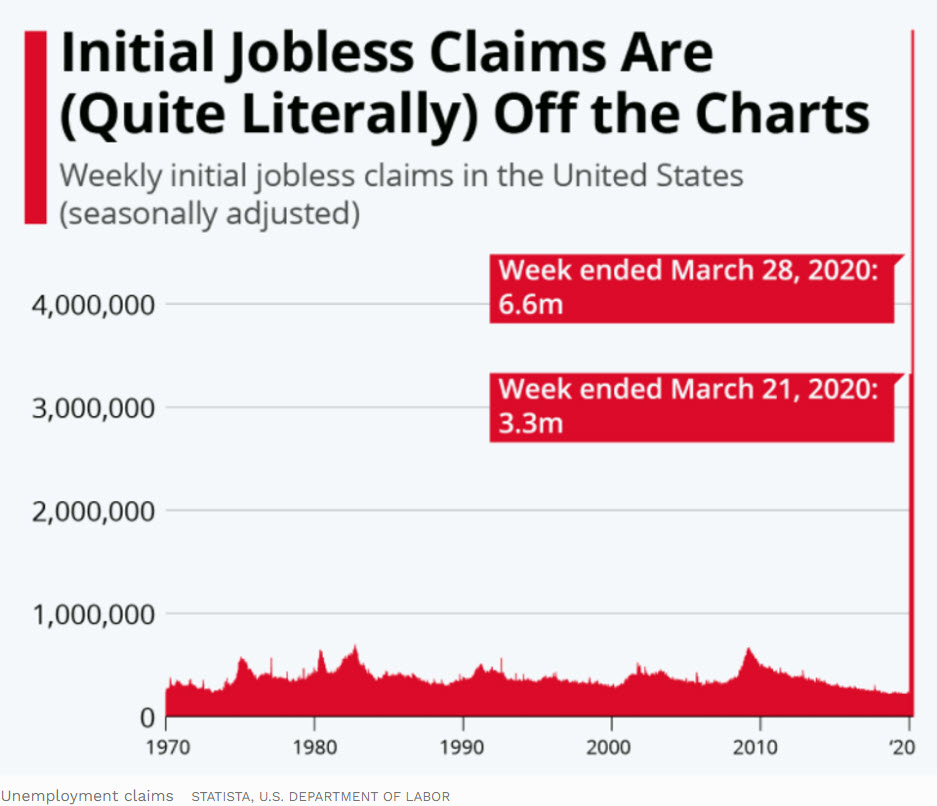
It is almost as if this chart was made by an entry-level statistician that made some sort of awful mistake.

This chart goes back to 1970. Look at the recessions in the early 1980’s, and especially in 2008. The highest number of weekly claims during the financial crisis was just over 600,000 people. Today’s data doesn’t even seem real in comparison.

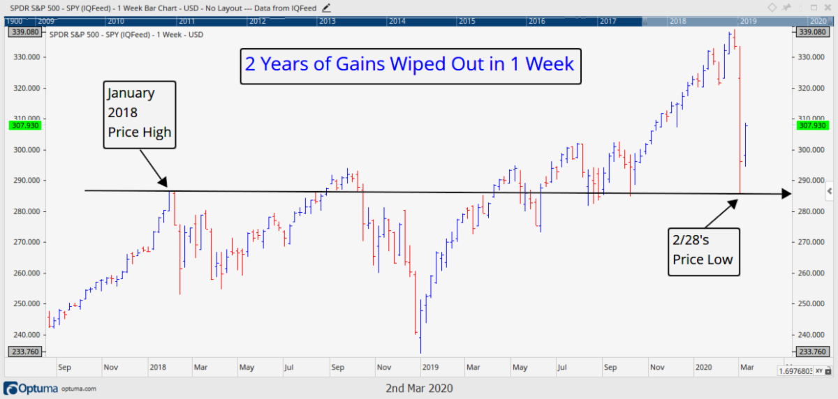
What do you think the market would do in the face of such negative data? One would assume that the market fell at least 10%.

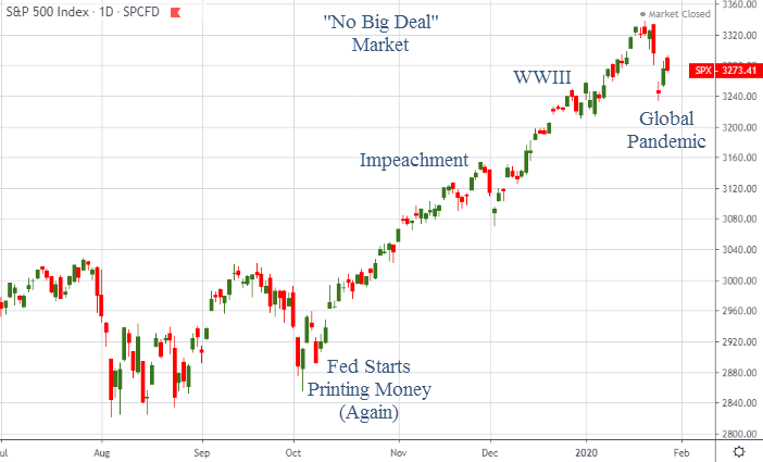
Last week when the first 6.6 million figure was announced, the market went up over 2%. Today, another 6.6 million unemployment figure was announced and the market rallied 1.5%.

This also doesn’t seem real to many people. How possibly could markets rise in the face of such terrible news? Are these market participants just evil psychopaths? How could prices seem so disconnected from reality?

Look at the chart below. This is the chart of S&P futures on April 3, 2020, when the unemployment claims number came out. The moment the data was announced, markets began to rally.

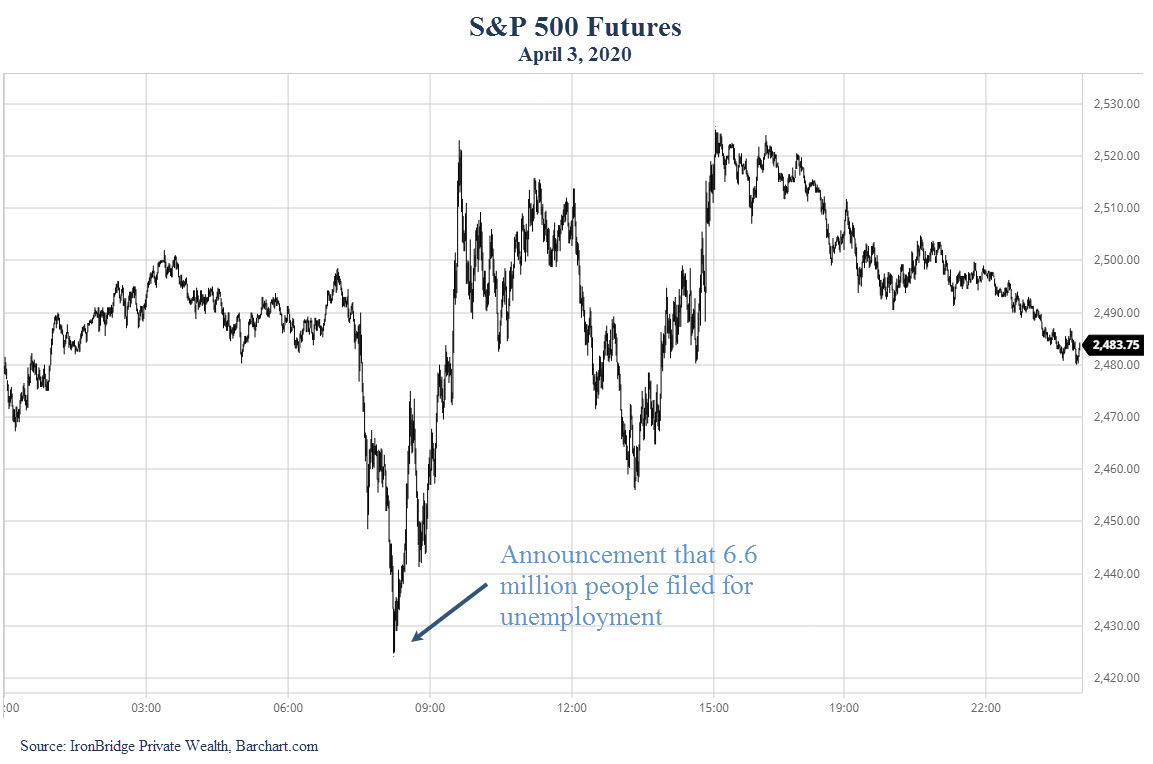
The market rallied because it was expected. The actual numbers were unknown, but people knew it was going to be absolutely terrible. And they were.

The other factor is that as data is announced, one tiny bit of uncertainty is removed. Two weeks ago the market had absolutely no idea how our shelter-in-place would effect the economy. We are now starting to see the effects. While they are bad, it now at least becomes KNOWN. One of the biggest components of fear is the fear of the unknown. And when that fear is removed, markets can become constructive once again.

The next logical question is: What is the market expecting?

Markets are incredibly complex systems. Billions of shares change hands every day through hundreds of millions of transactions. We’ve said many times that to claim to know what will happen with any certainty is foolish.

But we can take our best guess at what the market is expecting based on data and estimates that are widely known or talked about. Let’s go through the list:

Near-Term Expectations:

  • Well publicized reports by JPMorgan and Goldman Sachs project GDP for the 2nd quarter to decline somewhere around 30%. To put this in context, GDP fell 4.3% during the 2007-2009 financial crisis. Not 43%, but 4-point-3-percent. GDP fell 25% in the great depression. The magnitude of this is hard to fathom.
  • COVID-19 cases are expected to skyrocket. Deaths in the US are estimated to be between 200,000 and 500,000 by the time this is done, which puts the number of people infected between 15-30 million.
  • Earnings are expected to be horrible. Some people are projecting earnings to be negative for the entire S&P 500.
  • Volatility is expected to continue to be extreme.
  • Unemployment is expected to be somewhere between 10-15%. It peaked at 10% during the financial crisis.

Aye yi yi…where’s that margarita?

With all this bad news and uncertainty, what will happen next?

We don’t know what will happen, but let’s look at three possible scenarios that make the most sense to us so we can prepare for different outcomes.


Three Possible Market Scenarios: Bullish, Neutral and Bearish

Scenario #1: The Worst is Over (Bullish)

By the worst is over, we mean that we’ve seen the lows in the stock market for this awful period of time. We fully expect the number of infections and deaths to rise dramatically. And we expect the economic numbers will also deteriorate over the coming weeks.

This does not mean that stocks can’t go up.

Ultimately, this scenario relies on two things: science and liquidity.

The first catalyst for an optimistic resolution is via medical science.

There are countless companies and individuals searching for a cure or some way to help reduce the lethal effects of COVID-19. The last time there was this much focus on one goal was in the manufacturing sector during WWII. This solution is worth billions of dollars to whomever produces it (at least). The person or team who finds it will be rewarded handsomely, and will most certainly be declared a global hero.

The last time a global pandemic struck the globe was the Spanish Flu of 1918. There may be some similarities, but the primary difference is that medical treatments have advanced dramatically over the past 100+ years. Life expectancy in 1900 was roughly 48 years old for men and 50 years old for women, according to the book “A Profile of Death and Dying in America”. Today, life expectancy is pushing 80 years old.

How people are dying is also changing dramatically. The next chart looks at the leading causes of death in the US over the past 120 years.

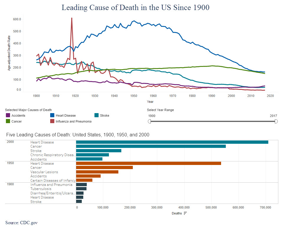
In 1900, most deaths were attributable to the flu, pneumonia, tuberculosis and diarrhea. Most of these caused some sort of infection that could not be controlled, and the person lost his or her life.

Today, medical science has virtually eliminated these causes of death. If we can get a medical breakthrough against COVID-19, we could easily see a very strong rebound in both the economy and the markets.

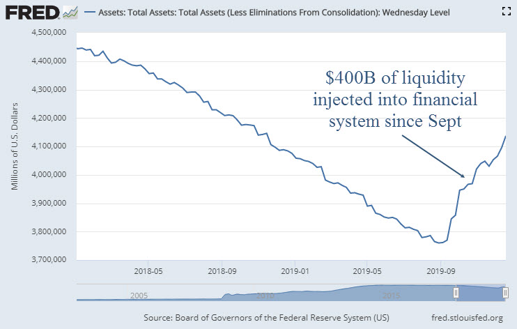
The second catalyst that could help the bullish case is liquidity. By liquidity, we mean money being printed by the government and central banks.

Last week Congress passed a $2 Trillion disaster bill to help individuals and businesses get through this period of time. At the same time, the US Federal Reserve announced they would print $4 Trillion and flood the markets with this artificial capital.

And just this morning, and additional $2.5 Trillion of stimulus was announced by the Fed.

These numbers are stunning. The chart below shows the historical Fed balance sheet since 2007, and the projected balance sheet through the end of 2021.

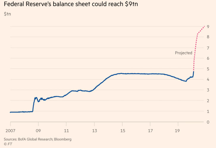
Over the past two weeks there has been over $8 Trillion dollars in stimulus announced that is scheduled to get into the economy and the markets within the next few months.

To put this is context, over the entire 10 years following the ’08 financial crisis, the Fed printed a total of $4.5 Trillion. This liquidity made its way into the financial markets and helped produce one of the largest and longest bull markets in history.

Maybe this is finally the time when the Fed loses its ability to increase market prices (similar to what happened in Japan over the past 3 decades). But if now is not the time, this could be a tremendous tailwind to asset prices over the coming years.

This injection of liquidity could very well be the secret weapon that allows the market to recover relatively quickly, even in the absence of a medical breakthrough or a fast economic recovery. And this market recovery could occur while the real economy remains in shambles.

Scenario #2: The Worst is Over, but the Recovery is Delayed (Neutral)

This scenario is based on the economy recovering, but not as strongly as we all hope. This is the “U” or “W” scenario we discussed in our previous report.

This scenario seems very logical to us.

The economy will start to loosen up. We will go back to socializing in restaurants, and spending time in public places. We will go back to work and school.

But we could be a bit tentative. Maybe we don’t go out quite as much as we used to. Maybe the virus makes a comeback because we let our guard down. Or maybe most of us are still practicing a modified form of the current “social distancing” that results in slower economic activity.

In this scenario the economy improves, but instead of it happening in May or June, it is pushed out until later summer or early fall. Businesses that were forced to shut down don’t reopen. People who had jobs before don’t have them after. People remain cautious about large gatherings, travel and other activities.

This would result in a stubbornly high unemployment rate. Consumer spending would be weaker. Government stimulus certainly has a limit, although the election year could push politicians to extend things out further than would normally happen.

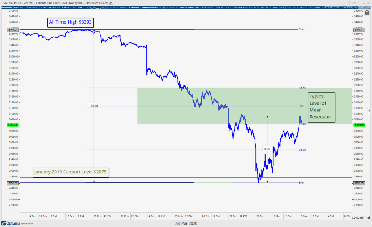
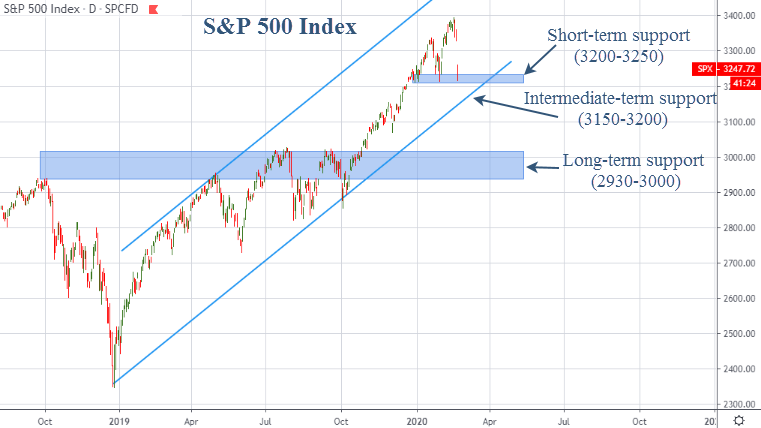
From a market perspective, we would likely see large swings higher and lower, but no real progress either way. Somewhat like the hypothetical chart below.

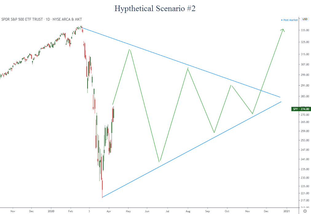
This obviously is a complete guess, but this type of pattern does tend to occur late in investment cycles. This would be an environment full of starts and stops that would certainly take its toll on investors. Good economic and COVID developments would be followed by bad developments. As soon as it appears we are in the clear, something negative happens, and vice-versa.

Ultimately the economy would recover and markets would resume moving higher, but it would take longer than we hope.

Scenario #3: Depression (Bearish)

Frankly, we don’t even like thinking about this scenario. But we must consider it and be prepared for it if it happens.

This suggests we are only in the early innings of the damage. In this scenario, there is no medical breakthrough, efforts such as shelter-in-place fail to contain the spread of the virus, patients who recovered get infected again, and the economic damage is deeper and lasts longer than anyone expects.

If this were to begin to become reality, it would likely start with a strong move lower that is equal to or greater than the large drop we saw from February to March. Ultimately, this scenario would result in a market that declines somewhere between 50-75% from its peak.

As uncomfortable as this scenario is, unfortunately it is still a possibility.

However, one of the main things that puts this scenario as a very low likelihood is the $8 Trillion of liquidity getting pumped into the markets and economy. This alone reduces the probability dramatically, where we should not expect that to be the likely outcome. However, we would be foolish to ignore this possibility.

Conclusion

In summary, as the news gets reported on the virus and the economy, remember that it is not just the news itself that drives the markets. It is the expectations of what reality may be that is the true driver of prices.

Bottom line, we need to remain unemotional about the future direction of the markets, and open to different potential outcomes. It is incredibly important during uncertain times like these to have a disciplined, rules-based approach to portfolio management that can adjust to changing circumstances without having to guess what will happen next.

Invest wisely!


 Our clients have unique and meaningful goals.

We help clients achieve those goals through forward-thinking portfolios, principled advice, a deep understanding of financial markets, and an innovative fee structure.

Contact us for a Consultation.

Neither the information provided nor any opinion expressed constitutes a solicitation for the purchase or sale of any security. The investments and investment strategies identified herein may not be suitable for all investors. The appropriateness of a particular investment will depend upon an investor’s individual circumstances and objectives. *The information contained herein has been obtained from sources that are believed to be reliable. However, IronBridge does not independently verify the accuracy of this information and makes no representations as to its accuracy or completeness.  Disclaimer This presentation is for informational purposes only. All opinions and estimates constitute our judgment as of the date of this communication and are subject to change without notice. > Neither the information provided nor any opinion expressed constitutes a solicitation for the purchase or sale of any security. The investments and investment strategies identified herein may not be suitable for all investors. The appropriateness of a particular investment will depend upon an investor’s individual circumstances and objectives. *The information contained herein has been obtained from sources that are believed to be reliable. However, IronBridge does not independently verify the accuracy of this information and makes no representations as to its accuracy or completeness.

Filed Under: IronBridge Insights

Dare We Look at Earnings?

March 27, 2020

NOTE TO CLIENTS

All of us at IronBridge are working from home over the coming weeks during Austin’s shelter-in-place order. Fortunately, we have had remote work capabilities for years. We will continue to serve your needs in an uninterrupted manner with access to our full suite of resources as if we were in the office.

The primary difference is the possibility probability of screaming kids or barking dogs in the background.


Earnings season for Q1 begins late next week. Needless to say, they will be bad. But even in the midst of the corona-chaos, it ultimately is a game of expectations versus reality. Let’s take look at some of the preliminary estimates so we can be prepared for what may come. We also look at previous 30% declines, and discuss the possible shapes the eventual and inevitable recovery may take.


“When you look fear in the face, you are able to say to yourself, ‘I lived through this horror. I can take the next thing that comes along.'”

-Eleanor Roosevelt


No doubt we have all been affected by the Covid-19 Pandemic. As we draft this newsletter, for instance, we are doing it from our respective homes. Where we live, in Austin, Texas, feels like a ghost town. We imagine your town feels similarly (and somewhat eerily) quiet. Entire parking lots are empty when they were typically packed, and we think it is safe to say for many, business is not as usual.

However, technology today is truly showing its positives and allowing many businesses, like ours, to continue rather seamlessly, able to provide services to our clients, even with these extreme circumstances. Once beyond the obvious logistical challenges everyone is facing, for many businesses, like ours, business actually is continuing in a lot of ways as usual.

There are clearly going to be winning and losing businesses that result out of all of this, with many already popping up in one camp or another. Some, like the airlines, are certainly at risk, as their entire industry is facing their biggest challenge ever. Are we going to see nationalized airlines again? How long until international travel will return to levels recently seen? What about domestic travel? Other industries, like streaming video providers and home delivery companies, are likely to have their best quarters ever. Certain companies have benefited greatly from the shift from co-located to isolated work environments.

Previous 30% Declines

Over the past month we issued multiple reports highlighting how unprecedented the decline in the equity markets has been, and we can now add one more to the record books. What we just witnessed was the fastest decline of over 30% ever in the modern history of America’s stock markets.

The chart below shows this comparison of all the past 30% declines. For this reason, some are now comparing the current decline to the roaring 20s that resulted in the great crash of 1929, morphing into the great depression. From a purely market history perspective the current decline does look a lot like that initial move lower in 1929. If not 1929, then the 1987 crash. These three periods are on the right side of the graphic below and they clearly stand out as different from the other 30% drawdowns. The other periods took their time to get to the 30% mark. 1929, 1987, and 2020, the three most notable market crashes in history, each had remarkable speed in their declines.

Uncertainty reigns supreme. Individuals are digesting just how swiftly everything has changed. Governments are dealing with new threats. Businesses are dealing with the new norm, specifically how to quantify the impact of Covid-19, and that may be the biggest change as far as the markets are concerned. The uncertainty that still exists is apparent in all aspects of life here in America and across the world.

What similar time period should we use as the appropriate analog? Is it the roaring 20s that turned into the Great Depression that had a similarly rosy economic backdrop that then turned greatly negative? Or, is it 1987, a crash that occurred in the midst of a bull market and rather strong economy (there was no recession in the late 80’s).

The financial crisis had a debt and leverage catalyst that took 1.5 years to threaten the solvency of the world’s banks, so that doesn’t seem analogous to today. Case in point, we just witnessed over 50% of the entire financial crisis’s declines in just 5 weeks, so this seems much different. Perhaps now is not like any prior time period, which is just another peg on the massive uncertainty board we are currently looking at.

This uncertainty that surrounds the next few months is unprecedented, and until we start to get some certainty about the future we should expect the recent volatility (both up and down) to continue.

Dare we Look at Earnings?

How uncertain is the world about the future? So uncertain that many companies have stopped providing earnings guidance and hardly any have come out with an estimate of lowered guidance for the 1st quarter or the rest of the year. They just don’t know how bad it is going to affect their companies yet, and with one week left before we kick off Q1 earnings, we are about to clear up a little of that uncertainty.

Earnings will ultimately be the tell of whether or not we truly are entering another recession, or, are we actually on the cusp of an economic depression (hopefully not)? Earnings results in the first quarter and full year expectations will be a big tell as to how bad this thing may get.

Earnings forecasts for the S&P 500 are generally derived two ways.

  1. Bottom-up. This method begins at the individual company level, and the sum of earnings for each company is used to predict the overall earnings of the S&P 500 itself. At this point there are very few companies providing updated guidance for the 1st quarter (or the rest of the year for that matter), so all we have is their original forecast’s from the first 6 weeks of 2020. No doubt these will be drastically changing over the coming weeks.
  2. Top-down. This occurs when an analyst looks at historical earnings of the S&P 500 and then adjusts them up or down based on macro and other factors.

Let’s look at both of these earnings estimates.

The first chart below shows just how quiet companies have been in adjusting their 1Q earnings estimates in light of the Corona Virus. Most companies provided this original earnings guidance in January and early February, during their full year and 4Q 2019 updates as they are required to report earnings within 45 days of their quarter end.

Since then, only 13 of the 500 S&P 500 companies have adjusted their earnings with only 11 companies withdrawing guidance completely.

Shown by the green bar on the chart above, some of the 13 firms adjusting their guidance lower include: Ralph Lauren, Apple, and Coca-Cola. However, many of these updates were provided prior to March, prior to the virus hitting Europe and North America a lot harder.

The one firm that provided the most recent update, Expedia, had this to say on March 13, 2020, “With the outbreak spreading significantly since Expedia’s fourth quarter earnings call on February 13, 2020, we now expect the negative impact in the first quarter related to COVID-19 to be in excess of the $30-$40 million range provided at that time.” Well that’s helpful! So basically, “things have gotten worse over the last month”.

Shown by the blue bar on the chart above, many of the 11 firms withdrawing guidance for 2020 are travel related companies such as Expedia, American Airlines, and Royal Caribbean. Withdrawing guidance means the company is no longer sticking to the numbers they provided and are not providing any new number, compared to the companies that are “revising” and providing new updated numbers.

In fact, less than half of the companies in the S&P 500 mentioned the Corona Virus in January and February. The chart below shows that only 213 of the 500 companies mentioned either Corona or COVID-19 in those earnings calls.

There is no doubt that will change during earnings season beginning next week. Prior to the unprecedented events of March, earnings for Q1 were expected to decline 2.9% from a bottoms up perspective.

Looking forward to Q2, from a bottoms up perspective, the scenario is similar. Very few companies have pre-announced any updates to their earnings. Companies are likely waiting until their 1st quarter earnings call to provide guidance, but it is also probably safe to say that a lot of companies simply do not know how their earnings are going to be affected during this forced period of lightened commerce. It may even come to fruition that they also won’t know how the rest of the year is going to look.

Don’t be surprised if we see a lot of companies withdrawing guidance for the year in the month of April, which could bring more uncertainty back to the markets.

Taken as a whole, from a bottoms up perspective, most companies have not provided any updates and thus bottoms up numbers are no doubt overstated, but by how much? This is where the tops down estimates might be helpful.

A few firms have taken a stab at just how much Corona Virus is going to affect bottom lines. Goldman Sachs is one of them, and it is not pretty.

The chart below shows what Goldman expects 2020 earnings to look like as of the week of March 23, 2020. They expect a whopping 123% decline in S&P 500 earnings in Q2 which would result in a full year Earnings estimate of just $110, a decline of 21% from 2019. (Earnings that fall more than 100% simply mean that the S&P 500 companies will lose money as a whole).

This also includes a massive assumption around Q4, with an estimate of $53 in earnings per share, which would be the biggest quarter ever by the S&P, by a long shot ($36 was the previous largest quarter). After such a deep pullback in demand, one would expect a strong snapback, so perhaps it is possible. But the reality is we could possibly see a whopping 20-30% decline in earnings for 2020.

Joining Goldman in their outlook, JP Morgan has a slightly more dire forecast of economic activity. They are now assuming a 30.1% decline in GDP in the 2nd quarter of 2020, with an unemployment rate average of 12.8% per this article by Fortune. For comparisons, Goldman is assuming a 24% drop in GDP in the 2Q.

It seems pretty safe to assume the 2nd quarter is going to look awful. And that’s an understatement. Given the potential drop in earnings, the stock market may actually be thinking rationally about all of this. Yes, it happened much faster than anyone thought possible, but so has the expected drop in earnings and economic output.

From a valuation standpoint, on Dec 31, 2019 the S&P’s valuation was 23.2x its earnings estimate of $139 to get to a price of $3230. If we assume Goldman’s earnings target of $110 for the year and a similar valuation multiple of 23x trailing earnings, then an S&P price of $2,530 seems reasonable. The S&P is right at that $2,530 price as we type on Friday, March 27.

What Shape will the Recover Take?

The million-dollar question remains: How long will this last?

Most economic recoveries occur in patterns that look like either a V, W, U or an L. Let’s assume that March and April are likely to be the two of the worst months in US economic history. What will the recovery look like?

A “V” recovery is one where the rebound in activity roughly equals the decline. This would imply that the violent decline in earnings will be followed by an equally violent rebound in activity. Maybe people will be tired of being cooped up for a month. Maybe the stimulus package will keep people from being evicted, and maybe the businesses that are shut down today will reopen to a line of customers out the door. This is the scenario we hope for. This would lead to a surprisingly strong stock market, and make the current environment a tremendous buying opportunity.

A “W” recovery initially looks like a “V”. Then there is some sort of relapse, where the markets and economy become weak again before ultimately rebounding. This may very well be the shape that this recover takes. The initial drop has been extreme for both markets and the real economy. A strong snap-back is logical. However, if the virus is initially contained through social distancing measures, but makes a strong comeback once people start going back to normal, we could easily find ourselves in the same situation over the summer or fall. Opportunities would still ultimately surface from this scenario, but there would be another period of very high volatility upon the second bout of uncertainty.

A “U” recovery would eventually get the economy back to previous levels, it just might take a little longer. This would suggest that the virus uncertainties extend into the summer, and more slowly work their way higher. In this scenario, there is no real snap-back in the economy or the markets, it simply remains weak for longer than a few months. This weakness could take 6-12 months to have any meaningful rebound. Volatility would remain high, and uncertainty would also remain very high. Ultimately, the market would rebound, but it would be after a lengthy recession with very little positive signs. This environment would favor the tactical investment strategy where risk could be quickly added and removed from portfolios.

The “L” recovery is what we desperately hope to avoid. Given the enormous drop in economic activity we’re seeing right now, this would likely lead to an economic depression. If we remain in a lock-down environment beyond April, and extend into the summer months, the risks dramatically increase that we would not see a fast rebound at all. This would suggest that it would take years to get back to where we were, and starts to bring up even more parallels to the 1929 crash. This scenario would likely lead to long-term unemployment, consumer behavior that changes permanently, personal and business bankruptcies, stress in real estate markets, and a generally bad environment for longer than many people think possible.

What will happen? We wish we knew the answer. The optimistic viewpoint is that this mess was not started by an underlying problem in the economy, like what occurred in 2008. We also have unprecedented liquidity being injected into the markets by the various central banks across the globe. The US is about to flood markets with over $6 Trillion of liquidity. That could have a very positive effect on markets and keep the economic damage contained to a short period of time. Expectations surrounding the virus are very negative, thus any positive developments could help boost expectations, along with market prices and economic activity.

The more negative view is that uncertainty is the real devil here. In a world of instantaneous digital news, that devil can get into our minds very quickly. We should expect that reported cases of Covid-19 are about to skyrocket, as are death totals. This could have negative effects on people’s psyche beyond what is already in place today. The economic damage is real, and the longer it extends the worse the ultimate outcome will be.

Invest wisely!


 Our clients have unique and meaningful goals.

We help clients achieve those goals through forward-thinking portfolios, principled advice, a deep understanding of financial markets, and an innovative fee structure.

Contact us for a Consultation.

Neither the information provided nor any opinion expressed constitutes a solicitation for the purchase or sale of any security. The investments and investment strategies identified herein may not be suitable for all investors. The appropriateness of a particular investment will depend upon an investor’s individual circumstances and objectives. *The information contained herein has been obtained from sources that are believed to be reliable. However, IronBridge does not independently verify the accuracy of this information and makes no representations as to its accuracy or completeness.  Disclaimer This presentation is for informational purposes only. All opinions and estimates constitute our judgment as of the date of this communication and are subject to change without notice. > Neither the information provided nor any opinion expressed constitutes a solicitation for the purchase or sale of any security. The investments and investment strategies identified herein may not be suitable for all investors. The appropriateness of a particular investment will depend upon an investor’s individual circumstances and objectives. *The information contained herein has been obtained from sources that are believed to be reliable. However, IronBridge does not independently verify the accuracy of this information and makes no representations as to its accuracy or completeness.

Filed Under: IronBridge Insights

Unprecedented Decline from All-Time-Highs

March 4, 2020

Last week saw the fastest 10+% decline from a 52 week high in history. From peak-to-trough, the S&P 500 Index fell over 16% in 6 days. Additionally, all S&P 500 sectors declined 10% or more over the same period. This also occurred on a global scale, where every country’s stock market in the world has seen a sea of red. Even gold, precious metals, and commodities were being sold on widespread fears over the corona-virus.


“All things are subject to interpretation…whichever interpretation prevails at a given time is a function of power and not truth.”

-Friedrich Nietzsche


Portfolio Update – Is Everyone Awake Now?

It was a bloodbath last week, so let’s get right to the point. With the intensity of the latest decline, many records were broken. It was not pretty and (for the time being anyways), it will go down in the record books.

While we are caught up in the day to day volatility of the markets’ ups and downs, it is important that we also take a step back and remember that weeks like the one we just withstood is the primary reason we have built the processes we have around managing portfolios. Having a plan is so important during times of increased volatility, as these processes are put in place with the purpose of navigating through the markets, regardless of the backdrop. Having a process and plan before times like these are upon us is crucial in being able to come out the other side intact.

Part of our investment process that does not get used very often is recognizing when panic conditions exist. Various quantitative indicators we measure are designed to recognize severe and abnormal volatility. When certain criteria exists like it did last week, it is much better to not sell into the panic, and instead wait to re-evaluate as these conditions subside. The panic conditions are indeed starting to calm (at least for now), and we are now analyzing data on prudent next steps to take.

Although the severity and swiftness of the move was unprecedented, our strategies performed as expected. Here specific actions that we took for clients over the past few weeks:

  • In early February, we sold all international and emerging market stock exposure and moved into long-term US Treasury bonds.
  • There was an ETF that liquidated on February 14th, and was in cash prior to the move lower.
  • Once the selloff began, we received sell signals on a few individual stocks, which increased cash across client portfolios.
  • We sold high yield bond exposure one day after the selling began, further reducing risk.
  • Following the third day of selling (that included two 1000-point down days and one 800-point down day on the Dow), our panic signals kicked in and advised us to stop making additional sells.
  • By last Friday, we began adding stock exposure as well as repurchase some existing holdings near the bottom of this move.
  • We also rotated out of some stocks that weren’t working well and into others that were showing more resilience and better opportunity.

Overall, we have been very pleased with how our strategies performed through all the volatility. (If you have specific questions on your account, please do not hesitate to reach out as always).

However, we are still concerned about what may happen next.

It appears as though the risks and uncertainties around the corona virus are to blame for the recent selloff. At this point, we do not think it is prudent to try to understand all the possible outcomes of what the corona virus may do. We only know that there are very bad scenarios, yet also some not-so-bad ones.

The main problem we see with diagnosing the virus outcomes is simple…what should we believe? The number of cases globally could be massively understated, as there are simply not enough testing kits to possibly test everyone who has symptoms. Also, there could be millions with the virus that are asymptomatic, or not showing any symptoms right now.

Would that be good or bad? It would be bad in that it would likely increase the panic surrounding the virus. But it may also be good in that it could make the actual mortality rate much lower than it appears now, and possibly less fatal than the flu.

Those in power across the globe are determining what information is appropriate to disseminate, and we can’t help but be skeptical about what are actual facts.

It would be difficult enough to predict how the virus may or may not spread. Trying to then predict how markets will respond to a potentially endless number of scenarios is infinitely more complex. Add to that uncertainty around the actual data, and there is a recipe for prediction disaster.

We have said many times that we simply don’t care why the market is doing what it is doing. We simply want a plan on how to handle what happens.

We want to understand the landscape and potential impacts, and we continue to monitor a variety of risks very closely. But ultimately it doesn’t matter why. This is why we rely on a process, not guesswork.

Which brings us to simply analyzing what “is” in the market right now.

First Correction since 2018

The S&P 500 fell over 16% from peak to trough in only 6 trading days. Since the decline exceeded 10%, we now have seen the first market correction since the 4th quarter of 2018. Let’s look at some of the unique characteristics of this latest fall from grace and where we may be headed from here.

The first chart below (courtesy of Bloomberg and LPL) shows just how swift this was compared to other 10% drawdowns. Officially it was the fastest decline of 10%+ from an all time high on record since the S&P 500 Index began on March 4, 1957.

This took prices all the way back to January 2018’s top (SPX 2875). At one point during this recent decline, 2 years of gains were wiped out.

The chart below shows that reality.

Do you think those January price levels are important? You bet they are! This is the quintessential definition of support and resistance levels. January 2018’s previous resistance has now become February 2020’s support. This is a key level to watch if selling resumes.

Another unique characteristic of this decline is just how widespread it was. The decline touched every single S&P 500 sector in a very negative way, offering up a little humble pie to those who rely solely on diversification to protect their portfolios from “risk”. Even the typically less volatile sectors (Consumer Staples and Healthcare) were down more than 10%. The drawdown column in the below chart shows the decline of each sector from their recent 52 week highs. Staples fell 10.56% while Energy was down a whopping 27.50%

In a week where Treasury bonds skyrocketed, it is inconceivable that Utility stocks, with the highest correlation to Treasuries and the lowest correlation to the S&P 500, still fell 12.5%! Yet, these are events we just witnessed and goes to show you cannot depend on diversification to protect you in the event of a stock market decline. If nothing else it’s likely a testament to just how stretched we had gotten on the upside.

They say that the four most dangerous words in investing are “this time is different”, yet time and time again we find unprecedented

and “different” events occurring in the markets. We think largely that quote is meant for higher level behavioral finance concepts, like fear and greed always being present in the markets; not for in-the-weed statistics like the ones above, but it’s hard to argue with the fact that actually, yes, this selloff was different.

An example of how this time was “different” was that diversifying your portfolio alone did not help you during last week’s slaughter (this is quickly becoming a common theme during selloffs). This is one reason why our strategies don’t rely solely on diversification to protect during drawdowns.

In the next chart below, international stocks also showed how widespread the selling was and how little diversification did for your portfolio. As of Monday, March 2, Every major stock market in the world had significant price drawdowns from their highs, with many down 15% or more. The median drawdown was 14.41% across the world over the last few weeks.

Another interesting aspect, and another continued knock on modern portfolio theory, the S&P 500 continues to massively out-perform the other markets around the world, even with its significant decline in February.


Anyone Hear the All-Clear Siren?

So are we all clear? Is the selloff over? If this decline is like most of the recent ones, then it would not be difficult to assume that yes, this decline is now over. The chart and statistics below, courtesy of SentimentTrader.com suggests that generally, after such a swift pullback in the markets, stocks are up over the next 6 months.

The chart and table below show the results from the other times the market fell so quickly from its all time highs. Of note, though, is one year later the average return has been flat, so that’s certainly a possibility. In addition and shown in the table, there are less than 10 data points, not near enough to try to make a statistically based gamble on the direction of the market, but if we were to accept these examples as representative then it would be safe to say we could be 1-12% higher in 6 months with a big risk we retest the lows within a year (note: we are already 5% higher after Monday’s, 3/2/2020, rally).

Other Times the Market Fell This Swiftly from an All Time High

Additionally, on Tuesday, March 3, the Federal Reserve also tried to come to the market’s rescue as it did its first “surprise” rate cut since 2008, a 50 basis point cut “in order to get ahead of the potential economic disruptions resulting from the Corona Virus”. This was a major surprise and the market initially liked it, up 1% on the news, but then immediately gave back all those gains and then some closing down over 2%.

Our Fed Monitor suggests this was an unnecessary move by the Fed and only means they have less ammo if a recession does eventually develop and they need to cut the remaining 1%. Our Fed Monitor is shown below through last week and reveals the 3 month Treasury rate has not really moved that much during the last month (while the longer end of the Treasury curve has been tanking). Based on our model, the Fed Funds rate was only 16 basis points above the market’s 3 month Treasury yield, right in the historical normal range between + or -20 basis points. This latest Fed move puts them near a historically low 30+ points below the market rate. It seems they may have reached for this one.

Nevertheless it is just another data point that the Fed “has the market’s back” as global central bankers continue to do all they can to keep the bull raging.


Looking Forward

What if this decline is like 1987 or 1989 or 1999, when the market saw further declines following such swift corrections from an all time high? After all, and shown in the table above, 3 of the 8 other times this occurred saw the correction fall further at some point within the next year.

The good news is we don’t have to try to guess if that will be the case. That’s one of the luxuries of having a process-driven portfolio management system. We are prepared for either outcome and we don’t have to guess what the market will do next. Besides being impossible to do, guessing what the market will do leaves a manager relying solely on luck rather than skill in navigating the markets.

If this decline is like all the other recent ones and wants to “V” bottom here (a term given to a swift decline that is immediately followed by a swift rally due to its shape of a “V” as viewed on a chart), then our client portfolios are already prepared for such outcomes.

However, if “this time is different”, and the recent decline does not hold, we have our strategies in place that will, once again, have us moving into safety and raising cash as necessary, just as they were designed to do.

On Monday, March 2, the Dow rallied the most points in its history, up over 5%, gaining back some of last week’s losses, but then those gains were half given back on Tuesday, March 3. So where do we go from here?

If you have followed our research for awhile you may remember a piece we put out entitled, “What does a Market Top Look Like?” In it we recognized a few technical readings that seemed to appear during topping processes. One of those is an initial decline that is followed by a bounce into a key resistance zone.

Right now that resistance zone is in the range of 3050 to 3120, where prices are trading as we go to print, so we are right in that first area of resistance. A rejection in price at this level, followed by a resumption of the downtrend back below last week’s and January 2018’s price high (discussed earlier) would be a bearish event and similar to other major tops that have occurred during our lifetime.

However, if price can continue to move higher from here, through the green shaded area and above the 3260 level, it is likely we have ourselves another “V” bottom, and we should look for new all time highs once again.

Invest Wisely!


 Our clients have unique and meaningful goals.

We help clients achieve those goals through forward-thinking portfolios, principled advice, a deep understanding of financial markets, and an innovative fee structure.

Contact us for a Consultation.

Neither the information provided nor any opinion expressed constitutes a solicitation for the purchase or sale of any security. The investments and investment strategies identified herein may not be suitable for all investors. The appropriateness of a particular investment will depend upon an investor’s individual circumstances and objectives. *The information contained herein has been obtained from sources that are believed to be reliable. However, IronBridge does not independently verify the accuracy of this information and makes no representations as to its accuracy or completeness.  Disclaimer This presentation is for informational purposes only. All opinions and estimates constitute our judgment as of the date of this communication and are subject to change without notice. > Neither the information provided nor any opinion expressed constitutes a solicitation for the purchase or sale of any security. The investments and investment strategies identified herein may not be suitable for all investors. The appropriateness of a particular investment will depend upon an investor’s individual circumstances and objectives. *The information contained herein has been obtained from sources that are believed to be reliable. However, IronBridge does not independently verify the accuracy of this information and makes no representations as to its accuracy or completeness.

Filed Under: IronBridge Insights

Corona-Virus & Volatility

February 24, 2020

After months of very low volatility, fears over the potential negative effects of the corona-virus on the global supply chain is causing markets to take an overdue pause.  Markets underwent a large sell-off today. The Dow Jones fell 1,031 points, and the S&P 500 was down over 3.3%.

In this issue we put this decline into context, identify short-term, intermediate-term and long-term support levels, as well as analyze the potential effects of the corona-virus going forward.


“Medicine is a science of uncertainty and an art of probability.”

-William Osler (1849-1919), founding professor of Johns Hopkins Hospital

Market Update

In our last issue of IronBridge Insights, we noted the following:

“Despite threats of World War 3, impeachment proceedings, and the recent threat of a pandemic virus sweeping the globe, markets have been resilient. Earnings have been positive for the most part, and there have been no major surprises economically. Essentially the market has been saying “No Big Deal” to every potential downside catalyst.” – IronBridge Insights “The One Thing”

Well, looks like volatility finally made its return.

What are the potential causes?

  1. Corona-virus. This is the most likely reason volatility has returned. We are not epidemiologists. Neither are the dozens of market analysts who are trying to predict the next phase of this potentially very harmful virus. There are supply chain disruptions occurring in China and elsewhere, and the threat of uncertainty can indeed have tangible economic effects. More on this below.
  2. Earnings. An increasing number of companies are announcing that they will not meet projected earnings for this quarter. The big daddy, Apple, was the most prominent company to warn that the effects of a supply chain disruption in China will have a negative effect on its Q1 numbers.
  3. Politics. Bernie Sanders is the clear front-runner to be the Democratic nominee. Some people have said that the market is selling off because of fear of Bernie’s policies on markets and the economy. Others have said that the market is selling off because a Bernie nomination increases the likelihood of another four years of the Donald. Our view is that politics should not be a major input in any investment process. There is too much emotion and not enough actual data supporting positive or negative political effects on prices. So we’ll simply let the market do what it is going to do, and adjust as our system tells us to do so.
  4. The Fed. The Fed once again started printing money in September. Last week, they began slowing these purchases slightly. Is it a coincidence that volatility has returned as the Fed begins to slow down its printing machine?

Despite the other potential reasons, it appears that the likely culprit for this selloff is in-fact fears over the potential effects of the corona-virus.

First, let’s examine the current market structure before going into more about the corona-virus potential.

In the first chart below, the S&P 500 Index shows just how rapidly this market has declined. The index is now flat for the year after falling over over 5% in just three days. Monday’s decline of over 3.5% made up the bulk of this decline.

Looking across this chart, however, shows that prices are settling in where the market found support a few times in both early and late January. So where the market currently sits could very easily be a spot to make an attempt at a bounce higher.

Zooming out a bit shows that the overall trend higher from the lows of late 2018 is still very much intact.

The chart below shows the S&P 500 since late 2018. Another area of support could be the rising blue trendline. Currently, the lower trendline of the two is at the 3150-3200 level. This would suggest that prices could fall another 2-3% before finding some footing.

Declines of 5-8% are a normal course of business when investing. The problem is we don’t know when a 5% loss is going to stop and reverse, and when it is going to turn into a 20% loss.

Zooming out even further shows that the market could in fact fall much further before finding support. The blue shaded area in the chart below is roughly at the 3000 level.

A retest of this area would suggest another 7-10% decline from current levels.

Putting these support levels together on the same chart below, we now have a more comprehensive view on where the market is likely to find buyers.

Another way to view it is that we now can see where risks are increased. If these support levels do not hold, the likelihood for further price declines increase.

Charts are a very easy and basic way to visualize and interpret complex data. Price data does not care “why”. When prices fall like they did today, charts don’t give an explanation. Neither does your brokerage statement.

So far, the charts are telling us that while 5% losses are not comfortable, there has really been no major damage done to price just yet. It may very well happen, but it hasn’t happened yet.

Client Portfolios

Within client portfolios, we have been consistently over-weight technology over the past 6 months. One shift that is taking place right now is a rotation out of tech stocks and into other areas of the market. We have followed suit by making minor adjustments to portfolios to reduce the over-weight exposure to technology stocks.

The other shift that our system has given us happened about a month ago. Clients had exposure to emerging markets stocks, and our system got us out before volatility presented itself.

The main place where risks are being tangibly felt are in the emerging market equities space. Once again, the US stock market is the place to be. Our clients have zero exposure to international stocks, and it frankly doesn’t look like that will change for at least months into the future. Maybe the corona-virus fears will subside, and this area will once again be attractive, but for now our process has us avoiding that exposure.

And until price actually tells us that it is time to be worried, we quite simply shouldn’t be worried. And despite today’s large selloff, the prudent course of action is to wait until sell signals are generated, and continue to look for opportunities to invest.


Corona-Virus Risks

Until the past few days, markets have generally been shrugging off the potential risks of a global pandemic due to the corona-virus.

We are not epidemiologists (people who deal with the incidence, distribution and possible control of disease). Nor do we claim to be.  But we do understand markets and economies.

In fact, we think we understand markets so well that we know the actual price movements from an outbreak of a global pandemic cannot be fully understood in advance. So we are not going to try to predict what the market’s response to risks will be.

People who make bold predictions about how markets will react are either trying to sell something or are simply fooling themselves. Usually both.

But we can definitely understand the global economic impact, and use this knowledge to apply prudent risk management strategies to our client’s hard-earned wealth.

Corona-Virus Background

We’re not going to get into details about the corona-virus background here, but if you’d like a primer, we suggest visiting the CDC website: https://www.cdc.gov/coronavirus/index.html

What are the Potential Risks of a Global Pandemic?

For our purposes, we are not going to get into the most important risk, which is the risks to lives of countless people across the globe. This is the ultimate risk, and cannot possibly be quantified. The loss to families, and society as a whole, is beyond the scope of this publication. Instead, we will focus on economic and market risks.

In our opinion, there are three categories of risks:

  1. Fears that materialize into reality
  2. Temporary impacts that are recovered
  3. Longer-term impacts that result in a global demand shift

Each of these categories of risks apply both to markets and actual economic activity.  By categorizing risks in this way, we can begin to have “sign-posts” to determine the tangible impact of the virus.

Fears that Materialize into Reality

The financial markets are the most obvious and immediate place where fears express themselves. A 3% loss in one day is not unheard of, but it’s also not extremely commonplace either.

The chart below, from LPL finanical’s Ryan Detrick, shows how many 2% drops have happened each year since 1950. It shows that big daily losses are usually clustered within larger bear markets.

The major bear markets over the past 70 years occurred in 2008, 2000, 1987 and the 1970’s. This is exactly where the spikes on the charts occurred.

A 5% pullback from all-time highs is not a major bear market condition. However, if fears continue to mount, they could materialize in a broader, more damaging market decline.

The other primary place where fears can materialize into reality is in consumer spending habits.

In China, quarantined cities are obviously causing spending declines across large parts of the economy. Italy recently began quarantining people to reduce interactions and theoretically slow the spread of the virus. This has tangible impacts to these local economies.

There are a variety of economic indicators that measure consumer spending and consumer behavior. If the US consumer begins tightening their belts, then we could see real economic impacts from the fear of the virus.

Consumer spending data should be watched closely. Weakness in this important area will tell us if fears are becoming reality.

The question then becomes, how long might tangible economic and market risks last?

Temporary Impacts that are Recovered

If the virus is contained within weeks or months, then the most likely economic outcome is a temporary decline in activity, followed by a strong rebound to pre-crisis levels.

A major supply chain disruption is the major economic risk of the corona-virus. If goods can’t be manufactured, or if parts can’t be transported from Asia, then sales slow and the economy as a whole starts to sputter.

There have been major supply chain disruptions in the past. The chart below shows major disruptions that occurred between 2013-2018.

This chart shows that while disruptions occur, they tend to be transitory. None of the disruptions listed caused a recession.

However, if we look at the duration of these events, with the exception of ongoing cyber attacks, each of these events were very finite in nature. The West Coast Port slowdown, Hurricane Harvey, and Brexit are all very short term occurrences. Short term disruptions logically would lead to short term effects.

Short-term disruptions suggest that demand is simply pushed forward until the supply chain disruption is corrected and goods can flow through the economy in a normal fashion.

What kind of dip the economy may undergo is difficult to predict. We should expect that US GDP is somewhat weak this quarter. We know that global GDP is going to be hit hard because of the quarantines in China and other Asian countries. If the virus spreads in Europe beyond Italy, then global GDP will get hit even harder.

It is logical to assume that the longer a disruption occurs, the more likely it is to have longer-term effects.

Longer-term Impacts that Result in a Global Demand Shift

These are the major economic and market risks that corona-virus presents:

  • Supply chains shut down for months or quarters.
  • Consumer habits change and the demand for goods permanently decrease.
  • Revenues decline not only for a quarter but for years into the future.
  • Prices on stocks move lower for a much longer period of time reflecting a new paradigm of lower revenues.

These risks are unknown right now. But there are some very real, and very negative potential outcomes that could happen.

Bottom line, we view the risks of a corona-virus pandemic in the form of a statistical probability distribution.

A “normal” distribution is one that is predictable. The flu, while killing many more people each year, is fairly predictable. The CDC estimates that as many as 56,000 people die each year from the flu. This is an awful number.

But the likelihood that 56 Million people will die this year from the flu is very low, and almost impossible.

But the corona-virus has a “fat left tail”. This means that there could be a higher probability of major lives lost that go far beyond the number of people who die each year from the flu.

This is the core of the corona-virus fear. Not what is, but what might be.

Our view is that we cannot predict what will happen. If the virus spreads, there will be tangible impacts that will affect your portfolio. And if those tangible impacts exceed the amount of risks we are prudently willing to take to help our clients achieve their financial goals, then we will increase cash and move to the sidelines.

But those effects are currently not present. So we will continue to apply our process and adapt as things change.

Do not let emotion drive your investing behavior.

Invest Wisely!


 Our clients have unique and meaningful goals.

We help clients achieve those goals through forward-thinking portfolios, principled advice, a deep understanding of financial markets, and an innovative fee structure.

Contact us for a Consultation.

Neither the information provided nor any opinion expressed constitutes a solicitation for the purchase or sale of any security. The investments and investment strategies identified herein may not be suitable for all investors. The appropriateness of a particular investment will depend upon an investor’s individual circumstances and objectives. *The information contained herein has been obtained from sources that are believed to be reliable. However, IronBridge does not independently verify the accuracy of this information and makes no representations as to its accuracy or completeness.  Disclaimer This presentation is for informational purposes only. All opinions and estimates constitute our judgment as of the date of this communication and are subject to change without notice. > Neither the information provided nor any opinion expressed constitutes a solicitation for the purchase or sale of any security. The investments and investment strategies identified herein may not be suitable for all investors. The appropriateness of a particular investment will depend upon an investor’s individual circumstances and objectives. *The information contained herein has been obtained from sources that are believed to be reliable. However, IronBridge does not independently verify the accuracy of this information and makes no representations as to its accuracy or completeness.

Filed Under: IronBridge Insights

The One Thing

January 29, 2020

Successful investing over time comes down to one thing: markets work in cycles.

In this issue we take a deeper dive into a topic we discuss relatively frequently, but one that is not addressed as much as it should be in the investment world…the idea of cycles. Once we get comfortable with one key claim, that the markets are cyclical rather than linear, we can then get comfortable with having an investment strategy that adjust to cycles. Not only that, but we argue that recognizing that markets work in cycles is THE most important factor when developing and executing an investment plan.

Specifically, we discuss the following topics below:

  • Stocks & Cycles
  • Missing the 10 Best Days vs 10 Worst Days
  • Stocks & Gold
  • Stocks & Inflation
  • Stocks & GDP

Market Update

We’ll dig more into recent market developments in our next issue of IronBridge Insights, but wanted to pass along a very brief summary of the markets.

Bottom line, the stock market continues to ignore any sort of bad news. Since last October, markets have been incredibly strong with very little volatility. The primary catalyst is most likely the fact that the Fed started printing money again late last September. And the market has gone straight up since then.

Despite threats of World War 3, impeachment proceedings, and the recent threat of a pandemic virus sweeping the globe, markets have been resilient. Earnings have been positive for the most part, and there have been no major surprises economically. Essentially the market has been saying “No Big Deal” to every potential downside catalyst.

S&P 500 index has been resilient so far

The move higher will not go on uninterrupted, and we expect volatility to rise and markets to become choppier than they have been.

However, our clients continue to participate in this move higher, and we are holding very little cash exposure, as has been the case for the past 4-5 months. Our signals continue to show strength, and only as recently as last week have we seen any remote type of weakness show up in our signals.

Bigger picture, the move higher does not appear over. While we do expect increased choppiness, and are prepared for a deeper move lower, signs of strength far out-weigh any signs of weakness. At least for now.


“The whole history of life is a record of cycles.”

-Ellsworth Huntington (1876-1947), Professor of Geography, Yale University

Are Markets Cyclical?

At the beginning of every year we like to take a step back in an attempt to see the proverbial forest through the trees. In this issue we focus on the macro with a goal of identifying where we are within an investment cycle.

One of the most important building blocks on an investment strategy is having an idea where you are within a cycle. It should be a huge input on how you invest.

Unfortunately, for most people (and investment firms) this concept is never even considered. And if even when it is discussed, there is no real action taken as a result.

Why is the investment cycle important?

Most individuals have 20-30 years to invest once they have accumulated their wealth. Some longer, some shorter. Over the course of most people’s lives, they spend the first 20 years learning, the second 20 years earning, the third 20 growing, and the final 20 spending.

The problem is that most investment strategies are based on theories that work only if you have an incredibly long time frame to invest…like 100 years or more. With ultra-long-time-frames, the downside of ignoring investment cycles aren’t as punitive. It isn’t as efficient as adapting to cycles, but it isn’t as punishing either.

The most common basis for investment strategies today is called “Modern Portfolio Theory” (learn more about it HERE.) The creator of this theory, Harry Markowitz, won a Nobel prize for it.

Nearly every large investment firms, and most smaller ones as well, base their entire investment philosophy on this theory.

Unfortunately, it doesn’t work unless you have ultra-long-time-frames. Even Mr. Markowitz himself said that this shouldn’t be used for individual investors. He suggested that its use should be limited to institutions like university endowments and life insurance companies that have 100-year-plus investment horizons.

Today’s growth of passive investing and indexing is an extension of Modern Portfolio Theory, and is also incredibly flawed.

Its theory is based on the falsehood that stocks (and bonds) always do well over the long run. While it can work for many years in a row, history shows us that there are very long periods where markets do not consistently go up.

If investment decisions are made based on poor data/inputs (in this case, that markets always move higher), then any good results that may come of them are pure coincidence or based on luck rather than being skill based.

Let’s say you’re on the golf course, and use your 9 iron to hit a shot from 130 yards away. But instead of a crisp, well-executed shot, you instead duff it and hit the ball just 90 yards…but it bounces off the cart path and rolls up next to the hole.

The outcome was good. But was that skill or just luck?

We would say it was lucky because you were trying to hit a 130-yard shot.

We think index investing is no different. Those practicing it believe in one key concept, that the market “over the long run” will always go up. In our opinion investors are making a grave mistake if they think this passive investing strategy is their saving grace. At best, they will be lucky and catch the markets at the right time. At worst, they will be exactly wrong at exactly the wrong time and suffer badly.

At IronBridge we make our investment decision based around one concept that we hold as truth, that the markets are indeed cyclical.

If this is not true, then the way we invest could be flawed, and if so then the passive investors who are grounding their theories in the opposite, that the market is linear, will be the ones who prevail.

So, in order to figure out the better direction to take, active or passive, let’s first prove the cyclicality of markets. If we can all agree that the markets are cyclical, then we can move on to investment strategies that take this into account.

If we cannot agree on the cyclicality then we must go back to the drawing board and admit that passive investing may be as good a strategy as any.


Stocks & Cycles

First, let’s start at the highest level. What is a cycle? Cycle is defined as a series of events that are regularly repeated in the same order. Cycles that are generally agreed upon are the lunar cycle, the solar cycle, the life cycle, and the business cycle.

The chart of the Dow Jones index below shows this cyclicality in markets.

The Dow Jones Industrial Average (100 Years)

Generally, there are large periods of time when price is moving up and to the right (a time to be fully invested), but those periods have been interrupted, sometimes for long periods themselves, by sideways or down movements (a period not to be fully invested).

Overall the equity markets seem to have periods of 20-30 years of generally upward moving stock prices followed by typically shorter, 15-25 years, of falling stock prices.

There have been 4 major stock market up-trends and 3 major stock market drawdowns over the last 100 years. The first major drawdown started in 1929 and took until 1954 (25 years) for prices to make new all time highs again. The last 100 years shows a roughly generation cyclicality to the markets.

But how long is “long term” to you? Is 25 years long term to you? Could you imagine investing your entire net worth during the roaring twenties only to have to wait for 20+ years just to get back to breakeven? That’s almost a lifetime! On the other hand what if you just waited a few years and instead invested in 1932? In this example the cycles of the market affected outcomes vastly differently.

The second long period of negative cycle occurred from 1966 to 1982 (16 years). On the chart it may not look like much, but there were three 50%+ drawdowns during this period. Avoiding even a portion of this period would have provided significant outperformance.

There’s a case to be made that we just finished a 3rd period of negative cycle from 2000 to 2015, with two similar 50%+ drawdowns. Generally, though, there have been long periods of good times for investing, but there also have been long periods of bad times for investing, and where you started your investing “career” matters greatly to your results.


Missing the 10 Best vs 10 Worst Days

One narrative purported by the investment industry is that if you miss the 10 best days in the market your investment results would be greatly negatively impacted. This is indeed true.

But they are (purposely) leaving out an equally important second half to the equation.

If you miss the 10 worst days in the market you substantially outperform. In fact, the amount of outperformance by missing the 10 worst days is much better than the outperformance of getting the 10 best days.

The table below (from LPL) shows if you avoided the 10 worst days each year from 1990 to 2017, your average return of the S&P 500 would be an extremely impressive 38.4%, outperforming by and hold’s 9% by 29.4%. Compare that 29.4% difference to the difference between the 9% buy and hold return and the -12.8% average loss if you missed the best days. -12.8% to 9%=21.8% while 9% to 38.4%=29.4%. It’s far better to miss the worst days than it is to miss the best days.

This “10 best days” quote is the biased narrative attempt at convincing you that “over the long run”, the market goes up more than it goes down and that trying to “time” it and be out during those periods of drawdown is a futile attempt.

However, the facts reveal that the 10 worst days each year do much more harm than the 10 best days do good. In addition, “long term” is a biased term with no substance. You need to define your timeline in order to truly appreciate the cyclical implications.

Miss the 10 best days versus missing the 10 worst day. Risk management is better than being invested always.

Another reality is if you can avoid drawdowns, you should (we know, easier said than done, right).

But are drawdowns random?

The table above also helps show that generally the biggest drivers of this disparity between the good days and the bad days occurs during periods of volatility.

The average disparity is 51.2% (38.4% average year outperformance +12.8% average year underperformance=51.2%). The periods where this variance is large are generally during those periods of cyclical market drawdowns and increased volatility (Year 1999 = 50.4% + 7.1%=57.5%, Year 2000 = 58.8%, Year 2001 = 56%, Year 2008 = 96%, Year 2009 = 107.5%, you get the picture).

Not only is it better for your portfolio to miss the biggest down days more so than it is to be in the market for the biggest up days, but during those periods the market is in a cyclical drawdown is typically when the largest disparities occur, and, thus, the potential for more outperformance can occur. This makes sense as those who have been in the industry through a full cycle know that volatility is generally more present during drawdowns than it is during meltups. Stock Market crashes happen much quicker than market tops as an example.

So, if we know we want to avoid the down days the most, and the disparity between the up days and the down days is the greatest during market drawdowns, then there is certainly a case to be made to try to avoid those periods where the odds are greater for down days. If we can prove that the market is cyclical then it gives us a base for trying to avoid those periods of drawdown. Again, getting grounded in the fact that the markets are cyclical is an essential step in building an investment strategy “for the long term”.


Stocks & Inflation

Looking only at charts of stocks that only focus on price ignores one of the biggest hurdles to investing success…inflation.

The next chart below shows 100 years of the Dow Jones Industrial Average, the same as the previous Dow chart, just this one is adjusted for inflation (using the CPI).

The Dow Adjusted for Inflation (CPI)
Dow jones index adjusted for inflation

It’s pretty clear that there are times the Dow is moving up and times it is moving down, even more so when we adjust for inflation. This up and down motion makes it cyclical by definition. If the Dow moved only up and to the right, then it would be non-cyclical, but to us it is pretty clear it moves in cycles.

Sometimes it outperforms inflation; other times it does not. If it wasn’t cyclical then it would outperform at all times, and that simply is not the case.

This chart confirms the 3rd period of underperformance discussed above, from 1999 to 2008. It shows the uptrend in stocks versus inflation is also now back in vogue. Is this the start of a new up cycle? Those periods have been as short as 10 years and as long as 19, so we are already in the sweet spot for longevity, but even during these periods of uptrends there were substantial drawdowns over shorter periods.

This introduces the concept of over the “intermediate term” and refers to the fractal nature of the markets. There are cycles within cycles, such as generational cycles, intermediate term cycles, business cycles, and/or the presidential cycle.

Do you want a strategy that performs well over the “intermediate term” or just over the “long term” or both? The reality is most investors want a strategy that performs well over the short, intermediate, and long terms, and in order to even attempt at providing this, one must agree that cycles indeed exist and stocks do not just go up and to the right!

The Dow is adjusted for inflation in order to help take out of the equation another variable, the value of the U.S. Dollar. The U.S. Dollar has been devalued by the issuance of money throughout its history, resulting in inflation (and its own cycle). Therefore to get a cleaner look at an asset it can often be beneficial to change the denominator.


Stocks & Gold

One way to do this is to use CPI, another is to use the price of Gold. By taking the Dow and dividing by the Price of Gold, the U.S. Dollar is completely taken out of the equation. And, if gold is assumed a proxy for inflation, then inflation is also taken out of the equation.

That chart is shown below and also reveals an even more long term cyclical nature of the equity market. The drawdowns here are absolutely massive as are the periods of equity outperformance. Could you imagine the performance of a portfolio that moved into equities during the uptrends and moved into gold (or a safe-haven such as cash), during times of cyclical drawdowns?

The Dow Priced in Gold
Dow Jones index priced in gold

The most interesting thing to us about this chart is the Dow’s price today compared to Gold, at around 18x, is the exact same as it was at the peak of 1929. In other words if you owned an ounce of gold in 1929 it would be worth exactly the same as if you bought the Dow at that time and held them both for 90 years. Extraordinary!…or you could have not bought the Dow in 1929 at 18x the price of gold and waited until 1932, when it was just 2x the price of an ounce of gold. The point being, the cycle affected a static portfolio’s results massively.

We use this chart more to prove the cyclicality that does indeed exist in the markets, but it sure is interesting to look at the Dow priced in other assets than the U.S. Dollar. This chart shows even further the cyclical nature of the markets and how when you make an investment decision, where you are in the cycle is absolutely crucial to your potential return. For better or worse, the cyclical nature of the market demands you pick the correct time to invest “for the long term”.


Stocks & GDP

Finally, the stock market moves quicker than U.S. GDP and historically has gone through incredible over and under valuation periods. Currently the S&P’s total market value is around 125% of U.S. GDP, which is expected to be around $21.2 Trillion. The S&P 500 is valued at around $25.6 Trillion today. Small businesses, government, and other non-publicly traded companies are also reflected in the GDP indicator which is one reason why Warren Buffett likes to use it as his gauge of where the markets are within an investment cycle. The “Buffett Indicator” also shows the cyclical nature of the markets historically. Historically, a reading over 90% (the S&P 500 is valued at 90% or more of GDP) in this indicator suggests overvaluation. Extremes have historically been hit near current levels as the 1960s saw a peak around 125% while the year 2000 ran to 150%. The 1940s, 1950s, and 1980s saw troughs around 50% S&P 500 value to GDP.

From a generational perspective, are we to expect the next 30 years to be robust, modest, or negative? Who knows, but what we do know after looking at these charts (and thousands of other charts of history) is that the markets indeed are cyclical, and they are cyclical at multiple different time frames. Within generational cycles there are smaller, multi-year cycles, and within those cycles there are even smaller cycles. This market to GDP chart shows a roughly 15 year peak to trough cycle (7 extremes in 100 years).

Agreeing there are cycles in the market is a necessary first step in building an appropriate investment strategy. Hopefully you agree with us that cycles indeed exist. If not, you may find a passive investment strategy appropriate (but please know our door is open when it’s time to look at something different).

The S&P 500 as a % of US GDP
The ratio of the S&P 500 to GDP works in a 35-year cycle.

Do you know what your advisor thinks about cycles and how they will respond to the changing of them? We know what we think about them and have built strategies to properly navigate them as they arise.

Invest Wisely!


 Our clients have unique and meaningful goals.

We help clients achieve those goals through forward-thinking portfolios, principled advice, a deep understanding of financial markets, and an innovative fee structure.

Contact us for a Consultation.

Neither the information provided nor any opinion expressed constitutes a solicitation for the purchase or sale of any security. The investments and investment strategies identified herein may not be suitable for all investors. The appropriateness of a particular investment will depend upon an investor’s individual circumstances and objectives. *The information contained herein has been obtained from sources that are believed to be reliable. However, IronBridge does not independently verify the accuracy of this information and makes no representations as to its accuracy or completeness.  Disclaimer This presentation is for informational purposes only. All opinions and estimates constitute our judgment as of the date of this communication and are subject to change without notice. > Neither the information provided nor any opinion expressed constitutes a solicitation for the purchase or sale of any security. The investments and investment strategies identified herein may not be suitable for all investors. The appropriateness of a particular investment will depend upon an investor’s individual circumstances and objectives. *The information contained herein has been obtained from sources that are believed to be reliable. However, IronBridge does not independently verify the accuracy of this information and makes no representations as to its accuracy or completeness.

Filed Under: IronBridge Insights Tagged With: 10 best days, 10 worst days, cycles, dow jones, inflation, market cycles, pandemic, world war 3

Turn the Page

December 20, 2019

What a year 2019 has been. Despite trade wars with no resolution, weakening economic data, geopolitical uncertainty, impeachment, Brexit, and a whole list of other potential negatives, markets across the globe were strong and had very little volatility. In this issue, we review the key charts that help explain a very interesting 2019.


“Learn from yesterday, live for today, hope for tomorrow.  The important thing is not to stop questioning.”

-Albert Einstein


Charts of the Year

As the year comes to an end, it is customary to review everything that happened and attempt to put things into context.  While we will not review the entire year, we do think some major themes emerged from this year that could give us clues as to what may be in store for next year.

Most importantly, we think reviewing the year allows us to better understand bigger trends and potential changes that may appear in the coming months and years. That said, you will not find predictions in our publications, especially this one. In fact, as our interest rate chart further below shows, we view predictions as an utter waste of time and effort.

However, we do believe we can enter the new year with a set of expectations on what may come.

As the year began in 2019, the overwhelming feeling was one of uneasiness. The stock market had just completed a sharp 20% decline that took only 3 months to occur. Most people entered the year with a bit of hesitation, and an expectation that volatility would continue. We were no different.

But as happens so many times in life, but even more often in the markets, reality tends to be much different than expectations.

So without further adieu, we present the charts that represent 2019.


Stocks Emerge from 22-month Bear Market

Year-to-Date performance on various assets classes were quite phenomenal in 2019. Stocks were up anywhere from 15% to 40%, bonds were up almost double-digits, and many other asset classes showed strong performance.

However, the important feature of this year was not the numbers themselves. Performance numbers looking back only to January 1st don’t take into account the big drop that occurred immediately preceding the turn of the year.

The most important occurrence in our opinion was that the market went through the 3rd mini-bear market since the 2009 lows, and have only recently broken out of that sideways trend.

The chart above shows the S&P 500 Index since the 2009 lows. There have been 3 sideways markets that were almost identical in length. In each, prices fell almost the same amount as well, each one falling roughly 20% from peak-to-trough.

It has only been two months since we broke out of this range. So despite a very strong year, the market could have much more room to run higher in the months ahead.


Long Term Charts Look Similar to the 10-Year Chart

While not necessarily representative of 2019, it is interesting to view just how similar long-term charts can appear to shorter-term ones.  The chart below shows the S&P 500 index (and stock data representative of the index prior to its inception) since 1880. Yes, this is a 140 years of stock market data.

Look familiar? Stocks moved in almost an identical fashion over longer periods of time as it did over the past 10 years.

This type of behavior, where shorter-term patterns repeat on longer-term time frames, is called a “fractal”. Fractals appear all across nature. The spiral pattern of a seashell very closely resembles the shape of a spiral galaxy. Same pattern, very different scales. The same applies to financial markets.

The breakout of this longer-term pattern occurred 5 years ago, and also suggests that we shouldn’t be surprised if markets move higher for longer than we may think is rational.


People Aren’t Very Good at Predictions

For whatever reason, people like to predict the future. And for the most part, they simply aren’t very good at it. This is a theme we have come back to time and again, and it didn’t let us down this year.

The chart below shows the Wall Street Journal’s Survey of Economists as to where interest rates would be at the end of 2019. The best economists in the world were asked to participate in this survey, and represent all the major financial institutions.

The results speak for themselves.

Not only did people miss the actual yield level itself, over 90% of respondents guessed incorrectly on the DIRECTION of the move in yields.

To put this in context, being wrong by 1.5% on the yield of the 10-year Treasury is like missing the final score of a football game by 300 points. It is so wildly wrong that the word “wrong” doesn’t even accurately describe it.

And the are the “smartest” guys in the room.

Let’s keep this in mind as the 2020 predictions start to be announced.


It’s All about the Fed

If you don’t look at any other chart in this report, look at this one. The Fed has started a binge of asset purchases and is flooding the market with liquidity once again. The current rate of increase of liquidity injections far exceeds the pace during the rapidly expanding “QE3” in 2012 and 2013.

The Fed has been the single biggest contributor to the rise in asset prices over the past 10 years. And it is signalling that it wants to keep pushing things higher.

At some point there will be a price to pay for the liquidity that the Fed is injecting into the financial system. But until that day comes, we must be aware what the Fed is doing and not try to fight the effects of its actions.


Yield Curve is No Longer Inverted

Inverted yield curves have been the single best predictor of recessions in the past 100 years. During a brief period of time this past summer, this was THE major development in global financial markets.

The period of time when the curve was inverted is shown below in the red circle. This was one of the shortest inversions on record, and almost immediately began to normalize.

Since the Fed stepped in, the yield curve has continued to normalize and is now at levels far from inversion.


2019 Year in Search by Google

Lastly, we usually don’t share things that aren’t market related, but Google’s “Year in Search” is quite impressive and is worth the two minutes. If nothing else to get a nice warm feeling about humanity in the face of what seems to be incessant and totally incoherent stream of nonsense about the world around us.

As we wrap up the last few business days of the year, we once again would like to wish you and your loved ones a safe and happy holiday season.

Invest Wisely and Happy Holidays!


 Our clients have unique and meaningful goals.

We help clients achieve those goals through forward-thinking portfolios, principled advice, a deep understanding of financial markets, and an innovative fee structure.

Contact us for a Consultation.

Neither the information provided nor any opinion expressed constitutes a solicitation for the purchase or sale of any security. The investments and investment strategies identified herein may not be suitable for all investors. The appropriateness of a particular investment will depend upon an investor’s individual circumstances and objectives. *The information contained herein has been obtained from sources that are believed to be reliable. However, IronBridge does not independently verify the accuracy of this information and makes no representations as to its accuracy or completeness.  Disclaimer This presentation is for informational purposes only. All opinions and estimates constitute our judgment as of the date of this communication and are subject to change without notice. > Neither the information provided nor any opinion expressed constitutes a solicitation for the purchase or sale of any security. The investments and investment strategies identified herein may not be suitable for all investors. The appropriateness of a particular investment will depend upon an investor’s individual circumstances and objectives. *The information contained herein has been obtained from sources that are believed to be reliable. However, IronBridge does not independently verify the accuracy of this information and makes no representations as to its accuracy or completeness.

Filed Under: IronBridge Insights

Illusion vs Reality

November 21, 2019

As we continue the discussion of economic reality versus market reality from our previous Insights issue, we also look at the various illusions that are present in the investing world. This includes the illusion of one of the most over-used and misunderstood concepts in wealth management…the idea of diversification.


“Reality is but an illusion, albeit a very persistent one.”

-Albert Einstein

Weak Economic Data vs Strong Markets, Part 2: The Illusion Continues

In the last ‘IronBridge Insights’ we discussed the massive schism that was occurring between the stock market and the economic fundamentals around the world. (Read it HERE.) That continues through today. We believe this is just more proof as to why having a strategy that is adaptive to the changing market conditions will be key to future investment success. A strategy that actually pays attention to the market will be ever more necessary as we can’t rely on the economics and fundamentals to be near as predictable as the academia and portfolio pie charts suggest or would like them to be.

Why do we have deteriorating fundamentals but a stock market at all time highs? Have you seen the latest CEO confidence numbers? They are miserable. The chart below shows CEO confidence has cratered back to financial crisis levels. In addition, all kinds of companies are reporting dismal earnings. Just this week Home Depot was the next victim, now with 3 consecutive negative quarters while trimming full year forecasts. The economics and fundamentals continue to weaken yet the market remains near all time highs. Why is this?

The problem lies with the question. We should not be asking all of these “whys”. The “whys” will never be figured out, not with any certainty anyways. Instead of continually wondering “why’, instead we should turn our focus to what actually matters, focusing on the “what is”. The “what is” is the fact the markets have all recently made new all time highs. This has occurred in spite of of an inverted yield curve, a supposed trade war that may never end, and a backdrop of significant fundamental and economic deterioration.

Another way to think of this is illusion versus reality.

The illusion is a deteriorating and weak environment that infers significant price contraction, but the reality is a strong stock market that keeps providing price gains.  If the market is strong then why are we bothering with all of these other distractions?

The market is what matters to your portfolio. The fact of the matter is the markets are near all time highs and are not supporting the narrative of a weaker and deteriorating economic backdrop (at least not yet).


The Illusion of Diversification

The illusions in today’s markets are not only found when comparing economic data to market strength. The illusion goes across asset classes. Again, we are less concerned with the “why”, and more concerned with “what is”. (However, we have a strong suspicion that the global central banks are a big reason “why” many of the strange things we see today exist.)

Let’s look at the illusion in bonds. The 10 Year Treasury yield is below 2% right now (1.8% to be exact). How do you think bonds will perform over the next 2, 5, 10, or 30 years? The illusion is a bond market that has historically done pretty well. The reality is the starting point of the measuring stick matters greatly.

The table below, from economist Robert Shiller, reveals that bonds have returned on average 5.0% per year…not bad. But the starting point matters a lot when it comes to returns as the price one pays is the single most important factor affecting one’s returns, and right now with bonds near all time low yields, bond prices are near all time high prices.

Notice how bonds performed historically when the 10 Year Yield (3rd to last column) averaged 3.0% or below. The only times in history we saw this were the 30s, 40s, and 50s (and thus far in this decade), long before diversified portfolios were being pushed upon the public. The average return for bonds during those 3 decades were under 2.5% per year. With the 10 year at just 1.8% today, do we really think bonds are going to give us much bang for our buck? The answer is no, so why should you dedicate a static 20%,30%, or even 40% or more of your portfolio to that asset class?

There will still be times when bonds will be a good asset class to own, even with rates this low. The chart below shows that even in a low rate environment, bonds are still very cyclical. The chart below compares equities as represented by the S&P 500’s ETF SPY, compared to the long term Treasury bond, revealing the cyclicality of the most boring of asset classes.

Although stocks largely have been more attractive since 2009, there certainly were times it was more attractive to own bonds rather than stocks, like 2014-2016 and more recently since 4Q 2018.

With cyclicality like this, it is tough to justify owning a set % of bonds at all times like most portfolio managers advise. Instead it makes sense to have a strategy that can move your assets to what is working. Overweighting stocks since 2009 (and underweighting bonds) and during intermittent periods in between has been much more appropriate than setting an allocation to bonds (or any asset class) and forgetting it. At a minimum you greatly improve your risk management, and likely also your returns.

Source: IronBridge Private Wealth

Below are some more excerpts from a client presentation we did that focus on the traditional static portfolio illusion versus the cyclical markets reality. The illusion is you need all assets all the time to have a diversified portfolio. The reality is you need only certain assets during certain times to achieve much better risk adjusted returns. Over time you also will achieve the same diversification (or better) as you actually get non-correlated and inversely correlated holdings when you need them most (like more bonds and cash in 2008 than stocks) rather than positively correlated holdings when you need them least (like bonds and stocks today when they are both going up in price).

In fact, the benefits of diversification itself are largely a fallacy.

Its illusion is safety but the reality is a diversified portfolio is often very risky. It’s extra risky when you need less risk, and less risky when you need more risk.

The place to be in the investment markets over the past decade has been U.S. stocks, so in addition to the heavy weighting of bonds, why has your advisor had you 5%,10%, even 20% allocated to international stocks instead of U.S. equities during the entirety of that period? They will claim it’s all part of some diversification need, but doing so likely had you significantly underperforming with more risk (volatility), the opposite of what diversification is supposed to do for you.

Can you afford another 10 years of underperforming with more risk? The easiest example is 2008 when a very diversified portfolio still fell over 30% in value as advisors mimicked deer in headlights, offering the oh so helpful advice of “staying the course”. How did they actually manage your portfolio during that time period and since? We question what it is exactly these advisors are “managing” except their own pocketbooks.

Do you really need to have international stocks and bonds and small caps and value and growth and financial stocks and REITs in your portfolio at all times? To us this is a cop out and a surefire way to tell an advisor doesn’t really “manage” your portfolio. After all there are plenty of computers that can (and do) do this at much cheaper prices.

At best it doesn’t work, at worst it is disingenuous. At a minimum your portfolio is at the mercy of the market at all times and almost certainly no less risky.

The chart below shows a similar chart as the one above, just comparing the S&P 500 now versus emerging market equities.

Source: IronBridge Private Wealth

U.S. stocks have tripled the returns of emerging markets since 2010, and done so with much less volatility.

Again, why does your advisor have you still exposed to emerging markets at roughly the same percentage you have always been exposed to them? Are they actually building correlation tables and calculating co-variances and doing the analysis to prove they are providing risk protection (of course they are not), or is it more likely they are doing so because it is the industry’s standard cop out?

Don’t get us wrong we are not saying emerging markets are done and should be forgotten, we just want to make sure there is a dynamic plan that will help identify when that time has come.

Indeed, there may be a time when U.S. stocks are doing horribly and emerging markets are doing wonderfully. The tables could certainly turn and you deserve something better than a static exposure that underperforms on the way up and also leaves you over exposed on the way down.

You don’t have to be allocated to all assets at all times. Having any emerging market exposure during the last decade has significantly hurt one’s portfolio.

The final chart below provides examples of the portfolios we are advising against. These are the standard “pie chart” portfolios that 99% of advisors suggest to their clients. Notice the upper left reveals a constant allocation to the various asset classes?

There is 6%-25% of suggested full time exposure to international equities right now, and if you ask why, the answer will be to diversify for diversification’s sake, or something along the lines of “foreign equities add value for diversification reasons”.

The chart above showing just how much better U.S. stocks have done compared to international equities reveals this not to be true. In fact it is untrue from the returns perspective as well as from the risk perspective since international and emerging market equities tend to also be more volatile than U.S. equities. Diversification for diversification’s sake is one of finance’s biggest fallacies.

Since our last ‘Insights’ we have followed our own advice and are now fully allocated. We even have a little international and small cap exposure. Why? Not because we always do, but because we have a system in place to take advantage of the things that are working and stay away from the things that are not. We don’t have to be victims of the market’s whims. To do so we need to stay away from the portfolios that set it and forget it, rebalance it to a set % of asset allocation quarterly, and are only reviewed when preparing for a client meeting.

We haven’t owned international equities in client portfolios in a long time, and as mentioned we have a small exposure right now. That could change and we will be happy to either shift it back to domestic equities or increase the allocation internationally, within each of our client’s pre-determined risk thresholds. We are not beholden to a pie chart and thus we are not at the market’s mercy.

Invest Wisely!


 Our clients have unique and meaningful goals.

We help clients achieve those goals through forward-thinking portfolios, principled advice, a deep understanding of financial markets, and an innovative fee structure.

Contact us for a Consultation.

Neither the information provided nor any opinion expressed constitutes a solicitation for the purchase or sale of any security. The investments and investment strategies identified herein may not be suitable for all investors. The appropriateness of a particular investment will depend upon an investor’s individual circumstances and objectives. *The information contained herein has been obtained from sources that are believed to be reliable. However, IronBridge does not independently verify the accuracy of this information and makes no representations as to its accuracy or completeness.  Disclaimer This presentation is for informational purposes only. All opinions and estimates constitute our judgment as of the date of this communication and are subject to change without notice. > Neither the information provided nor any opinion expressed constitutes a solicitation for the purchase or sale of any security. The investments and investment strategies identified herein may not be suitable for all investors. The appropriateness of a particular investment will depend upon an investor’s individual circumstances and objectives. *The information contained herein has been obtained from sources that are believed to be reliable. However, IronBridge does not independently verify the accuracy of this information and makes no representations as to its accuracy or completeness.

Filed Under: IronBridge Insights

Weak Economic Data vs Strong Markets

October 22, 2019

There is an old saying that the stock market has predicted 10 of the last 7 recessions. (Meaning stocks are more volatile than actual economic data.) But what happens when it’s the economic data that is showing weakness, while the markets continue to show strength? This is the situation today.

So who will win the battle between weak economic data and a strong stock market?


“I deal in facts, not forecasting the future. That’s crystal ball stuff. That doesn’t work.”

-Peter Lynch, Investor

Update: What Will the Fed do Next?

A few weeks ago in this publication we focused on the Federal Reserve’s recent, and controversial, decision to cut interest rates by “just” 25 basis points. To us the 25 basis point cut was no surprise as we concluded:

“The Fed simply follows the rate that the market sets. Period.”

The Fed is meeting next week. Let’s take a look once again into our crystal ball, the ole’ 3 month Treasury Bill, to see what the Fed is likely to do.

We feel pretty comfortable stating that the Fed will most likely cut another 25 basis points. The updated chart below shows the Fed Funds Rate is now 27 basis points behind the 3 month Treasury (as of 10-22-19), leaving them enough space to satisfy the market with another rate cut.

Note: In the chart below, if the green line is below the red line, we expect a cut. If it is above the red line, we expect rates to remain unchanged.

If the discrepancy between the Fed funds and the 3 month continues to widen then it would open up room for them to cut a full 50 basis points, but at this point, the odds are of another 25 basis point cut when the Reserve Board meets October 29 and 30.


Weak Economic Data vs Strong Markets

Markets are complex. A cornerstone of our investment philosophy is that they are so complex, in fact, that predicting them is almost impossible. Success at predicting is more a function of the probability of getting a guess right.

But understanding the overall environment at least lets investors factor in the broader conditions that exist in markets.

Single data points don’t tell you much about an investing environment. But when big themes start to emerge, we’d better pay attention. This is happening right now in economies globally. But it is happening with the backdrop of a stock market less than 1% from its all-time-high.

The first real big economic red flag that has occurred in 2019 has been the numerous inversions of the yield curve.

Discussed in the Sept 11 ‘insights’ (found here), this ominous sign has never previously occurred without a recession following at some point in the future.

But, as we discussed back in our March 29 publication (found here), the key to forecasting a recession is not necessarily when the inversion occurs, but instead when the curve starts to steepen after an inversion.

The chart below is an update of the yield curve spread between the 10 year treasury Bond and 3 month Treasury Bill. It indeed shows, after a brief stint in negative territory, the yield curve is now no longer inverted. The 10 year yield is now 10 basis points above the 3 month yield. It was when this inversion ended that the real fireworks began during the last two recessions. So unless this time is different (famous last words), then indeed we should be on high alert of a recession within the next 6-12 months, especially if the curve continues to steepen.

One caveat is we have never witnessed an inversion in the United States with interest rates so extremely low, so maybe that puts this inversion in its own category.

Nonetheless, this chart suggests that caution is warranted, and we need to be on close watch for a market and economic turn lower.

In addition to the yield curve inversion, more recently some dismal ISM Manufacturing numbers were printed, with that index now at its lowest level since the financial crisis and below the 50 level for only the 4th time in 10 years.

For reference, “ISM” stands for the Institute for Supply Management. This organization has been around since 1915, and conducts a survey of more than 300 firms in the attempt to measure changes in production levels from month-to-month. They conduct surveys on both manufacturing data and on services data. Companies that sell “stuff” to people are included in the manufacturing index, and companies that provide services such as technology or healthcare are included in the ISM Services index.

The chart below of most recent ISM Manufacturing survey shows that respondents are currently the most negative they have been since 2008. A move below 50 is correlated with manufacturing contraction.

This chart also suggests caution.

A few days later a disappointing ISM Services number followed, just above the 50 level on the Purchasing Managers Index for the services segment of the economy and the 3rd lowest reading since the financial crisis.

Again, it’s hard not to look at these economic indicators and not feel negative about where the economy is heading.

It’s not that the U.S. is the only bad apple of the bunch. In fact the U.S. was the lone good apple in what seemed a bad international bunch, for years, that is until now.

The below report shows industrial production has slowed across the globe as the U.S. (blue line) is now showing year over year industrial production slowing as well.

So not only are things weakening in the U.S. but they now join the rest of the world in a potential economic contraction.


But, here is the issue we have with all of this economic deterioration.

If things are looking so poor economically right now, why haven’t the stock markets priced things in and headed lower?

That’s what conventional wisdom suggests should occur, and to us, that is the most important thing to look at. Why hasn’t the stock market “led” all these economic indicators by falling too? After all the stock market is the top leading economic indicator.

One of the most dangerous words in finance is “why”. Why can get us in a lot of trouble. Why doesn’t my dog listen to me? Why did my three year old just start screaming as loud as he can for apparently no reason? Why is the sky blue (well maybe we finally figured out this one)?

Our suggestion, spend less time pondering the whys of this world, especially when it comes to investments, and focus instead on the what is.

Here’s one example as to why trying to fit “why” into the market’s narrative is a dangerous game.

  • Friend 1, “Why is the Fed cutting rates again?”
    • Friend 2, “Because the economy is slowing again”
  • Friend 1, “Why is the Economy slowing again?”
    • Friend 2, “Because the velocity of money is slowing”
  • Friend 1, “Why is the velocity of money slowing?”
    • Friend 2, “Because borrowing from banks has slowed”
  • Friend 1, “Why has borrowing slowed?”
    • Friend 2, “Because spending and hiring is slowing”
  • Friend 1, “Why is the stock market still up then?”
    • Friend 2, “I don’t know, let’s short it”

So should we just go short here because the economy is falling apart? This same conversation could have easily been had in August 2019 when the S&P 500 was 5% lower than it is today, just as it can just as easily occur right now, in October 2019, around 1% from new all time highs. It also could have easily been had after the last rate cut of the last rate cutting cycle, Dec 16, 2008, when virtually all economic indicators were looking poor during the depths of the financial crisis but also happened to occur near the market’s generational lows in price.

The point is: deteriorating economics can and have occurred throughout history, but that doesn’t mean the stock market has to or will fall.

We think it’s more important not to ponder the “why” this is occurring, but instead accept the reality of the situation as what is and then go from there.

That reality is the stock market is not pricing in a recession, not yet anyways, and we must respect that and forget the whys or why nots. Does the fact the yield curve has inverted and the ISM Manufacturing and Service indicators are falling actually lose you money? Again, let’s focus on the facts that actually matter to you and your account. The whys and why nots just do not matter, but the price of the stock market does matter.

The stock market thus far has not fallen on this bad economic news, and that matters most. Price-wise it remains range bound, still below July’s all time highs and above August’s six-month lows, as it has largely been range-bound since April 2019 now trying, once again, to bust through its upper resistance.

Our updated key price levels are highlighted above. These are the levels we are watching to get 1) either fully allocated yet again or 2) scale back our holdings.

We followed our own advice and did indeed add to exposures recently when the market broke out of its August range, but we still also have some cash on the sidelines through our Tactical Strategy as we wait for prices to overcome overhead resistance (new highs) and offer us better reward to risk ratios (a concept we discussed in more detail in the second half of our last ‘Insights’, The Fed’s Secret Indicator).

In the meantime the market has continued the chop it has been in since April as we wait patiently for its outcome.

Invest Wisely!


 Our clients have unique and meaningful goals.

We help clients achieve those goals through forward-thinking portfolios, principled advice, a deep understanding of financial markets, and an innovative fee structure.

Contact us for a Consultation.

Neither the information provided nor any opinion expressed constitutes a solicitation for the purchase or sale of any security. The investments and investment strategies identified herein may not be suitable for all investors. The appropriateness of a particular investment will depend upon an investor’s individual circumstances and objectives. *The information contained herein has been obtained from sources that are believed to be reliable. However, IronBridge does not independently verify the accuracy of this information and makes no representations as to its accuracy or completeness.  Disclaimer This presentation is for informational purposes only. All opinions and estimates constitute our judgment as of the date of this communication and are subject to change without notice. > Neither the information provided nor any opinion expressed constitutes a solicitation for the purchase or sale of any security. The investments and investment strategies identified herein may not be suitable for all investors. The appropriateness of a particular investment will depend upon an investor’s individual circumstances and objectives. *The information contained herein has been obtained from sources that are believed to be reliable. However, IronBridge does not independently verify the accuracy of this information and makes no representations as to its accuracy or completeness.

Filed Under: IronBridge Insights

  • « Go to Previous Page
  • Go to page 1
  • Interim pages omitted …
  • Go to page 4
  • Go to page 5
  • Go to page 6
  • Go to page 7
  • Go to page 8
  • Interim pages omitted …
  • Go to page 12
  • Go to Next Page »

Footer

LET'S CONNECT

  • Email
  • Facebook
  • Instagram
  • LinkedIn
  • Twitter

AUSTIN LOCATION

6420 Bee Caves Rd, Suite 201

Austin, Texas 78746

DISCLOSURES

Form ADV  |  Privacy Policy  |  Website Disclosures

  • Home
  • Difference
  • Process
  • Services
  • Insights
  • Team
  • Clients
  • Form CRS
  • Contact Us

Copyright © 2017-Present by IronBridge Private Wealth, LLC. All rights reserved.