• Skip to main content
  • Skip to footer

IronBridge Private Wealth

Forward with Confidence

  • Home
  • Difference
  • Process
  • Services
  • Insights
    • IronBridge Insights
    • Strategic Wealth Blog
    • Strategic Growth Video Podcast
    • YouTube Channel
  • Team
  • Clients
  • Form CRS
  • Contact Us

Generals and Soldiers, Dodging Market Hurricanes, and Revealing the Real Driver of International Stock Performance

August 29, 2017

Investors in international stocks in 2017 have been more “lucky” than “good” as the majority of their gains haven’t come from fundamental moves in the market, rather they have primarily come from currency fluctuations.  In fact, the majority of these gains came from something likely completely overlooked: the currency risk they were subjecting their portfolio to.


Insights Overview

MACRO INSIGHTS: International stocks have been performing phenomenally…or have they? What’s really behind the big run these equities have had so far year to date, but more importantly, will it continue?

PORTFOLIO INSIGHTS: Investing is much like trying to sail with the wind at our backs while trying to dodge a hurricane. Our proprietary tactical rotation strategy seeks to mathematically find positive trends while avoiding negative ones.

MARKET MICROSCOPE: The market has confirmed its short term pullback with another new low reached this week. Our eyes are wide open as to the real reasons international stocks have been outperforming. As such we also are aware of the risks in chasing such a trend.


On Our Radar

NORTH KOREA: As expected, heightened tensions proved transitory, and the situation did not have a lasting impact on equity markets.

JACKSON HOLE: The Fed’s annual Jackson Hole event has wrapped up and the biggest takeaway from Yellen’s speech is she “fears risks of excessive optimism will return sooner rather than later”. Like most things Fed related, it’s more talk than action.

MARKET CALM: The last week in August is historically the lowest volume week of the year. This can exacerbate moves up or down.

HURRICANE HARVEY: Our thoughts are with our readers, clients, friends and family in the Texas coastal regions as Hurricane Harvey makes landfall.


FIT Model Update: Consolidation

Fundamental Overview: Another measure of valuation, a variant of the PEG ratio (Price to Earnings growth), just reached an all time high and is 60% above its long term average going back to the 1950s. By almost all historical accounts, the market’s valuation remains extreme.

Investor Sentiment Overview: After pulling back in May and June, margin debt on the NYSE is again at an all time high. Margin debt expands as the markets rise and it contracts as they fall. It also reveals that risk appetites remain bullish, but the more debt to buy equities increases, the bigger the risk declines will be exacerbated.

Technical Overview: The market has recently broken to new all time highs after consolidating, but failed to hold those all time highs. This pushed the market back into its consolidating range as we look out for an intermediate top.


Focus Chart

Generals and Soldiers

Although we have seen a short term pullback, the S&P still remains within 3% of its all time high. We can’t say that for a lot of its 500 constituents though, as 175 of them now trade below their respective 200 day moving averages.

The Focus Chart below warns that there are some cracks forming in the foundation of the market. Historically these cracks have lead to larger pullbacks as the generals keep charging the mountain only to find fewer and fewer soldiers following them into battle.


Macro Insight

What You See is not Always What You Get

Is it a Good Time to Add To International Stocks?

Thus far in 2017, one of the hottest topics has been the performance of the European equity markets. However, if you talk to a German, they aren’t near as excited as Americans are about this trend. The reality is the outperformance of most international ETFs is being driven by the currency’s change in value, not that country’s stock market changes.

Case in point: the German market is actually down around 7% from its peak back in June.  So far this year, the German equity market ETF is up almost 20%. It has been a wonderful place for anyone invested in it. The top half of the graphic below reveals this performance. However, what has really been driving its returns will probably surprise most investors.

The middle section of the graphic reveals the “real” performance of Germany’s stock market (the $DAX) in 2017…up just a relatively measly 6.5%. So what gives? Why is the German ETF up more than 3x the actual German stock market? The final clue to this puzzle is revealed through the bottom line in the graphic.

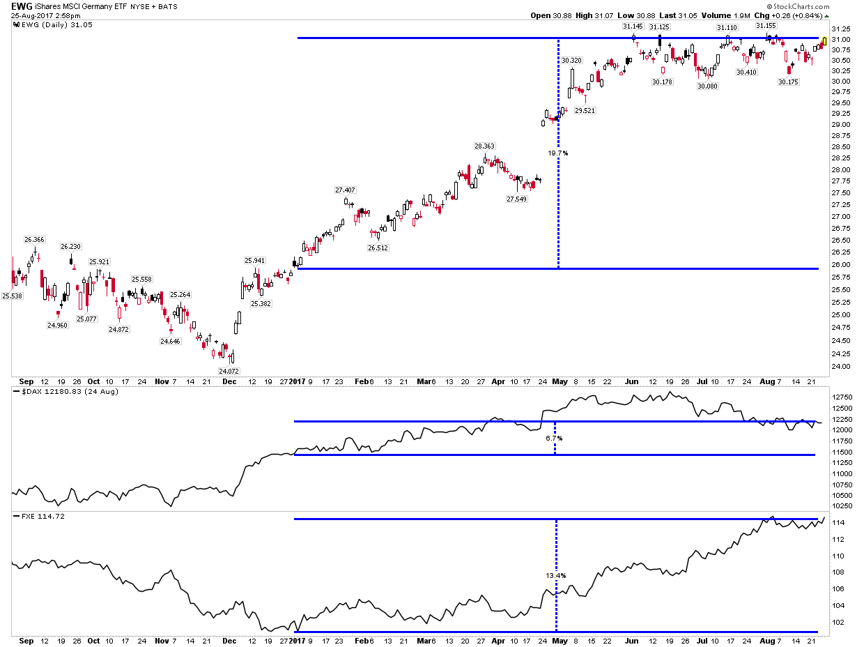
The European currency, the Euro, is up over 13% this year, a really big move for a currency in such a short time, bridging the gap between what the German stock market is actually doing versus what the U.S. Dollar based ETF implies.

What does it all mean? It means that the returns many are touting from being in international stocks are actually not being driven by equities, but instead by currencies. Furthermore, to be bullish international stocks here, you actually must be bullish the Euro, or other foreign currencies. Further thoughts and analysis surrounding international stocks and the Euro can be found in the Market Microscope section of this report.

To answer our own question, international stocks are not showing fundamental reasons to move higher, other than being cheaper than US stocks on some measures. This by itself is not a reason to invest in international stocks.


Portfolio Insight

Sail with the Winds at Your Back

As Hurricane Harvey threatens the Texas coast, we thought this an appropriate time to discuss to one of our investment themes: Invest when the environment is favorable and control risk when it is not.

Don’t Fight the Trend

Exposure: Tactical Rotation including US stocks, international stocks, government bonds, corporate bonds, hedging strategies, and more.

Investment Thesis: Find trends and participate in those trends, wherever they may be.

Commentary: A famous quote is “Don’t Fight the Trend”. Within client portfolios we have a Tactical “sleeve”, or sub-component, where we allocate a portion of portfolios to a strategy that mathematically seeks out markets that are outperforming. The idea is to invest where and when the trend is favorable, while attempting to avoid markets that are showing signs of stress.

Market Hurricanes and Calmer Seas

Market hurricanes are less frequent than financial media would like us to believe, but in the markets there are plenty of long stormy stretches and many more sunny and calm periods. But how can we tell when it will be sunny and when we need to buy canned beans to wait out a storm.

Unfortunately, we can’t always tell. But we can use data from underneath the surface of various markets and apply a strict discipline to gain exposure to places that are showing out-performance and favorable momentum.

We are not attempting to guess where the market will go next, and move in-and-out of investments hoping to guess correctly. It is quite the opposite…market prices tend to move in cycles, and these cycles can be identified with regularity based our statistical calculations.

Some cycles are small and short in duration, while others persist much longer than anyone can predict. The move higher in stocks from the 2009 lows is an excellent example. So is the decline from 2007 to those lows.

Just as we discussed last issue that risk management is not achieved by using only one strategy, attempting to sail with the wind at our backs (or to avoid the hurricane) also requires multiple layers of analysis to achieve success. Thus, we use a variety of tools to determine trend:

  • Technical Analysis, such as the concepts we discuss in our Market Microscope section.
  • Fundamental Analysis, including P/E ratios, Price-to-book, Price-to-sales, Free Cash Flow, etc.

Macro Analysis, or identifying bigger global trends involving GDP growth, global debt loads, and other factors.


Market Microscope

Market Choppiness Continues, Your Breadth Stinks

The selloff that started two weeks ago continues through this week as the market confirmed the short term move by making another short term low. Weakening momentum and waning market breadth helped warn of the risk that was in place and it may also help warn us when this decline is nearing its completion. International stocks aren’t looking near as rosy as they do on the surface. To be a buyer of Europe here you must be very bullish the Euro.

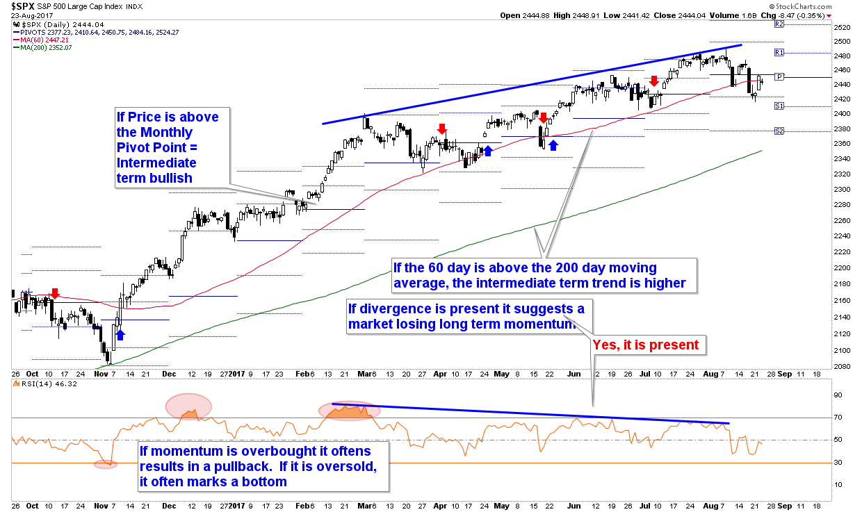
US Equities: Weakening but Not Alarming

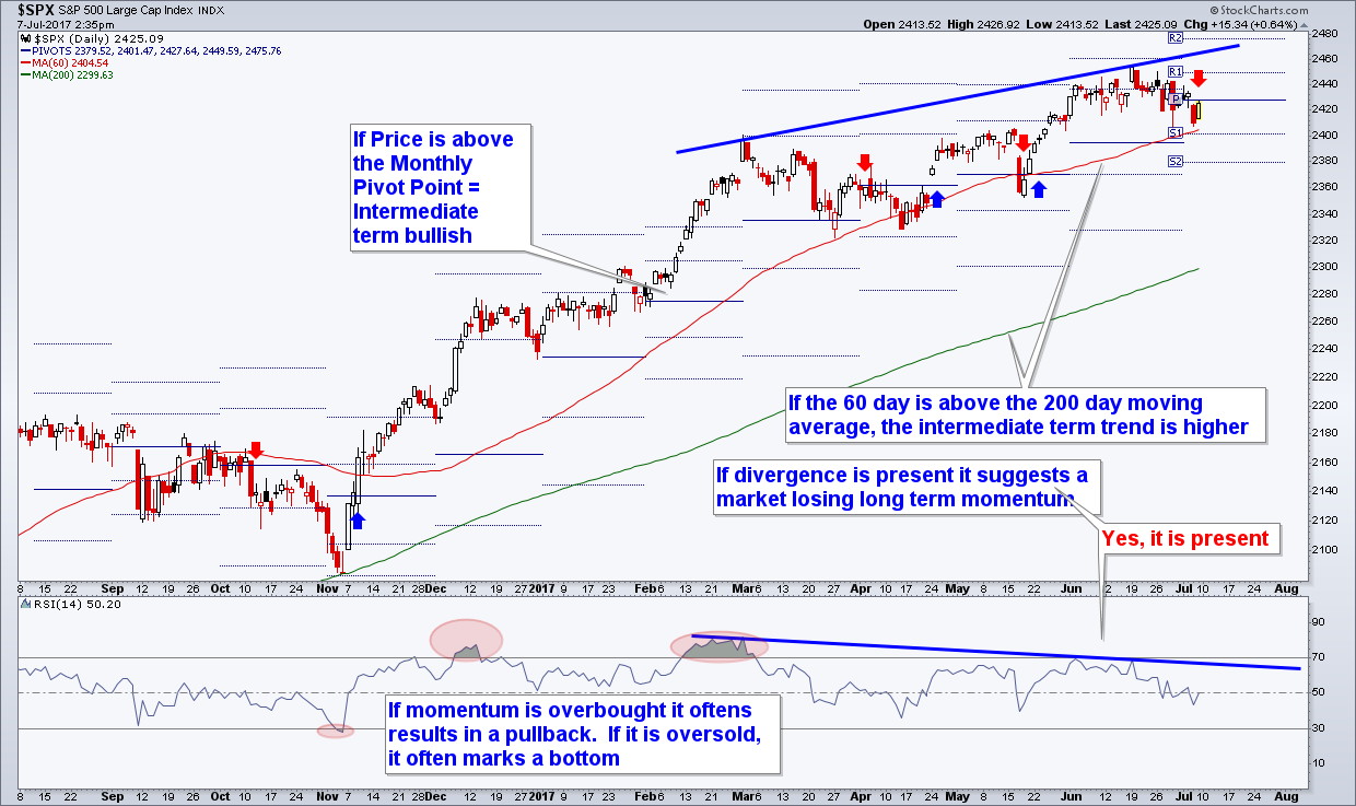
The one day selloff in the markets that occurred around the time this publication was last penned followed through again last week as the first chart below reveals. The waning momentum (as depicted by the divergence discussed on the graphic) that had plagued the market’s rather mundane rise since its March 1 top weighed the market down enough it fell through its 60 day moving average as well as the August Pivot point (both shown on the chart). This price action confirms the short term trend has indeed turned lower.

As a result, our models have told us it is prudent to raise cash temporarily in portfolios until this volatility passes. We don’t know how long or how deep a correction may be, so we have specific re-entry points mapped out for all clients if and when the market reverses higher. Late in the market cycle we must pay attention to draw-down risk.

At IronBridge we follow over 25 “official” indicators as part of our FIT Model. A few of those are discussed in the above chart, but we also keep our pulse on hundreds (if not thousands) of other market indicators. One such indicator is discussed next.


Take My Breadth Away

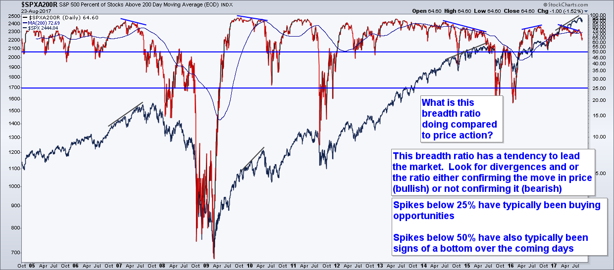
The stock market indexes can be misleading. What do we mean by that? Well, each index is just a function of all its components. The S&P, for instance, is made up of 500 stocks that are weighted in the index by market cap. Its top 5 components make up over 10% of the entire Index’s performance on any given day. The S&P is truly an example of the 80/20 rule. Over 80% of the stocks in the index make up less than 20% of its performance.

A great way to show how just a few companies can move the S&P 500 is shown by the next graphic.

The chart below shows the number of S&P 500 stocks that are above their own 200 day moving averages. The S&P itself is well above its own 200 day moving average, by over 4%, but the same cannot be said for many of its components. In fact, quite contrary.

Currently only 65% of the S&P 500 (325 companies) are above their own 200 day moving averages. This means there are 175 companies withing the S&P 500 that are in a bear market, with price below the last 200 day average price.

Analysis like this pertaining to the market’s components’ participation or not in trends is generally called breadth analysis and is a way to help peel back the onion that is the market.

So what does the chart reveal the onion looks like underneath? Well, with just 65% of components above their own 200 day moving averages, the market is approaching levels associated with larger selloffs. Notice the commentary on the chart reveals that typically the more significant market bottoms occur when this indicator falls below the 50th percentile. So from that aspect, the market could have more room to fall.

However, we prefer to use this indicator as more of a leading one, as revealed by the annotations. Market tops often form after there is a divergence between the S&P 500’s price and this indicator (as has been occurring since March). Notice that the top back in 2007 occurred when the S&P made a new price high in October (a higher high formed in price), but this breadth indicator was making a lower high.

Similarly, the strong rally off of 2009’s bottom ended in 2010 with a sign from this indicator’s slight divergence. Finally, the long topping process of 2015 was preceded by a slow decay in the number of stocks above their 200 day moving averages.

Generals and Soldiers

So why could this indicator be a good signal for market tops? We like to think of breadth in terms of generals and soldiers. The generals of the market (the top 20% of its constituents by market weight) continue their trends of higher prices, while the soldiers are dropping off. The generals and the market can continue to charge the mountain, but eventually if too few soldiers are following them, they too must retreat.

Recently, the FAANG stocks (Facebook, Apple, Amazon, Netflix, and Google) have been the generals, but even they are starting to show signs of slowing as the Nasdaq (an index made up largely of technology stocks) has started to lag (GOOGL is down 6%, AMZN is down 10%, and FB is down 5% from their recent all time highs). If the generals are also starting to also fade from their bullish trends, then we may see breadth indicators such as this one slip below the 50th percentile, and offer a larger pullback than we already have had.

One final takeaway from this chart. If we look back at the divergences that have formed. We can notice that when the market finally does pullback, it often pulls back to a price level that was associated with the former peak in the breadth indicator.

The start of the black lines drawn on the chart of the S&P 500 shows when the peak in the breadth indicator occurred. The price that coincides with the beginning of that line seems to be a good downside target. In this case it is the March 1, 2017 price of $2400 that would satisfy that rule. Last week’s low of $2417 has come close to that price. Is that enough to satisfy the rule, or will we see another decline through $2400 first?


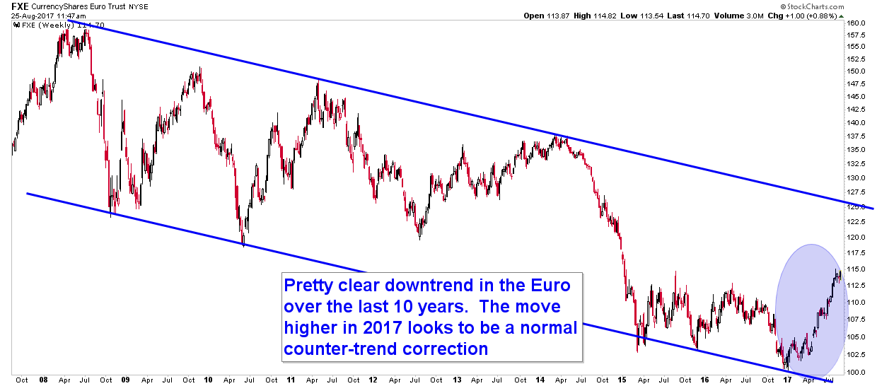
Euro Currency in Counter-Trend Correction

As discussed in the Macro Insights section, the Euro has been on a tear this year, up over 13%. However, if we zoom out and look at the longer-term, it appears the Euro is actually in a major downtrend, and if that’s the case then the recent tailwind that most European ETFs have enjoyed may soon be coming to an end.

The first chart below shows the current, longer-term, technical picture of the Euro’s ETF. Even with the relatively large rally this year, it has done little to change the long term bearish trend in the Euro.

Picking up where the Macro Insights section left off, the next chart shows the relative performance between two European focused ETFs that invest in basically the same stocks. Can you guess what the difference between the two are?

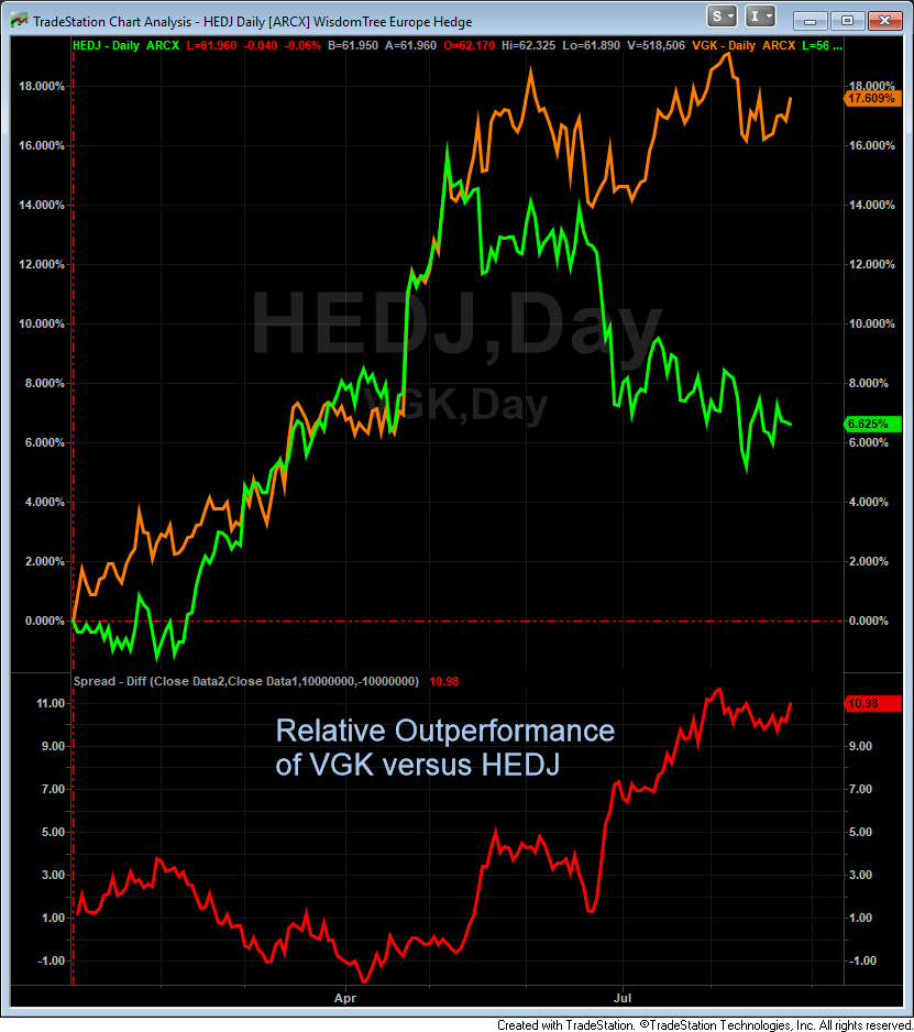
One ETF has currency exposure. One does not.

In orange, the Vanguard European ETF, VGK, does not hedge its currency exposure, so it is exposed to all the ups and downs of the Euro currency. As a result it has gained significantly more than the WisdomTree European Hedged ETF, in green, even though they invest in the same companies!

VGK is up almost 18% this year while HEDJ is up less than 7%. This is a similar corollary to the Macro Insight’s analysis of EWG and the German stock market. Unhedged, European stocks are up almost 18% and German stocks are up 19%, but if one were to hedge the currency risk (a truer equity investment), a U.S. investor in Europe would be up around 6.5% and up similarly in Germany.

Another way to look at the difference between two investment potentials is to compare them relatively.

The bottom segment of the chart reveals one technique to help decide which ETF is in the stronger trend. By dividing the two prices by one another through time we can see relative performance. Clearly the last few months it has been better to be in VGK and exposed to the Euro currency. However, one is taking a large leap of faith to conclude that European equities are actually doing better than U.S. equities. In reality the Euro is doing better than the U.S. Dollar.


Emerging Markets and the Euro

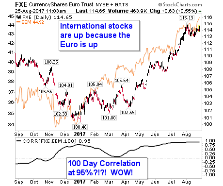
Friday, Aug 25, is a great example of how the Euro’s performance actually drives a large bulk of these ETF’s performance. Mid-morning the Euro was up 0.53% while EEM (the most popular emerging markets ETF) was up the exact same amount! One snapshot in time may not prove much, but the chart below sure does.

This chart displays the Euro’s price over the last year (as represented by its tracking ETF, FXE) compared to the price of EEM (in orange). Their trends have been largely the same, but more importantly check out the bottom indicator, which measures the 100 day correlation between EEM and FXE.

That correlation is at 95% and has been that way for weeks. When dealing with correlations one must always be careful not to assume causation, but in this case it makes perfect sense since the Euro is actually a large part of EEM’s performance. Why is that?

The reality is investors may be fooling themselves when thinking that international stocks are the place to be. In fact, if you take the currency out of the equation, the U.S. market remains dominant.


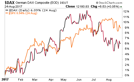
Better Lucky than Good?

The chart below shows the S&P 500 in orange with the German Dax Index along side it. The S&P is up 9% year to date versus a German market that is up just 6% in local currency. Put another way, investors in international stocks in 2017 have been more “lucky” than “good” as the majority of their gains haven’t come from fundamental moves in the market, rather they have primarily come from currency fluctuations.

Instead, the majority of their gains came from something they likely completely overlooked when building their investment thesis: the currency risk they were subjecting their portfolio to.


Our clients have unique and meaningful goals.

We help clients achieve those goals through forward-thinking portfolios, principled advice, a deep understanding of financial markets, and an innovative fee structure.

Contact us for a Consultation.


Filed Under: IronBridge Insights

Geopolitics, Discipline and Record Short VIX

August 11, 2017

In this issue, we focus on how Geopolitics affects the markets, how we maintain discipline in portfolios, and update the charts based on the recent market volatility.


On Our Radar

NORTH KOREA: The saber rattling continues as tensions escalate. We discuss the affects of geopolitics in our Macro section below.

MARKET TURBULENCE RETURNS: The calm markets over the past few months quickly changed. Our signals are close to triggering a slight increase in cash exposure.

JACKSON HOLE: The Federal Reserve meets from Aug 24-26 to discuss “Fostering a Dynamic Global Economy.” They will discuss geopolitics instead. 

VIX RECORDS: Various measurements of volatility are showing record levels of complacency.


FIT Model Update:  Consolidation in a Bull Market

FIT Model Logo
Fundamentals: Earnings are growing but at a lesser pace than historically with June 2017’s $105 trailing 12 months earnings still well below recent estimates. Earnings may have now peaked out again as analysts and their “rose colored glasses” have been expecting S&P earnings well into the $120s for years now. Quarter after quarter that continues to disappoint.

Investor Sentiment: The market complacency as measured by various data points concerning the VIX Index continued through this week. We are now seeing some of the ramifications of elevated complacency as the S&P had its biggest down day in 3 months on Aug 10.

Technical: The market has recently broken to new all time highs after consolidating, but failed to hold those all time highs. This pushed the market back into its consolidating range as we look out for an intermediate top.


Macro Insights

GEOPOLITICS: Not What You Might Think
Is War with North Korea Inevitable?

We hope not, and we shake our heads at this situation. Thursday, August 10, 2017 was a day the markets all fell over 1%. In fact it was the biggest down day in three months. No doubt there will be countless media outlets that try to blame the decline on “elevated tensions with North Korea”, but history suggests such stretched causations don’t hold up to the eye test, much less statistical analysis. In reality the markets move for thousands of reasons, and geopolitical risk is just one of those thousand potential reasons.

geopolitical events
The chart above reveals market reactions following key geopolitical events since 1950. Even the market’s selloff after 9/11 was fully recovered within 60 days (more on that below). At a minimum one could draw the conclusion that market reactions to key political events are temporary and could be taken advantage of by savvy investors, but a more likely scenario, especially given examples such as the Cuban Missile Crisis in 1962 which resulted in zero downside and ultimately a lot of upside in the markets, is that geopolitical events should be considered random, inconclusive, or non-material.

In short it’s impossible to prove that geopolitical events drive the world’s markets, and any potential correlation is likely coincidental. The market’s reaction to the terrorist attacks on 9/11 provides a good backdrop for discussion.

What Happened to markets after 9/11?

The next chart reveals the market’s performance surrounding 9/11/2001. The key takeaway is the stock market was already down over 25% before any of the horrible events of that day occurred.

9-11-01 S&P

The trend was already down, the market had already rolled over from its top 1.5 years earlier, and it was in the middle of a downtrend when those events occurred. The market actually shut down for the remainder of the week of 9/10, its longest close since 1933. This certainly did not help the psyche of investors who were already concerned about the 25%+ drawdown they had already endured.

Did the events of 9/11 result in the market’s further decline into its lows ultimately below $1000 in September 2001? It’s quite possible, but it is impossible to prove. If anything, it may have sped up the process, but from a technical analyst’s point of view, in early September 2001 the market had already broken down below the earlier lows seen that year. That breakdown in price in technical terms was a key event that should have lead to further selling.

The fact 9/11 occurred certainly probably didn’t help things, but did it actually “cause” the stock market’s further decline into the Sept 2011 lows? That is tough to prove, just as it will be tough to prove North Korea has anything at all to do with the market’s movements this week. 


Portfolio Insights

Discipline and Risk Management

Most firms rely mostly on asset allocation to manage risk. The theory is that different assets perform differently in different environments. While this sounds good, it has been proven to be dramatically ineffective, especially during times of stress.

The False Hope of Asset Allocation
The chart below shows the performance of various asset classes during the 2008 financial crisis. Asset allocation proved to be incredibly insufficient, just when investors needed it most.  The only asset class that performed well was bonds.  Interest rates moved from 5% to 0% over this period of time, supporting bond prices.  What happens if the Fed can’t move interest rates next time?
cross asset correlation
Risk Management Strategies

One strategy alone will not effectively manage risk in today’s investing environment. Thus, we at IronBridge apply multiple strategies within each portfolio to attempt to more effectively manage risk. They include:

  • Stop-Loss Strategy (see the chart below)
  • Sector Rotation (see our previous Insights newsletter for more on this)
  • Proprietary S&P 500 Index Long/Cash model
  • Asset Allocation/Diversification
  • Planning for various economic and market outcomes

The chart below from Tradestops shows an example of our stop loss strategy. We have exits on every position in our client portfolios. The yellow and red lines show how our exit price increases as the value of the particular investment increases. Not every exit strategy is the same, and there is no sure way to ensure profits. However, we believe that using various risk management strategies can help to avoid large and damaging drawdowns within portfolios.

trade stops 2

Market Microscope

Small Cap Fake-Out, S&P 500, VIX Complacency

The new highs hit over the past two weeks have reversed. As alluded to two weeks ago, the new high in small caps has also indeed turned out to be a false breakout as price has fallen back within its 3 month average. Longer term, there has been little damage done, but we remain keen to the fact that the market remains extremely bullish sentiment-wise and overvalued fundamentally. What keeps this market rising is the bullish technical trend that has been in place since November. Is that trend in danger of ending?

Small Caps Fake-out

The chart below is the same one from two weeks ago, just updated with price action since then. Notice that the new highs reached on the small cap ETF have now been reversed as price moves back into its former price range in place since December. That breakout which then swiftly moves back into range is termed a “false breakout”. When false breakouts occur, they often mark near term tops, and that indeed is what is occurring over the short term. For small cap stocks, the short term trend has now turned down.

The far right bar on the chart reveals price has fallen back below its 60 day moving average, equivalent to the average price of the last 3 months. Just below is the 200 day moving average. The 200 day moving average has been a key support for the market’s intermediate term trend and is a level we are keeping an eye on as it’s important it once again holds as support.

Notice back in November that same 200 day moving average acted as support during election time. We should expect a similar support to occur again, assuming price moves down to test it. A break of the 200 day moving average would increase the risk that the market’s intermediate term trend has also turned down.

small cap stocks.jpg

Zooming out to the bigger picture we see an S&P chart that looks slightly better than the small caps. Although price has also moved off of its highs, it found support on Thursday at its trailing 60 day price average. However, if price stays below $2454, then the market’s monthly “Pivot Point” will have failed as support. Pivot Points are used to help identify the average price of the prior month. If price falls below both its 60 day moving average and the Pivot Point it will increase the odds the intermediate term has turned down for the S&P.


S&P 500: Still Bullish, but…

On the next chart we also have been following another technical “negative” as the bearish divergence between price and momentum, pointed out in prior editions of this newsletter, remains present. That certainly adds to the risk the intermediate term trend may be turning down here. But, let’s not put the cart before the horse. For now the weight of the evidence for a bearish trend change is not quite there. That won’t occur until (if) the S&P joins the small caps in breaking below its 60 day moving average around $2440. This is something to keep an eye on early next week.

S&P PIVOT

Volatility, Welcome Back our Long Lost Friend!

One of the biggest market headlines this Summer has been the lack of volatility in the markets. The chart below shows one such example as actual volatility, as measured by the ATR indicator (Average True Range – in orange), which measures the range of the market’s average price movement over a given period of time, has reached a three year low. Indeed, volatility is very low right now, one of its lowest levels in history as the ATR sits at just $33/week.

S&P ATR

Furthermore, even though we are making a 3.5 year low in ATR, this is actually misleading as a 30 point price range on an S&P price of $2400 is much different than the same 30 point price range on an S&P at $1800. 30/$2400=1.25% average weekly price range, but 30 points on $1800=1.67% weekly price range. In reality today’s low volatility is much more extreme than any recent history.

There is a well known index measuring the S&P’s volatility called the VIX Index. The VIX Index measures the implied volatility baked into the cost of S&P options contracts. It sounds complicated, and can often be, but the primary way to think of the VIX is as a “fear” or “greed” indicator. When the VIX is elevated, and thus implied, or expected, volatility is high, fear is also typically elevated. When the VIX is depressed, fear is generally low (and greed is typically high), and recently the VIX has been flirting with all time lows. The chart below is updated with a moving average of the VIX index shown in blue. Notice that its movement largely tracks the actual volatility as measured by the markets average weekly range (ATR)? The VIX Index is also near its lows right now.

Another takeaway from the chart is the low ATR and low VIX are typically associated with a market top, and they certainly are not associated with a market bottom. Notice on the chart that tops in the market typically formed at times, or just after times, the volatility measurements were bottoming. May 2013, July 2014, and June 2015’s tops all formed with the VIX and/or the ATR near their lows. Is this week another such example?


Low VIX Not a Reason to Celebrate
If you are a market bull, a low VIX should not be something necessarily celebrated, but instead should be treated more as a red flag as market tops almost always are associated with periods of low volatilities. On the flip side, spikes in volatility often coincide with market bottoms. Notice on the chart above that the four largest spikes upward in the two volatility indices occurred as the market was forming its bottoms.
Volatility is cyclical, and low volatility right now is a warning sign, not a breath of fresh air as many assume.  Below is a list of some of the other records relating to volatility that have been broken recently.
  • Through Monday, August 7, the Dow had closed at a new all time high for nine straight days, a record string of new all time highs. However, although there were nine straight up days, the Dow only gained 1.8% during this time (an average of just 0.2%/day).
  • Through Tuesday, August 8, the S&P spent all 13 prior days in a range of -0.3% and +0.3%. This was the first time in history that occurred.

When we see stats such as these, the market contrarians in us should start to listen up.Somewhat counter intuitively, when records such as these are forming it reveals the market’s current underlying complacency and disregard for history. Stewards of market history realize that the markets are not linear but indeed are cyclical as current conditions never last into perpetuity. The chart of the VIX and ATR reveal the cyclicality of volatility.

Contrarians are worrying about the lack of volatility right now, not celebrating it, and we agree that it is now a concern.

But, the concern with the level of VIX doesn’t stop at the Index itself. Countless hedge funds and other trading strategies have noticed the perpetual trend of falling volatility and have built trading strategies around it. Many of them have been profitable over the last few years as they typically sell volatility, but their success will only last as long as volatility continues to wane.

Even the push toward passive portfolio management and index investing is just a function of the recent temporary trend of lower volatility. It is likely this trend, like most trends adopted by the mainstream, will end in tears.


Record Short VIX Contracts

Another measurement of just how little volatility there has been can be seen through the amount of VIX futures contracts being traded. That too has reached a record as the next chart shows. There are now over 650,000 open volatility contracts, a record that in itself reveals to us how mainstream volatility has become, but this raises an even bigger concern.

20170809_VIX

The amount of speculators short volatility is also at an all time record, and this cohort of investors typically is on the wrong side of the trade at key inflection points. That chart, courtesy of Bloomberg, is shown last.

The final chart’s index shows the data is that of “CFTC CBOE VIX Futures Non-Commercial Net Total”, but translated another way, the chart is of those firms that are labeled as “speculators”. This is a little known fact about the CFTC’s reporting requirements. Those who trade futures are either labeled as “Large Speculators”, “Small Speculators”, or “Commercials”. It’s a zero sum equation as you must be one of those three types of investors. This chart combines both the large and small speculators into one index.

So, speculators are the most short the VIX they have ever been? This is probably not going to end well!

vix speculators
Disclaimer This presentation is for informational purposes only. All opinions and estimates constitute our judgment as of the date of this communication and are subject to change without notice. > Neither the information provided nor any opinion expressed constitutes a solicitation for the purchase or sale of any security. The investments and investment strategies identified herein may not be suitable for all investors. The appropriateness of a particular investment will depend upon an investor’s individual circumstances and objectives. *The information contained herein has been obtained from sources that are believed to be reliable. However, Ironbridge does not independently verify the accuracy of this information and makes no representations as to its accuracy or completeness.   

Filed Under: IronBridge Insights

Sector Rotation, Breakout in Small Caps, Sectors as a Warning Signal

July 28, 2017

Sector rotation can be a powerful tool to stay ahead of key macro trends and outperform relative benchmarks.  We have ranked sector performance over the last month.  Currently, the sectors that are leading are Financials, Materials and Technology, which are more economically sensitive. At the same time, the defensive sectors are lagging, such as Utilities and Staples. This reveals an overall bullish posture.

INSIGHTS OVERVIEW

In this issue, we focus on Sector Rotation strategies, the breakout in Small Cap stocks, and take a look at how sector rotation can warn us of potential market stress before it actually occurs.

Read the full Report: IronBridge Insights – 2017-07-28

On Our Radar

Fed: The July FOMC meeting occured this week, with no change made in interest rates. However, the Fed did say that normalization of the balance sheet would begin soon.
GDP: Second quarter GDP released on 7/28 was lower than estimates at 2.6%.  Economic growth continues to be lower than should be expected at this point in the cycle.

Earnings: We are right in earnings season, and generally earnings have been strong. Companies continue to operate efficiently. Some companies have been subject to “sell the news”.

Washington: The vote on healthcare takes center stage this week in the continuing decades-long battle of who can appear most incompetent.

FIT MODEL UPDATE: Bull Market

Fundamentals: Earnings continue to be largely positive, but earnings aren’t all that control share prices. Some stocks have seen some profit taking on the good news. Overall the economy and fundamentals continue to move forward in a positive way.

Investor Sentiment: The latest record to be reached on the sentiment front concerns derivatives. The amount of put options purchased (options purchased to anticipate a decline in price) versus the amount of call options purchased (options purchased to anticipate a move higher in price) recently on the VIX Index set a low not seen for almost 3 years. This reveals market complacency remains very prevalent, and complacency often coincides with market tops.

Technicals: On most indices the market has broken out to new all time highs. This moves the technical needle back into bullish territory (from the former consolidation). We remain fully invested to take advantage of any further upside.

PORTFOLIO INSIGHT

Over the next few weeks, we will be introducing into client portfolios our sector rotation strategy. This involves owning different sector ETFs that are outperforming the S&P 500. Sector rotation can be a powerful tool to stay ahead of key macro trends and outperform relative benchmarks.

We have developed strict buy and sell disciplines that allows us to rigorously back-test how our approach would have performed in various market cycles and over various time-frames. We are very pleased with the results.

The chart below ranks all the sectors over the last month. Currently, the sectors that are leading are Technology, Energy and Cyclicals, which are more economically sensitive. At the same time, the defensive sectors are lagging, such as Utilities and Staples. This reveals an overall bullish posture.

We view there to be many potential benefits to our sector rotation strategy:

  • It removes emotion.
  • We do not try to predict which sector will outperform.
  • Sector rankings give us information on the overall health of the market.
  • Back-testing of this strategy shows excellent risk/reward metrics.
  • This strategy promotes prudent, focused diversification.

Our clients will have varying degrees of exposure to this strategy depending on each client’s individual goals and risk preferences. It replaces a portion of the equity exposure currently target allocations.

MARKET MICROSCOPE

Small Caps Break Higher

The biggest news on the technical front this week is the breakout in price that is occurring across most domestic markets. In particular, the breakout by small caps seems to be more relevant, given that it has been underperforming and consolidating since late 2016. In other words, small cap stocks hadn’t really done much for over 6 months as the chart above reveals, but that looks to be changing.

The rally in November and December took price into the mid $50s for FYX, one exchange traded product that focuses on small cap stocks. Since then the ETF moved net sideways, which is consistent with other small cap focused funds. Notice as the calendar moved from June to July, its price was below $55, the level reached in early December. Small cap stocks went nowhere for eight months, but that now seems to have ended with the technical breakout.

Relative strength analysis is a technique we like to use to help us make our investment decisions. One such example is shown next.

Small caps have broken out to new all time highs, but so have the other major domestic markets. So should we be invested in small caps right now, or is there a better option?

The chart above compares the performance of the small cap index to one of the large cap index funds. If the chart is moving higher, it means small caps are outperforming. If it is moving lower then large caps are outperforming. Right now the difference between the two is negligible.

Since early June, small caps have been outperforming large caps, but since December, large caps have been outperforming. One could also say that the two have performed equally over the last year, since the ratio today is the same as it was one year ago.

The chart above suggests that both large and small caps are performing similarly. Have large cap stocks also broken out to new all time highs, just like small caps? Indeed they have as the next graphic reveals. Right now both large cap and small caps are rising and making new all time highs, leaving us interested in both large and small caps right now. What this analysis helps prove is our indifference right now between large caps and small caps. They both are good choices, performing similarly over the last year.

Sector Rotation:

There is a little know but very important relationship in finance. Sector rotation is the concept of market participants rotating money from sector to sector looking for excess returns.

Generally, safer stocks such as those of utility companies and basic household goods (consumer staples) tend to perform better, relative to their peers, during recessions or times of market stress. Other sectors, such as technology, industrial companies and discretionary consumer goods tend to perform better during times of growth.

The chart above reveals the sector breakdown across the top along with the business cycle along the bottom (in green) and stock market cycle along the bottom (in red). Depending on which sectors are leading the markets, we can get a better glimpse into where we are within the market’s overall cycle.

The chart below shows the sector performance during the financial crisis. The stock market peaked in October 2007 and bottomed in March 2009, which is shown below. The leading sectors were the consumer staples, Health Care, and Utilities, two of which are considered the safest of the sectors. Keep in mind this chart reveals sector performance relative to the S&P 500.

What Happened to Sectors during the Financial Crisis?

The chart below shows the sector performance during the financial crisis. The stock market peaked in October 2007 and bottomed in March 2009, which is shown below. The leading sectors were the consumer staples, Health Care, and Utilities, two of which are considered the safest of the sectors. Keep in mind this chart reveals sector performance relative to the S&P 500.

Savvy readers will recognize, however, that this out performance by the defensive sectors occurred during the financial crisis. In other words, the crisis was already happening, and pain was already being felt. The key question is, do these defensive sectors start to outperform prior to the start of market down turns? Ah ha! They do!

Sectors Warn of Potential Stress?

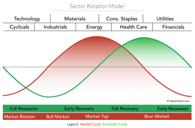
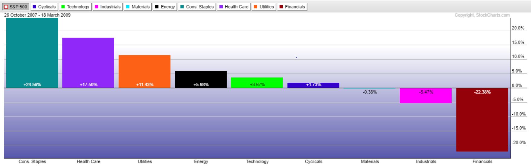
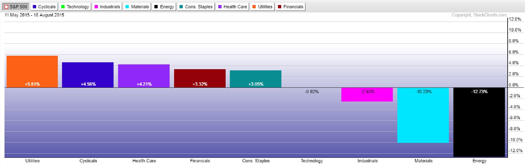
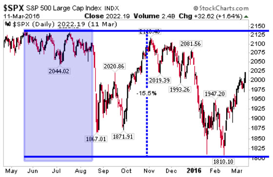
Wouldn’t it be nice, if we could be warned that something big could be brewing around the corner? Sector rotation happens to be one such warning sign we can look to for that signal of increased risk.  The chart on the right reveals the most recent sizeable market pullback, the one that occurred in late 2015/early 2016, which took the S&P from a peak to trough decline of over 15%.

On the left hand side we have shaded a large area where the market moved sideways to slightly down, but generally didn’t really do much. This period, however, was just before a very swift 200+ point S&P drop.

The chart immediately below shows the relative sector performance during this time. Notice anything familiar? The utility, health care, and staple sectors were in the group of out-performers, with utilities leading the way.

If we think of the S&P like a house, then the sectors would be the foundation, walls, and roof of that house. The utility and consumer staples, being generally the least volatile and most reliable of the sectors would be the foundation. The consumer cyclical, industrial, technology, and energy sectors would be the roof, with the financials, materials, and health care sectors the walls connecting the two. Typically a house can survive with some wall damage and even some roof damage, however, if the foundation on the house goes, the entire home becomes unstable.
This is how we like to look at the different sectors, and looking at the past helps prove to us that if the utility and/or staples sectors start to become the market out-performers, we should probably be looking to start protecting our holdings and moving to safer areas of the markets.
The good news is we are not seeing the utilities or staples lead this market, quite the contrary actually as the staples and utilities have been lagging over the last 50 days.
One of our proprietary techniques keeps us abreast of which sectors are leading and which are lagging, offering insight into the market’s broader cyclical position. Until the utilities and staples start moving into the outperforming column, we remain fully vested in equities.

Filed Under: IronBridge Insights

Central Banks and Global Stocks: Just Add Zeros

July 25, 2017

The Federal Reserve met today and decided to leave interest rates unchanged. But is this really important?

The Fed has raised interest rates multiple times in the past 18 months, but equity markets have continued moving higher and bond markets haven’t shown much volatility. More importantly than the decision on interest rates today was its statement on their balance sheet.  The Fed said that they would begin “implementing its balance sheet normalization program relatively soon.”

Global central banks have been printing trillions of dollars over the past 10 years.  The chart below via Bloomberg shows the combined balance sheet of the US Federal Reserve, the European Central Bank and the Bank of Japan, plotted against a global index of stocks. Notice a pattern?

This is why watching the Fed is so important.  However, while most people focus on interest rates, it is actually more important to focus on what central banks are doing with their balance sheets. If expanding their balance sheets has resulted in higher equity prices, it is logical to think that shrinking balance sheets could have the opposite effect.

These balance sheet have expanded by “printing” digital currency. It would be like you or me going into our bank account online and adding a couple “zeros” to the end of the number.  By a couple, I mean 12.  The Fed then takes these extra zeros and buys government bonds.  Theoretically, the sellers of these bonds then put the cash to work in the real economy.

But what has happened is that this cash has been put to work in the stock market, resulting in increased corporate buy-backs and generally rising stock prices.

In Fed-speak, “normalization” means “smaller”.  This could be accomplished in a few different ways:

  1. As bonds mature, don’t repurchase new bonds. In other words, remove a couple zeros.
  2. Sell existing bonds back into the open market.  Sell a couple of those zeros.
  3. Create inflation that reduces the relative size of the current bonds compared to future purchasing power.

The key question is “if normalization begins, what happens next?”  I wish we knew the answer to that question. In my opinion, central banks don’t know the answer to that question either.  The Fed provides their version of Policy Normalization here: https://www.federalreserve.gov/monetarypolicy/policy-normalization.htm

However, we can look at the maturity schedule of the balance sheet to see how much this normalization means in dollar terms.  The chart below from PIMCO shows this maturity schedule. I see risks of normalization in the large increase of maturing assets in Q1 and Q2 of 2018.  This could be the “tell” for future market volatility, since the Fed has not begun to actually normalize yet.

So what are we supposed to do?

  • Identify outcomes.  The fed has pushed stocks further than many people thought, and could continue to push them even higher for longer if normalization is gradual.  On the other hand, normalization could result in increased volatility and elevated downside risk.
  • Know your exit.  Don’t blindly hold assets without a defined exit strategy.
  • Be prepared for market volatility.  Both financially and emotionally. If volatility occurs, you and your portfolio will be prepared for it. If it doesn’t, enjoy the tranquility.

In the meantime, pay attention to what the Fed does with those zeros.

[/cherry_col]

[/cherry_row]

Filed Under: Market Commentary

Yield Curve Rising could signal next Market Peak

July 14, 2017

The yield curve has been steadily declining since the end of QE3 in 2014. Historically, an inverted yield curve has preceded recessions. However, it is not until the yield curve starts to rise after being inverted that we should be on the lookout for the next major stock market correction.

In this issue we discuss:

  1. The impact of rising yields and what it can tell us about market peaks
  2. Investments in client portfolios designed to benefit from a rising interest rate environment
  3. The trend in the S&P 500 continues to push higher, while it appears that we are now in a rising rate environment, one not seen since the 1970s.

MACRO INSIGHTS

The yield curve chart shows the 10 year Treasury minus the 2 year Treasury history, one measure of the “yield curve”. The yield curve sits at 0.98% right now, meaning the 10 year Treasury rate is 0.98% higher than the 2 year Treasury rate.

There have been two official recessions over the past 20 years, one lasting from March 2001-Nov 2001 and from Dec 2007 – June 2009.  Neither one of these recessions occurred when the yield curve was actually negative. Instead these recessions were occurring as the yield curve was rising.

A closer look at the chart reveals that the yield curve’s inversion actually didn’t result in a stock market decline. The declines in equities didn’t begin until the yield curve was rising.  Although it may be a sign a recession is coming, quite often the market continues its bullish ways in the face of an inverted yield curve.  Rather, once that yield curve starts to rise, that’s when we should be on the lookout for a stock market correction.

As called out on the left hand side of the chart above, when the yield curve is high it means longer-dated Treasuries offer more relative yield than shorter duration Treasuries. Similarly, when the yield curve is low (as it is now), shorter-dated Treasuries are likely the better end of the yield investment curve as we wait for the inevitable rise in the curve and thus more attractive rates. We have shortened bond duration to take advantage of a rising yield environment where shorter term yields don’t rise as quickly as longer-term yields. We have also positioned duration exposure in portfolios in such a way to potentially benefit from a rising rate environment. Being in shorter durations will be especially important if yields across the board are going to continue their recent ways. More details around that potential can be found in the Market Microscope section below.

PORTFOLIO POSITIONING

Portfolios have exposure to multiple fixed income mutual funds that are positioned well, in our opinion, for a rising interest rate environment. We focus on two of these funds below. Many firms have been calling for a rise in interest rates for many years, and it simply has not come to fruition. The data appears to be telling us that rising rates are finally here.  

Exposure #1: Floating Rate (Senior Loan) Fund

Investment Thesis: Generate current yield that increases as rates increase.

Commentary: This investment is positioned for rising rates by having exposure to corporate loans whose interest rates increase as general market rates increase. Many of these loans are tied to the 3-month LIBOR, shown in the chart above. Owning these types of investments are analogous to being the recipient of the payments from an adjustable rate mortgage. Your payments increase as rates rise, with relative stability in principle, unlike traditional bonds whose value may decline as interest rates rise. These are “senior” loans, meaning they are debt obligations that hold legal claim to the company’s assets above all other debt obligations. The primary risk in this fund is a deterioration in credit quality, typically associated with a weakening economic environment or outright recession. Weakening GDP or earnings would prompt a reduction in exposure to this fund.

Exposure #2: Diversified Income Fund

Investment Thesis: High current income with hedges against bond price declines.

Commentary: This fund is in the portfolio for two reasons: 1) Hedge against falling bond prices, and 2) Current yield is 4.61% with an effective duration of negative 0.70. What does this mean? Duration is a measure of a fund’s sensitivity to a change in interest rates. The higher a fund’s duration, the larger a corresponding move occurs in its price when interest rates move. Since this fund has a negative duration, we should expect the fund price to move higher if interest rates also move higher, which is what we expect to occur in the future. The table above shows various ways funds hedge interest rate risk. Fortunately, this fund does the hedging for us. This is an actively-managed, broadly diversified fund seeking multiple sources of income across a variety of bond markets. This fund employs strategies that seek to reduce interest-rate risk.

MARKET MICROSCOPE:  Detailed Analysis of Relevant Markets

The bull market continues, even as we see the S&P 500 take occasional pauses. We continue to monitor for signs that the bull market that began in 2009 is coming to an end, but for now the trend remains up. The bond market has been where recent action is as yields have started to creep higher. Are we about to embark on another significant generational rise in yields?

US Equities

Since the swift November and December rally the market has really embraced the Dog Days of Summer mantra. The first chart below shows us (by the green trendline) that the market really lifted off after the November Presidential election uncertainty was removed. Since then, although rising, the market has been much more tepid. After gaining around 9% in the one month following the election, the S&P has moved just 7% in the 7 months since (averaging just 1% per month).

The chart above as well as the next one leaves us with a small reason to start to get a little concerned, though. First thing to notice, on the far right side price has recently tested the yellow trendline in place since December. This reveals momentum has slipped to its slowest pace since that time period. A break of the trendline would then reveal a first since October, that momentum has turned negative, a precursor to a trend change.

The next chart below reveals a few other ways to measure trend. Trendlines, moving averages, and “Pivot Points” are all part of our FIT Model’s proprietary calculations, and two of the three are on the cusp of providing us some new signals. In fact you will probably see this next chart in this publication quite often because it actually hosts 4 key technical indicators used to objectively measure the stock market’s situation. Can you spot them?

Each of the blue boxes point out 4 indicators that are part of our FIT Model. How are each four doing?

First, in order of the callouts moving clockwise, there is a simple math calculation used by traders called “Pivot Points”. Pivot Points are a quick and easy calculation of the “average” price a particular entity traded at during the prior period. In this case that prior period is the month of June.

The numerous blue horizontal bars on the graphic mark the Monthly Pivot Points, and we can see all the way to the right that during the week of Jul 3, July’s Pivot Point (June’s average level of 2428) was broken below but quickly regained. A prolonged break below it would be a bearish development.

The second bubble calls out 2 moving averages, the 60 day and the 200 day, which together help us see both trend and momentum. When the 60 day is above the 200 day, momentum and trend are both strong. When the 60 day dips below the 200 day, that shows momentum has turned negative. If both the 60 day and 200 day moving averages are moving higher, then it shows us those trends are both higher, and similarly if both these moving averages are heading lower, that would be a bearish sign. Right now they are both strongly bullish, and with current prices above both these averages, that too reiterates the strong bullish trend.

The 3rd callout shifts to the bottom of the chart, which shows an indicator called the RSI. RSI stands for relative strength indicator and is a momentum measurement that looks at the current price versus price over the prior stated periods (in this case 14 days). More simply, if that line is declining then it shows momentum is also declining.

The blue line showing that decline is called a divergence. Divergences occur when prices are doing one thing, but momentum is doing another, and they are often present at key turning points in the market. In this case, indeed, price has been making new all time highs, but momentum has been slowing, and that is not a good sign for the intermediate term as it reveals a price that is rising but at a lesser pace than previously in this trend.

Finally, we also like to watch for extreme readings in momentum as the red ellipses outline. When momentum is overbought or oversold, it often coincides with a key market top or market bottom, respectively. Indeed the red ellipses did align with November’s lows, December’s temporary price high, and again with March 1’s top that lasted for 3 months. There is no extreme reading on this indicator at the moment. By looking at all of these different indicators, we can build a better picture of where we sit within the market’s trend. We add weightings and categories and can come up with a clearer picture of what to expect going forward, which is the primary goal of our FIT Model.

Our FIT Model’s current reading is “Consolidation within a Bull Market”. So, we remain in a bull market, but expect some sideways to partially down movement within that Bull Market over the coming weeks/months. We remain overall bullish equities with the expectation that this bullish trend’s end is somewhere on the horizon. Until that point, we remain fully invested to target allocations in equities.

Bonds

Bond markets move in roughly 30 year cycles. Interestingly these cycles align with demographic generations. Those born in Generation X have seen their entire adult lives in a bond bull market. The baby boomers have been a part of two different bond markets, one of falling bond prices and rising yields in the 60s and 70s when they were young and another of rising bond prices and falling yields in the 80s, 90s, 00s, and 10s as they matured. We think both of these generations are about to see the next cycle take place. The chart below, from ZeroHedge, reveals the long history of the 10 Year Treasury Yield. What is clear is that bond yields do not move in a linear fashion and indeed move in more cyclical ways. Additionally if we look back at the history we do see about a 30 year cycle in bonds.

Looking back the last 100 years, in 1921 yields topped out near 5.6%. 24 years later, during WW2, yields hit a low of 1.7%. From 1945 to 1981, 36 years, bond yields rose drastically to a high of 15.8%.

From there yields fell to what we think is the next “generational low” at just 1.6%. That trend of falling yields lasted 31 years from 1981 to 2012. Today, the 10-year Treasury yield is at 2.3%.

Even before 1921, the prior trend low of 2.9% was hit in 1900, a 21 year trend. Before that, a high of 6.6% was hit in 1861, a 39 year trend, and so on and so on as can be gathered from the chart. To us it is clear that there is an average 30 year trend in bond yields, and if that is true then the odds that we have just witnessed a major low in bond yields has certainly increased with yields falling for 31 years and yields across the curve showing large moves higher.

As the chart to the right shows, we have seen Short Term Treasury yields as measured by the 1-Month Treasury bonds move up tremendously in just the last 1.5 years. The annualized 1 month yield is almost 1% from what was 0% in late 2015.

Perhaps more meaningful, especially if you have been thinking about refinancing your home, is the 30 Year Treasury Yield. It too saw a fairly large move in rates from just over 2.1% to over 3.1% in a matter of months (July 2016 to Dec 2016). It’s not a stretch to imagine 30 Year Treasury Yields back above 4% in short time, especially if indeed the 30 year cycle in bonds is moving back toward higher rates.

We have been shortening the duration of all bonds, where we can, in order to minimize the price hit they take as rates move higher. What this allows is for us not to get locked into a bond for a longer period of time than necessary, allowing us to reinvest more quickly into higher yields. We also have been looking at ways to hedge, in case the rise in bond yields is just getting started. After a 9 year lull in the short term Treasury (as the 1 month chart reveals), it’s hard not to look at the last 1.5 years and not conclude that a change in trend to higher yields is upon us.

_________________________________

Disclaimer This presentation is for informational purposes only. All opinions and estimates constitute our judgment as of the date of this communication and are subject to change without notice. > Neither the information provided nor any opinion expressed constitutes a solicitation for the purchase or sale of any security. The investments and investment strategies identified herein may not be suitable for all investors. The appropriateness of a particular investment will depend upon an investor’s individual circumstances and objectives. *The information contained herein has been obtained from sources that are believed to be reliable. However, IronBridge does not independently verify the accuracy of this information and makes no representations as to its accuracy or completeness.  

Filed Under: IronBridge Insights

  • « Go to Previous Page
  • Go to page 1
  • Interim pages omitted …
  • Go to page 17
  • Go to page 18
  • Go to page 19

Footer

LET'S CONNECT

  • Email
  • Facebook
  • Instagram
  • LinkedIn
  • Twitter

AUSTIN LOCATION

6420 Bee Caves Rd, Suite 201

Austin, Texas 78746

DISCLOSURES

Form ADV  |  Privacy Policy  |  Website Disclosures

  • Home
  • Difference
  • Process
  • Services
  • Insights
  • Team
  • Clients
  • Form CRS
  • Contact Us

Copyright © 2017-Present by IronBridge Private Wealth, LLC. All rights reserved.