• Skip to main content
  • Skip to footer

IronBridge Private Wealth

Forward with Confidence

  • Home
  • Difference
  • Process
  • Services
  • Insights
    • IronBridge Insights
    • Strategic Wealth Blog
    • Strategic Growth Video Podcast
    • YouTube Channel
  • Team
  • Clients
  • Form CRS
  • Contact Us

risk management

Bank Run: Silicon Valley Bank Goes Under

March 10, 2023

D315TT It's a wonderful life. Image shot 1946. Exact date unknown.

Today, Silicon Valley Bank became the second largest bank failure in US history. What happened and what does it mean going forward?

Who is Silicon Valley Bank?

  • Silicon Valley Bank, or SVB, was the 16th largest bank in the US.
  • This was the second largest bank failure in US history.
  • Based in Santa Clara, California, they focused on startups, founders and private equity investors.
  • Frankly, this was a great bank with fantastic employees, seemingly well capitalized, that went under incredibly quickly. So what happened?

How did SVB get into this Situation?

In order to fully understand the events that transpired this week, we first need to look at the past few years.

The roots of their collapse started in 2021. Their deposit base jumped from $61 billion at the end of 2019 to $189 billion at the end of 2021.

When banks bring in deposits, they have to do something with them.

Like all banks, the goal is to lend the money out, and earn profits by charging higher interest rates on loans than what they pay on deposits. This difference is called “Net Interest Margin”, or NIM. Banks charge you 6% on a loan, and they pay you 0.5% on your cash. Voila, they earn 5.5% in NIM.

Because their deposit base grew so quickly, they couldn’t underwrite enough loans to put that money to work. In order for them to earn a higher yield on their customers’ deposits, they purchased over $80 billion worth of Mortgage Backed Securities, or MBS. These are financial instruments similar to bonds that are made of up of many different mortgages.

97% of the MBS they purchased had maturities of longer than 10 years. These were purchased before interest rates began to increase last year. (This is important.)

Why did they Go Under?

When banks buy securities with customer deposits, they have to put them in one of two buckets: 1) Available-for-Sale, or 2) Hold-to-Maturity.

Available-for-Sale assets must be “marked-to-market”. This simply means they report the current market value of each investment they hold, just like you see on your investment statements each month.

Hold-to-Maturity securities, on the other hand, don’t have to be reported that way. If you bought your house for a million dollars, and the value fell, you could still report the value as a million dollars.

The $80 billion of MBS were held in the Hold-to-Maturity bucket.

Last year, when interest rates rose so dramatically, the value of these securities fell. A lot. They lost billions of dollars. And because SVB had longer-maturity securities, they fell more that shorter-duration ones would have.

This week, they had to sell at least $21 billion of assets to meet withdrawal requests after depositors essentially made a run on the bank.

Once Hold-to-Maturity assets are sold, any gains or losses must be disclosed and reported. The sells they had to make this week resulted in a nearly $2 billion loss.

Between the MBS losses and continued customer withdrawals, the bank was forced into receivership by the FDIC.

What Does it Mean for You?

First, recognize what a bank deposit really is. Banks do not have a safe where they keep your money.

The following clip from “It’s a Wonderful Life” perfectly exemplifies what really happens when depositors want to withdraw money from a bank. (Fast forward to 3:50 in the clip to view the most relevant part.)

Banks don’t keep your funds. They lend them out, and invest it, and do other things to make themselves a profit.

As George Bailey says, “You’re money is not here.”

Why do you think the new account agreement is so big when you open a new checking or savings account?

You are not an account owner of a bank account. You are a bank creditor.

You lend the bank your money.

They do with it what they want.

Now that people can earn a decent yield on short-term cash funds and US Treasuries, there is competition for those deposits.

This is a good reminder to pay attention to your deposits, especially now that there are good alternatives.

Is there Risk of Contagion?

Quite frankly, yes there is.

That doesn’t mean that other banks will definitely go under, but it is absolutely possible.

Smaller and regional banks are most at risk right now, but there is also risk to the broader markets.

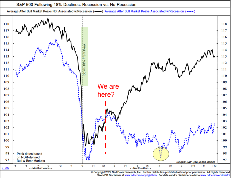
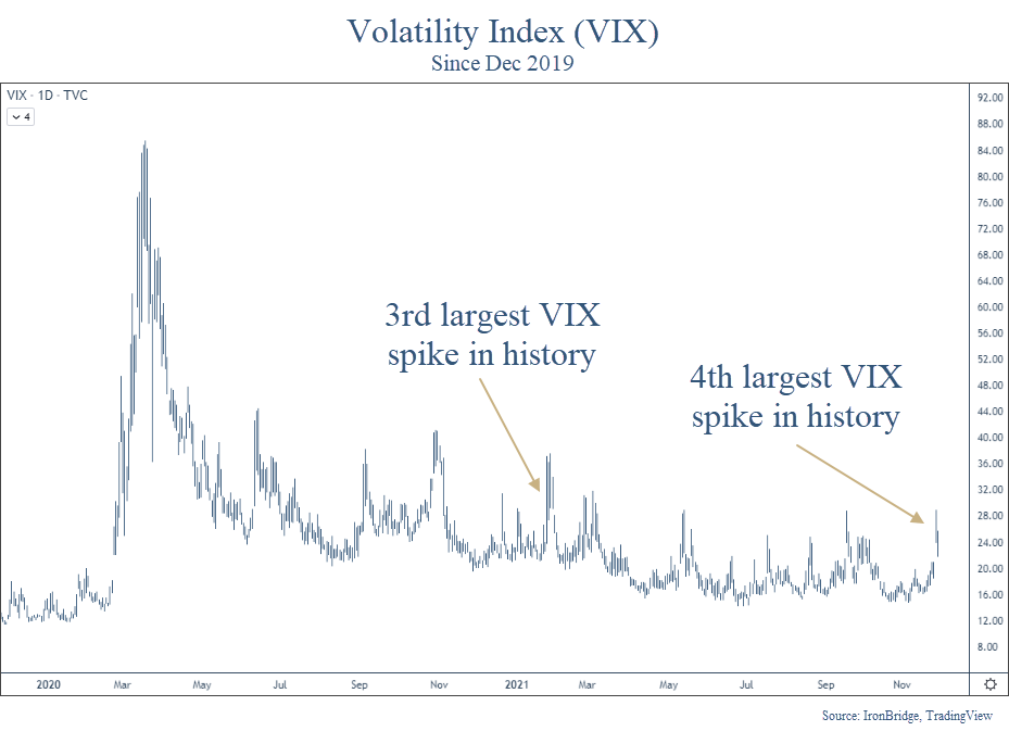
We have long been saying that risks are incredibly elevated right now. This is a good example of what can happen when risks are high. Banks don’t tend to fail in bull markets.

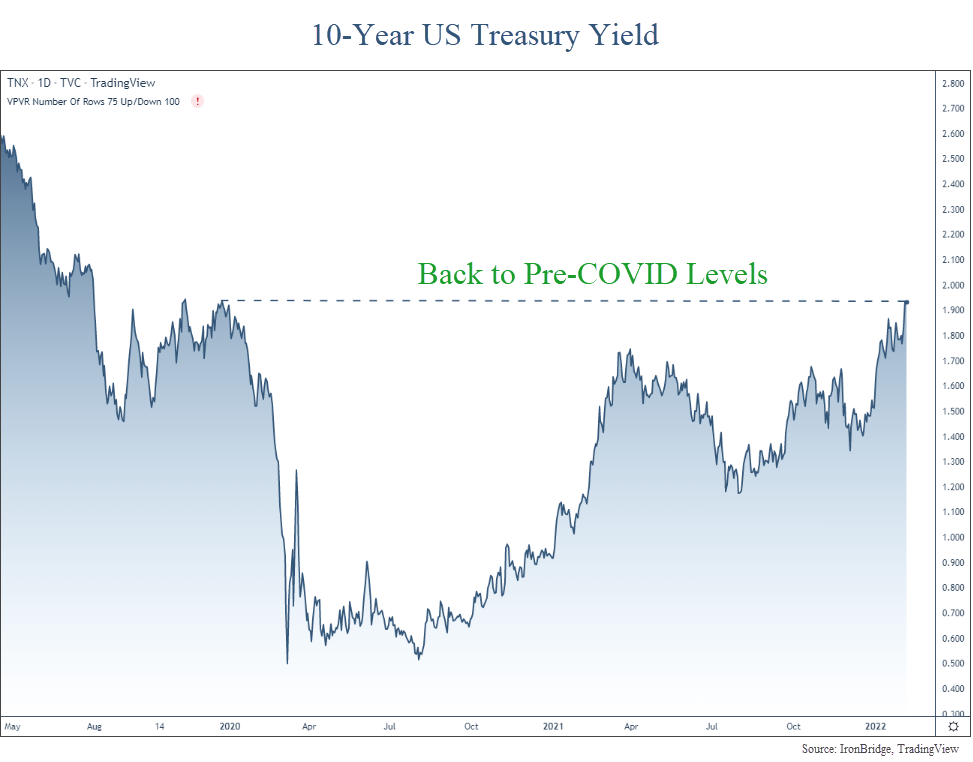
In our opinion, the full effects of higher interest rates have not been felt yet.

This is a major example of the unintended consequences that can happen in a complex system like financial markets.

Portfolio Implications

IronBridge clients continue to be very underweight risk exposure right now.

We believe that risks will remain elevated at least through this summer, and you should position your portfolio for continued volatility.

We discussed the two most likely scenarios in our recent video from last week.

We further reduced risk this week for clients, and view any rallies attempts in markets as good opportunities to de-risk even further.

It is much better to not participate in short-term rallies than to participate in long-term declines.

As always, let us know if you have any questions.

Invest wisely!


Filed Under: IronBridge Insights Tagged With: bank run, federal reserve, interest rates, markets, risk, risk management, silicon valley bank, volatility

A Recession or Not a Recession, That is the Question

August 5, 2022

“To be or not to be–that is the question: Whether ’tis nobler in the mind to suffer the slings and arrows of outrageous fortune or to take arms against a sea of trouble and by opposing end them.”

hamlet, act 3, scene 1

July was a nice month in the markets.

Which begs the question…have we seen the lows in this bear market?

Should we expect markets to continue to rise and suffer the slings and arrows of outrageous fortune? Or is this yet another fake-out like we’ve seen twice already this year and we go back into a sea of trouble?

The answer? It depends.

In most environments, it “depends” on a complex series of data points could shape the direction of the markets.

However, today’s environment seems more simple on the surface.

It depends primarily on only one variable: whether we are in a recession or not.

The reason is very simple…markets respond differently to pullbacks similar to what we’ve seen this year based solely on if it happens during a recession or not.

Let’s look at some historical context.

S&P 500 Performance: Recession vs No Recession

Markets can decline without the economy being in a recession. Since 2009, we’ve seen this happen a few different times:

  • 2011: US Debt Downgrade
  • 2016: Chinese Yuan Devaluation and Oil Crash
  • 2018: Random 20% decline in the 4th quarter

Each of these times, markets fell roughly 20%.

And each of these times, markets recovered losses within 18-24 months.

But there was no recession during these periods.

Our first chart below, courtesy of Ned Davis Research, shows this dynamic. The chart shows declines of at least 18% and separates it between two categories: whether it occurred during a recession or not.

The black line is the performance of the S&P 500 when there was no recession, while the blue dotted line shows the performance if there was an official recession.

We are currently two months past the recent lows, as indicated by the red dashed line.

Based on what the market has done historically, the results are very clear: if we’re not in a recession, we should expect the next 12 months to be pretty good. If we are in a recession, we should expect more volatility and a retest of the lows.

Which begs the question…are we in a recession or not?

Are We in a Recession?

Normally, determining a recession is pretty straight-forward: it is two consecutive quarters of negative GDP growth.

Both Q1 and Q2 this year were negative.

So by historical definitions, yes, we are in a recession.

But it may not be quite that simple this time.

We don’t like to get political in these reports, because the world focuses way too much on the self-absorbed, sociopathic political class.

But with mid-term elections around the corner, the incumbents are trying to change the definition of a recession.

It’s an overly transparent pre-election tactic. But we will reluctantly admit that in this case, they may have a point.

(To be fair to our politician friends, many economists agree that the first quarter did not resemble a typical economic recession.)

Let’s look at the data.

The first quarter GDP came in at a negative 1.4%, mostly because of two things:

  • Defense spending fell 8.5%
  • A trade imbalance due to a strengthening US dollar resulted in a negative 3.2% from total GDP.

Remove these two factors, and GDP is positive. In fact, if you simply remove the trade imbalance, GDP is positive.

Economic data in the first quarter was fairly positive as well, led by consumer spending, which was up 2.7%.

While the first quarter showed relatively good economic data, the second quarter was recessionary without question.

Second quarter GDP was negative 0.9%. And the negativity was more widespread.

  • Inventory investment decreased 2.0%
  • Housing investments decreased 0.7%
  • Federal and State spending both decreased slightly
  • Business investment decreased 0.1%
  • Consumer spending rose by a more moderate 0.7% (down from 2.7% in Q1)

With the underlying strength in the first quarter, it’s not out of bounds to assume that we’ve only seen one quarter of truly negative GDP growth.

(For the record, we don’t think we should change the traditional definition of a recession, but we should always put GDP data in context, both positive and negative.)

Which makes the current quarter especially important.

If we have negative GDP this quarter, there is no question that we are in a recession. The question then becomes how bad it is and how long it lasts.

Atlanta Fed GDPNow

One way to keep track of current GDP estimates is through the Atlanta Fed’s “GDPNow” tracker. (You can view the site HERE.)

As of Thursday, August 4th, they are projecting a 1.4% GDP for Q3, as shown in the next chart.

Granted, the estimate has steadily declined since the start of the quarter, and we still have almost 2/3 of the quarter left. So anything can happen.

And this data is also based on human estimates, which can be skewed.

But it should at least give us some hope that maybe we don’t see a formal recession this year. And if we do see one, it would likely be fairly mild.

This morning’s jobs report adds to the hope that we may not be in a recession just yet. The economy added 528,000 new jobs this quarter, and as of July has officially recovered the number of jobs lost during COVID.

However, we shouldn’t get too complacent at this point.

While GDPNow is showing positive estimates for current GDP, there are huge warning signs right now that should give us cause for concern.

Inverted Yield Curve

Historically, one of the best recession indicators has been an inverted yield curve. This occurs when the 10-year yield on US Treasuries are LOWER than the 2-year yields.

The next chart, courtesy of Bloomberg, shows this inversion.

When the line goes below zero, the curve is inverted.

Right now, it is more inverted than at any time since Paul Volker started fighting inflation the early 1980’s.

It is more negative than COVID, than the global financial crisis, the tech bubble, and various recessions during the 80’s and 90’s.

We strongly believe that it is imprudent to ignore this data point.

But this data point isn’t a very good timing indicator of when a recession may happen.

In reality, it is when the curve starts to steepen AFTER it has been inverted that is a better indicator that a recession is imminent, and we haven’t seen that happen yet.

Housing Market Concerns

While the inverted yield curve is a bit more theoretical in nature, there are real economic data points that are showing signs of stress.

The housing market plays a huge part in economic activity, accounting for 15-18% of US economic activity on average.

Leading indicators in the housing market are showing reason to be concerned.

One of these is cancellation rates, as shown in the next chart from Redfin.

Cancellations happen when an accepted offer is withdrawn by either party.

In this case, the majority of cancellations are due to buyers backing out.

There are legitimate reasons for this happening:

  • Mortgage rates have increased, making it unaffordable for a buyer to proceed;
  • Property taxes have been reassessed higher, increasing the cost of housing;
  • People anticipating that prices may fall, causing buyers to withdraw offers.

Here’s a link to the article discussing cancellations:

The Deal Is Off: Home Sales Are Getting Canceled at the Highest Rate Since the Start of the Pandemic

Another reason for cancellations is a drop in consumer confidence, which has a big effect on economic conditions in the US.

Consumer Confidence

While the housing market is a large part of the economy, the consumer as a whole is much more important. Approximately 70% of the US economy is driven by the consumer in one way or another (this includes housing).

So when consumer confidence slows, economic activity typically slows along with it.

And the consumer is in the dumps right now, as shown in our next chart.

Right now, the consumer is the least confident they have been at any time in the past 60 years. This includes the Vietnam era, the inflation of the 1970’s, the tech crash, the global financial crisis, and COVID.

That is concerning.

But what does all of this tell us about the near-term direction of the market?

S&P 500 Index

All of the data listed above is not news to the market.

Despite these concerning data points, markets have rallied over the past seven weeks.

But the move higher since June looks almost identical to the one in March, as shown in the chart below.

Specifically, the pattern is a three-leg move higher into previous highs.

There was an initial leg higher, a move lower of roughly the same timeframe, then an extended move higher in both time and price.

The move in March followed the Ukraine invasion.

The move in June really didn’t have any catalyst, other than the overall market being incredibly pessimistic.

In addition to the S&P 500, nearly every major US stock index looks identical.

The next chart shows the S&P 500, the Russell 2000 small cap index, the Nasdaq Composite and the S&P Mid Cap index.

Every one of these indices are at the same resistance level. This means that the market thinks these levels are important.

Regardless of the reason for the move in June, it has been strong. Earnings reports have been more positive than expected, and the market is starting to predict that the Fed will become more accommodative and “pivot” by slowing the rise of interest rates.

If the market is going to do it’s own pivot and head back lower, it must do so very quickly.

If it breaks above this resistance area, then we can begin increasing equity exposure in client portfolios, at least for a period of time.

If it heads lower, then we should expect a fairly quick move to test the lows from June.

Bottom Line

While a big consideration for the market is the current recession debate, markets are extremely complex systems. Relying on only one data point for decision-making would be foolish.

When looking at a variety of data points, it truly is a mixed bag out right now.

Recent market strength and earnings reports have been mostly positive. As such, the market seems to believe the Fed will slow down the pace of interest rate increases. (Frankly, this expectation seems to be unwarranted, especially after today’s employment numbers.)

For now, the move higher over the summer appears to be a typical bear market rally. As such, we have been intentionally slow to add equity exposure.

Why?

Mainly because there is still plenty of upside if the market wants to keep pushing higher. For example, the Nasdaq is down nearly 23% this year, even after a big rally over the summer.

And big stocks like Google, Microsoft, Facebook and Netflix still have massive upside potential at current levels.

If the market can get above the levels noted in the S&P chart above, there starts to be more proof that this rally may be more than just another temporary rally.

But if we do go into a recession, all bets are off. And there are many indications to suggest we are headed in that direction.

Bottom line is that we believe it is prudent to underweight risk right now, given the massive uncertainties in the market and the economy.

Invest wisely!


Filed Under: IronBridge Insights Tagged With: Apple, Facebook, federal reserve, Google, interest rates, investing, markets, Microsoft, recession, risk management, stock market, stocks, volatility, wealth management

Ares: Forever Quarrelling

February 8, 2022

Ares, the god of war, statue representing both the valor and brutality of war. Ares was one of 12 original Olympians and a son of Zeus.

In Greek mythology, Ares was the God of War.

He was one of the 12 original Olympians, and a son of Zeus. He symbolized both the valor and brutality of war.

Much of Greek mythology comes from ancient writings, such as Homer’s Iliad.

In the Iliad, Zeus tells his son, Ares:

To me you are the most hateful of all gods who hold Olympus. Forever quarreling is dear to your heart, wars and battle.

zeus to his son ares, in Homer’s iliad

It is telling that the Greeks chose to have War represented in their 12 primary deities. But it is most telling that they portrayed the God of War as the worst one of the bunch.

28 centuries later, humanity still faces those who feel the pull of Ares. Specifically, Vladimir Putin. And his drumbeats of war are growing louder by the day.

The possibility of a Russian invasion into the Ukraine has been increasing for at least two months now. It now appears almost inevitable that Russia will invade.

(Unless, of course, this was a pre-planned show of force with a pre-negotiated peaceful resolution that helps both Putin and Biden with their constituents.)

But we digress.

We will not discuss the human impact of a potential invasion or war. We only hope that if an invasion occurs, death and destruction are minimized as much as possible. And we hope it does not escalate into a more broad conflict that includes China, European nations or the United States.

What we will do is focus on the potential impact on the markets. Specifically, we discuss:

  • Timing of a Potential Invasion
  • Are Markets Pricing in the Risk of War?
  • What happened after Previous Geopolitical Events?
  • What is the risk of Russian Attacks on our Infrastructure?

Let’s get to it.

Timing of a Potential Invasion

First of all, Russia has a history of invading countries when the US is preoccupied with other things.

  • They invaded Afghanistan on Christmas Eve in 1979.
  • They invaded Hungary two days before the Presidential election in 1956.

Russia’s two biggest adversaries, the US and China, are both pre-occupied right now.

  • China is hosting the winter Olympics, and are trying to look good on the world stage (although nobody seems to be watching).
  • The Super Bowl is this weekend in the US. It is annually one of the most-watched television events of the year.

So it appears that this weekend may make sense if they are going to invade.

However, people said that in December as well, projecting that Russia might again invade around Christmas and that didn’t happen.

We are no geopolitical experts, but we would not be surprised if an invasion happened this weekend.

Are Financial Markets Pricing in an Invasion?

Bottom line, no, they are not. And if they are, they simply don’t care.

Typically when financial markets are concerned about a negative potential event, money flows into US Treasuries, causing yields to go down. However, yields have risen recently, and there has been no flight into the safety of US Treasuries.

In fact, US Treasury yields have continued moving HIGHER, and are now back to pre-COVID levels, as shown in the chart below.

10-year us treasury yields have been moving higher, despite tensions between russia and ukraine

The spike higher on the far right side of the chart shows a bond market that is decidedly NOT pricing in any global instability.

If the global financial markets were concerned about this invasion, we would first see it expressed in lower yields, not higher ones.

In fact, since late November and early December (when rumors about a Russian invasion began), yields have only risen. They are up over 65 basis points in that time, which is a very large move in yields for the Treasury market.

Simply put, this is not a bond market that is concerned about an invasion.

The stock market isn’t much different.

Yes, we have seen volatility this year. But it appears for now that the choppiness this year is simply a market working off the froth after large gains over the past two years. Not an anticipation of further escalation in the conflict.

As invasion rumors have continued to gain momentum over the past couple of weeks, US markets have rallied.

What about in Europe?

Germany appears to be the biggest loser (besides Ukraine) in all of this. They get energy from Ukranian pipelines, and their economy appears to have the most to lose.

Well, European markets are basically telling the same story…that there isn’t much to worry about.

The next chart shows the Euro STOXX 50, an index of the 50 of the largest companies in 8 European countries, and the German DAX, which is Germany’s equivalent of the Dow Jones Index.

euro stoxx 50 index and the german dax leading up to a potential russian invastion of ukraine.

This chart shows European markets that have been choppy since last summer. You’d never know by this chart that there was about to be a war any day.

In fact, European stocks have fared much better than US stocks over the past month, despite having much more to lose if Russia invades Ukraine.

Bottom line, financial markets across the globe simply aren’t predicting any lasting impact of the potential conflict.

What Happened in Previous Geopolitical Events?

This isn’t the first time we’ve had geopolitical scares.

In fact, we wrote about this exact thing in 2017 when there was sabre rattling as tensions with North Korea began to flare. Read it HERE.

Somewhat to our surprise, we found that geopolitics simply don’t have the negative effect that many people think.

The next table shows the performance of the S&P 500 Index following major geopolitical shocks, courtesy of S&P Capital and the Wall Street Journal.

stock market reaction following major geopolitical events since pearl harbor

Essentially there were 3 events in the past 100 years that caused markets to fall more than 12%:

  • Lehman Bankruptcy (that started the global financial crisis)
  • The minor bear market in 1997 during the tech bubble
  • Nixon Resignation during the sideways bear market of the 1970’s.

In fact, EVERY war in the past century was a non-event to markets.

Surprising, huh?

Pearl Harbor, the Cuban Missile Crisis, JFK assasination, the first Iraq war, 9/11…all resulted in only moderate declines the day it was announced, and all resulted in completely normal pullbacks.

In January, we saw the S&P 500 fall 12%. It has recovered about half of that move so far.

So maybe the market ALREADY priced in Russia invading Ukraine, based on how stocks have responded to the start of previous wars.

What if Russia Attacks Infrastructure in the U.S.?

This is the biggest wildcard.

One of the concerns by some is if the United States put punitive sanctions on Russia, they would retaliate with an attack on our infrastructure.

An attack on our digital infrastructure would be a problem, but it appears that would be a temporary one. There is not just one internet or communication provider. There are many. So while a localized attack may cause localized disruption, it would be very difficult to stop the “web” of communication that exists across this country. Landlines, cell towers, satellites, all provide data to people. It is a very decentralized system that would be hard to attack.

Water and electricity resources is another potential target. But as we’ve witnessed in Texas over the past year, the power grid going down or water supply being compromised does indeed cause inconveniences. But it would not necessarily cause permanent or irreparable damage to the country.

So what would Russia have to gain? They cause major inconveniences to us? Just keep robo-calling us about our expired car warranties and call it a day.

Is the inconvenience worth starting World War III? It doesn’t seem like it.

Conclusion

Bottom line, financial markets aren’t concerned. There isn’t enough tension, risks and potential benefits to Russia to warrant expanded conflict. And expanded conflict is the real risk.

Ukraine is a strategic benefit for Russia, but is not crucial to the global economic or market infrastructure.

Financial markets are taking the approach that there will always be conflict. Humans will be forever quarreling. And they are taking the view that minor conflicts are not important enough to change the overall market and economic cycle.

We’re not saying that it for sure WON’T turn into something bigger. If it does, we will adjust portfolios accordingly. After all, the market can change its mind anytime.

But for now, it appears that if Russia does in fact invade Ukraine, there is not much to worry about when it comes to your portfolio.

Invest wisely!


Filed Under: IronBridge Insights Tagged With: ares, geopolitics, god of war, greek mythology, markets, risk, risk management, russia, treasury yields, Ukraine, war

It Came from Left Field

November 29, 2021

Confused baseball player

Last Friday, the day after Thanksgiving, the market fell almost 1000 points. What was that all about?

First off, let’s put this move in context.

Volatility Spikes

The VIX rose 54% on Friday. This was the fourth largest spike in the history of the volatility index, as shown below.

Largest 1-day increase in the volatility index (VIX) in history.

There are some interesting things that we find in this data:

  1. Surprisingly, the 3rd-largest spike happened this past January. Not pre-COVID January 2020, but this past January of 2021. (Like you, we don’t remember that either.)
  2. Three of these happened during the COVID crash (items 10, 17 and 18 in the chart above).
  3. Only 4 of these 20 spikes (20%) occurred during true bear markets. The other 80% occurred randomly during up-trends.
  4. The largest spike in VIX history happened a few years ago. It led to a 20% pullback in stocks.
  5. The 2nd largest spike happened in early 2007, nearly 8 months prior to the market top before the 2008 financial crisis.

This list tells us that the spike in the VIX last Friday was indeed historic. Let’s now look at this VIX spike on a chart, not just in a list.

The next chart looks at the VIX since just before the COVID crash.

Well, that’s pretty strange. Friday’s spike higher was both historical and barely noticeable.

On first glance, it would appear that the VIX has done this many times during the past year.

Should we be Concerned?

With this volatility, should we expect Armageddon? According to mainstream media the Omicron mutation is going to be the worst mutation so far. But they are paid to sell commercials, not provide rational guidance.

Their constant hype of selling fear appears to be backfiring. Viewership is dramatically lower, and trust in the media is at an all-time low, and rightfully so. But we digress.

Bottom line, it’s easy to “blame” some kind of news for big market declines.

But the move on Friday looked to be more technical than anything else.

The day after Thanksgiving has notoriously low volume. Not many institutional traders are at their desk all day, and a small number of large trades can cause big dislocations when volume is low.

In addition, the market hasn’t had much volatility in the past year. So in a way, it made up for lost time.

So back to the question…should we be concerned?

Maybe.

Any time these types of moves happen, the most important development is ALWAYS whether we see follow-through or not.

As of this writing, markets are up almost 2%. We didn’t see any follow through lower just one day later. That’s a positive sign.

As the week goes on, we should start to get more clarity on what the market wants to do next.

We didn’t make any moves on Friday. Those are not the types of days to act upon.

That said, we do anticipate taking action in client portfolios this week:

  1. Our monthly trend signal resets on Wednesday, and that could cause us to raise cash.
  2. Big moves lower offer the potential to realize tax losses on certain positions. We can then offset some of realized gains that have occurred this year by selling some losers and rotating into different positions to avoid wash-sale issues.

Other than that, it appears for now that the move was simply random and out of left field.

The likely scenario is that we slowly move back towards all-time highs.

However, as always, we are going to stay vigilant in managing risk. And if that means increasing cash, we will do so as our signals tell us to. But for now, the move appears to be a random event that we should probably come to expect more of in the coming months and years.

Until then, we’ll keep watching the markets for clues.

Invest wisely.

Filed Under: Strategic Wealth Blog Tagged With: covid, markets, omicron, risk management, vix, volatility

Footer

LET'S CONNECT

  • Email
  • Facebook
  • Instagram
  • LinkedIn
  • Twitter

AUSTIN LOCATION

6420 Bee Caves Rd, Suite 201

Austin, Texas 78746

DISCLOSURES

Form ADV  |  Privacy Policy  |  Website Disclosures

  • Home
  • Difference
  • Process
  • Services
  • Insights
  • Team
  • Clients
  • Form CRS
  • Contact Us

Copyright © 2017-Present by IronBridge Private Wealth, LLC. All rights reserved.