• Skip to main content
  • Skip to footer

IronBridge Private Wealth

Forward with Confidence

  • Home
  • Difference
  • Process
  • Services
  • Insights
    • IronBridge Insights
    • Strategic Wealth Blog
    • Strategic Growth Video Podcast
    • YouTube Channel
  • Team
  • Clients
  • Form CRS
  • Contact Us

IronBridge Insights

Ain’t it Funny how Falling Feels like Flying

February 5, 2021

Funny how falling feels like flying for a little while market analogy

The GameStop saga represents an investment fervor that has gripped the media and markets over the past few weeks. What really happened, and what are the takeaways from yet another strange environment we find ourselves in?


“Ain’t it funny how falling feels like flying, for a little while.”

-Jeff Bridges in the movie “Crazy Heart”


In the movie Crazy Heart, there’s a song called “Ain’t it Funny how Falling Feels Like Flying, for a Little While”. The lead character in the movie is played by Jeff Bridges, who writes songs and scrapes by a meager living most of his adult life.

This song represents the musician’s attitude that just when he thinks he is on his way to commercial success, is only dealt with more and more setbacks in his career and personal life.

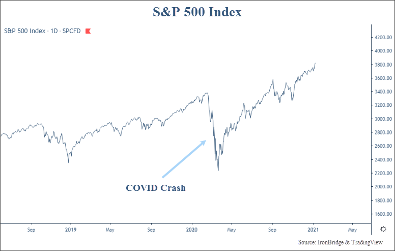
As soon as we think the craziness emitting from 2020 has passed, another string of strange circumstances emerges.

This time it involved a set of poorly run companies struggling to survive, an army of individual traders on a social media app, and a small group of heavy-weight institutional investment firms, all wrapped up in an investment frenzy.

There have only been a few times that we have received questions as consistently and repeatedly about a single topic in the markets as we have had with GameStop. It obviously happened with the COVID crash last year, and happened with Bitcoin a few years ago, but not since the Flash Crash in 2010 or even back to the financial crisis have we seen and heard such intense media focus as we have with this topic over the past couple of weeks.

Virtually every one of our circle of friends was talking about it at some point last week. Golfers in clubhouses were overheard chattering about it. High schoolers at lunch talked about the gamification of the stock market. Every area of the social media and online sphere was discussing some aspect of what was occurring. Was it time to buy? Should you buy put options? What happened? Is this normal? Were all questions we were hearing and fielding last week.

So what is this mess about GameStop really all about?

Background

GameStop is a retail company that sells physical video games in the form of DVDs. It is a very poorly run company that has been 10 years late to everything. They are the Blockbuster video of the gaming world. GameStop tried to rebrand themselves as selling “collectibles” and virtual reality devices. But they are selling things that people no longer need. Games can now be downloaded instantly.

There are many people, including a few large hedge funds, who think it will go bankrupt. They are probably right. So they have shorted the stock, betting that the stock price will go down in value, possibly to zero.

Shorting a stock is like borrowing someone’s car and selling it. Then before the owner of the car asks for it back, you try to buy the same exact car at a cheaper price. Voila, you made money. Your profit is the difference between what you sold the car at initially, minus the price of the replacement car plus some minor carrying costs.

This is what happens when you short a stock. You borrow shares, sell it at today’s market price, and hope the price falls before you have to buy it back.

This works great if the replacement car is cheaper than the original one you sold. However, if the price of the car goes up, you now have to buy a higher priced car to replace it. Congratulations, you are now losing money.

With stocks, unlike cars, prices tend to move higher over time. Shorting stocks is very difficult and requires a great amount of luck skill to be good at doing it.

What Happened?

Over the past two weeks, GameStop (ticker: GME) stock has been amazingly volatile.

The media over the past couple of weeks has been calling this a “short squeeze”. Sticking with our car analogy, a short squeeze is like having hundreds of people in a small town borrow the same kind of car, and they all sold it to the same dealer (these people “shorted” the car). Then when the car dealer starts to have people wanting to buy that car back, he starts to raise the price. Demand is now out-pacing supply. That dealer is “squeezing” the buyer to get more money out of him.

To make matters worse, with GameStop, more people had sold cars than there were cars in existence. 140% of the totals shares outstanding were short. So there was literally no inventory of shares (cars) that could be bought back anywhere near the market price from a couple weeks ago.

That’s okay if no one wants to buy that car. Maybe it’s an ugly car that breaks down all the time. It probably is worthless, and who in their right mind would want to buy it? But in GameStop’s case, a bunch of people decided they were all going to start buying ugly cars that broke down all the time. The people who borrowed and sold these cars had to scramble to find cars to buy and deliver back to the original owner.

In the stock market, there is not just one buyer of shares. There are millions of different buyers.

But a coordinated effort took place in GameStop and a handful of other stocks that sparked a buying frenzy. A group of young people on a social media platform named Reddit banded together to stage a “short attack”. They recognized that there was an imbalance in the amount of shares that were “short” GME stock. They were trying to “squeeze” the hedge funds that were irresponsibly short.

These hedge funds were the ones who had borrowed and sold the ugly cars. And they were incredibly irresponsible how many they sold.

A key feature of selling a stock short is that when it goes up in price, it becomes a larger position in your portfolio. If you buy a stock for $100,000 and it goes down 50%, then your exposure to that stock falls. It was worth $100,000, but now it is only worth $50,000. Not fun, but technically your risk reduces as it falls.

When shorting a stock, your risk exposure increases. If you short a stock with $100,000, if it goes up 50%, you now have to pay $150,000 to buy it back. It has become a larger risk in your portfolio.

Imagine what happens if a stock goes from $16 to $480?

One key theme over the past few weeks is the idea among these young traders that buying GameStop stock was a form of protest. We have seen protests take many forms over the years. But this is a new one.

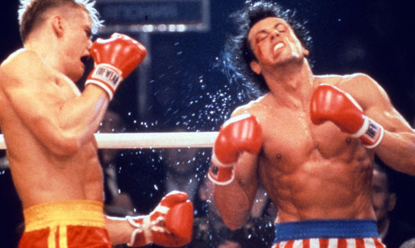
The thing is, it worked. They were flying. For a little while.

Let’s take a look at GME stock over the past month.

In the span of a couple weeks, GME stock rose from $16/share on January 12th, to over $480/share on January 28th. This is a staggering 3,000% return.

Some of these young traders were proudly showing off their gains. One of the ringleaders, 34-year-old Keith Gill (pictured below), showed daily snapshots of his trading portfolio. At one point, it showed a balance over $50,000,000. Holy cow, talk about flying.

It wasn’t just Mr. Gill who was showing off. Many people on social media, from the marketing genius behind Barstool Sports, Dave Portnoy, to tech entrepreneur and Dallas Mavericks’ owner Mark Cuban jumped on the bandwagon. Most likely in attempts to enhance their popularity among this “Reddit” crowd.

Many people were advocating to buy GameStop stock. Many others said to “Hold the Line” and not sell the stock. They were bankrupting a hedge fund. Hear me roar!

However, there are a few problems. First, a stock that go up 3,000% in a couple weeks probably won’t stay at that price very long. Anyone who has been in the investing world knows that. In the least surprising development of all, the stock has collapsed back down to the $60s, as seen on the GME chart above.

Another problem is that you aren’t supposed to give investing advice without the proper licensing. A public mention on social media to buy or hold a stock is technically a recommendation. Doing so without a license is illegal. Oops.

What is even wackier is that Mr. Gill himself is actually registered to recommend securities with an insurance firm called MassMutual. Because of this, he is now under investigation by the SEC and may have to testify in front of Congress. Read more about that part of this crazy story at the NYTimes HERE.

Of course, now that the stock has cratered, likely with further to fall, Mr. Gill has not shared a screenshot of his winnings.

These traders now realize they are falling.

But there is much more to this story than just a group of small traders banning together to “stick it to the man” in protest. So let’s instead focus on some of the things that the media is not talking about.

Stop Squeezing my Gamma

First of all, short squeezes happen all the time.

In fact, the alt-news website ZeroHedge has been tracking short squeezes back to at least 2013. And it surely has been happening much longer than that. The next chart below, from ZeroHedge, shows that short squeezes can perform very well. Since October, the most shorted stocks are up over 3x the Russell 3000.

The stocks that were the most shorted are companies that are likely in the most financial peril. When these companies outperform the broader market handily on a regular basis, then it’s probably safe to say that there is something way beyond fundamentals driving these price trends.

Back to the earlier chart of GME. Once the price of GME started to move higher, the short squeeze added fuel to the fire. Those who are short the stock have to “cover” their positions (buy back the car they sold), buy buying back those shares in the open market.

A short squeeze in many ways is a self-fulfilling prophecy. The higher the price goes, the more shorts need to cover. Rising prices cause more short covering, until eventually existing holders decide prices have swung too high and decide to sell, helping stop the squeeze.

But the real gasoline that was thrown on the stock was likely what’s referred to as a “gamma squeeze”.  A gamma squeeze is more of a function of how markets work than anything to do specifically with GameStop stock. It has to do with the options market, which is like the stock market on steroids.

An option is an investment vehicle where investors buy or sell a stock at an agreed upon price and date in the future. Instead of selling that car immediately, you come to an agreement that by next week you will sell it as long as it is above a certain price.

Prices of options change in value daily, and typically move in a much larger percentage than the price of the underlying stock.

One way to measure how quickly the price of these options change is called “Gamma”. It is a term used to describe the rate of change of the price of the option compared to the rate of change in the price of its underlying stock. A gamma squeeze is a necessary by-product of having liquidity in an options market with speculators and hedgers.

Generally, a higher gamma results in more hedging that needs to occur by the writer of that option. As volatility increases, so does an option’s gamma. Gamma is what tells the option seller how much of a stock he needs to buy to hedge his position and in GameStop’s case, Gamma was getting higher and higher and hedgers needed to hedge with more and more GameStop stock.

The real takeaway from a GameStop perspective is that all of this had very little to do with its underlying business, except for the fact there were a lot of shorts in the stock.

But that is rather normal on Wall Street, and it is far from a “crisis” as some have been touting. Anyone that has been in the markets long enough knows that these kinds of things happen all of the time, just not to this extreme.

Both short squeezes and gamma squeezes are primarily driven by a stock’s price, not its fundamentals and is a result of its price rising faster than initial risk management expected. Prices rising quickly could be the giveaway that one of these squeezes is occurring.

What is also especially different with GameStop is who was at the epicenter of the trading tsunami.

My Name is Robinhood and I’m Here to Help

Robinhood is an online trading platform directed at younger investors. It is trying to make investing fun by looking and feeling much like a video game.

Most trading is done via an app on your phone. When someone makes a trade through this app, it looks similar to winning on a slot machine. Bells ring, digital confetti falls across your phone’s screen, and the brain gets a rush of cortisol as a reward. All by design.

The Robinhood app has exploded in popularity. Millions of investors, mostly younger, have used it to start investing. That’s a great thing.

Robinhood’s biggest selling point to these younger investors is that there are no fees. Well, if something is free, you are probably the product. That is what is happening at Robinhood.

The primary source of revenue for Robinhood is that they sell order flow to large firms. The biggest buyer is Citadel.

Citadel is a behemoth in the trading world. By purchasing order flow from Robinhood, they are purchasing information. They know what stock is being traded and at what price. They claim that they use this information to get the individual investor the best possible price on the stock order they just placed.

But in actuality, they do what is called “front-running”. Here’s an example.

A Robinhood investor wants to buy 100 shares of Apple stock at $134 per share. They get on their app, enter the order, and revel in the digital confetti. Because Citadel paid for this information, they know that there is an order to buy 100 shares of a stock at $134/share before the trade is actually executed.  Citadel then goes out and buys Apple for $133.9999 and sells it to this investor for $134.00. The investor gets the price they wanted, but Citadel just made a fraction of a penny on the trade.

Repeat this millions of times each day and you have Citadel’s business model. And Robinhood is not the only firm from which they purchase this order flow.

In the real world, front-running is illegal. At IronBridge, we are required by the SEC to review brokerage statements to see if any an employee is buying a stock before we buy it for clients. Because it is illegal.

Why can Citadel do that? Good question. The SEC has been trying to figure out exactly what they are doing, and have not been successful. Citadel did, however, sue the SEC to try to keep what they are doing private.  Citadel has felt like it has been flying. Will they eventually fall?

One thing is for sure, the Reddit traders sure want them to. In the middle of the mania last week, Robinhood halted trading in GME.

This was not an attempt by the “suits” to screw the little guy. This was a result of Robinhood’s own risk management needs as regulated by the SEC.

But it is understandable that the Robinhood crowd is up in arms. In the traditional story, Robin Hood steals from the rich and gives to the poor. The younger traders feel like the opposite has happened. Once they started to really make a lot of money, they genuinely feel they were cut off from trading. The “rich” stepped in and stole from them.

But Robinhood may not be as big a culprit here as claimed. Yes, they do sell information about its users to big hedge funds and yes, they do sell information that allows those hedge funds to front run their clients’ purchases. But that’s always been the case. After all, “if you don’t pay for the product, you are the product”. Robinhood has been doing that from day one.  (Whether it should be legal or not is a different story.)

What really happened is that as the accounts in Robinhood got larger and larger, Robinhood’s capital base couldn’t support it. Risk Management stepped in and a decision was made to both: 1) lessen the potential volatility – how to do that? You lessen the trading in volatile stocks and then ultimately 2) Raise billions of $$$s of outside capital in order to shore up Robinhood’s balance sheet and increase their cash deposits.

Robinhood takes on a slight amount of credit risk due two what is called “T+2 Settlement. This antiquated system says that if you buy a stock, it doesn’t “settle” in your account for two days. If you make a trade and immediately withdraw funds, the brokerage firm has to pony up the money for that trade. Granted, they will go after you and get their money back, but they still have risk between the trade date and settlement date.

This is not so different from normal banks and the entire fractional reserve banking system. Banks must hold a percentage of their clients’ accounts assets in reserve, and so too must a Robinhood and other brokerages. As client accounts grow, so too must the Robinhood Capital base.

Robinhood actually provided a great blog post that helps summarize how the system works. If you want to be mad at someone for inhibiting the rights of traders, be mad at the the risk management department of Robinhood (you live by the sword you die by the sword), or be upset with the traders themselves for choosing a less financially stable firm, like Robin Hood, for doing their trading.

Or go even higher and get upset with the clearinghouses and ultimately the Depository Trust Clearing Corporation. Is Robinhood completely innocent? Probably not. But it doesn’t seem that Robinhood is as evil as the Reddit crowd has portrayed them. They operate in a much more regulated world than the Robinhooders probably realized.

Bloomberg explains the back-office part of it pretty well in this piece, and the Observer supports Robinhood’s decision in this piece.

Now did the hedge funds that were getting hosed make a few calls to some friends? Our guess would be yes. In a perfect world we will learn more about that come mid-February when the parties involved have hearings on Capital Hill.

What are the Takeaways?

This is a complicated issue, but there are some very clear takeaways.

Short Selling is not a bad thing. Maybe there should be some limits to it, but any structural problems in our markets today are not due to short sellers. The hedge funds who lost money got what they deserved by not appropriately managing risk.

T+2 Settlement is outdated and should be changed. There is no way in today’s technology environment it should take two days for cash to exchange hands when a stock is bought or sold.

Don’t get over your skis. Markets are complex, and if you don’t know what you are doing you probably shouldn’t be doing it. You can only stay lucky for so long.

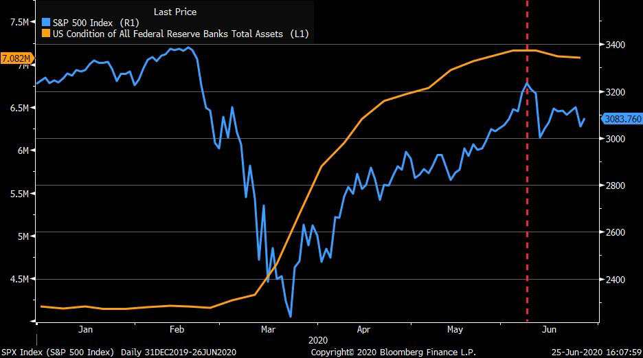
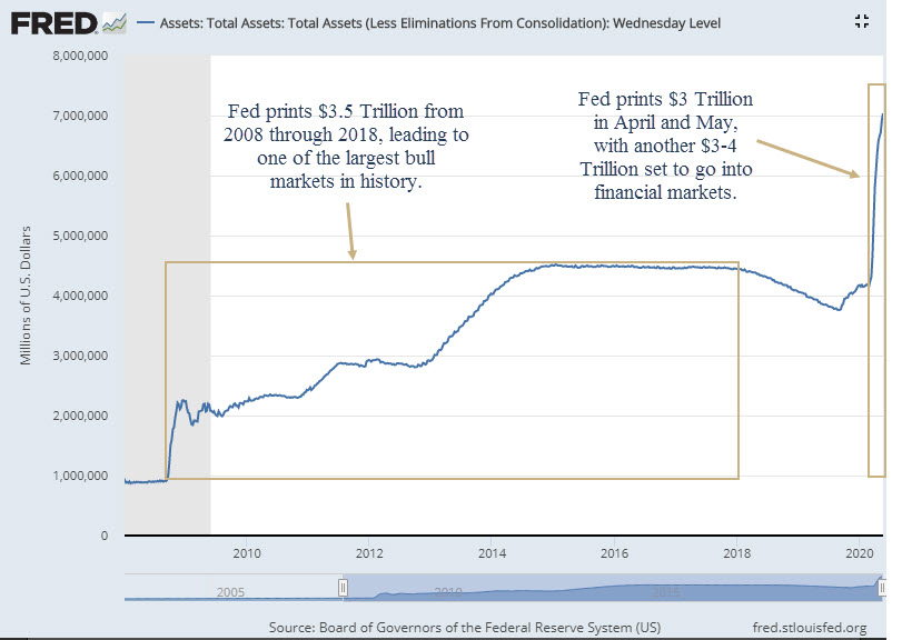
Markets are not efficient. Spoiler alert…they never have been. Things like GameStop happen every day. Just on a much smaller scale. The Fed printing gobs of money only serves to exacerbate it.

There are regulatory loop holes that favor the well connected. We are already starting to hear how there should be increased regulation by the politicians. Guess what? They are the ones who created these rules in the first place. Complex systems like global financial markets don’t have sound-bite solutions to their problems. It’s just not that easy.

Perhaps the single largest takeaway from this saga is this: The GameStop saga is a reflection of the speculative fervor that is gripping the financial markets.

This didn’t happen last March when markets were collapsing. This occurred after a massive rally in the markets. This fervor has permeated the fringes of the financial markets. It is happening in these Reddit stocks like GameStop. It is happening in assets like Bitcoin. Heck, it is even happening in residential real estate.

This is an environment where anything can happen. It is reminiscent of the late 1990’s. This same type of fervor took hold in the fringes of the markets in stocks like Pets.com. Just take a look at the cover of Fortune magazine from October of 1999.

The Nasdaq rose over 100% in the 6 months after this magazine cover was published. And it could have been published today.

The fervor in smaller internet stocks in the late 90’s eventually made its way into the broad markets and formed a massive bubble of epic proportions.

Will that happen today? That kind of flying would be pretty fun for a little while, wouldn’t it? But who knows if it will happen or not. We prefer boring markets. But we don’t get what we prefer. As our kids say, “You get what you get, so don’t throw a fit”.

Actually, there is more wisdom in that phrase than we would like to admit. (Being the highbrow, stuffy, intellectual types that we are.) The key is to not get emotional. The Reddit crowd got emotional. The hedge funds got emotional. The social media personalities got emotional. The politicians are getting emotional. They all have let their emotions control their actions, and they ultimately paid (or will pay) the price. You cannot do that when investing.

Making money is fun. But don’t get caught up feeling like you’re flying when you may about to be falling.

Invest wisely!


Disclaimer This presentation is for informational purposes only. All opinions and estimates constitute our judgment as of the date of this communication and are subject to change without notice. > Neither the information provided nor any opinion expressed constitutes a solicitation for the purchase or sale of any security. The investments and investment strategies identified herein may not be suitable for all investors. The appropriateness of a particular investment will depend upon an investor’s individual circumstances and objectives. *The information contained herein has been obtained from sources that are believed to be reliable. However, IronBridge does not independently verify the accuracy of this information and makes no representations as to its accuracy or completeness.

Filed Under: IronBridge Insights Tagged With: citadel, Gamestop, gamma, GME, robinhood, short squeeze

Twin Risks: Valuations and the Fed

January 8, 2021

Twin Risks of elevated valuations and the Fed

As we enter 2021, we turn our focus to things that could change the current bullish environment. Two main risks may emerge as the market continues its push higher: Valuations and the Fed.


“Life is a cycle, always in motion, if good times have moved on, so will times of trouble.”

-Indian Proverb


What a year.

And we’re only 8 days into it.

We read a meme online this week that said, “I tried the 7-day free trial for 2021, and I’d like to cancel it please.”

2020 was quite the year too. Just when we thought it was in the rear-view mirror, events remind us that the new year is more of a mental construct than any kind of actual barrier or turning point.

What may happen in 2021? How long can this bullish market environment last? What should we be watching for?

2020 Review

First, let’s briefly review the chaotic year of 2020.

A year ago, if someone told us that there would be a global pandemic that killed millions of people worldwide, GDP fell by a whopping 33% at one point, there were riots across the country, the presidential election was contested, and a mob stormed the US Capitol, what do we think the markets would have done?

Obviously, the majority of those surveyed would almost all say that markets were in total chaos. We would likely have predicted that market would be 40-50% lower, if not more.

But what happened?

  • The S&P 500 rose 18%.
  • The Nasdaq rose an amazing 43%.
  • The Dow Jones rose 9%.
  • Bonds rose over 7%.

These are not returns we would normally associate with a chaotic environment.

Which brings up an interesting question: What if the COVID market crash in March was just an exogenous anomaly?

At the time, it all seemed very logical. The forced shut down of the US and global economy had a real, tangible effect on markets. The subsequent rally, fueled by central banks across the globe, lifted financial markets, while having very little impact on those truly affected by the virus.

Generally speaking, markets have both internal and external influences. External, or exogenous, influences include things like COVID, terrorist attacks, assassinations, etc. While internal, or endogenous, influences are things within the market structure that affect prices, such as the Fed and the financialization of real estate prior to 2008.

Most investors believe that external factors have the most influence on asset prices. But throughout history, external events tend to have only fleeting impacts on markets. COVID may very well end up being another one of these exogenous events.

Let’s look at a chart to illustrate the seemingly temporary impact of COVID on asset prices.

The first chart below is the S&P 500 Index since mid-2018. The big spike downward is what we refer to as the COVID crash. The second chart simply removes the three months around this crash.

S&P 500 Index during and after the COVID crash of 2020-2021
S&P 500 Index without the price drop in the COVID crash

By removing the panicked, crash environment in March and April, the market appears to have simply gotten back on track to the trend it had before COVID-19 showed up.

Of course, we cannot simply remove parts of history that we don’t like. There is valuable information in the data removed from the second chart that helps give context to the current environment.

However, COVID absolutely classifies as an external influence to markets. This crash was not the result of a build-up of excesses. It was not the result of the financial sector being massively over leveraged to real estate like in 2008. It was not the result of tech stocks being massively overvalued when the Nasdaq doubled in 3 months to end the tech bubble.

The COVID crash is frankly a textbook exogenous event. It was unexpected and wreaked havoc, but it will likely be temporary. If the market is assuming that it is temporary, it makes sense that it is looking beyond the next few months.

The more important thing that the the 2020 crash did was it amplified two major risks in 2021 and beyond: valuation risks and Fed liquidity risks.

Valuation Risks

By any measurement, valuations on the equity markets are extremely high today.

There are multiple ways to measure valuations in the stock market:

  • Price to Earnings (P/E) Ratio
  • Price to Sales Ratio
  • Price to Book Value
  • Price to Earnings Yield

Today, every one of these are at or near all-time highs. Or at least they are higher than 98% of the readings that have ever occured.

Let’s look at the most common measure of valuation in stocks, the P/E ratio. This ratio measures the price of a stock (P) to the earnings per share (E) of a particular company.

The chart below shows this ratio for the broad market since 1870.

S&P 500 Index P/E ratio since 1870

With a current reading of 38.35, it is higher than only two other time in history.

One might suggest that it would be a good opportunity to sell based on this overvaluation.

We disagree. Valuations are an excellent way to view the potential risks in markets, but they are a terrible tool to make a buy or sell decision on.

Prior to the year 2000, valuations ranged from a low of 5 to a high of 22. If someone used the P/E ratio to make a buy or sell decision, they would have sold in the late ’80s or early 90’s, and would have missed an entire DECADE of returns, as shown the next chart below.

S&P 500 Index P/E Ratio with higher and lower bounds since 1870. A breakout of the high end of this range occurred in the 1990's.

Selling at other times when valuations were extreme were also not great times to sell. Every time the market reached the upper dotted line in the chart above (the mid-1890’s, early 1920’s, late 1930’s, late 1940’s) all resulted in poor times to sell. It resulted in tremendous missed opportunities. And if you waited until valuations became extreme to the downside, you missed decades of investment opportunity.So what should we do? Just ignore valuations altogether?

Not necessarily.

Valuations by themselves are fairly useless. And by “fairly” we mean “very”. A stock can remained undervalued for years. And a stock can also remain overvalued for years.

But valuations can provide context to help determine where we might be in an investment cycle.

For periods with higher valuations to become more “normal”, it requires either prices to fall or earnings to rise.

After the last two periods of overvaluation in 2000 and 2007, prices fell. Of course, earnings also fell since the economy was in a massive recession each time. But prices fell fast than earnings, so the P/E ratio also fell.

But this is not always the case.

Following the overvaluation in the early 1960’s, prices did not fall. They went sideways for nearly 20 years. Earnings eventually caught up to prices, and P/E ratios fell as the “P” stayed the same and the “E” rose.

So just because valuations are high doesn’t mean prices should fall. It means that we should be alert for a change in trend, but it does not mean that we should flat out sell.

When looking at today’s landscape, extreme valuations can be seen everywhere. Tesla is a prime example.

Tesla stock rose more than 700% in 2020. It made Elon Musk the richest man in the world yesterday. In fact, it has risen over 1,000% from the March lows.

TSLA stock price

So far in 2021, the total value of Tesla stock has increased more than the total value of GM and Ford combined. It has not achieved a value more than GM and Ford combined, it has increased more than the two combined. And that’s only this week.

People thought it would fall at $200 per share. And at $400. And at $600. Rinse and repeat. At some point they may be right. But no one knows from what level the price will ultimately reverse and move lower or move sideways.

But we don’t need to know when that may happen. We only need to know that these are indications of frothiness. They are not indications that we should massively raise cash immediately.

They are indications, however, that you should have stop-losses and a pre-defined exit strategy.

And those stop-losses should be rising in conjunction with the prices each of your investments. High valuations are indicative of a late cycle environment, and these environments have the potential for danger.

Anything can pop the bubble of high valuations. But it is usually something from within the market itself that ushers in the next bear market. COVID tried to pop the bubble, but appears to have failed. In fact, valuations seem to have benefitted from COVID. Go figure.

So what could cause the market to fall, and valuations get back to normal levels?

Ironically, it is the same thing that could keep valuations high for an extended period of time.

The Fed.

We’ve talked about the Fed a LOT in this newsletter. And you should probably expect us to continue to talk about it.

Risks from the Fed

In our view, markets could continue to move higher for quite some time. But they also could turn lower tomorrow and begin a multi-year decline.

So here is our formal 2021 prediction: we have no idea what is going to happen.

For our clients and longer term readers, you’ve heard us say this before. It’s okay to not know what is going to happen. In fact, it is more dangerous to think you know the outcome when dealing with complex systems than it is to admit you don’t know and prepare for multiple outcomes. It simply depends on how the markets view the Fed’s ability to keep prices propped up.

For now, the market is resilient. The Fed is turning events that seemingly should startle the market into non-events that simply have no effect on prices whatsoever.

The best sign of a bull market is when prices rise in the face of bad news. We have that in spades right now.

However, we don’t know how long this will last. We do know that it will not go up in a straight line, that there will be volatility, and that at some point we will likely enter into a new phase of extended price declines. Worse than what we saw in the COVID crash.

But what would the Fed do to start the next down market?

First, the Fed could make a policy mistake. Markets are watching every move the Fed makes. Policy mistakes could include raising rates too fast, or providing guidance that is unexpected to the market. They could push too much money into the financial system and cause hyperinflation. They could intervene in currency markets and cause imbalances that cause ripples throughout the globe.

Second, a new Fed chair could emerge who causes uncertainty. The current Fed chairman, Jerome Powell, holds this position until 2022. President Biden may choose to reappoint Mr. Powell, but will likely appoint his own chairperson. He announced that former chairwoman Janet Yellen would be his Treasury Secretary, so it appears on the surface that he wants to keep the current policy of easy money around for a while.

Third, the market may simply come to the determination that enough is enough. Trillions of dollars of money printing will have consequences at some point. The further we go along the current path of obscene money printing, the more dire the future consequences in our opinion.

So at some point, we will need to take steps to preserve assets for our clients and have large allocations to cash and other non-stock assets. But that time is not now.

As we start 2021, the market continues the trend of 2020 and is moving higher in the face of bad news. At some point, maybe 2021 is opposite and moves lower on good news.

In the meantime, markets continue to make all-time highs, and the trend is higher. This trend should be respected until proven otherwise. It could remain higher for longer than any of us think possible.

Until then, we will continue to look for both opportunities and dangers, and adjust to whatever 2021 may bring.

Invest wisely!


Our clients have unique and meaningful goals.

We help clients achieve those goals through forward-thinking portfolios, principled advice, a deep understanding of financial markets, and an innovative fee structure.

Contact us for a Consultation.

Neither the information provided nor any opinion expressed constitutes a solicitation for the purchase or sale of any security. The investments and investment strategies identified herein may not be suitable for all investors. The appropriateness of a particular investment will depend upon an investor’s individual circumstances and objectives. *The information contained herein has been obtained from sources that are believed to be reliable. However, IronBridge does not independently verify the accuracy of this information and makes no representations as to its accuracy or completeness.  Disclaimer This presentation is for informational purposes only. All opinions and estimates constitute our judgment as of the date of this communication and are subject to change without notice. > Neither the information provided nor any opinion expressed constitutes a solicitation for the purchase or sale of any security. The investments and investment strategies identified herein may not be suitable for all investors. The appropriateness of a particular investment will depend upon an investor’s individual circumstances and objectives. *The information contained herein has been obtained from sources that are believed to be reliable. However, IronBridge does not independently verify the accuracy of this information and makes no representations as to its accuracy or completeness.

Filed Under: IronBridge Insights Tagged With: danger, federal reserve, inflation, opportunity, p/e ratio, SP 500, Tesla, valuations

New Highs are Bullish

November 30, 2020

Stampede of Bulls signifying that New S&P 500 stock markets highs are bullish

November was one of the strongest months in market history. Various markets across the globe are pushing to new all-time highs. When conditions are bullish, we should expect bullish outcomes. In this month’s report, we look at an important investing lesson and identify the top two potential outcomes for markets in the coming months.


“If you change the way you look at things, the things you look at change.”

-Wayne Dyer


There are times when markets give investors very obvious lessons. The best investors listen when these time happen. The past month has been an excellent time to learn and improve on your investment process.

Prior to the election, the prevailing wisdom was that an uncertain or delayed election outcome would cause volatility in the markets. This makes complete sense. We live in a very polarized political climate. There have been countless riots this year. Many businesses boarded up their windows in anticipation of post-election violence. Tensions across the country were running very high.

Following the election, there was no clear winner. Vote counts were delayed. Accusations of fraud were everywhere. Legal challenges were obviously going to be made. This was the EXACT scenario that “should” cause markets to be extremely volatile.

What happened in the markets? The S&P 500 surged over 12% in 6 days. This happened before any election resolution and before any vaccine news. In fact, since the vaccine announcements, markets have gone sideways.

What is the lesson?

Stop trying to predict the markets.

Markets don’t always make sense to the casual observer. Heck, they don’t always make sense to the professional observer, ourselves included.

Predicting the future outcome of the markets, and gambling your hard-earned wealth on predicting extremely complex systems, is not a prudent use of your capital…both financial capital and mental capital.

It introduces too many negative consequences into your process. If you’re wrong, you become paralyzed. You thought markets should fall, but they rose dramatically. Or you thought markets should rise, and they fell dramatically.

So you’re left holding too much cash. Or you’re left holding stocks with big losses. Both have incredibly damaging effects on the psyche of the investor. You risk having one mistake carry over to your next decision. As they say in golf, don’t let one bad shot ruin your round.

We’ll dig deeper into this lesson next month by focusing on the effects that predictions have on the brain. But keep one lesson about predictions in mind…it’s not about getting it right all the time. It’s about probabilities. It’s about identifying the conditions that are present in markets, and whether those conditions provide good investment opportunities.

The best condition to identify and understand is price. This is what too many investors overlook. Which is strange because price is what matters most. Price is what makes an investment good or bad. Price is what affects your statement value. Price is what allows you to achieve your investment goals. Price is what pays. A good investment is one that goes up in price. So why focus on things that may or may not influence price?

We’re in a climate where price seems to be disconnected with reality. And that’s okay. It happens more often that we realize. It’s just SO obvious right now that it’s hard to ignore.

But price IS reality. A stock is worth what someone else will pay for it.

This is why we look at charts and discuss them in this publication. Charts are visual representations of the reality of the markets. We can disagree with them all we want, but that’s the reality.

So let’s focus on price and look at some charts.

New Highs are Bullish

A key part of the IronBridge investment process is the identification of trends. We don’t like to fight the market, and prefer investing with the wind at our backs. That means finding favorable trends and participating in them. And right now, there are favorable trends everywhere.

In the US, not only are large-cap stocks making new highs, but we’re seeing the more aggressive areas of the market make new highs as well. Mid-caps, small-caps and semiconductors made new all-time highs last week. Various international stock markets in Europe, Asia and South America are also making new highs.

The areas that were hit the hardest in the COVID crash, such as energy companies, banks, airlines and publicly traded restaurants are even participating in the move higher.

Let’s start by looking at the granddaddy of global markets, the S&P 500.

Following the COVID lows in late March, the S&P skyrocketed higher, almost unabated, through early September. But since the September high, markets have been choppy, with no real direction.

The first chart below shows this price action.

Following the September highs, there was no news at all that would cause the markets to pull back. But the S&P fell 10% in a few short weeks.

The choppiness continued with nearly three months of a sideways consolidation. This served to work off some of the excess bullishness that had built up from the March lows.

The surge around election day is an interesting one. As we mentioned above, markets rose 12% around the election. The high of that move actually came on the day that the Pfizer vaccine was announced. This came at the end of the move higher, not the beginning.

In fact, since the Pfizer news, we have had two other major developments in COVID, with the Moderna vaccine showing 94% efficacy, and the treatment that President Trump received while at Walter Reed hospital was also approved. Yet markets have gone sideways.

The markets seem to have anticipated the vaccine news. It has been public knowledge for quite some time that many vaccines were getting close to being available. If that is the case, then markets may also be looking past the obvious spike higher in cases we are currently witnessing across the country and the globe.

The markets also like a split government. There was no blue wave, and it seems that the US government under a President Biden may be a very centrist one. We wrote about this immediately after the election in our report “Gridlock is Good”, which you can read HERE.

Most importantly, the Fed is still very accommodative. They are scheduled to put another $3-4 Trillion into the financial markets in the coming months, and that should provide another tailwind to markets.

It’s not only the S&P that is breaking higher. Other notable indexes making new highs are shown in the next chart.

This chart shows the following indices moving clockwise from the top left: the S&P 500, the Dow Jones Industrial Average, the mid-cap S&P 400 Index and the small-cap Russell 2000 Index on the bottom left. The orange lines on the charts are the previous highs.

The first to make new highs was the S&P, which happened in September. This was primarily due to the heavy weighting of companies like Apple, Amazon and Microsoft in this index. Last week saw the remaining indices make new highs.

However, the most notable development is on the bottom two charts. These are weekly charts showing prices back to 2017.

Small-caps and mid-caps have both struggled to get above their price level from early 2018. These markets have gone sideways for almost three years.

When markets move sideways for long periods of time, there is usually substantial buying pressure when prices do finally break higher. This is precisely what we’ve seen happen in the past month. In fact, November was the strongest month EVER for small cap stocks…up nearly 20%. So much for volatility around the election.

No one predicted this kind of strength. It seems to have been quite the opposite. Most investment firms were predicting volatility, and rightfully so.

These are not signs of weakness. There is literally nothing more bullish than new highs. It is by definition the sign of an up-trend.

With the backdrop of strong price trends, a supportive Fed, and a potential light at the end of the COVID tunnel, what could go wrong?

Potential Outcomes

Again, price is what matters, not predictions. So while the backdrop appears very favorable, that does not mean that markets are without risk right now.

We view the current environment as having a binary outcome potential, where only two scenarios are likely.

We show these outcomes in the chart below.

While anything can happen, the first scenario seems most likely at this point.

Scenario #1: Melt Up

Despite the massive move higher since March, the conditions are present for what is called a melt-up. The tech bubble of the late 90’s is the best example of this environment. In this scenario, prices are not only dislocated from reality, the become more dislocated at an increasing rate.

A realistic target for this scenario is for the S&P 500 to get to the 4500 range. This would be close to a 30% return from here. There are scenarios where the market isn’t quite that strong, but there are also scenarios where the markets move even higher.

What could lead to this happening?

As we have said countless times over the past 6 months, the Fed is the most important factor in the markets right now. They are printing massive amounts of money that is making its way into the financial markets.

The primary risk to this scenario is that there is a change of policy at the Fed. This risk, however, may have been greatly diminished with the announcement today that President-Elect Biden will nominate former Fed-chair Janet Yellen as the Treasury Secretary.

This is a strong endorsement of the easy-money policies that the Fed has been implementing for years, and a clear signal that Biden wants to continue pumping liquidity into the system.

So it appears that the Fed won’t be an issue in the near term.

We then have to shift the focus to COVID. Cases are spiking, and Los Angeles just imposed another lock down. Will this happen on a more widespread basis?

Possibly, but the market is clearly signalling that it thinks the worst of the economic-related COVID issues could very well be behind us. What a wonderful thing to even consider.

This scenario is a fun environment if you own stocks. Melt-ups can provide amazing returns in short periods of time. It is a crushing environment if you’re sitting on too much cash, or even worse, if you’re trying to short the market.

While it appears to be a favorable backdrop for stocks, don’t ignore the downside risks either.

Scenario 2: Whipsaws

The other scenario that could play out would be a whipsaw market. Whipsaws occur when there is no real direction, and breakouts get reversed quickly. This results in a frustrating market that punishes a great number of people.

In this scenario, COVID is the likely culprit for market weakness. There could also be something completely different and unknown that causes it as well, but the logical reason would be continued economic hardships and deaths from this virus.

Markets need to reverse lower very soon in order for this scenario to play out.

This scenario would result in a few things happening:

  • First, the break to new all-time highs wouldn’t last. Markets would reverse course and move down below the 3550-3600 range on the chart above. Everyone who thought the breakout would continue would be mistaken.
  • Then, a quick move to the lower end of the range since September would occur. This could happen in a matter of weeks, if not faster.
  • The market would then break the lower end of the range, and get to the 3100 level, plus or minus.
  • The break lower would then be reversed, causing the markets to whipsaw around that low. This would cause everyone who thought we were headed to much lower markets to be mistaken, and prices would start to move substantially higher.

Ultimately this scenario puts the market at new all-time highs. We would just need one more bout of volatility to come to fruition first.

Of the two scenarios, our clients are currently positioned for scenario #1, and think this has the higher chance of happening. But we will not die on that hill, and are ready to make adjustments as necessary.

Bottom Line

Bottom line, the conditions are currently bullish. There has been a strong uptrend since the COVID lows, and these trends have been confirmed by multiple new highs.

In bullish environments, we should expect bullish outcomes.

If you have excess cash right now, you can put it to work. Just pay attention to your exits and have a defined risk management plan. As quickly as these environments rise, they can just as easily fall and erase all of their gains.

It appears that we have another window of opportunity in front of us. Take advantage of it. And if things change, don’t be afraid to adjust course.

Invest Wisely!

Filed Under: IronBridge Insights Tagged With: all-time-highs, bull market, bullish, federal reserve, markets, melt up, scenarios, whipsaw

Elections and Overconfidence

October 13, 2020

With less than a month to the election, we look at the dangers of overconfidence, analyze sector performance under tremendously different legislative environments, and discuss whether you should reduce risk prior to November 3rd.


“It ain’t what you don’t know that gets you into trouble. It’s what you know for sure that just ain’t so.”

-Mark Twain


Overconfidence

Mark Twain’s quote above seems appropriate for the weeks leading up to a Presidential election. It is about overconfidence.

The exact origin of this quote is not completely clear. It is credited to Twain, but many scholars have a hard time tracing it directly to him. Some give credit to one of his contemporaries, Josh Billings, who was a prominent political humorist in the late 1800’s.

Originally, Mr. Billings used it as a jab towards politicians. But over time, it has been used to criticize religion, the military, politics, environmental activists and finance.

This quote was included in the opening scene of an excellent film about investing called “The Big Short”. This movie was based on a book written by Michael Lewis. The main character is a hedge fund manager who bets big against the housing market leading up to the 2008 financial crisis.

The events in the movie are almost entirely true. The main character, who in both real life and the movie is named Michael Burry, was ridiculed for taking a stance that was extremely opposite of the consensus view that housing prices would never fall. By taking this position, he lost clients, lost employees, and almost lost his entire business.

When the financial crisis hit and home values across the country plummeted, he made hundreds of millions of dollars for himself and his clients. (We strongly recommend reading any of Michael Lewis’s books, particularly those about finance. They can be found on Amazon here.)

Both “The Big Short” and Mark Twain’s quote have one major theme…the danger of overconfidence.

An entire generation of financiers were convinced that housing prices would not fall. They were so confident in their belief that the bets they made brought down legendary companies like Bear Stearns and Lehman Brothers. Other companies who made the same bets and should have gone bankrupt are companies like Merrill Lynch, UBS, Wachovia, Countrywide, Fannie Mae, AIG, Washington Mutual, Lloyds and Royal Bank of Scotland. The overconfidence was amazingly broad and well accepted.

Presidential elections represent the apex of overconfidence in modern society.

Each election cycle, we ask presidential candidates to make bold predictions about how they will steer society to a better future. These days, it’s almost a job requirement to have unhealthy amounts of overconfidence. To run for the office, you must either have a massive ego or a very special calling. Usually both.

But presidential elections don’t only bring out overconfidence in the candidates. Investors, and the investment industry as a whole, are just as guilty of this on a very widespread scale.

With less than a month before the election, our inboxes have been bombarded with reports predicting the market outcomes under Trump versus Biden administrations.

All of these reports sound eloquent and well thought out.

But there is one important question…should we listen to any of them?

Previous Legislation by Industry

Nearly every conversation we have with clients and prospects right now includes a discussion about the election. Specifically, people are wondering if they should reduce risk before the election.

When considering an action like this (or any other action for that matter), you must first have a reliable understanding of how effective that implementation may be.

So let’s look at a few examples of major policy initiatives that were both campaigned on, and also legislated into action. And then look at the resulting performance that resulted from that policy action.

Most presidents have domestic policies that are very industry-specific.

President Obama and President Trump are polar opposites in many ways. Perhaps the most contrasting policy initiatives between Obama and Trump were in three main industries: healthcare, financials and energy.

The chart below shows just how different the two men were with regards to legislation that affects these industries.

President Obama passed major legislation that dramatically increased regulations on large financial institutions, energy companies and the entire healthcare industry.

In 2016, candidate Trump ran on an agenda of repealing each of these laws, and to a large extent was successful in removing large portions of them once he became president.

Surely these dramatically different policies would have a noticeable effect on the stock prices of each of these sectors.

Quite the contrary. Under President Obama, here is how these sectors performed annually during his administration:

  • Healthcare: 14.2%
  • Financials: 7.2%
  • Energy: 5.0%

Here are the performance of the same sectors under Trump:

  • Healthcare: 14.1%
  • Financials: 7.1%
  • Energy: -15.8%

Read that again.

Despite the huge differences in policy, the performance of healthcare and financials were practically identical. And energy did much WORSE under Trump than under Obama!

Policy differences sure didn’t lead to stock performance differences in these sectors.

If we look back to 2016, most investment firms were predicting that a Trump presidency would be very supportive for Financials and Energy. They literally couldn’t have been more wrong.

Let’s pick on JPMorgan, one of the more well-respected behemoths of the financial world.

The chart below shows their predictions from 2016 of which sectors would be hurt, and which would benefit under a Clinton versus a Trump presidency.

A green (+) in the column below each candidate represents which sectors they believe would benefit from that candidate becoming president. A red (-) represents which areas they believe that candidate’s policy will have a negative impact on the performance of that sector.

There is quite a bit of data on this chart, but the fine folks at JPMorgan essentially predicted that under a Trump presidency the best performing areas of the market would be Financials, Discretionary and Energy, while the Technology sector (IT in the chart above) would under-perform the broad market.

Just like people are doing in 2020, they laid out a very logical argument on why you should follow their highly intellectual musings and rely on their vast intelligence to guide your investment decisions.

You probably know where this is going.

Despite teams of “experts” in markets, politics, taxes, legislative processes, company fundamentals, and who knows how many other areas of expertise, they were flat out wrong.

Unfortunately, this doesn’t surprise us at all.

Maybe this is just industry-specific. Surely there were meaningful differences in stock performance of various sectors, and possibly the broad market as a whole under such different administrations.

The next chart, courtesy of LPL Financial, shows a more comprehensive sector performance under both Obama and Trump. The Trump data is shown through the end of September. The chart is organized in descending order by sector performance under Obama.

To continue picking on JPMorgan, let’s first look at the column under “Trump”.

Despite massive deregulation for Financial and Energy companies, they were the two worst performing sectors under Trump. Energy stock prices were hit especially hard, down nearly 16% per year. Most large investment firms predicted that energy stocks would be the single biggest beneficiaries of a Trump presidency.

To add insult to injury, Technology, which JPMorgan predicted would be the worst performer sector under Trump, ended up being the best performer BY FAR.

To be fair to JPMorgan, they were not alone in their poor efforts of prediction. Most large firms made very similar predictions, and all were made with a very high degree of confidence. Hopefully these firms didn’t use their overconfidence when implementing client portfolios, because their clients would have suffered dramatically if they followed their own advice. Or maybe they did shift client portfolios, which partially explains why we’re seeing consumer trust in financial institutions near all-time lows.

But if they didn’t shift client portfolios in that direction, why would they go to the effort of making these predictions in the first place???

To finish up with the chart above, it is incredibly interesting to us to see just how similarly the sectors performed under each president. The top two sectors were the same, the bottom two sectors were the same, and the rest were within a few percentage points of each other.

From an overall market standpoint, stock performance is very similar as well. The S&P averaged 12% per year under Obama and 14% per year under Trump.

This is real data.

Despite completely opposite legislation, and despite huge PR campaigns to rally support while the bills were being passed, there was very little difference in performance in nearly every sector.

So what explains the similarity?

It’s the Economy Fed Stupid

One of the more popular phrases during presidential elections was coined by James Carville, one of Bill Clinton’s primary advisors during his 1992 presidential campaign. He said, “It’s the Economy Stupid.”

He meant that how the economy is doing is the single biggest factor in whether an incumbent would win re-election.

Today, the single biggest factor in determining stock prices is simple…it’s the Fed.

We’ve written about this many times this year, and will write about it many times in the future. It continues to be the single most important theme for the markets.

The next chart below shows the Fed balance sheet since 1994. It is amazing just how much money has been printed this year in response to the COVID crisis. The values on the right side of this chart are in thousands. This means that the current Fed balance sheet is $7 million-thousand, or $7 Trillion for everyone on planet earth who is not an economist.

Stock prices have soared on the back of this massive injection of liquidity. Since the Fed started printing in late 2008, markets have relentlessly and consistently moved in tandem with the Fed’s actions.

And there is scheduled to be even more in the coming months, to the tune of nearly $4 Trillion of additional money printed.

This is what makes the market performance so eerily similar between Trump and Obama. The Fed began massive money-printing just before the start of Obama’s presidency. And they have continued until this very day.

Markets are responding to this liquidity by going up, despite what legislation has been passed.

The Fed is making company valuations irrelevant. They are making economic data irrelevant. They are making tax policy irrelevant. They are making geopolitics irrelevant.

And they are most likely making the presidential outcome this year irrelevant as well, at least as it pertains to the stock market.

Someday there will be massive consequences to these actions, but that day is most likely not today.

So What Should We Do?

Will the Fed’s massive support of the stock market help Trump get re-elected?

When the markets are higher in the 3 months leading up to the election, the incumbent president has won EVERY SINGLE TIME.

Will history repeat itself? Who knows. It is 2020 after all.

At this point, it doesn’t seem like that would be a very good bet. Biden has huge, double-digit leads in the polls. But continuing the theme of the danger of overconfidence, we would suggest that based on 2016, the Biden campaign and his supporters shouldn’t get too comfortable.

The final chart below shows the probability that Donald Trump will win during the days leading up to the election in both 2016 and 2020. This chart was derived from the betting odds via RealClearPolitics, and shows the likelihood of him winning versus the number of days left until the election.

At this same point in the election cycle, Trump had a 20% LOWER probability that he would win the election in 2016 than there is now. And the pattern is eerily similar.

So anyone confident that they know who will win the election is simply guessing, or more likely just trying to sway public opinion.

Should You Reduce Risk before the Election?

Let’s get back to the original question we keep receiving from clients, which we haven’t answered yet…”Should we reduce risk before the election?”

Bottom line, no. At least not as of the time of this newsletter.

And the other primary question…”Should we listen to the pre-election predictions?”

Once again, no. Don’t listen to the ivory tower academics at the large investment firms. They are most likely going to be wrong, despite spending lots of resources on trying to sound smart. And just like everyone else, if they were right, it’s as attributable to luck as anything else.

Our investment process raised cash for clients in early September, not because we were predicting volatility around the election, but simply because the market became volatile and we followed our predetermined process. As a result, most of our client accounts moved to roughly 25-30% cash.

The S&P 500 proceeded to declined 10% in September. Frankly, we thought that our system would likely keep us with increased cash exposure into or past the election. However, last week we had multiple buy signals. And despite the election drawing closer, our system had us increase stock exposure across the board, not decrease.

Now, the market is back to flirting with all-time highs. Despite the pending election, stocks are moving higher.

One thing is for certain…STAY NIMBLE.

Just because we invested in stocks last week doesn’t mean we will stay at our current investment exposures from now to beyond the election. A lot can happen, especially in this crazy year. We have our exits already mapped out in case volatility does return, so if our system tells us to move funds back to the sidelines, we will do it.

And if we do raise additional cash before the election, it does not mean that it will stay in cash long. We have predetermined buy signals to get our clients back in.

The anticipation of market volatility around the election is normal. It will happen this election, and will likely happen in every election for the rest of our lives.

The Lesson?

The main lesson is that you should create a process that is agnostic to anticipated risk.

The expectation of risk is greatly different than the realization of risk.

Adapting your portfolio when risk happens is key. When markets actually start to realize risk is when you should adapt, not when you think risk should happen.

Way too many investment managers fall victim to the same overconfidence that politicians and financiers make, and use their “experience” and “intuition” to make adjustments based on what is nothing more than guesses.

Don’t let it happen to you.

Most of our clients have heard us say this before. We don’t know what the market will do in the future. No one does.

And that’s okay.

Don’t try to guess when volatility will happen. Chances are that you will be wrong. And if your investment advisor is trying to guess when volatility will happen, they should stop also because chances are they will be wrong too.

By following a predetermined process, we don’t have to worry about the possible effects of the election on our clients’ portfolios. Our system will adapt to whatever the future may bring.

The best part of this process is that it allows us to have comfort in the fact that we don’t have all the answers right now. We don’t have to worry about whether we should worry about the election.

The most important thing to the market right now is not the president, but the Federal Reserve chairman. If that were to change, markets could undergo dramatic increases in volatility. But that appears to be very unlikely under either Biden or Trump.

Bottom line, the trend in the market is higher, and has been since the March lows. Valuations are stretched in many areas, but it simply doesn’t matter at this point. Don’t miss out because you think that the market should be volatile around the election. A pre-set plan will help greatly reduce the worry you may experience around big events like the election.

Then you can worry about more important things…like how a country of 330 million people can produce these candidates as our two primary options.

Invest wisely!


Our clients have unique and meaningful goals.

We help clients achieve those goals through forward-thinking portfolios, principled advice, a deep understanding of financial markets, and an innovative fee structure.

Contact us for a Consultation.

Neither the information provided nor any opinion expressed constitutes a solicitation for the purchase or sale of any security. The investments and investment strategies identified herein may not be suitable for all investors. The appropriateness of a particular investment will depend upon an investor’s individual circumstances and objectives. *The information contained herein has been obtained from sources that are believed to be reliable. However, IronBridge does not independently verify the accuracy of this information and makes no representations as to its accuracy or completeness.  Disclaimer This presentation is for informational purposes only. All opinions and estimates constitute our judgment as of the date of this communication and are subject to change without notice. > Neither the information provided nor any opinion expressed constitutes a solicitation for the purchase or sale of any security. The investments and investment strategies identified herein may not be suitable for all investors. The appropriateness of a particular investment will depend upon an investor’s individual circumstances and objectives. *The information contained herein has been obtained from sources that are believed to be reliable. However, IronBridge does not independently verify the accuracy of this information and makes no representations as to its accuracy or completeness.

Filed Under: IronBridge Insights Tagged With: biden, elections, investments, portfolio management, president, s&P 500, trump, volatility, wealth management

Does GDP Matter to Stocks?

August 26, 2020

Sometimes what should make sense simply doesn’t. This is especially true this year. We just witnessed the worst quarterly economic data in history, yet markets have now officially made up all of their losses from the COVID crash. This begs the question…does GDP matter to stocks?


“A man should look for what is, and not for what he thinks it should be.”

-Albert Einstein


Well, that didn’t take long.

Despite staggeringly high unemployment, the worst economic data in a century, a pending presidential election, social unrest and over 800,000 deaths worldwide from COVID, the S&P 500 index has officially made back all of its losses from earlier this year.

After making an all-time-high on February 19th, the S&P 500 then went on to set some pretty unfortunate records. The resulting 37% decline was:

  • The fastest 10% decline from all-time-highs in history.
  • The fastest 20% decline from all-time-highs in history.
  • The fastest 30% decline from all-time-highs in history.

In addition to these records, the Dow Jones had 12 separate days where it fell over 1,000 points during the course of a day. That only happened once in history before this year.

As unprecedented as the decline was, we have now experienced an equally unprecedented recovery. On Monday, the S&P 500 fully recovered the entire decline, surprising many people in the process.

The size of this decline and recovery is not unusual. It is the speed at which it occurred that is so amazing.

There have been 15 bear markets since 1956, as shown in the first graph below. This is courtesy of Ryan Detrick of LPL Research, who is becoming one of our favorite analysts to follow.

This graph shows the length of the bear market, the percent decline during that period, how long it took the market to recover, and whether or not there was an official recession.

Let’s focus on the last three rows that summarize the data.

It is interesting to note that not every bear market led to a recession. Of the 15 bear market environments, only 8 were accompanied by a recession. (This is where the popular saying “the stock market has predicted 10 of the past 5 recessions” comes from.)

The average decline of these 15 bears was 30% and occurred over a 12 month period. And, on average, it took 20 months for the market to fully recover those losses.

There is no doubt that we are currently in a recession. If we only focused on the environments that had both a bear market AND a recession, then the average decline increases to 37% over 18 months, with an average recovery time of 30 months.

The fall in stock prices we saw in March is right in line with the average bear market. However, instead of taking 18 months, it took just over ONE MONTH for the decline to occur. This recovery only took 5 months, instead of the average 30 months for prices to recover.

Wow.

(NOTE: This particular chart was published last week before the market officially made new highs. It also shows a 34% decline for the S&P 500, which was the decline on a closing basis, or only based on prices at the end of each trading day. The intra-day decline was over 37%.)

The speed of the decline and recovery speaks to just how unique this environment has been. This is the first government imposed recession outside of a global war, at least in the US. It did not start within the economy itself. There was no excess supply of goods, or an organic decline in demand. It was the result of governmental policies aimed at slowing the transmission of an extremely contagious and uncertain virus.

For many people, this dramatic rebound doesn’t make sense when combined with so many uncertainties. In many ways, we agree. Despite this strong run, there are plenty of reasons to be skeptical about the stock market.

But should we be skeptical?

GDP and Stock Prices

There are dozens of ways we could analyze the current environment. But let’s focus on the big daddy…GDP.

Of the many data economic data points from this year, perhaps GDP is the most profound. (GDP is Gross Domestic Product, or the total economic output of a region.)

In the second quarter, US GDP fell a whopping 32.9%, as shown in the next graph from an article by NPR.

This recession is far deeper than any previous one. The decline in the second quarter was greater than any previous quarterly decline, even including the Great Depression (which is not shown in this graph).

It seems logical that the stock market should be tied to economic output. A rising economy should result in rising stock prices, and vice-versa. It would also seem logical to expect to see a rise (or decline) in stocks that is proportional to the rise (or decline) in the economy. In other words, an economy shrinking faster should result in a proportionally weaker stock market.

The market fell 56% during the 2008 financial crisis. GDP fell much further this year, yet stocks “only” fell 37%. The market should be about to start a decline that is proportionate to the decline in the economy, right?

While that may happen, we should not expect it to happen. Why not?

The answer may surprise you.  tock prices are simply not that correlated to GDP.  At least not in real time, and at least not when looking at GDP alone.

We know there are some of you that are surprised, even shocked, to hear us suggest something like this, but stay with us, it won’t be as shocking when we’re done.

Before we dig into the data, let’s first have a quick statistics tutorial.

One way to look at correlation is with a scatter plot chart. Scatter plots show one data set on the y-axis (up and down), and another data set on the x-axis (left-to-right).

When two data sets are plotted on the same chart, we can then easily see what type of correlation there may be between the two data sets.

There are essentially three types of correlation:

  • Positive
  • Negative
  • No Correlation

Visually, it looks like this.

Positive correlation is what we should expect out of a relationship between GDP and stock prices. Higher GDP should, in theory, correlate with higher stock prices. The line should be going up and to the right.

There are varying degrees of correlation as well. Not everything is perfectly correlated, and we shouldn’t expect that out of stocks. But we should expect to see a relationship between the two.

So let’s look at the data.

The first scatter plot below shows the Wilshire 5000 Index versus GDP, from 1970 through 2019. The Wilshire 5000 is the most comprehensive of all stock indexes, and most closely resembles the US economy. (Ironically, it currently represents only 3500 companies, but was composed of 5000 companies when it was introduced in 1974.)

Each dot represents one year, and shows the performance of the Wilshire and GDP growth for that particular year.

What do we notice? For starters, it sure does look like the “No Correlation” example above.

Again, if stocks were correlated to GDP, the dots should be in a pattern that generally went from the bottom left to the upper right. A rising GDP would be associated with a rising stock market. So the strongest GDP years would have the strongest stock market performance.

But that simply is not the case. If we look at just about any of the GDP numbers, stock performance is all over the place.

A year with 4% GDP has had market performance anywhere from up over 30% to down more than 20%. Even the strongest economic years had both positive and negative performance.

Despite seeing this data, it doesn’t make sense that they would not correlate at all. Surely there is a way to see a connection between economic activity and stock prices.

Stocks vs the Following Year’s GDP

Markets are discounting mechanisms. This means that they are not looking at what is happening right now. They are looking into the future and trying to anticipate future conditions. They are forward-looking.

Maybe the current year’s stock price is more reflective of next year’s GDP.

This would make sense as well. By the time GDP falls, the market has already fallen. The same holds true when markets and the economy rebounds.

Let’s look at the same data, only with GDP shifted forward one year. The next chart below shows this. Instead of showing both stock returns and GDP for 1990, it shows stock returns for 1990 and GDP for 1991 for example.  We shouldn’t expect the correlation to be perfect, but it seems like it should show somewhat better correlation, right?

This is still a random collection of dots with no correlating pattern.

Obviously, calendar-based analysis has its own flaws, as bear markets and recessions don’t start and stop at year-end. But that isn’t enough of a reason to show no correlation at all.

We have mentioned in previous newsletters and in nearly every client conversation that the primary reason stocks are higher is actually quite simple…it’s the Fed.

Stocks vs M2/GDP

The Fed has been massively increasing the money supply, which made its way into stocks, resulting in higher prices. One of the primary measures of the amount of money available to go into various assets is known as M2.

M2 is a measure of the money supply that includes cash, checking deposits, and funds that are easily converted to cash, such as money market funds and savings accounts (source: Investopedia). M2 is also a target of central bank monetary policy.

If we incorporate the money supply into the equation, we now start to see some very strong correlations.

Let’s look at some analysis from another one of our favorite research analysts, Tom McClellan.

The next chart incorporates M2, GDP and stock prices, shifted forward one-year. The black line is the S&P 500, and the red line is M2 divided by GDP.

When the red line is rising, that means that the money supply is growing faster than GDP. This can happen when the Fed prints money (the numerator rises), or when GDP is falling (the denominator is falling).

As noted on the chart, when there are large surges of the M2/GDP ratio, the markets tends to have big surges as well. The correlation is very easy to see, even if it is not on a scatter plot.

There is a massive surge in this ratio right now. This chart was published before the Q2 GDP announcement came out, and assumed a 4% drop in GDP for the second quarter. The big spike on the right is literally off the charts now that the actual GDP number is a negative 33%.

Not surprisingly, the market is seeing a big surge higher in prices as well, despite all of the economic damage.

This chart confirms what we have been saying for some time now. The Fed is what matters, not the underlying economic data.

In fact, this type of correlation shows just the opposite of what we were looking for initially. Stocks aren’t LEADING the data, they are FOLLOWING the increases in overall liquidity.

It speaks to just how much the Fed has skewed markets in the modern era. The fact that we can analyze data showing very little connection between economic performance and market performance is truly stunning. And the gap seems to be increasing dramatically this year.

The primary question then becomes, “How long with this last?”

Unfortunately, we have no idea.

Maybe the economy catches up to the market. Maybe the market catches down to the economy. Maybe they continue live in alternate universes.

But with the M2/GDP ratio surging, with the Fed continuing to pump trillions of dollars into the financial markets, and with stocks breaking to new all-time highs, it is only logical to assume that rising stock prices should continue for some time. And it will likely be measured in years, not in months.

Since April, our signals have consistently been telling us that this is a risk-on environment, at least in the near-term.

Longer-term becomes more tricky. We will write more about this in the future, but our view is that we are in the late stages of a long-term debt cycle that began in the early 1980’s. There have been many debt cycles in history, and unfortunately every one of them have ended poorly.

Our best guess is that the next major down cycle will begin when markets lose confidence in the Fed.  But that may be many years into the future.

For now, we are in a period where you can take advantage of rising prices. Nothing goes straight up, and there will be bumps along the way. You must have a predetermined risk management process that can reduce risk when the music eventually stops.

But as of now, the trend is favorable, and the environment is a positive one for risk assets. And we should operate under that perspective until prices tell us it is time to change.

Invest wisely!


Our clients have unique and meaningful goals.

We help clients achieve those goals through forward-thinking portfolios, principled advice, a deep understanding of financial markets, and an innovative fee structure.

Contact us for a Consultation.

Neither the information provided nor any opinion expressed constitutes a solicitation for the purchase or sale of any security. The investments and investment strategies identified herein may not be suitable for all investors. The appropriateness of a particular investment will depend upon an investor’s individual circumstances and objectives. *The information contained herein has been obtained from sources that are believed to be reliable. However, IronBridge does not independently verify the accuracy of this information and makes no representations as to its accuracy or completeness.  Disclaimer This presentation is for informational purposes only. All opinions and estimates constitute our judgment as of the date of this communication and are subject to change without notice. > Neither the information provided nor any opinion expressed constitutes a solicitation for the purchase or sale of any security. The investments and investment strategies identified herein may not be suitable for all investors. The appropriateness of a particular investment will depend upon an investor’s individual circumstances and objectives. *The information contained herein has been obtained from sources that are believed to be reliable. However, IronBridge does not independently verify the accuracy of this information and makes no representations as to its accuracy or completeness.

Filed Under: IronBridge Insights

COVID vs. The Fed

June 26, 2020

Something we at IronBridge have been discussing over the past month has been an expectation that COVID cases would rise following Memorial Day and the opening up of the economy and society. This is now happening. In financial markets, increased risks around COVID are battling the liquidity tsunami from the Fed. Who will win?


“Those who have knowledge don’t predict. Those who predict don’t have knowledge.”
-Lao Tzu, 6th Century Chinese Poet

Once again, COVID numbers are spiking.

And it shouldn’t come as any surprise.

At our core, humans are social beings. We crave personal interactions, and have a deeply rooted need to be a part of an accepting and protective group. There are various ways people fill this need, through religion, political affiliations, or something far more important like football (we are in Texas after all).

Being isolated for extended periods of time can wreak havoc on a person’s psyche. So it is no surprise that after 3 months of isolation, people want to get out and experience the personal interactions we so crave.

But instead of being cautious, wearing masks and practicing social distancing, many people simply said “forget it”, and went back to life as normal. This combined with massive protests have led to a surge in cases, particularly in people ages 20-40.

So here we are, once again, seeing parts of the economy either slow or be shut down. Today, the state of Texas required bars to close following the recent surge, and it is prudent to anticipate that in the near future other businesses will be shut down as well.

Due to these potential shutdowns, today’s economic environment is as uncertain as any we have experienced in our careers. And likely as uncertain as anyone alive has ever experienced.

But as we have witnessed over the past few months, markets can be strong in the face of great economic uncertainty. There continues to be a huge disconnect between the markets and the real economy.

When there are disconnects like we have today, it is very difficult to predict the direction which will prevail. Will the economy catch-up to the markets? Will markets fall to be more in-line with economic realities? Or will the disconnect continue?

To understand the potential scenarios at play, we must first attempt to gain clarity on the driving forces in markets today. This exercise is a very easy one.

It is COVID versus the Fed.

In one corner, we have the potential damage that an unchecked or extended COVID outbreak could cause to society, the economy and the markets.

In the other corner, we have the Federal Reserve pumping trillions of dollars into financial markets globally.

For now, we simply must ignore the economic data. Why? Mainly because there has been no correlation between market movements and economic data. Why should there be? Markets are forward-looking and built on expectations. Economic data is backward-looking and reflect activity that has already happened. Economists are reliably incompetent, so in an environment where economic data is incredibly uncertain, it does not make sense to apply this to market analysis. Economic data will obviously matter again in the future, but it is a distraction right now.

Before getting into the correlations between the stock market and both COVID and Fed data, let’s first look at the price of the S&P 500 Index this year.

We are now in Round 3 of the heavyweight bout.

Round 1 was easily won by COVID. The uncertainties around the impact of the virus led to a market crash of 37% in just 6 weeks. Other areas fared much worse. Small caps were down 44% and some international markets were down over 50%.

But in Round 2, the Fed woke up. Following the March crash, we saw an eye-popping 47% rise between March and early June. That is a massive move, that more or less happened without much of a pause.

We are now in Round 3. COVID numbers have been rising, and markets have fallen 9% from recent highs.

But who is ultimately going to win…COVID or the Fed?

COVID versus the S&P 500

Let’s start with COVID.

The current bearish argument suggests that the rise in confirmed cases is causing market volatility. This may very well be the case, but let’s take a closer look.

The chart below from the COVID Tracking Project shows confirmed positive cases daily in the US, with a 7-day moving average in black. We have overlaid the S&P 500 index on top of this chart to give it some context. (We apologize that some of the S&P chart may be difficult to see. Click on the image to enlarge it.)

This shows a few interesting trends:

  • Daily confirmed cases didn’t begin to slow until two weeks after the market low.
  • Daily confirmed cases didn’t peak until almost a month after the low.
  • The steady decline in daily cases does appear to correlate with the push higher in markets in late May and early June.
  • The market began to fall before cases began to rise again.

Cases were steadily rising well after the market bottomed, and didn’t peak for nearly a month after the lows. Initially there was zero correlation between confirmed cases and stock prices.

However, things changed, and there was a decent correlation in May and early June when cases were falling and markets were rising. We could make that same argument over the past 3 weeks as well, as markets have moved lower as cases have once again risen.

If we looked at cumulative cases, instead of daily cases, there were roughly 200,000 total confirmed cases in the US at the market low in March. Today, we have nearly 2.5 million.

So an increase of 200,000 cases caused a 37% crash, but an increase of 2.3 million corresponded to a 47% increase in prices?

Bottom line, there must be a correlation. But the correlation is one of expectations around COVID cases, rather than actual reported cases.

This would make sense. If COVID statistics were unquestionable in their accuracy, we would have a much better sense of how markets actually correlated to the outbreak. But these statistics are suspect at best. Do we really believe the data from February and March? Testing was jokingly low at first, and is still under-reported in our opinion, although strides are being made in the right direction.

As is the case with many data points that are external to the markets, one can argue it both ways. On one hand, it’s difficult to conclude that an increase in cases won’t have any effect on prices. On the other hand, one cannot make a conclusion that a second wave will inevitably result in another market crash.

We must consider the Fed.

The Fed versus the S&P 500

As we referenced in our previous Insights publication, “Dispersion”, the Fed can and should take the credit for the huge rally off the lows. You can read this report HERE.

They have flooded the market with over $3 Trillion of liquidity. From the market lows, the Fed consistently added money to the financial system, directly resulting in a rising stock market.

But an interesting thing happened in early June…the Fed stopped printing.

Despite having announced that they would add over $6 Trillion into the markets, they paused at $3 Trillion. Maybe it was because they felt a 47% rise in markets was enough. Maybe they saw financial conditions easing and felt the prudent thing to do was to stop the madness. Maybe they needed to keep some dry powder in anticipation of a second wave outbreak.

The next chart shows the Fed balance sheet versus the S&P this year.

This shows an extremely clear correlation between the Fed and the stock market. Once the Fed started printing, stocks halted their decline and proceeded to explode higher. And when the Fed stopped printing, the market paused as well.

Regardless of the reasons behind the Fed’s actions, the result is crystal clear. The Fed has a direct impact on stocks. More than COVID, more than the economy, and more than corporate earnings.

So What Happens Next?

In our direct discussions with clients, and in our published reports, we consistently expected a large rebound when markets eventually bottomed. We have definitely seen that occur.

Client portfolios have been fully allocated for the most part of the past 3 months. And clients have benefited from a bullish environment that our signals identified.

In the near-term, however, things are less clear. As uncertainty rises, it is natural for markets to become anxious. It is also very normal to see 8-12% pullbacks when things are normal, much less in the long, strange trip of 2020.

You never know when a small pullback will turn into something larger. March was a great example of that.

But to become too bearish following the recent rise in COVID cases does not appear to be the most prudent action.

Patience is the key. If you have cash, it can be prudently put to work, but let the market come to you. Don’t force exposure. Don’t chase stocks higher, but don’t wait too long either. Establish a process, and follow a predetermined plan.

On the flip side of it, patience is also key if your portfolio is invested. Don’t force your portfolio into cash with the expectation that things are going to fall apart. Establish risk management rules, and follow your plan.

We have been consistently raising stop losses in client portfolios in the event markets deteriorate once again. The market has rebounded tremendously, and we don’t want to give too much back.

However, a nearly 40% decline in markets is a major move lower. And major moves like that don’t tend to repeat very quickly. This is an unprecedented year, so we cannot ignore that possibility, but we should not expect it either.

In the short-run, what we should expect is slightly more volatility than we have seen in the past two months. However, we should not expect volatility to return to levels seen in March during the crash.

When the COVID outbreak began, uncertainty and panic were tangible. It was an ugly surprise, and no one knew quite how to handle it.

A second wave does not carry with it the same uncertainties. Yes, it may cause more death, and may cause continued economic hardship. These are awful things, and we’re living in difficult times. But the unknowns are fewer today than they were in March, and any market shocks should be much less painful than during the first wave outbreak.

So despite the COVID uncertainties, the elephant in the room remains the Fed. If chairman Powell unleashes the remaining $3 Trillion of liquidity, it will likely overwhelm markets once again.

In this heavyweight battle between the Fed and COVID, at least with regards to financial markets, we must give the edge to the Fed until proven otherwise.

Invest wisely!


Our clients have unique and meaningful goals.

We help clients achieve those goals through forward-thinking portfolios, principled advice, a deep understanding of financial markets, and an innovative fee structure.

Contact us for a Consultation.

Neither the information provided nor any opinion expressed constitutes a solicitation for the purchase or sale of any security. The investments and investment strategies identified herein may not be suitable for all investors. The appropriateness of a particular investment will depend upon an investor’s individual circumstances and objectives. *The information contained herein has been obtained from sources that are believed to be reliable. However, IronBridge does not independently verify the accuracy of this information and makes no representations as to its accuracy or completeness.  Disclaimer This presentation is for informational purposes only. All opinions and estimates constitute our judgment as of the date of this communication and are subject to change without notice. > Neither the information provided nor any opinion expressed constitutes a solicitation for the purchase or sale of any security. The investments and investment strategies identified herein may not be suitable for all investors. The appropriateness of a particular investment will depend upon an investor’s individual circumstances and objectives. *The information contained herein has been obtained from sources that are believed to be reliable. However, IronBridge does not independently verify the accuracy of this information and makes no representations as to its accuracy or completeness.

Filed Under: IronBridge Insights

Dispersion

May 29, 2020

A theme has developed over the past month that likely has a great deal of importance to investing over the next few years. It is called “dispersion.” We have seen financial markets disconnect from the real economy, and assets within markets are showing massive differences in performance. What does this mean and how can you take advantage of it?


“To lend to a bank, we simply use the computer to mark up the size of the account.”

-Ben Bernanke, 2009


It has been a month since our last Insights newsletter, and excluding the last few days, market prices have not changed very much. The market tornado from late February to mid-April all of a sudden became calm and somewhat pleasant weather over the past month or so.

There has, however, been a major theme develop over the past month. This is one of dispersion.

When we refer to “dispersion”, we are referring to an increased difference between various parts of the financial markets, as well as a growing difference between financial markets and the real economy. Let’s explore both.

Stock Prices vs the Real Economy

Let’s first focus on the dispersion between stock prices and the economy. This is the most notable characteristic of the current environment, and to many the most confusing.

Since late March, there has been a massive disconnect between asset prices and the real economy. Unemployment and GDP numbers will be shockingly bad this quarter. We have already seen more than 20 million people file for unemployment in the past month.

Yet, markets continue to be stubbornly and somewhat surprisingly strong.

Why?

The answer is simple…the Fed.

For the 10 years following the 2008 financial crisis, the Fed printed almost $4 Trillion that made its way into financial markets. This liquidity led to one of the largest and longest bull markets in history.

The Fed has printed another $3 Trillion…since April.

And the Fed is not done yet. They have announced an ADDITIONAL $3 Trillion that is scheduled to make its way into the markets over the next few months. This also doesn’t include the $3 Trillion that Congress authorized in various stimulus packages.

Money “printed” by the Fed and forced into the financial markets can be tracked by the Fed Balance Sheet, which is shown on the chart below.

Again, the explosion higher in the balance sheet at the far right side of the chart could expand an additional $3-4 Trillion very soon.

The speed of the Fed’s action has been breathtaking. Never before in history have we seen such an explosion higher in liquidity coming from Washington, D.C.

There were two previous times anything remotely like this happened before:

  1. In 2009, when the Fed printed over $1 Trillion, kicking-off the massive 11-year bull market.
  2. In 2013, when the Fed began QE3 and printed $1.5 Trillion when it looked like the economy was about to move back into a recession.

Both of these previous actions were very good for stocks, and resulted in the S&P 500 doubling after 2009, and rising over 50% between 2012-2014.

Short-term, it appears that the Fed’s actions will have positive effects on the markets, but it also raises more questions…

  • How does the Fed print this kind of money?
  • This can’t be good long-term. How does this all end?

How Does the Fed Print Money?

When the Fed “prints” money, is simply does so in a digital way. Imagine if you could go into your online banking portal and add a zero to the end of your balance. That is all that is happening. The Fed “prints” by digitally manipulating account balances.

There are two interviews that explain this process.

The first is Ben Bernanke on 60 minutes in 2009, as they were beginning the massive expansion of the balance sheet. He explains this very simple digital “mark-up” of accounts that commercial banks have at the Federal Reserve. Watch the snippet HERE, and the full interview HERE. This interview was aired on March 15, 2009. The end of the bear market was March 6, 2009. Coincidence?

The second interview is from earlier this month, also with 60 minutes. This time with current Fed chairman Jerome Powell. It is worth the 13 minutes to watch the full interview. View it HERE. He discusses the printing mechanism around minute 6 of the video.

These interviews are both interesting and disturbing. Surely this can’t be good over the long-term, right? We’ll touch on that below.

Let’s just try to get it into context. Numbers this large are simply hard to imagine. What does $1 Trillion even look like?

Below, you get an idea. This illustration, courtesy of Reddit, shows just how massive $1 Trillion really is.

Yes, that’s a guy standing at the corner in the red circle. These are $100 dollar bills, cover almost the entire size of a football field, stacked two pallets tall.

Ok, so this visual didn’t help much. (Frankly, the $1 Million and $100 Million look way too small, but what do we know.)

Thinking about it in a different way, the size of the US economy is just over $20 Trillion. This represents the total economic output over the course of an entire year. Every car sold, every Netflix subscription bought, every burger and fries consumed…everything.

And in the span of a few short months, there will be over $9 Trillion of stimulus making its way into the markets and economy. Mostly into the markets.

After the Fed adds its zeros, it then buys various assets in the financial markets. Right now, it is buying US Treasury bonds and five different bond ETFs. It has also expanded its buying to include certain corporate bonds, including those classified as “junk”.

Once these bonds are purchased, the sellers (companies such as Citadel and Blackrock), then use the proceeds to put these funds into the stock market. This creates demand, albeit artificial, for stocks. Stocks move higher by having more buyers than sellers. So stocks then move higher, despite the crushing activity in the real economy.

When viewed this way, it’s hard to imagine how the Fed would NOT have an impact on markets. The size of this round of printing is simply overwhelming the markets. And that is their entire goal.

It is also easy to understand why we have the disconnect between stocks and the economy. Liquidity is propping up markets, while the real economy is largely unaffected by the Fed’s actions.

We simply cannot ignore the Fed, whether we agree with what they are doing or not.

How Does This All End?

At some point, markets will not respond favorably to the Fed’s actions. At some point, there will be a price to pay for all this craziness.

Will that be now? Maybe, but doubtful. It seems that the Fed still has not run out of ammunition.

In fact, we would not be surprised that the next step in the Fed’s arsenal is to begin the direct purchase of stocks. There is already discussion of this on Capital Hill, and other countries such as Switzerland and Japan already are doing this exact thing. It should not come as a surprise if the Fed starts to do it next.

What the ultimate end game looks like, no one knows. Frankly, the history around previous debt cycles is too lengthy to cover here. Unfortunately, these cycles of massive debt expansion usually end in war. (Thanks for ending the week on a happy note, guys.)

Back to the investment impact of all of this money printing.

Of all the data points to consider in the current environment, the Fed is by far the most important. It is no surprise that the massive injection of liquidity coincided with a strong rebound in stocks.

And the Fed is only halfway done.

We discussed how massive printing helped stocks in previous years. If you’ve watched the stock market over the past two months, you probably noticed that the markets think it will be effective this time around as well. The S&P 500 is up 35% from the late March lows, and still has another 12% to go to make it back to where it was in February before all of this chaos began.

Many people are wondering if this is just a bear market rally. In other words, many investors are expecting prices to fall below the levels seen in March, and are betting that the recent spike in prices will be completely reversed.

We are not ruling that out, but if it happened, it would be the single largest bear market bounce in history.

The chart below, from Ryan Detrick with LPL Financial, shows the largest percentage gains during bear markets.

The decline from February to March was the fastest 30%+ decline in history, so maybe we will see history once again with the largest bounce in a bear market ever? Again, we are not ruling that out, but at this point it has to be viewed as a very low probability scenario.

This suggests that the market is not going to retest the lows from March. Furthermore, it suggests that we should expect new highs this year, possibly as soon as this summer.

Which leads to the next logical question…what should we do now?

Dispersion in Financial Markets

Before getting into what actions we are taking, let’s revisit what kind of shape we might see in a potential recovery. As we discussed in previous newsletter “Dare We Look at Earnings” HERE, would it be a “V”, a “W”, a “U” or an “L”?

We are starting to get our answer. And the answer is “Yes”.

Some areas of the market and economy are recovering very quickly, and are taking the “V” shape, while others are not nearly as strong. Unlike previous bear markets, where everything gets hit hard and recovers simultaneously, today’s market is showing a great divide between the winners and the losers.

Frankly, we at IronBridge are very excited about this development. This means active management can shine.

Let’s take a look at a few sectors to notice the massive dispersion between them. The first chart below shows the “V”-shaped recoveries in technology, healthcare and consumer stocks. It is very easy to see the V in these areas.

Other areas of the market have not been nearly as strong.

Energy, financials and industrials have all struggled to make any real progress higher. They are taking the shape of a “W”, or potentially even an “L” or “U”. It is yet to be determined, as shown below.

These are the perfect examples of dispersion. If you owned the three in the first chart, and didn’t own the three in the bottom chart, you experienced out-performance.

This is exactly what our investment process was created to recognize and take advantage of.

Our clients have been heavily exposed to investments in the outperforming sectors in top chart, and have had little to no exposure to the ones in the bottom.

It’s not too late either. Cash on the sidelines can be put to work at these levels, albeit in a prudent and disciplined way. Higher prices are likely ahead, but we still need to watch for a second COVID wave and potential market weakness. However, as we said, that seems like the lower likelihood right now.

Bottom line, dispersion favors active management over passive management. It can be a very good time to invest, if you have the right methodology.

We believe this dispersion is a paradigm shift that may continue for years into the future. Not only will we likely see continued dispersion between sectors, but we will also see dispersion in broader asset classes as well.

The successful portfolio in the coming years will have the ability to recognize leadership changes in the markets. At some point, technology and healthcare will start to lag and energy and financials will excel.

A disciplined process can recognize both dispersion and change in leadership. That combined with strong risk management is a recipe for success in any environment.

Invest wisely!


Our clients have unique and meaningful goals.

We help clients achieve those goals through forward-thinking portfolios, principled advice, a deep understanding of financial markets, and an innovative fee structure.

Contact us for a Consultation.

Neither the information provided nor any opinion expressed constitutes a solicitation for the purchase or sale of any security. The investments and investment strategies identified herein may not be suitable for all investors. The appropriateness of a particular investment will depend upon an investor’s individual circumstances and objectives. *The information contained herein has been obtained from sources that are believed to be reliable. However, IronBridge does not independently verify the accuracy of this information and makes no representations as to its accuracy or completeness.  Disclaimer This presentation is for informational purposes only. All opinions and estimates constitute our judgment as of the date of this communication and are subject to change without notice. > Neither the information provided nor any opinion expressed constitutes a solicitation for the purchase or sale of any security. The investments and investment strategies identified herein may not be suitable for all investors. The appropriateness of a particular investment will depend upon an investor’s individual circumstances and objectives. *The information contained herein has been obtained from sources that are believed to be reliable. However, IronBridge does not independently verify the accuracy of this information and makes no representations as to its accuracy or completeness.

Filed Under: IronBridge Insights

Making Sense of the CARES Act

April 17, 2020

The CARES Act provides an estimated $2 trillion in fiscal stimulus to combat the economic impact of COVID-19 and provides the healthcare industry the financial support, equipment and protection it needs to help combat the virus.


“The purpose of government is to enable the people of a nation to live in safety and happiness.”

-Thomas Jefferson


On Friday, March 30th, the US Congress passed the “Coronavirus Aid, Relief and Economic Security Act”, or the “CARES Act”.

The $2 Trillion stimulus package has many aspects to it. (If you’d like to read the entire 335-page bill, you can read it HERE.)

But just in case you don’t have the time or inclination to read through 335 pages of congressional drivel, we have sifted through it for you. Below, we have prepared an overview of the important features that may apply to your individual situation. This includes items relating to your retirement accounts, stimulus payments for individuals, small business support and charitable giving.

$2 Trillion is a lot of money. Where will it go?

The illustration below shows how the $2 Trillion is allocated across various types of potential beneficiaries.This is an ambitious bill to say the least. It is relatively equally split between individuals, big corporations, small businesses and local governments.

For our purposes, we’ll focus on the important aspects relating to individuals and small businesses.

The two aspects of the bill that have received the most news coverage are the direct payments to taxpayers and the Paycheck Protection Program for small businesses.

But there are many additional provisions that may impact our clients and their families.

Retirement Plan Provisions
  • Required Minimum Distributions (RMDs) are waived in 2020 for qualified account holders including inherited or beneficiary-qualified accounts.
  • Loans from Qualified Plans – Up to 100% of the vested account balance up to $100,000 may be borrowed from an employer sponsored retirement plan during the 180-day period beginning on the date of enactment. In addition, current loans are given an extra year for repayment.
  • A penalty free coronavirus-related distribution of up to $100,000 can be made from IRAs, employer-sponsored retirement plans or a mix of both for individuals impacted by COVID-19. The amount will still be income taxable but for individuals under age 59.5, there will be no 10% penalty. There are many qualifying events beyond being diagnosed with COVID-19 including lay-offs, reduced work hours, lack of childcare, and more. Income taxes may be spread over three years.
  • Pension plan sponsors are permitted to delay 2020 plan contributions until January 1, 2021 at which time the contributions will be due with interest accrued at the plan’s effective rate.
Individual Payments and Unemployment
  • Most individuals earning less than $75,000 will receive a one-time cash payment of $1,200. Married couples receive two checks, plus $500 per child.
  • Self-employed people are allowed to apply for unemployment through the Pandemic Unemployment Assistance program.
  • Employers are permitted to provide up to $5,250 in tax-free student loan repayment benefits. This money will not be considered income for the workers that receive support.
  • The Federal Government will add $600 to every unemployment check and coverage is now expanded to independent contractors and the self-employed.
  • The CARES Act will waive the one-week elimination period to begin benefits, and it extends the length of time an individual may receive benefits for an additional 13 weeks beyond the state maximum.
Business Stabilization
  • Paycheck Protection Program (suspended) – As of April 16, this program has run out of funding but essentially it authorizes up to $349 billion in forgivable loans to small businesses to pay employees. The loans are forgiven as long as the proceeds are used to cover payroll costs, mortgage interest, rent, and utility costs over the 8 week period after the loan is made. There is an expectation that more funds will be approved by Congress, but nothing has been passed yet. More details can be found on the Treasury’s website.
  • Employee Retention Credits – This is a fully refundable tax credit (can exceed tax liability) for employers equal to 50% of qualified wages that Eligible Employers pay their employees. This credit applies to wages paid after March 12, 2020 and before January 1, 2021. The maximum amount of qualified wages taken into account for each employee is $10,000, so the maximum credit for an Eligible Employer for qualified wages paid to any employee is $5,000. If a business qualifies for and receives a Paycheck Protection Program loan, they do not qualify for the employee retention tax credits. Additional details can be found HERE.
  • Disaster Loans – Funded through the SBA disaster loan program, it includes a $10,000 loan advance that does not need to be repaid. It is intended for any eligible small business with fewer than 500 employees.
Charitable Contribution Changes
  • The CARES Act allows cash charitable contributions made in 2020 to be deducted up to 100% of adjusted gross income (AGI). Prior to the change, a taxpayer could only deduct up to 60% of AGI for cash contributions. Excess contributions can still be carried over for five years.
  • The act allows taxpayers who cannot itemize deductions a new ‘above-the-line’ deduction. The maximum amount is $300, and the contributions must be made in cash. There is no stated expiration of this provision in the Act.

If you would like to discuss specifics on whether these may apply to you, please do not hesitate to reach out. And as always, consult your tax advisor on how your specific situation may be impacted as well.


 Our clients have unique and meaningful goals.

We help clients achieve those goals through forward-thinking portfolios, principled advice, a deep understanding of financial markets, and an innovative fee structure.

Contact us for a Consultation.

Neither the information provided nor any opinion expressed constitutes a solicitation for the purchase or sale of any security. The investments and investment strategies identified herein may not be suitable for all investors. The appropriateness of a particular investment will depend upon an investor’s individual circumstances and objectives. *The information contained herein has been obtained from sources that are believed to be reliable. However, IronBridge does not independently verify the accuracy of this information and makes no representations as to its accuracy or completeness.  Disclaimer This presentation is for informational purposes only. All opinions and estimates constitute our judgment as of the date of this communication and are subject to change without notice. > Neither the information provided nor any opinion expressed constitutes a solicitation for the purchase or sale of any security. The investments and investment strategies identified herein may not be suitable for all investors. The appropriateness of a particular investment will depend upon an investor’s individual circumstances and objectives. *The information contained herein has been obtained from sources that are believed to be reliable. However, IronBridge does not independently verify the accuracy of this information and makes no representations as to its accuracy or completeness.

Filed Under: IronBridge Insights

  • « Go to Previous Page
  • Go to page 1
  • Interim pages omitted …
  • Go to page 3
  • Go to page 4
  • Go to page 5
  • Go to page 6
  • Go to page 7
  • Interim pages omitted …
  • Go to page 12
  • Go to Next Page »

Footer

LET'S CONNECT

  • Email
  • Facebook
  • Instagram
  • LinkedIn
  • Twitter

AUSTIN LOCATION

6420 Bee Caves Rd, Suite 201

Austin, Texas 78746

DISCLOSURES

Form ADV  |  Privacy Policy  |  Website Disclosures

  • Home
  • Difference
  • Process
  • Services
  • Insights
  • Team
  • Clients
  • Form CRS
  • Contact Us

Copyright © 2017-Present by IronBridge Private Wealth, LLC. All rights reserved.