• Skip to main content
  • Skip to footer

IronBridge Private Wealth

Forward with Confidence

  • Home
  • Difference
  • Process
  • Services
  • Insights
    • IronBridge Insights
    • Strategic Wealth Blog
    • Strategic Growth Video Podcast
    • YouTube Channel
  • Team
  • Clients
  • Form CRS
  • Contact Us

inflation

Selloff Over or Just Getting Started?

April 7, 2025

The S&P 500 officially fell 20% from it’s highs this morning.

But last Thursday morning, it was down only 7% from its highs.

Then Trump unleashed his tariff “plan”. Stocks were down over 10% in two days last Thursday and Friday, and another 4% at the open this morning.

This was a mini-crash.

A quick, but relatively normal pullback turned into a bloodbath on fears that tariffs will cause a recession and further market volatility.

This report is brief and to the point, and we will go over more in our webinar tomorrow. The registration link is further down in this report.

What happened?

  • Stocks had a mini-crash on Thursday and Friday, falling over 10% in just two days, after Trump announced tariffs that were much more widespread than many anticipated.
  • Concern over tariffs caused a technical selloff similar to last summer’s Japanese Yen selloff.
  • Market behavior the past few days has been similar to the COVID-lows.
  • This selloff has been about the unknowns with tariffs, as opposed to a deeply engrained structural problem like mortgages in 2008.
  • At this point we don’t anticipate this turning into a deeper bear market, but we can’t rule that out yet either.
  • We do think we are at or near a short-term low in stocks.

What to Do?

  • Don’t panic.
  • Keep the selloff in context…markets were only down 7% from all-time highs last Thursday morning.
  • Wait until a stronger rally develops to assess whether or not to reduce risk, not while fear and panic are extremely elevated.
  • This is not a dip to sell into, despite the elevated fear.
  • Stay calm, and reassess market dynamics on a rally.

Why do we think this could be a low?

There are a number of signs pointing to this being a near-term low in markets either today or tomorrow.

  • Sentiment at extremes
  • VIX spike higher
  • Treasury yields reversing higher
  • Option flow data is bullish
  • Capitulation signals
  • Broad, indiscriminate selling
  • Bullish divergences
  • Panicky conversations with clients

These data points are all quite bullish.

And while they don’t guarantee that the overall pullback is over, it does increase the likelihood that we have seen an interim low in prices.

We will look at charts of these in more detail in tomorrow’s webinar.

Tariffs Discussion

We will also discuss tariffs in more detail tomorrow, but here are our initial thoughts on tariffs:

  • Tariffs by themselves are not good, but if their implementation results in the elimination of all or a majority of income taxes in the US, it will be hugely beneficial.
  • The stated goal of the Trump administration is to use tariffs to eliminate income taxes of various kinds. A proposal today aims at eliminating capital gains taxes by the end of this year.
  • A broader stated goal by the administration is to eliminate the IRS entirely by reducing spending via DOGE and replacing income tax revenue with revenue from tariffs and a national sales tax.
  • Tariffs are inherently inflationary.
  • Tariffs are more steps towards economic de-globalization, which started with the semiconductor bill passed by the Biden administration. De-globalization is also inflationary without efficiency and productivity gains.
  • Potential productivity gains by the implementation of AI could be deflationary.
  • Small caps and mid caps may have an advantage over large caps going forward due to less overseas revenue and a lower impact from tariffs.

If you are looking to reduce risk, our advice is to wait until volatility has calmed down, which we expect over the coming weeks, if not sooner.

Don’t forget to register for our webinar tomorrow at 4pm central time. Click to register.
Volatility Spikes Occur Around Lows

Dramatic spikes higher in volatility tend to be a characteristic of a low point in markets.

This latest pullback appears to be no different, despite the harshness of the move.

In fact, we should probably get used to environments where volatility spikes very quickly like we have seen the past few days.

We know, that doesn’t make it feel any better.

But this type of move tends to occur at or near the end of major selloffs, as shown in the chart below.
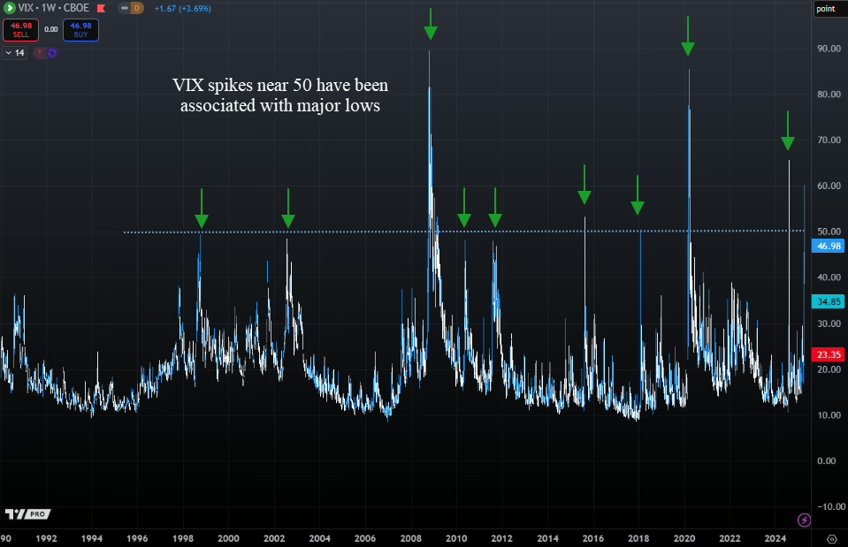
The bear market of 2008 had multiple spikes in the VIX that only resulted in short-term rallies of a few weeks.

But during other selloffs, the VIX moving near or above 50 marked the end of the selling. Today, the VIX touched 60, the highest level since the Japanese Yen selling last summer.

We have now seen two days (Thursday and Friday) that were both down at least 4%.

With stocks down again today, this marks only the 4th time in history we’ve seen selling like this.

What happened next was bullish over the near term, as shown in our next chart below.
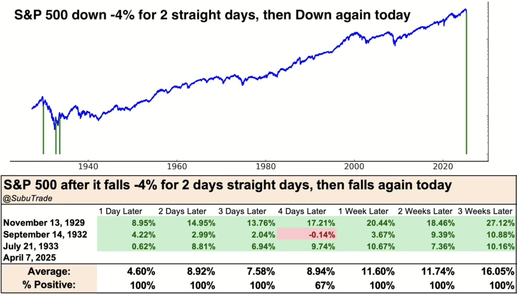
Returns following this type of volatility has been strong historically.

Average returns were over 11% when looking one week out.

This is a small sample size with only 3 occurrences, so we can’t take too much concrete information from it. But it shows that markets tend to bounce back strongly, at least over the near term.

Largest Two-Day Declines

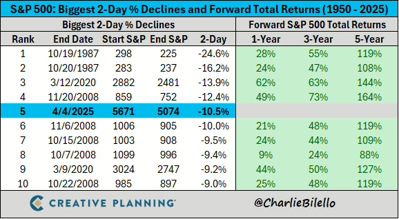
The two-day decline last Thursday and Friday was the 5th largest two-day decline in history.

What has happened after previous large declines?

The first chart below from Charlie Bilello (twiiter @charliebilello) shows the ten largest two-day declines in S&P 500 history.

There is no question about it, these have been buying opportunities, not selling opportunities. Returns have been much higher than average following selloffs like this.

If we look more closely at the chart above, all of the declines took place in 1987, 2008 or 2020. Not great company.

But this type of volatility not only tends to have strong returns looking over a 1-year timeframe or more, it also has marked the low point of major bear markets, as shown in the next chart below.
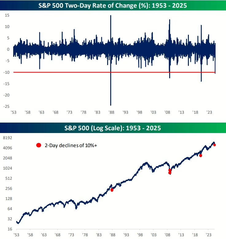
The top half of this chart shows a two-day performance of the S&P 500, while the red dots on the bottom half of the chart show when two day returns fell more than 10%.

Each of these occurred near the ultimate low of major bear markets.

But what about on a shorter time horizon?

Let’s look at what happened when we had very fast corrections.

Fastest 10% Corrections

Before the tariff selloff last week, markets were already moving quickly lower.

In fact, the S&P 500 had the 6th fastest 10% correction from all-time highs in history recently.

What happened next?
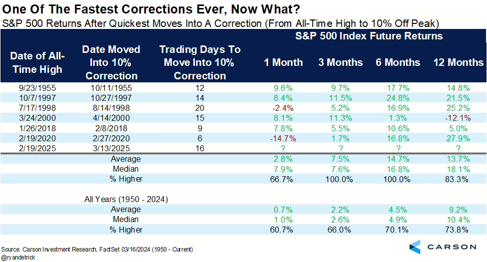
This chart shows that on average the market is nearly 15% higher on average after only 6 months.

This tells us that the speed of this overall correction also suggests that forward returns should be strong over the shorter-term as well, not just over the longer-term.

Bottom Line

The data suggests that we should expect an interim low any day, followed by a strong rally.

This doesn’t mean the decline is over, but economic and earnings data would have to deteriorate badly for further declines in stocks to occur. We are not ruling that out, it is just not the likely scenario at this point.

Earnings reports are starting this week, so we will have plenty of commentary from CEOs on the impact of tariffs on their business.

We will discuss more in our webinar tomorrow.

Invest wisely!


Filed Under: IronBridge Insights, Market Commentary Tagged With: inflation, investing, markets, stocks, volatility, wealth management

Can Market Strength Continue?

March 21, 2024

The idea which some people seem to entertain, that an active policy involves taking more risks than an inactive policy, is exactly the opposite of the truth. The inactive investor who takes up an obstinate attitude about his holdings and refuses to change his opinion merely because facts and circumstances have changed is the one who in the long run comes to grievous loss.

– John Maynard Keynes

The US stock market just had one of the strongest four months in history.

Can this market strength continue?

Spoiler alert…probably.

This time last year the data was NOT good, and risks to markets were incredibly high.

But as the year went on, the data improved. Our signals added risk back to target levels in client portfolios, and we were able to capture nice gains.

Fast-forward one year, and we have almost the exact opposite situation: good data, good markets and a generally positive environment.

However, the quote above from Keynes is as applicable today as when it was originally said in the 1930’s…as investors we MUST be able to look at data objectively and change strategy when it is required.

We were required to do that in 2023.

Will we be required to change from a bullish stance to a more negative one in 2024?

Let’s do a quick market scan to determine the likelihood of this.

Stock Strength to Continue?

As we mentioned earlier, stocks just had one of the strongest four-month spans in history.

In the 20 weeks that ended on March 15th, the S&P 500 index gained over 24%.

One might logically think that since stocks went up so much, they are overdue for a major pullback.

But the data tells a different story.

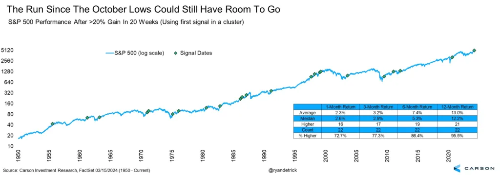
Our first chart is courtesy of Ryan Detrick of Carson Investment Research.

This chart shows the previous times the S&P 500 was up over 20% after 20 weeks. (You may need to click on the image to enlarge it.)

Since 1950, there have been 22 times the S&P 500 has been up over 20% in 20 weeks, as shown by the green diamonds in the chart above.

In 21 of those 22 times, the market was higher 12 months later by an average of 13%.

This is on top of the 20% that already occurred.

Even over the shorter timeframes, markets tended to do well.

Markets are higher one-month later roughly 72% of the time with an average performance of 2.3%. This beats the average monthly gain of 0.7% by nearly 3x.

Bottom line is that recent strength is positive, and despite any near-term correction that may occur, higher prices appear likely over the course of the year.

Opportunity Still in Small Caps

If we do see the historical trends mentioned above continue, then there still remains an opportunity in small cap US stocks.

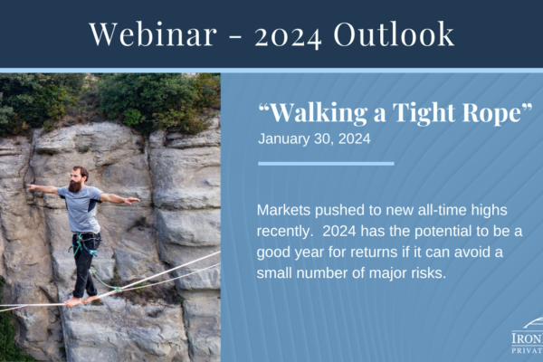
We discussed small caps in detail in our 2024 Outlook report, which can be viewed here:

The summary of our analysis was that if markets continue higher, we should expect smaller companies to perform well, possibly outperforming large cap stocks.

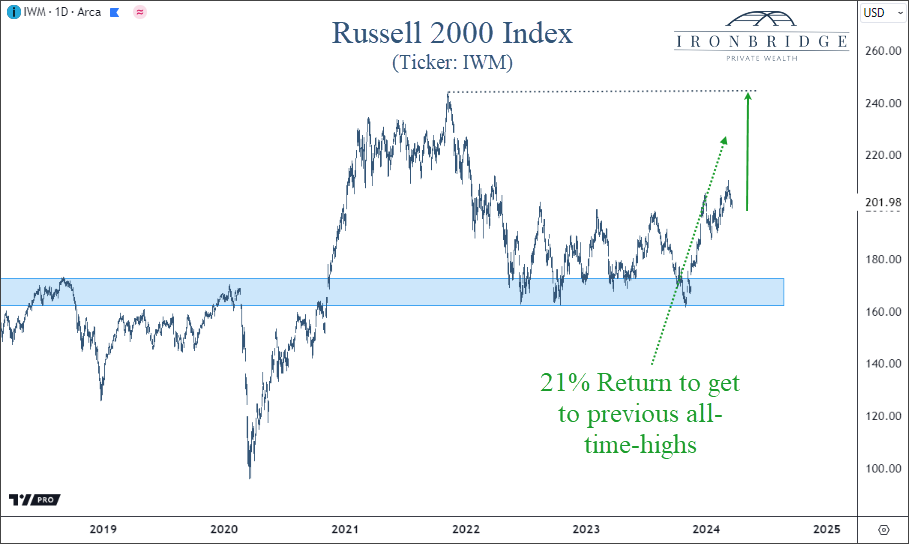
The next chart below shows this opportunity.

While the S&P 500 surpassed its previous all-time-highs last year, small caps still have a ways to go to achieve the same result.

In fact, the ticker IWM needs to go up 21% to get back to it’s previous highs.

Small caps are trying to break out of their range from the past two years, and if they are successful, then we should see the next leg higher for markets in general.

That is, as long as problems in the commercial real estate sector stay contained.

Commercial Real Estate is Stable (for now)

The wild card in small cap stocks remain the challenges from commercial real estate (CRE) debt.

So far, CRE debt has not been an issue in 2024.

Delinquency rates continue to be elevated, but there has been no further deterioration, which is a good sign.

Optimism that interest rates would fall this year has helped contribute to a stabilization in commercial real estate prices.

This stabilization has been needed for that sector of the economy.

CRE debt remains the single biggest risk to stock prices, in our opinion, given the potential to cause failures in smaller banks.

Inflation Pressures may keep Rates High

What about interest rates?

After all, the Fed did meet yesterday and kept rates unchanged.

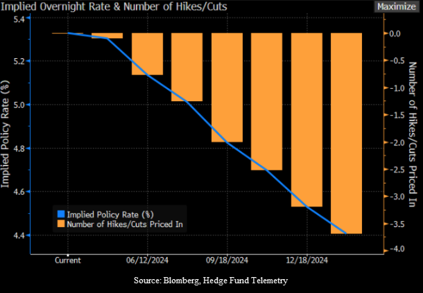
Two months ago, markets expected the Fed to have 6 rate cuts this year. Now, we’re down to an expected 3 rate cuts this year, with another expected next January, as shown in the chart below.

The blue line above shows the implied policy rate, or the rate which the Fed charges banks to hold funds overnight. This rate is currently in a range of 5.25 – 5.50%.

Learn more about the Fed Funds rate HERE.

With this many rate cuts projected, the market still appears to be anticipating a recession, despite the lack of recessionary data.

Why do we say that?

First, financial conditions are as loose as they’ve been since at anytime since the ’08 financial crisis.

Loose financial conditions imply that stress is low in the markets and the economy, providing support for economic growth.

Second, credit spreads are narrow.

This simply means that the riskier parts of the bond market are not showing signs of stress when compared to US Treasuries. Credit spreads are one of the earliest signs of stress in financial markets.

Third, inflation could be headed higher.

With a tight labor market, loose financial conditions, a supportive Fed, and an economy moving in the right direction, the conditions exist for another wave higher in inflation.

Higher inflation will NOT warrant rate cuts by the Fed.

In order for the Fed to cut rates, we believe that there needs to be a recession. And we simply don’t see that in the data in the near term.

But what if they do cut? What should we expect from markets?

Rate Cuts when Markets are near All-Time-Highs

Let’s imagine that the Fed does decide to cut rates in the next few months, and stocks remain around these levels or higher.

What would that mean for stocks?

Our friend Ryan Detrick once again has excellent data.

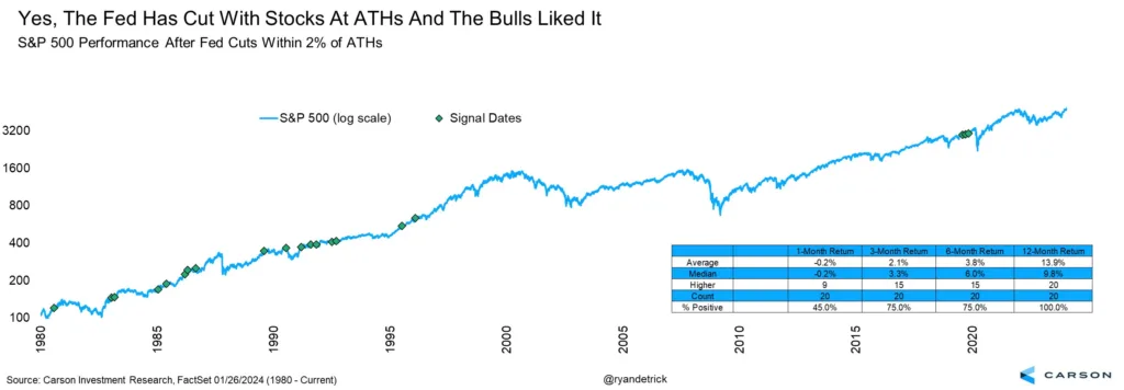
He looked at every time we saw a Fed rate cut with the S&P 500 within 2% of all-time-highs.

What he found was also bullish.

There were 20 times previously that the Fed cut rates with markets near all-time-highs.

Of those, markets were higher 20 out of 20 times, with an average gain of 13.9%.

Put another one in the bullish camp for 2024.

Bottom Line

The weight of the evidence suggests higher prices over the next year.

The combination of a strong market, loose financial conditions and stability in the commercial real estate market point to a generally calm market environment over the near term.

Things can always can change, so we must remember the quote above from Keynes and be vigilant in assessing risks and opportunities.

But for now, we should expect near term volatility to occur at any time, but expect that it should be short-lived and followed by higher prices.

Invest wisely!

Filed Under: IronBridge Insights Tagged With: federal reserve, inflation, interest rates, investing, IWM, markets, Russell 2000, stocks

2024 Outlook

January 31, 2024

Following a strong year in 2023, financial markets enter 2024 with strong momentum. Will this momentum continue?  Or will one of the risks push the market off it’s high wire?

In our 2024 Outlook report, we discuss the following:

  1. S&P 500 – New Highs are Bullish
  2. Liquidity Waterfall
  3. Small/Mid Caps Look Attractive
  4. Financial Conditions are Loose
  5. Signs of Stress not Apparent
  6. Risk #1: Inflation & Interest Rates
  7. Risk #2: Commercial Real Estate Risks
  8. Risk #3: Presidential Election
  9. Risk #4: De-Globalization
  10. Positioning
  11. Answer Your Questions

Invest wisely!

Filed Under: Strategic Growth Video Podcast Tagged With: federal reserve, inflation, interest rates, investing, markets, portfolio management, stocks, volatility

Where Oceans Meet but Don’t Mix

November 16, 2023

He released the two seas, meeting side by side. Between them is a barrier neither of them can transgress.

– The quran 55:19-21

Financial markets work in cycles.

Some cycles are short, lasting only hours. Like those following Fed meetings.

Others, however, last decades.

And when longer-term investment cycles change, things don’t always mix well.

Like many characteristics of financial markets, we see this phenomenon in nature as well.

What implications will this transition of investment cycles have on financial markets?

The Meeting of Oceans

At the southern tip of South Africa, the warm currents of the Indian Ocean meet the frigid currents of the Atlantic Ocean, as seen in the illustration below.

The dividing line between the Atlantic ocean and the Indian ocean is similar to when long-term investment cycles change.

Unlike geographic boundaries, the dividing line where these two oceans meet is determined by the CONDITIONS on each side of the line.

And despite their proximity, the composition of nearly everything in each respective ocean is different from one another.

Lifeforms, currents, temperatures, and mineral composition of the water all differ depending on which side of the boundary you look.

What is common place and normal under one set of conditions is abnormal and unusual in the next cycle.

Today, we are dealing with the transition from a falling interest rate cycle to a rising one.

The investment cycle, much like the meeting point of the Atlantic and Indian Oceans, is a place where forces collide, currents shift, and the landscape changes in unpredictable ways.

The transition between cycles is not always a clean one, either.

It can be messy.

This is because with longer-term cycles, investors become engrained in their belief that the underlying causes of the previous market cycle will continue into the next cycle.

Inflation & Interest Rate Cycles

The cycle we’re dealing with today is the inflation and interest cycle.

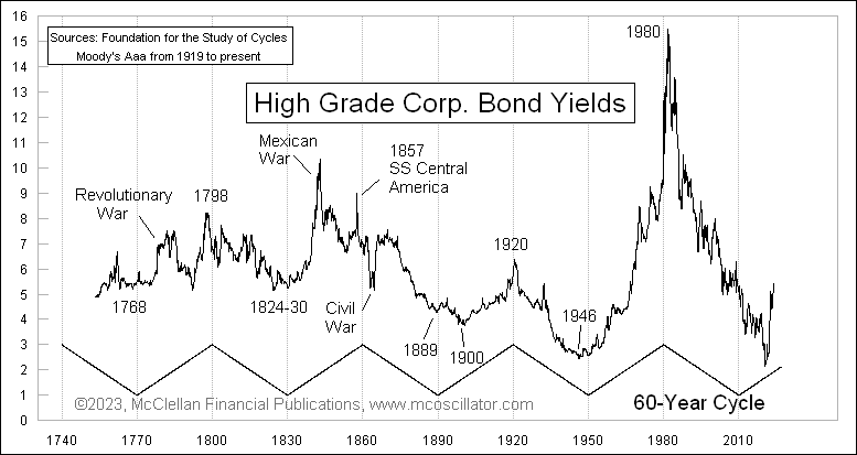
Historically, the full cycle lasts 60 years.

That’s 30 years of rising rates followed by 30 years of declining rates.

We can see this cycle on our first the chart below, courtesy of Tom McClellan.

The declining interest rate cycle that likely ended last year is actually quite late getting started.

According to the 30-year cycle, rates should have begun moving higher in 2010.

But the Fed had a different idea, and placed their thumb on the scale to keep interest rates at zero for another decade.

The decline in rates began in 1982. And began moving higher again in 2022.

That’s 40 years of a financial tailwind of declining interest rates supporting higher and higher asset prices.

When interest rates fall, the cost of money decreases. And when the cost of money decreases, profits rise.

This creates a “virtuous circle” of investment, where the declining cost of debt makes investment projects more and more appealing as rates fall.

But the inverse is true also.

Rising interest rates push the cost of capital higher, putting downward pressure on profit margins.

This pressure on profits results in many stocks struggling to grow during rising rate environments, mostly due to the influence of interest rates on valuations.

Stock Valuations and Interest Rates

One of the easiest places to visualize the effect of interest rates on the stock market is via valuations.

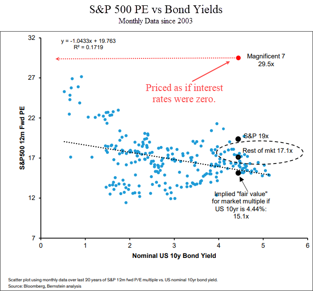
The next chart shows a scatter plot of the P/E ratio of the S&P 500 versus the 10-year US Treasury yield.

The yield of the 10-year Treasury is shows on the x-axis from left to right. The y-axis is the forward P/E ratio of the S&P 500 index.

Each blue dot shows the P/E ratio at the end of each month for the past 20 years, along with the corresponding 10-year US Treasury yield.

What this chart tells us is that there is a DIRECT correlation between interest rates and valuations.

And the formula is pretty easy: higher rates = lower valuations.

Most of the market is respecting this phenomenon.

The “Magnificent 7” is a term used for the largest seven companies in the index: Apple, Microsoft, Amazon, Nvidia, Meta, Google and Tesla.

This “Magnificent 7” is still trading as if interest rates were almost zero.

In the chart above, the red dot shows these seven stocks.

At an average valuation of 29.5, they are 72% more expensive than the rest of the S&P 500.

They may have better future growth prospects than other stocks, but this is still a very obvious data point where investors are assuming the lessons of the previous cycle will repeat in the next one.

The implication is that at some point in the next few months or years we should see reality start to set in for these big tech stocks.

That means that eventually we will start to see mid-caps, small-caps, international stocks and other investments start to outperform big tech stocks.

We’re seeing this in our system. We have recently added small caps, mid-caps and international stocks to client portfolios.

If interest rates put downward pressure on valuations, what does that mean bigger picture for the stock market?

Let’s look at the last two rising rate cycles for clues.

Rising Interest Rate Cycle (early 1900’s)

The last two times US markets experienced a rising interest rate cycle was in the 1970’s and the early 1900’s.

Let’s look at the early 1900’s first.

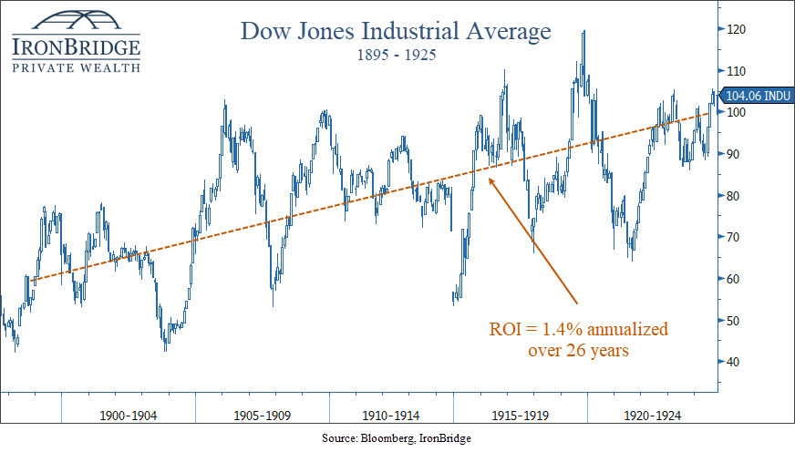
The next chart shows the Dow Jones Industrial Average from 1895 to 1925.

During this time, interest rates moved from a low of 3.7% to a high of over 6%.

This was the last interest rate cycle that happened before the existence of the Federal Reserve.

Over this period, stocks returned a whopping 1.4% per year compounded return.

Not great.

Interestingly, both GDP and earnings grew over the same period of time, much faster than the overall growth in equities.

This is because higher rates kept valuations low compared to the low rates of the previous cycle.

That’s great, but can we really compare today’s world to the one 100 years ago?

After all, isn’t everything different?

Sort of.

The one common denominator is us.

Humans are the key to the investment cycle.

With all of our flaws, behavioral oddities and penchant for making the same mistakes over and over and over, we bring our inherent biases to our actions whether we know it or not.

Sure, we think we’re smarter. After all, we have all the information in the world at our fingertips via our smart phones. But we tend to use it to view cat videos. So are we really that much more advanced?

But we digress.

So what about a more recent rising rate cycle?

Rising Interest Rate Cycle (1970’s)

The last time the US economy went through a rising rate cycle was in the 1970’s.

How did this compare to the period in the early 1900’s?

Answer?

Not any better.

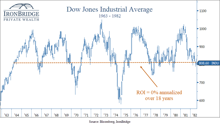
In fact, stocks returned 0% over nearly 20 years.

Stocks had a nice move higher post-WWII, but ran into the same valuation wall as it did in the early 1900’s.

Higher interest rates simply make it more difficult for stocks to grow over time.

There are many factors that go into the relationship between interest rates and valuations:

  • High interest rates compete for capital. Cash paying 5% has attracted dollars that otherwise would have gone into stocks.
  • The current value of a future stream of cash flows goes down as the discount rate goes up.
  • Financing costs increase, reducing profitability.

One thing is for sure: we must pay attention as these cycles change.

Mini-Cycles Within the Larger Cycle

If we have indeed made the transition from a declining rate environment to a rising one, we should expect broad stock markets to struggle more than they did in the previous cycle.

In these environments, bull markets will likely be measured in months instead of years.

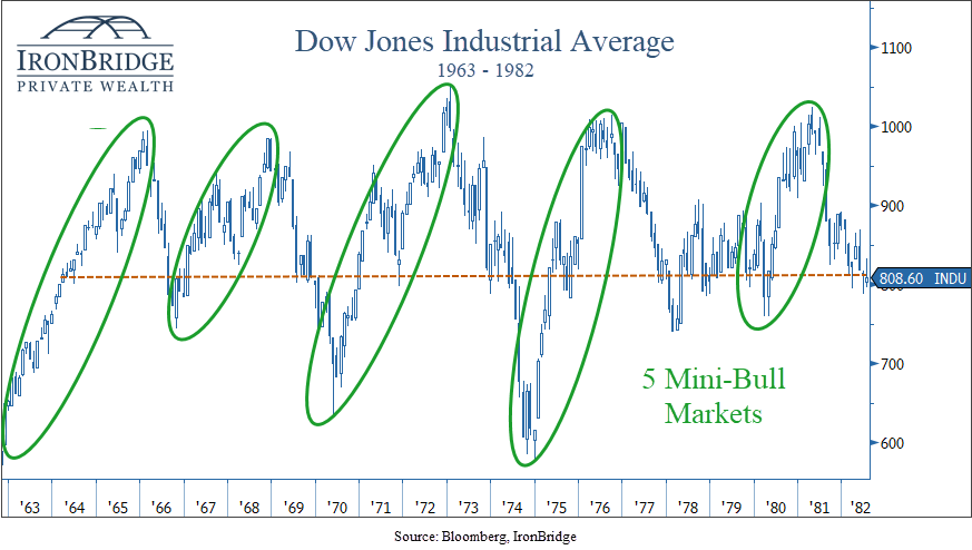
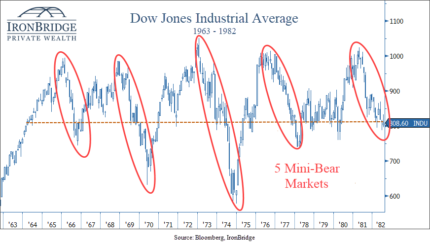
In both previous rising rate cycles, stocks had mini-bull markets that lasted from 24-36 months.

They were typically followed by bear markets lasting 18-24 months.

During the 1970’s, we saw 5 mini-bull markets, and 5 mini-bear markets, shown in the next two charts.

During each mini-bull market, prices met or slightly exceeded new highs on each subsequent move.

But each time markets would try to push to new highs, inflation would rise and a mild recession would occur. Stocks would fall to the low end of the range, and a mini-bear market would ensue.

This is the definition of a choppy market.

And this is the market that we may very well have over the coming decade.

Flash forward to today, and we’re in a bull market that has lasted 13 months thus far.

If the current cycle is anything like previous ones, we could see this mini-bull last a bit longer, possibly into mid-to-late 2024.

But chances are we should not expect a long-term bull market like we had during the 1980’s, 1990’s and 2010’s.

Bottom Line

The ebb and flow of interest rates and inflation create a dynamic environment that demands careful navigation.

In the coming years, it will become increasingly important to adjust exposure to risk based on non-emotional signals.

It will also become increasingly important to generate yield and not just rely on market appreciation to meet your financial goals.

A higher interest rate environment allows you to reduce risk and volatility over time.

But this rising interest rate cycle is not a two-year cycle that began in 2022 and ends in 2023.

Higher interest rates will likely be with us for many years into the future.

Invest wisely!


Filed Under: IronBridge Insights Tagged With: cape town, cycles, growth, income, inflation, interest rates, investment cycles, market cycles, markets, oceans, stocks, volatility, wealth management

Market Video: Orderly Correction & Commercial Real Estate Risks

September 29, 2023

In this Market Insights video, we discuss the current state of the market and delve into the stress that is starting to show in the commercial real estate sector.

We also analyze the GDP for the third quarter and present three scenarios that could unfold in the coming months and years.

Join us as we explore these topics and gain valuable insights into the market’s performance.

  • 00:45 S&P 500 Index
  • 02:13 Russell 2000 Small Caps
  • 04:54 Performance of Different Markets
  • 05:46 Delinquent Loans in Commercial Real Estate
  • 06:33 Delinquency Rates in Retail, Lodging, and Office
  • 09:23 GDP for the Third Quarter
  • 10:29 Scenarios for the Future

Please don’t hesitate to reach with any questions.

Invest wisely!


Filed Under: Strategic Growth Video Podcast Tagged With: commercial real estate, CRE, GDP, inflation, interest rates, markets, portfolio management, SPX, stocks, volatility, wealth management

The Fed’s Mixed Messages

June 14, 2023

Anyone who isn’t confused really doesn’t understand the situation.

edward r. murrow

The Federal Reserve met today, and for the first time in over a year they kept interest rates unchanged.

Typically, when the Fed pauses, it is a signal that they are more confident that their objectives have been met.

But this meeting was a bit different.

It was full of mixed messages.

Instead of signaling to the market that they are seeing concrete signs that inflation is going down, their message was incredibly strong that inflation problems have gotten worse and that higher interest rates are still ahead.

Let’s look at their mixed messages from today’s meeting.

The Projected Terminal Rate Increased

The Federal Reserve has a dual mandate as dictated by Congress: stable prices and full employment.

The “terminal rate” is the rate at which the Fed believes will best balance these two objectives.

Think of the terminal rate like getting two sides of a scale to be in balance.

a golden balance scale beside a laptop

If interest rates are too low, the employment goal is achieved but inflation can run hot.

If they are too high, then inflation is tamed, but it risks high unemployment.

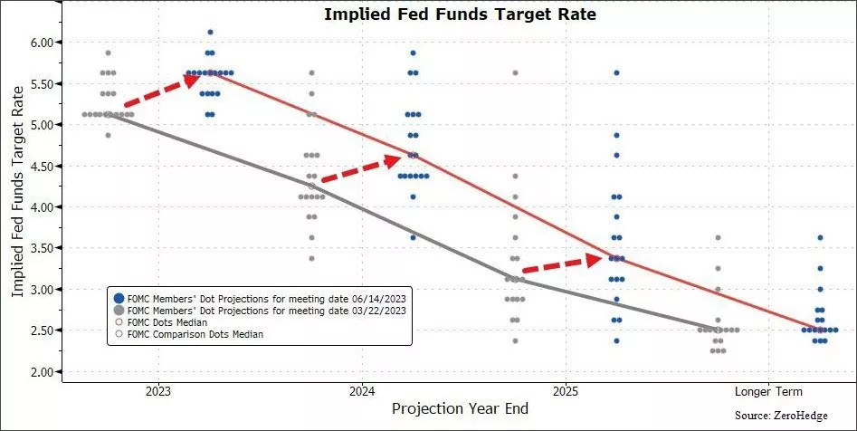
The projected terminal rate went up by 0.5% from their meeting one month ago.

This means they think they will increase rates at least two more times by the end of the year.

That may not seem like much, but in Fed-world, that is an enormous increase.

Which leads us to mixed message #1: They are MORE convinced today that inflation will continue to be a problem than they were at their last meeting. Yet, they chose to RAISE rates at the last meeting, and KEEP RATES UNCHANGED today.

Nine of the twelve voting members increased their projected terminal rate.

One member, in fact, believes the Fed will have to raise by another full percentage point to get inflation contained.

We can view this in the “dot plot” below.

Each dot in this chart represents one voting member’s view on where they think interest rates will be at the end of the year (shown along the bottom of the chart).

The grey dots were their previous projections and the blue dots are from today.

The question is…why pause if they are all so convinced inflation is still a problem?

It frankly doesn’t make much sense.

Especially given that inflation data has consistently been showing signs of slowing for at least a few months now.

So what does the inflation data tell us?

Inflation Data Differs from the Fed’s Message

This is where we start to question what the Fed is looking at.

If we look at numerous inflation data points, without question they are easing.

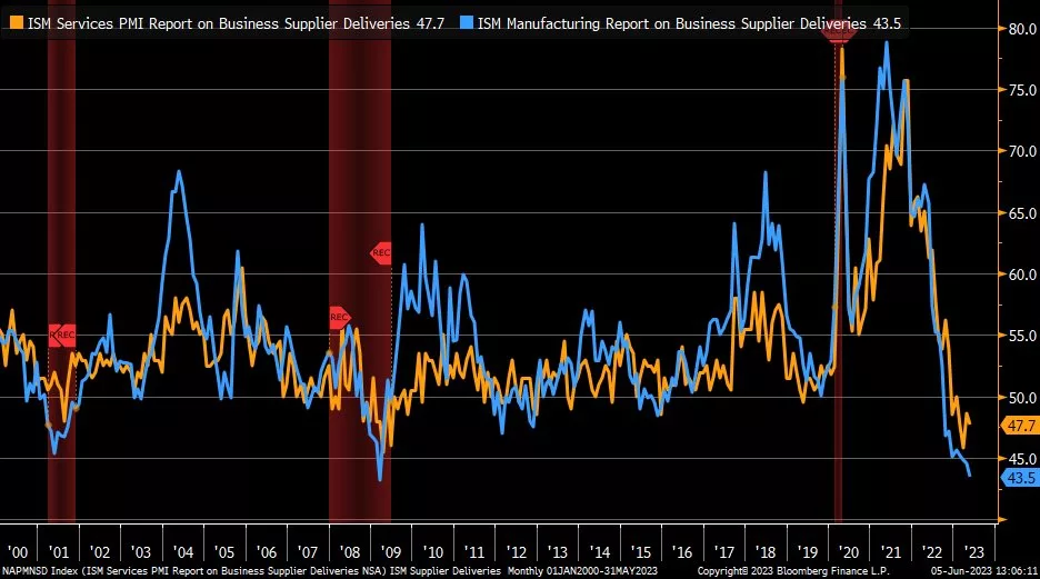
The next chart looks at a measure of inflation for the services sector of the U.S. economy (in orange) alongside the manufacturing supplier deliveries (in blue).

This is “fast data”.

Which means that it is an up-to-date measurement of inflationary pressures in the early stages of economic activity.

Think of supplier deliveries as the raw material ordered before a good is produced, sold and shipped. From electric vehicles to microwaves to jelly beans, this measures all of the various inputs to those end products.

This indicator tracks the actual deliveries, not just the orders.

And deliveries have fallen off a cliff in the past year.

Deliveries are important because they give us a glimpse into the first things that go into producing goods. Companies have purchasing managers who are responsible for getting the “stuff” in the door to make whatever widget that company produces.

This data is in recessionary territory (a reading below 50 signals a contraction).

You may think that this is just a result of the supply-chain issues being resolved after COVID. But that would make deliveries go UP. Companies would be receiving MORE of the inputs to their products, not less.

This is a sign that DEMAND is going down.

We can see this demand destruction in the business sector as well.

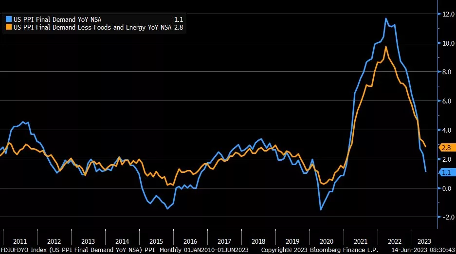
The next chart looks at final demand of producers (in blue) with final demand excluding the more volatile food and energy part of the economy (orange).

This also shows an environment where inflationary pressures are falling quite dramatically.

This is brings us to mixed message #2: the Fed has INCREASED their projected inflation targets while the data is showing exactly the opposite.

To be fair, employment continues to be strong, and the consumer remains resilient.

But employment data is “slow data”. When an employment number comes out it is typically at least a month old.

In fact, at the start of the last 4 recessions, employment indicators were all positive. It’s simply not a great tool to extract future economic activity.

Prioritizing slow data is like driving your car using the rear-view mirror. It doesn’t make much sense and it is incredibly dangerous.

And the Fed is doing just that.

Higher interest rates take time to work their way through the economy. They work on a lag. Increased rates now may take 6-12 months to show up in actual data.

They are prioritizing slow data to justify policies that work on a lag. It simply doesn’t make sense.

But there are very smart people working at the Fed. In addition to setting interest rates, they also provide numerous economic forecasts, including ones on unemployment.

This leads us to the last mixed message.

Unemployment Projections are Inconsistent with Growth Projections

As mentioned, the Fed does economic forecasts as a part of their “job”.

They should….there are over 400 Ph.D. economists employed there.

One forecast is on unemployment.

In May, they forecast that the unemployment rate would be 4.1% next year. (It is currently 3.7%).

But today they increased their forecast to 4.5%.

At the same time, they increased their GDP forecast from 0.6% annualized up to 1.0% annualized.

Here is mixed message #3: they think GDP will be STRONGER than they projected last month, but unemployment will be HIGHER than they thought as well.

We hate to break the news to them, but unemployment has NEVER risen by 0.8% in one year outside of a recession. (From the current 3.7% to their projected 4.5%).

Bottom Line

In our opinion, the mixed messages from today show just how different the potential outcomes are over the coming months.

On one hand, inflationary pressures are decreasing and economic data is showing signs of a slowdown. On the other hand, stock markets have remained surprisingly buoyant on the back of an artificial intelligence tech frenzy.

We’ll review these potential outcomes in our 2023 Mid-Year Outlook webinar that will be held on Tuesday, June 27th. You’ll receive details next week.

Until then we’ll continue to monitor the variety of differing data points to best help you achieve your financial goals.

Invest wisely!

Filed Under: IronBridge Insights Tagged With: federal reserve, inflation, interest rates, markets

Scrooged?

December 12, 2022

stern looking mature man in victorian costume carrying a cane  . Model is wearing a dark suit , top hat, glasses and prosthetic make up , the look created is also similar to a  Dickens victorian type character .

Men’s courses will foreshadow certain ends, to which, if persevered in, they must lead,” said Scrooge. “But if the courses be departed from, the ends will change.”

charles dickens, “A christmas carol”

In Charles Dickens’ famous book, A Christmas Carol, Ebenezer Scrooge begins the story as a mean-spirited and angry old man.

But he undergoes a transformative experience that changes him into someone who cares for others and embraces the spirit of giving.

The quote above by Mr. Scrooge is not the easiest quote to read.

If we paraphrase it, it may read something like this:

“If you go down a dangerous path, bad things will probably happen. But if things change, they might not be so bad after all.”

Currently, equity markets are trying to show more of a giving spirit like that of the transformed Scrooge.

But there are still MAJOR macro-economic signals with a grumpy, “old-Scrooge” like demeanor.

But will they will turn into positives in the coming months?


Grumpy Scrooge

First, let’s look at the more concerning indicators.

Specifically, there are three data points worth watching that are showing elevated risks for 2023:

  1. The Inverted Yield Curve
  2. Leading Economic Indicators
  3. Money Supply (M2)

These indicators tend to be excellent predicters of recessions when they turn negative.

And right now they are VERY negative.


Inverted Yield Curve

The yield curve is simply what a specific investment instrument yields at different maturities.

To understand the current yield curve environment, think of it like this:

Let’s say you want to invest in a Certificate of Deposit at a bank. You speak to a banker, and ask for the rates on a 2-year CD and a 10-year CD.

Logically, you expect the 10-year CD to be at a higher interest rate. You are, after all, committing funds to the bank for a decade.

But the banker tells you that the 2-year rate is paying 4.6%, while the 10-year rate is only 3.8%. This is an “inverted” yield curve.

When the yield curve on US Treasuries inverts, it has been the single best predictor of a recession in the past 100 years.

Right now, the yield curve is more inverted than anytime in the past 40 years.

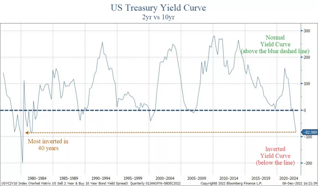
The chart below shows the difference between a 2-year US Treasury bond and a 10-year one.

US Treasury yield curve is the 2-year yield versus the 10-year yield. It is currently inverted by the most in nearly 50 years, signaling a deep recession is likely in 2023.

When the line is above zero, the curve is “normal”. Below zero and it is “inverted”.

The past three times the yield curve was inverted was in 2008, 2000 and 1987. It became inverted before the markets had extreme stress, and each time led to a recession and tremendous market volatility.

This chart above only goes back to the 1970’s, but it’s the same well before that as well.

The depth of this inversion is worrisome too.

At roughly 0.83%, this is a very steep inversion, and one that is signaling not just a recession, but a deep one.


Leading Economic Indicators

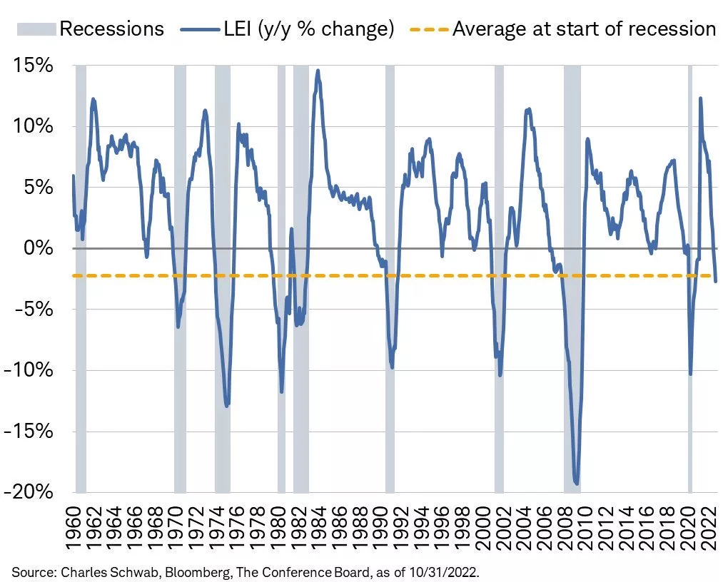
Another key data point to monitor is the Leading Economic Indicator Index (LEI). We discussed this in our Thanksgiving report (read it HERE).

The LEI is another excellent recession predicter.

It’s so good, in fact, that EVERY time in the past 70 years we’ve seen the LEI at these levels a recession has followed.

The chart below, courtesy of Charles Schwab and Bloomberg, shows that the negative LEI is below the average level where recessions begin.

Schwab Bloomberg leading economic indicators showing negative data and at a level below where recessions typically begin.

LEI is telling us that a recession is imminent (unless this time is different, which is a dangerous assumption in financial markets).  But LEI is not a good timing tool…it does not tell us when a recession might begin.

It only tells us that one is close. 

And the rate of change does in fact suggest that a recession is likely to be worse than “mild”.

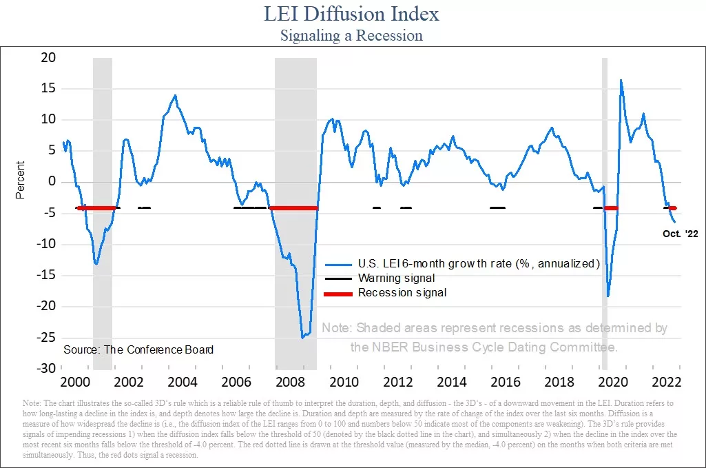
Another way to look at LEI is to look at the diffusion of the data.

Diffusion measures how widespread any strength or weakness is within the data. In the next chart, the diffusion index ranges from -50 to 50.  A reading below zero tells us that the majority of the data is weakening. 

Leading economic indicators diffusion index has an active recession signal.

When the diffusion index is below zero, it is indicating that a majority of the underlying data is weakening.  A reading above zero tells us the opposite, that most data is improving. 

When the diffusion goes below zero, it is a warning sign that economic trouble could be happening.  But a recession has not followed every time diffusion has turned negative.

Only when the index gets to minus-4 has it signaled that a recession is imminent.  The index is currently at minus-6. This is another excellent predicter of a recession, and it tells us that one is very likely to occur in 2023.


Money Supply (M2)

Another important, but little discussed aspect of financial market performance is the money supply.

There are various ways to measure the overall supply of money in a society. One of the broadest definitions is called “M2”. It measures the total amount of liquid funds in cash or near cash within a region.

This number includes cash, checking deposits and non-cash assets that can easily be converted into cash, like savings accounts and money markets.

If you’d like to learn more about M2, Investopedia has a nice article about it HERE.

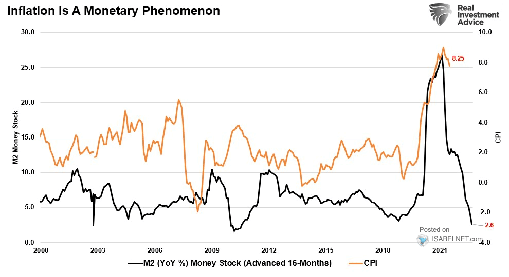
M2 has a very high correlation to inflation. More accurately, changes in M2 have a very high correlation to inflation.

The next chart shows this phenomenon, courtesy of our friends at Real Investment Advice in Houston.

The black line is the year-over-year change in M2 (moved forward 16 months), while the orange line is CPI.

M2 is telling us that inflation is likely to head much lower in the coming 12 months.

On the surface, this would appear to be a good thing. After all, isn’t inflation one of the problems that markets face right now?

Maybe it is a good thing.

But the real problem is the extent of the decline.

After a massive increase in M2 during COVID, the rate of change has collapsed.

The problem arises in how big this decline has been.

It is not signaling that inflation should moderate. It suggest that inflation may turn into outright deflation.

The only way this happens is if we enter a moderate-to-deep recession. When major data points align like these three do right now, we must pay attention.


The New, More Giving Scrooge

While there are plenty of reasons to believe that 2023 is going to be a bad year again for stocks, not everything is bad.

Let’s look at some good data points right now:

  • The consumer remains strong. Shoppers spent a record $5.29 billion this Thanksgiving, an all-time record high. Yes, inflation had some to do with this, but at this point inflation is not having a meaningful impact on the consumer, at least; not yet.
  • Unemployment is low. The unemployment rate remains below 4%, primarily due to the services sector being strong.
  • Inflation is slowing some. CPI for October came in at 7.7%, below estimates of 7.9%. November’s CPI data will be published tomorrow. As we can see from the M2, we should expect inflation to slow in the coming months.
  • The Fed may be close to pausing. The market is anticipating a 0.50% increase at their meeting next week, with an additional 0.25% at their February meeting. Currently, markets expect that to be the end of interest rate increases for now. Historically, when the Fed Funds rate gets above the 2-year treasury yield, the Fed pauses interest rate increases. This will likely happen this week, so they very well could be done raising rates for a while.

Unemployment is a big data point here. Once the unemployment rate starts to rise, it has a direct impact on spending.

And consumer spending is roughly 70% of the US economy.

The main problem with looking at unemployment and other actual economic data is that they are backward-looking.

Once unemployment increases, we are already likely in a recession (even if it is not officially announced yet).

Which makes the forward-looking data points that much more important to consider.


Bottom Line

Despite the recent calm in markets, this is not a time for complacency.

Over the past 50 years, every time markets were volatile and NOT in a recession, NONE of the three indicators listed above were negative.  

Now, all of them are negative. And all of them were negative prior to recessions.

This tells us that the likelihood of a recession next year is extremely high. In fact, the data suggests that it should be more of a question about the extent of the decline, not whether one occurs.

Fortunately, it is not a foregone conclusion that a recession will be deep and painful. There is still plenty of time for things to change into something more positive.

Hopefully, this angry Scrooge-like data will transform to be something less angry and more joyous towards everyone.

But as we always say, hope is not an investment strategy.

For now, we must deal with the realities of the environment at hand.  And the current environment has major risks that should not be ignored.

Invest wisely!

Filed Under: IronBridge Insights Tagged With: economics, federal reserve, GDP, inflation, investing, leading economic indicators, LEI, markets, money supply, portfolio management, volatility, wealth management, yield curve

Thanksgiving Appetizer Report

November 22, 2022

Fall theme charcuterie board for holiday entertaining

Just wanted to provide a quick update as everyone prepares for the holiday week. We’ll send out a more detailed report next week.

Big Picture

  • Markets have remained calm after the massive gain two weeks ago following a milder than expected inflation number.
  • Earnings for the most part have been better than feared.
  • Markets are entering a seasonally strong period. From the Tuesday before Thanksgiving thru January 2nd, markets are up on average 79% of the time, averaging a 2.7% gain.  This is what is commonly known as the “Santa Rally”.
  • Despite these positives, many
    warning signs still exist: leading economic indicators are weak, overall
    financial conditions are deteriorating, and the housing market is under
    stress. These conditions have not shown up in economic numbers (yet).

Economy

  • The good news: Economic activity remains resilient. GDP was up 2.6% in the 3rd quarter. 4th quarter GDP, according to GDPNow, is tracking up 4.2%. View it HERE.
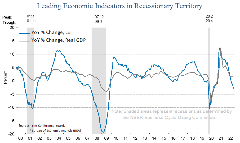
  • The bad news: Leading economic activity is at recessionary levels as shown in the first chart below.
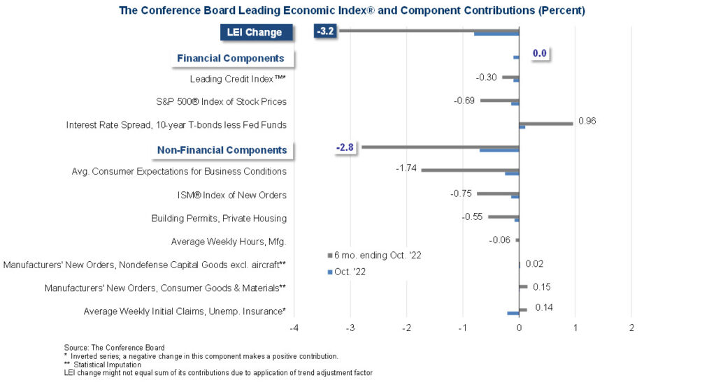
  • If you’re curious as to what makes up the Leading Economic Index, the second chart below shows the ten components with contribution from each.


Equity Markets

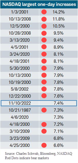
  • On November 10th, the S&P was up nearly 6%, and the Nasdaq was up 7.4%. This accounts for more than half of the return in the past two months.
  • The big jump in markets on was due to inflation coming in at 7.7% instead of 7.9%.
  • Big daily increases like this do not occur in good markets. The chart below shows the 20 largest increases in Nasdaq history.
  • 17 of the previous 19 largest daily increases occurred during major bear markets and did not mark the bottom.
  • The other 2 happened one week after the ultimate bear markets lows in 2009 and 2020 under very different conditions than we have now (VIX then was above 80, while VIX currently is at 22.)
  • Near-term, markets could continue to drift higher. Looking past the next few weeks, things appear to be very weak. Caution is advised.

Interest Rates

  • The Fed is likely to increase rates by 0.50% in December, then another 0.25% in February. The market anticipates that the Fed will stop raising rates after that.
  • Longer term rates appear to be calming down, and may be starting to price in recessionary risks.

Bottom Line

While the relative calmness has been a welcome respite from the volatility this year, we do not believe this is a time for complacency.

We would love to believe that the bear market is over. At our core, we are optimists.

But more importantly, we are realists.

Equity exposure has steadily increased in client portfolios this quarter. If market and economic conditions continue to improve, we will continue to do so.

But we view any new equity exposure as potentially having a very short shelf-life.

We will not hesitate to reduce equity exposure, increase cash levels, and do more hedging to protect portfolio values if and when these actions are warranted.

We hope you and your loved ones have a wonderful Thanksgiving holiday.

Invest wisely!

Filed Under: IronBridge Insights Tagged With: earnings, federal reserve, inflation, interest rates, markets

  • Go to page 1
  • Go to page 2
  • Go to page 3
  • Go to page 4
  • Go to Next Page »

Footer

LET'S CONNECT

  • Email
  • Facebook
  • Instagram
  • LinkedIn
  • Twitter

AUSTIN LOCATION

6420 Bee Caves Rd, Suite 201

Austin, Texas 78746

DISCLOSURES

Form ADV  |  Privacy Policy  |  Website Disclosures

  • Home
  • Difference
  • Process
  • Services
  • Insights
  • Team
  • Clients
  • Form CRS
  • Contact Us

Copyright © 2017-Present by IronBridge Private Wealth, LLC. All rights reserved.