• Skip to main content
  • Skip to footer

IronBridge Private Wealth

Forward with Confidence

  • Home
  • Difference
  • Process
  • Services
  • Insights
    • IronBridge Insights
    • Strategic Wealth Blog
    • Strategic Growth Video Podcast
    • YouTube Channel
  • Team
  • Clients
  • Form CRS
  • Contact Us

stocks

A Recession or Not a Recession, That is the Question

August 5, 2022

“To be or not to be–that is the question: Whether ’tis nobler in the mind to suffer the slings and arrows of outrageous fortune or to take arms against a sea of trouble and by opposing end them.”

hamlet, act 3, scene 1

July was a nice month in the markets.

Which begs the question…have we seen the lows in this bear market?

Should we expect markets to continue to rise and suffer the slings and arrows of outrageous fortune? Or is this yet another fake-out like we’ve seen twice already this year and we go back into a sea of trouble?

The answer? It depends.

In most environments, it “depends” on a complex series of data points could shape the direction of the markets.

However, today’s environment seems more simple on the surface.

It depends primarily on only one variable: whether we are in a recession or not.

The reason is very simple…markets respond differently to pullbacks similar to what we’ve seen this year based solely on if it happens during a recession or not.

Let’s look at some historical context.

S&P 500 Performance: Recession vs No Recession

Markets can decline without the economy being in a recession. Since 2009, we’ve seen this happen a few different times:

  • 2011: US Debt Downgrade
  • 2016: Chinese Yuan Devaluation and Oil Crash
  • 2018: Random 20% decline in the 4th quarter

Each of these times, markets fell roughly 20%.

And each of these times, markets recovered losses within 18-24 months.

But there was no recession during these periods.

Our first chart below, courtesy of Ned Davis Research, shows this dynamic. The chart shows declines of at least 18% and separates it between two categories: whether it occurred during a recession or not.

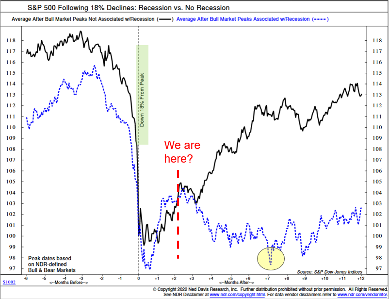
The black line is the performance of the S&P 500 when there was no recession, while the blue dotted line shows the performance if there was an official recession.

We are currently two months past the recent lows, as indicated by the red dashed line.

Based on what the market has done historically, the results are very clear: if we’re not in a recession, we should expect the next 12 months to be pretty good. If we are in a recession, we should expect more volatility and a retest of the lows.

Which begs the question…are we in a recession or not?

Are We in a Recession?

Normally, determining a recession is pretty straight-forward: it is two consecutive quarters of negative GDP growth.

Both Q1 and Q2 this year were negative.

So by historical definitions, yes, we are in a recession.

But it may not be quite that simple this time.

We don’t like to get political in these reports, because the world focuses way too much on the self-absorbed, sociopathic political class.

But with mid-term elections around the corner, the incumbents are trying to change the definition of a recession.

It’s an overly transparent pre-election tactic. But we will reluctantly admit that in this case, they may have a point.

(To be fair to our politician friends, many economists agree that the first quarter did not resemble a typical economic recession.)

Let’s look at the data.

The first quarter GDP came in at a negative 1.4%, mostly because of two things:

  • Defense spending fell 8.5%
  • A trade imbalance due to a strengthening US dollar resulted in a negative 3.2% from total GDP.

Remove these two factors, and GDP is positive. In fact, if you simply remove the trade imbalance, GDP is positive.

Economic data in the first quarter was fairly positive as well, led by consumer spending, which was up 2.7%.

While the first quarter showed relatively good economic data, the second quarter was recessionary without question.

Second quarter GDP was negative 0.9%. And the negativity was more widespread.

  • Inventory investment decreased 2.0%
  • Housing investments decreased 0.7%
  • Federal and State spending both decreased slightly
  • Business investment decreased 0.1%
  • Consumer spending rose by a more moderate 0.7% (down from 2.7% in Q1)

With the underlying strength in the first quarter, it’s not out of bounds to assume that we’ve only seen one quarter of truly negative GDP growth.

(For the record, we don’t think we should change the traditional definition of a recession, but we should always put GDP data in context, both positive and negative.)

Which makes the current quarter especially important.

If we have negative GDP this quarter, there is no question that we are in a recession. The question then becomes how bad it is and how long it lasts.

Atlanta Fed GDPNow

One way to keep track of current GDP estimates is through the Atlanta Fed’s “GDPNow” tracker. (You can view the site HERE.)

As of Thursday, August 4th, they are projecting a 1.4% GDP for Q3, as shown in the next chart.

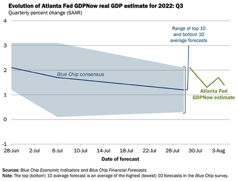
Granted, the estimate has steadily declined since the start of the quarter, and we still have almost 2/3 of the quarter left. So anything can happen.

And this data is also based on human estimates, which can be skewed.

But it should at least give us some hope that maybe we don’t see a formal recession this year. And if we do see one, it would likely be fairly mild.

This morning’s jobs report adds to the hope that we may not be in a recession just yet. The economy added 528,000 new jobs this quarter, and as of July has officially recovered the number of jobs lost during COVID.

However, we shouldn’t get too complacent at this point.

While GDPNow is showing positive estimates for current GDP, there are huge warning signs right now that should give us cause for concern.

Inverted Yield Curve

Historically, one of the best recession indicators has been an inverted yield curve. This occurs when the 10-year yield on US Treasuries are LOWER than the 2-year yields.

The next chart, courtesy of Bloomberg, shows this inversion.

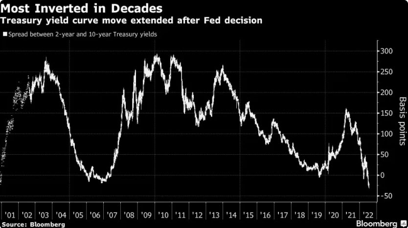
When the line goes below zero, the curve is inverted.

Right now, it is more inverted than at any time since Paul Volker started fighting inflation the early 1980’s.

It is more negative than COVID, than the global financial crisis, the tech bubble, and various recessions during the 80’s and 90’s.

We strongly believe that it is imprudent to ignore this data point.

But this data point isn’t a very good timing indicator of when a recession may happen.

In reality, it is when the curve starts to steepen AFTER it has been inverted that is a better indicator that a recession is imminent, and we haven’t seen that happen yet.

Housing Market Concerns

While the inverted yield curve is a bit more theoretical in nature, there are real economic data points that are showing signs of stress.

The housing market plays a huge part in economic activity, accounting for 15-18% of US economic activity on average.

Leading indicators in the housing market are showing reason to be concerned.

One of these is cancellation rates, as shown in the next chart from Redfin.

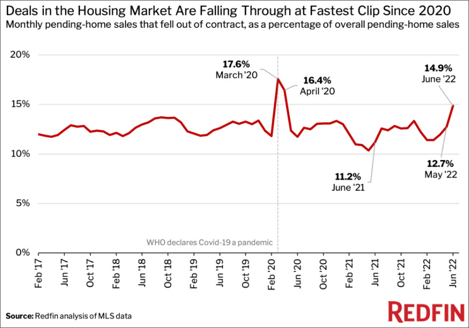
Cancellations happen when an accepted offer is withdrawn by either party.

In this case, the majority of cancellations are due to buyers backing out.

There are legitimate reasons for this happening:

  • Mortgage rates have increased, making it unaffordable for a buyer to proceed;
  • Property taxes have been reassessed higher, increasing the cost of housing;
  • People anticipating that prices may fall, causing buyers to withdraw offers.

Here’s a link to the article discussing cancellations:

The Deal Is Off: Home Sales Are Getting Canceled at the Highest Rate Since the Start of the Pandemic

Another reason for cancellations is a drop in consumer confidence, which has a big effect on economic conditions in the US.

Consumer Confidence

While the housing market is a large part of the economy, the consumer as a whole is much more important. Approximately 70% of the US economy is driven by the consumer in one way or another (this includes housing).

So when consumer confidence slows, economic activity typically slows along with it.

And the consumer is in the dumps right now, as shown in our next chart.

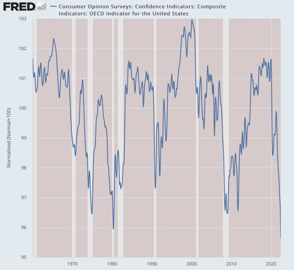
Right now, the consumer is the least confident they have been at any time in the past 60 years. This includes the Vietnam era, the inflation of the 1970’s, the tech crash, the global financial crisis, and COVID.

That is concerning.

But what does all of this tell us about the near-term direction of the market?
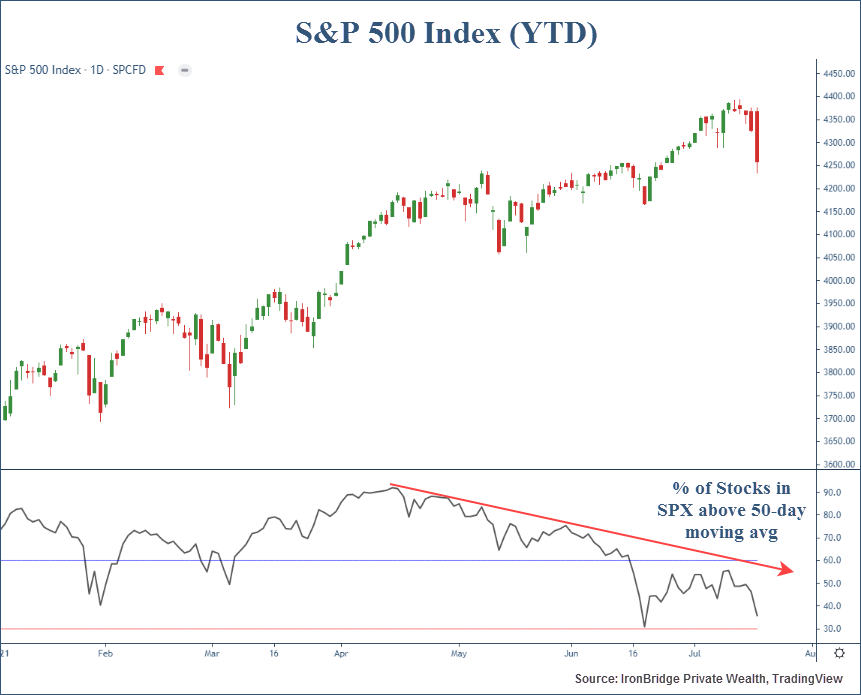
S&P 500 Index

All of the data listed above is not news to the market.

Despite these concerning data points, markets have rallied over the past seven weeks.

But the move higher since June looks almost identical to the one in March, as shown in the chart below.

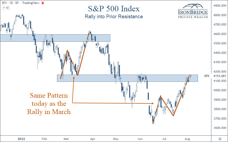
Specifically, the pattern is a three-leg move higher into previous highs.

There was an initial leg higher, a move lower of roughly the same timeframe, then an extended move higher in both time and price.

The move in March followed the Ukraine invasion.

The move in June really didn’t have any catalyst, other than the overall market being incredibly pessimistic.

In addition to the S&P 500, nearly every major US stock index looks identical.

The next chart shows the S&P 500, the Russell 2000 small cap index, the Nasdaq Composite and the S&P Mid Cap index.

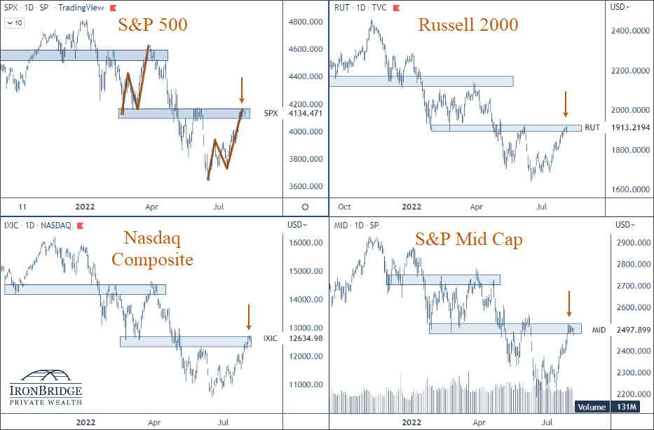
Every one of these indices are at the same resistance level. This means that the market thinks these levels are important.

Regardless of the reason for the move in June, it has been strong. Earnings reports have been more positive than expected, and the market is starting to predict that the Fed will become more accommodative and “pivot” by slowing the rise of interest rates.

If the market is going to do it’s own pivot and head back lower, it must do so very quickly.

If it breaks above this resistance area, then we can begin increasing equity exposure in client portfolios, at least for a period of time.

If it heads lower, then we should expect a fairly quick move to test the lows from June.

Bottom Line

While a big consideration for the market is the current recession debate, markets are extremely complex systems. Relying on only one data point for decision-making would be foolish.

When looking at a variety of data points, it truly is a mixed bag out right now.

Recent market strength and earnings reports have been mostly positive. As such, the market seems to believe the Fed will slow down the pace of interest rate increases. (Frankly, this expectation seems to be unwarranted, especially after today’s employment numbers.)

For now, the move higher over the summer appears to be a typical bear market rally. As such, we have been intentionally slow to add equity exposure.

Why?

Mainly because there is still plenty of upside if the market wants to keep pushing higher. For example, the Nasdaq is down nearly 23% this year, even after a big rally over the summer.

And big stocks like Google, Microsoft, Facebook and Netflix still have massive upside potential at current levels.

If the market can get above the levels noted in the S&P chart above, there starts to be more proof that this rally may be more than just another temporary rally.

But if we do go into a recession, all bets are off. And there are many indications to suggest we are headed in that direction.

Bottom line is that we believe it is prudent to underweight risk right now, given the massive uncertainties in the market and the economy.

Invest wisely!


Filed Under: IronBridge Insights Tagged With: Apple, Facebook, federal reserve, Google, interest rates, investing, markets, Microsoft, recession, risk management, stock market, stocks, volatility, wealth management

Ukraine War: Portfolio Update

March 4, 2022

We shared two other reports this week regarding the Ukraine War:

  • Informational Resources: View Report
  • Market Update: View Report

Today, we’ll give a brief update on our clients’ portfolio positioning given the uncertainties in Ukraine.

This report will be brief. Please reach out to us directly if you would like to discuss your individual portfolio in more detail.

We will provide another market update next week.

For now, let’s focus on three primary asset classes:

  1. Cash
  2. US Equity
  3. International Equity

We will look at two basic portfolios today: Balanced and Aggressive Growth.

We do have clients with custom portfolios, so please reach out if you would like a detailed snapshot of your account.


Balanced Portfolios

Let’s look at balanced portfolios this year.

Specifically, let’s look at the change in allocation from the start of the year.

The chart below shows three major asset groups (Cash/Fixed Income, US Equities and International Equities), and how much of a balanced portfolio was invested in each on three different points this year:

  • December 31
  • January 31
  • Current (March 4)


In this chart, the dark blue is the exposure to each asset class on December 31st. The lighter blue shows exposure on January 31st, and the gold is the current allocation to that asset class.

Broadly, this chart shows the following changes from the end of last year to now:

  • Cash/Fixed Income: increased from 31% to 59%
  • US Equity: decreased from 58% to 37%
  • International equity: decreased to 0% once Russia invaded Ukraine.

Since the start of the year, overall stock exposure (US plus International) fell from 66% to 37%.

This is very large increase to safer assets this year, especially given that there has only been roughly a 10% decline in the S&P 500 so far this year.

Now, let’s look at the same chart for more aggressive portfolio.

Aggressive Portfolios

Here is the same chart as above, only for portfolios that are more aggressive.


This tells the same story:

  • Cash/Fixed Income: increased from 6% to 40%
  • US Equity: decreased from 82% to 55%
  • International equity: decreased to 0% once Russia invaded Ukraine.

For both portfolios, clients should expect to see lower volatility now than in the first few weeks of the year.

This also speaks directly to one of our core objectives at IronBridge: to eliminate the big downside scenario.

We cannot avoid volatility, nor do we want to. You must have volatility if you want to try to achieve decent returns over time.

But by reducing exposure to risk on a total portfolio basis, you can greatly reduce the risk of having large, damaging returns.

Changes in the Composition of Equity Exposure

If the first tool in your risk management toolbox is your overall exposure to cash, the second tool is the characteristics of the assets that are still invested.

The charts above show that overall stock exposure has decreased this year.

The other thing that has happened is that the stocks in which you were invested changed as well. Specifically, the characteristics of those stocks changed.

Here are various ways the amount invested in stocks has changed this year:

All of the items listed above should contribute to lower volatility in the stocks you are still invested in.

Sector exposure changed from aggressive (technology) to defensive (consumer staples).

Stocks with lower P/E ratios and price-to-book ratios typically have lower volatility.

And we have had a very distinct shift from growth to value in your portfolio as well.

Why we like Cash for Risk Management

As shown above, cash exposure for all clients has increased substantially this year.

We strongly believe that cash is THE BEST way to manage risk.

Why?

Cash is predictable.

There are other ways to manage risk: hedging, asset allocation, derivatives in futures markets, certain options strategies and shorting stocks.

Each of these can be effectively used. But they are complex and have various other risks that come along with them.

To do this effectively, you MUST have a process. You cannot have emotion be a part of the decision.

Why? Because we are humans and we are not very good at combining rational actions with emotional feelings.

Bottom Line

We have continued making portfolios less aggressive and less exposed to risk. As long as the market is showing volatility, we will continue doing that.

Given the continued approach by Putin to dig in his heels and extend the duration of this war, markets are likely to remain volatile.

We are positioned for volatility now, and may become more defensive as time goes by.

As always, please let us know if you have any questions.

Invest wisely!


Filed Under: IronBridge Insights Tagged With: bonds, cash, investments, portfolio, russia, stocks, Ukraine, war

Charitable Giving and Donor-Advised Funds

November 3, 2021

The impulse to help others in need and to share good fortune is universal. It has never been solely the province of the very wealthy; charitable giving at all income levels, whether by donating time, money, or expertise, is a part of many people’s life plan.

When it comes to giving plans that involve donating wealth, the elements of several different dimensions – demographic trends, market performance, advances in financial services, increased need, and potential changes to the tax code – are combining to create unprecedented amounts of giving. And further, the way we give is changing.

We break down the recent data and the reasons behind the changes to philanthropy.

The Need of Last Year Resonated

According to a June 2021 study by Giving USA, American charitable giving hit $471 billion in 2020, a 3.8% increase from 2019. The largest increase in percentage terms was to local giving. Vanguard Charitable reports that homeless shelters and food pantries saw a rise of 147% in donations over 2019. Being able to help and make an impact in your community – the aphorism “charity begins at home” – clearly motivated donors.

But the Trend is Likely to Continue

However, there are many other reasons that played into giving that are likely to continue as we move forward in recovery. This will likely keep charitable dollars flowing. The more than decade-long strong performance of the equity markets means that wealth has increased dramatically. Stimulus programs that helped keep the economy moving also boosted consumer balance sheets as consumers elected to pay down debt. Confidence that the economy will recover and a strong labor market is also likely to result in more giving.

At the same time, a wealthy older generation is acting on their desire to leave a legacy of positively impacting their world. The difference with Boomers is that they are responding to younger generations’ priorities. Boomers see charitable giving as a way to involve their families, share their values, and create stronger bonds.

And finally, the likelihood that tax rates will increase and tax code changes will potentially alter existing tax-advantageous strategies is making it a priority to take advantage of the tax benefits available now by compressing a timeline for giving.

There’s an Efficient Way to Give

For many financial giving strategies, setting up a trust makes sense. Trusts avoid probate and they are very customizable. And they are not just vehicles for the extremely wealthy – there are many situations in which investors at all income levels can benefit from a trust structure. However, they are complicated legal structures with expense involved. Many investors who want who do not want a trust-based giving strategy are now turning to donor-advised funds (DAFs).

DAFs allow for donations of highly appreciated stock or other assets. The donor receives an immediate tax deduction but does not have to apportion the money to different charities right away. The money can stay in the account for years, be invested according to the donor’s wishes, and then ultimately be allocated to charity.

The National Philanthropic Trust cites data from 2015 – 2019 to underscore the increased popularity of these vehicles. Contributions to DAFs totaled $38.31 billion in 2019, up 80% since 2015. And people are increasingly allocating the money in their donor-advised funds to charities they have selected. More than $25 billion in grants to charitable organizations were made from DAFs in 2019, a 93% increase over 2015.

The Bottom Line

Increased need, a strong equity market, and the likelihood of losing tax advantages are propelling charitable giving. As the older generation makes their mark, they are including family – and not just adult family- in the process.

Filed Under: Strategic Wealth Blog Tagged With: charitable giving, donor-advised funds, family business, stocks, tax planning, taxes

Are the Dog Days of Summer Over?

July 19, 2021

A calm summer for the markets was interrupted today with a large selloff. Is this just a blip, or is it the start of a bigger decline?

What happened:

  • Dow Jones Industrial Index closed down 725 points, or 2.09%
  • S&P 500 was down 68 points or 1.59%
  • The media blamed COVID fears, but it looks more technical in nature
  • VIX Index rose nearly 40% at one point during the day
  • Bonds had their best day of the year, with long-term US Treasury prices up over 2%

Near-Term Market Assessment:

  • Numerous warning signs have been happening over the past three months:
    • Lumber prices have fallen 68% from their highs.
    • 10-Year Treasury Yields have dropped from 1.76% in March to 1.19% today.
    • Fewer stocks have been participating in the slow drift higher since mid-February. Today, more than 50% of the stocks in the S&P 500 are below their 50-day moving average (more on this below). That number has been steadily rising since April.
  • It is too early to tell if this selloff will continue. Bull markets tend to have short, sharp declines like this.
  • The S&P 500 Index is only 3% off its all-time highs. So the fear seems somewhat unwarranted at this point.

Portfolio Implications:

  • We have been systematically raising our stop-losses over the past few months.
  • We sold two positions today, one stock ETF and a high-yield bond ETF. Both moved to cash equivalent ETFs.
  • We may get further sell signals this week. If we do raise cash this week, it may not remain in cash very long if the market decides to resume its move higher.
  • We do not know when a short-term decline will turn into a long-term decline. That’s why we have rules and don’t try to guess. This kind of environment has the potential for a “whipsaw”, where we move from invested to cash and back to being invested. This is definitely not the favorite part of our process, but it is a natural consequence of having disciplined rules and not just winging it.

Market Discussion

Markets were down over 2% today. The primary (and easy) explanation is COVID. Every state in the US is showing a rise in cases. Los Angeles reinstated mask requirements this past weekend (even for those fully vaccinated). Other parts of California and possibly New York City may follow suit with mask requirements.

Naturally, any volatility in the markets is blamed on the most recent “thing”. It’s natural to assume that the rise in cases we are seeing now would result in a market environment like we saw in early 2020. We’re human and that’s what we do…extrapolate past events and assume they will happen again.

But the reality is that there were plenty of factors to explain the move lower today.

And they are mainly technical in nature.

First, market breadth has been very narrow the past few months.

This simply means that fewer and fewer stocks have been in uptrends, despite markets drifting higher. In fact, many stocks have been in downtrends since April.

The chart below shows the percentage of the S&P 500 Index that has been above its 50-day moving average (50dMA).

S&P 500 Index components above 50 day moving average following the market decline of July 19, 2020.

The 50dMA is simply the average price of a stock over the last 50 trading days. A stock above that level is generally considering to be in a rising trend (or a bull market). A stock that falls below that level is considered to be in a declining market.

What the chart above shows us is that while the market has been drifting higher, over 50% of the stocks in the index were in bear markets in June. This is referred to as “breadth”.

This indicator is similar to a game of jenga. When there are many blocks supporting the tower at the start of the game, the tower is strong and sturdy.

But as the game goes on, there are fewer blocks supporting the ever increasing height of the jenga tower.

This is happening in the stock market. When there are a lot of stocks supporting the index, it is more sturdy. In April, over 90% of the stocks in the S&P 500 Index were above their respective 50dMA. But as more and more stocks begin to reverse trend and fall, the index get wobbly.

This is very similar to mid-2018. We wrote about breadth in our “Soldiers are AWOL” report. After a weakening breadth environment in mid-2018, the market corrected by 20% in Q4 of that year.

The big tech stocks have been doing the heavy lifting in the past three months. The same exact thing happened in 2018.

The next reason is simply that the market is overdue for a correction.

So while COVID is to blame, the fact remains that we are due for a pause following the massive rally from the COVID lows last year. The market has had very little pauses, and is well overdue for a correction.

We shared the next chart in our last email newsletter, but it’s worth sharing again.

This shows the market rallies from previous major bear market bottoms. Three environments are shown here (1982, 2009 and 2021).

This chart suggests we are due for a natural pause given the strength of the move from March 2020’s lows.

So while the news is blaming COVID, the reason for today’s selloff seems to be much more technical in nature than simply worry about the delta strand.

The next few days will provide tremendous insight into what may happen over the coming weeks and months.

We had two sell signals today, selling one stock ETF and a high-yield bond ETF.

There is a chance we get many more sell signals this week.

However, no one knows if this is just a blip or if it is the start of something bigger.

Given the positive trends in the economy, continued massive support from the Fed, and the very technical nature of the market selloff today, we should assume that the bull market is still in tact, but due for a pause.

Risk management is a priority for us and our clients. Therefore, we will not wait to see what happens. We will act on our signals, and adjust course as necessary.

That could mean increased cash, but it could also mean that cash on the sidelines today gets put back to work very shortly.

Either way, the dogs days of summer could indeed be over for the stock market, even if it simply means a temporary pause in the bull market.

Please do not hesitate to reach out with any questions or concerns you have.

Invest wisely!

Filed Under: Special Report, Strategic Wealth Blog Tagged With: dow jones, market selloff, S&P Index, stocks, volatility

  • « Go to Previous Page
  • Go to page 1
  • Go to page 2

Footer

LET'S CONNECT

  • Email
  • Facebook
  • Instagram
  • LinkedIn
  • Twitter

AUSTIN LOCATION

6420 Bee Caves Rd, Suite 201

Austin, Texas 78746

DISCLOSURES

Form ADV  |  Privacy Policy  |  Website Disclosures

  • Home
  • Difference
  • Process
  • Services
  • Insights
  • Team
  • Clients
  • Form CRS
  • Contact Us

Copyright © 2017-Present by IronBridge Private Wealth, LLC. All rights reserved.