The Paramount Theatre in Austin, Texas is a city treasure. It has an amazing variety of shows, and the list of notable performers is unmatched. It was built in 1915, and began mostly as a vaudeville house.
Just a few of the notable performers in its history are Miles Davis, the Marx Brothers, George Carlin, Ray Charles, Billy Joel, Don Rickles, Chuck Berry, Gladys Knight…the list goes on. Learn more about the Paramount Theatre: https://www.austintheatre.org/
Harry Houdini
One of the most famous performers to grace the Paramount stage was Harry Houdini. And his presence can literally be seen to this day.
Houdini performed there in 1916. At the time, he was one of the most famous people in the world. His slight-of-hand tricks mesmerized audiences worldwide.
One part of his performance was a suspended levitation trick.
He would dangle from the ceiling and escape a straightjacket or chains or some other kind of concoction.
He most likely performed this trick at the Paramount during his eight shows in Austin. To accomplish it, the theater operators drilled a hole in the ceiling of the Paramount and dangled the global superstar over the audience.
The hole they drilled is still in the ceiling today, over 100 years later, as shown in the picture below.

The details of Houdini’s trick that night are unknown.
But as with any kind of “magic” trick, it’s not about how the performer escapes. It’s all about distracting the audience to create an illusion of making the impossible possible.
This same type of “magic” is happening in financial markets today.
Suspended Levitation
Harry Houdini mastered the art of the suspended levitation tricks.
In today’s markets, there appear to be two Houdini’s: the Fed and the mega-cap tech stocks (such as Tesla, Facebook, Google, Amazon, Apple and Microsoft).
We’ve discussed the Fed a LOT in these reports.
But we came across a new chart that shows just how big of an impact the Fed may have had in market growth over the past decade.
Bank of America Global Research did some very interesting analysis.
What they did is look at how much of the market growth can be explained by earnings growth, and how much can be explained by the Fed’s balance sheet.
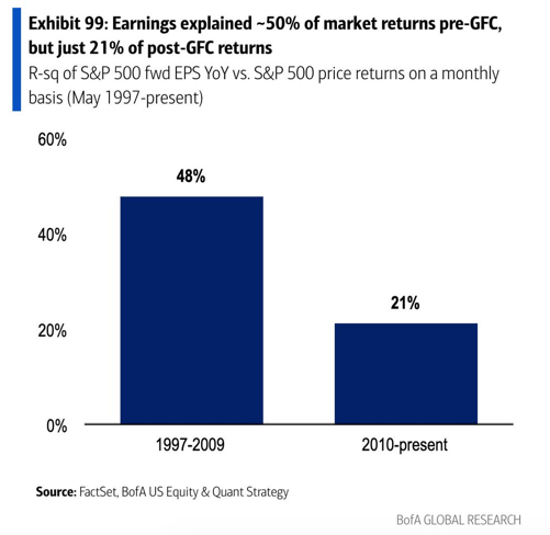
The first chart below shows how much of the returns of the S&P 500 can be explained by changes in the earnings of the companies within the index.
This chart paints an interesting picture.
Traditional investors assume that when earnings increase, so should the stock price. That’s what we’re buying after all, right? Shares in a company whose business should grow?
But the chart above tells us that’s not quite the case.
It tells us is that from 1997 to 2009, only 48% of the changes in the index can be explained by earnings growth.
And after the 2008 Financial Crisis, earnings only accounted for 21% of the changes in the S&P 500!
That’s pretty amazing. Only 21% of the increase in the market over a decade-long period is due to earnings?
What would explain the rest of the growth?
There are a variety of things that impact stocks:
- Earnings: Higher profits or revenue can lead to more valuable companies.
- Flows: More money chasing stocks makes it go higher, less money makes it go lower.
- Sentiment: Optimism creates more buyers, while pessimism means more sellers.
- Investing Alternatives: When stocks have competition for returns, less money goes into the stock market.
- Liquidity: When there is more money in the system, there is additional capital to put to work that is not tied up in other areas like inventories.
We could write dissertations about each of these categories.
But let’s focus on the last item, liquidity. This is the main avenue where the Fed has an impact.
Fed-Driven Market Growth
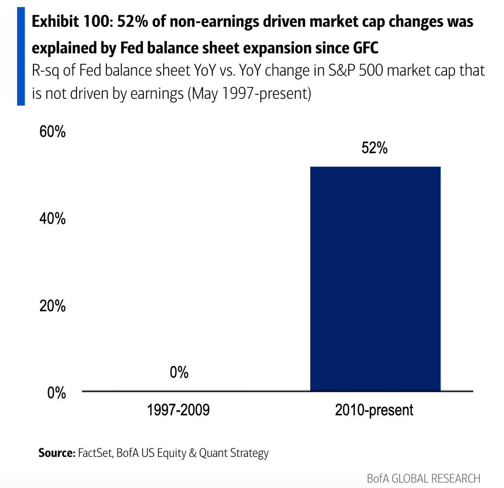
Bank of America also did the analysis on how much of the price changes can be explained by changes in the Federal Reserve balance sheet, which is shown in the next chart.
Here we really start to understand just how much impact the Fed has on markets.
From 1997 to 2009, literally zero percent of the return of the S&P 500 can be explained by changes in the Fed balance sheet.
Granted, the Fed’s balance sheet wasn’t that big before the financial crisis. But that’s kind of the point.
Since 2010, a whopping 52% of market performance can be attributed to the Fed. That’s even more of an impact than EARNINGS had in the 12 years leading up to it.
No wonder the Fed is nervous about what happens when they start to reduce the size of the balance sheet. (Read our article earlier this year The Fed is Stuck.)
They are creating an illusion, just like Houdini.
What started in 2009 as proper policy to keep the financial system operational, has since turned into a permanent juicing of the markets to keep them chugging higher.
The Fed starts to talk about tapering, and reverses course at the slightest whiff of risk.
Case in point…the Fed started to talk about tapering right before Thanksgiving. Markets fell a quick 5%, and next thing we know it’s off the table.
We’re not talking about the COVID Crash, where stocks plummeted 40% in a few short weeks. We’re talking about a normal 5% correction. They blamed the Omicron mutation, but that was just an excuse to postpone making tough decisions.
Our job as investors is to make money. So we appreciate what the Fed is doing.
And it may continue to work for a long time still. But we have to think about what happens next.
But the Fed isn’t the only one doing the heavy lifting. Tech stocks have helped tremendously this year.
Big Tech Stocks
The other market magician is the biggest-of-the-big tech stocks.
There have been increasing acronyms that represent these stocks:
- First it was FANG. Facebook, Apple, Netflix and Google.
- Then it became FAANG. Add Amazon to the mix.
- Then it was FANMAG. Microsoft needs love too.
- Now we can include Tesla and Nvidia. Who know what that will spell.
Whatever it spells, it’s yet another way the market is levitating.
We discussed the 5 largest stocks in our Strategic Growth Video Series, which you can view HERE.
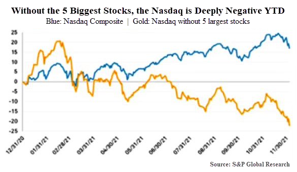
To view just how much of an impact the 5 largest stocks have had this year, look at the following chart from S&P Global Research.
This chart is quite shocking.
As of December 6th, when this chart was published, the Nasdaq index was up almost 20% for the year.
Without the largest 5 stocks, the index is DOWN over 20%.
Let’s hear that again. The index goes from UP 20% to DOWN 20% by removing only 5 stocks.
(By the way, these 5 stocks are Amazon, Google, Tesla, Facebook and Nvidia.)
Jiminy Christmas, Houdini, that’s some trick.
We can interpret this two ways. And these two ways have extremely different outcomes.
On the one hand, this could be positive.
The fact that so much of the index has fallen means that a large majority of stocks have actually gone through a pretty tough stretch. Many have gone through outright bear markets when viewed individually.
Maybe these stocks are ready to begin to move higher.
That would provide excellent investment opportunities outside of these big tech stocks.
On the other hand, if these stocks do start to falter, watch out.
If these handful of stocks start to weaken, and there is NOT a rise in the majority of the other components of the index, we could start to see a market that shifts from slowly drifting higher to quickly falling.
Reality is probably somewhere in between.
If the magicians of the market stop rising, but a majority of the other stocks start to do better, we could see an environment where the overall indexes are choppy and flat, but without any major losses.
That seems like the likely outcome while the Fed remains accommodative.
So far, every little dip has been bought. The scary 5% correction that we saw a couple weeks ago really didn’t amount to anything.
So the slight of hand continues and the performance goes on.
The market Houdini’s have escaped harms way for quite some time now. But if the Fed doesn’t continue to escape, they could leave a hole that we will be able to see for generations to come.
Invest wisely!


