• Skip to main content
  • Skip to footer

IronBridge Private Wealth

Forward with Confidence

  • Home
  • Difference
  • Process
  • Services
  • Insights
    • IronBridge Insights
    • Strategic Wealth Blog
    • Strategic Growth Video Podcast
    • YouTube Channel
  • Team
  • Clients
  • Form CRS
  • Contact Us

fed

Fed Raises Interest Rates: Implications and What We’re Watching

March 16, 2022

After reducing rates from 2.5% in 2019 to zero at the onset of the pandemic, the Federal Reserve has hiked rates by 0.25%. What does this mean and what should we be watching?

This was about as surprising as dropping a bowling ball on your foot and realizing it hurts.

While there are still MANY risks in the current market environment, this at least removes one uncertainty for now.

The Fed DID raise rates. They DID raise only a quarter-point. And they DID say they were going to raise more this year. (In fact, they hinted that they would likely have a rate increase at each remaining meeting this year).

What does this mean for the markets?

Frankly, not much.

  • Inflation won’t change with a single quarter-point rate increase.
  • Monetary policy isn’t going to change the global dynamics of the Ukraine war.
  • Global supply chains won’t change due to this.

Granted, the mainstream media will make it sound like this is the most important development in the history of mankind, and will bring on “experts” to discuss it ad nauseum. The markets have initially moved higher on this news, which is a good start.

But given the cross-currents around the globe affecting the markets, this interest rate increase is fairly minor in the list of things influencing prices.

As we’ve said many times, markets are extremely complex. Global politics are also extremely complex.

Combine the two and you have an enormous matrix of potential outcomes.

When that happens, it’s best to simplify.

Here is a chart of the S&P 500 Index with the most simplistic view we can think of.
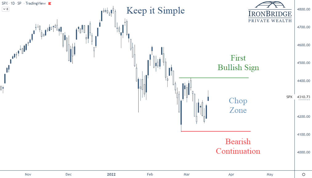


In this chart we show three basic scenarios:

  1. First Bullish Sign: If the market wants to move above the green line (the recent high from early March), then we would have the first sign that a trend change from down to up may be happening.
  2. Chop Zone: In between the green and red lines, there is very little reason to assume the market will ultimately move higher or lower.
  3. Bearish Continuation: If the market falls below the red line, then it is telling us that the volatility is not over and lower prices will follow.

So while we’re in this chop zone, we should consider the daily moves in the market to be noise.

Granted, when markets move 2% and 3% in a day, those are big moves. But until we see a move above or below the levels on this chart, it’s hard to become overly bullish or bearish.

Why do we mark these particular levels? Why might they be important?

Simple: We find it to be an easy way to determine the trend.

In downtrends, each time the market rallies, it stops at a lower level than where it stopped previously. For example, the all-time high was in early January. When it tried to rally in late January and early February, it stopped at a lower price than it was at the start of the year. The same thing happened in early March.

Each time it tried to rally, it made a “lower high”.

Having “lower highs” is the ultimate characteristic of a downtrend. And the market has definitely been in one since the first of the year.

The market can’t sustain a move higher if it doesn’t stop going down. (Thank you in advance for the Nobel Prize in Economics for that statement.)

On the flip side, if the trend of the market continues to move lower, it will make a new low in price below the red line.

That’s another characteristic of downtrends…lower lows.

We use more complex tools than this in our investment process. But this is one ways for you to think about the current market environment.

What are we Watching?

We’ll talk about this more in the coming weeks, but there are some major developments that we are watching right now.

I. Ukraine

This obviously remains the biggest wildcard and by far the biggest risk for markets.

So far, the market’s low (the red line in the chart earlier) occurred the morning of the invasion.

If we get a cease-fire, expect markets to respond favorably.

However, we need to be on guard for continued volatility and potentially lower prices if tensions escalate.

II. De-Globalization of the Economy

This is something we have been thinking about a LOT lately. We will discuss it in a future report as well.

One of the concerning outcomes of the sanctions imposed against Russia is that we have seen a shift to protectionism across the globe.

The globalization of the world economy that began post-World War II was designed to reduce the likelihood of another global war. The idea was that if countries were economic partners, they would have vested interests in maintaining peace.

So far, it has worked.

But since the sanctions were announced, multiple countries have decided to reduce trade. This has the potential to further reduce global supply of everything from oil to grains to semi-conductors.

Maybe these countries are simply responding to inflation and taking a temporarily cautious stance. If reduced trade is a temporary action, then things may go back to normal if inflation falls over the next few months.

However, if we are at the start of a longer-term cycle of de-globalization, there are many negative outcomes that could occur.

These include stubbornly high inflation, shortages of various goods, increased social unrest across the globe and a higher likelihood of more wars.

III. Stagflation

This is another topic we’ll discuss in a later report, but stagflation is becoming a real possibility now.

Stagflation occurs when inflation is high but the economy is in a recession.

It seems strange to think that it could occur in today’s world, but the possibility of stagflation is real.

IV. Market Recovery

We’re obviously watching risks, but not everything is bad right now.

Corporate earnings, for example, were at a record high last quarter.

The Leading Economic Index (LEI), as shown in the next chart, is also at record highs.
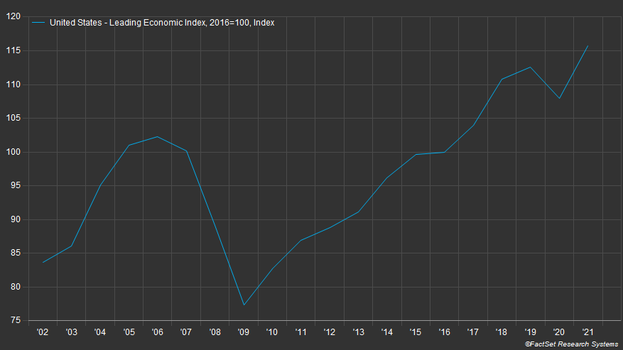
This chart goes back 20 years.

One thing to not is that leading up to the financial crisis of 2008, leading indicators were showing signs of weakness. In fact, this indicator peaked in mid-2006, more than two years before things really unraveled economically in 2008.

Note: The leading economic index is made up of ten components, including hours worked, various manufacturing data, building permits, stock prices, yields and expectation for business conditions.

Further supporting the potential for optimism is that both corporate and personal balance sheets are strong, employment is good, and the housing market is on fire.

It will be important to see data that includes the Ukraine war, and what affect (if any) it has had on this data in the coming weeks and months. We will especially be watching the earnings reports closely that begin in early April.

So while there are many reasons to be pessimistic, there are reasons the market could recover and move higher for the remainder of the year.

Bottom line

Ultimately, the market price is what’s important.

Let’s keep watching these levels on the market to see if it can sustain a move higher, and we’ll adjust your portfolio accordingly.

Invest wisely!


Filed Under: Strategic Wealth Blog Tagged With: fed, fed funds rate, federal reserve, inflation, interest rates, markets, volatility

Fed Meeting: Popping the Bubble or Normal Volatility?

January 26, 2022

So much for the New Year’s wish of putting 2020 and 2021 behind us and getting back to normal.

Or are we?

The markets had one of the calmest years in history last year, mainly on the back of the mega-cap tech firms.

But that calm was shattered as the market fell over 12% in a few short weeks.

Which begs the question…”Is this normal, or is this a sign that the biggest bubble in the history of the world is popping?”

Before we dig in, we’ll mention that the Fed met today and not much came of it. Yes, markets reversed lower after the announcement, but there were no surprises today.

They reiterated that they plan to raise rates by 0.25% in March. And reiterated that the balance sheet is way too big for the current economic environment. Both of these are accurate and prudent.

The markets were hoping he would say that all potential rate hikes are off the table, but that was an unrealistic expectation. And one mostly fabricated by the financial media.

So the reality of the Fed this evening is exactly the same as the reality of the Fed at noon today.

Let’s move on to the markets.

The S&P 500

Markets have had a terrible start to the year. In fact, we’re off to the worst January in history.

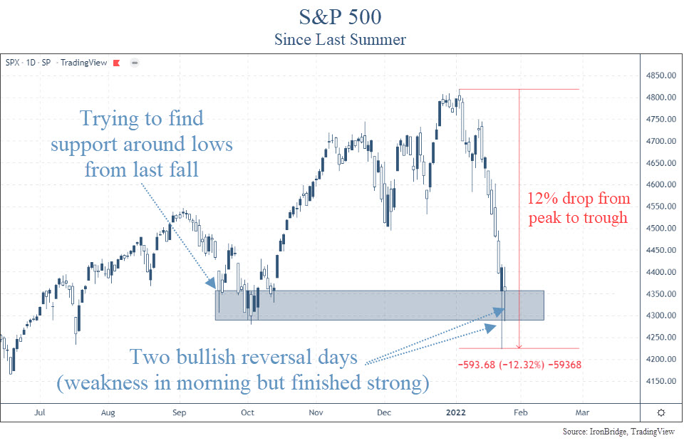
From peak-to-trough, the S&P fell 12% (so far at least).

Let’s look at the chart.

December was actually a fairly choppy month, but as soon as the clock struck midnight on New Year’s Eve, markets began to drop without much relief.

The last time the market had any sort of mild correction was last September. It chopped around for a few weeks and moved higher into year end.

Now, the market is testing those levels, as shown in the blue shaded rectangle in the chart above.

The other thing the market is trying to do is to rebound during the day from a very weak start.

The market has had two consecutive reversal days. The bulls are trying to show that they aren’t ready to give up just yet.

On Monday, Jan 24th, the S&P was down as much as 3.99%. However, by the end of the day it was actually positive. That’s a HUGE reversal day that only has a few precedents.

Since 1950, there have been 88 times the S&P fell by this much in a single day.

Only 3 times (including Monday) it finished positive on the day.

The other two times? October 2008.

Yikes.

On the surface, this doesn’t appear to be very good.

October 2008 was the thick of the financial crisis. Banks were failing, the housing market was tumbling, and there was economic and market chaos.

We aren’t seeing anything close to that right now.

Outside of the supply chain bottlenecks, the overall economy is doing fine.

The bond market isn’t showing any signs of stress either.

In fact, the bond market is typically the better market to watch if you’re concerned with the potential for a large drop in equities.

Yield Curve and Yield Spreads

The yield curve and yield spreads are the two major bond market data points that have been the best indicator of economic and widespread financial market stress over decades.

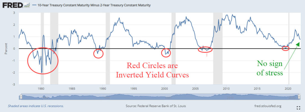
The yield curve measures the difference between longer-term bonds and shorter-term bonds. Specifically, the difference between the 10-year Treasury yield and the 2-year Treasury yield.

When the 10-year yield is LOWER than the 2-year yield, the curve gets “inverted”. An inverted yield curve has preceded EVERY recession over the past 50 years, as shown in the next chart.

The yield curve isn’t showing ANY concern.

What about the other major data point…yield spreads?

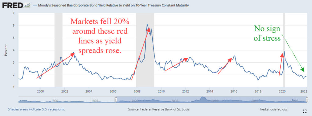
Yield spreads measure the difference between yields on the safe bonds (US Treasuries) versus the yields on unsafe bonds (junk bonds).

Specifically, we look at the Baa Corporate Bond Yield and the 10-Year Treasury yield.

This spread is shown on the next chart, which goes back to the late 1990’s.

Every time the market fell 20%, yield spreads widened well before that happened. There has been NO widening of yield spreads this year.

Bottom line, the bond market isn’t worried.

So why all the volatility recently?

The answer is pretty easy. They even met this afternoon…the Fed.

The Fed

The Fed met today, and despite a late day market selloff, no real news came from the meeting.

They reiterated that they anticipate a 0.25% rate hike in March.

This was expected.

They said they would remain aware of economic and financial conditions, and would adjust their approach if the situation warrants.

This was also expected.

So there was actually very little “news” that came of the meeting today.

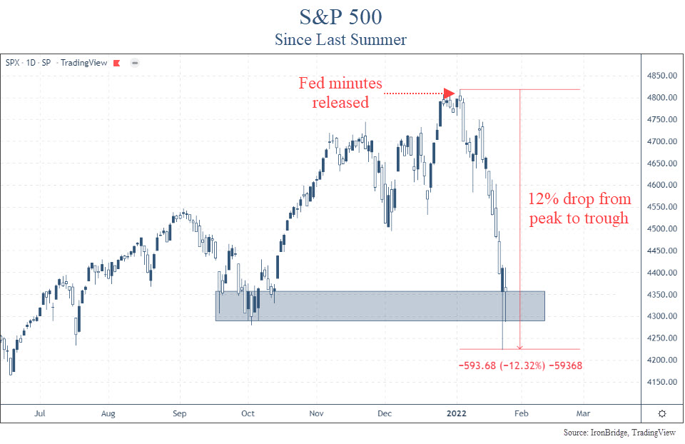
The real news happened a few weeks ago, when they released their minutes from their last Fed meeting of 2021.

In these minutes, they discussed a faster tightening that what the official messaging has been to the market.

The chart below shows when the minutes were released.

Oops. Since the release of the meeting notes, the market has gone pretty much straight down.

There were a couple of nice reversal days this week, but after the Fed meeting this afternoon, markets again fell.

So we’re getting mixed signals.

On one hand, the very speculative areas of the market are essentially collapsing:

  • Bitcoin is down almost 50%
  • Speculative tech stocks are down 70-80%
  • A whopping 42% of the stocks in the Nasdaq Composite Index are down over 50%

We’re seeing risk at the edges of the market.

Major stock indexes are also showing weakness. The S&P as we mentioned above fell 12%. The Nasdaq has been worse, falling 19% from peak-to-trough.

We’re NOT seeing risk at the core of the global markets…bonds.

Which side should we choose?

For now, we must assume that the volatility we have seen this year is normal.

10% corrections happen on average every 12-18 months. It’s been almost 2 years since we’ve seen one. So this type of volatility isn’t all that unusual.

It FEELS a little worse, because we had such low volatility last year.

And it may continue for a while longer.

But until we start to see risk show up in the more important areas of the market, we should expect an ultimate resolution higher.

That said, we have been taking steps to modify client portfolios. After all, we never know when a small correction will turn into the big one.

We increased cash two weeks ago. We have been rotating out of the more aggressive areas of the market into the traditionally more conservative areas.

International stocks have shown a tremendous amount of strength relative to their US counterparts. We have increased exposure there as well.

If the markets continue to show volatility, we will more aggressively raise cash. And we’re not far from those levels.

But the weight of the evidence, at least for now, suggests this pullback is normal. And frankly we should expect more of this type of volatility going forward.

It does not look like the start of the bursting of the bubble. At least not yet.

Invest wisely!

Filed Under: IronBridge Insights Tagged With: fed, federal reserve, inflation, interest rates, markets

Houdini’s Hole

December 10, 2021

The Paramount Theatre in Austin, Texas is a city treasure. It has an amazing variety of shows, and the list of notable performers is unmatched. It was built in 1915, and began mostly as a vaudeville house.

Just a few of the notable performers in its history are Miles Davis, the Marx Brothers, George Carlin, Ray Charles, Billy Joel, Don Rickles, Chuck Berry, Gladys Knight…the list goes on. Learn more about the Paramount Theatre: https://www.austintheatre.org/

Harry Houdini

One of the most famous performers to grace the Paramount stage was Harry Houdini. And his presence can literally be seen to this day.

Houdini performed there in 1916. At the time, he was one of the most famous people in the world. His slight-of-hand tricks mesmerized audiences worldwide.

One part of his performance was a suspended levitation trick.

He would dangle from the ceiling and escape a straightjacket or chains or some other kind of concoction.

He most likely performed this trick at the Paramount during his eight shows in Austin. To accomplish it, the theater operators drilled a hole in the ceiling of the Paramount and dangled the global superstar over the audience.

The hole they drilled is still in the ceiling today, over 100 years later, as shown in the picture below.

Houdini’s hole can be seen in the green area to the top-right of Saint Cecilia’s right hand. Photo courtesy of the Paramount Theatre website.

The details of Houdini’s trick that night are unknown.

But as with any kind of “magic” trick, it’s not about how the performer escapes. It’s all about distracting the audience to create an illusion of making the impossible possible.

This same type of “magic” is happening in financial markets today.

Suspended Levitation

Harry Houdini mastered the art of the suspended levitation tricks.

In today’s markets, there appear to be two Houdini’s: the Fed and the mega-cap tech stocks (such as Tesla, Facebook, Google, Amazon, Apple and Microsoft).

We’ve discussed the Fed a LOT in these reports.

But we came across a new chart that shows just how big of an impact the Fed may have had in market growth over the past decade.

Bank of America Global Research did some very interesting analysis.

What they did is look at how much of the market growth can be explained by earnings growth, and how much can be explained by the Fed’s balance sheet.

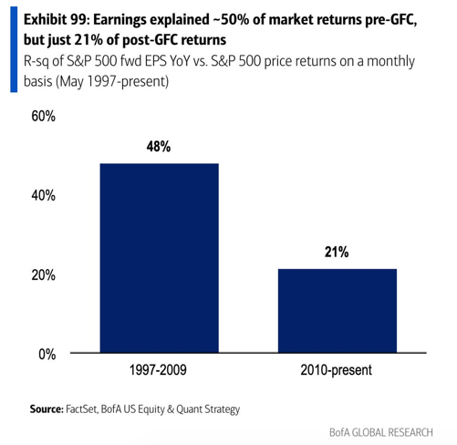
The first chart below shows how much of the returns of the S&P 500 can be explained by changes in the earnings of the companies within the index.

Earnings Contribution to changes in the S&P 500 Market Cap

This chart paints an interesting picture.

Traditional investors assume that when earnings increase, so should the stock price. That’s what we’re buying after all, right? Shares in a company whose business should grow?

But the chart above tells us that’s not quite the case.

It tells us is that from 1997 to 2009, only 48% of the changes in the index can be explained by earnings growth.

And after the 2008 Financial Crisis, earnings only accounted for 21% of the changes in the S&P 500!

That’s pretty amazing. Only 21% of the increase in the market over a decade-long period is due to earnings?

What would explain the rest of the growth?

There are a variety of things that impact stocks:

  • Earnings: Higher profits or revenue can lead to more valuable companies.
  • Flows: More money chasing stocks makes it go higher, less money makes it go lower.
  • Sentiment: Optimism creates more buyers, while pessimism means more sellers.
  • Investing Alternatives: When stocks have competition for returns, less money goes into the stock market.
  • Liquidity: When there is more money in the system, there is additional capital to put to work that is not tied up in other areas like inventories.

We could write dissertations about each of these categories.

But let’s focus on the last item, liquidity. This is the main avenue where the Fed has an impact.

Fed-Driven Market Growth

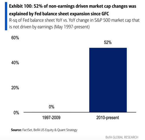
Bank of America also did the analysis on how much of the price changes can be explained by changes in the Federal Reserve balance sheet, which is shown in the next chart.

Fed Balance Sheet Contribution to changes in the S&P 500 Index

Here we really start to understand just how much impact the Fed has on markets.

From 1997 to 2009, literally zero percent of the return of the S&P 500 can be explained by changes in the Fed balance sheet.

Granted, the Fed’s balance sheet wasn’t that big before the financial crisis. But that’s kind of the point.

Since 2010, a whopping 52% of market performance can be attributed to the Fed. That’s even more of an impact than EARNINGS had in the 12 years leading up to it.

No wonder the Fed is nervous about what happens when they start to reduce the size of the balance sheet. (Read our article earlier this year The Fed is Stuck.)

They are creating an illusion, just like Houdini.

What started in 2009 as proper policy to keep the financial system operational, has since turned into a permanent juicing of the markets to keep them chugging higher.

The Fed starts to talk about tapering, and reverses course at the slightest whiff of risk.

Case in point…the Fed started to talk about tapering right before Thanksgiving. Markets fell a quick 5%, and next thing we know it’s off the table.

We’re not talking about the COVID Crash, where stocks plummeted 40% in a few short weeks. We’re talking about a normal 5% correction. They blamed the Omicron mutation, but that was just an excuse to postpone making tough decisions.

Our job as investors is to make money. So we appreciate what the Fed is doing.

And it may continue to work for a long time still. But we have to think about what happens next.

But the Fed isn’t the only one doing the heavy lifting. Tech stocks have helped tremendously this year.

Big Tech Stocks

The other market magician is the biggest-of-the-big tech stocks.

There have been increasing acronyms that represent these stocks:

  • First it was FANG. Facebook, Apple, Netflix and Google.
  • Then it became FAANG. Add Amazon to the mix.
  • Then it was FANMAG. Microsoft needs love too.
  • Now we can include Tesla and Nvidia. Who know what that will spell.

Whatever it spells, it’s yet another way the market is levitating.

We discussed the 5 largest stocks in our Strategic Growth Video Series, which you can view HERE.

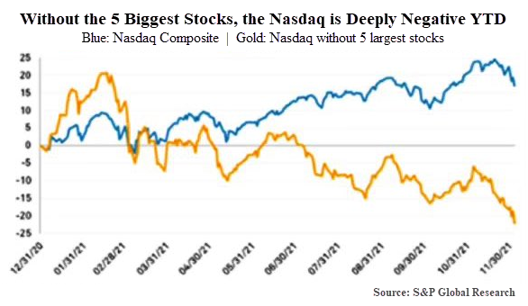
To view just how much of an impact the 5 largest stocks have had this year, look at the following chart from S&P Global Research.

This chart is quite shocking.

As of December 6th, when this chart was published, the Nasdaq index was up almost 20% for the year.

Without the largest 5 stocks, the index is DOWN over 20%.

Let’s hear that again. The index goes from UP 20% to DOWN 20% by removing only 5 stocks.

(By the way, these 5 stocks are Amazon, Google, Tesla, Facebook and Nvidia.)

Jiminy Christmas, Houdini, that’s some trick.

We can interpret this two ways. And these two ways have extremely different outcomes.

On the one hand, this could be positive.

The fact that so much of the index has fallen means that a large majority of stocks have actually gone through a pretty tough stretch. Many have gone through outright bear markets when viewed individually.

Maybe these stocks are ready to begin to move higher.

That would provide excellent investment opportunities outside of these big tech stocks.

On the other hand, if these stocks do start to falter, watch out.

If these handful of stocks start to weaken, and there is NOT a rise in the majority of the other components of the index, we could start to see a market that shifts from slowly drifting higher to quickly falling.

Reality is probably somewhere in between.

If the magicians of the market stop rising, but a majority of the other stocks start to do better, we could see an environment where the overall indexes are choppy and flat, but without any major losses.

That seems like the likely outcome while the Fed remains accommodative.

So far, every little dip has been bought. The scary 5% correction that we saw a couple weeks ago really didn’t amount to anything.

So the slight of hand continues and the performance goes on.

The market Houdini’s have escaped harms way for quite some time now. But if the Fed doesn’t continue to escape, they could leave a hole that we will be able to see for generations to come.

Invest wisely!


Filed Under: IronBridge Insights Tagged With: fed, federal reserve, investing, markets, nasdaq, top 5 stocks, wealth management

The Coming Inflation Waves

May 28, 2021

Symbolic waves of inflation could crash the US economy, but only after years of a gradual increase.

Inflationary pressures have been steadily building over the past year. That can easily be seen in the price of lumber, residential houses and various raw materials. Recent data showed that CPI increased a whopping 4.2%. What implications does this have on your portfolio?


The first panacea for a mismanaged country is monetary inflation. The second one is war.

Ernest Hemingway

There is no question that we have seen massive inflation in various parts of the US economy since the end of the COVID-related market crash last year.

Homes in Austin are regularly being offered 20-30% above list price. The price of lumber has quadrupled over the past year. Used car prices are at all-time highs.

Some of the side effects of an inflationary environment are fairly obvious. Prices at the grocery store will go up. Gas prices will go up. Generally speaking, the cost of all kinds of “stuff” will rise. After all, that is what inflation is.

But there are other, less obvious things that are likely to happen during the period of rising inflation and interest rates that we have likely already entered.

There are two that we think are of primary importance:

  1. Non-linear price and interest rate increases.
  2. Dispersion in asset returns.

Both of these characteristics are critical to understand the investing environment over the next 20 years.

The non-linearity of the coming inflationary cycle simply means that it isn’t likely to hit us all at once. It will likely come in waves. We don’t need to know the exact timing and duration of each wave to properly navigate the next “rising” environment. We simply must be aware that it won’t come out of nowhere…there will be plenty of signs, many of which we’re seeing now.

We’ll go into more about dispersion below, but let’s first look at the historical cycle of rising interest rates to better understand what to expect.


The Interest Rate Cycle

Everything works in cycles. The Earth circles the sun. The seasons regularly change. Humans are born, age and decline.

Interest rates are no different.

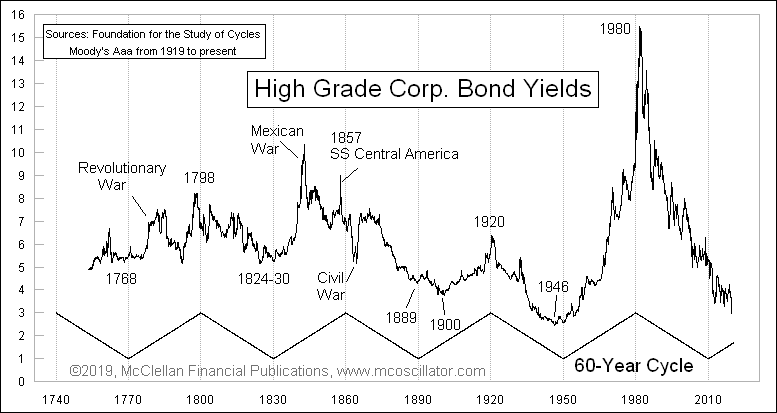
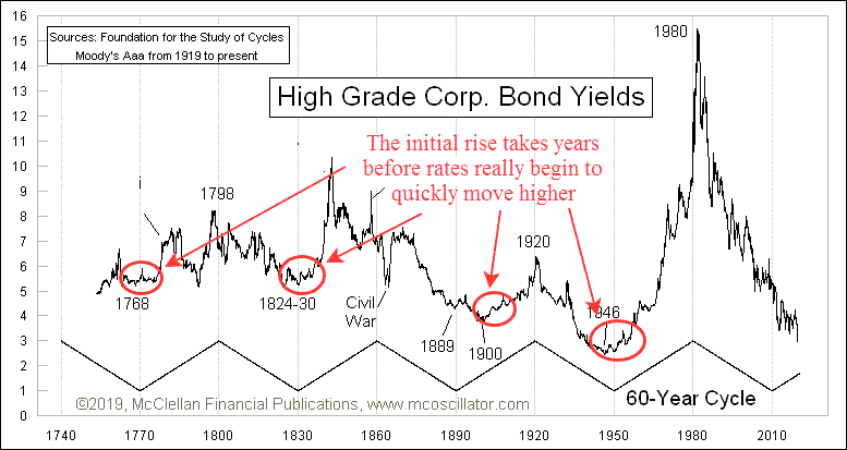
In fact, interest rates typically rise and fall on a 60-year cycle. That’s a 30-year cycle of rising interest rates, and a 30-year cycle of declining rates.

The chart below, from Tom McClellan of McClellan Financial Publications, is one of the best examples we’ve seen that shows this cycle in action.

The 60-year cycle of interest rates going back to the mid-1700s. Yields consistently move in 30-year cycles up and down.

This chart goes back to the mid 1700’s. We can fairly easily see the regular rise and fall of rates over this period of time. With the exception of a few wars here and there that artificially affected interest rates, the 30-year rhythm plays out pretty well.

The current period of declining interest rates began in the early 1980’s. Inflation peaked at 14.3% in 1980. Interest rates peaked in June of 1981, with the prime rate at an incredible 21.5%. Many of you reading this likely had mortgages at 13% and 14% at the time.

Paul Volcker, the chairman of the Federal Reserve at the time, famously declared a war on inflation and took steps to “pop” the inflation bubble. And he was ridiculed for it at the time.

Since then, however, inflation and interest rates have been on a steady decline, as we can see on the “Black Diamond” ski slope downward on the right-side of the interest rate chart above.

But interest rates began declining in 1980. It’s 2021. We’re now 40 years into a 30-year cycle. We’re on borrowed time for when interest rates should be moving higher.

But what will this transition look like from a declining interest rate and inflation cycle to a rising one?


Slowly then Suddenly

One of the expectations right now is that inflation will hit us like a Mack truck. That’s a logical conclusion, given that lumber prices are four times higher than this time last year.

But this is a mistake that many people make when thinking about rising interest rates and inflation.

It doesn’t happen all at once, especially at the start.

Let’s look at the same interest rate cycle chart, but focus on the beginning stages of each rising cycle. There have been four major turning points in the last 260 years, as noted on the chart below.

The 60-year interest rate cycle with annotations showing the gradual increase in interest rates.

If we look at the red circles, interesting patterns starts to emerge. Rates don’t have any initial spikes higher at first. It takes time for long cycles like this to turn, much like steering a cruise ship.

In fact, we notice three distinct similarities in these periods of rising rates:

  1. In all four cycles it took 7-10 years for the first 1-2% rise in rates to occur.
  2. During this first 7-10 years, there are multiple “squiggles”, where rates take two steps forward and one step back. They ebb and flow like waves.
  3. Following the gradual rise, there is almost always a large spike higher in rates. Unfortunately, this has consistently been associated with a major, generational war.

If interest rates bottomed last year during the COVID crash, we are literally at the very beginning of this rise.

If the cycle of higher rates is indeed beginning now (which is our primary thesis), then we should still be a few years away from the period of rapidly rising rates.

But as with all things market-related today, the Fed is once again the wild card.


The Reckless Fed

We have discussed the Federal Reserve many times over the past few years. As recently as January in our “Twin Risks” report we discussed the possibility of Fed missteps. And last June’s “COVID vs the Fed“, we expected that the Fed would win when it came to rising asset prices, and that was indeed the case.

But even with improvements in economic conditions and the pandemic seeming to be much more under control with the highly effective vaccines, the Fed continues to print and print and print some more.

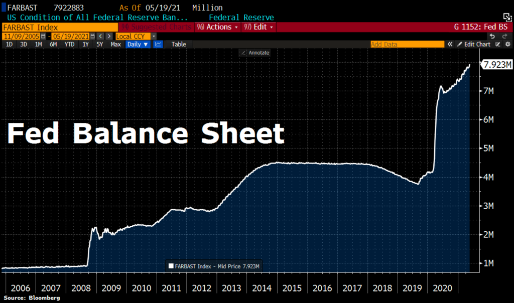
In our next chart below, we can see that the Fed balance sheet continues to expand dramatically.

The Federal Reserve (Fed) balance sheet as of May 2021 is almost $8 trillion. Courtesy of Bloomberg.

The spike higher in 2020 was the obvious and appropriate response to the COVID lockdowns. However, since late last year, the Fed has printed another $1 Trillion and force-fed it into the financial markets like a goose being primed for foie gras.

Last week alone the Fed printed nearly $100 Billion. All while the economy is obviously recovering and financial markets are at all-time highs.

During COVID, it was logical for the Fed to step in. Now? Frankly, it doesn’t make any sense.

It seems like we now have the first ingredients of a misstep. Continued massive monetary expansion WILL eventually have unintended consequences. What we don’t know is when the consequences will show up and what exactly those consequences will be.

The Fed is obviously signaling that it wants inflation. It is showing up all over the economy. Yet, the “official” inflation numbers are low.

Following the further injections of liquidity into the markets, pretty much every asset has risen in price (predictably). Some assets have risen more than others, but for the most part they all have gone up.

This simply can’t continue indefinitely. As Howard Markes says, “Trees don’t grow to the sky”. Everything works in cycles, especially asset prices.

And if everything works in cycles, and we are in a cycle where everything went up, what do we think might be next?

Well, it could be a cycle where everything goes down. But more likely it will be a cycle where instead of everything performing in unison, it could be a cycle where nothing performs in unison.

Which brings us to our second major theme for the coming decade: the return of dispersion.


What is Dispersion?

The official definition of dispersion, as it relates to our purposes here, is “the extent to which values of a variable differ from a fixed value such as the mean.” 1

Okay, so what does it mean in non-statistical terms?

It means that everything won’t go up at the same time.

It comes from the root word “disperse”. As when police officers instruct a crowd to go about their separate ways.

For our purposes, it means there will be areas of the financial markets that perform very well over the next 10-20 years, but there will also be many assets that decline in price as well.

In the definition above, the “values of a variable” simply mean different parts of the market. The “fixed value such as the mean” is the index.

So if the performance of S&P 500 is the “mean”, the underlying stocks and sectors within the market are the variables.

We would not be surprised if broad markets didn’t perform very well in the coming cycle. They could easily have flat or even negative returns over the next decade.

But that doesn’t mean you can’t make money. The “mean” is the average. But underlying that average are components that went up in price, and components that fell in price.

Since the early 1980’s, nearly every asset class has been in a bull market. Outside of the bear markets in 2000 and 2008 (and the COVID crash last year), stocks in general moved higher.

Guess what? So did bonds, commodities, homes, office buildings, international stocks, gold, and just about everything else on the planet as well.

Everything went up. The only difference was how much each investment went up.

And it makes sense that they all went up. As we noted earlier, both interest rates and inflation have been steadily declining since the early 80’s.

Declining interest rates almost always help asset prices go up. After all, many things are purchased with debt. Real estate is the most common use of debt to finance an acquisition, but debt is also used for all sorts of different financial activities. It is used to acquire companies, both large and small. And to build manufacturing facilities. And to purchase stocks. And to improve infrastructure. And to build high rises.

As interest rates fall, the cost of debt decreases. And that gives a purchaser the ability to buy more real estate, companies, manufacturing facilities, etc.

The opposite is also true.

As interest rates rise, the cost of debt increases. It takes away the purchasing power of everyone, from your new neighbor to the federal government.

This is why the Fed is so hell-bent on keeping interest rates low. And for a while now they have been successful.

But as we mentioned above, they can’t keep doing that forever. So we must start to think about what the next cycle may hold so we can make sense of the signals we may get from our investment process.


What Assets may Benefit from Rising Rates?

This is the $64,000 question. And if you’ve followed our reports at all, you probably know our answer. We have no idea.

While our investment process is designed to pick up on these changes over time, let’s look at some key characteristics of assets that could benefit from higher rates and inflation.

Pricing Power

In an inflationary environment, the costs of goods go up. That means that companies who are selling those goods are selling them at higher prices. Which naturally means that the revenue to these companies are also going up. Granted, input costs also rise, but if they can pass along higher prices to their consumers, it means they have pricing power.

Pricing power is critical to a company being able to successfully keep profit margins at current levels, and even being able to increase their margins. Without pricing power, companies have to increase efficiency or reduce costs to maintain profit margins.

Many companies will not be able to keep profit margins at current levels. The companies that can’t will likely have their stock price suffer.

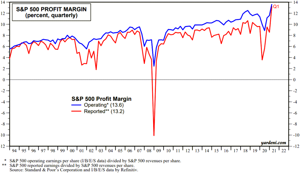
The next chart shows that profit margins on the S&P 500 are at all-time highs.

S&P 500 profit margins have been increasing since the mid 1990's and as of May 2021 was at an all-time high.

As we discussed in our previous report “The Icarus Market“, we discussed how P/E ratios were elevated due to the increased concentration of technology stocks in the S&P 500 Index.

This also applies to profit margins.

Technology companies tend to have both higher profit margins and P/E ratios. So as technology becomes a larger portion of the index, profit margins should naturally increase.

To assume that profits margins can stay at these elevated levels seems like an optimistic assumption. And if they can’t stay at these levels, it is most likely due to tech not being able to keep pace.

Low Reliance on Debt

Another characteristic of a potentially good investment is a low reliance on debt.

As we discussed above, as interest rates rise, so does the cost of capital. Companies with lower debt loads, companies not dependent on financing activities to support their business, and recipients of higher interest rates could all benefit.

Banks are one area that may do well. Most banks make money off of a spread. They pay you nothing on your savings account, but charge you interest to take a loan. The difference in what they pay versus what they receive is called the “Net Interest Margin” or NIM.

As interest rates go up, their NIM should also go up. Because they are quicker to pass along higher rates to you as a lender than they are to you as a saver. Be prepared for continued frustration for a few years if you’re expecting the yield on your savings account to go up much.

But the big banks are turning into dinosaurs. There are many companies looking to disrupt this industry, so it may be areas in the financial sector outside of the behemoth banks that ultimately do well.

Other investments are much more dependent on debt. Real estate, for example, is one such asset.

Traditionally, real estate is expected to benefit from inflation. But it is also hurt by higher rates. So the dynamic between the inflation waves and the interest rate waves is key when it comes to housing prices.

We’re seeing home prices skyrocket now, partially due to demand, but also due to the fact that inflation is starting to appear, but higher interest rates are not.

So when inflation rises and interest rates stay low, home prices should continue to rise. But in our wave theory, there will be periods where inflation goes down and interest rates go up. That would not be favorable for real estate, and may provide opportunities to increase exposure to real estate.

This is exactly what we are talking about with the coming inflation and interest rate waves.

Stuff

The last area that may benefit is simply “stuff”. Commodities, materials, lumber, chemicals, and many other things that are used in real life things.

The reason these areas do well is the mindset of consumers during inflationary periods. The expectation is that what you are buying today is going to cost much more next year. So while it is more expensive than it was a year ago, it’s probably going to be more expensive next year. So you might as well buy it today.

As this mindset permeates the economy, the prices of stuff get more expensive. At first, higher prices tend to self-correct.

Earlier this month, the price of lumber fell 30% in a couple of weeks. It had gone up so much that people simply stopped building that new home. So prices corrected.

In this first inflation wave, this is expected. We also expect that it won’t get down anywhere close to the prices from last year. Prices will fall, and people will start to build again. And the next wave higher begins.

Alternate that same behavior over the coming years and we have the exact scenario we are describing…waves of inflation that gradually get higher over time. Until BANG! inflation is out of control, and we go into the steepening phase of the cycle.

Bottom Line

It simply appears that we have begun the next cycle of higher interest rates and inflation.

While it will likely take many years before it starts to get out of hand, there are easy ways to prepare yourself for this environment.

  1. Make sure any debt you have is at a fixed rate. Expect to pay more interest on new debt as time goes by. There is plenty of time to prepare, but now is the time to think about and prepare for higher rates.
  2. Dispersion favors active management. We’ll discuss this more in the future, but passive index investing and broad asset diversification is likely to be a poor choice in the coming market cycle. Your portfolio must become more focused.
  3. Re-evaluate your income strategy. Bonds are likely to be the worst performing asset over the coming years, unless we see an outright market collapse. You will need to be very tactical with your bond strategy. Cash rates will eventually move higher, but likely slower than we think.

In the immediate future, however, we should expect higher prices. Given that the Fed is still recklessly throwing gallons of gas on a market that’s on fire, higher prices should be expected in the near term.

But we think that this reckless behavior by central banks ultimately will be viewed in a very negative light. Primarily because of the skewed asset prices it is creating now. But while the party is still raging, more spiking of the punchbowl seems fun. And for now, it is still working.

But as this new phase of rising inflation starts to take hold, the Fed will likely find it more and more difficult to keep asset prices afloat.

That’s when the waves of inflation start becoming bigger and bigger until they simply can’t control it any more.

Our investment process was designed to handle any environment, including the ones that are most uncertain. Let us know if you would like to discuss this in more detail and how your portfolio may be affected.

Invest Wisely!

References:

  1. “Dispersion” definition from the Oxford English Dictionary online

Filed Under: IronBridge Insights Tagged With: cycles, dispersion, fed, federal reserve, inflation, interest rates, investment cycles, market cycle, profit margins

Footer

LET'S CONNECT

  • Email
  • Facebook
  • Instagram
  • LinkedIn
  • Twitter

AUSTIN LOCATION

6420 Bee Caves Rd, Suite 201

Austin, Texas 78746

DISCLOSURES

Form ADV  |  Privacy Policy  |  Website Disclosures

  • Home
  • Difference
  • Process
  • Services
  • Insights
  • Team
  • Clients
  • Form CRS
  • Contact Us

Copyright © 2017-Present by IronBridge Private Wealth, LLC. All rights reserved.