
The myth of Icarus warned of the dangers of over-confidence. If we compared the markets to the flight of Icarus, how close are we to the sun? Close enough to melt our wings?
“Well, I think we tried very hard not to be overconfident, because when you get overconfident, that’s when something snaps up and bites you.”
-Neil Armstrong
The myth of Icarus we know today has its roots in the classical narrative poem, Metamorphoses, written by Ovid in the year 8 AD. In it, Icarus flies his wings of feathers and wax too close to the sun, and pays the ultimate price when the sun melts the wax and he plummets from the sky and drowns in the sea.
Before his flight, Icarus had warnings. His father, Daedalus, tested the wings and instructed him to fly neither too close to the sun, nor to the sea. Icarus, like most young adult children, ignored his father’s advice. But there must have been other warnings as well. Surely he felt the heat of the sun or the drip of the wax as his wings came apart in flight.
But filled with excitement and over-confidence, he kept his arms flapping as the wax melted off, and soon realized that his feathers were gone. He fell past his father to his demise.
It’s a tragic story of personal hubris that led to self-destruction.
Many people throughout history have suffered from the same flaws that Icarus did so many centuries ago. Napoleon invaded Russia. Japan bombed Pearl Harbor. People bought GameStop stock.
The classic lesson we can learn as investors is “don’t fly too close to the sun.”
But there is another lesson in this story as well. Daedalus’ not only warned Icarus to avoid flying too high…he warned him to not fly too close the sea as well.
What if Icarus was too cautious with his wings? What if instead of flying too high and drowning, he simply flew too low? He would end with the same fate of drowning in the sea, but it would provide a much different perspective. This would be a lesson in under-confidence instead of hubris.
Not only does this myth teach us of the dangers of arrogance, but we could argue that there is also a lesson of the dangers of timidity.
When investing, we are constantly dealing with our inner Icarus. How much risk is too much? How much is not enough?. How much risk is too much? How much is not enough?
In order to effectively assess risks, we need to do the same analysis on financial markets as we do with your personal risk tolerances.
Which leads the the obvious question…are financial markets closer to the sun or the sea right now?
Let’s look at three primary factors in today’s market that could melt the stock market’s wings:
- Valuations
- Rising Bond Yields
- Inflation
Valuations
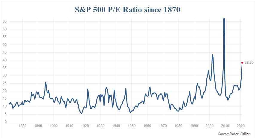
One of the least debated aspect of the stock market today is whether stocks are overvalued or not. (Spoiler Alert…they are). By all historical standards, valuations are elevated. And in many stocks, outrageously so.
The most common valuation metric to analyze is the P/E ratio. This simply calculates the Price of the S&P 500 per share (P) and divides it by the total earnings per share over the past 12 months (E). So if the price of the S&P is 3000, and the earnings are 100, the P/E ratio is 30.
For over a century, this ratio oscillated between a low of 8 and a high of roughly 23. Currently, the PE ratio is almost 40.
With a reading this high, you would assume that the market should be on the cusp of a large decline, right?
But a closer look shows something different. A strange thing started to happen in the 1980s and ’90s. Valuations appear to have gone through a regime shift higher.
The chart below shows the trailing 12-month P/E ratio for the S&P 500 since the early 1870’s. (Data was extrapolated prior to the S&P 500 inception in 1957.)
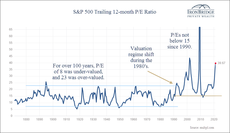
For over 100 years, P/E ratios oscillated between very predictable levels of 8 to 23. During the early and mid-90’s, things started to shift higher.
Since 1990, it had a low of just below 15 and a high of over 80! Technically, the P/E ratio was not able to be calculated, because earnings were negative in the first quarter of 2009. So in actuality it was like much, much higher than 80.
We’ve been conditioned to believe that stocks are over-valued if the P/E ratio is over 20 or so. Pundits on CNBC say that all the time. After all, the people in charge of the financial media and the large investment corporations learned about stocks and investing when there was no reason to question the validity of this predictable valuation range.
But a closer look suggests this regime shift may not be a temporary phenomenon. After all, 30 years isn’t exactly a short amount of time.
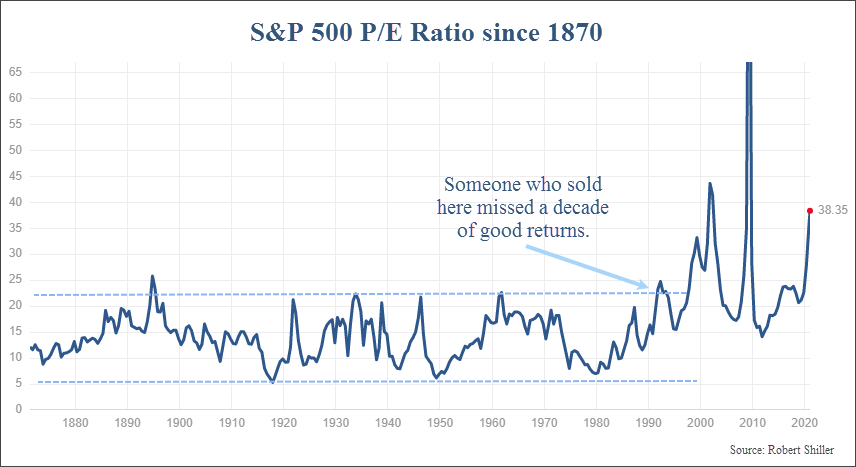
But more importantly than the actual levels of the P/E ratio is the timing of when this ratio was elevated. The high points in valuations did not occur at tops. They occurred near a LOW point in the market.
Going back to the late 1800’s, nearly every time P/E ratios peaked were very poor times to sell stocks. The 1890’s, early 1920’s, mid-30’s, early 60’s, early 90’s, 2002, 2009 were very bad times to sell your stocks. Bull markets had years to run before prices ultimately fell.
Let’s take a closer look at this phenomenon. The next chart, courtesy of Bloomberg, supports this thesis that high valuations may not be as much of a warning sign as well. It shows the P/E ratio plotted against earnings-per-share for the S&P 500 since the mid 1990’s.
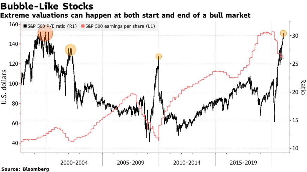
There have been four major spike in valuations since the mid-90’s. Three of these four times happened at a market low, not a market high. Granted, these are only a handful of data points, but it is still valuable information nonetheless.
Another interesting thing to note on this chart is that P/E ratios actually declined during the bull market from 2003 to 2007.
Maybe that is because valuations were SO extreme in 1999 that they could only go down. Makes sense. But it also suggests that levels once considered “expensive” from a valuation standpoint are more opinions instead of facts.
Instead of arguing that high valuations means that markets are near a peak, one could argue that the data supports exactly the opposite conclusion…that with the spike in valuations over the past year, a bull market may just be beginning.
But this conclusion just doesn’t feel right. Maybe it’s because we’ve been told for so long that these P/E levels are expensive. Maybe it’s simply because stocks ARE expensive right now. Either way, it’s tough to argue that using this ratio as a major part of a decision to buy or sell isn’t supported by the historical data
Which leads to the next logical question…why are valuations so high?
There are many theories. One is that low interest rates support higher valuations. That makes some sense if you factor in a low cost of capital. Another theory is that the easy money policy from global central banks have caused stocks to be the only investment in town that can make any real returns.
Those are both valid. However, the primary reason we are seeing the actual P/E levels in the S&P 500 increase is the massive increase in technology exposure in the S&P 500 over the past 30 years.
Currently, tech makes up 27% of the index. This doesn’t even include companies like Amazon, Facebook or Google, which are not considered a part of the “tech” sector. (Amazon is in the Consumer Discretionary sector, while Facebook and Google are in the Communications sector). Depending on how loosely you define “tech”, you could get 40-50% of the S&P that could be categorized as “technology”.
Tech companies have very high profit margins. So as tech becomes a larger portion of the overall market, net profit margins for the market as a whole increase.
This is a very clear trend. In fact, since the early 90’s, profit margins have nearly tripled, as shown on the chart below from Goldman Sachs.
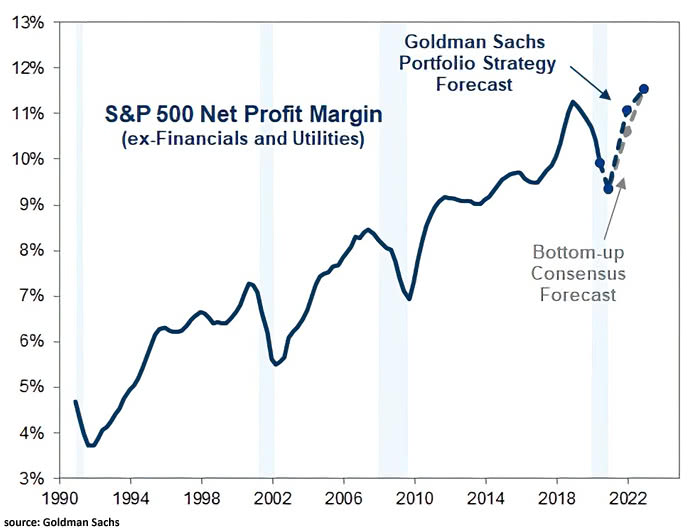
The other thing to note on this chart is that the decline in profit margins that occurred during last year’s COVID-crash were nearly identical to the declines that accompanied the recessions and bear markets of 2001 and 2008.
Higher margins don’t just mean an increase in profits. They result in an increase in value for the companies involved.
Let’s say you were going to buy a company that makes breakfast tacos. One company makes $0.20 per taco, and the other makes $1.50 per taco. Assuming the tacos are relatively similar in quality and each company sells similar quantities, you would buy the company that makes more money off of each taco they sell. You would be willing to pay a higher price for that taco company as well, because your payback of invested capital will happen more quickly from the excess profits.
And if you could borrow money at very low interest rates, you could probably pay even more for that taco company.
That’s the other factor with the higher valuation regime. Interest rates have steadily moved lower over the past 40 years. (We’ll talk more about that below.)
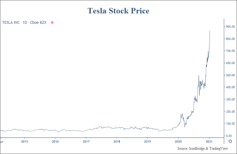
This analysis doesn’t even get into the vast numbers of companies that don’t even have earnings. Tesla fell into this category for years.
But there has to be a limit to everything. No stock keeps going higher…it ALWAYS works in cycles. As legendary investor Howards Markes says, “Trees don’t grow to the sky.”
But, as the next chart shows, trees can grow to be pretty damn tall. The price levels of the stocks that aren’t making money is flat-out ridiculous. In what may end up being one of the most interesting charts of the year, let’s look at the Goldman Sachs Non-Profitable Tech Index, courtesy of Jim Bianco of Bianco Research.
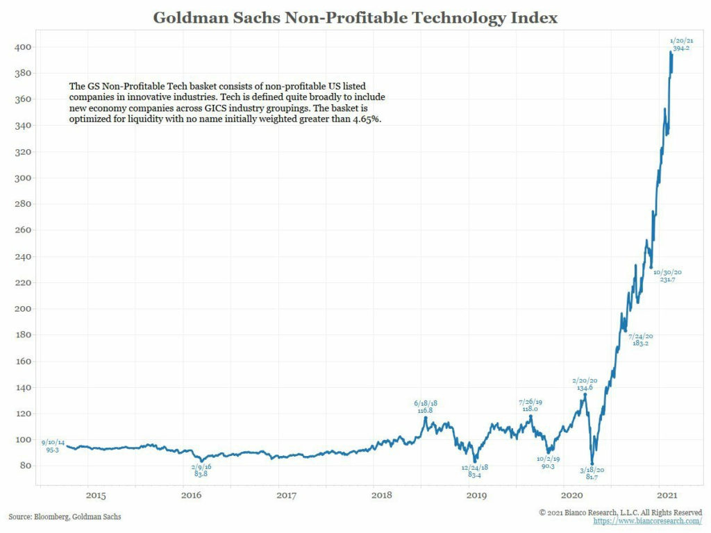
This chart measures the performance of publicly traded companies who don’t have profits. Basically they lose money. The price has skyrocketed since the COVID lows a year ago.
This index was overvalued at 200. It went to 400. Heck, it was overvalued at 100 if you look at traditional valuation metrics.
But it kept going higher.
Analyzing this chart is not an exercise in valuation analysis. This is an exercise in sentiment analysis. No valuation level is too high, because they are ALL too high. But that doesn’t mean the price will fall.
These investors are not looking at valuations. And ultimately a stock price is what someone else will pay for it, not what some formula thinks it should be worth.
Many of you reading this may disagree with the following conclusion, but P/E ratios are simply NOT a useful tool to help identify the future direction of the market.
The data just doesn’t support it. Maybe the past 30 years are an anomaly, and P/E’s will again provide actionable insights for investing decisions, but not now. And maybe not in the near future either.
In fact, not only do valuations not provide much benefit when making investment decisions, they don’t even provide that much information about the current state of the market in general. We’re sure that would go over well on CNBC.
What really happens when you analyze valuations is that you are trying to make a prediction about someone’s REACTION to the valuation. It’s not the valuation itself that could drive the stock price, it’s other people’s perception of the valuation relative to current market prices that matter.
So essentially valuation analysis is trying to predict stock prices by predicting company earnings and then predicting people’s reaction to what the changes in price may be. You’re multiple steps removed from actual stock price analysis, which is all that matters at the end of the day.
As with all things, the current poor usefulness of valuation metrics is probably temporary. So while it does not provide much useful information now (and hasn’t for at least the past 30 years), it will likely provide excellent information as soon as everyone decides it doesn’t work. Like all things, it will likely prove to be cyclical. So we’ll continue to watch them.
Back to Icarus, it feels like valuations this high should mean we are pretty close to the sun. But the data does not support being very confident in that, especially with a 40% market crash only 12 months ago.
What it does mean is that we should expect anything. If we saw a valuation spike last year that marked a major low, then prices likely move higher for quite a while longer. But if valuation measurements start to become important again, then caution is warranted.
Yes, that’s a cop out. But it’s true. It’s okay to own stocks right now. Just use stop losses to keep your losses small, and use trailing stops on the profitable stocks.
Rising Interest Rates
The next thing we hear quite often is that higher interest rates may “pop” the equity bubble.
Not much analysis needed here. The data simply doesn’t support that theory.
The chart below, from LPL Research, shows extended periods of time when the 10-year US Treasury yield rose.

There were 14 periods since 1962 when this happened. 11 of those 14 times resulted in higher stock prices. And the other three were down, but all less than 20% during the same time period.
It seems the same conclusion about valuations can be applied to higher interest rates…it’s just not a good indicator of increased risk. Like the valuation spikes, one could argue that rising rates are bullish for stocks. Maybe it’s going to matter, but there is not a statistical reason why we should ACT on the potential for higher rates. At least not when it comes to stock investing.
Bond investing is a totally different story. Rising rates mean that bond prices are falling. So if there is any kind of investment action to take, it’s to be very cautious about owning bonds right now.
Extremely low interest rates rising to more normal levels does not suggest markets are too near the sun to melt any wings yet.
Inflation
We’re going to take a deeper dive into inflation pressures in the near future, so we’ll only do a high-level overview here.
Outside of the Federal Reserve, inflation will most likely be the biggest single driver of markets in the coming years.
In the United States, markets haven’t had to deal with inflation in over 40 years. There has been a steady decline in both interest rates and inflation since the early 80’s. That has allowed assets of all types (stocks, bonds, real estate, commodities, etc.) to experience a tailwind for rising prices.
But contrary to what many people think, inflation isn’t likely to just show up on your driveway unannounced like Cousin Eddie in Christmas Vacation.
After 40 years of declining/low inflation, it won’t suddenly jump to 10% per year. There will be a transition.
So we can think about the coming inflation in two phases:
- The Transition to Higher Inflation
- High Inflation
The transition phase could take years, maybe even a decade. Right now, we are likely in the early stages of the transition phase.
The most common investment consideration of the High Inflation phase will be the massive separation between winners and losers in the markets. The transition phase will be the gradual split between these two camps.
What this means is that there will be areas of the markets that will provide awful returns. The easiest one to predict is the bond market.
Bonds and inflation are angry neighbors. They hate each other. Bonds hate inflation, and inflation hates bonds right back. . When the cost of goods and services rise, a fixed rate investment loses both nominal and real value. Even if you have a nice little muni bond paying 2% tax free, you still lose money in the form of purchasing power over time as inflation rates increase. If you have a bond fund, you get both small yields and declining value, with no maturity date to get your money back.
The other easy place to identify as poor investment options are companies that don’t have pricing power, or whose valuations were elevated because of a low interest rate environment. High growth companies, including many tech names, are included in this group.
So right as we think that valuations don’t matter, inflation could be the very spark that makes them matter once again.
As we said, we will dig more into the inflationary winners and losers in the near future.
But it’s not just assets or companies that will be affected in a rising inflationary world.
From an overall investment standpoint, many of the core tenants of today’s investment world will be upended in the coming environment:
- Broadly allocated portfolios will suffer.
- Index investing will lose it’s appeal with investors.
- An increasing dispersion in returns will favor active over passive investing.
In an inflationary environment, portfolios must become more focused. If you invest 40% of your portfolio in bonds, expect negative returns on 40% of your assets for a very long time into the future.
Likewise, if you invest in index funds (many of which have 40% in tech stocks), expect mediocre returns at best. With such high exposure in tech and growth stocks, index funds will have massive exposure to underperforming companies with high valuations and little pricing power.
As we discussed above, profit margins have been expanding for a long time now on the back of the technology revolution. One of the negative potential effects of inflation is the potential for it to reduce margins substantially.
Inflation is definitely a factor that could melt the market’s wings. When that starts to affect the broad stock indexes in very unclear.
But if we break apart the market into different subsets based on their potential impact from inflation, we then start to realize that certain assets are poised to do very well over the coming decade, while others are likely to struggle mightily.
In the very near term, the Federal Reserve IS the sun. Massive monetary stimulus, combined with massive direct stimulus into the economy in the form of direct payments to individuals, is THE recipe for inflation. And is THE primary source of heat that could make the market soar or melt its wings.
If for some reason inflation does not show up in the coming years, then all theories about inflation are dead. If it does not happen, then we will likely see a massive deflationary shock. This is not a good scenario for anything or anyone.
But in the meantime, it sure does appear that inflationary pressures are building.
In our opinion, being nimble is always a good thing when investing. But as we transition into a phase that separates winners from losers, it graduates from being a “good” thing to have to becoming a “necessary” part of any investment strategy.
Bottom line, there is sufficient data to suggest that the market is closer to the sun that to the sea right now. But not enough data to warrant an intentional shift to a lower risk portfolio.
Let us heed the advice of Daedalus, on both fronts. Don’t be too risky without proper risk controls, but also realize that this environment may still be conducive to excellent returns. So don’t fly too close to the sea either.
Invest wisely!
Disclaimer This presentation is for informational purposes only. All opinions and estimates constitute our judgment as of the date of this communication and are subject to change without notice. > Neither the information provided nor any opinion expressed constitutes a solicitation for the purchase or sale of any security. The investments and investment strategies identified herein may not be suitable for all investors. The appropriateness of a particular investment will depend upon an investor’s individual circumstances and objectives. *The information contained herein has been obtained from sources that are believed to be reliable. However, IronBridge does not independently verify the accuracy of this information and makes no representations as to its accuracy or completeness.