• Skip to main content
  • Skip to footer

IronBridge Private Wealth

Forward with Confidence

  • Home
  • Difference
  • Process
  • Services
  • Insights
    • IronBridge Insights
    • Strategic Wealth Blog
    • Strategic Growth Video Podcast
    • YouTube Channel
  • Team
  • Clients
  • Form CRS
  • Contact Us

yield curve

Thoughts on Recent Market Volatility

August 5, 2024

After an extended period of calm in financial markets, volatility has exploded higher the past two days. What caused it and should you be worried?

Hoping for the best, prepared for the worst, and unsurprised by anything in between.

Maya Angelou

Webinar

We are holding a webinar on Tuesday, August 6th to answer your questions and discuss current market volatility.

Look for information in a separate email.

What is Happening?

A few data points have spooked the market recently:

  • Japanese Central Bank raised interest rates, causing a “carry trade” to unwind. (This is the main culprit).
  • Yield Curve briefly un-inverts.
  • A jobs number was relatively weak last week.
  • Geopolitical concerns around Iran and Israel.

Should We be Worried?

Not yet.

Market volatility is always unnerving, but at this point the data suggests that this is a temporary move lower that should not result in the start of a major bear market.

However, we do expect large moves both up and down over the coming week(s).

We will update you as necessary.

What Should We Look For?

Most importantly, we should see selling pressure reduce in the next 48 hours:

  • If the selling is temporary, we should see a big snap-back rally this week.
  • If the selling is NOT temporary, we should still expect a big rally, but it will quickly be reversed over the next week or two.

Are we Selling?

Not yet.

We have “volatility overrides” as part of our investment process. This means that if certain panic conditions are present, we do not sell positions that meet this criteria.

Today, our process identified the current move as a panic move.

The last time the market gave us panic signals was at the COVID low in March of 2020.

Are we Buying?

We added exposure to small caps on Friday, and will likely continue to add on this weakness.

We did not buy or sell any positions today, but do expect to allocate to risk as the selloff fades.

That said, we will not hesitate to raise cash if needed.

Market Review

Let’s go over a few charts today:

  • VIX Index (Volatility)
  • Credit Spreads
  • Japanese Yen Carry Trade

We will discuss more tomorrow in our webinar.

Volatility Index

The VIX index is giving us the best view of the spike in volatility.

The move we have seen since last week is quite amazing. Here’s the chart:
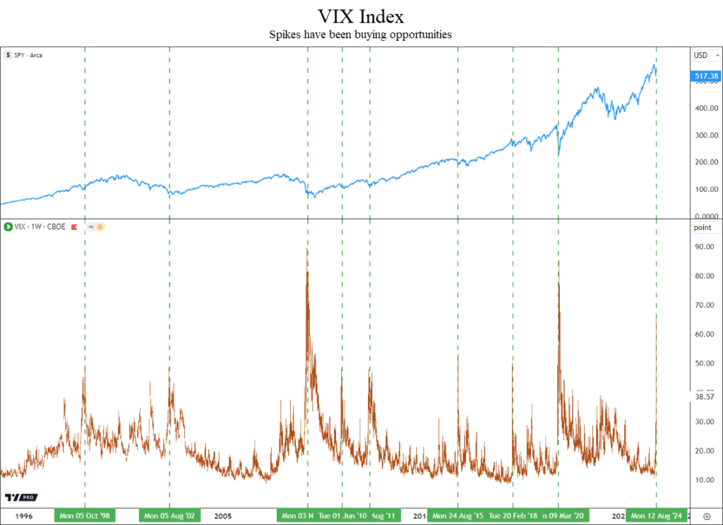
The blue line on top is the S&P 500 index (SPY), and the VIX index is in orange in the bottom pane of the chart.

This has been quite a spike higher, with the VIX approaching 70 today. It closed at 38 which is a good start.

Volatility doesn’t spike higher like this very often.

When it does, it has been an extremely good indicator that the selloff is either over or almost over.

This type of move typically does not mark a top in markets.

Quite the opposite in fact…this type of move usually signals that a low in price has either occurred or is close.

Credit Spreads

This is a warning sign that requires the most attention.

Anytime we see big moves lower in stocks, credit spreads widen a little as investors sell high-yield bonds and buy US Treasuries.

That is what we are seeing now, as shown in the next chart.
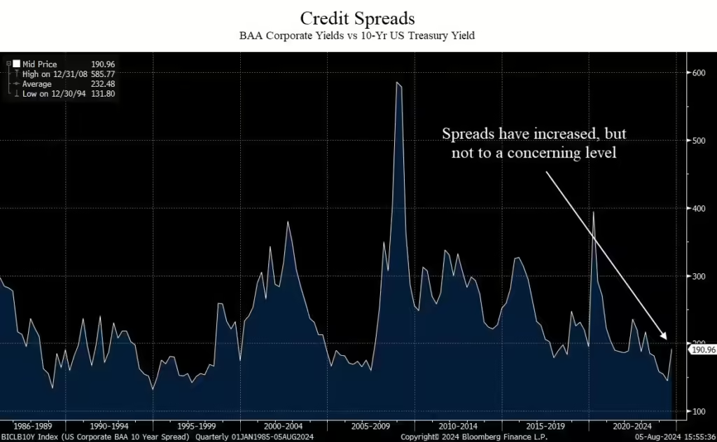
When this line goes up, it signals stress in the bond market.

Specifically, this shows the difference in yield between junk bonds and the 10-year US Treasury yield.

At 190 basis points, this means that junk bonds rated BAA only pay 1.90% above the 10-year treasury yield.

During the 2008 financial crisis, spreads jumped nearly 600 basis points, or 6%.

Normal spreads are 2-3%.

At readings of 1.9%, we are still below historical ranges.

For now, this indicator is not flashing warning signs, but the recent increase requires monitoring.

Japanese Yen Carry Trade

We saved this for last because it is the most complex.

We’ll try to simplify it.

A typical “carry trade” goes like this:

  1. Borrow money at low interest rates;
  2. Invest that money in assets that have higher return potential;
  3. Pay off the loan and keep the return minus the cost of the debt.

It’s essentially a fancy way to arbitrage, or make a spread between the cost of capital and the return you may get on the borrowed funds.

With the Yen carry trade, there are more factors at work.

One of the biggest factors is the currency conversion.

When money is borrowed in Yen, it is typically then converted to another currency, like the US Dollar.

That money is then invested in stocks or bonds.

The total return on the borrowed money is the return on the invested capital, plus or minus any return due to the currency moves.

When the Yen appreciates versus the US Dollar, it takes more dollars to pay off the initial loan in Yen. That means returns are diminished.

It then becomes stuck in a feedback loop.

The more assets that are converted back into Yen, the stronger the Yen becomes.

A stronger Yen puts more pressure on the carry trade, resulting in more selling.

More selling reduces return on the borrowed funds, resulting in a scramble to get out at any cost, as the return on the borrowed funds is eliminated by the strong Yen.

So let’s look at what the Yen has done.

Let’s review two charts:

  • Short-Term chart going back to last year;
  • Long-Term chart going back to the early 1990’s.

Let’s start with the short-term chart.
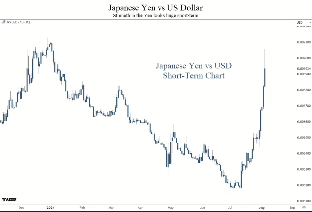
The move higher in the Yen appears to be a very large move.

When this line moves higher, the Yen is stronger. This hurts the carry trade.

When it moves lower, the Yen is weaker, helping to support the carry trade.

This move higher has resulted in a fast deleveraging of this carry trade.

Selling has been indiscriminate as investors try to reduce the damage from the strong Yen.

But like credit spreads, it’s helpful to take a broader view, so let’s look at the long-term chart.
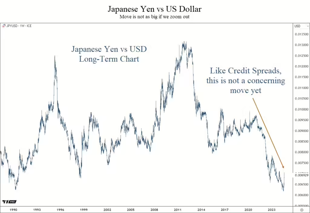
Just like credit spreads, the short-term move looks bad.

But by zooming out, we can see that the move hasn’t been all that unusual.

It may signal a massive trend change in favor of the Yen, but it is too early to say that with any conviction.

Bottom Line

The declines over the past two days have not been pretty. But at this point there is not enough evidence to get too defensive.

We will have plenty of information in the coming days, and will keep you posted on our analysis.

We will discuss this more in-depth in our webinar tomorrow, so keep an eye out for that email.

Invest wisely!


Filed Under: Market Commentary, Special Report Tagged With: bonds, carry trade, currency, japan, japanese yen, markets, s&P 500, us dollar, vix, volatility, yen, yield, yield curve

Recession Risks Remain High

February 10, 2023

Markets have calmed down quite a bit from the volatility of 2022.

This had led many people to believe that the worst might be behind us.

Maybe that is the case, but there are many data points suggesting we shouldn’t be too optimistic (at least not yet).

Let’s look at the data to see what it says.


Indicators a Recession is Near:

By far the bulk of the macroeconomic data is negative. In fact, many indicators suggest a recession is imminent.

While we haven’t seen anything bad happen yet, that doesn’t mean we’re out of the woods.

There are major economic drivers of the US economy that are flashing warnings signs:

  • Yield Curve
  • Leading Economic Indicators
  • Banks’ Willingness to Lend
  • CEO Confidence
  • Forward Earnings per Share

Let’s take a brief look at each of these items.

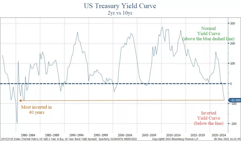
Yield Curve

The yield curve shows interest rates at various maturities.

When longer-term bond pay more interest than shorter-term ones, the yield curve is “normal”.

However, when shorter-term bonds pay more, the curve is “inverted”.

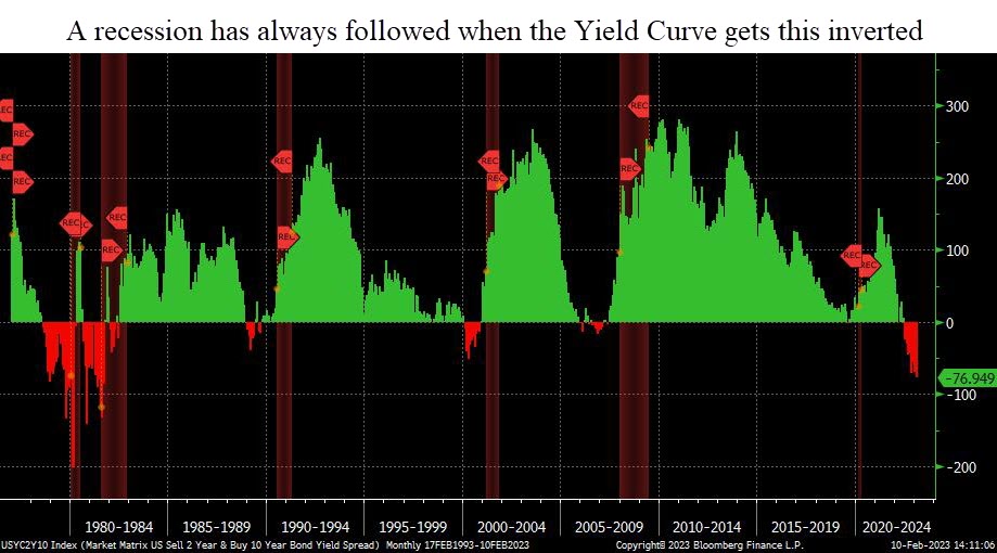
An inverted yield curve has a 100% success rate in predicting recessions. Currently, the curve is inverted, as shown on our first chart below.

A recession has always followed when the yield curve has been this inverted.

On average, a recession begins within 12-18 months after the initial inversion. This happened one year ago.

If history is any precedent, a recession should start by this summer.

Leading Economic Indicators

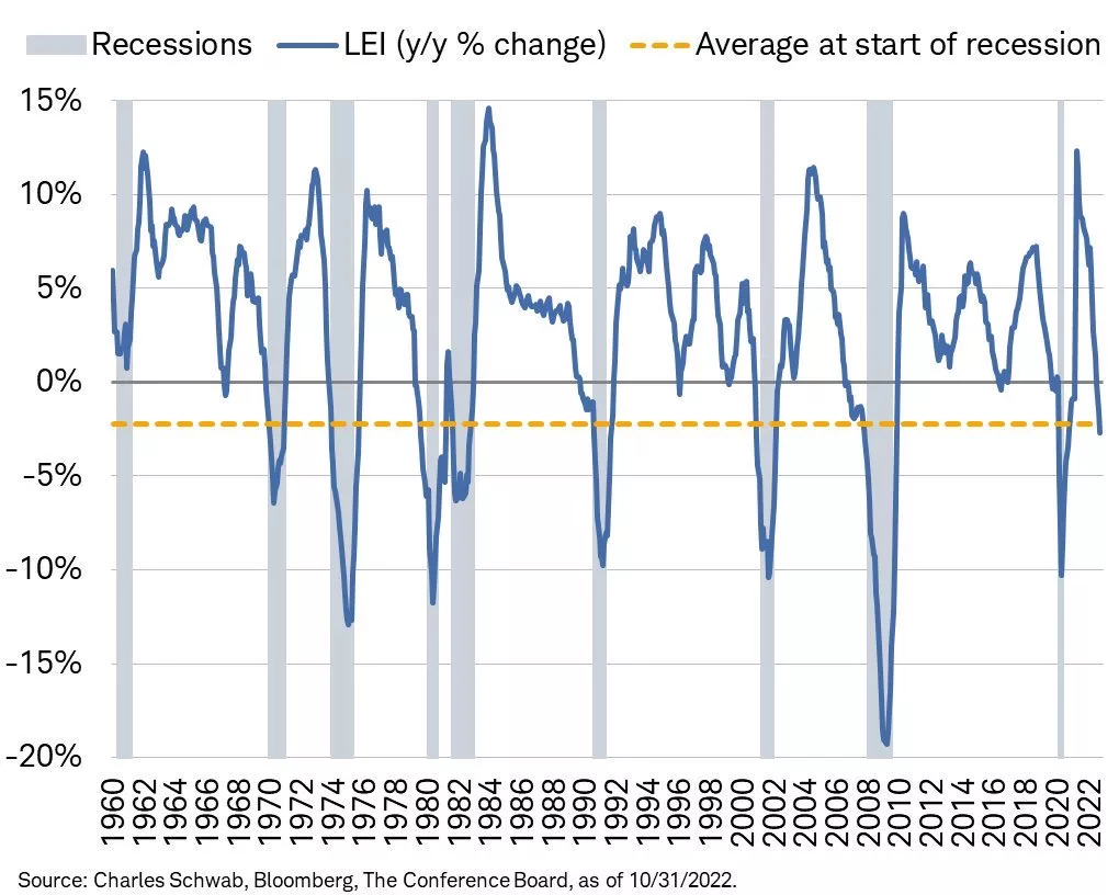
The Leading Economic Indicators (LEI) is a measurement of ten data points on the earliest stage of economic activity.

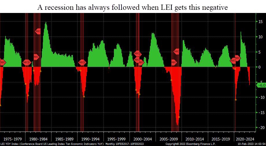
Right now, LEI is very negative. In fact, every time LEI has dropped this much, a recession has followed.

This next chart shows the LEI index. Green shows positive year-0ver-year growth, while declines are in red. Recessions are shown in the red shaded areas.

Typically, a recession starts 7-8 months after LEI growth drops by 3% year-over-year. This happened in December.

If history is any precedent, a recession should start by this summer.

Tightening Lending Standards

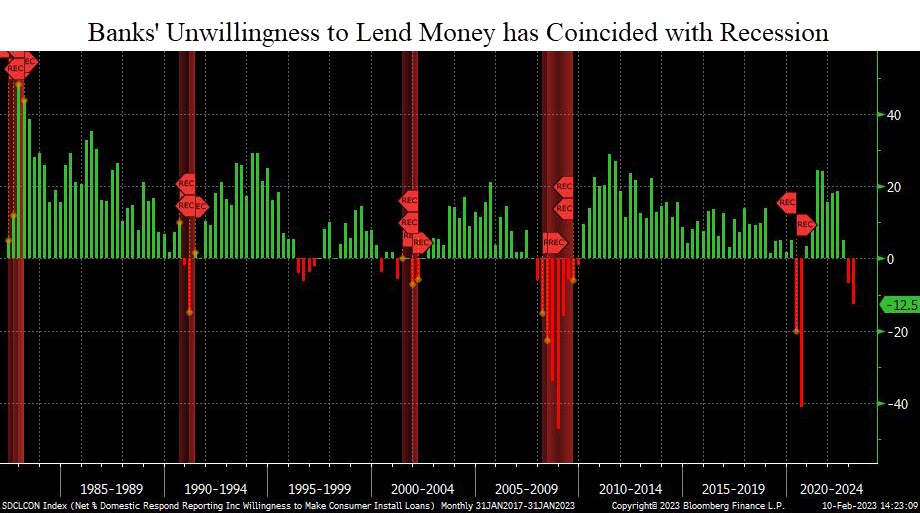
Banks are tightening lending standards and access to credit.

The US economy is driven by debt. When banks tighten, the economy slows.

Except for 1994, every time bank have pulled back on their willingness to lend money, a recession starts within months.

This suggests that we may already be in a recession.

CEO Confidence

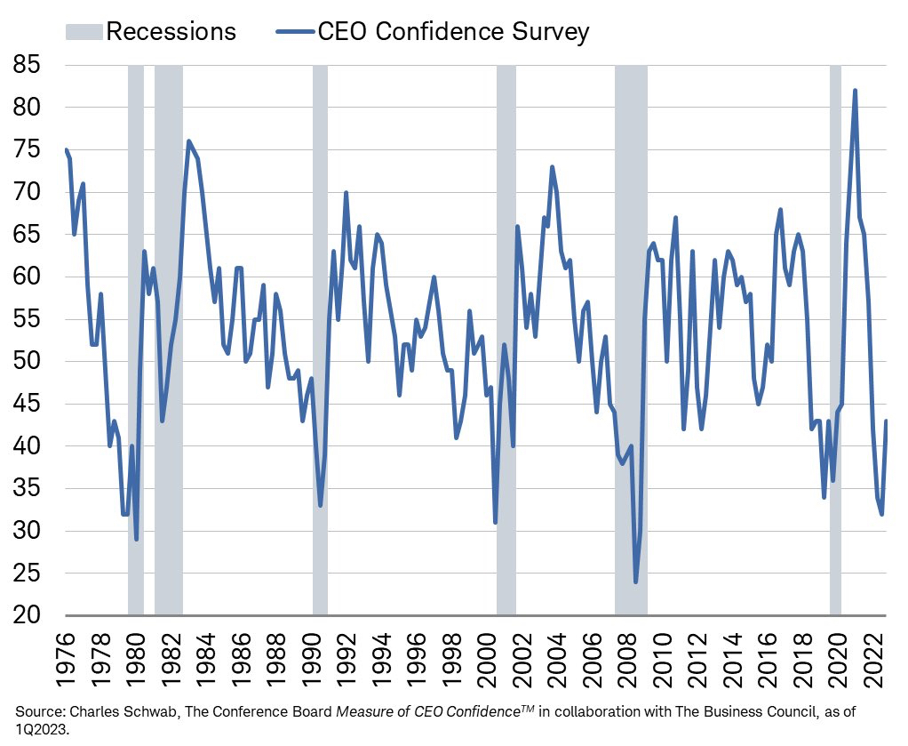
Corporate CEOs have access to real time economic data on how their company (and more broadly the overall economy) is performing.

When CEO confidence falls, recessions typically follow.

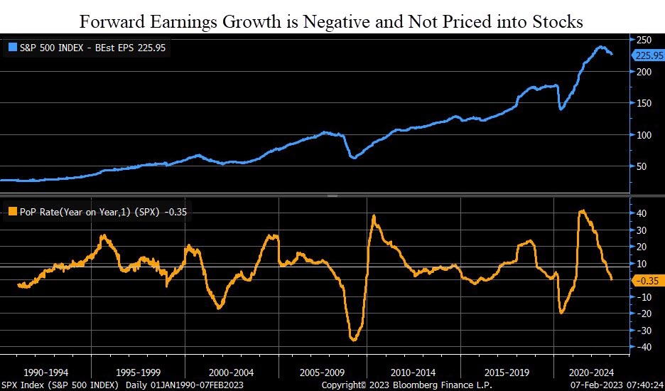
Earnings Growth

The previous data points are all macro-economic data points.

The next has to do directly with stocks.

If we do enter a recession, corporate earnings will decline. In fact, we’re already starting to see that.

All of the data points above suggest risks in financial markets remain very high over the next few months.

However, there are data points telling us a recession may not be quite as likely.

Indicators Suggesting a Recession is Less Likely:

While the bulk of the data is poor, there are some data points suggesting that a recession may not be imminent:

  • The US Consumer has been Resilient
  • Light Vehicle Sales are Steady
  • Employment Numbers aren’t Bad
  • VIX has remained low
  • Market Breadth is Improving
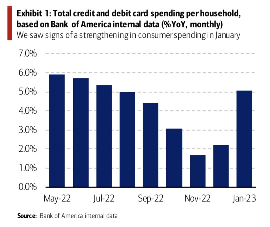
US Consumer Spending

70% of the US economy is dependent on the consumer.

If the consumer can remain resilient, then there still remains hope that we will avoid a recession (or at least have a mild one).

The next chart, courtesy of Bank of America, shows that consumer spending increased in January.

This is an important indicator to watch over the coming months.

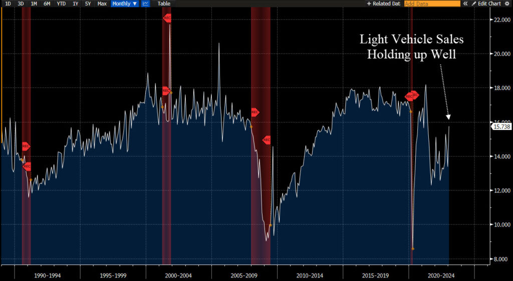
Light Vehicle Sales are Steady

Another indicator showing that the consumer is resilient and there is still overall demand in the economy can be seen in vehicle sales.

Light vehicles include almost every consumer auto. This categorization includes all cars and trucks weighing less than 10,000 pounds. (For reference, the maximum curb weight of a Ford F-150 is about 5,600 pounds.)

While this chart doesn’t necessarily show excessive strength, it also doesn’t show weakness either.

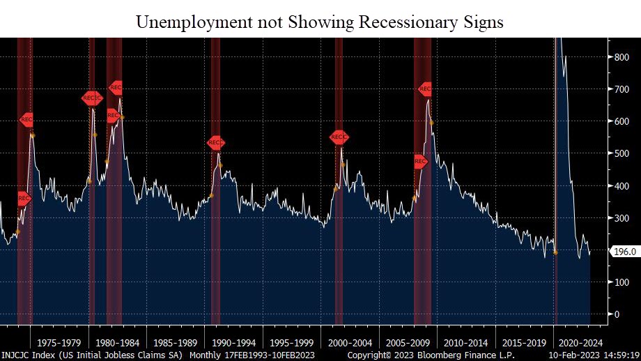
Employment Numbers Remain Strong

One of the most widely watched economic indicators is the unemployment number.

The chart below shows jobless claims. So far, unemployment has remained resilient.

This is very closely tied to the consumer spending data we mentioned above. When people have jobs, people spend money. Especially when prices are higher on just about everything they buy.

We’ve all heard of the layoff announcements by the Tech giants Amazon, Microsoft, Apple, Google, Microsoft, and more. These are concerning, and could be the tip of the iceberg.

But for now, those layoffs have not spilled over to the broader economy. At least not yet.

This is another data point we will watch with great interest in the coming months.

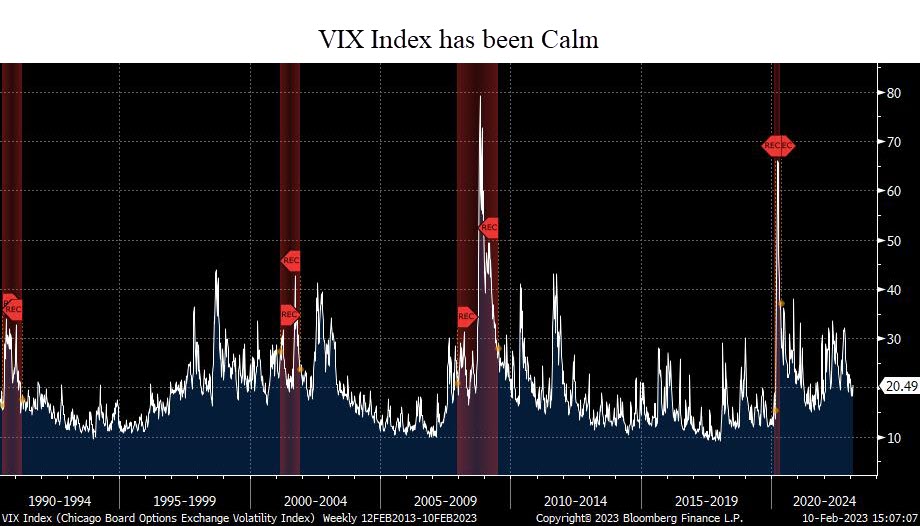
VIX Index

The VIX has reflected the relative market calm over the past few months.

While each recession has had a spike in the VIX, not every spike in the VIX has lead to a recession.

The VIX is a relatively fickle index, and there is little to no predictive power in it. But it does tell us that despite the high economic risks right now, the market is not overly fearful.

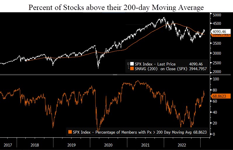
Market Breadth

The last chart we’ll discuss has to do with market breadth.

In order for the overall market to move higher, its underlying constituents need to be doing well.

And in the past few weeks, there has been improvement.

This chart shows the percent of stocks within the S&P 500 that are above their respective 200-day moving average. (This is simply the average price of that stock over the past 200 days.)

The current reading is 68%. This is a healthy number. While this number in isolation doesn’t give us an “all-clear” to invest, it is a good sign.

Bottom Line

Despite recent market strength, risks remain incredibly high.

At this point, it appears that the rally we’ve seen this year is another bear market rally.

The next few months are very critical. If a recession hasn’t started by mid-year, then the Fed very well may have manufactured a “soft landing”.

Client portfolios remain conservatively positioned, as they have been for the past 8-9 months.

The further we get into this year without bad things happening in the market, the better the overall risk/reward profile of this market becomes.

We’ll publish a video in the coming weeks to discuss the specific scenarios we see happening over the coming months.

Until then, please do not hesitate to reach out with any questions.

Invest wisely!

Filed Under: IronBridge Insights Tagged With: economy, federal reserve, growth, leading economic indicators, markets, recession, sales, stock market, volatility, yield curve

Scrooged?

December 12, 2022

stern looking mature man in victorian costume carrying a cane  . Model is wearing a dark suit , top hat, glasses and prosthetic make up , the look created is also similar to a  Dickens victorian type character .

Men’s courses will foreshadow certain ends, to which, if persevered in, they must lead,” said Scrooge. “But if the courses be departed from, the ends will change.”

charles dickens, “A christmas carol”

In Charles Dickens’ famous book, A Christmas Carol, Ebenezer Scrooge begins the story as a mean-spirited and angry old man.

But he undergoes a transformative experience that changes him into someone who cares for others and embraces the spirit of giving.

The quote above by Mr. Scrooge is not the easiest quote to read.

If we paraphrase it, it may read something like this:

“If you go down a dangerous path, bad things will probably happen. But if things change, they might not be so bad after all.”

Currently, equity markets are trying to show more of a giving spirit like that of the transformed Scrooge.

But there are still MAJOR macro-economic signals with a grumpy, “old-Scrooge” like demeanor.

But will they will turn into positives in the coming months?


Grumpy Scrooge

First, let’s look at the more concerning indicators.

Specifically, there are three data points worth watching that are showing elevated risks for 2023:

  1. The Inverted Yield Curve
  2. Leading Economic Indicators
  3. Money Supply (M2)

These indicators tend to be excellent predicters of recessions when they turn negative.

And right now they are VERY negative.


Inverted Yield Curve

The yield curve is simply what a specific investment instrument yields at different maturities.

To understand the current yield curve environment, think of it like this:

Let’s say you want to invest in a Certificate of Deposit at a bank. You speak to a banker, and ask for the rates on a 2-year CD and a 10-year CD.

Logically, you expect the 10-year CD to be at a higher interest rate. You are, after all, committing funds to the bank for a decade.

But the banker tells you that the 2-year rate is paying 4.6%, while the 10-year rate is only 3.8%. This is an “inverted” yield curve.

When the yield curve on US Treasuries inverts, it has been the single best predictor of a recession in the past 100 years.

Right now, the yield curve is more inverted than anytime in the past 40 years.

The chart below shows the difference between a 2-year US Treasury bond and a 10-year one.

US Treasury yield curve is the 2-year yield versus the 10-year yield. It is currently inverted by the most in nearly 50 years, signaling a deep recession is likely in 2023.

When the line is above zero, the curve is “normal”. Below zero and it is “inverted”.

The past three times the yield curve was inverted was in 2008, 2000 and 1987. It became inverted before the markets had extreme stress, and each time led to a recession and tremendous market volatility.

This chart above only goes back to the 1970’s, but it’s the same well before that as well.

The depth of this inversion is worrisome too.

At roughly 0.83%, this is a very steep inversion, and one that is signaling not just a recession, but a deep one.


Leading Economic Indicators

Another key data point to monitor is the Leading Economic Indicator Index (LEI). We discussed this in our Thanksgiving report (read it HERE).

The LEI is another excellent recession predicter.

It’s so good, in fact, that EVERY time in the past 70 years we’ve seen the LEI at these levels a recession has followed.

The chart below, courtesy of Charles Schwab and Bloomberg, shows that the negative LEI is below the average level where recessions begin.

Schwab Bloomberg leading economic indicators showing negative data and at a level below where recessions typically begin.

LEI is telling us that a recession is imminent (unless this time is different, which is a dangerous assumption in financial markets).  But LEI is not a good timing tool…it does not tell us when a recession might begin.

It only tells us that one is close. 

And the rate of change does in fact suggest that a recession is likely to be worse than “mild”.

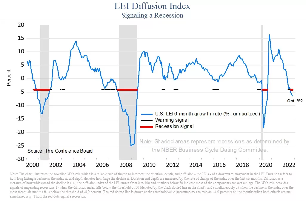
Another way to look at LEI is to look at the diffusion of the data.

Diffusion measures how widespread any strength or weakness is within the data. In the next chart, the diffusion index ranges from -50 to 50.  A reading below zero tells us that the majority of the data is weakening. 

Leading economic indicators diffusion index has an active recession signal.

When the diffusion index is below zero, it is indicating that a majority of the underlying data is weakening.  A reading above zero tells us the opposite, that most data is improving. 

When the diffusion goes below zero, it is a warning sign that economic trouble could be happening.  But a recession has not followed every time diffusion has turned negative.

Only when the index gets to minus-4 has it signaled that a recession is imminent.  The index is currently at minus-6. This is another excellent predicter of a recession, and it tells us that one is very likely to occur in 2023.


Money Supply (M2)

Another important, but little discussed aspect of financial market performance is the money supply.

There are various ways to measure the overall supply of money in a society. One of the broadest definitions is called “M2”. It measures the total amount of liquid funds in cash or near cash within a region.

This number includes cash, checking deposits and non-cash assets that can easily be converted into cash, like savings accounts and money markets.

If you’d like to learn more about M2, Investopedia has a nice article about it HERE.

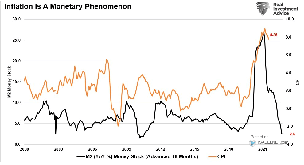
M2 has a very high correlation to inflation. More accurately, changes in M2 have a very high correlation to inflation.

The next chart shows this phenomenon, courtesy of our friends at Real Investment Advice in Houston.

The black line is the year-over-year change in M2 (moved forward 16 months), while the orange line is CPI.

M2 is telling us that inflation is likely to head much lower in the coming 12 months.

On the surface, this would appear to be a good thing. After all, isn’t inflation one of the problems that markets face right now?

Maybe it is a good thing.

But the real problem is the extent of the decline.

After a massive increase in M2 during COVID, the rate of change has collapsed.

The problem arises in how big this decline has been.

It is not signaling that inflation should moderate. It suggest that inflation may turn into outright deflation.

The only way this happens is if we enter a moderate-to-deep recession. When major data points align like these three do right now, we must pay attention.


The New, More Giving Scrooge

While there are plenty of reasons to believe that 2023 is going to be a bad year again for stocks, not everything is bad.

Let’s look at some good data points right now:

  • The consumer remains strong. Shoppers spent a record $5.29 billion this Thanksgiving, an all-time record high. Yes, inflation had some to do with this, but at this point inflation is not having a meaningful impact on the consumer, at least; not yet.
  • Unemployment is low. The unemployment rate remains below 4%, primarily due to the services sector being strong.
  • Inflation is slowing some. CPI for October came in at 7.7%, below estimates of 7.9%. November’s CPI data will be published tomorrow. As we can see from the M2, we should expect inflation to slow in the coming months.
  • The Fed may be close to pausing. The market is anticipating a 0.50% increase at their meeting next week, with an additional 0.25% at their February meeting. Currently, markets expect that to be the end of interest rate increases for now. Historically, when the Fed Funds rate gets above the 2-year treasury yield, the Fed pauses interest rate increases. This will likely happen this week, so they very well could be done raising rates for a while.

Unemployment is a big data point here. Once the unemployment rate starts to rise, it has a direct impact on spending.

And consumer spending is roughly 70% of the US economy.

The main problem with looking at unemployment and other actual economic data is that they are backward-looking.

Once unemployment increases, we are already likely in a recession (even if it is not officially announced yet).

Which makes the forward-looking data points that much more important to consider.


Bottom Line

Despite the recent calm in markets, this is not a time for complacency.

Over the past 50 years, every time markets were volatile and NOT in a recession, NONE of the three indicators listed above were negative.  

Now, all of them are negative. And all of them were negative prior to recessions.

This tells us that the likelihood of a recession next year is extremely high. In fact, the data suggests that it should be more of a question about the extent of the decline, not whether one occurs.

Fortunately, it is not a foregone conclusion that a recession will be deep and painful. There is still plenty of time for things to change into something more positive.

Hopefully, this angry Scrooge-like data will transform to be something less angry and more joyous towards everyone.

But as we always say, hope is not an investment strategy.

For now, we must deal with the realities of the environment at hand.  And the current environment has major risks that should not be ignored.

Invest wisely!

Filed Under: IronBridge Insights Tagged With: economics, federal reserve, GDP, inflation, investing, leading economic indicators, LEI, markets, money supply, portfolio management, volatility, wealth management, yield curve

Don’t Fight the Fed

September 21, 2022

The Federal Reserve met today and increased interest rates by 0.75%, as expected.

Stock markets were volatile all day, and ended up down almost 2%. So maybe it wasn’t so expected after all.

As we have consistently said in communications over the past few months, risks are very high right now.

Today didn’t do anything to change that in either our signals or our minds.

We’ll keep it short and to the point today, and let charts do most of the talking, but let’s do a brief portfolio update first.


Portfolio Update

Client portfolios are VERY conservative.

We have continued to reduce equity exposure in all portfolios, and we have added equity hedges to portfolios as well.

If markets continue to fall, your portfolio should remain very stable. We cannot eliminate risk, so there will always be fluctuations. But we have minimized those to properly handle the current environment.

We firmly believe this to be the proper course of action at this point.

As always, markets can change. If we get signals to increase risk, we will not hesitate to do so.


Yield Curve

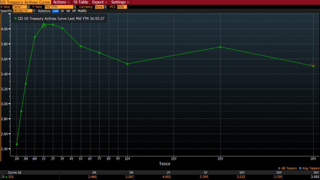
The Yield Curve remains inverted. This means that short-term rates are higher than longer term rates. The yield curve is more inverted than it has been in almost 50 years.

US Treasury Yield Curve is inverted

Why does the yield curve get inverted in the first place?

There are two main reasons:

  • Short-term rates are mostly set by the Fed. They have been steadily increasing rates all year.
  • Longer-term rates are set by the market. When there are concerns about economic weakness, money flows into longer-term treasury bonds.

Longer-term yields have been relatively stable the past few months, while short-term rates have risen dramatically.


Inverted Yield Curves Lead to Recessions

As we have mentioned numerous times this year, an inverted yield curve has been an excellent indicator of recessions.

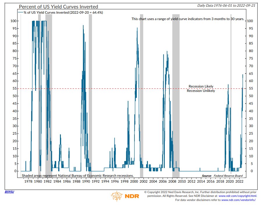
The next chart shows the percentage of the yield curve that is inverted (blue line), with recessionary periods in gray.

The percentage of the yield curve that is inverted simply looks at various maturities and counts whether the short-term rate is higher than the long-term rate. (3-months vs 2-years, 3-months vs 5-years, etc.)

When more than 55% of the yield curve becomes inverted, it has ALWAYS preceded a recession. We are now at 65% of the yield curve that is inverted.


The Fed’s Dot Plot

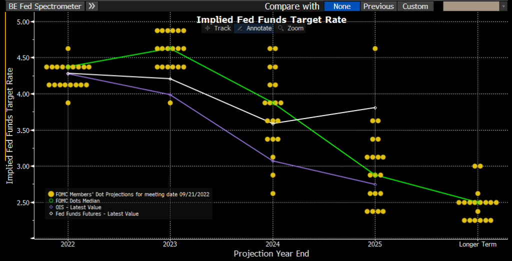
This is a bit of a complex chart, but it shows how each member of the Federal Reserve Committee sees future interest rates.

This shows that the majority of Fed members believe they will hike rates to somewhere between 4.5% and 5.0%. The target rate is currently 3.00-3.25%. (They use a 0.25% range when setting the Fed Funds rate).

So we can assume that there is likely another 1.50-2.00% of interest rate increases to come. This would likely be another 0.75% at the next meeting in October, followed by slightly decreasing hikes (0.50% then 0.25% at the following two meetings).

Things can change, but this is a good gauge of their thoughts.

It is also interesting to note that almost every Fed member is then projecting rates to fall in 2024 and beyond.


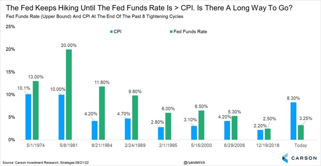
When has the Fed Stopped Hiking Historically?

Historically, the Fed stops raising rates when the Fed Funds rate gets above the inflation rate. There may be some time to go before that happens.


Bottom Line

Today’s developments do not surprise us.

The Fed has been crystal clear about wanting to slow the economy, slow wage growth, and remove speculation from markets (meaning lower stock and home prices).

They re-emphasized that today in no uncertain terms.

The Fed wants prices to fall. Don’t fight them, you won’t win.

The downside scenarios are large enough that it still makes sense to reduce risk if you haven’t done so already.

As always, please do not hesitate to reach out with questions or to review your individual circumstance.

Invest wisely!


Filed Under: IronBridge Insights Tagged With: fed funds rate, federal reserve, interest rates, inverted yield curve, markets, volatility, yield curve

Footer

LET'S CONNECT

  • Email
  • Facebook
  • Instagram
  • LinkedIn
  • Twitter

AUSTIN LOCATION

6420 Bee Caves Rd, Suite 201

Austin, Texas 78746

DISCLOSURES

Form ADV  |  Privacy Policy  |  Website Disclosures

  • Home
  • Difference
  • Process
  • Services
  • Insights
  • Team
  • Clients
  • Form CRS
  • Contact Us

Copyright © 2017-Present by IronBridge Private Wealth, LLC. All rights reserved.