• Skip to main content
  • Skip to footer

IronBridge Private Wealth

Forward with Confidence

  • Home
  • Difference
  • Process
  • Services
  • Insights
    • IronBridge Insights
    • Strategic Wealth Blog
    • Strategic Growth Video Podcast
    • YouTube Channel
  • Team
  • Clients
  • Form CRS
  • Contact Us

IronBridge Insights

Fed Meeting: Popping the Bubble or Normal Volatility?

January 26, 2022

So much for the New Year’s wish of putting 2020 and 2021 behind us and getting back to normal.

Or are we?

The markets had one of the calmest years in history last year, mainly on the back of the mega-cap tech firms.

But that calm was shattered as the market fell over 12% in a few short weeks.

Which begs the question…”Is this normal, or is this a sign that the biggest bubble in the history of the world is popping?”

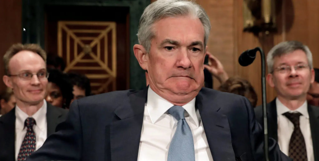
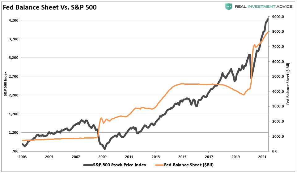
Before we dig in, we’ll mention that the Fed met today and not much came of it. Yes, markets reversed lower after the announcement, but there were no surprises today.

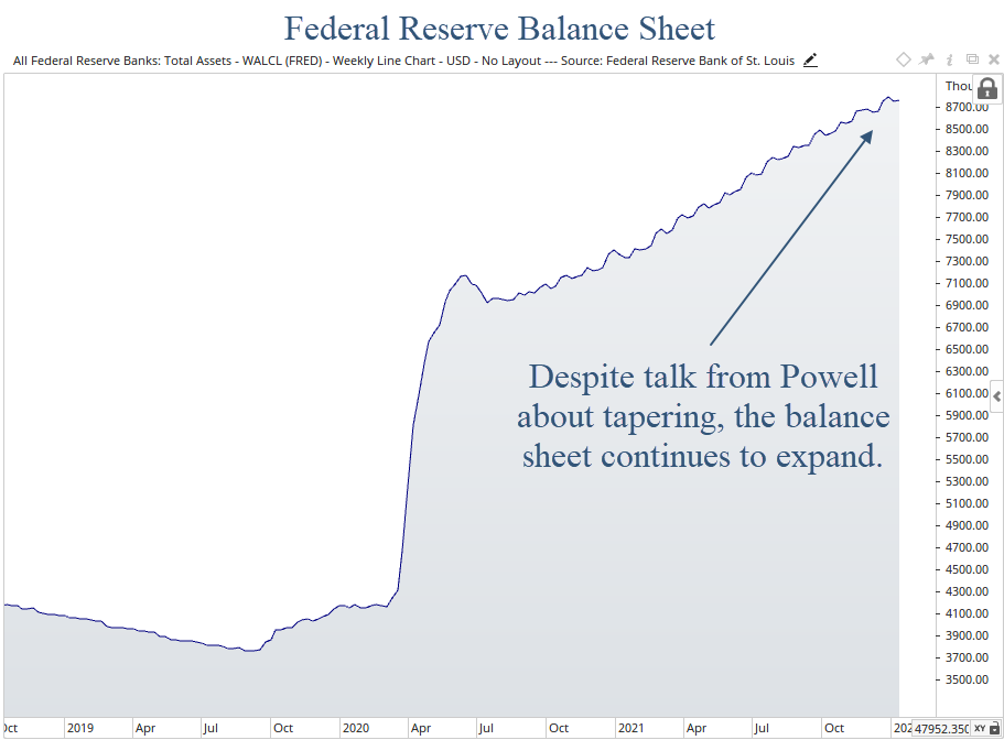
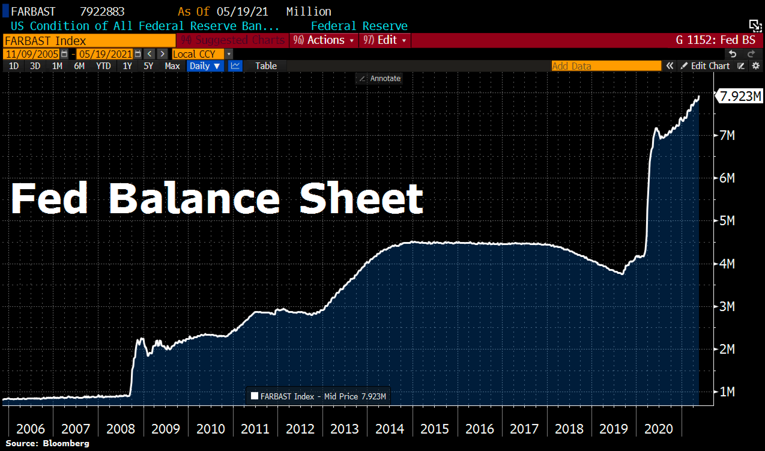
They reiterated that they plan to raise rates by 0.25% in March. And reiterated that the balance sheet is way too big for the current economic environment. Both of these are accurate and prudent.

The markets were hoping he would say that all potential rate hikes are off the table, but that was an unrealistic expectation. And one mostly fabricated by the financial media.

So the reality of the Fed this evening is exactly the same as the reality of the Fed at noon today.

Let’s move on to the markets.

The S&P 500

Markets have had a terrible start to the year. In fact, we’re off to the worst January in history.

From peak-to-trough, the S&P fell 12% (so far at least).

Let’s look at the chart.

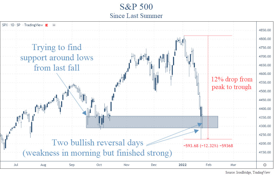
December was actually a fairly choppy month, but as soon as the clock struck midnight on New Year’s Eve, markets began to drop without much relief.

The last time the market had any sort of mild correction was last September. It chopped around for a few weeks and moved higher into year end.

Now, the market is testing those levels, as shown in the blue shaded rectangle in the chart above.

The other thing the market is trying to do is to rebound during the day from a very weak start.

The market has had two consecutive reversal days. The bulls are trying to show that they aren’t ready to give up just yet.

On Monday, Jan 24th, the S&P was down as much as 3.99%. However, by the end of the day it was actually positive. That’s a HUGE reversal day that only has a few precedents.

Since 1950, there have been 88 times the S&P fell by this much in a single day.

Only 3 times (including Monday) it finished positive on the day.

The other two times? October 2008.

Yikes.

On the surface, this doesn’t appear to be very good.

October 2008 was the thick of the financial crisis. Banks were failing, the housing market was tumbling, and there was economic and market chaos.

We aren’t seeing anything close to that right now.

Outside of the supply chain bottlenecks, the overall economy is doing fine.

The bond market isn’t showing any signs of stress either.

In fact, the bond market is typically the better market to watch if you’re concerned with the potential for a large drop in equities.

Yield Curve and Yield Spreads

The yield curve and yield spreads are the two major bond market data points that have been the best indicator of economic and widespread financial market stress over decades.

The yield curve measures the difference between longer-term bonds and shorter-term bonds. Specifically, the difference between the 10-year Treasury yield and the 2-year Treasury yield.

When the 10-year yield is LOWER than the 2-year yield, the curve gets “inverted”. An inverted yield curve has preceded EVERY recession over the past 50 years, as shown in the next chart.

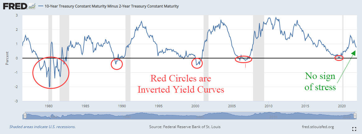
The yield curve isn’t showing ANY concern.

What about the other major data point…yield spreads?

Yield spreads measure the difference between yields on the safe bonds (US Treasuries) versus the yields on unsafe bonds (junk bonds).

Specifically, we look at the Baa Corporate Bond Yield and the 10-Year Treasury yield.

This spread is shown on the next chart, which goes back to the late 1990’s.

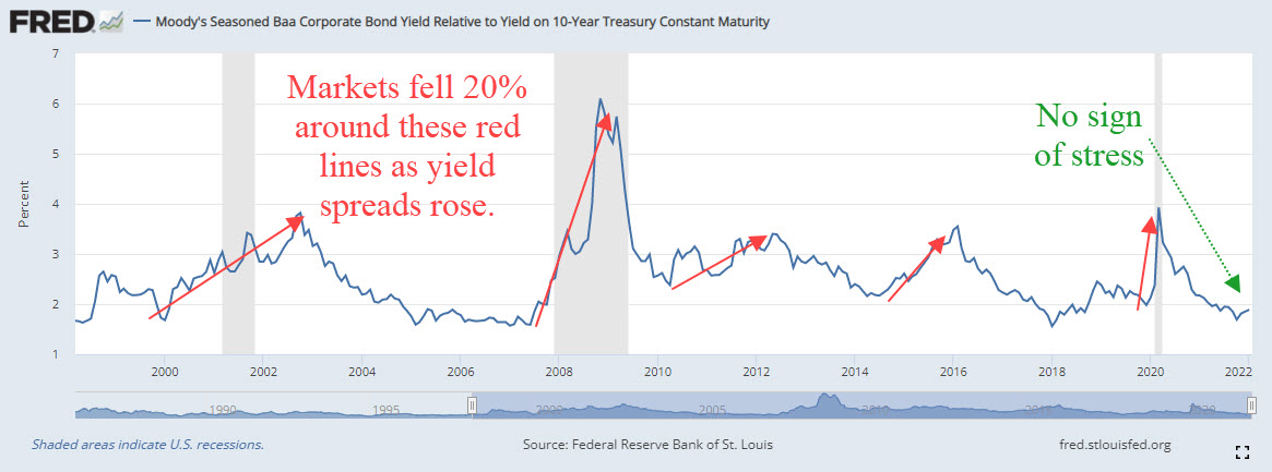
Every time the market fell 20%, yield spreads widened well before that happened. There has been NO widening of yield spreads this year.

Bottom line, the bond market isn’t worried.

So why all the volatility recently?

The answer is pretty easy. They even met this afternoon…the Fed.

The Fed

The Fed met today, and despite a late day market selloff, no real news came from the meeting.

They reiterated that they anticipate a 0.25% rate hike in March.

This was expected.

They said they would remain aware of economic and financial conditions, and would adjust their approach if the situation warrants.

This was also expected.

So there was actually very little “news” that came of the meeting today.

The real news happened a few weeks ago, when they released their minutes from their last Fed meeting of 2021.

In these minutes, they discussed a faster tightening that what the official messaging has been to the market.

The chart below shows when the minutes were released.

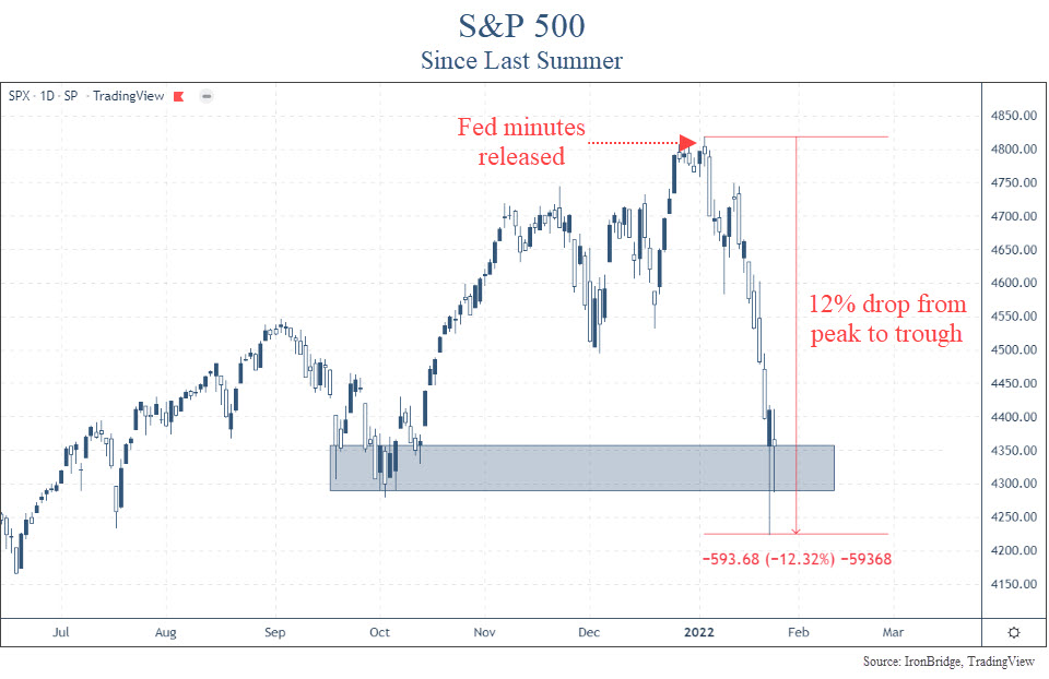
Oops. Since the release of the meeting notes, the market has gone pretty much straight down.

There were a couple of nice reversal days this week, but after the Fed meeting this afternoon, markets again fell.

So we’re getting mixed signals.

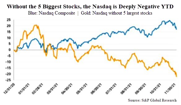
On one hand, the very speculative areas of the market are essentially collapsing:

  • Bitcoin is down almost 50%
  • Speculative tech stocks are down 70-80%
  • A whopping 42% of the stocks in the Nasdaq Composite Index are down over 50%

We’re seeing risk at the edges of the market.

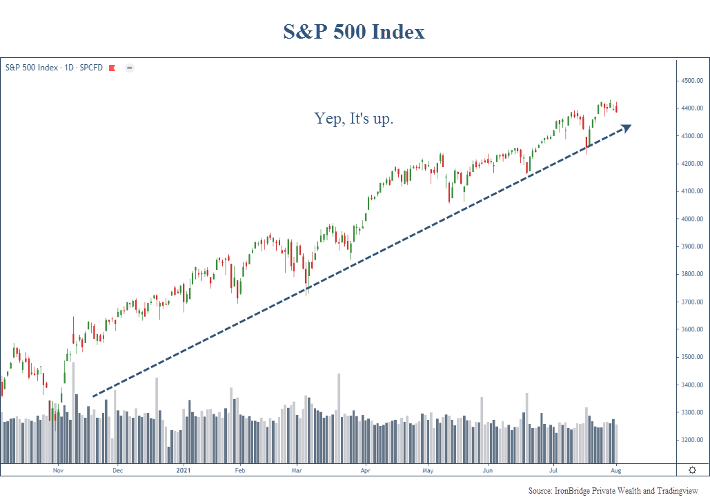
Major stock indexes are also showing weakness. The S&P as we mentioned above fell 12%. The Nasdaq has been worse, falling 19% from peak-to-trough.

We’re NOT seeing risk at the core of the global markets…bonds.

Which side should we choose?

For now, we must assume that the volatility we have seen this year is normal.

10% corrections happen on average every 12-18 months. It’s been almost 2 years since we’ve seen one. So this type of volatility isn’t all that unusual.

It FEELS a little worse, because we had such low volatility last year.

And it may continue for a while longer.

But until we start to see risk show up in the more important areas of the market, we should expect an ultimate resolution higher.

That said, we have been taking steps to modify client portfolios. After all, we never know when a small correction will turn into the big one.

We increased cash two weeks ago. We have been rotating out of the more aggressive areas of the market into the traditionally more conservative areas.

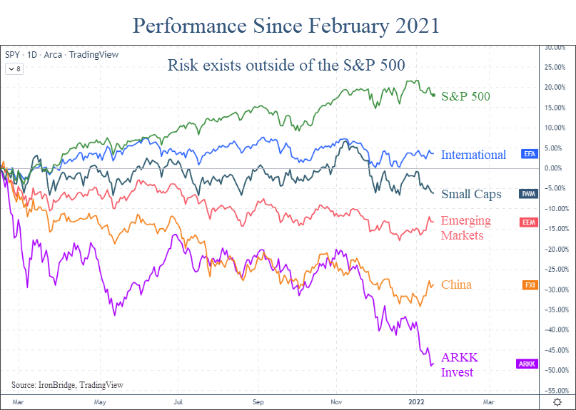
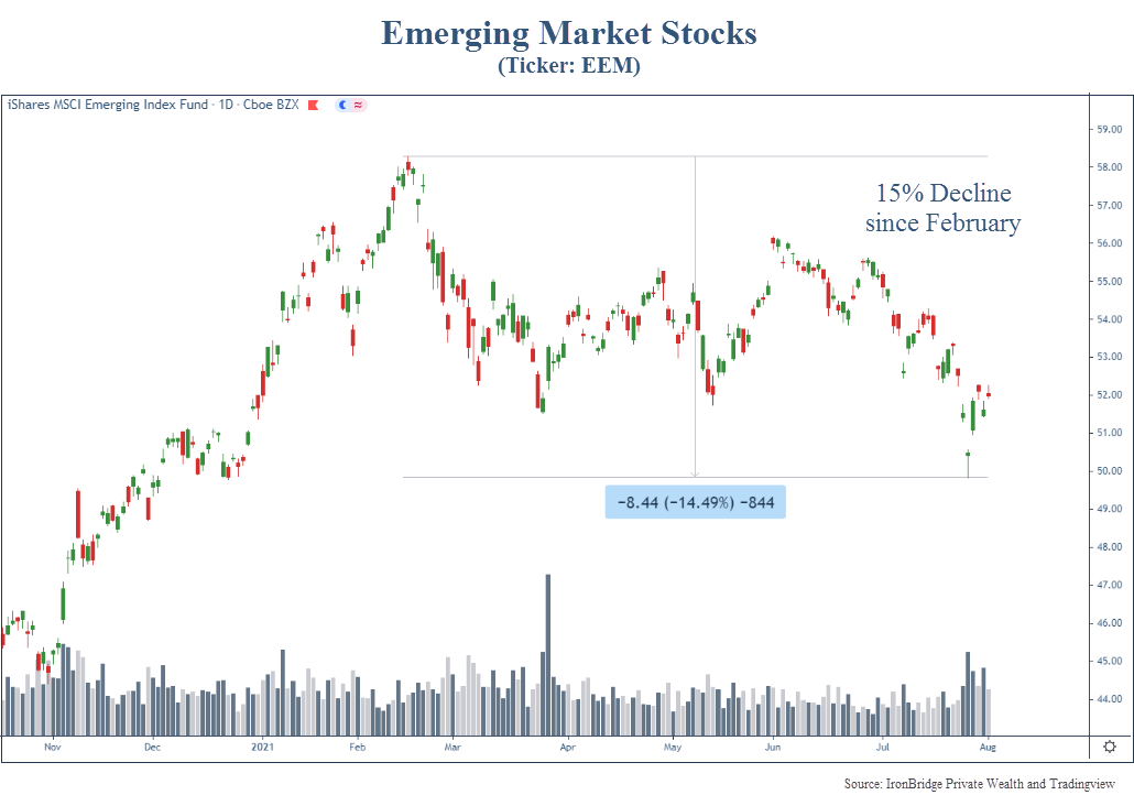
International stocks have shown a tremendous amount of strength relative to their US counterparts. We have increased exposure there as well.

If the markets continue to show volatility, we will more aggressively raise cash. And we’re not far from those levels.

But the weight of the evidence, at least for now, suggests this pullback is normal. And frankly we should expect more of this type of volatility going forward.

It does not look like the start of the bursting of the bubble. At least not yet.

Invest wisely!

Filed Under: IronBridge Insights Tagged With: fed, federal reserve, inflation, interest rates, markets

5 Themes for 2022 and Why We Hate Year-End Predictions

January 14, 2022

Fortune teller reading future with crystal ball. Seance concept.

We hate year-end predictions.

Maybe “hate” is the wrong word…it is far to kind.

We absolutely despise the cringeworthy year-end predictions that accompany this time of year. (Feel free to imagine other colorful adjectives we may use to describe them.)

Why?

  1. Because they are worthless.
  2. There is no accountability whatsoever for those who make them.
  3. There is no way to accurately predict such a complex system as the global financial markets with any consistency, other than using the most commonly occurring outcome of an historical return bell-curve.
  4. Did we mention they were worthless?

Case in point…the six largest investment firms in the world missed last year’s performance by nearly 20 percentage points on the S&P 500. Oof.

Our apologies in advance if you’re looking for our wild-ass guess expertly modeled estimate of what the S&P 500 will be on December 31, 2022.

As our clients hopefully know, we don’t try to predict what will happen. Instead, we try to listen intently to the markets and let our rules drive the investment decisions.

So instead of sharing our predictions, let’s instead share the five themes we’re tracking for the upcoming year.

Theme 1: The Fed

For those who regularly read our reports, there’s no surprise here that the Fed holds the top spot in themes we’re watching this year.

The Fed is the Alabama Crimson Tide of the financial world. They are always among the top few drivers of what will happen during the season. And unless you’re on the team or an alumni, most people are pretty tired of you by now.

More accurately, the Fed IS the driver of the market. It has been since 2009. So we MUST pay attention to what they are doing.

Right now, despite the talk from Chairman Powell about tightening and raising rates, they are still expanding their balance sheet.

Federal Reserve Balance Sheet has been increasing despite Powell saying they are tapering.

The increase in the Fed’s balance sheet is the single biggest contributor to both the increase in the stock market, as well as the re-emergence of inflation across the globe.

It is also a reason why we’ve only seen minor pullbacks since COVID began.

The eventual reduction by the Fed is very likely to lead to a much choppier environment for stocks, and at some point an outright bear market.

Whether that happens in 2022 or not is anyone’s guess.

But as of right now they are scheduled to begin reducing their balance sheet this year, not just slowing down the increase of it.

Paying attention to global markets when the Fed ACTS, instead of when they SPEAK, will be key for risk assets this year.

Theme 2: Inflation

The second theme to watch this year, and the natural follow up to the Fed, is inflation.

We’ve all seen it recently. From cars to steaks to milk to $10 packets of bacon. Everything costs more.

In fact, inflation just recorded the largest year-over-year increase in 40 years. It rose 7% in the past 12 months, as shown in the chart below.

On the surface, this looks ominous. We haven’t seen an inflationary environment since the 1970’s, and that decade was not a good time to passively invest in stocks.

However, our belief is that inflation will not increase and stay at elevated levels.

Instead, we think it will occur in waves.

We wrote about inflation numerous times last year (click to read):

  • The Coming Inflation Waves
  • Increased Gas Prices Signal both Post-COVID Norm and Inflation
  • The First Wave of Inflation is Receding

Lumber is a good example of our inflation-wave thesis.

After skyrocketing the first part of 2021, lumber prices subsequently collapsed. Now, they are skyrocketing again.

Take a look at the extreme moves in lumber recently.

This chart is pretty amazing. We’re talking about the price of LUMBER. Not some phantom crypto-coin being schlepped by a Kardashian.

Lumber is an excellent case study for this environment. There are demand influences, supply chain issues and quality differences in various types of lumber that contribute to this massive volatility. And for the most part, it does not have governmental influences on it like the cost of healthcare does.

Inflation has far-reaching ramifications. Not only for asset prices and the economy, but for society as a whole.

Higher prices hurt consumers. They hurt businesses without pricing power. They cause massive price adjustments in all sorts of areas. Inflation also has massive political implications as a disgruntled populace focuses its frustrations on political leaders.

This quote by John Maynard Keynes is fairly long, but worth the read:

By a continuing process of inflation, governments can confiscate, secretly and unobserved, an important part of the wealth of their citizens. By this method they not only confiscate, but they confiscate arbitrarily; and, while the process impoverishes many, it actually enriches some. The sight of this arbitrary rearrangement of riches strikes not only at security, but at confidence in the equity of the existing distribution the system brings windfalls, beyond their deserts and even beyond their expectations or desires, become ‘profiteers,’ who are the object of the hatred of the bourgeoisie, whom the inflationism has impoverished, not less than of the proletariat. As the inflation proceeds and the real value of the currency fluctuates wildly from month to month, all permanent relations between debtors and creditors, which form the ultimate foundation of capitalism, become so utterly disordered as to be almost meaningless; and the process of wealth-getting degenerates into a gamble and a lottery.

– John Maynar Keynes

Sounds pretty applicable to today. It was written in 1920.

We don’t expect inflation to cause massive societal disruptions this year, but we sure can see the foundation being laid for that to happen.

Inflation needs to be near the top of things to watch this year. And the coming decade for that matter.

Theme 3: Interest Rates

The third major driver of markets and the economy is the prevailing interest rate environment.

The COVID Crash in March 2020 pushed yields to their lowest levels in history. Not just recent history. All-time history. In the entire history of recorded financial records, dating back to ancient Egypt 4000 years before Christ, interest rates were never lower than they were two years ago.

Since then, they have marched higher. And they are currently trying to move beyond their highest levels since COVID began, as shown in the next chart.

Higher interest rates affect many areas. Real estate, fixed income markets and global currencies all have some sort of tie to interest rates. Not to mention more complicated instruments like derivatives and futures contracts.

Stocks are a bit different.

Higher interest rates aren’t necessarily bad for stocks all the time.

In fact, stocks tend to do just fine when rates rise.

The next chart, courtesy of LPL Financial’s Ryan Detrick, shows the performance of the S&P 500 each time the 10-year yield has risen by more than 1.00% (or 100 basis points).

Since 1962, there have been 14 times when the 10-year Treasury yields has risen by more than 100 basis points. Stocks were higher 11 of those times by an average of 17.3%.

Granted, most of these periods occurred during the massive bull market we’ve had over the past 40 years, but this is still an impressive statistic nonetheless.

While parts of the market are likely to suffer as interest rates rise, we shouldn’t assume that higher interest rates will automatically make stocks go down.

We are likely to find out if this holds true again this year.

Theme 4: Risk Makes a Comeback

The S&P 500 had an excellent year in 2021. CNBC and most financial news outlets primarily focus on the performance of this behemoth index.

But last year did have its share of risk if you looked outside of the large cap growth stocks.

The chart below shows the performance of various assets since last February.

The S&P is the leader by far. It was up almost 22% before the turn of the new year, since last February alone.

However, other assets didn’t perform so well during that same time:

  • International stocks were barely higher (Up 3%)
  • Small Caps lost value (Down 7%)
  • Emerging Markets down big (Down 13%)
  • China was substantially lower (Down almost 30%)
  • Even the high-flying ARKK investment ETF, run by Cathie Wood and epitomizing the speculative edges of the markets, fell by nearly 50% since last February.
  • Bitcoin is down nearly 40% in the past two months (not shown on the chart above). Not what we consider to be an effective a store of value, especially with inflation at 7%.

Why did the S&P returns exceed other areas of the market so much?

Simple…nearly 30% of the index is in the top 5 stocks. And those stocks did amazingly well last year.

The rest of the financial world experienced weakness or outright bear markets already.

The main question for this year is whether the rest of the world can do well if the top stocks in the S&P 500 do poorly.

If they can, which is an excellent possibility, then there will be more opportunity in owning things outside of the big tech companies. In our view, this is the likely path forward.

But if they can’t, and the rest of the world remains weak while the heavy lifters in the S&P 500 deteriorate, then it could be a difficult year across the board.

There are mixed messages here, and the answers are not clear. So you must adapt as the things develop, whether they become bullish or bearish.

Theme 5: Another Damn Election

It’s a mid-term year, and the fully saturated political environment is going to soak us once again.

In an ideal world, politics shouldn’t influence asset prices. But in our world they do.

Remember the performance of Chinese stocks from the chart above? A number of Chinese companies have excellent business models, fantastic customer bases and thriving businesses, but political influences caused massive declines in the performance of their stock last year, and it brought down the entire stock index in that country.

With this being an election year, there are some key areas of the market that could be made into whipping boys this year.

The two most likely targets? Big Tech and Big Oil.

We’re starting to hear rumblings from Washington about their intentions.

The big social media companies are scheduled to testify to Congress soon. And our beloved politicians won’t miss the opportunity to send an outlandish quote hurling through the echo chamber to get on the front page nationwide.

Same with big oil. We’re already hearing from President Biden that oil companies are gouging the American people. Maybe he’s right, maybe not. But we should expect them to be a target this year as well.

Despite of whether there is political influence or not, midterm election years tend to have increased volatility on average.

The next chart, again courtesy of LPL Financial, shows This chart shows the average return of each year of the 4-year Presidential Cycle since 1950.

Specifically, it shows that Midterm years have an average drawdown of 17% during the course of the year.

It also shows that on average, stocks are higher by 32% a year after the lows.

While each year has its own specific characteristics and abnormalities, the Presidential Cycle data suggests we should see some volatility this year, but should expect a nice recovery.

Bottom Line

Bottom line, the market is finishing up a strange year in 2021. The S&P 500 did great, but other areas didn’t do as well.

And markets are off to a fairly rocky start to the year so far. But the overall trend still remains higher, at least for now.

Where the market ends up at the end of the year is anyone’s guess. But we’ll keep adjusting portfolios as the data warrants, and will work hard to both protect and grow your hard-earned wealth.

Invest wisely!


Filed Under: IronBridge Insights Tagged With: 2022, federal reserve, inflation, interest rates, new year, predictions, stock market, trends, volatility

Houdini’s Hole

December 10, 2021

The Paramount Theatre in Austin, Texas is a city treasure. It has an amazing variety of shows, and the list of notable performers is unmatched. It was built in 1915, and began mostly as a vaudeville house.

Just a few of the notable performers in its history are Miles Davis, the Marx Brothers, George Carlin, Ray Charles, Billy Joel, Don Rickles, Chuck Berry, Gladys Knight…the list goes on. Learn more about the Paramount Theatre: https://www.austintheatre.org/

Harry Houdini

One of the most famous performers to grace the Paramount stage was Harry Houdini. And his presence can literally be seen to this day.

Houdini performed there in 1916. At the time, he was one of the most famous people in the world. His slight-of-hand tricks mesmerized audiences worldwide.

One part of his performance was a suspended levitation trick.

He would dangle from the ceiling and escape a straightjacket or chains or some other kind of concoction.

He most likely performed this trick at the Paramount during his eight shows in Austin. To accomplish it, the theater operators drilled a hole in the ceiling of the Paramount and dangled the global superstar over the audience.

The hole they drilled is still in the ceiling today, over 100 years later, as shown in the picture below.

Houdini’s hole can be seen in the green area to the top-right of Saint Cecilia’s right hand. Photo courtesy of the Paramount Theatre website.

The details of Houdini’s trick that night are unknown.

But as with any kind of “magic” trick, it’s not about how the performer escapes. It’s all about distracting the audience to create an illusion of making the impossible possible.

This same type of “magic” is happening in financial markets today.

Suspended Levitation

Harry Houdini mastered the art of the suspended levitation tricks.

In today’s markets, there appear to be two Houdini’s: the Fed and the mega-cap tech stocks (such as Tesla, Facebook, Google, Amazon, Apple and Microsoft).

We’ve discussed the Fed a LOT in these reports.

But we came across a new chart that shows just how big of an impact the Fed may have had in market growth over the past decade.

Bank of America Global Research did some very interesting analysis.

What they did is look at how much of the market growth can be explained by earnings growth, and how much can be explained by the Fed’s balance sheet.

The first chart below shows how much of the returns of the S&P 500 can be explained by changes in the earnings of the companies within the index.

Earnings Contribution to changes in the S&P 500 Market Cap

This chart paints an interesting picture.

Traditional investors assume that when earnings increase, so should the stock price. That’s what we’re buying after all, right? Shares in a company whose business should grow?

But the chart above tells us that’s not quite the case.

It tells us is that from 1997 to 2009, only 48% of the changes in the index can be explained by earnings growth.

And after the 2008 Financial Crisis, earnings only accounted for 21% of the changes in the S&P 500!

That’s pretty amazing. Only 21% of the increase in the market over a decade-long period is due to earnings?

What would explain the rest of the growth?

There are a variety of things that impact stocks:

  • Earnings: Higher profits or revenue can lead to more valuable companies.
  • Flows: More money chasing stocks makes it go higher, less money makes it go lower.
  • Sentiment: Optimism creates more buyers, while pessimism means more sellers.
  • Investing Alternatives: When stocks have competition for returns, less money goes into the stock market.
  • Liquidity: When there is more money in the system, there is additional capital to put to work that is not tied up in other areas like inventories.

We could write dissertations about each of these categories.

But let’s focus on the last item, liquidity. This is the main avenue where the Fed has an impact.

Fed-Driven Market Growth

Bank of America also did the analysis on how much of the price changes can be explained by changes in the Federal Reserve balance sheet, which is shown in the next chart.

Fed Balance Sheet Contribution to changes in the S&P 500 Index

Here we really start to understand just how much impact the Fed has on markets.

From 1997 to 2009, literally zero percent of the return of the S&P 500 can be explained by changes in the Fed balance sheet.

Granted, the Fed’s balance sheet wasn’t that big before the financial crisis. But that’s kind of the point.

Since 2010, a whopping 52% of market performance can be attributed to the Fed. That’s even more of an impact than EARNINGS had in the 12 years leading up to it.

No wonder the Fed is nervous about what happens when they start to reduce the size of the balance sheet. (Read our article earlier this year The Fed is Stuck.)

They are creating an illusion, just like Houdini.

What started in 2009 as proper policy to keep the financial system operational, has since turned into a permanent juicing of the markets to keep them chugging higher.

The Fed starts to talk about tapering, and reverses course at the slightest whiff of risk.

Case in point…the Fed started to talk about tapering right before Thanksgiving. Markets fell a quick 5%, and next thing we know it’s off the table.

We’re not talking about the COVID Crash, where stocks plummeted 40% in a few short weeks. We’re talking about a normal 5% correction. They blamed the Omicron mutation, but that was just an excuse to postpone making tough decisions.

Our job as investors is to make money. So we appreciate what the Fed is doing.

And it may continue to work for a long time still. But we have to think about what happens next.

But the Fed isn’t the only one doing the heavy lifting. Tech stocks have helped tremendously this year.

Big Tech Stocks

The other market magician is the biggest-of-the-big tech stocks.

There have been increasing acronyms that represent these stocks:

  • First it was FANG. Facebook, Apple, Netflix and Google.
  • Then it became FAANG. Add Amazon to the mix.
  • Then it was FANMAG. Microsoft needs love too.
  • Now we can include Tesla and Nvidia. Who know what that will spell.

Whatever it spells, it’s yet another way the market is levitating.

We discussed the 5 largest stocks in our Strategic Growth Video Series, which you can view HERE.

To view just how much of an impact the 5 largest stocks have had this year, look at the following chart from S&P Global Research.

This chart is quite shocking.

As of December 6th, when this chart was published, the Nasdaq index was up almost 20% for the year.

Without the largest 5 stocks, the index is DOWN over 20%.

Let’s hear that again. The index goes from UP 20% to DOWN 20% by removing only 5 stocks.

(By the way, these 5 stocks are Amazon, Google, Tesla, Facebook and Nvidia.)

Jiminy Christmas, Houdini, that’s some trick.

We can interpret this two ways. And these two ways have extremely different outcomes.

On the one hand, this could be positive.

The fact that so much of the index has fallen means that a large majority of stocks have actually gone through a pretty tough stretch. Many have gone through outright bear markets when viewed individually.

Maybe these stocks are ready to begin to move higher.

That would provide excellent investment opportunities outside of these big tech stocks.

On the other hand, if these stocks do start to falter, watch out.

If these handful of stocks start to weaken, and there is NOT a rise in the majority of the other components of the index, we could start to see a market that shifts from slowly drifting higher to quickly falling.

Reality is probably somewhere in between.

If the magicians of the market stop rising, but a majority of the other stocks start to do better, we could see an environment where the overall indexes are choppy and flat, but without any major losses.

That seems like the likely outcome while the Fed remains accommodative.

So far, every little dip has been bought. The scary 5% correction that we saw a couple weeks ago really didn’t amount to anything.

So the slight of hand continues and the performance goes on.

The market Houdini’s have escaped harms way for quite some time now. But if the Fed doesn’t continue to escape, they could leave a hole that we will be able to see for generations to come.

Invest wisely!


Filed Under: IronBridge Insights Tagged With: fed, federal reserve, investing, markets, nasdaq, top 5 stocks, wealth management

The Wolf and the Crane

September 15, 2021

Aesop was a Greek storyteller who lived from 620-564 BCE. His stories were verbally passed down through time, and often included tales of animals and inanimate objects that could speak and solve problems.

Many of Aesop’s Fables are commonplace even to this day. We are all familiar with the story of the tortoise and the hare.

But a lesser known fable is that of the Wolf and the Crane.

In the fable, the Wolf gets a bone stuck crosswise deep in his throat. He asks the Crane, with her long neck and lengthy bill, to reach in and pull the bone out. If she successfully removes the bone, he promises to reward her very handsomely in return.

So the Crane uneasily put her head into the Wolf’s throat, and removes the bone.

But when the Wolf felt that the bone was gone, he started to walk away.

The Crane anxiously asked, “But where is my reward?“

The Wolf whipped his head around and snarled, “Haven’t you already got your reward? Isn’t it enough that I let you take your head out of my mouth without snapping it off?”

The moral of this story is that you shouldn’t expect a reward when you are serving the wicked. (FYI, the full text of the fable is at the bottom of this page.)

This may seem harsh, but it is appearing more and more that the Fed is the Wolf.

And we are the Cranes.

We have benefitted from 12 years of strong markets on the back of the Fed printing press. The excesses of the banking and housing expansion before 2009 were never truly worked off. Only covered by a tsunami of digital dollars.

The Wolf, aka the Fed (and more broadly the largest U.S. banks), asked us to do something for them: increase consumption by using low-interest debt. Oh, and to buy stocks.

And we consumers obliged.

Total consumer debt has consistently risen over the past 30 years, as shown in the chart below.

Total consumer credit since 1990

Consumers benefitted in the form of easier access to credit and interest rates that are literally the lowest in recorded human history.

Investors benefitted as well.

The next chart, courtesy of our friend Lance Roberts with Real Investment Advice, shows the Federal Reserve balance sheet versus the S&P 500 Index. We discussed this chart in our Strategic Growth video series HERE.

Each time the Fed turned on the printing press since 2008, stocks went up. After all, this was the goal of their policy. They wanted stocks to go up in order to create confidence in the real economy.

Flooding the financial system with liquidity worked, and it continues to work to this day. If we look at all the problems in the world right now, it is easy to see that U.S. stocks simply don’t care about any of them.

GDP cratered over 30% in the second quarter of 2020. We’re in a global pandemic that is nearly two years old. There is massive unemployment, huge inflationary pressures, supply chain disruptions, major tax legislation, self-induced geopolitical messes, natural disasters, generational social discord, increasing wealth disparity…the list goes on.

Despite all of this uncertainty, we haven’t had a 5% pullback in almost a year.

As Jay-Z might say, “I got 99 problems but the market ain’t one”.

At least not yet.

This summer we wrote The Fed is Stuck. In it, we discussed the mechanisms that allowed the Fed to have a direct impact on financial markets.

Now, there is discussion that the Fed will start to reverse course.

Over the next few months, you’re going to hear a LOT of the word “taper” from the financial media. And rightfully so.

The Fed has created an economy and financial system completely dependent on its easy money policies.

If we can agree that the massive liquidity injections had a positive effect on the markets, one would also assume the opposite to be true.

So it is logical to begin to discuss the potential consequences as the Fed begins to reduce its support of the financial markets.

What Happens when the Fed Tapers?

Merriam-Webster defines “taper” as a verb that means “to diminish gradually”.

When the Fed “tapers” its asset purchases, it simply means they will slowly reduce the amount of money they are force-feeding into the financial system.

This HAS to happen at some point.

There is no way to continually print trillions of dollars and expect to not have any consequences.

So far, the only “consequences” have been mostly positive.

Inflation has been a consequence, but up to this point it has only been in the form of asset price inflation. Stocks have risen, bonds have risen, and real estate of all kinds have risen.

Federal Reserve Chair, Jerome Powell

What we haven’t seen is the negative inflation that will inevitably stall the economy. But it is starting to appear. In Austin, multiple restaurants have started to raise prices. Your grocery bill is likely a bit higher this fall than it was a year ago. Let’s not even talk about housing affordability.

At first, we the consumer will absorb the real economic inflation. But as these inflationary pressures build, the Fed simply can’t continue on its current path. We are nearing a point where the Fed must stop doing what it is doing.

So what is the Fed actually doing?

It is doing two things: shoveling $120 billion per month into the financial system and keeping interest rates artificially low.

So there are technically two things the Fed could start doing: reduce the $120 billion number, or increase rates.

Taper or Raise Rates?

At their meeting next week (September 21-22), it is widely expected that Jerome Powell will announce a tapering program.

This means that they are likely to reduce the $120 billion number. That leaves two very simple questions: By how much will they reduce it, and over what timeframe?

While most people are predicting the Fed to taper, it actually might make more sense for them to raise rates first.

The financial markets have been focused on the flow of assets into the system. The $120 billion per month results in a net increase in demand. When demand outpaces supply, prices go up. A reduction of the $120 billion would then logically either slow the rate of increase in the market, or at some point lead to an actual price decline.

But an increase in the interest rate environment would have a more subtle effect.

Adjustable rate debt would go up. The interest rates on new loans would likely go up. And what would essentially happen is the cost of funds would get slightly more expensive to slow down major purchases and leverage.

This would be a good thing in the early stages of an inflationary environment.

It also would result in a positive surprise to the financial markets.

That said, it’s very difficult to predict what the Fed will do. And even more difficult to predict how the market will react to it. We’ve yet to read much about the potential for the Fed to raise rates before slowing down their asset purchases.

Either way, it would be more of a surprise if they did NOT act next week.

So we should expect a clearer path forward from Mr. Powell next week, and a path that includes a slow down of Fed activity.

The Wolves Inside the Fed

One other reason to expect a tapering announcement next week is less grounded in economic reality, and has more to do with political grift.

Members of the Federal Reserve do not have major restrictions when it comes to their own personal investments. Or at least they didn’t until last week.

As former employees of large investment firms, we have dealt with trading restrictions for many years. Heck, even a small, independent firm like IronBridge has trading restrictions and requires disclosure of investment holdings. These are important so that we aren’t abusing our knowledge of future trades that we may do for all of our clients, and “front-run” the trade hoping our investment actions will boost the price of that stock.

However, the Federal friggin’ Reserve bank, the most powerful financial institution on the planet, does not have restrictions on what their active, policy-creating members can and can’t do.

Case in point…last week it was revealed that the Federal Reserve Bank of Dallas President Robert Kaplan (pictured below) owned nearly 30 positions in individual stocks valued at over $1MM per stock. He had 22 stock purchases last year of over $1MM per trade.

Dallas Federal Reserve President Robert Kaplan, aka a Wolf

Mr. Kaplan actively sets monetary policy. And that policy is designed to literally make stocks go up.

Conveniently, as the Fed is about to change course and start to taper, he announced that he magically found his ethics and will sell all of his individual stock holdings.

Funny how that works.

Mr. Kaplan isn’t the only one either.

Boston Fed President Eric Rosengren conveniently found ethics as well. He announced he would be selling all of his individual stock holdings by September 30th.

There are only 12 people who officially vote on Fed policy. And two of them (that we know of) are going to liquidate their holdings at the same exact time the Fed is changing their easy money policy.

This is a different kind of wolf, but a wolf nonetheless.

Maybe it is coincidence. Maybe these gentlemen are noble, ethical people. Maybe the Fed won’t reverse course and will keep pumping. Maybe stopping the massive amounts of liquidity going into the system isn’t going to slow this market down.

Or maybe they know exactly what they are doing.

And maybe like the Wolf, they won’t care what happens to the market and economy when they stop.

After all, we Cranes escaped the financial crisis and COVID crash with stock prices and home prices higher than when it all started.

Cognitive Dissonance

The other thing to watch in next week’s meeting is that the Fed will likely blame everything but themselves for the inflationary pressures building in the real economy.

This cognitive dissonance is important because it allows them to change policy without worrying about the negative consequences of what their change in policy might do to asset prices and the real economy.

This allows them to sleep at night believing that what they did was noble.

And maybe it was noble.

But if there begins to be negative fallout from the Fed stopping the printing presses, we should not expect the Fed to reverse course this time. In fact, we should expect the opposite going forward.

The Fed believes we have already received our rewards. We were “saved” from the jaws of the financial crisis and COVID crash.

The Fed didn’t chew the heads off of us Cranes. They “let” us escape unharmed.

And for the first time in many, many years, it appears that they are truly about to change from an easy monetary environment to a less accommodative one.

Therefore, now is not a time for complacency.

The markets are getting closer to a major top. We may not be there just yet, but we are definitely getting closer.

We don’t know if it will be three months, six months or five years before things change, but we are closer today than we were yesterday.

So stick to the basics:

  • Stay disciplined. Don’t let a small loss turn into a big loss.
  • Do not let your emotions get the best of you. Don’t become overly bullish or overly bearish…anything can happen.
  • It’s okay to be wrong. We can’t pick the top. And we won’t try. But if things are not working you need to change course. What’s not okay is to stay wrong and try to fight the market.
  • Use data to make decisions, not narratives. Always remember that the media exists to sell commercials, not give you objective investment advice.

So let’s watch what the Wolves will do next week with great interest. Whatever the Fed may do, we will be prepared.

Invest wisely!


The Wolf and the Crane

“A Wolf had been feasting too greedily, and a bone had stuck crosswise in his throat. He could get it neither up nor down, and of course he could not eat a thing. Naturally that was an awful state of affairs for a greedy Wolf.

So away he hurried to the Crane. He was sure that she, with her long neck and bill, would easily be able to reach the bone and pull it out.

“I will reward you very handsomely,” said the Wolf, “if you pull that bone out for me.”

The Crane, as you can imagine, was very uneasy about putting her head in a Wolf’s throat. But she was grasping in nature, so she did what the Wolf asked her to do.

When the Wolf felt that the bone was gone, he started to walk away.

“But what about my reward!” called the Crane anxiously.

“What!” snarled the Wolf, whirling around. “Haven’t you got it? Isn’t it enough that I let you take your head out of my mouth without snapping it off?”


Filed Under: IronBridge Insights Tagged With: Aesops Fables, consumer credit, federal reserve, inflation, interest rates, jerome powell, markets, monetary policy, printing press, quantitative easing, stock market

We’re All Cats on a Hot Stove

August 3, 2021

Waiting for a correction in the stock market? It may have already happened.


If a cat sits on a hot stove, that cat won’t sit on a hot stove again. That cat won’t sit on a cold stove either. That cat just don’t like stoves.

mark twain

It’s hard to believe, but the COVID market crash ended 16 months ago.

It was truly a black swan event. Something that came out of nowhere and was unlike anything the global financial markets have seen in over 100 years.

One of the most common questions we receive is, “When is the next crash going to occur?”

This is a good question, and a very logical one. And one we think about quite often.

After all, we are seeing a rise in the Delta variant, many cities are re-instituting mask policies, and there is discussion of additional lock-downs. Sounds like February and March 2020, right?

On top of that, we have the random 1,000-point decline that happened on July 19th. Read our comments in our article “Are the Dog Days of Summer Over?“

So there are valid reasons to be expecting a sharp market decline.

But we have been receiving this question for well over a year now.

In the past year, there has been a great deal of hesitation to put cash to work in the stock market. Granted, some people were very quick to put cash to work, but most were very hesitant. And many remain so to this day.

Why?

To fully answer both the question “Why?”, and the question of whether we should expect another market crash soon, we need to understand the human behavior factors at play.

We’re All Cats That Sat on a Hot Stove

As humans, we don’t arrive at skepticism by accident.

In fact, being skeptical is an extremely valuable survival tool. Especially when we see conditions that were similar to past experiences that caused us pain or harm.

The are three basic components of skepticism:

  1. You perform an action.
  2. You experience pain.
  3. You learn to avoid the conditions that caused the pain.

It isn’t rocket science. In fact, we can probably just file this alongside the long list of other things we’ve said that won’t win us a Nobel prize.

In the quote that we referenced at the beginning of this report, Mark Twain presents the ultimate completion of this three-step cycle:

  1. A cat sits on a stove.
  2. The cat burns his you-know-what.
  3. The cat never sits on a stove again, regardless of whether it is hot or cold. Because every stove now looks like a hot stove to the cat.

Pretty simple, right?

Sort of.

Most problems in life arise when we forget to do Step 3: Learn from past experiences.

We have all experienced situations that may have caused us pain that we ended up right back in for no good reason.

Substance addiction, bad relationships, a bad job…there are all sorts of examples of people forgetting about Step 3.

Many times we’re cats who sit right back on top of that stove. And many times we are once again burned.

But what happens if learning from past experiences is the REASON we are harmed in the future?

What if we perform Step 3 beautifully, learn to avoid the situation that caused harm, only to then be harmed MORE by the fact that we avoided the situation that previously caused us pain?

This is what happens in financial markets.

When you lose money in the stock market, you have to go back on the same exact stove that burned you if you want to get back in.

This is where the complexity starts to set in.

In markets, you have to think about Step 3 differently.

The lesson learned cannot be one of complete avoidance.

You must have the cognitive ability to reshape HOW you learn lessons about what got you in trouble in the first place.

After losing money in a big market decline, most of us think that the lesson should be to NOT get back onto the market stove. After all, it looks pretty hot, right? Delta variant, super high valuations, a massive rally from last March and an out-of-control Fed all make us think the temperature on the stove is pretty darn hot.

But just because these things are happening doesn’t mean you should avoid it altogether.

Don’t Avoid the Stove, Just Start to Use a Thermometer

Instead of avoidance, you must begin to use tools that can assess both the current temperature of the stove (markets), as well as the direction and rate of temperature change of that stove.

It is a rational response to avoid the stock market after getting walloped by it. In fact, it is the exact response that would help you avoid that pain in the future.

Many investors go through a big decline and turn into real estate investors. Or private equity investors. And that’s okay.

Markets are not for everyone.

But don’t believe that getting burned on stove means that there is something inherently wrong with stoves.

There is an opportunity cost to avoiding the stove.

The public financial markets provide access to fantastic investment opportunities with a tremendously high degree of liquidity. The primary benefit of liquidity, or the ability to get out of your investment quickly at little to no cost, is that you don’t have to be right all the time. You can change your mind and you can easily get out of things that aren’t working.

You simply need to start using tools that allow you to assess the temperature of the market.

At Ironbridge, we use a wide variety of tools. We won’t get into the specifics, but we use momentum analysis, trend analysis, RSI, MACD, DeMark Signals, and many other data points that help direct our decision-making. We have then developed sets of rules that drive our actions.

The whole point is that it’s important to have some gauge of the temperature of that burner, and not not simply guess when we jump onto it.

So Is the Stove Hot or Cold Right Now?

Okay, enough of the long analogy about stoves. Let’s get to the market analysis.

Bottom line, while the S&P 500 has not seen a correction since last November, we have already seen a correction in many assets.

Let’s look at the following charts to show what we’re talking about:

  • Russell 2000 (Small Caps)
  • China Stocks
  • Emerging Market Stocks
  • Big Tech Names
  • S&P 500 Sectors
  • S&P 500 Index itself

Before we start, a brief note on stock corrections.

Corrections can take two forms. They can happen via TIME, or via PRICE.

A price correction is what we usually think of when we think about a market pullback. Stock prices were going up, then they fall anywhere from 5% to 30%. Then resume their move higher.

But markets can correct in TIME as well. This simply means that they go through an extended, multi-month period with little price movement up or down.

Both time and price corrections serve the same purpose: remove excesses from the markets and get the ratio of buyers and sellers more in balance.

Okay, on to the charts.

Russell 2000 (Small Caps)

First, let’s look at the Russell 2000. After a strong surge following the Presidential election, small caps have been little changed since February/March.

The Russell 2000 small cap stock Index has been in a sideways consolidation for most of 2021.

The blue box in the chart above is a classic correction in TIME. Small caps have been choppy with no direction for six months now. These patterns tend to resolve themselves higher, so we should expect that as the base case scenario.

However, a break below 208 in the chart above would be a more ominous signal. This could lead to selling pressure expanding across the market, and not just be isolated to small caps.

International Stocks

Next, let’s look at China and other international stocks.

The next chart is that of China Large Cap Stocks, using the ticker FXI.

China large cap stocks are down 25% from the 2021 highs. Ticker FXI.

This is a classic correction in PRICE. Stocks are down 25% since February. There is little doubt the direction of this trend.

The same is true of other, more broad international stock indices.

Emerging market stocks are down over 15%, as shown in the next chart. This is no real surprise since China is the largest component. But it is another example of a major global equity market component that is experiencing a correction right now.

International stocks have been weak. There is no question about that.

U.S. Stocks

What about some of the major U.S. stocks?

Well, here is when we start to see what is really happening in U.S. stocks right now.

The next chart shows four of the largest U.S. stocks: Amazon, Apple, Microsoft and Netflix.

These charts show us that each of these stocks went through some sort of TIME correction in the past year.

  • On the top left of the chart is Amazon (AMZN). It was in a sideways move for almost a year. It broke higher, but fell back into it’s chop zone last Friday after a 7% decline following earnings. This is called a “false breakout”. Meaning it may have longer to go before it breaks out of its sideways correction.
  • Apple (AAPL), on the top right, shows a classic break higher from a sideways correction. It also spent over a year in a TIME correction before resolving higher.
  • Microsoft (MSFT), on the bottom left, was in a TIME correction for the second half of last year. It has steadily been moving higher since the start of the year.
  • Finally, Netflix (NFLX) is shown on the bottom right. This was a darling of the COVID period, and remains in a TIME correction since this time last year.

Each of these stocks experienced a correction. And these are major components of the S&P 500.

The fact that these stocks are breaking higher suggests we should have a bullish tilt to our thinking.

S&P 500 Sectors

Looking some of the sectors in the S&P 500, we see a similar picture.

The next chart looks at the Energy, Industrials, Tech, Financials and Consumer Discretionary sectors. We could have chosen more, but the chart gets way too busy.

Each of these sectors have all seen some sort of correction in the past year. Most have been correcting in TIME.

Energy has been the biggest winner since the election. There is an excellent lesson here. The pundits on CNBC and elsewhere all predicted a Biden presidency would harm energy companies. That would make sense logically. But the market responded in exactly the opposite way. The lesson? Using the financial media for investment decisions is not a sound strategy.

This sideways movement of the major S&P sectors suggests that corrections are actually happening under the surface of the market.

But what about the overall market itself?

S&P 500 Index

But here’s the strange thing: Despite corrections happening in both the major stocks and major sectors within the index, the S&P 500 Index itself has been very strong.

Despite the underlying TIME corrections happening in various sectors, and despite the obvious PRICE correction in international markets, the S&P 500 is up. In a very, boring, beautiful pattern higher.

So What Does All of This Mean?

It means that if you’re expecting a stock correction, it may have already happened.

As strange as this sounds, the underlying components in the markets have all mostly corrected already. Without an overall market correction.

Chalk this up as a win for indexers.

This is also why at IronBridge we have both active and passive strategies in place.

In fact, we have had the highest exposure to the S&P Index in our four-year history. We could only go about 5% higher in our portfolio weighting to the S&P 500 Index based on our rules. At the high point, clients had exposure of anywhere from 25-35% of their portfolios, depending on the risk level.

While the S&P has been boring, it’s more interesting to look at the small caps and international stocks.

Earlier this year, our clients had exposure to both of these areas. And both were stopped out at relatively small losses.

For small caps, that wasn’t such a big deal. Prices are similar to where they were when we exited.

But for international stocks, they are down 15-20% lower than where we exited.

Such is the nature of risk management.

We don’t know when things will reverse higher, chop sideways, or continue lower. Guess what, no one else does either.

But was has been interesting about this year is that there has been both volatility and no volatility at the same time. The stove is both hot and cold.

So it would be completely logical to expect the S&P to experience some sort of correction, either in PRICE or TIME.

But the underlying components suggest that we shouldn’t bank on it either.

There is a chance we have already seen the correction via the underlying components and the selloff in other areas.

If this is the case, the second half of this year should be strong. And will likely extend into next year.

If the S&P 500 does start to experience a correction, the likelihood is that it is relatively mild and most likely happens via a TIME correction.

In the meantime, look for opportunities to put cash to work, and stick with a disciplined risk management process.

Invest wisely!

Filed Under: IronBridge Insights Tagged With: behavioral finance, China, investing, markets, portfolio, sectors, SPX, volatility

The Fed is Stuck

June 30, 2021

Despite economic data showing massive improvement from the COVID recession and inflation running hot across all parts of the economy, the Fed continues to pump trillions of dollars into the financial system. Why? They know that if they stop, things will come crashing down.


It is well that the people of the nation do not understand our banking and monetary system, for if they did, I believe there would be a revolution before tomorrow morning.”

Henry Ford

The Federal Reserve board met earlier this month to discuss their interest rate and bond purchase strategy.

Following the meeting, markets fell nearly 2% on terrible news that surely signaled the Fed was going to finally pop the massive bubbles across the markets and economy.

What news was that?

Instead of raising interest rates in 2024, they were considering doing it in 2023 instead.

WHAT???

You can’t make this stuff up. Markets sold off hard because the FIRST interest rate hike might occur 2 years from now instead of 3.

Granted, markets (as they often do), reassessed the situation and realized that the Fed just brought a huge case of booze to spike the punch bowl even more, despite the party-goers being ragingly inebriated and in no shape to consume more. Markets promptly recovered those big losses.

But inflation is obviously running hot. The economy is obviously improving. There are millions of job openings. Employment data would be incredibly strong if government stimulus had not made it more profitable for people to not work than getting many lower waged jobs.

Despite things being in much better shape than it was a year ago when the Fed flooded the market with liquidity, they continue to add $80 Billion each WEEK into the financial system.

Why?

The answer is pretty simple…they are stuck.

They will tell you the reason is that inflation is “transitory”. (This is a word you are likely to hear way too much of in the coming months.)

In some ways, inflation is transitory. We recently shared a brief blog post “The First Wave of Inflation is Receding“, where we showed that lumber prices fell over 50% from recent highs.

Let’s share the chart of lumber in case you missed that report. (We published it on social media, so be sure to follow us for the latest reports.)

Lumber prices skyrocketed but have fallen over 50% since earlier this year.

In just over one year, lumber prices went from under $300 per unit to over $1700.

These are crazy price movements.

As soon as everyone was predicting that inflation was here to stay, lumber prices fell 52% in a matter of weeks.

Human Behavior and History

The price of lumber is exactly what we are talking about when we discuss inflation waves. Our thesis is that inflation will not just immediately come upon us and stay. Instead, it will ebb and flow into the economy in gradually increasing levels.

This thesis is based on both human behavior and history.

The impact from human behavior is pretty easy to think about. Let’s look at the recent increase in home values and lumber as our primary example:

  • The pandemic locked people in their homes.
  • People became tired of their homes. They wanted a bigger/nicer/different place from which to live and work.
  • Demand for homes started to increase.
  • Increased demand for homes caused increasing demand for lumber.
  • Homebuilders and other opportunists saw the price of lumber increasing and started to purchase lumber for future projects. Aka, “hoarding”.

This is how inflation works. Prices begin to rise, and it makes more sense to buy something now, because it will most likely become more expensive in the future.

Inflation can, in fact, be self-fulfilling. High prices tend to lead to even higher prices. It’s FOMO, the “fear of missing out”.

While at first inflation supports even more inflation, there comes a point where it is also self-correcting.

Prices reach a level where it simply doesn’t make any sense to buy it. Whatever “it” is.

This is what happened with lumber. Prices simply became too expensive and people stopped buying it.

We’re not winning any Nobel prizes in economics for this one.

The pace of home building slowed down, and people stopped hoarding lumber. Things just got too expensive. When demand slows, prices tend to fall. Voila. Lower prices.

This is what the Fed is banking on. They believe that inflation is “transitory” because they believe in the self-correcting mechanism of inflation itself. They believe that human behavior will naturally keep a lid on the inflation rate.

Janet Yellen, the US Treasury Secretary and former Fed Chair, said last week that she expects to see 5% inflation this year, but that it will drop to 2% by sometime later this year or in 2022.

Current Fed Chair Jerome Powell blamed inflation on supply bottlenecks in various ports across the globe. He suggests that once this bottleneck gets resolved, inflation will decrease as a result.

Here’s a great article from Reuters about it:

https://www.reuters.com/article/us-usa-debt-yellen-inflation/yellen-says-inflation-should-be-lower-than-current-levels-by-year-end

In the short-term, they are probably right…inflation does tend to self correct.

But higher prices also can be sticky.

Why? The expectations of sellers increase.

Let’s say you are going to sell your home. Over the past few years, homes have sold for $800k-900k pretty regularly in your neighborhood. So you list your home for $900k.

But you just saw ten of your neighbors’ homes sell for $1.2MM. Two even sold for over $1.4MM, but maybe they had done some upgrades. What would you do? Probably increase your sales price (either officially or just mentally) to $1.2MM. That is the new floor.

Homes didn’t stay at the peak sales price. But they stuck at a level higher than the previous prices. Not quite as high as the highest price point, but significantly higher nonetheless.

Outside of a crisis, either personally or economically, you’re probably not going to ask for less than what the average or most common sales price has been. Your expectations have caused a stair-step higher in price. Two steps forward, one-step back.

Thus, we have our first inflation wave.

Simply from human behavior.

These inflation waves happened before. We are no different than previous generations, other than the fact that our access to information is much more easily and quickly accessible than in the past.

We discussed the historical reasons for this theory in “The Coming Inflation Waves“, so we won’t go back over the details. We’ll only say that every inflationary cycle over the past 300 years has started in this way, so it’s a pretty easy bet that it will happen the same way again this time. Humans are, after all, still human.

That does not mean the coming inflation cycle will be easy to predict with regards to timing and magnitude.

The price of lumber should not have risen by THAT much over the past year. But it did. And we have one group to thank…the Fed.

The Fed’s easy money policy for over a decade has put massive amounts of liquidity into the markets and economy. And that makes the inflation cycles much more difficult to predict.

The Wildcard: The Fed

There are smart people on the Federal Reserve Board.

The people at the Fed know that the financial system has become dependent on the easy money policies instituted over the past 13 years.

And they know that if they start to reduce the amount of liquidity they are injecting into the markets that they will lose control of both the narrative of financial stability and the upward support of asset prices.

Let’s look at a couple charts that shows results of the Fed’s actions.

First is a chart of the Fed’s balance sheet versus the S&P 500 Index, courtesy of Lance Roberts of Real Investment Advice.

Fed Balance sheet versus the S&P 500 index. Stocks are highly correlated with the Fed's actions.

It doesn’t take a professional statistician to see that there is a correlation between how much money the Fed is printing and stock prices.

This chart is all over the investment industry, and the Fed certainly knows of this correlation as well.

Former Fed Chair Ben Bernanke said back in 2010 that stock prices were a way to deliver confidence into the economy. Read it HERE.

Ever since then, the Fed has viewed their role as the driver of stock prices.

But why would increasing liquidity support stock prices?

Simple…it increases valuations.

The next chart, courtesy of Bloomberg, shows an even higher correlation between the Fed and stocks. And it shows the REASON why stocks prices have gone up with the Fed balance sheet.

This chart shows the Fed’s balance sheet versus the P/E ratio of the S&P 500. P/E ratios are the most common way to show valuations in the stock market by taking the price per share of a company’s stock and dividing it by the earnings per share.

Fed balance sheet causes stock valuations to increase.

This chart is much more in sync than the first chart. For example, in the chart above of the Fed vs the S&P 500 Index, there was a period between 2017 and 2019 where the Fed’s balance sheet declined, but stock prices rose.

When we look at the chart of valuations, we can see that between 2017 and 2019 valuations actually declined as prices rose. Valuations reflected the reduction of the Fed balance sheet while prices kept moving higher.

The secret to the Fed’s ability to impact stock prices, it seems, is by increasing valuations.

The primary way valuations are affected is by investor sentiment.

So what this really tells us is that the Fed is driving investor behavior by flooding the market with trillions of dollars of liquidity.

Exactly like Mr. Bernanke said.

And here lies the problem.

The Fed needs to pump the markets with so much liquidity that the economy becomes so strong that stocks will remain stable even if they stop asset purchases. God forbid they actually go so far as reducing their balance sheet.

More accurately, the Fed needs to pump so much liquidity into the market that they generate so much CONFIDENCE in the economy that the Fed can taper without crashing the system.

So far it is working.

Markets have become dependent on the Fed to keep prices afloat. They expect it.

If the Fed tells the market that they will raise rates in two years, it is similar to telling a drug addict that they are going to rehab in a couple months.

What would that addict do? They would binge on everything they could get their hands on and roll into Betty Ford in a stupor.

That’s what we’re witnessing in financial markets. Risk taking is everywhere. Assets of all types have been sought after. Prices across the board have gone up. We’re in an environment where even fake digital assets with dog memes are being coveted.

This speculative attitude towards risk could contribute to a massive rally over the coming months or years. Similar to the tech mania in the late 1990’s. Unbridled speculation would lead to one final blow-off top that puts a cherry on top of the bull market. Chef’s kiss.

Unfortunately, the same support of massive risk taking today is laying the groundwork of the volatility that will follow.

The Fed knows this as well.

Thus, they are stuck.

Do they rip off the Band-Aid now and stop the party? Or do they continue to support the craziness?

It comes down to one thing: they don’t want the party to stop on their watch.

It is easy to criticize from the outside. But no one wants to be in charge when it comes crashing down.

And that’s what we’re dealing with.

No matter how well-intentioned the people at the Fed may be, they are still human too. And they don’t want to go down in history as presiding over the end of the golden era of speculation investing.

So we’re likely to continue on the current path until someone is forced into action.

And inflation is the likely culprit.

The Fed will likely change the narrative before they start to tighten. They will start to blame something other than their own policies. They will blame bottlenecks or China or Congress or us. Anything but their own policies.

And that’s when we’ll know the cycle is truly changing.

When the consequences of the Fed’s actions are eventually felt, Henry Ford’s quote in the beginning of this report will most likely prove significant. For there is likely to be a backlash against the Fed for the reckless behavior and influence.

Until then, we must be prepared for volatility, but we must be prepared for an out-of-control stock market first. And out-of-control markets can be a lot of fun.

But now is not the time for complacency. And it is not the time to be stubbornly bullish or bearish.

Now is the time to be stoic. Be completely in tune and at peace with reality. When investing, that’s a good state of mind to be in anyways.

We can’t unstick the Fed. But we can try to navigate the consequences of their actions, whether good or bad.

Invest wisely!


Filed Under: IronBridge Insights Tagged With: dow jones, federal reserve, inflation, markets, portfolio management, volatility

The Coming Inflation Waves

May 28, 2021

Symbolic waves of inflation could crash the US economy, but only after years of a gradual increase.

Inflationary pressures have been steadily building over the past year. That can easily be seen in the price of lumber, residential houses and various raw materials. Recent data showed that CPI increased a whopping 4.2%. What implications does this have on your portfolio?


The first panacea for a mismanaged country is monetary inflation. The second one is war.

Ernest Hemingway

There is no question that we have seen massive inflation in various parts of the US economy since the end of the COVID-related market crash last year.

Homes in Austin are regularly being offered 20-30% above list price. The price of lumber has quadrupled over the past year. Used car prices are at all-time highs.

Some of the side effects of an inflationary environment are fairly obvious. Prices at the grocery store will go up. Gas prices will go up. Generally speaking, the cost of all kinds of “stuff” will rise. After all, that is what inflation is.

But there are other, less obvious things that are likely to happen during the period of rising inflation and interest rates that we have likely already entered.

There are two that we think are of primary importance:

  1. Non-linear price and interest rate increases.
  2. Dispersion in asset returns.

Both of these characteristics are critical to understand the investing environment over the next 20 years.

The non-linearity of the coming inflationary cycle simply means that it isn’t likely to hit us all at once. It will likely come in waves. We don’t need to know the exact timing and duration of each wave to properly navigate the next “rising” environment. We simply must be aware that it won’t come out of nowhere…there will be plenty of signs, many of which we’re seeing now.

We’ll go into more about dispersion below, but let’s first look at the historical cycle of rising interest rates to better understand what to expect.


The Interest Rate Cycle

Everything works in cycles. The Earth circles the sun. The seasons regularly change. Humans are born, age and decline.

Interest rates are no different.

In fact, interest rates typically rise and fall on a 60-year cycle. That’s a 30-year cycle of rising interest rates, and a 30-year cycle of declining rates.

The chart below, from Tom McClellan of McClellan Financial Publications, is one of the best examples we’ve seen that shows this cycle in action.

The 60-year cycle of interest rates going back to the mid-1700s. Yields consistently move in 30-year cycles up and down.

This chart goes back to the mid 1700’s. We can fairly easily see the regular rise and fall of rates over this period of time. With the exception of a few wars here and there that artificially affected interest rates, the 30-year rhythm plays out pretty well.

The current period of declining interest rates began in the early 1980’s. Inflation peaked at 14.3% in 1980. Interest rates peaked in June of 1981, with the prime rate at an incredible 21.5%. Many of you reading this likely had mortgages at 13% and 14% at the time.

Paul Volcker, the chairman of the Federal Reserve at the time, famously declared a war on inflation and took steps to “pop” the inflation bubble. And he was ridiculed for it at the time.

Since then, however, inflation and interest rates have been on a steady decline, as we can see on the “Black Diamond” ski slope downward on the right-side of the interest rate chart above.

But interest rates began declining in 1980. It’s 2021. We’re now 40 years into a 30-year cycle. We’re on borrowed time for when interest rates should be moving higher.

But what will this transition look like from a declining interest rate and inflation cycle to a rising one?


Slowly then Suddenly

One of the expectations right now is that inflation will hit us like a Mack truck. That’s a logical conclusion, given that lumber prices are four times higher than this time last year.

But this is a mistake that many people make when thinking about rising interest rates and inflation.

It doesn’t happen all at once, especially at the start.

Let’s look at the same interest rate cycle chart, but focus on the beginning stages of each rising cycle. There have been four major turning points in the last 260 years, as noted on the chart below.

The 60-year interest rate cycle with annotations showing the gradual increase in interest rates.

If we look at the red circles, interesting patterns starts to emerge. Rates don’t have any initial spikes higher at first. It takes time for long cycles like this to turn, much like steering a cruise ship.

In fact, we notice three distinct similarities in these periods of rising rates:

  1. In all four cycles it took 7-10 years for the first 1-2% rise in rates to occur.
  2. During this first 7-10 years, there are multiple “squiggles”, where rates take two steps forward and one step back. They ebb and flow like waves.
  3. Following the gradual rise, there is almost always a large spike higher in rates. Unfortunately, this has consistently been associated with a major, generational war.

If interest rates bottomed last year during the COVID crash, we are literally at the very beginning of this rise.

If the cycle of higher rates is indeed beginning now (which is our primary thesis), then we should still be a few years away from the period of rapidly rising rates.

But as with all things market-related today, the Fed is once again the wild card.


The Reckless Fed

We have discussed the Federal Reserve many times over the past few years. As recently as January in our “Twin Risks” report we discussed the possibility of Fed missteps. And last June’s “COVID vs the Fed“, we expected that the Fed would win when it came to rising asset prices, and that was indeed the case.

But even with improvements in economic conditions and the pandemic seeming to be much more under control with the highly effective vaccines, the Fed continues to print and print and print some more.

In our next chart below, we can see that the Fed balance sheet continues to expand dramatically.

The Federal Reserve (Fed) balance sheet as of May 2021 is almost $8 trillion. Courtesy of Bloomberg.

The spike higher in 2020 was the obvious and appropriate response to the COVID lockdowns. However, since late last year, the Fed has printed another $1 Trillion and force-fed it into the financial markets like a goose being primed for foie gras.

Last week alone the Fed printed nearly $100 Billion. All while the economy is obviously recovering and financial markets are at all-time highs.

During COVID, it was logical for the Fed to step in. Now? Frankly, it doesn’t make any sense.

It seems like we now have the first ingredients of a misstep. Continued massive monetary expansion WILL eventually have unintended consequences. What we don’t know is when the consequences will show up and what exactly those consequences will be.

The Fed is obviously signaling that it wants inflation. It is showing up all over the economy. Yet, the “official” inflation numbers are low.

Following the further injections of liquidity into the markets, pretty much every asset has risen in price (predictably). Some assets have risen more than others, but for the most part they all have gone up.

This simply can’t continue indefinitely. As Howard Markes says, “Trees don’t grow to the sky”. Everything works in cycles, especially asset prices.

And if everything works in cycles, and we are in a cycle where everything went up, what do we think might be next?

Well, it could be a cycle where everything goes down. But more likely it will be a cycle where instead of everything performing in unison, it could be a cycle where nothing performs in unison.

Which brings us to our second major theme for the coming decade: the return of dispersion.


What is Dispersion?

The official definition of dispersion, as it relates to our purposes here, is “the extent to which values of a variable differ from a fixed value such as the mean.” 1

Okay, so what does it mean in non-statistical terms?

It means that everything won’t go up at the same time.

It comes from the root word “disperse”. As when police officers instruct a crowd to go about their separate ways.

For our purposes, it means there will be areas of the financial markets that perform very well over the next 10-20 years, but there will also be many assets that decline in price as well.

In the definition above, the “values of a variable” simply mean different parts of the market. The “fixed value such as the mean” is the index.

So if the performance of S&P 500 is the “mean”, the underlying stocks and sectors within the market are the variables.

We would not be surprised if broad markets didn’t perform very well in the coming cycle. They could easily have flat or even negative returns over the next decade.

But that doesn’t mean you can’t make money. The “mean” is the average. But underlying that average are components that went up in price, and components that fell in price.

Since the early 1980’s, nearly every asset class has been in a bull market. Outside of the bear markets in 2000 and 2008 (and the COVID crash last year), stocks in general moved higher.

Guess what? So did bonds, commodities, homes, office buildings, international stocks, gold, and just about everything else on the planet as well.

Everything went up. The only difference was how much each investment went up.

And it makes sense that they all went up. As we noted earlier, both interest rates and inflation have been steadily declining since the early 80’s.

Declining interest rates almost always help asset prices go up. After all, many things are purchased with debt. Real estate is the most common use of debt to finance an acquisition, but debt is also used for all sorts of different financial activities. It is used to acquire companies, both large and small. And to build manufacturing facilities. And to purchase stocks. And to improve infrastructure. And to build high rises.

As interest rates fall, the cost of debt decreases. And that gives a purchaser the ability to buy more real estate, companies, manufacturing facilities, etc.

The opposite is also true.

As interest rates rise, the cost of debt increases. It takes away the purchasing power of everyone, from your new neighbor to the federal government.

This is why the Fed is so hell-bent on keeping interest rates low. And for a while now they have been successful.

But as we mentioned above, they can’t keep doing that forever. So we must start to think about what the next cycle may hold so we can make sense of the signals we may get from our investment process.


What Assets may Benefit from Rising Rates?

This is the $64,000 question. And if you’ve followed our reports at all, you probably know our answer. We have no idea.

While our investment process is designed to pick up on these changes over time, let’s look at some key characteristics of assets that could benefit from higher rates and inflation.

Pricing Power

In an inflationary environment, the costs of goods go up. That means that companies who are selling those goods are selling them at higher prices. Which naturally means that the revenue to these companies are also going up. Granted, input costs also rise, but if they can pass along higher prices to their consumers, it means they have pricing power.

Pricing power is critical to a company being able to successfully keep profit margins at current levels, and even being able to increase their margins. Without pricing power, companies have to increase efficiency or reduce costs to maintain profit margins.

Many companies will not be able to keep profit margins at current levels. The companies that can’t will likely have their stock price suffer.

The next chart shows that profit margins on the S&P 500 are at all-time highs.

S&P 500 profit margins have been increasing since the mid 1990's and as of May 2021 was at an all-time high.

As we discussed in our previous report “The Icarus Market“, we discussed how P/E ratios were elevated due to the increased concentration of technology stocks in the S&P 500 Index.

This also applies to profit margins.

Technology companies tend to have both higher profit margins and P/E ratios. So as technology becomes a larger portion of the index, profit margins should naturally increase.

To assume that profits margins can stay at these elevated levels seems like an optimistic assumption. And if they can’t stay at these levels, it is most likely due to tech not being able to keep pace.

Low Reliance on Debt

Another characteristic of a potentially good investment is a low reliance on debt.

As we discussed above, as interest rates rise, so does the cost of capital. Companies with lower debt loads, companies not dependent on financing activities to support their business, and recipients of higher interest rates could all benefit.

Banks are one area that may do well. Most banks make money off of a spread. They pay you nothing on your savings account, but charge you interest to take a loan. The difference in what they pay versus what they receive is called the “Net Interest Margin” or NIM.

As interest rates go up, their NIM should also go up. Because they are quicker to pass along higher rates to you as a lender than they are to you as a saver. Be prepared for continued frustration for a few years if you’re expecting the yield on your savings account to go up much.

But the big banks are turning into dinosaurs. There are many companies looking to disrupt this industry, so it may be areas in the financial sector outside of the behemoth banks that ultimately do well.

Other investments are much more dependent on debt. Real estate, for example, is one such asset.

Traditionally, real estate is expected to benefit from inflation. But it is also hurt by higher rates. So the dynamic between the inflation waves and the interest rate waves is key when it comes to housing prices.

We’re seeing home prices skyrocket now, partially due to demand, but also due to the fact that inflation is starting to appear, but higher interest rates are not.

So when inflation rises and interest rates stay low, home prices should continue to rise. But in our wave theory, there will be periods where inflation goes down and interest rates go up. That would not be favorable for real estate, and may provide opportunities to increase exposure to real estate.

This is exactly what we are talking about with the coming inflation and interest rate waves.

Stuff

The last area that may benefit is simply “stuff”. Commodities, materials, lumber, chemicals, and many other things that are used in real life things.

The reason these areas do well is the mindset of consumers during inflationary periods. The expectation is that what you are buying today is going to cost much more next year. So while it is more expensive than it was a year ago, it’s probably going to be more expensive next year. So you might as well buy it today.

As this mindset permeates the economy, the prices of stuff get more expensive. At first, higher prices tend to self-correct.

Earlier this month, the price of lumber fell 30% in a couple of weeks. It had gone up so much that people simply stopped building that new home. So prices corrected.

In this first inflation wave, this is expected. We also expect that it won’t get down anywhere close to the prices from last year. Prices will fall, and people will start to build again. And the next wave higher begins.

Alternate that same behavior over the coming years and we have the exact scenario we are describing…waves of inflation that gradually get higher over time. Until BANG! inflation is out of control, and we go into the steepening phase of the cycle.

Bottom Line

It simply appears that we have begun the next cycle of higher interest rates and inflation.

While it will likely take many years before it starts to get out of hand, there are easy ways to prepare yourself for this environment.

  1. Make sure any debt you have is at a fixed rate. Expect to pay more interest on new debt as time goes by. There is plenty of time to prepare, but now is the time to think about and prepare for higher rates.
  2. Dispersion favors active management. We’ll discuss this more in the future, but passive index investing and broad asset diversification is likely to be a poor choice in the coming market cycle. Your portfolio must become more focused.
  3. Re-evaluate your income strategy. Bonds are likely to be the worst performing asset over the coming years, unless we see an outright market collapse. You will need to be very tactical with your bond strategy. Cash rates will eventually move higher, but likely slower than we think.

In the immediate future, however, we should expect higher prices. Given that the Fed is still recklessly throwing gallons of gas on a market that’s on fire, higher prices should be expected in the near term.

But we think that this reckless behavior by central banks ultimately will be viewed in a very negative light. Primarily because of the skewed asset prices it is creating now. But while the party is still raging, more spiking of the punchbowl seems fun. And for now, it is still working.

But as this new phase of rising inflation starts to take hold, the Fed will likely find it more and more difficult to keep asset prices afloat.

That’s when the waves of inflation start becoming bigger and bigger until they simply can’t control it any more.

Our investment process was designed to handle any environment, including the ones that are most uncertain. Let us know if you would like to discuss this in more detail and how your portfolio may be affected.

Invest Wisely!

References:

  1. “Dispersion” definition from the Oxford English Dictionary online

Filed Under: IronBridge Insights Tagged With: cycles, dispersion, fed, federal reserve, inflation, interest rates, investment cycles, market cycle, profit margins

The Icarus Market

March 12, 2021

Flight of Icarus painting, symbolizing the fall from over confidence and hubris

The myth of Icarus warned of the dangers of over-confidence. If we compared the markets to the flight of Icarus, how close are we to the sun? Close enough to melt our wings?


“Well, I think we tried very hard not to be overconfident, because when you get overconfident, that’s when something snaps up and bites you.”

-Neil Armstrong


The myth of Icarus we know today has its roots in the classical narrative poem, Metamorphoses, written by Ovid in the year 8 AD. In it, Icarus flies his wings of feathers and wax too close to the sun, and pays the ultimate price when the sun melts the wax and he plummets from the sky and drowns in the sea.

Before his flight, Icarus had warnings. His father, Daedalus, tested the wings and instructed him to fly neither too close to the sun, nor to the sea. Icarus, like most young adult children, ignored his father’s advice. But there must have been other warnings as well. Surely he felt the heat of the sun or the drip of the wax as his wings came apart in flight.

But filled with excitement and over-confidence, he kept his arms flapping as the wax melted off, and soon realized that his feathers were gone. He fell past his father to his demise.

It’s a tragic story of personal hubris that led to self-destruction.

Many people throughout history have suffered from the same flaws that Icarus did so many centuries ago. Napoleon invaded Russia. Japan bombed Pearl Harbor. People bought GameStop stock.

The classic lesson we can learn as investors is “don’t fly too close to the sun.”

But there is another lesson in this story as well. Daedalus’ not only warned Icarus to avoid flying too high…he warned him to not fly too close the sea as well.

What if Icarus was too cautious with his wings? What if instead of flying too high and drowning, he simply flew too low? He would end with the same fate of drowning in the sea, but it would provide a much different perspective. This would be a lesson in under-confidence instead of hubris.

Not only does this myth teach us of the dangers of arrogance, but we could argue that there is also a lesson of the dangers of timidity.

When investing, we are constantly dealing with our inner Icarus. How much risk is too much? How much is not enough?. How much risk is too much? How much is not enough?

In order to effectively assess risks, we need to do the same analysis on financial markets as we do with your personal risk tolerances.

Which leads the the obvious question…are financial markets closer to the sun or the sea right now?

Let’s look at three primary factors in today’s market that could melt the stock market’s wings:

  1. Valuations
  2. Rising Bond Yields
  3. Inflation

Valuations

One of the least debated aspect of the stock market today is whether stocks are overvalued or not. (Spoiler Alert…they are). By all historical standards, valuations are elevated. And in many stocks, outrageously so.

The most common valuation metric to analyze is the P/E ratio. This simply calculates the Price of the S&P 500 per share (P) and divides it by the total earnings per share over the past 12 months (E). So if the price of the S&P is 3000, and the earnings are 100, the P/E ratio is 30.

For over a century, this ratio oscillated between a low of 8 and a high of roughly 23. Currently, the PE ratio is almost 40.

With a reading this high, you would assume that the market should be on the cusp of a large decline, right?

But a closer look shows something different. A strange thing started to happen in the 1980s and ’90s. Valuations appear to have gone through a regime shift higher.

The chart below shows the trailing 12-month P/E ratio for the S&P 500 since the early 1870’s. (Data was extrapolated prior to the S&P 500 inception in 1957.)

For over 100 years, P/E ratios oscillated between very predictable levels of 8 to 23. During the early and mid-90’s, things started to shift higher.

Since 1990, it had a low of just below 15 and a high of over 80! Technically, the P/E ratio was not able to be calculated, because earnings were negative in the first quarter of 2009. So in actuality it was like much, much higher than 80.

We’ve been conditioned to believe that stocks are over-valued if the P/E ratio is over 20 or so. Pundits on CNBC say that all the time. After all, the people in charge of the financial media and the large investment corporations learned about stocks and investing when there was no reason to question the validity of this predictable valuation range.

But a closer look suggests this regime shift may not be a temporary phenomenon. After all, 30 years isn’t exactly a short amount of time.

But more importantly than the actual levels of the P/E ratio is the timing of when this ratio was elevated. The high points in valuations did not occur at tops. They occurred near a LOW point in the market.

Going back to the late 1800’s, nearly every time P/E ratios peaked were very poor times to sell stocks. The 1890’s, early 1920’s, mid-30’s, early 60’s, early 90’s, 2002, 2009 were very bad times to sell your stocks. Bull markets had years to run before prices ultimately fell.

Let’s take a closer look at this phenomenon. The next chart, courtesy of Bloomberg, supports this thesis that high valuations may not be as much of a warning sign as well. It shows the P/E ratio plotted against earnings-per-share for the S&P 500 since the mid 1990’s.

There have been four major spike in valuations since the mid-90’s. Three of these four times happened at a market low, not a market high. Granted, these are only a handful of data points, but it is still valuable information nonetheless.

Another interesting thing to note on this chart is that P/E ratios actually declined during the bull market from 2003 to 2007.

Maybe that is because valuations were SO extreme in 1999 that they could only go down. Makes sense. But it also suggests that levels once considered “expensive” from a valuation standpoint are more opinions instead of facts.

Instead of arguing that high valuations means that markets are near a peak, one could argue that the data supports exactly the opposite conclusion…that with the spike in valuations over the past year, a bull market may just be beginning.

But this conclusion just doesn’t feel right. Maybe it’s because we’ve been told for so long that these P/E levels are expensive. Maybe it’s simply because stocks ARE expensive right now. Either way, it’s tough to argue that using this ratio as a major part of a decision to buy or sell isn’t supported by the historical data

Which leads to the next logical question…why are valuations so high?

There are many theories. One is that low interest rates support higher valuations. That makes some sense if you factor in a low cost of capital. Another theory is that the easy money policy from global central banks have caused stocks to be the only investment in town that can make any real returns.

Those are both valid. However, the primary reason we are seeing the actual P/E levels in the S&P 500 increase is the massive increase in technology exposure in the S&P 500 over the past 30 years.

Currently, tech makes up 27% of the index. This doesn’t even include companies like Amazon, Facebook or Google, which are not considered a part of the “tech” sector. (Amazon is in the Consumer Discretionary sector, while Facebook and Google are in the Communications sector). Depending on how loosely you define “tech”, you could get 40-50% of the S&P that could be categorized as “technology”.

Tech companies have very high profit margins. So as tech becomes a larger portion of the overall market, net profit margins for the market as a whole increase.

This is a very clear trend. In fact, since the early 90’s, profit margins have nearly tripled, as shown on the chart below from Goldman Sachs.

The other thing to note on this chart is that the decline in profit margins that occurred during last year’s COVID-crash were nearly identical to the declines that accompanied the recessions and bear markets of 2001 and 2008.

Higher margins don’t just mean an increase in profits. They result in an increase in value for the companies involved.

Let’s say you were going to buy a company that makes breakfast tacos. One company makes $0.20 per taco, and the other makes $1.50 per taco. Assuming the tacos are relatively similar in quality and each company sells similar quantities, you would buy the company that makes more money off of each taco they sell. You would be willing to pay a higher price for that taco company as well, because your payback of invested capital will happen more quickly from the excess profits.

And if you could borrow money at very low interest rates, you could probably pay even more for that taco company.

That’s the other factor with the higher valuation regime. Interest rates have steadily moved lower over the past 40 years. (We’ll talk more about that below.)

This analysis doesn’t even get into the vast numbers of companies that don’t even have earnings. Tesla fell into this category for years.

But there has to be a limit to everything. No stock keeps going higher…it ALWAYS works in cycles. As legendary investor Howards Markes says, “Trees don’t grow to the sky.”

But, as the next chart shows, trees can grow to be pretty damn tall. The price levels of the stocks that aren’t making money is flat-out ridiculous. In what may end up being one of the most interesting charts of the year, let’s look at the Goldman Sachs Non-Profitable Tech Index, courtesy of Jim Bianco of Bianco Research.

This chart measures the performance of publicly traded companies who don’t have profits. Basically they lose money. The price has skyrocketed since the COVID lows a year ago.

This index was overvalued at 200. It went to 400. Heck, it was overvalued at 100 if you look at traditional valuation metrics.

But it kept going higher.

Analyzing this chart is not an exercise in valuation analysis. This is an exercise in sentiment analysis. No valuation level is too high, because they are ALL too high. But that doesn’t mean the price will fall.

These investors are not looking at valuations. And ultimately a stock price is what someone else will pay for it, not what some formula thinks it should be worth.

Many of you reading this may disagree with the following conclusion, but P/E ratios are simply NOT a useful tool to help identify the future direction of the market.

The data just doesn’t support it. Maybe the past 30 years are an anomaly, and P/E’s will again provide actionable insights for investing decisions, but not now. And maybe not in the near future either.

In fact, not only do valuations not provide much benefit when making investment decisions, they don’t even provide that much information about the current state of the market in general. We’re sure that would go over well on CNBC.

What really happens when you analyze valuations is that you are trying to make a prediction about someone’s REACTION to the valuation. It’s not the valuation itself that could drive the stock price, it’s other people’s perception of the valuation relative to current market prices that matter.

So essentially valuation analysis is trying to predict stock prices by predicting company earnings and then predicting people’s reaction to what the changes in price may be. You’re multiple steps removed from actual stock price analysis, which is all that matters at the end of the day.

As with all things, the current poor usefulness of valuation metrics is probably temporary. So while it does not provide much useful information now (and hasn’t for at least the past 30 years), it will likely provide excellent information as soon as everyone decides it doesn’t work. Like all things, it will likely prove to be cyclical. So we’ll continue to watch them.

Back to Icarus, it feels like valuations this high should mean we are pretty close to the sun. But the data does not support being very confident in that, especially with a 40% market crash only 12 months ago.

What it does mean is that we should expect anything. If we saw a valuation spike last year that marked a major low, then prices likely move higher for quite a while longer. But if valuation measurements start to become important again, then caution is warranted.

Yes, that’s a cop out. But it’s true. It’s okay to own stocks right now. Just use stop losses to keep your losses small, and use trailing stops on the profitable stocks.


Rising Interest Rates

The next thing we hear quite often is that higher interest rates may “pop” the equity bubble.

Not much analysis needed here. The data simply doesn’t support that theory.

The chart below, from LPL Research, shows extended periods of time when the 10-year US Treasury yield rose.

There were 14 periods since 1962 when this happened. 11 of those 14 times resulted in higher stock prices. And the other three were down, but all less than 20% during the same time period.

It seems the same conclusion about valuations can be applied to higher interest rates…it’s just not a good indicator of increased risk. Like the valuation spikes, one could argue that rising rates are bullish for stocks. Maybe it’s going to matter, but there is not a statistical reason why we should ACT on the potential for higher rates. At least not when it comes to stock investing.

Bond investing is a totally different story. Rising rates mean that bond prices are falling. So if there is any kind of investment action to take, it’s to be very cautious about owning bonds right now.

Extremely low interest rates rising to more normal levels does not suggest markets are too near the sun to melt any wings yet.


Inflation

We’re going to take a deeper dive into inflation pressures in the near future, so we’ll only do a high-level overview here.

Outside of the Federal Reserve, inflation will most likely be the biggest single driver of markets in the coming years.

In the United States, markets haven’t had to deal with inflation in over 40 years. There has been a steady decline in both interest rates and inflation since the early 80’s. That has allowed assets of all types (stocks, bonds, real estate, commodities, etc.) to experience a tailwind for rising prices.

But contrary to what many people think, inflation isn’t likely to just show up on your driveway unannounced like Cousin Eddie in Christmas Vacation.

After 40 years of declining/low inflation, it won’t suddenly jump to 10% per year. There will be a transition.

So we can think about the coming inflation in two phases:

  1. The Transition to Higher Inflation
  2. High Inflation

The transition phase could take years, maybe even a decade. Right now, we are likely in the early stages of the transition phase.

The most common investment consideration of the High Inflation phase will be the massive separation between winners and losers in the markets. The transition phase will be the gradual split between these two camps.

What this means is that there will be areas of the markets that will provide awful returns. The easiest one to predict is the bond market.

Bonds and inflation are angry neighbors. They hate each other. Bonds hate inflation, and inflation hates bonds right back. . When the cost of goods and services rise, a fixed rate investment loses both nominal and real value. Even if you have a nice little muni bond paying 2% tax free, you still lose money in the form of purchasing power over time as inflation rates increase. If you have a bond fund, you get both small yields and declining value, with no maturity date to get your money back.

The other easy place to identify as poor investment options are companies that don’t have pricing power, or whose valuations were elevated because of a low interest rate environment. High growth companies, including many tech names, are included in this group.

So right as we think that valuations don’t matter, inflation could be the very spark that makes them matter once again.

As we said, we will dig more into the inflationary winners and losers in the near future.

But it’s not just assets or companies that will be affected in a rising inflationary world.

From an overall investment standpoint, many of the core tenants of today’s investment world will be upended in the coming environment:

  1. Broadly allocated portfolios will suffer.
  2. Index investing will lose it’s appeal with investors.
  3. An increasing dispersion in returns will favor active over passive investing.

In an inflationary environment, portfolios must become more focused. If you invest 40% of your portfolio in bonds, expect negative returns on 40% of your assets for a very long time into the future.

Likewise, if you invest in index funds (many of which have 40% in tech stocks), expect mediocre returns at best. With such high exposure in tech and growth stocks, index funds will have massive exposure to underperforming companies with high valuations and little pricing power.

As we discussed above, profit margins have been expanding for a long time now on the back of the technology revolution. One of the negative potential effects of inflation is the potential for it to reduce margins substantially.

Inflation is definitely a factor that could melt the market’s wings. When that starts to affect the broad stock indexes in very unclear.

But if we break apart the market into different subsets based on their potential impact from inflation, we then start to realize that certain assets are poised to do very well over the coming decade, while others are likely to struggle mightily.

In the very near term, the Federal Reserve IS the sun. Massive monetary stimulus, combined with massive direct stimulus into the economy in the form of direct payments to individuals, is THE recipe for inflation. And is THE primary source of heat that could make the market soar or melt its wings.

If for some reason inflation does not show up in the coming years, then all theories about inflation are dead. If it does not happen, then we will likely see a massive deflationary shock. This is not a good scenario for anything or anyone.

But in the meantime, it sure does appear that inflationary pressures are building.

In our opinion, being nimble is always a good thing when investing. But as we transition into a phase that separates winners from losers, it graduates from being a “good” thing to have to becoming a “necessary” part of any investment strategy.

Bottom line, there is sufficient data to suggest that the market is closer to the sun that to the sea right now. But not enough data to warrant an intentional shift to a lower risk portfolio.

Let us heed the advice of Daedalus, on both fronts. Don’t be too risky without proper risk controls, but also realize that this environment may still be conducive to excellent returns. So don’t fly too close to the sea either.

Invest wisely!


Disclaimer This presentation is for informational purposes only. All opinions and estimates constitute our judgment as of the date of this communication and are subject to change without notice. > Neither the information provided nor any opinion expressed constitutes a solicitation for the purchase or sale of any security. The investments and investment strategies identified herein may not be suitable for all investors. The appropriateness of a particular investment will depend upon an investor’s individual circumstances and objectives. *The information contained herein has been obtained from sources that are believed to be reliable. However, IronBridge does not independently verify the accuracy of this information and makes no representations as to its accuracy or completeness.

Filed Under: IronBridge Insights Tagged With: bonds, inflation, markets, p/e ratio, profits, S&P500, sector, SP500, tech, technology, valuations, yields

  • « Go to Previous Page
  • Go to page 1
  • Go to page 2
  • Go to page 3
  • Go to page 4
  • Go to page 5
  • Go to page 6
  • Interim pages omitted …
  • Go to page 12
  • Go to Next Page »

Footer

LET'S CONNECT

  • Email
  • Facebook
  • Instagram
  • LinkedIn
  • Twitter

AUSTIN LOCATION

6420 Bee Caves Rd, Suite 201

Austin, Texas 78746

DISCLOSURES

Form ADV  |  Privacy Policy  |  Website Disclosures

  • Home
  • Difference
  • Process
  • Services
  • Insights
  • Team
  • Clients
  • Form CRS
  • Contact Us

Copyright © 2017-Present by IronBridge Private Wealth, LLC. All rights reserved.