• Skip to main content
  • Skip to footer

IronBridge Private Wealth

Forward with Confidence

  • Home
  • Difference
  • Process
  • Services
  • Insights
    • IronBridge Insights
    • Strategic Wealth Blog
    • Strategic Growth Video Podcast
    • YouTube Channel
  • Team
  • Clients
  • Form CRS
  • Contact Us

cycles

Where Oceans Meet but Don’t Mix

November 16, 2023

He released the two seas, meeting side by side. Between them is a barrier neither of them can transgress.

– The quran 55:19-21

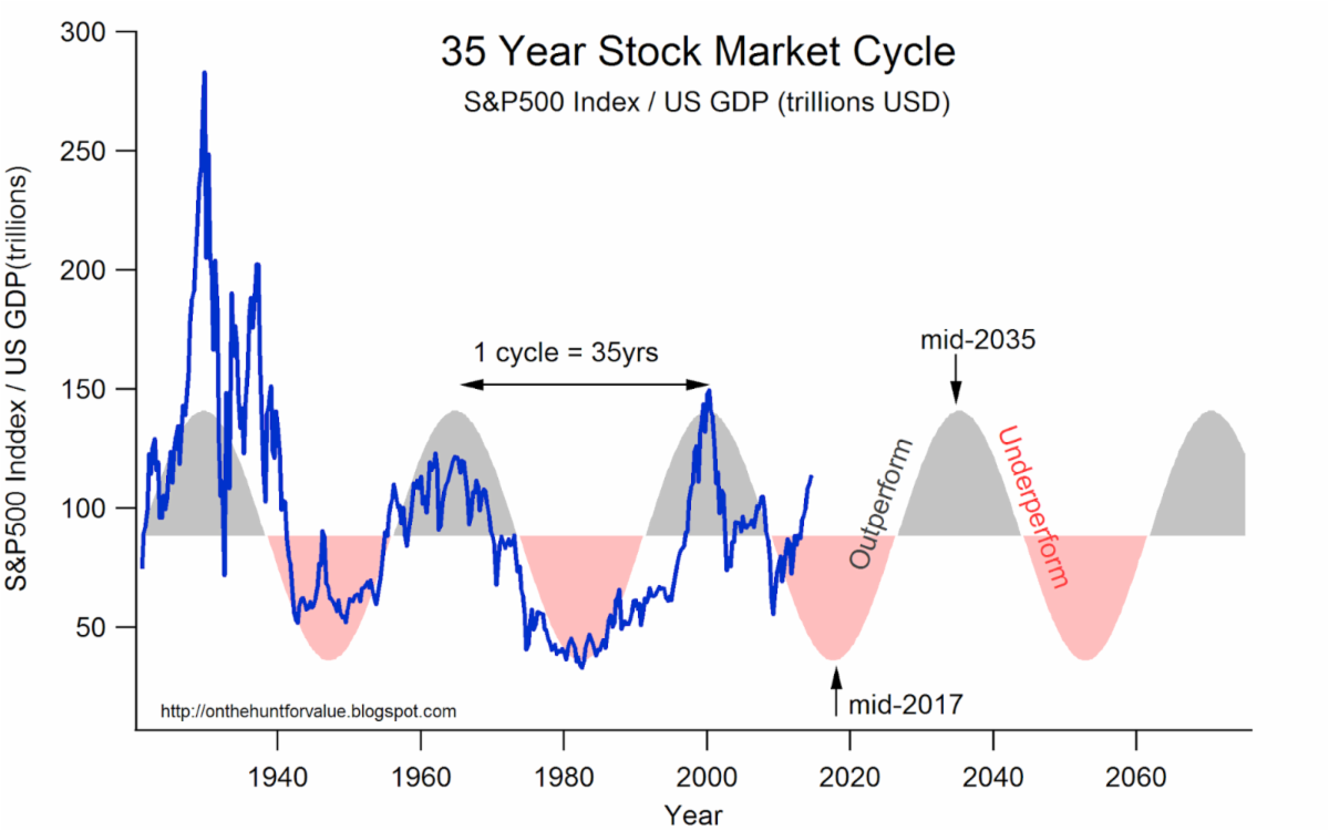
Financial markets work in cycles.

Some cycles are short, lasting only hours. Like those following Fed meetings.

Others, however, last decades.

And when longer-term investment cycles change, things don’t always mix well.

Like many characteristics of financial markets, we see this phenomenon in nature as well.

What implications will this transition of investment cycles have on financial markets?

The Meeting of Oceans

At the southern tip of South Africa, the warm currents of the Indian Ocean meet the frigid currents of the Atlantic Ocean, as seen in the illustration below.

The dividing line between the Atlantic ocean and the Indian ocean is similar to when long-term investment cycles change.

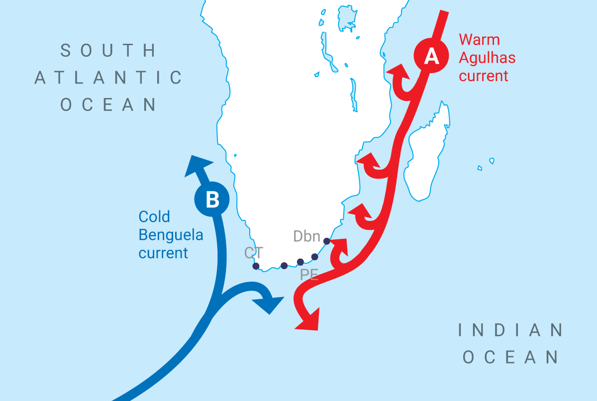
Unlike geographic boundaries, the dividing line where these two oceans meet is determined by the CONDITIONS on each side of the line.

And despite their proximity, the composition of nearly everything in each respective ocean is different from one another.

Lifeforms, currents, temperatures, and mineral composition of the water all differ depending on which side of the boundary you look.

What is common place and normal under one set of conditions is abnormal and unusual in the next cycle.

Today, we are dealing with the transition from a falling interest rate cycle to a rising one.

The investment cycle, much like the meeting point of the Atlantic and Indian Oceans, is a place where forces collide, currents shift, and the landscape changes in unpredictable ways.

The transition between cycles is not always a clean one, either.

It can be messy.

This is because with longer-term cycles, investors become engrained in their belief that the underlying causes of the previous market cycle will continue into the next cycle.

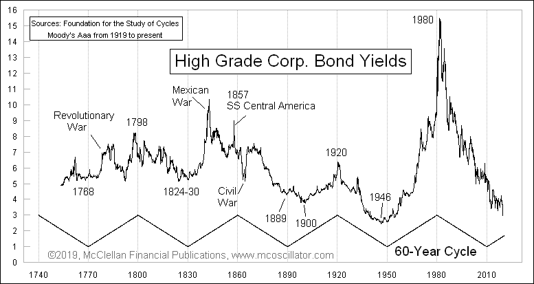
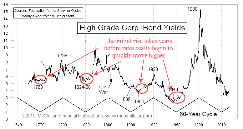
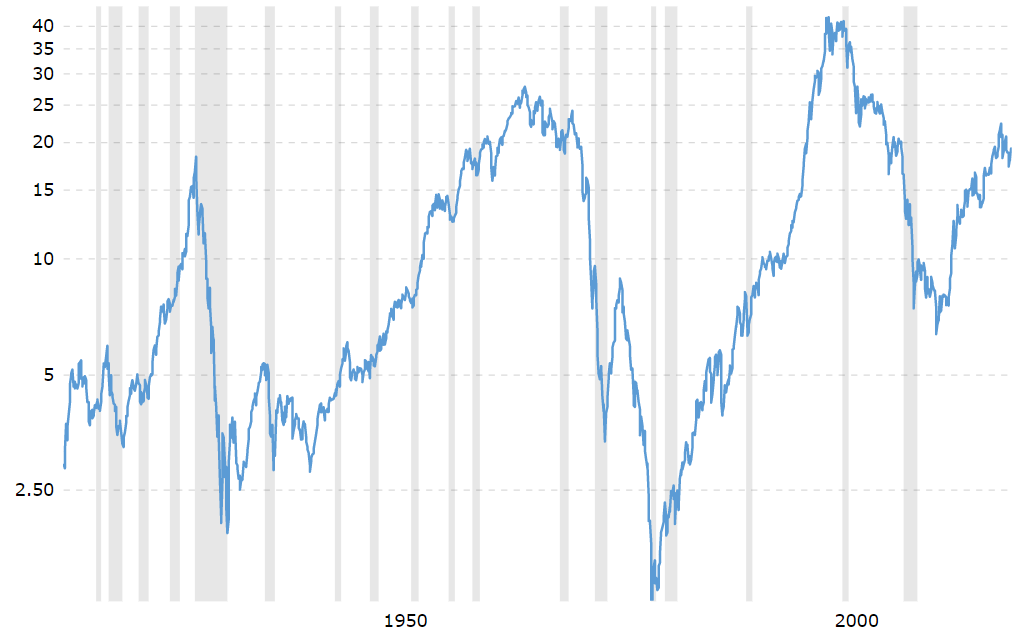
Inflation & Interest Rate Cycles

The cycle we’re dealing with today is the inflation and interest cycle.

Historically, the full cycle lasts 60 years.

That’s 30 years of rising rates followed by 30 years of declining rates.

We can see this cycle on our first the chart below, courtesy of Tom McClellan.

The declining interest rate cycle that likely ended last year is actually quite late getting started.

According to the 30-year cycle, rates should have begun moving higher in 2010.

But the Fed had a different idea, and placed their thumb on the scale to keep interest rates at zero for another decade.

The decline in rates began in 1982. And began moving higher again in 2022.

That’s 40 years of a financial tailwind of declining interest rates supporting higher and higher asset prices.

When interest rates fall, the cost of money decreases. And when the cost of money decreases, profits rise.

This creates a “virtuous circle” of investment, where the declining cost of debt makes investment projects more and more appealing as rates fall.

But the inverse is true also.

Rising interest rates push the cost of capital higher, putting downward pressure on profit margins.

This pressure on profits results in many stocks struggling to grow during rising rate environments, mostly due to the influence of interest rates on valuations.

Stock Valuations and Interest Rates

One of the easiest places to visualize the effect of interest rates on the stock market is via valuations.

The next chart shows a scatter plot of the P/E ratio of the S&P 500 versus the 10-year US Treasury yield.

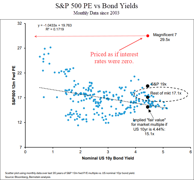
The yield of the 10-year Treasury is shows on the x-axis from left to right. The y-axis is the forward P/E ratio of the S&P 500 index.

Each blue dot shows the P/E ratio at the end of each month for the past 20 years, along with the corresponding 10-year US Treasury yield.

What this chart tells us is that there is a DIRECT correlation between interest rates and valuations.

And the formula is pretty easy: higher rates = lower valuations.

Most of the market is respecting this phenomenon.

The “Magnificent 7” is a term used for the largest seven companies in the index: Apple, Microsoft, Amazon, Nvidia, Meta, Google and Tesla.

This “Magnificent 7” is still trading as if interest rates were almost zero.

In the chart above, the red dot shows these seven stocks.

At an average valuation of 29.5, they are 72% more expensive than the rest of the S&P 500.

They may have better future growth prospects than other stocks, but this is still a very obvious data point where investors are assuming the lessons of the previous cycle will repeat in the next one.

The implication is that at some point in the next few months or years we should see reality start to set in for these big tech stocks.

That means that eventually we will start to see mid-caps, small-caps, international stocks and other investments start to outperform big tech stocks.

We’re seeing this in our system. We have recently added small caps, mid-caps and international stocks to client portfolios.

If interest rates put downward pressure on valuations, what does that mean bigger picture for the stock market?

Let’s look at the last two rising rate cycles for clues.

Rising Interest Rate Cycle (early 1900’s)

The last two times US markets experienced a rising interest rate cycle was in the 1970’s and the early 1900’s.

Let’s look at the early 1900’s first.

The next chart shows the Dow Jones Industrial Average from 1895 to 1925.

During this time, interest rates moved from a low of 3.7% to a high of over 6%.

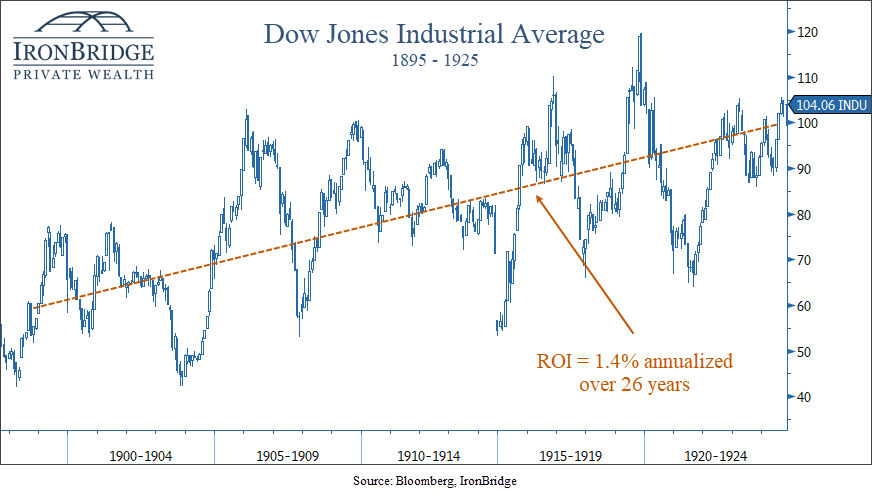
This was the last interest rate cycle that happened before the existence of the Federal Reserve.

Over this period, stocks returned a whopping 1.4% per year compounded return.

Not great.

Interestingly, both GDP and earnings grew over the same period of time, much faster than the overall growth in equities.

This is because higher rates kept valuations low compared to the low rates of the previous cycle.

That’s great, but can we really compare today’s world to the one 100 years ago?

After all, isn’t everything different?

Sort of.

The one common denominator is us.

Humans are the key to the investment cycle.

With all of our flaws, behavioral oddities and penchant for making the same mistakes over and over and over, we bring our inherent biases to our actions whether we know it or not.

Sure, we think we’re smarter. After all, we have all the information in the world at our fingertips via our smart phones. But we tend to use it to view cat videos. So are we really that much more advanced?

But we digress.

So what about a more recent rising rate cycle?

Rising Interest Rate Cycle (1970’s)

The last time the US economy went through a rising rate cycle was in the 1970’s.

How did this compare to the period in the early 1900’s?

Answer?

Not any better.

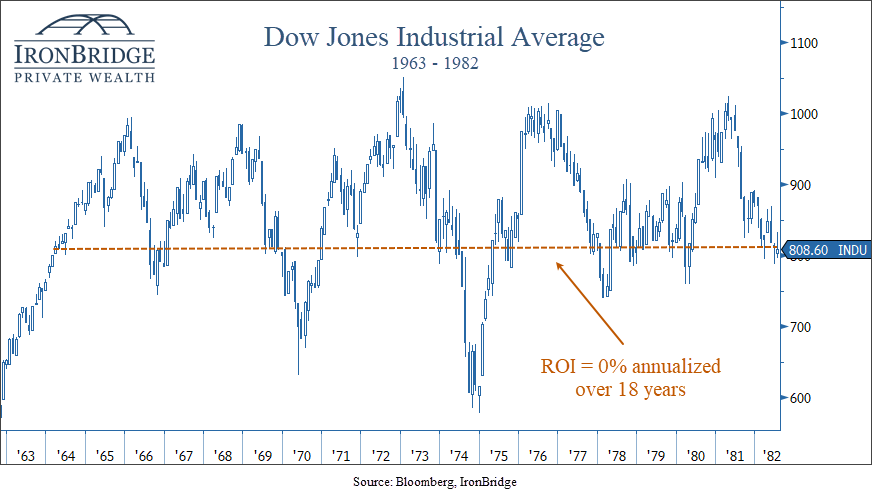
In fact, stocks returned 0% over nearly 20 years.

Stocks had a nice move higher post-WWII, but ran into the same valuation wall as it did in the early 1900’s.

Higher interest rates simply make it more difficult for stocks to grow over time.

There are many factors that go into the relationship between interest rates and valuations:

  • High interest rates compete for capital. Cash paying 5% has attracted dollars that otherwise would have gone into stocks.
  • The current value of a future stream of cash flows goes down as the discount rate goes up.
  • Financing costs increase, reducing profitability.

One thing is for sure: we must pay attention as these cycles change.

Mini-Cycles Within the Larger Cycle

If we have indeed made the transition from a declining rate environment to a rising one, we should expect broad stock markets to struggle more than they did in the previous cycle.

In these environments, bull markets will likely be measured in months instead of years.

In both previous rising rate cycles, stocks had mini-bull markets that lasted from 24-36 months.

They were typically followed by bear markets lasting 18-24 months.

During the 1970’s, we saw 5 mini-bull markets, and 5 mini-bear markets, shown in the next two charts.

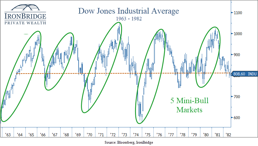
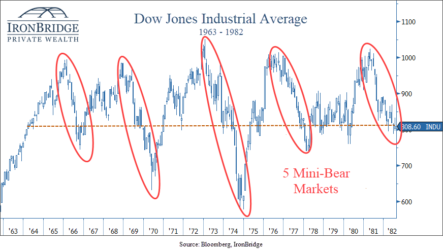
During each mini-bull market, prices met or slightly exceeded new highs on each subsequent move.

But each time markets would try to push to new highs, inflation would rise and a mild recession would occur. Stocks would fall to the low end of the range, and a mini-bear market would ensue.

This is the definition of a choppy market.

And this is the market that we may very well have over the coming decade.

Flash forward to today, and we’re in a bull market that has lasted 13 months thus far.

If the current cycle is anything like previous ones, we could see this mini-bull last a bit longer, possibly into mid-to-late 2024.

But chances are we should not expect a long-term bull market like we had during the 1980’s, 1990’s and 2010’s.

Bottom Line

The ebb and flow of interest rates and inflation create a dynamic environment that demands careful navigation.

In the coming years, it will become increasingly important to adjust exposure to risk based on non-emotional signals.

It will also become increasingly important to generate yield and not just rely on market appreciation to meet your financial goals.

A higher interest rate environment allows you to reduce risk and volatility over time.

But this rising interest rate cycle is not a two-year cycle that began in 2022 and ends in 2023.

Higher interest rates will likely be with us for many years into the future.

Invest wisely!


Filed Under: IronBridge Insights Tagged With: cape town, cycles, growth, income, inflation, interest rates, investment cycles, market cycles, markets, oceans, stocks, volatility, wealth management

The Coming Inflation Waves

May 28, 2021

Symbolic waves of inflation could crash the US economy, but only after years of a gradual increase.

Inflationary pressures have been steadily building over the past year. That can easily be seen in the price of lumber, residential houses and various raw materials. Recent data showed that CPI increased a whopping 4.2%. What implications does this have on your portfolio?


The first panacea for a mismanaged country is monetary inflation. The second one is war.

Ernest Hemingway

There is no question that we have seen massive inflation in various parts of the US economy since the end of the COVID-related market crash last year.

Homes in Austin are regularly being offered 20-30% above list price. The price of lumber has quadrupled over the past year. Used car prices are at all-time highs.

Some of the side effects of an inflationary environment are fairly obvious. Prices at the grocery store will go up. Gas prices will go up. Generally speaking, the cost of all kinds of “stuff” will rise. After all, that is what inflation is.

But there are other, less obvious things that are likely to happen during the period of rising inflation and interest rates that we have likely already entered.

There are two that we think are of primary importance:

  1. Non-linear price and interest rate increases.
  2. Dispersion in asset returns.

Both of these characteristics are critical to understand the investing environment over the next 20 years.

The non-linearity of the coming inflationary cycle simply means that it isn’t likely to hit us all at once. It will likely come in waves. We don’t need to know the exact timing and duration of each wave to properly navigate the next “rising” environment. We simply must be aware that it won’t come out of nowhere…there will be plenty of signs, many of which we’re seeing now.

We’ll go into more about dispersion below, but let’s first look at the historical cycle of rising interest rates to better understand what to expect.


The Interest Rate Cycle

Everything works in cycles. The Earth circles the sun. The seasons regularly change. Humans are born, age and decline.

Interest rates are no different.

In fact, interest rates typically rise and fall on a 60-year cycle. That’s a 30-year cycle of rising interest rates, and a 30-year cycle of declining rates.

The chart below, from Tom McClellan of McClellan Financial Publications, is one of the best examples we’ve seen that shows this cycle in action.

The 60-year cycle of interest rates going back to the mid-1700s. Yields consistently move in 30-year cycles up and down.

This chart goes back to the mid 1700’s. We can fairly easily see the regular rise and fall of rates over this period of time. With the exception of a few wars here and there that artificially affected interest rates, the 30-year rhythm plays out pretty well.

The current period of declining interest rates began in the early 1980’s. Inflation peaked at 14.3% in 1980. Interest rates peaked in June of 1981, with the prime rate at an incredible 21.5%. Many of you reading this likely had mortgages at 13% and 14% at the time.

Paul Volcker, the chairman of the Federal Reserve at the time, famously declared a war on inflation and took steps to “pop” the inflation bubble. And he was ridiculed for it at the time.

Since then, however, inflation and interest rates have been on a steady decline, as we can see on the “Black Diamond” ski slope downward on the right-side of the interest rate chart above.

But interest rates began declining in 1980. It’s 2021. We’re now 40 years into a 30-year cycle. We’re on borrowed time for when interest rates should be moving higher.

But what will this transition look like from a declining interest rate and inflation cycle to a rising one?


Slowly then Suddenly

One of the expectations right now is that inflation will hit us like a Mack truck. That’s a logical conclusion, given that lumber prices are four times higher than this time last year.

But this is a mistake that many people make when thinking about rising interest rates and inflation.

It doesn’t happen all at once, especially at the start.

Let’s look at the same interest rate cycle chart, but focus on the beginning stages of each rising cycle. There have been four major turning points in the last 260 years, as noted on the chart below.

The 60-year interest rate cycle with annotations showing the gradual increase in interest rates.

If we look at the red circles, interesting patterns starts to emerge. Rates don’t have any initial spikes higher at first. It takes time for long cycles like this to turn, much like steering a cruise ship.

In fact, we notice three distinct similarities in these periods of rising rates:

  1. In all four cycles it took 7-10 years for the first 1-2% rise in rates to occur.
  2. During this first 7-10 years, there are multiple “squiggles”, where rates take two steps forward and one step back. They ebb and flow like waves.
  3. Following the gradual rise, there is almost always a large spike higher in rates. Unfortunately, this has consistently been associated with a major, generational war.

If interest rates bottomed last year during the COVID crash, we are literally at the very beginning of this rise.

If the cycle of higher rates is indeed beginning now (which is our primary thesis), then we should still be a few years away from the period of rapidly rising rates.

But as with all things market-related today, the Fed is once again the wild card.


The Reckless Fed

We have discussed the Federal Reserve many times over the past few years. As recently as January in our “Twin Risks” report we discussed the possibility of Fed missteps. And last June’s “COVID vs the Fed“, we expected that the Fed would win when it came to rising asset prices, and that was indeed the case.

But even with improvements in economic conditions and the pandemic seeming to be much more under control with the highly effective vaccines, the Fed continues to print and print and print some more.

In our next chart below, we can see that the Fed balance sheet continues to expand dramatically.

The Federal Reserve (Fed) balance sheet as of May 2021 is almost $8 trillion. Courtesy of Bloomberg.

The spike higher in 2020 was the obvious and appropriate response to the COVID lockdowns. However, since late last year, the Fed has printed another $1 Trillion and force-fed it into the financial markets like a goose being primed for foie gras.

Last week alone the Fed printed nearly $100 Billion. All while the economy is obviously recovering and financial markets are at all-time highs.

During COVID, it was logical for the Fed to step in. Now? Frankly, it doesn’t make any sense.

It seems like we now have the first ingredients of a misstep. Continued massive monetary expansion WILL eventually have unintended consequences. What we don’t know is when the consequences will show up and what exactly those consequences will be.

The Fed is obviously signaling that it wants inflation. It is showing up all over the economy. Yet, the “official” inflation numbers are low.

Following the further injections of liquidity into the markets, pretty much every asset has risen in price (predictably). Some assets have risen more than others, but for the most part they all have gone up.

This simply can’t continue indefinitely. As Howard Markes says, “Trees don’t grow to the sky”. Everything works in cycles, especially asset prices.

And if everything works in cycles, and we are in a cycle where everything went up, what do we think might be next?

Well, it could be a cycle where everything goes down. But more likely it will be a cycle where instead of everything performing in unison, it could be a cycle where nothing performs in unison.

Which brings us to our second major theme for the coming decade: the return of dispersion.


What is Dispersion?

The official definition of dispersion, as it relates to our purposes here, is “the extent to which values of a variable differ from a fixed value such as the mean.” 1

Okay, so what does it mean in non-statistical terms?

It means that everything won’t go up at the same time.

It comes from the root word “disperse”. As when police officers instruct a crowd to go about their separate ways.

For our purposes, it means there will be areas of the financial markets that perform very well over the next 10-20 years, but there will also be many assets that decline in price as well.

In the definition above, the “values of a variable” simply mean different parts of the market. The “fixed value such as the mean” is the index.

So if the performance of S&P 500 is the “mean”, the underlying stocks and sectors within the market are the variables.

We would not be surprised if broad markets didn’t perform very well in the coming cycle. They could easily have flat or even negative returns over the next decade.

But that doesn’t mean you can’t make money. The “mean” is the average. But underlying that average are components that went up in price, and components that fell in price.

Since the early 1980’s, nearly every asset class has been in a bull market. Outside of the bear markets in 2000 and 2008 (and the COVID crash last year), stocks in general moved higher.

Guess what? So did bonds, commodities, homes, office buildings, international stocks, gold, and just about everything else on the planet as well.

Everything went up. The only difference was how much each investment went up.

And it makes sense that they all went up. As we noted earlier, both interest rates and inflation have been steadily declining since the early 80’s.

Declining interest rates almost always help asset prices go up. After all, many things are purchased with debt. Real estate is the most common use of debt to finance an acquisition, but debt is also used for all sorts of different financial activities. It is used to acquire companies, both large and small. And to build manufacturing facilities. And to purchase stocks. And to improve infrastructure. And to build high rises.

As interest rates fall, the cost of debt decreases. And that gives a purchaser the ability to buy more real estate, companies, manufacturing facilities, etc.

The opposite is also true.

As interest rates rise, the cost of debt increases. It takes away the purchasing power of everyone, from your new neighbor to the federal government.

This is why the Fed is so hell-bent on keeping interest rates low. And for a while now they have been successful.

But as we mentioned above, they can’t keep doing that forever. So we must start to think about what the next cycle may hold so we can make sense of the signals we may get from our investment process.


What Assets may Benefit from Rising Rates?

This is the $64,000 question. And if you’ve followed our reports at all, you probably know our answer. We have no idea.

While our investment process is designed to pick up on these changes over time, let’s look at some key characteristics of assets that could benefit from higher rates and inflation.

Pricing Power

In an inflationary environment, the costs of goods go up. That means that companies who are selling those goods are selling them at higher prices. Which naturally means that the revenue to these companies are also going up. Granted, input costs also rise, but if they can pass along higher prices to their consumers, it means they have pricing power.

Pricing power is critical to a company being able to successfully keep profit margins at current levels, and even being able to increase their margins. Without pricing power, companies have to increase efficiency or reduce costs to maintain profit margins.

Many companies will not be able to keep profit margins at current levels. The companies that can’t will likely have their stock price suffer.

The next chart shows that profit margins on the S&P 500 are at all-time highs.

S&P 500 profit margins have been increasing since the mid 1990's and as of May 2021 was at an all-time high.

As we discussed in our previous report “The Icarus Market“, we discussed how P/E ratios were elevated due to the increased concentration of technology stocks in the S&P 500 Index.

This also applies to profit margins.

Technology companies tend to have both higher profit margins and P/E ratios. So as technology becomes a larger portion of the index, profit margins should naturally increase.

To assume that profits margins can stay at these elevated levels seems like an optimistic assumption. And if they can’t stay at these levels, it is most likely due to tech not being able to keep pace.

Low Reliance on Debt

Another characteristic of a potentially good investment is a low reliance on debt.

As we discussed above, as interest rates rise, so does the cost of capital. Companies with lower debt loads, companies not dependent on financing activities to support their business, and recipients of higher interest rates could all benefit.

Banks are one area that may do well. Most banks make money off of a spread. They pay you nothing on your savings account, but charge you interest to take a loan. The difference in what they pay versus what they receive is called the “Net Interest Margin” or NIM.

As interest rates go up, their NIM should also go up. Because they are quicker to pass along higher rates to you as a lender than they are to you as a saver. Be prepared for continued frustration for a few years if you’re expecting the yield on your savings account to go up much.

But the big banks are turning into dinosaurs. There are many companies looking to disrupt this industry, so it may be areas in the financial sector outside of the behemoth banks that ultimately do well.

Other investments are much more dependent on debt. Real estate, for example, is one such asset.

Traditionally, real estate is expected to benefit from inflation. But it is also hurt by higher rates. So the dynamic between the inflation waves and the interest rate waves is key when it comes to housing prices.

We’re seeing home prices skyrocket now, partially due to demand, but also due to the fact that inflation is starting to appear, but higher interest rates are not.

So when inflation rises and interest rates stay low, home prices should continue to rise. But in our wave theory, there will be periods where inflation goes down and interest rates go up. That would not be favorable for real estate, and may provide opportunities to increase exposure to real estate.

This is exactly what we are talking about with the coming inflation and interest rate waves.

Stuff

The last area that may benefit is simply “stuff”. Commodities, materials, lumber, chemicals, and many other things that are used in real life things.

The reason these areas do well is the mindset of consumers during inflationary periods. The expectation is that what you are buying today is going to cost much more next year. So while it is more expensive than it was a year ago, it’s probably going to be more expensive next year. So you might as well buy it today.

As this mindset permeates the economy, the prices of stuff get more expensive. At first, higher prices tend to self-correct.

Earlier this month, the price of lumber fell 30% in a couple of weeks. It had gone up so much that people simply stopped building that new home. So prices corrected.

In this first inflation wave, this is expected. We also expect that it won’t get down anywhere close to the prices from last year. Prices will fall, and people will start to build again. And the next wave higher begins.

Alternate that same behavior over the coming years and we have the exact scenario we are describing…waves of inflation that gradually get higher over time. Until BANG! inflation is out of control, and we go into the steepening phase of the cycle.

Bottom Line

It simply appears that we have begun the next cycle of higher interest rates and inflation.

While it will likely take many years before it starts to get out of hand, there are easy ways to prepare yourself for this environment.

  1. Make sure any debt you have is at a fixed rate. Expect to pay more interest on new debt as time goes by. There is plenty of time to prepare, but now is the time to think about and prepare for higher rates.
  2. Dispersion favors active management. We’ll discuss this more in the future, but passive index investing and broad asset diversification is likely to be a poor choice in the coming market cycle. Your portfolio must become more focused.
  3. Re-evaluate your income strategy. Bonds are likely to be the worst performing asset over the coming years, unless we see an outright market collapse. You will need to be very tactical with your bond strategy. Cash rates will eventually move higher, but likely slower than we think.

In the immediate future, however, we should expect higher prices. Given that the Fed is still recklessly throwing gallons of gas on a market that’s on fire, higher prices should be expected in the near term.

But we think that this reckless behavior by central banks ultimately will be viewed in a very negative light. Primarily because of the skewed asset prices it is creating now. But while the party is still raging, more spiking of the punchbowl seems fun. And for now, it is still working.

But as this new phase of rising inflation starts to take hold, the Fed will likely find it more and more difficult to keep asset prices afloat.

That’s when the waves of inflation start becoming bigger and bigger until they simply can’t control it any more.

Our investment process was designed to handle any environment, including the ones that are most uncertain. Let us know if you would like to discuss this in more detail and how your portfolio may be affected.

Invest Wisely!

References:

  1. “Dispersion” definition from the Oxford English Dictionary online

Filed Under: IronBridge Insights Tagged With: cycles, dispersion, fed, federal reserve, inflation, interest rates, investment cycles, market cycle, profit margins

The One Thing

January 29, 2020

Successful investing over time comes down to one thing: markets work in cycles.

In this issue we take a deeper dive into a topic we discuss relatively frequently, but one that is not addressed as much as it should be in the investment world…the idea of cycles. Once we get comfortable with one key claim, that the markets are cyclical rather than linear, we can then get comfortable with having an investment strategy that adjust to cycles. Not only that, but we argue that recognizing that markets work in cycles is THE most important factor when developing and executing an investment plan.

Specifically, we discuss the following topics below:

  • Stocks & Cycles
  • Missing the 10 Best Days vs 10 Worst Days
  • Stocks & Gold
  • Stocks & Inflation
  • Stocks & GDP

Market Update

We’ll dig more into recent market developments in our next issue of IronBridge Insights, but wanted to pass along a very brief summary of the markets.

Bottom line, the stock market continues to ignore any sort of bad news. Since last October, markets have been incredibly strong with very little volatility. The primary catalyst is most likely the fact that the Fed started printing money again late last September. And the market has gone straight up since then.

Despite threats of World War 3, impeachment proceedings, and the recent threat of a pandemic virus sweeping the globe, markets have been resilient. Earnings have been positive for the most part, and there have been no major surprises economically. Essentially the market has been saying “No Big Deal” to every potential downside catalyst.

S&P 500 index has been resilient so far

The move higher will not go on uninterrupted, and we expect volatility to rise and markets to become choppier than they have been.

However, our clients continue to participate in this move higher, and we are holding very little cash exposure, as has been the case for the past 4-5 months. Our signals continue to show strength, and only as recently as last week have we seen any remote type of weakness show up in our signals.

Bigger picture, the move higher does not appear over. While we do expect increased choppiness, and are prepared for a deeper move lower, signs of strength far out-weigh any signs of weakness. At least for now.


“The whole history of life is a record of cycles.”

-Ellsworth Huntington (1876-1947), Professor of Geography, Yale University

Are Markets Cyclical?

At the beginning of every year we like to take a step back in an attempt to see the proverbial forest through the trees. In this issue we focus on the macro with a goal of identifying where we are within an investment cycle.

One of the most important building blocks on an investment strategy is having an idea where you are within a cycle. It should be a huge input on how you invest.

Unfortunately, for most people (and investment firms) this concept is never even considered. And if even when it is discussed, there is no real action taken as a result.

Why is the investment cycle important?

Most individuals have 20-30 years to invest once they have accumulated their wealth. Some longer, some shorter. Over the course of most people’s lives, they spend the first 20 years learning, the second 20 years earning, the third 20 growing, and the final 20 spending.

The problem is that most investment strategies are based on theories that work only if you have an incredibly long time frame to invest…like 100 years or more. With ultra-long-time-frames, the downside of ignoring investment cycles aren’t as punitive. It isn’t as efficient as adapting to cycles, but it isn’t as punishing either.

The most common basis for investment strategies today is called “Modern Portfolio Theory” (learn more about it HERE.) The creator of this theory, Harry Markowitz, won a Nobel prize for it.

Nearly every large investment firms, and most smaller ones as well, base their entire investment philosophy on this theory.

Unfortunately, it doesn’t work unless you have ultra-long-time-frames. Even Mr. Markowitz himself said that this shouldn’t be used for individual investors. He suggested that its use should be limited to institutions like university endowments and life insurance companies that have 100-year-plus investment horizons.

Today’s growth of passive investing and indexing is an extension of Modern Portfolio Theory, and is also incredibly flawed.

Its theory is based on the falsehood that stocks (and bonds) always do well over the long run. While it can work for many years in a row, history shows us that there are very long periods where markets do not consistently go up.

If investment decisions are made based on poor data/inputs (in this case, that markets always move higher), then any good results that may come of them are pure coincidence or based on luck rather than being skill based.

Let’s say you’re on the golf course, and use your 9 iron to hit a shot from 130 yards away. But instead of a crisp, well-executed shot, you instead duff it and hit the ball just 90 yards…but it bounces off the cart path and rolls up next to the hole.

The outcome was good. But was that skill or just luck?

We would say it was lucky because you were trying to hit a 130-yard shot.

We think index investing is no different. Those practicing it believe in one key concept, that the market “over the long run” will always go up. In our opinion investors are making a grave mistake if they think this passive investing strategy is their saving grace. At best, they will be lucky and catch the markets at the right time. At worst, they will be exactly wrong at exactly the wrong time and suffer badly.

At IronBridge we make our investment decision based around one concept that we hold as truth, that the markets are indeed cyclical.

If this is not true, then the way we invest could be flawed, and if so then the passive investors who are grounding their theories in the opposite, that the market is linear, will be the ones who prevail.

So, in order to figure out the better direction to take, active or passive, let’s first prove the cyclicality of markets. If we can all agree that the markets are cyclical, then we can move on to investment strategies that take this into account.

If we cannot agree on the cyclicality then we must go back to the drawing board and admit that passive investing may be as good a strategy as any.


Stocks & Cycles

First, let’s start at the highest level. What is a cycle? Cycle is defined as a series of events that are regularly repeated in the same order. Cycles that are generally agreed upon are the lunar cycle, the solar cycle, the life cycle, and the business cycle.

The chart of the Dow Jones index below shows this cyclicality in markets.

The Dow Jones Industrial Average (100 Years)

Generally, there are large periods of time when price is moving up and to the right (a time to be fully invested), but those periods have been interrupted, sometimes for long periods themselves, by sideways or down movements (a period not to be fully invested).

Overall the equity markets seem to have periods of 20-30 years of generally upward moving stock prices followed by typically shorter, 15-25 years, of falling stock prices.

There have been 4 major stock market up-trends and 3 major stock market drawdowns over the last 100 years. The first major drawdown started in 1929 and took until 1954 (25 years) for prices to make new all time highs again. The last 100 years shows a roughly generation cyclicality to the markets.

But how long is “long term” to you? Is 25 years long term to you? Could you imagine investing your entire net worth during the roaring twenties only to have to wait for 20+ years just to get back to breakeven? That’s almost a lifetime! On the other hand what if you just waited a few years and instead invested in 1932? In this example the cycles of the market affected outcomes vastly differently.

The second long period of negative cycle occurred from 1966 to 1982 (16 years). On the chart it may not look like much, but there were three 50%+ drawdowns during this period. Avoiding even a portion of this period would have provided significant outperformance.

There’s a case to be made that we just finished a 3rd period of negative cycle from 2000 to 2015, with two similar 50%+ drawdowns. Generally, though, there have been long periods of good times for investing, but there also have been long periods of bad times for investing, and where you started your investing “career” matters greatly to your results.


Missing the 10 Best vs 10 Worst Days

One narrative purported by the investment industry is that if you miss the 10 best days in the market your investment results would be greatly negatively impacted. This is indeed true.

But they are (purposely) leaving out an equally important second half to the equation.

If you miss the 10 worst days in the market you substantially outperform. In fact, the amount of outperformance by missing the 10 worst days is much better than the outperformance of getting the 10 best days.

The table below (from LPL) shows if you avoided the 10 worst days each year from 1990 to 2017, your average return of the S&P 500 would be an extremely impressive 38.4%, outperforming by and hold’s 9% by 29.4%. Compare that 29.4% difference to the difference between the 9% buy and hold return and the -12.8% average loss if you missed the best days. -12.8% to 9%=21.8% while 9% to 38.4%=29.4%. It’s far better to miss the worst days than it is to miss the best days.

This “10 best days” quote is the biased narrative attempt at convincing you that “over the long run”, the market goes up more than it goes down and that trying to “time” it and be out during those periods of drawdown is a futile attempt.

However, the facts reveal that the 10 worst days each year do much more harm than the 10 best days do good. In addition, “long term” is a biased term with no substance. You need to define your timeline in order to truly appreciate the cyclical implications.

Miss the 10 best days versus missing the 10 worst day. Risk management is better than being invested always.

Another reality is if you can avoid drawdowns, you should (we know, easier said than done, right).

But are drawdowns random?

The table above also helps show that generally the biggest drivers of this disparity between the good days and the bad days occurs during periods of volatility.

The average disparity is 51.2% (38.4% average year outperformance +12.8% average year underperformance=51.2%). The periods where this variance is large are generally during those periods of cyclical market drawdowns and increased volatility (Year 1999 = 50.4% + 7.1%=57.5%, Year 2000 = 58.8%, Year 2001 = 56%, Year 2008 = 96%, Year 2009 = 107.5%, you get the picture).

Not only is it better for your portfolio to miss the biggest down days more so than it is to be in the market for the biggest up days, but during those periods the market is in a cyclical drawdown is typically when the largest disparities occur, and, thus, the potential for more outperformance can occur. This makes sense as those who have been in the industry through a full cycle know that volatility is generally more present during drawdowns than it is during meltups. Stock Market crashes happen much quicker than market tops as an example.

So, if we know we want to avoid the down days the most, and the disparity between the up days and the down days is the greatest during market drawdowns, then there is certainly a case to be made to try to avoid those periods where the odds are greater for down days. If we can prove that the market is cyclical then it gives us a base for trying to avoid those periods of drawdown. Again, getting grounded in the fact that the markets are cyclical is an essential step in building an investment strategy “for the long term”.


Stocks & Inflation

Looking only at charts of stocks that only focus on price ignores one of the biggest hurdles to investing success…inflation.

The next chart below shows 100 years of the Dow Jones Industrial Average, the same as the previous Dow chart, just this one is adjusted for inflation (using the CPI).

The Dow Adjusted for Inflation (CPI)
Dow jones index adjusted for inflation

It’s pretty clear that there are times the Dow is moving up and times it is moving down, even more so when we adjust for inflation. This up and down motion makes it cyclical by definition. If the Dow moved only up and to the right, then it would be non-cyclical, but to us it is pretty clear it moves in cycles.

Sometimes it outperforms inflation; other times it does not. If it wasn’t cyclical then it would outperform at all times, and that simply is not the case.

This chart confirms the 3rd period of underperformance discussed above, from 1999 to 2008. It shows the uptrend in stocks versus inflation is also now back in vogue. Is this the start of a new up cycle? Those periods have been as short as 10 years and as long as 19, so we are already in the sweet spot for longevity, but even during these periods of uptrends there were substantial drawdowns over shorter periods.

This introduces the concept of over the “intermediate term” and refers to the fractal nature of the markets. There are cycles within cycles, such as generational cycles, intermediate term cycles, business cycles, and/or the presidential cycle.

Do you want a strategy that performs well over the “intermediate term” or just over the “long term” or both? The reality is most investors want a strategy that performs well over the short, intermediate, and long terms, and in order to even attempt at providing this, one must agree that cycles indeed exist and stocks do not just go up and to the right!

The Dow is adjusted for inflation in order to help take out of the equation another variable, the value of the U.S. Dollar. The U.S. Dollar has been devalued by the issuance of money throughout its history, resulting in inflation (and its own cycle). Therefore to get a cleaner look at an asset it can often be beneficial to change the denominator.


Stocks & Gold

One way to do this is to use CPI, another is to use the price of Gold. By taking the Dow and dividing by the Price of Gold, the U.S. Dollar is completely taken out of the equation. And, if gold is assumed a proxy for inflation, then inflation is also taken out of the equation.

That chart is shown below and also reveals an even more long term cyclical nature of the equity market. The drawdowns here are absolutely massive as are the periods of equity outperformance. Could you imagine the performance of a portfolio that moved into equities during the uptrends and moved into gold (or a safe-haven such as cash), during times of cyclical drawdowns?

The Dow Priced in Gold
Dow Jones index priced in gold

The most interesting thing to us about this chart is the Dow’s price today compared to Gold, at around 18x, is the exact same as it was at the peak of 1929. In other words if you owned an ounce of gold in 1929 it would be worth exactly the same as if you bought the Dow at that time and held them both for 90 years. Extraordinary!…or you could have not bought the Dow in 1929 at 18x the price of gold and waited until 1932, when it was just 2x the price of an ounce of gold. The point being, the cycle affected a static portfolio’s results massively.

We use this chart more to prove the cyclicality that does indeed exist in the markets, but it sure is interesting to look at the Dow priced in other assets than the U.S. Dollar. This chart shows even further the cyclical nature of the markets and how when you make an investment decision, where you are in the cycle is absolutely crucial to your potential return. For better or worse, the cyclical nature of the market demands you pick the correct time to invest “for the long term”.


Stocks & GDP

Finally, the stock market moves quicker than U.S. GDP and historically has gone through incredible over and under valuation periods. Currently the S&P’s total market value is around 125% of U.S. GDP, which is expected to be around $21.2 Trillion. The S&P 500 is valued at around $25.6 Trillion today. Small businesses, government, and other non-publicly traded companies are also reflected in the GDP indicator which is one reason why Warren Buffett likes to use it as his gauge of where the markets are within an investment cycle. The “Buffett Indicator” also shows the cyclical nature of the markets historically. Historically, a reading over 90% (the S&P 500 is valued at 90% or more of GDP) in this indicator suggests overvaluation. Extremes have historically been hit near current levels as the 1960s saw a peak around 125% while the year 2000 ran to 150%. The 1940s, 1950s, and 1980s saw troughs around 50% S&P 500 value to GDP.

From a generational perspective, are we to expect the next 30 years to be robust, modest, or negative? Who knows, but what we do know after looking at these charts (and thousands of other charts of history) is that the markets indeed are cyclical, and they are cyclical at multiple different time frames. Within generational cycles there are smaller, multi-year cycles, and within those cycles there are even smaller cycles. This market to GDP chart shows a roughly 15 year peak to trough cycle (7 extremes in 100 years).

Agreeing there are cycles in the market is a necessary first step in building an appropriate investment strategy. Hopefully you agree with us that cycles indeed exist. If not, you may find a passive investment strategy appropriate (but please know our door is open when it’s time to look at something different).

The S&P 500 as a % of US GDP
The ratio of the S&P 500 to GDP works in a 35-year cycle.

Do you know what your advisor thinks about cycles and how they will respond to the changing of them? We know what we think about them and have built strategies to properly navigate them as they arise.

Invest Wisely!


 Our clients have unique and meaningful goals.

We help clients achieve those goals through forward-thinking portfolios, principled advice, a deep understanding of financial markets, and an innovative fee structure.

Contact us for a Consultation.

Neither the information provided nor any opinion expressed constitutes a solicitation for the purchase or sale of any security. The investments and investment strategies identified herein may not be suitable for all investors. The appropriateness of a particular investment will depend upon an investor’s individual circumstances and objectives. *The information contained herein has been obtained from sources that are believed to be reliable. However, IronBridge does not independently verify the accuracy of this information and makes no representations as to its accuracy or completeness.  Disclaimer This presentation is for informational purposes only. All opinions and estimates constitute our judgment as of the date of this communication and are subject to change without notice. > Neither the information provided nor any opinion expressed constitutes a solicitation for the purchase or sale of any security. The investments and investment strategies identified herein may not be suitable for all investors. The appropriateness of a particular investment will depend upon an investor’s individual circumstances and objectives. *The information contained herein has been obtained from sources that are believed to be reliable. However, IronBridge does not independently verify the accuracy of this information and makes no representations as to its accuracy or completeness.

Filed Under: IronBridge Insights Tagged With: 10 best days, 10 worst days, cycles, dow jones, inflation, market cycles, pandemic, world war 3

Footer

LET'S CONNECT

  • Email
  • Facebook
  • Instagram
  • LinkedIn
  • Twitter

AUSTIN LOCATION

6420 Bee Caves Rd, Suite 201

Austin, Texas 78746

DISCLOSURES

Form ADV  |  Privacy Policy  |  Website Disclosures

  • Home
  • Difference
  • Process
  • Services
  • Insights
  • Team
  • Clients
  • Form CRS
  • Contact Us

Copyright © 2017-Present by IronBridge Private Wealth, LLC. All rights reserved.