• Skip to main content
  • Skip to footer

IronBridge Private Wealth

Forward with Confidence

  • Home
  • Difference
  • Process
  • Services
  • Insights
    • IronBridge Insights
    • Strategic Wealth Blog
    • Strategic Growth Video Podcast
    • YouTube Channel
  • Team
  • Clients
  • Form CRS
  • Contact Us

federal reserve

Rate Cuts at New Highs

September 20, 2024

Hawk,On,Dollar,Banknote,Seal,Macro,Close,Up,View

The Federal Reserve cut its target interest rate by 0.50% on Wednesday, with stock markets at or near all-time-highs. What does that signal for the economy and markets?


“Interest rates are to asset prices what gravity is to the apple. When there are low interest rates, there is a very low gravitational pull on asset prices.”

warren buffet

Focus on economic data and the weirdest presidential election in memory took a pause on Wednesday as the Federal Reserve met and reduced interest rates by a half of a percent.

Side Note: We will publish an election report in the coming weeks with our analysis of the potential election outcomes.

When the Fed cuts rates, it is important to understand the context in which the cut happens.

Essentially there are two environments to consider:

  1. Deteriorating economy and market
  2. Stable/Improving economy and market

Today, there is little question that the economy and market are stable.

Things can always change. And can change quickly.

But as of right now, stocks are at all-time-highs and gaining momentum. Economic data is holding up just fine, and we’re not seeing stress in the places that would be concerning.

So why cut?

Why did the Fed cut rates now?

In the two rate cutting environments mentioned above (deteriorating or stable data), interest rate cuts take on different roles.

When economic data is starting to weaken and markets are showing signs of stress, rate cuts help to pump liquidity into financial markets.

In theory, lower rates help to lessen the negative effects of a recession.

The idea is that lower rates decrease the cost of debt (consumer, corporate and government debt), helping the overall economy reduce costs to offset the potential for reduced economic output during a recession.

But today’s data is not recessionary.

In fact, we’re simply not seeing many signs at all of stress in financial markets that would be worrisome.

That means that this rate cut is likely a “normalization” rate cut.

Normalization Rate Cut

Normalization rate cuts are nothing more than cuts that happen outside of a pending recession.

The Federal Reserve spent over a decade at “abnormal” rates. (Zero percent rates for well over a decade is not normal).

This week’s cut appears to be a normalization with regards to inflation, not with regards to unemployment or the economy.

When inflation went from 1% to 9%, the Fed raised rates to slow inflation.

Then, inflation went from 9% to 3%. So the Fed cut rates this week.

Not because the economy is falling off a cliff, and not because unemployment ticked higher. (Higher unemployment numbers occurred because the government is now beginning to count illegal aliens in the number of unemployed people).

Anyone else getting frustrated with data manipulation?

But we digress.

With the cut this week, the Fed simply made the rates more in line with what the market is telling them they should be, and it appears the Fed is doing two things:

  1. The Fed is continuing to normalize interest rate policy after the chaotic inflation during COVID (caused by the Fed and other government policies).
  2. The Fed Funds rate is substantially higher than the 2-year Treasury yield, implying that the Fed is too restrictive with current rates, especially given the decline in inflation.

Our first chart shows these two yields.

This chart shows the 2-year Treasury yield (orange) versus the Fed Funds Rate (blue).

When the 2-year Treasury is higher than the Fed Funds rate (on the left side of the chart), the Fed is being restrictive in its policy. This is because the market is pricing in rates that are higher than what the 400 PhD. economists at the Fed think should be the proper rate.

The opposite is also true. When the 2-year Treasury yield is lower than the Fed Funds rate, they are being restrictive, as the market is telling them that rates should be reduced.

That has been the case for all of 2023 and 2024.

In this sense, the rate cuts were justified.

If we don’t see any further deterioration in the economy, this rate cut should be bullish.

Based on the initial reaction in stocks, the market agrees.

Normalization cuts overwhelmingly happen at or near all-time-highs, and they typically don’t signal an end to the bull market.

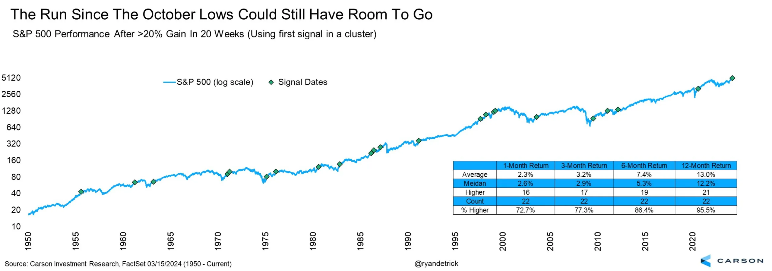
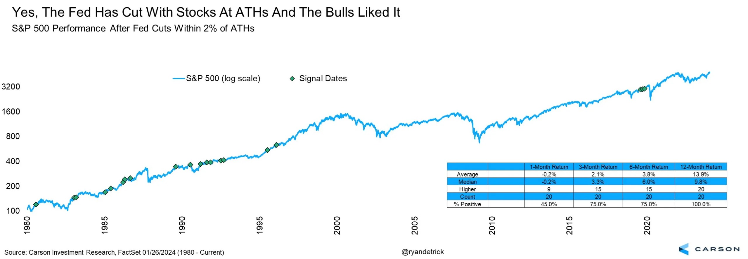
What has happened in the past when the Fed cut with markets at highs?

Rate Cuts with Stocks at All-Time-Highs

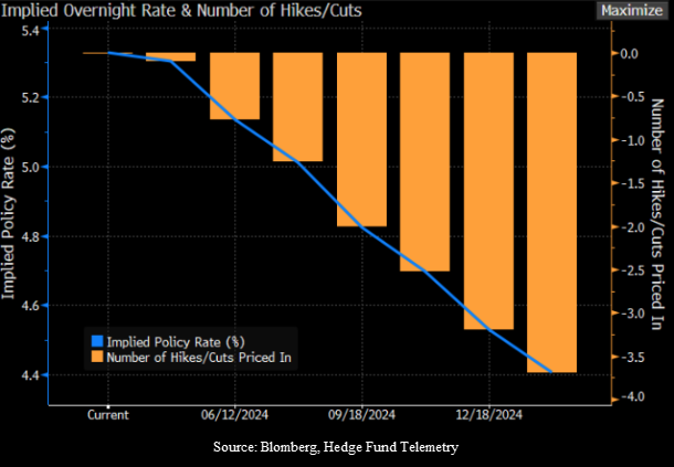
Another important data point when it comes to rate cuts is the timing of the first cut.

Our friend, Ryan Detrick, with the Carson Group, consistently has excellent charts about historical market reactions.

The two charts below show the times since 1980 that the Fed has cut rates when the S&P 500 Index was within 2% of an all-time-high.


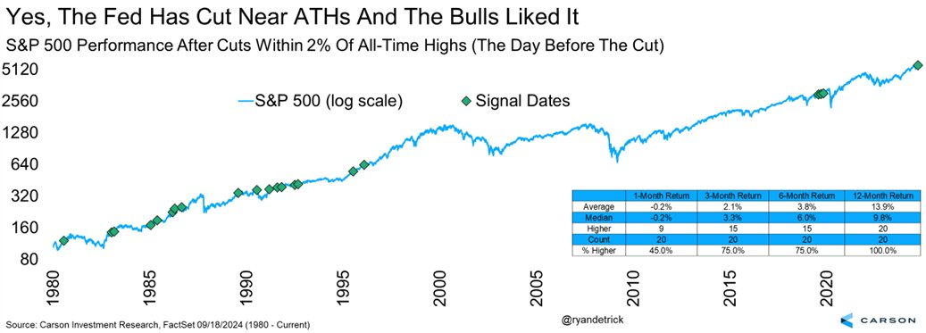
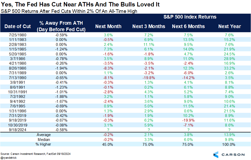
Historically, when the Fed cuts rates with markets at all-time-highs, the market is higher one year later 100% of the time with an average gain of nearly 14%.

Bottom line is that being bearish on the markets at this point does not appear justified by the data.

Again, this can change and change quickly.

But for now, things look pretty good.

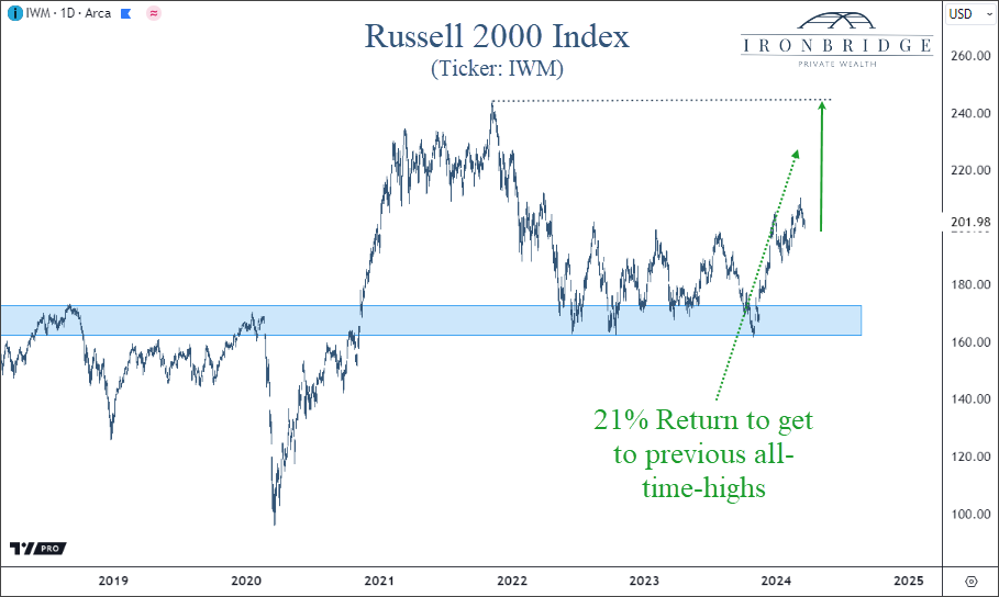
What Does Well After the First Rate Cut?

Another bullish development over the summer was a broadening out of participation in the bull market.

We have consistently been saying that small cap US stocks should play catch-up to the mega-cap tech that has done so well over the past two years.

This is supported also by stock performance after the first rate cut.

The next chart, courtesy of Bank of America, shows that small caps tend to outperform following the first rate cut.

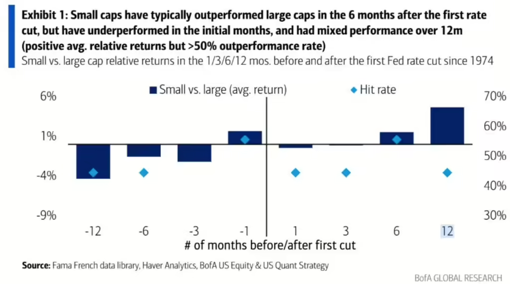
This chart shows that over the next 6 and 12 months, small caps should outperform large caps if this historical relationship continues.

The reason this works is that smaller companies are more sensitive to bank interest rates than their large counterparts.

A 0.50% decrease in interest rates go mostly to the bottom line for smaller companies with debt.

This increases profitability and free cash flow, so it is logical that this would be the case.

More Rate Cuts?

Should we expect more rate cuts?

The real discussion is around the future path of interest rates.

Some people are predicting another 2% of cuts by the end of 2025.

It is our position that if we see another 1-2 rate cuts of 0.25% each, that would signal that we are likely headed to a recession.

It also would make sense that the Fed did a larger, 0.50% rate cut (instead of just 0.25%), so they wouldn’t have the appearance of propping up markets too close to the election.

Bottom Line

Bottom line is that this cut does not appear to be a signal that doom and gloom is headed our way.

That can happen, but the probabilities are not high that it will.

Instead, this rate cut looks like a normal response to declining inflation, and not a signal that the economy is deteriorating.

The market will now start to focus on earnings and the election.

We’ll put out another report discussing the election in the next few weeks.

Until then, invest wisely!


Filed Under: IronBridge Insights Tagged With: federal reserve, interest rates, markets, stocks, volatility, wealth management

Can Market Strength Continue?

March 21, 2024

The idea which some people seem to entertain, that an active policy involves taking more risks than an inactive policy, is exactly the opposite of the truth. The inactive investor who takes up an obstinate attitude about his holdings and refuses to change his opinion merely because facts and circumstances have changed is the one who in the long run comes to grievous loss.

– John Maynard Keynes

The US stock market just had one of the strongest four months in history.

Can this market strength continue?

Spoiler alert…probably.

This time last year the data was NOT good, and risks to markets were incredibly high.

But as the year went on, the data improved. Our signals added risk back to target levels in client portfolios, and we were able to capture nice gains.

Fast-forward one year, and we have almost the exact opposite situation: good data, good markets and a generally positive environment.

However, the quote above from Keynes is as applicable today as when it was originally said in the 1930’s…as investors we MUST be able to look at data objectively and change strategy when it is required.

We were required to do that in 2023.

Will we be required to change from a bullish stance to a more negative one in 2024?

Let’s do a quick market scan to determine the likelihood of this.

Stock Strength to Continue?

As we mentioned earlier, stocks just had one of the strongest four-month spans in history.

In the 20 weeks that ended on March 15th, the S&P 500 index gained over 24%.

One might logically think that since stocks went up so much, they are overdue for a major pullback.

But the data tells a different story.

Our first chart is courtesy of Ryan Detrick of Carson Investment Research.

This chart shows the previous times the S&P 500 was up over 20% after 20 weeks. (You may need to click on the image to enlarge it.)

Since 1950, there have been 22 times the S&P 500 has been up over 20% in 20 weeks, as shown by the green diamonds in the chart above.

In 21 of those 22 times, the market was higher 12 months later by an average of 13%.

This is on top of the 20% that already occurred.

Even over the shorter timeframes, markets tended to do well.

Markets are higher one-month later roughly 72% of the time with an average performance of 2.3%. This beats the average monthly gain of 0.7% by nearly 3x.

Bottom line is that recent strength is positive, and despite any near-term correction that may occur, higher prices appear likely over the course of the year.

Opportunity Still in Small Caps

If we do see the historical trends mentioned above continue, then there still remains an opportunity in small cap US stocks.

We discussed small caps in detail in our 2024 Outlook report, which can be viewed here:

The summary of our analysis was that if markets continue higher, we should expect smaller companies to perform well, possibly outperforming large cap stocks.

The next chart below shows this opportunity.

While the S&P 500 surpassed its previous all-time-highs last year, small caps still have a ways to go to achieve the same result.

In fact, the ticker IWM needs to go up 21% to get back to it’s previous highs.

Small caps are trying to break out of their range from the past two years, and if they are successful, then we should see the next leg higher for markets in general.

That is, as long as problems in the commercial real estate sector stay contained.

Commercial Real Estate is Stable (for now)

The wild card in small cap stocks remain the challenges from commercial real estate (CRE) debt.

So far, CRE debt has not been an issue in 2024.

Delinquency rates continue to be elevated, but there has been no further deterioration, which is a good sign.

Optimism that interest rates would fall this year has helped contribute to a stabilization in commercial real estate prices.

This stabilization has been needed for that sector of the economy.

CRE debt remains the single biggest risk to stock prices, in our opinion, given the potential to cause failures in smaller banks.

Inflation Pressures may keep Rates High

What about interest rates?

After all, the Fed did meet yesterday and kept rates unchanged.

Two months ago, markets expected the Fed to have 6 rate cuts this year. Now, we’re down to an expected 3 rate cuts this year, with another expected next January, as shown in the chart below.

The blue line above shows the implied policy rate, or the rate which the Fed charges banks to hold funds overnight. This rate is currently in a range of 5.25 – 5.50%.

Learn more about the Fed Funds rate HERE.

With this many rate cuts projected, the market still appears to be anticipating a recession, despite the lack of recessionary data.

Why do we say that?

First, financial conditions are as loose as they’ve been since at anytime since the ’08 financial crisis.

Loose financial conditions imply that stress is low in the markets and the economy, providing support for economic growth.

Second, credit spreads are narrow.

This simply means that the riskier parts of the bond market are not showing signs of stress when compared to US Treasuries. Credit spreads are one of the earliest signs of stress in financial markets.

Third, inflation could be headed higher.

With a tight labor market, loose financial conditions, a supportive Fed, and an economy moving in the right direction, the conditions exist for another wave higher in inflation.

Higher inflation will NOT warrant rate cuts by the Fed.

In order for the Fed to cut rates, we believe that there needs to be a recession. And we simply don’t see that in the data in the near term.

But what if they do cut? What should we expect from markets?

Rate Cuts when Markets are near All-Time-Highs

Let’s imagine that the Fed does decide to cut rates in the next few months, and stocks remain around these levels or higher.

What would that mean for stocks?

Our friend Ryan Detrick once again has excellent data.

He looked at every time we saw a Fed rate cut with the S&P 500 within 2% of all-time-highs.

What he found was also bullish.

There were 20 times previously that the Fed cut rates with markets near all-time-highs.

Of those, markets were higher 20 out of 20 times, with an average gain of 13.9%.

Put another one in the bullish camp for 2024.

Bottom Line

The weight of the evidence suggests higher prices over the next year.

The combination of a strong market, loose financial conditions and stability in the commercial real estate market point to a generally calm market environment over the near term.

Things can always can change, so we must remember the quote above from Keynes and be vigilant in assessing risks and opportunities.

But for now, we should expect near term volatility to occur at any time, but expect that it should be short-lived and followed by higher prices.

Invest wisely!


Filed Under: IronBridge Insights Tagged With: federal reserve, inflation, interest rates, investing, IWM, markets, Russell 2000, stocks

2024 Outlook

January 31, 2024

Following a strong year in 2023, financial markets enter 2024 with strong momentum. Will this momentum continue?  Or will one of the risks push the market off it’s high wire?

In our 2024 Outlook report, we discuss the following:

  1. S&P 500 – New Highs are Bullish
  2. Liquidity Waterfall
  3. Small/Mid Caps Look Attractive
  4. Financial Conditions are Loose
  5. Signs of Stress not Apparent
  6. Risk #1: Inflation & Interest Rates
  7. Risk #2: Commercial Real Estate Risks
  8. Risk #3: Presidential Election
  9. Risk #4: De-Globalization
  10. Positioning
  11. Answer Your Questions

Invest wisely!


Filed Under: Strategic Growth Video Podcast Tagged With: federal reserve, inflation, interest rates, investing, markets, portfolio management, stocks, volatility

2023 Mid-Year Outlook Webinar

June 28, 2023

View the recording of our 2023 Mid-Year Outlook webinar.

Here are the topics we discussed and the time in the recording it happens so you can fast-forward to topics you find most relevant:

  • Recession probabilities (1:29)
  • S&P 500, Dow Jones & Russell 2000 (4:51)
  • Concentrated performance contribution YTD (8:48)
  • S&P 500 Index (10:11)
  • Russell 2000 small cap stock index (14:37)
  • Fed Balance sheet vs S&P 500 (16:14)
  • Banking stocks still under pressure (18:01)
  • Commercial real estate loans maturing over the next 5 years (19:24)
  • Yield curve (24:56)
  • Manufacturing PMIs and activity (29:10)
  • Portfolio Equity Positioning (31:27)
  • Scenarios, Risks & Opportunities (35:00)
  • Upside and Downside potential performance based on three scenarios (39:40)

Invest wisely!


Filed Under: Strategic Growth Video Podcast Tagged With: dow jones, economics, federal reserve, interest rates, manufacturing, markets, Russell 2000, S&P 500 Index, stocks, volatility

The Fed’s Mixed Messages

June 14, 2023

Anyone who isn’t confused really doesn’t understand the situation.

edward r. murrow

The Federal Reserve met today, and for the first time in over a year they kept interest rates unchanged.

Typically, when the Fed pauses, it is a signal that they are more confident that their objectives have been met.

But this meeting was a bit different.

It was full of mixed messages.

Instead of signaling to the market that they are seeing concrete signs that inflation is going down, their message was incredibly strong that inflation problems have gotten worse and that higher interest rates are still ahead.

Let’s look at their mixed messages from today’s meeting.

The Projected Terminal Rate Increased

The Federal Reserve has a dual mandate as dictated by Congress: stable prices and full employment.

The “terminal rate” is the rate at which the Fed believes will best balance these two objectives.

Think of the terminal rate like getting two sides of a scale to be in balance.

a golden balance scale beside a laptop

If interest rates are too low, the employment goal is achieved but inflation can run hot.

If they are too high, then inflation is tamed, but it risks high unemployment.

The projected terminal rate went up by 0.5% from their meeting one month ago.

This means they think they will increase rates at least two more times by the end of the year.

That may not seem like much, but in Fed-world, that is an enormous increase.

Which leads us to mixed message #1: They are MORE convinced today that inflation will continue to be a problem than they were at their last meeting. Yet, they chose to RAISE rates at the last meeting, and KEEP RATES UNCHANGED today.

Nine of the twelve voting members increased their projected terminal rate.

One member, in fact, believes the Fed will have to raise by another full percentage point to get inflation contained.

We can view this in the “dot plot” below.

Each dot in this chart represents one voting member’s view on where they think interest rates will be at the end of the year (shown along the bottom of the chart).

The grey dots were their previous projections and the blue dots are from today.

The question is…why pause if they are all so convinced inflation is still a problem?

It frankly doesn’t make much sense.

Especially given that inflation data has consistently been showing signs of slowing for at least a few months now.

So what does the inflation data tell us?

Inflation Data Differs from the Fed’s Message

This is where we start to question what the Fed is looking at.

If we look at numerous inflation data points, without question they are easing.

The next chart looks at a measure of inflation for the services sector of the U.S. economy (in orange) alongside the manufacturing supplier deliveries (in blue).

This is “fast data”.

Which means that it is an up-to-date measurement of inflationary pressures in the early stages of economic activity.

Think of supplier deliveries as the raw material ordered before a good is produced, sold and shipped. From electric vehicles to microwaves to jelly beans, this measures all of the various inputs to those end products.

This indicator tracks the actual deliveries, not just the orders.

And deliveries have fallen off a cliff in the past year.

Deliveries are important because they give us a glimpse into the first things that go into producing goods. Companies have purchasing managers who are responsible for getting the “stuff” in the door to make whatever widget that company produces.

This data is in recessionary territory (a reading below 50 signals a contraction).

You may think that this is just a result of the supply-chain issues being resolved after COVID. But that would make deliveries go UP. Companies would be receiving MORE of the inputs to their products, not less.

This is a sign that DEMAND is going down.

We can see this demand destruction in the business sector as well.

The next chart looks at final demand of producers (in blue) with final demand excluding the more volatile food and energy part of the economy (orange).

This also shows an environment where inflationary pressures are falling quite dramatically.

This is brings us to mixed message #2: the Fed has INCREASED their projected inflation targets while the data is showing exactly the opposite.

To be fair, employment continues to be strong, and the consumer remains resilient.

But employment data is “slow data”. When an employment number comes out it is typically at least a month old.

In fact, at the start of the last 4 recessions, employment indicators were all positive. It’s simply not a great tool to extract future economic activity.

Prioritizing slow data is like driving your car using the rear-view mirror. It doesn’t make much sense and it is incredibly dangerous.

And the Fed is doing just that.

Higher interest rates take time to work their way through the economy. They work on a lag. Increased rates now may take 6-12 months to show up in actual data.

They are prioritizing slow data to justify policies that work on a lag. It simply doesn’t make sense.

But there are very smart people working at the Fed. In addition to setting interest rates, they also provide numerous economic forecasts, including ones on unemployment.

This leads us to the last mixed message.

Unemployment Projections are Inconsistent with Growth Projections

As mentioned, the Fed does economic forecasts as a part of their “job”.

They should….there are over 400 Ph.D. economists employed there.

One forecast is on unemployment.

In May, they forecast that the unemployment rate would be 4.1% next year. (It is currently 3.7%).

But today they increased their forecast to 4.5%.

At the same time, they increased their GDP forecast from 0.6% annualized up to 1.0% annualized.

Here is mixed message #3: they think GDP will be STRONGER than they projected last month, but unemployment will be HIGHER than they thought as well.

We hate to break the news to them, but unemployment has NEVER risen by 0.8% in one year outside of a recession. (From the current 3.7% to their projected 4.5%).

Bottom Line

In our opinion, the mixed messages from today show just how different the potential outcomes are over the coming months.

On one hand, inflationary pressures are decreasing and economic data is showing signs of a slowdown. On the other hand, stock markets have remained surprisingly buoyant on the back of an artificial intelligence tech frenzy.

We’ll review these potential outcomes in our 2023 Mid-Year Outlook webinar that will be held on Tuesday, June 27th. You’ll receive details next week.

Until then we’ll continue to monitor the variety of differing data points to best help you achieve your financial goals.

Invest wisely!


Filed Under: IronBridge Insights Tagged With: federal reserve, inflation, interest rates, markets

Debt Ceiling: More Smoke than Fire

May 17, 2023

image of old building on american banknote

Negotiations on the debt limit are heating up in Washington.

What implications may it have?

In our view, negotiations are mostly political posturing by both sides trying to gauge the likelihood that the “other side” will ultimately be blamed from bad things that may or may not happen as a result of not raising the debt ceiling.

Unfortunately, this political grandstanding is all too common.

Regarding the debt ceiling, agreements have always been reached.

We have thought for many months that the risk of an actual default on U.S. Treasuries is very unlikely. Neither side benefits from this, and both sides are likely to be blamed.

However, politicians are gonna politic.

It appears that our fearless leaders want to sufficiently scare us in order to get their faces on the front page of every newspaper around the globe while we wait for them to announce an agreement.

But we digress.

In order to better understand the situation, let’s look at the history of the debt ceiling first, then look at the potential impact on financial markets.

Debt Ceiling Overview

The debt ceiling was first implemented in 1917 with the passage of the Second Liberty Bond Act.

This was done to fund the war effort during World War I.

The goal was to provide a limit to the amount of debt the U.S. government can issue via treasury bonds while keeping Congress fiscally constrained.

For many years, this worked.

But over the past few decades, the debt ceiling has done absolutely nothing to restrain spending.

The chart below from the BBC shows the debt ceiling (black line) versus total outstanding federal debt. Republican presidents are shaded red while Democrats are blue.

It’s not hard to see that when debt reaches the debt ceiling, Congress simply raises it.

This is not a Democrat versus Republican thing. No one has fiscal restraint in Washington.

And despite “negotiating” spending limits nearly every time the debt limit is raised, there has been exactly zero reduction in spending during any administration, regardless of which party is in power.

We’ll discuss 2011 more below, but part of the deal to raise the debt limit then was that Congress projected over $2 trillion in savings over the next ten years.

What happened?

Debt increased by nearly $20 trillion.

Any talking points from a deal in 2023 is likely to be just that…talking points.

Previous deals to reduce spending failed. Why would this time be any different?

What are the potential market implications if a deal does or doesn’t get done?

Potential Market Implications

When looking at potential market implications with any type of event, it is most important to look at the actual data.

Since 1980, there have been 74 debt limit increases.

Only one of them truly resulted in major market volatility: 2011.

The vast majority of the time, the debt limit does not have any meaningful impact.

The next chart looks at the S&P 500 versus the statutory debt limit.

The orange line is the debt limit and the white line is the S&P 500.

It’s pretty easy to see that periods of volatility did not necessarily correlate to debt increases:

  • During the tech bubble, the debt limit remained flat. This was also the last time Washington was fiscally conservative.
  • The debt limit was increased in 2008, but that obviously was not the cause of the financial crisis.

In fact, you could argue that the markets and the debt limit are positively correlated. This means that when the debt limit goes up, so does the market.

As we mentioned earlier, the only real exception was in 2011.

What happened to asset prices then?

The next chart shows performance of various assets during and after the debt crisis in 2011.

This chart shows asset performance from May through December of 2011, and includes long-term treasury bonds, the broad bond market, large-cap stocks, and small-cap stocks, developed international stocks, and emerging market stocks.

The vertical red dashed line is the date when President Obama and Congressional Republicans finally agreed on an increase. At the same time, U.S. debt was downgraded from AAA to AA for the first time in history.

A few interesting observations from this chart:

  1. Volatility didn’t start until AFTER an agreement was reached.
  2. Ironically, the best performer by far was long-term U.S. treasury bonds.
  3. International stocks performed the worst, with developed and emerging markets both down over 25% through year-end.
  4. The S&P 500 index was down 12% in the months following the debt increase.

The other thing to note about 2011 is that the Fed ended QE2 in July of 2011. So there was a natural headwind from reduced Fed liquidity at the time of this volatility.

There are similarities between then and now:

  • Republicans won a mid-term election the year before.
  • The Fed is in tightening mode.
  • Political divisiveness is high.

Maybe we see a replay of the 2011 situation.

We hear many pundits saying that treasury bond prices will plummet if a deal isn’t reached. Others are saying that markets will crash.

But probabilities suggest otherwise.

Like most political events, this one is likely to have a very short-term effect on markets.

Bottom Line

By all indications, a deal to raise the debt ceiling is close.

But even if it extends out another few weeks, the likelihood that the U.S. defaults on its debt payments and a global catastrophe follows is extremely low.

Any reaction by financial markets, whether positive or negative, is likely to be temporary.

After that initial reaction, markets will go back to looking at data as if nothing happened.

Right now, data is extremely mixed.

Economic indicators are weakening, but overall, the stock market has remained very calm.

As we’ve said for months, risks from an economic standpoint remain very high. This week alone, JPMorgan and Goldman Sachs both announced that a recession this year is highly likely. We agree.

Without question, volatility will increase if negative economic events occur.

But don’t expect the debt ceiling to be culprit.

Invest wisely!


Filed Under: IronBridge Insights Tagged With: debt ceiling, debt limit, federal reserve, interest rates, volatility

Et Tu Brute

May 4, 2023

In Shakespeare’s famous play “Julius Caesar”, a group of conspirators gather in the Roman Senate to assassinate the emperor.

Brutus was one of Caesar’s most trusted confidants.

He and the other murderers pull their swords and stabbed him to death on the Senate floor.

With his dying breath, Caesar looks on in shock and betrayal and utters the words “Et tu Brute”.

Across the country today, regional bank CEOs must feel the same betrayal.

Yesterday, the Federal Reserve raised rates an additional 0.25%.

The Federal Reserve is supposed to be the banking system’s most adamant supporter.

After all, their primary job is “financial stability”, and they are considered the “lender of last resort”.

Yet, they inexplicably betrayed the entire banking system with another unnecessary rate hike.

In the midst of an obvious banking crisis, Chairman Powell referred to the banking system as “secure and resilient”. In the past month, we’ve had 3 of the 4 largest bank failures in history. Ah yes, the epitome of strength and resilience for sure.

The primary problem in the banking system right now are deposit rates versus safe alternatives.

This banking crisis is NOT over by any means.

In fact, risks right now are higher than we’ve ever seen them.

Let’s look at the Fed, Regional Banks and the Commercial Real Estate market to assess risks.

The Fed’s Last Hike

In their meeting yesterday, the Fed left the door open to additional interest rate hikes.

Let’s be clear. We believe there is NO REASON for the Fed to hike again.  Whether they will or not is anyone’s guess.

They have yet to explicitly acknowledge it, but inflation is no longer the problem.

They are fighting a banking crisis that it nowhere close to being over.

Instead of pausing, Chairman Powell felt he had to project confidence in the financial system.

He was faced with a difficult choice:

  • Don’t raise rates, and risk markets interpreting that as fear over the health of the banking sector;
  • Raise rates, but risk making the banking crisis worse.

Powell woke up and chose violence.

In the world of instant public relations campaigns, not raising rates would have been an admission that the financial system has major problems.

Even if the system is weak, they can’t let the market perceive that they think the system is weak.

But if they raise rates (like they did), they all but guarantee more stress on the banking system by boosting rates on money markets, increasing the risk of deposit flight.

And if banks try to raise rates to slow the deposit outflow, they destroy any profitability they had.

In the end, the Fed decided to roll the dice and increase rates again.

Unfortunately, this will likely prove to be an incredibly poor decision.

In fact, markets are now pricing in a 15% likelihood that the Fed will CUT rates at their meeting in June. Not next year, but next month.

The chart below shows the implied Fed Funds rate through January of 2024.

The blue line (and left side of the chart) is the expected interest rate on the date along the x-axis. The orange bars (along the right side of the chart) is the number of expected cuts by next January.

Fed Funds implied interest rate for the remainder of 2023. Number of rate cuts and projected interest rate decreases.

Markets expect 4.5 interest rate cuts this year, and the rate to go from 5.25% down to 3.9%.

This is quite extraordinary given that the Fed raised rates YESTERDAY.

It firmly implies that markets think the Fed made a huge mistake with this recent hike and that the economy is about to be very bad.

Let’s turn our attention to the regional banks next.

Regional Banks

Regional bank stocks are suffering massively.

3 of the 4 largest bank failures in history have occurred in the past month, and there are more to come, likely this weekend with Pac-West Bank. It won’t be the last.

The next chart shows the ticker KRE, which is an ETF comprised of regional banks.

Regional bank stocks are down almost 60% since their highs last year.

They have also have given up ten years of gains. This is simply astonishing.

What this tells us is that the market thinks the banking crisis is much more urgent and important than inflation.

We agree.

Commercial Real Estate

Economic data is weakening. Fast.

Bank lending is one of the biggest contributions to economic growth. We live in a time where loans are the backbone of the US economic engine.

There has been more than $2 trillion of outflows from smaller banks over the past month.

If you are a bank CEO, do you think you would be aggressively handing out loans right now?

No.

You’re keeping all the reserves you can, hoping your customer base is loyal.

Lending standards were tightening before the banking crisis began. Now that it is accelerating, the problems will begin to spread.

The biggest area of concern for us is in commercial real estate.

Let’s look at some stats:

  • 67% of all commercial real estate loans were made by smaller banks.
  • 83% of all CRE loans are balloon notes. This means they mature and the owner is forced to do something (refinance or sell the property).

In the next two years, over $300 billion of CRE loans mature, as shown in the chart below from CRED IQ.

We must keep in mind that commercial real estate is a diverse market, and not all properties are created equal.

There are some areas of strength:

  • Manufacturing facilities are moving back to the U.S. from overseas, creating support for industrial space.
  • Grocery-anchored shopping centers (with an HEB for example) are doing quite well.
  • Senior-housing facilities are poised to benefit from aging demographics.

But these are relatively small areas in the CRE market.

Currently, these smaller and mid-size banks are dealing with a liquidity crisis.

They may start to face problems with their balance sheet. This would be an entirely different ballgame.

Bottom Line

Risks are incredibly high right now.

Despite that, markets have been relatively calm.

The next few months are perhaps the most important months of the past decade.

If we can get through them with relatively little damage from an economic and earnings standpoint, there is a chance that we avoid some very bad scenarios.

Until then, it is appropriate to err on the side of caution.

IronBridge clients continue to be extremely below their target risk, with elevated holdings in cash equivalents and various short-term high-quality fixed income holdings.

We anticipate that will continue, but as always we will continue to monitor markets for signals to add risk where appropriate.

Please do not hesitate to reach out with any questions.

Invest wisely!

Filed Under: IronBridge Insights Tagged With: bank run, banking crisis, commercial real estate, fed funds rate, federal reserve, interest rates, jerome powell, markets, volatility

Bank Run: Silicon Valley Bank Goes Under

March 10, 2023

D315TT It's a wonderful life. Image shot 1946. Exact date unknown.

Today, Silicon Valley Bank became the second largest bank failure in US history. What happened and what does it mean going forward?

Who is Silicon Valley Bank?

  • Silicon Valley Bank, or SVB, was the 16th largest bank in the US.
  • This was the second largest bank failure in US history.
  • Based in Santa Clara, California, they focused on startups, founders and private equity investors.
  • Frankly, this was a great bank with fantastic employees, seemingly well capitalized, that went under incredibly quickly. So what happened?

How did SVB get into this Situation?

In order to fully understand the events that transpired this week, we first need to look at the past few years.

The roots of their collapse started in 2021. Their deposit base jumped from $61 billion at the end of 2019 to $189 billion at the end of 2021.

When banks bring in deposits, they have to do something with them.

Like all banks, the goal is to lend the money out, and earn profits by charging higher interest rates on loans than what they pay on deposits. This difference is called “Net Interest Margin”, or NIM. Banks charge you 6% on a loan, and they pay you 0.5% on your cash. Voila, they earn 5.5% in NIM.

Because their deposit base grew so quickly, they couldn’t underwrite enough loans to put that money to work. In order for them to earn a higher yield on their customers’ deposits, they purchased over $80 billion worth of Mortgage Backed Securities, or MBS. These are financial instruments similar to bonds that are made of up of many different mortgages.

97% of the MBS they purchased had maturities of longer than 10 years. These were purchased before interest rates began to increase last year. (This is important.)

Why did they Go Under?

When banks buy securities with customer deposits, they have to put them in one of two buckets: 1) Available-for-Sale, or 2) Hold-to-Maturity.

Available-for-Sale assets must be “marked-to-market”. This simply means they report the current market value of each investment they hold, just like you see on your investment statements each month.

Hold-to-Maturity securities, on the other hand, don’t have to be reported that way. If you bought your house for a million dollars, and the value fell, you could still report the value as a million dollars.

The $80 billion of MBS were held in the Hold-to-Maturity bucket.

Last year, when interest rates rose so dramatically, the value of these securities fell. A lot. They lost billions of dollars. And because SVB had longer-maturity securities, they fell more that shorter-duration ones would have.

This week, they had to sell at least $21 billion of assets to meet withdrawal requests after depositors essentially made a run on the bank.

Once Hold-to-Maturity assets are sold, any gains or losses must be disclosed and reported. The sells they had to make this week resulted in a nearly $2 billion loss.

Between the MBS losses and continued customer withdrawals, the bank was forced into receivership by the FDIC.

What Does it Mean for You?

First, recognize what a bank deposit really is. Banks do not have a safe where they keep your money.

The following clip from “It’s a Wonderful Life” perfectly exemplifies what really happens when depositors want to withdraw money from a bank. (Fast forward to 3:50 in the clip to view the most relevant part.)

Banks don’t keep your funds. They lend them out, and invest it, and do other things to make themselves a profit.

As George Bailey says, “You’re money is not here.”

Why do you think the new account agreement is so big when you open a new checking or savings account?

You are not an account owner of a bank account. You are a bank creditor.

You lend the bank your money.

They do with it what they want.

Now that people can earn a decent yield on short-term cash funds and US Treasuries, there is competition for those deposits.

This is a good reminder to pay attention to your deposits, especially now that there are good alternatives.

Is there Risk of Contagion?

Quite frankly, yes there is.

That doesn’t mean that other banks will definitely go under, but it is absolutely possible.

Smaller and regional banks are most at risk right now, but there is also risk to the broader markets.

We have long been saying that risks are incredibly elevated right now. This is a good example of what can happen when risks are high. Banks don’t tend to fail in bull markets.

In our opinion, the full effects of higher interest rates have not been felt yet.

This is a major example of the unintended consequences that can happen in a complex system like financial markets.

Portfolio Implications

IronBridge clients continue to be very underweight risk exposure right now.

We believe that risks will remain elevated at least through this summer, and you should position your portfolio for continued volatility.

We discussed the two most likely scenarios in our recent video from last week.

We further reduced risk this week for clients, and view any rallies attempts in markets as good opportunities to de-risk even further.

It is much better to not participate in short-term rallies than to participate in long-term declines.

As always, let us know if you have any questions.

Invest wisely!


Filed Under: IronBridge Insights Tagged With: bank run, federal reserve, interest rates, markets, risk, risk management, silicon valley bank, volatility

  • Go to page 1
  • Go to page 2
  • Go to page 3
  • Go to page 4
  • Go to Next Page »

Footer

LET'S CONNECT

  • Email
  • Facebook
  • Instagram
  • LinkedIn
  • Twitter

AUSTIN LOCATION

6420 Bee Caves Rd, Suite 201

Austin, Texas 78746

DISCLOSURES

Form ADV  |  Privacy Policy  |  Website Disclosures

  • Home
  • Difference
  • Process
  • Services
  • Insights
  • Team
  • Clients
  • Form CRS
  • Contact Us

Copyright © 2017-Present by IronBridge Private Wealth, LLC. All rights reserved.