
Markets have calmed down quite a bit from the volatility of 2022.
This had led many people to believe that the worst might be behind us.
Maybe that is the case, but there are many data points suggesting we shouldn’t be too optimistic (at least not yet).
Let’s look at the data to see what it says.
Indicators a Recession is Near:
By far the bulk of the macroeconomic data is negative. In fact, many indicators suggest a recession is imminent.
While we haven’t seen anything bad happen yet, that doesn’t mean we’re out of the woods.
There are major economic drivers of the US economy that are flashing warnings signs:
- Yield Curve
- Leading Economic Indicators
- Banks’ Willingness to Lend
- CEO Confidence
- Forward Earnings per Share
Let’s take a brief look at each of these items.
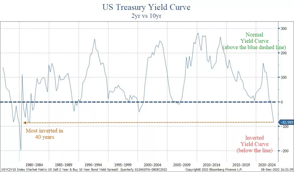
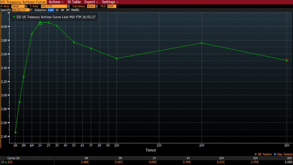
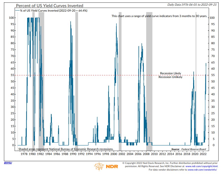
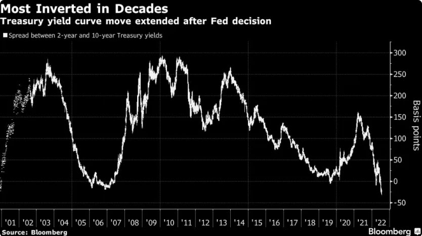
Yield Curve
The yield curve shows interest rates at various maturities.
When longer-term bond pay more interest than shorter-term ones, the yield curve is “normal”.
However, when shorter-term bonds pay more, the curve is “inverted”.
An inverted yield curve has a 100% success rate in predicting recessions. Currently, the curve is inverted, as shown on our first chart below.
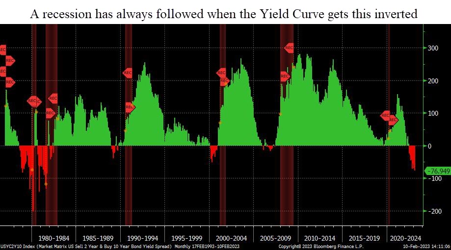
On average, a recession begins within 12-18 months after the initial inversion. This happened one year ago.
If history is any precedent, a recession should start by this summer.
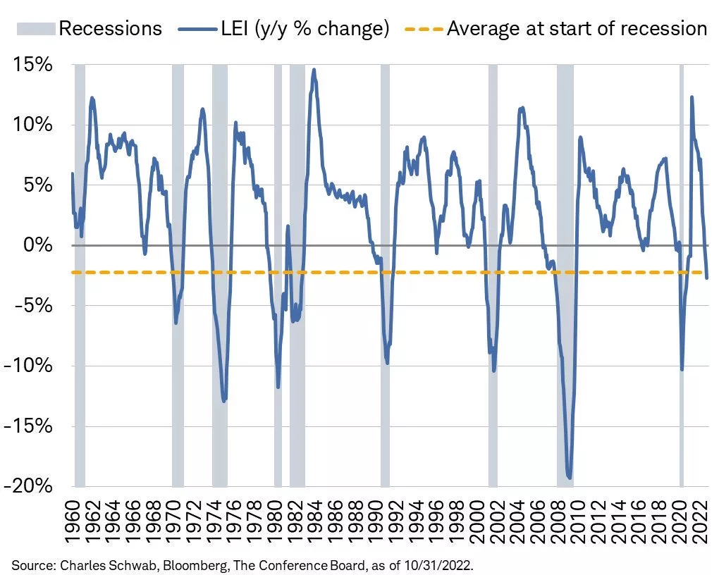
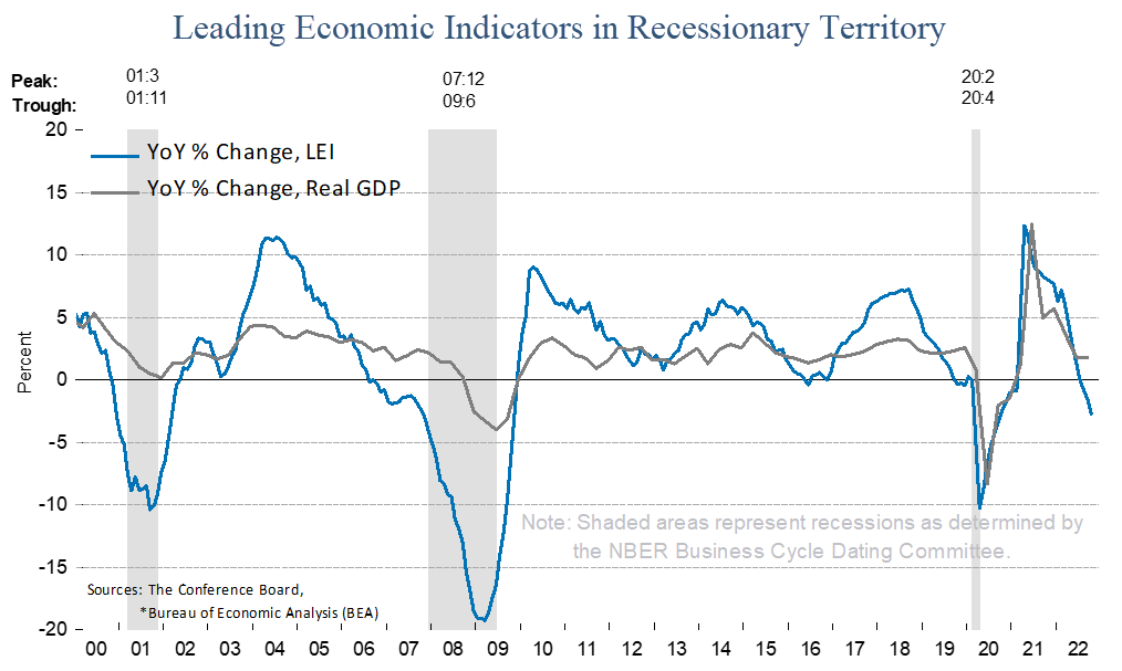
Leading Economic Indicators
The Leading Economic Indicators (LEI) is a measurement of ten data points on the earliest stage of economic activity.
Right now, LEI is very negative. In fact, every time LEI has dropped this much, a recession has followed.
This next chart shows the LEI index. Green shows positive year-0ver-year growth, while declines are in red. Recessions are shown in the red shaded areas.
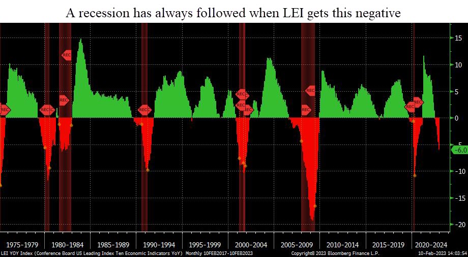
Typically, a recession starts 7-8 months after LEI growth drops by 3% year-over-year. This happened in December.
If history is any precedent, a recession should start by this summer.
Tightening Lending Standards
Banks are tightening lending standards and access to credit.
The US economy is driven by debt. When banks tighten, the economy slows.
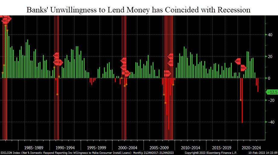
Except for 1994, every time bank have pulled back on their willingness to lend money, a recession starts within months.
This suggests that we may already be in a recession.
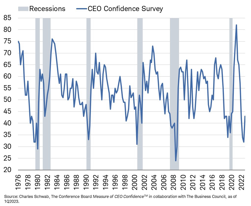
CEO Confidence
Corporate CEOs have access to real time economic data on how their company (and more broadly the overall economy) is performing.
When CEO confidence falls, recessions typically follow.
Earnings Growth
The previous data points are all macro-economic data points.
The next has to do directly with stocks.
If we do enter a recession, corporate earnings will decline. In fact, we’re already starting to see that.
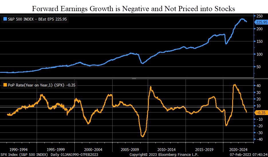
All of the data points above suggest risks in financial markets remain very high over the next few months.
However, there are data points telling us a recession may not be quite as likely.
Indicators Suggesting a Recession is Less Likely:
While the bulk of the data is poor, there are some data points suggesting that a recession may not be imminent:
- The US Consumer has been Resilient
- Light Vehicle Sales are Steady
- Employment Numbers aren’t Bad
- VIX has remained low
- Market Breadth is Improving
US Consumer Spending
70% of the US economy is dependent on the consumer.
If the consumer can remain resilient, then there still remains hope that we will avoid a recession (or at least have a mild one).
The next chart, courtesy of Bank of America, shows that consumer spending increased in January.
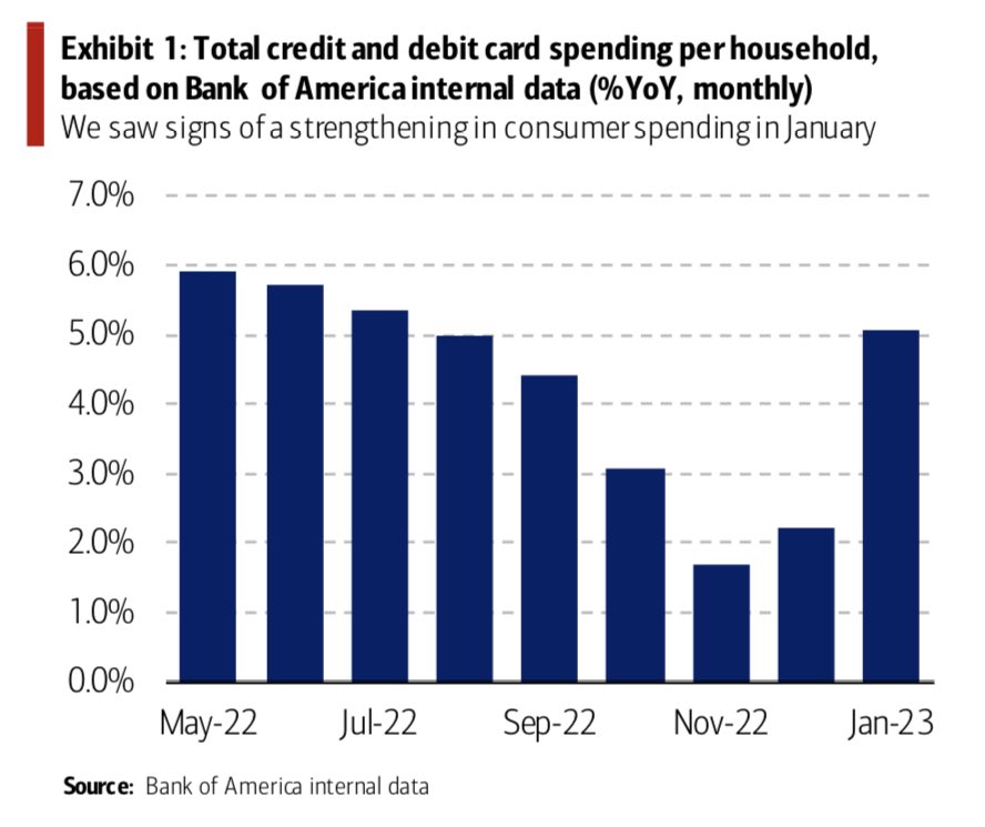
This is an important indicator to watch over the coming months.
Light Vehicle Sales are Steady
Another indicator showing that the consumer is resilient and there is still overall demand in the economy can be seen in vehicle sales.
Light vehicles include almost every consumer auto. This categorization includes all cars and trucks weighing less than 10,000 pounds. (For reference, the maximum curb weight of a Ford F-150 is about 5,600 pounds.)
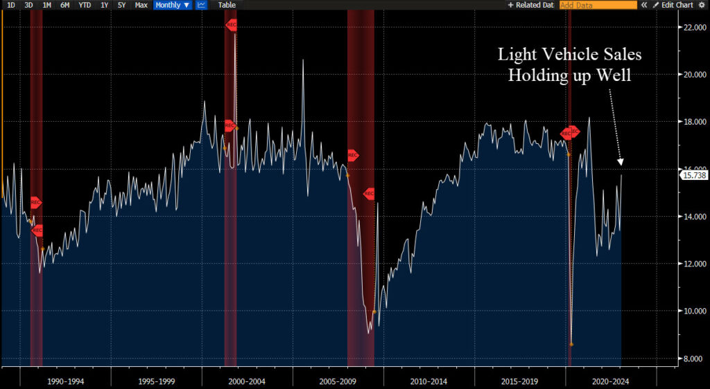
While this chart doesn’t necessarily show excessive strength, it also doesn’t show weakness either.
Employment Numbers Remain Strong
One of the most widely watched economic indicators is the unemployment number.
The chart below shows jobless claims. So far, unemployment has remained resilient.
This is very closely tied to the consumer spending data we mentioned above. When people have jobs, people spend money. Especially when prices are higher on just about everything they buy.
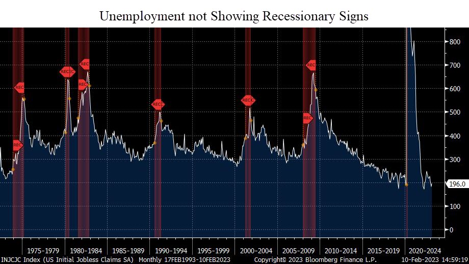
We’ve all heard of the layoff announcements by the Tech giants Amazon, Microsoft, Apple, Google, Microsoft, and more. These are concerning, and could be the tip of the iceberg.
But for now, those layoffs have not spilled over to the broader economy. At least not yet.
This is another data point we will watch with great interest in the coming months.
VIX Index
The VIX has reflected the relative market calm over the past few months.
While each recession has had a spike in the VIX, not every spike in the VIX has lead to a recession.
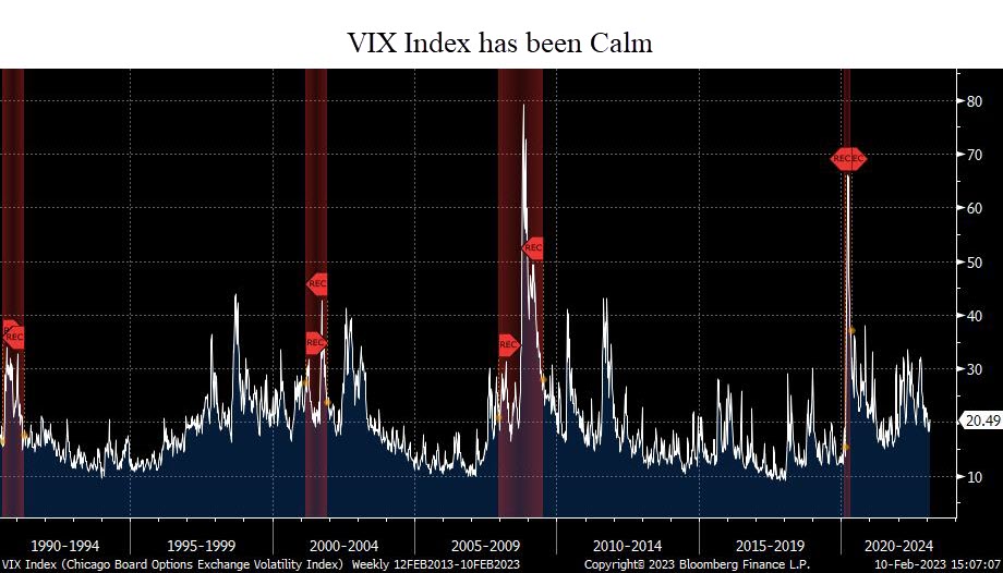
The VIX is a relatively fickle index, and there is little to no predictive power in it. But it does tell us that despite the high economic risks right now, the market is not overly fearful.
Market Breadth
The last chart we’ll discuss has to do with market breadth.
In order for the overall market to move higher, its underlying constituents need to be doing well.
And in the past few weeks, there has been improvement.
This chart shows the percent of stocks within the S&P 500 that are above their respective 200-day moving average. (This is simply the average price of that stock over the past 200 days.)
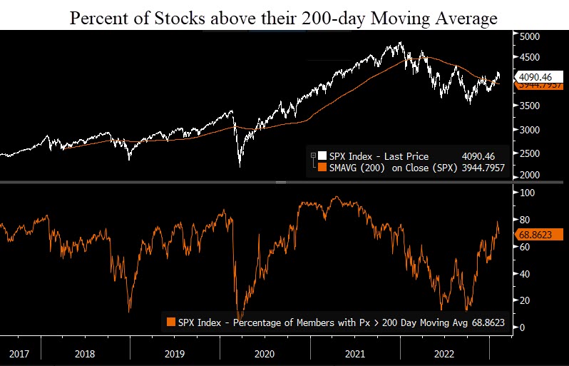
The current reading is 68%. This is a healthy number. While this number in isolation doesn’t give us an “all-clear” to invest, it is a good sign.
Bottom Line
Despite recent market strength, risks remain incredibly high.
At this point, it appears that the rally we’ve seen this year is another bear market rally.
The next few months are very critical. If a recession hasn’t started by mid-year, then the Fed very well may have manufactured a “soft landing”.
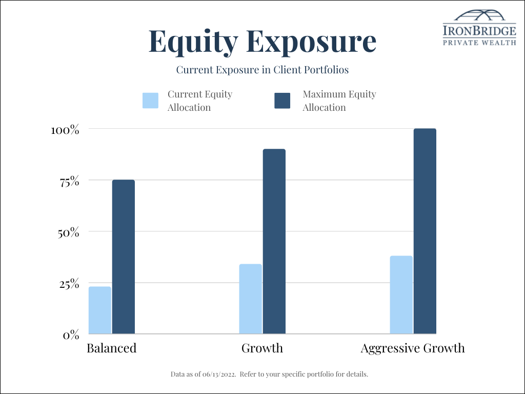
Client portfolios remain conservatively positioned, as they have been for the past 8-9 months.
The further we get into this year without bad things happening in the market, the better the overall risk/reward profile of this market becomes.
We’ll publish a video in the coming weeks to discuss the specific scenarios we see happening over the coming months.
Until then, please do not hesitate to reach out with any questions.
Invest wisely!