• Skip to main content
  • Skip to footer

IronBridge Private Wealth

Forward with Confidence

  • Home
  • Difference
  • Process
  • Services
  • Insights
    • IronBridge Insights
    • Strategic Wealth Blog
    • Strategic Growth Video Podcast
    • YouTube Channel
  • Team
  • Clients
  • Form CRS
  • Contact Us

investing

Selloff Over or Just Getting Started?

April 7, 2025

The S&P 500 officially fell 20% from it’s highs this morning.

But last Thursday morning, it was down only 7% from its highs.

Then Trump unleashed his tariff “plan”. Stocks were down over 10% in two days last Thursday and Friday, and another 4% at the open this morning.

This was a mini-crash.

A quick, but relatively normal pullback turned into a bloodbath on fears that tariffs will cause a recession and further market volatility.

This report is brief and to the point, and we will go over more in our webinar tomorrow. The registration link is further down in this report.

What happened?

  • Stocks had a mini-crash on Thursday and Friday, falling over 10% in just two days, after Trump announced tariffs that were much more widespread than many anticipated.
  • Concern over tariffs caused a technical selloff similar to last summer’s Japanese Yen selloff.
  • Market behavior the past few days has been similar to the COVID-lows.
  • This selloff has been about the unknowns with tariffs, as opposed to a deeply engrained structural problem like mortgages in 2008.
  • At this point we don’t anticipate this turning into a deeper bear market, but we can’t rule that out yet either.
  • We do think we are at or near a short-term low in stocks.

What to Do?

  • Don’t panic.
  • Keep the selloff in context…markets were only down 7% from all-time highs last Thursday morning.
  • Wait until a stronger rally develops to assess whether or not to reduce risk, not while fear and panic are extremely elevated.
  • This is not a dip to sell into, despite the elevated fear.
  • Stay calm, and reassess market dynamics on a rally.

Why do we think this could be a low?

There are a number of signs pointing to this being a near-term low in markets either today or tomorrow.

  • Sentiment at extremes
  • VIX spike higher
  • Treasury yields reversing higher
  • Option flow data is bullish
  • Capitulation signals
  • Broad, indiscriminate selling
  • Bullish divergences
  • Panicky conversations with clients

These data points are all quite bullish.

And while they don’t guarantee that the overall pullback is over, it does increase the likelihood that we have seen an interim low in prices.

We will look at charts of these in more detail in tomorrow’s webinar.

Tariffs Discussion

We will also discuss tariffs in more detail tomorrow, but here are our initial thoughts on tariffs:

  • Tariffs by themselves are not good, but if their implementation results in the elimination of all or a majority of income taxes in the US, it will be hugely beneficial.
  • The stated goal of the Trump administration is to use tariffs to eliminate income taxes of various kinds. A proposal today aims at eliminating capital gains taxes by the end of this year.
  • A broader stated goal by the administration is to eliminate the IRS entirely by reducing spending via DOGE and replacing income tax revenue with revenue from tariffs and a national sales tax.
  • Tariffs are inherently inflationary.
  • Tariffs are more steps towards economic de-globalization, which started with the semiconductor bill passed by the Biden administration. De-globalization is also inflationary without efficiency and productivity gains.
  • Potential productivity gains by the implementation of AI could be deflationary.
  • Small caps and mid caps may have an advantage over large caps going forward due to less overseas revenue and a lower impact from tariffs.

If you are looking to reduce risk, our advice is to wait until volatility has calmed down, which we expect over the coming weeks, if not sooner.

Don’t forget to register for our webinar tomorrow at 4pm central time. Click to register.

Volatility Spikes Occur Around Lows

Dramatic spikes higher in volatility tend to be a characteristic of a low point in markets.

This latest pullback appears to be no different, despite the harshness of the move.

In fact, we should probably get used to environments where volatility spikes very quickly like we have seen the past few days.

We know, that doesn’t make it feel any better.

But this type of move tends to occur at or near the end of major selloffs, as shown in the chart below.

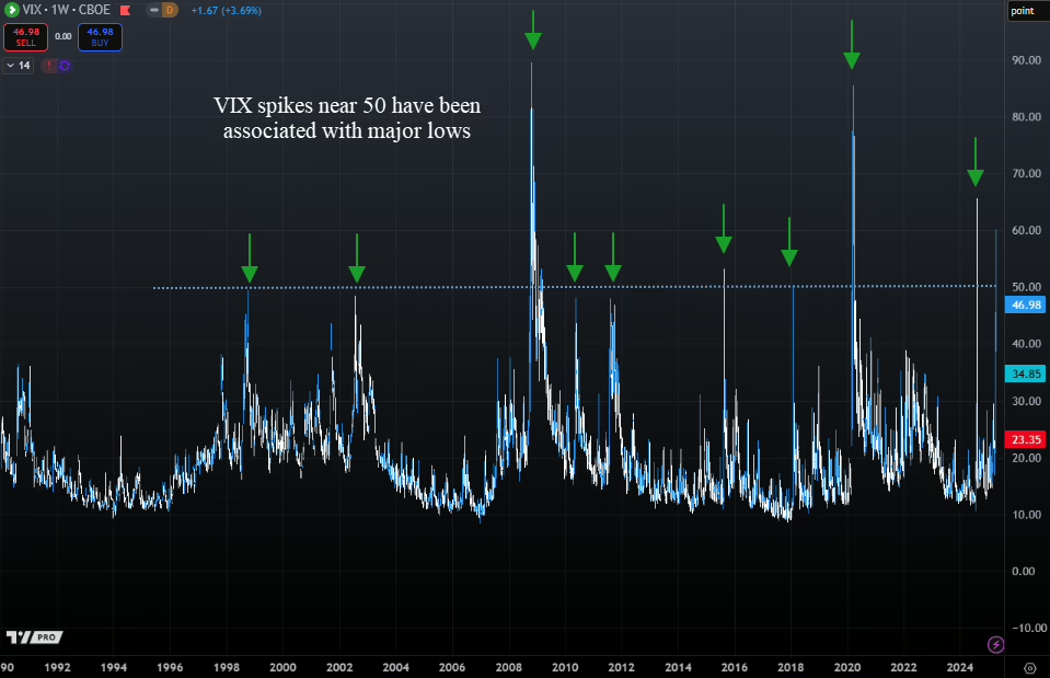
The bear market of 2008 had multiple spikes in the VIX that only resulted in short-term rallies of a few weeks.

But during other selloffs, the VIX moving near or above 50 marked the end of the selling. Today, the VIX touched 60, the highest level since the Japanese Yen selling last summer.

We have now seen two days (Thursday and Friday) that were both down at least 4%.

With stocks down again today, this marks only the 4th time in history we’ve seen selling like this.

What happened next was bullish over the near term, as shown in our next chart below.

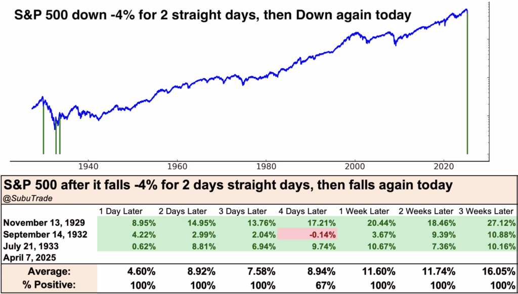
Returns following this type of volatility has been strong historically.

Average returns were over 11% when looking one week out.

This is a small sample size with only 3 occurrences, so we can’t take too much concrete information from it. But it shows that markets tend to bounce back strongly, at least over the near term.

Largest Two-Day Declines

The two-day decline last Thursday and Friday was the 5th largest two-day decline in history.

What has happened after previous large declines?

The first chart below from Charlie Bilello (twiiter @charliebilello) shows the ten largest two-day declines in S&P 500 history.

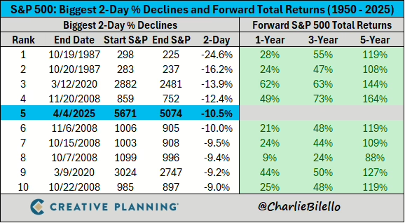
There is no question about it, these have been buying opportunities, not selling opportunities. Returns have been much higher than average following selloffs like this.

If we look more closely at the chart above, all of the declines took place in 1987, 2008 or 2020. Not great company.

But this type of volatility not only tends to have strong returns looking over a 1-year timeframe or more, it also has marked the low point of major bear markets, as shown in the next chart below.

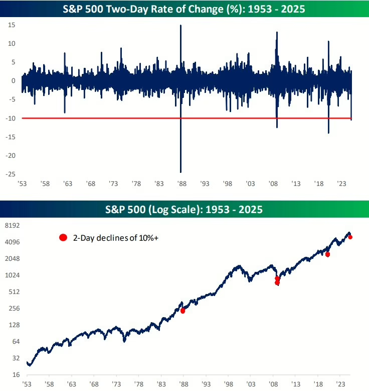
The top half of this chart shows a two-day performance of the S&P 500, while the red dots on the bottom half of the chart show when two day returns fell more than 10%.

Each of these occurred near the ultimate low of major bear markets.

But what about on a shorter time horizon?

Let’s look at what happened when we had very fast corrections.

Fastest 10% Corrections

Before the tariff selloff last week, markets were already moving quickly lower.

In fact, the S&P 500 had the 6th fastest 10% correction from all-time highs in history recently.

What happened next?

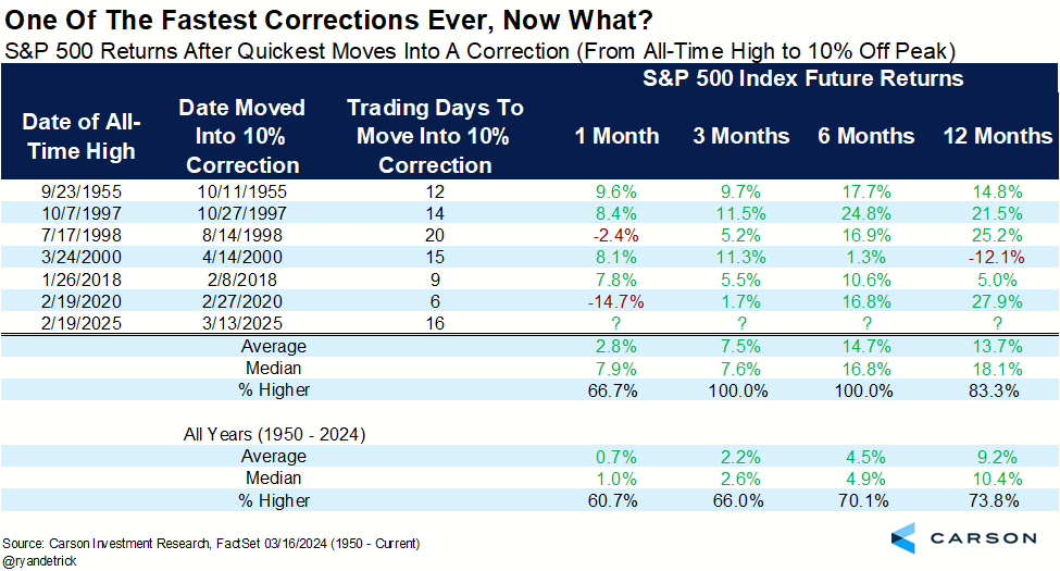
This chart shows that on average the market is nearly 15% higher on average after only 6 months.

This tells us that the speed of this overall correction also suggests that forward returns should be strong over the shorter-term as well, not just over the longer-term.

Bottom Line

The data suggests that we should expect an interim low any day, followed by a strong rally.

This doesn’t mean the decline is over, but economic and earnings data would have to deteriorate badly for further declines in stocks to occur. We are not ruling that out, it is just not the likely scenario at this point.

Earnings reports are starting this week, so we will have plenty of commentary from CEOs on the impact of tariffs on their business.

We will discuss more in our webinar tomorrow.

Invest wisely!


Filed Under: IronBridge Insights, Market Commentary Tagged With: inflation, investing, markets, stocks, volatility, wealth management

Can Market Strength Continue?

March 21, 2024

The idea which some people seem to entertain, that an active policy involves taking more risks than an inactive policy, is exactly the opposite of the truth. The inactive investor who takes up an obstinate attitude about his holdings and refuses to change his opinion merely because facts and circumstances have changed is the one who in the long run comes to grievous loss.

– John Maynard Keynes

The US stock market just had one of the strongest four months in history.

Can this market strength continue?

Spoiler alert…probably.

This time last year the data was NOT good, and risks to markets were incredibly high.

But as the year went on, the data improved. Our signals added risk back to target levels in client portfolios, and we were able to capture nice gains.

Fast-forward one year, and we have almost the exact opposite situation: good data, good markets and a generally positive environment.

However, the quote above from Keynes is as applicable today as when it was originally said in the 1930’s…as investors we MUST be able to look at data objectively and change strategy when it is required.

We were required to do that in 2023.

Will we be required to change from a bullish stance to a more negative one in 2024?

Let’s do a quick market scan to determine the likelihood of this.

Stock Strength to Continue?

As we mentioned earlier, stocks just had one of the strongest four-month spans in history.

In the 20 weeks that ended on March 15th, the S&P 500 index gained over 24%.

One might logically think that since stocks went up so much, they are overdue for a major pullback.

But the data tells a different story.

Our first chart is courtesy of Ryan Detrick of Carson Investment Research.

This chart shows the previous times the S&P 500 was up over 20% after 20 weeks. (You may need to click on the image to enlarge it.)

Since 1950, there have been 22 times the S&P 500 has been up over 20% in 20 weeks, as shown by the green diamonds in the chart above.

In 21 of those 22 times, the market was higher 12 months later by an average of 13%.

This is on top of the 20% that already occurred.

Even over the shorter timeframes, markets tended to do well.

Markets are higher one-month later roughly 72% of the time with an average performance of 2.3%. This beats the average monthly gain of 0.7% by nearly 3x.

Bottom line is that recent strength is positive, and despite any near-term correction that may occur, higher prices appear likely over the course of the year.

Opportunity Still in Small Caps

If we do see the historical trends mentioned above continue, then there still remains an opportunity in small cap US stocks.

We discussed small caps in detail in our 2024 Outlook report, which can be viewed here:

The summary of our analysis was that if markets continue higher, we should expect smaller companies to perform well, possibly outperforming large cap stocks.

The next chart below shows this opportunity.

While the S&P 500 surpassed its previous all-time-highs last year, small caps still have a ways to go to achieve the same result.

In fact, the ticker IWM needs to go up 21% to get back to it’s previous highs.

Small caps are trying to break out of their range from the past two years, and if they are successful, then we should see the next leg higher for markets in general.

That is, as long as problems in the commercial real estate sector stay contained.

Commercial Real Estate is Stable (for now)

The wild card in small cap stocks remain the challenges from commercial real estate (CRE) debt.

So far, CRE debt has not been an issue in 2024.

Delinquency rates continue to be elevated, but there has been no further deterioration, which is a good sign.

Optimism that interest rates would fall this year has helped contribute to a stabilization in commercial real estate prices.

This stabilization has been needed for that sector of the economy.

CRE debt remains the single biggest risk to stock prices, in our opinion, given the potential to cause failures in smaller banks.

Inflation Pressures may keep Rates High

What about interest rates?

After all, the Fed did meet yesterday and kept rates unchanged.

Two months ago, markets expected the Fed to have 6 rate cuts this year. Now, we’re down to an expected 3 rate cuts this year, with another expected next January, as shown in the chart below.

The blue line above shows the implied policy rate, or the rate which the Fed charges banks to hold funds overnight. This rate is currently in a range of 5.25 – 5.50%.

Learn more about the Fed Funds rate HERE.

With this many rate cuts projected, the market still appears to be anticipating a recession, despite the lack of recessionary data.

Why do we say that?

First, financial conditions are as loose as they’ve been since at anytime since the ’08 financial crisis.

Loose financial conditions imply that stress is low in the markets and the economy, providing support for economic growth.

Second, credit spreads are narrow.

This simply means that the riskier parts of the bond market are not showing signs of stress when compared to US Treasuries. Credit spreads are one of the earliest signs of stress in financial markets.

Third, inflation could be headed higher.

With a tight labor market, loose financial conditions, a supportive Fed, and an economy moving in the right direction, the conditions exist for another wave higher in inflation.

Higher inflation will NOT warrant rate cuts by the Fed.

In order for the Fed to cut rates, we believe that there needs to be a recession. And we simply don’t see that in the data in the near term.

But what if they do cut? What should we expect from markets?

Rate Cuts when Markets are near All-Time-Highs

Let’s imagine that the Fed does decide to cut rates in the next few months, and stocks remain around these levels or higher.

What would that mean for stocks?

Our friend Ryan Detrick once again has excellent data.

He looked at every time we saw a Fed rate cut with the S&P 500 within 2% of all-time-highs.

What he found was also bullish.

There were 20 times previously that the Fed cut rates with markets near all-time-highs.

Of those, markets were higher 20 out of 20 times, with an average gain of 13.9%.

Put another one in the bullish camp for 2024.

Bottom Line

The weight of the evidence suggests higher prices over the next year.

The combination of a strong market, loose financial conditions and stability in the commercial real estate market point to a generally calm market environment over the near term.

Things can always can change, so we must remember the quote above from Keynes and be vigilant in assessing risks and opportunities.

But for now, we should expect near term volatility to occur at any time, but expect that it should be short-lived and followed by higher prices.

Invest wisely!


Filed Under: IronBridge Insights Tagged With: federal reserve, inflation, interest rates, investing, IWM, markets, Russell 2000, stocks

2024 Outlook

January 31, 2024

Following a strong year in 2023, financial markets enter 2024 with strong momentum. Will this momentum continue?  Or will one of the risks push the market off it’s high wire?

In our 2024 Outlook report, we discuss the following:

  1. S&P 500 – New Highs are Bullish
  2. Liquidity Waterfall
  3. Small/Mid Caps Look Attractive
  4. Financial Conditions are Loose
  5. Signs of Stress not Apparent
  6. Risk #1: Inflation & Interest Rates
  7. Risk #2: Commercial Real Estate Risks
  8. Risk #3: Presidential Election
  9. Risk #4: De-Globalization
  10. Positioning
  11. Answer Your Questions

Invest wisely!


Filed Under: Strategic Growth Video Podcast Tagged With: federal reserve, inflation, interest rates, investing, markets, portfolio management, stocks, volatility

Price versus Earnings

August 8, 2023

The stock market is never obvious. It is designed to fool most of the people, most of the time.

Jesse Livermore, stock trader and author

Stock markets are complex.

Unfortunately, there are many variables that move markets higher or lower.

However, not all variable are created equal.

Two of the big ones are the P/E ratio and earnings.

The P/E ratio (or price-to-earnings ratio) is a simple measurement that takes price per share of a stock or index and divides it by the earnings per share.

If a stock trade at $100, and earns $5/share, its P/E ratio is 20. ($100 divided by $5).

Another way to think about this is that the P/E ratio is a gauge of how much an investor is willing to pay per dollar of earnings.

One interesting aspect of the market increase this year is that it has been exclusively due to an increase in valuations.

Last October, the P/E ratio for the S&P 500 index was 16.3.

Today, it is 20.6.

Meanwhile, earnings for the S&P 500 have fallen 9.3% since last summer.

The chart below shows this discrepancy.

In this chart, the P/E ratio of the S&P 500 (shown in green) has mirrored the price of the S&P 500 (shown in blue).

Meanwhile, earnings (in orange) have consistently fallen over the past year. Granted, there is a glimmer of hope with the slight increase so far this quarter.

This discrepancy between the P/E ratio and EPS is the result of market participants paying more per dollar of earnings, and is essentially a sign of speculation.

However, this discrepancy could actually be a good sign.

Why?

This type of behavior typically happens when markets exit a recession.

Prices tend to move higher first, before the fundamentals start to reflect a more positive environment.

The next chart shows this same dynamic coming out of the 2009 lows.

The S&P and its P/E ratio rose in tandem after the lows in March of 2009, while EPS continued to fall.

There are major differences to consider in the comparison with 2009:

  • Today, valuations are elevated by historical standards at 21. In 2009, the P/E ratio was 12.
  • Interest rates today are over 5% and rising. In 2009, they were zero with no expectation of going up anytime soon.
  • We had one of the largest recessions in history in 2009, while we haven’t had one at all today.
  • Sentiment was extremely pessimistic in 2009, with optimism the overwhelming sentiment today.

So while today’s environment is very different from that of 2009, the behavior of the markets is very similar.

If earnings can start catching up to valuations, that will help remove the risk of a major decline in stocks.

Bottom line

While we are not out of the woods just yet, there are many positive developments happening.

With elevated valuations like we have now, the possibility of entering a long-term bull market seems low.

But the possibility of a major bear market is decreasing as well.

That means a sideways, choppy market for a long period of time could be what ends up happening.

In that type of environment, income and dividends will be important.

It will also be very important to not chase every market rise, and to not feel FOMO when markets go through periods of positive price action.

In a sideways market, the turtle wins the race.

Invest wisely!


Filed Under: IronBridge Insights Tagged With: investing, markets, portfolio management, volatility, wealth management

Scrooged?

December 12, 2022

stern looking mature man in victorian costume carrying a cane  . Model is wearing a dark suit , top hat, glasses and prosthetic make up , the look created is also similar to a  Dickens victorian type character .

Men’s courses will foreshadow certain ends, to which, if persevered in, they must lead,” said Scrooge. “But if the courses be departed from, the ends will change.”

charles dickens, “A christmas carol”

In Charles Dickens’ famous book, A Christmas Carol, Ebenezer Scrooge begins the story as a mean-spirited and angry old man.

But he undergoes a transformative experience that changes him into someone who cares for others and embraces the spirit of giving.

The quote above by Mr. Scrooge is not the easiest quote to read.

If we paraphrase it, it may read something like this:

“If you go down a dangerous path, bad things will probably happen. But if things change, they might not be so bad after all.”

Currently, equity markets are trying to show more of a giving spirit like that of the transformed Scrooge.

But there are still MAJOR macro-economic signals with a grumpy, “old-Scrooge” like demeanor.

But will they will turn into positives in the coming months?


Grumpy Scrooge

First, let’s look at the more concerning indicators.

Specifically, there are three data points worth watching that are showing elevated risks for 2023:

  1. The Inverted Yield Curve
  2. Leading Economic Indicators
  3. Money Supply (M2)

These indicators tend to be excellent predicters of recessions when they turn negative.

And right now they are VERY negative.


Inverted Yield Curve

The yield curve is simply what a specific investment instrument yields at different maturities.

To understand the current yield curve environment, think of it like this:

Let’s say you want to invest in a Certificate of Deposit at a bank. You speak to a banker, and ask for the rates on a 2-year CD and a 10-year CD.

Logically, you expect the 10-year CD to be at a higher interest rate. You are, after all, committing funds to the bank for a decade.

But the banker tells you that the 2-year rate is paying 4.6%, while the 10-year rate is only 3.8%. This is an “inverted” yield curve.

When the yield curve on US Treasuries inverts, it has been the single best predictor of a recession in the past 100 years.

Right now, the yield curve is more inverted than anytime in the past 40 years.

The chart below shows the difference between a 2-year US Treasury bond and a 10-year one.

US Treasury yield curve is the 2-year yield versus the 10-year yield. It is currently inverted by the most in nearly 50 years, signaling a deep recession is likely in 2023.

When the line is above zero, the curve is “normal”. Below zero and it is “inverted”.

The past three times the yield curve was inverted was in 2008, 2000 and 1987. It became inverted before the markets had extreme stress, and each time led to a recession and tremendous market volatility.

This chart above only goes back to the 1970’s, but it’s the same well before that as well.

The depth of this inversion is worrisome too.

At roughly 0.83%, this is a very steep inversion, and one that is signaling not just a recession, but a deep one.


Leading Economic Indicators

Another key data point to monitor is the Leading Economic Indicator Index (LEI). We discussed this in our Thanksgiving report (read it HERE).

The LEI is another excellent recession predicter.

It’s so good, in fact, that EVERY time in the past 70 years we’ve seen the LEI at these levels a recession has followed.

The chart below, courtesy of Charles Schwab and Bloomberg, shows that the negative LEI is below the average level where recessions begin.

Schwab Bloomberg leading economic indicators showing negative data and at a level below where recessions typically begin.

LEI is telling us that a recession is imminent (unless this time is different, which is a dangerous assumption in financial markets).  But LEI is not a good timing tool…it does not tell us when a recession might begin.

It only tells us that one is close. 

And the rate of change does in fact suggest that a recession is likely to be worse than “mild”.

Another way to look at LEI is to look at the diffusion of the data.

Diffusion measures how widespread any strength or weakness is within the data. In the next chart, the diffusion index ranges from -50 to 50.  A reading below zero tells us that the majority of the data is weakening. 

Leading economic indicators diffusion index has an active recession signal.

When the diffusion index is below zero, it is indicating that a majority of the underlying data is weakening.  A reading above zero tells us the opposite, that most data is improving. 

When the diffusion goes below zero, it is a warning sign that economic trouble could be happening.  But a recession has not followed every time diffusion has turned negative.

Only when the index gets to minus-4 has it signaled that a recession is imminent.  The index is currently at minus-6. This is another excellent predicter of a recession, and it tells us that one is very likely to occur in 2023.


Money Supply (M2)

Another important, but little discussed aspect of financial market performance is the money supply.

There are various ways to measure the overall supply of money in a society. One of the broadest definitions is called “M2”. It measures the total amount of liquid funds in cash or near cash within a region.

This number includes cash, checking deposits and non-cash assets that can easily be converted into cash, like savings accounts and money markets.

If you’d like to learn more about M2, Investopedia has a nice article about it HERE.

M2 has a very high correlation to inflation. More accurately, changes in M2 have a very high correlation to inflation.

The next chart shows this phenomenon, courtesy of our friends at Real Investment Advice in Houston.

The black line is the year-over-year change in M2 (moved forward 16 months), while the orange line is CPI.

M2 is telling us that inflation is likely to head much lower in the coming 12 months.

On the surface, this would appear to be a good thing. After all, isn’t inflation one of the problems that markets face right now?

Maybe it is a good thing.

But the real problem is the extent of the decline.

After a massive increase in M2 during COVID, the rate of change has collapsed.

The problem arises in how big this decline has been.

It is not signaling that inflation should moderate. It suggest that inflation may turn into outright deflation.

The only way this happens is if we enter a moderate-to-deep recession. When major data points align like these three do right now, we must pay attention.


The New, More Giving Scrooge

While there are plenty of reasons to believe that 2023 is going to be a bad year again for stocks, not everything is bad.

Let’s look at some good data points right now:

  • The consumer remains strong. Shoppers spent a record $5.29 billion this Thanksgiving, an all-time record high. Yes, inflation had some to do with this, but at this point inflation is not having a meaningful impact on the consumer, at least; not yet.
  • Unemployment is low. The unemployment rate remains below 4%, primarily due to the services sector being strong.
  • Inflation is slowing some. CPI for October came in at 7.7%, below estimates of 7.9%. November’s CPI data will be published tomorrow. As we can see from the M2, we should expect inflation to slow in the coming months.
  • The Fed may be close to pausing. The market is anticipating a 0.50% increase at their meeting next week, with an additional 0.25% at their February meeting. Currently, markets expect that to be the end of interest rate increases for now. Historically, when the Fed Funds rate gets above the 2-year treasury yield, the Fed pauses interest rate increases. This will likely happen this week, so they very well could be done raising rates for a while.

Unemployment is a big data point here. Once the unemployment rate starts to rise, it has a direct impact on spending.

And consumer spending is roughly 70% of the US economy.

The main problem with looking at unemployment and other actual economic data is that they are backward-looking.

Once unemployment increases, we are already likely in a recession (even if it is not officially announced yet).

Which makes the forward-looking data points that much more important to consider.


Bottom Line

Despite the recent calm in markets, this is not a time for complacency.

Over the past 50 years, every time markets were volatile and NOT in a recession, NONE of the three indicators listed above were negative.  

Now, all of them are negative. And all of them were negative prior to recessions.

This tells us that the likelihood of a recession next year is extremely high. In fact, the data suggests that it should be more of a question about the extent of the decline, not whether one occurs.

Fortunately, it is not a foregone conclusion that a recession will be deep and painful. There is still plenty of time for things to change into something more positive.

Hopefully, this angry Scrooge-like data will transform to be something less angry and more joyous towards everyone.

But as we always say, hope is not an investment strategy.

For now, we must deal with the realities of the environment at hand.  And the current environment has major risks that should not be ignored.

Invest wisely!


Filed Under: IronBridge Insights Tagged With: economics, federal reserve, GDP, inflation, investing, leading economic indicators, LEI, markets, money supply, portfolio management, volatility, wealth management, yield curve

A Recession or Not a Recession, That is the Question

August 5, 2022

“To be or not to be–that is the question: Whether ’tis nobler in the mind to suffer the slings and arrows of outrageous fortune or to take arms against a sea of trouble and by opposing end them.”

hamlet, act 3, scene 1

July was a nice month in the markets.

Which begs the question…have we seen the lows in this bear market?

Should we expect markets to continue to rise and suffer the slings and arrows of outrageous fortune? Or is this yet another fake-out like we’ve seen twice already this year and we go back into a sea of trouble?

The answer? It depends.

In most environments, it “depends” on a complex series of data points could shape the direction of the markets.

However, today’s environment seems more simple on the surface.

It depends primarily on only one variable: whether we are in a recession or not.

The reason is very simple…markets respond differently to pullbacks similar to what we’ve seen this year based solely on if it happens during a recession or not.

Let’s look at some historical context.

S&P 500 Performance: Recession vs No Recession

Markets can decline without the economy being in a recession. Since 2009, we’ve seen this happen a few different times:

  • 2011: US Debt Downgrade
  • 2016: Chinese Yuan Devaluation and Oil Crash
  • 2018: Random 20% decline in the 4th quarter

Each of these times, markets fell roughly 20%.

And each of these times, markets recovered losses within 18-24 months.

But there was no recession during these periods.

Our first chart below, courtesy of Ned Davis Research, shows this dynamic. The chart shows declines of at least 18% and separates it between two categories: whether it occurred during a recession or not.

The black line is the performance of the S&P 500 when there was no recession, while the blue dotted line shows the performance if there was an official recession.

We are currently two months past the recent lows, as indicated by the red dashed line.

Based on what the market has done historically, the results are very clear: if we’re not in a recession, we should expect the next 12 months to be pretty good. If we are in a recession, we should expect more volatility and a retest of the lows.

Which begs the question…are we in a recession or not?

Are We in a Recession?

Normally, determining a recession is pretty straight-forward: it is two consecutive quarters of negative GDP growth.

Both Q1 and Q2 this year were negative.

So by historical definitions, yes, we are in a recession.

But it may not be quite that simple this time.

We don’t like to get political in these reports, because the world focuses way too much on the self-absorbed, sociopathic political class.

But with mid-term elections around the corner, the incumbents are trying to change the definition of a recession.

It’s an overly transparent pre-election tactic. But we will reluctantly admit that in this case, they may have a point.

(To be fair to our politician friends, many economists agree that the first quarter did not resemble a typical economic recession.)

Let’s look at the data.

The first quarter GDP came in at a negative 1.4%, mostly because of two things:

  • Defense spending fell 8.5%
  • A trade imbalance due to a strengthening US dollar resulted in a negative 3.2% from total GDP.

Remove these two factors, and GDP is positive. In fact, if you simply remove the trade imbalance, GDP is positive.

Economic data in the first quarter was fairly positive as well, led by consumer spending, which was up 2.7%.

While the first quarter showed relatively good economic data, the second quarter was recessionary without question.

Second quarter GDP was negative 0.9%. And the negativity was more widespread.

  • Inventory investment decreased 2.0%
  • Housing investments decreased 0.7%
  • Federal and State spending both decreased slightly
  • Business investment decreased 0.1%
  • Consumer spending rose by a more moderate 0.7% (down from 2.7% in Q1)

With the underlying strength in the first quarter, it’s not out of bounds to assume that we’ve only seen one quarter of truly negative GDP growth.

(For the record, we don’t think we should change the traditional definition of a recession, but we should always put GDP data in context, both positive and negative.)

Which makes the current quarter especially important.

If we have negative GDP this quarter, there is no question that we are in a recession. The question then becomes how bad it is and how long it lasts.

Atlanta Fed GDPNow

One way to keep track of current GDP estimates is through the Atlanta Fed’s “GDPNow” tracker. (You can view the site HERE.)

As of Thursday, August 4th, they are projecting a 1.4% GDP for Q3, as shown in the next chart.

Granted, the estimate has steadily declined since the start of the quarter, and we still have almost 2/3 of the quarter left. So anything can happen.

And this data is also based on human estimates, which can be skewed.

But it should at least give us some hope that maybe we don’t see a formal recession this year. And if we do see one, it would likely be fairly mild.

This morning’s jobs report adds to the hope that we may not be in a recession just yet. The economy added 528,000 new jobs this quarter, and as of July has officially recovered the number of jobs lost during COVID.

However, we shouldn’t get too complacent at this point.

While GDPNow is showing positive estimates for current GDP, there are huge warning signs right now that should give us cause for concern.

Inverted Yield Curve

Historically, one of the best recession indicators has been an inverted yield curve. This occurs when the 10-year yield on US Treasuries are LOWER than the 2-year yields.

The next chart, courtesy of Bloomberg, shows this inversion.

When the line goes below zero, the curve is inverted.

Right now, it is more inverted than at any time since Paul Volker started fighting inflation the early 1980’s.

It is more negative than COVID, than the global financial crisis, the tech bubble, and various recessions during the 80’s and 90’s.

We strongly believe that it is imprudent to ignore this data point.

But this data point isn’t a very good timing indicator of when a recession may happen.

In reality, it is when the curve starts to steepen AFTER it has been inverted that is a better indicator that a recession is imminent, and we haven’t seen that happen yet.

Housing Market Concerns

While the inverted yield curve is a bit more theoretical in nature, there are real economic data points that are showing signs of stress.

The housing market plays a huge part in economic activity, accounting for 15-18% of US economic activity on average.

Leading indicators in the housing market are showing reason to be concerned.

One of these is cancellation rates, as shown in the next chart from Redfin.

Cancellations happen when an accepted offer is withdrawn by either party.

In this case, the majority of cancellations are due to buyers backing out.

There are legitimate reasons for this happening:

  • Mortgage rates have increased, making it unaffordable for a buyer to proceed;
  • Property taxes have been reassessed higher, increasing the cost of housing;
  • People anticipating that prices may fall, causing buyers to withdraw offers.

Here’s a link to the article discussing cancellations:

The Deal Is Off: Home Sales Are Getting Canceled at the Highest Rate Since the Start of the Pandemic

Another reason for cancellations is a drop in consumer confidence, which has a big effect on economic conditions in the US.

Consumer Confidence

While the housing market is a large part of the economy, the consumer as a whole is much more important. Approximately 70% of the US economy is driven by the consumer in one way or another (this includes housing).

So when consumer confidence slows, economic activity typically slows along with it.

And the consumer is in the dumps right now, as shown in our next chart.

Right now, the consumer is the least confident they have been at any time in the past 60 years. This includes the Vietnam era, the inflation of the 1970’s, the tech crash, the global financial crisis, and COVID.

That is concerning.

But what does all of this tell us about the near-term direction of the market?

S&P 500 Index

All of the data listed above is not news to the market.

Despite these concerning data points, markets have rallied over the past seven weeks.

But the move higher since June looks almost identical to the one in March, as shown in the chart below.

Specifically, the pattern is a three-leg move higher into previous highs.

There was an initial leg higher, a move lower of roughly the same timeframe, then an extended move higher in both time and price.

The move in March followed the Ukraine invasion.

The move in June really didn’t have any catalyst, other than the overall market being incredibly pessimistic.

In addition to the S&P 500, nearly every major US stock index looks identical.

The next chart shows the S&P 500, the Russell 2000 small cap index, the Nasdaq Composite and the S&P Mid Cap index.

Every one of these indices are at the same resistance level. This means that the market thinks these levels are important.

Regardless of the reason for the move in June, it has been strong. Earnings reports have been more positive than expected, and the market is starting to predict that the Fed will become more accommodative and “pivot” by slowing the rise of interest rates.

If the market is going to do it’s own pivot and head back lower, it must do so very quickly.

If it breaks above this resistance area, then we can begin increasing equity exposure in client portfolios, at least for a period of time.

If it heads lower, then we should expect a fairly quick move to test the lows from June.

Bottom Line

While a big consideration for the market is the current recession debate, markets are extremely complex systems. Relying on only one data point for decision-making would be foolish.

When looking at a variety of data points, it truly is a mixed bag out right now.

Recent market strength and earnings reports have been mostly positive. As such, the market seems to believe the Fed will slow down the pace of interest rate increases. (Frankly, this expectation seems to be unwarranted, especially after today’s employment numbers.)

For now, the move higher over the summer appears to be a typical bear market rally. As such, we have been intentionally slow to add equity exposure.

Why?

Mainly because there is still plenty of upside if the market wants to keep pushing higher. For example, the Nasdaq is down nearly 23% this year, even after a big rally over the summer.

And big stocks like Google, Microsoft, Facebook and Netflix still have massive upside potential at current levels.

If the market can get above the levels noted in the S&P chart above, there starts to be more proof that this rally may be more than just another temporary rally.

But if we do go into a recession, all bets are off. And there are many indications to suggest we are headed in that direction.

Bottom line is that we believe it is prudent to underweight risk right now, given the massive uncertainties in the market and the economy.

Invest wisely!


Filed Under: IronBridge Insights Tagged With: Apple, Facebook, federal reserve, Google, interest rates, investing, markets, Microsoft, recession, risk management, stock market, stocks, volatility, wealth management

7 Lessons for Any Bear Market

June 29, 2022

Vienna, Austria - May 20, 2017: Main hall of the historical Austrian National Library in Vienna (Austria) on may 20, 2017, with an ancient globe map

That is the great fallacy: the wisdom of old men. They do not grow wise. They grow careful.

Ernest hemingway, “A farewell to arms”

Bear markets are not fun.

We all know that.

But there are valuable lessons from bear markets if you learn them.

Fortunately (or maybe unfortunately), we’ve lived through quite a few over the past 25 years. And given the volatility experienced during that period of time, our investment “age” would place us as old men. (The women of IronBridge remain obviously youthful.)

So Hemingway’s line from “A Farewell to Arms” resonates with us.

Bear markets may or may not create wisdom, because each one is different.

We don’t know how this one will play out. No one does.

But we have learned to be careful.

This got us thinking about various lessons we can learn from previous bear markets, and how we can apply them to today.

Below, we look at some higher-level lessons that relate to you and your well-being, as well as those learned from financial markets directly.

Let’s dig in.


Lesson #1: Keep Your Financial Plan on Track

The worst possible outcome of market volatility is not a decline in your wealth…it is a decline in your LIFESTYLE.

Don’t let that happen.

A good financial plan will factor in volatility in your portfolio. It is called stress-testing, and it is a statistical analysis using variable portfolio returns.

The chart below shows an example of hypothetical return projections for an actual client’s financial plan.

Real life future return projection including variability in returns and statistical analysis of a financial plan.
Source: IronBridge

This is just one of a thousand different potential scenarios our planning software uses to stress test someone’s probability of success in a financial plan. (Please do not hesitate to reach out if you would like us to update your individual financial plan.)

Two major things we notice about this projection:

  1. Returns are not linear. Our software does not assume the same return every year.
  2. Returns aren’t always good. Four of the first five years in the chart show negative returns. The worst projected decline is negative 28%.

Assuming variability makes your plan more realistic.

By projecting that bad years will happen, your portfolio can better weather the storms when they happen.


Lesson #2: Avoiding Large Declines is Key

This seems like the most obvious lesson, but avoiding large declines is the SINGLE MOST IMPORTANT thing you can do when investing.

Why?

Because when you experience large declines (which we define as 25-30% or greater), you don’t only sacrifice your financial plan, you lose the most valuable investing commodity there is: time.

You lose time by requiring huge gains to get back to where you were before the bear market began.

The next chart shows the return needed to get back to breakeven for various portfolio declines.

Returns needed to recover after various portfolio declines on a percentage basis.
Source: IronBridge

This chart shows that if your portfolio is down 10%, you need an 11% return to breakeven.

What stands out to us is that if your portfolio declines 30%, you need a whopping 43% return to breakeven. This is a huge return that takes multiple years to accomplish.

If you have a 40% or 50% decline, you need incredible future returns to get back to where you were.

These types of declines are not only painful emotionally, but will have hugely negative effects your long-term financial health.

Having the ability to move to cash is critical in our opinion.

Cash and short-term fixed income are the only predictable places to hide when major volatility hits the market.


Lesson #3: Diversification is Not Risk Management

Having different assets in your portfolio does not mean your portfolio is protected against large declines.

This year is a perfect example.

As of today, long-term bond prices have fallen MORE than stocks on a year-to-date basis, as shown in the chart below.

Stocks and bonds all down so far in 2022.

Maybe this changes in the second half of the year.

But relying solely on diversification as your primary risk management tool is not a good strategy to avoid large declines.


Lesson #4: Prices can Fall Further than You Think

There’s an old saying in the markets:

“How does a stock fall 90%? Easy, first it falls 80% then it gets cut in half.”

The lesson is that prices can be extremely volatile in bear markets, and can fall well beyond what may seem logically possible.

Let’s look at an extreme example of this today: Zoom stock.

Zoom was a darling of the COVID period as people abandoned the office and went remote. We at IronBridge became Zoom clients, and still use it many times per day.

Their earnings have consistently increased over the past two years, as shown on the bottom half of the chart below. The top half is price (blue line), and the orange is earnings per share.

Zoom stock has fallen 86% despite earnings increasing substantially.

Not only have earnings increased, but they have massively increased (up more than 8-fold).

Over the same period of time, however, the stock has been crushed.

It was down 86% from peak-to-trough. Ouch.

This illustrates perfectly that the market is not always logical. We would go a step further and say that more times than not it is very illogical.

But if you are prepared for it, both strategically and emotionally, you can handle the fact that it will probably do things that don’t make sense.


Lesson #5: Markets Lead, Economic Data Lags

One of the most common arguments during the early stages of a bear market is that the economic backdrop is strong.

The problem is that economic data is backward-looking.

In 2008, the initial GDP numbers were positive for most of the year. It was only until late 2008 (when the market was down nearly 40% on its way to being down over 55%), that GDP was revised lower for previous quarters.

It showed that the actual recession started nearly 12 months before, in late 2007. But in real time, GDP didn’t go negative until the market already declined.

Don’t rely on forecasters to give you any help, either.

Here are forecasts from the 12 largest investment firms in 2008. This was published in Barron’s magazine in early 2008 after the market had already peaked and was down nearly 20%.

Just over a year later, the S&P 500 bottomed at 666 (this still freaks us out a bit). Most of these forecasts were wrong by over 1,000 points. Nice work.

Instead of looking at the economic data itself, like the fine prognosticators above were, pay attention more to the trends of the data:

  • Is economic data improving or deteriorating?
  • Are companies lowering forward guidance, or do they foresee continued strength?
  • What are leading economic indicators doing?
  • Is previously reported economic data being adjusted higher or lower?

Markets will price in risk before the economic data reflects the risk.

Sometimes the markets are wrong. After all, not every bear market results in a recession.

But if you can identify how economic data is trending, you can better assess the overall risk in the market.


Lesson #6: Bear Markets Don’t Repeat, but They Tend to Rhyme

No bear market is exactly like a previous one.

But there are similarities.

For one, there tends to be excess speculation somewhere in the economy or markets.

In 2008, it was real estate. In 2000, it was tech companies. Today, central banks have printed our way into a complete mess. In addition, crypto is one area where we are seeing excess speculation turn into massive losses in value.

In addition to working off excesses, bear market patterns tend to look similar.

The first chart below compares 2008 to 2022.

Current market looks similar to 2008.

Looks pretty similar to us.

In 2008, there was a 22.5% drop before the bottom fell out of the market. Today, markets are down 23.5%. Maybe this suggests we are close to a similar outcome.

But there are plenty of chart comparisons that don’t result in massive declines.

In 1984, there was a recession, and the Fed was fighting inflation.

The next chart compares 1984 to today.

Current market looks similar to 1984

The pattern here looks pretty similar as well.

While both comparisons pass the eye test, each environment was different than today.

So while looking at these types of charts are interesting, they shouldn’t drive your behavior one way or another.


Lesson #7: Bear Markets can Happen in either Price or Time

When most of us think about a bear market, we naturally think of 2000 or 2008.

These were bear markets in PRICE.

In 2000, the Nasdaq fell over 70%. In 2008, the S&P 500 fell more than 55%.

Those of us in the markets then will remember those periods for the rest of our lives.

At their core, bear markets work off excesses of the previous economic and market expansion.

Prior to both 2000 and 2008, markets grew at rates that were were unsustainable. By the time these bear markets were done, prices collapsed and all the excesses were removed.

Price corrections tend to happen over the course of 1-3 years.

But markets can correct in TIME as well.

We haven’t seen a correction in time in quite a while.

In fact, the 1970’s were the last real sideways bear market.

The final chart looks at the Dow Jones index back to the late 1800’s.

Long term chart of the Dow Jones shows longer term bear markets.

This chart shows 5 major periods of sharp price declines: 1929, 1987, 2000, 2008 and 2020 (circled in red above).

The tamest of these periods was 1987, when the market “only” lost 34%. Each other time, markets fell well in excess of 40-50%.

Additionally, there were 3 major bear markets that occurred in “time” (the blue shaded areas above):

  • 1900-1915
  • 1934-1950
  • 1968-1982

Each of these periods lasted either 15 or 16 years. That’s a long time to have to wait for returns to start moving higher again.

Fortunately, these major bear markets don’t happen all that often.

But one thing in common with the previous bear markets that corrected in “time”: rising interest rates.

If we are going into a period of rising rates, which seems like a good assumption, the likelihood of a bear market in time seems to be a higher likelihood than a bear market in price.

Don’t let that scare you, though…there are ways to make money in a choppy sideways market.

It requires two components:

  1. Tactical exposure in the markets.  You don’t want to buy-and-hold in a “time” bear market.  The volatility will chew you up and spit you out.  You must have the ability to move to cash to limit volatility when downturns happen, but be able to increase exposure to areas performing well.  This is the basis of our investment philosophy at IronBridge.
  2. Increase exposure to yield-generating assets as interest rates rise.  As yields go up, you can earn more on a variety of assets to compliment your tactical market exposure.

We are preparing for this exact scenario, and have already begun having discussions with a number of our clients about what this means in your particular situation.

Bottom Line

In summary, there are always lessons to learn from any market environment.

But it does appear that we are in a bear market that may not reverse as quickly as those that have occurred since 2008.

Thus, us battered old investment men at IronBridge will echo Hemingway’s quote and be careful and cautious until the situation tells us not to be.

Invest wisely!


Filed Under: IronBridge Insights Tagged With: inflation, investing, markets, portfolio management, volatility, wealth management

Wise Men and Fools

April 26, 2022

The fool doth think he is wise, but the wise man knows himself to be a fool.

“As you like it”, Act v scene i, by william shakespeare

Markets are never easy.

Granted, there are times when things seem easier than others.

Over the past 13 years, investors have grown increasingly complacent about how easy investing can be. After all, every time there was a blip in the market, prices came roaring back quickly.

When data and trends align well, we can make higher probability conclusions about the direction of the market.

But when we have conflicting data, as we have now, it becomes more difficult to identify the direction with any real confidence.

Shakespeare’s quote is appropriate for this environment.

To think we know for sure what will happen is foolish. It is much better to acknowledge that we don’t know what will happen, so we can view developments with objectivity.

There are strong reasons to be optimistic about the markets over the coming months and years.

However, there are strong reasons to be incredibly pessimistic about the markets as well.

An important skill in this type of environment is to be mentally flexible. To know that you don’t know what will happen.

Let’s look at both the positive and negative data in the economy and markets right now to get a better understanding of the investing environment.


Bullish vs Bearish Data

First, let’s take a high-level look at the bearish and bullish arguments.

On one hand, we have plenty of reasons to be concerned:

  • The Fed is tightening
  • Inflation is extremely high
  • Ukraine War continues to be drawn out
  • Supply chain issues and food shortages globally are concerning
  • Valuations in many areas (stocks and real estate specifically) are still very high

We just need some turmoil in the Kardashian family and we have a cable news executive’s dream.

On the other hand, not everything is bad:

  • The US economy is strong
  • Corporate earnings and balance sheets are solid
  • Liquidity is still readily available
  • The US consumer is strong, on the back of high real estate valuations and increased incomes
  • Investor sentiment is very pessimistic (this is a contrarian indicator where this much pessimism tends to happen at market lows)
  • Some areas of the market have fallen 50-70% in value from last year, so some of the froth has been removed from various areas of the market.

Here’s an overview.

Bullish versus bearish data in the economy and the stock market.

Let’s look at two paths: one to lower stock prices, and another to higher ones.

The Path to Lower Stock Prices

Looking at the issues above, the biggest one by far is the Fed.

Yes, the war in Ukraine continues to be drawn out. Yes, inflation is very high. Yes, supply chain issues continue to be a problem.

Recession risks have increased in the past few months as well. Goldman Sachs currently places a 35% likelihood of a recession this year.

But the Fed has been the 10,000-lb gorilla in the room for a decade.

And their policy of massive monetary stimulus has now officially ended. They are no longer printing money, and they have started to raise interest rates.

This is not a small change.

We would argue that the Fed is the single most-important reason the market has been so incredibly strong over the past decade.

A reversion of policy should have an impact.

Their belief is that the US economy is strong enough to not depend on their artificial liquidity as support. Maybe they are right. After all, the economy is pretty strong.

The main problem is that the inflation cat has left the proverbial bag.

And it’s still too early to know how much of a negative affect it will have on the economy.

In all reality, it will take a number of months before inflation has a notable impact on economic data.

But the longer that inflation stays high, the more we will start to see reduced demand for a variety of goods.

For those with an economic background, it’s called “elasticity” of demand. Consumers are only willing to pay for something up to a certain price.

When the price gets too high, consumers stop buying it. We haven’t seen this just yet, but it’s hard to imagine we’re too far away from it.

Here is the pickle the Fed finds itself in: reduced demand will help lower inflation, but it will also cause a recession.

Not only is inflation rising, but so are interest rates. The combination of these two could wreak havoc on both the economy and financial markets.

But in an inflationary environment, not everything falls in price. There are many areas right now that are pushing to new highs, despite stock prices being lower.

The Nasdaq Composite index (mainly comprised of tech stocks) is now down over 20% from its highs. But consumer staples stocks pushed to new all-time highs last week.

While the broad market may not be very good right now, there are underlying pockets of strength.

These pockets of strength could be an indication that stock prices overall may resume their push higher soon. So let’s look at reasons we might need to be optimistic about the overall market environment going forward.

The Path to Higher Stock Prices

Yes, the Fed, inflation and interest rates are headwinds. But not everything is bad.

Earnings season picks up this week, and we should get more clarity on how companies are weathering the inflationary and uncertain geopolitical environment. So far, earnings have been good. Most estimates call for an increase in earnings of 4.5% year-over-year. Not great, but not bad either.

Just because we assume data should be negative doesn’t mean it will be.

One way that negative data isn’t quite showing up in the real economy has to do with mortgage rates.

The average 30-year mortgage is now above 5% for the first time in 11 years. But it hasn’t had a negative affect on homebuilders and home buyers just yet.

The next chart shows housing starts and building permits, one of the leading indicators of the housing market.

US housing starts and new building permits suggest that mortgage rates are not having much effect on the housing market yet.

In this chart, the blue lines are housing starts and the green lines are new building permits. In the past few months, they have been steady. New housing starts have actually risen a bit.

This could be a last minute push of people trying to build homes before rates get too high. But if nothing else, it tells us that mortgage rates may not be high enough to cause a housing slowdown. Time will tell.

With home-buying season about to start, we should know a lot more about the health of the housing market in the next few months.

This points to a consumer who has had both asset values and incomes rise.

And the consumer accounts for 68% of the US economy.

We should not ignore the positive impact that an optimistic US consumer can have on the economy and stock prices.

S&P 500 Index Levels

Let’s now look at the market itself.

Here’s an updated view of the S&P 500 Index, with the important levels to watch right now.

S&P 500 Index levels to watch for bull or bear market. Bullish above 4600, bearish below 4100. Chop zone in between.

We’ve broadened out our chop zone from a month ago, as the market seems to be stuck in a range between 4100-4600. (We had previously identified the chop zone as a range between 4100-4400.)

The real risk now is a break below 4100, or the lower end of the red area in the chart above.

There is very little support below this level, and we could easily see a scenario where markets fall another 10-20% if 4100 does not hold.

If it does fail, we will aggressively raise cash further.

Until that time, however, we should not assume that it will fail. We should assume that the chop zone will continue until we start to see whether the Fed/inflation/interest rate combo starts to have negative effects.

Either way, we expect that increased volatility will continue for a while longer.

Bottom Line

There are risks out there right now. Major risks that should not be ignored.

But there are still reasons to not bury your cash in cans in the backyard, at least not yet.

At this point, most clients have roughly 20% of their portfolio that normally would be allocated to stocks in cash right now.

If markets do fall further, we want to be able to have cash available to take advantage of that decline. Which is why we created the ability to move to cash as a part of our base investment process.

And during times like these, it is imperative to have a process.

We find comfort in our processes, because we know we don’t have to try to predict or guess what will happen next. There are no perfect investment systems, and we don’t claim to have one.

Be creating a process, we like to think that we are smart enough to know we are fools, as Shakespeare references.

The primary focus is to avoid big declines in your portfolio. We can’t avoid declines in general. There will always be volatility, and account values will go up and down. No process can avoid that.

When the market is choppy and messy like it is now, we can get signals that are quickly reversed.

That’s okay, in our opinion.

Because at some point a trend is going to reassert itself, either higher or lower.

And when that happens, we have confidence that we can identify it and either benefit from a positive trend or avoid the large downtrends.

In the meantime, we’ll remain diligent and make adjustments to your portfolio as our signals tell us to.

As always, please do not ever hesitate to reach out with questions.

Invest wisely!


Filed Under: IronBridge Insights Tagged With: federal reserve, housing market, interest rates, investing, markets, treasury yields, volatility, yields

  • Go to page 1
  • Go to page 2
  • Go to page 3
  • Go to Next Page »

Footer

LET'S CONNECT

  • Email
  • Facebook
  • Instagram
  • LinkedIn
  • Twitter

AUSTIN LOCATION

6420 Bee Caves Rd, Suite 201

Austin, Texas 78746

DISCLOSURES

Form ADV  |  Privacy Policy  |  Website Disclosures

  • Home
  • Difference
  • Process
  • Services
  • Insights
  • Team
  • Clients
  • Form CRS
  • Contact Us

Copyright © 2017-Present by IronBridge Private Wealth, LLC. All rights reserved.