• Skip to main content
  • Skip to footer

IronBridge Private Wealth

Forward with Confidence

  • Home
  • Difference
  • Process
  • Services
  • Insights
    • IronBridge Insights
    • Strategic Wealth Blog
    • Strategic Growth Video Podcast
    • YouTube Channel
  • Team
  • Clients
  • Form CRS
  • Contact Us

portfolio management

2024 Outlook

January 31, 2024

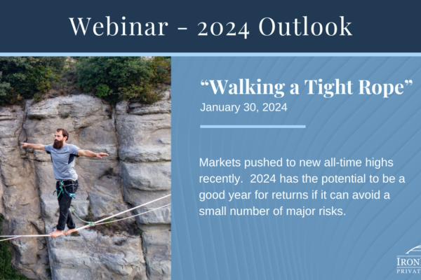
Following a strong year in 2023, financial markets enter 2024 with strong momentum. Will this momentum continue?  Or will one of the risks push the market off it’s high wire?

In our 2024 Outlook report, we discuss the following:

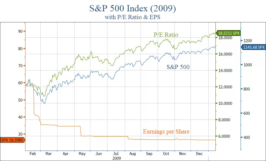
  1. S&P 500 – New Highs are Bullish
  2. Liquidity Waterfall
  3. Small/Mid Caps Look Attractive
  4. Financial Conditions are Loose
  5. Signs of Stress not Apparent
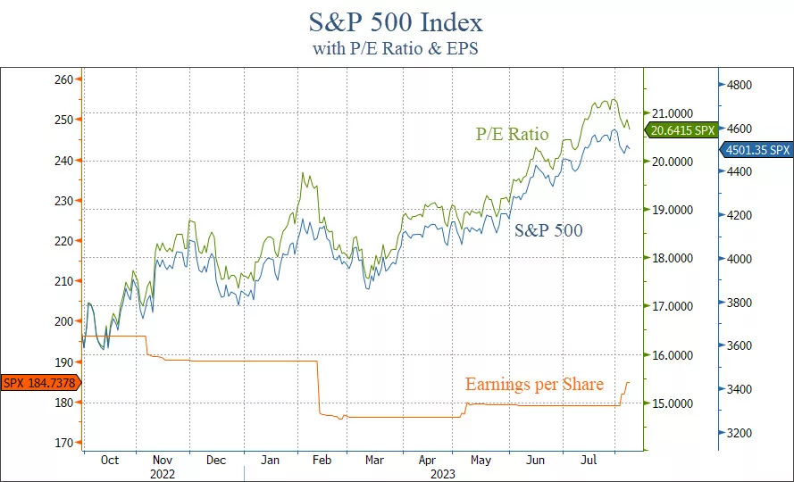
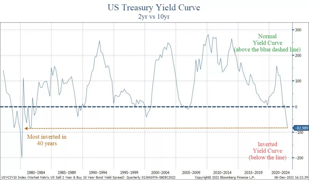
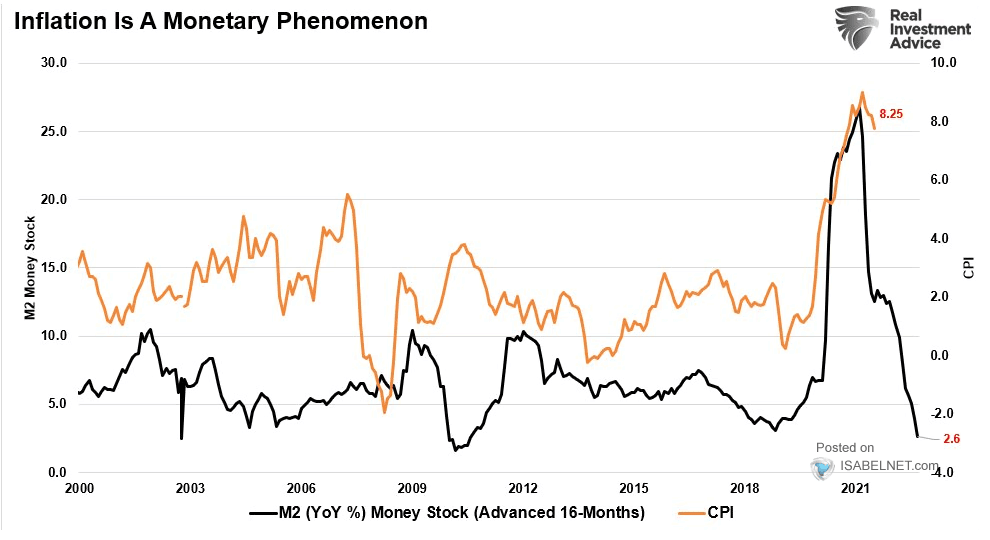
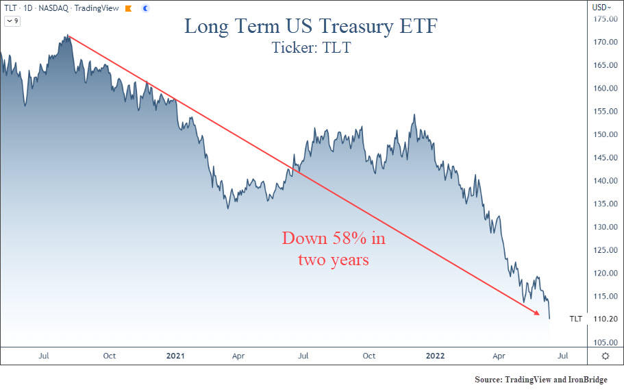
  6. Risk #1: Inflation & Interest Rates
  7. Risk #2: Commercial Real Estate Risks
  8. Risk #3: Presidential Election
  9. Risk #4: De-Globalization
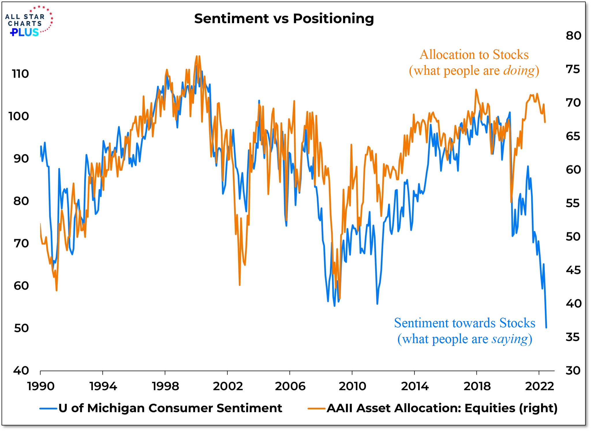
  10. Positioning
  11. Answer Your Questions

Invest wisely!


Filed Under: Strategic Growth Video Podcast Tagged With: federal reserve, inflation, interest rates, investing, markets, portfolio management, stocks, volatility

Market Video: Orderly Correction & Commercial Real Estate Risks

September 29, 2023

In this Market Insights video, we discuss the current state of the market and delve into the stress that is starting to show in the commercial real estate sector.

We also analyze the GDP for the third quarter and present three scenarios that could unfold in the coming months and years.

Join us as we explore these topics and gain valuable insights into the market’s performance.

  • 00:45 S&P 500 Index
  • 02:13 Russell 2000 Small Caps
  • 04:54 Performance of Different Markets
  • 05:46 Delinquent Loans in Commercial Real Estate
  • 06:33 Delinquency Rates in Retail, Lodging, and Office
  • 09:23 GDP for the Third Quarter
  • 10:29 Scenarios for the Future

Please don’t hesitate to reach with any questions.

Invest wisely!


Filed Under: Strategic Growth Video Podcast Tagged With: commercial real estate, CRE, GDP, inflation, interest rates, markets, portfolio management, SPX, stocks, volatility, wealth management

Price versus Earnings

August 8, 2023

The stock market is never obvious. It is designed to fool most of the people, most of the time.

Jesse Livermore, stock trader and author

Stock markets are complex.

Unfortunately, there are many variables that move markets higher or lower.

However, not all variable are created equal.

Two of the big ones are the P/E ratio and earnings.

The P/E ratio (or price-to-earnings ratio) is a simple measurement that takes price per share of a stock or index and divides it by the earnings per share.

If a stock trade at $100, and earns $5/share, its P/E ratio is 20. ($100 divided by $5).

Another way to think about this is that the P/E ratio is a gauge of how much an investor is willing to pay per dollar of earnings.

One interesting aspect of the market increase this year is that it has been exclusively due to an increase in valuations.

Last October, the P/E ratio for the S&P 500 index was 16.3.

Today, it is 20.6.

Meanwhile, earnings for the S&P 500 have fallen 9.3% since last summer.

The chart below shows this discrepancy.

In this chart, the P/E ratio of the S&P 500 (shown in green) has mirrored the price of the S&P 500 (shown in blue).

Meanwhile, earnings (in orange) have consistently fallen over the past year. Granted, there is a glimmer of hope with the slight increase so far this quarter.

This discrepancy between the P/E ratio and EPS is the result of market participants paying more per dollar of earnings, and is essentially a sign of speculation.

However, this discrepancy could actually be a good sign.

Why?

This type of behavior typically happens when markets exit a recession.

Prices tend to move higher first, before the fundamentals start to reflect a more positive environment.

The next chart shows this same dynamic coming out of the 2009 lows.

The S&P and its P/E ratio rose in tandem after the lows in March of 2009, while EPS continued to fall.

There are major differences to consider in the comparison with 2009:

  • Today, valuations are elevated by historical standards at 21. In 2009, the P/E ratio was 12.
  • Interest rates today are over 5% and rising. In 2009, they were zero with no expectation of going up anytime soon.
  • We had one of the largest recessions in history in 2009, while we haven’t had one at all today.
  • Sentiment was extremely pessimistic in 2009, with optimism the overwhelming sentiment today.

So while today’s environment is very different from that of 2009, the behavior of the markets is very similar.

If earnings can start catching up to valuations, that will help remove the risk of a major decline in stocks.

Bottom line

While we are not out of the woods just yet, there are many positive developments happening.

With elevated valuations like we have now, the possibility of entering a long-term bull market seems low.

But the possibility of a major bear market is decreasing as well.

That means a sideways, choppy market for a long period of time could be what ends up happening.

In that type of environment, income and dividends will be important.

It will also be very important to not chase every market rise, and to not feel FOMO when markets go through periods of positive price action.

In a sideways market, the turtle wins the race.

Invest wisely!


Filed Under: IronBridge Insights Tagged With: investing, markets, portfolio management, volatility, wealth management

Scrooged?

December 12, 2022

stern looking mature man in victorian costume carrying a cane  . Model is wearing a dark suit , top hat, glasses and prosthetic make up , the look created is also similar to a  Dickens victorian type character .

Men’s courses will foreshadow certain ends, to which, if persevered in, they must lead,” said Scrooge. “But if the courses be departed from, the ends will change.”

charles dickens, “A christmas carol”

In Charles Dickens’ famous book, A Christmas Carol, Ebenezer Scrooge begins the story as a mean-spirited and angry old man.

But he undergoes a transformative experience that changes him into someone who cares for others and embraces the spirit of giving.

The quote above by Mr. Scrooge is not the easiest quote to read.

If we paraphrase it, it may read something like this:

“If you go down a dangerous path, bad things will probably happen. But if things change, they might not be so bad after all.”

Currently, equity markets are trying to show more of a giving spirit like that of the transformed Scrooge.

But there are still MAJOR macro-economic signals with a grumpy, “old-Scrooge” like demeanor.

But will they will turn into positives in the coming months?


Grumpy Scrooge

First, let’s look at the more concerning indicators.

Specifically, there are three data points worth watching that are showing elevated risks for 2023:

  1. The Inverted Yield Curve
  2. Leading Economic Indicators
  3. Money Supply (M2)

These indicators tend to be excellent predicters of recessions when they turn negative.

And right now they are VERY negative.


Inverted Yield Curve

The yield curve is simply what a specific investment instrument yields at different maturities.

To understand the current yield curve environment, think of it like this:

Let’s say you want to invest in a Certificate of Deposit at a bank. You speak to a banker, and ask for the rates on a 2-year CD and a 10-year CD.

Logically, you expect the 10-year CD to be at a higher interest rate. You are, after all, committing funds to the bank for a decade.

But the banker tells you that the 2-year rate is paying 4.6%, while the 10-year rate is only 3.8%. This is an “inverted” yield curve.

When the yield curve on US Treasuries inverts, it has been the single best predictor of a recession in the past 100 years.

Right now, the yield curve is more inverted than anytime in the past 40 years.

The chart below shows the difference between a 2-year US Treasury bond and a 10-year one.

US Treasury yield curve is the 2-year yield versus the 10-year yield. It is currently inverted by the most in nearly 50 years, signaling a deep recession is likely in 2023.

When the line is above zero, the curve is “normal”. Below zero and it is “inverted”.

The past three times the yield curve was inverted was in 2008, 2000 and 1987. It became inverted before the markets had extreme stress, and each time led to a recession and tremendous market volatility.

This chart above only goes back to the 1970’s, but it’s the same well before that as well.

The depth of this inversion is worrisome too.

At roughly 0.83%, this is a very steep inversion, and one that is signaling not just a recession, but a deep one.


Leading Economic Indicators

Another key data point to monitor is the Leading Economic Indicator Index (LEI). We discussed this in our Thanksgiving report (read it HERE).

The LEI is another excellent recession predicter.

It’s so good, in fact, that EVERY time in the past 70 years we’ve seen the LEI at these levels a recession has followed.

The chart below, courtesy of Charles Schwab and Bloomberg, shows that the negative LEI is below the average level where recessions begin.

Schwab Bloomberg leading economic indicators showing negative data and at a level below where recessions typically begin.

LEI is telling us that a recession is imminent (unless this time is different, which is a dangerous assumption in financial markets).  But LEI is not a good timing tool…it does not tell us when a recession might begin.

It only tells us that one is close. 

And the rate of change does in fact suggest that a recession is likely to be worse than “mild”.

Another way to look at LEI is to look at the diffusion of the data.

Diffusion measures how widespread any strength or weakness is within the data. In the next chart, the diffusion index ranges from -50 to 50.  A reading below zero tells us that the majority of the data is weakening. 

Leading economic indicators diffusion index has an active recession signal.

When the diffusion index is below zero, it is indicating that a majority of the underlying data is weakening.  A reading above zero tells us the opposite, that most data is improving. 

When the diffusion goes below zero, it is a warning sign that economic trouble could be happening.  But a recession has not followed every time diffusion has turned negative.

Only when the index gets to minus-4 has it signaled that a recession is imminent.  The index is currently at minus-6. This is another excellent predicter of a recession, and it tells us that one is very likely to occur in 2023.


Money Supply (M2)

Another important, but little discussed aspect of financial market performance is the money supply.

There are various ways to measure the overall supply of money in a society. One of the broadest definitions is called “M2”. It measures the total amount of liquid funds in cash or near cash within a region.

This number includes cash, checking deposits and non-cash assets that can easily be converted into cash, like savings accounts and money markets.

If you’d like to learn more about M2, Investopedia has a nice article about it HERE.

M2 has a very high correlation to inflation. More accurately, changes in M2 have a very high correlation to inflation.

The next chart shows this phenomenon, courtesy of our friends at Real Investment Advice in Houston.

The black line is the year-over-year change in M2 (moved forward 16 months), while the orange line is CPI.

M2 is telling us that inflation is likely to head much lower in the coming 12 months.

On the surface, this would appear to be a good thing. After all, isn’t inflation one of the problems that markets face right now?

Maybe it is a good thing.

But the real problem is the extent of the decline.

After a massive increase in M2 during COVID, the rate of change has collapsed.

The problem arises in how big this decline has been.

It is not signaling that inflation should moderate. It suggest that inflation may turn into outright deflation.

The only way this happens is if we enter a moderate-to-deep recession. When major data points align like these three do right now, we must pay attention.


The New, More Giving Scrooge

While there are plenty of reasons to believe that 2023 is going to be a bad year again for stocks, not everything is bad.

Let’s look at some good data points right now:

  • The consumer remains strong. Shoppers spent a record $5.29 billion this Thanksgiving, an all-time record high. Yes, inflation had some to do with this, but at this point inflation is not having a meaningful impact on the consumer, at least; not yet.
  • Unemployment is low. The unemployment rate remains below 4%, primarily due to the services sector being strong.
  • Inflation is slowing some. CPI for October came in at 7.7%, below estimates of 7.9%. November’s CPI data will be published tomorrow. As we can see from the M2, we should expect inflation to slow in the coming months.
  • The Fed may be close to pausing. The market is anticipating a 0.50% increase at their meeting next week, with an additional 0.25% at their February meeting. Currently, markets expect that to be the end of interest rate increases for now. Historically, when the Fed Funds rate gets above the 2-year treasury yield, the Fed pauses interest rate increases. This will likely happen this week, so they very well could be done raising rates for a while.

Unemployment is a big data point here. Once the unemployment rate starts to rise, it has a direct impact on spending.

And consumer spending is roughly 70% of the US economy.

The main problem with looking at unemployment and other actual economic data is that they are backward-looking.

Once unemployment increases, we are already likely in a recession (even if it is not officially announced yet).

Which makes the forward-looking data points that much more important to consider.


Bottom Line

Despite the recent calm in markets, this is not a time for complacency.

Over the past 50 years, every time markets were volatile and NOT in a recession, NONE of the three indicators listed above were negative.  

Now, all of them are negative. And all of them were negative prior to recessions.

This tells us that the likelihood of a recession next year is extremely high. In fact, the data suggests that it should be more of a question about the extent of the decline, not whether one occurs.

Fortunately, it is not a foregone conclusion that a recession will be deep and painful. There is still plenty of time for things to change into something more positive.

Hopefully, this angry Scrooge-like data will transform to be something less angry and more joyous towards everyone.

But as we always say, hope is not an investment strategy.

For now, we must deal with the realities of the environment at hand.  And the current environment has major risks that should not be ignored.

Invest wisely!


Filed Under: IronBridge Insights Tagged With: economics, federal reserve, GDP, inflation, investing, leading economic indicators, LEI, markets, money supply, portfolio management, volatility, wealth management, yield curve

Women and Money: An Evolved Approach

August 18, 2022

Inspired mature grey-haired woman fashion designer thinking on new creative ideas at workplace. Smiling beautiful elegant classy middle aged older lady small business owner dreaming in atelier studio.

Women at all age levels are redefining how they think about their financial journey. This includes career paths, planning for flexibility, taking charge of family finances, or being successful on their terms.

There are some generational differences among Gen Z, Millennial, Gen X, and Boomer women—but not as much as you’d think. And two main differences that set them apart from men hold across generations:

  1. Women are better investors than men1
  2. Women are more likely to approach financial planning as a partnership with a trusted advisor2
  3. Women value a financial advisor that listens to them more than men do3

Women tend to outperform men partly because they are more patient investors and trade less. This results in better performance over time and lowers costs.

As to the second result, the easy reach is to point out the men are reluctant to ask for directions when driving too. But it’s a little more complicated than that, and the reasons why women seek financial advice change as they move through their lifecycle.

How they want to partner with a financial advisor is also different. Women want to be sure that the advisor listens to them and understands and respects their priorities.

Gen Z and Younger Millennials

Younger women (Gen Z and younger Millennials) are generally comfortable and confident about money and financial planning.

They’ve grown up with more salary transparency, the proliferation of money-related apps to help with budgeting and investing, and the optimism of youth. They are interested in financial planning that fits their busy lives. They make good salaries, still have debt, are single or newly partnered, and want to get a good foundation in place.

They gravitate to financial planners that offer the planning they need in a way that they can relate to. This includes cash-flow planning, debt reduction strategies, maximizing employee benefits, and above all – helping them improve their financial literacy.

This generation of women understands the value of starting early on the path to financial independence and wants financial planning advice that can help them build a solid foundation.

Older Millennials and Gen X

Portrait of smiling beautiful millennial businesswoman or CEO looking at camera, happy female boss posing making headshot picture for company photoshoot, confident successful woman at work

As women approach the mid-point of their careers, money becomes more complex.

Careers are in full swing, and growing wealth brings to the fore the costs of making a mistake.

These women may not have worked with a financial advisor before. Whether single or partnered, they realize that all the different pieces of their financial lives need to come together in a comprehensive plan.

For them, it’s about creating the option to stop work, scale back work, start a business of their own, or do more meaningful work that may not be as highly paid – while maintaining a current lifestyle and still save for financial goals in the future.

They realize the value of working with a financial advisor that can help them put together all the pieces of their lives:

  • Equity compensation
  • What to do with an annual bonus
  • Tax planning
  • Saving for education
  • Taking the right amount of investment risk
  • Buying a second home or income property
  • Creating opportunity with their wealth

These women want a trusted partner that explains the “why” to them, and guides them to make choices that are right for them.

As things change, they value being able to make changes to a plan to accommodate new goals or different circumstances.

Older Gen and X-Boomers

These women are driving the decision to work with a financial advisor for themselves and their families. Very often, something has sparked the need to partner with a financial advisor to solve an immediate problem.

  • A change of job
  • A spouse’s health issue
  • Aging parents
  • Imminent retirement
  • Death of a spouse
  • Tax issues

Having a trusted partner to help them sort through the issue calmly in a non-judgmental way is paramount. They want someone to help them fix problems, provide solutions, and ensure that no other avoidable situations are on the horizon.

They may realize that a spouse has always done the financial planning and that it may be time for them to understand the specifics of their wealth. They may want to plan for a retirement that allows them the time they have always wanted with their family.

This group has the most anxiety around money and the least excitement.4 They need to develop trust and have an investment plan that helps them achieve their goals – without taking on too much risk.

The Bottom Line

Women are taking control of their and their families’ wealth at all points on the age spectrum.

They value working with a financial advisor, but they are clear in their need to have someone who listens, prioritizes their goals, is a trusted partner, and truly understands how they want to build and maintain wealth.


1.Fidelity 2021 Women and Investing Study.

2, 3, 4. U.S. Bank. Women and Wealth: Exploring the Gender Gap. 2021.

This work is powered by Advisor I/O under the Terms of Service and may be a derivative of the original.

The information contained herein is intended to be used for educational purposes only and is not exhaustive. Diversification and/or any strategy that may be discussed does not guarantee against investment losses but are intended to help manage risk and return. If applicable, historical discussions and/or opinions are not predictive of future events. The content is presented in good faith and has been drawn from sources believed to be reliable. The content is not intended to be legal, tax or financial advice. Please consult a legal, tax or financial professional for information specific to your individual situation.

Filed Under: Strategic Wealth Blog Tagged With: estate planning, financial planning, portfolio management, tax planning, wealth management, women investing

7 Lessons for Any Bear Market

June 29, 2022

Vienna, Austria - May 20, 2017: Main hall of the historical Austrian National Library in Vienna (Austria) on may 20, 2017, with an ancient globe map

That is the great fallacy: the wisdom of old men. They do not grow wise. They grow careful.

Ernest hemingway, “A farewell to arms”

Bear markets are not fun.

We all know that.

But there are valuable lessons from bear markets if you learn them.

Fortunately (or maybe unfortunately), we’ve lived through quite a few over the past 25 years. And given the volatility experienced during that period of time, our investment “age” would place us as old men. (The women of IronBridge remain obviously youthful.)

So Hemingway’s line from “A Farewell to Arms” resonates with us.

Bear markets may or may not create wisdom, because each one is different.

We don’t know how this one will play out. No one does.

But we have learned to be careful.

This got us thinking about various lessons we can learn from previous bear markets, and how we can apply them to today.

Below, we look at some higher-level lessons that relate to you and your well-being, as well as those learned from financial markets directly.

Let’s dig in.


Lesson #1: Keep Your Financial Plan on Track

The worst possible outcome of market volatility is not a decline in your wealth…it is a decline in your LIFESTYLE.

Don’t let that happen.

A good financial plan will factor in volatility in your portfolio. It is called stress-testing, and it is a statistical analysis using variable portfolio returns.

The chart below shows an example of hypothetical return projections for an actual client’s financial plan.

Real life future return projection including variability in returns and statistical analysis of a financial plan.
Source: IronBridge

This is just one of a thousand different potential scenarios our planning software uses to stress test someone’s probability of success in a financial plan. (Please do not hesitate to reach out if you would like us to update your individual financial plan.)

Two major things we notice about this projection:

  1. Returns are not linear. Our software does not assume the same return every year.
  2. Returns aren’t always good. Four of the first five years in the chart show negative returns. The worst projected decline is negative 28%.

Assuming variability makes your plan more realistic.

By projecting that bad years will happen, your portfolio can better weather the storms when they happen.


Lesson #2: Avoiding Large Declines is Key

This seems like the most obvious lesson, but avoiding large declines is the SINGLE MOST IMPORTANT thing you can do when investing.

Why?

Because when you experience large declines (which we define as 25-30% or greater), you don’t only sacrifice your financial plan, you lose the most valuable investing commodity there is: time.

You lose time by requiring huge gains to get back to where you were before the bear market began.

The next chart shows the return needed to get back to breakeven for various portfolio declines.

Returns needed to recover after various portfolio declines on a percentage basis.
Source: IronBridge

This chart shows that if your portfolio is down 10%, you need an 11% return to breakeven.

What stands out to us is that if your portfolio declines 30%, you need a whopping 43% return to breakeven. This is a huge return that takes multiple years to accomplish.

If you have a 40% or 50% decline, you need incredible future returns to get back to where you were.

These types of declines are not only painful emotionally, but will have hugely negative effects your long-term financial health.

Having the ability to move to cash is critical in our opinion.

Cash and short-term fixed income are the only predictable places to hide when major volatility hits the market.


Lesson #3: Diversification is Not Risk Management

Having different assets in your portfolio does not mean your portfolio is protected against large declines.

This year is a perfect example.

As of today, long-term bond prices have fallen MORE than stocks on a year-to-date basis, as shown in the chart below.

Stocks and bonds all down so far in 2022.

Maybe this changes in the second half of the year.

But relying solely on diversification as your primary risk management tool is not a good strategy to avoid large declines.


Lesson #4: Prices can Fall Further than You Think

There’s an old saying in the markets:

“How does a stock fall 90%? Easy, first it falls 80% then it gets cut in half.”

The lesson is that prices can be extremely volatile in bear markets, and can fall well beyond what may seem logically possible.

Let’s look at an extreme example of this today: Zoom stock.

Zoom was a darling of the COVID period as people abandoned the office and went remote. We at IronBridge became Zoom clients, and still use it many times per day.

Their earnings have consistently increased over the past two years, as shown on the bottom half of the chart below. The top half is price (blue line), and the orange is earnings per share.

Zoom stock has fallen 86% despite earnings increasing substantially.

Not only have earnings increased, but they have massively increased (up more than 8-fold).

Over the same period of time, however, the stock has been crushed.

It was down 86% from peak-to-trough. Ouch.

This illustrates perfectly that the market is not always logical. We would go a step further and say that more times than not it is very illogical.

But if you are prepared for it, both strategically and emotionally, you can handle the fact that it will probably do things that don’t make sense.


Lesson #5: Markets Lead, Economic Data Lags

One of the most common arguments during the early stages of a bear market is that the economic backdrop is strong.

The problem is that economic data is backward-looking.

In 2008, the initial GDP numbers were positive for most of the year. It was only until late 2008 (when the market was down nearly 40% on its way to being down over 55%), that GDP was revised lower for previous quarters.

It showed that the actual recession started nearly 12 months before, in late 2007. But in real time, GDP didn’t go negative until the market already declined.

Don’t rely on forecasters to give you any help, either.

Here are forecasts from the 12 largest investment firms in 2008. This was published in Barron’s magazine in early 2008 after the market had already peaked and was down nearly 20%.

Just over a year later, the S&P 500 bottomed at 666 (this still freaks us out a bit). Most of these forecasts were wrong by over 1,000 points. Nice work.

Instead of looking at the economic data itself, like the fine prognosticators above were, pay attention more to the trends of the data:

  • Is economic data improving or deteriorating?
  • Are companies lowering forward guidance, or do they foresee continued strength?
  • What are leading economic indicators doing?
  • Is previously reported economic data being adjusted higher or lower?

Markets will price in risk before the economic data reflects the risk.

Sometimes the markets are wrong. After all, not every bear market results in a recession.

But if you can identify how economic data is trending, you can better assess the overall risk in the market.


Lesson #6: Bear Markets Don’t Repeat, but They Tend to Rhyme

No bear market is exactly like a previous one.

But there are similarities.

For one, there tends to be excess speculation somewhere in the economy or markets.

In 2008, it was real estate. In 2000, it was tech companies. Today, central banks have printed our way into a complete mess. In addition, crypto is one area where we are seeing excess speculation turn into massive losses in value.

In addition to working off excesses, bear market patterns tend to look similar.

The first chart below compares 2008 to 2022.

Current market looks similar to 2008.

Looks pretty similar to us.

In 2008, there was a 22.5% drop before the bottom fell out of the market. Today, markets are down 23.5%. Maybe this suggests we are close to a similar outcome.

But there are plenty of chart comparisons that don’t result in massive declines.

In 1984, there was a recession, and the Fed was fighting inflation.

The next chart compares 1984 to today.

Current market looks similar to 1984

The pattern here looks pretty similar as well.

While both comparisons pass the eye test, each environment was different than today.

So while looking at these types of charts are interesting, they shouldn’t drive your behavior one way or another.


Lesson #7: Bear Markets can Happen in either Price or Time

When most of us think about a bear market, we naturally think of 2000 or 2008.

These were bear markets in PRICE.

In 2000, the Nasdaq fell over 70%. In 2008, the S&P 500 fell more than 55%.

Those of us in the markets then will remember those periods for the rest of our lives.

At their core, bear markets work off excesses of the previous economic and market expansion.

Prior to both 2000 and 2008, markets grew at rates that were were unsustainable. By the time these bear markets were done, prices collapsed and all the excesses were removed.

Price corrections tend to happen over the course of 1-3 years.

But markets can correct in TIME as well.

We haven’t seen a correction in time in quite a while.

In fact, the 1970’s were the last real sideways bear market.

The final chart looks at the Dow Jones index back to the late 1800’s.

Long term chart of the Dow Jones shows longer term bear markets.

This chart shows 5 major periods of sharp price declines: 1929, 1987, 2000, 2008 and 2020 (circled in red above).

The tamest of these periods was 1987, when the market “only” lost 34%. Each other time, markets fell well in excess of 40-50%.

Additionally, there were 3 major bear markets that occurred in “time” (the blue shaded areas above):

  • 1900-1915
  • 1934-1950
  • 1968-1982

Each of these periods lasted either 15 or 16 years. That’s a long time to have to wait for returns to start moving higher again.

Fortunately, these major bear markets don’t happen all that often.

But one thing in common with the previous bear markets that corrected in “time”: rising interest rates.

If we are going into a period of rising rates, which seems like a good assumption, the likelihood of a bear market in time seems to be a higher likelihood than a bear market in price.

Don’t let that scare you, though…there are ways to make money in a choppy sideways market.

It requires two components:

  1. Tactical exposure in the markets.  You don’t want to buy-and-hold in a “time” bear market.  The volatility will chew you up and spit you out.  You must have the ability to move to cash to limit volatility when downturns happen, but be able to increase exposure to areas performing well.  This is the basis of our investment philosophy at IronBridge.
  2. Increase exposure to yield-generating assets as interest rates rise.  As yields go up, you can earn more on a variety of assets to compliment your tactical market exposure.

We are preparing for this exact scenario, and have already begun having discussions with a number of our clients about what this means in your particular situation.

Bottom Line

In summary, there are always lessons to learn from any market environment.

But it does appear that we are in a bear market that may not reverse as quickly as those that have occurred since 2008.

Thus, us battered old investment men at IronBridge will echo Hemingway’s quote and be careful and cautious until the situation tells us not to be.

Invest wisely!


Filed Under: IronBridge Insights Tagged With: inflation, investing, markets, portfolio management, volatility, wealth management

Gimme Shelter

June 13, 2022

A Directional Sign in Front of Storm Clouds indicating the Storm Evacuation Route. Arrow on sign is directing to the right.

Ooh, see the fire is sweepin’
Our streets today
Burns like a red coal carpet
Mad bull lost its way

– Rolling Stones, “Gimme Shelter”


The mad bull has lost its way.

And an historically volatile year is getting worse.

Last week it appeared that the market may have saved itself from more volatility.

But out-of-control inflation numbers once again show that this environment is anywhere from over.

In fact, it’s getting worse.

We don’t say this lightly, but the risk of a major market melt-down is extremely high right now.

The way the market structure looks right now is concerning.

Here are four of our major concerns:

  1. The Fed wants to reduce inflation, despite the consequences to the market or the economy.
  2. The bond market is cratering.
  3. Positioning in the market still remains bullish, despite very bearish sentiment.
  4. Patterns within the market are mirroring previous major declines.

We’ll briefly discuss each of the above, but let’s talk about portfolio positioning first.


Portfolio Update

Two weeks ago, the market rallied, and caused us to add measured equity exposure to portfolios.

As of today, all of that increase has been reversed, and equity exposure is now lower than it was three weeks ago.

Overall, we are extremely underweight exposure to stocks. And we expect that to be reduced throughout the week as well.

The next chart shows how your equity exposure looks relative to the maximum amount of equity you could potentially have in your portfolio.

The remaining balance is in cash and short-term fixed income.

NOTE: When we say “cash”, we are referring to cash and cash equivalent ETFs in your account. The following tickers are considered either cash equivalents or short-term fixed income, with very little volatility: FTSM, BIL, GSY, RAVI, SHV and PSDYX.

By the end of this week, it may make sense to use inverse ETFs to hedge equity exposure for a short period of time, while holding certain positions that are still showing favorable risk/reward metrics. (We did this during the COVID crash in March of 2020, and it proved to be a very effective risk management tool.)

So while we have already reduced your equity exposure dramatically, it could get even lower as the week goes on.

As always, please reach out to us directly with any questions.


The Fed

The Fed meets this Wednesday.

They are in a bind.

Earlier today, the market was projecting a 72% probability of a 0.50% rate hike, with a 28% probability of a 0.75% hike.

However, after the market, the Fed apparently leaked data suggesting they would do a 0.75% hike instead.

Probabilities immediately rose, and the market is now projecting a 93% chance of a 0.75% hike on Wednesday. All in the matter of a couple hours.

The next chart shows the probability earlier today, courtesy of the CME group. Click on the chart to be taken to their website. The bar on the left is the probability of a 50 bps rate hike, and the one on the right is for 75 bps.

And here are the probabilities now…

Just over a week ago, the probability of a 0.75% rate hike was only 3%. So in a few short days, the Fed changed their mind.

They have a fundamental choice to make: do they crash the markets and economy and reduce inflation, or do they blink and let inflation get further out of control?

It seems pretty clear which approach they want to take: fight inflation and the markets be damned.

Frankly, they are sleeping in the bed they made.

They let the bull market get crazy, and now the mad bull has lost its way.


The Bond Market

Bonds typically are a hiding place during volatility.

But when the Fed is raising rates, bonds have had more volatility than stocks.

In fact, long-term US treasury bonds are down over 58% over the past two years, as shows in the next chart.

This is not a sign of a healthy environment.


Positioning versus Sentiment

One of the things we’ve been watching as a positive for asset prices is sentiment.

Sentiment is a contrary indicator.

When sentiment is extremely positive, market prices can be near a top.

Conversely, when sentiment is extremely negative, like it is now, it can be a sign that a low in prices are near.

However, new data has come out showing positioning by investors.

And what is shows is that what people are saying versus what they are doing is very different.

The next chart, courtesy of All-Star Charts, shows this variance.

The orange line is positioning. This shows the current allocation to stocks by a survey from the AAII (American Association of Individual Investors).

The blue line is sentiment. It shows the University of Michigan Consumer Sentiment readings.

Previously, there has been a very strong correlation between the two.

Now, this correlation has broken down completely.

This suggests one of two things:

  1. Consumers are overly pessimistic, and will ride out this storm.
  2. Investors are overly allocated to stocks, and a massive shift out of equities is about to occur.

Our guess is that the second scenario is the likely outcome.


Market Patterns are Similar to Previous Major Bear Markets

First of all, every decline is unique. We do not use this type of analysis in our day-to-day investment management process.

But it is interesting just how closely the current market environment resembles major bear markets from the past.

The final chart, from Nautilus research, shows how the current environment compares to other major bear markets in 1937, 1973, 2000 and 2008.

(Our apologies for the small print…click to view a larger version.)

The correlation of the current market to each of these previous bears is very high.

In fact, the current market has over a 90% correlation with each of these environments.

Again, we don’t have any direct inputs based on analysis like this, but it does suggest that the overall pattern is similar to other major tops. And we should be aware of these types of correlations.


Bottom Line

We were hoping the volatility was over, and that the extremes in sentiment that we have seen recently were going to be good signs of an impending low.

However, our concerns now are “how much further can this fall”?

We wish we knew.

The bottom could have happened today. We doubt it, but it could have.

However, the bottom may very well be much, much lower from here.

And we’re not going to wait around to see what happens. We’re not going to HOPE things change. We’re not going to stand by and let an out-of-control market destroy your hard-earned capital.

We are going to ACT. We have already taken major steps to reduce risk, and are prepared to take even more as warranted.

We’re in a time of MAJOR risk for markets.

Today felt a little panicky. Our guess is that it starts to feel much more panicky in the coming weeks and months.

If we are wrong, we will gladly admit it and add equity exposure back into your portfolio.

But if we are right, we will help you avoid what is potentially one of the largest bear markets in history.

When the mad bull finds its way again, we’ll be prepared.

But in the meantime, we’d rather protect your portfolio than stand by and watch it fall.

Invest wisely!


Filed Under: IronBridge Insights Tagged With: bonds, federal reserve, interest rates, markets, patterns, portfolio management, portfolio update, volatility

Stick Save

May 31, 2022

A stick save occurs in ice hockey when a player uses his stick at the last second before the puck enters the goal.

We realize that an ice hockey reference may be considered blasphemous. We’re in Texas, after all.

But a stick save is an excellent reference for what happened this week.

Just when it looked like the bottom was about to fall out of the market, prices reversed higher.

In our recent webinar, we discussed scenarios where the market moved higher to test 4100, and the real information would be gathered if/when that happened.

(Here’s our webinar in case you missed it…our scenario discussions begin at minute 13:31)

Right now, most of the economic data is heavily skewed to suggesting more downside in prices, mainly due to persistently high inflation and a slowing economy.

As we mentioned in our webinar, the one thing that could support the market here is sentiment.

And it looks like sentiment is coming to the rescue.

When we say “sentiment”, we are referring to two things:

  1. Investor optimism and pessimism
  2. The positioning within the market

The first item above is simply a gauge of investor attitudes. It can give good information about the overall environment, but it doesn’t have any direct impact on stock prices.

The second item does.

“Positioning” within the market refers to the actions being taken by market participants.

This is essentially the “plumbing” of the market.

When more money flows in one direction, prices follow. Just like water in a pipe.

If more money is buying, prices go up. And vice-versa.

This may sound simple, but this plumbing refers to how markets actually work. It doesn’t matter what the P/E ratio is, or what GDP is doing, or what interest rates are.

GDP may cause more investors to buy or sell, but GDP is not a direct input to stock prices. It is an indirect input.

What matters is flow.

The volume of money moving throughout the market is the only direct input that matters.

Despite the legitimate worries about inflation, the economy, geopolitics, etc. (indirect inputs), enough people acted on it before last week (by selling stocks) that prices moved lower (direct inputs).

It looks like sellers were finally exhausted last week, so buyers were able to push prices higher in the face of deteriorating economic data.

Which puts the market right into the middle of an important resistance zone, as we also identified as a possibility in our webinar.

The next chart shows the S&P 500 this year.

S&P 500 Index at critical resistance. If it breaks higher, markets could rally 10% or more. If it stays below current levels, the bear market could continue. Next week is very important.

A couple weeks ago, the critical 4100 level broke to the downside. However, markets staged a rally and are now testing the resistance area.

It’s akin to a hockey player swiping away a puck right as it is entering the goal.

Stick save.

This rally makes the next two weeks critically important.

Markets were closed on Monday is observance of Memorial Day, but the shortened week should be one of the most important weeks of the year. It may end up carrying into next week, but the market should tip its hand soon.

If it can break higher from here, chances increase that we may have seen the low point for this bear market.

We are definitely not out of the woods if the market breaks higher, but it does start to suggest that the majority of the bad news has indeed been priced in.

However, if we see a selloff this week, then we need to be prepared for another major leg down.

The initial target for the S&P 500 Index on a move lower would be 3400, with another support level at 3100. (The S&P 500 is just over 4100 currently.)

So we can’t be blindly bullish here, but we can’t assume that things are all negative either.

If the market does keep rising, we will begin adding stock exposure back in client portfolios, and take on more of a cautiously optimistic tone.

We’ll provide another report late this week or sometime next week to provide an update.

Invest wisely!


Filed Under: IronBridge Insights Tagged With: federal reserve, inflation, interest rates, markets, portfolio management, volatility

  • Go to page 1
  • Go to page 2
  • Go to Next Page »

Footer

LET'S CONNECT

  • Email
  • Facebook
  • Instagram
  • LinkedIn
  • Twitter

AUSTIN LOCATION

6420 Bee Caves Rd, Suite 201

Austin, Texas 78746

DISCLOSURES

Form ADV  |  Privacy Policy  |  Website Disclosures

  • Home
  • Difference
  • Process
  • Services
  • Insights
  • Team
  • Clients
  • Form CRS
  • Contact Us

Copyright © 2017-Present by IronBridge Private Wealth, LLC. All rights reserved.