• Skip to main content
  • Skip to footer

IronBridge Private Wealth

Forward with Confidence

  • Home
  • Difference
  • Process
  • Services
  • Insights
    • IronBridge Insights
    • Strategic Wealth Blog
    • Strategic Growth Video Podcast
    • YouTube Channel
  • Team
  • Clients
  • Form CRS
  • Contact Us

volatility

2023 Mid-Year Outlook Webinar

June 28, 2023

View the recording of our 2023 Mid-Year Outlook webinar.

Here are the topics we discussed and the time in the recording it happens so you can fast-forward to topics you find most relevant:

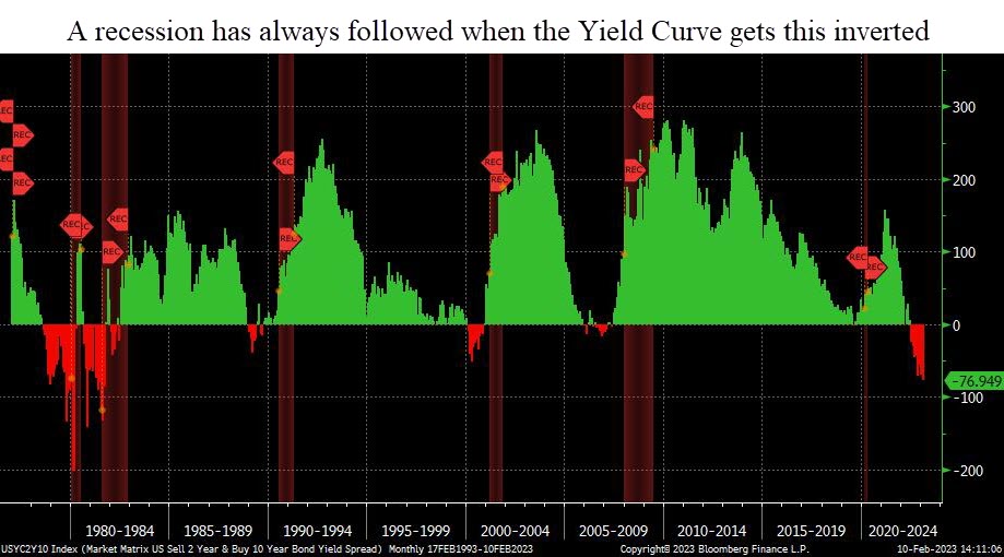
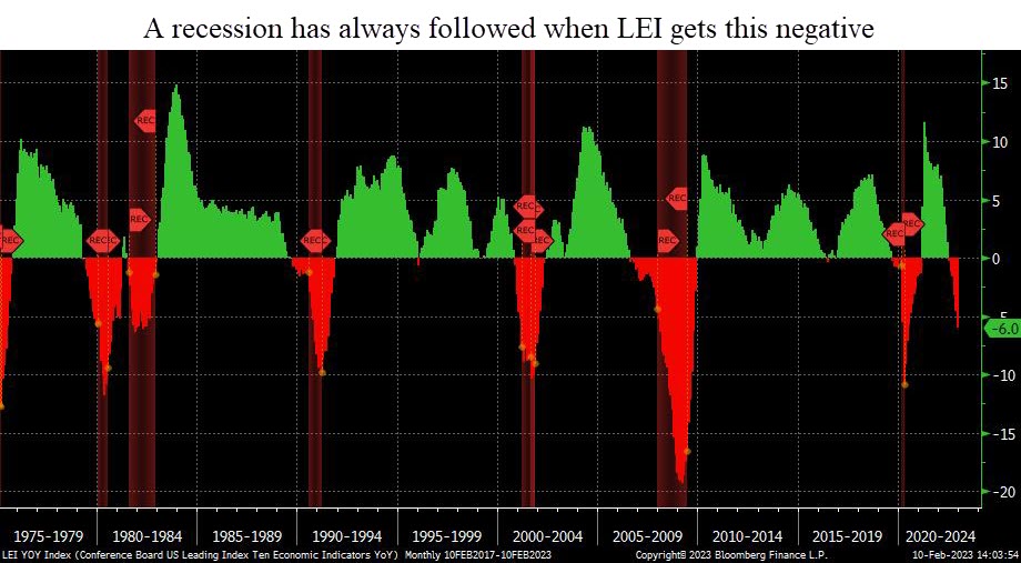
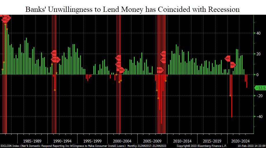
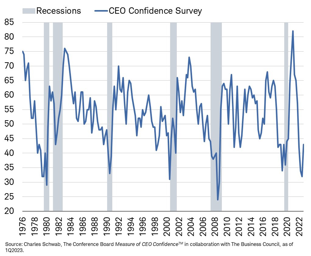
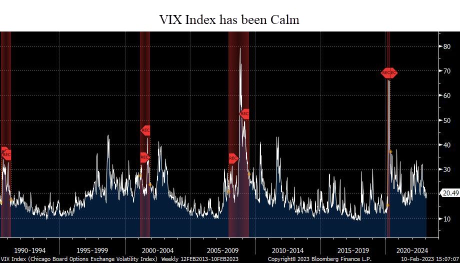
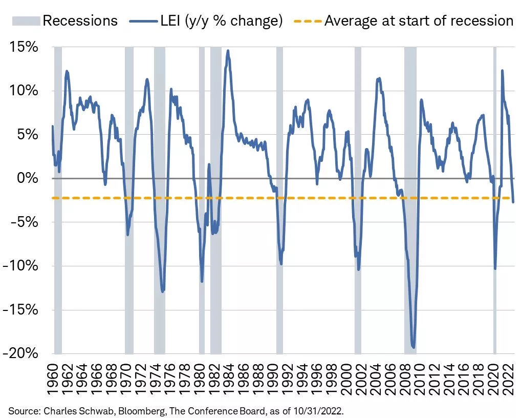
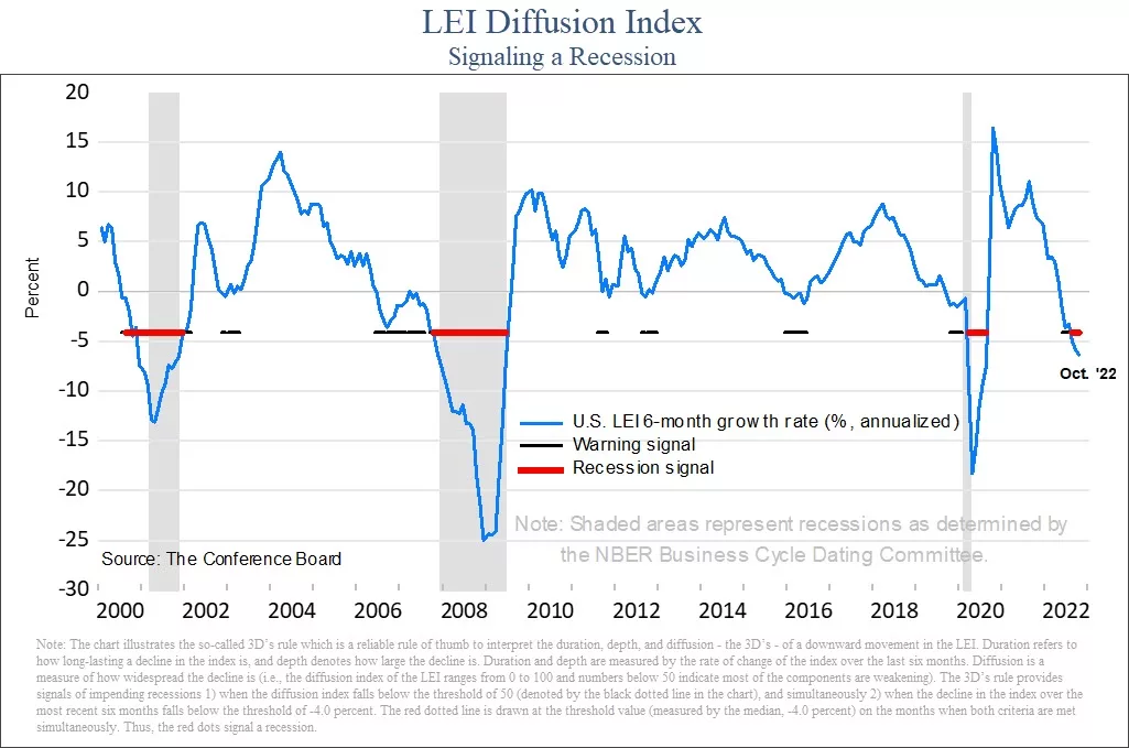
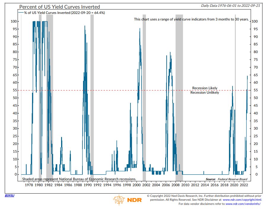
  • Recession probabilities (1:29)
  • S&P 500, Dow Jones & Russell 2000 (4:51)
  • Concentrated performance contribution YTD (8:48)
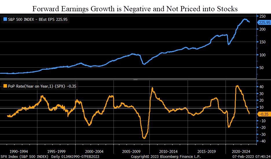
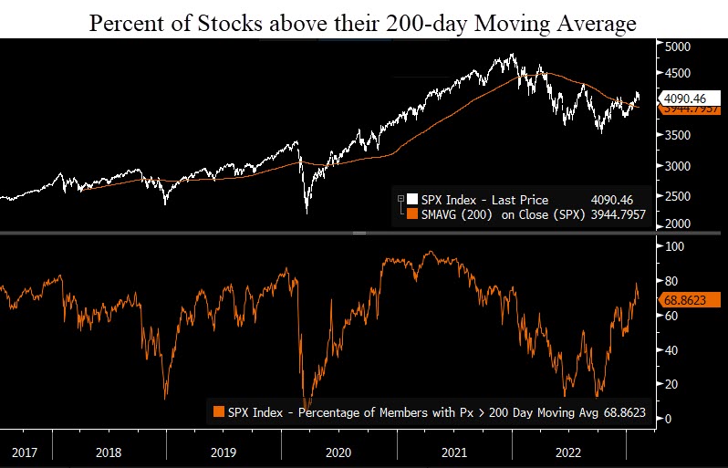
  • S&P 500 Index (10:11)
  • Russell 2000 small cap stock index (14:37)
  • Fed Balance sheet vs S&P 500 (16:14)
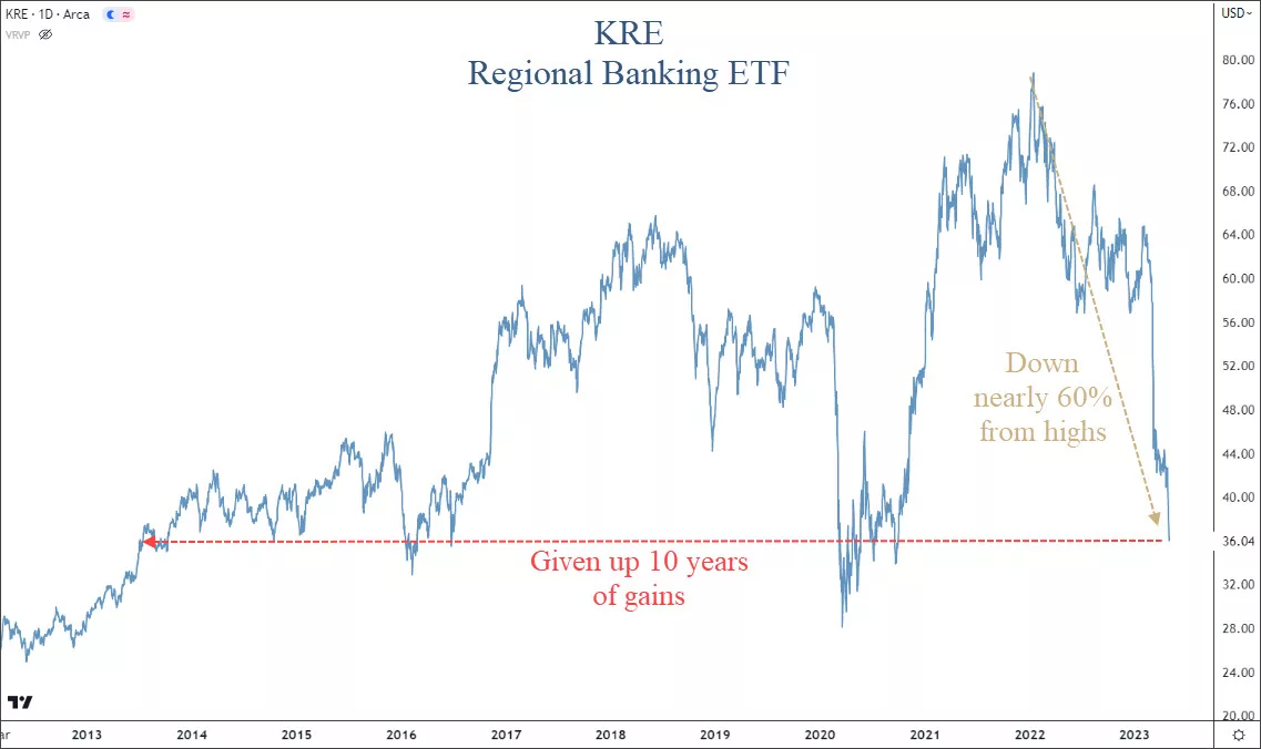
  • Banking stocks still under pressure (18:01)
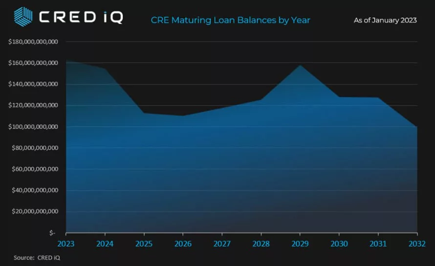
  • Commercial real estate loans maturing over the next 5 years (19:24)
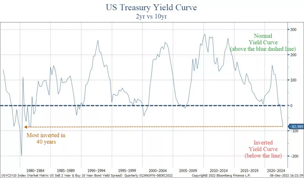
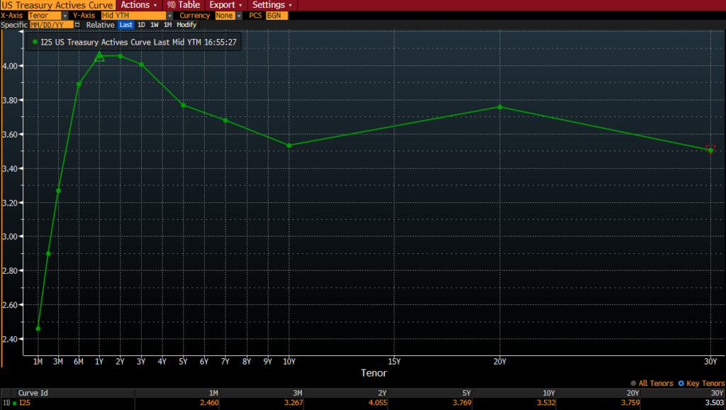
  • Yield curve (24:56)
  • Manufacturing PMIs and activity (29:10)
  • Portfolio Equity Positioning (31:27)
  • Scenarios, Risks & Opportunities (35:00)
  • Upside and Downside potential performance based on three scenarios (39:40)

Invest wisely!


Filed Under: Strategic Growth Video Podcast Tagged With: dow jones, economics, federal reserve, interest rates, manufacturing, markets, Russell 2000, S&P 500 Index, stocks, volatility

Debt Ceiling: More Smoke than Fire

May 17, 2023

image of old building on american banknote

Negotiations on the debt limit are heating up in Washington.

What implications may it have?

In our view, negotiations are mostly political posturing by both sides trying to gauge the likelihood that the “other side” will ultimately be blamed from bad things that may or may not happen as a result of not raising the debt ceiling.

Unfortunately, this political grandstanding is all too common.

Regarding the debt ceiling, agreements have always been reached.

We have thought for many months that the risk of an actual default on U.S. Treasuries is very unlikely. Neither side benefits from this, and both sides are likely to be blamed.

However, politicians are gonna politic.

It appears that our fearless leaders want to sufficiently scare us in order to get their faces on the front page of every newspaper around the globe while we wait for them to announce an agreement.

But we digress.

In order to better understand the situation, let’s look at the history of the debt ceiling first, then look at the potential impact on financial markets.

Debt Ceiling Overview

The debt ceiling was first implemented in 1917 with the passage of the Second Liberty Bond Act.

This was done to fund the war effort during World War I.

The goal was to provide a limit to the amount of debt the U.S. government can issue via treasury bonds while keeping Congress fiscally constrained.

For many years, this worked.

But over the past few decades, the debt ceiling has done absolutely nothing to restrain spending.

The chart below from the BBC shows the debt ceiling (black line) versus total outstanding federal debt. Republican presidents are shaded red while Democrats are blue.

It’s not hard to see that when debt reaches the debt ceiling, Congress simply raises it.

This is not a Democrat versus Republican thing. No one has fiscal restraint in Washington.

And despite “negotiating” spending limits nearly every time the debt limit is raised, there has been exactly zero reduction in spending during any administration, regardless of which party is in power.

We’ll discuss 2011 more below, but part of the deal to raise the debt limit then was that Congress projected over $2 trillion in savings over the next ten years.

What happened?

Debt increased by nearly $20 trillion.

Any talking points from a deal in 2023 is likely to be just that…talking points.

Previous deals to reduce spending failed. Why would this time be any different?

What are the potential market implications if a deal does or doesn’t get done?

Potential Market Implications

When looking at potential market implications with any type of event, it is most important to look at the actual data.

Since 1980, there have been 74 debt limit increases.

Only one of them truly resulted in major market volatility: 2011.

The vast majority of the time, the debt limit does not have any meaningful impact.

The next chart looks at the S&P 500 versus the statutory debt limit.

The orange line is the debt limit and the white line is the S&P 500.

It’s pretty easy to see that periods of volatility did not necessarily correlate to debt increases:

  • During the tech bubble, the debt limit remained flat. This was also the last time Washington was fiscally conservative.
  • The debt limit was increased in 2008, but that obviously was not the cause of the financial crisis.

In fact, you could argue that the markets and the debt limit are positively correlated. This means that when the debt limit goes up, so does the market.

As we mentioned earlier, the only real exception was in 2011.

What happened to asset prices then?

The next chart shows performance of various assets during and after the debt crisis in 2011.

This chart shows asset performance from May through December of 2011, and includes long-term treasury bonds, the broad bond market, large-cap stocks, and small-cap stocks, developed international stocks, and emerging market stocks.

The vertical red dashed line is the date when President Obama and Congressional Republicans finally agreed on an increase. At the same time, U.S. debt was downgraded from AAA to AA for the first time in history.

A few interesting observations from this chart:

  1. Volatility didn’t start until AFTER an agreement was reached.
  2. Ironically, the best performer by far was long-term U.S. treasury bonds.
  3. International stocks performed the worst, with developed and emerging markets both down over 25% through year-end.
  4. The S&P 500 index was down 12% in the months following the debt increase.

The other thing to note about 2011 is that the Fed ended QE2 in July of 2011. So there was a natural headwind from reduced Fed liquidity at the time of this volatility.

There are similarities between then and now:

  • Republicans won a mid-term election the year before.
  • The Fed is in tightening mode.
  • Political divisiveness is high.

Maybe we see a replay of the 2011 situation.

We hear many pundits saying that treasury bond prices will plummet if a deal isn’t reached. Others are saying that markets will crash.

But probabilities suggest otherwise.

Like most political events, this one is likely to have a very short-term effect on markets.

Bottom Line

By all indications, a deal to raise the debt ceiling is close.

But even if it extends out another few weeks, the likelihood that the U.S. defaults on its debt payments and a global catastrophe follows is extremely low.

Any reaction by financial markets, whether positive or negative, is likely to be temporary.

After that initial reaction, markets will go back to looking at data as if nothing happened.

Right now, data is extremely mixed.

Economic indicators are weakening, but overall, the stock market has remained very calm.

As we’ve said for months, risks from an economic standpoint remain very high. This week alone, JPMorgan and Goldman Sachs both announced that a recession this year is highly likely. We agree.

Without question, volatility will increase if negative economic events occur.

But don’t expect the debt ceiling to be culprit.

Invest wisely!


Filed Under: IronBridge Insights Tagged With: debt ceiling, debt limit, federal reserve, interest rates, volatility

Et Tu Brute

May 4, 2023

In Shakespeare’s famous play “Julius Caesar”, a group of conspirators gather in the Roman Senate to assassinate the emperor.

Brutus was one of Caesar’s most trusted confidants.

He and the other murderers pull their swords and stabbed him to death on the Senate floor.

With his dying breath, Caesar looks on in shock and betrayal and utters the words “Et tu Brute”.

Across the country today, regional bank CEOs must feel the same betrayal.

Yesterday, the Federal Reserve raised rates an additional 0.25%.

The Federal Reserve is supposed to be the banking system’s most adamant supporter.

After all, their primary job is “financial stability”, and they are considered the “lender of last resort”.

Yet, they inexplicably betrayed the entire banking system with another unnecessary rate hike.

In the midst of an obvious banking crisis, Chairman Powell referred to the banking system as “secure and resilient”. In the past month, we’ve had 3 of the 4 largest bank failures in history. Ah yes, the epitome of strength and resilience for sure.

The primary problem in the banking system right now are deposit rates versus safe alternatives.

This banking crisis is NOT over by any means.

In fact, risks right now are higher than we’ve ever seen them.

Let’s look at the Fed, Regional Banks and the Commercial Real Estate market to assess risks.

The Fed’s Last Hike

In their meeting yesterday, the Fed left the door open to additional interest rate hikes.

Let’s be clear. We believe there is NO REASON for the Fed to hike again.  Whether they will or not is anyone’s guess.

They have yet to explicitly acknowledge it, but inflation is no longer the problem.

They are fighting a banking crisis that it nowhere close to being over.

Instead of pausing, Chairman Powell felt he had to project confidence in the financial system.

He was faced with a difficult choice:

  • Don’t raise rates, and risk markets interpreting that as fear over the health of the banking sector;
  • Raise rates, but risk making the banking crisis worse.

Powell woke up and chose violence.

In the world of instant public relations campaigns, not raising rates would have been an admission that the financial system has major problems.

Even if the system is weak, they can’t let the market perceive that they think the system is weak.

But if they raise rates (like they did), they all but guarantee more stress on the banking system by boosting rates on money markets, increasing the risk of deposit flight.

And if banks try to raise rates to slow the deposit outflow, they destroy any profitability they had.

In the end, the Fed decided to roll the dice and increase rates again.

Unfortunately, this will likely prove to be an incredibly poor decision.

In fact, markets are now pricing in a 15% likelihood that the Fed will CUT rates at their meeting in June. Not next year, but next month.

The chart below shows the implied Fed Funds rate through January of 2024.

The blue line (and left side of the chart) is the expected interest rate on the date along the x-axis. The orange bars (along the right side of the chart) is the number of expected cuts by next January.

Fed Funds implied interest rate for the remainder of 2023. Number of rate cuts and projected interest rate decreases.

Markets expect 4.5 interest rate cuts this year, and the rate to go from 5.25% down to 3.9%.

This is quite extraordinary given that the Fed raised rates YESTERDAY.

It firmly implies that markets think the Fed made a huge mistake with this recent hike and that the economy is about to be very bad.

Let’s turn our attention to the regional banks next.

Regional Banks

Regional bank stocks are suffering massively.

3 of the 4 largest bank failures in history have occurred in the past month, and there are more to come, likely this weekend with Pac-West Bank. It won’t be the last.

The next chart shows the ticker KRE, which is an ETF comprised of regional banks.

Regional bank stocks are down almost 60% since their highs last year.

They have also have given up ten years of gains. This is simply astonishing.

What this tells us is that the market thinks the banking crisis is much more urgent and important than inflation.

We agree.

Commercial Real Estate

Economic data is weakening. Fast.

Bank lending is one of the biggest contributions to economic growth. We live in a time where loans are the backbone of the US economic engine.

There has been more than $2 trillion of outflows from smaller banks over the past month.

If you are a bank CEO, do you think you would be aggressively handing out loans right now?

No.

You’re keeping all the reserves you can, hoping your customer base is loyal.

Lending standards were tightening before the banking crisis began. Now that it is accelerating, the problems will begin to spread.

The biggest area of concern for us is in commercial real estate.

Let’s look at some stats:

  • 67% of all commercial real estate loans were made by smaller banks.
  • 83% of all CRE loans are balloon notes. This means they mature and the owner is forced to do something (refinance or sell the property).

In the next two years, over $300 billion of CRE loans mature, as shown in the chart below from CRED IQ.

We must keep in mind that commercial real estate is a diverse market, and not all properties are created equal.

There are some areas of strength:

  • Manufacturing facilities are moving back to the U.S. from overseas, creating support for industrial space.
  • Grocery-anchored shopping centers (with an HEB for example) are doing quite well.
  • Senior-housing facilities are poised to benefit from aging demographics.

But these are relatively small areas in the CRE market.

Currently, these smaller and mid-size banks are dealing with a liquidity crisis.

They may start to face problems with their balance sheet. This would be an entirely different ballgame.

Bottom Line

Risks are incredibly high right now.

Despite that, markets have been relatively calm.

The next few months are perhaps the most important months of the past decade.

If we can get through them with relatively little damage from an economic and earnings standpoint, there is a chance that we avoid some very bad scenarios.

Until then, it is appropriate to err on the side of caution.

IronBridge clients continue to be extremely below their target risk, with elevated holdings in cash equivalents and various short-term high-quality fixed income holdings.

We anticipate that will continue, but as always we will continue to monitor markets for signals to add risk where appropriate.

Please do not hesitate to reach out with any questions.

Invest wisely!

Filed Under: IronBridge Insights Tagged With: bank run, banking crisis, commercial real estate, fed funds rate, federal reserve, interest rates, jerome powell, markets, volatility

Bank Run: Silicon Valley Bank Goes Under

March 10, 2023

D315TT It's a wonderful life. Image shot 1946. Exact date unknown.

Today, Silicon Valley Bank became the second largest bank failure in US history. What happened and what does it mean going forward?

Who is Silicon Valley Bank?

  • Silicon Valley Bank, or SVB, was the 16th largest bank in the US.
  • This was the second largest bank failure in US history.
  • Based in Santa Clara, California, they focused on startups, founders and private equity investors.
  • Frankly, this was a great bank with fantastic employees, seemingly well capitalized, that went under incredibly quickly. So what happened?

How did SVB get into this Situation?

In order to fully understand the events that transpired this week, we first need to look at the past few years.

The roots of their collapse started in 2021. Their deposit base jumped from $61 billion at the end of 2019 to $189 billion at the end of 2021.

When banks bring in deposits, they have to do something with them.

Like all banks, the goal is to lend the money out, and earn profits by charging higher interest rates on loans than what they pay on deposits. This difference is called “Net Interest Margin”, or NIM. Banks charge you 6% on a loan, and they pay you 0.5% on your cash. Voila, they earn 5.5% in NIM.

Because their deposit base grew so quickly, they couldn’t underwrite enough loans to put that money to work. In order for them to earn a higher yield on their customers’ deposits, they purchased over $80 billion worth of Mortgage Backed Securities, or MBS. These are financial instruments similar to bonds that are made of up of many different mortgages.

97% of the MBS they purchased had maturities of longer than 10 years. These were purchased before interest rates began to increase last year. (This is important.)

Why did they Go Under?

When banks buy securities with customer deposits, they have to put them in one of two buckets: 1) Available-for-Sale, or 2) Hold-to-Maturity.

Available-for-Sale assets must be “marked-to-market”. This simply means they report the current market value of each investment they hold, just like you see on your investment statements each month.

Hold-to-Maturity securities, on the other hand, don’t have to be reported that way. If you bought your house for a million dollars, and the value fell, you could still report the value as a million dollars.

The $80 billion of MBS were held in the Hold-to-Maturity bucket.

Last year, when interest rates rose so dramatically, the value of these securities fell. A lot. They lost billions of dollars. And because SVB had longer-maturity securities, they fell more that shorter-duration ones would have.

This week, they had to sell at least $21 billion of assets to meet withdrawal requests after depositors essentially made a run on the bank.

Once Hold-to-Maturity assets are sold, any gains or losses must be disclosed and reported. The sells they had to make this week resulted in a nearly $2 billion loss.

Between the MBS losses and continued customer withdrawals, the bank was forced into receivership by the FDIC.

What Does it Mean for You?

First, recognize what a bank deposit really is. Banks do not have a safe where they keep your money.

The following clip from “It’s a Wonderful Life” perfectly exemplifies what really happens when depositors want to withdraw money from a bank. (Fast forward to 3:50 in the clip to view the most relevant part.)

Banks don’t keep your funds. They lend them out, and invest it, and do other things to make themselves a profit.

As George Bailey says, “You’re money is not here.”

Why do you think the new account agreement is so big when you open a new checking or savings account?

You are not an account owner of a bank account. You are a bank creditor.

You lend the bank your money.

They do with it what they want.

Now that people can earn a decent yield on short-term cash funds and US Treasuries, there is competition for those deposits.

This is a good reminder to pay attention to your deposits, especially now that there are good alternatives.

Is there Risk of Contagion?

Quite frankly, yes there is.

That doesn’t mean that other banks will definitely go under, but it is absolutely possible.

Smaller and regional banks are most at risk right now, but there is also risk to the broader markets.

We have long been saying that risks are incredibly elevated right now. This is a good example of what can happen when risks are high. Banks don’t tend to fail in bull markets.

In our opinion, the full effects of higher interest rates have not been felt yet.

This is a major example of the unintended consequences that can happen in a complex system like financial markets.

Portfolio Implications

IronBridge clients continue to be very underweight risk exposure right now.

We believe that risks will remain elevated at least through this summer, and you should position your portfolio for continued volatility.

We discussed the two most likely scenarios in our recent video from last week.

We further reduced risk this week for clients, and view any rallies attempts in markets as good opportunities to de-risk even further.

It is much better to not participate in short-term rallies than to participate in long-term declines.

As always, let us know if you have any questions.

Invest wisely!


Filed Under: IronBridge Insights Tagged With: bank run, federal reserve, interest rates, markets, risk, risk management, silicon valley bank, volatility

Recession Risks Remain High

February 10, 2023

Markets have calmed down quite a bit from the volatility of 2022.

This had led many people to believe that the worst might be behind us.

Maybe that is the case, but there are many data points suggesting we shouldn’t be too optimistic (at least not yet).

Let’s look at the data to see what it says.


Indicators a Recession is Near:

By far the bulk of the macroeconomic data is negative. In fact, many indicators suggest a recession is imminent.

While we haven’t seen anything bad happen yet, that doesn’t mean we’re out of the woods.

There are major economic drivers of the US economy that are flashing warnings signs:

  • Yield Curve
  • Leading Economic Indicators
  • Banks’ Willingness to Lend
  • CEO Confidence
  • Forward Earnings per Share

Let’s take a brief look at each of these items.

Yield Curve

The yield curve shows interest rates at various maturities.

When longer-term bond pay more interest than shorter-term ones, the yield curve is “normal”.

However, when shorter-term bonds pay more, the curve is “inverted”.

An inverted yield curve has a 100% success rate in predicting recessions. Currently, the curve is inverted, as shown on our first chart below.

A recession has always followed when the yield curve has been this inverted.

On average, a recession begins within 12-18 months after the initial inversion. This happened one year ago.

If history is any precedent, a recession should start by this summer.

Leading Economic Indicators

The Leading Economic Indicators (LEI) is a measurement of ten data points on the earliest stage of economic activity.

Right now, LEI is very negative. In fact, every time LEI has dropped this much, a recession has followed.

This next chart shows the LEI index. Green shows positive year-0ver-year growth, while declines are in red. Recessions are shown in the red shaded areas.

Typically, a recession starts 7-8 months after LEI growth drops by 3% year-over-year. This happened in December.

If history is any precedent, a recession should start by this summer.

Tightening Lending Standards

Banks are tightening lending standards and access to credit.

The US economy is driven by debt. When banks tighten, the economy slows.

Except for 1994, every time bank have pulled back on their willingness to lend money, a recession starts within months.

This suggests that we may already be in a recession.

CEO Confidence

Corporate CEOs have access to real time economic data on how their company (and more broadly the overall economy) is performing.

When CEO confidence falls, recessions typically follow.

Earnings Growth

The previous data points are all macro-economic data points.

The next has to do directly with stocks.

If we do enter a recession, corporate earnings will decline. In fact, we’re already starting to see that.

All of the data points above suggest risks in financial markets remain very high over the next few months.

However, there are data points telling us a recession may not be quite as likely.

Indicators Suggesting a Recession is Less Likely:

While the bulk of the data is poor, there are some data points suggesting that a recession may not be imminent:

  • The US Consumer has been Resilient
  • Light Vehicle Sales are Steady
  • Employment Numbers aren’t Bad
  • VIX has remained low
  • Market Breadth is Improving
US Consumer Spending

70% of the US economy is dependent on the consumer.

If the consumer can remain resilient, then there still remains hope that we will avoid a recession (or at least have a mild one).

The next chart, courtesy of Bank of America, shows that consumer spending increased in January.

This is an important indicator to watch over the coming months.

Light Vehicle Sales are Steady

Another indicator showing that the consumer is resilient and there is still overall demand in the economy can be seen in vehicle sales.

Light vehicles include almost every consumer auto. This categorization includes all cars and trucks weighing less than 10,000 pounds. (For reference, the maximum curb weight of a Ford F-150 is about 5,600 pounds.)

While this chart doesn’t necessarily show excessive strength, it also doesn’t show weakness either.

Employment Numbers Remain Strong

One of the most widely watched economic indicators is the unemployment number.

The chart below shows jobless claims. So far, unemployment has remained resilient.

This is very closely tied to the consumer spending data we mentioned above. When people have jobs, people spend money. Especially when prices are higher on just about everything they buy.

We’ve all heard of the layoff announcements by the Tech giants Amazon, Microsoft, Apple, Google, Microsoft, and more. These are concerning, and could be the tip of the iceberg.

But for now, those layoffs have not spilled over to the broader economy. At least not yet.

This is another data point we will watch with great interest in the coming months.

VIX Index

The VIX has reflected the relative market calm over the past few months.

While each recession has had a spike in the VIX, not every spike in the VIX has lead to a recession.

The VIX is a relatively fickle index, and there is little to no predictive power in it. But it does tell us that despite the high economic risks right now, the market is not overly fearful.

Market Breadth

The last chart we’ll discuss has to do with market breadth.

In order for the overall market to move higher, its underlying constituents need to be doing well.

And in the past few weeks, there has been improvement.

This chart shows the percent of stocks within the S&P 500 that are above their respective 200-day moving average. (This is simply the average price of that stock over the past 200 days.)

The current reading is 68%. This is a healthy number. While this number in isolation doesn’t give us an “all-clear” to invest, it is a good sign.

Bottom Line

Despite recent market strength, risks remain incredibly high.

At this point, it appears that the rally we’ve seen this year is another bear market rally.

The next few months are very critical. If a recession hasn’t started by mid-year, then the Fed very well may have manufactured a “soft landing”.

Client portfolios remain conservatively positioned, as they have been for the past 8-9 months.

The further we get into this year without bad things happening in the market, the better the overall risk/reward profile of this market becomes.

We’ll publish a video in the coming weeks to discuss the specific scenarios we see happening over the coming months.

Until then, please do not hesitate to reach out with any questions.

Invest wisely!


Filed Under: IronBridge Insights Tagged With: economy, federal reserve, growth, leading economic indicators, markets, recession, sales, stock market, volatility, yield curve

Scrooged?

December 12, 2022

stern looking mature man in victorian costume carrying a cane  . Model is wearing a dark suit , top hat, glasses and prosthetic make up , the look created is also similar to a  Dickens victorian type character .

Men’s courses will foreshadow certain ends, to which, if persevered in, they must lead,” said Scrooge. “But if the courses be departed from, the ends will change.”

charles dickens, “A christmas carol”

In Charles Dickens’ famous book, A Christmas Carol, Ebenezer Scrooge begins the story as a mean-spirited and angry old man.

But he undergoes a transformative experience that changes him into someone who cares for others and embraces the spirit of giving.

The quote above by Mr. Scrooge is not the easiest quote to read.

If we paraphrase it, it may read something like this:

“If you go down a dangerous path, bad things will probably happen. But if things change, they might not be so bad after all.”

Currently, equity markets are trying to show more of a giving spirit like that of the transformed Scrooge.

But there are still MAJOR macro-economic signals with a grumpy, “old-Scrooge” like demeanor.

But will they will turn into positives in the coming months?


Grumpy Scrooge

First, let’s look at the more concerning indicators.

Specifically, there are three data points worth watching that are showing elevated risks for 2023:

  1. The Inverted Yield Curve
  2. Leading Economic Indicators
  3. Money Supply (M2)

These indicators tend to be excellent predicters of recessions when they turn negative.

And right now they are VERY negative.


Inverted Yield Curve

The yield curve is simply what a specific investment instrument yields at different maturities.

To understand the current yield curve environment, think of it like this:

Let’s say you want to invest in a Certificate of Deposit at a bank. You speak to a banker, and ask for the rates on a 2-year CD and a 10-year CD.

Logically, you expect the 10-year CD to be at a higher interest rate. You are, after all, committing funds to the bank for a decade.

But the banker tells you that the 2-year rate is paying 4.6%, while the 10-year rate is only 3.8%. This is an “inverted” yield curve.

When the yield curve on US Treasuries inverts, it has been the single best predictor of a recession in the past 100 years.

Right now, the yield curve is more inverted than anytime in the past 40 years.

The chart below shows the difference between a 2-year US Treasury bond and a 10-year one.

US Treasury yield curve is the 2-year yield versus the 10-year yield. It is currently inverted by the most in nearly 50 years, signaling a deep recession is likely in 2023.

When the line is above zero, the curve is “normal”. Below zero and it is “inverted”.

The past three times the yield curve was inverted was in 2008, 2000 and 1987. It became inverted before the markets had extreme stress, and each time led to a recession and tremendous market volatility.

This chart above only goes back to the 1970’s, but it’s the same well before that as well.

The depth of this inversion is worrisome too.

At roughly 0.83%, this is a very steep inversion, and one that is signaling not just a recession, but a deep one.


Leading Economic Indicators

Another key data point to monitor is the Leading Economic Indicator Index (LEI). We discussed this in our Thanksgiving report (read it HERE).

The LEI is another excellent recession predicter.

It’s so good, in fact, that EVERY time in the past 70 years we’ve seen the LEI at these levels a recession has followed.

The chart below, courtesy of Charles Schwab and Bloomberg, shows that the negative LEI is below the average level where recessions begin.

Schwab Bloomberg leading economic indicators showing negative data and at a level below where recessions typically begin.

LEI is telling us that a recession is imminent (unless this time is different, which is a dangerous assumption in financial markets).  But LEI is not a good timing tool…it does not tell us when a recession might begin.

It only tells us that one is close. 

And the rate of change does in fact suggest that a recession is likely to be worse than “mild”.

Another way to look at LEI is to look at the diffusion of the data.

Diffusion measures how widespread any strength or weakness is within the data. In the next chart, the diffusion index ranges from -50 to 50.  A reading below zero tells us that the majority of the data is weakening. 

Leading economic indicators diffusion index has an active recession signal.

When the diffusion index is below zero, it is indicating that a majority of the underlying data is weakening.  A reading above zero tells us the opposite, that most data is improving. 

When the diffusion goes below zero, it is a warning sign that economic trouble could be happening.  But a recession has not followed every time diffusion has turned negative.

Only when the index gets to minus-4 has it signaled that a recession is imminent.  The index is currently at minus-6. This is another excellent predicter of a recession, and it tells us that one is very likely to occur in 2023.


Money Supply (M2)

Another important, but little discussed aspect of financial market performance is the money supply.

There are various ways to measure the overall supply of money in a society. One of the broadest definitions is called “M2”. It measures the total amount of liquid funds in cash or near cash within a region.

This number includes cash, checking deposits and non-cash assets that can easily be converted into cash, like savings accounts and money markets.

If you’d like to learn more about M2, Investopedia has a nice article about it HERE.

M2 has a very high correlation to inflation. More accurately, changes in M2 have a very high correlation to inflation.

The next chart shows this phenomenon, courtesy of our friends at Real Investment Advice in Houston.

The black line is the year-over-year change in M2 (moved forward 16 months), while the orange line is CPI.

M2 is telling us that inflation is likely to head much lower in the coming 12 months.

On the surface, this would appear to be a good thing. After all, isn’t inflation one of the problems that markets face right now?

Maybe it is a good thing.

But the real problem is the extent of the decline.

After a massive increase in M2 during COVID, the rate of change has collapsed.

The problem arises in how big this decline has been.

It is not signaling that inflation should moderate. It suggest that inflation may turn into outright deflation.

The only way this happens is if we enter a moderate-to-deep recession. When major data points align like these three do right now, we must pay attention.


The New, More Giving Scrooge

While there are plenty of reasons to believe that 2023 is going to be a bad year again for stocks, not everything is bad.

Let’s look at some good data points right now:

  • The consumer remains strong. Shoppers spent a record $5.29 billion this Thanksgiving, an all-time record high. Yes, inflation had some to do with this, but at this point inflation is not having a meaningful impact on the consumer, at least; not yet.
  • Unemployment is low. The unemployment rate remains below 4%, primarily due to the services sector being strong.
  • Inflation is slowing some. CPI for October came in at 7.7%, below estimates of 7.9%. November’s CPI data will be published tomorrow. As we can see from the M2, we should expect inflation to slow in the coming months.
  • The Fed may be close to pausing. The market is anticipating a 0.50% increase at their meeting next week, with an additional 0.25% at their February meeting. Currently, markets expect that to be the end of interest rate increases for now. Historically, when the Fed Funds rate gets above the 2-year treasury yield, the Fed pauses interest rate increases. This will likely happen this week, so they very well could be done raising rates for a while.

Unemployment is a big data point here. Once the unemployment rate starts to rise, it has a direct impact on spending.

And consumer spending is roughly 70% of the US economy.

The main problem with looking at unemployment and other actual economic data is that they are backward-looking.

Once unemployment increases, we are already likely in a recession (even if it is not officially announced yet).

Which makes the forward-looking data points that much more important to consider.


Bottom Line

Despite the recent calm in markets, this is not a time for complacency.

Over the past 50 years, every time markets were volatile and NOT in a recession, NONE of the three indicators listed above were negative.  

Now, all of them are negative. And all of them were negative prior to recessions.

This tells us that the likelihood of a recession next year is extremely high. In fact, the data suggests that it should be more of a question about the extent of the decline, not whether one occurs.

Fortunately, it is not a foregone conclusion that a recession will be deep and painful. There is still plenty of time for things to change into something more positive.

Hopefully, this angry Scrooge-like data will transform to be something less angry and more joyous towards everyone.

But as we always say, hope is not an investment strategy.

For now, we must deal with the realities of the environment at hand.  And the current environment has major risks that should not be ignored.

Invest wisely!


Filed Under: IronBridge Insights Tagged With: economics, federal reserve, GDP, inflation, investing, leading economic indicators, LEI, markets, money supply, portfolio management, volatility, wealth management, yield curve

Are We There Yet?

October 14, 2022

Looking into the back of the car at two children passengers passing the trip away teasing and crying.

We’ve all been there. (At least those of us with kids have been.)

The start of a long road trip. Everyone is excited to get going. Then you get 8 minutes into an 11-hour drive, and you hear the famous words emanate from the backseat…”Are we there yet?”

We’ve all been through bear markets too. (Although it’s been 15 years this month since the last real one began.)

Yesterday, markets had one of the largest reversal days in history.

Which begs the question…”are we there yet?”. Is this bear market over?

SPOLIER ALERT…the answer is pretty clear…no, we’re not there yet.

What about that Giant Reversal Day Yesterday?

Inflation data for September was announced yesterday morning. The CPI came in higher than expected, at 8.2% year-over-year. Markets expected a reading of 8.1%.

Last month, the same thing happened. And markets fell over 3% on the day.

Initially, it looked like we were going to see repeat of the damage. Markets fell hard in the morning, and were down over 2%.

But by the end of the day, all major US stock indices were HIGHER by more than 2%.

On the surface, this would seem like a good thing.

Markets heard bad news but rallied on it.

This isn’t the first time the market has had a big reversal like this.

Our first chart shows the ten largest reversals when the the S&P 500 and the Nasdaq were each at respective 52-week lows, courtesy of SentimenTrader.

Largest 10 reversals from 52-week lows for the S&P 500 Index and the Nasdaq Composite Index. All events happened during major bear markets.

The red dots are times that this happened while the markets were in major bear markets.

What does this chart tell us about big reversals like we saw yesterday?

  • 16 out of 18 previous events (excluding yesterday) occurred during deep recessions.
  • 7 occurrences happened during the 2008 Financial Crisis
  • 6 occurrences happened during the 2001-2002 Tech Bust
  • All previous occurrences in the Nasdaq happened in 2001/02 or 2008. Both times the index lost over 60%.
  • None of these events occurred at the lows.

During 2008, these events actually happened before things really started to unwind.

For the S&P 500, reversals happened once in January and twice in September of 2008. After the occurrence in September of 2008, the S&P 500 fell another 46%.

Reversals on the Nasdaq happened throughout the fall of 2008.  After the first one occurred in September of 2008, the Nasdaq fell another 42%.

These events are not indications of hope. They are signs that things are broken.

Caution is still warranted.

High Inflation is not because of Supply Issues

Inflation is proving to be harder than the Fed expected to get under control.

By looking at the past 5 years, we can definitely see the spike in inflation in the US, as shown below courtesy of Bloomberg.

US inflation rate has been skyrocketing since the COVID lockdowns.

The low on this chart was during the COVID lockdown. It has skyrocketed since.

One major factor after COVID is that there were problems in the global supply chain.

The Baltic Dry Index is a measure of the cost of shipping containers across the globe. When it goes up, it means that there are supply chain issues and great demand for ships.

This index is shown in the next chart.

The spike in this chart in 2021 was when there were massive bottlenecks at ports across the globe. At one point there were hundreds of ships waiting to get into the port at Long Beach, California.

But this index has moved back to pre-COVID levels.

This suggests is that inflation is NOT due to supply constraints. At least not on a global level.

For the most part, things are moving quite normally across trading channels.

So why is inflation high?

Components of Inflation

To understand the inflation numbers, we must understand the various data points that go into the CPI number.

Here’s a helpful graph from the Pew Research Center that shows the various components of inflation.

Components of the US inflation rate index the Consumer Price Index or CPI. Shelter, food, transportation, education and medical services are the major components.

Shelter, food, education, transportation and medical care account for 74% of the CPI numbers.

None of these are showing signs of weakening yet.

It’s tough for the CPI number to get to their stated goal of 2% if the largest inputs continue to go up.

This is why the Fed is so focused on the housing market.

At 32%, it is more than double the next largest component.

Energy prices are a decent-sized component at 7.54%, but they would have to fall by 90% to get the CPI where the Fed wants.

So they are attacking home values.

What would make home prices fall?

People get laid off. They can’t afford their monthly payment. There are fewer buyers because interest rates are too high.

The Fed essentially has a goal of crushing lower and middle class Americans.

In our previous report, “A Recession or Not a Recession”, we discussed the belief that the housing market will be the key to whether we see a major recession or just a mild one. Here’s a link to that report:

A Recession or Not a Recession, That is the Question

We stand by this thought.

The housing market has been showing some minor indications of weakness, but nothing like what the Fed wants to see.

Bottom Line

We have been pretty clear for the past few months that it appears we are in a major bear market.

We don’t see any reason to abandon that point of view.

That said, we should expect some fierce bear market rallies. And ones that last longer than one or two days.

But as of right now, there is very little reason to expect that we are near a major bear market low.

As always, please do not hesitate to reach out with any questions.

Invest wisely!


Filed Under: IronBridge Insights Tagged With: Baltic Dry Index, CPI, federal reserve, inflation, markets, volatility

Don’t Fight the Fed

September 21, 2022

The Federal Reserve met today and increased interest rates by 0.75%, as expected.

Stock markets were volatile all day, and ended up down almost 2%. So maybe it wasn’t so expected after all.

As we have consistently said in communications over the past few months, risks are very high right now.

Today didn’t do anything to change that in either our signals or our minds.

We’ll keep it short and to the point today, and let charts do most of the talking, but let’s do a brief portfolio update first.


Portfolio Update

Client portfolios are VERY conservative.

We have continued to reduce equity exposure in all portfolios, and we have added equity hedges to portfolios as well.

If markets continue to fall, your portfolio should remain very stable. We cannot eliminate risk, so there will always be fluctuations. But we have minimized those to properly handle the current environment.

We firmly believe this to be the proper course of action at this point.

As always, markets can change. If we get signals to increase risk, we will not hesitate to do so.


Yield Curve

The Yield Curve remains inverted. This means that short-term rates are higher than longer term rates. The yield curve is more inverted than it has been in almost 50 years.

US Treasury Yield Curve is inverted

Why does the yield curve get inverted in the first place?

There are two main reasons:

  • Short-term rates are mostly set by the Fed. They have been steadily increasing rates all year.
  • Longer-term rates are set by the market. When there are concerns about economic weakness, money flows into longer-term treasury bonds.

Longer-term yields have been relatively stable the past few months, while short-term rates have risen dramatically.


Inverted Yield Curves Lead to Recessions

As we have mentioned numerous times this year, an inverted yield curve has been an excellent indicator of recessions.

The next chart shows the percentage of the yield curve that is inverted (blue line), with recessionary periods in gray.

The percentage of the yield curve that is inverted simply looks at various maturities and counts whether the short-term rate is higher than the long-term rate. (3-months vs 2-years, 3-months vs 5-years, etc.)

When more than 55% of the yield curve becomes inverted, it has ALWAYS preceded a recession. We are now at 65% of the yield curve that is inverted.


The Fed’s Dot Plot

This is a bit of a complex chart, but it shows how each member of the Federal Reserve Committee sees future interest rates.

This shows that the majority of Fed members believe they will hike rates to somewhere between 4.5% and 5.0%. The target rate is currently 3.00-3.25%. (They use a 0.25% range when setting the Fed Funds rate).

So we can assume that there is likely another 1.50-2.00% of interest rate increases to come. This would likely be another 0.75% at the next meeting in October, followed by slightly decreasing hikes (0.50% then 0.25% at the following two meetings).

Things can change, but this is a good gauge of their thoughts.

It is also interesting to note that almost every Fed member is then projecting rates to fall in 2024 and beyond.


When has the Fed Stopped Hiking Historically?

Historically, the Fed stops raising rates when the Fed Funds rate gets above the inflation rate. There may be some time to go before that happens.


Bottom Line

Today’s developments do not surprise us.

The Fed has been crystal clear about wanting to slow the economy, slow wage growth, and remove speculation from markets (meaning lower stock and home prices).

They re-emphasized that today in no uncertain terms.

The Fed wants prices to fall. Don’t fight them, you won’t win.

The downside scenarios are large enough that it still makes sense to reduce risk if you haven’t done so already.

As always, please do not hesitate to reach out with questions or to review your individual circumstance.

Invest wisely!


Filed Under: IronBridge Insights Tagged With: fed funds rate, federal reserve, interest rates, inverted yield curve, markets, volatility, yield curve

  • « Go to Previous Page
  • Go to page 1
  • Go to page 2
  • Go to page 3
  • Go to page 4
  • Go to page 5
  • Go to Next Page »

Footer

LET'S CONNECT

  • Email
  • Facebook
  • Instagram
  • LinkedIn
  • Twitter

AUSTIN LOCATION

6420 Bee Caves Rd, Suite 201

Austin, Texas 78746

DISCLOSURES

Form ADV  |  Privacy Policy  |  Website Disclosures

  • Home
  • Difference
  • Process
  • Services
  • Insights
  • Team
  • Clients
  • Form CRS
  • Contact Us

Copyright © 2017-Present by IronBridge Private Wealth, LLC. All rights reserved.