• Skip to main content
  • Skip to footer

IronBridge Private Wealth

Forward with Confidence

  • Home
  • Difference
  • Process
  • Services
  • Insights
    • IronBridge Insights
    • Strategic Wealth Blog
    • Strategic Growth Video Podcast
    • YouTube Channel
  • Team
  • Clients
  • Form CRS
  • Contact Us

volatility

The Bear Market is Accelerating

September 13, 2022

Stocks had the worst day since the depths of COVID after inflation data came in higher than expected.

We’ll discuss the following in this report:

  • Market Overview
  • What is the Reason for the Decline?
  • Portfolio Updates

Let’s get to it.

Market Overview

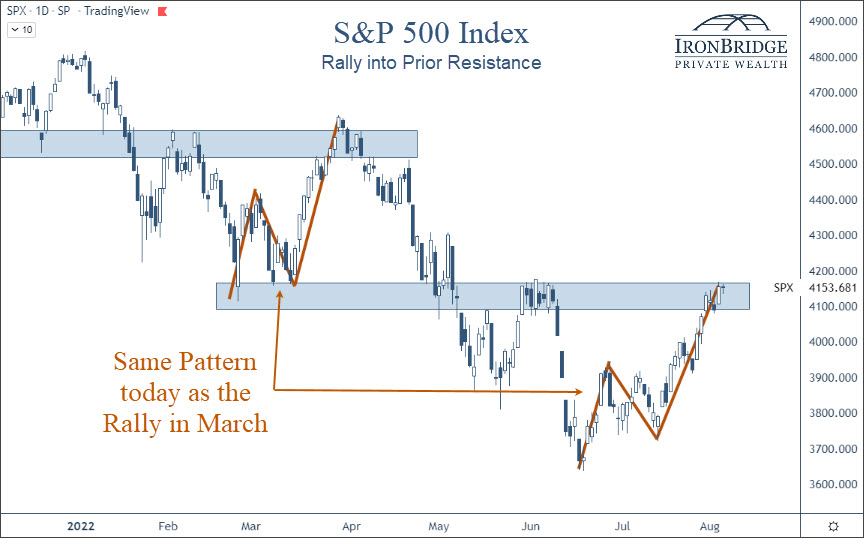
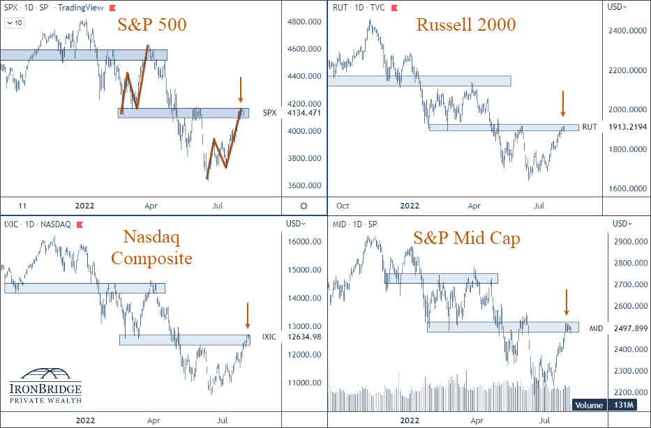
Major stock indexes had huge losses today:

  • S&P 500 Index: Down 4.3%
  • Dow Jones: Down 3.9%
  • Nasdaq: Down 5.2%

Wow.

These are the biggest daily losses in over two years.

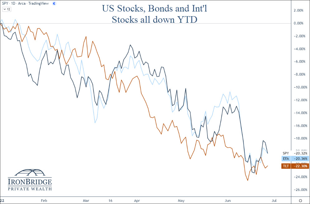
Bonds fell, international markets fell, commodities fell…everything was down.

This has not been a healthy market this year, and it looks to be worsening.

What is the Reason for the Decline?

The financial media is blaming inflation.

This morning, the Consumer Price Index (CPI) came in at 8.3% year-over-year, versus expectations of an 8% increase.

But do we really think the market would be up today if inflation was 7.9%? Is that 0.4% difference the real issue here?

We don’t think so.

Instead, we suggest that there is one main thing happening now: LIQUIDITY is being removed from the financial system by the Federal Reserve.

The strong rally in equity markets over the summer was based on the thought that the Fed would slow down the pace of interest rate increases.

This was wrong and illogical thinking.

The Fed has been very clear about this over the past three months.

They are actively trying to remove speculation from markets, in the attempt to reduce demand and drive down prices.

They WANT prices in the economy to fall. They WANT markets to fall. And they won’t stop until inflation is back down to 2%.

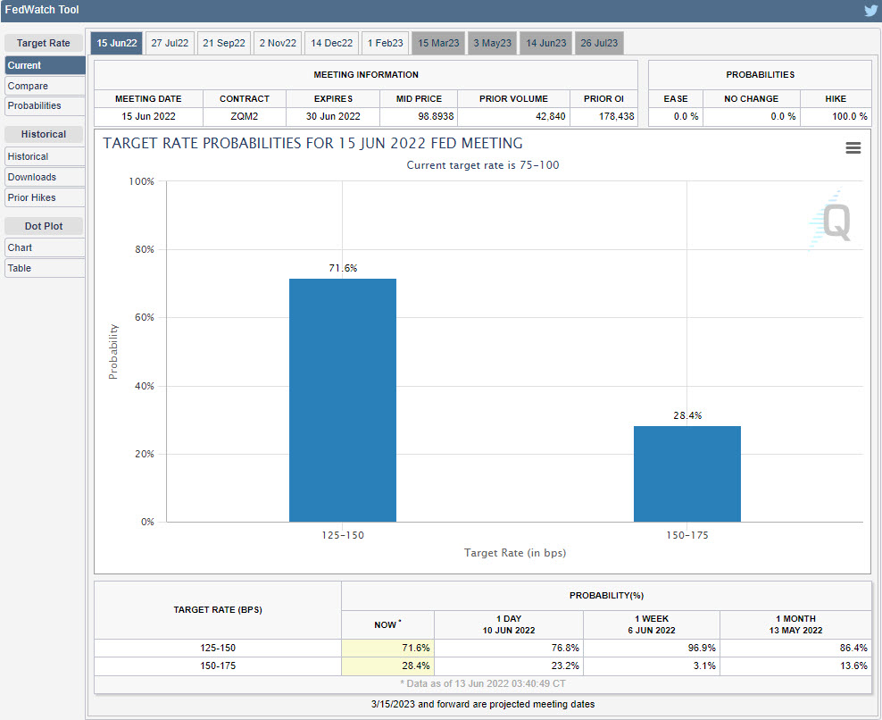
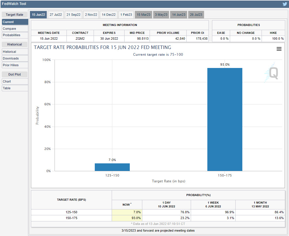
After today, there is a 100% chance that the Fed increases rates by 0.75% next week, with a 34% chance they raise a full one percent. They are not slowing down the pace of rate increases, they are increasing it.

The Fed also increased “Quantitative Tightening” this month. They are scheduled to remove almost $100 billion in liquidity from the financial markets in September alone.

The message in the 10 years after the 2008 financial crisis was “Don’t fight the Fed.” They were printing money like it was a monopoly game, with the goal of increasing asset prices to increase demand.

Now, we have the opposite environment, and the Fed is REMOVING assets from the financial system.

The natural result is decreased demand for risk assets.

But the message is still the same…don’t fight the Fed.

Portfolio Update

This year continues to be volatile, and we expect that to continue.

  1. As we shared in our video last Friday, the market is very volatile (obviously), and the outlook is uncertain. Two of our three highest probability scenarios include major declines in financial markets from here. The link to our video is below.
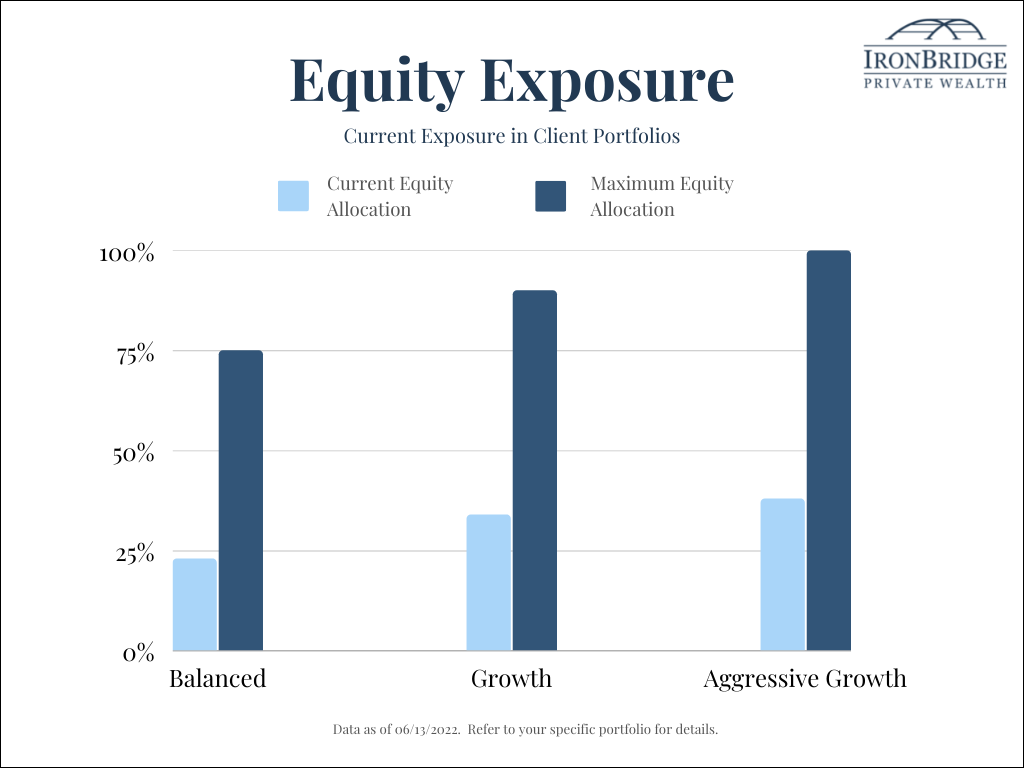
  2. We were already very defensively positioned in client portfolios with greatly reduced equity exposure and high cash and cash equivalent exposure. We increased cash exposure today as well.
  3. We see multiple scenarios where hedging positions will be included in client portfolios in the very near future. We also expect equity exposure to continue to be reduced from already low levels.

We discuss the following topics (followed by when they appear in the video):

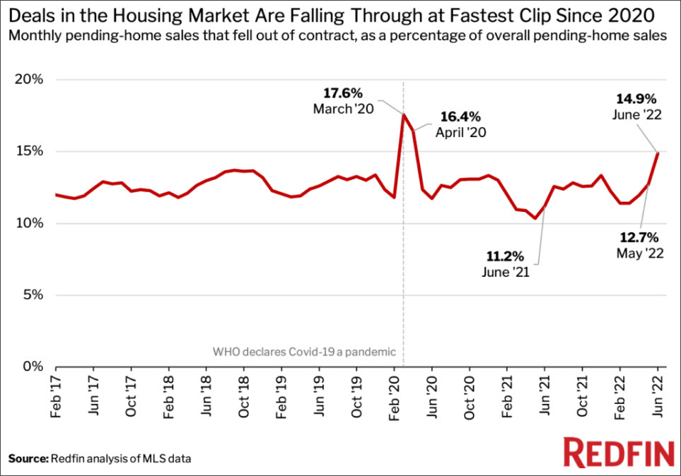
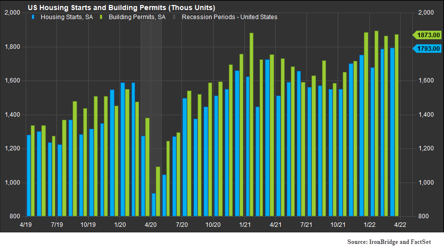
  • Why the real estate market may be the best indicator to watch
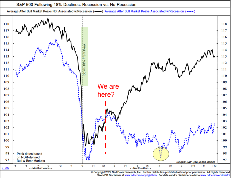
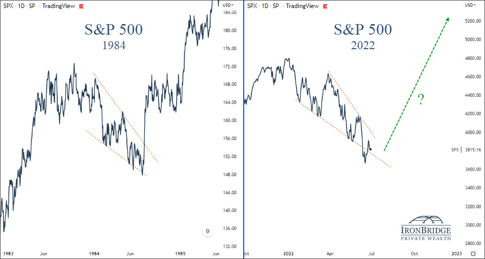
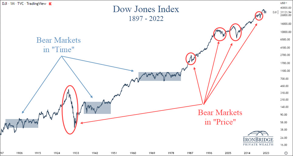
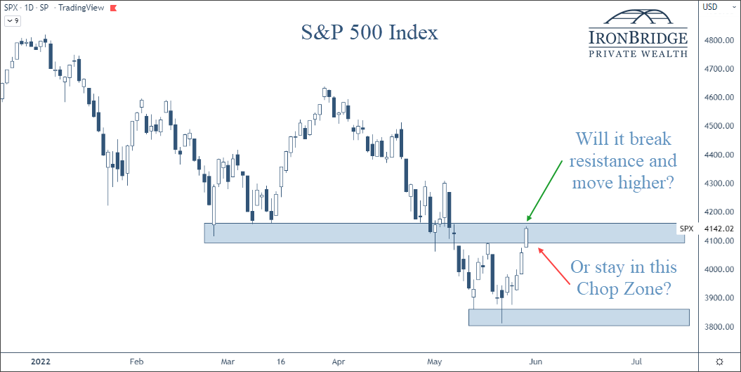
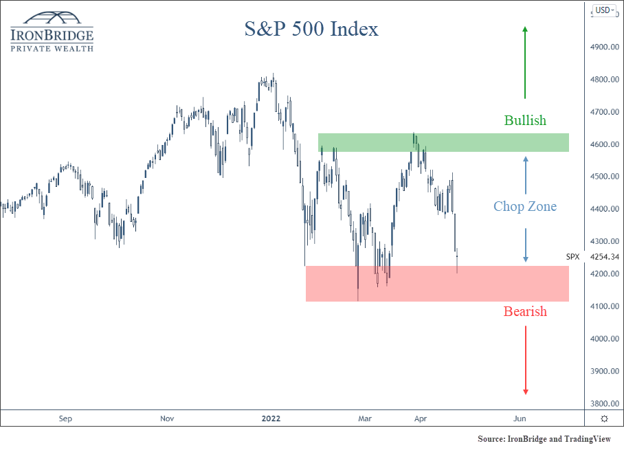
  • S&P 500 Overview (4:46)
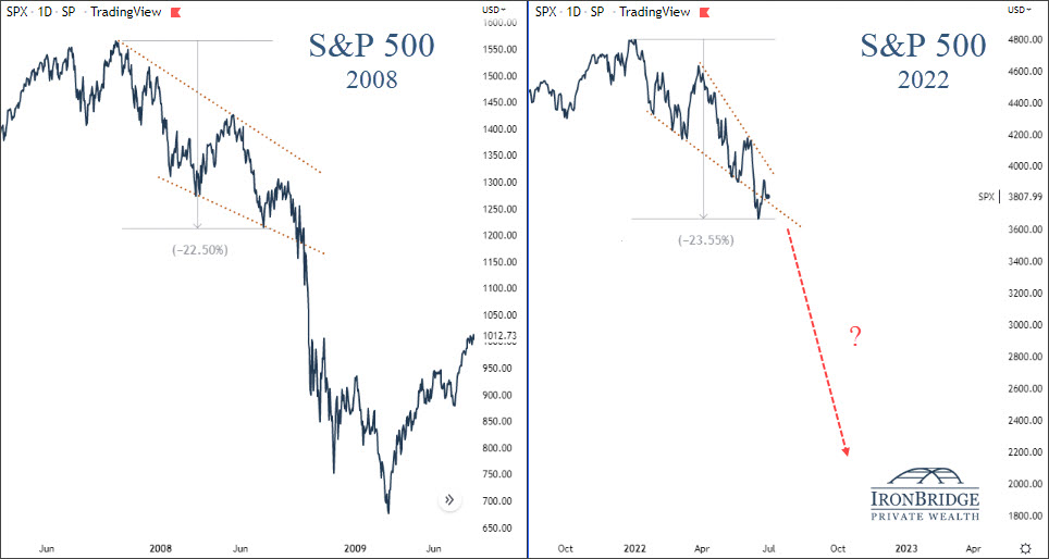
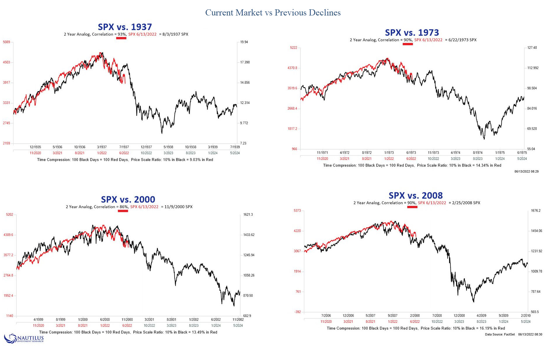
  • Similarities between now and 2008 (6:30)
  • Our top three potential market scenarios (8:15)
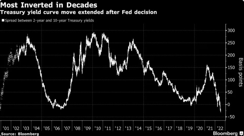
  • Yield Curve (12:06)
  • Commodities (13:05)

Bottom Line

This is not a time to be thinking about increasing allocations to stock. This is a time to be defensive.

This market environments could easily reverse higher, but the likelihood is that there is far more downside ahead.

We hope we are wrong. If we are, we will adjust accordingly.

In the meantime, the worst possible action is to do nothing, keeping large exposure to stocks and HOPE things get better.

Relying on hope in bear markets is the best way to make an investment mistake that could jeopardize your financial plan and your financial future.

As always, please do not hesitate to reach out with any questions.

Invest wisely.


Filed Under: Special Report Tagged With: federal reserve, inflation, interest rates, markets, volatility

Retiring in a Volatile Market: Control What You Can

August 23, 2022

Loving mature wife embracing husband from behind while writing in book. Happy middle aged couple making to do list of purchases and discussing future plans. Cheerful senior man working at home on wooden table with beautiful woman hugging him from behind, copy space.

Retirement during a volatile market is unsettling.

Whether you are on the cusp or have already made the leap, a market downturn’s impact on your savings will be felt now and potentially for years to come. How do you keep your plan on track and your desired lifestyle in place?

If you can’t control income, you’ll need to control expenses. And that means budgeting and taxes. You can deploy tactics and strategies to optimize these factors no matter what stage you are in on your retirement journey.

Set a Realistic Budget – And Stick to It

Lifestyle creep is real.

No matter how carefully you budget, somehow, the numbers on the spreadsheet don’t mean much when confronted with fun, deliciousness, seeing family, a quick weekend trip, or anything else. You get the idea.

A volatile market means that drawing income from investments will likely result in selling into a down market. This not only crystallizes the loss, but you may also have to sell greater amounts to make up for lower prices. This will hamper your recovery, and your assets may not grow as much over time.

Reviewing your budget to ensure you keep your spending at a level that is commensurate with your income is critical.

Plan Proactively to Reduce Taxes

Planning strategically for taxes can help you keep more of your income.

This can compensate for budget shortfalls or help you give long-term capital growth investments the time they need to recover. There are a lot of things you can do to keep yourself in the lowest possible tax bracket.

Maximize Tax-Free Social Security Income

Social security benefits have a tax-free component of at least 15%. Whether you pay taxes on the other 85% depends on your overall income level, but you can increase your tax-free income by maximizing your benefits.

Waiting until age 70 to claim increases your annual benefit by 8% for every year from your full retirement age (FRA). If you are married, it may make sense for the spouse with the highest income level to wait until age 70, while the lower-income spouse claims at early or full retirement.

Deploy an Asset Location Strategy

Asset location refers to the types of accounts where you hold investments. They are tax-deferred such as 401(k)s and IRAs, taxable brokerage accounts, and tax-free Roth accounts.

Using all the accounts together to create a tax strategy that lowers lifetime taxes is the goal. The general principle is to match the asset up to the account’s tax treatment. Stocks receive tax-favorable treatment on qualified dividends and long-term capital gains, so one option is to put them in a taxable account.

If you hold municipal bonds, they also go into a taxable account. Higher yielding corporate bonds would be held in a tax-deferred account, as the lower growth rate compared to equities will help reduce required minimum distributions, which are based on the account value.

Using the Roth IRA account as a flexible source of funds can help keep you in lower tax brackets. In years when taxable income is higher, using funds from the Roth account for living expenses can reduce income taxes and help you avoid the IRMAA Medicare Part B and Part D premium surcharge.

Take Advantage of Lower Asset Values with a Roth Conversion

The drop in value of 401(k) and IRA accounts is painful – but it also means that you can convert those assets to a tax-free Roth account with a lower tax liability.

This can set you up for a more effective asset location strategy and can help you control future income and taxes by eliminating RMDs on the assets that are converted.

The Bottom Line

Retiring in a volatile market adds a layer of complexity to all the choices you need to make.

It means emphasizing controlling your expenses, whether lifestyle or the taxes on the income you draw from retirement accounts.

The critical thing to remember is that you do have options, and you can control several important levers that can help you keep your retirement plans intact.


This work is powered by Advisor I/O under the Terms of Service and may be a derivative of the original. The information contained herein is intended to be used for educational purposes only and is not exhaustive. Diversification and/or any strategy that may be discussed does not guarantee against investment losses but are intended to help manage risk and return. If applicable, historical discussions and/or opinions are not predictive of future events. The content is presented in good faith and has been drawn from sources believed to be reliable. The content is not intended to be legal, tax or financial advice. Please consult a legal, tax or financial professional for information specific to your individual situation.

Filed Under: Strategic Wealth Blog Tagged With: inflation, interest rates, medicare, retirement, retirement planning, social security, tax planning, volatility

A Recession or Not a Recession, That is the Question

August 5, 2022

“To be or not to be–that is the question: Whether ’tis nobler in the mind to suffer the slings and arrows of outrageous fortune or to take arms against a sea of trouble and by opposing end them.”

hamlet, act 3, scene 1

July was a nice month in the markets.

Which begs the question…have we seen the lows in this bear market?

Should we expect markets to continue to rise and suffer the slings and arrows of outrageous fortune? Or is this yet another fake-out like we’ve seen twice already this year and we go back into a sea of trouble?

The answer? It depends.

In most environments, it “depends” on a complex series of data points could shape the direction of the markets.

However, today’s environment seems more simple on the surface.

It depends primarily on only one variable: whether we are in a recession or not.

The reason is very simple…markets respond differently to pullbacks similar to what we’ve seen this year based solely on if it happens during a recession or not.

Let’s look at some historical context.

S&P 500 Performance: Recession vs No Recession

Markets can decline without the economy being in a recession. Since 2009, we’ve seen this happen a few different times:

  • 2011: US Debt Downgrade
  • 2016: Chinese Yuan Devaluation and Oil Crash
  • 2018: Random 20% decline in the 4th quarter

Each of these times, markets fell roughly 20%.

And each of these times, markets recovered losses within 18-24 months.

But there was no recession during these periods.

Our first chart below, courtesy of Ned Davis Research, shows this dynamic. The chart shows declines of at least 18% and separates it between two categories: whether it occurred during a recession or not.

The black line is the performance of the S&P 500 when there was no recession, while the blue dotted line shows the performance if there was an official recession.

We are currently two months past the recent lows, as indicated by the red dashed line.

Based on what the market has done historically, the results are very clear: if we’re not in a recession, we should expect the next 12 months to be pretty good. If we are in a recession, we should expect more volatility and a retest of the lows.

Which begs the question…are we in a recession or not?

Are We in a Recession?

Normally, determining a recession is pretty straight-forward: it is two consecutive quarters of negative GDP growth.

Both Q1 and Q2 this year were negative.

So by historical definitions, yes, we are in a recession.

But it may not be quite that simple this time.

We don’t like to get political in these reports, because the world focuses way too much on the self-absorbed, sociopathic political class.

But with mid-term elections around the corner, the incumbents are trying to change the definition of a recession.

It’s an overly transparent pre-election tactic. But we will reluctantly admit that in this case, they may have a point.

(To be fair to our politician friends, many economists agree that the first quarter did not resemble a typical economic recession.)

Let’s look at the data.

The first quarter GDP came in at a negative 1.4%, mostly because of two things:

  • Defense spending fell 8.5%
  • A trade imbalance due to a strengthening US dollar resulted in a negative 3.2% from total GDP.

Remove these two factors, and GDP is positive. In fact, if you simply remove the trade imbalance, GDP is positive.

Economic data in the first quarter was fairly positive as well, led by consumer spending, which was up 2.7%.

While the first quarter showed relatively good economic data, the second quarter was recessionary without question.

Second quarter GDP was negative 0.9%. And the negativity was more widespread.

  • Inventory investment decreased 2.0%
  • Housing investments decreased 0.7%
  • Federal and State spending both decreased slightly
  • Business investment decreased 0.1%
  • Consumer spending rose by a more moderate 0.7% (down from 2.7% in Q1)

With the underlying strength in the first quarter, it’s not out of bounds to assume that we’ve only seen one quarter of truly negative GDP growth.

(For the record, we don’t think we should change the traditional definition of a recession, but we should always put GDP data in context, both positive and negative.)

Which makes the current quarter especially important.

If we have negative GDP this quarter, there is no question that we are in a recession. The question then becomes how bad it is and how long it lasts.

Atlanta Fed GDPNow

One way to keep track of current GDP estimates is through the Atlanta Fed’s “GDPNow” tracker. (You can view the site HERE.)

As of Thursday, August 4th, they are projecting a 1.4% GDP for Q3, as shown in the next chart.

Granted, the estimate has steadily declined since the start of the quarter, and we still have almost 2/3 of the quarter left. So anything can happen.

And this data is also based on human estimates, which can be skewed.

But it should at least give us some hope that maybe we don’t see a formal recession this year. And if we do see one, it would likely be fairly mild.

This morning’s jobs report adds to the hope that we may not be in a recession just yet. The economy added 528,000 new jobs this quarter, and as of July has officially recovered the number of jobs lost during COVID.

However, we shouldn’t get too complacent at this point.

While GDPNow is showing positive estimates for current GDP, there are huge warning signs right now that should give us cause for concern.

Inverted Yield Curve

Historically, one of the best recession indicators has been an inverted yield curve. This occurs when the 10-year yield on US Treasuries are LOWER than the 2-year yields.

The next chart, courtesy of Bloomberg, shows this inversion.

When the line goes below zero, the curve is inverted.

Right now, it is more inverted than at any time since Paul Volker started fighting inflation the early 1980’s.

It is more negative than COVID, than the global financial crisis, the tech bubble, and various recessions during the 80’s and 90’s.

We strongly believe that it is imprudent to ignore this data point.

But this data point isn’t a very good timing indicator of when a recession may happen.

In reality, it is when the curve starts to steepen AFTER it has been inverted that is a better indicator that a recession is imminent, and we haven’t seen that happen yet.

Housing Market Concerns

While the inverted yield curve is a bit more theoretical in nature, there are real economic data points that are showing signs of stress.

The housing market plays a huge part in economic activity, accounting for 15-18% of US economic activity on average.

Leading indicators in the housing market are showing reason to be concerned.

One of these is cancellation rates, as shown in the next chart from Redfin.

Cancellations happen when an accepted offer is withdrawn by either party.

In this case, the majority of cancellations are due to buyers backing out.

There are legitimate reasons for this happening:

  • Mortgage rates have increased, making it unaffordable for a buyer to proceed;
  • Property taxes have been reassessed higher, increasing the cost of housing;
  • People anticipating that prices may fall, causing buyers to withdraw offers.

Here’s a link to the article discussing cancellations:

The Deal Is Off: Home Sales Are Getting Canceled at the Highest Rate Since the Start of the Pandemic

Another reason for cancellations is a drop in consumer confidence, which has a big effect on economic conditions in the US.

Consumer Confidence

While the housing market is a large part of the economy, the consumer as a whole is much more important. Approximately 70% of the US economy is driven by the consumer in one way or another (this includes housing).

So when consumer confidence slows, economic activity typically slows along with it.

And the consumer is in the dumps right now, as shown in our next chart.

Right now, the consumer is the least confident they have been at any time in the past 60 years. This includes the Vietnam era, the inflation of the 1970’s, the tech crash, the global financial crisis, and COVID.

That is concerning.

But what does all of this tell us about the near-term direction of the market?

S&P 500 Index

All of the data listed above is not news to the market.

Despite these concerning data points, markets have rallied over the past seven weeks.

But the move higher since June looks almost identical to the one in March, as shown in the chart below.

Specifically, the pattern is a three-leg move higher into previous highs.

There was an initial leg higher, a move lower of roughly the same timeframe, then an extended move higher in both time and price.

The move in March followed the Ukraine invasion.

The move in June really didn’t have any catalyst, other than the overall market being incredibly pessimistic.

In addition to the S&P 500, nearly every major US stock index looks identical.

The next chart shows the S&P 500, the Russell 2000 small cap index, the Nasdaq Composite and the S&P Mid Cap index.

Every one of these indices are at the same resistance level. This means that the market thinks these levels are important.

Regardless of the reason for the move in June, it has been strong. Earnings reports have been more positive than expected, and the market is starting to predict that the Fed will become more accommodative and “pivot” by slowing the rise of interest rates.

If the market is going to do it’s own pivot and head back lower, it must do so very quickly.

If it breaks above this resistance area, then we can begin increasing equity exposure in client portfolios, at least for a period of time.

If it heads lower, then we should expect a fairly quick move to test the lows from June.

Bottom Line

While a big consideration for the market is the current recession debate, markets are extremely complex systems. Relying on only one data point for decision-making would be foolish.

When looking at a variety of data points, it truly is a mixed bag out right now.

Recent market strength and earnings reports have been mostly positive. As such, the market seems to believe the Fed will slow down the pace of interest rate increases. (Frankly, this expectation seems to be unwarranted, especially after today’s employment numbers.)

For now, the move higher over the summer appears to be a typical bear market rally. As such, we have been intentionally slow to add equity exposure.

Why?

Mainly because there is still plenty of upside if the market wants to keep pushing higher. For example, the Nasdaq is down nearly 23% this year, even after a big rally over the summer.

And big stocks like Google, Microsoft, Facebook and Netflix still have massive upside potential at current levels.

If the market can get above the levels noted in the S&P chart above, there starts to be more proof that this rally may be more than just another temporary rally.

But if we do go into a recession, all bets are off. And there are many indications to suggest we are headed in that direction.

Bottom line is that we believe it is prudent to underweight risk right now, given the massive uncertainties in the market and the economy.

Invest wisely!


Filed Under: IronBridge Insights Tagged With: Apple, Facebook, federal reserve, Google, interest rates, investing, markets, Microsoft, recession, risk management, stock market, stocks, volatility, wealth management

7 Lessons for Any Bear Market

June 29, 2022

Vienna, Austria - May 20, 2017: Main hall of the historical Austrian National Library in Vienna (Austria) on may 20, 2017, with an ancient globe map

That is the great fallacy: the wisdom of old men. They do not grow wise. They grow careful.

Ernest hemingway, “A farewell to arms”

Bear markets are not fun.

We all know that.

But there are valuable lessons from bear markets if you learn them.

Fortunately (or maybe unfortunately), we’ve lived through quite a few over the past 25 years. And given the volatility experienced during that period of time, our investment “age” would place us as old men. (The women of IronBridge remain obviously youthful.)

So Hemingway’s line from “A Farewell to Arms” resonates with us.

Bear markets may or may not create wisdom, because each one is different.

We don’t know how this one will play out. No one does.

But we have learned to be careful.

This got us thinking about various lessons we can learn from previous bear markets, and how we can apply them to today.

Below, we look at some higher-level lessons that relate to you and your well-being, as well as those learned from financial markets directly.

Let’s dig in.


Lesson #1: Keep Your Financial Plan on Track

The worst possible outcome of market volatility is not a decline in your wealth…it is a decline in your LIFESTYLE.

Don’t let that happen.

A good financial plan will factor in volatility in your portfolio. It is called stress-testing, and it is a statistical analysis using variable portfolio returns.

The chart below shows an example of hypothetical return projections for an actual client’s financial plan.

Real life future return projection including variability in returns and statistical analysis of a financial plan.
Source: IronBridge

This is just one of a thousand different potential scenarios our planning software uses to stress test someone’s probability of success in a financial plan. (Please do not hesitate to reach out if you would like us to update your individual financial plan.)

Two major things we notice about this projection:

  1. Returns are not linear. Our software does not assume the same return every year.
  2. Returns aren’t always good. Four of the first five years in the chart show negative returns. The worst projected decline is negative 28%.

Assuming variability makes your plan more realistic.

By projecting that bad years will happen, your portfolio can better weather the storms when they happen.


Lesson #2: Avoiding Large Declines is Key

This seems like the most obvious lesson, but avoiding large declines is the SINGLE MOST IMPORTANT thing you can do when investing.

Why?

Because when you experience large declines (which we define as 25-30% or greater), you don’t only sacrifice your financial plan, you lose the most valuable investing commodity there is: time.

You lose time by requiring huge gains to get back to where you were before the bear market began.

The next chart shows the return needed to get back to breakeven for various portfolio declines.

Returns needed to recover after various portfolio declines on a percentage basis.
Source: IronBridge

This chart shows that if your portfolio is down 10%, you need an 11% return to breakeven.

What stands out to us is that if your portfolio declines 30%, you need a whopping 43% return to breakeven. This is a huge return that takes multiple years to accomplish.

If you have a 40% or 50% decline, you need incredible future returns to get back to where you were.

These types of declines are not only painful emotionally, but will have hugely negative effects your long-term financial health.

Having the ability to move to cash is critical in our opinion.

Cash and short-term fixed income are the only predictable places to hide when major volatility hits the market.


Lesson #3: Diversification is Not Risk Management

Having different assets in your portfolio does not mean your portfolio is protected against large declines.

This year is a perfect example.

As of today, long-term bond prices have fallen MORE than stocks on a year-to-date basis, as shown in the chart below.

Stocks and bonds all down so far in 2022.

Maybe this changes in the second half of the year.

But relying solely on diversification as your primary risk management tool is not a good strategy to avoid large declines.


Lesson #4: Prices can Fall Further than You Think

There’s an old saying in the markets:

“How does a stock fall 90%? Easy, first it falls 80% then it gets cut in half.”

The lesson is that prices can be extremely volatile in bear markets, and can fall well beyond what may seem logically possible.

Let’s look at an extreme example of this today: Zoom stock.

Zoom was a darling of the COVID period as people abandoned the office and went remote. We at IronBridge became Zoom clients, and still use it many times per day.

Their earnings have consistently increased over the past two years, as shown on the bottom half of the chart below. The top half is price (blue line), and the orange is earnings per share.

Zoom stock has fallen 86% despite earnings increasing substantially.

Not only have earnings increased, but they have massively increased (up more than 8-fold).

Over the same period of time, however, the stock has been crushed.

It was down 86% from peak-to-trough. Ouch.

This illustrates perfectly that the market is not always logical. We would go a step further and say that more times than not it is very illogical.

But if you are prepared for it, both strategically and emotionally, you can handle the fact that it will probably do things that don’t make sense.


Lesson #5: Markets Lead, Economic Data Lags

One of the most common arguments during the early stages of a bear market is that the economic backdrop is strong.

The problem is that economic data is backward-looking.

In 2008, the initial GDP numbers were positive for most of the year. It was only until late 2008 (when the market was down nearly 40% on its way to being down over 55%), that GDP was revised lower for previous quarters.

It showed that the actual recession started nearly 12 months before, in late 2007. But in real time, GDP didn’t go negative until the market already declined.

Don’t rely on forecasters to give you any help, either.

Here are forecasts from the 12 largest investment firms in 2008. This was published in Barron’s magazine in early 2008 after the market had already peaked and was down nearly 20%.

Just over a year later, the S&P 500 bottomed at 666 (this still freaks us out a bit). Most of these forecasts were wrong by over 1,000 points. Nice work.

Instead of looking at the economic data itself, like the fine prognosticators above were, pay attention more to the trends of the data:

  • Is economic data improving or deteriorating?
  • Are companies lowering forward guidance, or do they foresee continued strength?
  • What are leading economic indicators doing?
  • Is previously reported economic data being adjusted higher or lower?

Markets will price in risk before the economic data reflects the risk.

Sometimes the markets are wrong. After all, not every bear market results in a recession.

But if you can identify how economic data is trending, you can better assess the overall risk in the market.


Lesson #6: Bear Markets Don’t Repeat, but They Tend to Rhyme

No bear market is exactly like a previous one.

But there are similarities.

For one, there tends to be excess speculation somewhere in the economy or markets.

In 2008, it was real estate. In 2000, it was tech companies. Today, central banks have printed our way into a complete mess. In addition, crypto is one area where we are seeing excess speculation turn into massive losses in value.

In addition to working off excesses, bear market patterns tend to look similar.

The first chart below compares 2008 to 2022.

Current market looks similar to 2008.

Looks pretty similar to us.

In 2008, there was a 22.5% drop before the bottom fell out of the market. Today, markets are down 23.5%. Maybe this suggests we are close to a similar outcome.

But there are plenty of chart comparisons that don’t result in massive declines.

In 1984, there was a recession, and the Fed was fighting inflation.

The next chart compares 1984 to today.

Current market looks similar to 1984

The pattern here looks pretty similar as well.

While both comparisons pass the eye test, each environment was different than today.

So while looking at these types of charts are interesting, they shouldn’t drive your behavior one way or another.


Lesson #7: Bear Markets can Happen in either Price or Time

When most of us think about a bear market, we naturally think of 2000 or 2008.

These were bear markets in PRICE.

In 2000, the Nasdaq fell over 70%. In 2008, the S&P 500 fell more than 55%.

Those of us in the markets then will remember those periods for the rest of our lives.

At their core, bear markets work off excesses of the previous economic and market expansion.

Prior to both 2000 and 2008, markets grew at rates that were were unsustainable. By the time these bear markets were done, prices collapsed and all the excesses were removed.

Price corrections tend to happen over the course of 1-3 years.

But markets can correct in TIME as well.

We haven’t seen a correction in time in quite a while.

In fact, the 1970’s were the last real sideways bear market.

The final chart looks at the Dow Jones index back to the late 1800’s.

Long term chart of the Dow Jones shows longer term bear markets.

This chart shows 5 major periods of sharp price declines: 1929, 1987, 2000, 2008 and 2020 (circled in red above).

The tamest of these periods was 1987, when the market “only” lost 34%. Each other time, markets fell well in excess of 40-50%.

Additionally, there were 3 major bear markets that occurred in “time” (the blue shaded areas above):

  • 1900-1915
  • 1934-1950
  • 1968-1982

Each of these periods lasted either 15 or 16 years. That’s a long time to have to wait for returns to start moving higher again.

Fortunately, these major bear markets don’t happen all that often.

But one thing in common with the previous bear markets that corrected in “time”: rising interest rates.

If we are going into a period of rising rates, which seems like a good assumption, the likelihood of a bear market in time seems to be a higher likelihood than a bear market in price.

Don’t let that scare you, though…there are ways to make money in a choppy sideways market.

It requires two components:

  1. Tactical exposure in the markets.  You don’t want to buy-and-hold in a “time” bear market.  The volatility will chew you up and spit you out.  You must have the ability to move to cash to limit volatility when downturns happen, but be able to increase exposure to areas performing well.  This is the basis of our investment philosophy at IronBridge.
  2. Increase exposure to yield-generating assets as interest rates rise.  As yields go up, you can earn more on a variety of assets to compliment your tactical market exposure.

We are preparing for this exact scenario, and have already begun having discussions with a number of our clients about what this means in your particular situation.

Bottom Line

In summary, there are always lessons to learn from any market environment.

But it does appear that we are in a bear market that may not reverse as quickly as those that have occurred since 2008.

Thus, us battered old investment men at IronBridge will echo Hemingway’s quote and be careful and cautious until the situation tells us not to be.

Invest wisely!


Filed Under: IronBridge Insights Tagged With: inflation, investing, markets, portfolio management, volatility, wealth management

Gimme Shelter

June 13, 2022

A Directional Sign in Front of Storm Clouds indicating the Storm Evacuation Route. Arrow on sign is directing to the right.

Ooh, see the fire is sweepin’
Our streets today
Burns like a red coal carpet
Mad bull lost its way

– Rolling Stones, “Gimme Shelter”


The mad bull has lost its way.

And an historically volatile year is getting worse.

Last week it appeared that the market may have saved itself from more volatility.

But out-of-control inflation numbers once again show that this environment is anywhere from over.

In fact, it’s getting worse.

We don’t say this lightly, but the risk of a major market melt-down is extremely high right now.

The way the market structure looks right now is concerning.

Here are four of our major concerns:

  1. The Fed wants to reduce inflation, despite the consequences to the market or the economy.
  2. The bond market is cratering.
  3. Positioning in the market still remains bullish, despite very bearish sentiment.
  4. Patterns within the market are mirroring previous major declines.

We’ll briefly discuss each of the above, but let’s talk about portfolio positioning first.


Portfolio Update

Two weeks ago, the market rallied, and caused us to add measured equity exposure to portfolios.

As of today, all of that increase has been reversed, and equity exposure is now lower than it was three weeks ago.

Overall, we are extremely underweight exposure to stocks. And we expect that to be reduced throughout the week as well.

The next chart shows how your equity exposure looks relative to the maximum amount of equity you could potentially have in your portfolio.

The remaining balance is in cash and short-term fixed income.

NOTE: When we say “cash”, we are referring to cash and cash equivalent ETFs in your account. The following tickers are considered either cash equivalents or short-term fixed income, with very little volatility: FTSM, BIL, GSY, RAVI, SHV and PSDYX.

By the end of this week, it may make sense to use inverse ETFs to hedge equity exposure for a short period of time, while holding certain positions that are still showing favorable risk/reward metrics. (We did this during the COVID crash in March of 2020, and it proved to be a very effective risk management tool.)

So while we have already reduced your equity exposure dramatically, it could get even lower as the week goes on.

As always, please reach out to us directly with any questions.


The Fed

The Fed meets this Wednesday.

They are in a bind.

Earlier today, the market was projecting a 72% probability of a 0.50% rate hike, with a 28% probability of a 0.75% hike.

However, after the market, the Fed apparently leaked data suggesting they would do a 0.75% hike instead.

Probabilities immediately rose, and the market is now projecting a 93% chance of a 0.75% hike on Wednesday. All in the matter of a couple hours.

The next chart shows the probability earlier today, courtesy of the CME group. Click on the chart to be taken to their website. The bar on the left is the probability of a 50 bps rate hike, and the one on the right is for 75 bps.

And here are the probabilities now…

Just over a week ago, the probability of a 0.75% rate hike was only 3%. So in a few short days, the Fed changed their mind.

They have a fundamental choice to make: do they crash the markets and economy and reduce inflation, or do they blink and let inflation get further out of control?

It seems pretty clear which approach they want to take: fight inflation and the markets be damned.

Frankly, they are sleeping in the bed they made.

They let the bull market get crazy, and now the mad bull has lost its way.


The Bond Market

Bonds typically are a hiding place during volatility.

But when the Fed is raising rates, bonds have had more volatility than stocks.

In fact, long-term US treasury bonds are down over 58% over the past two years, as shows in the next chart.

This is not a sign of a healthy environment.


Positioning versus Sentiment

One of the things we’ve been watching as a positive for asset prices is sentiment.

Sentiment is a contrary indicator.

When sentiment is extremely positive, market prices can be near a top.

Conversely, when sentiment is extremely negative, like it is now, it can be a sign that a low in prices are near.

However, new data has come out showing positioning by investors.

And what is shows is that what people are saying versus what they are doing is very different.

The next chart, courtesy of All-Star Charts, shows this variance.

The orange line is positioning. This shows the current allocation to stocks by a survey from the AAII (American Association of Individual Investors).

The blue line is sentiment. It shows the University of Michigan Consumer Sentiment readings.

Previously, there has been a very strong correlation between the two.

Now, this correlation has broken down completely.

This suggests one of two things:

  1. Consumers are overly pessimistic, and will ride out this storm.
  2. Investors are overly allocated to stocks, and a massive shift out of equities is about to occur.

Our guess is that the second scenario is the likely outcome.


Market Patterns are Similar to Previous Major Bear Markets

First of all, every decline is unique. We do not use this type of analysis in our day-to-day investment management process.

But it is interesting just how closely the current market environment resembles major bear markets from the past.

The final chart, from Nautilus research, shows how the current environment compares to other major bear markets in 1937, 1973, 2000 and 2008.

(Our apologies for the small print…click to view a larger version.)

The correlation of the current market to each of these previous bears is very high.

In fact, the current market has over a 90% correlation with each of these environments.

Again, we don’t have any direct inputs based on analysis like this, but it does suggest that the overall pattern is similar to other major tops. And we should be aware of these types of correlations.


Bottom Line

We were hoping the volatility was over, and that the extremes in sentiment that we have seen recently were going to be good signs of an impending low.

However, our concerns now are “how much further can this fall”?

We wish we knew.

The bottom could have happened today. We doubt it, but it could have.

However, the bottom may very well be much, much lower from here.

And we’re not going to wait around to see what happens. We’re not going to HOPE things change. We’re not going to stand by and let an out-of-control market destroy your hard-earned capital.

We are going to ACT. We have already taken major steps to reduce risk, and are prepared to take even more as warranted.

We’re in a time of MAJOR risk for markets.

Today felt a little panicky. Our guess is that it starts to feel much more panicky in the coming weeks and months.

If we are wrong, we will gladly admit it and add equity exposure back into your portfolio.

But if we are right, we will help you avoid what is potentially one of the largest bear markets in history.

When the mad bull finds its way again, we’ll be prepared.

But in the meantime, we’d rather protect your portfolio than stand by and watch it fall.

Invest wisely!


Filed Under: IronBridge Insights Tagged With: bonds, federal reserve, interest rates, markets, patterns, portfolio management, portfolio update, volatility

Stick Save

May 31, 2022

A stick save occurs in ice hockey when a player uses his stick at the last second before the puck enters the goal.

We realize that an ice hockey reference may be considered blasphemous. We’re in Texas, after all.

But a stick save is an excellent reference for what happened this week.

Just when it looked like the bottom was about to fall out of the market, prices reversed higher.

In our recent webinar, we discussed scenarios where the market moved higher to test 4100, and the real information would be gathered if/when that happened.

(Here’s our webinar in case you missed it…our scenario discussions begin at minute 13:31)

Right now, most of the economic data is heavily skewed to suggesting more downside in prices, mainly due to persistently high inflation and a slowing economy.

As we mentioned in our webinar, the one thing that could support the market here is sentiment.

And it looks like sentiment is coming to the rescue.

When we say “sentiment”, we are referring to two things:

  1. Investor optimism and pessimism
  2. The positioning within the market

The first item above is simply a gauge of investor attitudes. It can give good information about the overall environment, but it doesn’t have any direct impact on stock prices.

The second item does.

“Positioning” within the market refers to the actions being taken by market participants.

This is essentially the “plumbing” of the market.

When more money flows in one direction, prices follow. Just like water in a pipe.

If more money is buying, prices go up. And vice-versa.

This may sound simple, but this plumbing refers to how markets actually work. It doesn’t matter what the P/E ratio is, or what GDP is doing, or what interest rates are.

GDP may cause more investors to buy or sell, but GDP is not a direct input to stock prices. It is an indirect input.

What matters is flow.

The volume of money moving throughout the market is the only direct input that matters.

Despite the legitimate worries about inflation, the economy, geopolitics, etc. (indirect inputs), enough people acted on it before last week (by selling stocks) that prices moved lower (direct inputs).

It looks like sellers were finally exhausted last week, so buyers were able to push prices higher in the face of deteriorating economic data.

Which puts the market right into the middle of an important resistance zone, as we also identified as a possibility in our webinar.

The next chart shows the S&P 500 this year.

S&P 500 Index at critical resistance. If it breaks higher, markets could rally 10% or more. If it stays below current levels, the bear market could continue. Next week is very important.

A couple weeks ago, the critical 4100 level broke to the downside. However, markets staged a rally and are now testing the resistance area.

It’s akin to a hockey player swiping away a puck right as it is entering the goal.

Stick save.

This rally makes the next two weeks critically important.

Markets were closed on Monday is observance of Memorial Day, but the shortened week should be one of the most important weeks of the year. It may end up carrying into next week, but the market should tip its hand soon.

If it can break higher from here, chances increase that we may have seen the low point for this bear market.

We are definitely not out of the woods if the market breaks higher, but it does start to suggest that the majority of the bad news has indeed been priced in.

However, if we see a selloff this week, then we need to be prepared for another major leg down.

The initial target for the S&P 500 Index on a move lower would be 3400, with another support level at 3100. (The S&P 500 is just over 4100 currently.)

So we can’t be blindly bullish here, but we can’t assume that things are all negative either.

If the market does keep rising, we will begin adding stock exposure back in client portfolios, and take on more of a cautiously optimistic tone.

We’ll provide another report late this week or sometime next week to provide an update.

Invest wisely!


Filed Under: IronBridge Insights Tagged With: federal reserve, inflation, interest rates, markets, portfolio management, volatility

Market Volatility Webinar: When the Levee Breaks

May 11, 2022

Market volatility has risen dramatically this year. In this episode, we discuss:

1. Market Overview

2. Fed Policy Change (they are stuck)

3. S&P 500 Index Levels

4. The Big Four Stocks (Microsoft, Apple, Amazon and Google)

5. Potential Outcomes

6. Portfolio Positioning

Filed Under: Strategic Growth Video Podcast Tagged With: inflation, interest rates, markets, nasdaq, portfolio management, volatility

Wise Men and Fools

April 26, 2022

The fool doth think he is wise, but the wise man knows himself to be a fool.

“As you like it”, Act v scene i, by william shakespeare

Markets are never easy.

Granted, there are times when things seem easier than others.

Over the past 13 years, investors have grown increasingly complacent about how easy investing can be. After all, every time there was a blip in the market, prices came roaring back quickly.

When data and trends align well, we can make higher probability conclusions about the direction of the market.

But when we have conflicting data, as we have now, it becomes more difficult to identify the direction with any real confidence.

Shakespeare’s quote is appropriate for this environment.

To think we know for sure what will happen is foolish. It is much better to acknowledge that we don’t know what will happen, so we can view developments with objectivity.

There are strong reasons to be optimistic about the markets over the coming months and years.

However, there are strong reasons to be incredibly pessimistic about the markets as well.

An important skill in this type of environment is to be mentally flexible. To know that you don’t know what will happen.

Let’s look at both the positive and negative data in the economy and markets right now to get a better understanding of the investing environment.


Bullish vs Bearish Data

First, let’s take a high-level look at the bearish and bullish arguments.

On one hand, we have plenty of reasons to be concerned:

  • The Fed is tightening
  • Inflation is extremely high
  • Ukraine War continues to be drawn out
  • Supply chain issues and food shortages globally are concerning
  • Valuations in many areas (stocks and real estate specifically) are still very high

We just need some turmoil in the Kardashian family and we have a cable news executive’s dream.

On the other hand, not everything is bad:

  • The US economy is strong
  • Corporate earnings and balance sheets are solid
  • Liquidity is still readily available
  • The US consumer is strong, on the back of high real estate valuations and increased incomes
  • Investor sentiment is very pessimistic (this is a contrarian indicator where this much pessimism tends to happen at market lows)
  • Some areas of the market have fallen 50-70% in value from last year, so some of the froth has been removed from various areas of the market.

Here’s an overview.

Bullish versus bearish data in the economy and the stock market.

Let’s look at two paths: one to lower stock prices, and another to higher ones.

The Path to Lower Stock Prices

Looking at the issues above, the biggest one by far is the Fed.

Yes, the war in Ukraine continues to be drawn out. Yes, inflation is very high. Yes, supply chain issues continue to be a problem.

Recession risks have increased in the past few months as well. Goldman Sachs currently places a 35% likelihood of a recession this year.

But the Fed has been the 10,000-lb gorilla in the room for a decade.

And their policy of massive monetary stimulus has now officially ended. They are no longer printing money, and they have started to raise interest rates.

This is not a small change.

We would argue that the Fed is the single most-important reason the market has been so incredibly strong over the past decade.

A reversion of policy should have an impact.

Their belief is that the US economy is strong enough to not depend on their artificial liquidity as support. Maybe they are right. After all, the economy is pretty strong.

The main problem is that the inflation cat has left the proverbial bag.

And it’s still too early to know how much of a negative affect it will have on the economy.

In all reality, it will take a number of months before inflation has a notable impact on economic data.

But the longer that inflation stays high, the more we will start to see reduced demand for a variety of goods.

For those with an economic background, it’s called “elasticity” of demand. Consumers are only willing to pay for something up to a certain price.

When the price gets too high, consumers stop buying it. We haven’t seen this just yet, but it’s hard to imagine we’re too far away from it.

Here is the pickle the Fed finds itself in: reduced demand will help lower inflation, but it will also cause a recession.

Not only is inflation rising, but so are interest rates. The combination of these two could wreak havoc on both the economy and financial markets.

But in an inflationary environment, not everything falls in price. There are many areas right now that are pushing to new highs, despite stock prices being lower.

The Nasdaq Composite index (mainly comprised of tech stocks) is now down over 20% from its highs. But consumer staples stocks pushed to new all-time highs last week.

While the broad market may not be very good right now, there are underlying pockets of strength.

These pockets of strength could be an indication that stock prices overall may resume their push higher soon. So let’s look at reasons we might need to be optimistic about the overall market environment going forward.

The Path to Higher Stock Prices

Yes, the Fed, inflation and interest rates are headwinds. But not everything is bad.

Earnings season picks up this week, and we should get more clarity on how companies are weathering the inflationary and uncertain geopolitical environment. So far, earnings have been good. Most estimates call for an increase in earnings of 4.5% year-over-year. Not great, but not bad either.

Just because we assume data should be negative doesn’t mean it will be.

One way that negative data isn’t quite showing up in the real economy has to do with mortgage rates.

The average 30-year mortgage is now above 5% for the first time in 11 years. But it hasn’t had a negative affect on homebuilders and home buyers just yet.

The next chart shows housing starts and building permits, one of the leading indicators of the housing market.

US housing starts and new building permits suggest that mortgage rates are not having much effect on the housing market yet.

In this chart, the blue lines are housing starts and the green lines are new building permits. In the past few months, they have been steady. New housing starts have actually risen a bit.

This could be a last minute push of people trying to build homes before rates get too high. But if nothing else, it tells us that mortgage rates may not be high enough to cause a housing slowdown. Time will tell.

With home-buying season about to start, we should know a lot more about the health of the housing market in the next few months.

This points to a consumer who has had both asset values and incomes rise.

And the consumer accounts for 68% of the US economy.

We should not ignore the positive impact that an optimistic US consumer can have on the economy and stock prices.

S&P 500 Index Levels

Let’s now look at the market itself.

Here’s an updated view of the S&P 500 Index, with the important levels to watch right now.

S&P 500 Index levels to watch for bull or bear market. Bullish above 4600, bearish below 4100. Chop zone in between.

We’ve broadened out our chop zone from a month ago, as the market seems to be stuck in a range between 4100-4600. (We had previously identified the chop zone as a range between 4100-4400.)

The real risk now is a break below 4100, or the lower end of the red area in the chart above.

There is very little support below this level, and we could easily see a scenario where markets fall another 10-20% if 4100 does not hold.

If it does fail, we will aggressively raise cash further.

Until that time, however, we should not assume that it will fail. We should assume that the chop zone will continue until we start to see whether the Fed/inflation/interest rate combo starts to have negative effects.

Either way, we expect that increased volatility will continue for a while longer.

Bottom Line

There are risks out there right now. Major risks that should not be ignored.

But there are still reasons to not bury your cash in cans in the backyard, at least not yet.

At this point, most clients have roughly 20% of their portfolio that normally would be allocated to stocks in cash right now.

If markets do fall further, we want to be able to have cash available to take advantage of that decline. Which is why we created the ability to move to cash as a part of our base investment process.

And during times like these, it is imperative to have a process.

We find comfort in our processes, because we know we don’t have to try to predict or guess what will happen next. There are no perfect investment systems, and we don’t claim to have one.

Be creating a process, we like to think that we are smart enough to know we are fools, as Shakespeare references.

The primary focus is to avoid big declines in your portfolio. We can’t avoid declines in general. There will always be volatility, and account values will go up and down. No process can avoid that.

When the market is choppy and messy like it is now, we can get signals that are quickly reversed.

That’s okay, in our opinion.

Because at some point a trend is going to reassert itself, either higher or lower.

And when that happens, we have confidence that we can identify it and either benefit from a positive trend or avoid the large downtrends.

In the meantime, we’ll remain diligent and make adjustments to your portfolio as our signals tell us to.

As always, please do not ever hesitate to reach out with questions.

Invest wisely!


Filed Under: IronBridge Insights Tagged With: federal reserve, housing market, interest rates, investing, markets, treasury yields, volatility, yields

  • « Go to Previous Page
  • Go to page 1
  • Go to page 2
  • Go to page 3
  • Go to page 4
  • Go to page 5
  • Go to Next Page »

Footer

LET'S CONNECT

  • Email
  • Facebook
  • Instagram
  • LinkedIn
  • Twitter

AUSTIN LOCATION

6420 Bee Caves Rd, Suite 201

Austin, Texas 78746

DISCLOSURES

Form ADV  |  Privacy Policy  |  Website Disclosures

  • Home
  • Difference
  • Process
  • Services
  • Insights
  • Team
  • Clients
  • Form CRS
  • Contact Us

Copyright © 2017-Present by IronBridge Private Wealth, LLC. All rights reserved.