• Skip to main content
  • Skip to footer

IronBridge Private Wealth

Forward with Confidence

  • Home
  • Difference
  • Process
  • Services
  • Insights
    • IronBridge Insights
    • Strategic Wealth Blog
    • Strategic Growth Video Podcast
    • YouTube Channel
  • Team
  • Clients
  • Form CRS
  • Contact Us

volatility

Fed Raises Interest Rates: Implications and What We’re Watching

March 16, 2022

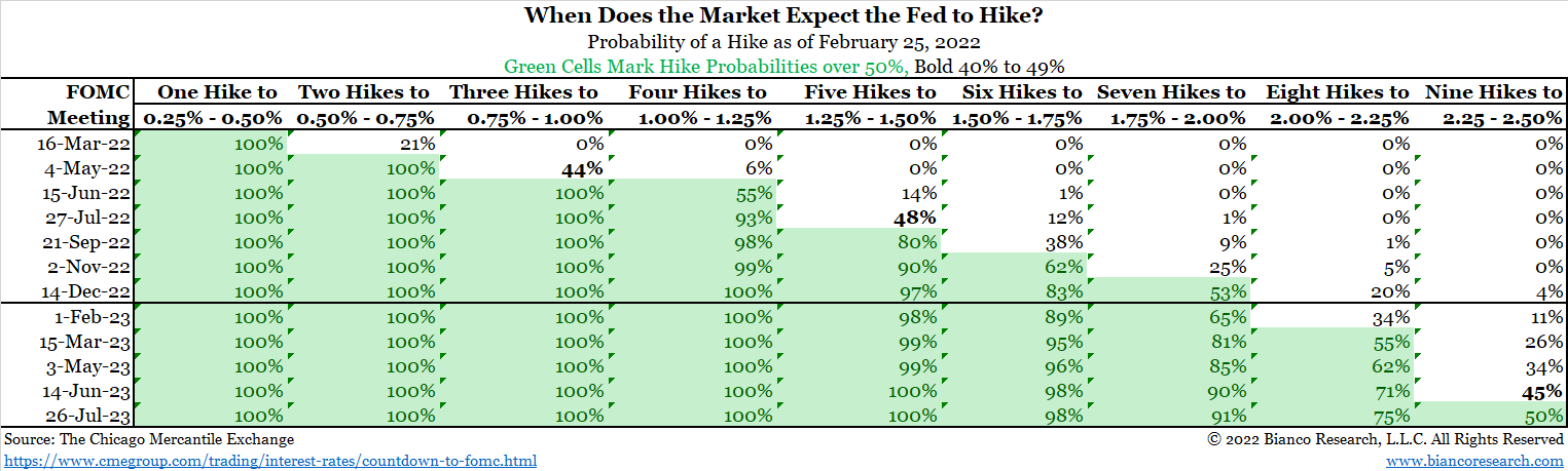
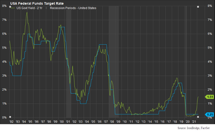
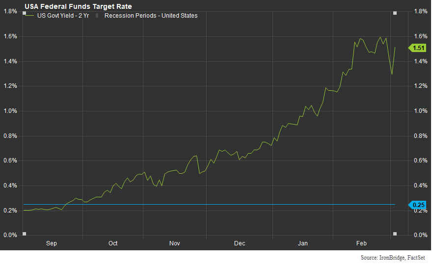
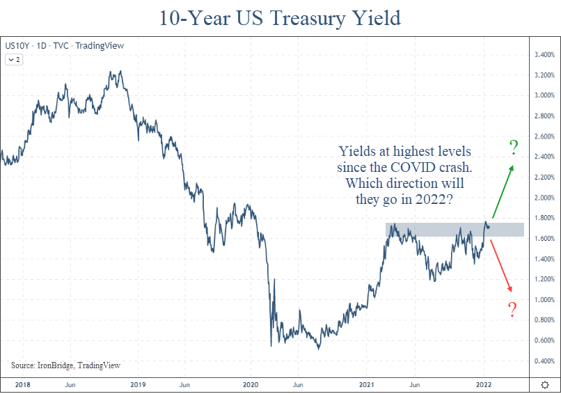
After reducing rates from 2.5% in 2019 to zero at the onset of the pandemic, the Federal Reserve has hiked rates by 0.25%. What does this mean and what should we be watching?

This was about as surprising as dropping a bowling ball on your foot and realizing it hurts.

While there are still MANY risks in the current market environment, this at least removes one uncertainty for now.

The Fed DID raise rates. They DID raise only a quarter-point. And they DID say they were going to raise more this year. (In fact, they hinted that they would likely have a rate increase at each remaining meeting this year).

What does this mean for the markets?

Frankly, not much.

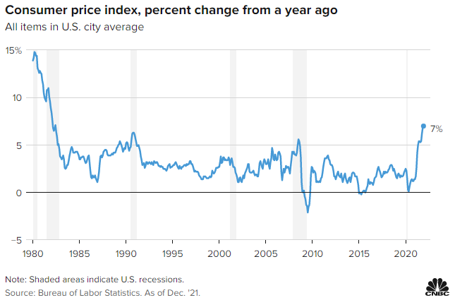
  • Inflation won’t change with a single quarter-point rate increase.
  • Monetary policy isn’t going to change the global dynamics of the Ukraine war.
  • Global supply chains won’t change due to this.

Granted, the mainstream media will make it sound like this is the most important development in the history of mankind, and will bring on “experts” to discuss it ad nauseum. The markets have initially moved higher on this news, which is a good start.

But given the cross-currents around the globe affecting the markets, this interest rate increase is fairly minor in the list of things influencing prices.

As we’ve said many times, markets are extremely complex. Global politics are also extremely complex.

Combine the two and you have an enormous matrix of potential outcomes.

When that happens, it’s best to simplify.

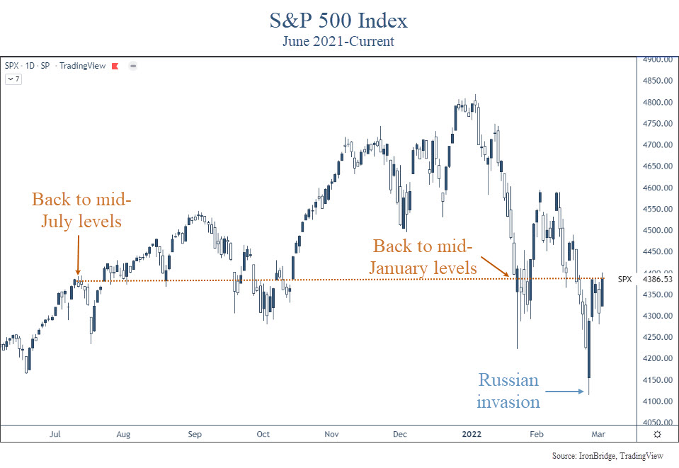
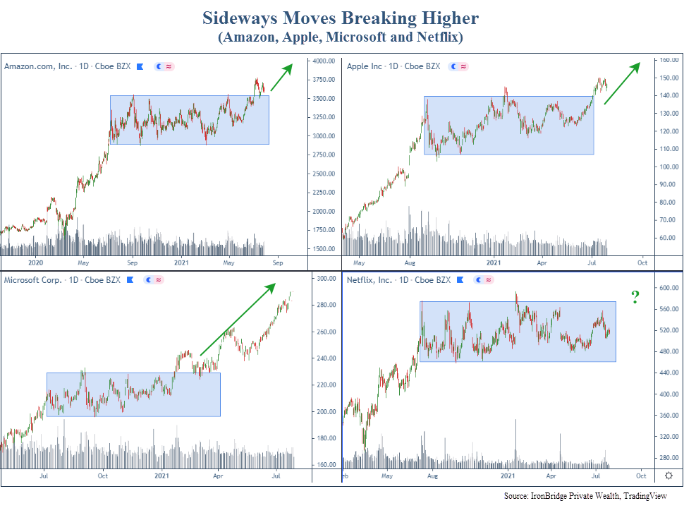
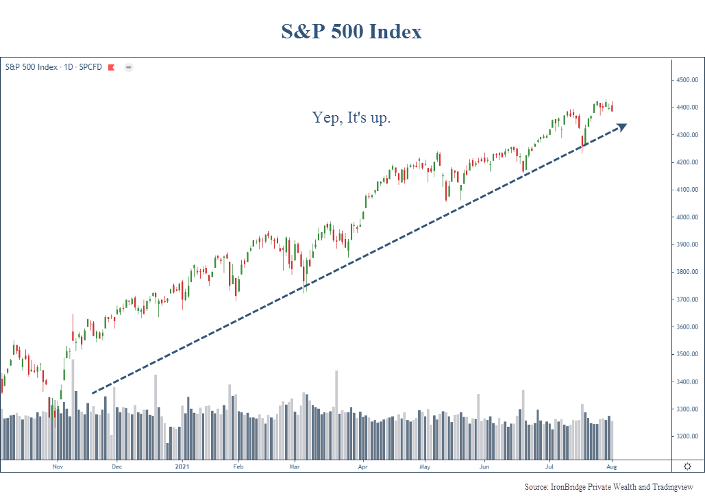
Here is a chart of the S&P 500 Index with the most simplistic view we can think of.


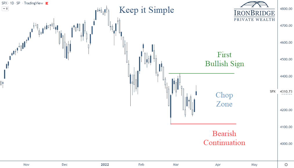
In this chart we show three basic scenarios:

  1. First Bullish Sign: If the market wants to move above the green line (the recent high from early March), then we would have the first sign that a trend change from down to up may be happening.
  2. Chop Zone: In between the green and red lines, there is very little reason to assume the market will ultimately move higher or lower.
  3. Bearish Continuation: If the market falls below the red line, then it is telling us that the volatility is not over and lower prices will follow.

So while we’re in this chop zone, we should consider the daily moves in the market to be noise.

Granted, when markets move 2% and 3% in a day, those are big moves. But until we see a move above or below the levels on this chart, it’s hard to become overly bullish or bearish.

Why do we mark these particular levels? Why might they be important?

Simple: We find it to be an easy way to determine the trend.

In downtrends, each time the market rallies, it stops at a lower level than where it stopped previously. For example, the all-time high was in early January. When it tried to rally in late January and early February, it stopped at a lower price than it was at the start of the year. The same thing happened in early March.

Each time it tried to rally, it made a “lower high”.

Having “lower highs” is the ultimate characteristic of a downtrend. And the market has definitely been in one since the first of the year.

The market can’t sustain a move higher if it doesn’t stop going down. (Thank you in advance for the Nobel Prize in Economics for that statement.)

On the flip side, if the trend of the market continues to move lower, it will make a new low in price below the red line.

That’s another characteristic of downtrends…lower lows.

We use more complex tools than this in our investment process. But this is one ways for you to think about the current market environment.

What are we Watching?

We’ll talk about this more in the coming weeks, but there are some major developments that we are watching right now.

I. Ukraine

This obviously remains the biggest wildcard and by far the biggest risk for markets.

So far, the market’s low (the red line in the chart earlier) occurred the morning of the invasion.

If we get a cease-fire, expect markets to respond favorably.

However, we need to be on guard for continued volatility and potentially lower prices if tensions escalate.

II. De-Globalization of the Economy

This is something we have been thinking about a LOT lately. We will discuss it in a future report as well.

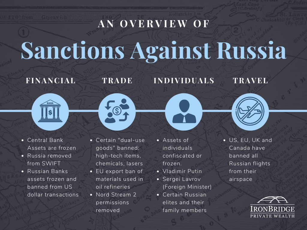
One of the concerning outcomes of the sanctions imposed against Russia is that we have seen a shift to protectionism across the globe.

The globalization of the world economy that began post-World War II was designed to reduce the likelihood of another global war. The idea was that if countries were economic partners, they would have vested interests in maintaining peace.

So far, it has worked.

But since the sanctions were announced, multiple countries have decided to reduce trade. This has the potential to further reduce global supply of everything from oil to grains to semi-conductors.

Maybe these countries are simply responding to inflation and taking a temporarily cautious stance. If reduced trade is a temporary action, then things may go back to normal if inflation falls over the next few months.

However, if we are at the start of a longer-term cycle of de-globalization, there are many negative outcomes that could occur.

These include stubbornly high inflation, shortages of various goods, increased social unrest across the globe and a higher likelihood of more wars.

III. Stagflation

This is another topic we’ll discuss in a later report, but stagflation is becoming a real possibility now.

Stagflation occurs when inflation is high but the economy is in a recession.

It seems strange to think that it could occur in today’s world, but the possibility of stagflation is real.

IV. Market Recovery

We’re obviously watching risks, but not everything is bad right now.

Corporate earnings, for example, were at a record high last quarter.

The Leading Economic Index (LEI), as shown in the next chart, is also at record highs.

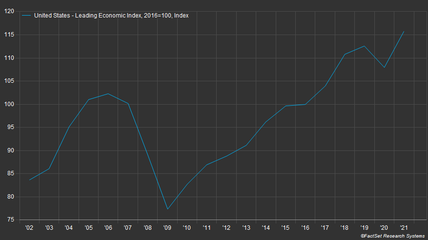
This chart goes back 20 years.

One thing to not is that leading up to the financial crisis of 2008, leading indicators were showing signs of weakness. In fact, this indicator peaked in mid-2006, more than two years before things really unraveled economically in 2008.

Note: The leading economic index is made up of ten components, including hours worked, various manufacturing data, building permits, stock prices, yields and expectation for business conditions.

Further supporting the potential for optimism is that both corporate and personal balance sheets are strong, employment is good, and the housing market is on fire.

It will be important to see data that includes the Ukraine war, and what affect (if any) it has had on this data in the coming weeks and months. We will especially be watching the earnings reports closely that begin in early April.

So while there are many reasons to be pessimistic, there are reasons the market could recover and move higher for the remainder of the year.

Bottom line

Ultimately, the market price is what’s important.

Let’s keep watching these levels on the market to see if it can sustain a move higher, and we’ll adjust your portfolio accordingly.

Invest wisely!


Filed Under: Strategic Wealth Blog Tagged With: fed, fed funds rate, federal reserve, inflation, interest rates, markets, volatility

Ukraine War: Market Update

March 2, 2022

There is a LOT happening in markets this week. As we said in our email on Monday, this may be the most important week since the 2008 financial crisis.

Today we’ll discuss a few of the major issues we’re watching:

  • Sanctions against Russia (the Financial War)
  • S&P 500
  • The Fed

As a note, we’ve put together a series of resources that we have been tracking, which you can reference here:

Ukraine War: Informational Resources

Let’s get started.


Sanctions against Russia (aka, the Financial War)

Once Russia invaded Ukraine last Thursday, the U.S. and the European Union announced a series of initial sanctions against Russia and various Russian companies. These sanctions were quick and were very coordinated among nations.

This immediately caused Putin to fight three separate wars: a military one in Ukraine, a financial war with the global financial system, and a war of perception at home.

Let’s focus on the financial war.

Frankly, once the initial sanctions were announced last week, we perceived them as basically useless.

Nearly every one allowed the entities and individuals sanctioned a 30-day window to comply with the sanctions. This meant that they weren’t going to take effect until potentially AFTER the war was over.

However, over the weekend, the sanctions became much more punitive.

They were also universally approved by the US, European Union, and the UK. Other countries such as Switzerland, Australia, Japan, New Zealand and Taiwan have all made their own sanctions against Russia as well.

There are essentially four types of sanctions being imposed:

  • Financial
  • Trade-Related
  • Sanctions on Individuals
  • Travel

Here’s our overview of these sanctions:

All of these sanctions have two goals:

  1. Punish Russia financially by freezing financial resources and removing them from the global financial system.
  2. Turn global and Russian sentiment against Putin.

So far these are working well in the short time they have been in effect.

Russia has $640 billion in foreign reserves that have now been frozen. The war is costing them approximately $20 billion per day. By most estimates, Russia has $200 billion of unencumbered assets within Russia that have not been frozen by sanctions.

That means that financially, Russia could possibly run out of money in 10 days.

We shall see, but the initial response is that the sanctions have indeed put Putin in a tough situation.

But what impact has the war had on the stock market?


S&P 500 Index

Historically, when wars begin, the stock market tends to bottom near the time of the initial invasion. This has been true for every major war since the Germans invaded Poland at the start of World War II.

So far, markets have responded to the Russian/Ukraine war as markets historically have done…by rallying higher against almost every ounce of common sense any of us possess.

As of today (March 2nd), the low point of the market happened on Thursday, February 24th. This was the day that Russia invaded Ukraine.

Since then, the S&P 500 is UP nearly 7%.

The chart below shows the S&P 500 Index since last June.

The first thing we notice is that the low point of the market thus far was immediately following the invasion. Despite the onset of this war, markets are essentially the same place they were in mid-January.

The second thing we notice is that the market was down “only” 2% the morning of the invasion.

That sounds like a lot, but relative to the volatility that occurred during the COVID crash, when markets moved nearly 10% any given day, a 2% move isn’t overwhelmingly bad. Especially given the fact that many people think this could lead to a nuclear war.

However, during the COVID crash, and also during the bear market of late 2018, markets regularly moved 2% a day.

But this pullback feels worse, doesn’t it?

That could be because we have been lulled to sleep by a very calm market in the past couple of years. It also could be that the risk of nuclear war seems like a reality for the first time in decades, which is obviously nothing to ignore.

Either way, people in general seem to have a more negative feeling towards these developments.

While the invasion itself didn’t cause much volatility, markets definitely anticipated volatility prior to the onset of this unnecessary war.

In fact, the S&P 500 was down 14% from peak-to-trough intraday in 2022, while the Nasdaq and Russell 2000 were both down over 20% peak-to-trough.

Does the fact that we didn’t see much volatility since war began mean we’re in the clear?

The answer is both “maybe” and “absolutely not”.

There are a number of positives that could result in a strong market if the Ukraine war comes to a peaceful and quick resolution:

  • The economy is strong.
  • The consumer is strong.
  • The Fed is now likely to slow down their pace of interest rate increases, resulting in continued support of financial markets.
  • The world is unified against Russia, making a coordinated effort to overcome the fallout from sanctions more economically and politically realistic. (Supplying Europe with gas from the US, for example.)

So if we get a peaceful resolution, there are reasons to be optimistic.

However, the elephant in the room is Putin. More accurately, he is the wild animal who is cornered and scared.

Dictators have one goal: to remain in power.

And Putin’s reputation has been greatly diminished both globally and domestically.

If he can’t get out of this situation peacefully, save face, and retain power all at the same time, there is no telling what he might do. And this is the risk we all fear.

Let’s refocus on the financial markets.

Prior to the Ukraine mess, the markets were selling off because concerns on inflation and the speed at which the Fed might act.

What should we expect from the Federal Reserve now?


The Fed

What might the fed do now?

The easiest way to look at this is what the anticipation of Federal Reserve rate hikes might be.

The next chart, from Bianco Research, shows the probability of Fed rate hikes at each upcoming Fed meeting.

Here’s how to read this table.

On the top left, the FOMC Meeting on 16-Mar-22 shows (from left to right across the table) a 100% probability of a hike of 0.25-0.50%, a 21% probability of a 0.50-0.75% hike, and so on. (FOMC stands for “Federal Open Market Committee”)

This tells us that the market is now pricing a 0.25% hike in March, and a total of four rate hikes this year.

Three weeks ago, there was a probability of over 90% of a 0.50% rate hike in March, with 6-7 hikes likely this year.

So the Ukraine situation is causing the Fed to pause slightly, at least for now.

That could create a tailwind for stocks as well.

But they are definitely behind the curve.

For the past 30 years, the Fed Funds rate has essentially mirrored the 2-year US Treasury yield, as shown in the next chart.

But if we zoom in to the recent rise in the 2-year Treasury yield, we see just how far the Fed needs to go to catch up.

Six months ago, these rates were the same.

Now, the Fed would need to hike 6 times to catch up to the 2-year yield.

This is their dilemma.

The other thing to note on the chart above is that the 2-year Treasury yield barely moved in response to the Ukraine war.

Globally, investors have not been moving into safe havens like we would normally expect.

Bottom line, we are not seeing the type of volatility that we would probably expect in a conflict with the implications of this one.

That leads us to believe one of two things will happen:

  1. Markets are correct. This implies that the Ukraine conflict will come to a conclusion within a week or two.
  2. Markets are unprepared. This implies that the real volatility is yet to come.

We don’t like to think about what happens in scenario 2.

But we must think through it and be prepared for any scenario, for that is our job as fiduciaries of your capital.

On Friday, we will give you a portfolio update and look at the specific levels on the markets that we are watching.

Invest wisely!


Filed Under: IronBridge Insights Tagged With: fed funds rate, federal reserve, fiduciary, investing, markets, russia, treasury yields, Ukraine, volatility, war

5 Themes for 2022 and Why We Hate Year-End Predictions

January 14, 2022

Fortune teller reading future with crystal ball. Seance concept.

We hate year-end predictions.

Maybe “hate” is the wrong word…it is far to kind.

We absolutely despise the cringeworthy year-end predictions that accompany this time of year. (Feel free to imagine other colorful adjectives we may use to describe them.)

Why?

  1. Because they are worthless.
  2. There is no accountability whatsoever for those who make them.
  3. There is no way to accurately predict such a complex system as the global financial markets with any consistency, other than using the most commonly occurring outcome of an historical return bell-curve.
  4. Did we mention they were worthless?

Case in point…the six largest investment firms in the world missed last year’s performance by nearly 20 percentage points on the S&P 500. Oof.

Our apologies in advance if you’re looking for our wild-ass guess expertly modeled estimate of what the S&P 500 will be on December 31, 2022.

As our clients hopefully know, we don’t try to predict what will happen. Instead, we try to listen intently to the markets and let our rules drive the investment decisions.

So instead of sharing our predictions, let’s instead share the five themes we’re tracking for the upcoming year.

Theme 1: The Fed

For those who regularly read our reports, there’s no surprise here that the Fed holds the top spot in themes we’re watching this year.

The Fed is the Alabama Crimson Tide of the financial world. They are always among the top few drivers of what will happen during the season. And unless you’re on the team or an alumni, most people are pretty tired of you by now.

More accurately, the Fed IS the driver of the market. It has been since 2009. So we MUST pay attention to what they are doing.

Right now, despite the talk from Chairman Powell about tightening and raising rates, they are still expanding their balance sheet.

Federal Reserve Balance Sheet has been increasing despite Powell saying they are tapering.

The increase in the Fed’s balance sheet is the single biggest contributor to both the increase in the stock market, as well as the re-emergence of inflation across the globe.

It is also a reason why we’ve only seen minor pullbacks since COVID began.

The eventual reduction by the Fed is very likely to lead to a much choppier environment for stocks, and at some point an outright bear market.

Whether that happens in 2022 or not is anyone’s guess.

But as of right now they are scheduled to begin reducing their balance sheet this year, not just slowing down the increase of it.

Paying attention to global markets when the Fed ACTS, instead of when they SPEAK, will be key for risk assets this year.

Theme 2: Inflation

The second theme to watch this year, and the natural follow up to the Fed, is inflation.

We’ve all seen it recently. From cars to steaks to milk to $10 packets of bacon. Everything costs more.

In fact, inflation just recorded the largest year-over-year increase in 40 years. It rose 7% in the past 12 months, as shown in the chart below.

On the surface, this looks ominous. We haven’t seen an inflationary environment since the 1970’s, and that decade was not a good time to passively invest in stocks.

However, our belief is that inflation will not increase and stay at elevated levels.

Instead, we think it will occur in waves.

We wrote about inflation numerous times last year (click to read):

  • The Coming Inflation Waves
  • Increased Gas Prices Signal both Post-COVID Norm and Inflation
  • The First Wave of Inflation is Receding

Lumber is a good example of our inflation-wave thesis.

After skyrocketing the first part of 2021, lumber prices subsequently collapsed. Now, they are skyrocketing again.

Take a look at the extreme moves in lumber recently.

This chart is pretty amazing. We’re talking about the price of LUMBER. Not some phantom crypto-coin being schlepped by a Kardashian.

Lumber is an excellent case study for this environment. There are demand influences, supply chain issues and quality differences in various types of lumber that contribute to this massive volatility. And for the most part, it does not have governmental influences on it like the cost of healthcare does.

Inflation has far-reaching ramifications. Not only for asset prices and the economy, but for society as a whole.

Higher prices hurt consumers. They hurt businesses without pricing power. They cause massive price adjustments in all sorts of areas. Inflation also has massive political implications as a disgruntled populace focuses its frustrations on political leaders.

This quote by John Maynard Keynes is fairly long, but worth the read:

By a continuing process of inflation, governments can confiscate, secretly and unobserved, an important part of the wealth of their citizens. By this method they not only confiscate, but they confiscate arbitrarily; and, while the process impoverishes many, it actually enriches some. The sight of this arbitrary rearrangement of riches strikes not only at security, but at confidence in the equity of the existing distribution the system brings windfalls, beyond their deserts and even beyond their expectations or desires, become ‘profiteers,’ who are the object of the hatred of the bourgeoisie, whom the inflationism has impoverished, not less than of the proletariat. As the inflation proceeds and the real value of the currency fluctuates wildly from month to month, all permanent relations between debtors and creditors, which form the ultimate foundation of capitalism, become so utterly disordered as to be almost meaningless; and the process of wealth-getting degenerates into a gamble and a lottery.

– John Maynar Keynes

Sounds pretty applicable to today. It was written in 1920.

We don’t expect inflation to cause massive societal disruptions this year, but we sure can see the foundation being laid for that to happen.

Inflation needs to be near the top of things to watch this year. And the coming decade for that matter.

Theme 3: Interest Rates

The third major driver of markets and the economy is the prevailing interest rate environment.

The COVID Crash in March 2020 pushed yields to their lowest levels in history. Not just recent history. All-time history. In the entire history of recorded financial records, dating back to ancient Egypt 4000 years before Christ, interest rates were never lower than they were two years ago.

Since then, they have marched higher. And they are currently trying to move beyond their highest levels since COVID began, as shown in the next chart.

Higher interest rates affect many areas. Real estate, fixed income markets and global currencies all have some sort of tie to interest rates. Not to mention more complicated instruments like derivatives and futures contracts.

Stocks are a bit different.

Higher interest rates aren’t necessarily bad for stocks all the time.

In fact, stocks tend to do just fine when rates rise.

The next chart, courtesy of LPL Financial’s Ryan Detrick, shows the performance of the S&P 500 each time the 10-year yield has risen by more than 1.00% (or 100 basis points).

Since 1962, there have been 14 times when the 10-year Treasury yields has risen by more than 100 basis points. Stocks were higher 11 of those times by an average of 17.3%.

Granted, most of these periods occurred during the massive bull market we’ve had over the past 40 years, but this is still an impressive statistic nonetheless.

While parts of the market are likely to suffer as interest rates rise, we shouldn’t assume that higher interest rates will automatically make stocks go down.

We are likely to find out if this holds true again this year.

Theme 4: Risk Makes a Comeback

The S&P 500 had an excellent year in 2021. CNBC and most financial news outlets primarily focus on the performance of this behemoth index.

But last year did have its share of risk if you looked outside of the large cap growth stocks.

The chart below shows the performance of various assets since last February.

The S&P is the leader by far. It was up almost 22% before the turn of the new year, since last February alone.

However, other assets didn’t perform so well during that same time:

  • International stocks were barely higher (Up 3%)
  • Small Caps lost value (Down 7%)
  • Emerging Markets down big (Down 13%)
  • China was substantially lower (Down almost 30%)
  • Even the high-flying ARKK investment ETF, run by Cathie Wood and epitomizing the speculative edges of the markets, fell by nearly 50% since last February.
  • Bitcoin is down nearly 40% in the past two months (not shown on the chart above). Not what we consider to be an effective a store of value, especially with inflation at 7%.

Why did the S&P returns exceed other areas of the market so much?

Simple…nearly 30% of the index is in the top 5 stocks. And those stocks did amazingly well last year.

The rest of the financial world experienced weakness or outright bear markets already.

The main question for this year is whether the rest of the world can do well if the top stocks in the S&P 500 do poorly.

If they can, which is an excellent possibility, then there will be more opportunity in owning things outside of the big tech companies. In our view, this is the likely path forward.

But if they can’t, and the rest of the world remains weak while the heavy lifters in the S&P 500 deteriorate, then it could be a difficult year across the board.

There are mixed messages here, and the answers are not clear. So you must adapt as the things develop, whether they become bullish or bearish.

Theme 5: Another Damn Election

It’s a mid-term year, and the fully saturated political environment is going to soak us once again.

In an ideal world, politics shouldn’t influence asset prices. But in our world they do.

Remember the performance of Chinese stocks from the chart above? A number of Chinese companies have excellent business models, fantastic customer bases and thriving businesses, but political influences caused massive declines in the performance of their stock last year, and it brought down the entire stock index in that country.

With this being an election year, there are some key areas of the market that could be made into whipping boys this year.

The two most likely targets? Big Tech and Big Oil.

We’re starting to hear rumblings from Washington about their intentions.

The big social media companies are scheduled to testify to Congress soon. And our beloved politicians won’t miss the opportunity to send an outlandish quote hurling through the echo chamber to get on the front page nationwide.

Same with big oil. We’re already hearing from President Biden that oil companies are gouging the American people. Maybe he’s right, maybe not. But we should expect them to be a target this year as well.

Despite of whether there is political influence or not, midterm election years tend to have increased volatility on average.

The next chart, again courtesy of LPL Financial, shows This chart shows the average return of each year of the 4-year Presidential Cycle since 1950.

Specifically, it shows that Midterm years have an average drawdown of 17% during the course of the year.

It also shows that on average, stocks are higher by 32% a year after the lows.

While each year has its own specific characteristics and abnormalities, the Presidential Cycle data suggests we should see some volatility this year, but should expect a nice recovery.

Bottom Line

Bottom line, the market is finishing up a strange year in 2021. The S&P 500 did great, but other areas didn’t do as well.

And markets are off to a fairly rocky start to the year so far. But the overall trend still remains higher, at least for now.

Where the market ends up at the end of the year is anyone’s guess. But we’ll keep adjusting portfolios as the data warrants, and will work hard to both protect and grow your hard-earned wealth.

Invest wisely!


Filed Under: IronBridge Insights Tagged With: 2022, federal reserve, inflation, interest rates, new year, predictions, stock market, trends, volatility

It Came from Left Field

November 29, 2021

Confused baseball player

Last Friday, the day after Thanksgiving, the market fell almost 1000 points. What was that all about?

First off, let’s put this move in context.

Volatility Spikes

The VIX rose 54% on Friday. This was the fourth largest spike in the history of the volatility index, as shown below.

Largest 1-day increase in the volatility index (VIX) in history.

There are some interesting things that we find in this data:

  1. Surprisingly, the 3rd-largest spike happened this past January. Not pre-COVID January 2020, but this past January of 2021. (Like you, we don’t remember that either.)
  2. Three of these happened during the COVID crash (items 10, 17 and 18 in the chart above).
  3. Only 4 of these 20 spikes (20%) occurred during true bear markets. The other 80% occurred randomly during up-trends.
  4. The largest spike in VIX history happened a few years ago. It led to a 20% pullback in stocks.
  5. The 2nd largest spike happened in early 2007, nearly 8 months prior to the market top before the 2008 financial crisis.

This list tells us that the spike in the VIX last Friday was indeed historic. Let’s now look at this VIX spike on a chart, not just in a list.

The next chart looks at the VIX since just before the COVID crash.

Well, that’s pretty strange. Friday’s spike higher was both historical and barely noticeable.

On first glance, it would appear that the VIX has done this many times during the past year.

Should we be Concerned?

With this volatility, should we expect Armageddon? According to mainstream media the Omicron mutation is going to be the worst mutation so far. But they are paid to sell commercials, not provide rational guidance.

Their constant hype of selling fear appears to be backfiring. Viewership is dramatically lower, and trust in the media is at an all-time low, and rightfully so. But we digress.

Bottom line, it’s easy to “blame” some kind of news for big market declines.

But the move on Friday looked to be more technical than anything else.

The day after Thanksgiving has notoriously low volume. Not many institutional traders are at their desk all day, and a small number of large trades can cause big dislocations when volume is low.

In addition, the market hasn’t had much volatility in the past year. So in a way, it made up for lost time.

So back to the question…should we be concerned?

Maybe.

Any time these types of moves happen, the most important development is ALWAYS whether we see follow-through or not.

As of this writing, markets are up almost 2%. We didn’t see any follow through lower just one day later. That’s a positive sign.

As the week goes on, we should start to get more clarity on what the market wants to do next.

We didn’t make any moves on Friday. Those are not the types of days to act upon.

That said, we do anticipate taking action in client portfolios this week:

  1. Our monthly trend signal resets on Wednesday, and that could cause us to raise cash.
  2. Big moves lower offer the potential to realize tax losses on certain positions. We can then offset some of realized gains that have occurred this year by selling some losers and rotating into different positions to avoid wash-sale issues.

Other than that, it appears for now that the move was simply random and out of left field.

The likely scenario is that we slowly move back towards all-time highs.

However, as always, we are going to stay vigilant in managing risk. And if that means increasing cash, we will do so as our signals tell us to. But for now, the move appears to be a random event that we should probably come to expect more of in the coming months and years.

Until then, we’ll keep watching the markets for clues.

Invest wisely.

Filed Under: Strategic Wealth Blog Tagged With: covid, markets, omicron, risk management, vix, volatility

The Secret Downsides of Diversification

October 13, 2021

As of March 2021, Amazon had over 12 million different non-book products for sale (if you count books, it’s more than 75 million). Having an incredibly diverse product set is a vital part of Amazon’s business strategy.

Investors are often told diversification is a critical part of their investment plan. But is it really?

Taking numbers from 2019, there are approximately 4,210 equity mutual funds. The average number of stocks in each fund is about 38 for a large cap fund, and about 50 for a mid-cap fund. A broad asset allocation based on mutual funds could potentially have an investor owning hundreds of different stocks.

What happened to your portfolio in March 2020? Did broad diversification pay off?

Diversification Doesn’t Limit Losses Like People Think

There’s a saying that diversification is the “only free lunch in finance”. The premise is that a diversified portfolio will contain assets that move in different directions during periods of market turmoil.

For example, growth stocks may struggle when value stocks are doing well, as we saw earlier this year. It goes from style to asset class, sector, capitalization, and geography – all potential sources of diversification. Building a diversified portfolio is supposed to reduce risk, which will potentially increase return.

In theory, all well and good.

But what happens when there is systemic risk, as we saw during the early days of the pandemic?

Diversification can’t hold back a tsunami. Granted, black swans like 2008 or the pandemic are fortunately rare. But what isn’t rare at all are market cycles. They are predictable and regular. As the market moves through different cycles, different risks and opportunities emerge.

The problem is that asset allocations built on the principle of diversification aren’t built handle changes in the market cycle. They don’t see risk or opportunities coming, and don’t effectively react to these cycle changes.

Worse and More of it: Diversification May Limit Gains

Adding non-correlated investments to your portfolio is supposed to lower risk and increase return – but you can have too many. The result is that the risk-return profile decreases – you take more risk and get less return.

It’s called “deworsification.”

Deworsification is caused by creating a portfolio in which too many assets are correlated with each other. It can be caused by investing in multiple funds that hold many stocks, as described above. It can also be the result of combining different strategies in a portfolio. Investors need to be aware of hidden sources of over-diversification, such as target-date funds held in a 401(k).

Adding an additional asset allocation in a brokerage account can result in a portfolio that is simply duplicating efforts.

The problem here is that the portfolio isn’t just vulnerable to systemic risk – it’s also missing out on potential gains. The fear of concentrating in any one position often means investors lose out on potential sources of alpha because their asset allocation doesn’t allow for building a position or letting it run.

Said another way, assets tend to not perform the same in up markets, but perform identically in bad ones.

So having too much diversification hurts returns in good times without providing much protection in bad times.

A Different Approach

An ideal portfolio would seek sources of alpha and would be sensitive to risk – but only when risk exists in the market.

Limiting positions when the market cycle is indicating positive signals means reducing return. And risk management that reacts to changes in the market by reducing exposure to riskier assets can both protect your portfolio, but also allows for cash to be redeployed when signals turn positive again.

Creating this kind of portfolio isn’t about investing in stocks according to a static asset allocation – it’s about having rules that take the emotion out of investing.

Successful investing means you own right exposure, in the right amount, during the right point in the cycle. And when necessary, going to cash.

The Bottom Line

Investors have many options now, and investing can be deceptively easy – until markets change.

The free lunch quote above is attributed to Harry Markowitz, who developed modern portfolio theory – in 1952. There might be a better way than relying on traditional methods of portfolio management that haven’t kept pace with the realities of our investment universe.

Filed Under: Strategic Wealth Blog Tagged With: alpha, diversification, markets, portfolio management, volatility

The Federal Reserve Trading Scandal: Just the Tip of the Iceberg?

October 5, 2021

Iceberg - Hidden Danger And Global Warming Concept - 3d Illustration

In the past three weeks, there have been three prominent Fed officials who have been caught in trading scandals.

For those not familiar with this scandal, you can read about it here:

https://news.yahoo.com/a-timeline-of-the-federal-reserves-trading-scandal-104415556.html

In summary, last week, Robert Kaplan and Eric Rosengren, Presidents of the Dallas and Boston Federal Reserves respectively, both “retired” amid revelations that they had actively traded stocks and investments that directly benefitted from the Fed’s actions.

Last Friday, yet another official, Richard Clarida, reportedly moved millions of dollars out of bonds and into stocks the DAY BEFORE the Fed announced trillions of dollars of market stimulus.

This is a conflict at best, and flat-out criminal at worst.

If an employee of any financial institution did this, they would be fired. And probably banned from the financial industry for life.

But the Fed officials simply “retired”.

The End Game: Losing Confidence

The financial markets have risen on the back of Fed printing for over a decade now.

For many years, our clients have been asking (and we have been wondering), “When will the next bear market begin?”

And for many years our answer has been, “When the market loses confidence in the Fed.”

Well, this may very well be how it starts.

In our opinion, the single biggest risk in global financial markets is a mistake by the Federal Reserve.

Thus far, they have consistently erred on the side of being supportive of financial markets. And prices have gone up in response.

But the recent tumult inside the Fed has a different feeling.

The blatant and intentional actions of these men were for one reason: to make money.

By itself, there’s nothing wrong with that.

But when you “front-run” major announcements intended to change the direction of global financial markets, you go from simply trying to make money to committing acts that violate any basic conflict of interest rule. And likely go far beyond that.

These men should be investigated. Just like any other member of the financial industry.

But unfortunately, they probably won’t.

Neither will the many people in Congress who do the same thing every week.

It’s almost as if there is a ruling class that is above the law.

Stock Market

What effect might this have on the stock market?

Markets have become volatile once again. Maybe it’s just a long overdue pause, or maybe it’s because of this scandal.

Either way, the Fed is such a HUGE part of the markets these days, anything they do (good or bad) will likely have an impact.

The extent of that impact is still unknown.

On the one hand, this could be the first domino to something bigger. A weakened Fed opens itself up to major criticism, and rightfully so.

Up to this point, the Fed hasn’t had to deal with much criticism. Trump was a vocal critic of the Fed, until he became president and wanted markets to remain strong. Ron and Rand Paul have both been critical, but their voices have quieted since COVID began.

And when new Fed chairs get appointed, they may or may not have the stomach to fight such criticism.

On the other hand, maybe this criticism causes the Fed to double down on their printing machine. Maybe they announce continued support of the markets because they don’t want the one-two punch of both bad publicity AND a weak stock market.

At this point, weakness in the market appears to be normal.

After all, we went nearly a year without a 5% correction. That’s pretty abnormal, as these types of declines happen 1-2 times per year on average.

But if the stock market has peaked (which we’re not certain that they have), then we very well may look back at these trading scandals as the moment the Titanic first ran into the iceberg.

Invest wisely.

Filed Under: Strategic Wealth Blog Tagged With: federal reserve, markets, scandal, trading, volatility

We’re All Cats on a Hot Stove

August 3, 2021

Waiting for a correction in the stock market? It may have already happened.


If a cat sits on a hot stove, that cat won’t sit on a hot stove again. That cat won’t sit on a cold stove either. That cat just don’t like stoves.

mark twain

It’s hard to believe, but the COVID market crash ended 16 months ago.

It was truly a black swan event. Something that came out of nowhere and was unlike anything the global financial markets have seen in over 100 years.

One of the most common questions we receive is, “When is the next crash going to occur?”

This is a good question, and a very logical one. And one we think about quite often.

After all, we are seeing a rise in the Delta variant, many cities are re-instituting mask policies, and there is discussion of additional lock-downs. Sounds like February and March 2020, right?

On top of that, we have the random 1,000-point decline that happened on July 19th. Read our comments in our article “Are the Dog Days of Summer Over?“

So there are valid reasons to be expecting a sharp market decline.

But we have been receiving this question for well over a year now.

In the past year, there has been a great deal of hesitation to put cash to work in the stock market. Granted, some people were very quick to put cash to work, but most were very hesitant. And many remain so to this day.

Why?

To fully answer both the question “Why?”, and the question of whether we should expect another market crash soon, we need to understand the human behavior factors at play.

We’re All Cats That Sat on a Hot Stove

As humans, we don’t arrive at skepticism by accident.

In fact, being skeptical is an extremely valuable survival tool. Especially when we see conditions that were similar to past experiences that caused us pain or harm.

The are three basic components of skepticism:

  1. You perform an action.
  2. You experience pain.
  3. You learn to avoid the conditions that caused the pain.

It isn’t rocket science. In fact, we can probably just file this alongside the long list of other things we’ve said that won’t win us a Nobel prize.

In the quote that we referenced at the beginning of this report, Mark Twain presents the ultimate completion of this three-step cycle:

  1. A cat sits on a stove.
  2. The cat burns his you-know-what.
  3. The cat never sits on a stove again, regardless of whether it is hot or cold. Because every stove now looks like a hot stove to the cat.

Pretty simple, right?

Sort of.

Most problems in life arise when we forget to do Step 3: Learn from past experiences.

We have all experienced situations that may have caused us pain that we ended up right back in for no good reason.

Substance addiction, bad relationships, a bad job…there are all sorts of examples of people forgetting about Step 3.

Many times we’re cats who sit right back on top of that stove. And many times we are once again burned.

But what happens if learning from past experiences is the REASON we are harmed in the future?

What if we perform Step 3 beautifully, learn to avoid the situation that caused harm, only to then be harmed MORE by the fact that we avoided the situation that previously caused us pain?

This is what happens in financial markets.

When you lose money in the stock market, you have to go back on the same exact stove that burned you if you want to get back in.

This is where the complexity starts to set in.

In markets, you have to think about Step 3 differently.

The lesson learned cannot be one of complete avoidance.

You must have the cognitive ability to reshape HOW you learn lessons about what got you in trouble in the first place.

After losing money in a big market decline, most of us think that the lesson should be to NOT get back onto the market stove. After all, it looks pretty hot, right? Delta variant, super high valuations, a massive rally from last March and an out-of-control Fed all make us think the temperature on the stove is pretty darn hot.

But just because these things are happening doesn’t mean you should avoid it altogether.

Don’t Avoid the Stove, Just Start to Use a Thermometer

Instead of avoidance, you must begin to use tools that can assess both the current temperature of the stove (markets), as well as the direction and rate of temperature change of that stove.

It is a rational response to avoid the stock market after getting walloped by it. In fact, it is the exact response that would help you avoid that pain in the future.

Many investors go through a big decline and turn into real estate investors. Or private equity investors. And that’s okay.

Markets are not for everyone.

But don’t believe that getting burned on stove means that there is something inherently wrong with stoves.

There is an opportunity cost to avoiding the stove.

The public financial markets provide access to fantastic investment opportunities with a tremendously high degree of liquidity. The primary benefit of liquidity, or the ability to get out of your investment quickly at little to no cost, is that you don’t have to be right all the time. You can change your mind and you can easily get out of things that aren’t working.

You simply need to start using tools that allow you to assess the temperature of the market.

At Ironbridge, we use a wide variety of tools. We won’t get into the specifics, but we use momentum analysis, trend analysis, RSI, MACD, DeMark Signals, and many other data points that help direct our decision-making. We have then developed sets of rules that drive our actions.

The whole point is that it’s important to have some gauge of the temperature of that burner, and not not simply guess when we jump onto it.

So Is the Stove Hot or Cold Right Now?

Okay, enough of the long analogy about stoves. Let’s get to the market analysis.

Bottom line, while the S&P 500 has not seen a correction since last November, we have already seen a correction in many assets.

Let’s look at the following charts to show what we’re talking about:

  • Russell 2000 (Small Caps)
  • China Stocks
  • Emerging Market Stocks
  • Big Tech Names
  • S&P 500 Sectors
  • S&P 500 Index itself

Before we start, a brief note on stock corrections.

Corrections can take two forms. They can happen via TIME, or via PRICE.

A price correction is what we usually think of when we think about a market pullback. Stock prices were going up, then they fall anywhere from 5% to 30%. Then resume their move higher.

But markets can correct in TIME as well. This simply means that they go through an extended, multi-month period with little price movement up or down.

Both time and price corrections serve the same purpose: remove excesses from the markets and get the ratio of buyers and sellers more in balance.

Okay, on to the charts.

Russell 2000 (Small Caps)

First, let’s look at the Russell 2000. After a strong surge following the Presidential election, small caps have been little changed since February/March.

The Russell 2000 small cap stock Index has been in a sideways consolidation for most of 2021.

The blue box in the chart above is a classic correction in TIME. Small caps have been choppy with no direction for six months now. These patterns tend to resolve themselves higher, so we should expect that as the base case scenario.

However, a break below 208 in the chart above would be a more ominous signal. This could lead to selling pressure expanding across the market, and not just be isolated to small caps.

International Stocks

Next, let’s look at China and other international stocks.

The next chart is that of China Large Cap Stocks, using the ticker FXI.

China large cap stocks are down 25% from the 2021 highs. Ticker FXI.

This is a classic correction in PRICE. Stocks are down 25% since February. There is little doubt the direction of this trend.

The same is true of other, more broad international stock indices.

Emerging market stocks are down over 15%, as shown in the next chart. This is no real surprise since China is the largest component. But it is another example of a major global equity market component that is experiencing a correction right now.

International stocks have been weak. There is no question about that.

U.S. Stocks

What about some of the major U.S. stocks?

Well, here is when we start to see what is really happening in U.S. stocks right now.

The next chart shows four of the largest U.S. stocks: Amazon, Apple, Microsoft and Netflix.

These charts show us that each of these stocks went through some sort of TIME correction in the past year.

  • On the top left of the chart is Amazon (AMZN). It was in a sideways move for almost a year. It broke higher, but fell back into it’s chop zone last Friday after a 7% decline following earnings. This is called a “false breakout”. Meaning it may have longer to go before it breaks out of its sideways correction.
  • Apple (AAPL), on the top right, shows a classic break higher from a sideways correction. It also spent over a year in a TIME correction before resolving higher.
  • Microsoft (MSFT), on the bottom left, was in a TIME correction for the second half of last year. It has steadily been moving higher since the start of the year.
  • Finally, Netflix (NFLX) is shown on the bottom right. This was a darling of the COVID period, and remains in a TIME correction since this time last year.

Each of these stocks experienced a correction. And these are major components of the S&P 500.

The fact that these stocks are breaking higher suggests we should have a bullish tilt to our thinking.

S&P 500 Sectors

Looking some of the sectors in the S&P 500, we see a similar picture.

The next chart looks at the Energy, Industrials, Tech, Financials and Consumer Discretionary sectors. We could have chosen more, but the chart gets way too busy.

Each of these sectors have all seen some sort of correction in the past year. Most have been correcting in TIME.

Energy has been the biggest winner since the election. There is an excellent lesson here. The pundits on CNBC and elsewhere all predicted a Biden presidency would harm energy companies. That would make sense logically. But the market responded in exactly the opposite way. The lesson? Using the financial media for investment decisions is not a sound strategy.

This sideways movement of the major S&P sectors suggests that corrections are actually happening under the surface of the market.

But what about the overall market itself?

S&P 500 Index

But here’s the strange thing: Despite corrections happening in both the major stocks and major sectors within the index, the S&P 500 Index itself has been very strong.

Despite the underlying TIME corrections happening in various sectors, and despite the obvious PRICE correction in international markets, the S&P 500 is up. In a very, boring, beautiful pattern higher.

So What Does All of This Mean?

It means that if you’re expecting a stock correction, it may have already happened.

As strange as this sounds, the underlying components in the markets have all mostly corrected already. Without an overall market correction.

Chalk this up as a win for indexers.

This is also why at IronBridge we have both active and passive strategies in place.

In fact, we have had the highest exposure to the S&P Index in our four-year history. We could only go about 5% higher in our portfolio weighting to the S&P 500 Index based on our rules. At the high point, clients had exposure of anywhere from 25-35% of their portfolios, depending on the risk level.

While the S&P has been boring, it’s more interesting to look at the small caps and international stocks.

Earlier this year, our clients had exposure to both of these areas. And both were stopped out at relatively small losses.

For small caps, that wasn’t such a big deal. Prices are similar to where they were when we exited.

But for international stocks, they are down 15-20% lower than where we exited.

Such is the nature of risk management.

We don’t know when things will reverse higher, chop sideways, or continue lower. Guess what, no one else does either.

But was has been interesting about this year is that there has been both volatility and no volatility at the same time. The stove is both hot and cold.

So it would be completely logical to expect the S&P to experience some sort of correction, either in PRICE or TIME.

But the underlying components suggest that we shouldn’t bank on it either.

There is a chance we have already seen the correction via the underlying components and the selloff in other areas.

If this is the case, the second half of this year should be strong. And will likely extend into next year.

If the S&P 500 does start to experience a correction, the likelihood is that it is relatively mild and most likely happens via a TIME correction.

In the meantime, look for opportunities to put cash to work, and stick with a disciplined risk management process.

Invest wisely!

Filed Under: IronBridge Insights Tagged With: behavioral finance, China, investing, markets, portfolio, sectors, SPX, volatility

Are the Dog Days of Summer Over?

July 19, 2021

A calm summer for the markets was interrupted today with a large selloff. Is this just a blip, or is it the start of a bigger decline?

What happened:

  • Dow Jones Industrial Index closed down 725 points, or 2.09%
  • S&P 500 was down 68 points or 1.59%
  • The media blamed COVID fears, but it looks more technical in nature
  • VIX Index rose nearly 40% at one point during the day
  • Bonds had their best day of the year, with long-term US Treasury prices up over 2%

Near-Term Market Assessment:

  • Numerous warning signs have been happening over the past three months:
    • Lumber prices have fallen 68% from their highs.
    • 10-Year Treasury Yields have dropped from 1.76% in March to 1.19% today.
    • Fewer stocks have been participating in the slow drift higher since mid-February. Today, more than 50% of the stocks in the S&P 500 are below their 50-day moving average (more on this below). That number has been steadily rising since April.
  • It is too early to tell if this selloff will continue. Bull markets tend to have short, sharp declines like this.
  • The S&P 500 Index is only 3% off its all-time highs. So the fear seems somewhat unwarranted at this point.

Portfolio Implications:

  • We have been systematically raising our stop-losses over the past few months.
  • We sold two positions today, one stock ETF and a high-yield bond ETF. Both moved to cash equivalent ETFs.
  • We may get further sell signals this week. If we do raise cash this week, it may not remain in cash very long if the market decides to resume its move higher.
  • We do not know when a short-term decline will turn into a long-term decline. That’s why we have rules and don’t try to guess. This kind of environment has the potential for a “whipsaw”, where we move from invested to cash and back to being invested. This is definitely not the favorite part of our process, but it is a natural consequence of having disciplined rules and not just winging it.

Market Discussion

Markets were down over 2% today. The primary (and easy) explanation is COVID. Every state in the US is showing a rise in cases. Los Angeles reinstated mask requirements this past weekend (even for those fully vaccinated). Other parts of California and possibly New York City may follow suit with mask requirements.

Naturally, any volatility in the markets is blamed on the most recent “thing”. It’s natural to assume that the rise in cases we are seeing now would result in a market environment like we saw in early 2020. We’re human and that’s what we do…extrapolate past events and assume they will happen again.

But the reality is that there were plenty of factors to explain the move lower today.

And they are mainly technical in nature.

First, market breadth has been very narrow the past few months.

This simply means that fewer and fewer stocks have been in uptrends, despite markets drifting higher. In fact, many stocks have been in downtrends since April.

The chart below shows the percentage of the S&P 500 Index that has been above its 50-day moving average (50dMA).

S&P 500 Index components above 50 day moving average following the market decline of July 19, 2020.

The 50dMA is simply the average price of a stock over the last 50 trading days. A stock above that level is generally considering to be in a rising trend (or a bull market). A stock that falls below that level is considered to be in a declining market.

What the chart above shows us is that while the market has been drifting higher, over 50% of the stocks in the index were in bear markets in June. This is referred to as “breadth”.

This indicator is similar to a game of jenga. When there are many blocks supporting the tower at the start of the game, the tower is strong and sturdy.

But as the game goes on, there are fewer blocks supporting the ever increasing height of the jenga tower.

This is happening in the stock market. When there are a lot of stocks supporting the index, it is more sturdy. In April, over 90% of the stocks in the S&P 500 Index were above their respective 50dMA. But as more and more stocks begin to reverse trend and fall, the index get wobbly.

This is very similar to mid-2018. We wrote about breadth in our “Soldiers are AWOL” report. After a weakening breadth environment in mid-2018, the market corrected by 20% in Q4 of that year.

The big tech stocks have been doing the heavy lifting in the past three months. The same exact thing happened in 2018.

The next reason is simply that the market is overdue for a correction.

So while COVID is to blame, the fact remains that we are due for a pause following the massive rally from the COVID lows last year. The market has had very little pauses, and is well overdue for a correction.

We shared the next chart in our last email newsletter, but it’s worth sharing again.

This shows the market rallies from previous major bear market bottoms. Three environments are shown here (1982, 2009 and 2021).

This chart suggests we are due for a natural pause given the strength of the move from March 2020’s lows.

So while the news is blaming COVID, the reason for today’s selloff seems to be much more technical in nature than simply worry about the delta strand.

The next few days will provide tremendous insight into what may happen over the coming weeks and months.

We had two sell signals today, selling one stock ETF and a high-yield bond ETF.

There is a chance we get many more sell signals this week.

However, no one knows if this is just a blip or if it is the start of something bigger.

Given the positive trends in the economy, continued massive support from the Fed, and the very technical nature of the market selloff today, we should assume that the bull market is still in tact, but due for a pause.

Risk management is a priority for us and our clients. Therefore, we will not wait to see what happens. We will act on our signals, and adjust course as necessary.

That could mean increased cash, but it could also mean that cash on the sidelines today gets put back to work very shortly.

Either way, the dogs days of summer could indeed be over for the stock market, even if it simply means a temporary pause in the bull market.

Please do not hesitate to reach out with any questions or concerns you have.

Invest wisely!

Filed Under: Special Report, Strategic Wealth Blog Tagged With: dow jones, market selloff, S&P Index, stocks, volatility

  • « Go to Previous Page
  • Go to page 1
  • Go to page 2
  • Go to page 3
  • Go to page 4
  • Go to page 5
  • Go to Next Page »

Footer

LET'S CONNECT

  • Email
  • Facebook
  • Instagram
  • LinkedIn
  • Twitter

AUSTIN LOCATION

6420 Bee Caves Rd, Suite 201

Austin, Texas 78746

DISCLOSURES

Form ADV  |  Privacy Policy  |  Website Disclosures

  • Home
  • Difference
  • Process
  • Services
  • Insights
  • Team
  • Clients
  • Form CRS
  • Contact Us

Copyright © 2017-Present by IronBridge Private Wealth, LLC. All rights reserved.